

© 1998 by Ralph W. Lambrecht, all rights reserved
Tone Reproduction
Silver-gelatin photographs are capable of rendering image tones from the brightest whites to the deepest blacks, but the image quality of every book is limited by the paper and inks used during its printing process. Selecting bright-white papers for offset printing is not a problem, but unfortunately, even the darkest printing inks cannot compete with the maximum blacks of a real silver-gelatin photograph.
Consequently, the resulting book images are always inferior to their photographic counterparts. This is not a huge problem with regular publications, but it is of great concern to us, because we do not want to lose any learning effort to the technical limitations of a mechanical printing process.
Since authors — as concerned with tonal accuracy as we are — should not leave the publisher and printer guessing at their intentions, we added two step tablets to this page, purely to support and control the printing process of this book. We hope that it helped to optimize the tonal accuracy on all pages and kindly ask you to excuse and ignore them here.

Introduction to the Zone System
An overview to get you started
Have you ever looked at a scene and had a clear vision of the final print? Sometimes the image turns out just as we expected, but as often as not, the final print is far from what we intended. In the first half of the 20th century Ansel Adams and Fred Archer developed a system to replace the guesswork with much needed control over the photographic process. They called it the ‘Zone System’.
For most serious fine-art photographers, whether amateur or professional, the Zone System continues to be accepted as a standard to control the entire monochrome tone-reproduction cycle from subject to print. The Zone System organizes the many decisions that go into exposing, developing and printing a negative, and once mastered, it provides a practical method to ensure maximum negative and print quality through the visualization of the final print and a thorough understanding of equipment and materials.
In brief, the Zone System works like this: The photographer decides how light or dark key elements in the scene should be in the final print and then takes reflective readings of these areas to determine exposure and contrast range. This is done to either obtain a literal recording of the scene or a creative departure from reality. The film is then exposed and developed to create a negative capable of producing the visualized print.
Several good books have already been written about the Zone System. Some are very technical, while others try to simplify the system to make it available to a larger audience. This chapter only provides an overview to assist in understanding what the Zone System is all about. How far you take it from here depends on your type of photography and your level of interest in photographic craftsmanship. However, a basic understanding of the Zone System is helpful, if not required, to get the most out of quality photographic publications, and it will increase your photographic confidence, even if you decide to continue to use ordinary exposure and development techniques.
Zones
Good photographic paper is capable of showing bright white highlights, which transition smoothly to deep black shadows with an abundance of gray values in between. This continuous transition from bright white to deep black is divided by the Zone System into eleven zones, which are numbered with Roman numerals. Fig.1 shows the resulting zone scale. Zones II, III, V, VII and VIII are of the greatest interest, and consequently highlighted, but they all require some definition.
Zone 0 is the darkest a photographic paper can get. It is the paper’s black.
Zone I is almost black. In this zone, a hint of tonality is observed, but it has no pictorial value.
Zone II clearly differs from paper-black through signs of shadow texture, but the deep tones make it difficult to make out image details.
Zone III is as dark as textured shadows should get, otherwise important image details are lost.
Zone IV shows darker areas with full texture and detail.
Zone V is a fully textured middle gray, representing an 18% reflectance. The ‘Kodak Gray Card’ can be used as an exposure guide for this zone.
Zone VI shows lighter areas with full texture and detail.
Zone VII is as light as textured highlights should get, otherwise important image details are lost.
Zone VIII clearly differs from paper-white through signs of highlight texture, but the light tones make it difficult to make out image details.
Zone IX is almost white. In this zone, a hint of tonality is observed, but it has no pictorial value.
Zone X is as bright as the photographic paper’s base. It is the paper’s white.

fig.1 In the Zone System, all gray values, from deep black to bright white, are divided into eleven zones, creating the zone scale.
The definitions above describe the zones in terms of tonal values as they appear in the photographic print. Nevertheless, it is important to be aware that zones are exactly one stop of exposure apart in the subject scene. Therefore, the lightmeter will find Zone III to be two stops darker than Zone V, and Zone VIII to be three stops brighter than Zone V.
Visualization
This is the first step in the Zone System. Before the actual picture is taken, the scene is viewed with the final photograph in mind. The Zone System practitioner looks at the scene, identifies the areas of pictorial significance and forms a mental representation of the final photograph. The brightest highlight cannot be brighter than the paper’s white, and the darkest shadow cannot be darker than the paper’s black.
During this process, the zone scale in fig.1 is used as a reference. Textured shadows, which contain important image detail, are typically visualized to be on Zone III, and textured highlights are usually imagined to be on Zone VII. However, for image brilliance, highlight tonality is more important than highlight detail, and it is recommended to alternatively envision tonal highlights to be on Zone VIII. All remaining values fall onto their respective zones (fig.2). Some photographers find it advantageous to record the results of this mental process in some form.
To obtain a literal recording of the scene, zone placement depends on the tonal values of the subject, but for a creative departure from reality, zone placement is entirely up to the photographer. In order for this to work, film exposure and development must be carried out in a way that supports the visualization.
Exposure and Development
The photographers of the 19th century were well aware of the basic influence of exposure and development on negative quality. They already knew that the shadow density of a negative is largely controlled by the exposure, whereas the highlight density depends more on the length of development time. These early photographers summed up their experience by creating the basic rule of photographic process control, ‘expose for the shadows and develop for the highlights’. The Zone System is based on this advice while applying the principles of sensitometry, which were pioneered by Ferdinand Hurter and Vero Driffield in 1890. Nevertheless, only after the invention of reliable lightmeters did it become an accurately controllable system.
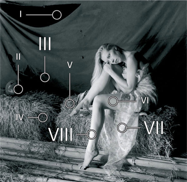
fig.2 During print visualization, textured shadows are thought of as being on Zone III, and textured highlights are envisioned to be on Zone VII or tonal highlights to be on Zone VIII. All remaining values fall onto their respective zones.
Exposure
According to the axiom ‘expose for the shadows and develop for the highlights’, the Zone System practitioner begins by measuring the light reflected from the shadow area that contains the darkest important shadow detail, and places it on Zone III. This reading is then used to determine the film exposure.
Reflective light measurements are best accomplished with a specifically designed 1° spotmeter, but a 5° spot attachment for an already existing meter may serve as a substitute. Regardless of how the reading was taken, the shadow exposure recommended by any meter must be adjusted, since lightmeters are calibrated for the average gray of Zone V and not the relatively dark tones of Zone III. Without an adjustment, the measured subject area inevitably ends up on Zone V, and the shadows are rendered too light as a result. But knowing that, in the subject, Zone V is exactly two stops brighter than Zone III, a compensating exposure reduction of two stops is applied to render the textured shadows as visualized. Some meters, specifically designed for the Zone System, handle this exposure adjustment automatically by allowing the user to place a measurement directly onto any visualized Zone. It is important to note that the shadow reading alone controls film exposure!
Contrast
To check the overall contrast range of the scene, a reflected light measurement is taken from a tonal highlight area of the highest pictorial significance. If it automatically falls onto the intended zone, the scene can be considered to be of ‘normal’ contrast. But not all lighting situations are ‘normal’. In a low-contrast scene, such as a foggy morning landscape, the difference between shadows and highlights is less than normal. In a high-contrast scene, such as a sunny day at the beach, the difference is greater than normal.
Consider the following two examples. In the first, a low-contrast scene, the difference between textured shadows (III) and tonal highlights (VIII) measures as only four stops. The film is labeled as ‘N+1’, since the missing stop (8-3-4=+1) indicates that a negative-contrast increase is required to compensate for the low scene contrast. In the second example, a high-contrast scene, the difference between textured shadows (III) and tonal highlights (VIII) measures as seven stops. The film is labeled as ‘N-2’, since the extra two stops (8-3-7=-2) indicate that a negative-contrast decrease is required. It is important to note that the highlight reading alone determines film development!
Development
The Zone System practitioner is now ready for the last portion of the axiom ‘expose for the shadows and develop for the highlights’.
It is a fortunate fact that highlights and shadows respond differently to film developing chemicals. Highlights develop quickly and build up negative density at a fast pace. Shadows also develop quickly at first, but soon negative density becomes retarded. Leaving the film in the developer increases shadow density only moderately, but it increases highlight density significantly. This creates an opportunity.
The Digital Zone System
The advantages of controlling the tonal interpretation and reproduction of an image equally apply to images photographed, and printed, using digital equipment. The process of visualization remains the same, identifying key areas of the subject for reproduction in the print. However, the discussed axiom ‘expose for the shadows and develop for the highlights’ no longer applies. In fact, the opposite is true and with digital capture, in common with reversal film and photographic paper, the axiom simply changes to ‘expose for the highlights and control the shadows with contrast’.
Exposure
Unlike negative film, a digital camera is less tolerant to errors in highlight exposure and more forgiving with shadow exposure. It is very easy to overexpose highlight areas and reach the upper limit of a pixel value. Overexposed highlight are transformed into featureless whites. Shadow areas are less vulnerable, and although they can suffer from sensor noise, they can be manipulated to cajole extra shadow details out of seemingly featureless blacks. For these reasons, a good digital exposure ensures that Zone VIII and IX highlights are placed well within the pixel range. This is accomplished either by taking a reflected highlight reading and applying a controlled exposure increase, or by using an incident measurement of the main light source. At the same time, shadow detail does not deteriorate more than necessary.
Contrast Control
Film contrast can be altered by the extent of its development. While it is possible to manipulate and increase the contrast of a digital image, the dynamic range of a digital camera’s sensor is limited. This range is equivalent to reversal film and considerably less than color or B&W negative film. This may change with technological advances, but it is important to understand the limitations of digital capture and how they affect visualization. It is also worth noting that Ansel Adams was frustrated at the lack of development control with reversal films, which the Zone System requires. You may well experience the same frustration with digital cameras when it comes to normal and high contrast scenes.

fig.3 A digital Zone System correlates monitor ‘K’ values (0-100%) and digital RGB values (0-255) to the eleven zones of the traditional Zone System.
A film exposed in a high-contrast lighting situation must be developed for less than the normal time to keep the highlights from becoming too dense to print. The reduced development time will affect the shadows to the point that exposure must be increased to prevent underexposed shadows.
A film exposed in a low-contrast lighting situation must be developed for more than the normal time to build enough density in the highlights. The increased development time will not affect the shadows significantly, but it will get the highlights dense enough for those ‘brilliant’ whites in the print.
Zone System versus Automated Metering
The Zone System relies on the relatively laborious process of taking reflective light readings from key subject areas in the scene. Automated metering systems, built into modern cameras, take many readings within a fraction of a second. Even with the most sophisticated exposure metering systems now available, Zone System practitioners still prefer an external spotmeter in combination with print visualization to determine accurate film exposure and development, manually. They do so for good reason.
Simple, reflective lightmeters, as part of the builtin camera metering system, are calibrated with the assumption that each scene happens to be an average scene of 18% reflectance (Zone V). More advanced systems give the image center a higher importance, provide some exposure program settings based on different subject matter, or deploy a complex matrix metering system based on a huge database of image-taking experience. None of these assumptions are necessarily wrong, since the metering system does not actually ‘see’ the scene. However, for any scene that is not average, or does not closely match the program’s assumptions, optimum film exposure cannot be achieved. Automatic metering is a blind approach.

fig.4 The two examples of ‘Horse and Barn’ with a white horse in front of a bright barn (top row, high-key image) and a black horse in front of a dark barn (bottom row, low-key image), can create a real challenge to any automated exposure system. Using such a system, both scenes are averaged, according to a pre-programmed algorithm, which typically represents the white horse too dark and the black horse too light. The Zone System, on the other hand, offers a practical opportunity to represent both scenes at their realistic tonal values.
fig.4a Exposure Extremes
Severe lighting conditions can easily fool even the most sophisticated lightmeters. Not actually being able to ‘see’ the scene, they need to make simplifying assumption.
fig.4b Using Automated Metering
Lightmeters assume all scenes to be of average reflectance. This false assumption returns only average results, underexposing high-key and overexposing low-key scenes.
fig.4c Using the Zone System
On the other hand, combining perceptual print visualization with lightmeter readings and the associated zone placement easily secures a literal recording of any scene.
In the Zone System, on the other hand, preprogrammed premises are replaced by viewing and interpreting the actual scene and taking individual measurements of key subject areas. The Zone System is a visual approach. The difference between automated exposure metering and the Zone System can be effectively explained using the high and low-key examples of ‘Horse and Barn’ (see fig.4).
Picture a white horse standing in front of a large bright barn (see fig.4a, top). In Zone System terms, the horse is on Zone VII. However, the camera’s builtin meter cannot know that it is ‘looking’ at a white horse in front of a bright barn. It erroneously assumes this high-key scene to be a bright scene of average reflectance and will suggest an exposure setting to render horse and barn averaged around Zone V. This, unfortunately, underexposes the film by about two stops and will, consequently, create an image of a gray horse in front of a gray barn (see fig.4b, top), which is probably not the intention.
Now, picture a black horse standing in front of a large dark barn (see fig.4a, bottom). In Zone System terms, the horse is on Zone III. Nevertheless, the meter will assume this low-key scene to be a dark scene of average reflectance and will suggest an exposure setting to render horse and barn averaged around Zone V again. This time, the film will be overexposed by about two stops, which in effect creates an image identical to the previous: gray horse in front of a gray barn (see fig.4b, bottom).
An experienced Zone System practitioner handles these subjects differently. He or she looks at the scene and realizes that a black horse must be rendered as Zone III and a white horse as Zone VII in order to obtain a literal recording of the scene. A spotmeter reading of the horse is taken, knowing that the subsequent exposure always renders the horse as Zone V. This reading is then corrected to get a realistic image of the horse. Two stops of exposure are added (more exposure) for the scene with the white horse to move it from Zone V to VII (see fig.4c, top), and two stops are subtracted from the reading (less exposure) for the scene with the black horse to move it from Zone V to III (see fig.4c, bottom). This process is referred to as ‘Zone Placement’.
A second spotmeter reading reveals that the bright and dark barn automatically fall onto Zone VIII and Zone IV, respectively, unless a development adjustment is made. Since this matches the visualization of the scene well, both frames will receive N (normal) development. The two scenes are high and low-key examples but are of normal contrast.
In fairness, it has to be said that an external incident lightmeter would handle the ‘Horse and Barn’ examples equally well as the Zone System. The characteristic white dome of the meter, pointed towards camera or light source, measures the light falling onto the subject rather than the light being reflected from the subject. The exposure suggestions are, consequently, independent from subject reflectance. Both scenes in fig.4 would receive the same correct exposure. As a matter of fact, using an incident meter gives the same result as measuring a Kodak Gray Card with a reflective meter. However, the incident meter is not capable of measuring the subject brightness range and, therefore, cannot be an ideal tool for Zone System work. Nevertheless, it is a perfect substitute in situations where speed is of the essence and subject illumination and contrast are more or less under control, as in model shoots.
This is the Zone System in a nutshell. It is a very flexible system, capable of handling any lighting situation, and I’ll show you how to make it work for you in the following chapters.
Introduction to Sensitometry
A graph is worth a thousand pictures
Sensitometry is the science of measuring the sensitivity of photographic materials. It is commonly used to illustrate the characteristics of film and paper, whereby the image density is charted in relation to different amounts of exposure and the processing of these materials. The practical photographer has often little or no ambition to learn sensitometry, but a fundamental knowledge of this potentially complex technical field can be very helpful to understand how different films and papers respond to exposure and development variations (fig.1). This introduction will familiarize you with the basic terminology and introduce you to film and paper characteristic curves as they frequently appear in manufacturer’s material specifications and photographic literature.
Ferdinand Hurter and Vero Driffield published their first characteristic curve in 1890 to explain how negative density and exposure are related. They charted the exposure in log units on the horizontal and the negative density on the vertical axis, to create what was later called the H&D curve in their honor. Eventually, this description went out of fashion and was first replaced by the term DlogE curve (density versus log exposure), which was later changed again to DlogH curve after internationally agreed ISO units were established. At the time of its introduction, most members of the photographic community did not readily accept Hurter and Driffield’s method, but the manufacturers of film and paper soon saw the advantages. And some corporate research teams, such as Loyd Jones and his associates at Kodak, made huge contributions to the development and application of sensitometry, all based on Hurter and Driffield’s pioneering work.
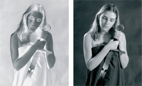
fig.1 The practical photographer is usually not interested in sensitometry, but it does reveal how films and papers respond to exposure and development.
Characteristic Curves
Figures 2 and 3 show a typical characteristic curve for film and paper, respectively. Both curves are nonlinear, which simply means that a constant exposure increase does not necessarily produce a constant density increase. Initial exposure increases exhibit a relatively small increase in density and create a curve shape referred to as the ‘toe’. Further increases in exposure create an almost constant increase in image density in the linear ‘midsection’. Approaching maximum density, exposure increases have less and less of an effect, and the densities level off in the ‘shoulder’. Adding exposure after Dmax has been reached will actually reduce density again, which is referred to as solarization, but only the region of the curve from toe to shoulder is of primary interest to practical photography.
Typically, papers are less linear than films are. This is more apparent as paper contrast increases, and it is also highly dependent on material differences. You may find papers with long or pronounced toes and small or short shoulders, favoring highlight separation, or others with short toes and pronounced shoulders, favoring shadow separation. Similar differences can be found from one film to another, and film characteristic is significantly influenced by the choice of developer. Some film/developer combinations create a substantial film shoulder, compressing image highlights, while others create a long toe, compressing the shadows.
Using sensitometry to search for the ultimate film, paper or developer in general is futile. The best material is always the one that is best suited for a particular application. However, finding for example the film least sensitive to overexposure, the developer most forgiving to process errors, or the most complementary paper for a specific film is quite possible with even a basic understanding of sensitometry.
Exposure and Density
Some photographers are unfamiliar with reading exposure in log units, as used in the horizontal axis of figures 2 and 3. However, they are likely to know that increasing or decreasing the exposure by a ‘stop’ multiplies or divides the exposure by a factor of 2. Using stops proved so useful that the industry applied the factor 2 to all exposure modifying variables as a basic increment. There is a 1-stop difference between the familiar numbers of the aperture (f/stop) scale, the shutter speed sequences on your camera, the main ISO film speeds (50/18°, 100/21°, 200/24°, 400/27°, …), full EV numbers and even the subject zones in the Zone System.
In technical literature, it is more common to use a logarithmic scale instead. Even so, it is very easy to convert from one to the other. The logarithmic equivalent of the number 2 is nearly 0.3. This means that increasing the exposure by a stop is the same as adding 0.3 log exposure. Two stops equal 0.6 log, three stops equal 0.9 and so on. A log exposure change of 3.0 simply refers to a change of 10 stops. Just divide the log exposure by 0.3, and the result will be the exposure in stops. It’s that simple.
So far, we have only concerned ourselves with the horizontal axis of the characteristic curve responsible for the exposure. The vertical axis shows us how film and paper emulsions react to different exposures due to development. The most obvious material reaction to increased exposure is an increase in density. In the case of film, we refer to it as transmission density, and in the case of paper, we refer to it as reflection density. When charting characteristic curves, it is useful that density is the logarithmic equivalent of transmission and reflection, allowing us to keep the horizontal and vertical axis at the same scale.

fig.2 This is a typical film (negative) characteristic curve, illustrating the nonlinear relationship between relative transmission density and exposure. Only the region from toe to shoulder is of primary interest to practical photography.
A film with an absolute transmission density of zero does not exist, because this would mean that the film is 100% transparent. Every film has some inherent density that is material dependent but not related to exposure. Modern films have a gelatin emulsion on an acetate or polyester base that transmits about 80% of the light after processing. Consequently, they have an inherent density of about 0.1. Subtracting this inherent density of base and emulsion leaves us with the relative transmission density of the negative, which is a true measure of the film’s response to exposure and development. If, due to exposure and development, the density increases to the point where only 50% of the light is transmitted, then the transmission density has risen to 0.3. Every time a further density increase of 0.3 can be measured, the transmission is halved again. A transmission density of 0.6 transmits 25% of the light, 0.9 transmits 12.5% and so on. A practical limit for the relative transmission density of a negative is about 1.5, which is enough to record about a 10-stop difference in exposure (fig.2).
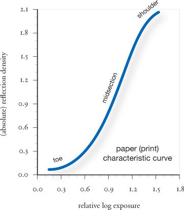
fig.3 This typical paper characteristic curve illustrates the relationship between absolute reflection density and exposure from toe to shoulder.
A paper with an absolute reflection density of zero does not exist either, because this would mean that 100% of the light reaching it would be reflected. The white base of most modern photographic papers reflects about 90% of the light, and therefore, they have a minimum reflection density of about 0.05. A reflection density of 0.3 reflects 50% of the light, 0.6 reflects 25% and so on. Maximum densities of modern papers are about 2.1 and above, in which case the paper reflects less than 1% of the light that reaches it (see fig.3). Some toners increase maximum paper densities even further. However, reflection densities above 1.9 are of limited use to practical photography, because the human eye has difficulty differentiating darker tones under normal lighting conditions.

fig.4 This is a typical characteristic curve of a digital camera after the raw color image has been changed to grayscale. Similar to analog positive film, where more exposure means less density, grayscale values of the digital image (K%) decrease with exposure. Internally stored digital RGB values, on the other hand, increase with exposure.
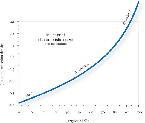
fig.5 The characteristic curve of an inkjet printer illustrates the relationship between the print’s relative reflection density and the grayscale values of the digital image. This typical curve no longer has the distinctive toe and shoulder areas of an analog silver print.
Digital Sensitometry
The principles of sensitometry can be equally applied to digital imaging. A digital camera converts light into digital numbers, which can be interpreted by computers and printers. Digital image-recording equipment is designed to work primarily with color images. Different colors and light intensities are recorded, using an additive color system in which three numbers define the red (R), green (G) and blue (B) content of every image point. The RGB color model allows us to distinguish between millions of colors.
In the case of monochrome photography, only the intensity of the light is important, and it can be represented by a single number. A typical grayscale image may have 256 distinct levels of gray (8 bit) or many more (10, 12 or 16 bit). The number of gray levels does not change the range of intensity, only the fineness of the tonal gradation. As the grays of a film negative are measured in density, the digital grayscale file is similarly measured in K%. The term ‘K’ is historically a measure of image density in terms of black ink, used during the printing process.
Figures 4 and 5 show the typical characteristic curves of a digital camera and an inkjet printer, respectively. Both curves are nonlinear but in a different way to film and photographic paper. Although digital camera sensors have a linear response, recorded numbers are modified, using a transfer function, before saving them to memory. This redistributes the tonal values more usefully across the scale. As with film and paper, each camera and printer model produces a different tonal distribution. Calibrated equipment, on the other hand, delivers remarkably consistent image characteristic. The unique benefit of digital imaging is, undoubtedly, that one can modify every aspect of the digital file before committing it to paper.
A solid understanding of sensitometry is not at all necessary when it comes to good photography from the viewpoint of creativity, composition, interest and impact. Nevertheless, sensitometry covers the underlying image-making principles and what happens fundamentally to film, paper or digital files from the moment of exposure. The real value of understanding basic sensitometry to the practical photographer lies not in knowing more about the scientific aspects of photography, but in having more knowledgeable control over the entire image-making process, which eliminates guesswork and increases efficiency and confidence.
Tone Reproduction
Zone System and sensitometry combined
We have gained a basic understanding of the Zone System and sensitometry in the previous two chapters. Combining the two will allow us to get control over image contrast and understand how zones are represented throughout the image reproduction cycle. Ultimately, they show us the importance of tonal gradation and how to manipulate it through exposure, development, and critical material selection.
Studies conducted by several authors, including my own, indicate that most viewers prefer prints with a full tonal scale from pure white to solid black and an abundance of gray tones in between. Therefore, a widely accepted print is likely to have maximum contrast and full gradation. I’m not saying that a fine print requires all tones all the time, but most people like it that way, most of the time. Apart from the creative license of the artist, we generally like our printed images to be a reasonably true representation of the scene captured. Unfortunately, in many cases this is impossible, since the average subject brightness ratio is far greater than the maximum print brightness ratio. As a consequence, the resulting print is often a disappointing record that fails to satisfy our memory’s expectations.
The most efficient man-made reflectors cast back as much as 98% of the light that reaches them, but natural objects are limited to about 90% reflection. On the other hand, nature’s best absorbers reflect as little as 1.5% of the light that they receive. If uniformly illuminated, the maximum reflectance ratio of an outdoor scene is, therefore, about 60:1 (90/1.5) or 6 stops. Although these extremes are not unlikely, average outdoor scenes have more moderate reflection ratios of around 30:1 or about 5 stops.

So far, we have assumed perfectly diffuse lighting, but the various objects in an outdoor scene rarely receive the same illumination. The subject lighting ratio between direct light and shadow illumination can be controlled in a studio environment, but in natural daylight, it can reach values of up to 12:1 on a clear sunny day. This can significantly alter the subject brightness ratio. Let’s assume that we have a very dark and a very bright object placed in a sunlit scene. If the bright object is moved into the sunlight and the dark object into the shade, then the subject brightness ratio is maximized to 720:1 (60x12) or almost 10 stops. These numbers were verified in a field study published in November 1941 by Loyd A. Jones and H. R. Condit, who analyzed data from 126 different outdoor scenes in which the subject brightness ratios ranged from a low 27:1 (about 5 stops) to a high 760:1 (almost 10 stops), averaging at 160:1 or a little more than 7 stops (fig.1).

fig.1 The measurements taken by Jones and Condit in 1941 serve as a starting point for an objective tone-reproduction analysis. They obtained data on the subject brightness ratio of 126 outdoor scenes. The lowest-contrast scene had a value of 27:1, and the highest-contrast scene had a value of 760:1. For the whole group of scenes, the average subject brightness ratio was 160:1.
The greatest possible print brightness ratio on the other hand, is limited by the reflection density ratio of the paper. The white base of unexposed but fully fixed photographic paper is capable of reflecting about 90% of the light. A fully exposed and developed paper with a glossy finish can be so dark that less than 1% of the incident light is reflected. However, the extreme toe and shoulder regions of the characteristic curve are of little use to pictorial photography, due to the tonal compression they cause, and hence, the useful print brightness ratio is reduced to about 80:1.
Comparing this with the field test, it is evident that the paper is unable to realistically represent an average outdoor scene, by about a factor of 2 or roughly a stop. The next example can help us visualize how the paper is falling short of our expectations. We know from the ‘Introduction to the Zone System’ that Zone V has a reflectance of 18%. Zone VI is twice as bright in the subject zone scale, and therefore, it must have a reflectance of 36%. Consequently, Zone VII has 72% reflectance and Zone VIII must have twice that. But wait a minute! We said that the paper cannot reflect more than 90% and this calculation would get us above 100%. Besides, we are still missing Zone IX and X. The answer can only be that we do not have a linear relationship between subject zone brightness and print zone reflections. Photographic paper cannot handle the brightness ratio of an average outdoor scene. Zone V can be represented realistically at about 18% reflection, but the extreme zones must be compressed to fit into the print zone scale. This is why it is so challenging to capture the sparkle we remember from the original scene. Many printers labor with dodging and burning tools to bring some of the sparkle back. The Zone System does not eliminate these techniques, but it maximizes image contrast control and, therefore, actually promotes dodging and burning from being a poor rescue attempt to a powerful tool of creative print manipulation.

fig.2 During tone reproduction zones are transferred from the subject, through the negative, to the paper. The even zone spacing of the subject zone scale is altered throughout the cycle. The extreme zones are typically compressed while medium zones are often expanded. In the darkroom, the negative is projected onto the paper, and the textural negative density range becomes the textural paper log exposure range. The paper curve is turned sideways to accommodate this fact in this example of a film with normal development printed onto normal graded paper. The gray reference scale will be used in the rest of the book to identify tonal alterations due to material and processing modifications.
Film and Paper Are Setting the Tone
Tone reproduction is one of the most important factors in print quality. Fig.2 shows how the tonal values transfer through the image reproduction cycle from the subject, through the negative, to the print, while creating their individual zone scales. This example explores the influence of film and paper, but it ignores any optical or physical equipment influence from camera or enlarger. Assumed is a negative, which was exposed and developed as normal and then printed onto a grade-2 paper. Ansel Adams supposedly abandoned the terminology of zone scales for negative and print in his later years, because he felt that zone scales are only applicable to the subject brightness range, turning into tonal scales for negative and print. Nevertheless, we will maintain the zone scales throughout the reproduction cycle in this book. It is consistent, and it helps to understand how zones are represented in negative and print, and how different materials influence them.

fig.3 This diagram, based on a Kodak original, shows how the zones are compressed and expanded in the tone-reproduction cycle from the scene to the final print. It also shows the influence of the optical images on tonal values, and it helps to standardize a few key terms and values for negative and print density.
Zones II, VIII and V are highlighted, because they are considered to be the boundaries and the center of the pictorial range, respectively. All zones start out evenly spaced, exactly one stop apart in the subject zone scale. After exposure and development of the film, they are represented in the negative zone scale. Most modern films have a relatively straight characteristic curve except for the toe and the extreme areas of the shoulder. Therefore, severe tonal compression is restrained to the extreme shadow and highlight zones. All other zones in the negative are also compressed, but more or less evenly spaced. In the darkroom, the negative is projected onto the paper, and the different negative densities correlate to different print exposures. In other words, the textural negative density range becomes the textural paper log exposure range. In fig.2, the paper curve is turned sideways to accommodate this fact.
Throughout the book, the term ‘subject brightness range’ is used to describe a range of measurable light intensities. Strictly speaking, this is not correct, because brightness only refers to the human perception of luminance and not the measurable quantity of it. The term ‘subject luminance range’ is technically more accurate, but it is not frequently used in photographic literature. To avoid confusion, we have chosen to use the incorrect, but more generally understood, term and its abbreviation, SBR, instead.
Zone spacing changes again as soon as the negative is printed, which is represented through the paper characteristic curve. The already compressed highlights are ‘hitting’ the pronounced toe of the paper curve, where they are compressed even further, making highlight separation difficult. Quite the opposite is happening at the center of the zone scale. Zone V is falling onto the steep portion of the paper curve, and it is being expanded as a result, causing increased tonal separation in the midtones. At Zone II, the process is reversed into tonal compression again, due to the influence of the film toe and paper shoulder.
The actual tonal representation depends on the film, developer, paper, and to some extent even on the equipment used. It may also differ somewhat from the simulation in fig.2. Nevertheless, the fact that zones are being compressed and expanded, while moving through the reproduction cycle, is realistically presented. Approximating gray tones were added to fig.2 in order to provide a visual relationship for the print zones. This normal tonal scale will be used as a reference throughout the rest of the book, showing how any material or processing change will alter the tonal representation.

© 2000 - 2006 Ralph W. Lambrecht
fig.4 This table shows standard Zone System values for relative negative transmission and absolute print reflection density in 1/3-stop increments. To illustrate the relationship between the analog and the digital Zone System, typical grayscale values for computer monitors are also shown in K%.
Tone Reproduction and the Zone System
Fig.3 also illustrates how the zones are compressed and expanded in the photographic reproduction cycle from the scene to the final print. The difference to fig.2 is that the characteristic curves are not shown anymore, but in addition to their contribution, the influence of the optical images from camera and enlarger are explored. Moreover, a few key values for negative and print density are labeled so we can start to create a personal density standard, which will function as a reference for your own values.
Fig.3 presents the evenly spaced subject zones with their doubling light units on top. The average outdoor scene, with a subject brightness ratio of 160:1, is equivalent to about 7 1/3 stops. It will be of more interest, and much simpler, for us to follow the 7 stops of the pictorial range, from the beginning of Zone II to the end of Zone VIII, through the tone reproduction. We will, therefore, ignore the remaining 1/6 stops on either end of the average outdoor scene. They fall within Zone I and IX and have little tonal value anyway. In addition to the density values of the pictorial range, it will prove useful to also track the textural range, which reaches from the center of Zone II to the center of Zone VIII. But for now, let’s keep in mind that we are starting with seven zones, or a subject brightness range of log 2.1.
Zone compression starts as soon as the lens has formed the optical image in the camera. Minute lens and camera flare, caused mainly by the higher zones, bring non-image forming light to the lower zones. Consequently, the zone scale moves to the right, compressing the lower zones and leaving the higher zones unaffected. The resulting image is projected onto the film and is turned into negative densities through development and processing. A typical film characteristic curve has a relatively low gradient, which compresses all zones evenly, except for the toe and shoulder, where the low and high zones are compressed more severely. A quality negative, suitable for a diffusion enlarger, has a negative density range of about log 1.2 to cover the seven zones. This is little more than half of the original subject brightness range.
Zone compression continues in the enlarger. Similar to the light distribution in cameras, enlargers and their lenses suffer from flare too. However, since image tones are reversed in the negative, the more luminous lower zones now scatter some non-image forming light into the higher zones. As a consequence, the zone scale moves to the left, this time compressing the higher zones and leaving the lower zones unaffected. After image projection and paper processing, we can evaluate the final print. Photographic paper, by design, has a much larger density range than the negative, which provides an opportunity to expand the zones again. Nevertheless, toe and shoulder of the paper characteristic curve compress the already compacted shadow and highlight zones one more time, but midtones are expanded again and often exaggerated.
In the end, the compression from the subject brightness range to the negative density range, and the subsequent compression and expansion to the print density range, have shifted the evenly spaced zones of the subject significantly. As a rule of thumb, low and high zones are usually compressed and middle zones are typically expanded. There is little similarity left between the original subject zone scale and the final print zone scale. With modern papers, a pictorial print density range of log 1.9 is typically available to cover the original seven subject zones. This almost brings back the original subject brightness range of log 2.1. However, we must realize that the original brightness ratio is significantly reduced, from 160:1 in the subject down to about 80:1 in the print. We have to accept this material behavior to some extent, but throughout this book, we will discover ways to work around it or manipulate some of it to our advantage.
Standard Values and Their Manipulation
The table in fig.4 shows a collection of standard Zone System values for relative negative transmission and absolute print reflection density in 1/3-stop increments. To illustrate the relationship between analog and digital Zone System, typical grayscale values for computer monitors are also shown in K%. The development of these numbers was based on a few material and equipment assumptions, and they may not be completely valid for all photographers and their material choices. Therefore, I do not claim absolute validity for these numbers, but I am confident that they apply in most situations where a film has been exposed and developed normally (N), and a diffusion enlarger was used to print onto a bright white photographic paper having a pearl or glossy finish.
The standard densities for negatives and prints change as soon as the film development is altered to control a more or less demanding subject brightness range. When the subject brightness range is larger than normal, a reduced development time is chosen to compensate. The inclusion of additional zones will push all other zones up in density and they will become darker than normal. When the subject brightness range is smaller than normal, an increased development is chosen to compensate. The development time is extended to increase the negative densities of the middle zones, avoiding an otherwise dull negative and print. The exclusion of some zones will pull all other zones down in density and they will become lighter than normal. ‘Development and Film Processing’ provides more detail on this subject. The next chapter will show how different materials can influence the tonal scale.
Tone-Reproduction Theory
From the field study conducted by Jones and Condit, we know that the subject brightness range of the average outdoor scene is wider than the density range of photographic paper. We have accepted the zone compression at the highlight and shadow end of the tonal scale to get a full-scale print, but now, we want to know how this compares to an exact reproduction of scene luminance. The theory of tone reproduction is divided into an objective and a subjective, or psychological, method.
The study of subjective tone reproduction compares the visual sensation of the human eye, also called brightness, as a response to the subject luminance of the original scene, to the sensation created when viewing the final photograph and its surrounding areas. We will be discussing some of these effects as they influence our choice of print mounting and illumination in coming chapters, but a more detailed discussion is better left to more specialized scientific literature.

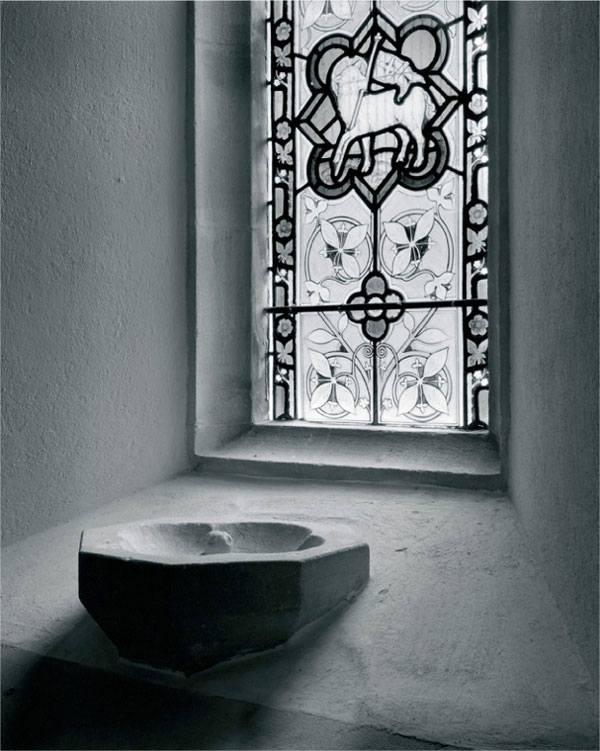
fig.5 This illustration shows how the photographer combines imagination and knowledge to bring the tone-reproduction cycle full circle. Applied with experience, this can be done if the final print is meant to be a close reproduction of the original scene or an artistic expression thereof.
(illustration ©1976 by White, Zakia and Lorenz, ‘The New Zone System Manual’, Morgan & Morgan, Inc. Dobbs Ferry, NY, USA, ISBN 0-87100-100-4)
The study of objective tone reproduction, on the other hand, compares the densities of the photographic print with the log luminance of the original scene. This provides information on how closely the photographic process has come to represent an exact tone reproduction of the subject luminance.
The illustration in fig.5 is a simplified view of how the combination of imagination and skill brings the tone-reproduction cycle full circle. Before the actual picture is taken, the scene is viewed with the final photograph in mind. The photographer takes a look at the scene and forms a mental representation of the intended reproduction. The brightest highlight cannot be brighter than the paper’s white, and the darkest shadow cannot be darker than the paper’s black. Armed with the necessary experience and knowledge about the equipment and materials used, film and paper are then exposed and developed to create the visualized print. Depending on the photographer’s intent, this is done to either obtain a literal recording of the scene or a creative departure from reality.
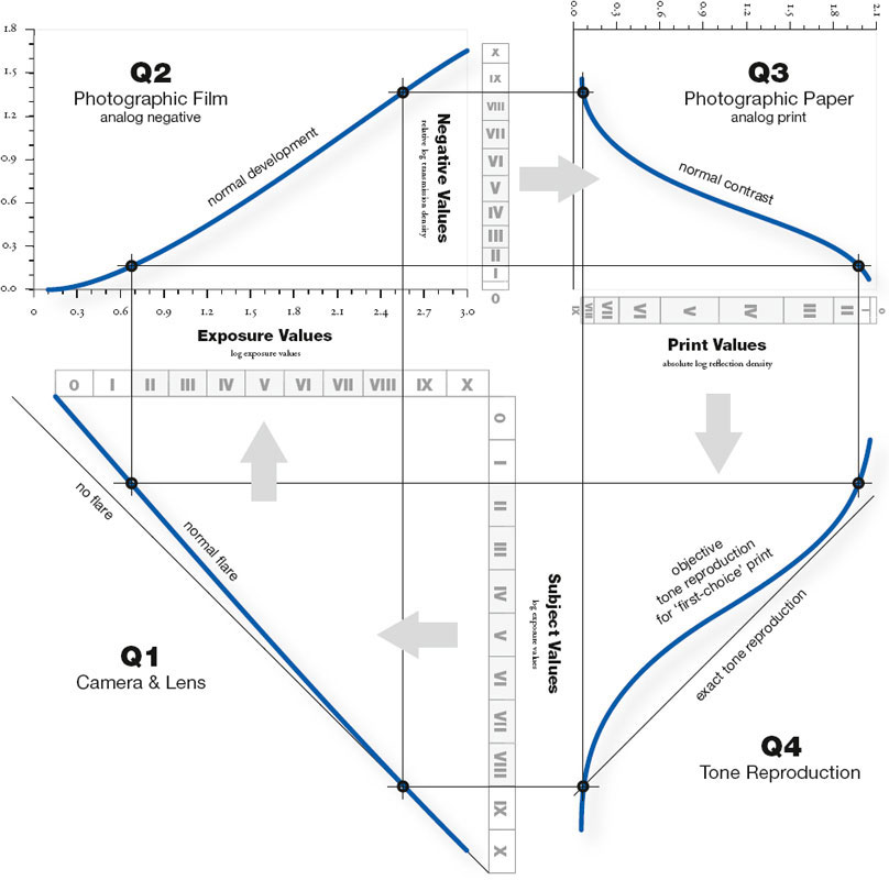
fig.6 This is an example of a detailed tone-reproduction cycle for normal film development and normal paper contrast. Quadrant 4 shows the resulting objective tone-reproduction curve. In the preferred print, highlight and shadow detail is sacrificed for a higher than objective contrast in the midtones.
Fig.6 illustrates a more detailed example of an objective tone-reproduction study for normal film development and normal paper contrast, creating a normal tone-reproduction cycle. Quadrant 1 shows the subject values as they appear in the scene to be photographed, and how they are influenced by camera and lens flare into the film exposure values. These are projected into quadrant 2, and together with their developed negative transmission densities, they build the film characteristic curve. In quadrant 3, the negative values and the equivalent print reflection densities create the paper characteristic curve and the resulting print values. These are projected into quadrant 4, and when combined with the original subject values from quadrant 1, they build the objective tone-reproduction curve. For clarity, only the projection lines for the two endpoints of the pictorial range are shown throughout this tone-reproduction cycle.
If film and paper had straight line characteristic curves, or in other words, if the densities of film and paper were to increase by a consistent amount for every consistent exposure increase, then the tone reproduction would be represented by a straight line in quadrant 4. This exact tone-reproduction line is shown as a reference and can be used to quantify the objective tone reproduction.
As you will see in ‘Fine-Tuning Print Exposure & Contrast’, material characteristics and practical photographic experience demand optimized lighting conditions for satisfactory print viewing. Print illumination of around 1,000 lux (100 foot-candles) is about ideal. This viewing condition will require an objective tone-reproduction curve similar to the one in fig.6 to meet the standards of subjective excellence. This standard is the result of another study by Loyd A. Jones, C. N. Nelson and H. R. Condit, in which thousands of prints were made from more than a hundred outdoor scenes. They differed in exposure, contrast, density and tone-reproduction curve shape. The reference line was arbitrarily placed so that it intersected with the curve at the highlight point, because it cannot be below the minimum density of the paper. The preferred prints had a curve laying, in average, about 0.3 below the reference line in density (lighter than exact tonal reproduction). The highlight gradients were very low (less contrast), but the midtone gradients were always high, 1.15 and above (more contrast), blending into lower shadow gradients (less contrast again).
Consequently, a preferred ‘first-choice’ print sacrifices tonal separation in highlights and to some extent in shadows, to magnify separation of the midtones. Whenever the midtone gradient is below 1.10, the print will be judged as being dull or too flat. In addition, the preferred print must be lighter than the exact tone-reproduction curve, since a print with a curve density approaching the reference line was judged as being too dark. This consistent failure of the preferred print to match the exact tone-reproduction curve is thought to be a consequence of normal human eye functionality and its compensation for large luminance ranges in the natural environment. The eye has a definite preference for fine midtone detail and compensates for it with compressed highlights, if a wide scene brightness range should require it. We will use this knowledge to prepare, present and display our photographs accordingly.
Digital Tone Reproduction
Fig.7 shows an example of a digital tone-reproduction cycle for a digital camera and a calibrated print. Quadrants 1 and 4 are identical to the analog process, since analog and digital camera have similar flare characteristics (Q1), and the preference for a ‘first-choice’ print does not change with the process of image creation (Q4). However, Quadrants 2 and 3 differ from their analog counterparts, since their vertical scales have been replaced by a digital grayscale ranging from 0-100% (K%). By adjusting the raw camera data, the image file is manipulated until an aesthetically pleasing image is created. This typically happens as a combination of automatic camera adjustment and manual fine-tuning, using image software and a calibrated monitor. The result is stored as a digital file (Q2) and then printed on a calibrated printer to create a digital print (Q3), which satisfies the ‘first-choice’ print requirements. The resulting zone scales are indeed very similar to their analog cousins.
For all practical purposes, negatives and paper, as used in analog photography, are continuous-tone materials. Even the smallest increase in exposure causes a slight density change in the light sensitive emulsions. This results in a print with natural and convincing smooth tones, just as our eyes perceive them. The same is not necessarily the case with digital imaging, since the digital recording of distinct gray levels is limited to a finite amount. This can cause abrupt unsightly tonal changes, also called ‘posterization’ or ‘banding’, whenever low-bit recordings (8 bit) are heavily manipulated. However, this is easily avoided by sensibly manipulating only the high-bit recordings (10, 12 or 16 bit) of raw camera or scanner data files, which is explored a bit further in the next chapter.

fig.7 This is an example of a digital tone-reproduction cycle for a digital camera and a calibrated print. Quadrant 1 and 4 are identical to the analog process, since analog and digital camera have similar flare characteristics (Q1), and the preference for a ‘first-choice’ print does not change with the process of image creation (Q4).
Image Gradation
The influence of material characteristics
In the previous chapter, we clarified how film and paper, through their s-shaped characteristic curves, are responsible for the nonlinear tonal distribution and, consequently, for the image gradation and final tone reproduction of the subject values in the print. Through disciplined exposure and contrast control of film and paper, a photographer can precisely dictate specific shadow and highlight densities (typically the boundaries of the pictorial or textural range), but all other image tones depend exclusively on the individual film and paper selection as well as the interaction of their developed densities. In other words, shadow and highlight extremes can be harnessed through exposure and contrast control, but image gradation and final tone reproduction are material dependent.
So far, we have used idealized curves for film and paper only to keep explanations and graphs representative and independent of material. In this chapter, we will concentrate on the differences of some typical film and paper characteristics to see how they affect image gradation and final tone reproduction.
The possible combinations of available films, papers and developers create an overwhelming quantity of potential characteristic curves (fig.1). Addressing the material uniqueness of individual films and papers would not only be tedious, but it also could never be complete within the context of this book. Nevertheless, there are some common characteristics that significantly influence image gradation and final tone reproduction, and they will be covered here.
Toe and Shoulder in Films
The toe and shoulder of the film characteristic curve are responsible for print shadows and highlights, respectively. Long toes and shoulders have a low gradient and result in a reduction of local shadow and highlight contrast, compressing the print values more than normal and limiting tonal separation. Short toes and shoulders, on the other hand, have a steep gradient, enhancing tonal separation.
Toe, midtones and shoulder share the representation of the subject brightness range on the film. If one attribute occupies more zones than normal, then the other two have to share the rest. In theory, many combinations are possible, but in practice, it is most likely for a film to have either a pronounced toe or shoulder, not both. A film with a long toe (see fig.2a) leaves less room than normal for midtones and shoulder to build up density. The result is reduced shadow separation with an increasingly steep midtone to highlight gradient and contrast. A film with a short toe and a significant shoulder (see fig.4a) has more shadow separation than normal, but at the cost of reduced highlight separation.
To study the simulated effect of toe and shoulder characteristics, compare fig.2b and fig.4b to each other or to the normal print in fig.3. The highlights in fig.2b are well separated through the absence of a shoulder in the film, but the long toe compresses the shadows and darkenes the midtones. In fig.4b, the film’s long shoulder limits highlight separation and lightens midtones, but the short toe increases shadow contrast and separation.
Toe Shapes in Papers
In the example above, we did not alter the paper in order to study the influence of the film alone. We will now attend to the influence of the paper characteristics, but concentrate our study on the paper toe exclusively, because toe shapes are very different in today’s photographic papers, and our limited interest in print densities above 1.89 eliminates most of the shoulder’s effect on the final print. Therefore, we can divide today’s papers into long- and short-toe papers, as shown in fig.5a and fig.7a, respectively.
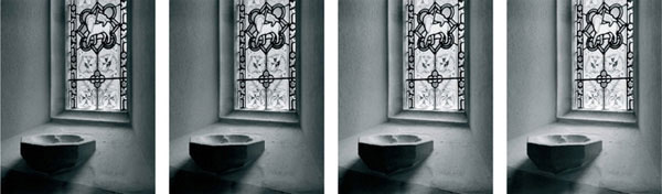
fig.1 All four images have the same shadow and highlight densities and the same overall contrast, but through the use of different films, papers and developers, the images exhibit different shadow, midtone and highlight characteristics. Image gradation changes with material choice.
As the simulated images in fig.5b and fig.7b show, compared to the normal print in fig.6, the differences are mostly in the highlights where the paper toe is in control. The short-toe characteristic in fig.5b renders good highlight separation with slightly darkened midtones, and the long-toe paper in fig.7b lightened highlights and midtones, but leaves us with a low highlight contrast. There is little difference between the shadows in the three prints.
Combining Film and Paper
Of course, the final print tones are a result of film and paper choice, and it is, therefore, important to find the right combination. Limited highlight separation, as a result of a pronounced shoulder in the film curve, can be compensated for using a paper with a short toe, or if desired, can be exaggerated with a long-toe paper. Limited shadow separation can be corrected with a short-toe film or a higher paper contrast, but selecting a different brand of paper is unlikely to produce the desired result.
Understanding the variables of image gradation will help you to select the appropriate materials and their combinations. It also will explain why some darkroom enthusiasts swear by one brand of paper, while others claim that it never worked for them. They probably use different films or developers. The final choice depends mostly on the type of photography and personal taste. A sparkling architectural print of a glass building needs more highlight separation than a soft and dreamy glamour portrait. There is no harm in having several different films and papers at hand to be prepared for different subject matter. Just remember, you are more likely to get quality results if you understand your materials thoroughly, rather than having the complexity of your darkroom materials competing with the product offerings of the national photographic wholesaler.

fig.2a A film having a long-toe and no-shoulder characteristic renders near normal highlight but compressed shadow separation.
fig.2b The highlights in this print are well separated through the absence of a shoulder in the film, but the long toe has compressed the shadows and darkened the midtones.

fig.3 This is a comparison print with normal film and paper characteristics. The print has a full tonal scale with normal highlight and shadow detail.

fig.4a A film having a short-toe and longshoulder characteristic renders limited highlight separation but delivers increased shadow contrast.
fig.4b The highlight separation in this print is very limited and midtones are light due to the film’s long shoulder, but the short toe increased shadow contrast and separation.

fig.5a A short-toe paper characteristic increases highlight separation and contrast, while darkening midtones.
fig.5b The short-toe characteristic of this paper results in increased highlight separation with slightly darkened midtones.

fig.6 This is a comparison print with normal film and paper characteristics. The print has a full tonal scale with normal highlight and shadow detail.

fig.7a A long-toe paper characteristic reduces highlight separation and contrast, while lightening midtones.
fig.7b The long-toe characteristic of this paper lightened highlights and midtones, but results in reduced highlight separation.

fig.8 The image gradation and final tone reproduction of digital images is independent of photographic material characteristics. Therefore, few constraints to imagination and artistic interpretation are applied.

fig.9 Severe digital curve manipulation applied to 8-bit images can potentially cause posterization and banding (a). 10, 12 or 16-bit images are required to allow for smooth digital manipulation (b). However, once image manipulation has been concluded, an 8-bit image copy is more than sufficient to support a high-quality print presentation (c).
Digital Image Gradation
In analog photography, image gradation is controlled by material characteristics as well as the competent selection and combination of these materials. In digital imaging, no such material limits exist, because any realistic or unrealistic tonal distribution can easily be created through skillful curve manipulation alone (fig.8). This leaves the flexibility to either create a faithful representation of the original subject or to support the imagination of the photographer and creatively explore the possibilities of artistic image manipulation, without the material constraints of analog photography. Furthermore, curve manipulation, combined with historical data, can successfully be used to simulate the image characteristics of long-gone film and paper favorites.
What material limits are to analog photography, digital recording limits are to digital imaging. An 8-bit digital capture is more than enough to support a high-quality print presentation, but it cannot be as highly manipulated as a 10, 12 or 16-bit capture, without the danger of posterization or banding (fig.9a-b). Therefore, it is best to capture an image in an as high-bit file format as possible prior to image manipulation. Once image manipulation is concluded, the high-bit image can be converted to 8-bit without hesitation, because its 256 shades of gray make for a smooth representation of all image tones (fig.9c).
Review Questions
1. What is the main purpose of using the Zone System?
a. it supports the process of visualization
b. it makes dodging and burning obsolete
c. cuts down on waste and eliminates test strips
d. it always provides a negative which prints on grade-2 paper
2. What is the meaning of Zone V in the Zone System?
a. the average of the lightest and darkest tone in the scene
b. a fully textured middle gray with 18% reflectance
c. the exposure reading of a calibrated lightmeter
d. 50% gray
3. Does automated metering always suggest the best exposure?
a. no, because not all scenes are of average reflectance
b. no, because not all lightmeters are calibrated the same
c. no, because lightmeters are easily fooled by flare
d. yes, the average brightness always suggests the best exposure
4. Which is a true statement about the film characteristic curve?
a. it is not affected by the choice of developer
b. it can be fully controlled with development techniques
c. it illustrates the relationship between density and exposure
d. it has a fixed shape for each film
5. What is the typical subject brightness range of an outdoor scene?
a. 32:1
b. 64:1
c. 160:1
d. 800:1
6. Which of the following is true about the tone-reproduction cycle?
a. Zone V never changes
b. it illustrates the compression of shadows and highlights
c. it can only be used with film-based systems
d. it does not account for camera or lens flare
7. What is image gradation?
a. a measure of print permanence
b. another word for image contrast
c. another word for tone-reproduction cycle
d. the result of film and paper characteristics affecting image tonality
1a, 2b, 3a, 4c, 5c, 6b, 7d