Chapter 8
Planning Your Design Strategy
In This Chapter
 Selecting a fluid or fixed width
Deciding on the number of columns in the layout
Determining your menu navigation
Choosing how to display your content
Creating a sandbox environment for testing
With every new Web design project you enter into, you need to answer several preliminary questions before you can proceed with starting the design and development processes of the Web site you’re working on. If you’re working on a design project for a client, communicate with her to make sure you understand the requirements before you proceed — same thing if you’re working on a project of your own. You have to evaluate the overall project in terms of content, type, and purpose to determine what your design strategy will be. Without a plan in place from day one, you’re likely to struggle through the entire design process, so developing a solid plan first is a good practice to get into for every project you approach, no matter how big or small.
In this chapter, I discuss some of those preliminary decisions to make for your project, such as which type of layout to use, how many columns to include, and what the navigation structure will look like for menus. I also explore several ways to present content on a Web site, such as using full content versus excerpts, using photographs versus thumbnails to provide a visual component, and presenting content (for example, chronologically, by topic, by most popular, and so on).
Finally, I take you through the steps of creating your own WordPress sandbox (or development environment) locally, on your own computer, so that you can develop and test your Web site design before you officially launch it on the Internet.
Choosing the Width of Your Web Site
Every Web site starts with a layout that takes width into consideration. Here are the two primary types of widths to consider when you start to design your Web site:
 Fixed: This is a static width that’s determined by a set number of pixels. This type of layout stays the same size no matter how big or small the user’s computer monitor and resolution are.
Fluid: This is a flexible width, determined by percentages that create an experience in which your Web site fills the entire width of your readers’ browsers, no matter how big or small their monitor size and/or screen resolution is.
When choosing between a fixed and fluid width, keep in mind that computer monitors and resolutions come in several sizes and people who surf the Web use their browsers in many ways. Some users fully maximize their browser windows so that they take up the full height and width of the screen. Other users do the same, but use different toolbars and sidebars in their browsers that decrease the screen size that displays your Web site. More rare, but still in practice, are users who use a portrait (vertical) setup for their monitors rather than the typical, default landscape (horizontal) layout. Your challenge as a Web designer is to design your Web site so that it fits correctly in your visitors’ browsers, no matter what their setups are.
Screen resolution is also a factor to strongly consider and is a setting on each computer system that can vary greatly among your Web site visitors. Screen resolution is the number of pixels wide followed by the number of pixels high that your computer monitor uses to display content on your computer screen; the greater the numbers, the higher the resolution. So, for example, a resolution of 1600 x 900 (or 1600 pixels wide by 900 pixels high) is a greater resolution than 800 x 600.
 W3Schools is a Web site that leads the way in providing tools and resources for Web designers; it keeps track of the statistics on what screen resolutions are most, and least, used on the Web from year to year, and the results are then published to help designers understand how people use the Internet. The site’s most recent report for 2011 indicates that the majority of people who browse the Web use a 1024 x 768, or greater, screen resolution (www.w3schools.com/browsers/browsers_display.asp).
The type of layout, fixed or fluid, that you decide to use greatly depends on your own preferences or the preferences of your client. Some designers are completely married to one type of layout over the other; however, as computer monitor sizes get bigger and bigger for desktop and laptops and then smaller and smaller for mobile devices and tablets (such as the iPad), designers are finding that they may have to alter their regular design techniques to account for the various screen sizes out there.
In the following sections, I go into more detail about fixed width and fluid width designs and the pros and cons to each choice.
Designing with a fixed width
A fixed width Web site has a container that’s a set width, in pixels, and everything within it remains contained within the width defined in the Cascading Style Sheet (CSS). (I discuss CSS in detail in Chapter 14.) If a fixed width container is set to 960 pixels, for example, it doesn’t move wider than 960 pixels, no matter what the visitor’s screen size or resolution is. So if a visitor browses at a 1600-pixel-width resolution, the Web site still displays a 960-pixel-width container.
Figure 8-1 displays a popular 960-pixel-wide layout. In the figure, the header and footer of the site are 960 pixels wide; the content area is 520 pixels wide; the two sidebars are 200 pixels wide; and the content area and first sidebar are separated by 20-pixel right margins.

Figure 8-1: A sample fixed-width layout at 960 pixels in width.
The CSS for the layout shown in Figure 8-1 looks something like this:
body {
background: #ffffff;
margin:0;
font-family: arial, verdana, helvetica, sans-serif;
}
#container {
width: 960px;
margin:0 auto;
}
#header {
width: 960px;
height: 100px;
margin-bottom: 20px;
background: #eee;
}
.content {
width: 520px;
margin-right: 20px;
float:left;
background: #eee;
}
.sidebar1 {
width: 200px;
margin-right: 20px;
float:left;
background: #eee;
}
.sidebar2 {
width: 200px;
float:left;
background: #eee;
}
#footer {
float:left;
width: 960px;
height: 100px;
margin-top: 20px;
margin-bottom: 20px;
background: #eee;
}
And the HTML markup for the layout in Figure 8-1 looks like this (and corresponds to the preceding CSS example):
<!doctype html>
<html lang="en" class="no-js">
<head>
<meta charset="utf-8">
<title>Your Site Title</title>
</head>
<body>
<div id="container">
<header>This is the Site Header</header>
<div class="content">
<p>This is the content area</p>
</div>
<div class="sidebar1">This is the first sidebar</div>
<div class="sidebar2">This is the second sidebar</div>
<div id="footer">This is the footer area</div>
</div>
</body>
</html>
A 960-pixel-wide layout is the most popular, and most standard, fixed width layout because designers create sites with the assumption that 1024 x 768, or greater, is the most popular screen resolution in use. So a 960-pixel-wide layout displays perfectly on a 1024-pixel-wide resolution when you take into account the browser’s toolbar and scroll bars. Anything larger than 960 pixels creates a horizontal scroll bar along the bottom of the browser window, and requiring your readers to scroll horizontally while reading your Web site isn’t desired. A resource you may find helpful is the 960 Grid System Web site at http://960.gs, which offers basic Photoshop templates that are created with a 960-pixel-wide layout.
Using a fixed width layout has its advantages and disadvantages. One of the biggest advantages is that you can more easily control design elements, such as graphics, icons, and banners. Because a fixed width layout is set to a static pixel width, you can be pretty confident that what you see on your computer screen is what your Web site visitors see, too. Because you know the exact width of the Web site, it’s easy to plan for the insertion of videos, photos, and other media elements, and you can be certain that the files will display correctly within the container of the overall site design.
One disadvantage to a fixed width layout is how it looks on larger computer monitors. A layout that’s 960 pixels in width shows a lot of empty space on a monitor that displays content in a 1600 x 950 resolution. In this case, you’d have 640 pixels of empty space. Although this may bother some people, it’s not enough to dissuade some designers from using this model.
Figure 8-2 shows my Web site, which is a fixed layout at 960 pixels in width for a 1024-pixel-wide screen resolution. I chose a fixed width layout for my site because I find it an easier layout to work with. Figure 8-3 demonstrates how the 960-pixel-wide, fixed layout appears in a 1600-pixel-wide screen resolution. You can see how differently the site appears, in terms of the empty space to the left and right of the design container on the 1600-pixel-wide resolution display.

Figure 8-2: A fixed layout at 960 pixels displayed on a 1024-pixel-wide screen resolution.
Designing with a fluid width
A Web site designed with a fluid width layout has a flexible width. The container of the Web site content is determined by percentages, rather than static pixels. Unlike the fixed width layout, which I discuss in the preceding section, the fluid width layout can expand or contract in width based on the screen resolution used by the visitor’s browser. In the earlier example for the fixed width layout, I used a 960-pixel-wide example; the container of the Web site was exactly 960 pixels in width, and that never changes. With a fluid width layout, you change the 960 pixels in width to 90 percent in width. The container takes up 90 percent of the browser, no matter how big or small.

Figure 8-3: A fixed layout at 960 pixels displayed on a 1600-pixel-wide screen resolution.
Figure 8-4 displays a popular 90-percent-width layout. The header and footer of the site are 90-percent wide; the content area is 50-percent wide; the two sidebars are 20-percent wide; and the content area and first sidebar are separated by 5-percent margins.

Figure 8-4: A sample fluid width layout at a 90-percent width.
The CSS for the layout shown in Figure 8-4 looks something like this:
body {
background: #ffffff;
margin:0;
font-family: arial, verdana, helvetica, sans-serif;
}
#container {
width: 90%;
margin:0 auto;
}
#header {
width: 90%;
height: 100px;
margin-bottom: 20px;
background: #eee;
}
.content {
width:50%;
margin-right: 5%;
float:left;
background: #eee;
}
.sidebar1 {
width: 20%;
margin-right: 5%;
float:left;
background: #eee;
}
.sidebar2 {
width: 20%;
float:left;
background: #eee;
}
#footer {
float:left;
width: 90%;
height: 100px;
margin-top: 20px;
margin-bottom: 20px;
background: #eee;
}
Combine this fluid width CSS example with the HTML markup I provide in the preceding section, and you see the difference in layout. The fluid width layout, with the width calculated in percentages, creates an elastic layout that changes its width based on the screen size your site visitor uses.
Fluid width has a few advantages — the most important being that it uses all the space (or real estate) of a browser. No real estate goes to waste. Fluid width adjusts to the visitor’s screen resolution and creates, what some feel is, a better user environment. Also, in screen resolutions smaller than 1024 pixels in width, it eliminates the horizontal scroll bar across the bottom of the browser that often happens with a fixed width design created for resolutions greater than 1024.
However, fluid width has several disadvantages that you need to be aware of. Many of these disadvantages are what cause designers to shy away from a fluid width design method. Here are some of these disadvantages:
Multimedia display: One major problem accounts for multimedia files such as photographs, videos, and images within the content of a Web site. If, for example, you embed a video that is 500 pixels in width and place it within the 50-percent width container (refer to Figure 8-4), you can never be sure that every site visitor’s browser creates a content area greater than 500 pixels. If the visitor uses a smaller resolution, the embedded video, at 500 pixels in width, may overlap other areas of the site design, which isn’t your intended result.
You do have workarounds for this problem, however, by using CSS properties like min-width and max-width, which I cover in Chapter 14; however, these properties aren’t supported by Internet Explorer, which means you have to work harder to create Internet Explorer–specific expressions that resolve the problem, using the height and overflow CSS properties.
Readability: Visitors that have very large monitors or screen resolution settings may cause a fluid width Web site to span the entire width of the screen, making it sometimes difficult to read — unless you use CSS solutions to create a minimum or maximum width, which I discuss in Chapter 14.
Speaking of CSS, it’s sometimes difficult to get a fluid width Web site to display correctly in all major browser systems without a lot of work — and undesired browser-specific CSS hacks to force it into working and displaying the way it should. Getting the site to display correctly isn’t impossible, but the extra time and work (and brain power) involved in making it happen make some designers stick with a fixed width layout method of designing Web sites, which is a perfectly acceptable practice.
At the end of the day, whichever method of laying out Web sites you’re most comfortable with is what you should stick with. But, by all means, experiment with different layouts and solutions to find the ones that you like best.
Choosing the Number of Columns
Most Web sites are laid out in columns that span the width of the visitor’s computer screen and rows that span the length. When you develop a plan for your Web site design layout, you need to decide how many columns you’ll use to display content. The options are literally endless, but keep in mind that the more columns you use in a Web site design, the smaller they need to be for them to display across the width of the screen. (Rows, on the other hand, because they are vertical, can be used endlessly because you are not limited in the amount of vertical space you have available in your browser window.)
A Web site that uses a one-column layout has one column that spans the full width of the computer monitor, whereas a Web site that uses a four-column layout has four smaller columns that span the width of the monitor screen. Most layouts are anywhere from one to three columns, with each column holding different types of content, such as blog posts, navigation menus, advertisement banners, and so on. A two-column layout is the most popular, followed by a three-column layout, and in some cases, you do see a one-column layout.
Take into account the following factors when deciding how many columns to use in a site design:
What type of content is being presented
How much content there is
Whether you, or your client, intend to advertise, sell products, or host videos or audio files
The answers to those questions help determine how many columns the Web site needs to cleanly accommodate and present all the different content offerings to Web site visitors. You want the Web site to have a clean and organized feel, as well as to make sure it’s not too cluttered and confusing to the visitors. If there is a lot of content to display, consider using a larger number of columns to present the content in an orderly way.
Figures 8-5, 8-6, and 8-7 show examples of one-, two-, and three-column layouts, respectively (all WordPress-powered Web sites, by the way!).

Figure 8-5: An example of a one-column layout at http://lisasabin-wilson.com.

Figure 8-6: An example of a two-column layout at http://ewebscapes.com.

Figure 8-7: An example of a three-column layout at http://safemama.com.
Determining Web Site Navigation
All good Web sites provide visitors with an easy way to navigate the different areas of the sites. To provide your visitors with a way to read internal pages and archives and to navigate to a page where they can get in touch with you, you have to provide them with a menu of links, or a navigation menu, to make that happen. A navigation menu displays prominently on a Web site so that your readers don’t have to hunt around to find the information they want.
In Chapter 10, I discuss how you can use the built-in custom menus feature in WordPress, which makes it easy to include navigation menus on your site. Your job, as a Web designer, is to determine what type of navigational structure makes sense for your client, or your site visitors, and what kind of information and links you want to include in those menus. Here are the various ways to accomplish your navigational structure:
A horizontal navigation menu across the top of your site
A vertical navigation menu down one side of your site
A series of different menus with groupings of related links
A horizontal navigation menu in the footer of your site
The possibilities for providing menus of links to your visitors for navigation are really endless, especially with the ease in which the WordPress platform makes it for you to accomplish. As a designer developing a site, you need to answer these questions:
Should you even have a navigation menu? Some sites don’t require a full navigation menu, particularly if they’re smaller sites with little content or information to offer. However, most Web sites have more than one page, and you want to provide a method for your site visitors to easily navigate to those pages and back to the home page.
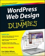
Where should you place the navigation menu? A popular location for the navigation menu is near the top of the Web site, below the Web site name and/or header graphic. The Allure Themes Web site (http://allurethemes.com) has a theme called Dabble, as shown in Figure 8-8, which has a horizontal navigation menu (with drop-down menus) prominently displayed below the site header to make it easy for the visitors to navigate to the various areas within the site.
Figure 8-8: An example of a horizontal navigation menu with links that drop down at AllureThemes.com.
What links should you include in the navigation menu? You (or your client) should have a good idea of what links and information should be presented in the navigation menu. Generally, you include links to important internal pages (such as an About Me or Contact page), categories or archives, and links to external Web sites, such as the site’s Twitter or Facebook page.
Before writing a single line of code for the Web site development, knowing what the navigation structure should include will help you put a plan in place to build and display the navigation menu on the Web site. For example, Web sites with a great deal of links for the menu benefit from a horizontal structure with drop-down lists — links that drop down when you hover over the menu titles (see Figure 8-8). Likewise, Web sites with a small amount of links may benefit from a smaller, more compact vertical menu in the sidebar.
Understanding Content Display Options
With a WordPress-powered Web site, several options are available to display content, such as
Full articles
Excerpts
Photo galleries
Chronological order
Grouped by topic
Most popular
Deciding how to display different types of content on your Web site is greatly determined by what type of content your Web site offers. Here are a few examples:
An online store: A Web site that sells products to its visitors wants a prominent display of the product information, including photos, descriptions, pricing, and purchasing options. This type of e-commerce setup is designed to sell products and make money, so making sure those products and the purpose of the Web site are prominently displayed when a visitor first sees the site is important. See Chapter 16 for a detailed explanation of e-commerce options for WordPress.
A news or magazine site: This type of site focuses on the delivery of content, or articles and stories that have been written for reader consumption. This type of site should display the content in a fashion that’s easily accessible by readers. You may consider grouping the content into topical archives with excerpts (short snippets or teasers that require the reader to click a Read More link to access the full article) to compact the content in areas on the Web site that are easy to navigate. I cover the different WordPress template tags and code for accomplishing excerpts and topical archives in Chapter 12.
A photography site: A site may focus completely on photography or imagery, in which case, the emphasis is on the visual offerings of the Web site. Explore options for how to display photos or video galleries in Chapter 16.
A site with a blog: A simple, typical blog layout, for example, displays full blog posts in chronological order (from the most recent posts to the oldest). This type of content presentation is typically reserved for a Web site that has a blog on its front page or a Web site that contains a blog as part of its content offerings. In Chapter 15, I cover using WordPress as a content management system (CMS) so that you can use different types of layouts for different pages on the Web site. For example, the front page of the Web site can be all about e-commerce and products, and an internal page (any page other than your front page) can have a completely different layout of blog posts and articles.
You have many options for content delivery with a WordPress Web site, and before you design or code the site, knowing what type of content will be presented and how it should look are important pieces of information to include in your overall plan before you begin.
Testing Your Design in a Sandbox Environment
As a Web site designer and developer, it’s very helpful to have a sandbox to play in. A sandbox, in this case, is a Web site or local development area where you can work on a Web site design and test different layouts and methods of content delivery before launching the site live on a client’s (or your) hosted domain. As a professional designer who creates several Web sites per year for my clients, a sandbox environment is extremely vital to what I do. The sandbox allows me a private space to create the site design and present my work to my client where we can work, back and forth, to get the site design and features in line with what my client expects. After the client gives me final approval on the overall Web site design and layout, I can transfer the site from my sandbox domain to the client’s live domain within a matter of minutes. (I explain how to accomplish that transfer at the end of this chapter.)
Additionally, something that helps me a great deal when I work with platforms that change as quickly as WordPress and related plugins is creating a sandbox environment where I can install and run beta versions of the software (as I discuss in Chapter 3). In a test environment, working with new features before they release to the public in an official version upgrade can be highly beneficial. The advantages of doing this include
Becoming adept at using new features so that when you upgrade your site, you’re informed enough to advise your users.
The opportunity to install and test new plugins or themes before you commit to making those changes on your site.
Testing early, beta versions of WordPress to help discover bugs and then using WordPress Trac to report any problems. You don’t have to be a programmer to contribute to the WordPress project. You can be a tester and help the developers and programmers fix issues for WordPress users worldwide.
In the following sections, you find out how to create your own sandbox environment as well as how to transfer a site from your sandbox domain to the live domain.
Creating a sandbox environment
You can create a test environment in several ways, and everyone’s mileage will vary on how they prefer to create one. Here are the steps you can take to create a sandbox environment:
1. Find out whether your hosting provider lets you create subdomains.
Generally, most hosting providers give you this option. I use the cPanel hosting account manager to create my subdomain, but your hosting account may offer you a different management tool, such as NetAdmin or Plesk.
A subdomain is the second level of your current domain that can handle unique content separately than content in your main domain. Subdomains operate underneath your main domain and can function as a wholly different section of your site, independent from your existing domain name.
In Steps 3 and 4, I use my domain, ewebscapes.com, to create the subdomain http://testing.ewebscapes.com. The prefix testing in that Web address (or URL) is a subdomain that branches off ewebscapes.com that, when set up, handles completely different content than what’s currently installed on my main domain.
2. Log in to cPanel (or the hosting account manager tool provided to you).
 If you’re using a management tool other than cPanel, the steps will likely be different than what I’ve described in this section. Please refer to your Web hosting provider’s documentation for assistance with the tool you’re using.
3. Locate and then click the Subdomains icon in the cPanel interface.
Arrangement of icons on the cPanel interface will vary from hosting provider to hosting provider.
The Subdomains page within cPanel appears, as shown in Figure 8-9.
4. Type the name of your subdomain in the Subdomain text box.
For the purposes of making this straightforward and easy, type testing in the text box.
5. From the drop-drop list, choose the name of the domain on which you want to add the subdomain.
In Figure 8-9, the drop-down list shows the domain ewebscapes.com. In this example, you’re creating the subdomain on this domain, so the new subdomain is http://testing.ewebscapes.com.

Figure 8-9: The Subdomains page in cPanel where you can create a new subdomain.
A unique folder name for your new subdomain appears in the Document Root text box. Don’t alter this text because this tells your Web server where to install the necessary WordPress files.
6. Click the Create button.
After a few seconds, the page refreshes and displays a message that the new subdomain has been created, as shown in Figure 8-10.

Figure 8-10: A successful subdomain creation message in cPanel.
Now that you have a subdomain set up on your hosting account, you can install WordPress into the folder that was created when you added the subdomain. For example, if you created a testing subdomain, you’ll install WordPress into the /testing folder. Flip to Chapter 3 for the steps to install WordPress.
With your new subdomain created, you can work on your new WordPress Web site design and development without disrupting anything on the live site (or the intended domain where the Web site will eventually be after it’s completed).
To go one step further, you can use the Members Only WordPress plugin to lock down your sandbox environment and keep it away from prying eyes and search engines. The Members Only plugin lets you show the Web site only to those people whom you give access to by providing them with a username and password to log in to the sandbox test site. You can find the Members Only plugin on the Plugin Directory page at http://wordpress.org/extend/plugins/members-only. (See Chapter 16 for the lowdown on installing plugins.)
Using a plugin to back up and transfer from your sandbox
I use the BackupBuddy plugin on a regular basis to move a WordPress Web site from one hosting environment to another. BackupBuddy is not a free plugin available on the WordPress Plugin Directory page. You have to pay for this plugin, but it’s worth every penny because it takes the entire backup and migration (or transfer) process and makes mincemeat out of it. Translation: BackupBuddy makes the backup and migration of your Web site very easy to accomplish and can be done in minutes, instead of hours.
You can use the BackupBuddy plugin to back up and transfer from your sandbox environment to your client’s destination server and vice versa. Follow these steps to use this plugin to move the Web site from your sandbox environment to your (or your client’s) server:
1. Purchase and download the BackupBuddy plugin from http://ewebscapes.com/backupbuddy.
At this time, the cost for the plugin starts at $45.
2. Install the plugin on your current WordPress Web site.
By current, I mean your sandbox environment, not the destination server yet.
3. In WordPress Dashboard, choose Plugins⇒BackupBuddy⇒Activate under the BackupBuddy plugin name.
WordPress activates the plugin.
4. Choose BackupBuddy⇒Backups.
The Backups page appears.
5. Click the Full Backup button.
This initiates a full backup of your database, files, and content and then packages it neatly into one Zip file for you to store on your local computer, in a location of your choosing.
6. Download the importbuddy.php file by clicking the importbuddy.php link on the Backups page and downloading it to your local computer.
Preferably, place this file in the same directory as the backup file you downloaded in Step 5.
7. Connect to the destination Web server via FTP.
See Chapter 5 for the lowdown on connecting to your Web server and transferring files with FTP.
8. Upload the backup.zip file and the importbuddy.php file.
These files are uploaded in the root, or top-level, directory on your Web server. On some Web servers, this is the /public_html folder, but on others, it may be the /httpdocs folder. If you aren’t sure what your root directory is, your hosting provider can tell you.
9. Create a new database on your new hosting account.
You can find the steps for creating a database in Chapter 3.
10. Navigate to the importbuddy.php file in your Web browser.
This URL looks like http://yourdomain.com/importbuddy.php (where yourdomain.com is your actual domain name).
The BackupBuddy page loads in your Web browser.
11. Follow the steps provided on the BackupBuddy page to import the backup file and install WordPress.
These steps include adding the database information needed, such as the database username, database name, password, and host (see Chapter 3).
This entire process takes about 5–10 minutes, maybe more depending on the size of your Web site.
12. Type the URL of your Web site in your Web browser address bar and press Enter.
This loads your Web site in your browser window, and after BackupBuddy does its thing, the new Web site is completely loaded onto the new server and is an absolute duplicate of what you had in your sandbox environment.
Using this method to back up and transfer a full WordPress Web site from one server to another takes about 5–10 minutes to accomplish, which is a huge timesaver. If you had to transfer and back up the site manually (by taking manual backups of separate elements, such as images, content, themes, plugins, settings, and so on), it’d take a couple hours to complete. The BackupBuddy plugin is an essential tool in my WordPress toolkit that I use several times per week, at least.