
As we learned in Chapter 4, Interface Builder, Auto Layout stops us from thinking about object positions in terms of grids and instead has us thinking about relationships. The problem with user interfaces is that a simple layout can actually hide a fair amount of complexity. When this happens, using Auto Layout can be very tedious.
Let's say you'd like to create a sign up form for your application. The form has several input boxes and a sign up button. Ideally, you'd like to group some of the input boxes to make things easier on the user.
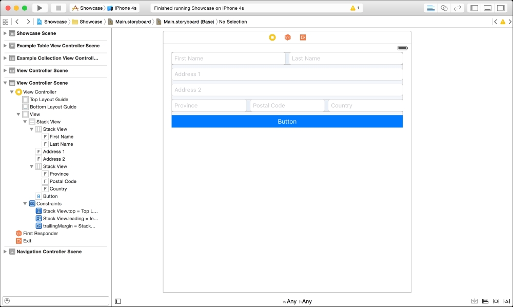
This is what your layout would look like using plain Auto Layout within a view:

24 constraints need to be created to lay out this screen
This layout is also brittle. If it's decided that the spacing between elements should change, someone would need to manually make those changes. Adding a new input box would require that most, if not all, of the constraints be recreated.
Stack views, on the other hand, take away nearly all of the requirements to create constraints in favor of a system, and simply describe the alignment and distribution of every item within it:
Only 3 constraints are needed
The only constraints needed are on the top most stack view. A stack view has a list of elements that it contains and a set of rules that it follows to place those objects on screen. That's all. There is no need to attach every object to its neighbor.
We're going to recreate this layout step by step. To start off, drag out a new view controller object from the object library and connect it with a show segue from the Stack View cell in our static table view.
Next, let's drag in a new Vertical Stack View and pin it to the left and right hand edges of the view:
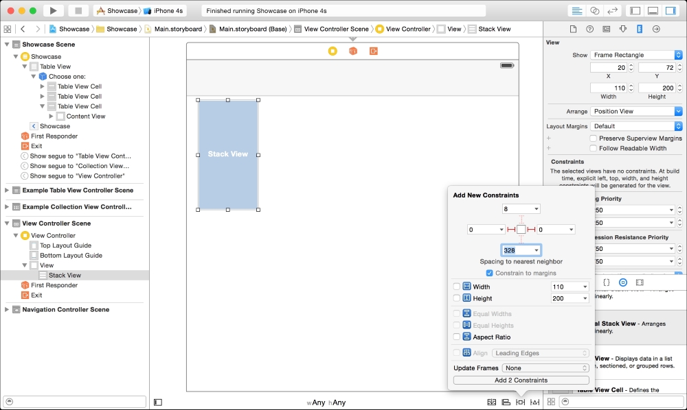
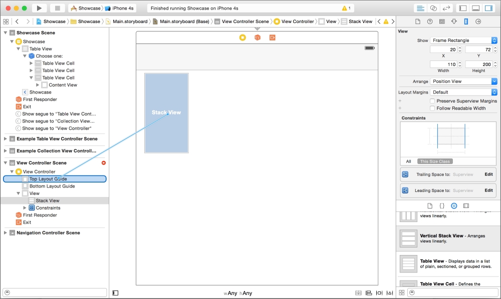
Pin the stack view to the Top Layout Guide in the document outline sidebar:
The alignment rectangle hasn't quite been satisfied yet for the Stack view; it still needs height information. Since we want this view to get bigger as we add content, we aren't going to add a constraint for a height or pin this stack view to the bottom of the screen. Since the stack view will simply grow to accommodate its continents, the simplest fix is to add objects and let their heights dictate.
Drag a text field object into the Stack View from the object library:

Immediately, you'll see that the Auto Layout error in the Document Outline sidebar disappears and the Stack View sizes itself to the same size as the text field. This is going to be the Address 1 text field, so go to the Placeholder field in the Attributes Inspector in the Utility sidebar and add in that text.
Next, we're going to add in the Address 2 text field. Instead of dragging the field from the object library to the canvas, we're going drag it onto the View Hierarchy in the document outline sidebar. You'll notice that a blue line will appear which shows you where you'll be placing this object. Place it directly underneath the Address 1 text box by releasing the mouse button. Add the text Address 2 to the Placeholder field in the Attributes Inspector.
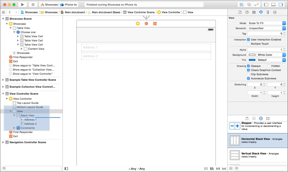
Dragging an object into the view hierarchy instead of the IB canvas
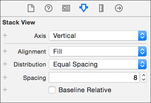
Now let's change some of the attributes of the Vertical Stack View we created. Select the Stack View in the document outline sidebar and open up the Attributes Inspector in the Utility sidebar.
You'll see several options in the Stack view area:
- Axis: This lets you change the stack view from horizontal to vertical.
- Alignment: This states how the objects are aligned to the stack view. Leading means left (for horizontal) or top (for vertical), center will center items in the view, and trailing means right (or bottom).
- Distribution: This states how each item is distributed within the stack view. You can choose to fill the view completely or space them out in different ways.
- Spacing: This allows you set a value for the space between elements.
Choose Equal Spacing for distribution and 8 for Spacing.
This layout is now extremely flexible. Any objects contained in the stack view are laid out according to these rules and will be automatically placed on screen:

Instead, let's add in the First and Last Name text fields and lay these out horizontally.
If we were to simply drag two more text fields onto the Stack View for the First and Last Names, they would follow the same rules as the Address fields and be vertically stacked. We want to stack them horizontally within our vertical stack and we can do this by nesting Stack views.
Drag a Horizontal Stack view from the object library and drop it above the Address 1 text field in the Document Outline sidebar. Make sure that it's inside the Vertical Stack View.
Drag two new text fields into this horizontal stack view and change their placeholder text to First Name and Last Name:

We'll need to make the following modifications to the horizontal stack view's attributes in the Utility sidebar:
- Distribution: Fill Equally
- Spacing: 8
This form is coming together very quickly. To add in the rest of the address information, drag another horizontal stack view below the Address 2 text field, set it's stack view attributes like the previous one and then drag three new text fields into it (onto the document outline sidebar to make things easier). Once in place, change their placeholder text to Province, Postal Code, and Country, respectively.

Finally, drag a button below the last horizontal stack view and change its properties to have a colored background and an appropriate tint. Run the app in the simulator or on a device to see how the stack layout handles each size class:
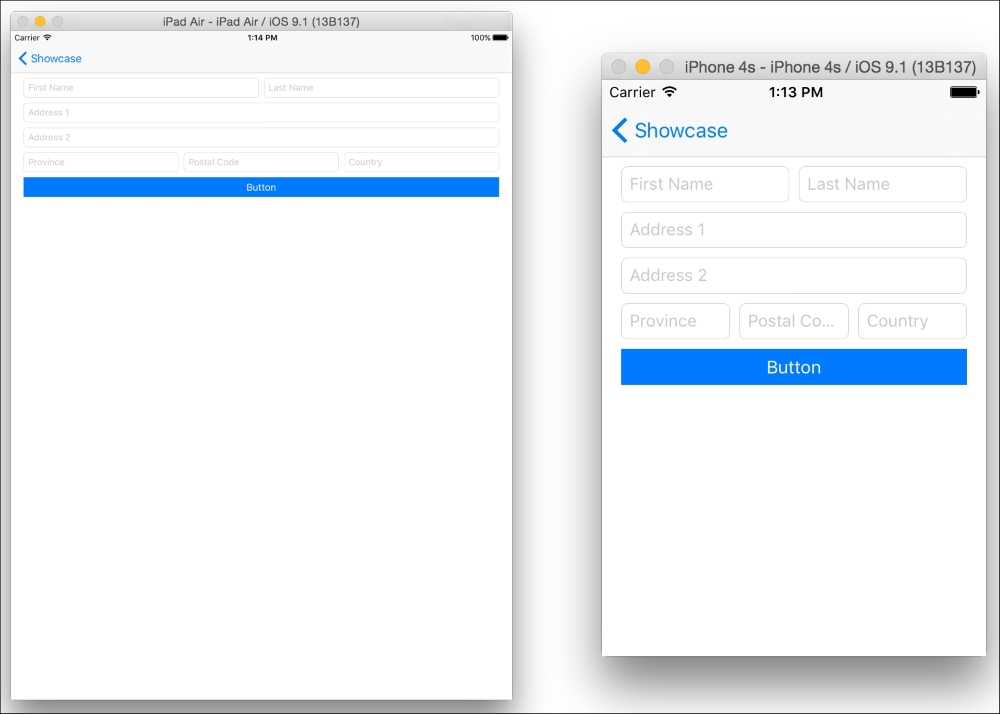
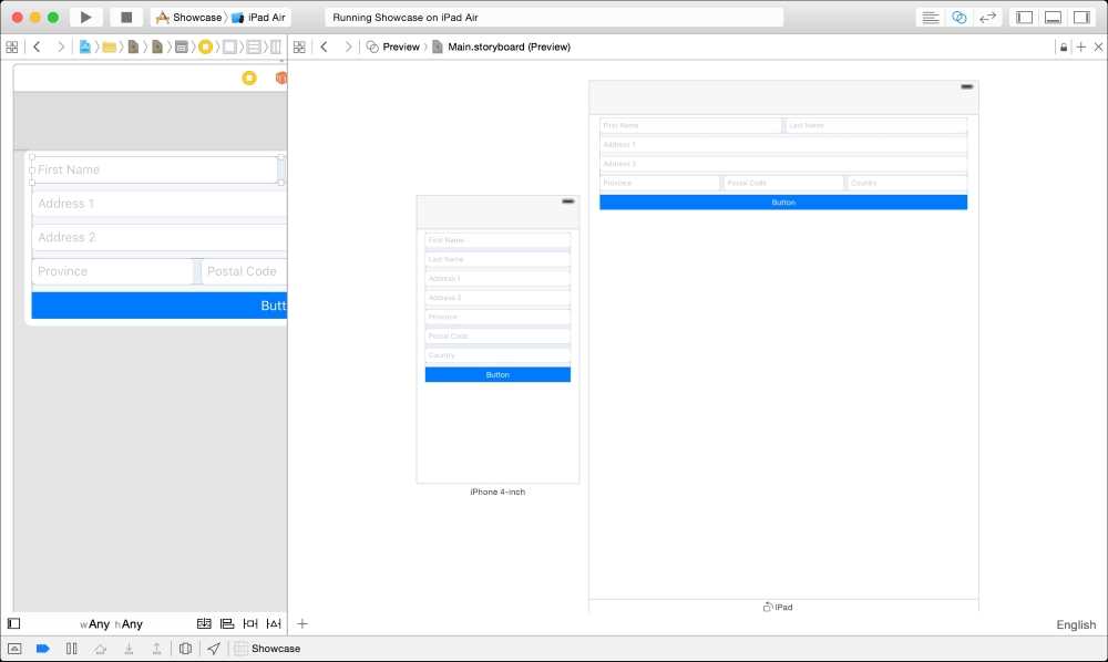
Our app running on the iPad Air and iPhone 4s simulators
Back in the storyboard, if you select any of the stack views, you'll notice that certain properties in the Utility sidebar have a + icon next to them. This allows you to add different values for different size classes. Using one Storyboard view, you could have a Stack view that is segmented for iPads and completely vertical on an iPhone. Let's change that now.
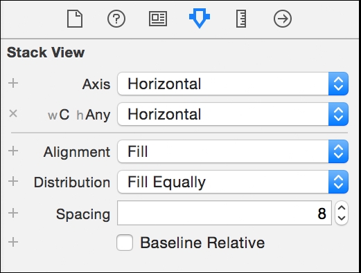
For both stack views, press the + button next to Axis property in the Attributes Inspector and select Any Width, Compact Height. Inside the new wAny hC field, change the axis to Vertical.
Opening up the Preview Assistant editor shows a layout that is now optimized for an iPhone and an iPad—all without writing any code or creating complicated sets of Auto Layout constraints.
OS X has a different set of APIs to iOS. The table view (NSTableView), Collection View (NSCollectionView), and Gravity Stack View (NSStackView) are all similar but have enough differences to exist outside of the scope of this book. For more information about the implementation of these technologies see https://developer.apple.com.