CHAPTER 5
Applying the Contiguity Principle
Align Words to Corresponding Graphics
CHAPTER SUMMARY
Sometimes in e-learning that uses on-screen text to explain graphics, a scrolling screen reveals the text, followed by the graphic further down the screen. When you scroll down to the graphic, the corresponding text has scrolled out of the window from above; when you scroll up to see the text, the corresponding graphic has scrolled out of the window from below. The result is a physical separation of the text and the graphic. Alternatively, audio narration may be presented before or after the graphics it describes. When you click on a speaker icon, you can hear a brief narration, and when you click on a movie icon, you can see a brief animation, but the narration and animation are separated in time. The result is a temporal separation of the words from the corresponding graphic. In this chapter we summarize the empirical evidence for learning gains resulting from presenting text and graphics in an integrated fashion (that is, placing printed words next to the part of the graphic they describe or presenting spoken words at the same time as a corresponding graphic), rather than from presenting the same information separately.
The psychological advantage of integrating text and graphics (in space or in time) results from a reduced need to search for which parts of a graphic correspond to which words, thereby allowing the user to devote limited cognitive resources to understanding the materials. When printed words are placed far from the corresponding graphic or narration is presented before the graphic, learners need to search for which part of the graphic the words are talking about, and thereby waste limited processing capacity. The contiguity principle seeks to eliminate this extraneous processing so learners can use their processing capacity to make sense of the material.
In this edition, we retain an emphasis on the need to embed printed words nearby the graphic they describe—contiguity of printed words and graphics on the screen—and the benefits of coordinating spoken words and graphics so that the learner can look at the part of the graphic that is being described by spoken words—contiguity of audio and graphics in time. We present new evidence concerning the contiguity principle and clarify some of the boundary conditions under which the contiguity principle applies most strongly.
Principle 1: Place Printed Words Near Corresponding Graphics
The first version of the contiguity principle involves the need to coordinate printed words and graphics. In this chapter, we focus on the idea that on-screen words should be placed near the part of the on-screen graphics to which they refer. We recommend that corresponding graphics and printed words be placed near each other on the screen (that is, contiguous in space).
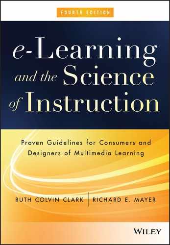
In designing or selecting e-learning courseware, consider how on-screen text is integrated with on-screen graphics. In particular, when printed words refer to parts of on-screen graphics, make sure the printed words are placed next to the corresponding part of a graphic to which they refer. For example, when the graphic is a diagram showing the parts of an object, the printed names of the parts should be placed near the corresponding parts of the diagram, using a pointing line to connect the name to the part. The printed names should not be presented at the bottom or side of the graphic as a legend, as this creates the need to split attention by looking back and forth between words in the legend and the corresponding part of the graphic. For example, Figure 5.2 from a course on ergonomics illustrates appropriate sitting posture with a legend placed on the side of the screen. The legend makes a neat display on the screen. However when you try to find the number corresponding to the legend on the graphic, your eye has to move across from text to graphic. This search leads to split attention and adds extraneous load to the lesson. One solution is to place each text item close to the graphic using a pointing line to link text to visual.
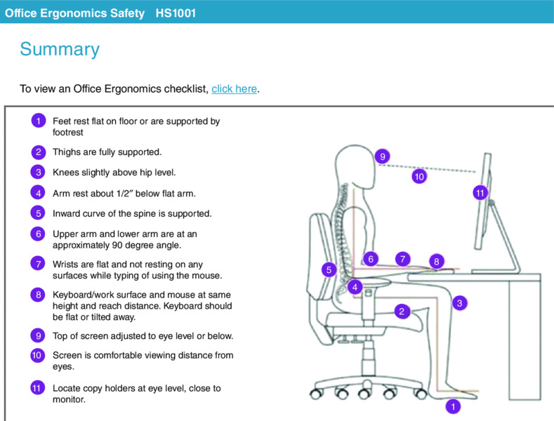
Figure 5.2 The Legend Placed on the Side of the Graphic Violates the Contiguity Principle.
Similarly, when a lesson presents words that describe actions (or states) depicted in the series of still frames, make sure that text describing an action (or state) is placed near the corresponding part of the graphic, using a pointing line to connect the text with the graphic. In contrast, do not put a caption at the bottom of the screen (or in the body of the passage), as this also creates the need to look back and forth between the words in the caption and the corresponding part of the graphic.
When there is too much text to fit on the screen, the text describing each action or state can appear as a small pop-up message that appears when the mouse touches the corresponding portion of the graphic. This technique is called a mouse-over or rollover. For example, Figure 5.3 shows an application screen that uses the rollover technique. When learners place their cursors over different sections of the application screen, a text caption appears that explains that section. In Figure 5.3 the mouse has rolled over section 1 and the text window below it remains in view as long as the mouse hovers in that area of the screen. One problem with rollovers is that they are transient. The text box disappears when the cursor moves to a different location on the screen. Thus, rollovers may not be appropriate for situations in which it’s important for the learner to view more than one block of rollover text at a time or to take an action that relies on rollover text.
Figure 5.3 From Clark and Lyons, 2011. A Screen Rollover Integrates Text Below Section 1 of Graphic.
Violations of Contiguity Principle 1
Violations of the contiguity principle are all too common. The following list gives some of the most common violations (although there are more) of this principle that are frequently seen in e-learning courseware:
- In a scrolling window, graphics and corresponding printed text are separated, one before the other, and partially obscured because of scrolling screens.
- Feedback is displayed on a separate screen from the practice or question.
- Links lead to an on-screen reference that appears in a second browser window that covers the related information on the initial screen.
- Directions to complete practice exercises are placed on a separate screen from the application screen on which the directions are to be applied.
- All text is placed at the bottom of the screen away from graphics.
- An animation or video plays on one half of the screen while text describing the animation is displayed simultaneously on the other half of the screen.
- Key elements in a graphic are numbered, and a legend at the bottom or side of the screen includes the name for each numbered element, such as in Figure 5.2.
Separation of Text and Graphics on Scrolling Screens
Sometimes scrolling screens are poorly designed so that text is presented first and the visual illustration appears further down the screen, as illustrated in Figure 5.4. As the user scrolls down to view the graphic, the text is no longer visible and vice versa. This particular problem can be remedied by integrating text and visuals on a scrolling screen, as shown in Figure 5.5. Another remedy to the scrolling screen problem is to use text boxes that pop up over graphics when the graphic is touched by the cursor (as shown in Figure 5.3). Alternatively, fixed screen displays can be used when it is important to see the text and graphic together. On a fixed screen, the graphic can fill the screen and text can be embedded within the graphic near the element being described.
Figure 5.4 Text and Graphic Separated on Scrolling Screen.

Figure 5.5 Text and Graphic Visible Together on a Scrolling Screen.
Separation of Feedback from Questions or Responses
Another common violation of the contiguity principle is when feedback is placed on a screen separate from the question or from the learner’s answers. This requires the learner to page back and forth between the question and the feedback, adding cognitive load to learning. For example, in Figure 5.6 from our pharmaceutical sales example lesson, a multiple-select question (not shown) requires the learner to select physicians whose practice would benefit from a new drug. When learners click “done,” they are routed to Feedback A screen that shows the correct answers. In order to compare their answers with the correct answers, the learners must page back to the question screen. A better solution is shown in the Feedback B screen. In this screen the learner’s answers (checks in boxes) have been carried over from the question screen and placed next to the correct answer allowing a quick and easy comparison without paging back.
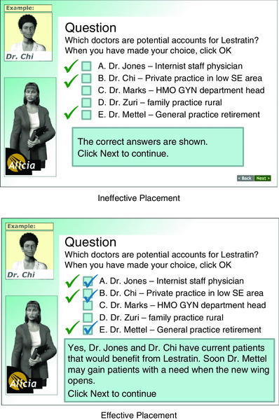
Figure 5.6 Ineffective and Effective Placement of Feedback.
Separating Content with Linked Windows
The use of links that lead to adjunct information is common in e-learning. However, when the linked information covers related information on the primary screen, this practice can create a problem. For example, a link on an application screen leads to a window containing a job aid. Having access to reference material is a good idea for memory support. However, if the resulting window covers the graphic example that it describes, the contiguity principle is violated. A better solution is to link to a window that is small, can be moved around on the main screen, and/or can be printed.
Presenting Exercise Directions Separate from the Exercise
Another common violation of the contiguity principle is the practice of presenting exercise directions in text separated from the screens on which the actions are to be taken. For example, in Figure 5.7 we see textual directions for a case study from an Excel e-learning lesson. When moving to the spreadsheet on the next screen, the learner no longer has access to the directions. A better alternative is to put the step-by-step directions in a box that can be minimized or moved on the application screen.
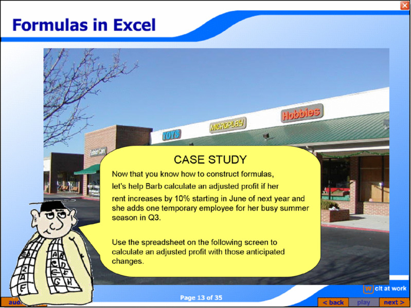
Figure 5.7 Separating Exercise Directions from Application Screen Adds Extraneous Memory Load.
Displaying Captions at the Bottom of Screens
For consistency, many e-learning designs place all text in a box at the bottom of the screen like the frame shown in Figure 5.8A. The problem with this layout is that the learner needs to scan back and forth between the words at the bottom of the screen and the part of the graphic they describe. A better arrangement is to relocate the text closer to the visual as well as to insert lines to connect the text and visual, as shown in Figure 5.8B. In some cases, the text can be broken into shorter segments, with each segment placed next to the part of the graphic it describes.

Figure 5.8 Text Placed at Bottom of Screen (Left) Versus Next to Visual (Right).
Using a Legend to Indicate the Parts of a Graphic
Suppose you wanted students to learn about the parts in a piece of equipment. You could show them an illustration in which each element is numbered, and a legend below or next to the illustration that describes each one, as shown in Figure 5.2. The problem with this layout is that the learner must scan between the number and the legend, which creates wasted cognitive processing. A more efficient design would place the name and part description near the corresponding part on the visual. The text could be placed in a rollover box or in a fixed display on the screen. If the learner will benefit from seeing several parts simultaneously, leaving them on the screen in a fixed display would be better than a rollover box that disappears when the cursor is moved.
Displaying Running Text in a Separate Window with Animations or Video
You may want to use an animation or video to depict movement, such as to show how to perform a computer application or to illustrate how equipment works. If the animation is playing at the same time as the running text in a window to the side or at the bottom, the learners must continually shift back and forth from reading the printed text and viewing the fleeing animation or video. If they read the text, they miss much of the animation or video; if they watch the animation or video, then they will read the text after the animation has run. A better solution is to present the printed text in a separate box to be viewed independently of the animation, as shown in Figure 5.9.
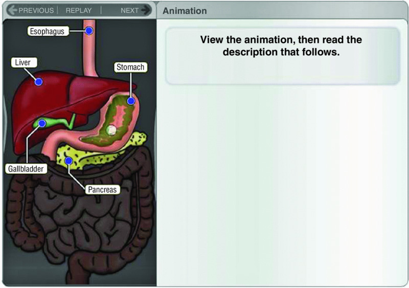
Figure 5.9 Text Is Viewed Separately from Animation. .
With permission of University of Phoenix
Psychological Reasons for Contiguity Principle 1
As we have reviewed in the examples of how to apply contiguity principle 1, it is not unusual to see corresponding printed text and graphics physically separated in e-lessons. Some designers separate words and pictures because they haven’t stopped to think about whether it’s an effective way to present information. Others reason that presenting the same material in two different places on the page or at two different times allows learners to choose the format that best suits their needs or even to experience the same information in two different ways. We recommend against separating words and pictures, even for environments with high traffic and low bandwidth, because it is not based on an accurate understanding of how people learn.
Rather than being copy machines that record incoming information, humans are sense-makers who try to see the meaningful relationships between words and pictures. When words and pictures are separated from one another on the screen, people must use their scarce cognitive resources just to match them up. This creates what can be called extraneous processing—cognitive processing that is unrelated to the instructional goal. When learners use their limited cognitive capacity for extraneous processing, they have less capacity to use to mentally organize and integrate the material.
In contrast, when words and pictures are integrated, people can hold them together in their working memories and therefore make meaningful connections between them. This act of mentally connecting corresponding words and pictures is an important part of the sense-making process that leads to meaningful learning. As we saw in Chapter 2, it is in working memory that the related incoming information is organized and integrated with existing knowledge in long-term memory.
When the learner has to do the added work of coordinating corresponding words and visual components that are separated on the screen, the limited capacity of working memory is taxed—leading to cognitive overload. Ayres and Sweller (2014) argue that putting corresponding words and pictures far apart from each other creates what they call split attention, which forces the learner to use limited working memory capacity to coordinate the multiple sources of information. Split attention occurs when the learner continually has to look back and forth between two or more locations on the screen. You should avoid instructional designs that cause split attention because they force the learner to waste precious cognitive processing on trying to coordinate two disparate sources of information.
Evidence for Contiguity Principle 1
Our first recommendation—presenting corresponding printed text and graphics near each other on the screen—is not only based on cognitive theory, but it is also based on several relevant research studies (Mayer, 1989b; Mayer, Steinhoff, Bower, & Mars, 1995; Moreno & Mayer, 1999a). In five different tests involving lessons on lightning formation and how cars’ braking systems work, learners received printed text and illustrations containing several frames (or on-screen text with animation). For one group of learners (integrated group), text was placed near the part of the illustration that it described, as you can see in Figure 5.10A. For another group (separated group), the same text was placed under the illustration as a caption, as you can see in Figure 5.10B. Across the five studies, the integrated group performed better on problem-solving transfer tests than the separated group. Overall, the integrated group produced between 43 and 89 percent more solutions than the separated group. The median gain across all the studies was 68 percent for an effect size of 1.12, which, as mentioned in Chapter 2, is a large effect.

Figure 5.10 Screens from Lightning Lesson with Integrated Text and Graphics (Left) and Separated Text and Graphics (Right). .
Adapted from Mayer, 2001a, 2005b
Similar results have been found with training programs for technical tasks (Chandler & Sweller, 1991; Paas & van Merriënboer, 1994; Sweller & Chandler, 1994; Sweller, Chandler, Tierney, & Cooper, 1990), practical training in physical therapy (Pociask & Morrison, 2008), and even with a single scientific illustration and explanatory text presented on a computer screen (Florax & Ploetzner, 2010). Erhel and Jamet (2006) found that people learned better from an online lesson on the human heart when pop-up windows containing text appeared next to the part of the graphic they described, rather than having the text at the bottom of the screen. In a systematic review of 37 studies, Ginns (2006) found strong support for the benefits of spatial contiguity with an average effect size of .72. In a more recent meta-analysis of published research on spatial contiguity, in twenty-two out of twenty-two experiments students performed better on learning tests if they received integrated rather than separated presentations, yielding a median effect size greater than 1 (Mayer & Fiorella, 2014).
Additional evidence comes from eye-tracking studies involving text and corresponding diagrams. Successful learners tended to read a portion of the text, then search the diagram for the object being described in the text, then read the next portion of text and search the diagram for the object being described, and so on (Hegarty, Carpenter, & Just, 1996; Schmidt-Weigand, Kohnert, & Glowalla, 2010a). It seems reasonable that we can simplify this process for all learners by breaking text into chunks, and by placing each chunk of text near the part of the graphic that it describes. For example, in a naturalistic eye-tracking study shown in Figure 5.11, newspaper readers were more likely to look back and forth between corresponding words and graphics (which contributes to meaningful learning) if the words were placed next to corresponding graphics on the newspaper page (Holsannova, Holmberg, & Holmqvist, 2009).
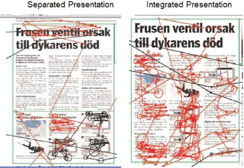
Figure 5.11 Eye-Tracking Shows Better Integration of Text and Visual When Visuals Are Integrated into the Text. .
From Holsannova, Holmberg, and Holmqvist, 2009
Let’s take a look at a more focused eye-tracking study by Johnson and Mayer (2012). Suppose we ask some students to learn about how a car’s braking system works by studying a separated slide in which the graphics are on the top and the text is a caption at the bottom, as shown in Figure 5.12. Suppose we ask other students to study an integrated slide in which the text is broken into segments and placed next to the corresponding parts of the graphic, as shown in Figure 5.13. Both slides show exactly the same graphics and exactly the same words, but differ only regarding where the words are placed. Consistent with contiguity principle 1, across three experiments, students in the integrated group performed better on a transfer test than students in the separated group. An eye-tracking analysis showed that students in the integrated group made more eye movements between corresponding words and graphics than students in the separated group, suggesting they were more engaged in building connections between corresponding words and graphics. Making connections between corresponding words and graphics is a major step in meaningful learning according to the cognitive theory of multimedia learning described in Chapter 2.
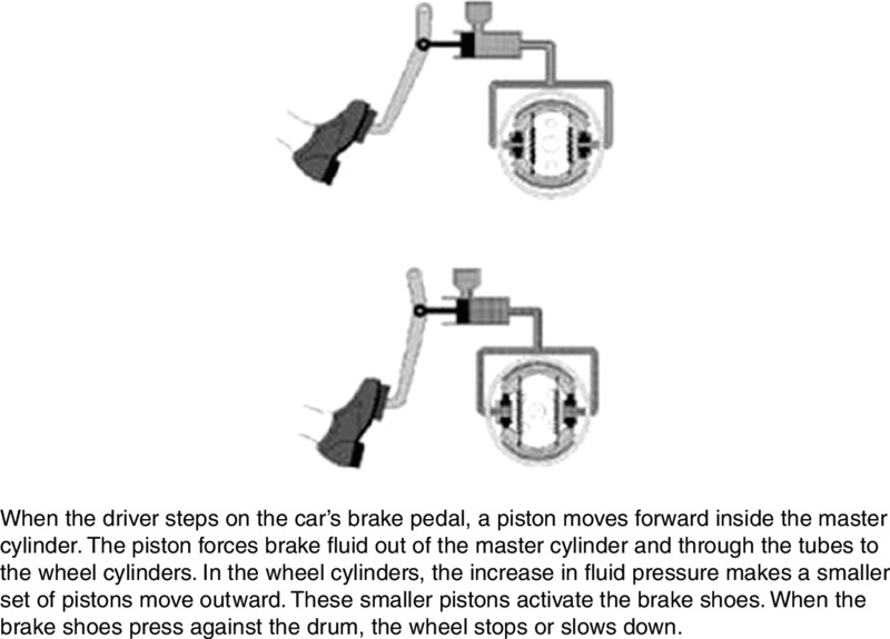
Figure 5.12 Separated Version of the Brakes Lesson. .
From Johnson and Mayer, 2012

Figure 5.13 Integrated Version of the Brakes Lesson. .
From Johnson and Mayer, 2012
Some possible boundary conditions are that the spatial contiguity recommendation may most strongly apply to low-knowledge learners (Mayer & Fiorella, 2014) and when the graphic and words are complex and unintelligible without each other (Ayres & Sweller, 2014).
Principle 2: Synchronize Spoken Words with Corresponding Graphics
Another version of the contiguity principle deals with the need to coordinate spoken words and graphics. In this section we focus on the idea that spoken words (that is, narration) that describe an event or element should play at the same time as the graphic (animation or video) is depicting the event or element. In short, we recommend that corresponding graphics and spoken words be presented at the same time (that is, contiguous—next to each other—in time).
When e-learning courseware contains narration and corresponding graphics ( animation or video), you should consider how spoken words are integrated with on-screen graphics. In particular, when spoken words describe actions that are depicted in the on-screen graphics, make sure the corresponding spoken words and graphics are presented at the same time. For example, when the graphic is an animation showing the steps in a process, the narration describing a particular step should be presented at the same time that the step is shown on the screen. When the graphic is a video showing how to perform a task, the narration describing each step should be presented at the same time as the action shown on the screen. Violations of Contiguity Principle 2
Violations of the contiguity principle include the following:
- A link to audio is indicated by one icon and a link to video is indicated by another icon.
- A segment provides a narrated description followed by animation or video.
Separation of Graphics and Narration Through Icons
Suppose you click on “How the Heart Works” in an online encyclopedia, and two buttons appear—a speaker button indicating that you can listen to a short narration about the four steps in heart cycle and a movie button indicating that you can watch a short animation, as illustrated in Figure 5.14. You click on the speaker button and listen to a description of the four steps in the heart cycle. Then you click on the movie button and watch a narration showing the four steps in the heart cycle. You might think this is an excellent presentation because you can select which mode of presentation you prefer. You might like the idea that you listen to the explanation first and then watch, or vice versa, thereby giving you two complementary exposures to the same material.

Figure 5.14 Narration Is Presented Separately from Animation.
What’s wrong with this situation? The problem is that when a lesson separates corresponding words and graphics, learners experience a heavier load on working memory—leaving less capacity for deep learning. Consider the learner’s cognitive processing during learning when a narration is followed by an animation. After listening to the narration, the learner needs to hold all the relevant words in working memory, and then match up each segment with the corresponding segment of the animation. However, having to hold so much information in working memory can be overwhelming, so the learner may not be able to engage in other cognitive processes needed for deep learning. This is the type of load we called extraneous processing in Chapter 2. Extraneous processing refers to mental load that does not contribute to learning. Therefore, we recommend that you avoid e-learning lessons that present narration and graphics separately.
Separation of Graphics and Narration in a Continuous Presentation
Even when a lesson presents graphics and narration as a continuous unit, a lesson may be designed so that an introduction is presented as a brief narration that is followed by graphics (such as an animation, video, or series of still frames depicting the same material). For example, consider a multimedia presentation on “How the Heart Works” that begins with a narrator describing the four steps in the heart cycle, followed by four still frames depicting the four steps in the heart cycle.
At first glance, you might like this arrangement because you get a general orientation in words before you inspect a graphic. Yet, like the previous scenario, this situation can create cognitive overload because the learner has to mentally hold the words in working memory until the graphic appears—thereby creating a form of extraneous cognitive processing. To overcome this problem, we recommend presenting the narration at the same time the static frames are presented. In this situation, the learner can more easily make mental connections between corresponding words and graphics.
Psychological Reasons for Contiguity Principle 2
The psychological rationale for avoiding temporal separation of words and graphics in contiguity principle 2 is analogous to that for avoiding spatial separation of words and graphics in contiguity principle 1. When corresponding narration and graphics are presented at different times in e-lessons, the learner has to hold the words in working memory until the corresponding graphics are presented, or vice versa. Given the limits on working memory, some text information may be lost before the corresponding graphics are displayed (or vice versa).
The goal of contiguity principle 2 is to make sure that the learner can have a representation of a text segment and a corresponding part of a graphic in working memory at the same time, in order to make connections between them. This constructive learning is more likely when graphics and corresponding words are presented at the same time rather than successively.
Evidence for Contiguity Principle 2
Our second recommendation—presenting corresponding speech and graphics at the same time—is also based on research evidence (Mayer & Anderson, 1991, 1992; Mayer, Moreno, Boire, & Vagge, 1999; Mayer & Sims, 1994; Owens & Sweller, 2008). In one experiment, some students (integrated group) viewed a thirty-second narrated animation that explained how a bicycle tire pump works, in which the spoken words described the actions taking place on the screen. For example, when the narrator’s voice said, “. . .the inlet valve opens . . .,” the animation on the screen showed the inlet valve moving from the closed to the open position. Other students (separated group) listened to the entire narration and then watched the entire animation (or vice versa). On a subsequent transfer test the integrated group generated 50 percent more solutions than did the separated group, yielding an effect size greater than 1, which is considered large.
In a recent review across nine different experimental comparisons involving pumps, brakes, lightning, lungs, and musical notation, in every experiment students who received simultaneous presentations performed better on a transfer test than did students who received a separated presentation, yielding a median effect size greater than 1 (Mayer & Fiorella, 2014). In a systematic review of thirteen studies, Ginns (2006) found strong evidence for temporal contiguity with an average effect size of .87. Pioneering research by Baggett (1984) and Baggett and Ehrenfeucht (1983) shows that learners experience difficulty in learning from a narrated video, even when corresponding words and graphics are separated by a few seconds.
As you can see, when you have a narrated animation, narrated video, or even a narrated series of still frames, there is consistent evidence that people learn best when the words describing an element or event are spoken at the same time that the animation (or video or illustration) depicts the element or event on the screen. Some possible boundary conditions are that the temporal contiguity recommendation applies most strongly when the narration and animation segments are long or complex (Ginns, 2006; Mayer, Moreno, Boire, & Vagge, 1999; Moreno & Mayer, 1999; Schüler, Scheiter, Rummer, & Gerjets, 2012), and when students cannot control the order and pace of presentation (Micas & Berry, 2000).
What We Don’t Know About Contiguity
Overall, our goal is to reduce the need for learners to engage in extraneous processing by helping them see the connection between corresponding words and graphics. Two techniques we explored in this chapter are to present printed words near the part of the graphic they refer to, and to present spoken text at the same time as the portion of graphic they refer to. Some unresolved issues concern:
- How many words should be in each segment.
- Does the contiguity principle go away when the verbal message is very short, such as just a few words?
Figure 5.15 This Alternative to Figure 5.1 Applies the Contiguity Principle.
Chapter Reflection
- In this chapter we presented a number of violations of contiguity. What violations of contiguity have you experienced in e-learning lessons or in face-to-face classroom lessons you have created or taken? How do these violations depress learning?
- Placing text at the bottom of screens that have graphics gives the lessons a consistent look and feel. How would you reply to someone making this argument?
- Have you ever read a book in which a graphic appears on the back of a page describing the graphic? You need to flip back and forth to make sense of the message. How did this make you feel? Why did you feel that way?
- As long as you present essential narration and graphics, why should the order of presentation matter?
COMING NEXT
In this chapter, we have seen the importance of (a) the on-screen layout of printed text and graphics and (b) the coordination of corresponding narration and graphics. Next, we will consider the benefits of presenting words in audio narration rather than in on-screen text. We know that audio adds considerably to file sizes and requires the use of sound cards and sometimes headsets. Does the use of audio add anything to learning? In the next chapter we examine the modality principle, which addresses this issue.
Suggested Readings
- Ayres, P., & Sweller, J. (2014). The split-attention principle in multimedia learning. In R.E.Mayer (Ed.), Cambridge handbook of multimedia learning (2nd ed., pp. 206–226). New York: Cambridge University Press. Explains how poor instructional design can create split attention.
- Ginns, P. (2006). Integrating information: A meta-analysis of spatial contiguity and temporal contiguity effects. Learning and Instruction, 16, 511–525. Summarizes research on the contiguity principle.
- Johnson, C.I., & Mayer, R.E. (2012). An eye-movement analysis of the spatial contiguity effect in multimedia learning. Journal of Experimental Psychology: Applied, 18, 178–191. Reports research supporting contiguity principle 1, including eye-tracking results.
- Mayer, R.E., & Anderson, R.B. (1991). Animations need narrations: An experimental test of a dual-coding hypothesis. Journal of Educational Psychology, 83, 484–490. Reports exemplary research evidence for contiguity principle 2.
- Mayer, R.E., & Fiorella, L. (2014). Principles for reducing extraneous processing in multimedia learning: Coherence, signaling, redundancy, spatial contiguity, and temporal contiguity. In R.E.Mayer (Ed.), Cambridge handbook of multimedia learning (2nd ed., pp. 279–315). New York: Cambridge University Press. Summarizes research on the contiguity principle.
CHAPTER OUTLINE
- Modality Principle: Present Words as Speech Rather Than On-Screen Text
- Limitations to the Modality Principle
- Psychological Reasons for the Modality Principle
- Evidence for Using Spoken Rather Than Printed Text
- When the Modality Principle Applies
- What We Don’t Know About Modality