Chapter Eleven. Using Components with ActionScript 3.0
As you work with Flash, you’ll probably want to use symbols and scripts similar to ones you’ve used before. In those cases, it makes sense to recycle the older elements rather than re-creating them from scratch.
Flash takes that principle a step further: It provides ready-made, prescripted symbols called components that you can use in any movie. You can find them in the Components panel (Window > Components).
The ActionScript inside these components is thorough and robust, so you can depend on them to work properly. In addition, the ActionScript is already compiled, or translated into the “machine language” that computers understand. The downside is that you can’t edit or view the components’ ActionScript, but the upside is that the scripts run much faster and make fewer demands on the computer than scripts you’d write yourself.
To make the best use of components, you have to write scripts to integrate them into your movie. This chapter provides a few examples that will show you how to use components in simple ways. ActionScript reference books such as the one mentioned in Chapter 10 will help when you’re ready to progress to more complex scripts.
Because ActionScript 3.0 and 2.0 can’t be used in the same movie, Flash CS3 comes with two different sets of components. If you choose ActionScript 3.0 as the scripting language for a document (see #84), the Components panel shows the ActionScript 3.0 components; otherwise, it shows the ActionScript 2.0 components. The ActionScript 3.0 components are much improved over earlier versions; they’re faster, lighter, and easier to use. For that reason, we’ll focus on the ActionScript 3.0 components, although some of the techniques you’ll see here will apply to earlier component versions as well.
Getting to Know ActionScript 3.0 Components
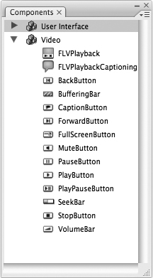
The ActionScript 3.0 components fall into two categories: user interface (UI) and video. The UI components (Figure 96a) allow users to interact with programs and Web sites; they include familiar elements such as buttons, menus, sliders, check boxes, and so on. The video components (Figure 96b) allow users to control video that’s playing back as part of a Flash movie.
Figure 96a. The Components panel shown here displays ActionScript 3.0 UI components.
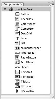
Figure 96b. ActionScript 3.0 video components require familiarity with ActionScript—with the exception of FLVPlayback, which Flash deploys as part of the video import process.
To add an instance of a component to your movie, drag it from the Components panel onto the Stage. Two items are added to the Library: the component itself and a folder of supporting files called Component Assets. To use additional instances of the same component, drag them from the Library, not from the Components panel.
If you use more than one type of component in a movie, only the first will add the Component Assets folder to the Library. Additional components will share the same set of supporting files.
Adding a component instance to your movie presents the same problem as adding a button (see #27): The component functions properly—a check box can be selected, a slider moves sideways, and so on—but it doesn’t accomplish anything. To make a component useful, you have to add ActionScript code that monitors each instance of the component and responds to changes (see #100).
Customizing Component Instances
While using off-the-shelf components is convenient, it’s not as creatively satisfying as designing your own symbols. Flash addresses this issue by providing several ways to modify the appearance of ActionScript 3.0 components:
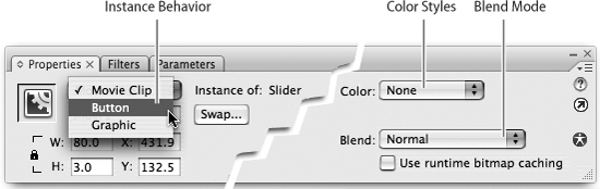
• Use the Property inspector. As with standard movie clips, you can use the buttons on the right side of the Property inspector to change the color or blending mode of a component instance. The drawback is that there’s no live preview: The only way to see what your changes look like is to test or publish the movie. To get around this, go to the Instance Behavior menu (Figure 97a) and change the symbol type from Movie Clip to Button. (The instance may temporarily look different, but that’s OK.) Make whatever changes you want to the color and blending modes, then change the symbol type back to Movie Clip.
Figure 97a. To allow a live preview of your color and blending-mode changes, choose Button on the Instance Behavior menu. Be sure to set the instance back to Movie Clip when you’re finished.
• Use the Free Transform tool. You can transform instances of components, but not necessarily with the results you’d expect. Depending on the component, scaling an instance may change one dimension, both, or neither, and it doesn’t affect text size at all. Skewing or rotating an instance works fine on the graphic part of the component, but it makes all text—labels and data—disappear. You can avoid this problem by embedding a font (see #99).
• Edit the component. Double-click an instance on the Stage to enter symbol editing mode, but with a difference: All the states of the component are shown (Figure 97b). Double-click one of the states to edit it as you would a standard symbol. (If you want a particular change to affect multiple states, you have to edit each one individually.) You can change the graphic portion (Figure 97c), but you can’t change the appearance of the text—that can be done only through ActionScript. When you edit one instance of a component, the changes you make affect all instances of that component in your movie.
Figure 97b. When you edit a component (in this case, the Radio Button), Flash shows you all of its possible states. To apply a change to multiple states, you must edit each individually.
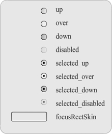
Figure 97c. The Radio Button component has been edited to look like an eye when selected or an oval when not selected. Think twice before you make significant alterations to a user-interface element; users may fail to recognize that these are radio buttons.

To change an edited component back to its original appearance, drag another copy of the component from the Components panel to the Library, then choose “Replace existing items.”
• Use ActionScript. Although you can’t use ActionScript to make radical changes in a component’s appearance, you can change attributes such as its size and visibility. You can also make changes in the font, size, and style of the component’s text. For an example of how ActionScript is used to set these parameters, see #98.
Setting Parameters for Component Instances
You can think of the properties of a component instance as referring to outward characteristics such as size and color, and parameters as referring to more functional aspects. Each component has a different set of parameters, but here are some of the more common ones:
• Label. A label is the text that’s associated with an instance.
• Label Placement. The standard placement of the label varies according to the component (Figure 98a).
Figure 98a. A label is typically placed to the left of a text field, to the right of a check box, and directly on a button.
• Value. When a user makes a choice from a menu or from among a group of radio buttons, the value is what’s reported back to ActionScript. The value is often the same as the label, but it doesn’t have to be. For example, if a user chooses “Yes” in response to “Do you want a sales representative to call you?” the value (unseen by the user) might be “sucker.”
• Selected. This parameter, which can have a value of “true” or “false,” determines whether an instance is already selected when it first appears on the Stage—for example, whether a check box initially has a check in it.
• Enabled. Selecting “false” for the enabled parameter causes an instance to appear dimmed on the Stage.
• Visible. Selecting “false” for the visible parameter causes the instance to disappear from the Stage entirely.
There are three ways to set an instance’s parameters:
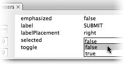
• Use the Parameters tab of the Property inspector. When an instance of a component is selected on the Stage, clicking the Property inspector’s Parameters tab shows you a table of the instance’s primary parameters. A default value is filled in for each one, but you can change them. Some of the values are in editable text fields; others are on menus (Figure 98b).
Figure 98b. In the table shown here for the Button component, the value of the “label” parameter is editable text, while the value of the “selected” parameter is chosen from a menu.
• Use the Component Inspector. Open the Component Inspector panel by choosing Window > Component Inspector. The Parameters tab includes a table similar to the one in the Property inspector, but with more parameters. Changing a value here causes the same value to be changed in the Property inspector, and vice versa.
• Use ActionScript. To use this method to set parameters for a component instance, you must give it an instance name (see #90). The ActionScript code for setting parameters takes this general form:
instanceName.parameter = value
For this example, assume we have an instance of the CheckBox component called checkBox1. To change the instance’s label and add a check mark, we could put the following code in a frame 1 script:
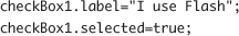
Writing this script doesn’t change anything in the authoring environment; it takes effect only when you test or publish the movie (Figure 98c).
Figure 98c. On the left, the check box instance as it appears in the FLA file; on the right, the same instance as a SWF file in the Flash Player.
The simple syntax shown here is useful only for the parameters that are listed in the Component Inspector. Changing other characteristics of an instance requires more elaborate scripting, as you’ll see in #99.
Formatting Text in a Component Label
Usually, the first thing you’ll want to change about a component instance is the appearance of its label; the default font is small and unexciting.
Changing the label properties is tricky, because the label is a separate entity. In ActionScript terms, it’s an instance of the TextFormat class inside an instance of the component. In this case, think of a class as being an abstract version of a symbol. The TextFormat class represents a generic, featureless hunk of text; we can create instances of that class with specific fonts, styles, and sizes.
Staying with the example we used in #98, assume we want the label for checkBox1 to be in 16-point Gill Sans italic. We start by creating a new instance of the TextFormat class, which we’ll name niceText:
var niceText:TextFormat = new TextFormat();
We can then set the properties for that instance:
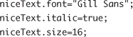
Finally, we set the style for checkBox1. The specific style property we’re setting is textFormat, and the model we’re using is the instance we called niceText.
checkBox1.setStyle("textFormat", niceText);
The finished script is shown in Figure 99a; the published movie is shown in Figure 99b.
Figure 99a. The finished script (including the two lines we wrote in #98) is displayed in the Actions panel.
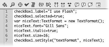
Figure 99b. The check box instance looks like this in the final movie. Compare the enhanced label to the default version in Figure 98c.
You may choose to embed the font that’s used in a label. This isn’t required, but it’s good insurance in case the user’s computer doesn’t have the font installed. It also keeps the label from disappearing if the component instance is rotated or skewed (see #97). The only drawback to embedding a font is that it increases the size of the SWF file.
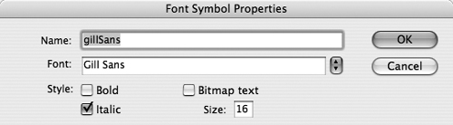
To embed the Gill Sans font that’s used in the label for checkBox1:
1. Create a new font symbol by right-clicking (Windows) or Control-clicking (Mac) inside the Library and choosing New Font from the contextual menu.
2. In the Font Symbol Properties dialog box, name the symbol gillSans (or whatever name you prefer) and choose its font, style, and size (Figure 99c). Click OK.
The font symbol appears in the Library.
Figure 99c. The Font Symbol Properties dialog box is set for 16-point Gill Sans italic.
3. Right-click (Windows) or Control-click (Mac) the font symbol and choose Linkage from the contextual menu.
4. In the Linkage Properties dialog box, select “Export for ActionScript.” Flash fills in the “Class” field with the name of your font symbol. It also fills in the “Base class” field. The information in these fields allows ActionScript to recognize the font symbol.
5. Write down the name that Flash put into the Class field (in this case gillSans). Click OK.
If an alert box appears, click OK again.
6. In the Actions panel, add the following line to the top of your frame 1 script:
var embeddedFont:Font=new gillSans();
This creates an instance of the font symbol and gives it the name embeddedFont (or whatever you’d like to call it).
The word after “new” is the class name that you wrote down in the preceding step.
7. Go to the line in which you formerly specified a font for the niceText instance. Delete the font name and rewrite the line as follows:
niceText.font=embeddedFont.fontName;
(If you used a different instance name in step 6, use it instead of “embeddedFont.”) The revised code tells niceText to use the embedded font rather than the one on the user’s computer.
8. Add one more line to the end of the script, giving the check box instance permission to use the embedded font:
checkBox1.setStyle("embedFonts", true);
9. To make sure Flash really is using the embedded font, use the Free Transform tool to rotate or skew the checkBox1 instance on the Stage.
10. Test or publish the movie. If the label next to the check box appears rotated or skewed, Flash is using the embedded font (Figure 99d). If the text disappears, something went wrong—go through the steps again.
Figure 99d. Embedding a font allows a component’s label to be rotated and/or skewed.
Scripting User Interface Components
The component instances we’ve created in #97 through #99 look good, but they don’t do anything useful. To make an instance respond to user input, you have to know the answer to two questions: First, what event do you want the instance to respond to—for example, a rollover, a mouse click, a key press? Second, what do you want to happen as a result?
Let’s combine the check box that we’ve been working on with the happy/sad face movie that we made in #89 and refined in #90. What we want to happen is:
• When the check box is selected, the face becomes happy (Figure 100a).
Figure 100a. When the “I use Flash” check box is selected, the face becomes happy (left); when it’s deselected, the face becomes sad (right).

• When the check box is deselected, the face becomes sad.
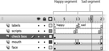
Let’s start by laying out the Timeline. It looks similar to Figure 89b, but the first frame has been deleted. There are now two segments: “happy” from frames 1 to 10 and “sad” from frames 11 to 20 (Figure 100b).
Figure 100b. The Timeline has a happy segment and a sad segment, with a “stop” frame script at the end of each segment.
The instance of the check box component—which we’ll call just “the check box” for short—is placed where the Happy and Sad buttons used to be, and it remains visible throughout the movie. In frame 1 of the scripts layer, we paste the script from Figure 99a. (For simplicity’s sake, we’re omitting the embedded font.)
If we were to test the movie at this point, the check box would function just as it did before. Independently, the face would start out neutral, become happy, and then stop.
Now let’s tie the movement of the face to the events in the check box. When the movie begins, the check box is selected and the face becomes happy: That’s exactly what we want to happen. When the user clicks the check box to deselect it, we want the face to turn sad. To make that happen, we can add the following function to the frame 1 script:
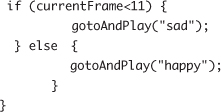
The function here is named mouseResponse, but you can name it anything you like. When the user clicks the mouse, if the playhead is anywhere in the happy segment, it moves to the beginning of the sad segment; if it’s anywhere in the sad segment, it moves to the beginning of the happy segment. (We cheated here and used a frame number instead of a frame label, but doing otherwise would have made the script too complicated.)
We want this function to be triggered in response to a mouse click in the check box. To accomplish this, we use an event listener—the capability of an object to sense when it’s being clicked, rolled over, or otherwise interacted with and then to transmit the event to a defined function.
We add an event listener to the check box with a single line of ActionScript:
checkBox1.addEventListener(MouseEvent.CLICK, mouseResponse);
This code adds an event listener to checkBox1 that waits for a click of the mouse. When it detects one, it activates the mouseResponse function.
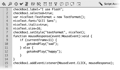
The finished script (Figure 100c) produces the results that were shown in Figure 100a. It doesn’t do so in the most polished or foolproof way—for example, the script doesn’t know whether the check box is selected at any given time—but it should be simple and clear enough to get you started with writing your own scripts.
Figure 100c. The finished script contains an event listener and a function that’s triggered when the event occurs.