Continuous Improvement— Problems Everywhere
Everyday we face problems that need to be solved and situations that need to improve. Nevertheless, there are many occasions when we do not even realize a problem exists, or we misunderstand the nature of the problem altogether.
Congress and NASA, plumbers and cabinetmakers, hospitals and airlines, railroads and cable TV—they all afflict us with poor quality, and we add to it by our own frequent failures to do things right the first time in our personal lives. The burden that poor quality imposes on society is probably incalculable. When corporations are asked what poor quality costs them, they guess around 5% or 7% of sales. But when they actually calculate their costs they find that it is more like 20% to 30%.
—Main (1994, p. 7)
Introduction
The quotations above make it clear that problems are all around us. But when we recognize that there is a problem, we are then also subject to making a choice of whether to solve it or to live with it. As we choose to live with problems, more and more of our life is filled with little work-arounds. These may be simple things such as having a desk that is too high to type comfortably, or working in an office where you do not have enough room to place a piece of paper on a surface. Or the problems we encounter may be large problems within the organization. For example, one department may share a piece of equipment with another department and there are arguments between the departments about this equipment. If the process of sharing the equipment and resolving problems about sharing the equipment are not managed correctly, this can result in a large amount of time of each department being spent in back-and-forth bickering about the equipment’s maintenance, repair, and cleanliness. Another persistent problem in many organizations is a small drip of water from a faucet in a sink. This may seem a trivial problem, but it means that either someone is not fulfilling their responsibility or there is no clear responsibility for maintaining this shared resource. The costs mount up and those affected become frustrated. For example, the maintenance worker may be frustrated because the drip creates chemical deposits on the porcelain, but no one seems to care.
The root causes of problems in the workplace are often hidden. They may be due to the procedures within one job, the division of work between jobs and departments in a company or the company’s system procedures. Even the small, ongoing problems can slowly drain the company’s productivity and its ability to provide services and products that are of a better quality and lower costs.
The Problem Organization
There are several characteristics that troubled organizations have in common …
- The outgoing product or service normally contains deviations from the published, announced, or agreed-upon requirements. …
- The company has an extensive field service or dealer network skilled in rework and resourceful corrective action to keep the customers satisfied. …
- Management does not provide a clear performance standard or definition of quality, so the employees each develop their own. …
- Management does not know the price of nonconformance. … 5. Management denies that it is the cause of the problem … (Crosby 1984)
A basic premise of continuous improvement is that the systems within the company contain the root cause of most problems in the company. The root cause of the problem is seldom the worker in the system. However, when a manager blames the “system” for a problem, this does not mean that the problem is impossible to eliminate. Instead the manager is saying that it is necessary to change the system. However, to change the system we have to be able to see the system and we have to be able to recognize how the system generates the problem.
Continuous Improvement Organization
It is management’s job to ensure that continuous improvement thrives in the company. Continuous improvement consists of two words— continuous and improvement. Improvement occurs when we eliminate errors or defects from the process. This leads to increased productivity, increased resource effectiveness, and improved responsiveness to the customer. Continuous means that the improvement process is an ongoing journey, one that never ends.
To fully implement continuous improvement, companies must evaluate their organizational design to see how the work design encourages or inhibits continuous improvement. To achieve continuous improvement, the work design must have elements in it that:
- focuses both workers and managers on seeing how they do their work; and,
- focuses both workers and managers on how to improve the process of doing their work.
In addition, the work design needs to have elements in it that encourage both workers and managers to make improvements daily.
Considering the TQC [total quality control] movement in Japan as part of the KAIZEN movement gives us a clearer perspective on the Japanese approach. First of all, it should be pointed out that TQC activities in Japan are not concerned solely with quality control. … In the West, the term QC [quality control] is mostly associated with inspection of finished products, and when QC is brought up in discussion, top managers, who generally assume they have very little to do with quality control, lose interest immediately. (Imai 1986, p. 13)
A lean work design does focus employees on implementing continuous improvement. But, again, the work design must itself incorporate the necessary elements to achieve continuous improvement. Top management and all managers must recognize that continuous improvement is an important part of their job and that it cannot be delegated. By viewing quality control and total quality control as part of a continuous improvement effort, it is easier to recognize that the work design must provide a broader path to ensure and foster continuous improvement.
Organizational Design and Problem Solving
Individual efforts are not encouraged for various reasons, but primarily because there is no structure in place to support them and because managers fear a loss of control.
Also, in most organizations problems are not viewed as opportunities for improvement, but as failures, and thus are hidden rather than addressed. (Liker and Meier 2006, p. 309)
The first element of organization design that is needed to solve problems is a means of recognizing problems when they occur. Tucker (2004) in a study of nursing problems in a U.S. hospital found that most problems were not recognized by the management and often not even by the nurses themselves. Consequently, no actions were taken to improve the system and to eliminate these persistent failures. One lesson of this study is that reporting of problems needs to be encouraged and managers must be diligent to ensure that reporting a problem is not punished but encouraged instead.
This mechanism must help all employees recognize that their job is not only to perform a certain element of work such as preparing reports, running a machine, or selling a product to a customer but also to improve their work processes.
The first mechanism used to achieve continuous improvement is to define the manager’s job as managing both the process and the results. The results are the output of the processes and determine how productive the process itself is. The processes are the way we do the work and the steps employees perform in order to obtain the desired results. Assigning responsibility to the manager for both the process and the results is reinforced by using measures that regularly report process performance and results. Both types of performance measures are needed to ensure that managers recognize that they must manage both aspects of the organization.
By insisting that managers report on their efforts to improve their process and their efforts to involve employees in this improvement, the work design ensures that there is a mechanism for reporting problems to the manager. Once the work design encourages problem identification and involving the workers in problem solving, it then needs to provide the means to the workers to solve the problems in their workplace.
Example: One important productivity measure of retail sales store productivity (i.e., results measure) is sales. The manager of an ice cream store could view declining sales in multiple ways. First, the manager could see declining sales as a signal that the manager’s employees are not treating their customers well enough to get repeat sales. Or, the manager could interpret declining sales as a signal that the employees are lazy and don’t respond to the customers quickly enough. However, if the manager has measures of the process in place, the manager can explore whether there is a problem with the process design that dissatisfies the customers. For example, if the manager is measuring the time from the customer’s entrance into the store until they have their order filled and the manager notes that this time has been increasing over the past months as sales have decreased, the manager has a clue about why sales have been decreasing. The manager can then investigate why it is taking longer to serve customers now than it was earlier. There could be multiple reasons for this. It could be that there are new employees and they have not been adequately trained. Or, it is possible that the new ice cream freezers that were recently installed keep the ice cream harder and it takes the employees longer to scoop enough ice cream to fill a cone. The major point is that by regularly using process measures, the problem solving effort is focused on how to improve the process.
Using Visual Measurements to Encourage Problem Solving
Another work design mechanism is needed to ensure that managers effectively use the results and process measurements. This second mechanism is typically a type of a management report that includes not only the results but also the process measures. This is typically organized by subdividing the desired results into smaller activities and then measuring what is actually achieved and comparing this to what was expected. This provides fast feedback on process performance that can be used to identify where a process is not performing as expected. These visual measurement systems help to focus both the managers and the workers on the process and how the process produces results.
Using a table, such as that in Table 9.1, to visualize the actual versus expected performance helps to engage the workers, which is essential to achieving continuous improvement. Table 9.1 gives an example of a cashier in a supermarket and compares the expected versus the actual realized scans at the cashier. The display in Table 9.1 clearly states management expectations in the column labeled “Expected scans.” This provides a clear statement to the workers about expectations of the process. When the process is not performing as expected, it provides a regular structured way to notify management of the problems and it also solicits employee engagement in improving the process.
Table 9.1 Operator checklist
Time period |
Expected scans |
Actual scans |
Deviation (actual minus expected) |
Reason for deviation |
8:00−9:00 |
320 |
100 |
-220 |
Only 10 customers |
9:00−10:00 |
320 |
280 |
−40 |
Had to load paper and clean scale |
10:00−11:00 |
320 |
340 |
20 |
|
11:00−12:00 |
320 |
250 |
−70 |
Scale was slow, multiple deli items required multiple scans |
The supermarket owner might also use results measures to track the productivity of their employees. One results measure could be the number of customers served for each hour or in each cashier labor hour.
A results measure such as customers served per hour does give a clear understanding of labor productivity, but it does not give a clear picture of the process, because the customers served per cashier labor hour are the outcome of multiple processes. By measuring the performance at each process step instead (i.e., through the use of process measures), the manager can identify the small ongoing problems that are consuming the labor hours. If on average there are 20 scans for a customer and the expected number of customers for a cashier per hour during this time period is 16, then the expected number of scans is 320. The cash register records the number of scans, which can be compared to the expected scans and the deviations and reasons for the deviations can be noted. In our example in Table 9.1, the deviation for the period 8:00 to 9:00 was identified by the manager as being due to there being fewer customers than expected. The deviation from 9:00 to 10:00 was identified as being due to problems with the equipment.
The real value of measuring the process with this kind of process measure is that it has highlighted some small problems. Over a period of days the manager can identify those problems that appear the most often and then have the workers solve the simple problems themselves.
Using Employee Teams for Problem Solving
A mechanism to transform the insights about these small repetitious problems in the process into concrete improvements is the use of teams. The use of teams allows employees to improve their processes. By having the process measures visually summarized in table or matrix form such as in Table 9.1, gives employees the ability to recognize and understand the problems. This then allows employees to use their knowledge about the process to change the process and eliminate the problem.
The employee improvement teams need the structure and tools to solve the problems in the workplace. The job of a lean work design is to provide this support.
- First, employees need training about the overall process.
- Second, their performance evaluation should recognize that they are also responsible for process improvement. In many situations, this might include an evaluation of customer satisfaction as part of the evaluation of the performance of their unit. For example, a hospital might measure patient satisfaction scores for each week based on survey results from patients who were hospitalized during a given week. These scores will be provided for each unit in the hospital. So the nurse manager and the nurses will receive the patient satisfaction scores for their department.
- Third, another piece of support the employees must receive is to be trained in the basic problem solving tools so that they can successfully conduct process improvement.
- Finally, the team itself should have an organization.
Now the team is ready to spin the Plan-Do-Check-Act (PDCA) wheel.
Spinning the PDCA Wheel
Improvement, the act of bettering things beyond their current status, can only occur after one has captured and understood the full nature of a current problem. (Shingo 2007, p. 13)
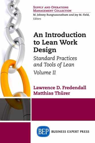
One approach to understanding the continuous improvement process is the PDCA cycle (see Figure 9.1). PDCA reflects the scientific method and was first expressed by Shewhart in the 1920s. Deming used the idea in Japan in the 1950s, where it was sometimes referred to as the Deming Cycle, although Deming referred to it as the Shewhart cycle. It was popularized by Deming in his lectures and is now commonly used for discussing continuous improvement or continuous problem solving.
PDCA is a conceptual explanation of the scientific method. As shown in the figure of the PDCA wheel above, PDCA is a continuous cycle of working through the steps (i.e., Plan, Do, Check, and Act) and then cycling through the process again to make further improvements.
Companies typically operationalize the PDCA wheel by creating standardized problem solving approaches that are used by everyone in their company. For example, General Electric’s Six Sigma uses Define-Measure-Analyze-Improve-Control for its standard problem solving steps. Another set of standard problem solving steps is shown in Table 9.2. These steps provide a guideline for the team to use as it seeks to find a solution to a problem.
For example, the supermarket manager, in the example earlier on the cashier scanning customer items to be purchased, may suggest to a team of cashiers that they investigate how the scale used to weigh produce slows down the scanning process. We will now introduce some of the common tools used by teams in continuous improvement.
Common PDCA Tools
A carpenter with only a hammer, one screwdriver, a pair of pliers, and a straight-blade saw, can build cabinets that are functional, but plain and crude. The carpenter with many different tools at hand will be able to create unique and well-crafted items and solve problem situations. (Tague 1995, p. 1)
Table 9.2 Steps of standard problem solving
Step number |
Step name |
Description |
1 |
Problem statement |
A clear statement of the problem is written. It must focus on the weakness and not the strengths. |
2 |
Collect data |
This requires gathering data to confirm that the problem defined above exists. |
3 |
Analyze causes to identify root cause |
Given an identified and measured problem from the first two steps, the team seeks to identify the root cause of the problem. |
4 |
Identify alternative solutions |
Once the root cause of the problem has been identified, the team proposes multiple possible solutions to the problem. |
5 |
Select and implement solution |
The team evaluates the solution potential of each alternative identified in step 4. And selects the alternative to implement. |
6 |
Evaluate the effects |
Given the alternative solution that was selected is implemented, the team measures whether its implementation actually solved the problem. |
7 |
Create standardized solutions |
When the alternative solution that was selected is actually implemented, the team establishes a plan to ensure that this alternative is now the new standard to perform the process. |
8 |
Reflect on the process |
Here the team reflects on its process of performing this PDCA cycle. The team develops internal suggestions for how it can improve its PDCA performance and possibly suggests the next improvement project. |
The first set of tools needed is tools to help define the problem. There are many ways to define the problem, but the simplest tool is often the most effective. Have standards about how the problem is to be written and expressed.
- Standard 1—state the problem as a weakness. The problem cannot be disguised as a strength. For example, don’t say: “We want shorter lead times” because that hides the issue that your company has a weakness when measured by lead times. Instead say something such as: “Our company’s lead times are too long.” That focuses the team on solving a problem, which is essentially a weakness.
- Standard 2—describe symptoms, not the diagnosis of symptoms. For example, when you go to the doctor you do not want to give a diagnosis such as: “Doctor, I am allergic to reading books about lean work design.” Instead, you want to describe your symptoms. For example, you could say: “Doctor, I have a high temperature and I become very tired whenever I read a book about lean operations.” That is not a diagnosis, but rather a description of facts. Remember your mantra at this stage has to be: “Symptoms, not diagnosis.” Once the data is gathered, the diagnosis is conducted at the next stage.
Once the problem is defined and the team has written the problem statement, data must be collected. Some common tools to gather data are a process flow chart showing the stage in the process with a problem and the problem described below.
The Kepner-Tregoe Institute suggests using a “Is–Is Not” matrix for suggestions about what data to gather and how to organize the data. The “Is–Is Not” matrix can be an effective tool. It organizes data into two categories “Is” and “Is Not.” The “Is” category describes what is occurring. This may start with the symptoms, but it quickly goes into more detail by answering four questions in terms of where, when, to what objects, or to whom does it occur? For example, in the ice cream scooping problem, the team member has to answer questions such as “Where does it occur?” and “What objects are affected” (see Table 9.3).
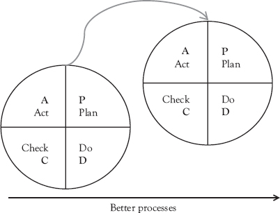
Problems never come alone. Normally a series of problems can be identified. Therefore, once problems have been identified, the most important problem has to be selected to be solved. An important tool to guide problem selection is the Pareto diagram. A Pareto diagram is a type of chart that contains both bars and a line graph. Individual values are represented in descending order by bars and the cumulative total is represented by the line. This chart allows for the identification of the problem which contributes most to the overall failure rate.
Table 9.3 Is–Is Not matrix for the problem: A full scoop of ice cream cannot be obtained in one step
|
Is (where, when, to what objects, or to whom does it occur?) |
Is not (where, when, to what objects, or to whom does it not occur?) |
Therefore? (underlying rational—what might explain the pattern) |
Where? |
At the counter |
|
|
When? |
In the morning |
In the afternoon |
The ice cream is more frozen in the morning than in the afternoon. |
What objects are affected? |
All types of ice creams. |
|
|
Who? |
All clerks except Larry |
Larry |
Larry is the only male clerk. Maybe he is stronger. |
Example: Ms. Shirt Co is a contract job shop that sews shirts. It has little profit margin and often sees its profit eaten up in defective shirts. The manager found that 10 percent of the shirts had a defect that was found at inspection. These defects are represented in the Pareto chart in Figure 9.2. From the Pareto diagram it becomes evident that crooked seam, missing button, and missed stitches are responsible for 75 percent of the defects. These are the functions that should be improved first.
Next, the causes of a problem have to be identified. An important tool to identify causes qualitatively is the cause and effect diagram or Ishikawa diagram. This diagram categorizes possible causes into seven classes (see Figure 9.3):
- People—this is anyone involved with the process
- Methods—this is how the process is performed
- Machines—this is any equipment involved in the process
- Materials—this is any material involved in the process
- Measurements—this is how measurement data was obtained
- Environment—this is any environmental factor such as location, time, and temperature.
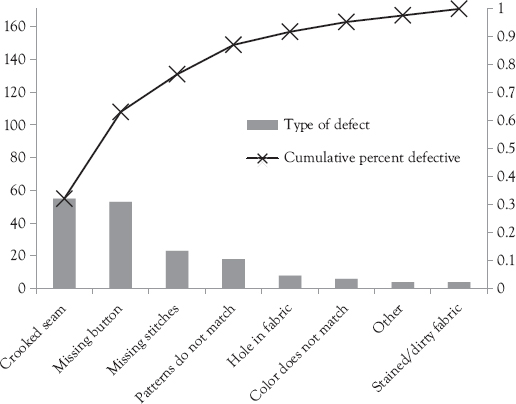
Figure 9.2 Pareto diagram: Ms Shirt Co
Figure 9.3 Cause and effect diagram
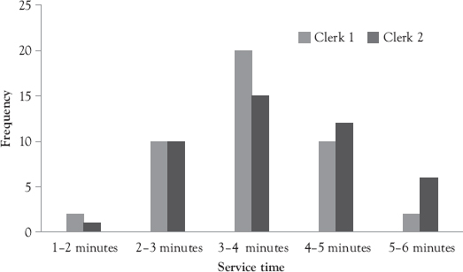
An important tool to gain a first impression of the data is a histogram. A histogram is a bar graph of raw data that summarizes the number of occurrences of a certain event. For example, Figure 9.4 summarizes the distribution of the time it takes clerks 1 and 2 to prepare an ice cream cone. The histogram is an important tool as it shows the central location, shape, and spread of data which contains important information about the system.
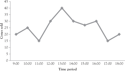
But a histogram only gives an impression of the aggregated data. It does not tell anything about what happened over time. The simplest way to visualize what happens in a process over time is a run chart (see Figure 9.5).
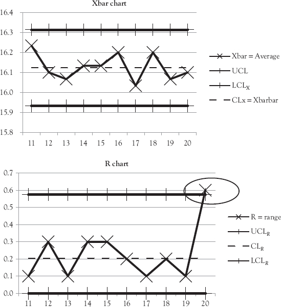
Control charts are a more sophisticated form of run charts. Control charts are time-series charts of the system performance (using some measure such as the average or the range, or the standard deviation) with a measure of the upper and lower control limit (UCL and LCL) also charted on the same graph. The control limits indicate the amount of deviation in the process that is natural (i.e., between the UCL and LCL).
There are many different types of control charts. A common example is the Xbar and R charts. The key element in every control chart is that it provides a picture of the process performance over time (e.g., the sample mean or Xbar and the sample range or R). This picture allows the process operator to determine if their process is or is not in control each time the operator takes a sample and plots it. A capability is under control when one can predict, at least within limits, how its target condition may be expected to vary in the future. Prediction within limits means that the probability that the observed measure will be within the given limits can be stated at least approximately. It follows that a process is under control when only chance causes or common variability exist within it. Violating the limit (i.e., performance outside of a control limit) indicates that there is a specific assignable cause for the variance within the process. So, control charts indicate if there is assignable variability—which should be found and eliminated.
There are two major steps to using any control chart. First, the control limits have to be established and then the samples have to be taken and plotted into the chart over time.
Step 1, in creating a set of Xbar and R charts, is to gather data when the process is in control. If the measurement is number of ounces, then weights are taken and recorded. The samples are taken when the process is working (i.e., in control) and each sample is the size that will be taken by the worker to determine if it is in control. For example, 10 samples were taken in Table 9.4, where the number in each sample (n) is 3 and 10 samples were taken over time.
Once the sample is taken, the next step is to calculate the mean and the range and use these to calculate the control limits. This sample mean calculation and range calculation are shown in Table 9.5. The data for each sample is arranged vertically and the average is calculated just for that column. For example, for sample 1, the average is 16.2 for the three items weighed in sample (16.3, 16.1, and 16.2). The range of these three data points is 0.2 = 16.3 − 16.1. This is calculated for all 10 samples.
Then the average of all averages and the ranges is calculated. In the example for Table 9.5, the average of the averages is 16.12 and the average range is 0.18. The UCL and LCL of the average is calculated either by estimating the standard deviation using the range or by measuring the standard deviation. In the example in Table 9.5, the standard deviation of the average is 0.11 and the standard deviation of the range is 0.079. The ![]() and the
and the ![]() , so UCLX = 16.12 +
, so UCLX = 16.12 + ![]() and the LCLX = 15.93. The control limits for the R chart are
and the LCLX = 15.93. The control limits for the R chart are ![]() . The LCLR = −0.057, which is set at 0.0 since a range cannot be smaller than 0.
. The LCLR = −0.057, which is set at 0.0 since a range cannot be smaller than 0.
Table 9.4 Ten Samples of 3 with weight in ounces
Data point (n) |
1 |
2 |
3 |
4 |
5 |
6 |
7 |
8 |
9 |
10 |
1 |
16.3 |
16.0 |
16.1 |
16.1 |
16.0 |
16.0 |
16.0 |
16.3 |
16.3 |
16.0 |
2 |
16.1 |
16.2 |
16.3 |
16.2 |
16.1 |
16.1 |
16.1 |
16.0 |
16.0 |
16.1 |
3 |
16.2 |
16.1 |
16.2 |
16.3 |
16.0 |
16.0 |
16.0 |
16.2 |
16.2 |
16.1 |
Table 9.5 Sample averages and ranges for 10 samples
Data point (n) |
1 |
2 |
3 |
4 |
5 |
6 |
7 |
8 |
9 |
10 |
1 |
16.3 |
16.0 |
16.1 |
16.1 |
16.0 |
16.0 |
16.0 |
16.3 |
16.3 |
16.0 |
2 |
16.1 |
16.2 |
16.3 |
16.2 |
16.1 |
16.1 |
16.1 |
16.0 |
16.0 |
16.1 |
3 |
16.2 |
16.1 |
16.2 |
16.3 |
16.0 |
16.0 |
16.0 |
16.2 |
16.2 |
16.1 |
Xbar = average |
16.2 |
16.1 |
16.2 |
16.2 |
16.0 |
16.0 |
16.0 |
16.2 |
16.2 |
16.1 |
R = range |
0.2 |
0.2 |
0.2 |
0.2 |
0.1 |
0.1 |
0.1 |
0.3 |
0.3 |
0.1 |
Once the control limits are calculated, the operator takes a sample of the same size n every time, at the times established by the manager. As each sample is taken, the operator is testing whether the process is or is not in control. The Xbar chart in Figure 9.6 shows that for samples 11 to 20 the sample was always in the control limit. There are also no clear trends (four or more points in the same direction) and runs (four or more points in a row either above or below the center line).
Below the Xbar Chart is the R chart. This graphs the range of each sample over time. Examining the R chart shows that all of the ranges are within the UCL and LCL except for sample 20. The range of sample 20 is above the upper control limit. The conclusion is that sample 20 is not in control. Often this point is circled as shown in Figure 9.6 and the operator makes a note about what actions they took to return the process to control.
A3 Thinking
A3 thinking means that the entire problem solving or improvement effort should be recorded in such a way that it can be placed onto a piece of “A3” sized paper. In the United States, this size of paper is 11 in. × 17 in. The paper is in landscape orientation and divided into two columns, with a standard layout. There are two advantages for problem solving in the form of A3 thinking:
- It restricts the problem to a solvable size.
- It summarizes the required information in a standard form, which everybody can easily access; that is, everybody knows where to find the problem statement and so on.
An example outline of an A3 problem solving format is shown in Figure 9.7. The A3 format guides the team through the problem solving process. It directs them to first identify the problem. This is an important step in problem solving. Then it has them clearly identify the objectives of their team. Will they solve the entire problem? Or will they instead address only a small part of the problem? The next step is to identify the baseline or current state of the process they are examining. This is an important step because it achieves agreement about how to measure the current performance and it allows the team to know if they have actually made improvements. In addition it allows them to communicate to management the importance of the problem. Once the current state is known, the team is asked to imagine what the future state of the new improved process looks like. The process map or the value stream is redrawn to show how the process will operate without a problem. The difference between the proposed future state and the current state provide a set of problems or projects that have to be solved for the team to achieve its objectives. The steps to solve these problems become the implementation plan. The implementation plan gives dates for the accomplishment of each milestone.
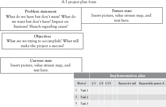
Figure 9.7 A3 thinking
References
Crosby, P.B. 1984. Quality Without Tears: The Art of Hassle-Free Management. New York: McGraw-Hill, Inc.
Imai, M. 1986. KAIZEN (Ky’zen): The Key to Japan’s Competitive Success. New York: McGraw-Hill Publishing Company.
Liker, J.K., and D. Meier. 2006. The Toyota Way Fieldbook: A Practical Guide for Implementing Toyota’s 4 Ps. New York: McGraw-Hill.
Main, J. 1994. Quality Wars: The Triumphs and Defeats of American Business. New York: The Free Press, A Division of Macmillan, Inc.
Shingo, S. 2007. Kaizen and the Art of Creative Thinking: The Scientific Thinking Mechanisms. English Translation 2007 by Enna Products Corporation of Idea woNigasuna, 1959 Tokyo, Japan: Hakuto-shobo Publishing. Vancouver, WA: PCS Inc.
Tague, N.R. 1995. The Quality Toolbox. Milwaukee, WI: ASQ Quality Press.
Tucker, A.L. 2004. “The Impact of Operational Failures on Hospital Nurses and Their Patients.” Journal of Operations Management 22, no. 2, pp. 151–69.