Let’s consider the problem we analyzed in Chapter 3 for which we performed classification on the Zalando dataset. While doing all our work, we made a strong assumption without explicitly saying it: we assumed that all the observations were correctly labeled. We cannot say that with certainty. To perform the labelling, some manual intervention was needed, and, therefore, a certain number of images were surely wrongly classified, as humans are not perfect. This is an important revelation. Consider the following scenario: in Chapter 3, we achieved roughly 90% accuracy with our model. One could try to get better and better accuracy, but when is it sensible to stop trying? If your labels are wrong in 10% of cases, your model, as sophisticated as it may be, will never be able to generalize to new data with very high accuracy, because it will have learned wrong classes for many images. We spent quite some time checking and preparing the training data, normalizing it, for example, but we never spent any time checking the labels themselves. We also assumed that all classes have similar characteristics. (I will discuss later in this chapter what this exactly means, for the moment, an intuitive understanding of the concept will suffice.) What if the quality of the images for specific classes is worse than for others? What if the number of pixels whose gray value differs from zero is dramatically different for different classes? We also did not check if some images are completely blank. What happens in that case? As you can imagine, we cannot check all images manually, attempting to detect such issues. Suppose we have millions of images, a manual analysis is surely not possible.
We need a new weapon in our arsenal to be able to spot such cases and to be able to tell how a model is doing. This new weapon is the focus of this chapter, and it is what I call “metric analysis.” Very often, people in the field refer to this array of methods as “error analysis.” I find that this name is very confusing, especially for beginners. Error may refer to too many things: Python code bugs, errors in the methods, in algorithms, errors in the choice of optimizers, and so on. You will see in this chapter how to obtain fundamental information on how your model is doing and how good your data is. We will do this by evaluating your optimizing metric on a set of different datasets that you can derive from your data.
You have already seen a basic example previously. You will remember that we discussed, with regard to regression, how in the case of MSEtrain ≪ MSEdev, we are in a regime of overfitting. Our metric is the MSE (mean squared error), and evaluating it on two datasets, training and dev, and comparing the two values, can inform you whether the model is overfitting. I will expand on this methodology in this chapter, to allow you to extract much more information from your data and model.
Human-Level Performance and Bayes Error
In most of the datasets that we use for supervised learning, someone must have labeled the observations. Take, for example, a dataset in which we have images that are classified. If we ask people to classify all images (imagine this being possible, regardless of the number of images), the accuracy obtained will never be 100%. Some images may be too blurry to be classified correctly, and people make mistakes. If, for example, 5% of the images are not classifiable correctly, owing, for example, to how blurry they are, we must expect that the maximum accuracy people can reach will always be less than 95%.

For example, if, with a model, we achieve an accuracy of 95%, we will have ϵ = 1 − 0.95 = 0.05 or, expressed as a percent, ϵ = 5%.
A useful concept to understand is human-level performance, which can be defined as follows:
Human-level performance ( definition 1) : The lowest value for the error ϵ that can be achieved by a person performing the classification task. We will indicate it with ϵhlp.
Let’s devise a concrete example. Suppose we have a set of 100 images. Now let’s suppose we ask three people to classify the 100 images. Imagine that they obtain 95%, 93%, and 94% accuracy. In this case, human-level performance accuracy will be ϵhlp = 5%. Note that someone else may be much better at this task, and, therefore, it is always important to consider that the value of ϵhlp we get is always an estimate and should only serve as a guideline.
Now let’s complicate things a bit. Suppose we are working on a problem in which doctors classify MRI scans in two classes: with signs of cancer and without. Now let’s suppose we calculate ϵhlp from the results of untrained students obtaining 15%, from doctors with a few years of experience obtaining 8%, from experienced doctors obtaining 2%, and from experienced groups of doctors obtaining 0.5%. What then is ϵhlp? You should always choose the lowest value you can get, for reasons I will discuss later.
We can now expand the definition of ϵhlp with a second definition.
Human level performance ( definition 2) : The lowest value for the error ϵ that can be achieved by people or groups of people performing the classification task
Note
You don’t have to decide which definition is right. Just use the one that gives you the lowest value of ϵhlp.
Now I’ll talk a bit about why we must choose the lowest value we can get for ϵhlp. Suppose that of the 100 images, 9 are too blurry to be correctly classified. This means that the lowest error any classifier will be able to reach is 9%. The lowest error that can be reached by any classifier is called the Bayes error . We will indicate this with ϵBayes. In this example, ϵBayes = 9%. Usually, ϵhlp is very close to ϵBayes, at least in tasks at which humans excel, such as image recognition. It is commonly said that human-level performance error is a proxy for the Bayes error. Normally it is impossible or very hard to know ϵBayes, and, therefore, practitioners use ϵhlp assuming the two are close, because the latter is easier (relatively) to estimate.
Keep in mind that it makes sense to compare the two values and assume that ϵhlp is a proxy for ϵBayes only if persons (or groups of persons) perform classification in the same way as the classifier. For example, it is OK if both use the same images to do classification. But, in our cancer example, if the doctors use additional scans and analysis to diagnose cancer, the comparison is no longer fair, because human-level performance will not be a proxy for a Bayes error anymore. Doctors, having more data at their disposal, clearly will be more accurate than the model that has as input only the images at its disposal.
Note
ϵhlp and ϵBayes are close to each other only in cases in which the classification is done in the same way by humans and from the model. So, always check if that is the case, before assuming that human-level performance is a proxy for the Bayes error.

Typical values of accuracy that can be achieved vs. amount of time invested . At the beginning, it is very easy to achieve quite a good accuracy with machine learning often reaching ϵhlp. This is intuitively indicated by the line in the plot. After that point, the progress tends to be very slow.
Get better labels from humans or groups, for example, from groups of doctors, as in the case of medical data in our example.
Get more labeled data from humans or groups.
Do a good metric analysis to determine the best strategy for getting better results. You will learn how to do this in this chapter.
As soon as your algorithm exceeds human-level performance, you cannot rely on those techniques anymore. So, it is important to get an idea of those numbers, to decide what to do to obtain better results. Taking our example of MRI scans, we could get better labels by relying on sources that are not related to humans, for example, checking diagnoses a few years after the date of the MRI, when it is usually clear whether a patient has developed cancer. Or, for example, in the case of image classification, you may decide yourself to take a few thousands of images of specific classes. This is not usually possible, but I wanted to make the concept clear: you can get labels by means other than by asking humans to perform the same kind of task that your algorithm is performing.
Note
Human-level performance is a good proxy for Bayes error for tasks at which humans excel, such as image recognition. For tasks that humans are very bad at, performance can be very far from the Bayes error.
A Short Story About Human-Level Performance
I want to tell you a story about the work that Andrej Karpathy has done while trying to estimate human-level performance in a specific case. You can read the entire story on his blog post (a long post, but one that I suggest you read) at https://goo.gl/iqCbC0 . Let me summarize what he did, since it is extremely instructive concerning what human-level performance really is. Karpathy was involved in the ILSVRC (ImageNet Large Scale Visual Recognition Challenge) in 2014 ( https://goo.gl/PCHWMJ ). The task was made up of 1.2 million images (training set) classified in 1000 categories, including such objects as animals, abstract objects such as a spiral, scenes, and many more. Results were evaluated on a dev dataset. GoogleLeNet (a model developed by Google) reached an astounding 6.7% error. Karpathy wondered how humans would compare.

Web interface developed by Karpathy. Not everyone would find it amusing to look at 120 breeds of dogs, to try to classify the dog on the left (which, by the way, is a Tibetan mastiff).
If you have a few hours to spare, I suggest you try. You will gain a whole new appreciation of the difficulties of evaluating human-level performance. Defining and evaluating human-level performance is a very tricky task. It is important to understand that ϵhlp is dependent on how humans approach the classification task, which is dependent on the time invested, the patience of the persons performing the task, and on many factors that are difficult to quantify. The main reason for it being so important, apart from the philosophical aspect of knowing when a machine becomes better than humans, is that it is often taken as a proxy for the Bayes error, which gives a lower limit of our possibilities.
Human-Level Performance on MNIST

A set of digits from the MNIST dataset that are almost impossible to recognize. Such examples are one of the reasons why ϵhlp cannot be zero.
Bias
Now let’s start with a metric analysis: a set of procedures that will give you information on how your model is doing and how good or bad your data is, by evaluating your optimizing metric on different datasets.
Note
Metric analysis consists of a set of procedures that will give you information on how your model is doing and how good or bad your data is, by looking at your evaluating your optimizing metric on different datasets.
To start, we must first define a third error: the one evaluated on the training dataset, indicated with ϵtrain.
The first question we want to answer is if our model is not as flexible or complex as needed to reach human-level performance. Or, in other words, we want to know if our model has a high bias, with respect to human-level performance.
To answer the previous question, we can do the following: calculate the error from our model from our training dataset ϵtrain and then calculate |ϵtrain − ϵhlp|. If the number is not small (bigger than a few percent), we are in the presence of bias (sometimes called avoidable bias), that is, our model is too simple to capture the real subtleties of our data.

Bigger networks (more layers or neurons)
More complex architectures (convolutional neural networks, for example)
Training your model longer (for more epochs)
Using better optimizers (such as Adam)
Doing a better hyperparameter search (covered in Chapter 7)
There is something else you need to understand. Knowing ϵhlp and reducing the bias to reach it are two very different things. Suppose you know the ϵhlp for your problem. This does not mean that you have to reach it. It may well be that you are using the wrong architecture, but you may not have the skills required to develop a more sophisticated network. It may even be that the effort required to achieve the desired error level would be prohibitive (in terms of hardware or infrastructure). Always keep in mind what your problem requirements are. Always try to understand what is good enough. For an application that recognizes cancer, you may want to invest as much as possible to achieve the highest accuracy possible: you don’t want to send someone home only to discover the presence of cancer months later. On the other hand, if you build a system to recognize cats from web images, you may find a higher error than ϵhlp completely acceptable.
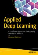
Metric Analysis Diagram
Metric analysis diagram (MAD) with only one of the quantities we will encounter in this chapter: ΔϵBias
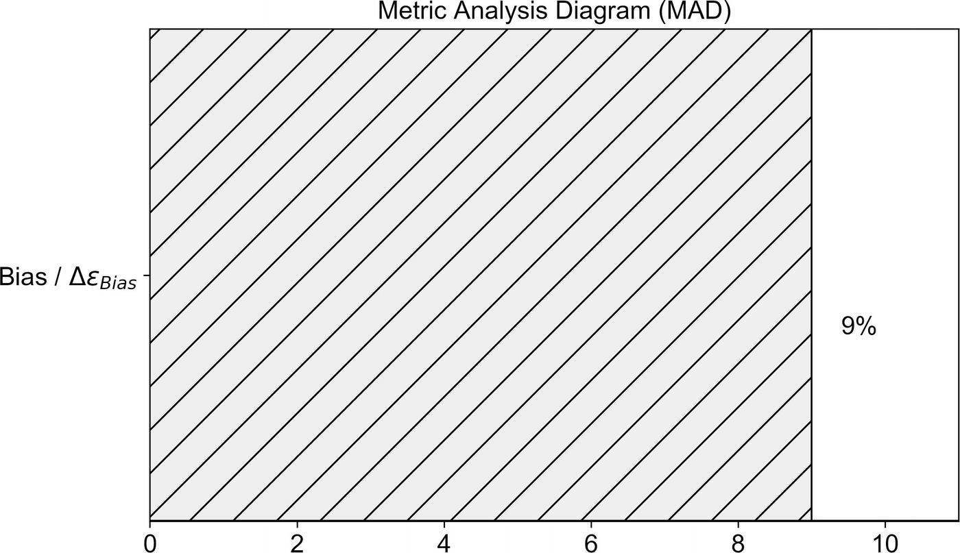
Training Set Overfitting

With this quantity, we can say that we are overfitting the training dataset if Δϵoverfitting train is bigger than a few percent.
ϵtrain: The error of our classifier on the training dataset
ϵhlp: Human-level performance (as discussed in the previous sections)
ϵdev: The error of our classifier on the dev dataset
ΔϵBias = |ϵtrain − ϵhlp|: Measuring how much “bias” we have between the training dataset and human-level performance
Δϵoverfitting train = |ϵtrain − ϵdev|: Measuring the amount of overfitting of the training dataset
Training dataset: The dataset that we use to train our model (you should know it by now)
Dev dataset: A second dataset that we use to check the overfitting on the training dataset
MAD diagram for our two problems: bias and overfitting of training dataset
As you can see in Figure 6-5, you can have a quick overview of the relative gravity of the problems we have, and you may decide which one you want to address first.
Get more data for your training set
Use regularization (review Chapter 5 for a complete discussion of the subject)
Try data augmentation (for example, if you are working with images, you can try rotating them, shifting them, etc.)
Try “simpler” network architectures
As usual, there are no fixed rules, and you must test which techniques work best on your problem.
Test Set
I would like to quickly mention another problem you may encounter. We will look at it in detail in Chapter 7, because it is related to hyperparameter search. Recall how you choose the best model in a machine-learning project (this is not specific to deep learning, by the way)? Let’s suppose we are working on a classification problem. First, we decide which optimizing metric we want, let’s suppose we decide to use accuracy. Then we build an initial system, feed it with training data, and see how it is doing on the dev dataset, to check if we are overfitting our training data. You will remember that in previous chapters, we have talked often about hyperparameters—parameters that are not influenced by the learning process. Examples of hyperparameters are the learning rate, regularization parameter, etc. We have seen many of them in the previous chapters. Let’s say you are working with a specific neural network architecture. You need to search the best values for the hyperparameters, to see how good your model can get. To do this, you train several models with different values of the hyperparameters and check their performance on the dev dataset. What can happen is that your models work well on the dev dataset but don’t generalize at all, because you select the best values using only the dev dataset. You incur the risk of overfitting the dev dataset by choosing specific values for your hyperparameters. To check if this is the case, you create a third dataset, called the test dataset, cutting a portion of the observations from your starting dataset, which you use to check the performance of your models.


The MAD diagram for the three problems we may encounter: bias, overfitting of training data, overfitting of dev data
Note that if you are not doing any hyperparameter search, you will not need a test dataset. It is only useful when you are doing extensive searches; otherwise, in most cases, it is useless and takes away observations that you may use for training. What we discussed so far assumes that your dev and test set observations have the same characteristics. For example, if you are working on an image recognition problem and you decide to use images from a smartphone with high resolution for training and the dev dataset, and images from the Web in low resolution for your test dataset, you may see a big |ϵdev − ϵtest|, but that will probably be owing to the differences in the images and not to an overfitting problem. I will discuss later in the chapter what can happen when different sets come from different distributions (another way of saying that the observations have different characteristics), what exactly this means, and what you can do about it.
How to Split Your Dataset
Now I would like to discuss briefly how to split your data in both a general and deep-learning context.
But what exactly does “split” mean? Well, as discussed in the previous section, you will require a set of observations to make the model learn, which you call your training set. You also will need a set of observations that will constitute your dev set, and a final set called the test set. Typically, you would see splits such as 60% of observations for the training set, 20% of observations for the dev set, and 20% of observations for the test set. Usually, these kinds of splits are indicated in the following form: 60/20/20, where the first number (60) refers to the percentage of the entire dataset that makes up the training set, the second (20) to the percentage of the entire dataset that makes up the dev set, and the last (20) to the percentage that makes up the test set. In books, blogs, or articles, you may encounter sentences such as “We will split our dataset 80/10/10.” You now have an explanation of what this means.
Usually, in the deep-learning field, you will deal with big datasets. For example, if we have m = 106, we could use a split such as 98/1/1. Keep in mind that 1% of 106 is 104—a big number! Remember that the dev/test set must be big enough to give high confidence to the performance of the model, but not unnecessarily big. Additionally, you will want to save as many observations as possible for your training set.
Note
When deciding on how to split your dataset, if you have a big number of observations (for example, 106 or even more), you can split your dataset 98/1/1 or 90/5/5. So, as soon as your dev and test dataset reach a reasonable size (depending on your problem), you can stop. When deciding how to split your dataset, keep in mind how big your dev/test sets must be.
Do you notice anything different? The biggest difference is that now, class 9 is only appearing in 2.8% of the cases. Before, it was appearing in 9.9% of the cases. Apparently, our hypothesis that the classes are distributed according to a random uniform distribution was not right. This can be quite dangerous when checking how the model is doing or because your model may end up learning from a so-called unbalanced class distribution .
Note
Usually, an unbalanced class distribution in a dataset refers to a classification problem in which one or more classes appear a different number of times than others. Generally, this becomes a problem in the learning process when the difference is significant. A few percent difference is often not an issue.
If you have a dataset with three classes, for example, where you have 1000 observations in each class, then the dataset has a perfectly balanced class distribution, but if you have in class 1 only 100 observations, in class 2 10,000 observations, and in class 3 5000, then we talk about an unbalanced class distribution. You should not think that this is a rare occurrence. Suppose you have to build a model that recognizes fraudulent credit card transactions. It is safe to assume that those transactions are a very small percent of the entire amount of transactions that you will have at your disposal.
Note
When splitting your dataset, you must pay great attention not only to the number of observations you have in each dataset but also to which observations go in each dataset. Note that this problem is not specific to deep learning but is important generally in machine learning.
To go into details on how to deal with unbalanced datasets would be beyond the scope of this book, but it is important to understand what kind of consequences they may have. In the next section, I will show you what can happen if you feed an unbalanced dataset to a neural network, so that you gain a concrete understanding of the possibility. At the end of the section, I will offer a few hints on what to do in such a case.
Unbalanced Class Distribution: What Can Happen
Because we are talking about how to split our dataset to perform metric analysis, it is important to grasp the concept of unbalanced class distribution and how to deal with it. In deep learning, you will find yourself very often splitting datasets, and you should be aware of the problems you may encounter if you do this in the wrong way. Let me give you a concrete example of how bad things can go if you do it wrongly.
Confusion Matrix for the model described in the text
Predicted Class 0 | Predicated Class 1 | |
|---|---|---|
Real class 0 | 659 | 4888 |
Real class 1 | 6 | 50503 |
How should we read the table? In the column “Predicted Class 0,” you will see the number of observations that our model predicts as being of class 0 for each real class. 659 is the number of observations our model predicts as being of class 0 that are really in class 0. 6 is the number of observations that our model predicts in class 0 that are really in class 1.
It should be easy to see now that our model predicts effectively almost all observations to be in class 1 (a total of 4888 + 50,503 = 55,391). The number of correct classified observations is 659 (for class 0) and 50,503 (for class 1), for a total of 51,162 observations. Because we have a total of 56,056 observations in our training set, we get an accuracy of 51162/56056 = 0.912, as our TensorFlow code above told us. This is not because our model is good; it is simply because it has classified effectively all observations in class 1. In this case, we don’t need a neural network to achieve this accuracy. What happens is that our model sees observations belonging to class 0 so rarely that it almost doesn’t influence the learning, which is dominated by the observations in class 1.
What at the beginning seemed a nice result turns out to be a really bad one. This is an example of how bad things can go, if you don’t pay attention to the distributions of your classes. This, of course, applies not only when splitting your dataset, but in general, when you approach a classification problem, regardless of the classifier you want to train (it does not apply only to neural networks).
Note
When splitting your dataset in complex problems, you must pay special attention not only to the number of observations you have in your datasets but also to what observations you choose and to the distribution of the classes.
Change your metric : In the preceding example, you may want to use something else instead of accuracy, because it can be misleading. You could try using the confusion matrix, for example, or other metrics, such as precision, recall, or F1. Another important way of checking how your model is doing, and one that I strongly suggest you learn, is the ROC curve, which will help you tremendously.
Work with an undersampled dataset . If, for example, you have 1000 observations in class 1 and 100 in class 2, you may create a new dataset with 100 random observations in class 1 and the 100 you have in class 2. The problem with this method, however, is that you usually will have a lot less data to feed to your model to train it.
Work with an oversampled dataset . You may try to do the opposite. You may take the 100 observations in class 2 mentioned above and simply replicate them 10 times, to end up with 1000 observations in class 2 (sometimes called sampling with replacement).
Try to get more data in the class with less observations : This is not always possible. In the case of fraudulent credit card transactions, you cannot go around and generate new data, unless you want to go to jail…
Precision, Recall, and F1 Metrics

True positives (tp): Tests that predicted yes, and the subjects really have the disease
True negatives (tn): Tests that predicted no, and the subjects do not have the disease
False positives (fp): Tests that predicted yes, and the subjects do not have the disease
False negatives (fn): Tests that predicted no, but the subjects do have the disease


Accuracy: (tp + tn)/N, how often our test is right
Misclassification rate: (fp + fn)/N, how often our test is wrong. Note that this is equal to 1 − accuracy.
Sensitivity/Recall: tp/ty, how often the test really predicts yes when the subjects have the disease
Specificity: tn/tno, when the subjects have no disease, how often our test predicts no
Precision: tp/(tp + fp), the portion of tests predicting correctly the subject having the disease with respect to all positive results obtained
All those quantities can be used as metrics, depending on your problem. Let’s create an example. Suppose your test should predict if a person has cancer or not. In this case, what you want is the highest sensitivity possible, because it is important to detect the disease. But at the same time, you also want the specificity to be high, because there is nothing worse than sending someone home without treatment when it is needed.


Accuracy would be 99%.
The misclassification rate would be 10/1000 or, in other words, 1%.
Recall would be 990/990 or 100%.
Specificity would be 0%.
Precision would be 99%.


Accuracy would still be 99%.
The misclassification rate would still be 10/1000 or, in other words, 1%.
Recall would now be 0/10 or 0%.
Specificity would be 990/990 or 100%.
Precision would be (0 + 0)/1000 or 0%.

Now we have something that changes that can give us enough information, depending on the question we pose. Note that changing what we want to predict will change how the confusion matrix will look. We can immediately say, looking at the preceding matrix, that our model that predicts that everyone is healthy works very well when predicting healthy people (not very useful) but fails miserably when trying to predict sick people.


This quantity will give you information keeping precision (the portion of tests predicting correctly the subject having the disease with respect to all positive results obtained) and recall (how often the test really predicts yes when the subjects have the disease) in consideration. For some problems, you want to maximize precision, and for others, you want to maximize recall. If that is the case, simply choose the right metric. The F1 score will be the same for two cases in which you have Precision = 32% and Recall = 45% and one with Precision = 45% and Recall = 32%. Be aware of this fact. Use F1 score, if you want to find a balance between Precision and Recall.
Note
The F1 score is used when you want to maximize the harmonic average of Precision and Recall, or, in other words, when you don’t want to maximize either Precision or Recall alone, but you want to find the best balance between the two.

This tells us that the model is quite good at predicting healthy people.
The F1 score is usually useful, because, normally, as a metric, you want one single number, and in this way, you don’t have to decide between precision or recall, as both are useful. Remember that the values of the metrics discussed will always be dependent on the question you are asking (what is yes and no for you). Be aware that an interpretation is always dependent on the question you want to answer.
Note
Remember that when calculating your metric, whatever it may be, changing your question will change the results. You must be very clear at the beginning of what you want to predict and then choose the right metric. In the case of highly unbalanced datasets, it is always a good idea to use not accuracy but other metrics as recall, precision, or, even better, F1, it being an average of precision and recall.
Datasets with Different Distributions
Now I would like to discuss another terminology issue, which will lead you to understand a common problem in the deep-learning world. Very often, you will hear sentences such as “The sets come from different distributions.” This sentence is not always easy to understand. Take, for example, two datasets formed by images taken with a professional DSLR, and a second one made up of images taken with a dodgy smartphone. In the deep-learning world, we would characterize those two sets as coming from different distributions. But what is the real meaning of the sentence? The two datasets differ for various reasons: resolution of images, blurriness resulting from different quality lenses, amount of colors, quality of the focus, and possibly more. All these differences are what is usually meant by distributions. Let’s look at another example. We could consider two datasets: one made of images of white cats and one made of images of black cats. Also, in this case, we are talking about different distributions. This becomes a problem when you train a model on one set and want to apply it to the other. For example, if you train a model on a set of images of white cats, you probably are not going to do very well on the dataset of black cats, because your model has never seen black cats during training.
Note
When talking about datasets coming from different distributions, it is usually meant that the observations have different characteristics in the two datasets: black and white cats, high and low-resolution images, speech recorded in Italian and German, and so on.
Because data is so precious, people often try to create different datasets (train, dev, etc.) from different sources. For example, you may decide to train your model on a set made of images taken from the Web and check how good it is with a set made of images you’ve taken with your smartphone. It may seem like a good idea to be able to use as much data as possible, but this may give you many headaches. Let’s see what happens in a real case, so that you may get a feeling of the consequences of doing something similar.
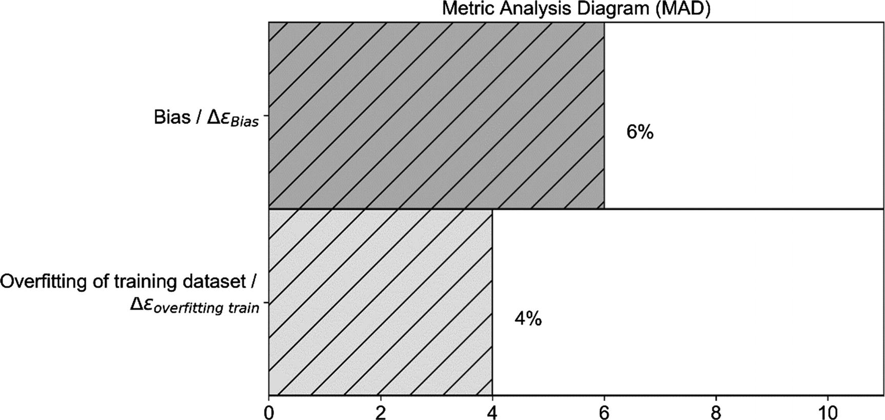
One random image from the dataset (left) and its shifted version (right)
For the training dataset, we get 96.8%.
For the dev dataset, we get 96.7%.
For the train-dev (you will see later why it is called like this), the one with the shifted images, we get 46.7%. A very bad result.
What has happened is that the model has learned from a dataset where all images are centered in the box and, therefore, could not generalize well to images shifted and no longer centered.
When training a model on a dataset, usually you will get good results for observations that are like the ones in the training set. But how can you find out if you have such a problem? There is a relatively easy way of doing that: expanding our MAD diagram . Let’s see how to do it.

- 1.
Split your training set in two—one that you will use for training and one we will call the train set—and a smaller one that you will call train-dev set.
- 2.
Train your model on the train set.
- 3.
Evaluate your error ϵ on the three sets: train, dev, and train-dev.
- 4.
Calculate the quantity Δϵtrain − dev. If it is big, this will provide strong evidence that the original training and dev sets come from different distributions.
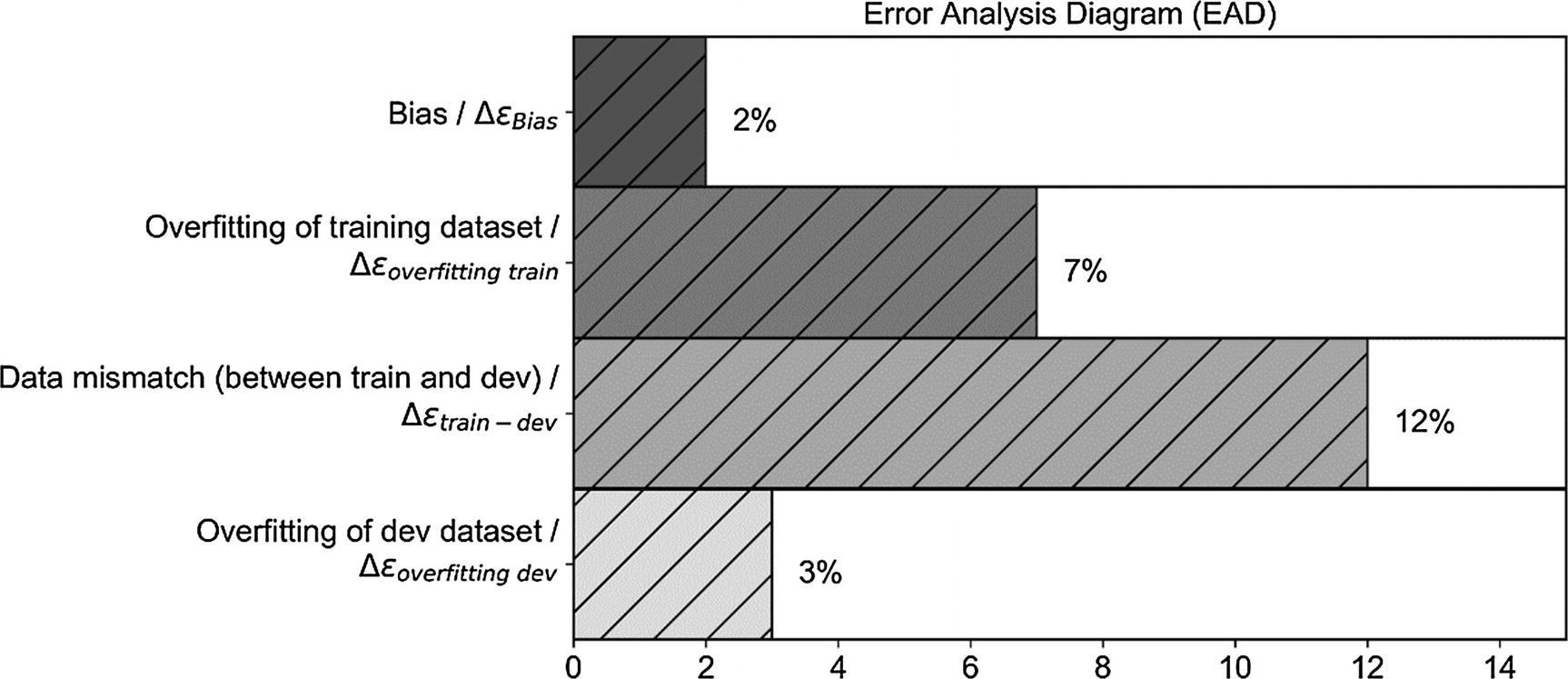
Example of the MAD diagram with the data mismatch problem added. Don’t look at the numbers; they are there strictly for illustrative purposes.
The bias (between training and human-level performance) is quite small, so we are not that far from the best we can achieve (let’s assume here that human-level performance is a proxy for the Bayes error). Here, you could try bigger networks, better optimizers, and so on.
We are overfitting the datasets, so we could try regularization or get more data.
We have a strong problem with data mismatch (sets coming from different distributions) between train and dev. At the end of this section, I suggest what you could do to solve this problem.
We are also slightly overfitting the dev dataset, during our hyperparameter search.
Note that you don’t need to create the bar plot, as I have done here. Technically, you require only the four numbers, to draw the same conclusions.
Note
Once you have your MAD diagram (or simply the numbers), interpreting it will give you hints on what you should try to get better results, for example, higher accuracy.
You can conduct manual error analysis, to understand the difference between the sets, and then decide what to do (in the last section of the chapter, I will give you an example). This is time-consuming and usually quite difficult, because once you know what the difference is, it may be very difficult to find a solution.
You could try to make the training set more like your dev/test sets. For example, if you are working with images and the test/dev sets have a lower resolution, you may decide to lower the resolution of the images in the training set.
As usual, there are no fixed rules. Just be aware of the problem and think about the following: your model will learn the characteristics from your training data, so when applied to completely different data, it (usually) won’t do well. Always get training data that reflect the data you want your model to work on, not vice versa.
K-Fold Cross-Validation
What to do when your dataset is too small to split it in a train and dev/test set
How to get information on the variance of your metric
- 1.
Partition your complete dataset in k equally big subsets: f1, f2, …, fk. The subsets are also called folds. Normally the subsets are not overlapping, that means that each observation appears in one and only one fold.
- 2.For i going from 1 to k:
Train your model on all the folds except fi
Evaluate your metric on the fold fi. The fold fi will be the dev set in iteration i
- 3.
Evaluate the average and variance of your metric on the k results
A typical value for k is 10, but that depends on the size of your dataset and the characteristic of your problem.
Remember that the discussion we did on how to split a dataset applies here also.
Note
When you are creating your folds, you must take care that they reflect the structure of your original dataset. For example, if your original dataset has 10 classes, you must make sure that each of your folds has all the 10 classes, with the same proportions.
Although this may seem a very attractive technique to deal generally with datasets with less than optimal size, it may be quite complex to implement. But, as you will see shortly, checking your metric on the different folds will give you important information on possible overfitting of your training dataset.
Let’s try it on a real dataset and see how to implement it. Note that you can implement k-fold cross-validation easily in with the sklearn library, but I will develop it from scratch, to show you what is happening in the background. Everyone (well, almost) can copy code from the Web to implement k-fold cross-validation in sklearn, but not many can explain how it works or understand it, therefore being able to choose the right sklearn method or parameters. As a dataset, we will use the same we used in Chapter 2: the reduced MNIST dataset containing only digits 1 and 2. We will perform a simple logistic regression with one neuron, to make the code easy to understand and to let us concentrate on the cross-validation part and not on other implementation details that are not relevant here. The goal of this section is to let you understand how k-fold cross-validation works and why it is useful, not on how to implement it with the smallest number of lines of code possible.
- 1.
Do a loop over all the folds (in this case, from 1 to 10), iterating with the variable i from 0 to 9.
- 2.
For each i, use the fold i as the dev set, and concatenate all other folds and use the result as train set.
- 3.
For each i, train the model.
- 4.
For each i, evaluate the accuracy on the two datasets (train and dev) and save the values in the two lists: train_acc and dev_acc.
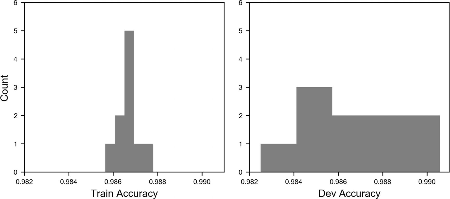
Distribution of the accuracy values for the train set (left) and for the dev set (right). Note that the two plots use the same scale on both axes.
The image is quite instructive. You can see that the accuracy values for the training set are quite concentrated around the average, while the ones evaluated on the dev set are much more spread. This shows how the model on new data behaves less well than on the data it has trained on. The standard deviation for the training data is 5.4 · 10−4 and for the dev set 2.4 · 10−3, 4.5 times larger than the value on the train set. In this way, you also get an estimate of the variance of your metric when applied on new data, and on how it generalizes. If you are interested in learning how to do this quickly with sklearn, you can check the official documentation for the KFold method here: https://goo.gl/Gq1Ce4 . When you are dealing with datasets with many classes (remember the discussion on how to split your sets?), you must pay attention and do what is called stratified sampling.2 sklearn provides a method to do that too: stratifiedKFold, which can be accessed here: https://goo.gl/ZBKrdt .
You can now easily find averages and standard deviations. For the training set, we have an average accuracy of 98.7% and a standard deviation of 0.054%, while for the dev set, we have an average of 98.6% with a standard deviation of 0.24%. So, now you can even give an estimate of the variance of your metric. Pretty cool!
Manual Metric Analysis: An Example

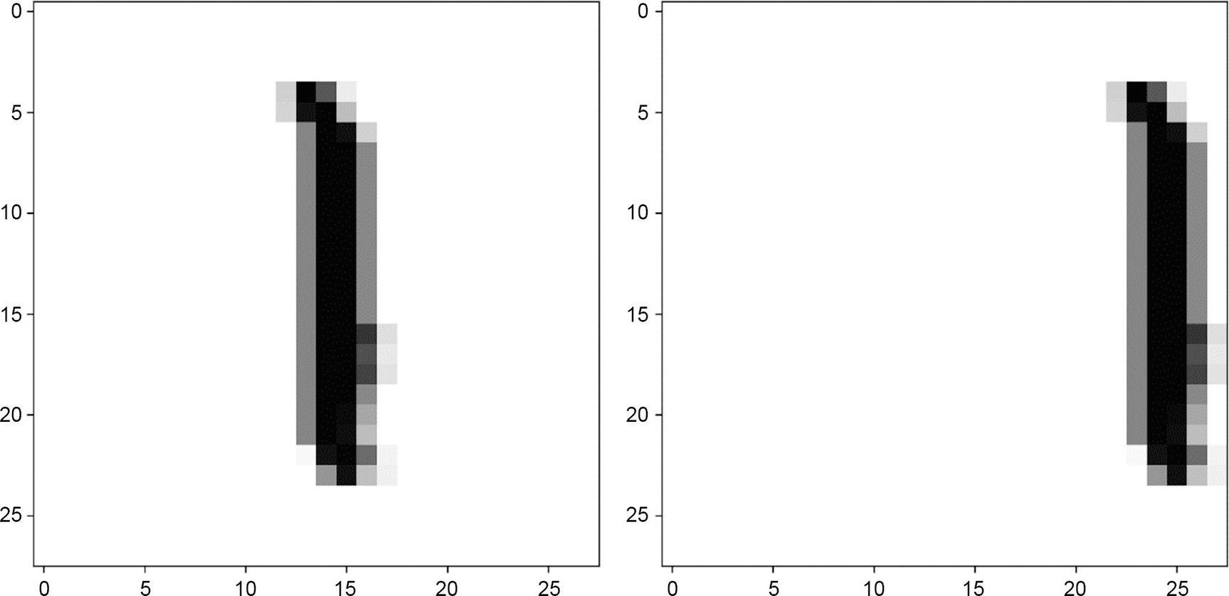
Example from fold 0 for the digit 1. The image on the left is a bar plot of the gray values of the 784 pixels , as they are seen in our model on the right. Remember that as inputs, we have a one-dimensional array of the 784 gray values of the pixels of the image.
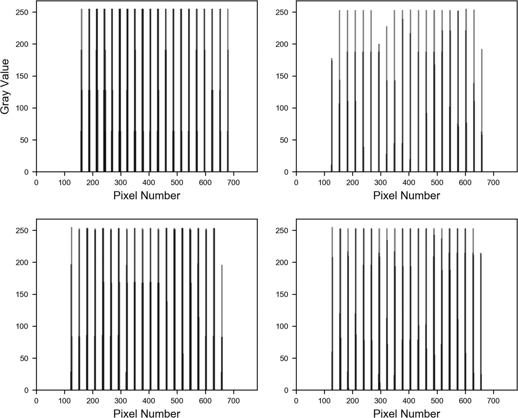
Four examples of the digit 1 reshaped as one-dimensional arrays . All look the same: a number of bars roughly equally spaced.
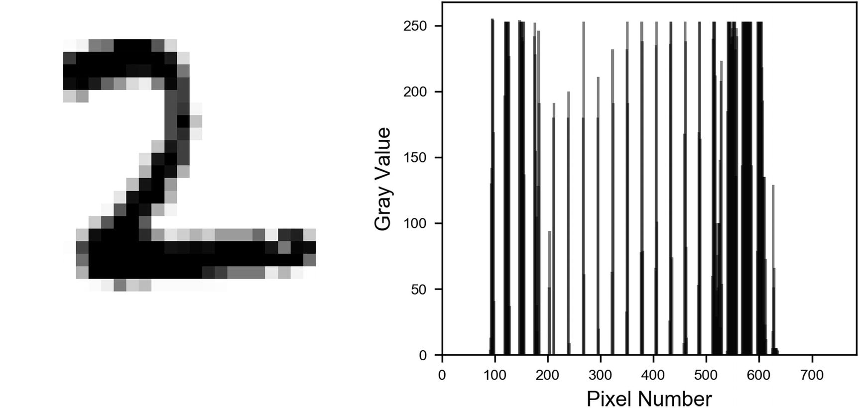
Example from fold 0 for the digit 2. The image on the left is a bar plot of the gray values of the 784 pixels, as they are seen in our model. Remember that as observations, we have a one-dimensional array of the 784 gray values of the pixels of the image.

How different parts of the images look when reshaped as one-dimensional arrays . Horizontal parts are labeled (A) and (B), and the more vertical part is labeled (C).

Four examples of the digit 2, reshaped as one-dimensional arrays . The wider clusters of bars can be seen clearly.
As you can imagine, this is an easy pattern to spot for an algorithm, and so it is to be expected that our model works well. Even a human can spot the images, even when reshaped, without any effort. Such a detailed analysis would not be necessary in a real-life project, but it is instructive to see what you can learn from your data. Understanding the characteristics of your data may help you in designing your model or understanding why it is not working. Advanced architectures, such as convolutional networks, will be able to learn those two-dimensional features exactly in a very efficient way.

 , we classify the image in class 1 (so, digit 2), and if
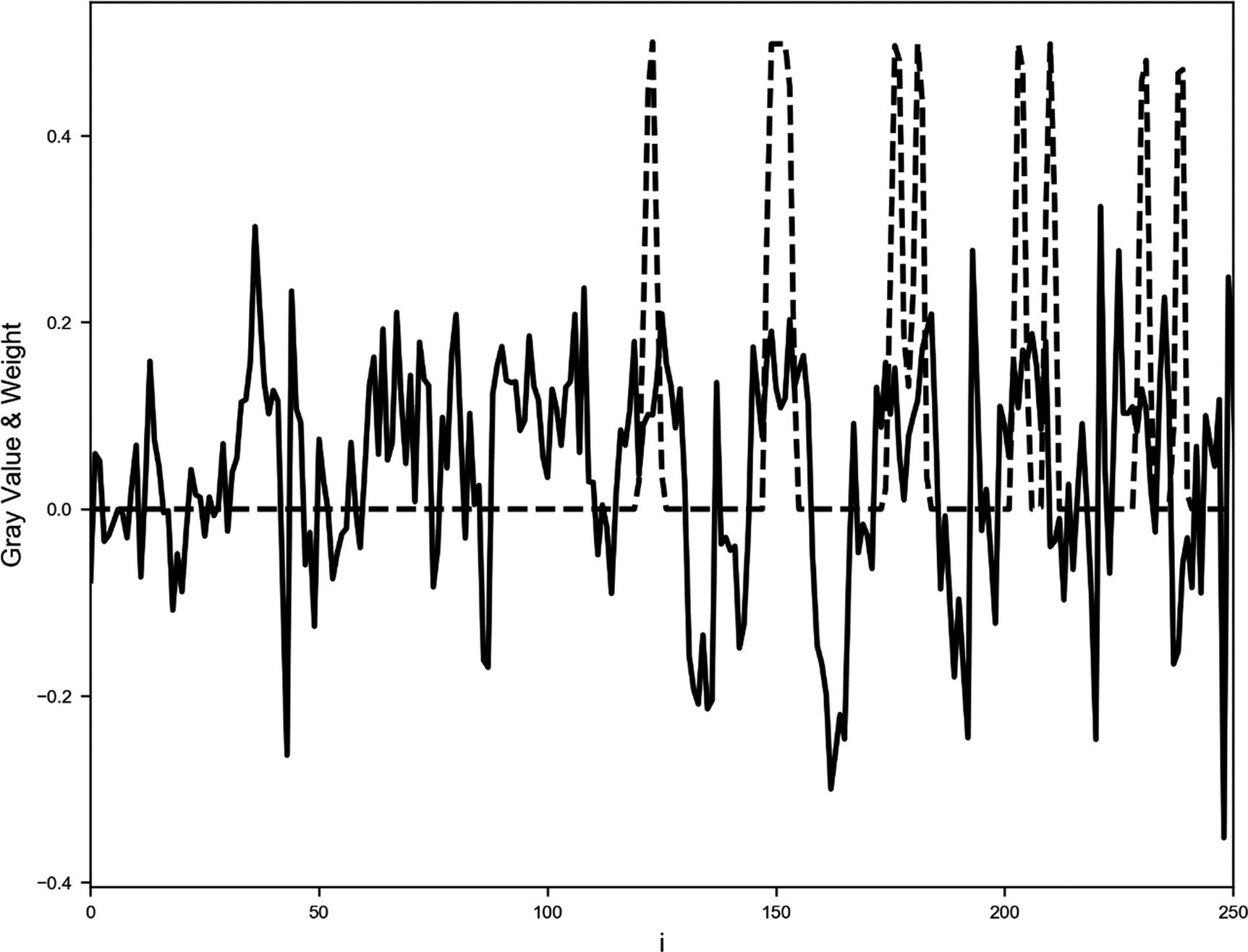
  , we classify the image in class 0 (so, digit 1). Now from the discussion of the sigmoid function in Chapter 2, you will remember that σ(z) ≥ 0.5 when z ≥ 0 and σ(z) < 0.5 for z < 0. This means that our network should learn the weights in such a way that for all the ones, we have z < 0, and for all the twos, z ≥ 0. Let’s see if that is really the case. In Figure 6-15, you can see a plot for a digit 1, from which you can find the weights wi (solid line) of our trained network after 600 epochs (and after reaching an accuracy of 98%) and the gray value of the pixel xi rescaled to have a maximum of 0.5 (dashed line). Note how each time xi is big, wi is negative. And when wi > 0, the xi are almost zero. Clearly, the result
  will be negative, and, therefore, σ(z) < 0.5, and the network will identify the image as a 1. In the image, I zoomed in to make this behavior more evident.
Plot for a digit 1, from which you can find the weights wi (solid line) of our trained network after 600 epochs (and after reaching an accuracy of 98%) and the gray value of the pixel xi rescaled to have a maximum of 0.5 (dashed line)
Plot for a digit 2, from which you can find the weights wi (solid line) of our trained network after 600 epochs (and after reaching an accuracy of 98%) and the gray value of the pixel xi rescaled to have a maximum of 0.5 (dashed line)

wi · xi for i = 1, …, 784 for a digit 1. You can see how almost all values lie below zero. The thick line at zero is made of all the points i, such that wi · xi = 0.
As you can see, in very easy cases, it is possible to understand how a network learns and, therefore, it is much easier to debug strange behaviors. But don’t expect this to be possible when dealing with much more complex cases. The analysis we have done would not be so easy, for example, if you tried to do the same with digits 3 and 8, instead of 1 and 2.