
It’s not about “good” or “bad” data, it’s about “right” data.[164]
Tom Anderson, the CEO of OdinText, sounds almost philosophical in his statement on “good” and “bad,” but his quote summarizes nicely what many have tried to say: Only with the “right” data will you be able to draw conclusions and act on them. But what is “right”? Once you have defined a good question—that is, once you define the ask—the next challenge is to determine what data can help answer this question. The best question might be unanswered because we are using or measuring the wrong data. There are two important factors in this discussion:
What kind of data (sometimes also called features or variables[165]) should we use? Often companies have premade measurements available, such as click rates of users, their ages, or financial KPIs. The more of them you use, the harder it is to find relationships and not get overwhelmed by noise. With too few variables and features, however, you might not find what has the biggest effect in a given situation.
Take as an example the work of a behavioral-targeting company. It has many variables about a visitor, such as the pages she has clicked before, the time she clicked the advertisement, and her network ID. It might even store the stock market situation and the weather at the time of the click. Not all of these data elements are equally helpful. For example, it turns out that the information about the browser is one of the best features to select for a campaign selling online games, since not every game runs in every browser window. Feature selection is thus the balance between utility and volume of data. It is a crucial step in getting to the right data.
How much data should we use? Social media has created massive data amounts, and there is always the temptation to use it all. Fisheye Analytics stores 25 terabytes of data, or more than 300,000 CDs, every month. Ideally you want to use all data at once, but this poses engineering challenges and often might not improve the result. How much data would you need to describe a line? Correct, two data points. Would it improve your model if you were to have a million data points? No! The question about how much data to use is often a question about how to sample your data to be statistically relevant.
Even worse, using all available data might disguise the actual issue, as we saw in the example in Chapter 8. In that case, the issues surrounding social media comments about a corporate CEO only became apparent after the data was reduced to discussions on net neutrality.
Note
The world of data science and the world of statistics are very similar. Nevertheless, both domains have developed out of different areas. Therefore, often their language might be slightly different. Within data science, you will find more engineers. They call a “feature” what a scientist or statistician would call a “variable.” Both terms have similar meanings: if you were to put your data into a spreadsheet, the “variables” or “features” would typically be described by the column headings of the spreadsheet.
It is an early, sunny afternoon, and we are in one of New York’s best independent coffee shops. The coffee is excellent and the discussion is exciting. The entrepreneurs around the table are discussing matchmaking algorithms. How can a computer best match two people to create the greatest likelihood of a marriage? For sure, there is a market out there for those kinds of applications, and there are hundreds of sites already trying exactly this. This group of entrepreneurs have many ideas on the table:
Use each person’s social graph.
Use the social graphs of all of that person’s friends.
Ask the person to rate pictures, articles, movies, and so on to see what he likes.
Measure how long it takes him to fill out the initial application form.
Check how many spelling mistakes he makes.
Check what type of language the person uses (slang, easy and conversational, or stiff and formal).
The list became longer and longer as more data points were added. “We should even use DNA information to match the best couples,” suggested one youngster. Then there was silence. Was this too unrealistic? Not really: GenePartner even offers this as a service, based on research[166] that found that partners are more attracted to each other if a specific antigen is highly different. Thus DNA, taste, friends, language—if all of this seems reasonable, what stops us from making the perfect matchmaking machine? Get all the data from Facebook, Twitter, questionnaires, preferred books, preferred movies, and even from DNA analysis and load it up into a big dark “black box” called machine learning and just let a big computer do the job? In this case there would be no need for experience, and all our conclusions could be drawn by statistical algorithms.
Is it that simple? No—at least not today! The more variables there are, the more difficult the task will be. Also, computers have the same issues as humans, that we can’t see the forest for the trees.
In sum, it is not wise to use all data, but it is necessary to carefully select the data sets that have a high causal impact. This process is also commonly referred to as feature selection or regularization. To guide this selection process, you can use one of the following ways to look at features, as illustrated in Figure 9-1.
- Causation
Is this variable in a causal relationship with the outcome to the question?
- Error
How easily and cleanly can you measure this variable?
- Cost
How available is the data?
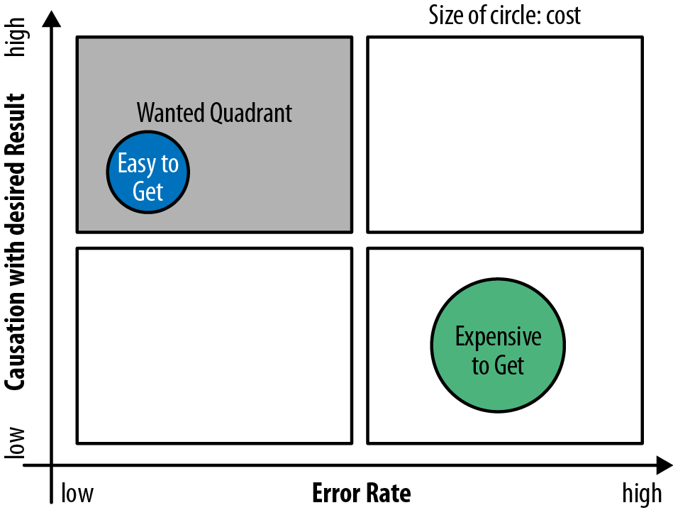
You should select features that have the biggest effect in terms of answering the question. However, it is not always easy, if even possible, to distinguish between causation and correlation. Let’s look at the case from British Petroleum: in 2010, the BP platform Deepwater Horizon spilled 4.9 million barrels (780,000 m3) of crude oil and created a disaster along the US gulf coastline.
The reaction was a public outcry in the United States as politicians, journalists, celebrities, and the general public all reacted negatively to the disaster. Their outrage was visible in the media. Fisheye Analytics collected all media data (blogs, Twitter, Facebook, news forums) on this oil spill and created a Net-Sentiment-Score using its own proprietary sentiment algorithm. The Net-Sentiment-Score is a ratio based on the difference between the amount of negative sentiment and positive sentiment in all articles, tweets, and blog posts.
During the same time this public outcry occurred, the share price from BP collapsed. Was there a causal relationship? The graph prepared by the Fisheye Analytics team shown in Figure 9-2 might suggest a weak correlation. The graph shows in the upper part the Net-Sentiment-Score and in the lower part the share price.
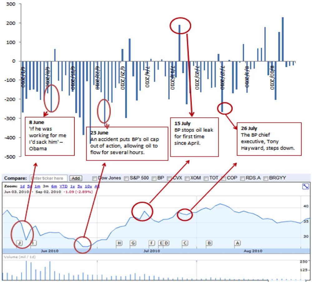
As you can see, there is some form of correlation between the stock market movements and the Net-Sentiment-Score of the public discussions. In other words, there is some form of dependency relationship between these two data sets. Correlation enables us to link Net-Sentiment-Score and the share price with a mathematical formula: for each reduction in the Net-Sentiment-Score, the share price will reduce by a certain amount in USD.
However, can you conclude that negative tweets are causing a lower share price? No, not solely on the basis of statistical correlation. To do so would be wrong.
While correlation is easily established through statistical analysis, causation is not easily concluded. Even worse, we will see in this section that is never possible to absolutely prove a causal relationship. However, the combination of statistical evidence and logical reasoning can help to suggest a certain likelihood of a causal relationship.
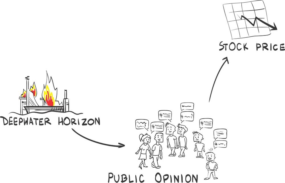
To establish whether the number of negative articles caused the share price to drop or vice versa, we can look to so-called Structural Causal Models (SCM), as introduced in 2009 by UCLA professor Judea Pearl.[167]
SCMs represent the different measurements or data sets diagrammatically, indicating causal relations via arrows.
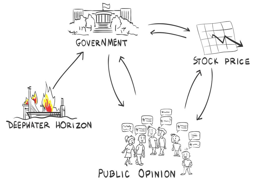
The oil spill disaster caused an outcry from the public in all types of media. This outcry caused stockholders to sell their shares because they worried that the company’s brand name would be damaged, which might impact future revenue. Thus the SCM will look like the one depicted in Figure 9-3.
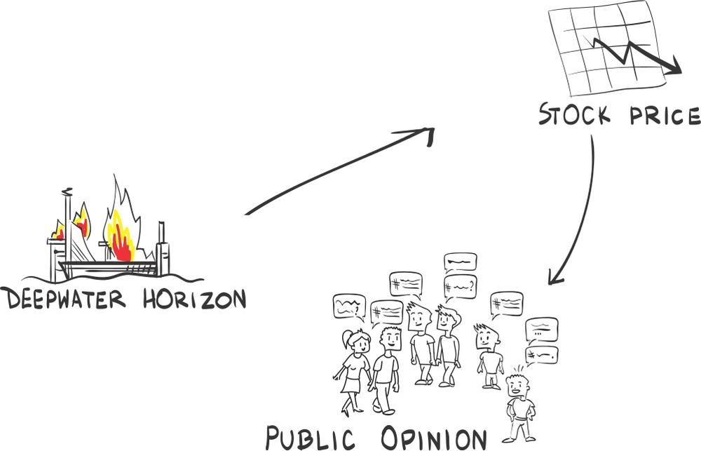
The reverse order might also be possible. The stock price dropped due to the oil disaster, as shareholders assumed bleak times to come. The drop caused the general public to talk about it. In this case, cause and effect were reversed, and the Net-Sentiment-Score would have no effect on the share price. In this case, the SCM would show the public opinion only after the stock-price drop, as depicted in Figure 9-4.
One way to test which of those two scenarios was true is to use a timestamp. If the share-price drop was before the public reaction in the media, one could at least reject the other hypothesis that the public reaction in the media caused the share-price drop. In the case of BP, however, both reactions are overlapped in time and thus no conclusion can be drawn.
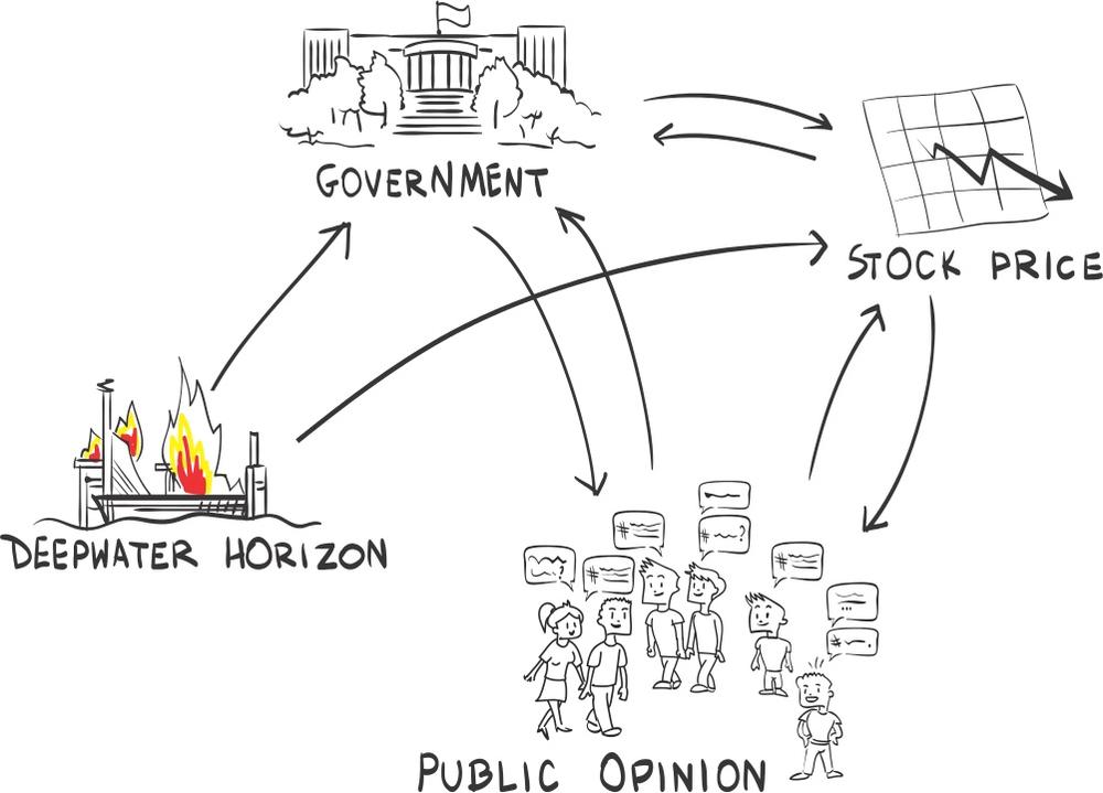
So far, the SCM only included two variables: stock price and Net-Sentiment-Score. It might happen, however, that there are important variables that we have not yet identified. Those variables are called lurking, moderating, intervening, or confounding variables. In our example with BP, it could be the role of the government. How was it reacting? To include the government, we need to include a new entity into our SCM, as done in Figure 9-5. If the government was very demanding in terms of remedies for the environmental damages, that would in turn create a future liability for BP and thus let the share price drop. The negative Net-Sentiment-Score might only mirror the reactions from the government, but not cause the actual drop in the share price.
Another explanation could be that initially there was no reaction by the politicians. But forced by a loud public outcry over this spill, politicians started to react and to demand compensatory payments, which in turn created future liabilities for BP, causing the share price to drop. In such a case, the Net-Sentiment-Score actually caused the share price drop.
There are way more combinations possible than previously shown, and which is the real one is hard to figure out. It is not easy to know what is cause and what is correlation. However, we can all probably agree that all of the preceding effects played some role. Thus the SCM can be displayed as in Figure 9-6. But even if we were to know the causal relationships, we still would not know how strong those relationships are.
In theory, it would be easy to find the weights for those causations. You just have to repeat the event exactly the same way and only change the variable you would like to investigate. For our example, this would mean we need to turn time back and have the same oil spill again, but either reduce the tweets or silence the government. Afterward, we look at the reaction of the share price. In practice, such time warp experiments are not possible, which leads us to the fundamental problem of causal inference. Paul W. Holland explains in an excellent paper on statistics and causal inference[168] that there will never be certainty when establishing a causal relationship. This is good news for any manager who gets questioned over and over again whether one can determine cause and effect. However, even if it is theoretically impossible to establish causal relationships with certainty, you can compute statistical analyses to test for causal relationships at a certain level of probability:
It is also a mistake to conclude from the Fundamental Problem of Causal Interference that causal inference is impossible. What is impossible is causal inference without making untested assumptions. This does not render causal inference impossible, but it does give it an air of uncertainty.
—Paul W. Holland
Those tests would try to keep all circumstances constant and change only one parameter at a time. The gold standard for this can be found in medicine. Clinical trials are set up as randomized controlled trials to best estimate the causal effect of a drug. The key here is that patients are split randomly into two groups. One is taking the medication, and the other one is only taking a placebo. In some situations, even the doctors conducting the test do not know which group is which (double-blind trial). One of the biggest worries in those tests is that we have overlooked a lurking variable and that the sample split is not really randomized. In the online world, randomized controlled trials are best known as A/B tests. In an A/B test, we try to limit the risk of lurking variables by just increasing the testing sample. In medicine, we cannot put all available patients into a health-related test. However, in online retail, we can.
No matter whether it is a medical or an online test, we control the surroundings. In an A/B test, we make sure that someone selected for website design A will never see the website B. We are able to do this because we have almost full control of our environment. For example, we can identify visitors by cookie or IP address and only show them a certain website. Those systems are never perfect because some visitors might use several devices and therefore are exposed to both versions. Other visitors might decide to delete cookies and therefore see different versions of the website. Here, Holland’s conclusion that we can’t be sure about causal effect is true. However, to the best of our abilities we have reduced potential lurking variables.
In social media analyses, controlled trials are often not possible. BP, for example, cannot just create another oil spill to create a test of another media strategy. Even if it could or would create another oil spill (obviously it would not), a second oil spill would be judged by the same worldwide audience that saw the first one, and this prior experience would affect their reactions, so we would have even less control of outside variables. The Deepwater Horizon oil spill was, unfortunately, not the only one in history, and you could attempt to use those past events to try to separate cause and effect. But those comparisons pose significant challenges. A spill of similar size damaging the United States would be the Lakeview Gusher spill about 100 years ago. In 1910, social media didn’t exist, and the ways people express their opinions have changed quite radically since that time.
A more recent one would be the Prudhoe Bay oil spill, which happened in 2006. Social media already existed at that time, and you might be able to measure the public reaction to it. But this spill was only 1% the size of the Deepwater catastrophy in terms of spilled oil. It also was in Alaska and thus did not impact as many people. Both differences make any comparison quite complicated.
Past media response might give an indication of a basis for comparison, but it will not be the hard measurement we are looking for.
It is true that BP is an extreme example, but as a general rule, it is difficult to understand correlation within social media, since no two events are identical. Take for example an online retailer that communicates rebates to potential customers via social media. Similar to BP, it can’t easily control who sees the vouchers and who does not. The open nature of social media makes it impossible to control. Without a control group, the retailer will never be sure about what made people react to the offered discounts.
The second area to watch out for in feature selection is the error. It might seem strange at first to consider error in our data. However, almost any data type comes with error. No machine and no process is 100% accurate and thus any data will have errors. In the online world, we are used to the fact that this error is small. A click is a click. Some clicks might be reported and others might not, due to different measurements or different systems that process those clicks afterward.
The situation gets even worse if we look at social media. In order to automatically understand the written text by humans, social media uses additional metrics that are calculated using fuzzy logic. Take the measurement of sentiment or influence as an example. Those metrics are measured more like probability. A “negative” sentiment means in reality: “There is a good chance that there is a negative sentiment.” We have seen algorithms on sentiment where the amount of error was so great that they were yielding measurements that were only slightly better than guessing. So you should think twice before using those features in any measurement setup.
As we see in this book over and over again, structured data has a lower error rate and therefore is often preferred over unstructured data.
Structured data is exactly what it says it is. It is data that has a predefined order so that a computer can easily read and work with it. The data is in records that a computer is able to store, fetch, and process. A simple example would be Table 9-1. Any computer can read this and use the variables it represents.
Table 9-1. Example of structured data
| Item | Price | Currency | Quantity | Unit |
|---|---|---|---|---|
| Apple | 1.99 | USD | 1 | Pounds (lb) |
| Oranges | 0.99 | USD | 1 | Pounds (lb) |
| Strawberries | 2.99 | USD | 250 | Grams (g) |
The previous example is a simple list, but data structure can be more complex as well, taking forms such as arrays, trees, graphs, or hash tables.
The opposite of structured data is unstructured data. Unstructured data is information that is not easily analyzed by a computer. This could be text (like a tweet), pictures, voice, or other data.

The information kept in Figure 9-7 might be the same as in Table 9-1, but it is not as easily retrieved by a computer. Another example might be the following tweet: “I am craving apples—$1.99—I thought they were kidding.” This tweet contains some information, which is as well stored in Table 9-1, mainly the price of apples. However, some information is missing:
You can assume that $1.99 should be a price.
You know the author of the tweet and that he lives in New York, thus the price is in USD and not in Singaporean dollars. Additionally, this means that the price is for one pound of apples.
You can assume that “kidding” indicates some kind of emotional reaction such as being upset or surprised.
A computer, on the other hand, will have a hard time understanding the underlying content of those types of tweets. Even when trained to understand this kind of unstructured data, an algorithm will most likely have a higher error rate than it would with structured data. Therefore, if you are deciding which feature to select, you will most likely drop features that exhibit error. Structured data is often more powerful than unstructured data because it has fewer errors.
This insight explains why social media is often not as powerful as we might have hoped it would be. Social media largely produces unstructured data, and it often comes with a relatively larger degree of error as compared to structured sources. However, despite this shortcoming, it is often the case that unstructured data is the only data available. Take for example efforts to improve marketing (see Chapter 1) or customer care (see Chapter 4). Success is dependent on user-generated comments, and any successful project will rely on unstructured data.
Another reason unstructured data is getting used more and more despite its shortcomings is that you have already used all available structured data for analysis and prediction and now you are looking for the next competitive edge. An example can be found in the financial industry, as noted in Predicting the Stock Market. Hedge funds have already used most of the existing data signals to predict market behavior, and thus unstructured data is left as largely unexplored ground. While the relationship of the unstructured data to financial metrics might not be as strong as the relationship of structured data such as revenue, the hope is that you can gain additional insights that you did not have before.
There is a cost associated with data retrieval and data storage. Despite massive data volume, most of the time, you will not simply get the needed data. You might need to buy it externally, or you may need to create a new IT infrastructure to get it. Again, take as an example the concept of sentiment. If an automated algorithm is not sufficient, then you can always use manual readers to determine the sentiment. Looking at 25 TB of text data, it does not seem very feasible. Why? Because of cost. In any feature selection process you might use, the cost to acquire or retrieve the data will play a role.
Next to cost, there is the power of insider knowledge. Data exclusively owned by you can, if relevant, create more of a competitive advantage than any public data. Public data can be used by everyone else, which in turn will mean no sustainable competitive advantage.
Take the example in Chapter 7 of Moneyball, a great book by Michael Lewis and a fascinating movie. Billy Beane, general manager of the Oakland Athletics, used publicly available in-game activity statistics to spot underevaluated players. By using this technique, he could create a winning team despite having a smaller budget than many of his competitors.
It is an exciting story. But did this create a long-lasting competitive advantage? No! Once the competition understood that data usage can help to predict performance, they caught up quickly, and today all major baseball teams use sabermetrics to monitor players’ performance.
A similar example can be found in financial service companies. They rely on public data. Their competitive advantage is their algorithm, meaning the way they synthesize data. This kind of advantage is hard to keep. Thus it is no wonder that quantum hedge funds are one of the most secretive organizations we have seen. We have been asked for a nondisclosure agreement just so that we could have a look at a company brochure. Asked why the company thought it was necessary, since no information about their algorithms was displayed, the response was, “But our performance charts are in it, so you might be able to reverse-engineer our formula.”
We use the idea of competitiveness coming from inside often within this book. This might be one of the main reasons Twitter is not as valuable as Facebook. Facebook has much better control over its data, while Twitter has sold its data to companies like Dataswift and Gnip. Because of this idea, we argue in Chapter 4 not to use public customer care platforms but to own them.
Back to the New York coffee bar full of entrepreneurs discussing matchmaking algorithms, which we had described in Which Data Is Important?: they understood that they needed to cut down on their variables. But which variables should they use, and which should they ignore? The best guide here is to use the framework displayed in Figure 9-1. Let’s as an example consider the suggested variable of the social graphs. This means that the team plans to analyze all Facebook and Twitter connections of the user. Should this variable be used for the matchmaking algorithm?
- Error
Is it technically feasible to analyze the social graphs of someone in regards to social networks such as Facebook and Twitter? And if so, what would the error rate be?
- Causation
Is the measurement of someone’s interest graph a true representation of his real interests? How likely is it that this measured interest graph is a good influencer for the partner selection?
- Cost
How expensive is it to retrieve the data? Are you the only one with this data, and is it a potential competitive advantage?
However, the social graph might not be our first pick to do couple matchmaking. Why?
- Error
Measuring the number of connections and to whom is easy. Either it is publicly available information as in Twitter or it is easily accessible once you access the user’s Facebook profile. What is less easy to measure is the strength of a connection. Methods could include analyzing retweets and messaging behavior. However, such measurement will most likely include significant errors since:
Not all communication might be mapped. For example, the user might have only high school contacts on Facebook because he didn’t want to lose contact with them. However, his important daily activity might not be happening on Facebook.
There are privacy settings. More and more guides help the users to keep parts or all of their content private and thus not easily accessible. Maybe this person is even keeping multiple identities online in order to protect his privacy?
- Causation
Long ago, Goethe knew that there should be a causal relationship between your identity and your friends: “Tell me with whom you associate, and I will tell you who you are.” But how strong is this causation? Especially in a time where we have 500+ friends in Facebook and where social heritage does not define who we are allowed to meet. Yes, the causational effects are probably low, as we saw in Chapter 1, where we discussed whether social networks have sufficient information in order to place advertisements.
- Cost
The cost of getting to the public part of this information is low. Services like Twitter offer a publicly available access (API) so that everyone can tap into this data. However, if everyone can tap into this information, creating a competitive advantage will be difficult. Private data is not easily available and often has to be bought.
Thus the social graph might not be our first pick. One might argue that the way people use a social network will change over time and all communication will be mapped out. If that is the case and if that information is accessible, then we would need to revisit this discussion.
Are there other variables that might be a better fit for a matchmaking algorithm? Following the idea of structured data is superior, the team soon turned to a questionnaire. The structured data obtainable through a questionniare provides a couple of advantages:
- Error
Measurement is generally more accurate. For example, let’s say you ask in a questionnaire how old someone is or how much education someone has achieved. We can be fairly confident that most people will provide an accurate response to this question, and so the error rate will be low.
- Causation
The causation depends on the question. For example, consider the amount of educational achievement. There is ample research showing that similar educational background is important for a good personal match. And you should be able to ask several questions covering all kinds of areas of a relationship, such as trust and habits.
- Cost
The cost is higher because you have the burden of creating a survey and finding respondents. However, afterward that information is yours and could, if relevant, be a competitive advantage.
We don’t know whether the young startup OkCupid (@okcupid) followed the concepts outlined in this chapter. Chris Coyne and Sam Yagan did in fact meet in New York, and they certainly adopted the right methods. They only use a questionnaire in which for each question (for example, “How messy are you?”) they ask you to:
Answer for yourself.
Answer how you would like your partner to answer.
Indicate how important this question is to you.
(Read more about their approach on their website.) The system seems to work, and users say it is beating most matchmaking engines. The Boston Globe calls them the “Google of online dating.” [169] OkCupid was acquired in 2011 by Match.com.
In the last section, we discussed features or variables and how to reduce them. But even if all features are selected, it is sometimes worthwhile to reduce the amount of data used. This might seem strange at a time when big data is being discussed by everyone. Today you have all the technology in place to handle large amounts of data, so why should you reduce it? If data is value, shouldn’t more data equal more value?
Data without a sound approach is just noise.
The answer is no. More data might simply be noise if not used correctly, as Xavier Amatrian has pointed out. In other situations, more data might only create more of a burden. How many data points do you need to describe a line? Two! Even if you use two million points, it will not change your accuracy. There are two ways to reduce data:
- Sampling
Are two points enough, or will I need more? And if I need more, how many? Those questions will be answered by sampling.
- Subsets
Sometimes, as we saw in Case Study: Major Telecom Company, a subset can actually reveal insights that we would not have seen otherwise due to the noise.
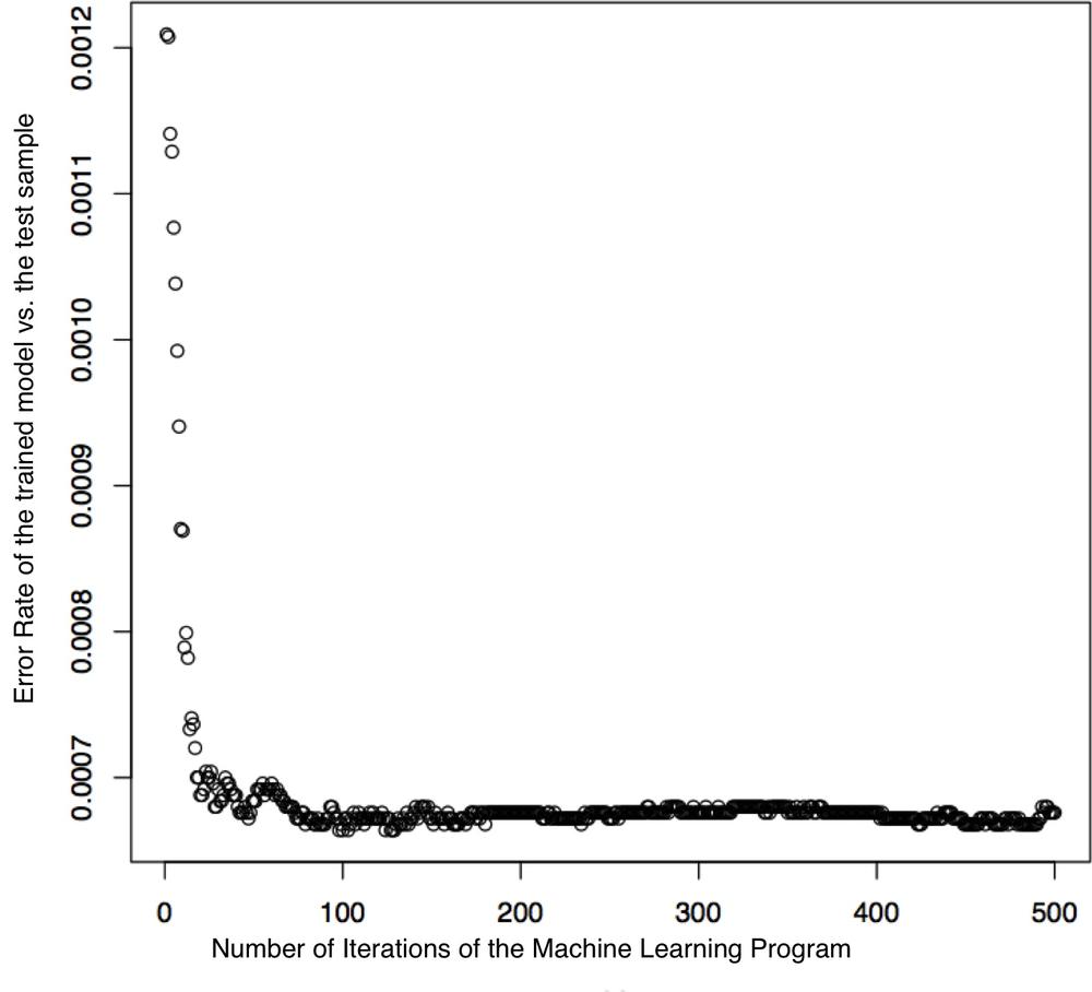
Sampling is the process of only using a small statistically relevant sample of all potential data to gain some knowledge of a statistical population. In the case of a line, two data points would be sufficient. However, how many points do we need to train a recommendation system? Figure 9-8 shows the number of trees used in a random forest.[171] The model is already optimally set up after a little over 100 trees. At least in this case, the algorithm does not need to create all potential branches of a decision tree model.
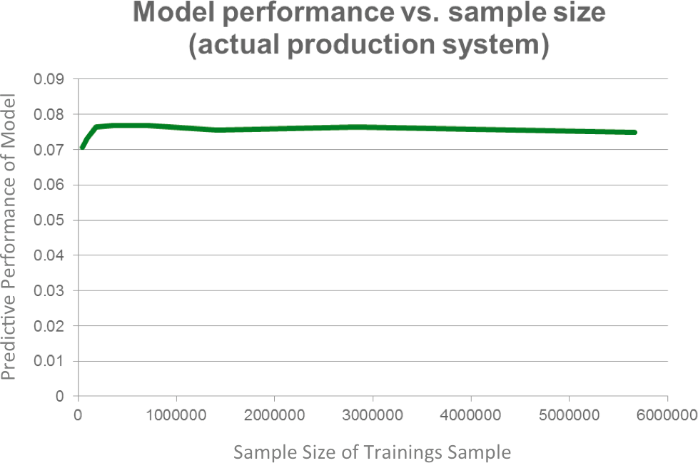
Xavier reported something similar. He analyzed the needed sample size to train the suggestion engine from Netflix sufficiently. As one can see in Figure 9-9, more data does not improve the algorithm.
A subset of the data can be used if we purposely limit one or more of the variables. This way we might reduce the variation or noise and see certain relationships within the data better.
We have spoken so far about the benefits of working with structured versus unstructured data. To deal with unstructured data, we introduce measurements in order to make that data semi-structured. In the context of social media such a measurement is the keyword. A keyword is a word or phrase that must be contained in our unstructured text. Keywords represent an effective way to cut part of your unstructured data out for further analytics or benchmarking.
However, a keyword also creates an effective subset within your data set. Let’s say you want to analyze how social media conversations affect sales. You could take all the billions of tweets ever written and try to correlate them with your sales figures. This kind of work is not only very resource intensive (since this is truly big data), it is also totally useless. You will not get anything useful out of it because it will not generate any insights. The noise level will be beyond the actual signal you wanted to measure.
Thus we use a keyword, and you will only analyze the correlation between the tweets that mention your brand and your sales revenue. While this seems a sensible approach, there is no single truth in how to set up a keyword. Human language is multifaceted, and there are many ways to express even one brand. As a result, any subset we create using keywords is a new source of error.
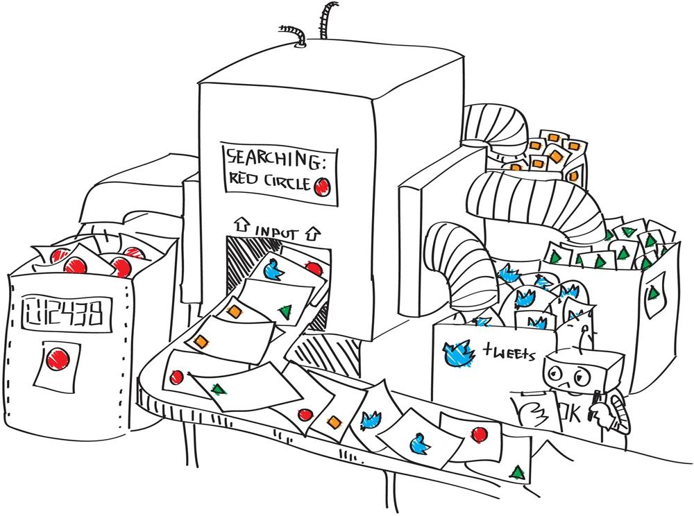
As depicted in Figure 9-10, the use of keywords can filter specific articles out of billions of social media articles. The filter used in the picture filters out all of the ones containing a “RED box.” In real life, this could be all articles containing a certain brand term. Everything without a RED box will be filtered out. Based on this selection, further algorithms can be applied such as sentiment, place, and language. In Figure 9-10, only the amount of RED boxes and the source, such as Facebook, or Twitter, are calculated. In real life, these results could then be correlated with other internal figures such as the sales revenues. However as discussed earlier, correlation does not mean causation. Just because the RED box has a high correlation with high sales revenues does not mean that the RED box actually caused this high revenue.
You might now nod and say that you know the concept of keywords. At the end, every one of us has already used Google, Bing, or another search engine. Therefore we think we understand what keywords are. But be ready for a surprise. Keyword setup in Google and keyword setup for big-data analysis are vastly different. A good keyword design can take weeks or even months and is not a trivial problem.
Why? Have you ever had a problem with Google search such that the first entry was not what you were looking for but the second or third on the list displayed? Like for most of us, it probably happens often. Google search is a two-step process. In the first step, we type in a keyword and Google displays some results. In the second step, we manually screen those results and choose the one we like best from the top 25 results.
With social media monitoring, there can’t be a second manual step because it needs to be an automated process. A keyword for a brand might generate hundreds or even thousands of articles a day. Consequently, there is no opportunity or capability to do a manual screening process such as the one we do with Google search.
The expectations for a keyword for a social media−monitoring company are way higher than those for a Google search.
A keyword supporting the marketing team in analyzing the value of a brand will look different than the keyword that will warn the PR department about viral discussions of the brand. Unfortunately, there is no simple golden rule in keyword design. Each and every keyword has its own shortcomings. It’s either set too broadly or too narrowly. See the sidebar for more on keyword setup.
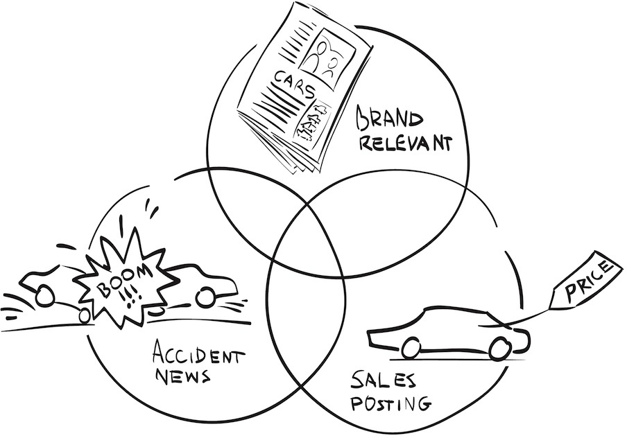
If a keyword is set up too broadly, it will allow too many irrelevant articles, posts, tweets, etc. to be included into your data set. This will distort the analytics. If the filter is too narrow, it may only allow correct content but might miss relevant articles. This will distort the analytics as well. There will never be a 100% correct keyword. You need to be aware of this fact before you use keywords to make decisions. Let’s look, for example, at all articles published about a car brand. The volume of articles is depicted in the Venn diagram Figure 9-11. Here you can see how difficult it can be to find the right balance for the actual brand term.
The data set comprises all articles mentioning the brand term. For the sake of our discussion, let’s say the brand term is “Renault.” The data analytics is done for the marketing team and should tell them how the public discussion on “Renault” correlates to their positioning efforts. That would mean that secondhand sales or any local news about an accident involving a Renault is not interesting. They most likely have no relationship to the marketing positioning effort and thus can be treated as noise. We thus need to make a subsample out of the data. But how? By introducing another word filter. For example, we could exclude all the articles mentioning the word “accident” or “sales.” The result is depicted in the Venn diagram in Figure 9-11. Each exclusion will unfortunately cut out wanted articles as well. We would no longer see a news article that talks about the fact that “car sales from Renault” went up. Nor would we see the “recall to prevent further accidents” information. Both are, however, highly relevant for our positioning efforts.
On Tuesday, January, 12, 2010, an earthquake of 7.0 Mw shook the earth in Haiti. This disaster and its 52 aftershocks killed more than 316,000 and left many injured and homeless. The World Economic Forum appealed to the international community of business leaders to help. Former U.S. President Bill Clinton and the World Economic Forum’s chairman Klaus Schwab together led this initiative. Media data for such an event should be overwhelmingly positive, right?
Sure, if you look only at the subset of data regarding the initiative. However, automated analytics would result in a misleading conclusion due to two issues. First, documents about the earthquake tragedy would overshadow the fundraising story. Also, automated sentiment algorithms are not very well equipped to understand a positive reaction to such a fundraising effort. We discussed the limitations of sentiment in Automation and Business Intelligence. But as a summary, one can say that human sentiment is probably one of the most difficult things to compute using a statistical algorithm:
An algorithm cannot differentiate between the message and the messenger. The message was that something terrible had happened in Haiti, but the messengers Clinton and Schwab were trying to bring hope.
The computer does not know the question you are trying to answer. Is this analysis about the reaction to a tragic accident in Haiti or the impact of the noble actions taken by Clinton and Schwab on their respective brands? An algorithm would need to be clearly trained to answer one or the other of those questions.
The computer will not be able to understand when something is ironic or satirical.
The only way to deal with those two issues is to reduce the data and to fine-tune the sentiment algorithm exactly toward this setup:
Reduce the number of media used. For example, use only one media type, such as news articles or blog posts, so that the way people express themselves is similar.
Reduce the amount of data used to what is relevant for the sample. For example, only use articles that talk about Schwab’s session to raise funds, versus all articles on the World Economic Forum and Haiti.
Reduce the use-case for the algorithm and fine-tune the algorithm to just answer one and only one question: what is the public perception of those fundraising activities?
Only through a subset can you make visible that the world respected and applauded Clinton and Schwab for their efforts to help Haiti.
When it comes to data and the task of finding some common structure within data, the paradox is that less is often more. Unfiltered, massive datasets can hide both trends and valuable artifacts within the dataset. Therefore, finding appropriate features or variables and doing good data reduction are among the key aspects of finding the fourth “V” of the data. Only a focused approach will realize the underlying value beneath the data. Including all data and trying to find common clues will lead to failure.
Sampling, data selection, and keywords all play roles in turning masses of social information into workable data sets. The latter two skills in particular represent an art as much as a science, given the subjective nature of interpreting data, as this chapter’s case studies and anecdotes have revealed. They underscore the human dimension of big-data analysis, even as we seek to increasingly automate the process over time. By linking our knowledge with effective use of these tools, we can turn this process into a manageable goal that supports our desired outcomes.
We often find that many people underestimate the amount of data they have within their own company. Let’s first ask about what data you have in-house:
List data sources you have in-house. Don’t worry if these information sources are not saved so far. At least there is one point in time that your company knew. Be creative and think outside of the box. Images of surveillance cameras. Yes, write it down. User behavior, sales figures, log files…you will be surprised how much data you have.
Now let’s look back at the question you formulated in Chapter 8. Take the data sources you have listed and score them according to these three dimensions: correlation with your question; noisiness of the data (or how strong you expect the signal to be); and cost of acquiring and storing this data.
Questions? Don’t hesitate to ask us on Twitter, @askmeasurelearn, or write your question on our LinkedIn or Facebook page.
[164] Thomas H.C. Anderson, “The Social Media Analytics Expectations Gap,” http://bit.ly/1kOYiJi.
[165] In this book, “features” and “variables” have the same meaning.
[166] Giovanni Frazzetto, “The science of online dating,” EMBO reports Nov 2010, http://bit.ly/IPHKVQ.
[167] Judea Pearl, “Causality: Models, Reasoning, and Inference,” Statistics Surveys, 2009, doi:10.1214/09-SS057.
[168] Paul W. Holland, “Statistics and Causal Inference,” Journal of American Statistical Association, Dec 1986, http://bit.ly/1gBGgge.
[169] Hiawatha Bray, “Online dating: The economics of love,” The Boston Globe, February 2007, http://bo.st/1eiAfVv.
[170] Paul, Ian, “Girls Around Me App Voluntarily Pulled After Privacy Backlash,” PC World, April 2, 2012, http://bit.ly/1fh1V9K.
[171] Random forest is a machine-learning technique that helps to do classification and regression models.