Black and white printing: techniques
With well-organized facilities and a basic understanding of darkroom materials and procedures you can now get down to printing your work. The most important aspects of learning to print are (a) being able to distinguish really first-class print quality from the merely adequate, and (b) mastering the skills to control your results fully. Other requirements, such as speed and economy, will come with experience – but unless you have standards to strive for and the knowledge of how to achieve them, you will too easily accept second best. This chapter concentrates on the basic controls possible in making prints by silver halide means. It also looks at some chemical methods of altering your final result.

Figure 13.1 Contact-printing equipment. Top and centre: contact print units for 35mm and 120 rollfilm strips of negatives. Strips slip into thin transparent guides on the underside of the glass. Bottom: basic arrangement using plate glass
Try to produce contact prints – negative size prints made by having the film in direct contact with the paper – from all your new negatives as soon as they are processed. Then you can safely file away the films, and just handle the paper sheets to pick and choose which shots to enlarge, mark up possible cropping, etc. To make contact prints, use the enlarging equipment described in Chapter 12, plus a contact-printing frame (Figure 13.1) or at least a 10 × 8 in sheet of clear plate glass. Set up the empty enlarger so it projects an even patch of light on the baseboard slightly larger than your paper. Reduce the lens aperture about two stops and (assuming you are not using panchromatic paper) set the red swing-over filter in the light beam.
Switch off white room lights. Place a sheet of grade 1 or 2 paper, or variable-contrast equivalent, emulsion upwards within the projected patch of red light. Lay out the negatives emulsion downwards, on top, pressed down by the glass. If you use a contact frame, you can first slip negatives into thin transparent guides on the underside of the glass. This is especially helpful when printing more than one contact sheet off a film, or working in the dark using pan paper.
Exposure varies according to the intensity of your light patch, and negative densities. As a guide, having switched off the enlarger and swung back the filter, use your timer to bracket trial exposures around 10 seconds. (Give different parts of the sheet 5, 10 and 20 seconds as shown in Figure 13.2.) Remove and process the paper, waiting until it has reached and remained in the fixer for at least 1 minute before you view results in white light.

Figure 13.2 Above and right: Testexposing a contact sheet. (A) use the red filter to help pre-position glass and paper within the light patch. By covering one-third of the paper after 5 seconds (C), then two-thirds after a further 5 seconds (D), and giving a final 10 seconds, bands receive 5, 10 and 20 seconds exposure
Rinse the contact sheet and hold it out of the solution; prints look deceptively pale under water. They also darken slightly when dried. The darkest band of density on your print received the longest exposure time. If results prove you were wildly out in guessing exposure, a further bracketed test may be required. But the chances are that you can now decide from the most promising band of density what exposure will be correct for your next and final contact sheet.

Figure 13.3 The final sheet of contact prints. This one was given 10 seconds overall
Of course, if the set of negatives you are printing vary greatly in density, the correct contact-sheet exposure will have to be a compromise between darkest and lightest frames. Variations will be less if you use soft rather than hard contrast paper. It is important that contacts show the detailed picture content of every frame, even if their print quality has to look rather flat at this stage. You can also help matters by ‘shading’ or ‘printing-in’ individual frames which otherwise print much darker or lighter than the majority (page 248). Make sure the finished contact sheet carries your film’s reference number, perhaps written on the back of the paper.
Decide the shot you want to enlarge, based on composition, sharpness, expression, action, etc., selected from the contact sheet. If there are several near-identical frames which differ mostly in density, pick out all these negatives. Then decide from the technical quality of each one which negative will print best. Check sharpness, and look especially to see that there is sufficient detail present in important highlight and shadow areas. Ensure that both surfaces of the film are free of marks or debris before inserting it into the negative carrier, emulsion downwards.
Adjust the masking frame to your paper size, allowing for any white borders. Then switch off the darkroom’s white lighting, switch the enlarger on and open the lens to full aperture. Raise or lower the enlarger head until the wanted part of the projected image fills the masking frame area, focusing the image and if necessary readjusting height until composition is correct. (Never focus with a thick red filter over the lens – it will alter the focus setting, and when removed the image may be unsharp.) At this point, if you have a condenser enlarger, you could remove the carrier and check the projected light patch for evenness. Adjust lamp or condensers as necessary.
Next, stop down the lens two or three f-settings – more if the negative is rather thin. The reasons for stopping down are (1) to give a conveniently long exposure time (10 seconds or so, for example, gives you more time to locally shade exposure – see below – than something as short as perhaps 1 or 2 seconds), (2) to get peak image performance from the lens, and (3) to compensate for any slight focusing error, by extending depth of focus.
Look carefully at the image on the easel, and decide the most likely paper grade. If you have an enlarging exposure meter calibrated for your enlarger and developer, set this for the paper or filter in use. Take a spot reading from part of the image you expect to print mid-grey, and read off the time needed. But even if you use a meter, print results are so subject to final visual judgement that it is still helpful to make a bracketed series of test strips. This is why many black and white printers consider that metering is just time-consuming. With experience, it is possible to look and guess test exposures closely enough.

Figure 13.4 Spot measurement of exposure from an area chosen to print mid-grey, using an enlarging meter with a probe. The meter will have been calibrated from previous tests using your equipment and materials
Use the metered or guessed time as the centre point of a geometric range of exposures on a half sheet of paper (Figure 13.5). Think carefully how to position these strips – for greatest information, each one should include both darkest and lightest parts of the image. After exposure and processing, judge the best strip, looking especially at key areas such as flesh tone in a portrait, and checking how much detail (present in the negative) has printed in shadows and highlights. If the best strip looks too harsh or too flat, change to a different paper grade – or with variable-contrast paper alter the filtration. Adjust exposure for this change if necessary and test again. Should exposure time now become awkwardly short or long, alter the lens aperture: opening it one stop allows time to be halved, closing it one stop allows it to be doubled. (Aperture has no effect on contrast.) Finally take a full sheet of paper, position it under the enlarging easel masks and give the exposure time you consider correct.

Figure 13.5 Test-exposing an enlargement. By holding an opaque card stationary in the light beam, different areas of a half sheet of printing paper can be given a range of exposure times
Local control of exposure
A single ‘straight’ printing exposure often fails to suit every part of the picture. The reason may be that the negative density range, while well matched to the paper for most subject tones, exceeds it at one extreme or the other. Perhaps a patch of shadow becomes solid black or highlight detail looks ‘burnt out’, when midtones are correct for density and contrast. Perhaps subject lighting was uneven, or you simply want to darken and merge some parts of a composition in order to emphasize others. In fact there is hardly a picture that cannot be improved in some way during printing by locally reducing exposure (known as ‘shading’, ‘holding back’ or ‘dodging’) or extending it (‘printing-in’ or ‘burning-in’).
To lighten part of the picture insert your hand, or red acetate or opaque card, into the light beam during part of the exposure. Have your shading device about halfway between lens and paper, and unless you are shading up to a hard edge, such as a horizon or the side of a building, soften the shadow edge by keeping it slightly on the move. To darken a chosen area, follow up the main exposure with an additional period when you print-in using a hole in a card, or the gap between your cupped hands; see Figure 13.7. Feather the edge of your exposure-controlled area in the same way as for shading.
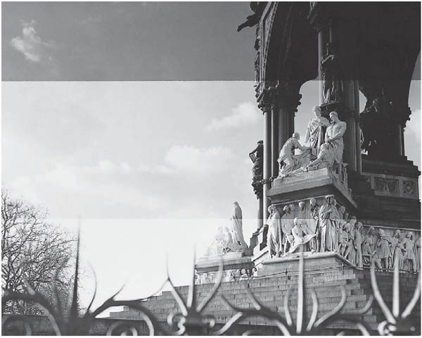
Figure 13.6 Always position exposure test bands across an enlargement so that each one includes both light and dark parts of the image, as here. If these three bands had been run vertically instead, two would have shown information about sky and foreground only
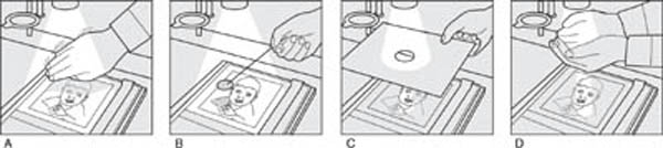
Figure 13.7 Shading and printingin. Large areas at one side of the picture are conveniently shaded with the edge of your hand (A). To make isolated ‘island’ areas lighter, shade with a ‘dodger’ (B) made from card and attached to thin flower wire. To darken isolated areas, print-in through a hole in opaque card (C) or form a shape between cupped hands (D)
To decide how long to shade or print-in, make the best possible straight print first. Then, with the aid of the red filter, place pieces of printing paper across excessively dark or light image areas and make test-strip exposures at shorter and longer exposure times respectively. If necessary sketch out a shading ‘map’ (Figure 13.9). This will remind you where and by how much you must shade during your main exposure, and the same for extra exposure afterwards. The harder the contrast of your paper, the greater these exposure differences will have to be. If burning-in will take an unacceptably long time, you can halve it by carefully opening the lens one stop after the main exposure, provided you do not shift lens or paper. Just remember to stop down again before exposing the next print.
Sometimes an area being heavily printed-in to black contains some small highlights which still appear as grey shapes, no matter how much additional exposure you seem to give. The best solution then may be to fog over these parts. Either print-in with the enlarger turned out of focus, or fog using a small battery torch fitted with a narrow cowl of black paper (Figure 13.10). Keep the enlarger on, red-filtered, to show you the exact image areas you are treating with white torch light.
Local control of contrast
Shading and printing-in are like retouching: if done well, no one should know they have taken place. But when they are overdone you will find that shadows look unnaturally flat or grey, and burnt-in highlights veil over, again with lost contrast. This will happen most readily when parts of the subject were exposed on the tone-merging ‘toe’ of the film’s performance curve (Figure 10.3), or near the top end where irradiation again destroys tone separation. Perhaps the cause is general underexposure or overexposure respectively, or just subject range beyond the capabilities of your film.
Either way, these tone-flattened areas need extra contrast, which you can best achieve with variable-contrast paper using selective filtration. Imagine, for example, that you need to shade and contrast-boost a simple patch of shadow in a picture which otherwise prints with grade 2 filtration. You (a) shade this shadow throughout the entire period while the rest of the picture is being printed, then (b) change to grade 4 or 5 filtration, and (c) carefully print the shadow area back in, to the level of exposure it would have received if shaded normally.

Figure 13.8 Print shading. Top: a ‘straight’ print given 22 seconds shows pale sky, and dark detail at top and right side of memorial. Middle: test pieces for sky (given 35 seconds) and memorial (10 seconds). Bottom: working from the test information this print was exposed for 22 seconds, during which memorial areas were shaded for 4 and 5 seconds – see the shading plan below. Then the sky was printed-in for an extra 14 seconds


Figure 13.9 A rough sketch made as a reminder of the different exposures needed for various areas of the picture, right
Sometimes, perhaps due to an emergency situation, you have to print a negative so contrasty that it is beyond your softest filtration or graded paper. Three techniques are then worth trying, either singly or all together:
1 |
Make the enlarger illumination less hard. If you have a condenser enlarger, place a piece of tracing paper on top of the condenser or in the lamphouse filter drawer. Light output will probably be quartered, so widen the lens aperture and increase exposure. Negative contrast will be reduced by about one grade. |
2 |
Reduce paper contrast by ‘flashing’. This is a tiny amount of controlled fogging to light – not enough to make the paper look grey, but sufficient to overcome ‘inertia’ and raise the image exposure received in highlight areas to a developable state, with very little change to darker tones. To do this, first expose the paper normally. Then, while it is still in the masking frame, hold tracing paper just below the lens and give a second or so ‘flash’ of what is now totally diffused light. You must discover the best amount of flash exposure by trial and error. |
3 |
Change to a low-contrast print developer, which still gives a good black but a more graduated range of greys. See Beer’s developer (Appendix D); also contrast masking in Advanced Photography. |

Figure 13.10 Local fogging-in with a battery torch darkens small unwanted light parts, which then blend with dark areas. Alternatively print-in normally, but defocus the lens

Figure 13.11 Vignetting. Below: To fade out picture edges hold a card with a large cut-out shape almost stationary throughout exposure

Figure 13.12 Right: Typical vignetted result. Having the card fairly close to the paper avoids the vignette printing dark and ‘dirty’ near the centre

Figure 13.13 The picture above contains strong shapes cut through by edges of the frame. Printing-in a black edge line (right) helps to pull the main elements of the image together

Overall increase of contrast
An excessively flat negative, provided it still contains sufficient shadow and highlight detail, will usually print on a grade 5 paper. However, other worthwhile techniques to boost contrast include:
1 |
Chromium-intensifying the negative, page 318 (only suitable for silver-image film). |
2 |
Developing your printing paper in a line developer, such as D8. |
3 |
Printing on lith paper using lith developer, page 255. |
4 |
Changing from a diffuser enlarger to a condenser enlarger, or from a condenser to a point-source enlarger. |

Figure 13.14 Arrangement for fogging in a black edge line to the picture area. The narrow gap must be even all round
Vignetting away edges
To avoid clear-cut borders completely, you can turn to the old nineteenth-century style vignettes, which have the picture fading out to white paper like the dog’s head, left. Cut a large hole – typically oval – in a sheet of opaque card. Have this held ready the correct distance between lens and paper before starting exposure, checked with the red filter over the lens. Then swing back the filter and expose, keeping your vignetting card in position at the same height (moving slightly) to shade all four sides of the paper for the entire exposure.
Adding edge lines
You sometimes have one or more dark subjects against a light background, shapes which become cropped awkwardly first by framing in the camera and then by white print borders. Figure 13.13 shows one example. To lessen the isolation of these two pieces of the image it helps to add a thin black line between picture edge and border. You can do this by felt pen as an after-treatment, but for single or short print runs photographic fogging gives best results. Use thin black card cleanly cut to a size a few millimetres smaller than the picture area set on your masking frame, Figure 13.14. Expose a print in the usual way, but, without removing it from the easel, cover the emulsion with the card, weighted down with a few coins. Use red-filtered enlarger light to check that a small gap is left evenly all around the edge. Then remove the negative carrier and fog the paper to unfiltered enlarger light, giving the same exposure time used before when the negative was in place.
Photograms
A photogram is basically made by laying an actual object on top of your printing paper and then exposing it to light from the (empty) enlarger. The resulting print is a negative shadow image – opaque objects create white shapes and transparent or semi-transparent items appear as grey tones. First ensure that your enlarger forms an even patch of light larger than the sheet of paper. Then stop-down and using a strip of normal grade paper discover the exposure time which just results in a full black when processed. Do a test photogram with this as your main exposure, but also explore shifting or removing some objects after half or three-quarters of this time. Try objects like a scattering of nails and screws, glassware (Figure 13.15), feathers or flowers.

Figure 13.15 Below: photogram of a cut-glass bowl resting on the printing paper. The bowl was turned slightly four times between giving one quarter the correct exposure for a dark background

Figure 13.16 Right: Photogram made by exposing an enlargement of a negative of tree bark, then placing a hand on the paper and using the enlarger (with negative removed) to fog the uncovered part
Figure 13.17 Here a decorated glass dish rested on the paper. The negative of the man was enlarged and exposed through the enlarger, then the whole sheet exposed to the raised and empty enlarger, shading the face throughout with a dodger
Prints from prints
This involves contact printing from an existing enlargement, and results in a negative print. Figure 13.18 for example was produced by face-to-face contact printing a resin coated bromide print. Avoid fibre based paper which shows a fibrous pattern when trans-illuminated. Printing this way results in the picture becoming laterally reversed – if this creates problems make your original enlargement with the negative inverted in the carrier.

Figure 13.18 Negative print made by face-to-face contact printing the enlargement shown on page 192 onto another piece of grade 2 paper. The sandwich was pressed down hard under glass and given 25 seconds exposure under the enlarger (negative carrier empty) with the lens set to its widest aperture
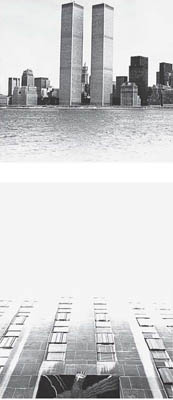

Figure 13.19 Double printing. Top left: test print from Manhattan skyline negative, shading the bottom half throughout. Above: test print from converging building negative, shading the top half throughout. Right: the two exposures made in sequence onto one sheet of paper
Double printing
Having exposed a sheet of paper to the image from one negative, you can then expose it to another. This of course gives superimposition – the shadows and darker tones of one image showing up mostly in highlights and paler tones of the other. But by shading part of the first image, and then printing this area of the paper back with the second image, one scene can be made to merge into the other – often with interesting surreal effect; see Figure 13.19.
Variable-contrast paper is ideal for this work because you can adjust filters to compensate for any contrast differences between negatives. It also helps to have two enlargers, each set up with a negative so that you only shift the paper from one baseboard to the other. You can even carefully cut card shapes and tape-hinge these to the easel as flaps, to help mask out unwanted parts of one and then the other image along a sharp-edged boundary.
Tinted-base papers
Various brightly tinted bromide papers are made by manufacturers such as Kentmere. You need quite contrasty negatives because the pre-coloured base has a contrast-reducing effect. Print processing is the same as for regular papers, and gives a neutral black image. Similar results are possible by soaking any fibre-based print in a cold water fabric dye. However, with some coloured paper products you can also treat your processed print in a special bleach supplied by the same manufacturers. The bleach removes the black silver and also the dye in the image area alone. Results therefore turn from a black image on coloured base to a white image on coloured base. If you then treat this print in suitable dye you get a two-coloured result.
Photo-linen
This is an emulsion-coated white linen you process like bromide paper but limit washing to about 10 minutes. It comes in a single, grade 2, contrast. Results have a textured surface and the linen can be embroidered, sewn together in panels as a wall hanging, etc., as well as being toned (page 259) or hand coloured. The material costs about 2–3 times the price of bromide paper.
Using lith paper
A few manufacturers, such as Sterling, include among their products extreme-contrast lith-type paper. Provided you process in a lith developer – such as Tetenal Dokulith – this paper gives stark black and white prints from continuous-tone negatives, also exaggerating their grain and sharpness. However, its main interest lies in the range of tones – from brown-black to yellow – you can achieve by gross overexposure and underdevelopment; see Figure 13.20.
Some lith papers are orthochromatic, and so will need deep red safelighting. Choose a negative that is rich in pattern or texture, and pin-sharp. First make test strips based on the exposure you would give with normal bromide paper but bracketed with only about 20 per cent differences of time. Process fully in lith developer (typically 2 minutes) followed by regular stop bath and fixer. Decide what you consider correct exposure, ignoring the extreme contrast.
Now make a full print giving four times this exposure time, or opening up the lens two stops. Greatly dilute some of your previous working-strength developer, 1 part developer 5 parts water, and develop this print purely by inspection, removing it quickly from the developer at whatever stage the image looks best. When you view your fixed print in white light it will show a mixture of black shadows and tinted midtones, with generally normal contrast. Increasing exposure by large amounts and reducing development still further produces more colour and lower contrast. Do any shading or printing-in as normal.
Always check any unexpected faults on your print first of all against the corresponding image on the negative. Assuming that the negative itself is free of blemishes, the most common faults in printing and their causes are:


Figure 13.20 A normal contrast negative printed four ways onto a lith type bromide paper, processed in a lith developer. This page, top: 10 seconds exposure and full development. Bottom: 8 seconds exposure and full development. Both prints have a rich black, contrasty image-enhanced look – each reproducing only a small part of the negative’s range of tones (compare water surface and background woods). Opposite page, top: exposed 20 seconds with enlarger lens opened one stop. Processed by inspection in diluted developer. Bottom: exposed 30 seconds with lens open an additional stop. Processing as above. The greater the overexposure and underdevelopment the ‘warmer’ the midtones and the lower the contrast


Once the darkroom side of black and white printing is over, you can still make radical changes to a picture by various chemical processes workable in normal light. These include bleaching, toning and colour tinting.
Image reduction and bleach-out
The two most useful forms of print reducer are Farmer’s, which you use to progressively lighten the image, and iodine bleach, which completely removes parts of the image down to white paper. Formulae for each appear in Appendix D, and you can also buy them pre-packaged. Remember health and safety in handling these chemicals, page 320.
Farmer’s reducer
This is also known as ferricyanide reducer or ‘ferri’. Basically it is a combination of potassium ferricyanide, which changes the print’s black silver image back to silver halide, and hypo (sodium thiosulphate, fixer) which makes the halides soluble so that they can be washed from the paper. Farmer’s reducer can be used as a sequence of two separate solutions, but it is much easier to see the reduction effect with both chemicals present, even though the mixture does not then keep and must be used ‘one-shot’.
Use Farmer’s reducer to lighten just those areas of the picture you have been unable to shade sufficiently. Alternatively, applied to the whole print, it will ‘clear’ veiled highlights and give extra sparkle to light tones – which it reduces more quickly than darker tones.
The print you want to work on should be fully fixed, rinsed and squeegeed on to a clean flat surface. Dilute the Farmer’s reducer with water until tests on a scrap print show that its image-lightening action is fairly slow, and therefore controllable. Then apply it to your main print by cotton-wool swab. Keep stopping the action by hosing over the print surface with water (remembering that if you go too far, reduction cannot be reversed). When the image has altered to the visual result you require, give the print normal fixing, washing and drying.
Iodine bleach
This is the best bleacher for giving a ‘clean’ complete erasure of the image. It is a dark brown solution containing iodine and potassium iodide, which combine with the silver to form a silver halide. This in turn is fixed and washed out. Use the bleacher to convert small black spots into white spots, for subsequent spotting-in with dye or water colour; see page 297. It is also excellent for ‘shaping-out’ subjects from their backgrounds.
Thoroughly blot off the fixed, rinsed print you want to bleach, and apply the undiluted solution with a brush or (for large areas) a swab. A deep brown stain immediately appears, but you can see the black image fading away beneath it. When this bleaching is complete, soak the print in a tray containing some fresh fixer for 5–10 minutes until the treated areas are completely stain-free and white. Then wash and dry the print normally. Discard the fixer because of the iodide by-products it now contains.
When ‘shaping out’ a very complex subject you can first dry your print, paint over or cover parts you do not want to bleach with a waterproof resist, and then place the whole sheet in a tray of the bleacher. Afterwards peel off the resist at the refixing stage.
Toning changes the black image into a colour, by either coating the silver or converting it into another, coloured, chemical or dye. The paper base remains unchanged. Some toned images (sepia, red) are at least as permanent as the original silver. Others (blue, green) are not.
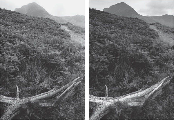
Figure 13.21 Changing local tone values with reducer. Below, left: straight print from negative. Right: this print had nearly twice as much exposure. Then after processing, the fallen branch was lightened back by repeatedly applying dilute Farmer’s reducer on a large watercolour brush
You may want to tone your print to subtly improve tonal richness and increase its permanence, using selenium or perhaps gold. Or you might sepia-tone, either to create an antique-looking image, or as a preliminary to tinting (see below). Stronger toning colours should be used with restraint, unless you need a gaudy effect.
Image colours given by two typical toners are shown in Figure 13.23. These are sold as prepared chemicals, or can be made up (see Appendix D). You can also buy ready-to-use comprehensive kits such as ‘Colorvir’ or Tetenal Multi-toner, offering a whole range of colours. The kit contains separate packs of yellow, magenta and blue toner. By mixing these units in different proportions different toning colours are formed.
Some toners require two stages. First, you bleach the area you want to tone in a ferricyanide solution (without fixer), then you redevelop this bleached image as a coloured chemical image in the toner. Redevelopment can take place in normal room lighting because only halides representing the image are present, so fogging is impossible.
Others are single solution toners, and gradually displace or form an amalgam with the black silver, starting with palest tones first. Yet others (typically those in kits) use dye-coupled development, in which the existing image is first bleached, then redeveloped in a developer plus a chosen colour coupler, and finally bleached again to remove the black silver simultaneously reformed during the redeveloping stage. This leaves an image in dye alone. Notice the similarity with colour film processing.
Whichever toning formula or kit you use, you can choose to change the whole image to a coloured form or, perhaps by means of a paint-on resist (see above), tone just selected areas only. Unaffected parts which remain as black silver can next be toned a further colour. Another way of working is to duotone, meaning that shadows and dark tone values in your picture remain black while midtones and paler parts take on colour.
The way you achieve this two-tone effect will depend on the formula and colour. With sepia toner, for example, you dilute the bleach bath, which then allows you time to remove your print before silver from the darkest shadow areas has been affected. Then in the toner, only paler, bleached tones become fully sepia. In single-bath toner (e.g. blue), you treat the print just long enough to start affecting the lighter tones.


Figure 13.22 Bleaching out background. Above: a straight print shows a moss-covered tree stump with confusing background. Right: by carefully applying iodine bleacher with a swab and brush, and finally refixing, unwanted parts of the image are reduced to white paper

Figure 13.23 Chemical toning. Above: untoned print on bromide paper. Centre: after bleaching and full sepia toning. Far right: blue single-solution toner (often gives a patchy effect if the print is overwashed)
Prints for toning should be fully developed in the first instance. Toners such as sepia slightly lighten the image, and others such as blue slightly intensify it, so anticipate this when making the original print. You will also find that final colours differ somewhat according to whether the print is on a bromide, chlorobromide or lith emulsion paper.
Tinting means hand-colouring your print with watercolours, dyes or oil paints. Oils are applied by brush; other paints by brush, spot-pen or airbrush. The main advantage of tinting over colour photography is that you can choose the colour of every single element in your picture – restrict colour to something you want to emphasize or show in an interpretative way. There is little point in aiming for an accurate, objective record. See Figure 1.13.
If you colour over a normal black and white image, its black silver will mute most of your hues. Instead, work with a print which is warm in image tone and slightly pale. You might sepia-tone the print for example, or make it in the first instance on chlorobromide paper processed in warm-tone developer. Remember that tinting, unlike toning, colours both the image and clear parts of the paper. In fact colours show as stronger and more pure in highlight areas.
Water-based colours, dyes
These are applied to the print while it is still damp. Blot off the print surface and with a swab add a wash of colour to largest areas first. Build up sufficient density of colour gradually. Work down to the smaller areas using a brush, always blotting off the print after each colour application. When only tiny coloured details remain to be done, dry the print and mount it (page 295), then add these final tints using a small brush or, if you are working with dyes, a fibre tip pen. See page 297.

Figure 13.24 ‘Girl On The Tube’ by Tansy Spinks. A print on lith paper was given blue split-toning to enhance its dreamlike image. This, plus the unsharpness and de-personalized male figures, contribute to a sense of isolation
Oil-based colours
Here you must work on a dry, mounted print. Squeeze artists’ oil colour (Marshall’s Oils for example) on to a palette and pick up and apply small amounts at a time, using a fine brush moistened in turpentine. Again work from the largest to smallest areas. Progress is slow because a coloured surface must dry for about 24 hours before you can add other coloured details on top. Oils also alter the surface texture of your paper. However, colours can be erased or changed more readily than with water-based tints, by means of a cotton bud dipped in turpentine.
Airbrushing
Colouring of prints can also be handled with a miniature paint spray known as an airbrush. This is powered by compressed air from a can or an electric pump and compressor unit, and projects a fine spread of spirit- or water-based dye or pigment. Control is by a single button – pressing it down controls air flow, and pushing it forward or back allows paint to flow in a narrow or broad spray from a small internal reservoir. Airbrushing is a good way to create smooth, graduated areas of colour or tone, but takes a lot of practice. Colourists today increasingly turn to digital methods of altering prints, as described in Chapter 14.

Figure 13.25 Opposite: given a subject like this, which is mostly one colour, toning the print can add great strength and richness. ‘Theo’s grandmother’s walnuts’ by Jean Dieuzaide, is a sepia-toned fibre-based print
Summary. Black and white printing: techniques
• |
Contact prints are an important way of proofing/filing all your film images. Aim for maximum information of picture content in every frame. |
• |
Select and clean negatives for enlarging; remember to stop down, and give a geometric series of test strip exposures, each strip spanning shadows and highlights. |
• |
Make local density changes by shading and burning-in; make local contrast changes by altered filtration (variable-contrast paper). |
• |
To reduce printing contrast, use softer grade paper or a lower number filter with VC paper, diffuse the enlarger illumination, ‘flash’ expose the paper or change to softer-working developer. |
• |
To increase contrast, use harder grade paper or VC filtration, consider negative intensification, line developer, lith materials, or change to a condenser or point-source enlarger. |
• |
Check print faults against your negative. Most white marks are caused by light obstruction, black marks by fog or rough handling, patchiness by careless processing. |
• |
Materials and methods worth exploring: lith paper, tinted bromide papers (with bleach stage), adding edge lines, vignetting, and double printing. |
• |
Photograms can give unexpected, unique images. Try removing objects part way through exposure, combining object shapes with an image projected through the enlarger, and printing from prints. |
• |
Dilute Farmer’s reducer will lighten print density and brighten highlights. Halt its effect at any point with water. Stronger-acting iodine bleach will remove chosen image parts altogether. Follow both by re-fixing and washing. |
• |
Toning chemically changes a black silver image into a colour. Use it for special effects; to enrich print tone values; increase permanence (selenium or gold toning); or (sepia) as a preliminary to hand tinting. Some toners reduce image permanence. |
• |
Toners may work as single solutions. Others require the print to be bleached, then toned during a redevelopment stage. Yet others use bleaching and dye-coupled development (wide choice of couplers), followed by optional silver bleach. Prints can be toned overall or just a selected area, or only image midtones and highlights (duotone effect). |
• |
Tinting, by applying water or oil colours, allows total control of colouring and is often best used subjectively. Work from largest to smallest areas. Graduated tone or colour can be applied by airbrushing. |
1 |
Make a ‘ring-around’. Pick an interesting negative and make a wideranging set of prints (a) on various types, contrasts and surfaces of paper, and (b) using different developers. Mount these on a card for reference. |
2 |
Make strong linear and tonal designs by means of photograms. Try: (a) Numerous opaque objects – paper clips, beans, etc. – which you shift around the paper or partly remove after one-quarter, half and three-quarters the full black exposure. (b) Positioning some objects on a glass sheet a few inches above the paper; others in surface contact. Hold tracing paper just below the enlarging lens to make the raised objects form soft-edged shadow shapes. The others remain sharp and are therefore emphasized. (c) Place a few larger objects on the paper. Expose these with a moving torch following each circumference – like a paint spray around a stencil. |
3 |
Make two suitable prints of a landscape or cityscape, identical in size. Use a dye-coupled toner kit to multi-colour tone one of these prints. Tone different areas – sky, vegetation, buildings, etc. – separately, and allow some parts to remain black and white. For each colour, work by applying bleacher carefully only to the part being toned. The other print should be selectively sepia-toned and handtinted with water colours, working to a similar colour scheme. |