In earlier chapters, you learned how to do simple color correction, how RGB and indexed color differ, and how to change the foreground and background colors in the Toolbox. But a deeper understanding of GIMP's color model can illuminate all sorts of useful image-processing tricks.
In this chapter, I'll describe the way GIMP represents colors, different color models, and techniques to manipulate colors.
Understanding color requires a more theoretical approach than you've seen so far. A familiarity with color implementation in digital images is helpful to understanding the sorts of advanced tricks that can be played.
If you feel overwhelmed by the theory, you can skip those sections and use this chapter for reference when you have questions about color. Later chapters will not require an understanding of color theory, though some of the techniques covered here will help in other projects.
This chapter will cover the following:
RGB and CMY color
Working in HSV
Working for print: CMYK
GIMP's other color choosers
Correcting color balance
Working with grayscale or black and white
Coloring monochrome images and making sepia photos
Using the Threshold tool to clean up scanned images
Indexed color
Picking colors from the image
The color channels
Selection using color decomposition
Some color-mapping toys
Color profiles
You've already worked with RGB images, and you know the letters stand for red, green, and blue. But do you know why those three colors are used? Why not red, yellow, and blue, like the paints you probably mixed as a child?
The answer has two parts. The first part has to do with the structure of the human eye. Our color vision is made possible by light-sensitive cells in the retina called cones. There are three types of cones: some are sensitive to red, some to green, and some to blue. Every color we can see, we perceive as a combination of these three primary colors.
The second part of the answer lies with how colors of transmitted light combine to make other colors. Transmitted colors are additive. The light of one color, combined with the light of another color, is perceived as a third color that is lighter than either component.
Computer monitors use the additive technique to depict color. Each pixel in a computer monitor is a combination of red, green, and blue lights. These three colors combine efficiently into virtually any color that the eye can perceive.
If you hold a magnifying glass up to your screen, you should be able to see the separate colors. It's easiest to see in white areas—that's where all three colors are lit up.
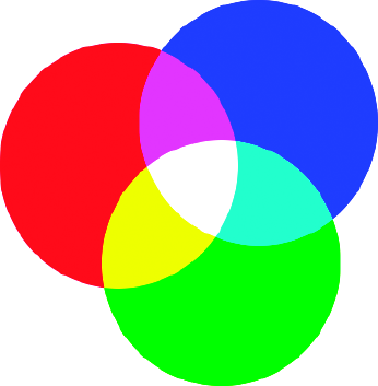
Figure 8-1 gives you an idea of how the primary colors combine to make other colors.
Notice that the center of the circle, where all three colors combine, is white. (It may not look white to you, an optical illusion created by the other colors nearby. Try covering the other colors so that you see only the center portion. You'll see it really is white.)
So what's up with those red, yellow, and blue paints you mixed as a child?
The red, green, and blue additive primary colors work for transmitted light. But ink or paint on paper follows different rules. As you add colors of transmitted light, the image gets brighter. But as you add shades of paint to a reflecting surface, the image gets darker. That's subtractive color.
The paint absorbs light of particular frequencies. The light that doesn't get absorbed is reflected to your eye. In other words, the paint subtracts colors from the white light shining on it. When you mix several colors of paint together, the paint absorbs more and more colors, subtracting from the colors that reach your eye. Reflected color is called subtractive.
Each of the additive colors that come from your RGB monitor has an opposite, or complementary color. The complement of blue is yellow, of green is magenta, and of red is cyan. You can see the relationships in Figure 8-1.
For subtractive colors, it works best to use those complementary colors as primaries: so the subtractive primary colors are cyan, magenta, and yellow, and the color model based around them is known as CMY.
Take some yellow paint and put it on white paper. The white surface reflects the full spectrum of magenta, cyan, and yellow light, while the yellow surface absorbs the magenta and cyan—what's left is yellow.
But wait! When you shine differently colored lights on a white screen, you're looking at reflected light, but it follows the "additive" rules. What's up with that?
That's confusing, but the reflection is a red herring. The color you see is still coming from transmitted light, even after it's reflected. It's not subtractive color because there's no tinted surface subtracting from the colors you see.
It's convenient to consider these two systems, additive and subtractive, as mirrors of each other. They have their own rules about how colors work, but the rules are exact opposites of each other.
For example, if you mix any two of the additive primaries (red, green, or blue), you get one of the subtractive primaries (also called the additive secondaries): magenta, cyan, or yellow, as you saw in Figure 8-1.
Conversely, mixing any two subtractive primaries of paint will yield the additive primaries: yellow + magenta = red, yellow + cyan = green, and cyan + magenta = blue.
Tip
GIMP can help you experiment with combining colors, using the Addition and Subtract layer modes and the color picker. That's how Figure 8-1 was made. You'll learn how in the next chapter.
There's another way the two approaches mirror each other. If you keep adding transmitted light colors, eventually you'll get white. If you keep mixing colors of paint (subtracting reflected light), you theoretically end up with black. (In practice, with paint you get a muddy dark brown most of the time, but that's just reality refusing to conform to theory. You'll learn more about black in the discussion of CMYK color.)
Digital images have another property: depth, or how many different shades of each color the video system can display. You will sometimes see color depth abbreviated as bpp, bits per pixel.
You may hear the phrase bits per channel, the number of bits used per color in each pixel. Multiply by three (for the three primary colors) to get bits per pixel—or sometimes by four if the image has transparency.
Many early color computers could display only 256 colors—this is 28, the largest number that can be expressed in 8 bits, and hence this was sometimes referred to as 8-bit color.
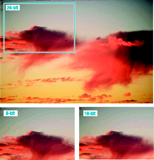
Later, computers were introduced that could display 16-bit color, or 65,536 (216) colors. Today, most computers can display 24-bit color: 8 bits per color channel, or 16,777,216 (224) different colors. This is sometimes called true color. Figure 8-2 compares these three color depths.
Modern computers most often use 32 bits to represent a pixel. Generally, 32-bit color has the same number of colors as 24-bit color. The extra 8 bits may be used to represent transparency (as GIMP does), or it may not be used for anything at all.
Note
Macintosh computers show the color depth choices as "256," "Thousands," or "Millions," historically corresponding to 8-bit, 16-bit, and 24- or 32-bit color.
Some professional graphic artists and motion picture animators use even greater color depth: 16 or more bits per color channel. Normal computer monitors can't display this many colors—some video cards can display 10 bits per channel on a CRT monitor, but typical LCD monitors only manage 6 bits per channel. But extreme color precision can offer more control to the artist who must produce exactly the right color on professional output equipment. High-end digital cameras and some scanners can also produce images with 16 bits per channel, though you'll never see the difference on an ordinary computer display. GIMP 2.4 doesn't support these high color depths—it uses 32 bits per pixel internally—but support for higher color depths is in the works for future versions.
Warning
When someone says "8-bit color," they might mean 8 bits per pixel—only 256 colors total—or they could mean 8 bits per channel, or 24-bit true color. The same is true of someone saying "16-bit color": it could mean slightly less than true color, or it could mean high-depth color with 16 bits per channel. Usually you can tell from the context, but the terminology can be quite confusing.
The 24-bit model is pretty easy to understand. Divide 24 by 3, and you get 8 bits to assign to each color. However, 16-bit color is not so easy to figure—you can't divide 16 by 3 so conveniently. What gives?
In 16-bit color, the usual technique is to assign 5 bits each to red and blue, with the remaining 6 going to green. It turns out our eyes are more sensitive to green light, so distinguishing fine differences of intensity is most useful in that part of the spectrum.
Eight-bit color is even weirder. Because there just aren't enough bits to do a good job, there never was a truly common standard bit assignment for those 256 colors. The usual trick was to create a palette of colors, assigning the values however the designer saw fit. If a program needed to show a color that wasn't in the palette, it picked the closest match (which sometimes wasn't very close).
Since monitor phosphors could show far more information than the system could supply, the palette could be redesigned with different goals in mind: making text and windowing systems look good, making computer graphics such as logos look good, making photos look good, and so on. Each window on a display might use a different palette, and when you went from one application to another, every window on the display would suddenly shift colors.
Fortunately, you probably won't have to deal with palette headaches any more except for GIF images (see the section on "Indexed Color" later in this chapter).
Knowing RGB notation can help you understand color in web pages written in hypertext markup language, or HTML. Although HTML lets you specify the most common colors by name, such as "red," many web page authors prefer something more flexible. Instead, they specify colors by their RGB values.
Figure 8-3 shows what the color notation looks like. HTML notation shows six digits representing three two-digit numbers in base 16 (called "hexadecimal," or just "hex" for short), ranging from 00 (darkest) through 99 to ff (brightest). Bright red is shown: the first two digits are ff, meaning as much red as possible. The second and third pair are both 00, meaning no green and no blue, only red.
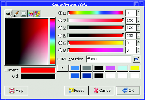
In HTML, you add "#" in front of the number GIMP gives you. So red would be #ff0000 in HTML notation. (You can also write this in a more compact three-digit form, as #f00.)
Notice that you can also read the R, G, and B values off the sliders in GIMP's color chooser. R is 255 (ff is hexadecimal for 255), while G and B are both 0. If you don't know how to convert between hexadecimal and decimal numbers, that's not a problem: just use GIMP's color chooser to pick a color, copy the number in the HTML notation field, and then put a "#" in front of it.
RGB is straightforward, and it's the way the computer represents colors internally. But sometimes it works better to represent colors in some other way.
HSV, or Hue, Saturation, and Value, is a very useful color model. You've worked a little with HSV already if you've used GIMP's color chooser.
The HSV model, like RGB and CMY, uses three numbers to represent each color. But instead of splitting an image into separate color components, HSV uses conceptual properties of the image.
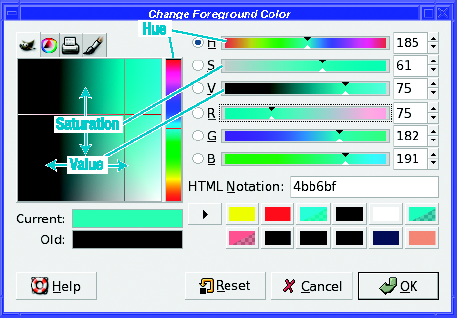
Hue is a measure of where that color falls in the spectrum—is it more blue, or more red, or more green? In GIMP's color chooser dialog, hue goes from 0 to 360, not 0 to 255 the way the RGB values do. The number represents degrees on a circle: a hue of 360 is the same as a hue of 0 (both are pure red). You can see the hue values laid out in the rainbow-colored vertical bar in GIMP's color chooser, from reds at the bottom (hue=0) through orange, yellow, green, blue, magenta, and finally back to red again (hue=360) at the top.
Saturation is how intense a color is. It ranges from 0 to 100. A color that's bright and vivid is highly saturated and has saturation of 100. A color that's pale and looks "washed out" will have a lower saturation, down to white at the bottom (saturation=0). In GIMP's color chooser, dragging up and down in the color square changes saturation; or you can drag the "S" slider by itself.
Value represents how bright a pixel is, from 0 to 100. A black pixel has value=0; a bright pixel (whether it's white or some other color) has value=100. Dragging left and right in GIMP's color square changes value, as does dragging the "V" slider.
Figure 8-4 illustrates these relationships.
Why learn this model? Why not just stick with good old Red, Green, and Blue?
Experimenting with the color chooser will provide the answer. Think of a color, then try picking it using only the R, G, and B sliders. Then try again using the H, S, and V sliders.
Most people find that it's more intuitive to choose colors according to questions like "More red, or more yellow?" "How intense should the yellow be?" and "How bright do you want it?" That's much easier than it is to figure out how much red you need to mix with how much green to make the shade of brownish-yellow you're after.
In addition, other aspects of the HSV model can provide a shortcut to certain image-editing operations.
You've already seen the Hue-Saturation dialog in action: first in Chapter 2, where reducing saturation provided a quick fix for red-eye, and then in Chapter 6, where changing hue helped to get rid of a color error in a photograph. You'll learn other uses for HSV later in this chapter.
Printers use the subtractive colors—with a twist. To represent dark colors in CMY, you would normally combine all three inks in fairly equal amounts. But due to the physical properties of ink, this often ends up as a muddy dark brown instead of a nice sharp black. It also uses up a lot of expensive colored ink. So most printers add a fourth color, pure black, and add that to the CMY mixture to get better dark colors.
This might have been called CMYB—but B is already used for blue when talking about colors. So, instead, black is represented by K, and the printing color space is known as CMYK.
Note
You might also sometimes see it written as CYMK.
People working primarily for print media, on professional equipment, want a lot of control over how much black gets mixed in when an image is printed. Therefore, they like to work directly with CMYK colors when they're editing images.
GIMP is limited in that respect. The Decompose function, which I'll talk about later in this chapter, has a CMYK option. The color chooser offers a CMYK tab, and the new Gutenprint print plug-in (see the section "Printing" in Chapter 12) allows adjustment of K. However, most tools and filters don't give you control over CMYK color, and most plug-ins can't yet save to CMYK. (That may happen in a future version of GIMP.)
But fortunately, most of us don't need this functionality. You can't see any difference at all on a computer monitor. Desktop computers and home inkjet and laser printers can print perfectly well from an RGB image, and so can most copy and print shops.
If you take your images to a professional for printing, you can use external programs to convert from RGB to CMYK. There's a GIMP plug-in that uses a program called littlecms to convert to CMYK. Or you can just let the printing house do it for you—they know the characteristics of their printers better than you do anyway.
Up to now, I haven't mentioned the tabs at the top of GIMP's color chooser dialog. What are they, anyway?
The tabs provide alternative ways of changing color, in case you don't like the standard Saturation-Value square with the Hue bar next to it. The number of tabs and their order may vary from system to system. Some systems may not show any tabs, if the extra color-selector modules weren't installed. Other systems may have more than four, if additional modules have been added.
The default color chooser is the one you've already used—the standard GIMP color chooser (which has a picture of Wilber on its tab).
The "triangle" color selector provides an alternate HSV interface (Figure 8-5). Instead of a vertical slider, hue is represented by a circle (remember from the discussion of HSV how the Hue slider goes from 0 to 360, representing degrees around a circle?). The two small rings are grab handles that you can drag: one drags the point of the triangle around the circle to choose a hue, and the other drags into the triangle to choose saturation and value.
Notice that you still have the familiar set of sliders for H, S, V, R, G, and B on the right: only the left section of the dialog has changed.
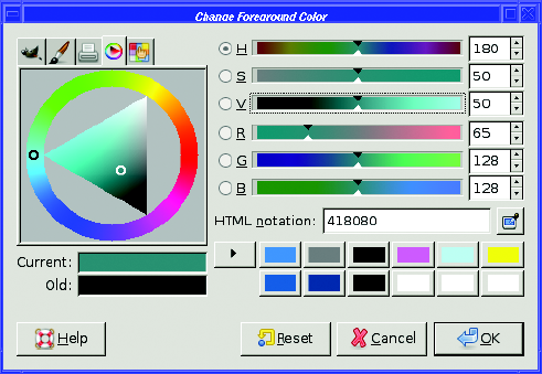
Once you've chosen the hue, drag the other white ring back into the triangle to choose saturation and value. Dragging toward the black corner reduces value; toward the white corner, saturation.
The interface in this tab is pretty. But it's sometimes a little hard to balance saturation and value—they don't follow equal scales (for instance, the point in Figure 8-5 has saturation and value both set to the halfway point of 50, but clearly it's not halfway between the dark and light corners of the triangle).
The interface is also a lot slower than the standard GIMP selector—on my machine I find that it can't always update as fast as I can drag the circle around. But if you have a fast system, you may prefer this color selector.
The CMYK tab, with a picture of a printer, offers controls to set CMYK colors. If you're working for a print medium, and know exactly the CMYK hue you're after, you can choose it here. If you have a CMYK color profile set, GIMP will use it for this tab. But beware: GIMP does not use CMYK color internally, so the value you choose in this tab will be converted to RGB for most GIMP operations.
The Black Pullout parameter (GIMP 2.2 and earlier) lets you control how much the other colors can be reduced in order to use black instead. The maximum, 100, means use as much black as possible. Adjusting Black Pullout automatically adjusts the other colors (but not the reverse).
Finally, the trickiest of the selectors: Watercolor (Figure 8-6). When you drag the mouse in the square palette area, the color you drag gets "mixed with" the current color. At first, the color will be fairly pale; drag in small circles within the same color area to make the color gradually darker. Be careful not to slop over into other color zones, unless you want to mix in a different color.
The slider to the right of the palette controls how fast color is added. To be cautious, or to paint with pastel colors, slide it farther down, as in Figure 8-6. If you slide it down all the way to the bottom, though, no color at all will be added.
If you've done a lot of watercolor painting, this selector may seem familiar. If you've done a little watercolor painting, and when you mix colors, you usually end up with a muddy brown and have to start over—well, this interface may seem familiar!
To try it out, start with white and add color gradually to see what happens. It takes practice and parsimonious mouse use to get good color combinations without ending up at dark gray or brown.
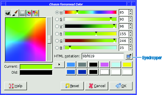
What happens if you go too far? The watercolor selector is one of the few areas in GIMP where there's no Undo. So if you accidentally add the wrong color or your color gets too dark, you usually have to start over by going back to white. With any luck, one of the color presets to the right of the Current and Old color swatches will be white. If not, there's always the eyedropper.
Tip
The "eyedropper" button to the right of the HTML notation field, new for GIMP 2.4, lets you set GIMP's color chooser to any color you can see on the screen—even in windows belonging to other applications. Click on the eyedropper in any GIMP color chooser, then click on the color you want. It's a fast way to get back to white...or to use a color out of a photograph or web page. GIMP has an eyedropper tool in the Toolbox, too, the Color Picker tool (described in the section "Picking Colors from the Image"), but it's much less flexible: the tool can only pick colors from open image windows, while the eyedropper in the color chooser dialog can pick colors from anywhere.
Cameras don't always record the same colors your eye sees. Photographs taken indoors under incandescent lights often come out looking yellow (though some cameras have settings to compensate for this effect). Fluorescent lights can turn photos blue. Long exposures can have strange effects as well, especially with film cameras.
For instance, Figure 8-7 was a relatively long exposure on color slide film. Although it was a beautiful storm (I was trying to capture lightning, but didn't manage it), the clouds were just ordinary gray, not the purple shade that showed up in the slide. To be honest, I rather like the purple sky in this photograph. But what if I wanted to make the colors more normal?
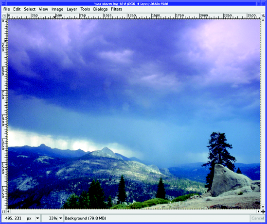
GIMP has several ways of adjusting color balance. The simplest is Colors
For correcting color casts, Hue is the only slider you need. The effect of nudging the Hue slider slightly to the left shows up well in Figure 8-8. A subtle change can help eliminate a color cast in a photo.
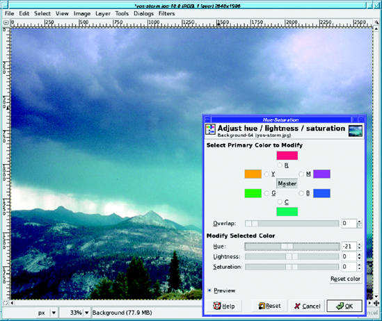
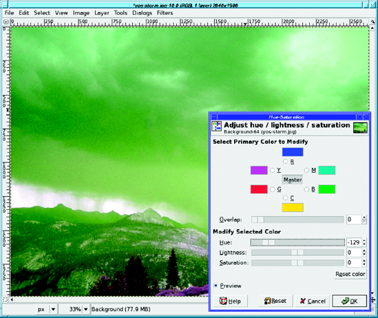
However, you usually have to be very sparing with the Hue slider. Move it more than a trifling distance and you'll have huge color changes in your image, as Figure 8-9 shows.
Layers
Choose to modify Shadows, Midtones, or Highlights, then slide the sliders in the direction you want to go—in this case, away from Magenta (toward Green) and away from Blue (toward Yellow). Figure 8-10 shows the result.
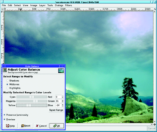
How do you decide which range to adjust? It's not always obvious which is best. In this case, Highlights seemed like the obvious choice, because the strongest magenta cast was in the brightest part of the clouds. Wrong! Choosing Highlights created a grainy texture in that region, whereas choosing Midtones gave nearly the same color balance but without the unwanted texture.
When in doubt, start with Midtones. But you don't have to stop there; before you click OK, you can adjust all three ranges. The Reset Range button sets the current range back to zero, while Reset zeroes all three ranges at once.
You've already used the Levels and Curves tools for adjusting brightness and contrast. But they're also powerful tools for adjusting color.
The key is the Channel menu at the top of the Levels and Curves tools. By default, it's set to Value, meaning that the tool will adjust the brightness of the image. But you can also adjust levels or curves of the individual color channels: Red, Green, or Blue.
You can even adjust the transparency, or Alpha, channel. However, that is a more advanced technique and isn't generally useful for photographs.
You can adjust each channel in Levels by moving the Output sliders around, just as you would adjust the brightness of a photo. But Levels offers you a more powerful tool: the three eyedropper buttons representing White Point, Gray Point, and Black Point. You can use them to adjust color casts as well as brightness. All you need is to find places in your image that should be pure white, pure black, or a neutral gray. Then click on one of the eyedroppers and a corresponding point in the image. It doesn't matter which channel is showing—the eyedroppers will affect all three channels. In this case, I've clicked on a white point in the clouds, viewing the red channel to see what the effect is there (Figure 8-11).
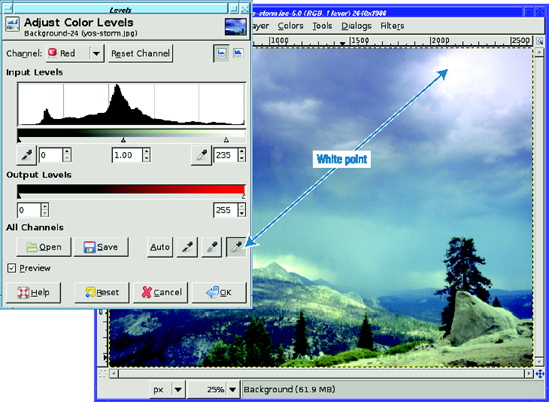
Experiment to find out which controls work best. In this case, I also tried setting the gray point to the color of the lowest band of clouds, but that didn't help much compared to setting the white point. And setting the black point didn't help at all.
Curves doesn't have White, Black, and Gray eyedroppers, but it gives you a lot more control over the amount of each color at each point in the curve.
Figure 8-12 shows the effect of a curve that reduces the amount of blue in the brightest areas of the picture without changing the other two channels.
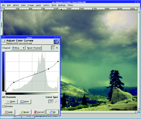
Figure 8-12. The right curve can make color adjustment easier, even if you adjust only one color channel.
It often won't be obvious which channel you should adjust to correct a color problem. Don't be afraid to experiment!
How do you turn a color photograph into a black-and-white one?
It turns out there are lots of approaches. They all produce similar results, but they're not exactly the same. There are quite a few ways to map three color values into a single brightness value. If you want a specific effect, you may want to try several methods and compare the results. But why are there so many methods?
Mostly because it's not always obvious what brightness means.
What are all the brightness values, and how do they differ?
Since each pixel in an image has a red, green, and blue value, these three numbers must be combined in some way to turn the pixel into a single gray value. The obvious way is to take the average of the three: (R + G + B)/3.
Another simple method is to extract the value of the most prominent color in the image: max(R, G, B). This is Value, the V of HSV color.
But those methods don't always give you a result that matches what the eye sees. The eye is most sensitive to green, less so to the other colors. Luminosity (also called luminance) is a measure intended to match the way most people's eyes see colors on a computer display. Instead of just averaging red, green, and blue, luminosity is a weighted average that gives the most weight to green, and the least to blue.
In some cases, though, a slightly more complicated method can give better results. To find the lightness of a pixel, GIMP takes the value of the color that's most prevalent, and the value of the color that's least prevalent, then averages those two numbers. This usually gives a "flatter" result, with less dynamic range: the brights aren't as bright, and the darks aren't as dark.
How do you create all these grayscale images in GIMP?
The most straightforward way to convert to grayscale is to change the image's mode from RGB (24 bits) to grayscale (8 bits) using Image
Grayscale mode uses luminance. Often, this is all you need. It's the only method that converts the entire image; the others will convert only the current layer. It is also the only method that will save the image in grayscale mode (if the format you're using, such as PNG, allows such a concept). This can make a smaller image on disk.
Once you tell GIMP an image should be grayscale mode, it won't let you add any colors to it. If you want to add colors later (even in a new layer), you need to convert the mode back to RGB...which won't add the colors back; it will merely change the image's mode so that you can add colors.
The second grayscale conversion method is the Desaturate function found in the Colors menu. In GIMP 2.4, this gives you a dialog offering a choice between Lightness, Luminosity, or Average. (In earlier GIMP versions, the Colors menu was found in Layer
You may have noticed that, ironically, none of the Desaturate options do the same thing as reducing saturation to zero in the Hue-Saturation dialog. Figure 8-13 shows other uses for the Saturation bar. By reducing saturation in an image, you can create a pale-hued image that can make a nice background for a poster or greeting card. Increasing saturation creates a bright, garish image, which again could be useful for posters or other artwork.
No, this isn't what happens when you leave your disk drive out in the rain too long! Colors
The Decompose dialog gives you lots of choices (Figure 8-14). Yikes!
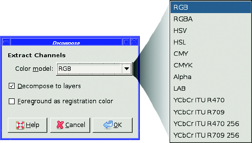
The first five should already be familiar to you. RGB will give you the red, green, and blue channels of your image; RGBA will do the same, but will include information about the alpha channel if your image has transparency. HSV, CMY, and CMYK are all terms you've read about earlier in this chapter; HSL is a variant of HSV that gives you a lightness layer in place of value). Alpha gives you just the transparency and nothing else.
LAB is yet another color model. The L stands for luminance; A and B represent a color channel between red and green and another color channel between blue and yellow. Some images made in Photoshop and certain other programs use this model. If you don't need to convert LAB images, you probably don't need to worry about it, though it can be useful for certain effects, like sharpening.
The YCbCr ITU entries represent specialized color models used for digital video and for the internals of JPEG images. They're similar to LAB, but most people won't find much use for them.
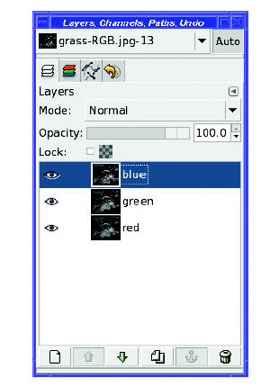
Whichever color model you choose, Decompose will create a new image in which the layers correspond to the color channels (Figure 8-15). If you uncheck Decompose to Layers in the dialog, it will give you separate new images, instead of separate layers in a single new image. Either way, it will leave the original image unchanged. (The last option, Foreground as registration color, is for high-end CMYK printing; it maps the current foreground color to black.)
In the new image, what you see is the top layer—in this case, the blue layer. You can view the other layers by clicking on the visibility buttons in the Layers dialog.
Tip
You can make changes to these layers, then recombine them into a color image using Recompose (located right next to Decompose in the menus). You can also build a color image out of several unrelated grayscale images using Compose. This will let you choose among all of the grayscale layers (and only grayscale layers) currently open in the GIMP.
Decompose is fun because it lets you see the components of your image in several different color models. But it's also useful: you can modify one or more channels then Recompose, or you can use one of the layers as your final monochrome image, if you like it.
Often, the green layer of an RGB decomposition makes a good approximation to what the eye sees. Or try the value layer of an HSV decomposition (which should be equivalent to using the Hue-Saturation dialog and reducing saturation to zero).
The saturation layer of an HSV decomposition is particularly interesting—it looks a little like a black-and-white negative of the original image. The K layer of a CMYK decomposition also looks like a negative. But they're not really equivalent to a negative: if you want to see what a black-and-white negative of the image would actually look like, you can do that by converting to monochrome using any of the methods already discussed, and then selecting Colors
Decompose is also useful in making tricky selections, as you'll see later in this chapter.
Finally, if you want complete control, try Colors
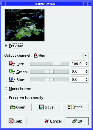
Notice that you can make the image much brighter or darker by using the sliders in the Channel Mixer. If you just want to adjust the weights of the colors, without changing overall brightness, the Preserve luminosity checkbox will adjust all the values so that the image's luminosity remains unchanged even if the three slider values add to more or less than 100%.
Some cameras have a "sepia" setting, which makes a black-and-white photo and then colors it brownish, like a photographic print that's been "toned" to make it last longer.
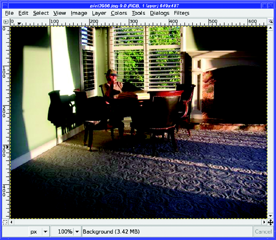
But if you like the look of sepia prints and your camera doesn't do them, you can make your own with GIMP. Start with a color photo (Figure 8-17).
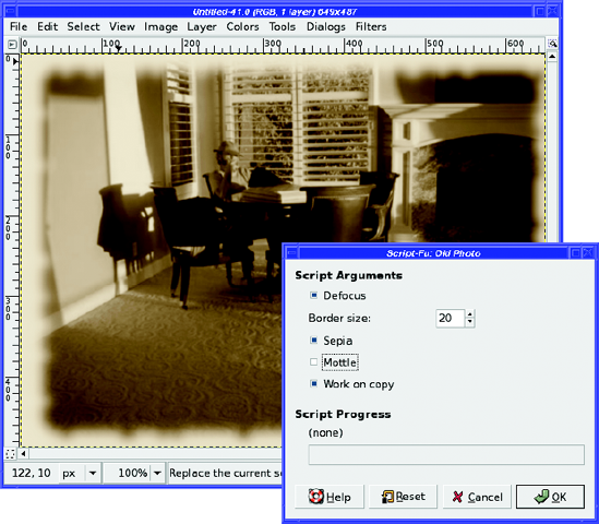
First, let's do it the easy way. GIMP already has a plug-in to do this conversion. It's in Filters
Defocus makes the focus a little softer.
Border size creates a fuzzy border around the image, making it look like the edges have been torn. Change this value to 0 if you don't want a border.
Sepia converts the image to black and white, and then tints it sepia (without this, the image will remain colored).
Mottle creates mottling all over the photo, making it look like it's been sitting in a dusty drawer for 50 years.
Work on copy creates a new image, leaving your original unchanged.
By default, it will Defocus, add a 20-pixel border, tint sepia, add no mottling, and create a copy.
How does it work? How can you use GIMP's color system to make your own sepia prints?
Let's try several techniques. They all begin by converting the color image to black and white. But make sure the image ends up in RGB mode, not grayscale, so you'll be able to add the sepia color.
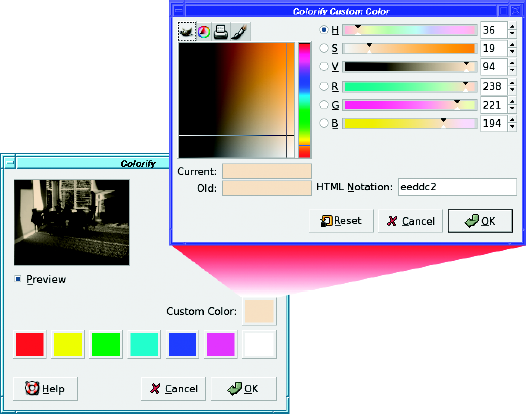
One method is by using the Colorify plug-in, accessed through Colors
Colorify tends to make images that are fairly dark. You have to make the tint color very light or you may end up with a muddy result.
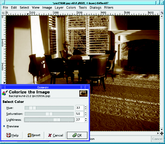
Finally, you can use layer modes. First, set the foreground color to a medium sepia color: a28a65 (typed into the HTML notation box) works well as a starting point. Now, create a new layer that is entirely filled with this color by clicking on New Layer in the Layers dialog. Set the Layer Fill Type to Foreground color.This covers your original layer. But don't panic!
Go to the Mode menu in the Layers dialog and choose Color (Figure 8-21).
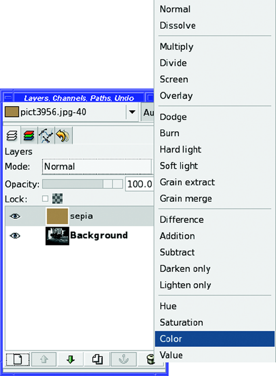
This gives a sharper result than Colorize or Old Photo. Of course, you can use the Color layer mode to tint photos any shade, not just sepia; and you can create impressive effects by drawing different colors on different parts of the color layer. You'll learn more about colorizing with layer modes in Chapter 10.
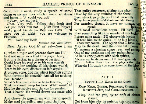
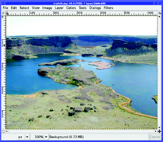
Have you ever tried to scan in a page from a book? It's especially tricky with an old yellowed book, or a page that has crumples and folds and dirt spots on it, or text showing through from the other side of the page. How can you clean up a page of text like Figure 8-22 into a nice black-and-white image?
For anything that really ought to be black and white (with no shades of gray in between), the tool of choice is Colors
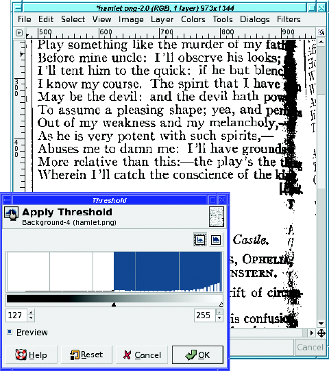
Threshold has two sliders, though most of the time you'll only need to adjust the left one. The sliders move along a bar showing a range of grayscales. The key to the Threshold tool: any pixel value between the two sliders—marked as blue in the tool—will be white in the resulting image. Anything that's darker than the left slider or brighter than the right slider will be black. (Yes, that's slightly counterintuitive. To give the image more white, you want less white—more blue—in the tool's dialog.)
To adjust the darkness of an image such as a scan, slide the left slider until you're happy with the result.
So what's the right slider for, anyway? Adjusting the right slider will take anything that's very bright in the image, and make it black instead of white. This may sound like an odd thing to do, and generally it's not useful in scans. However, you can also use the Threshold tool on a photograph to make selection masks—you'll see how later in this chapter. Occasionally being able to select a brightness region somewhere in the middle can help a lot in making a selection.
Threshold, since it creates an image that's purely black and white, will eliminate any "aliasing" smoothing the edges of lines, sometimes resulting in a "jaggy" look. When you want smoother edges and don't mind some gray in the image, Curves or Levels may be a better tool than Threshold. Try all of them to become familiar with the differences.
In Figure 8-23, Threshold works fine for everything except the right edge, where the page curves away toward the binding. Using Levels or Curves doesn't help with that, either. So how do you fix it? Easy: with layer masks.
Make a duplicate layer with the original scanned page. Run Threshold on that layer too—but set the threshold so that the text at the right edge comes out looking right. Now all you need to do is combine those two layers with a gradient layer mask...just like the "ostraffe" layer mask project in Chapter 5.
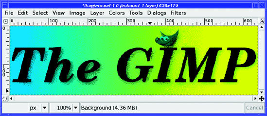
An image with indexed color contains only a fixed set of colors, usually 256 or fewer. You've already read about indexed formats such as GIF and indexed PNG in Chapter 2. There, you saw an example of how the number of colors can change the quality of the image.
The list of colors in the image is called the image's palette, like an artist's palette holding the pigments to be used in a painting. The file size of an indexed image depends very much on the number of colors in the palette. Indexed formats can be efficient when they have only a small number of colors. They're ideal for small web images such as icons for buttons or forward/backward arrows.
Every image loaded into GIMP has a color mode, represented in the title bar of the image window. For instance, in Figure 8-24, the title bar shows that the image is in RGB mode.

Saving an image as GIF will automatically convert it to indexed mode, since GIF images are always indexed. But you usually won't get the smallest possible image that way: GIMP will use 256 colors, when four might have sufficed. You're much better off converting the image to indexed mode yourself, even for GIF. To save in indexed PNG format, converting to indexed mode is your only option. Since PNG images can be either indexed or full color, GIMP uses the image's mode to determine which form of PNG to use.
Suppose you've made a logo such as Figure 8-24, and want to save it in an indexed format. How do you make the image size as small as possible?
To convert to indexed mode, use Image
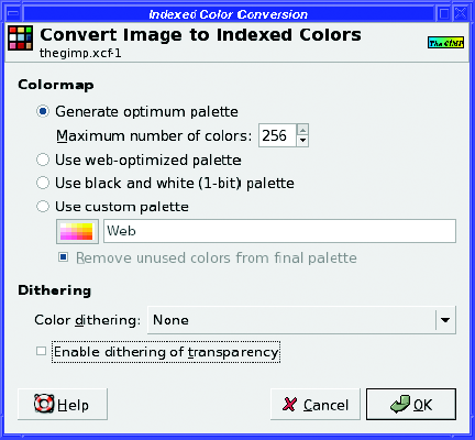
By default, GIMP chooses Generate optimum palette, which creates a palette of the colors in the image, and no others. Most of the time, this is your best choice. The other options offer palettes for special cases.
The black-and-white palette, which contains only those two colors, can save a lot of space if your image truly only contains those two colors (no shades of gray).
The web-optimized palette and the Web palette in the custom palette list use colors that used to be standard in web browsers. Today, nearly all web browsers and computers support 24-bit true color, so web palettes are much less important. You're usually better off optimizing a palette for each image.
The trick in converting to indexed mode is in choosing the right number of colors: the smallest number for which the image still looks good enough. Start with a small number, like four or eight (make a guess based on how many colors you think the image should need), and click OK (Figure 8-26).
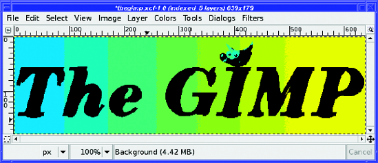
Yuck! The image looks awful! That's clearly not enough colors, so undo and try a different setting.(Converting to indexed, alas, does not have a preview.)
Take a look at those options again. An image that has shades of color can often benefit from dithering: combining several colors in the palette to simulate colors that aren't there. Dithering will increase file size significantly, but not as much as increasing the number of colors.
The dialog offers several dithering options:
Figure 8-27 shows the effect of starting with that same 8-color palette and adding Floyd-Steinberg (reduced color bleeding) dithering plus dithering of transparency. The shadows around the letters are now dithered with black dots, but they still don't look at all like a shadow. There's good news too: the transition in the color background looks much smoother now, as you can see in the zoomed image (Figure 8-28).
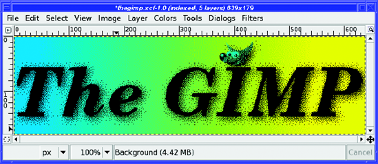
Figure 8-27. An 8-color palette with Floyd-Steinberg (reduced color bleeding) dithering and dithering of transparency
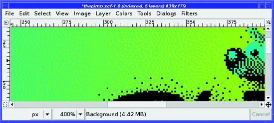
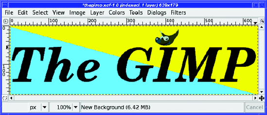
What's the problem? Well, part of the problem is that converting an image with multiple layers to indexed mode often doesn't work very well. This image has five layers: the background, the text, the text's shadow, Wilber, and Wilber's shadow. GIMP is trying to index each of these layers separately—and so the dithering on those shadow layers looks very poor. There are two solutions.
First, get rid of the layers. Image
Note
What's the difference between Flatten and Merge Visible Layers? They differ in two ways. First, Flatten will remove any invisible layers and leave you with only one layer in the image, while Merge Visible Layers will leave any invisible layers untouched. Second, Flatten will also remove any transparency, while Merge Visible Layers keeps it. If you don't have any transparency or invisible layers in your image, you can use either one—they'll both do the same thing.
The flattened image looks much better when indexed, even with only eight colors (Figure 8-29).
But sometimes, if the goal is to make a very small image, simplifying the design can help more. The sad fact is that those lovely, subtle color fades you can make in GIMP don't translate very well to indexed formats.
If you can change the design to eliminate shading, you can make a much smaller image. In Figure 8-30, all the shading (except in Wilber himself) has been removed and the image converted to indexed with no dithering. This resulted in a GIF file less than 5K, as compared to 6.1K for the dithered version and 15.8K for the image in Figure 8-29.
Doubtless you're wondering, "Why all this fuss over a mere 10 kilobytes?" Of course, for a single image there isn't much point trying to make your images this small. But some web pages have hundreds of images on them. If you design your icons to have small file sizes, that can make the difference between a web page that loads instantly and one that loads so slowly that users give up on it and go someplace else.
Tip
Do you ever find that the GIMP function you want to use is grayed out when you're working with an image you loaded from a GIF file? Most often, it's because your image is in indexed mode, perhaps because it was originally a GIF image. Many of GIMP's color functions will only work on an RGB image (or sometimes a grayscale image), and will be disabled for indexed images. This is because an indexed image does not allow a full range of colors. If you see color functions disabled and wonder why, check the title bar of the image window and see if it says "Indexed." If so, a quick conversion (using the Mode menu) back to RGB mode will solve the problem. If that doesn't enable the function, check whether the image has an alpha channel; some filters require one. Of course, if you ultimately want to save to GIF or indexed PNG, you'll have to convert back to indexed mode before you save.
What if you want to change one of the colors in an indexed image?
Dialogs
To change a color, simply double-click on the color square to bring up a color chooser. Alternately, click on a square and then edit the HTML notation box and press Return. Or click on a color, and then click the lower-left button in the dialog (its tooltip calls it Edit color).
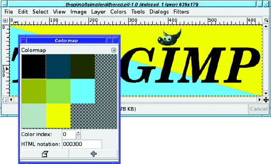
Color index lets you move to the next or previous colors, though clicking on the appropriate square is usually just as easy.
The + button in the lower right is Add color from FG. It adds a new entry in the colormap, using GIMP's current foreground color. Note that this will slightly increase the size of your colormap, and therefore your image.
Between the colormap editor and making corrections with the Pencil tool, you can usually fix any dithering problems in your indexed image. In the end, you get a clean image to put on the web.
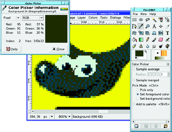
While cleaning up that indexed image, the Color Picker tool was awfully helpful. It was introduced back in the animation section of Chapter 3, but it comes in especially handy here.
One problem you may have with indexed images is difficulty in using GIMP's normal color chooser. For instance, in the indexed Wilber image, if I set GIMP's foreground color to bright red and try to draw on the image, what actually appears is a muddy brown. What gives?
An indexed image can display only the colors in the palette. If you attempt to draw with a color that's not in the palette, GIMP will try to pick the closest color—almost certainly not what you want.
The solution is to use GIMP's Color Picker tool to grab a specific color from the image, as in Figure 8-32. That way, you'll be sure of getting a color from the right palette.
GIMP maintains three special color masks that show the red, green, and blue components of the current image. You can see them in the Channels dialog, usually docked as a tab with Layers and Paths (Figure 8-33). Light colors means a lot of the indicated color; dark means less.
Notice the white flower in the blue channel (the flower petals have a lot of blue in them), the general lightness of the green channel (there's a lot of green in the photo), and darkness of the red (there's a little red in the flower but not much anywhere else).
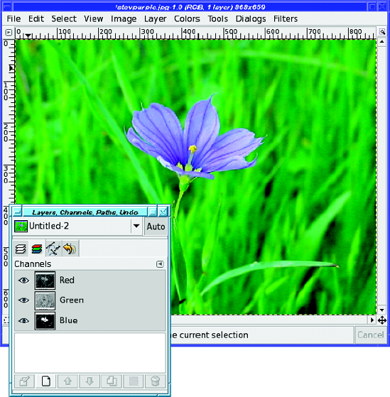
However, the previews in the dialog are too small to see much detail. You can make them a bit larger using the Preview Size item in the tab configuration menu—to the right of the Layers label in the dialog—but they'll still be small compared to the full-sized image. Also, not many operations work directly on the color channels. You can turn a color channel into a selection (via the context menu in the Channels dialog), but for more detailed work with color channels, you're usually better off using Decompose to create an image with red, green, and blue layers.
Remember Colors
Well, for example, you could select that flower from Figure 8-33.
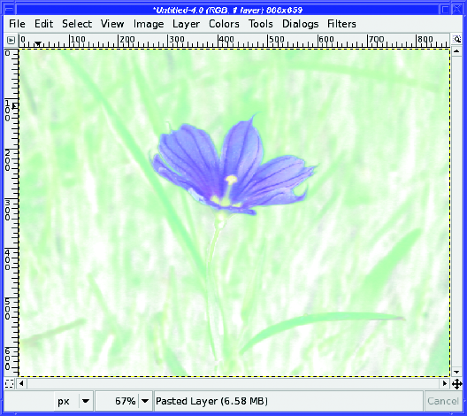
If you right-click on the blue channel (in the Channels dialog) and choose Channel to Selection, the "marching ants" make it look like you have a pretty good selection of the flower. But that's deceptive.
There's a problem: nothing is completely selected. The flower was mostly blue, but not pure blue, so it gets mostly selected. The grass around the flower has some blue, so a little bit of that gets into the selection too. Instead of getting all of the flower and none of the grass, you get a mostly opaque flower and mostly transparent grass.
If you paste the selection onto a white background, you'll see something like Figure 8-34. It might make a nice background for stationery, but it's not what you thought you had selected.
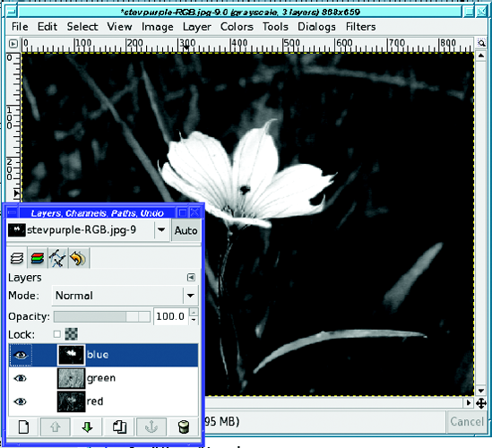
Decomposing to RGB can give a better result. Figure 8-35 shows the blue layer, which is basically the same as the blue channel. You can see lots of pieces of the background, not just the flower. But since it's in a layer now, you can modify it to be more useful.
To turn the blue layer into a useful selection mask, use the Threshold tool (Figure 8-36). A tool such as Levels or Curves will also work.
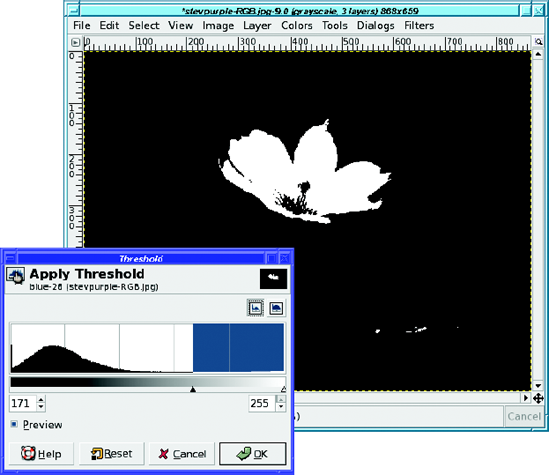
Once you've set the threshold, you can use drawing tools to clean up the selection. Paint out (in black) anything you don't want, like those white bits in the bottom right; and paint in (in white) anything you do want, like the center of the flower. Once you're happy with your selection mask layer, copy it (Ctrl+C).
Now go back to your original image, and activate the QuickMask (remember it from Chapter 5?) by clicking on the dotted square at the lower left of the image window.
A simple paste (Ctrl+V) onto the QuickMask, then click the Anchor button (this is one of the few times you want to anchor a floating layer rather than make it a new layer) and your selection is ready (Figure 8-37). Switch from QuickMask mode back into normal mode and copy, and you have a perfect flower that's ready to paste anywhere.
Tip
This method also works well for creating a layer mask. To avoid the sharp edges that the Threshold tool can create, try Levels instead.

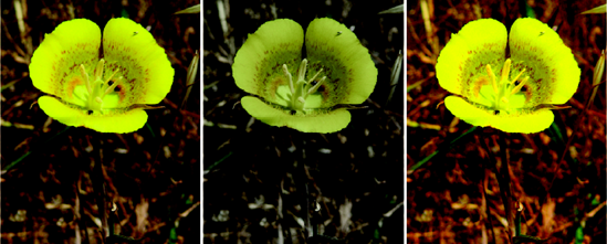
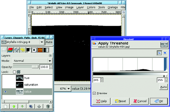
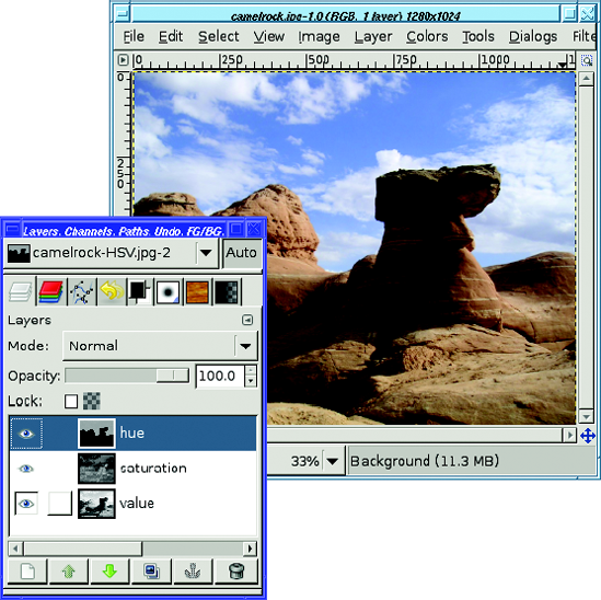
With Decompose, though, you aren't restricted to using just the RGB color channels. HSV decomposition can be even more useful in extracting a glaring overcast sky (Figure 8-38).
Decompose to HSV, and then run Threshold on the value layer (Figure 8-39). Clean up any stray pixels with a drawing tool such as the Paintbrush, and you're ready to select the sky.
Once the sky is selected (you may also want to grow or feather the selection by a few pixels), you can make a replacement light blue sky (Figure 8-40). But it doesn't look right.
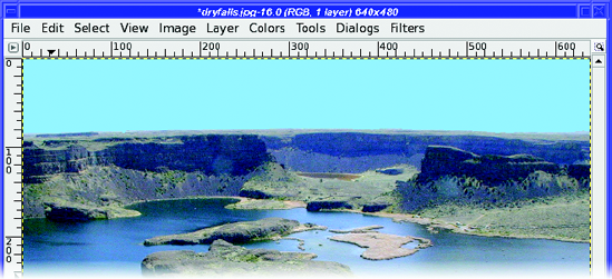
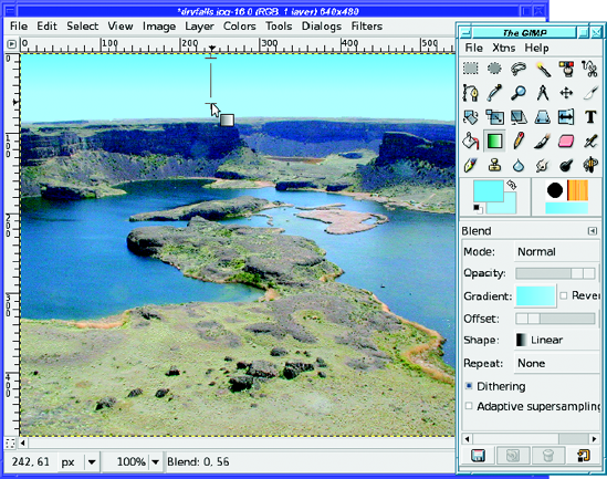
What's wrong with the sky in Figure 8-40? Real skies are darker and bluer up high, fading to lighter colors down low. So use a gradient and two similar shades of blue to make a more realistic sky (Figure 8-41).
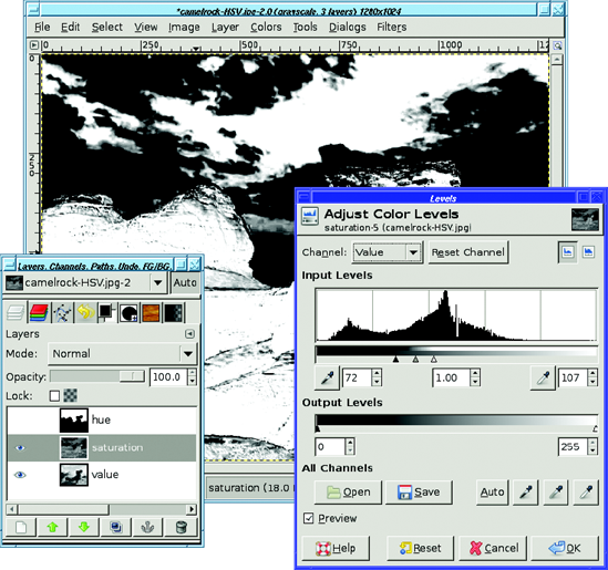
But it's not always the Value channel you want. For the photo in Figure 8-42, the Hue channel works better than Value for selecting the sky. But that's not all you can do.
The saturation layer is even more useful: it can separate the clouds from the blue sky, because the sky is much more saturated than the clouds are. For selecting clouds you'll want to use Levels (Figure 8-43) or Curves, not Threshold, because to select fuzzy edges you need levels of gray, not just black and white.
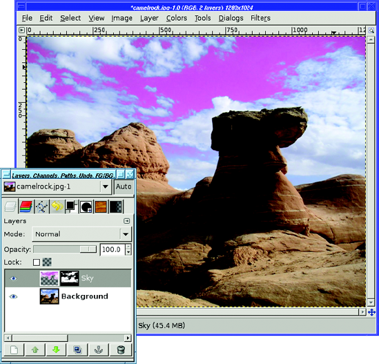
You may notice that the layer in Figure 8-43 is also selecting some of the rock, not just the sky. But that's okay because I'm using it as a layer mask for the sky layer I pasted earlier—that layer contains only sky, no rock. Copy the saturation layer, then right-click on the sky layer and choose Add layer mask... (the initial value doesn't matter since you're about to paste into it). Paste the saturation layer, and click the Anchor button to make it replace the layer mask. And now you're ready to use Brightness/Contrast, Hue/Saturation, or any other operation you like on the sky. By using the saturation of the sky compared to the clouds, you can select just the blue sky, and make it darker blue...or any other color you like (Figure 8-44).
The Colors menu has a few interesting entries remaining.
Filter Pack is a complex plug-in that gives you a choice of several operations you can apply to your image. It can change Hue, Saturation, and Value, or you can edit the color curve directly (under Advanced). Of course, you can already do all those operations using separate color tools, but Filter Pack lets you combine several operations at once. It also gives you a choice of operating on any combination of Shadows, Midtones, and Highlights; and you can pick those shadows, midtones, and highlights according to Hue, Saturation, or Value. You can even apply the same effect over and over again: for instance, turn on Saturation and click the button for More Sat, then click it again, and again, to get a wild, oversaturated view.
Find all these buttons too confusing? You might prefer individual tools—but play around with Filter Pack and see what you can create.
Hot finds bright areas that might give problems on TV screens.
Maximum RGB intensifies every color in the image to its brightest and most saturated—or, if you choose minimal channels, its least saturated.
Retinex is a useful filter that can bring out detail in dark images taken in very low light. The effect is quite different from the simple brightening you might get from Levels, Curves, or Brightness/Contrast. Its results are sometimes grainy, but if you're trying to squeeze detail out of a dark photo, it's definitely worth a try.
Colors
Rearrange Colormap... lets you adjust the order of colors within an indexed image's palette. Set Colormap... lets you change the palette of an indexed image to one of GIMP's named palettes. You can also add palettes of your own, in the palettes folder in your GIMP profile.
Adjust Foreground and Background only works if you set GIMP's foreground and background colors to something other than black and white. It takes no arguments, but changes the image's dark pixels to shades of the foreground color, while changing light pixels to shades of the background. Why? Nobody knows...the filter may be removed in future GIMP versions.
Alien Map... can shift all the colors in your image in unpredictable and psychedelic ways. It offers two modes, RGB or HSL (similar to HSV, with L meaning luminosity), and a handful of sliders. It rotates each channel as many times as you specify with the frequency slider, while the phase shift sliders can make it start at a different place. But honestly, it's difficult to predict what any combination of settings will do. You'll probably do best by sliding knobs at random to see what happens.
Color Exchange... lets you exchange one color with another (similar to Select by Color followed by Fill with FG, or to the color exchange found on some digital cameras). You can select the color to be replaced by middle-clicking in the preview window. But beware: by default it's very picky about only replacing the exact color you've selected, so on a photograph, you may not see any replacement at all. To make Color Exchange more lenient about what it considers a match, set the three Threshold sliders to numbers larger than 0.0.
Color Range Mapping... is a bit easier to use (though whether it's actually useful is arguable). It maps all colors in the range between the background and foreground colors (you can't choose the color from the plug-in's dialog as you can with Color Exchange), so choose your two colors first, perhaps by using the Color Picker tool to choose colors from the image. But beware: it doesn't map only colors that are between the two colors you specify. It maps all colors in the image, extrapolating from the colors you've specified. If you only want to map the colors of part of your image, select the part you care about first, or use Rotate Colors, described in a moment.
Gradient Map replaces the image with colors taken from the current gradient. The darkest parts of the image will map to the left side of the gradient, and the lightest parts to the right side.
Palette Map is similar, except it takes colors from the current palette. If you don't work much with indexed images, you might not even know that you have a current palette. You can see it, or choose another, with File
Rotate Colors... is a powerful way to map a color range to another. It's what you probably hoped Color Range Mapping would do. Don't panic at the complexity of the dialog—it's surprisingly easy to use. Drag the arrows on the upper ("From") color wheel to span the color range you want to replace. Pay attention to the arc between the two arrows, so you know which arrow is the starting point and which is the end point. If you want to reverse them, you can click on Change Order of Arrows or you can just drag one arrow past the other one. Then set the new color (which will replace the "From" color) the same way, and keep an eye on the preview to see if it's doing what you expected. Figure 8-45 shows how to replace a range of blues with reds.
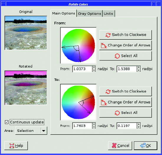
The Gray Options tab of Rotate Colors lets you specify what to do with gray areas in the image, since the Main Options color wheel can't represent them. Gray Threshold specifies how desaturated a color has to be before it's considered to be gray. These gray areas will be mapped to whatever color you set in the Gray Options color wheel. Gray Mode lets you specify whether to do this substitution before or after doing the color rotation: with Change to this GIMP won't do any further substitution, while with Treat as this the replacement color will be mapped to a color in the output range.
Sample Coloriz..., already discussed in the "Sepia Photos" section earlier in this chapter, rounds out the Colors
Different computer systems display colors very...differently. If you've ever viewed the same photo on both a Mac and a PC, you've probably seen how much the colors and brightness can vary.
One way to compensate for that is by using color profiles. These are files (usually with an .icc or .icm extension) that represent the difference between a standard baseline (called the sRGB profile) and the capabilities of a particular device like a monitor, printer, or scanner.
Some devices such as monitors and scanners come with a color profile included, and if you install the driver that comes with the device, it may install a profile as well. However, that can backfire: sometimes device profiles are wrong. If you notice odd colors—say you try to paint in white but the result looks yellow, or you notice images are much darker or lighter when viewed in GIMP than they are when viewed with other programs—the culprit might be a color profile.
You can choose profiles in the Preferences window's Color Management category (Figure 8-46). Modes of operation can be No color management (GIMP won't look for color profiles at all), Color managed display (use color profiles), or Print simulation (temporarily switch to using the printer's profile—this is also called soft proofing).
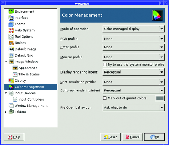
Then there's a list of profiles to set. RGB Profile is GIMP's notion of the "standard" sRGB working space. Normally it should be set to None to use GIMP's built-in sRGB space, but you can set a profile explicitly if you have a newer or slightly different version. CMYK profile, too, is GIMP's notion of the default CMYK color space; it's used primarily by the CMYK color chooser and when loading image files that use CMYK.
Monitor profile describes your monitor, but there's a problem: monitor profiles are very dependent on ambient lighting conditions, so ideally you should use a different profile for a monitor located near a window vs. the same monitor used in a windowless room lit with fluorescent light. Since the manufacturer doesn't know what your computer room is like, any profile shipped with the monitor is at best a compromise. At worst, it might be just plain wrong.
A common source of problems, especially on Windows, is the Try to use the system monitor profile checkbox. If that option is on, GIMP will use whatever it finds in the standard system location—probably somewhere under C:windowssystemcolor on Windows, or /Library/ColorSync/Profiles or /Library/Printers/[manufacturer]/Profiles on Mac. Linux doesn't have a system color profile.
Warning
A lot of monitor profiles installed with a Windows driver package are just plain wrong, and can lead to all sorts of odd color problems in GIMP. If you find that all images opened in GIMP have a color cast—white looks yellowish or greenish—the first thing you should try is switching Mode of operation to No color management and see if the problem goes away. If it does, you may have a bad monitor profile installed.
If you really care about exact color, you can buy monitor calibration devices that can measure your monitor's output under the lighting conditions you use most, and create an exact color profile for it. For making quick-and-dirty color profiles without any specialized hardware, there's an open source tool called lprof, part of the LittleCMS color management package. Or you can use your system's color profiling tool: on Mac, go to System Preferences
Display rendering intent describes different ways of dealing with colors that can't be shown in the current color space.
Print simulation mode is the place to set your printer's profile (if you have one) so that you can predict how an image will print out (and Softproof rendering intent and Mark out of gamut colors describe how to treat colors that are hard to convert to CMYK). Printer profiles are usually accurate only for one set of inks and one type of paper, so if you print to different papers or with ink other than the manufacturer's, you may need an updated profile.
The last item in the Color Management preferences is File Open behavior, which tells GIMP what to do when it encounters a file with an embedded color profile.
Many imaging devices, like digital cameras and scanners, include a color profile whenever they save a file. If GIMP detects such a color profile when you open an image, it will ask you whether to convert the image to the sRGB workspace. Usually it's a good idea to let GIMP convert the file. The alternative is for GIMP to work on the file without converting (the colors may look slightly wrong to you) and keep the color profile attached when saving the image. If you always want to do one or the other, you can set a preference here so GIMP will no longer ask.
By now, you probably know more about color than you ever wanted to know.
You're familiar with all of the common color models and some of the theory behind them. You know about indexed color, grayscale, RGB, and alpha; how to tell the color mode of your image, and how to change it.
You've worked with GIMP's different color choosers, and you've probably picked a favorite that you use most of the time. You may even switch among several of them depending on the sort of project you're working on.
You know several methods to correct a photograph's color cast, to change a color image to black and white, or to reduce the amount of color in an image. You've also seen several ways to add color to monochrome images.
When you need to use an indexed image, you know how to optimize it so you can get a good-looking image that only requires a very small file size. You can clean up scanned images by adjusting their color levels. You know how to decompose an image into its component colors, and how you can use that to help you make tricky selections. And finally, you know a little about color management and how to tune GIMP's handling of color profiles.
You'll find many of these techniques helpful as you move on to the next chapter and explore some advanced drawing tricks.