In this chapter, I'll take a step back from photographs and explore how to use GIMP as a drawing program. I'll cover the following topics:
Making new images
Using layers for drawing
Drawing lines and curves
Changing colors and brushes
Erasing
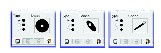
Drawing rectangles, circles, and other shapes
Outlining and filling regions
Filling with patterns and gradients
Importing brushes or gradients, or making your own
When GIMP won't draw
A drawing project
Most drawing projects begin with a blank canvas in a new window. Create one using File
Choose a reasonable size for the image. To practice drawing techniques, use a size that fits easily on your screen and leaves room for the Toolbox and Layers dialog. I often use 800×600. For real-world projects, you may want to use a larger canvas, in order to have high resolution for printing or for including fine details. The Template drop-down menu at the top of the New Image dialog lets you choose from a list of popular image sizes.
Warning
In the Preferences category Default Image (called New Image in earlier versions of GIMP), you can set an image size. However, the New Image dialog may not always show this size. Sometimes it reflects the dimensions of the last image you created, or of the last region you copied. To go back to the default size you specified in Preferences, click Reset.
Expanding the Advanced Options tab in the New Image dialog (Figure 4-1) shows some additional choices, such as
By default, GIMP will fill your new image with the current background color. For starters, you probably want a white background; though later you might want to use other colors for a richer effect. You can change your background color using the color swatch in the Toolbox, or for white, you can simply choose White from the Fill with menu of the New Layer dialog.
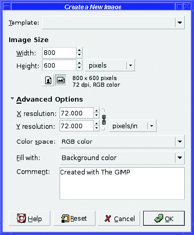
You can also make a new image transparent. This can be useful if you're making an icon for a web page, or an image that will be pasted onto a photograph later. But the gray checkerboard pattern GIMP uses for transparency can be distracting. When you're learning drawing techniques, it's easier to draw on layers over a white background, even if you want transparency (you can always turn off the background before you save the file). You'll see how that helps in the drawing project at the end of this chapter.
The New Image dialog offers one more option: a space for a comment, defaulting to "Created with GIMP." You can use this space for your name and copyright information, or information about the image you're creating and what it represents. Or, of course, you can leave it blank.
Note
Not all image formats can include a comment, but the most common formats-JPEG, PNG, and GIF-all have it.
The first rule of drawing is use a new layer.
You just created a new image with a perfectly clean white background. Why should you add yet another layer?
What if you want to change the background color later? Or make the background transparent? What if you decide you want to move part of your image to a different place? What if you want to duplicate a figure you've drawn, so you can have two of them against the same background?
Sure, it's possible to make all these changes with GIMP later; but it's a lot more work than just using layers from the start.
You don't need to make a new layer for every line you draw. But try to think of your drawing in terms of functional units: the background is one layer, grass might be another, trees a third, and the sky a fourth.
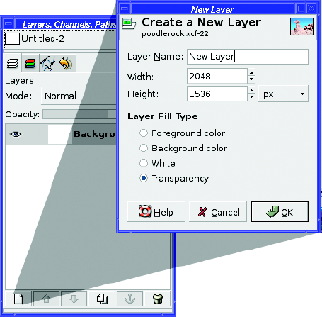
So, the first step is to create a new blank layer. To do that, go to the Layers dialog and click the New Layer button in the lower-left corner. Up pops the New Layer dialog (Figure 4-2).
The Layer Name field lets you choose a memorable name for the layer. You don't have to choose a name; GIMP will assign one for you, something like "New Layer." But a well-chosen layer name can help in the long run. The name shows up in the Layers dialog, so a layer named "red arrow" or "sky" can tell you right away what's in it.
Width and Height default to the size of the image. That's usually fine. If you know you don't need a layer quite that big, you might be able to save some memory by specifying a smaller size (or you can crop the layer later).
Layer Fill Type lets you specify whether the layer will start out transparent (much like Fill with in the New Image dialog). The default is Transparency. Most often, when you add new drawing layers, transparency is just the ticket. But some of the special effects you'll learn in later chapters will use a solid-colored layer.
The OK button creates the new layer and adds it to the Layersdialog. If you need to move it up or down in the layer stack, use the up and down arrow buttons at the bottom of the Layers dialog, next to the New Layer button; or drag the layer's line to where you want it. The new layer automatically becomes the active layer.
Note
If you're using an earlier GIMP version and you try moving your new layer down in the stack (the only choice available now), you might be surprised to discover that you can't! Remember the note about right-clicking to Add Alpha Channel in the Layers dialog's context menu in Chapter 3? By default, the background layer doesn't have transparency, and GIMP versions prior to 2.4 won't let a layer be moved up if it doesn't have transparency.
You're ready to draw! Choose a nice color (using the foreground color swatch), or just leave it black.
GIMP has a collection of four tools for drawing lines and freehand curves. I'll start with the simplest: the Pencil.
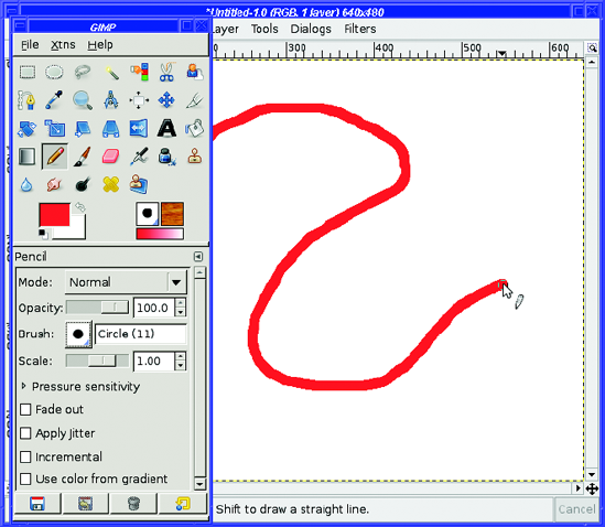
The Pencil tool lets you draw sharp-edged lines (Figure 4-3). Select it in the Toolbox, and then try scribbling by dragging on the image to see what it does. The Pencil tool will leave a trail everywhere you go, as long as you have the left mouse button pressed.
Tip
It's easy to draw straight lines with any of the line-drawing tools. Click once where you want one end of the line to be (GIMP paints a dot there the size of the brush). Then move (with the mouse button up—you're not dragging) to where you want the other end of the line, hold down the Shift key (GIMP will show a thin line between the mouse position and the last place that you clicked), choose your endpoint, and when you're happy with the line, click the mouse button.
Notice the mouse cursor in Figure 4-3. In addition to the normal arrow and the pencil icon telling you which drawing tool is selected, there's a circle around the arrow's point. This shows the size of the current brush.
Okay, a pencil normally has a point, not a brush. But this is a Super GIMP Pencil.
GIMP BRUSH ICON DISPLAY OPTIONS
You can stop GIMP from showing brush size in the cursor by turning off Show brush outline under Preferences
Alternately you can turn off Show brush outline, turn on Show paint tool cursor, and change the cursor mode from Tool Icon to either Tool icon with crosshair or Crosshair only. This gives you a similar but perhaps more precise result. Your call! You can also choose Black and White instead of Fancy for Cursor Rendering, which may help performance slightly on very slow machines.
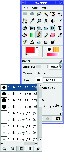
Changing the brush gives you control over the width and shape of the line you draw with any of GIMP's drawing tools. There are two ways of changing the brush. You can click on the brush icon in Tool Options, which drops down a menu (Figure 4-4). Or you can click on the brush icon in the Toolbox, to the right of the color swatches, which pops up the Brushes dialog (Figure 4-5). Depending on your GIMP version and how you've set up your desktop, the Brushes dialog may be a separate dialog, or it might be a tab shared with Layers and other dialogs.
Clicking on a new brush in either the menu or the dialog changes the active brush immediately. You can try one, draw with it, undo it if you don't like it, and try another brush, all without dismissing the dialog.
Tip
You can also get to the Brushes dialog using File
Brushes are like very small images. When you use a paint tool such as the Pencil, it's as though you've dipped the brush image in ink and then dragged it across the screen.
In addition to the normal hard-edged circles, some brushes have fuzzy edges. The Pencil tool will ignore the fuzzy edge; I'll talk about how to use those brushes in a moment.
GIMP 2.4 added a special brush: the Clipboard Brush. Select a small area from an image and copy it. Then look at the brush menu or the Brushes dialog. The first entry will be whatever you just copied, which you can now use like a brush.
Some brushes, such as the diagonal slashes, are asymmetric. They yield different patterns depending on the direction in which you drag. (You can use this effect for calligraphy, as if you were using a classic quill pen.)
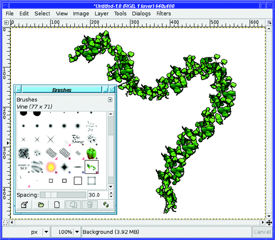
A few brushes are actually animated images. Why would you ever want an animated brush? Since it changes as you drag it across the screen, you get a line that's varied or random. A fun example is the Vine brush (Figure 4-6).
Note
Like a few other colored brushes, the Vine brush has another weird property: a fixed color that ignores GIMP's current foreground and background colors.
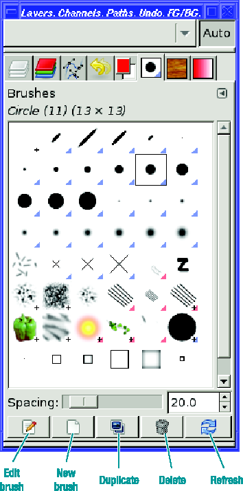
The Brushes dialog, shown in Figure 4-5, has a few options. Spacing can make the brush's patterns look more spread out as you drag across the screen. Try it with the Vine brush to see the effect, but you can use it on non-animated brushes as well.
Most of the buttons at the bottom of the Brushes dialog help with changing brushes or adding new ones:
Edit brush brings up a Brush Editor dialog. On most existing brushes, everything in this dialog will be grayed out because built-in brushes cannot be edited: they're read-only.
New brush opens the Brush Editor dialog and lets you create a parametric brush (Figure 4-7). You can specify shape, size, hardness, and related parameters. The button at the lower left lets you save your brush by the name chosen at the top of the Brush Editor. Your new brush will then appear in the Brushes dialog every time you start GIMP, unless you delete it.
Note
When you save a parametric brush, the file will appear with a .vbr extension in your GIMP brushes folder.
Duplicate brush makes a copy of a parametric brush. You can edit it and save under a new name.
Delete brush does just what it says. You can't delete any of the built-in brushes this way, only those that you've saved in your personal collection.
Refresh brushes re-reads your brushes directory to see if you installed any new brushes while GIMP was running. Click this button after editing a brush.
If you right-click on a brush, a context menu will offer some additional brush operations.Open brush as image (new for GIMP 2.4) is the most useful of these. You can edit the image using normal GIMP operations, and then save it as type GIMP brush (with the extension ".gbr") or GIMP brush (animated) (".gih") in the Brushes folder of your GIMP profile. In the case of animated brushes, you'll be able to see each frame as a layer, just like the animation you made in Chapter 3. You'll see a more detailed example of making an animated brush in Chapter 9.
Tip
Because a brush is just an image, you can create a brush image yourself in GIMP, starting from scratch. You don't have to start by editing an existing brush.
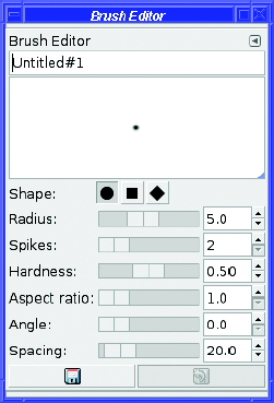
Most brushes are images. But a brush you create with the Brushes dialog's Edit or New buttons is a different type, as mentioned previously, called a parametric brush. You can choose from a few simple shapes (round, square, diamond), and then specify the size (Radius), Hardness (how fuzzy the edge is), Aspect ratio (whether it's long and thin or basically square), Angle (which rotates it), and Spacing (which makes it draw discrete blobs as you drag across the window, instead of placing the images close together so that they appear to be a continuous line).
Since parametric brushes and image brushes are specified differently, you can't change one into the other. You can't do anything useful with Edit brush on an image brush, and you can't choose Open brush as image on a parametric brush. In the Brushes dialog, each parametric brush shows a blue triangle at its lower-right corner, while animated brushes have a red corner. And a plus symbol means the brush is larger than the preview shown in the dialog.
Tip
There are lots of excellent GIMP brushes available for free downloading. Try a web search for gimp brushes.
All the line-drawing tools have similar options. The basics shared by all tools include the following:
Mode offers the same list of modes as the Layers dialog (those modes will be discussed in Chapters 9 and 10), plus a few that are special (see the section, "Special Drawing Tool Modes" later in this chapter).
Opacity makes the tool's line more transparent. It's a percentage, from 0 to 100.
Scale(new for 2.4) lets you make the brush bigger or smaller—very useful!
Fade out makes the line fade out after a specified distance, even if you keep dragging.
Jitter (new for 2.4) adds some randomness to the line. Sometimes that can make a drawing look more natural.
Incremental only makes a difference if Opacity is less than 100%. Using a tool with no spacing, or drawing on top of a previous line, will make the line darker (more opaque). Without incremental mode, the line won't get darker.
Use color from gradient uses the gradient (displayed below the current brush in the Toolbox window) instead of the current foreground color. It even works with color brushes like the Vine brush. Click on the gradient in the Toolbox to see some examples; you'll learn more about gradients later.
Tip
Some people like to make GIMP 2.4's new brush scaling available as a mouse wheel control. You can do that from the Preferences window in the category Input Controllers: click on Main mouse wheel under Active Controllers, click the button at the bottom of the active controller list (the tooltip says "Configure the selected controller"), choose the action (e.g., Shift-Scroll up) in the dialog that pops up, click Edit to get an Action dialog, and then expand the Tools category and scroll down to Increase Brush Scale. Then do the same for a scroll-down.
In addition to these options, the drawing tools can respond to pressure if you have a drawing tablet.
In addition to the normal layer modes (which will be discussed in Chapters 9 and 10), the drawing tools offer three modes that are special (Figure 4-8).
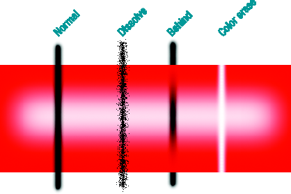
Dissolve adds randomness to the drawing (similar to the Jitter option). Wherever GIMP would have drawn partial transparency, instead it will draw a random pattern of dots. (Dissolve is also available as a layer mode, but it's more often useful for drawing.)
Behind draws behind anything that's already drawn in the layer. This only works when drawing onto a layer that has transparency. (On an opaque layer, such as a background layer filled with white, it would make no sense. You wouldn't be able to see something drawn behind an opaque background.)
Color erase seeks out the current foreground color and erases it, replacing it with transparency. It doesn't erase any other colors; only the current foreground color, making it very useful for erasing a solid-color background. Of course, like Behind, this only works if the layer allows transparency. In Figure 4-8, I changed the foreground color to red before drawing the color-erase sample; if the foreground color were black, there would be no visible effect since it wouldn't match the red box.
The Pencil tool is okay when you're using hard-edged brushes. But what if you want to use one of those fuzzy brushes? Or what if you want a line without those "jaggy" edges that the Pencil tool makes?
In that case, use the Paintbrush tool (Figure 4-9).

The Paintbrush tool differs from the Pencil tool in two important ways. First, it can use fuzzy-edged brushes. Second, it can use the hard-edged brushes too, but it uses them in a different way from the Pencil tool.
Figure 4-10 shows some of the differences. In 4-10A, each tool is used with a large, hard-edged brush. The results look similar until you look closely.
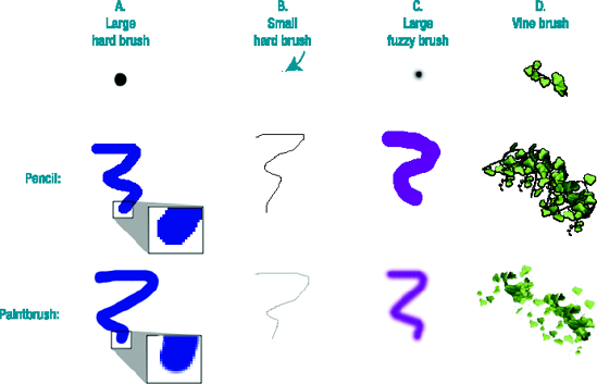
The Paintbrush uses a technique known as antialiasing on the edges of diagonal lines: pixels along the edges are made semitransparent, or blended into the background color, to fool the eye into seeing a smooth diagonal line. The Pencil tool does not use antialiasing, so the edges look jagged.
Then why would you ever want to use the Pencil tool? 4-10B shows you one reason. Antialiasing on a thin line can make it fade into the background.
The lower Paintbrush line in B was drawn in the same black color as the upper Pencil line. Notice the Pencil line is sharp, black, and distinct as compared to the fuzzy gray Paintbrush line. For small, fine artwork, the Pencil tool is often best.
The other reason is indexed images. It takes more colors to draw an antialiased line. This means that the eventual file size will be larger. It also means the final image might not be usable for processes such as T-shirt or business-card printing that can only handle a small, fixed number of colors.
4-10C shows the tools when used with a fuzzy-edged brush. Obviously, the Paintbrush tool wins here. The Pencil tool ignores any fuzzy edges in the brush, and paints a wide, fat line.
4-10D shows how the choice of tool can make a difference with some of the more elaborate brushes. The Pencil preserves all the details of the vine leaves, while the Paintbrush creates an interesting sponge-art effect.
GIMP offers two more tools for drawing lines. One of them is the Airbrush tool (Figure 4-11).
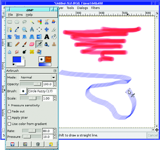
Figure 4-11. The Airbrush tool, using a large, hard-edged brush (top) and a slanted calligraphic brush (below)
The Airbrush almost always draws fuzzy edges, even if you use a hard-edged brush. It's also time sensitive. The slower you drag across the page, the darker the line will be, just as if you were using a real airbrush or a can of spray paint. Hover over one spot holding the mouse button down, and the spot will get darker and darker until it's completely opaque. (That means that if you stay in one place with a hard-edged brush, eventually the edges will become sharp. That's the one way the Airbrush can draw nonfuzzy edges.)
Painting with the Airbrush takes some practice and a deft touch... just like a real airbrush! The Airbrush adds two additional options to the normal set:
Rate controls how sensitive the Airbrush tool is to movement, that is, how fast things get darker if you slow down.
Pressure controls the darkness. Think of it as the amount of paint the airbrush is spraying.
Tip
If you ever try to draw straight lines with the airbrush, you might hit a snag: since you have to click once to start the line, and then draw a line starting at the same place, your starting point may come out darker than the rest of the line. As usual, there's a trick: click at one end of the line, then undo, and then Shift-click at the other end. The undo removes all the paint from your first endpoint but still remembers to start the line there.
The Ink Pen tool (Figure 4-12) is the most complex of the basic drawing tools, but it can be very rewarding. It emulates an old-fashioned fountain pen with replaceable nibs (tips).
Not only can you make nibs of different shapes (analogous to choosing different brushes with the other tools), the Ink Pen reacts to your speed as you draw, creating a line that varies in width like a line from a real ink pen.
Careful: you can create blobs of ink if your penmanship isn't quite right. But unlike a real ink pen, you won't get ink all over your shirt pockets.
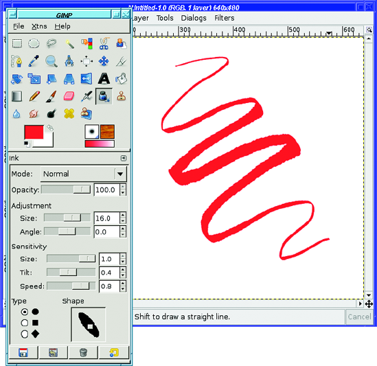
The Ink Pen is most useful if you have a drawing tablet rather than a mouse. It will change line thickness in response to pressure or tilt on a tablet. But even with a regular mouse, you can sometimes create nice effects.
The Ink Pen, unlike all the other drawing tools, ignores GIMP's current brush. It has its own notion of a brush, similar to GIMP's parametric brushes, with the following options:
Adjustment controls the width of the pen's nib and its angle (0 is horizontal).
Sensitivity controls how much the Ink Pen will react as you vary your drawing style with your speed or the pressure and tilt on a tablet.
Type controls the shape of the nib. Initially, you choose one of three basic shapes.
The Shape box to the right of the type selector lets you refine the nib. It shows the chosen shape with a small square in the middle of it. Drag the square to change the aspect ratio and tilt of the nib (Figure 4-13).
USING A DRAWING TABLET
Drawing tablets, or graphics tablets, are devices that include a pad, a stylus, and sometimes a mouse or additional buttons. They're available in a variety of sizes from several manufacturers.
Tablets are very popular with professional computer artists for two reasons. First, drawing with a penshaped object feels more natural to most people. You have much more control over shapes, and most people find that they can make lines flow more smoothly with a pen on a tablet than with a mouse.
The other reason? Most graphics tablets offer additional controls. They're sensitive to pressure: GIMP can vary line width, color, or opacity of the line you draw depending on how hard you press on the tablet. Some tablets are also sensitive to tilt: GIMP can detect whether you're holding the pen straight up or tilted over on its side, and can vary the line accordingly.
All of GIMP's drawing tools allow you to specify pressure sensitivity if you have a tablet, and some (like the Ink Pen) are sensitive to tilt as well.
Many tablets use a double-ended stylus: the upper end works as a second tool, usually called the eraser. GIMP can assign different tools to the stylus and the eraser, which makes it very convenient to switch tools simply by flipping the stylus over.
There's a catch to all this, though. It's sometimes difficult to get the operating system to see all the drawing-tablet information GIMP needs.
Tablets under Windows usually work, though there may be some problems with particular models. Tablets under Linux sometimes require you to download additional drivers for the kernel and for X. On the Mac, Apple's implementation of the X Window System does not currently support drawing tablets. The X supplied by Mac Ports does offer support, though it may depend on drivers supplied by the manufacturers.
If you have a drawing tablet, you can tell GIMP about it by clicking on Configure Extended Input Devices in the Input Devices section of the Preferences window. This will pop up the Input dialog:
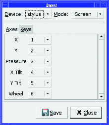
By default, the tablet's tools will have Mode: Disabled. Set this to Screen for each tool in turn, then click Save, and GIMP should remember the settings next time.
The other Mode option besides Screen is Window, which restricts the tool to work only in the image window. This in theory could give you better control, especially with smaller-sized tablets. However, in practice, it doesn't work very well on most systems, and it makes it impossible to move the stylus back to the Toolbox window to choose a new tool.
Try Window if you want, but most people find that setting all tools to Screen works best.
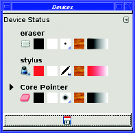
GIMP also has a Device Status dialog, accessed from the Toolbox via File
The Eraser (Figure 4-14) erases. Simple, no?
Well, not quite that simple. The definition of erase depends on the image. If the current layer has an alpha channel, then erasing makes the current layer transparent wherever the eraser touches it.
Remember, alpha channel means that a layer or image supports transparency. GIMP uses alpha as a synonym for transparency in quite a few places. Tutorials on the web for GIMP or other image-editing programs use this term quite a bit, so it's good to remember it.
In a layer that does not support transparency, the Eraser just paints the current background color.
The Eraser, like other drawing tools, uses the current brush. Use a large brush for erasing large areas. For erasing smaller areas or single pixels, use a smaller brush. Remember, you can zoom in on an image to magnify it so that you have more control over exactly what gets erased.
Most of the time, there are more precise ways to remove detail than the Eraser. (You'll learn about some of these methods in Chapters 5 and 6.) But the Eraser is useful for quick-and-dirty touch-ups of drawings.
The Eraser adds two new options to the usual drawing tool set. Hard edge makes the Eraser ignore any fuzzy edges in the brush. Remember how the Pencil tool made fuzzy-edged tools look large and sharp-edged? The Hard edge option will make the Eraser behave like that.
Anti erase is trickier. How is it possible that GIMP could un-erase something?
When you erase in a layer with an alpha channel, you're merely telling GIMP to make that part of the layer transparent. Behind the scenes, though, GIMP knows which colors were there before you made it transparent. With the Anti erase option, GIMP removes transparency from the layer wherever you drag the eraser. If there was color there that you erased earlier, you'll see it again.
Warning
Using Anti erase on a transparent area that has always been transparent will leave a black trail, as though you were drawing with the Pencil or Paintbrush with a black foreground color.
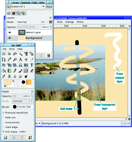
Figure 4-14 shows the difference in how the anti-eraser behaves in various circumstances. The image has two layers: an opaque background layer, and another layer that includes a photograph in the center, with transparency everywhere outside of the area of the photograph.
Selecting the opaque background layer and erasing leaves a trail of white (the current background color). Anti-erase on this layer does nothing, since there's no transparency to remove.
Selecting the pasted photograph layer gives more complex behavior. Erasing over the photograph makes the photograph transparent, so you can see through to the background layer. Notice that where the erased trail moves off the bottom of the photograph into the area that's already transparent, nothing changes: erasing transparency just gives you transparency.
Anti-erase over the photograph does nothing, except in areas that were previously erased. There, it un-erases, removing the transparency and revealing the photograph again. But where anti-erase strays outside of the photograph into purely transparent areas, it erases the transparency and replaces it with black, since there was previously no other color there.
Now that you're an expert on drawing lines and erasing them, you'd probably like to draw some shapes, too.
GIMP doesn't have any tools specifically for drawing shapes, which confuses some people coming to it from vector-drawing programs. But GIMP doesn't need shape-drawing tools: the trick is to make a selection, then fill or stroke the selection.
To try this, first use either the Rectangle or Ellipse Select tool and drag out a selection in the image.
Tip
To constrain the Rectangle Select tool to a square, or the Ellipse Select tool to a circle, press the Shift key after you start dragging in the image. Pressing Shift first might sometimes work, but often it will give surprising results, which will be explained in Chapter 5. Of course, you can also use Fixed: Aspect Ratio in Tool Options with a 1:1 ratio.
Stroking a selection outlines the boundaries of the selection. It's located in Edit
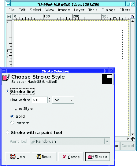
Stroke line will draw outlines using the current foreground color. You can specify the Line Width in pixels (or, if you choose, in some other unit). The default 6-pixel line is quite wide.
Alternatively, you can stroke with a line-painting tool, such as Pencil or Paintbrush. GIMP will act as though you had run that paint tool around the borders of the selection, using the current color and brush. (You can even make picture frames by stroking with a wide brush, especially if you use one of the more elaborate brushes, such as some of the animated ones.)
Sometimes stroking with a paint tool, especially an antialiased tool like the Paintbrush, works better on curves than specifying a line width. Try it both ways on a circular selection and see.
If you use Line Width rather than a paint tool, you can specify the type of line used by clicking the expander next to Line Style (Figure 4-16).
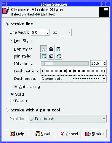
Cap style changes the look of the ends of lines (useful when stroking paths, not so useful with selections); Join style does the same for places where lines connect to other lines (for instance, at the corners of a rectangle).
Miter limit specifies how sharp or blunt the corners will be. A limit of zero makes the corners more rounded; higher numbers will make them sharper. Cap and join styles and miter limits won't be very noticeable unless your line is quite wide.
Dash pattern lets you make a dashed line and specify exactly how the dashes will appear drag horizontally in the preview to make different patterns). Dash preset lets you choose from a selection of common dashed-line styles.
You've already seen what Antialiasing can do, in the section on the Paintbrush tool. It can be helpful on rounded or diagonal lines.
You can also stroke with a pattern, which generally will only be interesting if you use a fairly large line width. I'll talk about patterns in a moment.
Note
Both rectangular and elliptical selections offer antialiasing, which uses transparency along the edges of the selection to make boundaries smoother. They also let you feather edges: you can make the edges of your selection fuzzy rather than sharp. This isn't useful for outlining selections, but it can be useful when you're filling them. There are also some other selection options that you'll learn about in Chapter 5.
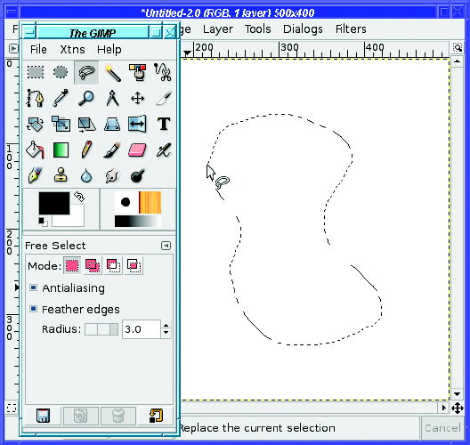
Another selection tool you'll find useful for drawing is Free Select, also called the Lasso tool, from its Toolbox icon.
The Lasso lets you draw a freehand selection of any shape (Figure 4-17). Just outline your shape in the image, and end somewhere near where you started, and GIMP will make a closed curve. You can treat it just like you would a rectangular or elliptical selection. It offers the same antialiasing and feather options as the other selection tools.
Filling a selection with a solid color or pattern is even easier than stroking a selection. Just above Stroke Selection in the Edit menu, Edit
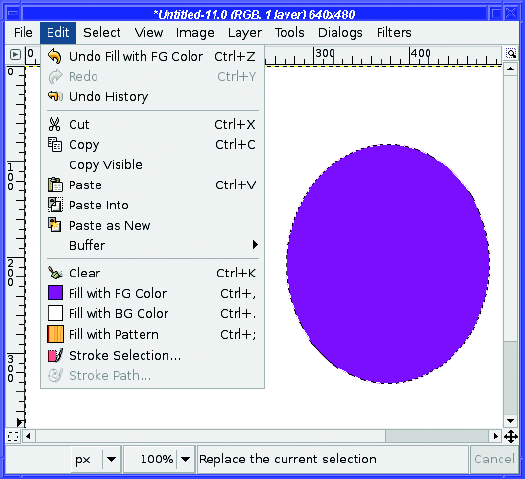
Notice that all three of these Fill with items show the current color or pattern next to the entry in the menu. This gives you a quick sanity check to make sure you're using the color you expect. Of course, if you decide that you don't like the color, just go to the Toolbox and click on the color swatch to change the color, then Fill with FG Color again.
If you don't have a selection, the Fill with items will fill the whole layer. This is an easy way to change the color of a background layer.
You can also fill a selection (or the whole layer) by dragging from the Toolbox's foreground, background, or pattern swatches, from the Current or Old colors in the color chooser dialog, or from any of the patterns in the Patterns dialog, directly into the image.
For more complicated fill-ups, use the Bucket Fill tool (Figure 4-19). Choose it in the Toolbox, then click anywhere inside your selection or layer to fill it with the foreground color.
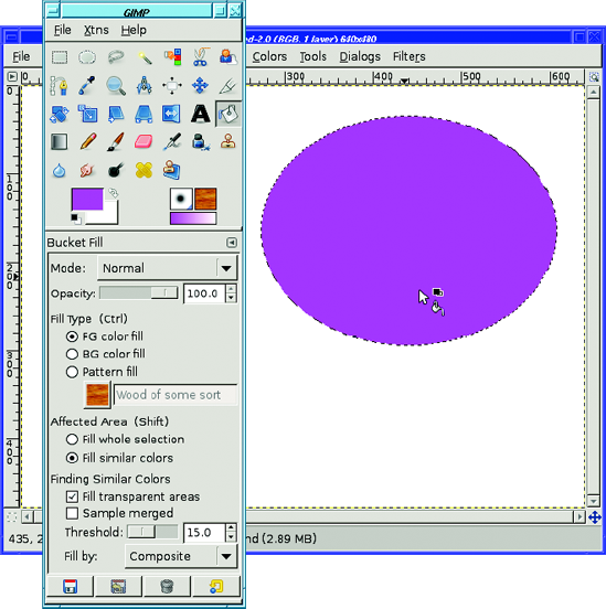
So what does Bucket Fill add, compared to Fill with FG or just dragging a color to the image window? The difference is in the tool options. Bucket Fill has lots of options, starting with the Opacity and Mode selections shared with the line-drawing tools.
Fill Type lets you fill with the foreground color (FG), background color (BG), or a pattern. The <Ctrl> next to Fill Type tells you that pressing the Ctrl key when you click in the image will choose the opposite of your specified color: if FG is chosen, then Ctrl-click will fill with the background color rather than the foreground, and vice versa.
Affected Area lets you control what area will be filled. Fill whole selection is easy: select the area you want to fill, and click in it. But with Fill similar colors, when you click somewhere in the image, GIMP will look for adjacent areas that are colored similarly. (If there's a selection, GIMP still won't fill outside it.)
Just how similar the color needs to be is controlled by the Threshold slider (Figure 4-20).

For example, in a photo like Figure 4-20, you might want to use Fill similar colors to replace a cloudy sky with a blue one. Set the foreground color to light blue, then click somewhere in the sky.
With a very low Threshold, not much of the sky is likely to have the same color as the point where you click; you end up with color bands and an unnatural look. With the default Threshold of 15, a lot of the clouds get replaced, but not all of them; sometimes this looks okay, but other times it looks weird. With just the right Threshold (50, for this image), the whole sky is replaced, but nothing else. Go higher, and some of the fill will spill over into other areas, like the cliff face. At very high settings, nearly every color in the image will be replaced, and at the highest setting of 255, the entire image will be blue. The only way to determine the exact Threshold setting is by experimenting; it's different for every image.
Fill transparent areas lets you fill similar colors, even if you click on a transparent or nearly transparent area. Normally, clicking on transparency won't fill anything.
Sample merged uses the colors from all layers in the image to determine the color GIMP will try to match, instead of just the color in the currently active layer. This is useful when you're building up an image with a lot of layers stacked on top of one another. Of course, when GIMP fills, it will still put the color only in the current layer.
Fill by lets you specify how GIMP will decide which areas are similar. You can tell GIMP to look only at the red, green, or blue channel: for instance, if you set Fill by to Blue, then GIMP will consider a bright blue spot to be equivalent to a white one. Or you can set it to Hue, Saturation, or Value: using Hue would treat light blue and dark blue areas the same, while using Saturation would treat bright blue and bright red similarly, ignoring pale and washed-out colors. In Chapter 8, you'll see examples of how to use color or HSV decomposition to select different parts of an image. For now, you can leave Fill by at its default value of Composite, meaning all aspects of the pixel values will be considered.
What's all this about patterns?
GIMP has a diverse collection of patterns (Figure 4-21). The current pattern is always shown in the Toolbox next to the current brush. It will also be shown next to tools and menu items that use patterns, such as Bucket Fill and Edit
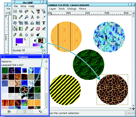
Clicking on the pattern shown in the Toolbox will bring up the Patterns dialog, where you can select from all the patterns GIMP knows about.
A pattern is just an image. Right-clicking on any square in the Patterns dialog offers Open Pattern as Image, from which you can edit the image and save it as a new pattern (usually with a file name ending in .pat, though .png and .tga will also work).
But a pattern is a slightly special type of image: it's usually tileable. Imagine the pattern image is a tile and you're flooring a room with it. You'd want the right edge of each tile to match the left edge of the tile next to it, and similarly with the top and bottom of each tile.
If the edges match, then the tile job will be seamless and look like a single huge pattern. If they don't match, then you will be able to see seams between each image. It will be obvious that you used a lot of small images, and the result won't look so good.
Most of the time, the patterns built into GIMP offer whatever you need. If you want more, there are plenty of sites that offer downloadable patterns. But if you crave something really special, GIMP can help you make an image into a tileable pattern. Filters
The Gradient, or Blend, tool is another way to fill areas (Figure 4-22). It's also useful in all sorts of GIMP effects, as you'll learn in later chapters.
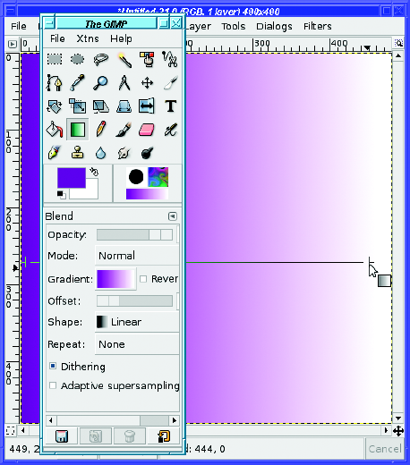
The typical gradient makes a smooth transition from the foreground color to the background color. (There are also other gradients that display different effects, such as Golden for making metallic golden glows, Neon Cyan for making neon lights, or the fun Radial Eyeball choices for making bloodshot eyes.) With the Gradient tool selected in the Toolbox, mouse down in one place, drag to another place, and release the mouse button to draw a gradient into the current layer (of course, if there's a selection, the tool will only draw inside it).
Tip
If you drag even slightly off horizontally or vertically, you'll get a gradient that's noticeably diagonal. If that isn't what you want, try holding down the Ctrl key as you drag. This will constrain your dragged line to a multiple of 15 degrees, which makes it much easier to drag a perfectly horizontal or vertical line. This Ctrl-key constraint works in most drawing tools, and also in the transform tools such as Rotation.
You may have already noticed that there's a gradient indicator in the Toolbox, below the current brush and pattern. That's because the default gradient, a smooth blend from foreground to background color, isn't the only gradient available (Figure 4-23).
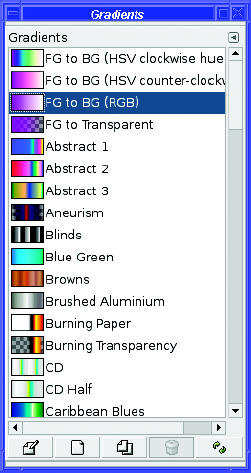
Most of the gradients available in the dialog have fixed colors regardless of the current foreground and background. Some gradients also include transparency, or partial transparency. You may find that some of them give a nice effect, or you may find most of them extraneous. Your call! But the basic gradient, FG to BG (RGB), is useful for all kinds of effects, as you'll see in later chapters.
The Gradients dialog has buttons at the bottom similar to the ones in the Brushes dialog: Edit, New, Duplicate, Delete, and Refresh. As with Brushes, you can create new gradients and save them to use later (see Chapter 9 for the details).
The usual drawing tool options, Opacity and Mode, are available in the Gradient tool options you saw back in Figure 4-22.
Mode is more interesting here than in most of the other tools since it can create some wild effects. For instance, try using Difference mode and applying the same gradient repeatedly (with a colored gradient—it's not very interesting in black and white). Then try it on a gradient of a different shape (see Shape, described in this section).
What Mode actually does will be explored in more detail in Chapter 9. For now, just play around and see what you can make.
Reverse transposes the colors of the gradient. Instead of starting with the foreground color and blending into the background color, it will start with the background color. Of course, you could just drag in the other direction to get the same effect; but some of the other gradient shapes only draw in one direction. With them you will need the Reverse button.
Offset controls where the gradient actually starts, as a percentage of the total distance you drag. If it's 0 (the default), then GIMP will create a gradient from your start point to your endpoint. If Offset is 40, then GIMP will draw the foreground color as a solid color for the first 40% of the distance, and only then will start the gradient. You can get the same effect by simply starting your drag in a different place, so this option isn't usually needed.
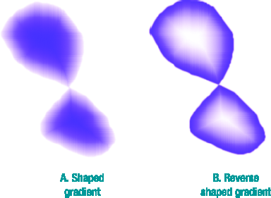
Shape offers a wealth of other ways GIMP can orient the gradient. Linear is the default, but GIMP can also make gradients that look like circles, cones, or spirals, or (the most fun) it can make a gradient following any shaped selection you make.
Try making a shaped selection using the Lasso tool; then set the gradient to Shaped (Spherical) and drag inside the image (Figure 4-24A). Then change the gradient to Reverse and drag again (Figure 4-24B).
Even if you drag over only a small distance, the Gradient tool will fill the whole selection (or image, if there's no selection active). Repeat gives you control over what happens outside of the region you dragged. The default setting, None, will simply use the beginning and ending colors of the gradient. If you select Sawtooth wave, GIMP will repeat the gradient, starting again at the beginning color; with Triangle wave, the gradient will be repeated in reverse.
Dithering offers higher precision in the way the gradient's color is calculated. Most of the time you won't notice a difference, but under some circumstances, you might see color-banding with this option disabled, especially on very large images.
Adaptive supersampling is another way of getting higher precision, at the cost of more computational work. most of the time you probably don't need it, but if you notice unevenness or a stair-step effect, try it.
WHEN GIMP WON'T DRAW
GIMP is a great drawing program, but it can be frustrating too. Sometimes, you pick a drawing tool, try to draw, and nothing happens. What's up?
There are a lot of reasons that this can happen. Here are some of them:
If you have a selection, GIMP will only draw inside it. When you try to draw outside the selection, nothing happens. Usually, it's obvious when you have a selection, because you can see the "marching ants" selection outline. But it's possible to have a selection and not know it. You might have done View

GIMP will only draw to the current layer. Do you have the right layer marked as active in the Layers dialog? Is the layer visible? Is the opacity set to something more than 0%, so that the layer isn't completely transparent? Do the layer's boundaries extend to where you're trying to draw?
It's also possible you've pasted recently and still have a floating selection. GIMP won't draw normally to a floating selection. You'll have to click the New button to make it a new layer, or the Anchor button to merge it into the previous active layer.
While you're looking at the Layers dialog, take a look at the Keep Transparency button on the layer (the one to the right of Mode, with the checkerboard square next to it). If that's checked, then GIMP won't let you draw on currently transparent parts of the layer.
Check the opacity of the tool in its tool options: make sure it's at 100%.
Layers each have a mode, and some of the modes do strange things in combination with the layer beneath. Make sure the current layer's mode is Normal (unless you're deliberately creating an effect using a different layer mode, of course).
Check the Mode in the tool options for the drawing tool you're using. If it's not Normal, unexpected things can happen. And usually will.
It's time to put all these techniques together and create a drawing.
So bring up a blank canvas, whatever size you like, with File
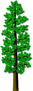
For a first drawing project, how about a tree? A tree is fairly simple and doesn't require a lot of art experience.
What's the first rule of drawing?
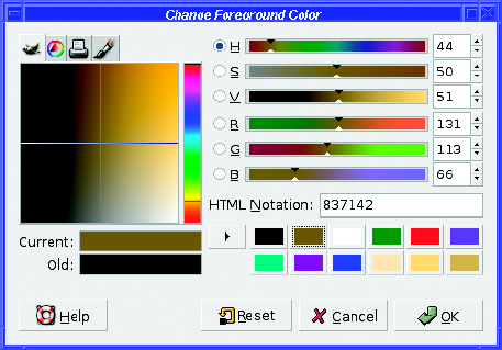
Right—create a new layer. Name it "trunk." Choose a brown foreground color. It's not always obvious where to find brown in a computer's color chooser. Try setting the hue to orange, then drag left and down to make the color darker (Figure 4-25).
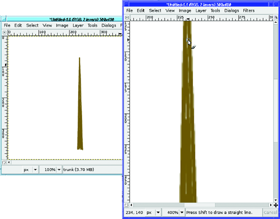
Use the Paintbrush tool to draw the trunk. You can make the trunk a straight vertical line, if you like. But a real tree has a trunk that tapers a little, narrow at the top and wide at the base. You can accomplish this by using a narrow brush and drawing several near-vertical lines. Click where you want the top of the tree to be, and then click to the left side of the base and Shift-click. Now click again at the top, and Shift-click at the bottom-right (Figure 4-26).
Then fill in the trunk by drawing more lines just inside your original outlines until the trunk is a fairly solid brown color. Or just until you like it!
If you have trouble filling in small holes in the trunk, you can zoom in, but there's an even better approach: multiple views. View

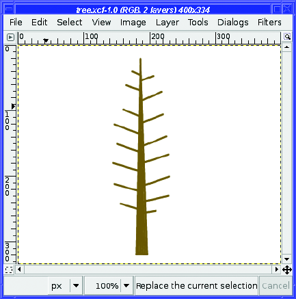
Once your trunk is ready, add some branches. Make a new "branch" layer. Then use the same click, Shift-click technique with the Paintbrush (Figure 4-28).
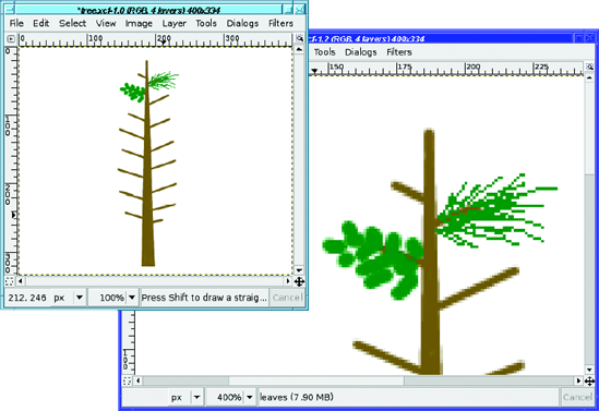
Now it's time to add the leaves (or needles, if it's a pine tree), so switch to a green foreground color. Use a new layer for this! You may decide later that you don't like your leaves and want to change them. Or you might want to make an autumn or winter version of your tree.
For pine needles, use the Pencil tool and the smallest brush available, since you'll want to make thin lines. (Remember, the Paintbrush doesn't work well on the smallest brush. Making your drawing quite a bit larger would work around this and would give smoother lines than the Pencil tool.) For leaves, you might want a slightly larger brush (Figure 4-29). Experiment and see what looks right for your tree.
Continue putting in leaves, using short strokes, until your tree looks fairly well filled-in (Figure 4-30). Add more branches (switching to the "branches" layer, of course) if you need to.
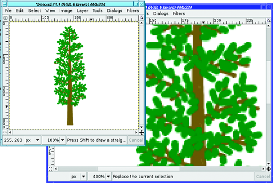
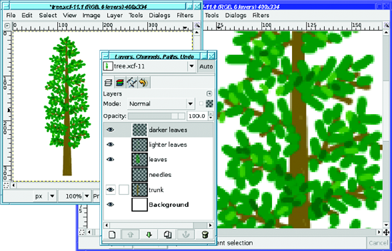
Real trees have a range of leaf colors. You may want to add some slightly darker leaves, and some slightly lighter ones. Use separate layers for each color, in case the blend of colors doesn't work out and you need to change it (Figure 4-31).
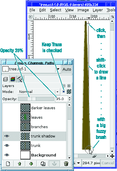
The tree looks pretty good now. But that solid brown trunk doesn't look right. It needs a shadow!
To make a shadow on the trunk, turn off visibility on all the branch and leaf layers so you can see what you're doing. Select the "trunk" layer and duplicate it to create a new shadow layer called "trunk shadow," just above the trunk layer but below the branches. Make this layer semi-transparent: try starting at about 35% opacity. You can adjust this later.
Select the Paintbrush tool (if it isn't already selected), a medium-sized fuzzy brush, and a dark foreground color. You can use black, but using a different dark color can give your shadow "depth," as though it's reflecting light from objects nearby.
You're going to draw a dark shadow line up the right side of the tree. But first, a tip: you can make sure the shadow doesn't spill off the side of the tree by using the Keep transparency toggle button in the Layers dialog.
With Keep transparency checked, draw a line up the side of the tree trunk (Figure 4-32). Keep the center of the fuzzy brush about at the edge of the trunk—you want it to be blackest at the right edge of the tree trunk, and fade away toward the middle. It's okay that the big fuzzy brush hangs off the edge of the trunk; the Keep transparency option will prevent any overhang.
You can add shadows to your leaves, too. Since they're too small and numerous for you to draw all the individual leaf shadows like you did with the trunk, take a shortcut: make a drop shadow of the leaf layer or layers, using small values for offset and blur radius.
Figure 4-33 shows the effect of the shadow. The tree is no longer flat—now it's a 3-D tree!
It's nice to have a tree. But wouldn't it be helpful to have a wooden planter box so you could carry the tree around or take it inside?
Make a new image to build your box. You can put the tree and the box together later. As with the tree, it's best to start with a blank image with a white background, and then make new transparent layers for each new piece you add. You'll want separate layers for each of the four sides of the box, so start with a layer called "box front" for the front face.
A box has a rectangular front. So make a selection using the Rectangle Select tool. You can fill that rectangle with a woodgrain pattern.
GIMP offers several woodgrain patterns to choose from. Some of them are better suited to a wooden box than others: the ones that look like wood paneling or a parquet floor look somewhat strange if you try to make a box out of them.
Just try lots of patterns until you find one you like. You can keep the Patterns dialog up while you choose a pattern, fill inside the image with Edit
I picked the birch-like pattern in Figure 4-34, which GIMP rather vaguely names "Wood of some sort."
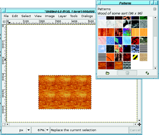
Figure 4-34. The first step in making a wooden box: a rectangular selection filled with a woodgrain pattern
Now the box needs sides. You could try to draw a side using the Free Select tool. But really, the side of the box should be just like the front, except rotated so that it looks like it's receding from you. GIMP has just the tool for that: the Perspective Transform tool.
First you need another layer. Make a duplicate layer of the box front, from the button in the Layers dialog. GIMP will name it "box front copy"; you'll want to rename this to something like "box right."
GIMP's perspective transformations work best if the layer is no bigger than the object you're trying to transform. (The image can be any size; it's only the size of the layer that matters.) You can crop the layer to eliminate all the extra transparent areas using Layer
Note
If you still have your rectangular selection now filled with your pattern, another way to make a new layer containing only the selection is to copy, paste, and click New Layer in the Layers dialog to turn the floating selection into a normal one.
Use the Move tool to move the "box right" layer over to the right, so that its left side touches the right side of the "box front" layer. It's not critical that they line up exactly; just get them close.
Now activate the Perspective Transform tool and click somewhere near the upper right of the box's right side (Figure 4-35). Drag to where you think the far top-right corner of the box will be.
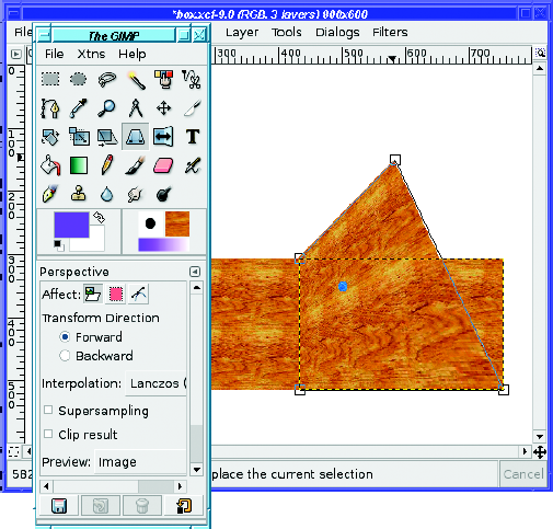
Meanwhile, the Perspective Transform Information dialog pops up, giving you a bunch of data you probably don't need, as well as buttons for Help, Reset, Cancel, and Transform. The last button is the one that will actually save the operation once you're happy with it.
The Perspective Transform tool has roughly the same options as the Rotate tool you already used in Chapter 2. Most important, you can preview the actual Image, Grid, Image+Grid, or Outline.
Notice that the Perspective Transform tool gives you boxes at each of the four corners of the layer. These are grab handles. When you clicked near the upper-right corner of the layer, GIMP assumed you wanted that grab handle, so that's the one that was dragged along with your mouse. (The blue dot shows you where the center of the layer will end up. It won't necessarily be blue; GIMP will show it in a color that contrasts with the color already there.)
Now click near the lower-right corner's grab handle, and drag that up until it looks like it's in about the right place for the box side (Figure 4-36).
For a box like this, you want the far grab handles directly on top of each other: the line between them should be straight up and down, and should contain no "jaggies." However, the diagonal lines—the "top" and "bottom" of the box as they recede—will not look right if they're parallel: they should be closer together at the far end, just as the sides of a railroad track look closer together where the track is further away. (See Chapter 9 for a detailed discussion of perspective drawing.)
When you're happy with the perspective, click Transform in the dialog.
You may find that it doesn't look quite as good after you've clicked Transform as when you were previewing. If so, just undo and try again.
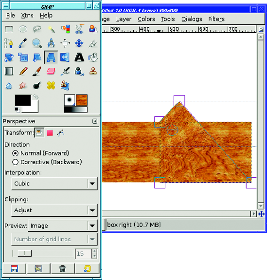
The next step is to make the left side of the box, pretty much the same way as you made the right side. Start by copying the box front. Crop the layer if necessary, then use perspective transform.
Bonus! On the left side you don't need to move the layer, because the left side of the "box left" layer should touch the left side of the box front. That will happen automatically as soon as you copy the layer.
You might think you can just copy the "box right" layer to make the box's left side, but that won't look quite right. The sides of the boxes need to appear closer together at the far end than they are at the near end (they need to converge) in order for the perspective to look right. If you make the two sides exact copies of each other, it'll look wrong. (Don't take my word on this. Try it and see!)
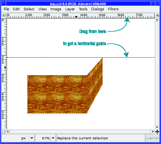
To make the box look right, it's best if the far top ends of the two box sides line up at the same height. A guide can help you with that.
Guides are horizontal or vertical lines you can put anywhere in the image to help you draw in exactly the right place. Guides don't show up in the final image; they're strictly there to help you draw, and you can Show or Hide Guides from the View menu.
To get a horizontal guide, click on the ruler at the top of an image window, and drag downward (Figure 4-37). For a vertical guide, click on the ruler at the left side of the window and drag to the right. When you're moving a guide, GIMP will automatically select the Move tool, so you may have to switch back to the tool you were using previously.
In addition to giving you a visual indication of where you are, guides have another useful property: when you drag near them, the mouse will "snap to the guide." When moving a layer or working on a transform, this makes it easier to get the exact right spot. (You can disable Snap to guides in Preferences, but you probably won't want to.)
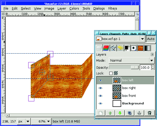
After the perspective transformation is finished (Figure 4-38), you'll want to move the layer down in the layer stack, using the up and down arrows in the Layers dialog. The left side should be behind the front side, so it needs to be below the front side in the layer stack.
Finally, it's time to make the back side of the box. Use the Scale tool this time on another copy of the "box front" layer (Figure 4-39)—that way, the woodgrain pattern will be scaled a little smaller (since the back of the box is farther away). If you have trouble matching the new selection to the corners that are already there, it may help to set up vertical guides so that your selection will snap to them.
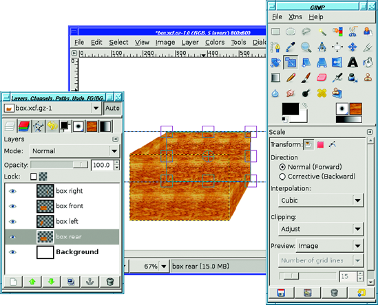
It's not important whether the bottom of the selection matches anything: the bottom will be hidden by the front side of the box, so no one will ever see it. You could hide anything you want at the bottom of your box, and no one would ever know—except other GIMP users who look at your XCF.
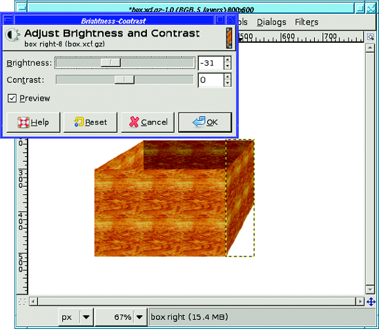
You have all four sides of your box now. But it still doesn't look right, does it? The problem is lighting. A real box will have some sides brighter, and others darker, depending on where the light is.
Your tree had the shadow on the right side of the trunk. If the box will be in the same image, it needs to match that. You need to leave the front of the box bright, but darken the left and right sides since they are both in the shade.
You already know how to make something darker using Brightness-Contrast, Levels, or Curves (from Chapter 2). These operations work on one layer at a time, so it's easy to adjust each part of the box individually.
Select the layer for the box's right side, and then bring up your favorite brightness tool. (Which one you choose isn't important. You won't be making any subtle changes here, just general brightness.) I'll use the simplest one, Layer
You don't have to darken them all exactly the same amount as you did the right side: with a real box, the darkness of the two sides would depend on the color of the table it's sitting on and the color of whatever's inside it. (Really! Try it with a real box and prove it to yourself.)
You'll probably want to make the back a little darker than the front, too, if only to keep it from blending into the box front where the two layers meet. But play around with the four colors until it looks realistic to you.
Finally, it's time to combine the two images and plant the tree in its planter box.
If you drew the box the right size for the tree, good for you! If not, no problem: use Scale to make them the right size.
Tip
Make sure you're viewing both images at the same magnification setting.
Should you paste the box into the tree image, or the tree into the box image?
In order for the tree to go into the box, it has to be behind the front of the box, but in front of the back of the box, so the box needs to stay as multiple layers. The tree, however, can be pasted all as one layer. So it's easier to copy the whole tree using Edit
Wait! Before you use Copy Visible, turn off the white background of the tree image. You want to paste a tree with a transparent background. Now aren't you glad you made a new layer when you started the trunk, instead of drawing it on the white background? (In Chapter 5, you'll learn how to separate objects from their backgrounds, but it's a lot more work.)
You've turned off the background and copied the tree. But there's one more problem to solve before you can paste: there isn't enough room in the box image for that tall tree!
Solving that is easy but it requires a few steps. First figure out how much space you need. You can use the Measure tool, or just combine the sizes of the two images. Too big is not a problem—you can always crop later.
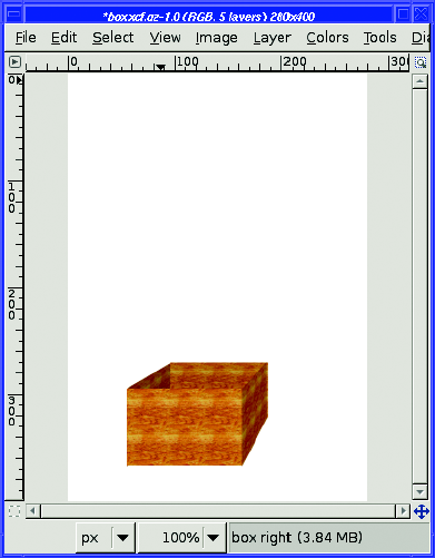
Now resize the box image to be larger, using Image
Now you should see something like Figure 4-41. There's a preview below the Offset fields, showing the new size of the image. It also shows the current location of the existing layers in the new, larger image. You can drag the image thumbnail around in this box.
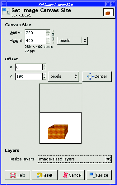
In this case, the goal is to get more space on top of the box, so drag the box thumbnail down to the bottom of the preview area. You can also type the offset of the layers directly in the Offset fields, but dragging the thumbnail around is usually easier.
If you're using GIMP 2.4, below the preview is Resize Layers, to specify which layers should be resized along with the image. In this case, you want the white background to cover the whole canvas. So set this to Image-sized layers. (The preview doesn't show that the white layer will be resized, but it will.) You can also leave this at None and resize the background layer later, too, using Layer to Image Size from the Layers dialog's context menu. Depending on whether your background layer has transparency, you may need to fill it with white after resizing the canvas. Click Resize to get your new larger image (Figure 4-42).
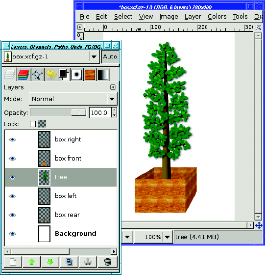
Finally, it's time to paste the tree into the box!
In your tree image with the background layer made invisible, Edit
Put it inside the box: use the arrow buttons to move the layer down until it's above (in front of) the box's back and left side, but below (behind) the box's front and right side (Figure 4-43). Or just drag the layer's line to the right place in the stack.
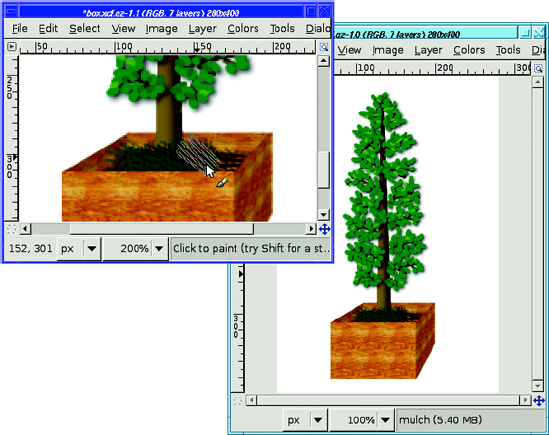
You can make the drawing look a little more realistic by adding some dirt or moss around the base of the tree.
Make a new layer just above the tree layer. Choose a dark green or brown color, fill in where you'd expect to see dirt, and try scribbling in different colors with different brushes (the Pencil Sketch (32×32) brush can add some randomness). Using two different views can help quite a bit here (Figure 4-44).
Finally, try adding a shadow. There are fancy ways of drawing shadows based on the shapes already in the image (you can use the Rotate and Perspective tools—you'll learn more about those in Chapter 9), but even adding a rough shadow drawn with the Free Select tool will make most images look more three-dimensional.
Start by making a new layer, named "shadow." Put it above the background, but below all the other layers. Give the layer some transparency, maybe about 50 to 70%, and set the foreground color to black.
Now choose the Free Select tool and turn on feathering. Shadows always have fuzzy edges, but you'll have to guess how fuzzy. Try to eyeball where the shadow should be (it may help to put a real physical box on the table in front of you and see where its shadow falls). Then use the Free Select tool to drag out the shape of the shadow.
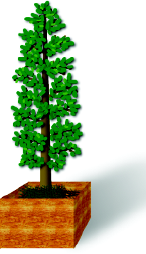
Once you have a shadow shape selected, you can fill it with black (which will look fuzzy gray, not black, because of the layer transparency). But for a little more realism, try filling it using the Gradient tool. Make the shadow start out black close to the box, but lighten it farther away. Experiment with different shadow shapes, and with starting the gradient at different places to see the different types of shadows you can generate. Your tree is planted (Figure 4-45)! You're now an expert GIMP artist.
Now you know how to draw on layers, and have an idea when to make a new layer. You can draw lines, curves, and shapes such as rectangles and circles, and you can outline them or fill them. You've seen the various types of brushes GIMP offers, and how to use them with each of GIMP's painting tools. Finally, you've learned techniques of drawing, shading, filling with patterns, and using the Perspective Transform tool to model real-world objects.
You can use these techniques to draw practically anything you can think of. Just use a little patience, and a lot of layers.
Armed with this knowledge, it's time to go back to working with photographs to learn how to select specific pieces so that you can use them in your own projects.