In Chapter 4, you learned the basics of drawing with GIMP. But there are still quite a few tricks that can give your drawings more polish.
In this chapter, you'll learn how to use layer masks, gradients, and layer modes to create great-looking drawings and logos. You'll learn how to control the Perspective tool, and create shadows and highlights. Finally, you'll learn how to create your own brushes, gradients, and other GIMP resources. The chapter will cover the following:
Useful mask tricks
Layer modes
Creating depth: drawing with layer modes
Drawing realistic shadows
Realism and multipoint perspective
Adding reflections and shading
Making brushes, patterns, and gradients
You learned about the basics of layer masks in Chapter 5, and saw one use for them. But there are all sorts of interesting effects you can create with layer masks.
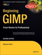
One of the easiest uses of a layer mask is to make some text (or any other layer) fade out.
Just follow two easy steps:
Add a layer mask. Right-click on the layer in the Layers dialog and choose Add Layer Mask..... Initialize it to White (full opacity), the default setting.
Draw a gradient on the mask. The layer mask should already be selected since you just created it. If not, click on its thumbnail in the Layers dialog. Choose the Blend (Gradient) tool in the Toolbox, and the standard foreground and background colors of black and white, respectively.
Then just drag in the image to draw the gradient. You can drag exactly vertically or horizontally (remember, holding down the Ctrl key while you drag will help by constraining the gradient's angle to a multiple of 15 degrees), or you can drag in any direction you like.
In this case, I started with a layer that had the text and drop shadow already merged together, and then dragged diagonally, from the lower right toward the upper left of the text-and-shadow layer (Figure 9-1). You can see the gradient in the layer mask's thumbnail in the Layers dialog.
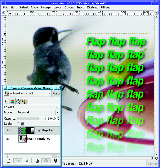
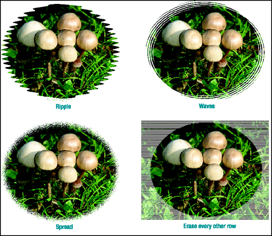
A layer mask can also give an image a fuzzy border, so that it fades into the background. This gives a nice effect for images included on web pages.
The procedure is straightforward. First choose your favorite selection tool. Turn on feathering (you'll probably want as much feathering as possible), and then make a selection where you want your border to be (Figure 9-2).
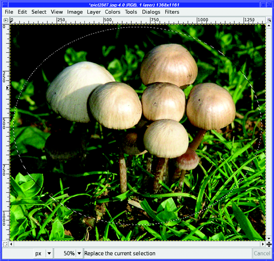
Now add a layer mask to the image layer: right-click on the layer in the Layers dialog and choose Add Layer Mask... (In some GIMP versions, you may not be able to create a layer mask unless the image has transparency. If Add Layer Mask... is grayed out, use Layer
Now you have an image with a fuzzy boundary. Everything outside the selection is transparent, so GIMP will show it with a checkerboard pattern.
To find out how the image will really look on a website, there are two additional steps. First, hide the selection with View
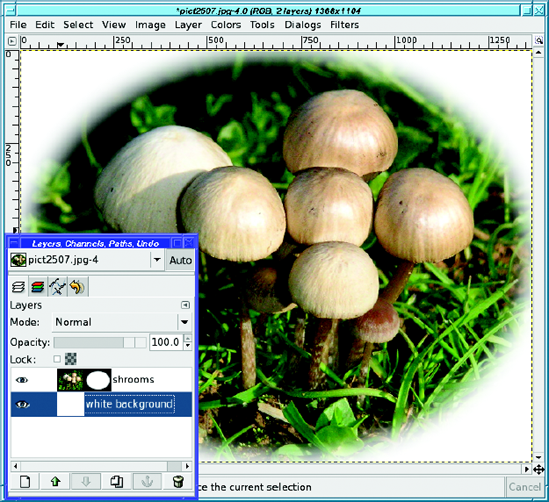
Figure 9-4. Adding a white background layer and making the selection invisible gives you a much better idea of how the border will look.
If you're happy with the result, make the selection visible again (that way, you won't be surprised the next time you try to select something), and then cancel it (Select
What if you want more feathering than the 100 pixels that GIMP allows in its selection tools?
While you still have the selection, you can use Select
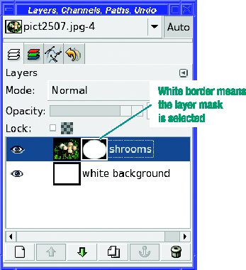
A better solution is to make sure the layer mask is selected (it will have a white border, as in Figure 9-5)—and then blur it with Filters
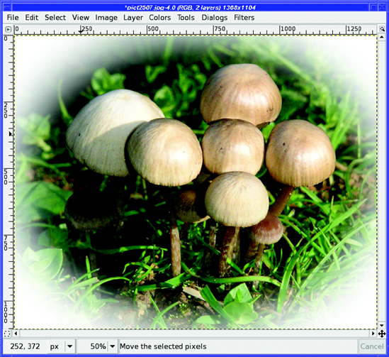
Blurring the existing 100-pixel feathering by another 250 pixels gives a more gradual border, as shown in Figure 9-6.
But wait—what's wrong with Figure 9-6? Notice what happens at the edges. All this blurring has made the border extend beyond the edges of the image. If you put the image on a web page, you'll see squared-off edges, as in Figure 9-7.
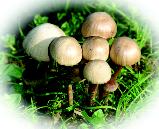
This happens because the oval frame gets bigger when it's blurred, and the image isn't big enough to contain it. For a really fuzzy border, you have to leave quite a bit of room around your original selection. If you want a lot of fade at the boundary, your best bet is to avoid cropping much until the very end.
Note
You can do the same sort of operation on GIMP's QuickMask: select the image with a fuzzy border, and then paste it onto a white background. Why use a layer mask? Because that makes it easier to see the effect of the operation. With the QuickMask, you have to modify the mask, change it to a selection, copy it, and paste it somewhere else—only then will you see whether you need to go back and modify the QuickMask.
Of course, since the layer mask is just a black-and-white image itself, you can modify it in a variety of ways to make all sorts of borders, like the ones in Figure 9-8. Experiment! You may not like most of the effects, but you might also find the perfect look.
By now, you should be comfortable with adding layers to an image. Generally, when you put one layer on top of another, the top layer is what you see. Lower layers only show through when the upper layer is at least partially transparent.
But layers can be combined in many other ways, using layer modes. You'll find them in the Mode menu in the Layers dialog. GIMP will use a layer's mode to determine how to combine each pixel from the top layer with the pixel in the same location in the layer below. Layer modes are also called blending modes, because they specify how to blend the colors in a layer with the colors in the layer below it (this has nothing to do with the Blend tool, however).
Note
The Mode drop-down menu in the drawing tool options, which you've already seen in Chapter 4, works basically the same way that layer modes do. It also adds a few special modes that are only used for drawing tools.
Confusing? Let's look at an example.
Figure 9-9 shows a red swirl on a white background. Of course, the swirl is in a separate layer from the background.
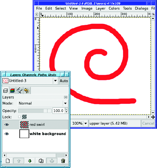
Where the swirl is red, you're seeing just that—red. The layer mode is Normal, so GIMP takes each pixel in the top layer (the red swirl), determines that it's not transparent, and shows you only that. Outside of the swirl, the top layer is transparent, so GIMP shows you the next layer down. Simple!
But what happens if you set the layer mode to Subtract(Figure 9-10)?
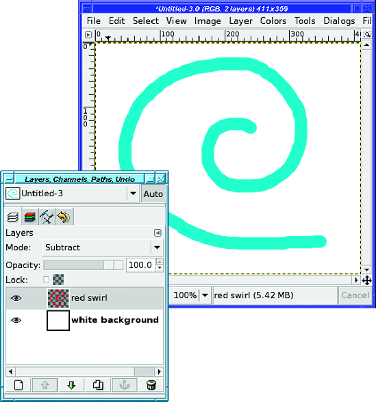
Why did the red swirl turn that color?
In Subtract mode, the color you see is the result of subtracting the front layer (the swirl) from the back layer (the background). Each color channel is subtracted separately.
Remember that white is the combination of the three primary colors: red, green, and blue. Each color has a range from 0 to 255 (8 bits, in computer terminology). A white pixel is (255, 255, 255) to GIMP. A red pixel is (255, 0, 0): all the red, with no green or blue. So:
white - red = (255 - 255, 255 - 0, 255 - 0)
or (0, 255, 255).
The result has no red at all, but full green and blue: it's cyan. That's why the red swirl on top of a white background becomes cyan in Subtract mode.
A lot of the modes don't do anything interesting when the background is white. For instance, in Addition mode, the colors of the two layers are added together. But white already contains a full complement of each color. You can't get any whiter than white, so in Addition mode, the red swirl just becomes white and disappears in the background. For the same reason, other modes won't seem to do anything useful if the background is black.
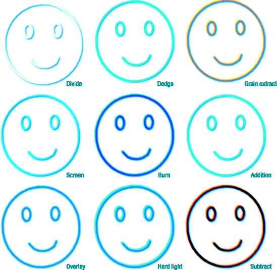
Figure 9-11 shows all of GIMP's layer modes, using the tree from Chapter 4 against a background of light blue/cyan.
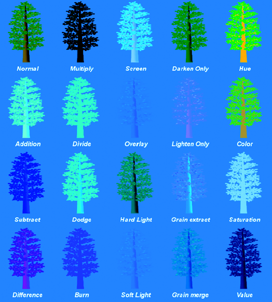
Be careful not to draw too many conclusions from this one diagram, though. The effects of each layer mode can vary considerably depending on the colors of the layers involved, as you'll see. Also, though it may not seem like it as you read through, all these modes have their uses—which are often not what you'd expect at all! But more on that later.
Dissolve and the two special drawing tool modes Behind and Color Erase were discussed in Chapter 4. Now I'll cover the other modes, what they do, and some ways to use them. You'll learn even more uses for the layer modes in Chapter 10.
Addition mode is straightforward: the two pixel values are added together:
If that makes any of the colors greater than 255, then that color is set to 255. Addition will nearly always make the image lighter.
Subtract is the opposite: the front layer is subtracted from the layer below it:
Anything that would become negative will be set to zero. This will make colors darker, naturally. You'll often end up with a lot of black or near-black from using Subtract mode.
Note
Why is it "Addition," but "Subtract" rather than "Subtraction"? Historical reasons. Which usually means, "No one remembers any more why they're named that way."
Taking the difference of two numbers is the same as subtracting, isn't it? Usually that's true. But in GIMP,Difference mode is, well, different. Difference is a subtraction too: but after subtracting, if any color values are negative, GIMP uses the absolute value of that color instead of truncating it to zero. Think of it as showing the difference between two colors regardless of the direction of that difference.
This means that instead of a lot of dark areas, the regions that would have been black become lighter again—especially in the colors that would have been absent. You can see that in Figure 9-11: areas of the trunk that were dark blue in Subtract mode become magenta in Difference mode.
Difference sometimes creates strange, garish colors and unusual transitions between colors. It can be useful when you need that sort of effect. In Chapter 10, you'll see several other uses for Difference mode.
Multiply multiplies the value of the pixels in the two layers (bet you already guessed that). This generally makes the image darker.
Why should that be? Multiplying two numbers should make a bigger number, shouldn't it? And bigger numbers are lighter?
The trick is that the result is normalized to 255 (in other words, divided by 255). Otherwise, too much of the image would end up being too bright.
So, the equation for Multiply is
Note
This ends up being darker than the front layer because B / 255 is less than 1 (except where B is white).So when it's multiplied by F, you get a number that's usually less than F.
Divide is a little more complicated. As you learned in grade school, you can't divide by 0 (at least without getting infinity). To guard against division by 0, GIMP adds 1 to the front layer's pixel values. Like Multiply, Divide is normalized, though this time it's normalized to 256 (1 is added to the normalization because of the 1 that was added to the front layer's pixels).
Divide mode often results in nearly white pixels that look "burned out."
These four modes are closely related to Multiply and Divide. Burn and Overlay are similar to Multiply and make the image darker; Dodge and Screen are more like Divide, and make an image brighter.
Dodge divides the back layer by the inverse of the front layer (the inverse comes from subtracting the front layer from white, just like Colors
In Burn mode, it's the back layer that is inverted rather than the front layer; then after the division, the result is inverted again:
Burn ends up looking a lot like Multiply, though there are some differences. In Figure 9-11, you can see that they both got darker, but Burn took on the blue color of the background layer, while Multiply turned black. With another color combination, though, Burn might end up darker.
In Screen mode, the values of the visible pixels in the two layers are inverted, multiplied, and the product inverted again:
This sometimes results in a washed-out look and a bright image with muted colors.
Overlay is a combination of Multiply and Screen modes. The back layer is inverted, multiplied by twice the front layer, added to the original rear layer, and then multiplied by the original rear layer. (If you didn't follow that, don't worry about it.)
It usually doesn't darken nearly as much as straight Multiply, though in this case, it has taken on so much of the background color that you can scarcely see the tree any more.
Hard light is another combination of Multiply and Screen modes. Depending on the color of the rear layer, you can sometimes think of it as an opposite of Overlay mode.
The formula is complicated because it has two parts: one for dark colors, and another for bright ones.
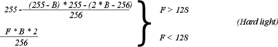
Hard light can sometimes be a useful mode for combining two photographs when you want bright colors and sharp edges.
Soft light is not the opposite of Hard light, but it does tend to soften edges and dim colors. It's yet another mixture of Multiply and Screen modes, and its effect is most similar to Overlay mode. In fact, in some versions of GIMP, Soft light and Overlay modes are identical due to a bug.
If Rm is the result from Multiply mode, and Rs is the result from Screen mode, the equation for Soft light is
These two are easy: they do just what their names imply. For each color component of each pixel, GIMP will show you the darker (or lighter) of the two components. So Darken only will make the image darker, while Lighten only will make it lighter. So Lighten only would be
To get Darken only, just use Min instead of Max.
Grain extract is supposed to produce something akin to the "grain" you might see in photographic film. In reality, I find it's more useful for giving images an embossed and desaturated look.
Its equation is surprisingly simple:
Grain merge adds texture to an ordinary image, as if adding film grain or texture from an artist's canvas. The equation is the mirror of Grain extract:
You can use these two modes together to combine the texture of one image with the color of another, as you'll see in the next chapter.
These modes are straightforward once you understand what they do, but their names can be a bit confusing.
Hue mode takes the hue from the front layer (unless the front layer's saturation is 0), but takes saturation and value from the back layer. Saturation and Value modes, likewise, take the named value from the front layer and everything else from the back layer.
Note
Some graphics programs offer a Luminosity mode instead of Value. It's the same thing.
Color mode gives you the color of the front layer with the lightness of the back layer. It's like Hue, except that it takes saturation as well as hue from the front layer.
You'll see in the next chapter how you can use this mode to colorize an image, using a photograph as the back layer and a solid color as the front layer. It's as if you took a black-and-white version of the back layer and covered it with a colored filter—only it works better than simply using a translucent-colored layer in Normal mode, since that would darken the image unacceptably.
Saturation and Value modes aren't needed very often (though Saturation can be used to remove color from selected parts of an image), but Hue and Color modes can be quite useful for colorizing images, as you'll see in Chapter 10.
So far, layer modes probably seem mostly an academic exercise. But there are some surprisingly interesting things you can do by combining them.
For instance, suppose I start with a happy face drawn with circular selections, stroking, and the Paintbrush tool with a fuzzy brush (Figure 9-12). Of course, in keeping with the first law of drawing (Make a new layer!), the face is on a layer by itself, separate from the white background.

Make a copy of the face layer, and offset it a few pixels up and to the right. All you'll see initially is a face drawn with slightly thicker lines.
But look what happens when you use layer modes on the top copy of the face (Figure 9-13).
As you can see, layer modes can give some nifty three-dimensional effects to simple lines with very little effort on your part.
But it gets even better. Layer modes control how a layer combines with everything visible below it—not just the next layer down. In the case of the two face layers, with each layer transparent along the borders of the lines, the color of the background makes a difference.
Figure 9-14 shows what some of the modes look like if the background layer is changed to a medium gray: (128, 128, 128). The effects are even more interesting than the ones on a white background—and very different.
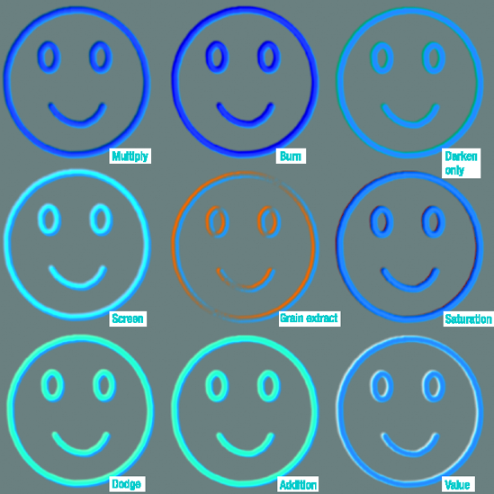
Figure 9-14. Layer mode depth effects are even more pronounced when using a background other than white.
Tip
Medium gray is often useful when combining layers to get depth effects. Medium colors, not particularly bright or dark, can work well too. Blurring one of the two layers can make the effects even more pronounced.
By now you're probably worried. "How can I possibly remember what all the different layer modes will do with every possible color combination?" Fear not. You don't need to remember all the possible combinations. Just make two similar layers (one a copy of the other, but shifted, blurred, or otherwise modified), and then start trying layer modes until you see an effect you like. Once you've clicked on the Mode menu in the Layers dialog, the down-arrow key will change to the next mode, saving you a lot of mouse clicking.
Tip
There's a problem with using a gray background. Ultimately, you'll probably want your pretty 3-D image on a layer of its own, so that you can paste it into other projects, or on a nice color that works for the project. Since the background color is inherent to the effect, you can't just make the background invisible: if you do, the interesting effect will disappear too. (Try it!) You can try selecting the background with Fuzzy Select, but sometimes you'll have trouble at the edges of letters. The solution: Colors
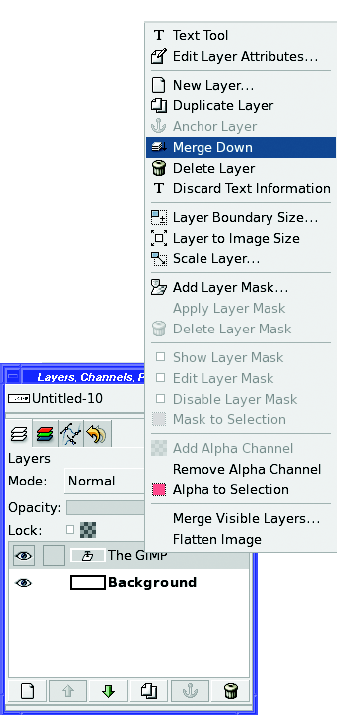
Here's a straightforward example of how to use layer modes to create interesting logos. Start by making some text in basic black on a white background (Figure 9-15).
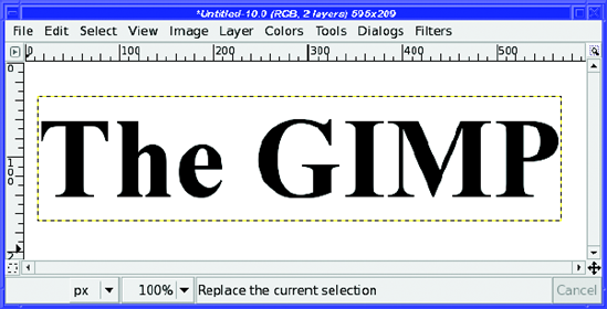
For once, rather than keeping the text layer separate, in this exercise you should merge the two layers. Right-click on the text layer in the Layers dialog and select Merge Down(Figure 9-16).
Make a duplicate of the text layer, Gaussian Blur it (Filters
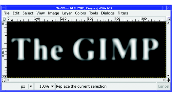
For the next step, you need to replace the original white background on the bottom layer with a medium gray. (Remember your old friend medium gray?) Turn off visibility temporarily on the blurred and inverted layer so that you can see what you're doing on the lower layer. Then select a medium gray foreground color: in the color chooser, set H and S to 0 and V to 50, or type 808080 into the HTML Notation box.
In theory, you should be able to use GIMP's Select by Color tool to select all the white background, and then use Edit
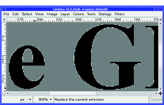
Antialiasing smoothes the text by making pixels at the edge slightly transparent, blurring the interface of type and background. That means that along the edges of the letters, the color isn't exactly black or exactly white, but some in-between shade of gray. Select by Color will leave some of these areas unselected, and when you fill with gray, you'll end up with speckles left over (Figure 9-18).
You could clean those up by hand, or by using operations like Select
So what can you do? Layer modes to the rescue! Make a new layer with the Layer Fill Type set to Foreground color, so you have a layer of solid gray. Use the down arrow in the Layers dialog to move that layer to the bottom of the stack, below your black-text-on-white-background layer.
Then set the text layer mode to Multiply, and magically, the white background turns to gray (Figure 9-19).
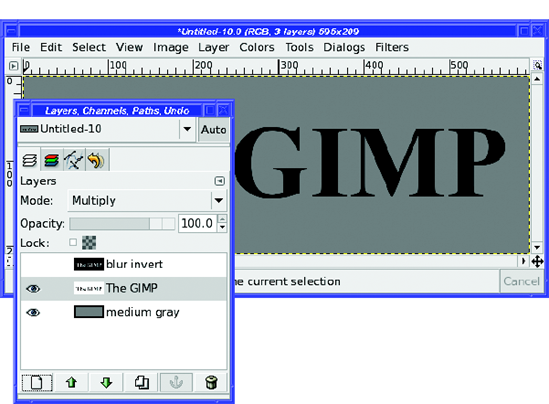
Figure 9-19. Multiply mode changes the white background to gray smoothly, without any unwanted speckles.
Why does that work so well? How does Multiply get rid of the speckles so cleanly?
It's a trick. No antialiasing speckles are harmed in the generation of this background. Instead, it's darkening the white to become the background color, without changing the black text (or its gray antialiasing) very much."Darken only" works as well as Multiply, and the trick works for colored backgrounds as well as gray ones. On a gray background like this one, you could also use Burn; but with a colored layer underneath, Burn will change the color of the black text. (As always, if you're not sure, try several layer modes—or all of them—and see what works best.)
Note
For this project, since you started with just a text layer, you could also make this black-on-gray layer by making a duplicate of the original text layer and merging it with a medium gray layer. But there are times when you only have a black-on-white image to start with. This trick using Multiply mode works any time you have a dark shape on a light background and you want to eliminate the background. It even works if you're replacing the background with a pattern.
Getting back to the 3-D letter project: turn visibility back on for the top layer (the one you blurred and inverted). Then set that layer to Difference(Figure 9-20).
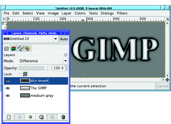
Nice effect! But you can get an even nicer, more 3-D effect by using the Move tool to move the top (blurred, inverted) layer a few pixels in any direction.
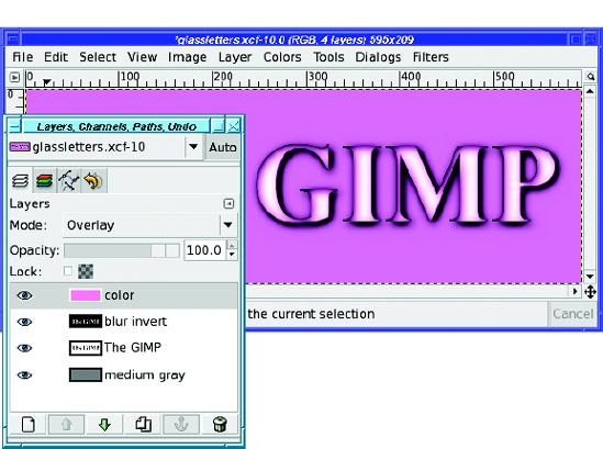
Don't like the gray color? No problem. Make another solid-color layer, any color you like, put it on top, and set it to Overlay mode (Figure 9-21).
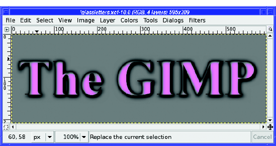
Or set it to Darken only, which maintains a medium-gray background while turning the text your desired color (Figure 9-22). That might be useful if you want to select the text and paste it somewhere else. (If you need to paste the text without the background, try using a copy of the original text or blurred text to paste into the QuickMask or use as a layer mask. Don't forget that you need to click the Anchor button in the Layers dialog after pasting into either the QuickMask or a layer mask.)
Tip
Try all the available modes for your color filter—remember, the up and down arrow keys in the Layers dialog are good for trying every mode. Quite a few of the modes give interesting results.
I'm sure by now you realize that I've only given you a tiny idea of the useful effects you can get by combining modes. It would be an epic task to list all the possible combinations. So, make lots of layers and experiment for yourself!
Remember adding a shadow to the tree-in-a-box in Chapter 4? Did you find that you had to try over and over to get a shadow that looked good?
There's an easier way to give a complicated object a shadow than by drawing it by hand. Just make a copy of the object's layer, turn it black, blur it, and then use the Perspective tool to make it point in the right direction.
Pasting an object into a photograph is a great way to show this. First, make sure you know in which direction the shadows are pointing in the original photo. In Figure 9-23, that's easy because of the figure of the hiker. I've livened up the picture by adding Tux, the Linux penguin.
Note
Tux was drawn by Larry Ewing using GIMP version 0.54. Larry has an excellent "Penguin Tutorial" page describing the methods he used: http://www.isc.tamu.edu/~lewing/linux/notes.html.
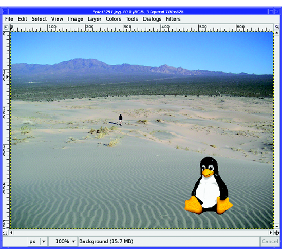
Figure 9-23. Notice the direction of the hiker's shadow. Tux looks somehow artificial without a shadow.
Tux is cute and all, but he just doesn't look...realistic. The reason is the lack of a shadow. (Well, okay, maybe it's not the only reason.)
Start by making a drop shadow from the Tux layer.
Now use the Perspective tool to drag the shadow off in the right direction (Figure 9-24). Try to match the shadow angle that you see on other objects in the same photo. Don't worry if the base of the shadow doesn't quite match the base of the pasted object; you can fix that separately.
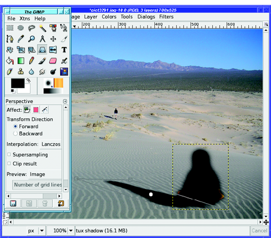
Until now, the shadow layer has been on top of the Tux layer. Obviously that's not right. Now is a good time to move the shadow layer down in the layer stack. Then use the Move tool to move the shadow so that its base is in the right place (Figure 9-25).
Note
This is basically what the Perspective Shadow plug-in does. However, it can be hard to get the plug-in to work right; it's usually easier just to make a perspective shadow by hand.
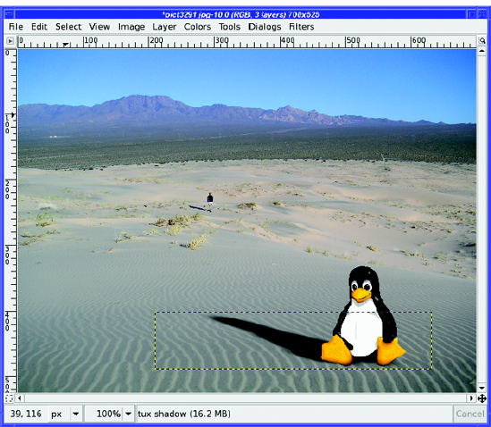
That looks pretty good—but you're not quite done yet. Change the transparency of the shadow layer so that it's not completely black. Then you can see some of the texture and color underneath it (Figure 9-26).
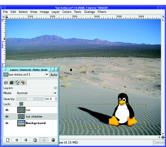
Figure 9-26. Give the shadow layer some transparency, so you can see the colors and textures underneath.
Of course, sometimes you may need more work to make a shadow look perfect, especially if it's being cast onto a curved or irregular surface. But for most of your shadow needs, the Perspective tool combined with Blur and layer transparency will give you everything you need.
There's a little fib in the last section. Remember where it said to match the shadow angle of other objects in the photo? That's close to true—but sometimes not close enough.
The problem is perspective (the name of the tool you used to warp Tux's shadow to the right shape and angle!).
If you look carefully, you can see the problem. In Figure 9-25, both the hiker's and Tux's shadows are at roughly the same angle. If you have a sharp eye, Tux's shadow will look just a bit out of line—tilted down. However, in the final Figure 9-26, his shadow is rotated up a bit—and somehow that looks more natural.
Why is that? It's actually a nearly ideal representation of the effect of perspective. But it's easier to start any discussion of perspective with the most elementary version.
You probably remember your introduction to perspective in Chapter 4, when you drew the box for the tree planter. That was a reasonable introduction to single-point perspective (Figure 9-27).
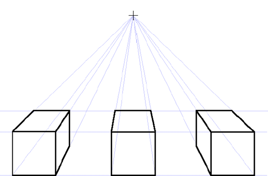
Figure 9-27. A classic example of single-point perspective: three boxes drawn with one vanishing point
The "point" in question is the vanishing point. This is the place where parallel lines seem to converge in the distance. Imagine looking down the lane stripes on a long stretch of road. You'll note after some distance you can no longer distinguish them as separate stripes. If you can see far enough, the entire road disappears to a point in the horizon.
Since there are three boxes in Figure 9-27, you can see what happens when foreground objects are offset to one side or another. But that tells you something else: the vanishing point does not have to be in the center of the image.
Use any object (such as your hand, or the opposite page of the book) to block out two boxes. Now you have an example of a drawing where the vanishing point is offset to one side.
This is similar to the effect at work in the Tux image. But in Figure 9-26, the point where the shadows converge is way off to one side. Why is that, and how do you figure out where the vanishing point should be?
In Figure 9-27, all the horizontal lines are parallel to each other, and so are the vertical lines. The only lines that have a different angle are lines that recede "into the paper." Real images are often more complicated; we can do better.
How? By adding another vanishing point, as in Figure 9-28.
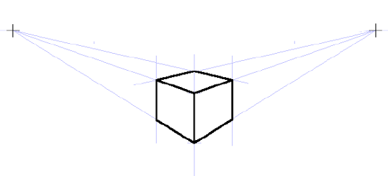
Figure 9-28. Perspective using two vanishing points. Note the guide layout is very different from single-point drawings.
Not coincidentally, the box has been drawn so that the angle from it to the left vanishing point is similar to the angle the shadows follow in Figure 9-26. What happens if you scale up part of the two-point drawing and paste it onto the Tux picture (as in Figure 9-29)?
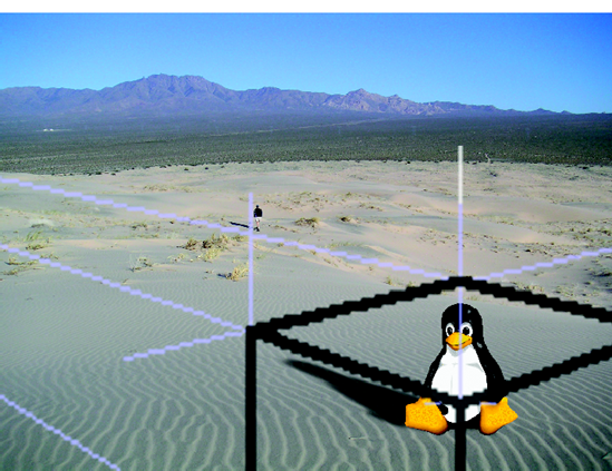
Figure 9-29. Centered on Tux (the focus of the image), the two-point cube's perspective lines show the relationship of Tux's shadow to the hiker's.
An understanding of perspective will help not only with drawing, but any time you have to make an alteration to an existing image. Getting the angles, warps, and shapes "just right" can seem impossible using LARTM ("Looks About Right To Me"), but is easy when you know how to draw perspective lines.
GIMP doesn't let you set up guides that aren't exactly vertical or horizontal to help with the Perspective tool. But that's okay: by drawing lines in a separate layer, as shown here, you can still find your vanishing points, and then let them guide you when using the Perspective tool. Then make the layer invisible before you save.
In many cases (such as this one), the vanishing point is so distant, it's off the edge of the picture. That's perfectly normal. Sometimes old-world draftsmen (in the days before computers) would stick a pin into their drafting board way off the work, and line up their guides with a ruler.
Not so easy with a screen! But you can use the same trick you see in Figure 9-29. Make your guides smaller on a separate layer, and then scale them up to the proper size.
By using vanishing points with GIMP's Perspective tool and adding a realistic shadow, you can convincingly stick just about any object into even the most distorted background.
To draw Tux's shadow on the dunes, you had to have an idea of where the light was coming from. If you wanted to make an object look really three-dimensional, you'd want more than just a shadow: you'd want highlighting on the side of the object that faces the light, and shading on the other side of the object.
Remember shading the tree and box in Chapter 4? This is similar, but with curved objects a few other details are involved.
Rather than using Tux, I'll use a simpler example: I'll show you how to make a sphere.
Note
GIMP has a plug-in to make a sphere for you, in the Xtns menu of the Toolbox. But once you know how to shade a sphere, you can use similar techniques to shade any object. In Chapter 11, you'll learn more about how the Sphere plug-in works.
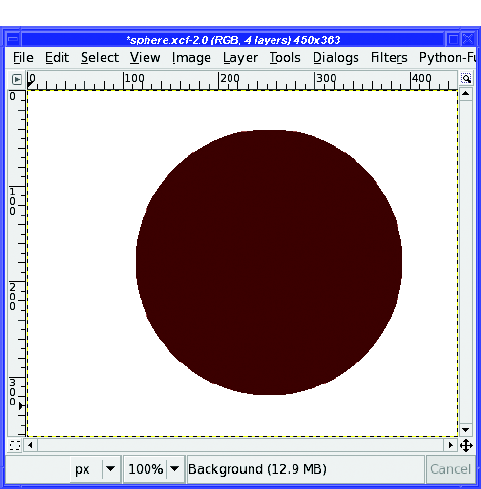
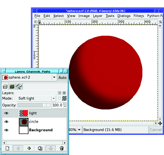
Start by making a colored circle. Make a circular selection, and then fill it using Fill with FG Color or the Bucket Fill tool (Figure 9-30). Use a fairly dark color: this will be your shadow color. Of course, put your circle in its own layer.
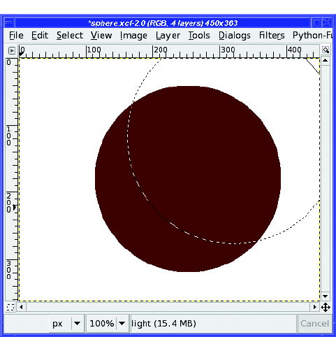
Bring up the color chooser and make the foreground color quite a bit brighter (increase its Value by sliding the V slider to the right). This will become the lighted part of the sphere.
You'll need a selection that's a bit bigger than the current circle, and feathered quite a lot. Your choice: either enable Feather edges in the Ellipse Select tool and make a new circular selection, or use the existing selection, enlarge it with Select
Move the selection toward your light source: in this case, I'll move up and to the right (Figure 9-31). Remember, you can move a selection with Alt-drag or Shift-Alt-drag, or by using the Transform selection tab in the Move tool options.
Once the selection is moved, fill it with your new brighter foreground color (Figure 9-32). Then change the layer mode to any mode that looks good. Screen and Dodge are good for bright colors; Soft light gives a more subtle and darker effect.
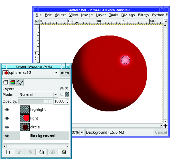
Add a bright highlight: make a small, feathered circular selection up near the light source, and fill it with white (Figure 9-33).
Finally, add a shadow, the same way you did with Tux. There are two slightly tricky aspects to this step. First, if your perspective drag handles end up off the screen, it can sometimes be difficult to get them back. Second, it's hard to tell when the perspective is right just by looking at the shadow's preview, so look instead at the box drawn by the Perspective tool (Figure 9-34).
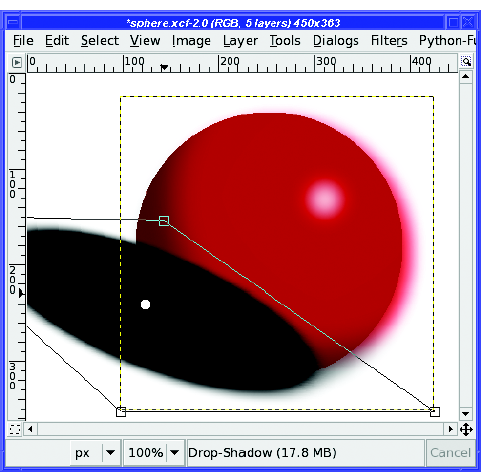
Drag the shadow to where it looks right and adjust its transparency, and you're all set (Figure 9-35).
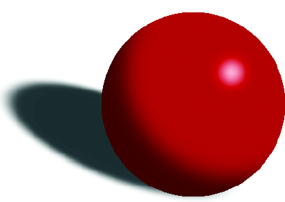
Of course, you can modify this technique in all sorts of ways. When you need to shade a complex object, you can draw shadows along one edge of the object using the Paintbrush tool with a fuzzy brush (in a separate layer, of course), or fill complex selections you've made with tools such as the Lasso tool.
You can make spheres with different textures such as glassy, metallic, or leathery: vary the feathering of the selections you fill, and then add textures or reflected objects, perhaps warped with one or more of the Map plug-ins discussed in Chapter 7.
You can add color to the shadow, or to the highlighted areas, to emphasize color being reflected from other parts of your artwork. Try different approaches! The more you experiment with light and shadow, the better your art will look.
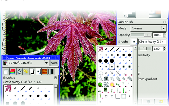
GIMP has a great collection of brushes, gradients, and patterns. But sometimes you need something really specific. How do you make your own?
In Chapter 4, you learned how to create simple parametric brushes. But what if you want to create a brush of a different type?
The easiest way to make a brush out of an image is the Clipboard brush (new in GIMP 2.4). Simply copy anything in GIMP, then look at the list of brushes either in the Brushes dialog or in the Brush menu in the Toolbox. The first item will be a brush made of whatever you copied (Figure 9-36).
Any image can become a brush. But GIMP has two types of image brushes: color and grayscale.
A grayscale image brush works like most of GIMP's standard brushes: anywhere the brush is black, GIMP will paint in the current foreground color. Anywhere that's white will not affect the image. Be sure to use white rather than transparent for grayscale brushes: GIMP will refuse to save a grayscale brush with transparency.
Warning
If you try to save an image as a grayscale brush and you get an error message, check to make sure the image is really in grayscale mode, not RGB (it should say grayscale in the window's title bar). If not, use Image
Color image brushes keep their color when you paint with them (like the Vine brush discussed in Chapter 4). Most good color image brushes will be small and will have transparent backgrounds.
Hey—that describes Wilber! How would you go about making Wilber (Figure 9-37) into a GIMP brush?
Making an image into a brush is easy—just save it in the right place using the right image type (Figure 9-38). The right place is the folder check-marked Writable in Preferences
Tip
If you have trouble finding your GIMP profile folder in the Save as dialog, try clicking on Browse for other folders; then right-click in the file list and select Show Hidden Files.
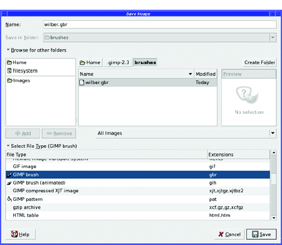
The right type is GBR, for "GIMP brush." You can expand GIMP's Select File Type list and click on GIMP brush, or just save it to a file ending in .gbr and let GIMP figure out the type.
Once you click Save in the dialog, you'll be prompted for a Spacing and Description (Figure 9-39).
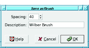
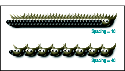
Spacing is how far apart the images will be when you draw lines and curves with the brush (Figure 9-40). The Description is the name that will show up when you choose the brush from the Brushes dialog.
After you've saved a brush, you need to Refresh brushes—the button in the lower right of the Brushes dialog—before GIMP will see the new brush. Of course, exiting GIMP and starting again also works. Then you can use your brush.
Although it's fun to draw silly lines made of Wilbers, a more practical use for simple custom brushes is as a stamp, or an image you need to use frequently. Suppose you have a signature that you like to add to your artwork. You could keep your signature in a file and open it every time you needed to use it, copy it, and then paste it into the new image. But if it's already loaded as a GIMP brush, it's always accessible through the Brushes dialog. Much easier, and you don't need to remember where you stored the file.
The real power of custom brushes is in animated brushes. These are made from images with multiple layers, just like the animated image you made at the end of Chapter 3. As you drag the mouse across the canvas, instead of seeing the same object repeated many times, you'll see slightly different objects. GIMP's Vine brush, and others such as the Pencil Sketch brushes, Felt Pen, Confetti, and Galaxy, all use animation to give you a random-looking, constantly changing line. The animated brushes have a red corner in the Brushes dialog, so you can tell them from other types of brushes.
To illustrate, I'll demonstrate how to make a simple animated brush: some cartoon grass.
Start with a small image. I'll use 50 × 50 pixels. It shouldn't have any background, just a completely transparent image. (If you start with an image that has a background, Add Alpha Channel followed by Clear can fix that.)
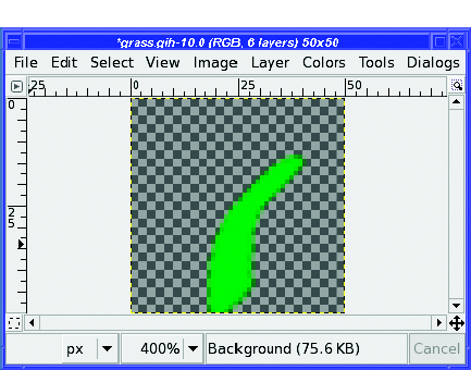
Now draw a blade of grass (Figure 9-41). Notice that I zoomed in the window to 400%: it's hard to draw in a 50 × 50 window at normal size.
Tip
Since GIMP doesn't offer any way to draw a line that starts wide and then tapers to a point, I drew each blade as a constant-width line, then zoomed in and used Lasso Select and Clear to taper their tips.
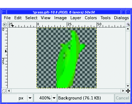
Make a new layer, and draw another blade of grass. Grass will look more realistic if each blade is a slightly different shade of green as well as a different shape.
Continue adding new layers until you're happy. I'll stop at six layers (Figure 9-42).
Now it's time to save the brush. Use the same folder you used for simple brushes—the brushes folder in your GIMP profile directory—but this time use the GIMP brush (animated) type, a .gih extension (Figure 9-43).
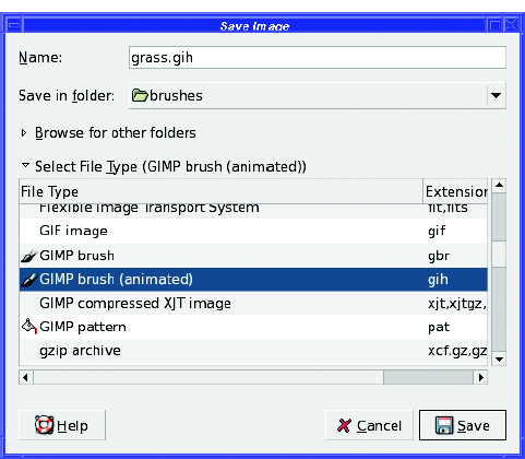
This brings up the Save as Brush Pipe dialog (Figure 9-44). Pipe is another term for an animated brush.
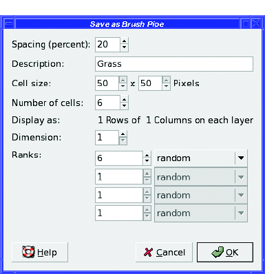
Spacing is the distance between consecutive brush marks, just as it was with simple brushes. It's specified as a percentage of the brush size. You'll have to experiment with this setting to find the right one for your brush. For grass, 8 or 10 works fairly well.
Description is simply a text description you can give to your brush. Number of cells is the number of layers in your image. GIMP should initialize this for you.
The rest of the options—Cell size, Display as, Dimension, and Ranks—control how the frames of the animated brush are chosen from the image, and in what order. For a simple animated brush like this, leave Dimension at 1 and set the first Ranks column to the number of cells (6, in this case).
Note
For more complicated brushes, you can choose to divide each layer into a grid, and then use each grid cell as a frame in the brush. Dimension and the other Ranks fields tell GIMP how the grid is set up and in what order to choose the frames. These make brush design more complicated; you're probably best off ignoring them until you get comfortable with animated brush design. They're used for fancy effects like changing orientation according to the direction you're drawing.
The menu next to the Ranks entry controls the order in which cells are chosen. Random picks a random layer each time; Incremental uses the layers in order; angular and velocity let you create more advanced effects, such as changing the brush image according to the direction or speed the mouse is moving. The other options, pressure, xtilt, and ytilt, use those values from a drawing tablet if you have one. If you don't, you're better off sticking to Random or Incremental.
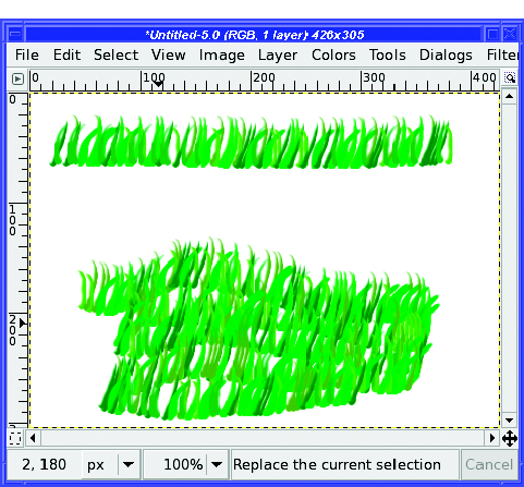
Figure 9-45 shows the effect of drawing with the grass brush.
GIMP can also import animated brushes from certain other programs. Paintshop Pro calls them tubes and uses the .tub extension. Convert them to GIMP animated brushes by opening the .tub file as an image and saving as GIH. For other programs, you may be able to find plug-ins or external programs to convert a brush to GIMP's GIH format.
Note
You'll sometimes see the term image hose to refer to animated brushes, especially in the Paintshop Pro world. The idea is that the brush is a hose that sprays out a stream of constantly changing images. Pipes (as in GIMP's dialog) and tubes are other ways of referring to animated brushes.
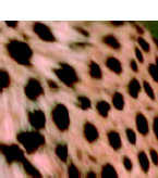
You've probably used some of GIMP's built-in patterns by now. But you can get a pattern from a photo too. For instance, what if you want a pattern of spots copied out of a cheetah photograph (Figure 9-46)?
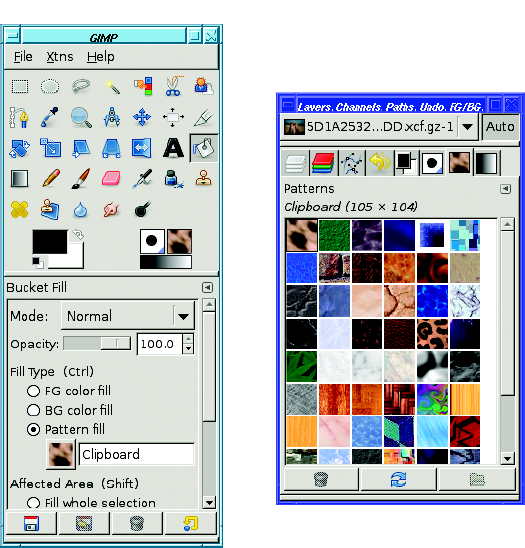
The easiest way to test a pattern is to use the Clipboard pattern, which works just like the Clipboard brush. Copy your pattern, and it will automatically appear as the first item in the Patterns dialog, or in the Pattern Fill checkbox you get in the bucket fill tool (Figure 9-47). Drag from the Clipboard pattern into an image window, or use Edit
Well, of course there's a catch. When you fill with a new pattern, you'll almost always see a tiling effect, as in Figure 9-48.
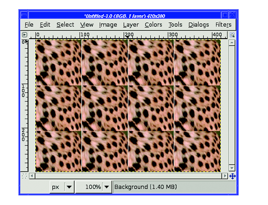
What went wrong? There's a sharp boundary where the bottom edge of one copy of the pattern doesn't match the top edge of the next copy (and similarly with the left and right edges, though the effect is less obvious). The eye is very good at picking out boundaries. That won't do!
Fortunately, GIMP has a filter to help with creating patterns which can be found at Filters
After running Make Seamless on the cheetah pattern, copying it, and filling with it, you get something more like Figure 9-49.
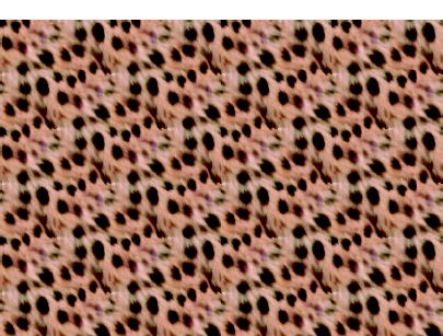
Running Make Seamless sounds easy, and it is. But it's not perfect—notice the repeating group of spots you can see in the cheetah pattern when it's tiled. Patterns with straight lines, such as bricks, may end up warped or blurred in unnatural-looking ways. Even fairly random patterns like cheetah spots can become blurry or blotchy. If I move the selection over just a few pixels in the original cheetah image, copy it and use the Make Seamless command, it comes out like Figure 9-50.
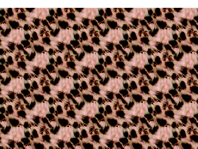
Figure 9-50. Moving the selection over slightly can make a big difference in how realistic a pattern looks, even with Make Seamless.
The key to choosing a good pattern is finding one that doesn't change much from one edge to the other. If it's brighter in one corner, if there's a big dark spot in the middle or a line along the bottom, if there's an obvious shape inside...it will be obvious where one tile ends and the next begins. Sometimes this is acceptable (and even some of GIMP's built-in patterns show obvious edges), but most of the time you won't want that.
There are also plug-ins you can download, such as Resynthesizer, and other techniques such as a high-pass filter and the Clone tool, that can go beyond Make Seamless to help make your patterns tileable.
After making brushes, I'm sure you can guess how to save your pattern once you're happy with it. Navigate in the Save as dialog to the brushes folder in your GIMP profile, and save it as type "GIMP pattern" (with a .pat extension). When you're prompted for a description, choose a name that makes sense. Then open the Patterns dialog and click the Refresh button in the lower right.
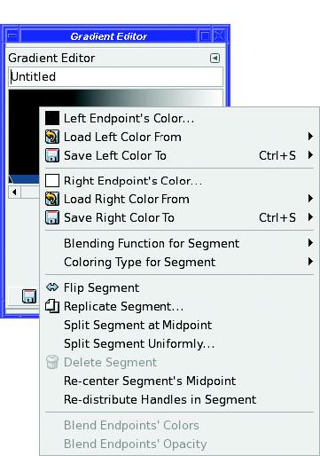
You can make your own gradients, too, by using the Gradient Editor.
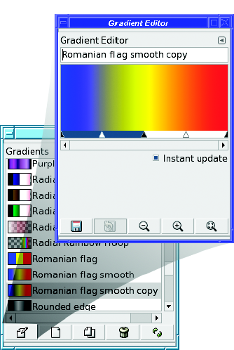
The easiest way to learn the Gradient Editor is to edit an existing gradient. Select a gradient similar to your goal, make a copy of it by clicking the Duplicate button, then click Edit to get the Gradient Editor (Figure 9-51). You can also use the context menus of the Gradients dialog (right-click on any gradient in the list, and then select Edit to edit that gradient, or New to make a new one).
Warning
Make sure you duplicate an existing gradient before running the Gradient Editor. If you try to edit one of GIMP's built-in gradients, many functions in the dialog won't work because the gradient will be opened as read only.
At the top of the Gradient Editor is the name (for a new gradient, "Untitled"). You can change this to the name of your new gradient.
Below the name is an image of the gradient as it currently looks, and below that, an area for range selection sliders—the blue-and-white bar with black-and-white triangles.
In the range selection area, black triangles define segments. Each segment has two endpoint colors. White triangles represent the midpoints of ranges. The currently selected range is blue; the others are white.
In Figure 9-51, there are two segments. The first (leftmost) segment is active, since that's the one with the blue bar below it. Its left endpoint color is blue, and its right endpoint color is yellow. The second segment has a yellow left endpoint, and a blue right endpoint.
Each segment will fade from the color at one endpoint to the other. How fast it will fade is controlled by dragging the midpoint slider (the white triangle). Drag it to the right, and you'll see more blue; to the left, and you'll see more yellow. You can also drag the black endpoint sliders, or even drag the entire selected zone.
Tip
To make an abrupt cutoff, like "Romanian Flag" (as opposed to "Romanian Flag Smooth"), make segments where the left and right endpoints are the same colors, so there's no fade from one end to the other.
You can control many aspects of blending, and add or delete segments, by right-clicking in the gradient to get a context menu (Figure 9-52). The most important entries are Left Endpoint's Color and Right Endpoint's Color to choose the colors used in the current segment.
When you've edited a gradient to your liking, the Save button adds the gradient to your GIMP profile. You don't need to choose a file name or file type for it: GIMP will handle that for you.
Most people won't ever need to create or modify a gradient. But for those who do, GIMP's Gradient Editor gives you plenty of power to do whatever you need. Experiment and see what it can do for you.
By now you know how to create your own brushes, patterns, and gradients. You know all about perspective and how to use it when drawing, how to make shadows, and how to make text or other objects fade out using layer masks. And you have some idea of the effects you can achieve by combining GIMP's many layer modes in your drawings.
Next, it's time to revisit photographs, and see how you can use some of these same techniques to make your photos better, or to combine several photographs together—a process called compositing.