You have your shiny new digital camera, and it takes great pictures.But straight out of the camera, the photos are huge, and far too big to put on a website or email to friends. Maybe they also have other problems you'd like to correct before you show them to anyone.
This chapter will explore some of the most common ways you can use GIMP to improve your digital photos and share them with the world. It will cover the following:
Opening files
Scaling
Saving files
Cropping
Brightening and darkening
Rotating
Sharpening
Fixing red-eye
The first step in editing any image is to open it.
If GIMP isn't running yet, you can start it by dragging one or more images to GIMP's desktop icon (if you have one), or simply run GIMP from the command line:gimpfile1.jpg file2.jpg. GIMP will start up and display windows for each image.
But if GIMP is already running, opening images this way will start a second instance of GIMP. You're better off dragging images to GIMP's Toolbox window, as described in Chapter 1, or usingthe Open dialog (File
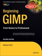
GIMP's Open Image dialog lists files and folders in the main frame of the dialog. Above the file area is a sequence of buttons representing the location of the currently chosen folder. Clicking on these buttons can move you up one level, or several.
You can select more than one file at a time in the file list. Click on the first file, and then hold down the Shift key while clicking to highlight a range of files (they may not highlight until you release Shift); or hold the Ctrl key down while clicking individual files to select or deselect them. GIMP will open each file as a separate image.
Try typing the first few letters of an image's name to jump to that image in the file list. Ctrl+L will bring up a text field that allows typing or pasting a file name (another Ctrl+L hides it again). On Linux, typing certain characters (such as a forward slash, /) will cause this dialog to pop up without the need for Ctrl+L.
On the left side of the dialog is a list of bookmarks. You can click on a bookmark to jump directly there, or add the current folder to the bookmarks list by clicking the Add button.
Underneath the file list is a menu for file type, initialized to All Images.You can use this menu to restrict the types of images you see in the dialog.
Below the Add and Remove buttons is an expander for Select File Type. This is different from the file type list right above it: it's for unusual situations where GIMP cannot detect the format of an image file automatically. It is seldom useful: if GIMP can't detect an image file's type on its own, it usually means that the file has been damaged in some way, in which case the selector won't help. However, if you have an image that you think may have the wrong extension, it's worth a try.
Besides the Open dialog, GIMP offers two more Open options in its File menu: Open Location, which allows you to paste a web URL, and the Open Recent menu, which lists images you've edited... well, recently. If the file you're looking for is no longer listed in the Open Recent menu, you may still find it in Document History at the bottom of the Open Recent menu.
Warning
When editing a digital camera photo, it's a good idea to make a copy of the image first, and then edit the copy. Although you can use GIMP's Save As dialog to save a file to a different name, it's easy to forget to do that and thus overwrite your original image.
Modern digital cameras take beautiful photos in high resolution: 6 or 7 megapixels or even more. That's great, but higher resolution makes for larger files of at least half a megabyte each and perhaps much more. If you put images this big on the web, or send them via email, the recipients will not thank you.
The solution is to scale the images: make them smaller. Don't confuse this with changing the canvas size: in GIMP, that only changes the size of the work area without changing the contents. To take the image contents and blow them up or shrink them down, Scale is what you want.
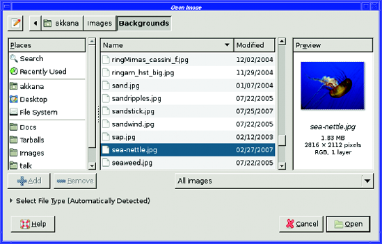
The Scale Image dialog (Figure 2-2) is accessed from the Image menu in the image window: Image
The dialog has three sections. The most important section comes first: the new size (width and height) of the image. By default, size is given in pixels. This is a good choice, and you should use it unless you have a firm reason to do otherwise.
The width and height are "chain linked" together. You can type a new number into either the Width or Height field, then hit the Tab key or click in another field, and the other dimension will automatically update to keep the aspect ratio—the ratio of width to height—of the image unchanged. This prevents the contents of your photo from getting taller and skinnier, or shorter and fatter. Very convenient!
If you actually do want to scale the two dimensions independently, clicking the chain link icon breaks the chain and unlinks width and height, so you can change one without changing the other. Welcome to the Hall of Funhouse Mirrors. Clicking on the chain link again will link them back together.
Even if you work in pixel dimensions, you may want to use the units drop-down menu (initially in pixels) in order to scale an image to some multiple or fraction of its current size. With the units menu set to percent, you can set the width or height to 200 to make the image twice as large, or to 50 to make it half the size. (You only need to set width or height, not both; if they're chained together, the other will adjust automatically.)
THE UNDO COMMAND: A GIMP USERs'S BEST FRIEND
If you're curious about how the chain link icons work, or how the image might look when scaled to a particular size, you can try it without any fear of losing your data. GIMP's Undo command is your friend! Get familiar with it early on. It's very useful to be able to try things while knowing you can always undo your changes and go back to the previous version.
Undo is in the Edit menu, along with Redo and an item called Undo History, which brings up a window showing the history of commands you've used recently. You can also undo the last command by pressing Ctrl+Z. Undo is so frequently useful that it's well worth learning that keyboard command.
GIMP can undo several operations in a row, not just the last single operation. By default, it remembers the last five operations. You can change that number in Preferences File
A larger Undo stack takes more memory, so it may be best to stick with the default settingunless your machine has quite a lot of RAM. There's also a preference to limit the amount of memory the Undo system can use, though the preference for the number of Undo operations takes precedence. Therefore, you know you'll always have at least the number of Undo operations you specify in Preferences.
Try Undo now: type something into the Scale dialog, perhaps even with width and height unchained from each other, and click the Scale button. Then undo the Scale operation, using Ctrl+Z or Edit
For photos intended for web pages, it's usually best to keep the largest dimension of the image at 640 pixels or less (400 × 300 images are free on eBay!). If you have a lot of images, or if many of the people who will view your images have slow network connections, smaller is better.
The Resolution section in the Scale Image dialog allows you to specify the number of pixels per inch (or other units, if you choose). This doesn't change the size of the image; it's merely a note that gets added to the image so the image size can later be converted to physical units (such as inches). Most of the time, you won't need to look at these values.
The Interpolation Quality controls details of how the image is scaled. Linear, which is the default in at least some GIMP versions, does not produce the best quality, but it's fairly fast. Unless you're on a very slow machine, you'll probably want to change this to one of the higher-quality settings, such as Cubic or Lanczos. These settings will run a little slower, but they'll produce much better-looking images, especially if you ever scale images larger instead of smaller. I recommend changing this value permanently, in the Preferences dialog under Tool Options, so you don't have to think about it when you're using the Scale dialog.
Note
Which quality setting is considered "Best" can vary with GIMP versions and with the sort of image you're scaling. The difference between Cubic and Lanczos is fairly subtle.
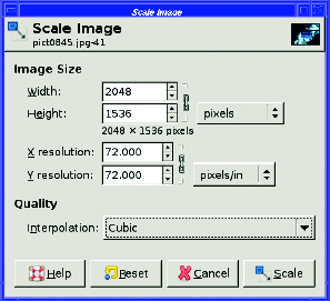
Usually, when you click Scale in the dialog to make a digital photo smaller, and GIMP rescales the image, the window will resize to be tiny (Figure 2-3). Don't be fooled: the image probably isn't as small as GIMP is showing you.
What happened? Since the original image was too large to fit on the screen, GIMP showed it as "zoomed out"— in the example in Figure 2-3, it is shown at only 33% of actual size. After the image is scaled, GIMP keeps the same zoom setting (it may or may not make the actual window smaller, depending on your setting for Resize window on zoom in the ImageWindows preference category). So now, even though the image could easily fit on the screen, you're still seeing it at 33%. The solution is to zoom after rescaling. Use the Zoom menu in the image window, the menu under View
Warning
The + and − keys on the numeric keypad may not work. If they don't, use the ones on the regular keyboard. On some earlier GIMP versions, zooming in used = instead of + (on most US keyboards, = is the un-Shifted version of +, and so is easier to type). Remember, you can always change these key bindings, as described in Chapter 1 in the section "Keyboard Shortcuts."
Scaling an image is easy, and it's an important operation when you're sharing images with other people. For many images, scaling may be the only operation you need. But if you plan other operations that may affect image size, such as rotation or cropping, do them first. Scaling should usually be the last thing you do when you're editing an image; that way, you have the greatest control over the image's exact final size.
The exception that proves the rule is a very slow machine. If you scale the image first, subsequent operations will go much faster. However, you'll find that this matters only with very slow machines—or very large images!
Most of the time, Image
You'll find it in the Toolbox next to the Rotate tool, or through the menu Tools
The Scale tool is a bit trickier to use than Image
Third, by default it doesn't maintain the layer's original aspect ratio. You may end up with a "funhouse mirror" version of your image where everything looks tall and skinny or short and fat. Keep aspect in the tool options can fix that (there are also options to keep height while varying width, and vice versa). It also offers Interpolation, Clipping, and Preview options similar to those for the Rotate tool.
For improving digital photos, you probably won't want to use the Scale tool. But keep it in mind for later when you're using lots of layers and doing crazy things to them. It might be just the ticket then, as it does have the advantage of giving a live preview of what the image will look like when scaled. Sometimes that's awfully helpful.
Image editing is just like any other type of document editing: once you've made any significant change to a file, you should save it. It's smart to save your work frequently, in case of a computer crash or other disaster.
GIMP uses Ctrl+S as the keyboard shortcut for File
If you've edited an original image, modified it, and now want to save to a new file name, use File
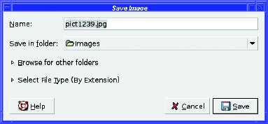
The Save in folder popup offers a list that corresponds to the "bookmarks" you've set up in GIMP's Open dialog. You can get a file selector that gives you more choices by clicking on the expander next to Browse for other folders.
The Select File Type expander lets you choose an image format. Normally, you don't need it: just type the extension as part of the file name (e.g., mypicture.jpg to save in JPEG format) and GIMP will use the appropriate format. The expander is there in case you need to see a list of formats GIMP can handle, or in the rare case that you need to save a file with an extension that doesn't match the file type you need to use—for example, if you want to save a JPEG image but name it "image.jfif" instead of "image.jpg". You'll learn more about file types in the next section, "Image File Types".
Once you Save As, the GIMP considers your entry to be the new name for the image. From then on, you can save and any changes will be saved to the new file name, without overwriting the original file. The file name is visible in the title bar of the image window, so you can check easily to make sure you're saving to the right file name. There's one other save option worth noting: Save a Copy. This works like Save As in that you can choose a file name different from the one you're currently using. The difference is that Save a Copy does not change GIMP's notion of the current image file name. After you Save a Copy, subsequent saves will still use the original file name. This is very useful when you're making repeated edits to an image, and you want to save it in a format that preserves all your work, such as XCF, but you want to share the final result on the web in a more efficient format, such as JPEG or GIF.
The choice of file types used to hold images—GIF, JPEG, BMP, PNG, TIFF—is baffling. What do each of these file types mean, and which format should you use?
When choosing a format for the web, or to send images by email, the most important criterion is usually file size. In order to view your image, each user will need to download it. This is especially important if anyone in your intended audience might be connected via a slow modem, or if you're sending images by email and some recipients might have an emailaccount with a disk quota. Also, many email systems will simply refuse to transfer files that are too big.
The other important factor when choosing an image format is image quality. There's typically a trade-off between file size and quality: you can compress an image to a smaller size only by sacrificing some quality. But by choosing the right file type, you can find the best balance of quality and file size.
For sharing full-color photographs, the best format to use is usually JPEG. Pronounced "jay-peg," the name comes from the group that defined the format, the Joint Photographic Experts Group. Usually, a JPEG file will have an extension of ".jpg", or occasionally ".jpeg". JPEG images are highly compressed and are encoded in full color, so it's a very efficient format for photographs or other images with a wide range of colors.
The drawback to this format is that the compression is lossy. That means that every time you read a JPEG file, make a change (however minor), and write the file back to disk, the image quality degrades slightly. Don't use JPEG for images you plan to edit over and over. But as a format for exchanging photographs with other people, JPEG excels. (There's no quality loss when you copy the file from one place to another, only when you edit it and write it back to disk.)
You may be wondering, "My camera stores images as JPEGs. Does that mean I'm losing quality?"
The answer is yes. That's why many cameras provide a non-lossy raw format (discussed in the section, "Other Formats") as well as JPEG. However, JPEG files are so efficient that you can store many, many more images than is possible with raw mode on the same memory card. Use raw format if you're worried about making sure you preserve every detail, or if you're bothered by the image quality of a JPEG; but for most people, the slight quality loss caused by using JPEG on a camera, plus editing an image once or twice and saving it again in JPEG format, will not be noticed. The space savings are worth it.
The Graphics Interchange Format, pronounced "giff" with a hard "g" as in "graphics," is an indexed format. This means that it uses a fixed list of colors instead of encoding every color separately. This is very efficient for images with a small number of colors, like a five-color corporate logo.
GIF can represent up to 256 colors (256 is 2 to the 8th power, so this is also called 8-bit color ). Typical photographs have many more colors than that (typically tens or hundreds of thousands), so saving a photograph in GIF format will usually result in very poor quality. Even worse, with 256 colors, the file will usually be larger than a full-color JPEG version of the same image! The lesson is clear: don't use GIF for photographs; use it only for simple icons and logos.
So what is GIF good for? The GIF format offers two very useful features: transparency and animation. With transparency, you can make an icon with a clear background. If you display it on aweb page, or on a button in a program's user interface, whatever's behind the icon (a color, or even another image) will show through. GIF doesn't allow for partial transparency; a pixel is either fully transparent or not transparent at all.
GIF animation allows you to create images that move. Most web browsers support animated GIF images. (Whether this is a good idea is unclear; some users dislike animated images on web pages, and will avoid websites that use them. But animations have their uses.) To learn how to create GIF animation, see "Making Simple GIF Animations" in Chapter 3.
PNG, pronounced "ping," once stood for "PNG's Not GIF," though it's now sometimes referred to as the Portable Network Graphics format. It's a relatively new format, originally intended as a replacement for GIF because of legal issues regarding the GIF format.
PNG offers two modes: it can be used for full-color images, like JPEG, or for indexed images, like GIF. In full-color mode, it's not nearly as efficient as JPEG: a PNG will be much larger than a JPEG of the same image. However, it's not lossy, so if you read a full-color PNG, make a modification, and write it back out, the quality will be just as good as it was before. This makes full-color PNG a good format for storing original copies of your own images if you might want to edit them later.
Indexed PNG is just as efficient as GIF (sometimes more efficient) for images such as logos and icons with a small number of colors, and it can support more than 256 colors. Nearly all web browsers support basic PNG, so it's safe to use PNG images on web pages. PNG supports transparency, like GIF, and it also supports partial transparency so you can have translucent areas. However, some browsers (such as older versions of Internet Explorer) don't support PNG transparency, so transparent PNG images on a web page may not always display properly.
PNG doesn't support animation. There's a format called MNG that adds animation to PNG images, but no web browsers support it yet. For animated images, GIF is pretty much the only choice.
This is GIMP's own format. When you're editing an image and you have a lot of layers and paths and other information you want to save, this is the format to use. Otherwise, don't. XCF files are usually quite large and can only be read by GIMP, not by other programs. Since XCF files are so large, you can compress them using the GZIP or BZIP2 formats—save to a file name ending in xcf.gz or xcf.bz2, and GIMP will handle the compression and decompression when it reads or writes the file.
Tagged Image File Format (with a file extension of either .tif or .tiff) is another full-color, non-lossy format. Like full-color PNG, it's not very compact (don't use it on web pages—many web browsers can't display it anyway), but it's fine for keeping originals of images you might want to edit again. The reason I recommend using PNG instead of TIFF, aside from web browser compatibility, is that TIFF isn't a single standard, but many different standards with different interpretations. A TIFF written by one program may not always read correctly in another program. GIMP will read most TIFF files, but sometimes it will "have a tiff" about certain types of TIFFs.
One advantage to TIFF over other full-color formats is that it handles a wider range of colors. For the technically minded, it can handle 16 bits per color channel. This is important to some professional artists and graphic designers. However, GIMP doesn't currently handle 16-bit color anyway (that's planned for a future release), so if you're editing in GIMP, you don't get any benefit from using TIFF.
There are more image formats. Lots more. Too many more. Here are some of the most common:
Raw :Not actually a format, raw is a term encompassing all the various proprietary formats used by camera manufacturers. GIMP supports many of these (usually requiring external plug-ins, such as ufraw). A few raw formats are held as "trade secrets" by the camera manufacturer, and your only option is to use another program to convert the image to a more standard format before editing it.
BMP :This is Microsoft's Windows Bitmap format. BMP files are quite large and don't offer any advantage over PNG or TIFF. Save to BMP if you need to (for example, for writing Windows software), but otherwise it's usually better to choose a different format.
PCD :This is Kodak's proprietary Photo CD format. It includes several resolutions within one file (so files tend to be very large) and is not lossy. GIMP doesn't handle PCD directly, though there's a plug-in available to read it. You're usually better off converting PCD files to something else.
PSD :This is Adobe's proprietary Photoshop format. It saves layers and other information, analogous to XCF in GIMP. PSD is really two formats: GIMP can read the older version, while the newer one is a closed standard that can't be read by GIMP or most other non-Adobe programs.
ICO :This is the Microsoft Windows Icon format. It can contain several resolutions in one file. This format is useful not only for Windows icons, but also to create a favicon for your website—those tiny images that show up if someone bookmarks your site—as well as next to the web page address in some browsers. GIMP can read and write ICO files directly.
PDF and PostScript :These are vector graphics formats, not raster (pixel) graphics like the other formats discussed so far. Instead of representing an image as a rectangular collection of pixels, a vector image is a collection of drawing instructions involving points, lines, and curves. GIMP can't edit vector graphics directly (though there are a few plug-ins that give you limited vector image support), but it can import PostScript or PDF through a plug-in that converts the image into a raster image. If you're planning to save your image as PostScript or PDF, you're usually better off using a program intended for editing vector graphics.
SVG: Scalable Vector Graphics is another vector format that is growing in popularity on the web. GIMP can import images from SVG, and in the future it may be able to export them to SVG as well. In addition, you can use the Path tool (which you'll meet in Chapter 5) to make simple vector graphics that you can save as SVG, and you can import paths from SVG.
Some image formats let you adjust settings to trade quality for smaller file size. In some cases (for instance, small buttons on a web page), it may be important to make the file as small as possible, and a slight loss of quality may be worthwhile.
JPEG and GIF both have quality adjustments, but their methods are very different.
JPEG's quality adjustments come by varying the amount of image compression. JPEG's compression takes advantage of tricks of human perception; it tries to degrade quality in ways that won't be very noticeable. By experimenting with the Quality setting in the Save as JPEG dialog (Figure 2-5), which appears after you specify a file name ending in .jpg, you can find a balance that gives you a very small file size but still a pretty good-looking image.
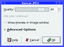
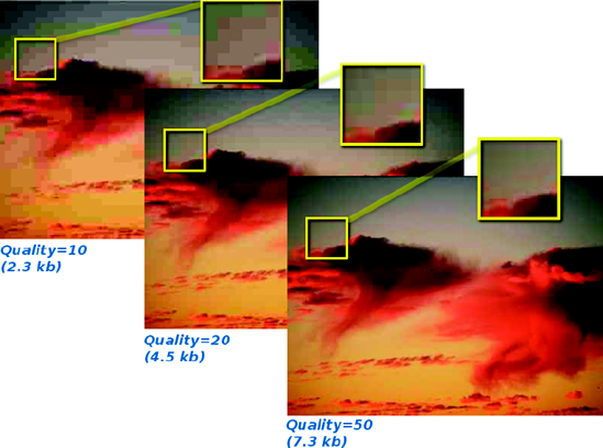
Begin by making sure the checkbox for Show Preview in image window is checked. This lets you see the effect of changing the Quality setting. The file size will also be shown in the dialog. GIMP's default Quality setting is 85 when saving to new files (when editing existing files, it uses whatever Quality setting is already there). The value 85 is a good choice for photographic images stored locally, but you may find that you can get away with settings as low as 50 with surprisingly little degradation. Figure 2-6 shows an example of how the quality can change with different compression settings, but I encourage you to try this on one of your own images to see the differences in quality and file size.
You may be tempted to move the slider to 100% for images you store locally. Surely that would be best for images you're storing, and would prevent loss of data from JPEG compression?
Alas, even at 100%, JPEG still loses some data every time you save. Using a setting of 100% will produce a file two or three times larger than a setting of 95%, and the quality won't be any better. There's no advantage in using quality settings above 95%. If you want to save without any loss, you're better off using formats such as PNG or TIFF.
Finally, GIMP has some other JPEG settings in the Advanced area of the Save as JPEG dialog (Figure 2-7).
Optimize gives you an additional reduction in file size without any further reduction in image quality. It's on by default, and there's no reason to change that.
Progressive is a useful setting for images that will be uploaded to the web. It makes the image load in a different way, so people viewing the image will see a poor-quality version right away, which gradually improves, instead of seeing the image load line by line starting from the top.
Smoothing, Use restart markers, Force baseline JPEG, Subsampling, and DCT method control details of the JPEG format. You shouldn't need to change these unless you want very fine control over the way the JPEG file is saved.
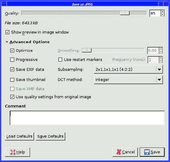
Save EXIF data is a good option to know. JPEG includes a way of holding information (called metadata) about the file using something called Exchangeable Image File Format, or EXIF. Most digital cameras add EXIF information about the date the photo was taken, the resolution, and the camera's settings, such as lens focal length and whether a flash was used. GIMP cannot show or edit this EXIF information (that will probably be available in some future release), but it can preserve the information so that you can view it with other programs. If you don't want the EXIF information preserved, deselecting this box will make the file slightly smaller.(You can see exactly how much smaller by watching the File size value at the top of the dialog.)
EXIF can embed a thumbnail of the image in the file. Many cameras include this thumbnail, which adds several kilobytes, but most programs don't do anything useful with it.
Deselecting Save thumbnail prevents saving this extra information, making the resulting filesmaller.
XMP data is another metadata format (from Adobe). Some of the same tools that can read EXIF can also handle XMP, but it's not as widely used as EXIF.
Comment is a place to put any text you might want to add to an image. You can use this to include your name, a copyright notice, or details about where the photo was taken or what it portrays.
Load Defaults and Save Defaults let you save settings you want to use most of the time. For instance, if you always want to preserve EXIF but don't want the thumbnail, and you find an 83% quality setting is enough for you most of the time, you can set those values in the dialog and click Save Defaults. GIMP still won't use them for every image—if you load a JPEG file that uses different settings, GIMP will use the image's settings unless you change them—but the defaults are helpful for JPEG files you create or convert from other formats.
GIF and indexed PNG quality settings are quite different from JPEG. Since these indexed formats use a fixed number of colors, you can make the files much smaller by reducing the number of colors they use.
To do this, you need to know about GIMP's image modes. Most images edited in GIMP are full-color images, denoted as RGB in the title bar of the image window (for instance, Figure 2-3).But images that are destined to be saved as GIF or indexed PNG should be converted first using the Image
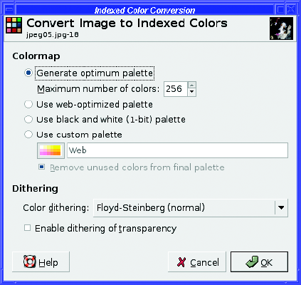
When converting an RGB image to indexed mode, you first need to choose a palette, the set of colors that will be represented in the final image. You can choose a predefined palette, such as a web-optimized palette, or one from the custom palette menu; you can choose a black-and-white palette, if you know that the image contains only thosetwo colors; or, the most common case, you can let GIMP create a palette based on the colors actually in the image. You specify the number of colors, up to a maximum of 256, and GIMP will try to approximate any other colors that exist in the image by using combinations of the colors in the palette (Figure 2-9).

Figure 2-9. Different levels of indexing, showing file sizes when saved as GIF. Note that all the GIF versions of this photo, even the smallest, result in a bigger file than the best JPEG.
This process of approximation is called dithering : it involves combining pixels of several different colors. You can choose from several types of dithering that create different effects, or you can specify no dithering, which may create a smaller file size and a cleaner appearance for images with sharp lines and only a few colors. See Chapter 8 for a detailed discussion of optimizing indexed images.
The Convert Image to Indexed Colors dialog does not include a Preview button. So you'll probably need to run it several times: choose some settings, click OK, and then use Undo to go back to RGB mode and try again with different settings. It's worth spending some time on this if you're trying to squeeze an indexed GIF or PNG image as small as possible.
Note
GIMP offers a third image mode, grayscale, for black-and-white images. Grayscale mode is useful for scans of black-and-white documents or photographs, or simply for converting color photos to black and white.
When saving an RGB image as GIF, if you skip the step of converting it to indexed mode, GIMP will offer to do the indexing for you. In this case, GIMP will choose a palette intended to represent as many of the image's colors as possible. This helps preserve image quality, but it doesn't do much to reduce the file size. You may even end up with a larger, yet poorer quality file than if you'd used JPEG. You're much better off doing your own conversion.
The Save as GIF dialog offers a few additional options:
Interlace is like JPEG's progressive option: it makes images load in a different way, so that someone viewing them in a web browser can see more of the image before it has loaded completely.
GIF comment is like a JPEG comment, a place where you can store copyright information or details about where or how the image was taken. (GIF doesn't include EXIF, so the GIF comment is the only place such information can be recorded.)
Animated GIF Options Controls ways of making an animation, as you'll see in Chapter 3.
Saving an RGB image as PNG will save it as a full-color PNG. If you want indexed PNG, you must convert the image to indexed mode before saving it. That said, the Save as PNG dialog offers yet another set of options:
Interlacing is similar to GIF's interlacing or JPEG's progressive options.
Save background color relates to images with transparency. Since not all web browsers handle PNG transparency, those that don't can use the GIMP's current background color instead.
Save gamma stores information about your monitor (see the section on color profiles in Chapter 8). Some viewing programs can compensate for this, and try to adjust the PNG image so that it looks the same on the viewer's monitor as it did on yours. (Most viewing programs probably won't get this right, so for most people, there's no point in choosing this option. It increases file size slightly.)
Save layer offset is only meaningful if you're saving a layer that has been moved relative to the rest of the image (you'll learn about layers in Chapter 3). Most viewers probably won't handle this correctly either.
Save resolution records the current resolution (dots per inch or dpi) of the image, and is only useful if you're trading files with someone whose software cares about dpi.
Save creation time records the time the image was last modified.
Save comment is like the GIF or JPEG comment, but alas, you can't set it in this dialog. Set it on the Comment tab in the Image Properties dialog Image

Save color values from transparent pixels is similar to Save background color, intended mainly for browsers that don't handle transparency properly.
Finally, PNG offers a settable Compression level. Unlike JPEG, PNG's compression is not lossy. The only disadvantage to using high compression levels is that it will take slightly longer to save the file. Most of the time difference happens when saving; it doesn't take a viewer much longer to uncompress a highly compressed PNG image. So usually it's best to use the largest amount of compression possible.
Fairly often, a photo has more in it than you want. Perhaps you took a picture of something far away, and your zoom wasn't quite enough to get "up close," so the subject only occupies a small part of the center of the photo. Or perhaps there's some unwanted object intruding on part of the frame, such as another person, a garbage bin, or your finger. (Not that you'd ever take a photo with your finger in front of the lens! At least, with GIMP, you don't ever have to admit to doing such a thing.)
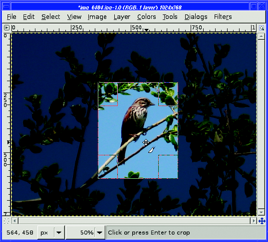
The solution to this problem is cropping. Click on the Croptool button in the Toolbox to select it; it looks like a scalpel blade (Figure 2-10).
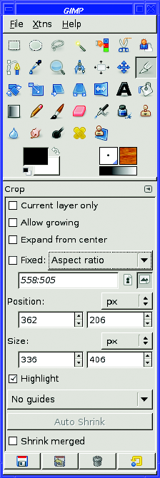
To use the Crop tool, press the left mouse button down in the image window at the upper-left point of where you want the cropped image, drag down and to the right to where you want the lower-right point to be, and then release the mouse button. (You can start at any corner, as long as you drag diagonally to the opposite corner of the rectangle you want cropped.) You will see a preview of the cropped image (Figure 2-11) with drag handles outlined on each corner to help you adjust the crop rectangle.
In GIMP 2.4, drag any corner or any edge to resize the rectangle; dragging inside the rectangle lets you move it. (In earlier versions of GIMP, dragging the upper-left or lower-right drag handles let you make the crop rectangle larger or smaller, while dragging the upper-right or lower-left drag handles moved the rectangle without changing its size.) Watch the mouse cursor carefully as you move it over the drag handles. The cursor will change as the mouse covers the handle, and will give you a clue as to what GIMP will do if you begin dragging at that position. Figure 2-11 shows the Crop tool in "move" mode, where the cursor is positioned near the center of the image and not on a drag handle. The cursor itself is a pair of crossed arrows (to indicate "Move"), plus a copy of the Crop tool's "scalpel" symbol. When you move over a handle, the crossed arrows will change to a cursor showing which corner or edge will be resized if you start a drag.
GIMP 2.2 and earlier also popped up a Crop dialog showing information about the location of the upper-left corner, the width and height of the cropped image, and the aspect ratio. In GIMP 2.4, there's no more Crop dialog; the information shows up in tool options in the Toolbox. If you find that the Crop dialog gets in your way in earlier versions, hold the Shift key down when you first drag in the image to start the crop. That will prevent the dialog from coming up. When you have the rectangle adjusted precisely to where you want it, click near the middle of the rectangle or hit Enter to make it final. (In 2.2 and earlier, you can also use the Crop button in the dialog.)
The Crop tool offers quite a few options (Figure 2-10):
Current Layer Only crops only a single layer (see Chapter 3 for more information about using layers).
Allow growing lets you drag outside the image's boundaries; once you execute the crop, GIMP will make these new areas transparent.
Expand from center takes the point where you start dragging as the center of a rectangle rather than one corner.
Fixed lets you restrict the final image to a specific Aspect ratio (the width-to-height proportions of the image; use a colon—for example, 4:3), Width or Height (to fix only one dimension but let the other vary freely), or Size (use x, as in 640×480). This is especially useful if you're creating desktop wallpaper, or creating a set of fixed-size icons for a website. The two buttons next to the Fixed field let you specify "portrait" or "landscape" mode.
The Position and Size fields update to show where the current crop rectangle is. Most of the time you won't use these fields, but they're available if you need to specify exact pixel positions. You can also move the crop rectangle by one pixel at a time using the arrow keys on your keyboard, as long as the mouse is over one of the corner oredge control areas. Add the Shift key to adjust by larger amounts.
Highlight, which is on by default, darkens the area outside the crop (this area will be discarded).
Next is a menu that draws guides to help you visualize the layout of the cropped image. You can choose No guides (the default), Center lines (showing you the halfway points between top and bottom, left and right), or Rule of thirds or Golden sections (two guidelines taught in many photography and art books). Guides won't show up when you save the image (you'll use them again in Chapter 4).
Auto Shrink will attempt to shrink the crop rectangle to a hard boundary, but it's not very good at finding boundaries, so you're probably better off using Image
Tip
If you already have an area selected, there's a faster way to crop: use the Image
A common problem with camera images is that they are either too light or too dark. GIMP hasthree powerful level adjustment tools to correct such problems: Brightness-Contrast, Levels, and Curves. You can find these tools in two different places in the menu system: in the top-level Colors menu Layer
Tip
Since Brightness/Contrast, Levels, and Curves are tools, you can also make them available as buttons in the Toolbox. Choose File
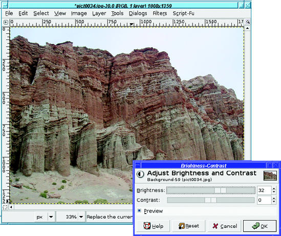
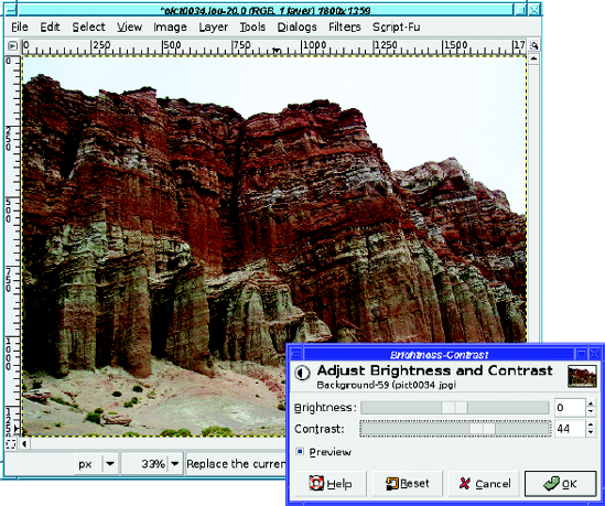
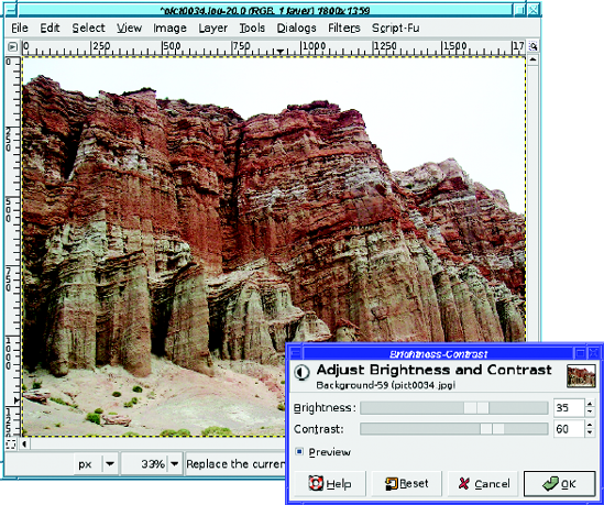
The simplest level adjustment tool is Brightness-Contrast (Figure 2-12).
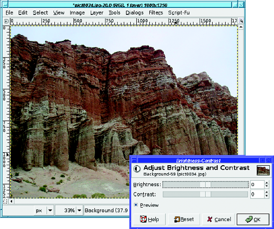
The basic controls in the dialog are simple: two sliders, one for brightness and one for contrast. You can also type in numbers (the values go from −127 to 127, with 0 as the current image), but most of the time you'll probably just drag the sliders until the image looks best.
In addition, the dialog has a checkbox marked Preview. With Preview on, any changes you make to the sliders will be shown in the image window, so you can see exactly how your changes will look. No actual changes will be made until you click OK. Many GIMP dialogs have a Preview option; it's a useful feature that you'll want to leave enabled unless you have a very slow machine.
If you get the settings too far off, the Reset button at the bottom of the dialog will set them back to zero so you can start over. Cancel will dismiss the dialog without making any changes to the image, while OK will take the current settings and change the image accordingly.
Figure 2-13, 2-14, and 2-15 show some examples of the changes brightness and contrast can make. Play around with the sliders to get a feel for what they do. You'll probably find that when you make an image brighter, you'll want to increase contrast a bit, or it will look washed out. You may also be surprised at how well a slight contrast increase can bring out brighter colors in an image. Be careful of pushing contrast too far, though, or you can make the image look grainy.
The Brightness-Contrast tool is straightforward and useful. But GIMP has two other brightness tools that are much more powerful: Levels and Curves. As with Brightness-Contrast, make sure that Preview is checked so that you can see the effects as you play with settings.
Levels (Figure 2-16) has two sets of controls: Input Levels and Output Levels. Input Levels shows a histogram representing the current brightness, or tonal range of the image: this is a graph where the horizontal axis represents brightness, and the vertical axis represents the number of pixels that have that brightness. If the image is fairly well balanced, the histogram should be spread fairly evenly across the image. Such an image is said to have full tonal range. If an image is way under- or overexposed, the histogram is probably bunched up at one end, or shows a spike over to the left or the right. Such an image has a reduced tonal range—it is not using all the possible pixel values that can be displayed.
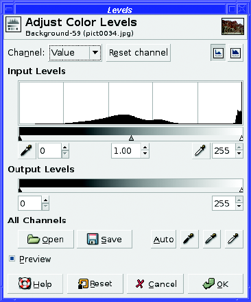
Figure 2-16. The Levels dialog. Notice the values bunched up at the right (light) end: that's the white sky in Figure 2-12.
Both input and output have sliders that you can play with to make the image brighter or darker, or give it more or less contrast. The three input sliders are referred to as shadow, midtone, and highlight, representing the darkest points in the image, a midpoint, and the brightest points.
Sometimes you can use the histogram for guidance: drag the left input slider to where it lines up with the left edge of the thick part of the histogram, and line up the right slider with the right side of the histogram (Figure 2-17). Don't neglect to experiment with the middle input level slider, which is also called gamma value—you can fine-tune the contrast of the image with it.
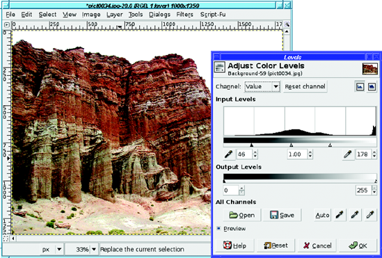
Figure 2-17. Lining up the input sliders with the histogram. The bits of the histogram bunched at the far right are because of the bright sky.
You can also use the eyedropper buttons under the input levels sliderto pick points in your image that should be all black or all white: click on the left eyedropper button, and then click on the darkest point in the image. Then do the same to match the right eyedropper to the lightest point in the image.
At the dialog's upper right are two buttons, Linear and Logarithmic. These control the way the histogram is drawn. They have no effect on the operation of Levels, but switching to Logarithmic can make the histogram easier to see by making it taller.
One common point of confusion is that the sliders on input and output seem to work in opposite directions. If you move the leftmost input slider (at the dark end) to the right, the image gets darker; if you move the leftmost output slider (also at the dark end) to the right, the image gets lighter. What's going on here, and how can you remember which slider does what?
Think about it this way: the input sliders let you expand the tonal range of an image that has a restricted range. The leftmost shadow slider controls the black level: anything in the original image that was darker than the position of this slider will be mapped toblack. Similarly, anything to the right of (brighter than) the rightmost highlight slider will end up entirely white.
Once the image has been remapped according to the positions of the input sliders, the output sliders do the opposite: they let you restrict the tonal range of the final image. Moving the leftmost output slider right means that nothing in the final image will be fully black: anything that would have been black will now be a little bit less dark. Conversely, moving the rightmost output slider to the left means that anything that would have been white will now be a little less bright.
So input expands tonal range; then output restricts it. The leftmost input slider, which represents the blackest pixels in the image, gets mapped to wherever the black output slider is positioned; and likewise the right input slider gets mapped to the right output slider (Figure 2-18).
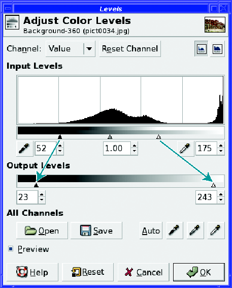
Figure 2-18. The input sliders, after the image's tonal range has been expanded, map to the output sliders to compress the final tonal range.
In most cases, full tonal range is a good thing; once you've adjusted the input sliders to expand your image's tonal range, you wouldn't want to restrict it again. Most of the time, you won't need the output sliders at all. They're there for the rare cases when an image needs to have a restricted range, or for images that are legitimately lacking some part of their tonal range (no highlights or no shadows).
HISTOGRAM GAPS
If you open the Levels dialog on an image when you've previously made a brightness, levels, or curves adjustment, you may notice gaps in the new histogram. What do the gaps mean? The following image shows gaps in the histogram after correcting brightness. Logarithmic mode is used to make the histogram easier to see.
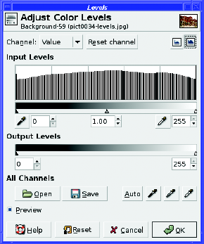
The gaps represent lost information. When GIMP uses the input sliders to expand the tonal range of an image, some of the fine differences between pixels at the extremes of the image (in the very bright or very dark parts) may be lost. "Lost information" sounds bad, but most of the time, it wasn't anything you cared about, or you would have set the sliders differently. But you can see the result in the histogram when you look at the image. This also means that you can sometimes use GIMP as a forensic tool, to tell whether someone else's image has been edited in this way.
Another thing you may notice about the Levels dialog is the Auto button. This is theoretically comparable to the Auto Levels in some other photo-editing programs, but in practice, I find that it seldom helps photographs very much. (This may say more about which photos I try it on than it does about GIMP's Auto Levels.) It's always worth a try; you can fine-tune from there if it doesn't do quite the right thing, and you always have the Reset and Cancel buttons if you don't like the effect.
Finally, at the top of the Levels dialog is a menu allowing you to choose a channel (Curves has one, too). Initially this is set to Value, which you can think of as meaning "brightness," but you can also choose Red, Green, Blue, or Alpha. The three color channels allow you to adjust color problems, such as a yellow cast from a photograph taken indoors without a flash. Color correction will be explored later, in the "Correcting Color Balance" section of Chapter 8, butmeanwhile, if you have an image that needs color correction, try using this menu in Layers or Curves. Alpha is a term meaning "transparency"; you'll work more with transparency in Chapters 3 and 4.
The Curves dialog (Figure 2-19) adjusts many of the same values as Levels, but in a different way. Some people find it more intuitive than Levels; others less so. You'll probably find that you prefer one or the other; which one you use is purely a matter of preference.
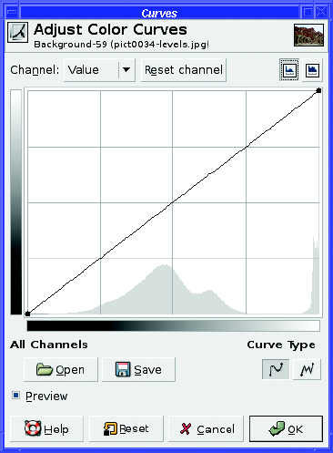
In the Curves dialog, the horizontal bar at the bottom of the graph represents input values, just like the input graph in the Levels dialog. The vertical bar represents output levels. But you don't need to know that to use Curves. To begin using it, just click on the line and drag it up a little (to make the image brighter) or down a little (to make it darker).
As soon as you click on the line, GIMP creates a control point : a handle you can use to grab the curve and drag it higher (brighter) or lower (darker). You can go back and click again on an existing control point and slide it up or down along the curve, or you can leave existing control points where they are and click somewhere else on the line to create more control points (Figure 2-20). If you need to get rid of a control point you've made, just slide it all the way left or right to another control point or to one of the endpoints of the curve.
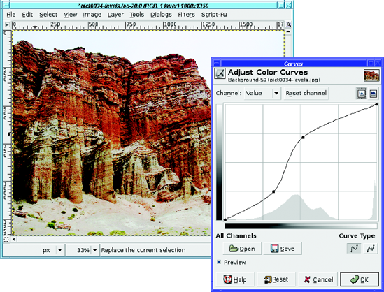
The advantage of the Curves tool (besides being fun to play around with) is that you can easily control which parts of the image are adjusted. The upper-right part of the curve corresponds to parts of the image that are already bright, while the lower-left part corresponds to darker areas. If most of the image is fine, but there are some bright areas that look blown out and you just want to tone those down, you can make a curve that's straight except at the upper right, where it curves below the original line to make the bright areas darker. Then if the dark parts are too dark, you can grab the lower-left corner and drag it upward to brighten just those parts. You can make as many control points as you wish, and as complicated a curve as you desire, to fine-tune the correction you will make. (The catch is that such complex curves seldom accomplish much more than a single control point moved to the right place on the curve. But try it yourself. Experiment and see what you can do!)
The Linear versus Logarithmic buttons at the upper right of the dialog control the way the histogram is presented, just as in Levels; they have no effect on the operation of Curves.
At the lower right are two buttons for Curve Type. By default, the Curves dialog will make a smooth curve connecting your control points, but if you want finer control than that, click on the Freehand button and draw your curve directly.
At the lower-left are buttons enabling you to Save a curve, or Open one you've previously saved. This may be helpful if you have a large number of images that all have basically the same exposure problems.
Finally, Curves, like Levels, offers a menu that lets you work on color channels individually, in case you need to fine-tune the image's color.
In addition to the three general tools for adjusting exposure, GIMP's Colors menu has several other useful tools.
Threshold (Figure 2-21) lets you map an image to black and white, adjusting the threshold point between the two. Like Levels and Curves, Threshold shows a histogram of the image's brightness. The area between the black-and-white sliders, colored blue, represents the range that will be white in the final image. Everything else will be black. You can drag the sliders directly, or mouse down in the histogram area and drag out the area that should be white.
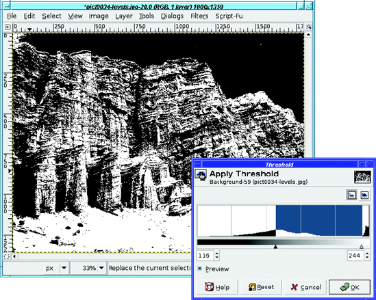
Figure 2-21. The Threshold dialog. Notice the black sky, corresponding to the white area at the far right of the dialog.
Tip
Threshold is particularly useful for scans of printed text documents and line art (you'll see an example in Chapter 8). If you end up with a few extra speckles of the wrong color, you can clean them up afterward using GIMP's drawing tools (see Chapter 4).
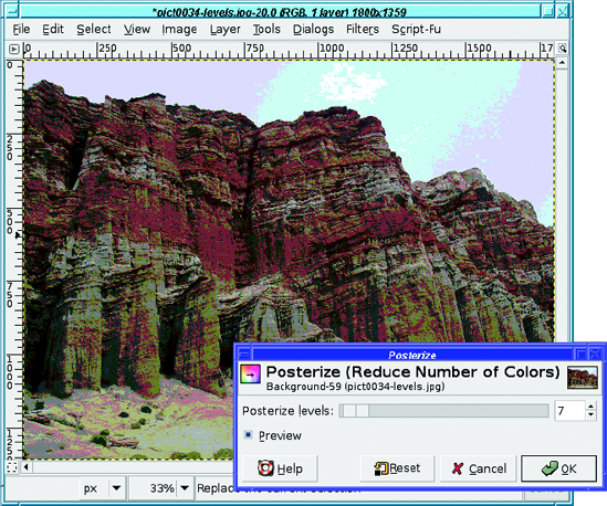
Posterize (Figure 2-22) reduces the number of colors in the image, creating a gaudy display like you might see on an artistic poster. You can achieve a similar effect by converting an RGB image to indexed mode, but posterize is a quick way to achieve this effect, and it still leaves you with an RGB image in case you want to do further editing. The effect is most obvious when you use a small number of colors.
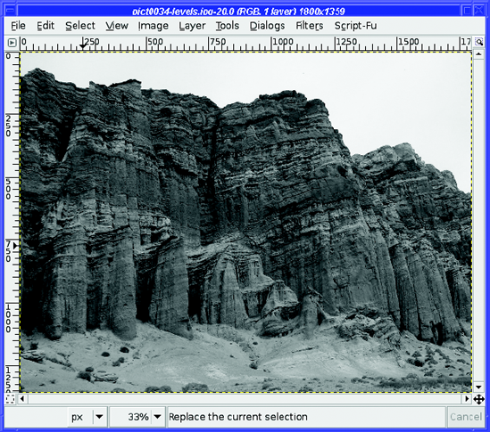
Desaturate (Figure 2-23) removes the colors from an image, changing it to a grayscale image without requiring you to convert to grayscale mode. The three choices in the dialog let you choose the gray level in three ways, giving subtly different results. (GIMP 2.2 and earlier didn't offer a choice of methods.) Desaturate has no preview, so you'll have to try it and use Undo if you don't like the results.
Invert reverses every color in the image, turning it into its own photographic negative. This is most useful with black-and-white images but can have an interesting effect on color images(Figure 2-24).
The Auto menu includes a set of automated functions useful for correcting photographs with poor exposure. They're worth trying if you have a difficult image you're trying to save; if you don't like the effect, there's always Undo.
Equalize tries to spread the image's colors out among a wider range of intensities. Most of the time, you probably won't like the effect, but sometimes it brings out detail you didn't realize was there.
White Balance tries to correct color casts, and often does a decent job. It's worth trying if you have an off-color image.
Color Enhance makes the colors more intense—usually too intense, but try it and see.
Normalize helps adjust the exposure on underexposed images. On images that are well balanced except for being too dark, it may help immensely, but if the image's levels are uneven, Normalize will probably just make things worse.
Stretch Contrast and Stretch HSV are similar to Normalize except that they operate on the three color channels independently. Sometimes they can help remove color casts.
GIMP offers two types of rotation. One is a quick fix for images shot in vertical format, while the other, free rotation, is a more subtle tool that can correct minor errors made while shooting.
I shoot lots of verticals : photos where I rotate the camera by 90 degrees to the left or right in order to make an image that's taller than it is wide.
That's fine, but when I put it on a website, or load it into GIMP, everything's sideways! The camera doesn't know that the image should be rotated, so it just saves it in the normal way, wider than it is tall. (Some cameras are smart enough to notice when they're rotated, and save the information in the file. Starting with 2.4, GIMP detects this and asks whether you want the image rotated.)
But fixing a rotated image in GIMP is incredibly easy, using the Image
The final option in the menu, Guillotine, is a different operation (not a rotation) and will be discussed in Chapter 7.
Do you ever shoot a photo of a landscape, and notice later that you didn't hold the camera perfectly horizontal?
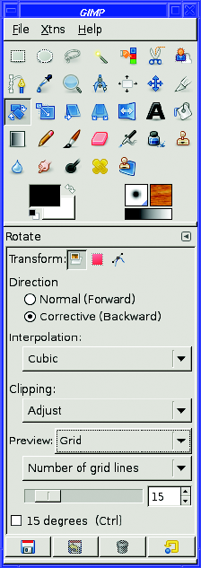
Okay, maybe you don't, but I have to confess I make that mistake from time to time. Fortunately, GIMP comes to the rescue with the Rotate tool (Figure 2-25).
Select the Rotate tool in the Toolbox. There are several other tools that look similar, but remember, you can always hold the mouse over a tool (technically: hover ) and read the tooltip to remind yourself which tool is which. Now look at the tool options—in particular, the Transform Direction option. For correcting a photo with a non-level horizon, set Transform Direction to Backward, and set Preview to Grid.
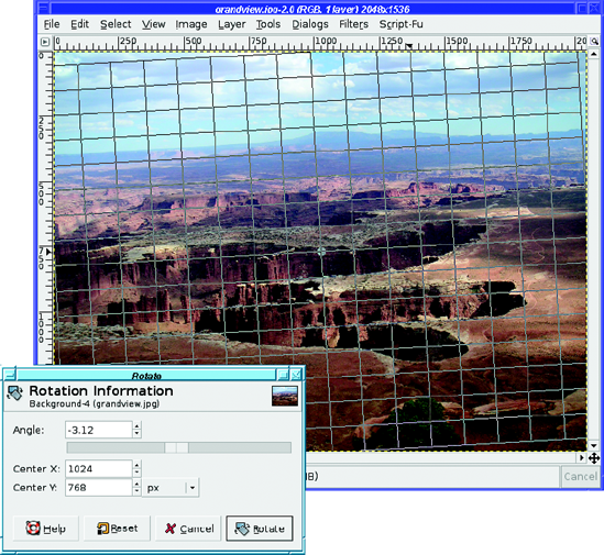
With the Rotate tool selected, click in the image to begin the rotation process. The Rotate dialog appears. You can use it to type in an explicit angle in degrees, or to change the center of rotation. Most of the time, though, you won't need to do that.
If you have Preview set to Grid, you'll see a grid of lines drawn on the image.
Now drag in the image and watch the grid change. The goal is to line the grid up to where the horizon should be in the image (Figure 2-26). When you're happy with how the grid lines up, clicking the Rotate button will rotate the image (Figure 2-27). Rotating a large image takes a while: GIMP's progress bar, at the lower right of the image window, gives you an idea of how long the operation is taking (there's a Cancel button next to it, if you change your mind).
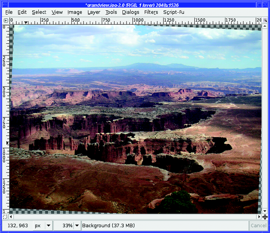
Notice that rotating makes the picture larger: the corners hang off the edges of the image. Behind the image, you see a gray checkerboard pattern. This pattern isn't really part of the image; it's how GIMP represents transparency. Your rotated image is now on a transparent background. If you would prefer the image cropped to its original dimensions, with no transparency added, thecheckbox for Clip Result in the Rotate tool options will do the crop for you. Alternately, you can increase the image size to show the corners using Image
The Rotate tool has quite a few options:
Transform lets you apply the rotation to the current layer, just the selection, or the current path. If you use the "chain link" buttons in the Layers dialog to link several layers together, they will all rotate together (you'll see an example of that in Chapter 3).
Direction changes the direction of the rotation, and the Preview options work along with it. While Backward and Grid work perfectly for an image with a tilted horizon, there are other times when you want to rotate an object and see exactly how it will look. In that case, set Transform Direction to Forward, and Preview to Image or Image+Grid.
Interpolation affects the quality of the rotated image. Unless your machine is very slow, you'll probably want to change this to Cubic or Lanczos.
Clipping lets you crop the rotated image to the same size as the original, as already noted. (Unfortunately, there's no setting that will clip the result to eliminate the transparent corners entirely.)
Preview (discussed earlier) controls the way GIMP will show the effect of the rotation.
You can also restrict the rotation to be an even multiple of 15 degrees. If you don't check this option, you can still constrain the rotation by holding down the Ctrl key while rotating.
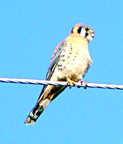
Alas, photographs aren't always as sharp as we'd like. (Blame it on the camera's autofocus!Yes, that's it!) For instance, the kestrel in Figure 2-28 is a little out of focus.

GIMP can sharpen it. GIMP can't work miracles, but it can go a long way toward sharpening an image that's a little fuzzy. It offers several sharpening methods. The two most important are Sharpen and Unsharp Mask, both located in the Filters
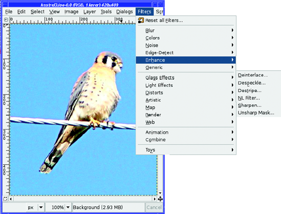
Sharpen is very simple (Figure 2-30). It has a slider to control the amount of sharpening, and a preview window to show what the effect will look like. Scroll the preview window to the appropriate part of the image, or use Preferences to increase the preview size. (Resizing the dialogalso changes the size of the preview area.)
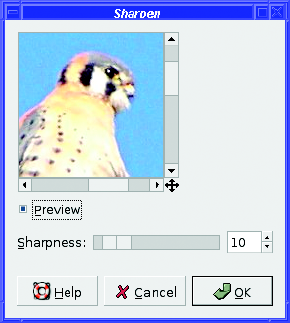
Here's what the kestrel looks like when sharpened (Figure 2-31).
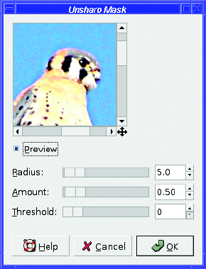
For more extreme sharpening, use Unsharp Mask (Figure 2-32). Don't be misled by the name, which comes from the details of how it works. Unsharp Mask makes an image much sharper—not less sharp—but it does that by making a blurry copy of the image, and then using that as a mask for the sharpening operation. Like Sharpen, it brings up a window with sliders and a preview area, but it has three parameters you can control, and it's capable of sharpening an image much more than the standard Sharpen.
Fiddle with the three parameters of Unsharp Mask and see what they do. Generally speaking, Radius affects the distance over which the sharpening works; make this bigger for large images, or very fuzzy ones. Amount controls how strong the effect will be; make this as small as you can so as not to oversharpen and end up with a grainy image, or with halos around the object you're hoping to sharpen. Threshold controls the smoothness of the image; if you end up with grainy areas that should look smooth, such as thesky, an adjustment here may help.
Unlike Sharpen, which can only create fairly subtle changes, Unsharp Mask can easily go too far in sharpening an image (for instance, see Figure 2-33). In fact, I find that the default values are usually already too extreme, and I decrease them slightly. Figure 2-33 shows the effect ofthe default values on the kestrel.
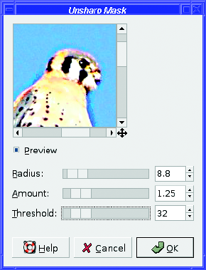

Figure 2-34 shows what happens if I decrease Radius to 4, and increase Threshold to prevent the sky from becoming grainy.
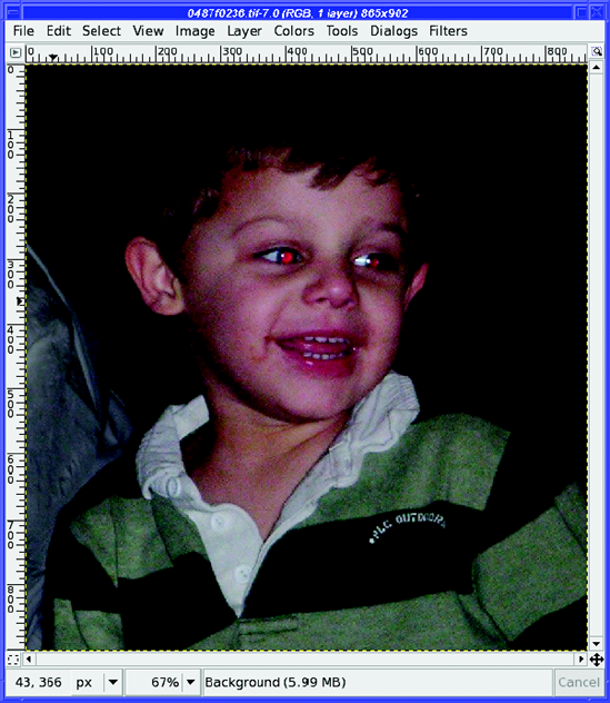
Flash pictures of people, especially children, often exhibit red-eye : pupils reflect too much light from the flash, turning the eye a diabolical crimson. This is particularly noticeable in photos of children (Figure 2-35) since their pupils are especially large.
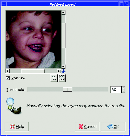
Fortunately, the fix is very easy, especially now that GIMP 2.4 has a red-eye filter built in. Just use the Rectangle Select tool to outline a box around the eyes, then choose Filters
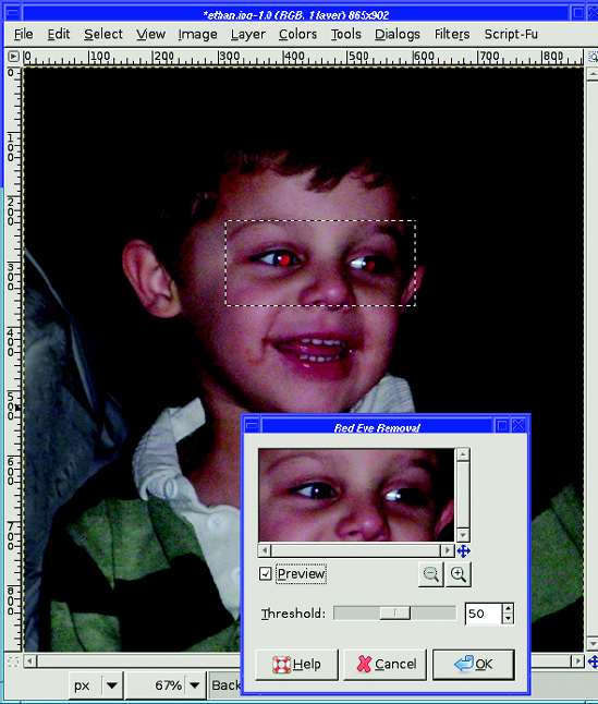
Why do you need to select the area with the eyes? If you're curious, try using the red-eye filter without making a selection first. Figure 2-37 shows what happens to any other parts of the image that just happen to be pink or red.
In GIMP 2.2 and earlier, red-eye removal was a little more complicated—you had to do it by hand, and it can be useful to know the technique in case you ever want to remove green-eye or yellow-eye from animal photos. Here's a quick-and-dirty method that usually works fairly well.
First, zoom in on the image, using the View
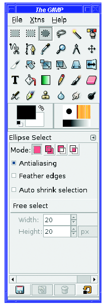
Now choose the Ellipse Select tool in the Toolbox (Figure 2-38).
Click slightly above and to the left of the pupil. Imagine a square box around the pupil you want to hit the corner of where that square box would be. Then drag down and right (just like when you were making a crop rectangle with the Crop tool) until you have a circular selection around the pupil (Figure 2-39).
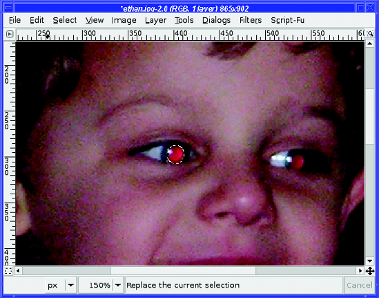
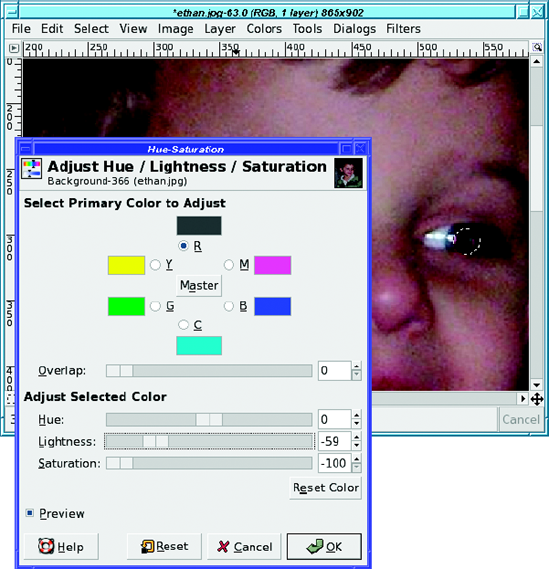
In GIMP 2.4, you can adjust the size and position of the ellipse interactively, though unfortunately earlier GIMP versions didn't allow this. In earlier GIMPs, if your elliptical selectionends up in the wrong place, just undo and try again. It's not critical that it match the pupil exactly; just get it close. Try to err on the side of too large rather than too small (too small may give you a halo). Once you have the pupil selected, go to the Colors menu (in GIMP 2.2 and earlier, find it under Layer
First, click on the toggle button under R. This will restrict the operation to only the red color. (The eyes of animals sometimes show "red-eye" in colors other than red, so if you're trying to fix a demon bunny or kitty, you may want to leave the setting on Master.) Then slide the Saturation control all the way to the left. Desaturating an image means removing all the color, or making it grayscale, though in this case, we're only removing all of the red.
The hue-saturation operation only applies to what's selected, if there's a selection—otherwise it applies to the whole layer (you can think of it as applying to the whole image, until you begin working with layers in Chapter 3). That's true of most GIMP operations: if a selection is active, then only what's inside the selection will be changed.
With the pupil desaturated, the photo looks much better. The red is gone, and for some photos this may be all you need. But in this case, the pupil looks lighter than it should. I'd like to darken it a little.
If you find the selection boundary distracting, using Ctrl+T toggles the selection outline off temporarily: it's a shortcut for View
The Lightness slider makes the image brighter or darker, much as the Brightness slider in the Brightness-Contrast dialog did. With Lightness adjusted much darker (Figure 2-40), the pupil looks much more natural.
Now go back to the Ellipse Selection tool, select the other pupil, and apply the same operation. Voilà! No more demon! (See Figure 2-41.)
Now you know enough to take your photos, fix any minor problems they may have, and share them with anyone in an appropriate size and format. You can crop your photos to preserve the most important parts and get rid of the rest. You can correct problems with brightness and contrast, minor rotation difficulties, and red-eye caused by too much flash. You know when to use GIF, when to use JPEG, and when to use PNG or TIFF. You can even modify photographs that aren't completely in focus. That may be enough to keep you busy for quite a while.
But there's so much more that you can do with an image-editing program! The heart of image editing is learning to use layers. It's a different model from anything you may have used in simpler photo-editing programs, but once you begin to use layers, you'll wonder how you ever lived without them.
So take a deep breath, and prepare to explore layers, the real power of GIMP.