Compositing is a fairly general word. In its most basic sense, it means combining two or more images of any sort—even small elements such as a circle, a shadow, or a text layer—to make a new image. You've already been doing that throughout much of this book.
In this chapter, I'll cover a more specific meaning: blending two or more existing photographs to make a new image. (In some cases, the two photographs may be copies of the same photograph, as you'll see.)
You'll learn some tips for improving photos that weren't covered in the chapters on photo retouching, and tricks for extracting detail from a photo that you may not have known was there. You'll learn to create artistic renderings of your photos (without needing GIMPressionist or similar plug-ins), and how to combine photos in interesting ways. You'll learn how astronomical photographs are made, and how to use astrophotography techniques to take photos you didn't think your camera could capture. Finally, you'll learn how to make panoramic images, including some tips on how to shoot them in the first place. The chapter will cover the following:
Colorizing images
Combining patterns with textures or grain
Using layer modes to improve photos
Making photos into art using layer modes
Compositing unrelated images
Stacking images
Stitching panoramas
Did you ever have an old black-and-white photograph you wished was in color? Or maybe you have a color photograph, but you don't like the real colors. You may want to colorize a whole image, or perhaps just a part.
Colorizing a black-and-white image is just a variation on the sepia photo techniques you learned in Chapter 8. Instead of using a light brown tone, just experiment with various colors until you hit the combination you're after.
But what if you want to alter the colors in an image that already has color?
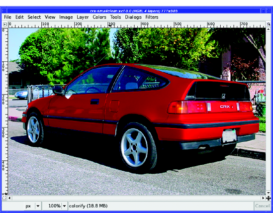
For instance, have you ever wondered what your car would look like in another color? A professional paint job costs a fortune, but with GIMP it's both cheap and fun (Figure 10-1).
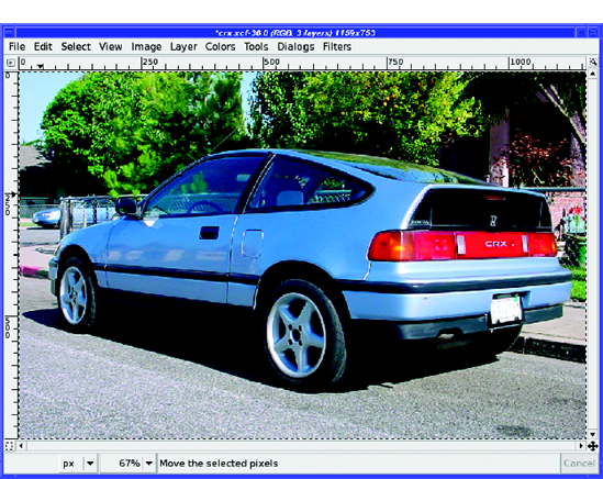
Begin by selecting the part of your photo you want to colorize using the techniques you learned in Chapter 5. In this case, that would be all parts of the car that are blue.
Tip
For this kind of operation, you'll often find that a combination of selection techniques works best. On the car, it was easiest to start with Fuzzy Select (Select Contiguous Regions), which caused some overrun. Then use the Lasso or the QuickMask to fill in selection gaps and cut away any excess.
Copy your selection and paste it, which will make a new floating layer. As usual, convert it to a regular layer with the New Layer button (at the lower left of the Layers dialog). If you made the background layer invisible, your new layer might look like Figure 10-2.
Now, color the layer. You can start with the Colors
But don't stop there. Since all you're doing is painting solid colors on the top layer, you can just as easily paint patterns, or make a two-tone by drawing a gradient with the Blend tool (Figure 10-4).

Of course, you can make several copies of each part of the car and color them differently. Try adding stripes or other shapes. Then switch layers on and off to see which color or pattern you like best. (This is also a good way of testing hair colors on a photo of yourself before you take the plunge and dye your hair magenta!)
Some modes, such as Multiply, will probably look strange at first. Sometimes you can fix that by reducing the layer's Opacity. It's difficult to predict the effects of the layer modes on various color shifts you may make, even if you're experienced with these modes. The bottom line? Try them all and see.
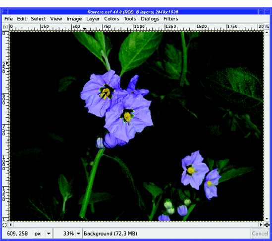
Colorizing with layer modes is fun, but on some images you need more. For instance, if you try to use modes like Overlay on an animal like a squirrel (Figure 10-5), you'll lose a lot of the fur detail. You can keep some of that detail by using the Heal tool (Chapter 6), but it's tedious, and works better for correcting small spots than for covering large areas. Fortunately, there's a better way, using the Grain Extract and Grain Merge modes.
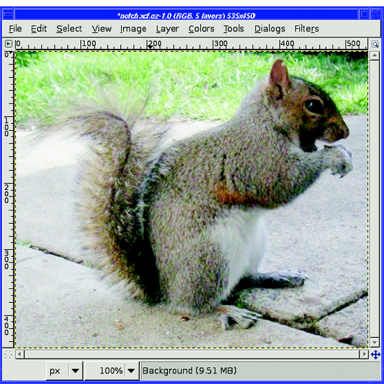
Figure 10-5. Fur detail in this squirrel won't show up well with simple compositing like you used for the car.
Start by selecting the part of the image you want to colorize. For the squirrel, it works best to select just the gray fur, omitting the eye, the white belly, and the tail. Use the Copy and Paste commands, and make it a new layer, just as with the car. Then click the Duplicate button in the Layers dialog to make a copy of the gray fur layer (you'll need it later). Turnoff visibility on the upper of the two copies and make the lower one active: that's where you're going to put your new color or pattern, so name it something appropriate. I'd like to give this squirrel a leopard-spot pattern, so I'll name the layer leopard.
Choose the pattern you're going to use. There's a pattern called Leopard in GIMP'sbuilt-in pattern collection, but the spots are quite small—for the squirrel, I'd prefer bigger spots. To fix that, right-click on the Leopard pattern in the Patterns dialog andchoose Open Pattern as Image. Then scale it as much as you want: 175% works well in this case.
You can save the result as a new pattern file (.pat) if you think you'll use it for other projects. But for one-time use, the easiest way to use your scaled pattern is simply to choose Edit
Back in the squirrel picture, turn on the Lock alpha button in the Layers dialog, just under Opacity. That way, you'll get the leopard pattern only where the gray fur is. Then choose Edit

Figure 10-6. Fill with Pattern. Notice that the leopard layer is active in the Layers dialog, Lock is checked, and the active pattern (in the tab in the Layers dialog window and in the Edit menu in the image window) is the scaled-up leopard pattern from the clipboard. (The image is shown as it appears after being filled.)
At this point, you can try some layer modes on the leopard pattern layer. Overlay works pretty well on this image, but it doesn't look realistic enough—the pattern overwhelms the fur detail. It's a good start, but what you need is a way of adding more of that furry texture.
That's where you'll use that copy you made of the gray fur layer. Turn off visibility of the Background and pattern layers and make the gray fur layer visible and active. Click Duplicate to make a second copy of it.
Choose the upper of the two gray fur copies and blur it with Filters
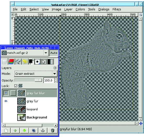
To use Grain merge, you need to store the result of Grain extract in a single layer. So merge the gray fur blur layer with the gray fur layer below it by right-clicking on the blur layer and choosing Merge down. Set the resulting layer to Grain merge mode.
Turn the Background and leopard layers back on (Figure 10-8) to see the result. You can still see the pattern, but the fur texture is much more evident than it was before. Try turning visibility of the grain merge layer off and on to see the difference it makes. You can even enhance the texture more by duplicating the grain layer. (I've also added a layer mask to make the pattern less evident on the squirrel's face, ears, and "hands," and you can improve the result further with a bit of Filters

Figure 10-8. With the grain layer in Grain merge mode, the furry texture is much more obvious even through the pattern.
What happened? Let's review how you can use Grain extract and Grain merge together. When you need to save or emphasize the texture of some part of an image, start by making a copy of your target that has the texture removed (that's the blurred layer). Combine that, in Grain extract mode, with the original to make a "grain" layer. That grain layer, used in Grain merge mode, will add the original grain wherever you need it.
Think way back to Chapter 2, where you used tools such as Levels and Curves to improve the brightness of an image.
You can make similar changes by using layer modes, sometimes with a much better result. Just make a copy of the image, right on top of the original, and experiment with the layer mode of the top copy.
Let's take a look at some of the corrections you can make by compositing an image with itself.
Sometimes you pick the wrong f-stop. Sometimes the camera guesses the exposure wrong. Especially aggravating, sometimes there just isn't enough light where you want to shoot—such as in Figure 10-9.
When your picture comes out too dark, you can try to adjust the color, brightness, and contrast to get the perfect balance. But there's a much quicker way to get nearly ideal brightening.
First, go to the Layers dialog and duplicate the Background layer. Next, change the resultant layer to Screen mode. Usually that's all you have to do.
In some cases the result will be too light, but you can adjust that by turning down the Opacity slider. Other times, such as with this picture, the original was so dark you need to lighten it further. In that case, just duplicate the second layer and you'll get a third layer, already in Screen mode. The picture will become even brighter. Figure 10-10 is the result of two additional screen layers.
Of course, if your second or third layer goes too far, you can adjust Opacity on just the top layer until it looks just right.
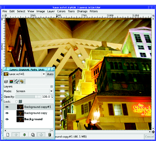
Figure 10-10. Look at all the detail you can see in areas that were previously just mud, particularly the building at the center right.
Note
In some cases, especially when you're just trying to lighten up a portion of a photo, you'll find Dodge mode works a little better. But most of the time, Screen is just right.
When you find yourself confronted by an image that's just way too flat and has no significant bright areas, self-compositing with Overlay or Hard light mode can help bring out color and detail.
Hard light will tend to overwhelm any bright areas in the photo, so confine it to dull, washed-out images only. Figure 10-11 shows the striking difference it can make to a dull image. For images with very bright colors or a lot of detail, Overlay is more versatile.
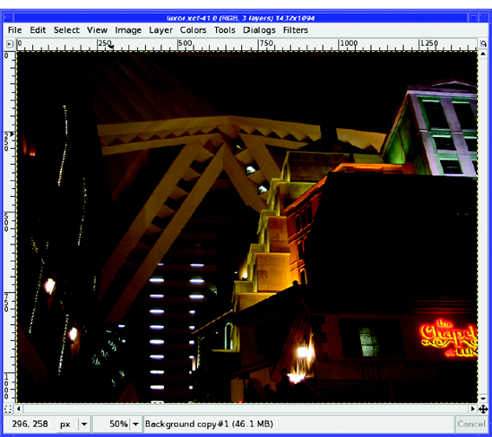
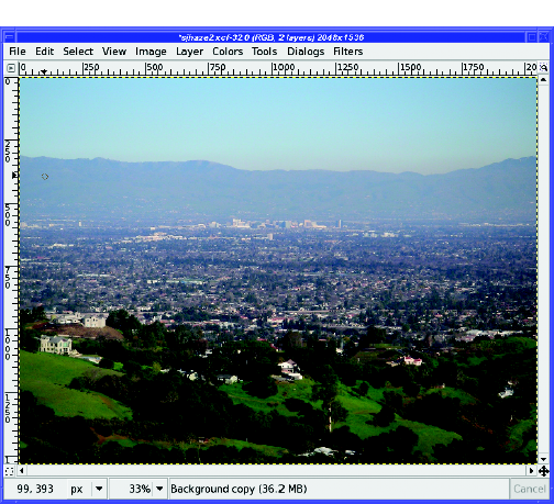
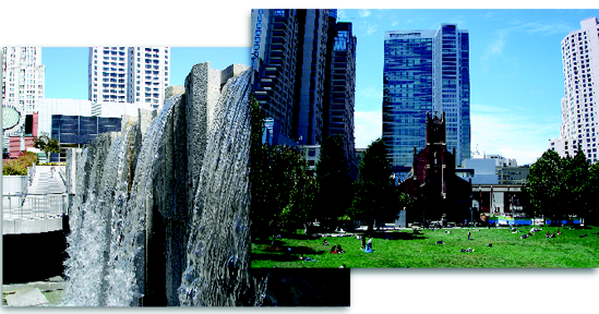
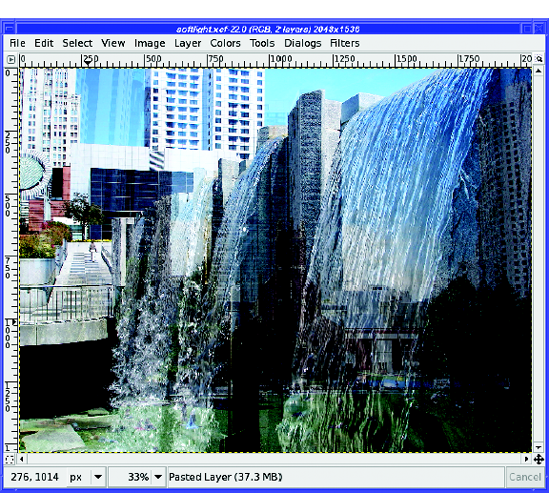
I live near a major city, and it's frequently smoggy or hazy. When I try to take long-distance shots with my camera, I'm often disappointed: objects that seemed perfectly clear to the eye are buried in haze in the photograph, as in Figure 10-12.
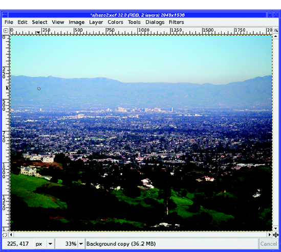
Overlay mode excels at cutting through haze. Make a layer copy, and then set the top layer to Overlay. The city becomes much clearer (Figure 10-13).
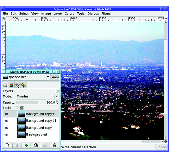
But that's just the beginning. With the Overlay layer selected, click the New Layer button again. GIMP makes another copy, already in Overlay mode—and the distant city becomes sharper. Click again, and it becomes sharper still. You can keep adding Overlay layers until the image gets as sharp as you need (Figure 10-14).
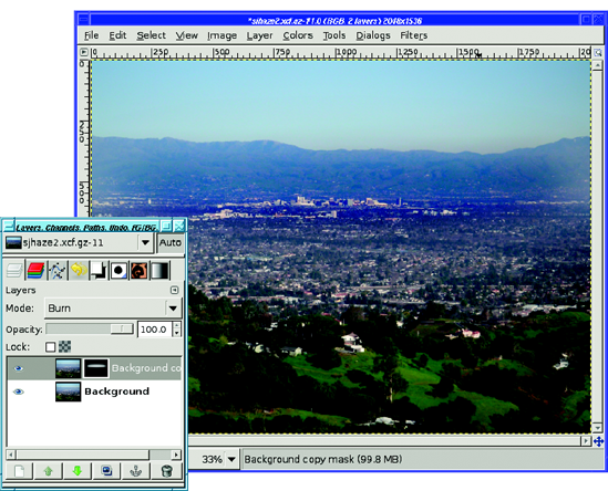
If that effect isn't strong enough for you, try turning off all but the first two layers and using Burn mode on the upper layer (Figure 10-15).
Burn mode gives excellent detail and color on the city that previously was shrouded in haze. The downside is that the rest of the image becomes black and you no longer have those nice green hills in the foreground.
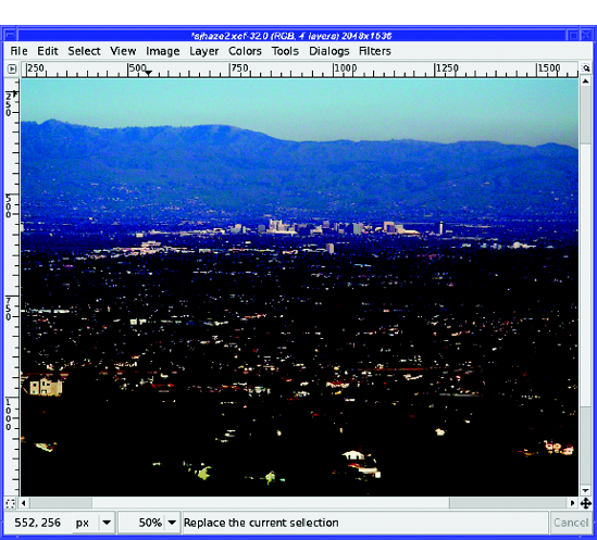
Figure 10-15. Burn mode cuts through the haze much better than Overlay—but now the rest of the photo has way too much contrast.
Of course, you can adjust the strength of the effect by changing the Opacity of the upper layer. But with Burn, you may find that light areas are still too dark and you can't get the nice green hills you had when you started.
Adding a layer mask to the burned layer can fix that. The goal is to make the layer opaque where you want the effect, fading to transparent in places you don't want to change. To do that, either paint in the area you want burned, leaving the rest black, or draw a gradient separating the part you want burned from the part you don't. Figure 10-16 shows the effect of a white oval, blurred by 300 pixels, covering just the city.
As you've seen, compositing an image with itself usually affects the contrast, colors, and apparent sharpness of the image. It's a useful technique for changing iffy photos into better ones.
But if you modify one of the copies of the image before you combine it with the original, you can create many other interesting artistic effects.
The idea is to start with any photo you like, duplicate the layer, and then move it just a little bit. It's easier to describe what's going on after you see an example of the technique.
In the first series, you'll see three effects applied to the same image (Figure 10-17). The top (duplicated) layer will be moved down and to the right by a few pixels.
Tip
A good way of moving a layer by small amounts is to click on the Move tool, and then use the arrow keys to move the layer one pixel at a time.
Each caption will tell you the exact number of pixels moved to achieve the effect shown. Your own experiments will probably use different shifts. Less movement will make finer lines; more will add detail and color. Sometimes you'll like more vertical movement, sometimes more horizontal. Fortunately, it's cheap and easy to experiment!
Generally, you'll move the image only moderately when using Divide mode. Figure 10-18 is a fairly strong example of the effect, showing heavy shadow detail by moving the top layer down more than sideways.
It's striking that such a dark image results in such a light drawing. Also, the complexity in the dark areas has created an effect very much like you would see when an artist draws with colored pencils on heavily textured paper. Figure 10-19 shows another example, with a more complex landscape photograph.
Less complex images will generate fewer lines, and can be moved less to get a more sketched look. You can further modify your "drawing" by playing with the colors, or turn it into a graphite pencil sketch by converting it to grayscale.
Sometimes, you want a dark result rather than something bright. In that case, use Difference mode on the same picture to create Figure 10-20.

Figure 10-20. Difference mode makes a neon line drawing on black. The top layer was moved eight pixels to the right and ten pixels down while in Difference mode.
That's a neat effect, almost like neon lights. But playing with the Opacity of the difference layer can make the effect more interesting, and turns the artwork into a "black velvet" painting (Figure 10-21). Too bad I don't have any photographs of Elvis to use as examples!
Difference usually requires you to move the top layer more than you would for other layer mode effects. This picture is no exception, having moved only a little further right than Figure 10-21, but almost three times as much to the right. (When moving a layer over larger distances than a few pixels, remember that holding down Shift while pressing an arrow key moves the layer by a larger distance than by using the arrow key alone.)

Figure 10-21. Reducing the top layer's Opacity to 75% brings out some of the details within the lines.
The result will often change dramatically as you vary the offset of the two layers, sometimes in surprising ways. If you go too far, particularly in Difference mode, the "painting" will start to become blurry. It's an interesting balance that looks like what might happen if Van Gogh had tried to imitate Rembrandt's dark realism.
You can get a similar effect by using Subtract mode, but in most cases, Difference will give a more pleasing image. However, it's worth a try—when Subtract does work, it's spectacular.
If you look closely, sometimes you can see the exposed edges of the background layer at top and left. Of course, you can crop the image to eliminate those edges before saving your painting.
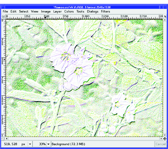
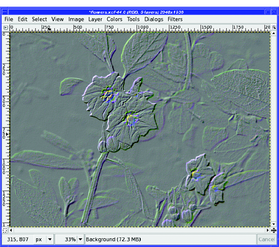
Although Grain extract was originally intended for storing information to be used in simulating photographic grain or other textures, as in the squirrel example, it's also useful for making an embossed version of an image. It works with almost any image.
Normally, you'll need very little layer movement with Grain extract. The image in Figure 10-22 uses more offset than you'd normally want—partly to make sure the effect shows up well, and partly because the color accents are attractive.
In a real embossed work, of course, the image would be colorless. Many other "emboss" conversions will use as little as one or two pixel shifts, and won't show much color at all. You can always convert to grayscale to eliminate the color, of course.
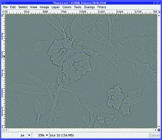
Sometimes you can use Gaussian Blur instead of an offset when using layer effects. Typically, a blur gives a somewhat weaker, more subtle effect than an offset. Edges won't be emphasized as strongly.
Gaussian Blurring the top layer in the Grain extract example, instead of offsetting it, gives an effect like a tintype photo (Figure 10-23). Reversing the layers—putting the blurred layer beneath the original rather than above it—gives a similar effect except that the colors are reversed (the flowers are darker than the background, instead of lighter).
There's a compromise between the offsetting and blurring: use a Motion Blur, which blurs in a specific direction. Since it's directional, Motion Blur acts a lot like an offset; but it smoothes out the effect, giving less emphasis to the edges and more to the gradations within the image. The color accents are also muted. The difference can be subtle, but try it to see whether you like it better.
By now, you probably see what's going on. Most images will have sudden changes in color where they transition from one object (a flower) to another (the background). These artistic effects all capitalize on those transitional edges. Anything that causes the edges to spread or interfere will give an interesting—and sometimes unexpected—result when you use Divide, Difference, Subtract, or Grain extract.
So far, you've used layer modes to combine an image with itself (perhaps after minor modifications such as blur or offset). But, of course, you can use layer modes to combine two different images as well.
Soft light mode is a real workhorse for combining just about any two images (Figure 10-24). Copy an image and paste it as a new layer over a different image, and you'll probably get a fun result (Figure 10-25). As a rule, use the less distinct image as the background, since it will slightly dominate the combination. You canalso use Soft light to give the effect of objects reflected from water or glass.
Compositing with Soft light doesn't do what you'd expect from the name: it doesn't soften the image. Instead, you'll get a nice increase in brightness and contrast. Even pictures you think are just fine can be surprisingly enhanced, with no fake look at all.
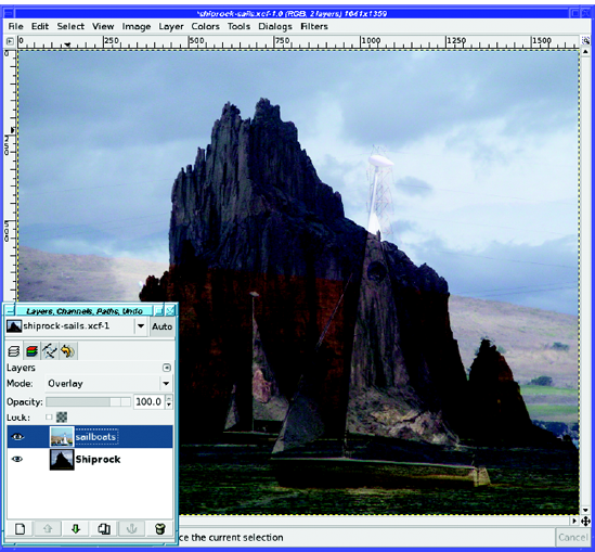
Overlay has an effect quite similar to Soft light, and is always worth trying to see how the effects compare. Overlay is also good for adding elements of an image on top of darker areas in another image, like the photographs in Figure 10-26. You'll still see elements of both, of course—it's not a substitute for painstakingly selecting an object and pasting it into another picture.

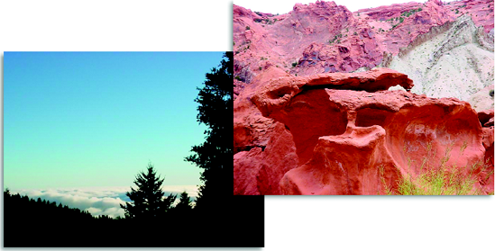
But sometimes you might not mind "ghostly images." For instance, the ghostly sailboats in front of dark, looming Shiprock give a nice effect (Figure 10-27).
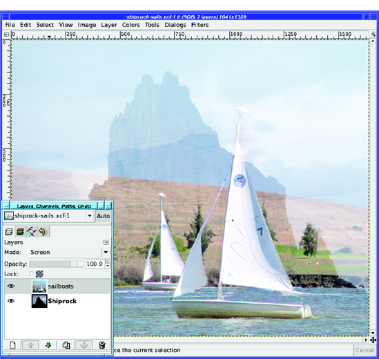
Screen, too, is a useful tool for combining images—but it has a very different effect. Screen brightens the image, so instead of ghostly, looming figures, the brighter image will stand out (Figure 10-28).
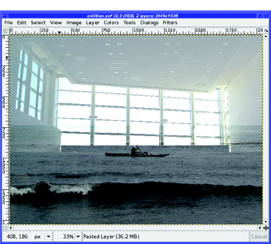
Addition mode can be useful when you have two dark images that might work together, or two images with complementary light and dark areas (one is light where the other is dark), such as in Figure 10-29. Combining them in Addition mode gives the result in Figure 10-30.
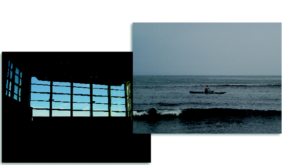
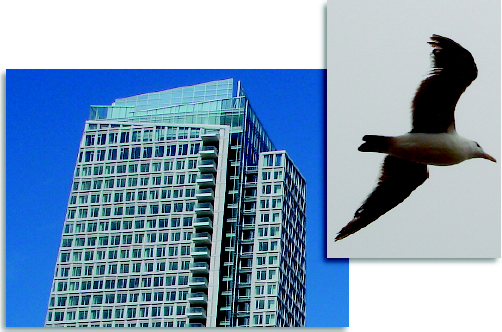
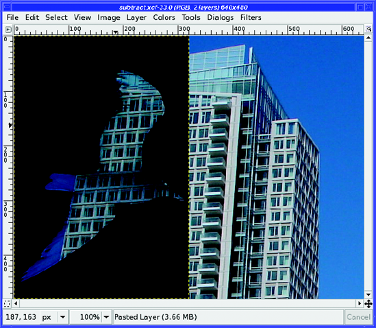
Subtract usually inverts dark and light on the layer being subtracted. You can use it to take an image that has light and dark areas, such as the gull in Figure 10-31, and make a mask for another image, as shown in Figure 10-32.
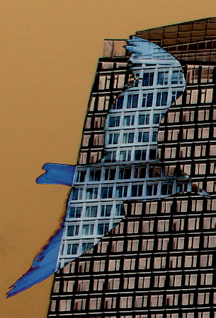
Difference will give a slightly different and weirder effect, turning the dark colors bright again (Figure 10-33).
When the background picture has very distinct darker and lighter areas, like the tree silhouettes in Figure 10-34, it can seem to turn into a mask when Burn mode is used (Figure 10-35). In this case, the trees blot out the strange rock formation, but the lighter sky alters its colors to appear otherworldly. You've probably seen effects like this used to illustrate science-fiction book covers.

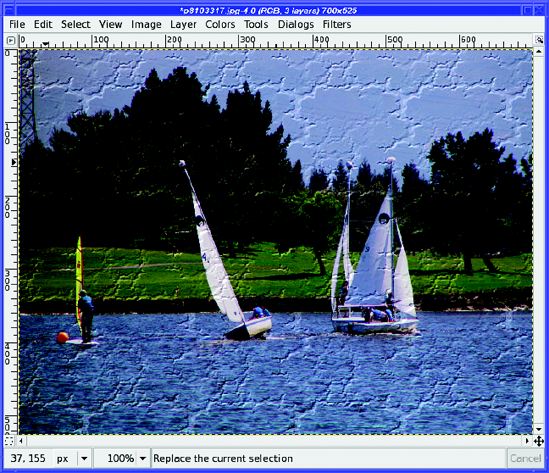
You've already seen, in the squirrel project, how to use Grain extract and Grain merge together. But you can use Grain merge with other patterns as well. To add texture to a photograph, use the photo as the lower layer, and fill the upper layer with a tileable pattern.
For instance, using GIMP's built-in pattern named "Crack" as the upper layer in Grain merge mode, on top of the sailboats, gives the result shown in Figure 10-36.
As always, when dealing with layer modes, the results of any particular combination tend to be unpredictable. These examples can point you in the right general direction, but experimentation will often give surprising results. You can duplicate layers and use multiple modes with varying degrees of opacity to create almost anything. It's fun and easy to try several options, and it's almost always rewarding.
Have you ever marveled at a space shot, like the ones from the Hubble Space Telescope? Did you know that the "raw" images straight from the camera are hardly ever that good?
Astrophotography is one area where image compositing is an essential tool. Professional observatories, NASA, and amateurs in their backyards all use a set of related techniques known collectively as stacking.
The first image stacks were just that: photographic negatives or slides stacked directly on top of each other. When these stacks were viewed on a light table, or printed, the result was a photograph with much higher contrast. With stacking, details that weren't visible in any single original became easy to see.
Of course, today, stacking is usually done by computer. Stacking multiple images of the same object is similar to the self-compositing you've already used earlier in this chapter. But compositing several different but similar images is better than self-compositing in many cases, as you'll see.
Sometimes astronomers get carried away with stacking. The famous "Hubble Deep Field" photo captured more than 1,500 distant galaxies in a tiny patch of sky 1/30th the diameter of the full moon. The Deep Field project shot 342 images over 10 consecutive days, and used 276 of them in the end. Of course, the Hubble team uses much more complex stacking and compositing methods than simple layer modes. But many of the basic principles are the same.
Although stacking techniques were developed first for astronomy, you can stack earthbound images as well. You can boost the light level of a dim image, improve contrast, or even increase resolution. It can also be fun to stack several different images into an "average." But stacking will always add another benefit: reduced noise.
Every photograph includes some unwanted interference, from thermal activity in the camera's sensor chip or various other sources. (Such as cosmic rays. Really!) Collectively, these spurious signals are called noise.
Noise is random: it shows up in unpredictable places. If you take two images of the same scene, the scene may not change, but the noise will be different.
Suppose you shoot an image that has a light speck due to noise. If you composite that image with itself, or use a tool such as Levels or Curves to boost the contrast, you will increase the speck of noise as much as the object you're trying to capture. If you've tried boosting contrast on a very dark photograph, you've probably seen that already.
But if you composite two different images of the same object, chances are that the second image's noise will be in different places. The noise in the first image will be partially cancelled out by the second image, and vice versa. The result is a less noisy image.
So how do you go about making a stack? There are three steps:
Open the images as layers.
Register the layers.
Combine the layers.
Load each image in the stack as a separate layer. Open the first image normally, and then use File
Once all the layers are loaded, make all but the first two layers invisible. Next, before you stack the two layers, you have to register them.
Stacking won't work well unless the images fit over each other exactly. If the subject of the photograph isn't in the same place, or isn't the same size, then it will look blurry when the two images are combined.
You can make this step much easier if you use a tripod when shooting images you plan to stack. If you try to shoot hand-held, you will almost certainly move or rotate thecamera. That can be fixed, but it's tedious: use GIMP's Measure tool to measure sizes and angles in the two images, and then Scale by the ratio of the two measurements and Rotate by the difference in the angles. Eek! It's much better to use a tripod and get them right in the first place.
Note
Even the best tripod will not give you perfectly registered photos of the night sky. Why? The earth is turning, which means, from the camera's point of view, that the sky is moving—about a degree every four minutes.
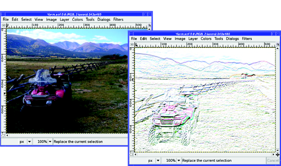
Once the images are approximately aligned, select the Move tool in the Toolbox and set the mode of the upper layer to Difference. This will show every place the two images differ. Two perfectly registered, identical layers will look totally black when the top layer is in Difference mode. Otherwise, move the upper layer around (remember the arrow keys for moving by one pixel at a time) to make the combined image as black as possible.
Now it's time to make a stack, using one of the methods I'll describe next. After you've stacked one layer, make the next layer visible, register it, and stack it. Repeat until you're out of layers.
There are times when a flash just isn't appropriate. Did you ever go out at night with your little digital camera and wish you had a fancy SLR that could take time exposures?
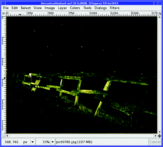
With stacking, you can—even if your camera can't. Just take a lot of short exposures, and then stack them in Addition mode.
For instance, I shot some photos of a fence near a local reservoir. The camera I was using wouldn't do an exposure longer than four seconds. At that setting, the original images just look black. It's hard to tell that there's anything in the shot at all.
If I take a single image and use Curves or Levels on it, I can see that I do indeed have a shot of the fence. But I have to enhance the image so much that it becomes extremely noisy and grainy.
I can do a little better by making 10 or 12 copies of one image and compositing them all in Addition mode. But it's still very noisy.
But what if I take 12 different images of the fence, and then stack those?
Stacking different images allows you to increase the light level a lot with hardly any increase in the noise. You can even duplicate some layers: Figure 10-37 shows a stack of 24 layers total, two copies each of 12 different layers, all in Addition mode.
This technique reduces noise so well that you can boost the brightness even more using Levels or Curves (after merging or flattening all the layers into one) without hurting the image much.
So grab a tripod (even one of the little plastic ones with legs a few inches long, if your camera is small enough), wander off to a dark place, and try taking some shots!
Those great shots that you see from NASA spacecraft aren't just snapshots downloaded straight from the camera. They take a lot of processing before NASA puts them up on public websites. (If you watch NASA TV, sometimes you can even see GIMP windows on screens at Mission Control! Of course, NASA uses a wide assortment of tools, not just GIMP.)
Figure 10-38 shows an original photo of Saturn's largest moon, Titan, taken from the Cassini spacecraft. (You can find unprocessed images by looking for "raw images" on the Cassini website.) You can see that there's a little detail there, but it's hard to see it well. The contrast is very low.
But Cassini actually shot four of these Titan shots, and you can download all four and stack them.
Register the frames, and then set each layer's mode to Multiply (Figure 10-39).
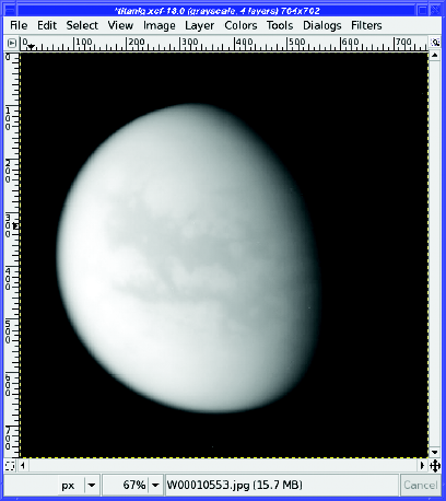
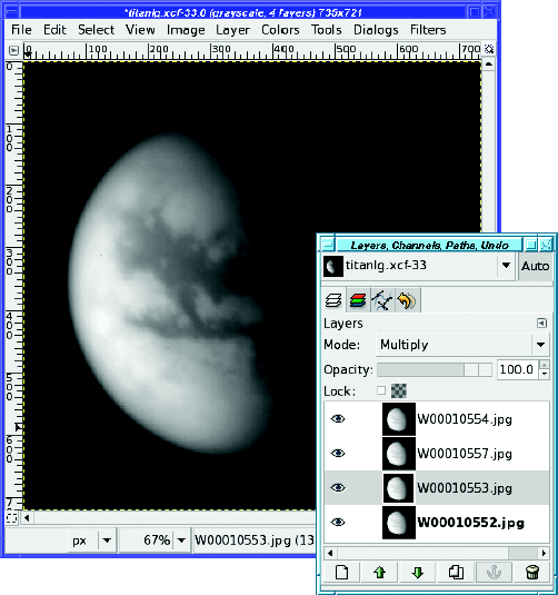
When the Titan images were stacked, they didn't get sharper, merely more contrasty. But stacking, carefully done, can also increase sharpness. Technically, what you're increasing is resolution, the size of the smallest detail that can be distinguished in the photograph.
In recent years, video astrophotography has become very popular. Astrovideographers take cheap webcams or security cameras, modify them to mount on a telescope, and then take videos of bright objects such as the moon, Jupiter, or Mars. Each individual image is awful, and it doesn't make a very interesting movie. But if you split the video into its component frames—several hundred separate images—you can stack those frames to make an amazingly sharp photograph. Using these techniques, amateurs are now getting images as sharp as the professional observatory photos from just a few decades ago.
First you have to remove the bad frames. Turbulence in the atmosphere (even on a clear night) means that some images in these "movies" will be too blurry to be worth keeping. Then stack the remaining frames using an averaging technique. Each layer is in normal mode, and the stacking is done with GIMP's Opacity slider.
The bottom layer, of course, is at 100% opacity. Click on the layer above it, and change the opacity to 50%. Now you're seeing an image that comes half from the first layer and half from the second: they're averaged. The resulting image won't be any brighter or darker than the components, but it will share pixels from both.
Now make the third layer visible and active. Set its opacity to 33%. That means that it'll be contributing only a third to the final image; the combination of the first two images will contribute two-thirds. So you're still seeing an average of the three.
Turn on the fourth layer, and set its opacity to 25%. And so on through all the layers. The rule you're following is that layer N gets opacity 1/N: 1/1, 1/2, 1/3, 1/4, and so on.
Of course, you wouldn't want to do this by hand if you had 200 layers. Astrovideographers usually use dedicated programs that handle both stacking and registration. Within GIMP, for a large number of layers, you'd be better off writing a script (you'll learn how to write simple scripts in Chapter 11).
Ever find a beautiful sweeping view and feel frustrated that your camera's lens isn't wide enough to fit it all in?
Even if you have an SLR with replaceable lenses, sometimes you'll want to shoot vistas that are just too wide for the camera to capture in one shot.
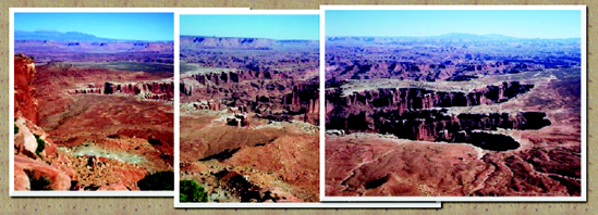
Back in the film days (remember film?), I sometimes used to shoot several overlapping pictures, and then take the prints and tape them together and pin them up outside my office. They might have ended up looking something like Figure 10-40.
That might have been good enough a decade or so ago, but you can do a lot better than that now!
Combining several images into a panorama is called stitching. The process is straightforward, but it includes several steps, and requires some patience to get a result that looks truly seamless.
Let's take it one step at a time.
Perhaps you already have a collection of images you'd like to stitch together. If not, here are some handy tips for taking a panoramic series. Some people find this stage the most intimidating part of the process, but it's not a problem if you follow a few guidelines.
Overlap quite a bit. At first, you might be tempted to put the left edge of image 2 right where the right edge of image 1 was. There are two problems with that.
First, camera lenses (especially wide-angle lenses) distort the image (a phenomenon known as lens warp). The distortion is especially pronounced at the edges. If you use a lot of overlap, you'll be using mostly the centers of each frame where there isn't so much distortion. (GIMP does have a plug-in to remove lens warp—Filters
Overlap at least a third of each image (as in Figure 10-40), but more is better, especially if you're using a digital camera: "bits are cheap."
Keep the camera level: don't tilt it between shots. If you have a tripod, or a flat surface like a picnic table, that makes it easy.
If you have to hold the camera by hand (and let's face it, most of the time when you see a spectacular vista worthy of a panoramic shot, you probably won't have your tripod with you), try standing in a stable position and twisting your body as you take each shot.
Pay attention to the horizon in the camera's viewfinder: try to keep it parallel to the top and bottom of the frame. If you accidentally tilt the camera, you can use GIMP's Rotate tool to make it level after the fact. However, rotating images so that they all match well enough to make a panorama is more difficult than it sounds, and you can save yourself a lot of work by shooting them level to begin with.
It's less important that you keep the horizon at the same height for each photo. You can have more sky in one shot, more ground in another, and the panorama will still look fine. The downside: to get a rectangular picture you may have to trim more from the top and bottom than is ideal.
If you can shoot all the images at the same exposure setting, that may save a little work later. Otherwise, the individual photos may vary in color or brightness. Notice the different colors of the sky and the ground between the left and middle pictures of Figure 10-40.
Some cameras offer a panorama setting which does this automatically, or manual exposure controls. If yours doesn't, you may be able to simulate it by metering on a point somewhere around the middle of your panorama: hold the shutter button halfway down, rotate the camera (still holding the button halfway), and press the button the rest of the way to take the picture. Repeat as necessary.
This isn't crucial. You can adjust brightness in GIMP, of course. And a panorama whose components have slightly different brightness levels may still look okay. Try it both ways and see whether it's worthwhile for you.
Once you've shot all your images and uploaded them to GIMP, it's time to start stitching.
Although it's normally best to work at the full resolution of your camera and scale the final image down after you're finished, that's not necessarily true for a panorama.
Panoramic images combine a lot of photos into one humongous GIMP image. Using three-megapixel or larger images for a big panorama (say, five or more images) can take up so much memory that it slows the machine to a crawl. The saved XCF will take up a lot of disk space, too (don't forget that you can use a compressed XCF format by saving to a file name ending in .xcf.gz or .xcf.bz2). You might use full resolution if you need an image that large—for instance, if you plan on printing to a banner three feet long. But otherwise, if you notice slowness, consider scaling down a bit.
Once you know the resolution of the individual images, how many of them there are, and the overlap you used, you can calculate how big an image you'll need to hold the panorama.
The next step in building a panorama is to make a new image of the right size. What is the right size? That's something you'll have to figure out.
Tip
If you'd rather not do the calculations, I've written a script called Pandora to automate the first few steps of panorama stitching. Find it under "Scripts" at http://gimpbook.com.
The easy way out is to simply take the width of your images and multiply by the total number you'll stitch together. There's not much penalty for starting with a new image that's too big—you'll just crop it in the end anyway. GIMP may complain if you try to create a new image larger than the parameters set in your preferences. The default is 128MB (up from 64MB in GIMP 2.2). Should you need to change this setting, you'll find it in Preferences under Environment.
If you're feeling lucky, subtract whatever you think you can get away with, say 20% to 25%. Don't stress over it. If it's too big, crop it later. If it turns out you needmore space, a simple Image
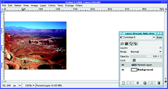
Once you've decided on a size, create the new image with a white background. I'll refer to this image as the "panorama image".
Open the first image as a new layer and move it (using the Move tool) all the way to the left side of the image (assuming your panorama is left to right). The panorama image will look something like Figure 10-41.
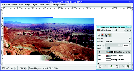
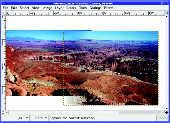
Next, load the second image as a new layer, just as you did the first, and use the Move tool to move the new layer to where it approximately overlaps the first one. Don't worry about getting it perfect...yet.
How do you get rid of the sharp edge between the first picture and the second? By using a layer mask.
In the Layers dialog, right-click on the second layer and choose Add Layer Mask... Initialize it to White (full opacity), the default.
Now use the Gradient tool to draw a gradient on the layer mask. It should be white every where to the right of the overlap, shading to black at the left edge of the second image. If you have the usual black foreground and white background, and the Gradient tool is in normal mode (not Reverse), this means starting your drag from the left edge of the second image, and then dragging right for some distance, not all the way to the point where the first image ends. You'll end up with a result like Figure 10-42.
Tip
Use the Ctrl key while dragging your gradient, to help you get a gradient that's exactly horizontal.
Now that the second image has transparent areas, you can position it more accurately. Switch to the Move tool, but there's a trick: if you simply click and drag with the Move tool, you'll move the layer mask rather than the layer itself, since the mask is still selected in the Layers dialog (indicated by the white boundary around it in Figure 10-42). Click on the layer preview in the Layers dialog to select the layer and not just its mask.
Zoom way in so that you can see details, and scroll so you can see the region of the image where the two layers overlap. Then use the Move tool to move the second image around until it matches the first image as well as possible. (Don't forget about the arrow keys.)
It'll usually be obvious when the images mesh. When you have two overlapping images (one partially transparent) that don't quite match, the image will look a bit blurry, as though you had a few too many beers before beginning the stitching process. When you find the right position, suddenly the image will seem to snap to focus, and all the blurriness and double vision will go away.
The catch? It won't happen everywhere in the image. Most of the time, the two images won't match up perfectly. If you line them up in the center, the top and bottom won't match. You're seeing lens warp. If you overlapped the images a lot (50% or more) or zoomed in when you shot the images, you'll see less lens warp, but there will always be some.
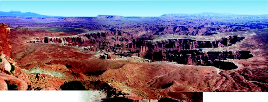
Usually, you're best off matching two layers at the vertical midpoint, and not worrying about the top and bottom (you can fix that in the next step). But if your panorama has a pronounced horizontal line somewhere—say, the horizon in an ocean panorama, or the canyon rim in my Canyonlands shots—you may want to use that as the location to match.
The gradient in your layer mask was great for a first step, but now it's time to eliminate parts of the image that don't match well. You don't want to replace the gradient, just add to it.
In this canyon panorama, the first priority is getting rid of those mesa tops that don't line up. To do that, a bit of black added with the Paintbrush tool in the upper left of the second image's layer mask will make the ghostly floating mesa disappear. (Remember, black in the layer mask makes that part of the image invisible.)
Watch the double images gradually go away as you scribble—it's fun.
If you need to get rid of a whole corner of an image, you can add another gradient to the existing gradient. Use the Mode menu in the Gradient tool: any of the darkening modes, such as Multiply, Subtract, or Darken only, will do (they'll give slightly different results at the edges where the two gradients meet, but you probably won't see the difference).
Tip
Remember that you can use Show Layer Mask from the Layers dialog (or Alt-click or Alt-Shift-click on the layer preview) if you get confused about what your mask looks like.
When you've finished adjusting the mask, click on the layer preview in the Layers dialog so the mask won't remain selected. That way, you won't be surprised if you try to do anything with the layer later.
Figure 10-43 shows the mesa-top area cleaned up (I cheated a little and made a new butte). Notice that the sky now looks patchy. Don't worry about the sky—you can clean that up later.
Most of the time, you can get what you need (except the sky) by drawing on the layer mask. But in a few cases, you'll have something—perhaps a branch, or a road—that just doesn't meet in the two images.
Sometimes, you can use other tools to fix this. Of course, you can draw directly on the image, using your cloning and smudging skills from Chapter 6. But first, try IWarp(described in Chapter 7, in the section "Distorts"). Sometimes careful use of IWarp can do exactly what you need.
You're done adding the second image! Now, repeat the steps for each of the pieces of your panorama: load the image, add a layer mask, move it into place, adjust the layer mask, and make any additional adjustments you need.
Tip
You can also load all the images in one step at the beginning, using File
Sometimes you'll find that one image is a lot harder to stitch than the others, especially if it's rotated. If you used a lot of overlap between photos, you can probably discard the problematic ones and save yourself a lot of time. Don't get wrapped up in the need to use every photo.
Ironically, skies are particularly hard to get right in panoramas. Differences in exposure seem much more obvious in a clear blue sky. So go ahead and cheat: select the sky using your favorite selection technique (for instance, use Select by Color with Sample Merged turned on, or just paint on the QuickMask), and then make a sky in a new layer using a gradient between two shades of blue, just like in the "Decomposing to HSV" exercise in Chapter 8.
Finally, crop the panorama. The top and bottom edges of the component images probably won't quite line up. It's your choice: you can leave the edges ragged (Figure 10-44), to show off its panoramic nature, or you can crop to an even rectangle so it looks like the whole thing was taken in one shot.
Now you know all sorts of ways to composite several images. No book could possibly list all the amazing things you can do compositing images in GIMP, but now you know the important tools and a collection of different techniques. You should have a solid base from which to begin experimenting with your own images.
You'll also be able to apply techniques you find in web tutorials. If you experiment with these ideas, and try them on the sorts of images you use yourself, you'll be an expert in no time.
But for now, take a break from fiddling with images by hand. During the course of this chapter you've done quite a lot of repetitive operations that would have been so much easier if they were automated. In the next chapter, you'll learn how to automate GIMP processes yourself, using plug-ins and scripting.