
One of the greatest advantages of using HTML5 for your games is that you can target mobile browsers. When considering mobile, many factors come into play. One of the biggest challenges you’ll face with mobile is preparing for the vast variety of screen sizes across devices.
In this chapter, you’ll learn how to prepare your canvas game to scale and fill as much screen as possible on handheld devices and even desktop displays. You’ll also learn how you can distribute your game over the Web by using the Add to Home Screen option in iOS Safari. To put this into practice, you will be adding code to Fakezee (see Chapter 7) so it will fit on mobile screens and will also be optimized for touch events.
To begin the mobile optimization of Fakezee, the init function will be updated to run a new function (see Listing 12-1). The optimizeForTouchAndScreens function will handle optimization for touch events on mobile devices. More code will be added later to handle screen sizes and orientations.
Listing 12-1. Updated init Function in index.html
function init() {
   canvas = document.getElementById('canvas'),
   stage = new createjs.Stage(canvas);
   createjs.Ticker.setFPS(60);
   createjs.Ticker.on('tick', stage);
   optimizeForTouchAndScreens ();
   preload();
}
function optimizeForTouchAndScreens () {
   if (createjs.Touch.isSupported()) {
      createjs.Touch.enable(stage);
   }
}
The Touch class has a method named enable, which will enable touch interaction with the stage passed into it. This will also allow for multi-touch modes to work in your application. At the time of writing this book, Touch supports iOS, modern mobile browsers, and IE10. Although we will not be utilizing multi-touch with the mobile games in this book, enabling touch is still essential to gain full responsiveness for touch events. Not doing so will cause noticeable delays on various devices.
Before enabling touch, you should check if the browser running your application is a touchscreen device. There’s no need to add features where they are not needed or supported, so wrapping a simple conditional around the touch-enabling code should be done. The isSupported method on Touch will return true if touch events are supported.
Setting the Viewport
The viewportmeta tag informs the browser how to behave when it renders your web page. It represents the viewable area, and is what is zoomed, scaled, and rotated. The default behavior of the viewport lends itself nicely to most web sites, and gives the user a lot of control over how they can view the page. However, in a gaming environment it’s best to tweak these values to better suit the needs of your game. Listing 12-2 displays the viewport meta tag that is added to the head of index.html in the Fakezee game.
Listing 12-2. The Viewport Meta Tag Is Used to Control How the Screen is Rendered
<meta name="viewport" content="user-scalable=no,width=device-width,initial-
   scale=1 maximum-scale=1.0"/>
The content property for viewport can be set to customize the way the screen renders and reacts to user touches. Preventing the user from scaling will essentially lock the assets in place and prevent default mobile browser behaviors. You’ll typically want to prevent your game from dragging around or zooming while the player is interacting with it. Disabling user scaling on the viewport’s content will prevent this from happening. The last three properties set in this example assure you that your application will initially load at full scale and will take advantage of the entire available screen real estate.
 Note Preventing users from scaling your content will lock your assets in place and prevent pinching or scrolling. However, there is currently no way to prevent the browser from reacting to device orientation changes.
Scaling Fakezee for Multiple Screen Size
It’s extremely difficult to predict how your game will appear on all of the phone, tablet, and computer screens it might come across. When it comes to handheld devices, your biggest challenge will be the limited space provided to you for your content. This precious space is often cluttered with navigation bars and other browser UI that can’t be avoided.
Before getting into the JavaScript code, some extra styles are needed. Place these styles in either a style block or separate style sheet. Strip out the inline styles that are currently in the img and canvas elements in the index.html file for Fakezee. Listing 12-3 shows the new styles and updated HTML elements.
Listing 12-3. The Updated Styles and HTML Elements for Fakezee
//updated styles
body{
    background-color: #8b0000;
    margin: 0;
}
#gameWrapper{
    position: absolute;
}
canvas, img{
    -webkit-transform-origin:0px 0px;
    transform-orgin: 0 0;
    position: absolute;
}

//updated HTML elements
<div id="gameWrapper">
    <img id="bg" src="img/bg.jpg">
    <canvas id="canvas" width="550" height="500"></canvas>
</div>
There are a several approaches when it comes to preparing for screen sizes, but we’ll be looking at just one. The technique I prefer is to scale the canvas to adjust to screen sizes and to adjust upon orientation changes. Listing 12-4 adds the code that listens for orientation and screen resizing events.
Listing 12-4. Checking For Devices and Desktop to Set the Appropriate Event Listeners
function optimizeForTouchAndScreens () {
   if (typeof window.orientation !== 'undefined') {
      window.onorientationchange = onOrientationChange;
      if (createjs.Touch.isSupported()) {
         createjs.Touch.enable(stage);
      }
      onOrientationChange();
   }
   else {
      window.onresize = resizeGame;
      resizeGame();
   }
}
This function is updated to check if the user is on a desktop or a device. First, if it’s a device, the onorientationchange event is set on window, which will trigger when the user moves from portrait to landscape, or vice versa. The function onOrientationChange function is called, which will handle this event. You’ll want to manually call this function as well because you won’t get the change event when the page is first loaded, which is needed to trigger the initial scaling and positioning of the canvas.
In the case of a desktop, there will never be an orientation change. However, you still want the game to respond to window resizing. The resizeGame function is called on this event, and it is also initially called when the page is loaded to properly adjust the canvas.
The onOrientationChange and resizeGame functions are shown in Listing 12-5.
Listing 12-5. The onOrientation and resizeGame Functions Adjust the Size of the Game to Fit the Screen
function onOrientationChange() {
   setTimeout(resizeGame, 100);
}
function resizeGame() {
   var nTop, nLeft, scale;
   var gameWrapper = document.getElementById('gameWrapper'),
   var bg = document.getElementById('bg'),
   var w = window.innerWidth;
   var h = window.innerHeight;
   var nWidth = window.innerWidth;
   var nHeight = window.innerHeight;
   var widthToHeight = canvas.width / canvas.height;
   var nWidthToHeight = nWidth / nHeight;
   if (nWidthToHeight > widthToHeight) {
      nWidth = nHeight * widthToHeight;
      scale = nWidth / canvas.width;
      nLeft = (w / 2) - (nWidth / 2);
      gameWrapper.style.left = (nLeft) + "px";
      gameWrapper.style.top = "0px";
   }
   else {
      nHeight = nWidth / widthToHeight;
      scale = nHeight / canvas.height;
      nTop= (h / 2) - (nHeight / 2);
      gameWrapper.style.top = (nTop) + "px";
      gameWrapper.style.left = "0px";
   }
   canvas.setAttribute("style", "-webkit-transform:scale(" + scale +
       ")");
   bg.setAttribute("style", "-webkit-transform:scale(" + scale + ")");
   window.scrollTo(0, 0);
}
When the user rotates their device, or resizes their browser window on desktop, the resizeGame function is ultimately called. The reason for the intermediate onOrientationChange function is because you’ll need a short timeout set after the onorientationchange event is handled. This is because some device browsers will run the event handler code before the window actually rotates and resizes. This is problem because you need the new window sizes to properly resize the canvas.
A series of variables are first set at the top of the function (see Listing 12-6).
Listing 12-6. The resizeGame Function’s Local Variables
var nTop, nLeft, scale;
var gameWrapper = document.getElementById('gameWrapper'),
var bg = document.getElementById('bg'),
var w = window.innerWidth;
var h = window.innerHeight;
var nWidth = window.innerWidth;
var nHeight = window.innerHeight;
var widthToHeight = canvas.width / canvas.height;
var nWidthToHeight = nWidth / nHeight;
A reference to the div that the holds the game elements is first referenced. You will need this to reposition the game after its resized. In this particular game, an image was created in the DOM as the background for the game. This image will also need to be resized to match the new size of the canvas.
The current width and height of the window is set to the variables w, nWidth, h, and nHeight. Next, the widthToHeight variable is set to the ratio of the game, which can be retrieved by referencing the width and height of the canvas. Finally, nWidthToHeight is set the current ratio of the window.
In a nutshell, the desired game ratio is being set along with the current window ratio. These values will determine how the canvas should be scaled and placed in the screen. With the appropriate values set, a conditional is written to determine how the scaling should be handled (see Listing 12-7).
Listing 12-7. Factoring the Direction in Which to Scale and Position the Game
if (nWidthToHeight > widthToHeight) {
      nWidth = nHeight * widthToHeight;
      scale = nWidth / canvas.width;
      nLeft = (w / 2) - (nWidth / 2);
      gameWrapper.style.left = (nLeft) + "px";
      gameWrapper.style.top = "0px";
   }
   else {
      nHeight = nWidth / widthToHeight;
      scale = nHeight / canvas.height;
      nTop = (h / 2) - (nHeight / 2);
      gameWrapper.style.top = (nTop) + "px";
      gameWrapper.style.left = "0px";
}
If the nWidthToHeight value (the current width-to-height ratio of the window) is greater than widthToHeight (the desired width-to-height ratio of your game), then you know that the window is too wide to attempt to scale the canvas to the sides of the window. You then calculate nWidth by using the height of the window. Now that you know what the new width of the game should be, scale is calculated by dividing it by the canvas width. This scale value is the ultimate goal here, and will be used to scale the canvas.
Note Although the canvas will be scaling on window resizing and orientation changes, the original width and the height properties on your canvas will always remain the same.
Now that the scale has been calculated, the game’s positioning needs to be adjusted. In this first case, where the canvas will be hugging the top and bottom of the window, its left position needs to be updated so it sits perfectly in the middle. This is set to nLeft by finding the middle of the window and subtracting half of the canvas’ new width. You’ve done this often when centering display objects on the stage. Figure 12-1 shows the results on an Android Nexus device and an iPhone 5. Note that in the case of the iPhone running iOS7 (the bottom image), full screen is launched automatically when rotated to landscape orientation.
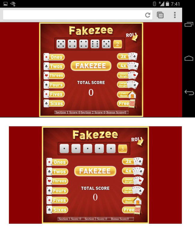
Figure 12-1. Fakzee scaled to fit in landscape orientation for Android (top) and iOS (bottom)
Similar techniques are used in the case where the screen is tall, or in portrait mode, and the results are shown in Figure 12-2.
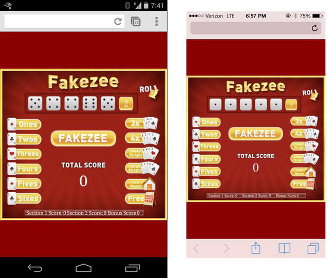
Figure 12-2. Fakzee scaled to fit in portrait orientation for Android (left) and iOS (right)
Although you’ve seen these results in the above figures, the function is not quite complete. With the new scale property acquired, it needs to be applied to the canvas (see Listing 12-8).
Listing 12-8. Updating the Styles to Scale the Canvas and Background Image
canvas.setAttribute("style", "-webkit-transform:scale(" + scale + ")");
bg.setAttribute("style", "-webkit-transform:scale(" + scale + ")");
window.scrollTo(0, 0);
The scaling is accomplished via transform styles on the canvas and background image, which are set with JavaScript. Lastly, the window scroll is set to 0, which can help remove unwanted address bars on mobile devices.
Optimizing Fakezee for iOS Home Pages
A really cool feature of iOS is the ability to save a bookmark to a site on your home page. However, this feature goes beyond being a simple bookmark. Using the appropriate meta tags and image preparation, you can get your game to appear and behave much like a native application.
Adding the Web App Meta Tags
Two more meta tags are needed to optimize Fakezee to behave the way you want it to when being launched from the home screen. These two meta tags are shown in Listing 12-9.
Listing 12-9. The Meta Tags Used To Optimize iOS Home Screen Apps
<meta name="apple-mobile-web-app-capable" content="yes"/>
<meta name="apple-mobile-web-app-status-bar-style" content="black"/>
The first tag, apple-mobile-web-app-capable, will display your app in full screen when launched from the home screen. Not supplying this tag will result in your app simply launching in the Safari browser. The second tag, apple-mobile-web-app-status-bar-style, specifies the style that the status bar will be displayed in. In this example, the background color will be black.
Creating a Home Screen App Icon
The icon on the home screen will, by default, be a screenshot of the web page. However, you can specify the icon that will be used. Listing 12-10 shows a series of link tags that are used to specify the icon image.
Listing 12-10. The link Tags to Set the Fakezee Icons
<!-- iOS 7 iPad (retina) -->
<link href="webapp/apple-touch-icon-152x152.png"
   sizes="152x152"
   rel="apple-touch-icon">

<!-- iOS 6 iPad (retina) -->
<link href="webapp/apple-touch-icon-144x144.png"
   sizes="144x144"
   rel="apple-touch-icon">

<!-- iOS 7 iPhone (retina) -->
<link href="webapp/apple-touch-icon-120x120.png"
   sizes="120x120"
   rel="apple-touch-icon">

<!-- iOS 6 iPhone (retina) -->
<link href="webapp/apple-touch-icon-114x114.png"
   sizes="114x114"
   rel="apple-touch-icon">

<!-- iOS 7 iPad -->
<link href="webapp/apple-touch-icon-76x76.png"
   sizes="76x76"
   rel="apple-touch-icon">

<!-- iOS 6 iPad -->
<link href="webapp/apple-touch-icon-72x72.png"
    sizes="72x72"
    rel="apple-touch-icon">

<!-- iOS 6 iPhone -->
<link href="webapp/apple-touch-icon-57x57.png"
   sizes="57x57"
   rel="apple-touch-icon">
As you can see, there are several images prepared for the icon. These tags are commented appropriately and represent the many possible iOS devices that could be running your application. When preparing an icon, it’s best to design it large, and then save it in the appropriate sizes that are listed above. Figure 12-3 shows the icon that was prepped in a variety of sizes for the Fakezee home screen app.

Figure 12-3. The Fakezee icon used for the iOS home screen app
The icon will appear in a few locations. The first is in the modal screen that appears when the user selects the Add to Home Screen option in the mobile Safari menu. Figure 12-4 shows this being done on an iPad.
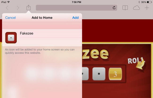
Figure 12-4. The Fakezee icon in the Add to Home modal screen in iOS
The other location where the icon is used is on the home screen where it will represent the application itself and launch the app. Figure 12-5 shows the Fakezee icon on the home screen of an iPad.
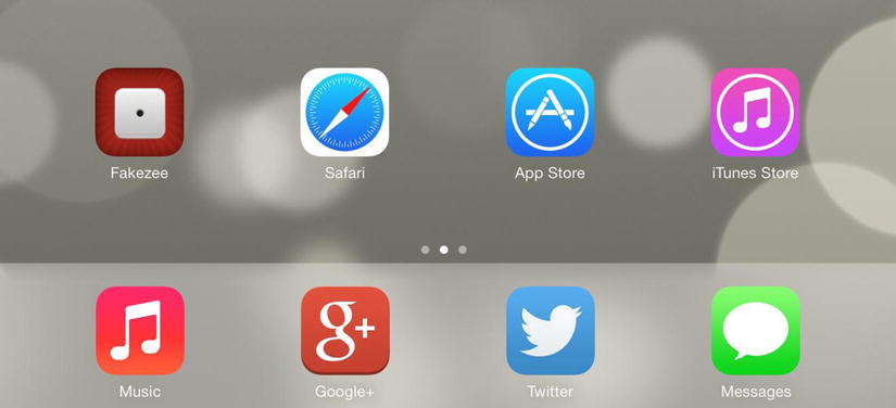
Figure 12-5. The Fakezee iOS home screen app icon on an iPad
The startup image is the splash screen image that will appear as your application is loading. If you are familiar with native iOS development, this is equivalent to the Default.png file that is required for your application. Listing 12-11 shows the list of link tags needed for the startup image on various iOS devices.
Listing 12-11. The link Tags Used to Set the Startup Image for Fakezee
<!-- iOS 6 & 7 iPad (retina, portrait) -->
<link href="webapp/apple-touch-startup-image-1536x2008.png"
   media="(device-width: 768px) and (device-height: 1024px)
      and (orientation: portrait)
      and (-webkit-device-pixel-ratio: 2)"
   rel="apple-touch-startup-image">

<!-- iOS 6 & 7 iPad (retina, landscape) -->
<link href="webapp/apple-touch-startup-image-1496x2048.png"
   media="(device-width: 768px) and (device-height: 1024px)
      and (orientation: landscape)
      and (-webkit-device-pixel-ratio: 2)"
   rel="apple-touch-startup-image">

<!-- iOS 6 iPad (portrait) -->
<link href="webapp/apple-touch-startup-image-768x1004.png"
   media="(device-width: 768px) and (device-height: 1024px)
       and (orientation: portrait)
       and (-webkit-device-pixel-ratio: 1)"
   rel="apple-touch-startup-image">

<!-- iOS 6 iPad (landscape) -->
<link href="webapp/apple-touch-startup-image-748x1024.png"
   media="(device-width: 768px) and (device-height: 1024px)
      and (orientation: landscape)
      and (-webkit-device-pixel-ratio: 1)"
   rel="apple-touch-startup-image">

<!-- iOS 6 & 7 iPhone 5 -->
<link href="webapp/apple-touch-startup-image-640x1096.png"
   media="(device-width: 320px) and (device-height: 568px)
      and (-webkit-device-pixel-ratio: 2)"
   rel="apple-touch-startup-image">

<!-- iOS 6 & 7 iPhone (retina) -->
<link href="webapp/apple-touch-startup-image-640x920.png"
   media="(device-width: 320px) and (device-height: 480px)
      and (-webkit-device-pixel-ratio: 2)"
   rel="apple-touch-startup-image">

<!-- iOS 6 iPhone -->
<link href="webapp/apple-touch-startup-image-320x460.png"
   media="(device-width: 320px) and (device-height: 480px)
      and (-webkit-device-pixel-ratio: 1)"
   rel="apple-touch-startup-image">
Much like the icon, several variations of the startup image must be created. Because of the variety of resolutions and ratios on iOS screens, the startup image cannot simply be created large and scaled down for each case. Another important thing you’ll notice is that landscape startup images do not have landscape resolutions. This is because iOS will simply rotate your image in the case of a device in landscape mode; therefore you should prep your images at landscape, but rotate 90 degrees when saving for production. Figure 12-6 shows the startup image prepped for the retina iPad.

Figure 12-6. The startup image displays while the app is loading
Now your web app is fully optimized to launch full-screen from the home screen of an iOS device. There are more features you may wish to look into when creating these types of applications, including caching, which will download all of the files to the user’s device and allow for offline use. The mobile Safari API includes even more functionality that might suit your needs when developing iOS web apps, so I encourage you to dig in and see what might make your game or application even more enjoyable. Figure 12-7 shows the final, full screen Fakezee game being launched on an iPad.
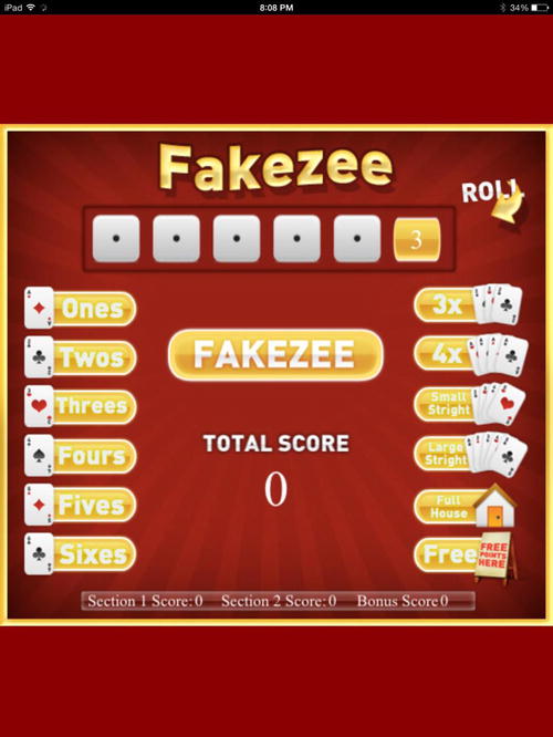
Figure 12-7. Fakezee launched full-screen as an iOS home screen app
Summary
In this chapter, CSS scaling techniques were introduced to enhance the Fakezee game to fit on the various screen sizes of tablets, handhelds, and desktops. Further enhancements were implemented to optimize the game for being added to iOS home screens, which can allow for the native-like, full-screen appearance of your applications.
This chapter focused heavily on mobile browsers and the optimizations that can be considered to best distribute your canvas games for the Web. However, this is only half the fun when it comes to mobile game development. In the next chapter, you’ll learn how to package and publish your HTML5 games for mobile app stores.