
C H A P T E R 5
Evolving the Default User Experience
Tips on What You Can Change Without Breaking Supportability
With the overview of a site completed, you should have a better understanding of how all the pieces of a site fit together. Although you still have a long road ahead of you (and some really cool places to visit!), you’ll now explore what you can do to modify the default user experience with and without ruining the supportability. (In short, this means that Microsoft Support will not help you if you get into trouble...as if they would anyway—read more about this in the “Disclaimer” section.)
In this chapter, you will look at several methods for customizing the default user experience. By no means exhaustive, the techniques you will learn here will make you a potent tool on any SharePoint team.
The techniques you will look at here are MenuItemTemplate, CustomAction, control templates, feature stapling, custom application pages, and delegate controls. Each of these techniques may be powerful on its own, but when you combine them…well, let’s just say that nuclear explosions become like gentle whispers between oysters—during a hurricane.
Disclaimer
Changing any file that comes with SharePoint will break your supportability. I briefly mentioned one exception in Chapter 4, which is that you can change the Hidden attribute of the default webtemp.xml file.
If you modify any other file, though, you can no longer call Microsoft Support and expect them to help you. Actually, you can expect it as much as you like, but they will ask you to restore your original file, which sort of voids the whole point of modifying it. And, to make matters even worse, Microsoft can, with the release of any update that you choose to install, overwrite any file it wants to overwrite, at any time, without warning.
This all seems to point in one direction: do not muck around in the default files. Now, I have been in this game long enough to know that saying this to a developer is like telling a kid to not look forward to Christmas. We developers grow and learn by taking things apart and seeing how they work, or do not work, when we try to put them back together. It is going against nature to tell a developer not to do something that looks the slightest bit fun.
So, I will dispense with all the bovine manure and give you some advice instead.
 Tip Muck around in the default files as much as you like. Do so in a lab or test environment, and do so with vigor. Bomb your SharePoint installation to smithereens, tear down any site on which you can lay your hands, and try to see whether you can get it back together again. Just don’t expect this to work in production, so explore from a learning perspective, not from a production perspective.
Customizing Menus and Lists
In Chapter 4, specifically in Figure 4-1, you saw a fancy screenshot with a bunch of annotations that were like a map of the user interface. Figure 5-1 shows the relevant parts of that screenshot to save you from page-flipping madness.
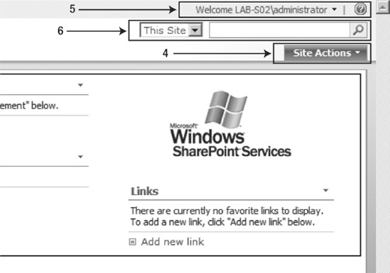
Figure 5-1. Site and personal actions
Elements 4 and 5 are the Site Actions and personal actions menus, respectively. I will get to element 6 later.
You may have noticed that the Site Actions menu changes with different site definitions, including the default Team Site and Meeting Workspace definitions (see Figure 5-2). And, if this can change based on what type of site definition you’re using, there must be a way to modify that menu without breaking supportability.
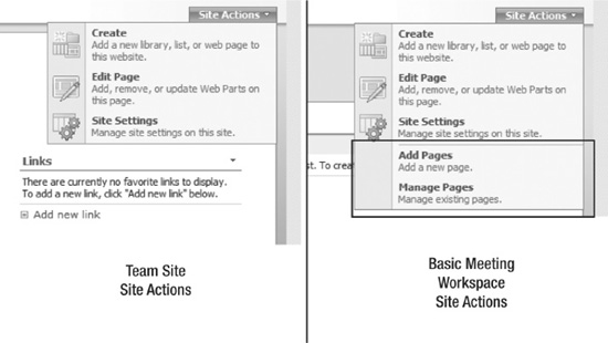
Figure 5-2. Site Actions menu examples
To modify the Site Actions menu, you should start by checking out the pages hosting the Site Actions menu to see how they get created. The Site Actions menu appears on every page, so it is safe to assume that it is defined in the master page rather than on individual pages. Let’s open the default.master file that resides in the [12]TEMPLATEGLOBAL directory.
You could explore plenty of tags in the default.master file, but I’ll detail some of these later; for now, I’ll direct your attention to line 152 in default.master, which is the line starting with a SharePoint:SiteActions tag. I’m certain you can guess what that tag does, but you’ll want to know how the tag works too.
Tip If you want to use .NET Reflector to explore the SharePoint: tags, look at the <%@Register Tagprefix="SharePoint" tag at the start of the master page to find the correct assembly and namespace. In this case, that would be Microsoft.SharePoint.WebControls in Microsoft.SharePoint.dll.
Your first clues come from the child tags of the SiteActions tag, specifically the FeatureMenuTemplate tag. The tag is responsible for creating the menu. You will explore how it does this in a few moments, but first let’s look at its child elements, as shown in Figure 5-3.
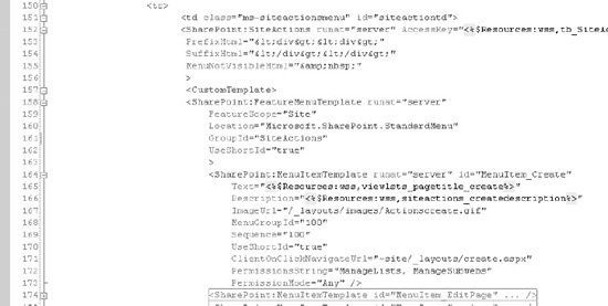
Figure 5-3. SiteActions and its children
MenuItemTemplate
You will quickly discover that the child MenuItemTemplate tags match the choices of the Site Actions menu, so there’s no big surprise there. Those MenuItemTemplate tags have power, however, so you should take note of a few useful attributes. A really cool feature is the incredible control you have to filter which menu items are displayed. Specifically, using the attributes of a MenuItemTemplate, you can narrow down who gets to see a given item based on a wide array of filtering options. Note that some of the filtering attributes here are optional; if you do not set a filtering attribute, then the default value, specified for each attribute in the following text, is used.
First notice the PermissionsString and PermissionMode attributes. These attributes specify the permissions a user must have in order for the menu item to appear. The PermissionsString attribute holds one or more comma-separated string values that state which permissions the user needs. These values come from the SPBasePermissions enumeration. I could give you a complete list of all those values, but the official documentation does a great job, so I see no reason to just copy and paste that information here. Here are a few examples to show you what kind of permissions you could use (refer to the official documentation on MSDN at http://www.understandingsharepoint.com/url/10026, or search for SPBasePermissions in the SDK to get the complete list):
PermissionMode defines how these permissions should be evaluated; it can be either All to signify that a user needs every permission listed in the PermissionsString attribute or Any to signify that any permission is sufficient. If PermissionMode is not set, All is used as the default.
You can further refine the permission requirements using the PermissionContext attribute. By setting this value, you specify to which SharePoint objects or contexts the required permissions should apply. For instance, you can combine the Permissions string Open with the PermissionContext attribute set to RootSite to show a menu item only if the user has Open permissions on the site collection’s root web.
The possible PermissionContext values are CurrentFolder, CurrentItem, CurrentList, CurrentSite, and RootSite. If PermissionContext is not set, CurrentSite is the default value.
In addition to user permission requirements, you can also filter menu items based on which features are activated; you just use the RequiredFeatures attribute to do this. For instance, if you have a feature to send an email from the current page, you can put a link to that page in a FeatureMenuTemplate element, such as the Site Settings menu, only if that feature has been activated. That way, you’re not putting invalid links in the menu, and the link will automatically be removed if the feature is deactivated.
Then you have the AuthenticationRestrictions attribute, which can be set to either AllUsers, AnonymousUsersOnly, or AuthenticatedUsersOnly to specify which authentication method a user should use to see the menu item. That way, you can prevent a menu item from being shown to anonymous users or to authenticated users. For instance, you may want to hide a Log In to This Site menu item from authenticated users or hide a Log Out from This Site menu item from anonymous users.
The final filtering attribute I will mention here is the PageModes attribute. You can set this to Design, Normal, and All to filter when the menu item should be displayed. For example, you might want an Edit This Page link to appear only if you are in the Normal viewing mode of a page but not if you are already in the Design/Edit viewing mode.
Most of the other attributes of MenuItemTemplate are quite self-explanatory, but a few attributes require a bit more explanation.
The MenuGroupId attribute groups items together on the menu. To illustrate this, take a look at the Site Actions menu of the Meeting Workspace in Figure 5-2. The last two menu items, Add Pages and Manage Pages, are part of their own MenuGroupId, in this case 200, while the remaining and default menu items are part of the 100 MenuGroupId. These numbers are just arbitrary integers, by the way, but the groups do appear in numerical order.
The Sequence number of the MenuItemTemplate defines the order within the MenuGroupId in which items should appear. Again, this is just an arbitrary number, but menu items do appear in ascending order. Note that a menu item with Sequence set to 1 but part of MenuGroupId 200 will still appear after a menu item with sequence 5 that is part of MenuGroupId 100. In other words, the MenuGroupId attribute has priority over the Sequence attribute.
Note MenuGroupId is not the same as GroupId. I’ll explain GroupId in a moment.
MenuItemTemplate has two attributes for handling the actual clicks on the menu item: ClientOnClickNavigateUrl and ClientOnClickScript. The ClientOnClickNavigateUrl attribute simply sets the URL to which the click will lead, while ClientOnClickScript contains a JavaScript call. The important thing here is to not use both attributes in the same MenuItemTemplate. If you do, as shown in Figure 5-4, only the attribute defined first will work. So if you need to have a JavaScript function called first and then have the user navigate to a URL, you must handle the URL navigation in script code.
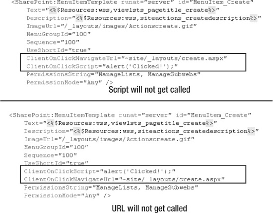
Figure 5-4. Conflicting ClientOnClick attributes
FeatureMenuTemplate
You may be asking yourself why I’m spending so much time explaining the intricate details of a simple item in the Site Actions menu. The reason for this will become clear in a few moments, and it may even be one of those “aha!” moments for you. It was for me, at least; your mileage may vary.
The FeatureMenuTemplate tag wraps the four Site Actions menu items to create the Site Actions menu, but it also does far more than that. Two attributes are important: the Location attribute and the GroupId attribute. Combined, these two attributes define which menu to show:
<SharePoint:FeatureMenuTemplate runat="server"

    FeatureScope="Site"

    Location="Microsoft.SharePoint.StandardMenu"

    GroupId="SiteActions"
    UseShortId="true"

    >
The important thing to note here is that the two values are actually completely arbitrary string values despite looking like they may actually be connected to a namespace. You can create your own FeatureMenuTemplate element using whatever values you like. Take a look at the following sample code:
<SharePoint:FeatureMenuTemplate runat="server"

    FeatureScope="Site"

    Location="Microsoft.SharePoint.MyStandardMenu"

    GroupId="CustomSiteActions"

    UseShortId="true"

    >
If you replace the FeatureMenuTemplate of default.master with the previous code, your site settings will work just like before—at least until you want to add some menu items. We will get to that really soon, I promise.
Why are there two values, and how are they different? Both are grouping mechanisms that work quite similarly. They are usually used in unison to group similar menus.
Hold on…what do you mean by “group similar menus”? I thought we were talking about the Site Actions menu?
Ah, yes, it is time to show you why the FeatureMenuTemplate together with the MenuItemTemplate are so important to the user experience.
Ladies and gentlemen, I give you…Figure 5-5!
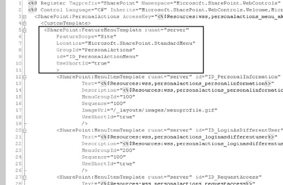
Figure 5-5. Section from welcome.ascx
What you see before you is a part of welcome.ascx, or the personal actions menu. As you can see, that menu is also based on the FeatureMenuTemplate but differs from the Site Actions menu in the GroupId attribute.
And, if you should happen to stumble upon an open DefaultTemplates.ascx file, scroll down to line 1795 to discover another FeatureMenuTemplate, inside the ToolbarActionsMenu template, as shown in Figure 5-6.
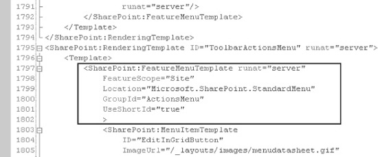
Figure 5-6. Section from DefaultTemplates.ascx
There are plenty of similar examples, so you should be beginning to see a pattern here. Quite a lot of menus in SharePoint are actually created using a FeatureMenuTemplate. Not all are, but many are.
Knowing that FeatureMenuTemplate contains MenuItemTemplate and that MenuItemTemplate can be highly targeted and context sensitive, you can now see how many menus behave and look differently depending on which user sees the menu. Why is there no Settings menu in a list when a user does not have the Manage Lists permission? It’s simply because the items on the menu, in this case GroupId SettingsMenu and Location Microsoft.SharePoint. StandardMenu, all have the Permissions attribute set to ManageLists.
Note This is also how the Site Settings page shows only the links to which you have the proper permissions. I will get to that shortly.
However, all this information does not give you any information about how to create your own menu items, because you cannot actually modify any of these FeatureMenuTemplate tags to add more actions, right? Remember the disclaimer about modifying default SharePoint files? If you modify the files, you break your supportability. There must be another way to manipulate menu items.
Enter CustomAction….
CustomAction
CustomAction tags are defined in features so you can create, install, and activate a feature to modify different menus in SharePoint. The syntax matches that of MenuItemTemplate tags but differs in some key areas. Figure 5-7 shows an example of an elements file containing a
CustomAction.
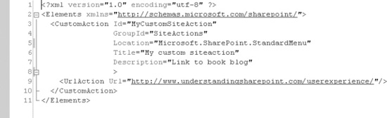
Figure 5-7. CustomAction sample
Note that the CustomAction contains a GroupId attribute and a Location attribute that matches the values of the Site Actions menu’s FeatureMenuTemplate. When activated, this feature will add a link to the Site Actions menu, linking the title “My custom siteaction” to the URL defined in the UrlAction child element, as shown in Figure 5-8.
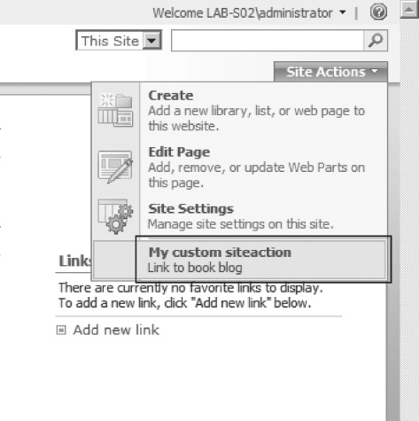
Figure 5-8. Site Actions menu with custom action
The CustomAction and MenuItemTemplate tags have some key differences. First, in the CustomAction tag, you have a different set of filtering options. There is no Permissions attribute like you have in MenuItemTemplate, and although you have a Rights attribute that closely resembles the Permissions attribute, Rights are always All, meaning that a user must have all the permissions you list in the value.
Second, you can use a CustomAction group to target specific content types, lists, or file types using the RegistrationType attribute. If you set that attribute, you must also set the RegistrationId attribute to match which content type, list template type, or file type you want to affect. For example, the following code will add an action to the EditControlBlock—you know, the drop-down menu that appears when you hover your pointer over an item—for folders only:
<CustomAction Id="MyCustomSiteAction"

              Location="EditControlBlock"

              Title="Open folder in Explorer"

              RegistrationType="ContentType"

              RegistrationId="0x0120"

              >
Figure 5-9 shows the result.
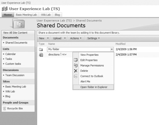
Figure 5-9. CustomAction on the EditControlBlock of folders
Tip Folders are actually just normal items with a content type inheriting from the root folder content type. We will get to that in Chapter 8.
Tip CustomAction honors the inheritance of content types, meaning that if you have a custom action connected to an existing type and you create a new content type based on that existing type, the new content type will also inherit the custom action.
Tip The drop-down menu you see in Figure 5-9 is called the EditControlBlock, ECB for short.
You may have noticed that the UrlAction child element is the only way to set an action through CAML. Although that may be correct, another option may quite possibly blow your mind. You can use the ControlAssembly and ControlClass attributes to manage the custom action through code.
What this means is that if you set these attributes to a valid class in a valid assembly, your class will get the chance to react to events when the custom action is added to the menu. You can use this to filter menu items at runtime rather than at design time, so this is an incredibly powerful feature. Here are some examples to show you how you could utilize this feature:
- You could have a menu item appear only during specific times of the day to ensure that certain actions, such as checking out documents, are permitted only during work hours and during the workweek.
- You could add a Ship This Order menu item only if the payment has been received from the customer.
- You could create a stock portfolio solution and have a Buy/Sell Shares in This Company menu item only if the P/E ratio of a stock is greater than or less than a certain value.
- You could…filter on anything! How about allowing people to attend a company picnic only if they have not beaten you in Tetris?
Note There is a massive caveat with using ControlAssembly and ControlClass. In EditControlBlock, the menu items are generated in a JavaScript function of core.js. That means you cannot use ControlAssembly and ControlClass to filter ECB menu items.
D’oh!
This applies only to a CustomAction using the ControlAssembly and ControlClass attributes. Normal links using the UrlAction child element still work as explained.
However, using a CustomAction is not just limited to menus. The entire Site Settings page uses the CustomAction framework for creating the columns and links to manage a site. The Operations and Application Management pages in Central Administration use custom actions. And, as you have seen, the toolbars located in various places such as in lists use custom actions.
In fact, let’s take a look at how the Site Settings page is created and see whether you can add some categories and links. That can be very useful for providing your own management options to site administrators and power users.
The Site Settings page gets its content from the SiteSettings.xml file. Open the [12] TEMPLATEFEATURESSiteSettingsSiteSettings.xml file, as shown in Figure 5-10.
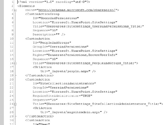
Figure 5-10. SiteSettings.xml
Ah, this looks quite familiar. There is one new element here, CustomActionGroup. However, when you realize that the CustomActionGroup maps nicely to the GroupId attribute of both FeatureMenuTemplate and CustomAction, I am fairly certain that you can easily understand this new element. In fact, several CustomActionGroup elements match the columns on the Site Settings page.
Let’s try adding custom actions to the Site Settings page by using CustomAction and CustomActionGroup. Here is what you could do in the elements file of your feature:
<Elements xmlns="http://schemas.microsoft.com/sharepoint/">

  <CustomActionGroup Id="MyCustomSettings"

                     Location="Microsoft.SharePoint.SiteSettings"

                     Description="Custom administration options"

                     Sequence="5"

                     Title="Custom administration"/>
  <CustomAction Id="MyCustomSiteAction"

                GroupId="MyCustomSettings"

                Location="Microsoft.SharePoint.SiteSettings"

                Rights="EnumeratePermissions,BrowseUserInfo"

                Title="Manage something..."

                >

    <UrlAction Url="_layouts/CustomManagement.aspx"/>

  </CustomAction>

</Elements>
Figure 5-11 shows the result of this little exercise.
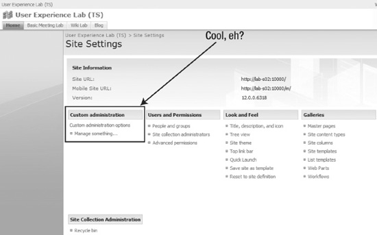
Figure 5-11. The fruits of your labor
Now you should begin to understand how to add menu items to virtually any menu in SharePoint. All you need are the Location and GroupId attributes, and you are good to go.
Tip Do you want to find all the possible Location and GroupId values? That is quite difficult. Microsoft does provide a large list in the documentation if you search for default custom action locations and IDs. That list is not exhaustive, though, so you may want to dig a bit to find the proper Location and GroupId values if you are missing a position. PersonalActions is an example of a Location and GroupId value that is not listed. Since you can create your own Location and GroupId values as well, no list can ever be exhaustive. A shovel and the will to dig are your best tools.
A final and important element is HideCustomAction. As the name implies, this element can remove existing CustomAction elements. The following code removes the “People and groups” link from the Users and Permissions category on the Site Settings page (and Figure 5-12 shows the result):
<HideCustomAction HideActionId="PeopleAndGroups"

    GroupId="UsersAndPermissions"

    Location="Microsoft.SharePoint.SiteSettings"/>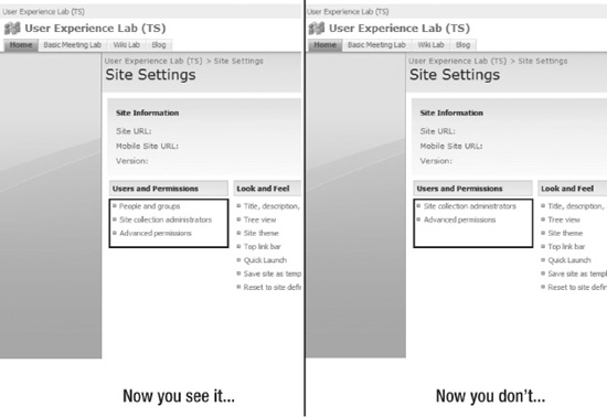
Figure 5-12. HideCustomAction snatches away “People and groups”
So if you want to replace any management links on the Site Settings page, just use RemoveCustomAction first, and then use CustomAction to provide your custom link. It’s an incredibly powerful option if I ever saw one.
Note No Microsoft-provided files were harmed during this exercise.
Using Control Templates
When you were searching for examples of where the FeatureMenuTemplate was used, you looked at two .ascx files, welcome.ascx and DefaultTemplates.ascx, located in the [12] TEMPLATECONTROLTEMPLATES folder. These control files are really just regular ASP.NET controls containing code used to render aspects of the user interface. If you are familiar with the ASP.NET template framework, you know there are no real secrets to the ASP.NET code.
Overview of Control Templates
There are some important things to note about how these controls are used, specifically, regarding the DefaultTemplates.ascx file. If you open that file, you will notice that it is composed solely of SharePoint:RenderingTemplate tags, each with a unique ID. You may even begin to see, from the ID values, what these templates do. Figure 5-13 shows the beginning of the file with the rendering templates collapsed.
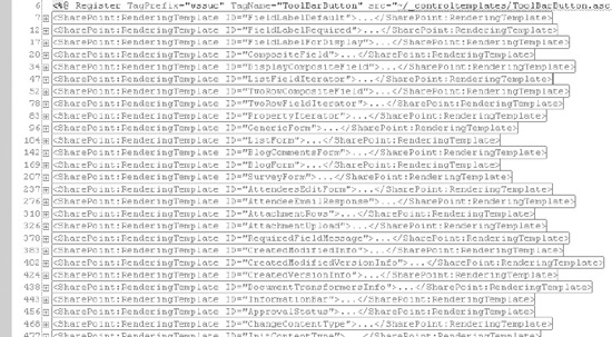
Figure 5-13. Beginning of DefaultTemplates.ascx
The “long story short” here is that each of these templates is responsible for creating an aspect of the user interface. Because of this, learning more about this file is incredibly important. I will show a few examples to illustrate what these templates do and then explain how you can use this information to modify the user experience.
Let’s start simple, shall we? Look for the rendering template with an ID value of TextField. It should look something like this:
<SharePoint:RenderingTemplate ID="TextField" runat="server">

    <Template>

        <asp:TextBox ID="TextField" MaxLength="255" runat="server"/><br>

    </Template>

</SharePoint:RenderingTemplate>
It’s nothing too fancy—just a simple text box. I expect you can imagine where this template is used. Try modifying the asp:TextBox, and see what happens when you add a new item to a list or library. Remember to reverse your changes, though, because Microsoft Support will eat your head if you modify any default files, as you know.
Here’s another example, which is a bit more complex this time:
<SharePoint:RenderingTemplate ID="NewFormToolBar" runat="server">
<Template>
<wssuc:ToolBar CssClass="ms-toolbar" id="toolBarTbl"
RightButtonSeparator=" " runat="server">
<Template_Buttons>
<SharePoint:AttachmentButton runat="server"/>
</Template_Buttons>
</wssuc:ToolBar>
</Template>
</SharePoint:RenderingTemplate>The NewFormToolBar template references a ToolBar control from the wssuc tag prefix, which, as you can see at the top of the DefaultTemplates.ascx file, is mapped to the ToolBar.ascx control, also residing in the [12]TEMPLATECONTROLTEMPLATES folder. Notice that the ToolBar tag has a child element of AttachmentButton. Now open the ToolBar.ascx file:
<table class="<%=CssClass%>" cellpadding="2" cellspacing="0"

       border="0" id="<%=ClientID%>" width="100%" >

  <tr>

<%-- Buttons on the left --%>

<wssawc:RepeatedControls id="RptControls" runat="server">

    <HeaderHtml/>

    <BeforeControlHtml>

        <td class="ms-toolbar" nowrap="true">

    </BeforeControlHtml>

    <AfterControlHtml>

        </td>

    </AfterControlHtml>

    <SeparatorHtml>

        <td class=ms-separator>|</td>

    </SeparatorHtml>

    <FooterHtml/>

</wssawc:RepeatedControls>

    <td width="99%" class="ms-toolbar" nowrap>

         <IMG SRC="/_layouts/images/blank.gif" width=1 height=18 alt="">

        </td>

<%-- Buttons on the right --%>

<wssawc:RepeatedControls id="RightRptControls" runat="server">

    <HeaderHtml/>

    <BeforeControlHtml>

        <td class="ms-toolbar" nowrap="true">

    </BeforeControlHtml>

    <AfterControlHtml>

        </td>

    </AfterControlHtml>
    <SeparatorHtml>

        <td class=ms-separator>|</td>

    </SeparatorHtml>

    <FooterHtml/>

</wssawc:RepeatedControls>

  </tr>

</table>
Note I have left out the directives at the top of the file to save space.
This file, along with its calling rendering template, is responsible for creating the toolbars that appear over the NewForm, EditForm, and DisplayForm forms (see Figure 5-14).
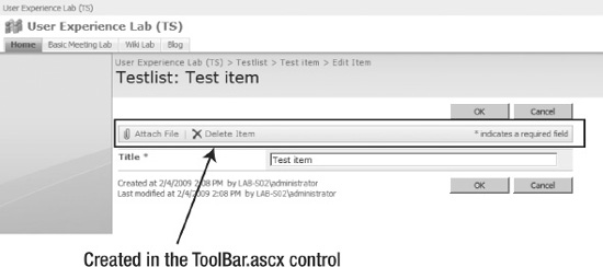
Figure 5-14. Result of ToolBar.ascx in NewFormToolbar. Don’t mind the list and item names.
I will suspend the mindless listing of code now; I just wanted to give you a few illustrative examples.
Manipulating the Control Templates
How does any of this help you? Again, you are faced with the agony of not being able to modify any default files. To the rescue comes the ability to overload any rendering template using a seemingly simple technique.
You can override each of the templates in DefaultTemplates.ascx by creating another .ascx file and putting that file in the CONTROLTEMPLATES folder. In the custom .ascx file, you add SharePoint:RenderingTemplate tags using the same Id as the template you want to override. A simple iisreset later, and you have changed which template is actually used to render a user interface element. Take a look at the following code to see an example of overriding the TextField rendering template (Figure 5-15 shows the result):
<SharePoint:RenderingTemplate ID="TextField" runat="server">

    <Template>
        <asp:TextBox BorderStyle="none" BorderWidth="0" ID="TextField"

            MaxLength="255" runat="server"/><br>

    </Template>

</SharePoint:RenderingTemplate>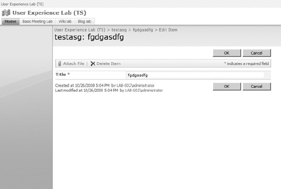
Figure 5-15. Result of overriding TextField. Notice the lack of borders on the text box.
Tip Get to know the DefaultTemplates.ascx file in more detail; there is gold to be had when you learn where each user interface element gets created.
This is all fine and dandy, but there are some troublesome catches here. First, you can override any template only once. If you attempt to override with a second .ascx file, only one of the overriding templates will take effect.
Second, the override is global, just like any addition to the [12]TEMPLATE folder. That means there is no scope for a template override, so if you override TextField, you should be prepared to see the effects on every site in every site collection. This may or may not be what you want; just be aware of these caveats, and you should be fine.
If you are looking to modify only a single text field column, you will likely be much better off creating a new field and rendering it the way you want. Chapter 9 details fields and columns.
Using Feature Stapling
Please take a moment and stare into my eyes. You will become sleepy; your eyes will become heavy. Listen to my voice as you slip away into a state of hypnosis. When I snap my fingers, you will wake up.
Features are great. Features are good. Love features. Features are your friends. You want to use features.
*Snap!*
Good morning, sunshine! (Features are great.) It’s time to move on to the next part of this chapter (features are great) that will focus on a wonderful method for modifying the default user experience (features are great).
If you feel a strong urge to use features, then you are indeed a wise developer. Features offer you the best method of adding functionality to a site.
The problem, however, is that if you want to add features to an existing site definition, such as the Team Site definition, you are out of luck. Sure, you can add, install, and activate features after the site has been created, but you cannot modify the site definition itself, both because Microsoft Support will have you flogged but more important because modifying a site definition after a site has been created from the definition is not supported.
Tip Microsoft KB article 898631 details the supported and unsupported methods of modifying site definitions. See http://support.microsoft.com/kb/898631 for more information.
To solve this problem, Microsoft has added a method called feature stapling. In essence, this functionality allows you to add, or staple as it is called, a feature to a site definition. This is very useful in some scenarios, especially when you want to abide by the rules of not modifying a site definition after a site has been created from the definition. Feature stapling allows you to bypass this problem by not modifying the site definition but rather appending to it.
To staple a feature, you add a FeatureSiteTemplateAssociation element to an elements file of a feature. The FeatureSiteTemplateAssociation has two attributes: Id is the ID of the feature to staple, and TemplateName is the name of the template, for instance, STS#0 or MYSiteDefinition#1. Here’s an example:
<FeatureSiteTemplateAssociation TemplateName="STS#0"

                                Id="3a79daf8-c5a2-4320-9915-c0df53a10742"/>
Now, whenever you create a new site from the STS#0 definition, the feature with Id 3a79daf8-c5a2-4320-9915-c0df53a10742 gets “stapled” to the site. This is particularly useful when sites are created automatically, such as when creating a new Meeting Workspace while adding a new calendar event.
There is one very important thing to know about feature stapling. Feature stapling works when provisioning a site but not on sites that have already been provisioned. So if you create a new Team Site before you staple your fancy new feature to the Team Site template, then your existing Team Site will not get the new feature automatically. You can still activate the feature manually, though.
There really isn’t too much more to say about feature stapling except a few tips.
Tip You can have a FeatureActivated event handler on the stapled feature and have code executed whenever a site gets created. That way, you can effectively have complete control over the site creation without ever touching the original site definition.
Tip You can also staple a feature to the global site definition to activate a feature on any new site, regardless of which definition is used.
Customizing Application Pages: Master Pages, CSS, and Themes
Have you ever tried to customize the application pages interface? If you have mucked around in application.master, you have already broken your supportability. If you search the Web, you will find a lot of creative solutions for handling design on application pages, including adding a custom HTTP module to intercept the page request runtime and change the application page. Sadly, none of these options is supported.
Note The term application pages refer to pages that reside in the _layouts directory site settings, list settings, user management settings, and so on. The _layouts directory is mapped to the [12] TEMPLATELAYOUTS folder.
The problem is that there is only one supported method for modifying the appearance of application pages, and that method is themes. When you set a theme for a site, you also set the theme for the application pages. This is great to some level but hardly satisfying when what you want to have is complete control over your management pages.
Using themes is basically just adding another CSS file to the mix. However, CSS deals only with style and visual elements, so you are out of luck if you want to actually focus on the user experience rather than the user interface.
Or are you…?
The fact that Microsoft does not support the editing of any of its files does not prevent you from doing exactly what you want to your own files. Adding files to the [12]TEMPLATELAYOUTS directory is both supported and encouraged as long as you do not overwrite any of the default files.
So, if you want to have your very own custom application pages, just create your own page. In fact, you can even copy Microsoft’s pages and modify the copies to create exactly the management experience you like. We will explore creating custom application management pages in Chapter 14.
Combined with what you learned earlier about modifying the Site Settings page using CustomAction and HideCustomAction, you can get pretty decent results without breaking any supportability. And the even better part is that if you decide to reverse the changes, then all you need to do is deactivate the feature. As if by magic, your old link to the Microsoft page reappears.
Using Delegate Controls
If you have no idea what delegate controls are, be prepared to learn an incredibly powerful new feature of WSS.
A delegate control is actually very simple in concept and works very much like a content placeholder that you know from regular ASP.NET. You create a DelegateControl in your page and then, using features, tell SharePoint what you want that delegate control to contain. The idea here is that you modify the page or pages using features, allowing you to deploy a page at one point and then later change how the page works.
Why is this so cool when modifying the default user experience? The default.master file that ships with SharePoint includes several delegate controls, meaning that you can modify the contents of default.master without even touching it.
Oh…there’s more. Listen to this: even the application.master file contains three delegate controls. You get to decide what is there. Talk about free ride to customization heaven.
Before you go around adding marquees and modifying CSS on your application pages, let’s get the basics down.
A delegate control has at least a ControlId attribute that is very important to you. When you want to fill the delegate control with custom goodness, you add a Control element to your elements.xml file and specify the ControlId value of the delegate control using the Id attribute.
In addition, you need to specify a Sequence number. The sequence is just an ordering integer; in case you have several features that fill the same delegate control, the feature with the lowest sequence number gets priority.
The final requirement of the Control element is to specify which control you want to put in the delegate control using the ControlSrc attribute. You can use any .ascx file that is accessible to the page. Take a look at the following code for an example:
<Control Id="AdditionalPageHead" Sequence="5"

         ControlSrc="~/_controltemplates/MyAdditionalPageHead.ascx"></Control>
Notice the Id attribute? Id refers to a delegate control present in the out-of-the-box default.master and application.master files. I’ve created a simple control in MyAdditionalPageHead.ascx just to illustrate this, but you can go completely bonkers and add basically anything you like. Here’s my simple sample:
<%@ Control Language="C#" ClassName="WebUserControl1" %>


<script runat="server">

    public override void RenderControl(HtmlTextWriter writer)

    {

        writer.Write("Look, no hands!");

    }

</script>
And, what demonstration would be complete without showing the mandatory result? Figure 5-16 should satisfy your wildest dreams of customization options.
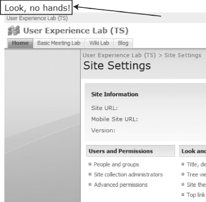
Figure 5-16. That should whet your appetite.
Tip You can also use ControlAssembly and ControlClass instead of ControlSrc if you have a compiled and strong-named server control that you want to use instead of the user control.
The application.master file gives you three delegate controls to fill with your heart’s desire. These are AdditionalPageHead, GlobalSiteLink1, and GlobalSiteLink2. If you examine the application.master files, however, you will notice that each GlobalSiteLink requires a feature scope of Farm, meaning you must have your feature scoped at the farm level in order for your control to fill these delegate controls.
The default.master file also gives you a few delegate controls for your enjoyment. The most commonly used delegate control is the search box. Microsoft uses this when it modifies the search box when you install MOSS or Search Server 2007. Table 5-1 lists other delegate controls you can use.
Table 5-1. Delegate Controls in default.master
| ControlId | Description |
AdditionalPageHead |
Part of the HEAD HTML tag; same as for application.master |
GlobalSiteLink0 |
Top of page, to the left of Welcome <Username> |
GlobalSiteLink1 |
Top of page, to the right of Welcome <Username> |
GlobalSiteLink2 |
Top of page, to the right of GlobalSiteLink1 |
SmallSearchInputBox |
Search box |
TopNavigationDataSource |
Navigation data source for top navigation bar |
PublishingConsole |
Mostly used for MOSS Publishing Pages feature |
QuickLaunchDataSource |
Navigation data source for QuickLaunch menu |
A delegate control, like a content placeholder, can have a default value to be used if no Control element is activated. This is the case, for example, for QuickLaunchDataSource and TopNavigationDataSource, which provide default data sources unless you (or any feature you activate) override the controls.
Cool, eh?
Last Stop
Everyone out! This chapter is finished. You saw a wide range of options you can use to customize the default user experience. Still, plenty more exist, but the ones I have shown here are the options I find most powerful.
A whole book could have been written focusing only on the default user experience, but since I want to cover more ground in this book, I must move on. When you have the time—after reading the remaining chapters, of course—here are some tips you might find useful:
- Never be afraid to explore in your lab environment. If you mess up, you can reinstall or revert to a previous snapshot if you have a virtual environment that supports snapshots. The price to pay for ignorance is far higher than that of the occasional reinstall.
- Be an active participant in online or offline communities. After spending several years in online communities, I can testify that what you learn from your peers far outweighs any effort required to participate.
- Seek to understand, not just perform. If you find a recipe for fixing a problem, understand why that recipe works rather than just performing the steps. Even if you don’t have the time to fully explore everything new you encounter, make a mental or physical note to yourself to go back at a later time.
- Oh, and value your designers. Just like we, as developers, might be or will be gurus of making SharePoint dance like a ballerina, designers are really good at making that ballerina look as great as she dances. Appearance is important to the user; Dirty Dancing would not have been as good if Dame Edna and Sir David Attenborough starred in it.
Next you’ll enter into the forest of lists to explore a very fundamental part of the SharePoint architecture. In the following two chapters, you will go into some very dark places and fight some really scary battles. Inside the forest of lists lurks a monster that has scared SharePoint developers from their senses for many moons. If you do survive, however, you will be rewarded with some very important treasure in the form of knowledge.
If you survive.