
Now that you are all up to speed with the theory, let's start putting it into practice. Today's Web is a very visual medium. The humble image tag has allowed web designers to turn dull and uninspiring documents into graphically rich experiences. Graphic designers quickly seized on the image tag (originally intended as a way to add visual content to a website) as a way of visually embellishing a page. In fact, if it wasn't for the invention of the image tag, the profession of web designer may never have evolved.
Unfortunately, we've used the image tag to clutter our pages with purely presentational images. Luckily, CSS gives us the ability to display an image on a page without it being part of the markup. This is achieved by adding an image as a background to an existing element. Through a series of practical examples, this chapter will show you how background images can be used to create a variety of interesting and useful techniques.
In this chapter, you will learn about
Fixed- and flexible-width rounded-corner boxes
The sliding doors technique
Multiple background images and the
border-radiuspropertyCSS drop shadows
Opacity and RGBa
Getting PNGs to work in older versions of Internet Explorer
Parallax scrolling
Image replacement
Applying a background image is easy. Say you want your website to have a nice tiled background. You can simply apply the image as a background to the body element:
body {
 background-image:url(/img/pattern.gif);
}
The default browser behavior is to repeat background images horizontally and vertically so that the image tiles across the whole of the page. For more control, you can choose whether your background image tiles vertically, horizontally, or not at all.
Gradients are very fashionable at the moment, so you may want to apply a vertical gradient to your page instead. To do this, create a tall but narrow gradient graphic. You can then apply this graphic to the body of the page and let it tile horizontally.
body {
 background-image: url(/img/gradient.gif);
  background-repeat: repeat-x;
}
Because the gradient has a fixed height, it will stop abruptly if the content of the page is longer than the height of the image. You could choose to create a really long image, possibly one that fades to a fixed color. However, it is always difficult to predict how long a page will become. Instead, simply add a background color as well. Background images always sit on the top of the background color, so when the image runs out the color will be displayed. If you choose a background color that is the same as the bottom of the gradient, the transition between image and background color will be seamless.
body {
 background-image: url(/img/gradient.gif);
  background-repeat: repeat-x;
  background-color: #ccc;
}
Tiling images can be useful in some situations. However, most of the time, you will want to add nontiled images to your page. For instance, say you want your web page to start with a large branding image. You could simply add the image directly into the page, and in many situations, this would be the correct thing to do. Yet if the image contains no information and is purely presentational, you may want to separate the image from the rest of your content. You can do this by creating a hook for the image in your HTML and applying the image using CSS. In the following example, I have added an empty div to the markup and given it an ID of branding. You can then set the dimensions of the div to be the same as the branding image, apply it as a background, and tell it not to repeat.
#branding {
  width: 700px;
  height: 200px;
  background-image:url(/img/branding.gif)
  background-repeat: no-repeat;
}
Last, it is possible to set the position of your background image. Say you want to add a bullet to every headline on your site, as shown in Figure 4-1. You could do something like this:
h1 {
  padding-left: 30px;
  background-image: url(/img/bullet.gif);
  background-repeat: no-repeat;
  background-position: left center;
}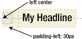
The last two keywords indicate the positioning of the image. In this case, the image will be positioned to the left of the element and vertically centered. As well as using keywords, you can set a background image's position using units such as pixels or percentages.
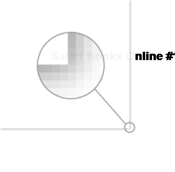
If you set a background position using pixels or ems, the top-left corner of the image is positioned from the top-left corner of the element by the specified number of pixels. So if you were to specify a vertical and horizontal position of 20 pixels, the top-left corner of the image will appear 20 pixels from the top-left corner of the element. However, background positioning using percentages works slightly differently. Rather than positioning the top-left corner of the background image, percentage positioning uses a corresponding point on the image. So if you set a vertical and horizontal position of 20 percent, you are actually positioning a point 20 percent from the top left of the image, 20 percent from the top left of the parent element (see Figure 4-2).
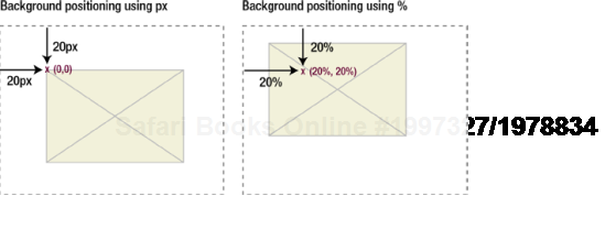
Figure 4.2. When positioning background images using pixels, the top-left corner of the image is used. When positioning using percentages, the corresponding position on the image is used.
If you want to position the previous bullet example using percentages instead of keywords, setting the vertical position to 50 percent would vertically center the bullet image:
h1 {
  padding-left: 30px;
  background-image: url(/img/bullet.gif);
  background-repeat: no-repeat;
  background-position: 0 50%;
}
The specification says that you are not supposed to mix units such as pixels or percentages with keywords. This seems like a nonsensical rule, and it's one that many modern browsers deliberately ignore. However, mixing units and keywords fails to work on certain browsers and will most likely invalidate your CSS. As such, it is best not to mix units with keywords at this time.
To save time, CSS also provides a shorthand version of the background property. This allows you to set all the properties in one go, rather than having to set them all individually.
h1 {
  background: #ccc url(/img/bullet.gif) no-repeat left center;
}
While background images are a simple concept to grasp, they form the basis of many advanced CSS techniques.
One of the first criticisms leveled against CSS-based designs was that they were very square and boxy. To get around this, people started creating designs that incorporated more organic curved shapes. Rounded-corner boxes very quickly became one of the most sought-after CSS techniques around. There are various ways of creating rounded-corner boxes. Each approach has its strengths and weaknesses, and the one you choose depends largely on your circumstances.
Fixed-width rounded-corner boxes are the easiest to create. They require only two images: one for the top of the box and one for the bottom. For example, say you want to create a box style like the one in Figure 4-3.
The markup for the box looks something like this:
<div class="box">
  <h2>Headline</h2>
    <p>Content</p>
</div>
In your favorite graphics package, you need to create two images like those in Figure 4-4: one for the top of the box and one for the bottom. The code and images for this and all the other examples in this book can be downloaded from www.cssmastery.com or www.friendsofed.com.
You then apply the top image to the heading element and the bottom image to the bottom of the box div. Because this box style just has a solid fill, you can create the body of the box by adding a background color to the box div.
.box {
  width: 418px;
background: #effce7 url(/img/bottom.gif) no-repeat left bottom;
}
.box h2 {
background: url(/img/top.gif) no-repeat left top;
}You will not want your content to butt up against the sides of the box, so you also need to add some padding to the elements inside the div:
.box {
width: 418px;
background: #effce7 url(/img/bottom.gif) no-repeat left bottom;
padding-bottom: 1px;
}
.box h2 {
background: url(/img/top.gif) no-repeat left top;
margin-top: 0;
padding: 20px 20px 0 20px;
}
.box p {
padding: 0 20px;
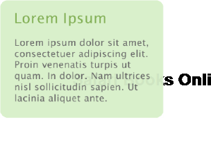
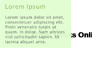
}This is great for a simple box with a solid color and no borders. But what if you want to create a fancier style, such as the one in Figure 4-5?
You can actually use the same approach, but this time, instead of setting a background color on the box, you can set a repeating background image. For this to work, you will need to apply the bottom curve image to another element. In this case, I used the last paragraph element in the box:
.box {
  width: 424px;
  background: url(/img/tile2.gif) repeat-y;
}

.box h2 {
  background: url(/img/top2.gif) no-repeat left top;
  padding-top: 20px;
}

.box .last {
  background: url(/img/bottom2.gif) no-repeat left bottom;
  padding-bottom: 20px;
}

.box h2, .box p {
  padding-left: 20px;
  padding-right: 20px;
}

<div class="box">
  <h2>Headline</h2>
   <p class="last">Content</p>
</div>
Figure 4-6 shows the resulting styled box. Because no height has been given to the box, it will expand vertically as the text size is increased.
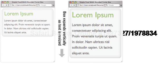
The previous examples will all expand vertically if you increase your text size. However, they do not expand horizontally, as the width of the box has to be the same as the width of the top and bottom images. If you want to create a flexible box, you will need to take a slightly different approach. Instead of the top and bottom curves consisting of a single image, they need to be made up of two overlapping images (see Figure 4-7).
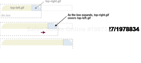
As the box increases in size, more of the larger image will be revealed, thus creating the illusion that the box is expanding. This concept is sometimes referred as the sliding doors technique because one image slides over the other, hiding it from view. More images are required for this method to work, so you will have to add a couple of extra, nonsemantic elements to your markup.
<div class="box">
  <div class="box-outer">
<div class="box-inner">
      <h2>Headline</h2>
        <p>Content</p>
    </div>
  </div>
</div>
This method requires four images: the top two images make up the top curve, and the bottom two images make up the bottom curve and the body of the box (see Figure 4-8). As such, the bottom images need to be as tall as the maximum height of the box. We will name these images top-left.gif, top-right.gif, bottom-left.gif, and bottom-right.gif.
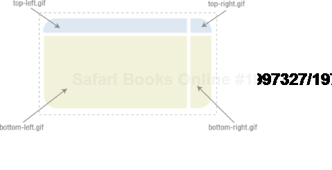
First, you apply the bottom-left.gif to the main box div and bottom-right.gif to the outer div. Next you apply top-left.gif to the inner div and finally top-right.gif to the heading. Last, it is a good idea to add some padding to space out the contents of the box a little.
.box {
  width: 20em;
  background: #effce7 url(/img/bottom-left.gif) no-repeat left bottom;
}


.box-outer {
  background: url(/img/bottom-right.gif) no-repeat right bottom;
  padding-bottom: 1em;
}
.box-inner {
background: url(/img/top-left.gif) no-repeat left top;
}
.box h2 {
background: url(/img/top-right.gif) no-repeat right top;
padding-top: 1em;
}
.box h2, .box p {
padding-left: 1em;
padding-right: 1em;
}In this example, I have set the width of the box in ems, so increasing the text size in your browser will cause the box to stretch (see Figure 4-9). You could, of course, set the width in percentages and have the box expand or contract depending on the size of the browser window. This is one of the main principles behind elastic and liquid layouts, something I will be covering later in the book.
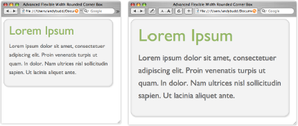
Figure 4.9. Flexible rounded-corner boxes expand both horizontally and vertically as the text is resized.
Note
The addition of a couple of extra nonsemantic elements is not ideal. If you only have a couple of boxes, it is probably something you can live with. But if you are concerned you could always add the extra elements using JavaScript (and the DOM) instead. For more details on this topic, see the excellent article by Roger Johansson of 456 Berea Street at www.456bereastreet.com/archive/200505/transparent_custom_corners_and_borders.
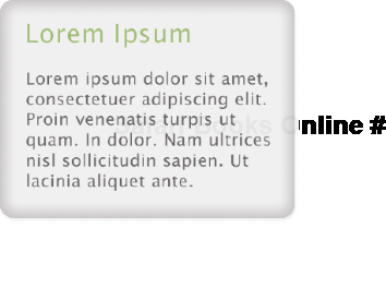
Mountaintop corners are a simple yet very flexible concept, first coined by Dan Cederholm of www.simplebits.com, author of the best-selling friends of ED book Web Standards Solutions (friends of ED, 2004 and updated 2009). Suppose you want to create a variety of different-colored rounded-corner boxes. Using the previous methods you would have to create different corner graphics for each color theme. This may be okay if you only had a couple of themes, but say you wanted to let your users create their own themes? You'd probably have to create the corner graphics dynamically on the server, which could get very complicated.
Fortunately, there is another way. Instead of creating colored corner graphics, you can create curved, bitmap corner masks (see Figure 4-10). The masked area maps to the background color you are using while the actual corner area is transparent. When placed over a colored box, they give the impression that the box is curved (see Figure 4-11).
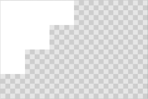
Figure 4.10. In a bitmapped corner mask, the white mask will cover the background color, creating a simple curved effect.
As these corner masks need to be bitmapped, subtle curves work best. If you try to use a large curve, it will appear jagged and unsightly.
The basic markup is similar to the previous method; it requires four elements to apply the four corner masks to:
<div class="box">
  <div class="box-outer">
    <div class="box-inner">
      <h2>Headline</h2>
        <p>Content</p>
    </div>
  </div>
</div>
The CSS is also very similar:
.box {
  width: 20em;
  background: #effce7 url(/img/bottom-left.gif)
  no-repeat left bottom;
}


.box-outer {
  background: url(/img/bottom-right.gif) no-repeat right bottom;
  padding-bottom: 5%;
}


.box-inner {
  background: url(/img/top-left.gif) no-repeat left top;
}


.box h2 {
  background: url(/img/top-right.gif) no-repeat right top;
  padding-top: 5%;
}
no-repeat left bottom;
}
.box-outer {
background: url(/img/bottom-right.gif) no-repeat right bottom;
padding-bottom: 5%;
}
.box-inner {
background: url(/img/top-left.gif) no-repeat left top;
}
.box h2 {
background: url(/img/top-right.gif) no-repeat right top;
padding-top: 5%;
}.box h2, .box p {
padding-left: 5%;
padding-right: 5%;
}
The main difference, apart from using different images, is the addition of a background color on the main box div. If you want to change the color of the box, you can simply change the color value in the CSS without having to re-create any new graphics. This method is only suitable for creating very simple boxes; however, it provides a great deal of flexibility and can be used over and over again on different projects.
The previous examples are great, but most of them rely on the addition of nonsemantic markup to your code. These extra elements are needed because you can only add one background image per element. Wouldn't it be great if you could add multiple background images instead? Well, through the magic of CSS 3 you can. What's more, the syntax is extremely simple and takes the same form as regular background images. The main difference is that instead of defining one background image to use, you can use as many images as you like. Here's how it's done:
.box {
  background-image: url(/img/top-left.gif),
                                              url(/img/top-right.gif),
                                              url(/img/bottom-left.gif),
                                              url(/img/bottom-right.gif);
  background-repeat: no-repeat,
                                         no-repeat,
                                         no-repeat,
                                         no-repeat;
background-position: top left,
top right,
bottom left,
bottom right;
}
<div class="box">
<h2>Headline</h2>
<p>Content<p>
</div>You start by defining all the images you want to use with the background-image property. Next, you set whether you want them to repeat on not. Last, you set their positions using the background-position property. You can see the results in Figure 4-12. Safari has supported multiple background images as far back as version 1.3, and the latest versions of Firefox and Opera have now started to catch up. Internet Explorer doesn't yet support multiple background images, but don't let that stop you from using this technique in situations where it doesn't matter if IE users see square corners instead.

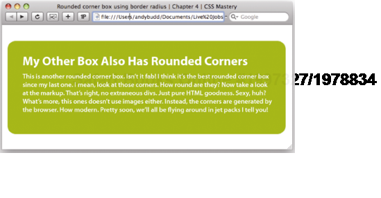
In these days of high-definition computer games with on-the-fly texture mapping, you would think that browsers would be able to draw a simple rounded corner box themselves, without the need of raster graphics. Well, now they can, thanks to the new CSS 3 border-radius property. All you need to do is set the radius of the desired border and let the browser do the rest (see Figure 4-13).
.box {
  border-radius: 1em;
}
Because this property is new, there is still some disagreement about how it should actually work. So until this property gets wider adoption, you'll need to use browser-specific extensions to invoke it. Currently, both Firefox and Safari support this property, so I'll use the −moz and −webkit prefixes.
.box {
-moz-border-radius: 1em;
-webkit-border-radius: 1em;
border-radius: 1em;
}
Note
Browser manufacturers are always experimenting with new extensions to CSS. Some of these may come from yet to be implemented versions of CSS, while others may find their way into the specifications at a later date. Some extensions may never become part of the formal specification, such as those used by Safari for rendering UI elements on the iPhone.
So as not to confuse other user agents or invalidate your code, these extensions can be invoked by adding a vendor-specific prefix to your selector, property, or value. For instance, Mozilla uses the -moz prefix, while Safari uses the -webkit prefix. There are similar prefixes for IE, Opera, and all the major browsers. Each browser has its own set of special features you can access using these prefixes, so you'll probably need to check which ones are available on the vendors developer site.
Using this mechanism, you can try out new CSS 3 features before they become an official recommendation. However, make sure you use these extensions with care, as the format of these experimental features may differ between browsers and could change or disappear by the time the specification becomes an official recommendation.
Last on my list of new CSS 3 tricks is the border-image property. This excellent addition to CSS allows you to define a single image to act as the border of an element. What good is a single image, you may ask? The beautify of this property is that it allows you to slice up that image into nine separate sectors, based on some simple percentage rules, and the browser will automatically use the correct sector for the corresponding part of the border. Known as nine-slice scaling, this technique helps avoid the distortion you'd normally get when resizing rounded corner boxes. It's a little difficult to visualize, so I think an example is in order.
Imagine you had a 100-pixel high image of a curved box, like the one in Figure 4-14. If you draw two lines 25 percent from the top and bottom of the box, then another two lines 25 percent from the left and the right, you will have divided the box up into nine sectors.
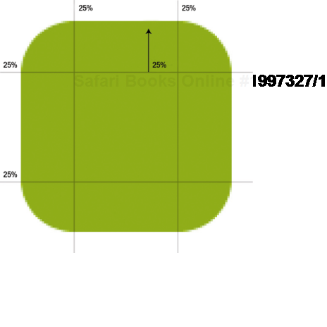
Figure 4.14. The source file for our border image, with the division points draw on for illustration purposes.
The border-image property will automatically use the images in each sector for the corresponding border. So the image in the top-left sector will be used for the top-left border, and the image in the middle-right sector for the right-hand-side border. I want my borders to be 25 pixels wide, so I set that as the width in my CSS. If the images aren't big enough, they will automatically tile, creating an expandable box (see Figure 4-15). Here is how you achieve this effect in code:
.box {
  -webkit-border-image: url(/img/corners.gif)
  25% 25% 25% 25% / 25px round round;
}
Safari has supported this property for a while, through the use of the Webkit-specific extension, as shown in this example. Firefox 3.5 and Opera 9.5 now also support border-image, which opens up its use to a much wider audience.

Drop shadows are a popular and attractive design feature, adding depth and interest to an otherwise flat design. Most people use a graphics package like Photoshop to add drop shadows directly to an image. However, using the power of CSS, it is possible to apply simple drop shadow effects without altering the underlying image.
There are various reasons you may want to do this. For instance, you may allow nontechnical people to administer your site who have no experience using Photoshop, or you may simply be uploading images from a location where you do not have access to Photoshop, such as an Internet cafe. By having a predefined drop shadow style, you can simply upload a regular image and have it displayed on your site with a drop shadow.
One of the nicest benefits of using CSS is that it is nondestructive. If you decide that you want to remove the drop shadow effect later on, you can simply alter a couple of lines in your CSS files rather than having to reprocess all of your images.
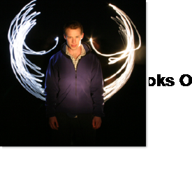
This very simple drop shadow method was first described by Dunstan Orchard of www.1976design.com. It works by applying a large drop shadow graphic to the background of a wrapper div. The drop shadow is then revealed by offsetting the image using negative margins.
The first thing you need to do is create the drop shadow graphic. I created my drop shadow graphic using Adobe Photoshop. Create a new Photoshop file, the dimensions of which are as large as the maximum size of your image. I created a file that's 800 pixels by 800 pixels just to be on the safe side. Unlock the background layer and fill it with the color you want your shadow to sit on. In my case I simply kept the background layer white. Create a new layer and fill it with white. Now move this layer up and left by 4 or 5 pixels and then apply a 4- or 5-pixel-wide drop shadow to this layer. Save this image for web and call it shadow.gif (see Figure 4-16).
The markup for this technique is very simple:
<div class="img-wrapper"><img src="dunstan.jpg" width="300"height="300" alt="Dunstan Orchard" /></div>
To create the effect, you first need to apply your shadow graphic to the background of the wrapper div. Because divs are block-level elements, they stretch horizontally, taking up all the available space. In this situation we want the div to wrap around the image. You can do this by explicitly setting a width for the wrapper div, but doing so reduces the usefulness of this technique. Instead, you can float the div, causing it to shrink-wrap on modern browsers, with one exception—IE 5.x on the Mac. You may want to hide these styles from IE 5.x on the Mac. For more information on hiding rules from various browsers, see Chapter 8, which discusses hacks and filters.
.img-wrapper {
background: url(/img/shadow.gif) no-repeat bottom right;
clear: right;
float: left;
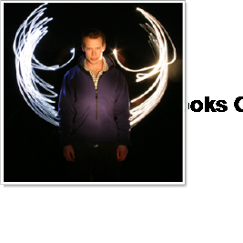
}To reveal the shadow image and create the drop shadow effect (see Figure 4-17), you need to offset the image using negative margins:
.img-wrapper img {
margin: −5px 5px 5px −5px;
}
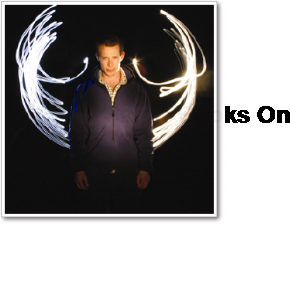
You can create a good, fake photo border effect by giving the image a border and some padding (see Figure 4-18):
.img-wrapper img {
  background-color: #fff;
  border: 1px solid #a9a9a9;
  padding: 4px;
  margin: −5px 5px 5px −5px;
}
This works for most modern, standards-compliant browsers. However, we need to add in a couple of simple rules to get it working correctly in IE 6:
.img-wrapper {
  background: url(/img/shadow.gif) no-repeat bottom right;
  clear: right;
  float: left;
  position: relative;
}


.img-wrapper img {
  background-color: #fff;
  border: 1px solid #a9a9a9;
  padding: 4px;
  display: block;
  margin: −5px 5px 5px −5px;
  position: relative;
}
The drop shadow effect now works in IE 6.
Richard Rutter of www.clagnut.com came up with a similar method for creating drop shadows. Instead of using negative margins, his technique uses relative positioning to offset the image:
.img-wrapper {
  background: url(/img/shadow.gif) no-repeat bottom right;
  float:left;
  line-height:0;
}


.img-wrapper img {
  background:#fff;
  padding:4px;
  border:1px solid #a9a9a9;
  position:relative;
  left:-5px;
  top:-5px;
}While the previous techniques server their purpose, they are all a little cumbersome. Wouldn't it be good if browsers could create their own drop shadows, doing away with the need of Photoshop filters and raster graphics? Well you guessed it, CSS 3 allows us to do this as well, using the handy box-shadow property. This property takes four values: the vertical and horizontal offsets, the width (and hence blurriness) of the shadow, and the color. So in the following example, I am offsetting the shadow by three pixels, making it six pixels wide and medium gray (see Figure 4-19).
img {
  box-shadow: 3px 3px 6px #666;
}
Because this is another one of those experimental CSS 3 properties, you will need to use the Safari and Firefox extensions for now. However, it hopefully won't be long until this property is more widely supported.
img {
  -webkit-box-shadow: 3px 3px 6px #666;
  -moz-box-shadow: 3px 3px 6px #666;
  box-shadow: 3px 3px 6px #666;
}
One of the most exciting things about this property is the fact that it works in conjunction with the border-radius property (see Figure 4-20). This means you can now programmatically create drop shadows on rounded corner boxes without even having to open up your graphics package!
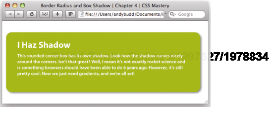
We used this effect quite liberally on the UX London 2009 website, serving up drop shadows to modern browsers (see Figure 4-21), and regular boxes to less-capable browsers (see Figure 4-22).


The clever use of opacity can give your designs an extra dimension. It can also be used to layer elements over each other, so you get a hint of what lies beneath. As well as being a cool trick, this can also be used to improve the usability on your site.
CSS opacity has been available in most modern browsers for quite some time, so I'm surprised that it's not used more often. Unsurprisingly, it isn't supported by older version of Internet Explorer. However, a quick bit of IE-specific code will fix that problem. As an example of its use, imagine you wanted to pop up an alert message to your users, layering it over the existing document so they could still see what was underneath (see Figure 4-23).
.alert {
  background-color: #000;
  border-radius: 2em;
  opacity: 0.8;
  filter: alpha(opacity=80); /*proprietary IE code*/
}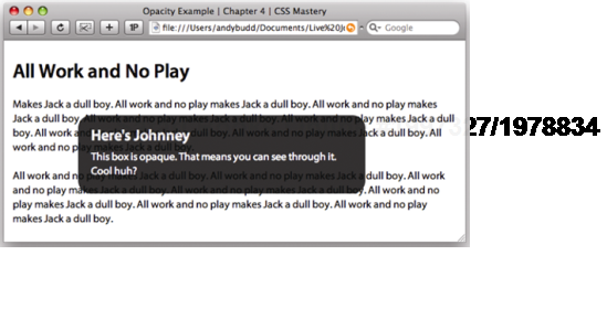
The one big problem with CSS opacity is that it's inherited by the contents of the element you're applying it to, as well as the background. So if you look closely at Figure 4-23, you'll see that the text on the page is showing through the alert text as well. This doesn't matter if you're using a very high opacity in combination with high-contrast text. However, with lower opacities, the content of your box can start to get unreadable. This is where RGBa comes in.
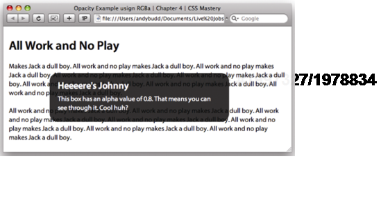
RGBa is a mechanism for setting color and opacity in one go. RGB stands for "Red," "Green," and "Blue," while the "a" stands for "alpha transparency." To use RGBa in the previous example, you would do something like this:
.alert {
  background-color: rgba(0,0,0,0.8);
  border-radius: 2em;
}
The first three numbers represent the red, green, and blue values of the color. In this case, the alert box is going to be black, so these are all set to 0. As with opacity, the last number is the decimal value of opacity, so 0.8 means this background will be 80 percent opaque, or to put it another way, 20 percent transparent. A value of 1 would make the alert 100 percent opaque, while a value of 0 would make it fully transparent. The results of this technique are shown in Figure 4-24.
One of the biggest benefits of the PNG file format is its support for alpha transparency. This allows you to get really creative with your designs (see Figure 4-25). Unfortunately, Internet Explorer 6 doesn't natively support PNG transparency, although IE 7 and 8 do. However, there are a couple of ways you can get older versions of Internet Explorer to play ball.
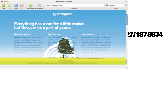
Figure 4.25. The old Revyver site had a beautiful example of PNG transparency at the bottom of the viewport. As the page scrolled, you would get glimpses of the content show through the branches of the tree and arcs of the rainbow.
The best-known way of forcing PNG transparency support in IE 6 is to use the proprietary AlphaImageLoader filter. To do this, you need to include the following line of code in your CSS.
filter:progid:DXImageTransform.Microsoft.AlphaImageLoader
(src=/img/my-image.png', sizingMethod='crop'),
Unfortunately, using this code will invalidate your CSS, so your best option is to filter this off into a separate IE 6–specific style sheet.
.img-wrapper div {
  filter:progid:DXImageTransform.Microsoft.AlphaImageLoader
  (src='/img/shadow2.png', sizingMethod='crop'),
  background: none;
}
The first rule uses a proprietary filter to load in the PNG and enforce alpha transparency. The original background image will still be displayed, so the second rule simply hides the original background image.
Internet Explorer has another piece of proprietary code called a conditional comment that will let you serve up a particular stylesheet to specific versions of IE. In this case, you only want IE 6 to see the new stylesheet, so you can place the following code in the head of the page:
<!--[if ie 6]>
<link rel="stylesheet" type="text/css" href="ie6.css"/>
<![endif]-->
Note
Don't worry too much about conditional comments at this stage; you will learn all about them in detail in Chapter 8.
The problem with this technique is that it forces you to include this line of code for every alpha-transparent PNG you want to use. As such, it is somewhat cumbersome to use.
The other alternative is to use a technique known as the IE PNG fix. This involves using a little-known, Microsoft-specific extension to CSS called behaviors. By downloading the appropriate .htc file and pointing to it in your IE 6–specific stylesheet, you can enable PNG transparency on any element you want.
img, div {
   behavior: url(iepngfix.htc);
}
For more information on this technique and to download the .htc file, visit www.twinhelix.com/css/iepngfix.
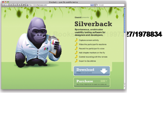
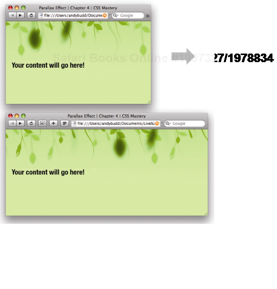
Background images aren't only about creating rounded corner boxes and drop shadows. We can have a lot of fun with them as well. Clearleft did just that when we launched our Silverback usability testing application. If you go to www.silverbackapp.com and resize the browser window, you will notice a strange effect (see Figure 4-26). The background images move at slightly different speeds, giving the impression that the page has depth. This phenomenon is known as parallax scrolling and was the mainstay of many old school computer games.
To achieve this effect, you first need to create a couple of different background images. We created one image of our vines on a green background and then two further images of vines on an alpha transparent background. This allowed the midground and foreground images to flow over each other and the background, without obscuring the view.
The main background will be applied to the body element. However, assuming we're not using CSS 3 multiple-background images, we'll need to add two new elements to attach our backgrounds to. The content of the page then needs to sit in front of these elements so you can interact with it. You could place the foreground div in front of the content, but this would partially block your content and make it difficult to interact with. So the markup structure will look something like this:
<body>
  <div class="midground">
    <div class="foreground">
      <p>Your content will go here!</a>
    </div>
  </div>
</body>
The first thing you need to do is add the main background to the body element. You want this image to tile horizontally, so you will need to set the image-repeat property to repeat-x. You also want the body element to take on the color of the background, which in this instance is light green. Last, you want to offset your image horizontally by 20 percent, relative to the size of the window. This is where the magic happens. As the window resizes, the position of the background image will change, and it will appear to move across the screen.
body {
  background-image: url(/img/bg-rear.jpg);
  background-repeat: repeat-x;
  background-color:#d3ff99;
  background-position: 20% 0;
}
You now need to do the same with the midground and foreground images, choosing higher percentages so they move faster relative to each other and give that sense of depth. We decided to set the midground's position to 40 percent, and the foreground position to a whopping 150 percent. You can obviously play around with these positions to generate the effect that is right for you.
body {
  background-image: url(/img/bg-rear.jpg);
  background-repeat: repeat-x;
  background-color:#d3ff99;
  background-position: 20% 0;
}


.midground {
  background-image: url(/img/bg-mid.png);
  background-repeat: repeat-x;
  background-color: transparent;
  background-position: 40% 0;
}


.foreground {
  background-image: url(/img/bg-front.png);
  background-repeat: repeat-x;
  background-color: transparent;
  background-position: 150% 0;
}
HTML text is great. Search engines can read it; you can copy and paste it; and it enlarges if you increase the text size in your browser. It is, therefore, a good idea to use HTML text instead of text as images wherever possible. Unfortunately, web designers have only a limited selection of fonts to play with. Also, while you can control your typography to a certain extent using CSS, some things just are not possible with live text. Because of this, there are occasions, usually for branding reasons, when you will want to use images of text instead.
Rather than embed these images directly in the page, CSS authors came up with the idea of image replacement. Essentially, you add your text to the document as normal, and then, using CSS, you hide the text and display a background image in its place. That way, search engines still have the HTML text to find, and the text will be available if you disable CSS.
This seemed like a great idea for a while, until various flaws emerged. Some of the more popular methods are inaccessible to screen readers, and most do not work with images turned off but CSS turned on. As a result, many CSS authors have stopped using image replacement methods and have reverted to using plain text. While I advocate avoiding image replacement where possible, I still believe there can be situations where it is appropriate, such as when you need to use a particular font because of corporate branding guidelines. To do this, you should have a good grasp of the various techniques available and understand their limitations.
Created by Todd Fahrner, Fahrner Image Replacement (FIR) is the original, and probably the most popular, image replacement technique. I am going to explain this method because of its historical significance and because it is one of the easiest methods to understand. However, this method has some serious accessibility implications, which I will come to in a moment, and should thus be avoided.
The basic concept is very simple. You wrap the text you want to replace in a span tag:
<h2>
  <span>Hello World</span>
</h2>
You then apply your replacement image as a background image to the heading element:
h2 {
  background:url(hello_world.gif) no-repeat;
  width: 150px;
  height: 35px;
}
and hide the contents of the span by settings its display value to none:
span {
  display: none;
}
This method works like a charm, but it is this last rule that causes problems. Many of the most popular screen readers ignore elements that have their display value set to none or their visibility to hidden. Therefore, they will completely ignore this text, causing a huge accessibility problem. So a technique intended to improve the accessibility of a site actually has the opposite effect. For this reason, it is best not to use this technique.
Mike Rundle of www.phark.net invented a screen-reader–friendly image replacement technique that has the added benefit of dropping the extra, nonsemantic div:
<h2>
  Hello World
</h2>
Instead of using the display property to hide the text, the Phark method applies a very large, negative text indentation to the headline:
h2 {
  text-indent: −5000px;
  background:url(/img/hello_world.gif) no-repeat;
  width: 150px;
  height:35px;
}
This method works well and solves the screen reader issue. However, as with the FIR method, this method does not work when images are turned off but CSS is turned on. This is an edge case and probably only applicable to people on very slow connections or those using their cell phones as a modem. There is an argument that site visitors do have the ability to turn images on and they just choose not to. However, it is worth bearing in mind that certain people may not see the replaced text, so it is best to avoid using this method for crucial information or navigation.
One of the main problems image replacement tries to solve is the lack of fonts available on most computers. Rather than swap the text out with images of text, Mike Davidson and Shaun Inman took an altogether more inventive approach.
Flash allows you to embed fonts into a SWF file, so instead of swapping the text out for an image, they decided to swap the text out and replace it with a Flash file. The swapping is done using JavaScript by looping through the document and grabbing any text within a particular element or with a particular class name. The JavaScript then swaps the text for a small Flash file. The really clever part comes next. Rather than creating a separate Flash file for each chunk of text, this technique places the swapped text back into a single, duplicated Flash file. Thus, all you need to do to trigger your image replacement is add a class, and the combination of Flash and JavaScript will do the rest. Another benefit is that the text in Flash files can be made selectable, meaning that it can be copied and pasted with ease.
Shaun Inman released his Flash image replacement method and dubbed it Inman Flash Replacement, or IFR for short. IFR is a very lightweight method. Details about this method, including the source code, can be found at www.shauninman.com/plete/2004/04/ifr-revisited-and-revised.
Mike Davidson built extensively on this method, creating the Scalable Inman Flash Replacement (sIFR) method. This method extends IFR by allowing things such as multiline text replacement and text resizing. sIFR is now being maintained and developed by Mark Wubben and contains lots of interesting new features.
To use sIFR on your site, you first need to download the latest version from http://novemberborn.net/sifr3. Installing sIFR on your site is fairly simple, although it's worth reading through the documentation first. The first thing you need to do is open the Flash file, embed the font you want to use, and export the movie. For sIFR to work properly, you next need to apply the enclosed print and screen styles or create your own. Next, add the sifr.js JavaScript file to every page you want sIFR to work on. This file is highly configurable and allows you to specify which elements to replace, the text color, padding, case, and a variety of other stylistic elements. However, padding and line-height both affect the size of the text, so in practice, this isn't easy. Once you are finished, upload all the files to your server and watch your tired old fonts be replaced with dynamic Flash content.
The main problem with these techniques involves load times. The pages have to load fully before JavaScript can replace the text. Consequently, there is usually a brief flicker before all the text has been replaced with the Flash equivalent (see Figure 4-28).
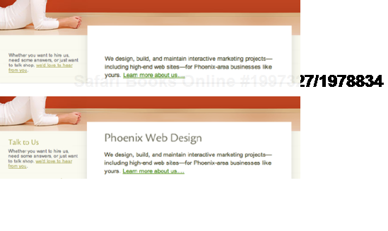
Figure 4.28. Notice how the headlines at www.fortymedia.com only display once the page has loaded. This is a sure sign that sIFR is being used on this site.
Although this flicker is not a huge problem, it is noticeable and can give the impression that the page is loading slowly. Also, some pages can feel a little sluggish if there is a lot of Flash replacement going on. Furthermore users can get a "flash of unstyled content," which can look buggy and disorientating. As such, it's a good idea to keep any replacement to a minimum and limit this technique to main headlines only. sIFR is a great way to bring richer typography to the web and is perfect for relatively small sites with consistent typographic treatment. However, sIFR can be extremely fiddly when applied to large sites with multiple heading sizes, styles, and colors. It also gets tricky if some headings span multiple lines or have background colors. So my advice would be to avoid using sIFR for large projects and limit it to your personal site.
In this chapter, you have learned how background images can be applied to elements to produce a variety of interesting techniques, such as flexible rounded-corner boxes and pure CSS drop shadows. You have also seen how the onset of new CSS 3 properties like border-radius and box-shadow are beginning to make these effects redundant. You have learned all about opacity and seen how to force PNG support in Internet Explorer along with several methods of image replacement.
In the next chapter, you will learn how background images and links can be combined to create some interesting interactive effects.