
The human race is a naturally inquisitive species. We just love tinkering with things. When I recently bought a new iMac, I had it to bits within seconds, before I'd even read the instruction manual. We enjoy working things out ourselves and creating our own mental models of how we think things behave. We muddle through and only turn to the manual when something goes wrong or defies our expectations.
One of the best ways to learn Cascading Style Sheets (CSS) is to jump right in and start tinkering. In fact, I imagine this is how the majority of you learned to code, by picking things up off blogs, viewing source to see how things worked, and then trying them out on your personal sites. You almost certainly didn't start by reading the full CSS specification, which is enough to put anyone to sleep.
Tinkering is a great way to start, but if you're not careful, you may end up misunderstanding a crucial concept or building in problems for later on. I know; I've done so several times. In this chapter, I am going to review some basic but often misunderstood concepts and show you how to keep your HTML and CSS clear and well structured.
In this chapter you will learn about
Structuring your code
The importance of meaningful documentation
Naming conventions
When to use IDs and class names
Microformats
Different versions of HTML and CSS
Document types, DOCTYPE switching, and browser modes
Most people don't think about the foundations of a building. However, without solid foundations, the majority of buildings wouldn't stay standing. While this book is about advanced CSS techniques, much of what you are about to learn would not be possible (or at least would be very difficult) without a well-structured and valid HTML document to work with.
In this section, you will learn why well-structured and meaningful HTML is vital to standards-based development. You will also learn how you can add more meaning to your documents, and by doing so, make your job as a developer easier.
The early Web was little more than a series of interlinked research documents using HTML to add basic formatting and structure. However, as the World Wide Web gained in popularity, HTML started being used for presentational purposes. Instead of using heading elements for page headlines, people would use a combination of font and bold tags to create the visual effect they wanted. Tables got co-opted as a layout tool rather than a way of displaying data, and people would use blockquote to add whitespace rather than to indicate quotations. Very quickly, the Web lost its meaning and became a jumble of font and table tags. Web designers came up with a name for this kind of markup; they called it tag soup (see Figure 1-1).
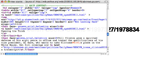
Figure 1.1. The markup for the lead story from abcnews.com on August 14, 2000, uses tables for layout and large, bold text for headings. The code lacks structure and is difficult to understand
As web pages became more and more presentational, the code became increasingly difficult to understand and maintain. WYSIWYG (What You See Is What You Get) editors offered authors an escape from these complexities and promised a brave new world of visual layout. Unfortunately, rather than making things simpler, these tools added their own complicated markup to the mix. Editors like FrontPage or Dreamweaver allowed users to build complex table layouts at the click of a button, cluttering the code with nested tables and "spacer GIFs" (see Figure 1-2). Sadly, these layouts were extremely fragile and prone to breaking. Because the markup was littered with meaningless code, it was easy to delete the wrong tag and watch the whole layout crumble. Furthermore, due to the complexity of the code, bug hunting was almost impossible. It was often easier to code the page from scratch than hunt around in the hope of fixing the bug. Things were further complicated if you were working on a large site. Because the presentation of the site was locked into the individual pages, you had to craft complicated "find and replace" routines to make even the smallest sitewide change. I've broken more than one site in my time because of a hastily constructed "find and replace" routine. Consequently, your page templates would go out of sync extremely quickly, and a simple change could mean hand editing every page on your site.
Tables were never meant for layout, so David Siegel invented a clever hack to make them work. In order to prevent tables from horizontally or vertically collapsing, Siegel suggested using a 1-pixel transparent GIF. By putting these hidden images in their own table cells and then scaling them vertically or horizontally, you could artificially enforce a minimum width on the cells, thus preserving the layout. Also known as a "shim GIF" because of the file name given to them in Dreamweaver, they were an extremely common sight in old school table-based layouts. Thankfully, the practice has now died out, so you no longer see these presentational elements cluttering up your code.
Rather than being seen as a simple markup language, HTML gained a reputation for being complicated, confusing, and prone to errors. Consequently, many people were afraid of touching the code, which resulted in an overreliance on visual editors and spawned a whole generation of designers that didn't understand how to code.
By the turn of the millennium, the web design industry was in a mess, and something needed to be done.
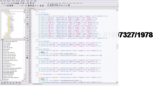
Figure 1.2. A screenshot of Homesite showing a complicated table-based layout using lots of spacer GIFs (courtesy of Jeff L.).
Then along came Cascading Style Sheets. CSS allowed authors to control how a page looked through an external style sheet, making it possible to separate the content from presentation. Now, sitewide changes could be made in one place and would propagate throughout the system. Presentational tags like the font tag could be ditched, and layout could be controlled using CSS instead of tables. Markup could be made simple again, and people began to develop a newfound interest in the underlying code.
Meaning started to creep back into documents. Browser default styles could be overridden, so it became possible to mark up something as a heading without it being big, bold, and ugly. Lists could be created that didn't display as a series of bullet points, and blockquotes could be used without the associated styling. Developers started to use HTML elements because of what they meant rather than how they looked (see Figure 1-3).
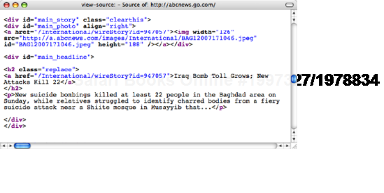
Figure 1.3. The markup for the lead story on abcnews.com from earlier this year is well structured and easy to understand. While it does contain some presentational markup, the code is a significant improvement on the code in Figure 1-1.
Meaningful markup provides the developer with several important benefits. Meaningful pages are much easier to work with than presentational ones. For example, say you need to change a quotation on a page. If the quotation is marked up correctly, it is easy to scan through the code until you find the first blockquote element. However, if the quotation is just another paragraph element, it will be a lot harder to find. For a more complicated, but no less realistic example, say that you needed to add an extra column to your homepage. You could simply drop the content in at the right point and then update the widths in your CSS. To do the same in a table-based layout you'd need to add an extra column in your table, change the colspan settings, alter the widths on all the cells, and change the widths of all your shim gifs. In effect, you'd have to change the entire structure of your page to accommodate this simple change.
As well as being easy for humans to understand, meaningful markup—otherwise known as semantic markup—can be understood by programs and other devices. Search engines, for instance, can recognize a headline because it is wrapped in h1 tags and assign more importance to it. Screen reader users can rely on headings as supplemental page navigation.
Most importantly for the context of this book, meaningful markup provides you with a simple way of targeting the elements you wish to style. It adds structure to a document and creates an underlying framework to build upon. You can style elements directly without needing to add other identifiers, and thus avoid unnecessary code bloat.
HTML includes a rich variety of meaningful elements, such as
h1,h2, and so onul,ol, anddlstrongandemblockquoteandciteabbr,acronym, andcodefieldset,legend, andlabelcaption,thead,tbody, andtfoot
As such, it is always a good idea to use an appropriate meaningful element where one exists.
Every few years the CSS versus tables argument seems to flare up on blogs, mailing lists, or developer forums. The discussion is usually sparked when developers who have grown accustomed to the table-based approach rebel against the idea of having to learn a new skill. I can sympathies with this reaction, as CSS-based layout does seem difficult at first, especially when your current process seems to work. However, the benefits of CSS have been debated numerous times and include things like less code bloat, faster downloads, and easier maintenance to name just three. Most professional developers have come to see the benefits of web standards, and it's rare to see an agency of any size or quality doing things the old-fashioned way. So if you're still using table based layout, you're going to find it increasingly difficult to get work with agencies. Thankfully, these old habits are dying out, and there is a whole new generation of developers who have never had to suffer the inconvenience of table-based layout.
Meaningful elements provide an excellent foundation, but the list of available elements isn't exhaustive. HTML 4 was created as a simple document markup language rather than an interface language. Because of this, dedicated elements for things such as content areas or navigation bars just don't exist. You could create your own elements using XML, but for reasons too complicated to go into, it's not very practical.
HTML 5 hopes to solve some of these problems by providing developers with a richer set of elements to work with. These include structural elements like header, nav, article, section, and footer as well as well as new UI features like data inputs and the menu element. In preparation for HTML 5, many developers have started adopting these as naming conventions for their ID and class names.
The next best thing is to take existing elements and give them extra meaning with the addition of an ID or a class name. This adds additional structure to your document and provides useful hooks for your styles. So you could take a simple list of links, and by giving it an ID of nav, create your own custom navigation element.
<ul id="nav">
  <li><a href="/home/">Home</a></li>
  <li><a href="/about/">About Us</a></li>
  <li><a href="/contact/">Contact</a></li>
</ul>
An ID is used to identify a specific element, such as the site navigation, and must be unique to that page. IDs are useful for identifying persistent structural elements such as the main navigation or content areas. They are also useful for identifying one-off elements—a particular link or form element, for example.
While a single ID name can only be applied to one element on a page, the same class name can be applied to any number of elements on a page. This makes classes much more powerful. Classes are useful for identifying types of content or similar items. For instance, you may have a page that contains multiple news stories.
<div id="story-id-1">
  <h2>Salter Cane win Best British Newcomer award</h2>
     <p>In a surprise turn of events, alt folk group, Salter Cane, won
Best British Newcomer and the Grammys this week...</p>
</div>


<div id="story-id-2">
  <h2>Comic Sans: The Movie wins best documentary at the BAFTAs </h2>
     <p>The story of this beloved typeface one the best documentary
category. Director Richard Rutter was reported to be speechless...</p>
</div>
Best British Newcomer and the Grammys this week...</p>
</div>
<div id="story-id-2">
<h2>Comic Sans: The Movie wins best documentary at the BAFTAs </h2>
<p>The story of this beloved typeface one the best documentary
category. Director Richard Rutter was reported to be speechless...</p>
</div>Rather than giving each story a separate ID, you would give them all a class of news.
<div class="news">
  <h2>Salter Cane win Best British Newcomer award</h2>
     <p>In a surprise turn of events, alt folk group, Salter Cane, won
Best British Newcomer and the Grammys this week...</p>
</div>
<div class="news">
<h2>"Comic Sans: The Movie" wins best documentary at the BAFTAs </h2>
<p>The story of this beloved typeface one the best documentary
category. Director Richard Rutter was reported to be speechless...</p>
</div>When naming your IDs and classes, it is important that you keep the names as "unpresentational" as possible. For instance, if you want all of your form notification messages to be red, you could give them a class of red. This is fine as long as there are no other red elements on the page. However, say you wanted to style required form labels red as well. You are now forced to guess to which element that class could refer, and things are already starting to get confusing. Imagine how confusing the code could become if you used presentational elements across the whole site? This gets even more complicated if you decide to change the presentation of your form notifications from red to yellow. Now, you either have to go back and change all your class names, or you have an element called red that looks yellow.
Instead, it makes sense to name your elements based on what they are rather than how they look. That way your code will have more meaning and never go out of sync with your designs. So in the previous example, rather than giving your notifications a class of red, you should give them a more meaningful name like .warning or .notification (see Figure 1-4). The great thing about meaningful class names is that you can reuse them across your site. For instance, you could also use the class of .notification on other types of messages, and style them completely differently based on where they are in the document.
When writing class and ID names, you need to pay attention to case sensitivity, as browsers assume .andybudd is a different class from .andyBudd. The best way to handle this issue is simply to be consistent with your naming conventions. I always keep all my class and ID names lowercase and separate multiple words with a hyphen for legibility. So andy-budd is more legible than andyBudd.
It is often difficult to decide if an element should have an ID or class name. As a general rule, classes should be applied to conceptually similar items that could appear in multiple places on the same page, whereas IDs should be applied to unique elements. However, you then get into a debate about which elements are conceptually similar and which elements are unique.
For instance, imagine you have a site that contains primary navigation in the header, page-based navigation at the bottom of the search results page, and tertiary navigation in the footer. Do you give each of these a separate ID like main-nav, page-nav, and footer-nav, or do you give them all a class of nav and style them based on their position in the document? I used to prefer the former approach, as it felt slightly more targeted. However, it comes with its own set of problems. What happens if I decide that I now need search results navigation at the top and the bottom of the search page or that I need two levels of navigation in the footer?
If you use a lot of IDs, you will start to run out of unique names very quickly and end up creating extremely long and complicated naming conventions. So these days, I tend to prefer class names and only use IDs if I'm targeting something extremely specific and know that I'll never want to use that name for something different elsewhere on the site. Or to put it another way, you should only use an ID if you're absolutely sure the item will appear only once. If you think you will need similar items in the future, use a class. By keeping your naming conventions general and using classes you don't end up with long chains of ID selectors all with very similar styles.
#andy, #rich, #jeremy, #james-box, #cennydd, #paul, #natalie, #sophie {
  font-size: 1.6em;
  font-weight: bold;
  border: 1px solid #ccc;
}
You can simply create a generic class for them all.
.staff {
  font-size: 1.6em;
  font-weight: bold;
  border: 1px solid #ccc;
}
Due to the flexibility of classes, they can be very powerful. At the same time, they can be overused and even abused. Novice CSS authors often add classes to nearly everything in an attempt to get fine-grained control over their styles. Early WYSIWYG editors also had the tendency to add classes each time a style was applied. Many developers picked up this bad habit when using generated code to learn CSS. This affliction is described as classitis and is, in some respects, as bad as using table-based layout because it adds meaningless code to your document.
<h2 class="news-head">Andy wins an Oscar for his cameo in Iron Man</h2> <p class="news-text"> Andy Budd wins the Oscar for best supporting actor in Iron Manafter his surprise cameo sets Hollywood a twitter with speculation. </p> <p class="news-text"><a href="news.php" class="news-tink">More</a></p>
In the preceding example, each element is identified as being part of a news story by using an individual news-related class name. This has been done to allow news headlines and text to be styled differently from the rest of the page. However, you don't need all these extra classes to target each individual element. Instead, you can identify the whole block as a news item by wrapping it in a div (code) with a class name of news. You can then target news headlines or text by simply using the cascade.
<div class="news">
  <h2>Andy wins an Oscar for his cameo in Iron Man </h2>
     <p>Andy Budd wins the Oscar for best supporting actor in Iron Man
after his surprise cameo sets Hollywood a twitter with speculation.</p>
     <p><a href="news.php">More</a></p>
</div>
Anytime you find yourself repeating words in your class names like news-head and news-link or section-head and section-foot, it would be worth looking to see if you can break those elements into their constituent parts. This makes your code much more componentized and hence much more flexible.
Removing extraneous classes in this way will help simplify your code and reduce page weight. I will discuss CSS selectors and targeting your styles shortly. However, this overreliance on class names is almost never necessary. If you find yourself adding lots of classes, it's probably an indication that your HTML document is poorly structured.
One element that can help add structure to a document is the div element. Many people mistakenly believe that a div element has no semantic meaning. However, div actually stands for division and provides a way of dividing a document into meaningful areas. So by wrapping your main content area in a div and giving it a class of content, you are adding structure and meaning to your document.
To keep unnecessary markup to a minimum, you should only use a div element if there is no existing element that will do the job. For instance, if you are using a list for your main navigation, there is no need to wrap it in a div.
<div class="nav">
  <ul>
    <li><a href="/home/">Home</a></li>
    <li><a href="/about/">About Us</a></li>
    <li><a href="/contact/">Contact</a></li>
  </ul>
</div>
You can remove the div entirely and simply apply your class to the list instead:
<ul class="nav">
    <li><a href="/home/">Home</a></li>
    <li><a href="/about/">About Us</a></li>
    <li><a href="/contact/">Contact</a></li>
</ul>
Using too many divs is often described as divitus and is usually a sign that your code is poorly structured and overly complicated. Some people new to CSS will try to replicate their old table structure using divs. But this is just swapping one set of extraneous tags for another. Instead, divs should be used to group related items based on their meaning or function rather than their presentation or layout.
Whereas divs can be used to group block-level elements, spans can be used to group or identify inline elements:
<h2>Andy wins an Oscar for his cameo in Iron Man </h2>
  <p>Published on <span class="date">February 22nd, 2009</span>
by <span class="author">Harry Knowles</span></p>
Although the goal is to keep your code as lean and mean(ingful) as possible, sometimes you cannot avoid adding an extra nonsemantic div or span to get the page to display the way you want. If this is the case, don't fret too much over it. We live in a transitional period, and CSS 3 will give us much greater control of our documents. In the meantime, real-world needs often have to come before theory. The trick is knowing when you have to make a compromise and if you are doing it for the right reasons.
Due to the scarcity of elements in HTML it's very difficult to highlight certain types of information such as people, places, or dates. To combat this, a group of developers decided to create a set of standardized naming conventions and markup patterns to represent this data. These naming conventions were based on existing data formats such as vCard and iCalendar and became known as microformats. As an example, here are my contact details, marked up in the hCard format.
<div class="vcard">
  <p><a class="url fn" href="http://andybudd.com/">Andy Budd</a>
    <span class="org">Clearleft Ltd</span>
    <a class="email" href="mailto:[email protected]">[email protected]</a>
  </p>
  <p class="adr">
    <span class="locality">Brighton</span>,
    <span class="country-name">England</span>
  </p>
</div>
Microformats allow you to mark up data in a way that makes it accessible to other programs and services. Some people have written scripts that can extract event information marked up in hCalendar format and import it directly into a calendar application (see Figures 1-5 and 1-6).
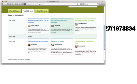
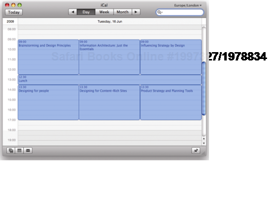
Figure 1.6. This means that visitors can add the whole schedule to their calendar application at the click of a button.
Other people have written plug-ins that allow Firefox to extract contact information marked up in hCard format and send it to your mobile phone via Bluetooth (see Figure 1-7 and 1-8).
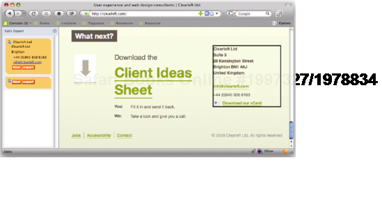
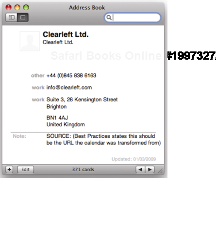
Figure 1.8. Using Operator or the older Tails add-on in Firefox, you can import these contact details directly into your address book.
There are currently 9 official microformats, along with a further 14 draft formats. These include
hCalendar for dates, calendars and events
hCard for people and organizations
XFN for relationships between people
hProduct for product descriptions (draft)
hRecipe for ingredients and cooking instructions (draft)
hReview for product and event reviews (draft)
hAtom for episodic content like blog posts (draft)
Many large websites already support microformats. For instance, Google Maps uses the hCard format for address information on its map search results. Similarly, Yahoo! supports microformats on a number of properties including the popular Flickr photo-sharing site. In fact, Yahoo! released 26 million microformats into the wild when they used the hListing format in their Kelkoo shopping search engine. It's extremely easy to add microformatted data to your website, so it's something I recommend doing wherever possible.
We're only just scratching the surface with what can be achieved with microformats. If you want to learn more, check out "Microformats: Empowering Your Mark-up for Web 2.0" by John Allsopp. Alternatively head over to http://microformats.org to view the official specifications.
CSS comes in various versions, or levels, so it's important to know which version to use. CSS 1 became a recommendation at the end of 1996 and contains very basic properties such as fonts, colors, and margins. CSS 2 was released in 1998 and added advanced concepts such as floating and positioning to the mix, as well as new selectors like the child, adjacent sibling, and universal selectors.
Time moves very slowly at the World Wide Web Consortium (W3C), so while work on CSS 3 started before the turn of the millennium, the final release is still some way off. To help speed development and browser implementation, CSS 3 has been broken down into modules that can be released and implemented independently. CSS 3 contains some exciting new additions, including an advanced layout module, brand new background properties, and a host of new selectors. Some of these modules are scheduled for release as soon as the second half of 2009. Sadly, we've been here before, and several modules have been on the verge of release only to be pushed back into "last call" or "working draft" status, so it's difficult to know how many will actually make the grade. Hopefully, by 2011, we'll see a number of these modules become official recommendations. More worryingly, some modules don't appear to have been started, while others haven't been updated for several years. Due to this glacial pace of development, it seems unlikely the CSS 3 will ever be fully complete.
The good news is that, despite the numerous delays, many browser vendors have already implemented some of the more interesting parts of the CSS 3 specification. As such, it is possible to start using many of these exciting selectors today,
Because of the expected length of time between the release of CSS 2 and CSS 3, work started in 2002 on CSS 2.1. This revision of CSS 2 intends to fix some errors and provide a much more accurate picture of CSS browser implementation. CSS 2.1 is slowly nearing completion and is thus the recommended version of CSS to use.
HTML 4.01 became a recommendation at the end of 1999 and is the version of HTML that most people use. In January 2000 the W3C created an XML version of HTML 4.01 and named it XHTML 1.0. The main difference between XHTML 1.0 and HTML 4.01 is that it follows the XML coding conventions. This means that, unlike in regular HTML, all XHTML attributes must contain quote marks, and all elements must be closed. So while the following code is legitimate in HTML, it's not in XHTML:
<h2>Peru Celebrates Guinea Pig festival
  <p><img src=pigonastick.jpg alt=Roast Guinea Pig>
  <p>Guinea pigs can be fried, roasted, or served in a casserole.
Instead, in XHTML 1.0 it would have to be written link this.
<h2>Peru Celebrates Guinea Pig festival</h2>
  <p><img src="pigonastick.jpg" alt="Roast Guinea Pig" /></p>
  <p>Guinea pigs can be fried, roasted, or served in a casserole.</p>
XHTML 1.1 was an attempt to take XHTML even closer to XML. There was very little practical difference between the two languages. However there was one big theoretical difference. While it was still considered acceptable to serve up an XHTML 1.0 page as an HTML document, XHTML 1.1 pages were supposed to be sent to the browsers as if they were XML. This meant that if your XHTML 1.1 page contained a single error, such as an unencoded ampersand, web browsers weren't supposed to display the page. This obviously isn't ideal for most website owners, so XHTML 1.1 never really took off.
There is still some debate as to whether you should serve up an XHTML 1.0 pages as if it were HTML or if you're better sticking with HTML 4.01. However, it's clear that you shouldn't be using XHTML 1.1 unless you're using the correct mime type and are happy for your page not to display if it contains an error.
HTML 5 is relatively new, and as a draft specification is changing all the time. However, it has a lot of momentum and several popular browsers have already started building in support. HTML 5 grew out the frustration developers had with the slow and archaic development of XHTML 2. So a group of them decided to draft their own specification. This proved so successful that HTML 5 became an official W3C project, and the development of XHTML 2 was sidelined.
As mentioned previously, the goal of HTML5 was to produce a modern markup language that better reflected the type of information being published on the web. So it introduces new structural elements like header, nav, article, sections and footer. It also contains a host of new form additions that should make building web applications a lot easier.
A document type definition (DTD) is a set of machine-readable rules that define what is and isn't allowed in a particular version of HTML or XML. Browsers are supposed to use these rules when parsing a web page to check the validity of the page and act accordingly. Browsers know which DTD to use, and hence which version of HTML you are using, by analyzing the page's DOCTYPE declaration.
A DOCTYPE declaration is a line or two of code at the start of your HTML document that describes the particular DTD being used. In this example, the DTD being used is for XHTML 1.0 Strict:
<!DOCTYPE html PUBLIC "-//W3C//DTD XHTML 1.0 Strict//EN"
"http://www.w3.org/TR/xhtml1/DTD/xhtml1-strict.dtd">
DOCTYPE declarations will typically, but not always, contain a URL to the specified DTD file. So HTML5, for instance, doesn't require a URL. Browsers tend to not read these files, choosing instead to recognize common DOCTYPE declarations.
DOCTYPEs currently come in two flavors, strict and transitional. As the name suggests, transitional DOCTYPEs are aimed at people transitioning from older versions of the language. As such, the transitional versions of HTML 4.01 and XHTML 1.0 still allow the use of deprecated elements like the font element. The strict versions of these languages ban the use of deprecated elements to separate content from presentation.
As well as being semantically marked up, an HTML document needs to be written using valid code. If the code is invalid, browsers will try to interpret the markup themselves, sometimes getting it wrong. Worse still, if an XHTML document is being sent with the correct MIME type, browsers that understand XML simply won't display an invalid page. Because browsers need to know which DTD to use in order to process the page correctly, a DOCTYPE declaration is required for the page to validate.
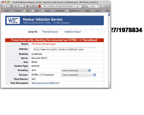
You can check to see if your HTML is valid by using the W3C validator, a validator bookmarklet, or a plug-in like the Firefox Web Developer Extension. Many HTML editors now have validators built in, and you can even install a copy of the W3C validator locally on your computer. The validator will tell you if your page validates, and if not, why not (see Figure 1-9).
Validation is important because it can help you track down bugs in your code. As such, it is a good idea to get into the habit of validating early and often. However, validation isn't an end unto itself, and many otherwise good pages fail to validate due to small errors such as unencoded ampersands, or because of legacy content. So although validation is important, in the real world, a degree of common sense is required.
Note
Various code validation tools are available. You can validate your site online by going to http://validator.w3.org/ and entering your URL. However, if you are going to validate often—which is a good idea—typing your URL each time can become a little tedious. Instead, I use a handy validation bookmarklet, or favelet, which is a small piece of JavaScript that can be stored in the bookmarks or favorites folder in your browser. Clicking the bookmark will trigger the JavaScript action. In the case of the validator bookmarklet, it runs the page you are currently on through the W3C validator and displays the results. You can find the validator bookmarklet along with many other handy web development bookmarklets from http://favelets.com/.
If you use Firefox, you can download and install a wide variety of plug-ins. Among the numerous validator plug-ins available, my personal favorite is the Web Developers Extension plug-in. As well as allowing you to validate your HTML and CSS, it enables you to do a wide variety of other useful tasks like outlining various HTML elements, turning off stylesheets, and even editing styles in the browser. The Firefox Web Developer Extension can be downloaded from http://chrispederick.com/work/web-developer/ and is a must-have for any CSS developer using Firefox. Another great tool is the Firefox Validator Extension, which you can download from http://users.skynet.be/mgueury/mozilla/.
There is also a developer toolbar for Internet Explorer 6 and 7, which can be downloaded from http://tinyurl.com/7mnyh. Although it is not as feature rich as the Firefox toolbar, it is still extremely useful. Internet Explorer 8 includes its own set of developer tools built directly into the browser, as does Safari 4.
As well as being important for validation, browsers use DOCTYPE declarations for another purpose.
When browser manufacturers started to create standards-compliant browsers, they wanted to ensure backward compatibility. To accomplish this, they created two rendering modes: standards mode and quirks mode. In standards mode, the browser renders a page according to the specifications, and in quirks mode pages are displayed in a looser, more backward-compatible fashion. Quirks mode typically emulates the behavior of older browsers such as Microsoft Internet Explorer 4 and Netscape Navigator 4 to prevent older sites from breaking.
The most obvious example of the difference between these modes revolves around the Internet Explorer (IE) on Windows proprietary box model. When Internet Explorer 6 debuted, the correct box model was used in standards mode, while the older, proprietary box model was used in quirks mode. To maintain backward compatibility with sites built for IE 5 and below, Opera 7 and above also uses IE's faulty box model in quirks mode.
Other differences in rendering are subtler and specific to certain browsers. However, they include things like not requiring the # symbol for hex color values, assuming lengths without units in CSS are pixels, and increasing the font size by one step when using keywords.
Mozilla and Safari have a third mode called "almost standards mode," which is the same as standards mode, except for some subtle differences in the way tables are handled.
You can tell what mode a page is rendering in by using the Web Developer Extension in Firefox. A green tick will be displayed in the toolbar if the site is rendering in standards mode, while a red cross shows that the page is being rendered in quirks mode. The development tools in Internet Explorer 8 also show which mode the browser is rendering in.
The browser chooses which rendering method to use based on the existence of a DOCTYPE declaration and the DTD being used. If an XHTML document contains a fully formed DOCTYPE, it will normally be rendered in standards mode. For an HTML 4.01 document, a DOCTYPE containing a strict DTD will usually cause the page to render in standards mode. A DOCTYPE containing a transitional DTD and URI will also cause the page to render in standards mode, while a transitional DTD without a URI will cause the page to render in quirks mode. A badly formed or nonexistent DOCTYPE will cause both HTML and XHTML documents to be rendered in quirks mode.
The effect of choosing a rendering mode based on the existence of a DOCTYPE is known as DOCTYPE switching, or DOCTYPE sniffing. Not all browsers follow these exact rules, but they give you a good idea of how DOCTYPE switching works. For a more complete list, the chart at http://hsivonen.iki.fi/doctype/ shows the various rendering modes different browsers use depending on the DOCTYPE declaration in use.
DOCTYPE switching is a hack used by browsers to distinguish legacy documents from more standards-compliant ones. Despite writing valid CSS, if you choose the wrong DOCTYPE, your pages will be rendered in quirks mode and behave in a buggy and unpredictable way. As such, it is important to include a fully formed DOCTYPE declaration on every page of your site and choose a strict DTD when using HTML.
<!DOCTYPE HTML PUBLIC "-//W3C//DTD HTML 4.01//EN"
   "http://www.w3.org/TR/html4/strict.dtd">

<!DOCTYPE html PUBLIC "-//W3C//DTD XHTML 1.0 Strict//EN"
   "http://www.w3.org/TR/xhtml1/DTD/xhtml1-strict.dtd">

<!DOCTYPE html>
Many HTML editors will automatically add a DOCTYPE declaration for you. If you are creating an XHTML document some older editors may also add an XML declaration before the DOCTYPE declaration:
<?xml version="1.0" encoding="utf-8"?>
An XML declaration is an optional declaration used by XML files to define things such as the version of XML being used and the type of character encoding. Unfortunately, IE 6 automatically switches to quirks mode if the DOCTYPE declaration is not the first element on a page. This was fixed in IE 7, but unless you are serving your pages as XML documents, it is best to avoid using an XML declaration.
In this chapter, you learned all about how semantic naming conventions and meaningful markup can make your code easier to read and maintain. You also learned the difference between IDs and class names and which ones to use when. You know about the different versions of CSS and HTML available and how the browsers decide how to handle those differences.
In the next chapter, you will recap some of the basic CSS selectors as well as learn about a host of new CSS 3 selectors. You will learn all about specificity and the cascade, as well as how to organize and plan your style sheets for easy maintenance.