
It is human nature to try to organize the world around us. Scientists create lists of animals, plants, and chemical elements. Magazines create lists of the top 10 movies, the latest fashion trends, and the worst-dressed celebrities. People write shopping lists, to-do lists, and lists to Santa. We just love making lists.
Lists provide us with a way of grouping related elements and, by doing so, we give them meaning and structure. Most web pages contain some form of list, be it a list of the latest news stories, a list of links to your favorite web pages, or a list of links to other parts of your site. Identifying these items as lists and marking them up as such can help add structure to your HTML documents, providing useful hooks with which to apply your styles.
In this chapter you will learn about
Styling lists with CSS
Using background images as bullets
Creating vertical and horizontal nav bars
Using sliding doors tabbed navigation
Pure CSS drop-downs
Creating CSS image maps
Creating remote rollovers
Using definition lists
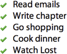
Basic list styling is very simple. Say you start with this simple to-do list:
<ul>
  <li>Read emails</li>
  <li>Write chapter</li>
  <li>Go shopping</li>
  <li>Cook dinner</li>
  <li>Watch Lost</li>
</ul>
To add a custom bullet, you could use the list-style-image property. However, this doesn't give you much control over the position of your bullet image. Instead, it is more common to turn list bullets off and add your custom bullet as a background image on the list element. You can then use the background image positioning properties to accurately control the alignment of your custom bullet.
Older versions of Internet Explorer and Opera control list indentation using the left margin, whereas most modern browsers, including Firefox and Safari use left padding. As such, the first thing you will want to do is remove this indentation by zeroing down the margin and padding on the list. To remove the default bullet, you simply set the list style type to none:
ul {
  margin: 0;
  padding: 0;
  list-style-type: none;
}
Adding a custom bullet is very straightforward. Applying padding to the left side of the list item creates the necessary space for your bullet. The bullet is then applied as a background image on the list item. If the list item is going to span multiple lines, you will probably want to position the bullet at or near the top of the list item. However, if you know the contents of the list items won't span more than one line, you can vertically center the bullet by setting the vertical position to either middle or 50%:
li {
  background: url(/img/bullet.gif) no-repeat 0 50%;
  padding-left: 30px;
}
The resulting styled list can be seen in Figure 6-1.
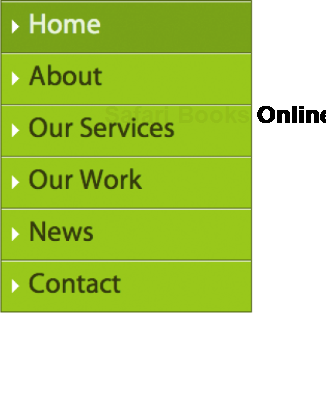
Combining the previous example with the link styling techniques you learned in Chapter 5, you can create graphically rich vertical navigation bars complete with CSS rollovers, like the one shown in Figure 6-2.
As always, you need to start with good, semantic mark-up:
<ul class="nav">
  <li><a href="home.htm">Home</a></li>
  <li><a href="about.htm">About</a></li>
  <li><a href="services.htm">Our Services</a></li>
  <li><a href="work.htm">Our Work</a></li>
  <li><a href="news.htm">News</a></li>
  <li><a href="contact.htm">Contact</a></li>
</ul>
The first things you want to do are remove the default bullets and zero down the margin and padding:
ul.nav {
  margin: 0;
  padding: 0;
  list-style-type: none;
}
You can then start layering on the graphical styling. In this case, I'm giving my navigation menu a light green background and a dark green border. I'm also going to set the width of my navigate list in ems.
ul.nav {
  margin: 0;
  padding: 0;
  list-style-type: none;
  width: 8em;
  background-color: #8BD400;
  border: 1px solid #486B02;
}
Rather than style the list items, styling the enclosed anchor links provides better cross-browser compatibility. To create a button-like hit area, you simply set the display property of the anchors to block. The anchor links will then expand to take up the available space, which in this case is determined by the width of the list. You could set the width of the anchors explicitly, but I've found setting the width of the parent list makes for more maintainable code. The last couple of rules are just stylistic, setting the color of the link text and turning off the underlines.
ul.nav a {
  display: block;
  color: #2B3F00;
  text-decoration: none;
}
To create the beveled effect on the menu items, you need to set the top border to be lighter than the background color and the bottom border slightly darker. At this point, you can also drop in a background image to use as an icon.
ul.nav a {
  display: block;
  color: #2B3F00;
  text-decoration: none;
  border-top: 1px solid #E4FFD3;
  border-bottom: 1px solid #486B02;
  background: url(/img/arrow.gif) no-repeat 5% 50%;
  padding: 0.3em 1em;
}
Note
Ideally, I would have set the positioning of my arrow to be 10 pixels from the left-hand edge of the anchor. However, the CSS specification doesn't allow the mixing of units, so I've used a percentage instead. In reality, most browsers accept mixed units, and I think this is one of several instances where the specification is wrong.
With all the borders stacked one on top of the other, you'll notice that the bottom border on the final link doubles up with the bottom border on the list. In this instance, I'm going to take the simple option and remove the bottom border from the list. However in situations where this isn't possible, the addition of a class on the first or last list item can allow you to remove the border directly. In the future, you'll also be able to use the :last-child pseudo class, but for the time being, browser support is limited.
ul.nav .last a {
  border-bottom: 0;
}
The list now looks like a stylish vertical navigation bar. To complete the effect, the last thing you need to do is apply the :hover, :focus, and :selected states. To do this, simply change the background and text colors. You could also experiment with changing the border colors to create a depressed button type effect. These styles are applied to the anchor links when the user hovers over them. They are also applied to any anchors that have a class of selected applied to their parent list item.
ul.nav a:hover,
ul.nav a:focus,
  ul.nav .selected a {
  color: #E4FFD3;
  background-color: #6DA203;
}
This technique should now work in all the major browsers except IE 6 and below for Windows. Unfortunately, IE6 inexplicably adds extra space above and below the list items. To fix this bug, you need to set the display property on the list items to inline:
ul.nav li {
  display: inline: /* :KLUDGE: Removes large gaps in IE/Win */
}
And there you have it: a styled vertical nav bar, complete with rollovers.
In the previous vertical nav bar example, I used a class to indicate the current page. For small sites with the navigation embedded in the page, you can simply add the class on a page-by-page basis. For large sites, there is a good chance that the navigation is being built dynamically, in which case the class can be added on the back end. However, for medium-sized sites, where the main navigation doesn't change, it is common to include the navigation as an external file. In these situations, wouldn't it be good if there were a way to highlight the page you are on, without having to dynamically add a class to the menu? Well, with CSS there is.
This concept works by adding an ID or a class name to the body element of each page, denoting which page or section the user is in. You then add a corresponding ID or class name to each item in your navigation list. The unique combination of body ID and list ID/class can be used to highlight your current section or page in the site nav.
Take the following HTML fragment as an example. The current page is the home page, as indicated by an ID of home on the body. Each list item in the main navigation is given a class name based on the name of the page the list item relates to.
<body id="home">
<ul class="nav">
  <li><a href="home.htm">Home</a></li>
  <li><a href="about.htm">About</a></li>
  <li><a href="services.htm">Our Services</a></li>
  <li><a href="work.htm">Our Work</a></li>
  <li><a href="news.htm">News</a></li>
<li><a href="contact.htm">Contact</a></li>
</ul>
</body>
To highlight the current page, you simply target the following combination of IDs and class names:
#home .nav .home a,
#about .nav .about a ,
#news .nav .news a,
#products .nav .products a,
#services .nav .services a {
  background-position: right bottom;
  color: #fff;
  cursor: default;
}
When the user is on the home page, the nav item with a class of home will display the selected state, whereas on the news page, the nav item with the class of news will show the selected state. For added effect, I have changed to cursor style to show the default arrow cursor. That way, if you mouse over the selected link, your cursor will not change state and you won't be tempted to click a link to a page you are already on.
Imagine you had a page of search results and you wanted to create a simple page-based navigation list like the one in Figure 6-3. To do this, you would start by creating an ordered list of your navigation options.
<ol class="pagination">
  <li><a href="search.htm?page=1" rel="prev">Prev</a></li>
  <li><a href="search.htm?page=1">1</a></li>
  <li class="selected">2</li>
  <li><a href="search.htm?page=3">3</a></li>
  <li><a href="search.htm?page=4">4</a></li>
  <li><a href="search.htm?page=5">5</a></li>
  <li><a href="search.htm?page=3" rel="next">Next</a></li>
</ol>
You'll notice that I've used the rel attribute to denote the previous and next pages in a set of results. This is a great use of the rel attribute and will come in handy when we style these links differently later on.
As with the other list examples in this chapter, you first need to remove the default browser margin, padding, and list styles. Many developers, including myself, prefer to do this using a global reset at the start of their style sheets. So if you're using a global reset, you can skip this first step.
ol.pagination {
  margin: 0;
  padding: 0;
  list-style-type: none;
}
To make the list items line up horizontally instead of vertically you could set their display property to inline. However for more complex horizontal list styling you will gain more control if you float the items and then use margins to space the space them out instead.
ol.pagination li {
  float: left;
  margin-right: 0.6em;
}
Now the list items are all displaying horizontally you can start applying the graphical treatment. In this case, I want all the page numbers to appear in a square box with a gray background. When users hover over these links, I want their backgrounds to turn blue and the link text to turn white.
ol.pagination a,
 ol.pagination  li.selected {
  display: block;
  padding: 0.2em 0.5em;
  border: 1px solid #ccc;
  text-decoration: none;
}
ol.pagination a:hover,
ol.pagination a:focus,
ol.pagination li.selected {
background-color: blue;
color: white;
}That's all very well for the page numbers, but I want to style the prev and next links slightly differently. To do this, I'm going to target their rel attributes using attribute selectors. First off, I don't want the previous and next links to have a border effect, so I'm going to turn these off.
ol.pagination a[rel="prev"],
ol.pagination a[rel="next"] {
  border: none;
}
The other thing I want to do is add a presentational arrow at the start and the end of the list. You could do this by hard-coding them into your HTML. However, you can also inject them using CSS, allowing you to change or remove them later on. To use CSS, you need to use the :before and :after pseudo-selectors in combination with the content property.
ol.pagination a[rel="prev"]:before {
content: "�0AB";
padding-right: 0.5em;
}
ol.pagination a[rel="next"]:after {
content: "�0BB";
padding-left: 0.5em;
}The first declaration targets the anchor link at the start of the list and adds a double left arrow with the character code of "00AB" before said link. The second declaration targets the last anchor link and adds a double right arrow at the end of the link.
And there you have it, a simple, yet flexible, horizontal page navigation bar.
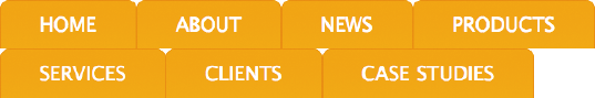
Simple navigation bars are great for paged content, but you'll probably want to create more graphically rich menus for your main navigation. In this example, I am going to demonstrate how to create a graphical navigation bar like the one shown in Figure 6-4.
As in the previous example, you start with a simple, unordered list:
<ul class="nav">
  <li><a href="home.htm">Home</a></li>
  <li><a href="about.htm">About</a></li>
  <li><a href="news.htm">News</a></li>
  <li><a href="products.htm">Products</a></li>
  <li><a href="services.htm">Services</a></li>
  <li><a href="clients.htm">Clients</a></li>
  <li><a href="case-studies.htm">Case Studies</a></li>
</ul>
You then zero down the padding and margins, as well as remove the default bullets. For this example, I want my horizontal nav bar to be 72 ems wide and to have a repeating orange gradient as a background.
ul. nav {
  margin: 0;
  padding: 0;
  list-style: none;
  width: 72em;
  background: #FAA819 url(img/mainNavBg.gif) repeat-x;
}
The list is currently displayed vertically. To make it display horizontally, float your list items to the left.
ul. nav li {
  float: left;
}
Remember that when an element is floated, it no longer takes up any space in the flow of the document. As such, the parent list effectively has no content and collapses down, hiding the list background. As you learned in Chapter 3, there are several ways to make parent elements contain floated children. One method is to add a clearing element. Unfortunately, this adds unnecessary markup to the page so should be avoided if possible. Another other method is to float the parent element as well and clear it further down the line, say, using the site footer. The third method it to use the overflow:hidden technique, which is the method I normally use:
ul.nav {
  margin: 0;
  padding: 0;
  list-style: none;
  width: 72em;
  overflow: hidden;
  background: #FAA819 url(img/mainNavBg.gif) repeat-x;
}
As with the page navigation example, each of the links in this horizontal nav bar is made to behave like a button by setting its display property to block. If you wanted each button to be a fixed size, you could explicitly set its height and width. However, this can cause maintainability issues. Instead I'm going to let the width of each button be based on the size of the anchor text. To do this, rather than setting an explicit width, I have applied 3 ems of padding to the left and right sides of each anchor link. As in the previous example, the link text is being vertically centered using line height. After that, the link underlines are turned off, and the link color is changed to white:
ul.nav a {
  display: block;
  padding: 0 3em;
  line-height: 2.1em;
  text-decoration: none;
  color: #fff;
}
I want to create dividers between each link in the nav bar. You could do this by setting horizontal borders on the list item or anchors. However, for simplicity's sake, I'm going to apply a background image to the anchor links instead.
ul.nav a {
  display: block;
  padding: 0 2em;
  line-height: 2.1em;
  background: url(img/divider.gif) repeat-y left top;
  text-decoration: none;
  color: #fff;
}
However, the first link in the nav bar will have an unwanted divider. Adding a class to the first list item and setting the background image to none can remove this:
ul. nav .first a {
  background-image: none;
}
Alternatively, if you're not too worried about supporting IE 6, you could forego the additional class and use the :first-child pseudo class instead.
ul.nav li:first-child a {
  background: none;
}
Last, the rollover state in this example is simply a change in link color:
ul.nav a:hover,
ul.nav a:focus  {
  color: #333;
}
And there you have it: a well-styled horizontal nav bar with good, cross-browser support.
In Chapter 4, you learned about Douglas Bowman's sliding doors technique and how it could be used to create flexible, rounded-corner boxes. This technique can also be used to create flexible, expandable tabbed navigation. Using this method, tabs are created from one large image and one side image. As the text in the tabs expands, more of the large image is uncovered. The smaller image stays flush to the left, covering up the hard edge of the larger image and completing the effect (see Figure 6-5).
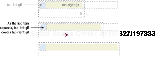
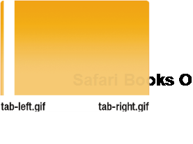
The images used to create the tabs in the following example can be seen in Figure 6-6. Both of these images are very large. This is to allow the font size to be increased by several hundred percent without the tabs appearing to break.
The HTML for this example is exactly the same as in the previous, horizontal nav bar example:
<ul class="nav">
  <li><a href="home.htm">Home</a></li>
  <li><a href="about.htm">About</a></li>
  <li><a href="news.htm">News</a></li>
  <li><a href="products.htm">Products</a></li>
  <li><a href="services.htm">Services</a></li>
  <li><a href="clients.htm">Clients</a></li>
  <li><a href="case-studies.htm">Case Studies</a></li>
</ul>
As in the previous examples, the margin and padding are zeroed, the list bullets are removed, and a width is set for the navigation bar. An overflow of hidden is also applied to the navigation list in order to clear any enclosed floats.
ul.nav {
  margin: 0;
  padding: 0;
  list-style: none;
  width: 72em;
  overflow: hidden;
}
Like the previous example, the list elements are floated left to make them display horizontally rather than vertically. However, this time, the larger of the two images that make up the tab is applied as a background image to the list item. As this image forms the right side of the tab, it is positioned to the right
ul.nav li {
  float: left;
  background: url(img/tab-right.gif) no-repeat right top;
}
As in the previous example, the anchors are set to display as block-level elements to make the whole area clickable. The width of each tab is again controlled by the width of the contents, and setting the line height similarly controls the height. To complete the tab effect, the left part of the tab is applied as a background on the anchor and aligned left. As the tab changes size, this image will always be aligned left, sitting over the top of the larger image and covering the hard left edge. Last, to make sure this technique works in IE 5.2 on the Mac, the anchors are floated as well.
ul.nav li a {
  display: block;
  padding: 0 2em;
  line-height: 2.5em;
  background: url(img/tab-left.gif) no-repeat left top;
  text-decoration: none;
  color: #fff;
  float: left;
}
To create the rollover effect, you can simply change the link color:
ul.nav a:hover,
ul.nav a:focus  {
  color: #333;
}
The resulting tabbed navigation should look like Figure 6-7.
If you increase the text size in your browser, you should see that the tabs scale nicely, as illustrated in Figure 6-8.
This method provides an easy and hassle-free way to make attractive and accessible tabbed navigation bars.
Despite some concerns about usability, drop-down menus continue to be a popular interface element on the Web. JavaScript-only solutions abound, but many of them have innate accessibility problems—namely not working in browsers where JavaScript has been disabled. Because of this, several pioneers have explored the idea of pure CSS drop-downs. One such person is Patrick Griffiths with his Suckerfish drop-downs technique (http://www.alistapart.com/articles/dropdowns/).
This technique is incredibly simple and works by nesting the subnavigation in an unordered list, positioning that list off screen and then repositioning it when the parent list item is hovered. You can see the final product in Figure 6-9.
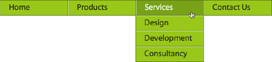
Let's start this example by marking up our multilevel navigation list.
<ul class="nav">
  <li><a href="/home/">Home</a></li>
  <li><a href="/products/">Products</a>
    <ul>
      <li><a href="/products/silverback/">Silverback</a></li>
      <li><a href="/products/fontdeck/">Font Deck</a></li>
    </ul>
  </li>
<li><a href="/services/">Services</a>
<ul>
<li><a href="/services/design/">Design</a></li>
<li><a href="/services/development/">Development</a></li>
<li><a href="/services/consultancy/">Consultancy</a></li>
</ul>
</li>
<li><a href="/contact/">Contact Us</a></li>
</ul>As with all the navigation examples in this chapter, you first need to zero down the margin and padding as well as remove the default bullets. As this is going to be a horizontal navigation, you then need to give your list items a width and float them all left. For stylistic reasons, I want to give my navigation lists a border and background color. However, because the enclosed list items are all floated, they take up no space, forcing the lists to collapse in on themselves. To get around this problem, I've decided to float the lists as well.
ul.nav, ul.nav ul {
  margin: 0;
  padding: 0;
  list-style-type: none;
  float: left;
  border: 1px solid #486B02;
  background-color: #8BD400;
}


ul.nav li {
  float: left;
  width: 8em;
  background-color: #8BD400;
}
To ensure the items in the drop-down menus stack up vertically, you need to set the width of the list to be the same as the width of the enclosed list items. The drop-down menu is now starting to take shape.
To hide the actual drop-downs until they are activated, we need to set their position to absolute and then hide them off the left-hand side of the screen.
ul.nav li ul {
  width: 8em;
  position: absolute;
  left: −999em;
}
Now, this is where the magic happens. By adding a hover pseudo-selector to the parent list item, we can make the drop-down list reappear by changing its position back to its regular starting position.
.nav li:hover ul {
  left: auto;
}
These last few styles set the navigation links to behave like block-level elements and then change the appearance of the list, giving the items background colors and beveled borders.
ul.nav a {
  display: block;
  color: #2B3F00;
  text-decoration: none;
  padding: 0.3em 1em;
  border-right: 1px solid #486B02;
  border-left: 1px solid #E4FFD3;
}


ul.nav li li a {
  border-top: 1px solid #E4FFD3;
  border-bottom: 1px solid #486B02;
  border-left: 0;
  border-right: 0;
}


/*remove unwanted borders on the end list items*/
ul.nav li:last-child a {
  border-right: 0;
  border-bottom: 0;
}
ul a:hover,
ul a:focus {
color: #E4FFD3;
background-color: #6DA203;
}And there you have it, a simple drop-down navigation bar that uses pure CSS. This technique works in most modern browsers but fails in older version of Internet Explorer, which don't support the :hover pseudo-class of nonanchor elements. To get around this issue, you can use a few lines of JavaScript or a .htc behavior file to enable this functionality.
Note
The JavaScript code for the drop-down navigation fix in Internet Explorer is beyond the scope of this book, but you can find out more details at http://htmldog.com/articles/suckerfish/dropdowns/.
Image maps allow web developers to specify regions of an image to act as hotspots. Image maps were very popular several years ago, but they are much less common these days. This is due partly to the popularity of Flash and partly to the move toward simpler and less presentational markup. While image maps are still a perfectly valid part of HTML, they do mix presentation with content. However, it is possible to create simple image maps with a combination of lists, anchors, and some advanced CSS.
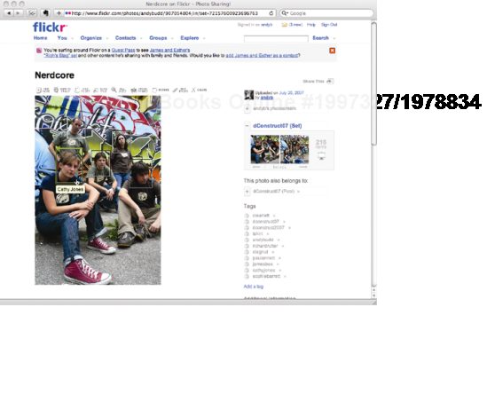
For this example, I'm going to use a photograph of some members of the Clearleft team pretending to be an indie band in front of the graffiti outside our offices (see Figure 6-10). When I hover over each person, I want a rectangular box to appear. Clicking this box will take me to that person's website.
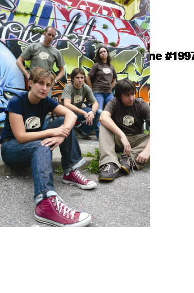
The first thing you need to do is add your image to the page, inside a named div:
<div class="imagemap"> <img src="img/nerdcore.jpg" width="333" height="500"alt="Some of the Clearleft team" /> </div>
Then, you need to add a list of links to each person's website after the image. Each list item needs to be given a class to identify the person in that list item. You can also give each link a title attribute containing the name of the person. That way, when the link is hovered over, a tooltip showing the person's name is will be displayed on most browsers.
<div id="imagemap"> <img src="img/nerdcore.jpg" width="333" height="500"alt="Some of the Clearleft team" /> <ul> <li class="rich"> <a href="http://www.clagnut.com/" title="Richard Rutter">Richard Rutter</a> </li> <li class="sophie"> <a href="http://www.wellieswithwings.org/" title="Sophie Barrett">Sophie Barrett</a> </li> <li class="cath"> <a href="http://www.electricelephant.com/" title="Cathy Jones">Cathy Jones</a> </li> <li class="james"> <a href="http://www.jeckecko.net/blog/" title="James Box">James Box</a> </li> <li class="paul"> <a href="http://twitter.com/nicepaul" title="Paul Annett">Paul Annett</a> </li> </ul> </div>
Set the width and height of the div so that it matches the dimensions of the image. Then set the position property of the div to relative. This last step is the key to this technique, as it allows the enclosed links to be positioned absolutely, in relation to the edges of the div, and hence the image.
.imagemap {
  width: 333px;
  height: 500px;
position: relative; /* The key to this technique */ }
You won't want the list bullets to display, so remove them by setting the list-style property to none. For completeness, you may as well zero down the list's margin and padding as well:
.imagemap ul {
  margin: 0;
  padding: 0;
  list-style: none;
}
The next thing to do is style the links. By positioning the anchor links absolutely, they will all be moved to the top-left corner of the containing div. They can then be positioned individually over the correct people, forming the hotspots. However, first you will need to set their widths and heights to create your desired hit area. The link text is still displayed; therefore, it is necessary to hide it off the screen by using a large, negative text indent:
.imagemap a {
  position: absolute;
  display: block;
  width: 50px;
  height: 60px;
  text-indent: −1000em;
}
The individual links can now be positioned over the relevant people:
.imagemap .rich a {
  top: 50px;
  left: 80px;
}


.imagemap .sophie a {
  top: 90px;
  left: 200px;
}


.imagemap .cath a {
  top: 140px;
  left: 55px;
}
.imagemap .james a {
top: 140px;
left: 145px;
}
.imagemap .paul a {
top: 165px;
left: 245px;
}Last, to create the rollover effect, a solid white border is applied to the links when they are hovered over:
.imagemap a:hover,
imagemap a:focus {
border: 1px solid #fff;
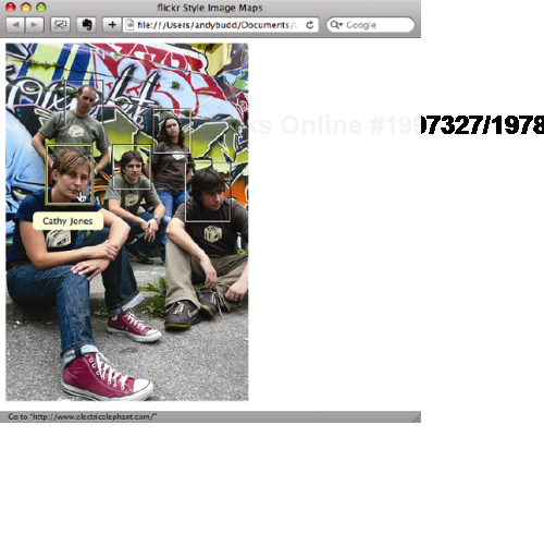
}And that is the basic technique finished. If you try rolling over one of the pictures, you should see something similar to Figure 6-11.
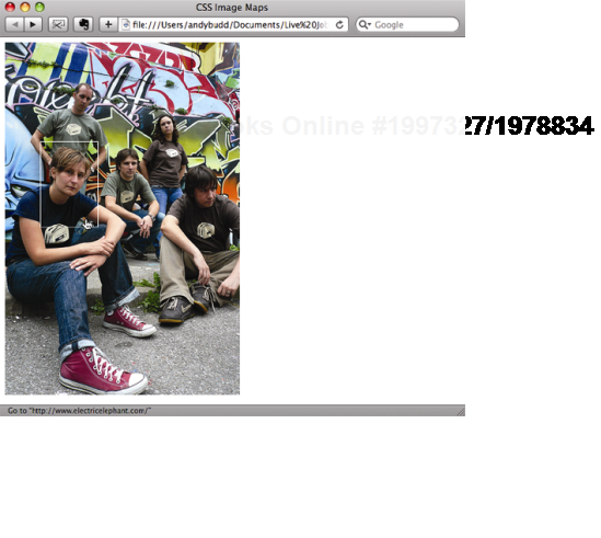
Well, that's assuming you're using a more capable browser like Safari or Firefox. If you're using Internet Explorer, you won't see anything at all! It appears that Internet Explorer doesn't like displaying links whose content has been hidden off-screen, even if you've explicitly set widths and heights. The good news is that since writing the first edition of this book, I've discovered a fix.
If you give the anchor links some kind of background, this seems to trick Internet Explorer into behaving correctly. The only problem is, we don't actually want the links to have a background, as they are supposed to be hidden! You could try setting the background to be transparent, but this doesn't seem to work. So instead, why not use a transparent image like a transparent PNG or GIF?
.imagemap a {
  position: absolute;
  display: block;
  background-image: url(/img/shim.gif);
  width: 60px;
  height: 80px;
  text-indent: −1000em;
}
Bizarrely enough, you don't actually have to point to a real image! You can simply make up a nonexistent URL and still trick IE into behaving correctly. However, linking to a nonexistent URL feels wrong, even if it is being used to fix a buggy browser, so I'd stick to using a real image, however redundant
If you have used the photo sharing service Flickr, you may have come across a similar technique used to annotate images (see Figure 6-12). When you roll over an annotated image, a double-bordered box will appear over the area containing each note. When you hover over one of these boxes, it will highlight and display the note. With a bit of tweaking, we can achieve the same thing using the previous technique.
To create the double-border box, you need to add a couple of extra spans inside each anchor link. The note will also need the addition of an extra span. Once the extra spans have been added, the amended list should look like this:
<ul>
  <li class="rich">
    <a href="http://www.clagnut.com/">
      <span class="outer">
      <span class="inner">
<span class="note">Richard Rutter</span>
</span>
</span>
</a>
</li>
...
</ul>The CSS starts off identical to the previous example, setting the dimensions of the wrapper div to those of the image, and the position property to relative. The list padding and margin are again zeroed down and the bullets removed:
.imagemap {
  width: 333px;
  height: 500px;
  position: relative;
}


.imagemap ul {
  margin: 0;
  padding: 0;
  list-style: none;
}
As before, the enclosed anchor links are positioned absolutely. However this time I'm going to set the dimensions on the inner spans, and let the outer spans and anchor links take shape around them. I've given the outer span a dark border and the inner span a light border to highlight their positions on the image. Last, I don't want to hide the text inside the anchor links; I want to display it as a tool tip instead. As such, I've given this text some basic styling.
.imagemap a {
  position: absolute;
  display: block;
  background-image: url(/img/shim.gif);
  color: #000;
  text-decoration: none;
  border: 1px solid transparent;
}
.imagemap a .outer {
display: block;
border: 1px solid #000;
}
.imagemap a .inner {
display: block;
width: 50px;
height: 60px;
border: 1px solid #fff;
}As before, you will need to position the anchors over each person:
.imagemap .rich a {
  top: 50px;
  left: 80px;
}


.imagemap .sophie a {
  top: 90px;
  left: 200px;
}


.imagemap .cath a {
  top: 140px;
  left: 55px;
}


.imagemap .james a {
  top: 140px;
  left: 145px;
}
.imagemap .paul a {
top: 165px;
left: 245px;
}You can then apply the rollover effect to the anchor link. This is done by changing the anchor's border color from transparent to yellow, on hover and focus:
.imagemap a:hover,
.imagemap a:focus {
  border-color: #d4d82d;
}
To display the note when the hotspot is rolled over, you first need to position the contents of the note span beneath the hotspot. To do this, set the position of the note span to absolute and give it a negative bottom position. To pretty up the notes, set a width, some padding, and a background color, and then center the text:
.imagemap a .note {
  position: absolute;
  bottom: −3em;
  width: 7em;
  padding: 0.2em 0.5em;
  background-color:#ffc;
  text-align: center;
 }
If you check the page in the browser, it should look something like Figure 6-13.

As you can see, the effect is starting to take shape. The notes look OK, but it would be nice if they were centered horizontally below the hotspot, rather than flush to the left. You can do this by positioning the left edge of the note span at the midpoint of the hotspot. Next, move the note span left, half the width of the note, using negative margins. The hotspot in this example is 50 pixels wide, so I have set the left position of the note to be 25 pixels. The notes are 8 ems wide, including the padding, so setting a negative left margin of 4 ems will horizontally center the note beneath the hotspot.
.imagemap a .note {
  position: absolute;
  bottom: −3em;
  width: 7em;
  padding: 0.2em 0.5em;
  background-color:#ffc;
  text-align: center;
  left: 25px;
  margin-left: −4em;
}
With the notes now centered, it's time to work on their interactivity. The notes should be hidden by default and only displayed when the hotspot is hovered over. To do this, you could set the display property to none and then change it to block when the anchor link is hovered over. However, this would prevent some screen readers from accessing the contents of the note. Instead, I am going to hide the text off the left side of the screen and reposition it on hover:
.imagemap a .note {
  position: absolute;
  bottom: −3em;
  width: 7em;
  padding: 0.2em 0.5em;
  background-color:#ffc;
  text-align: center;
  left: −1000em;
  margin-left: −5em;
}


.imagemap a:hover .note,
.imagemap a:focus .note {
  left: 25px;
}
We are almost there now. Just one more tweak is required to finish the technique. Rather than continuously display the hotspots' double borders, it would be nice if the borders only displayed when the image was rolled over. That way, people can enjoy the image normally, unfettered by the hotspots. However, when the mouse hovers over the image, the hotspots appear, letting the visitor know more information is available to be discovered. You can do this by making the borders on the outer and inner spans transparent by default and then setting their color when the image is hovered over:
.imagemap a .outer {
  display: block;
  border: 1px solid transparent;
}


.imagemap a .inner {
  display: block;
  width: 50px;
  height: 60px;
  border: 1px solid transparent;
}


.imagemap:hover a .outer,
.imagemap:focus a .outer {
 border-color: #000;
}


.imagemap:hover a .inner,
.imagemap:focus a .inner {
 border-color: #fff;
}
Unfortunately, as you have already learned, IE 6 only supports hovering on anchor links. To get around this problem, it is also a good idea to display the borders when the hotspots are hovered over directly:
.imagemap:hover a .outer,
.imagemap:focus a .outer,
.imagemap a:hover .outer,
.imagemap a:focus .outer {
  border: 1px solid #000;
}
.imagemap:hover a .inner,
.imagemap:focus a .inner,
.imagemap a:hover .inner,
.imagemap a:focus .inner {
border: 1px solid #fff;
}And there you have it: a Flickr-style, advanced CSS image map (see Figure 6-14).
A remote rollover is a hover event that triggers a display change somewhere else on the page. This is accomplished by nesting one or more elements inside an anchor link. Then, using absolute positioning, you can position the nested elements individually. Despite being displayed in different places, they are both contained within the same parent anchor, so will both react to the same hover event. As such, when you hover over one element, it can affect the style of another element.
In this example, you are going to build on the basic CSS image map technique by placing a list of links below the image. When the links are hovered over, the image hotspots will be outlined. Conversely, when you hover over the hot areas on the picture, the text links will highlight.
The HTML for this example is similar to that of the basic CSS image map example. However, you will need two additional spans: one wrapped around the link text and one empty span to act as the hotspot. This will allow you to position the link text beneath the image and the hotspots over the respective people.
<div class="remote"> <img src="img/nerdcore.jpg" width="333" height="500"alt="Rich, Sophie, Cath, James and Paul" /> <ul> <li class="rich"> <a href="http://www.clagnut.com/" title="Richard Rutter"> <span class="hotspot"></span> <span class="link">» Richard Rutter</span> </a> </li> <li class="sophie"> <a href="http://www.wellieswithwings.org/" title="Sophie Barrett"> <span class="hotspot"></span> <span class="link">» Sophie Barrett</span> </a> </li>
<li class="cath">
<a href="http://www.electricelephant.com/" title="Cathy Jones">
<span class="hotspot"></span>
<span class="link">» Cathy Jones</span>
</a>
</li>
<li class="james">
<a href="http://www.jeckecko.net/blog/" title="James Box">
<span class="hotspot"></span>
<span class="link">» James Box</span>
</a>
</li>
<li class="paul">
<a href="http://twitter.com/nicepaul" title="Paul Annett">
<span class="hotspot"></span>
<span class="link">» Paul Annett</span>
</a>
</li>
</ul>
</div>The basic list styling is the same as the image map example:
.remote {
  width: 333px;
  height: 500px;
  position: relative;
}
.remote ul {
margin: 0;
padding: 0;
list-style: none;
}The first things you need to do are set the position property of the hotspots to absolute and then specify their dimensions. In this example, three of the hotspots are the same size, while two are slightly larger. As such, I've defined the default sizes first and then overridden them where necessary. Just as in the previous technique, this will position all of the anchors at the top-left corner of the image. You can then position each hotspot over the relevant person in the image, using the top and left positioning properties.
.remote a .hotspot {
  width: 50px;
  height: 60px;
  position: absolute;
}


.remote .rich a .hotspot {
  top: 50px;
  left: 80px;
}


.remote .sophie a .hotspot {
  top: 90px;
  left: 200px;
}


.remote .cath a .hotspot {
  top: 140px;
  left: 55px;
  width: 60px;
  height: 80px;
}
.remote .james a .hotspot {
top: 140px;
left: 145px;
}
.remote .paul a .hotspot {
top: 165px;
left: 245px;
width: 60px;
height: 80px;
}Similarly, the spans containing the link text are also positioned absolutely and are given a width of 15 ems. They, too, are positioned in relation to the enclosing list, in this case to the right of the image using a negative right position. Last, the links are given a cursor style to make sure the correct icon is displayed in IE.
.remote a .link {
  position: absolute;
  display: block;
  width: 10em;
  right: −11em;
  cursor: pointer;
}


.remote .rich a .link {
  top: 0;
}


.remote .sophie a .link {
  top: 1.2em;
}


.remote .cath a .link {
  top: 2.4em;
}
.remote .james a .link {
top: 3.6em;
}
.remote .paul a .link {
top: 4.8em;
}The hotspots should now be in the correct place, as should the text links.
To create the rollover effect on the hotspot when either the hotspot or the text is hovered over, you need to apply a border to the hotspot span, when the parent anchor is hovered over:
.remote a:hover .hotspot,
.remote a:focus .hotspot {
  border: 1px solid #fff;
}
Similarly, to change the color of the text when either the text or the hotspot span is hovered over, you need to change the style on the span when the parent anchor is hovered or otherwise gains focus:
.remote a:hover .link ,
.remote a:focus .link {
  color: #0066FF;
}
If you test this example, it works perfectly in Safari and Firefox (see Figure 6-15). If you hover over a person's name, the link text changes color, and a box appears over that person in the picture. The same happens if you hover over the person in the image.
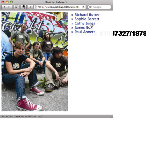
Figure 6.15. Remote rollover demonstration. When the link text at the bottom of the image is rolled over, an outline appears over the associated person in the image.
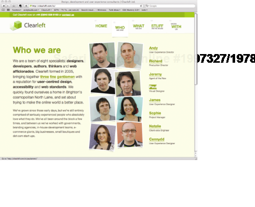
While the styling of this example is quite simple, you are really only limited by your imagination. In fact, we use a slightly modified version of this technique on the Who we are section of the Clearleft site (http://clearleft.com/is/) (see Figure 6-16).
Throughout this chapter, I have discussed how unordered lists (and by extension, ordered lists) can be used to create a variety of effects. However, there is a third, often overlooked list type that has been gaining more attention of late: the definition list. A definition list consists of two core components: a definition term <dt> and one or more definition descriptions <dd>.
<dl>
  <dt>Apple</dt>
    <dd>Red, yellow or green fruit</dd>
    <dd>Computer company</dd>
  <dt>Bananna</dt>
    <dd>Curved yellow fruit</dd>
</dl>
As the name suggests, the primary purpose of a definition list is to mark up definitions. However, the HTML specification is rather vague and suggests definition lists could be used for other applications like product properties or conversations. This stretches the concept of definitions somewhat but still makes a certain amount of sense in the context of HTML's history as a simple text formatting language.
Many web standards pioneers seized on the fact that definition lists could be used to structurally group a series of related elements and started to use them to create everything from product listing and image galleries, to form and even page layouts. While these techniques are undoubtedly clever, I personally believe they stretch the implied meaning of definition lists beyond their natural breaking point.
One of the arguments for using definition lists in this fashion is that no other HTML element allows for this type of association. However, this isn't strictly true, as the purpose of the div element is to group a document up into logical sections. More worryingly, this is exactly the same type of argument used when justifying tables for layout. This raises concerns that definition lists are starting to be used inappropriately.
For more information on definition lists, I recommend checking out the excellent article by Mark Norman Francis at 24 Ways (http://24ways.org/2007/my-other-christmas-present-is-a-definition-list).
In this chapter, you have learned how flexible lists can be. You learned how to create vertical and horizontal navigation bars, including accessible tabbed navigation. Finally, you learned how to use positioning to create pure CSS image maps and remote rollovers.
In the next chapter, you will learn how to create accessible form layouts and data tables, and how to style them with CSS.