
A valid and well-structured document provides the foundations to which your styles are applied. To be able to style a particular HTML element using CSS, you need to have some way of targeting that element. In CSS the part of a style rule that does this is called the selector.
In this chapter, you will learn about
The most common kinds of selectors are type and descendant selectors. Type selectors are used to target a particular type of element, such as a paragraph or a heading element. You do this by simply specifying the name of the element you wish to style. Type selectors are sometimes also referred to as element or simple selectors.
p {color: black;}
h1 {font-weight: bold;}
Descendant selectors allow you to target the descendants of a particular element or group of elements. A descendant selector is indicated by a space between two other selectors. In this example, only paragraph elements that are descendants of a blockquote will be indented, while all other paragraphs will remain unchanged.
blockquote p {padding-left: 2em;}These two types of selector are great for applying generic styles that apply across the board. To be more specific and target selected elements, you can use ID and class selectors. As the names suggest, these selectors will target elements with the corresponding ID or class name. ID selectors are identified using a hash character; class selectors are identified with a period. The first rule in this example will make the text in the introductory paragraph bold, and the second rule will make the date grey:
#intro {font-weight: bold;}
.date-posted {color: #ccc;}

<p id="intro">Happy Birthday Andy</p>
<p class="date-posted">24/3/2009</p>
As I mentioned previously, many CSS authors develop an overreliance on class and ID selectors. If they want to style headlines one way in the main content area and another way in the secondary content area, there is the tendency to create two classes and apply a class to each headline. A much simpler approach is to use a combination of type, descendant, ID, and/or class selectors:
#main-content h2 {font-size: 1.8em;}
#secondaryContent h2 {font-size: 1.2em;}

<div id="main-content">
  <h2>Articles</h2>
    ...
</div>
<div id="secondary-content">
  <h2>Latest news</h2>
    ...
</div>
This is a very simple and obvious example. However, you will be surprised how many elements you can successfully target using just the four selectors discussed so far. If you find yourself adding lots of extraneous classes to your document, it is probably a warning sign that your document is not well structured. Instead, think about how these elements differ from each other. Often, you will find that the only difference is where they appear on the page. Rather than give these elements different classes, think about applying a class or an ID to one of their ancestors, and then targeting them using a descendant selector.
There are instances where you may want to style an element based on something other than the structure of the document—for instance, the state of a link or form element. This can be done using a pseudo-class selector.
/* makes all unvisited links blue */
a:link {color:blue;}

/* makes all visited links green */
a:visited {color:green;}

/* makes links red when hovered or activated.
focus is added for keyboard support */
a:hover, a:focus, a:active {color:red;}

/* makes table rows red when hovered over */
tr:hover {background-color: red;}

/* makes input elements yellow when focus is applied */
input:focus {background-color:yellow;}
:link and :visited are known as link pseudo-classes and can only be applied to anchor elements. :hover, :active, and :focus are known as dynamic pseudo-classes and can theoretically be applied to any element. Most modern browsers support this functionality. Unsurprisingly, IE 6 only pays attention to the :active and :hover pseudo-classes when applied to an anchor link, and ignores :focus completely. IE7 supports :hover on arbitrary elements but ignores :active and :focus.
Last, it's worth pointing out that pseudo-classes can be strung together to create more complex behaviors, such as styling the hover effect on visited links different from those on unvisited links.
/* makes all visited linkes olive on hover */
a:visited:hover {color:olive;}
The universal selector is possibly one of the most powerful and least used of all the selectors. The universal selector acts like a wild card, matching all the available elements. Like wild cards in other languages, the universal selector is denoted by an asterisk. The universal selector is often used to style every element on a page. For instance, you can remove the default browser padding and margin on every element using the following rule:
* {
  padding: 0;
  margin: 0;
}
When combined with other selectors, the universal selector can be used to style all the descendants of a particular element or skip a level of descendants. You will see how this can be put to practical effect a little later in this chapter.
CSS 2.1 and CSS 3 have a number of other useful selectors. Unfortunately, while most modern browsers support these advanced selectors, older browsers like IE 6 do not. Luckily, CSS was created with backward compatibility in mind. If a browser doesn't understand a selector, it ignores the whole rule. That way, you can apply stylistic and usability embellishments in more modern browsers and not worry about it causing problems in older browsers. Just remember to avoid using these more advanced selectors for anything critical to the function or layout of your site.
The first of these advanced selectors is the child selector. Whereas a descendant selector will select all the descendants of an element, a child selector only targets the element's immediate descendants, or children. In the following example, the list items in the outer list will be given a custom icon while list items in the nested list will remain unaffected (see Figure 2-1):
#nav>li {
  background: url(folder.png) no-repeat left top;
  padding-left: 20px;
}

<ul id="nav">
  <li><a href="/home/">Home</a></li>
  <li><a href="/services/">Services</a>
    <ul>
      <li><a href="/services/design/">Design</a></li>
      <li><a href="/services/development/">Development</a></li>
      <li><a href="/services/consultancy/">Consultancy</a></li>
    </ul>
  </li>
  <li><a href="/contact/">Contact Us</a></li>
</ul>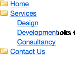
The child selector is supported by IE 7 and above. However, there is a small bug in IE 7 that causes problems if there are HTML comments between the parent and child.
It is possible to fake a child selector that works in IE 6 and below by using the universal selector. To do this, you first apply to all of the descendants the style you want the children to have. You then use the universal selector to override these styles on the children's descendants. So to fake the previous child selector example you would do this:
#nav li {
  background: url(folder.png) no-repeat left top;
  badding-left: 20px;
}

#nav li * {
  background-image: none;
  padding-left: 0;
}
Sometimes, you may want to style an element based on its proximity to another element. The adjacent sibling selector allows you to target an element that is preceded by another element that shares the same parent. Using the sibling selector, you could make the first paragraph following a top-level heading bold, gray, and slightly larger than the subsequent paragraphs (see Figure 2-2):
h2 + p {
  font-size: 1.4em;
  font-weight: bold;
  color: #777;
}
<h2>Peru Celebrates Guinea Pig festival</h2>
  <p>The guinea pig festival in Peru is a one day event to celebrate
these cute local animals. The festival included a fashion show where
animals are dressed up in various amusing costumes.</p>
  <p>Guinea pigs can be fried, roasted, or served in a casserole. Around
65 million guinea pigs are eaten in Peru each year.</p>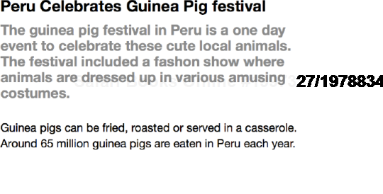
Figure 2.2. The adjacent sibling selector can be used to style the first paragraph after a headline, allowing you to do away with extraneous classes.
As with the child selector, this fails in IE 7 if comments appear between the elements you are targeting.
As the name suggests, the attribute selector allows you to target an element based on the existence of an attribute or the attribute's value. This allows you to do some very interesting and powerful things.
For example, when you hover over an element with a title attribute, most browsers will display a tooltip. You can use this behavior to expand the meaning of things such as acronyms and abbreviations:
<p>The term <acronym title="self-contained underwater breathingapparatus">SCUBA</acronym> is an acronym rather than an abbreviationas it is pronounced as a word.</p>
However, there is no way to tell that this extra information exists without hovering over the element. To get around this problem, you can use the attribute selector to style acronym elements with titles differently from other elements—in this case, by giving them a dotted bottom border. You can provide more contextual information by changing the cursor from a pointer to a question mark when the cursor hovers over the element, indicating that this element is different from most.
acronym[title] {
  border-bottom: 1px dotted #999;
}

acronym[title]:hover, acronym[title]:focus {
  cursor: help;
}
In addition to styling an element based on the existence of an attribute, you can apply styles based on a particular value. For instance, sites that are linked to using a rel attribute of nofollow gain no added ranking benefit from Google. The following rule displays an image next to such links, possibly as a way of showing disapproval of the target site:
a[rel="nofollow"] {
  background: url(nofollow.gif) no-repeat right center;
  padding-right: 20px;
}
All modern browsers including IE 7 support these selectors. However, because IE 6 doesn't support attribute selectors, you could potentially use them to apply one style to IE 6 and a different style to more capable browsers. For instance, Andy Clarke makes use of this technique by presenting black and white version of his site to IE 6 (see Figure 2-3) and a color one to all other browsers (see Figure 2-4).
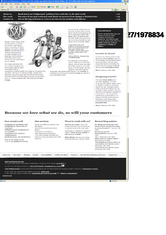
Figure 2.3. Andy Clarke serves up a black and white version of his site to IE 6 using attribute selectors, among other techniques.
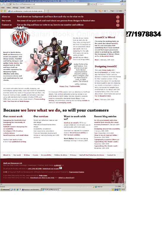
#header {
  background: url(branding-bw.png) repeat-y left top;
}
[id="header"] {
  background: url(branding-color.png) repeat-y left top;
}
Some attributes can have more than one value, separated by spaces. The attribute selector allows you to target an element based on one of those values. For instance, the XFN microformat allows you to define the relationship you have with a site by adding keywords to the rel attribute of an anchor link. So I can say that a particular site belongs to a work colleague of mine by adding the co-worker keyword to the links in my blogroll. I can then show readers that I work with that person by displaying a particular icon next to that co-worker's name.
.blogroll a[rel~="co-worker"] {
  background: url(co-worker.gif) no-repeat left center;
}

<ul class="blogroll">
  <li>
  <a href="http://adactio.com/" rel="friend met colleague co-worker">
Jeremy Keith</a>
  </li>
  <li>
  <a href="http://clagnut.com/" rel="friend met colleague co-worker">
Richard Rutter</a>
  </li>
  <li>
  <a href="http://hicksdesign.com/" rel="friend met colleague">
John Hicks</a>
  </li>
  <li>
  <a href="http:// stuffandnonsense.co.uk/" rel="friend met colleague">
Andy Clarke</a>
  </li>
Jeremy Keith</a>
</li>
<li>
<a href="http://clagnut.com/" rel="friend met colleague co-worker">
Richard Rutter</a>
</li>
<li>
<a href="http://hicksdesign.com/" rel="friend met colleague">
John Hicks</a>
</li>
<li>
<a href="http:// stuffandnonsense.co.uk/" rel="friend met colleague">
Andy Clarke</a>
</li></ul>
With even a moderately complicated style sheet, it is likely that two or more rules will target the same element. CSS handles such conflicts through a process known as the cascade. The cascade works by assigning an importance to each rule. Author style sheets are those written by the site developers and are considered the most important. Users can apply their own styles via the browser and these are considered the next most important. Finally, the default style sheets used by your browser or user agent are given the least importance so you can always override them. To give users more control, they can override any rule by specifying it as !important even a rule flagged as !important by the author. This is to allow for specific accessibility needs such as using a medium contrast user style sheet if you have a certain forms of dyslexia.
So the cascade works in the following order of importance:
User styles flagged as
!importantAuthor styles flagged as
!importantAuthor styles
User styles
Styles applied by the browser/user agent
Rules are then ordered by how specific the selector is. Rules with more specific selectors override those with less specific ones. If two rules are equally specific, the last one defined takes precedence.
To calculate how specific a rule is, each type of selector is assigned a numeric value. The specificity of a rule is then calculated by adding up the value of each of its selectors. Unfortunately, specificity is not calculated in base 10 but a high, unspecified, base number. This is to ensure that a highly specific selector, such as an ID selector, is never overridden by lots of less specific selectors, such as type selectors. However, if you have fewer than 10 selectors in a specific selector, you can calculate specificity in base 10 for simplicity's sake.
The specificity of a selector is broken down into four constituent levels: a, b, c, and d.
If the style is an inline style, a equals 1.
b equals the total number of ID selectors.
c equals the number of class, pseudo-class, and attribute selectors.
d equals the number of type selectors and pseudo-element selectors.
Using these rules, it is possible to calculate the specificity of any CSS selector. Table 2-1 shows a series of selectors, along with their associated specificity.
Table 2.1. Specificity examples
Selector | Specificity | Specificity in Base 10 |
|---|---|---|
| 1,0,0,0 | 1000 |
| 0,2,0,0 | 200 |
| 0,1,1,0 | 110 |
| 0,1,0,1 | 101 |
| 0,1,0,0 | 100 |
| 0,0,2,1 | 21 |
| 0,0,1,1 | 11 |
| 0,0,0,2 | 2 |
| 0,0,0,1 | 1 |
At first glance, all this talk of specificity and high but undefined based numbers may seem a little confusing, so here's what you need to know. Essentially, a rule written in a style attribute will always be more specific than any other rule. A rule with an ID will be more specific than one without an ID, and a rule with a class selector will be more specific than a rule with just type selectors. Finally, if two rules have the same specificity, the last one defined prevails.
Specificity can be extremely important when fixing bugs, as you need to know which rules take precedence and why. For instance, say you had this set of rules. What color do you think the two headlines will be?
#content div#main-content h2 {
  color: gray;
}
#content #main-content>h2 {
  color: blue;
}
body #content div[id="main-content"] h2 {
  color: green;
}
#main-content div.news-story h2 {
  color: orange;
}
#main-content [class="news-story"] h2 {
color: yellow;
}
div#main-content div.news-story h2.first {
color: red;
}
<div id="content">
<div id="main-content">
<h2>Strange Times</h2>
<p>Here you can read bizarre news stories from around the globe.</p>
<div class="news-story">
<h2 class="first">Bog Snorkeling Champion Announced Today</h2>
<p>The 2008 Bog Snorkeling Championship was won by Conor Murphy
with an impressive time of 1 minute 38 seconds.</p>
</div>
</div>
</div>The answer, surprisingly, is that both headlines are gray. The first selector has the highest specificity because it's made up of two ID selectors. Some of the later selectors may look more complicated, but as they only contain one ID, they will always lose out against the more specific selectors.
If you ever come across a CSS rule that just doesn't seem to be working, you could be suffering from a specificity clash. Try making your selectors more specific by adding the ID of one of its parents. If that fixes the problem, you'll probably find that there is a more specific rule somewhere in your style sheet overriding what you're trying to do. If that's the case, you'll probably want to go back through your code and clean up the specificity clashes to keep your code as lean as possible.
Specificity is very useful when writing CSS, as it allows you to set general styles for common elements and then override them for more specific elements. For instance, say you want most of the text on your site black, except for your intro text, which you want gray. You could do something like this:
p {color: black;}
p.intro  {color: grey;}
This is fine for smaller sites. However, on larger sites you will find more and more exceptions will start to creep in. Maybe you want to have the introductory text on your news stories blue and the introductory text on your home page on a gray background. Each time you create a more specific style, you will probably need to override some of the general rules. This can lead to quite a bit of extra code. It can also start to get very complicated, as one element may be picking up styles from a variety of places.
To avoid too much confusion, I try to make sure my general styles are very general while my specific styles are as specific as possible and never need to be overridden. If I find that I have to override general styles several times, it's simpler to remove the declaration that needs to be overridden from the more general rules and apply it explicitly to each element that needs it.
One interesting way to use specificity is to apply a class or an ID to the body tag. By doing this, you can then override styles on a page-by-page or even a site-wide basis. For instance, if you wanted all your news pages to have a specific layout, you could add a class name to the body element and use it to target your styles:
body.news {
  /* do some stuff */
}

<body class="news">
  <p>My, what a lovely body you have.</p>
</body>
Sometimes, you'll need to override these styles on a particular page, such as your news archive page. In this case, you can add an ID to the body tag to target that specific page.
body.news {
  /* do some stuff */
}

body#archive {
  /* do some different stuff */
}

<body id="archive" class="news">
  <p>My, what a lovely body you have.</p>
</body>
Using a class for the type of page and an ID for the specific page gives you a huge amount of control over the design and layout of your site. As such, this is one of my favorite techniques for writing maintainable code.
People often confuse inheritance with the cascade. Although they seem related at first glance, the two concepts are actually quite different. Luckily, inheritance is a much easier concept to grasp. Certain properties, such as color or font size, are inherited by the descendants of the elements those styles are applied to. For instance, if you were to give the body element a text color of black, all the descendants of the body element would also have black text. The same would be true of font sizes. If you gave the body a font size of 1.4 ems, everything on the page should inherit that font size. I say should because IE for Windows and Netscape have problems inheriting font sizes in tables. To get around this, you will either have to specify that tables should inherit font sizes or set the font size on tables separately.
If you set the font size on the body, you will notice that this style is not picked up by any headings on the page. You may assume that headings do not inherit text size. But it is actually the browser default style sheet setting the heading size. Any style applied directly to an element will always override an inherited style. This is because inherited styles have a null specificity.
Inheritance is very useful, as it lets you avoid having to add the same style to every descendant of an element. If the property you are trying to set is an inherited property, you may as well apply it to the parent element. After all, what is the point of writing this:
p, div, h1, h2, h3, ul, ol, dl, li {color: black;}when you can just write this:
body {color: black;}Just as sensible use of the cascade can help simplify your CSS, good use of inheritance can help to reduce the number and complexity of the selectors in your code. It you have lots of elements inheriting various styles, though, determining where the styles originate can become confusing.
The larger, more complicated, and graphically rich your sites become, the harder your CSS is to manage. In this section, I will look at ways to help you manage your code, including grouping your styles into logical sections and adding comments to make your code easier to read.
You can add styles directly to the head of a document by placing them between style tags; however, this is not a very sensible way to apply styles to a document. If you want to create another page using the same styles, you would have to duplicate the CSS on the new page. If you then wanted to change a style, you would have to do it in two places rather than one. Luckily, CSS allows us to keep all our styles in one or more external style sheets. There are two ways to attach external style sheets to a web page. You can link to them or you can import them:
<link href="/css/basic.css" rel="stylesheet" type="text/css" />
<style type="text/css">
<!--
@import url("/css/advanced.css");
-->
</style>
You do not have to confine importing to an HTML document. You can also import one style sheet from another style sheet. This allows you to link to your basic style sheet from the HTML page and then import your more complicated styles into that style sheet:
@import url(/css/layout.css);
@import url(/css/typography.css);
@import url(/css/color.css);
Breaking your CSS into multiple style sheets used to be a common approach and was the method I recommended in the first edition of this book. However, recent browser benchmarking has shown that importing style sheets can be slower than linking to them.
There are two other speed related problems when using multiple CSS files. First off, multiple files will result in more packets being sent from the server, and it's the number, rather than the contents, of these packets that affects download time. Furthermore, browsers are only able to download a limited number of concurrent files from the same domain at any one time. For older browsers, this limit used to be a paltry two files, although modern browsers have upped this to eight. So in an older browser, if you have three style sheets, you would have to wait for the first two files to download before it starts downloading the third. Because of these reasons, a single, well-structured CSS file can help improve download speeds considerably.
A single CSS file also allows you to keep all your code in one place. I used to recommend splitting up your code for easy maintenance. However, it was always difficult to decide if a specific declaration related to the layout or the typography of the site. Often, it could relate to both, and you'd end up making arbitrary decisions where to put them. This approach also meant having to keep multiple style sheets open and continually swapping between files. With features like code folding being built into most modern CSS editors, it's now much easier to edit a single page than it used to be. So for these reasons, I tend to prefer a single CSS file over several smaller ones. That being said, it really does depend on the site in question, so there are no hard and fast rules here.
When writing your own style sheets, you will have a good idea how they are structured, what problems you have encountered, and why things have been done a certain way. But if you come back to that style sheet in six months, there is a good chance you will have forgotten much of this. Additionally, you may need to hand your CSS to somebody else for implementation, or another developer may have to edit your code in the future. It is therefore a good idea to comment your code.
Adding comments in CSS is very simple. A CSS comment starts with /* and ends with */. This type of commenting is known as C-style commenting, as it is the type of comment used in the C programming language. Comments can be single or multiline and can appear anywhere within the code.
/* Body Styles */
body {
  font-size: 67.5%; /* Set the font size */
}
If your CSS files become very long, finding the style you want can be difficult. One way to speed things up is to add a flag to each of your comment headers. A flag is simply an extra word preceding your header text that does not naturally appear in your CSS files. A search for your flag followed by the first couple of letters in your comment header will take you right to the part of the file you're looking for. So in this example, a search for "@group typ" will take you straight to the typography section of your style sheet:
/* @group typography */
If you happen to use the OS X editor, CSS Edit, this format is used to create a simple yet effective means of navigating your style sheet.
It is a good idea to break your style sheets down into sensible chucks for ease of maintenance. At Clearleft, we usually start with the most general styles first. These include styles that are applied to the body tag and should be inherited by everything on the site. Next are any global resets we may need, followed by links, headings, and other elements.
Once the general styles are covered, we start to get a little more specific and tackle our helper styles. These are general classes that are used across the site and include things like forms and error messages. We then move onto structural elements like layout and navigation.
As we move through the style sheet, we slowly layer styles on top of each other, getting more and more specific as we go. Now that the page furniture is out of the way, we turn our attention to page-specific components. Lastly we include any overrides and exceptions at the bottom of the document. The whole document structure ends up looking like this:
General styles
Body styles
Resets
Links
Headings
Other elements
Helper styles
Forms
Notifications and errors
Consistent items
Page structure
Headers, footers, and navigation
Layout
Other page furniture
Page components
Individual pages
Overrides
I use a large, stylized comment block to visually separate each section.
/* @group general styles
-------------------------------------------------------------------*/


/* @group helper styles
-------------------------------------------------------------------*/


/* @group page structure
-------------------------------------------------------------------*/


/* @group page components
-------------------------------------------------------------------*/


/* @group overrides
-------------------------------------------------------------------*/
Not everything naturally falls into a well-defined block, so some judgment is required. Keep in mind that the more you can break up and objectify your code, the easier it is to understand and the quicker you can find the rules you are looking for.
Because my style sheets tend to have a similar structure, I save time by creating my own precommented CSS templates to use on all my projects. You can save even more time by adding a few common rules that you use in all of your sites, to create a sort of prototype CSS file. That way, you will not have to reinvent the wheel each time you start a new project. A sample prototype CSS file can be found in the code download for this book at cssmastery.com
With large, complicated projects, it is often useful to annotate your CSS files with temporary comments to aid development. These could be reminders of things you need to do before launch or look-up tables for common values such as column widths.
If there are a lot of colors in your design, you will probably find yourself constantly flicking back and forth between your graphics application and text editor to check hex values. This can be a pain at times so several people have suggested the need for CSS variables. While this is an interesting idea it would take CSS one step closer to a proper programming language and potentially alienate non-programmers. As such, I tend to use a low-fi approach instead. All I do is add a little color look-up table at the top of my style sheet so I can constantly refer to it during development. Once I'm finished developing the page, I'll usually strip this out.
/* Color Variables


@colordef #434343;  dark gray
@colordef #f2f6e4;  light green
@colordef #90b11f; dark green
@colordef #369; dark blue
*/
To make your comments more meaningful, you can use keywords to distinguish important comments. I use @todo as a reminder that something needs to be changed, fixed, or revisited later on, @bugfix to document a problem with the code or a particular browser, and @workaround to explain a nasty workaround:
/* :@todo Remember to remove this rule before the site goes live */
/* @workaround: I managed to fix this problem in IE by setting a small
negative margin but it's not pretty */
/* @bugfix: Rule breaks in IE 5.2 Mac  */
In programming terms, these keywords are called gotchas and can prove very helpful in the later stages of development. In fact, all these terms form part of a project known as CSSDoc (http://cssdoc.net) that aims to develop a standardized syntax for commenting your style sheets.
Comments can increase the size of your CSS files quite considerably. Therefore, you may want to strip comments from your live style sheets. Many HTML/CSS and text editors have a search-and-replace option, making it pretty easy to remove comments from your code. Alternatively, you could use one of several online CSS optimizers such as the one found at www.cssoptimiser.com Not only does an optimizer remove comments, but it also strips out whitespace, helping to shave off a few extra bytes from your code. If you do choose to strip comments from your live style sheets, remember to retain a commented version for your production environment. The best way of managing this process is to create a deployment script that strips comments automatically when you make your changes go live. However, as this is an advanced technique, it's probably best left to fairly large, sophisticated sites.
Instead, the best way of reducing file size would be to enable server-side compression. If you are using an Apache server, talk to your hosts about installing mod_gzip or mod_deflate. All modern browsers can handle files compressed with GZIP, and decompress them on the fly. These Apache modules will detect whether your browser can handle such files, and if it can, send a compressed version. Server-side compression can reduce your HTML and CSS files by around 80 percent, reducing your bandwidth and making your pages much faster to download. If you don't have access to these Apache modules, you still may be able to compress your files by following the tutorial found at http://tinyurl.com/8w9rp.
Most websites will have more than one person working on them, and larger sites can involve several teams all working on different aspects of the site. It is possible that programmers, content managers, and other front-end developers may need to understand how elements of your code and design function. Therefore, it is a very good idea to create some form of style guide.
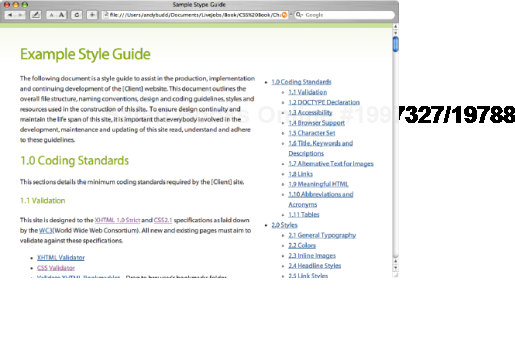
A style guide is a document, web page, or microsite that explains how the code and visual design of a site is pieced together. At its most basic level a style guide should outline the general design guidelines like the appropriate treatment for headlines and other typographic elements, how the grid structure works and what color pallet to use. A good style guide will also look at the treatment of repeating elements like articles, news items, and notifications to define how they should and shouldn't be implemented. More detailed style guides may even include information on coding standards like the version of XHTML/CSS used, the chosen accessibility level, browser support details, and general coding best practices (see Figure 2-6).
Style guides are a great way of handing a project over to those responsible for maintaining or implementing the site. By setting down some simple guidelines, you can help ensure the site develops in a controlled way, and help lessen the fragmentation of your styles over time. Style guides are also a great way of introducing new employees or contractors to an unfamiliar and potentially complicated system.
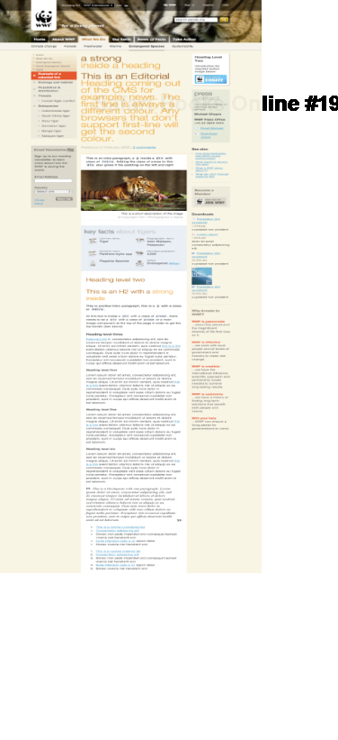
Unfortunately, keeping your style guide up-to-date can take a considerable amount of effort so they often go out of sync with the live site very quickly. Because of this we prefer to use a form of living style guide that we've called a "pattern portfolio" (see Figure 2-7).
A pattern portfolio is a page or series of pages that use the live style sheets to display every possible permutation and combination of styles on a site, from heading levels and text styles through to specific content and layout types. These pages can provide your back-end and front-end developers with an extremely valuable resource, allowing them to build page combinations that haven't even been conceived of yet. As they draw from the live styles, they can also act as a useful form of regression testing, allowing you to check that any changes to your CSS haven't caused and untoward problems.
In this chapter, you have reacquainted yourself with the common CSS 2.1 selectors as well as learned about some powerful new CSS 3 selectors. You now have a better understanding of how specificity works and how you can use the cascade to structure your CSS rules and help them hit the target. You have also learned how to comment and structure your style sheets for maintainability.
In the next chapter, you will learn about the CSS box model, how and why margins collapse, and how floating and positioning really works.