
One of the major benefits of CSS is the ability to control page layout without needing to use presentational markup. However, CSS layout has gained an undeserved reputation for being difficult, particularly among those new to the language. This is partly due to browser inconsistencies, but mostly due to a proliferation of different layout techniques available on the Web. It seems that each CSS author has their own preferred way of creating multicolumn layouts, and new CSS developers will often use a technique without really understanding how it works. This situation has been exacerbated by the rise of so-called CSS frameworks, which aim to make CSS layout easier by creating a strong coupling between markup and presentation—the very reason we ditched table-based layout in the first place. This black box approach to CSS may get quick results but ultimately stunts the developer's understanding of the language and ability to implement changes.
All these CSS layout techniques rely on three basic concepts: positioning, floating, and margin manipulation. The different techniques really aren't that different, and if you understand the core concepts, it is relatively easy to create your own layouts with little or no hassle. In fact, layout is generally the easiest part of CSS; it's all the tweaking that takes time.
In this chapter, you will learn about
Horizontally centering a design on a page
Creating two- and three-column float-based layouts
Creating fixed-width, liquid, and elastic layouts
Creating equal height columns
CSS frameworks versus CSS systems
When it's time to start turning your designs into fully functional templates, it is very tempting to jump straight in and start marking up your page or slicing up your images. However, you can find that you've painted yourself into a corner very quickly. Instead, a small amount of planning can save a lot of hassle further down the line. Or, as the saying goes, "Measure twice; cut once."
The first step in creating a scalable and easy to maintain CSS system is to review your designs, looking for repeating patterns. These could be patterns in the structure of the page or the way certain elements are repeated across the site. You shouldn't be too concerned with the visual representation at this stage. Instead, look at the structure and meaning. I like to do this by printing out each design, spotting the patterns and then scribbling mark-up notes on each page (see Figure 8-1). However, I've seen people do this by annotating their Photoshop files or grey-box designs.

Begin by breaking your pages into major the structural areas like the wrapper, header, content area, and footer. These areas tend to be consistent across the whole site and rarely change. To use an architectural analogy, you could think of these as the external walls of the building.
Then, turn your attention to the content area itself, and start building out your grid structure. How many different content areas does the design have, and how do they differ? Are the content areas actually that different, or can they be treated the same from a layout perspective? Most designs will have only a couple of unique content areas, so look for shared characteristics rather than the visual representation. You could consider these content areas as the internal load-bearing walls of your construction.
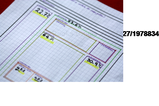
Finally, we need to start looking at the different layout constructs that appear in the various content areas. Do you need to present certain types of information in two, three, or four columns? Unlike the previous step, these layout constructs tend to be very flexible and change from page to page. So you could think of them like the dry wall partitions in your building. Combined with the previous step, these construct help form the floor plan of each of your pages. At this point, reach for the graph paper and colored pencils, and start mapping the structure and dimensions in more detail (see Figure 8-2).
With the structure in place, you can now turn your attention to the different kinds of content. Is this is a news story, an article, or a press release? Give each block a meaningful name and then see how they relate to each other. It may turn out that there's actually very little difference between your news stories and press releases, in which case, combining them into a single content type would make sense.
Look at how each content block is structured, and see if you can see patterns emerging across different types. For instance, you may notice that both your articles and news stories have a prominent header and footer, so identify them as such. It really doesn't matter if the headers and footers look different, as you can style them later based on context. The same is true of things like error messages, search boxes, and menu items. Try to keep the class names as generic as possible, and style them based on context.
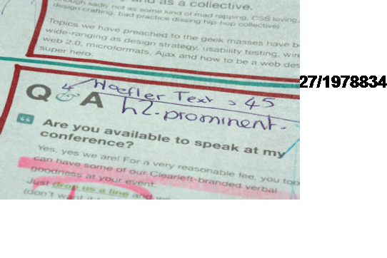
Once I've got patterns and naming conventions sorted, I find it useful to start defining the elements I'm going to use. For example, a list of links might be an unordered list, while a story might to be a div with an h2, a paragraph, and an anchor element. It's much easier to do this up front, with a few of your colleagues, than on the fly. I also find it useful to jot down color codes, dimensions, and anything else that will help during production. Again, you can make these annotations on a printout of the designs for quick reference, as shown in Figure 8-3.
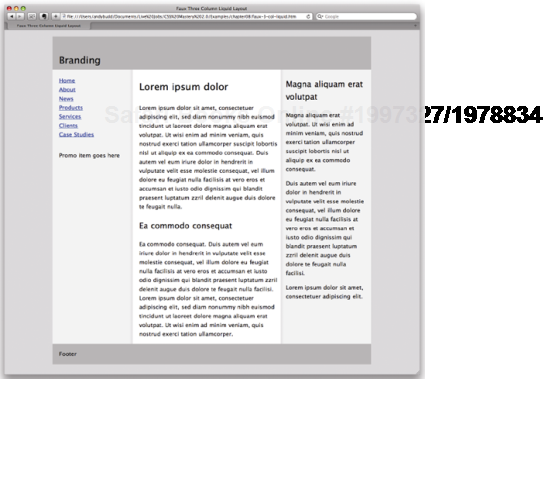
Let's assume that we're going to be building a classic three-column blog template, like the one shown in Figure 8-4.
By analyzing the design, it's clear that we're going to need a wrapper element to center the design, along with a header, content area, and footer. The markup would, therefore, look something like this:
<body>
  <div class="wrapper">


    <div class="header">
      <!--Your header content goes here-->
    </div>
<div class="content>
<!--Your page content goes here-->
</div>
<div class="footer">
<!--Your footer content goes here-->
</div>
</div>
</body>As these last three areas are enclosed inside the wrapper, let's start by styling the wrapper element.
Long lines of text can be difficult and unpleasant to read. As modern monitors continue to grow in size, the issue of screen readability is becoming increasingly important. One way designers have attempted to tackle this problem is by centering their designs. Rather than spanning the full width of the screen, centered designs span only a portion of the screen, creating shorter and easier-to-read line lengths.
Say you have a typical layout where you wish to center a wrapper div horizontally on the screen:
<body>
  <div class="wrapper">
  </div>
</body>
To do this, you simply define the width of your wrapper div and set the horizontal margins to auto:
.wrapper {
  width: 920px;
  margin: 0 auto;
}
In this example, I have decided to fix the width of my wrapper div in pixels, so that it fits nicely on an 1024×768–resolution screen. However, you could just as easily set the width as a percentage of the body or relative to the size of the text using ems.
This works on all modern browsers. However, IE 5.x and IE 6 in quirks mode don't honor the margin:auto declaration. Luckily, IE misunderstands text-align: center, centering everything instead of just the text. You can use this to your advantage by centering everything in the body tag, including the wrapper div, and realigning the contents of the wrapper back to the left:
body {
text-align: center;
}
.wrapper {
width: 920px;
margin: 0 auto;
text-align: left;
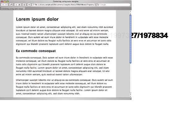
}Using the text-align property in this way is a hack—but a fairly innocuous hack that has no adverse effect on your site. The wrapper now appears centered in older versions of IE as well as more standards-compliant browsers (see Figure 8-5).
There are a few different ways of doing CSS-based layout, including absolute positioning and using negative margins. I find float-based layouts the easiest and most reliable method to use. As the name suggests, in a float-based layout, you simply set the width of the elements you want to position and then float them left or right.
Because floated elements don't take up any space in the flow of the document, they no longer appear to exert any influence on the surrounding block boxes. To get around this, you will need to clear the floats at various points throughout the layout. Rather than continuously floating and clearing elements, it is quite common to float nearly everything and then clear once or twice at strategic points throughout the document, such as the page footer. Alternatively, you could use the overflow method to clear the contents of particular elements. This is my current preferred method, so it's the one I'll be using throughout the rest of these examples.
To create a two-column layout inside our content area, we first need to create our basic HTML structure.
<div class="content">


<div class="primary">
  <!-- main content goes here -->
</div>


<div class="secondary">
  <!--navigation and secondary content goes here -->
</div>


</div>
The secondary content area for this design—including the site navigation—will be on the left side of the page, while the primary content will be on the right. However, I have chosen to put the primary content area above the secondary content area in the source order for usability and accessibility reasons. First, the primary content is the most important thing on the page and so should come first in the document. Second, there is no point forcing screen reader users to trawl through navigation links and less important content like site promotions before they get to the primary content if they don't have to.
Normally, when people create float-based layouts, they float both columns left and then create a gutter between the columns using margin or padding. When using this approach, the columns are packed tightly into the available space with no room to breathe. Although this wouldn't be a problem if browsers behaved themselves, buggy browsers can cause tightly packed layouts to break, forcing columns to drop below each other.
This can happen on IE because it honors the size of an element's content, rather than the size of the element itself. In standards-compliant browsers, if the content of an element gets too large, it will simply flow out of the box. However, on IE, if the content of an element becomes too big, the whole element expands. This can be triggered by the smallest things, such as some of your text being set in italic. If this happens in very tightly packed layouts, there is no longer enough room for the elements to sit next to each other, and one of the floats will drop. Other IE bugs, such as the 3-pixel text jog bug and the double-margin float bug (see Chapter 9), along with various browser-rounding errors can also cause float dropping.
To prevent your layouts from breaking, you need to avoid cramming floated layouts into their containing elements. Rather than using horizontal margin or padding to create gutters, you can create a virtual gutter by floating one element left and one element right (see Figure 8-6). If one element inadvertently increases in size by a few pixels, rather than immediately running out of horizontal space and dropping down, it will simply grow into the virtual gutter.
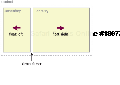
The CSS for achieving this layout is very straightforward. You simply set the desired width of each column and then float the secondary content left and the primary content right. You also need to add a small amount of padding to the primary content to prevent the enclosed text being flush to the right hand edge of the element. You'll notice that I've also added display:inline to all the floated items. This is a defensive measure to prevent the double margin float bug in IE (more on that in the next chapter).
.content .primary {
  width: 650px;
  padding-right: 20px;
  float: right;
  display: inline;
}

.content .secondary {
  width: 230px;
  float: left;
  display: inline;
}
As the total width available is 920 pixels, these dimensions leave a 20-pixel wide virtual gutter between each floated element. As mentioned previously, doing this protects the layout from float drops due to accidental content expansion.
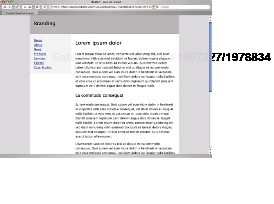
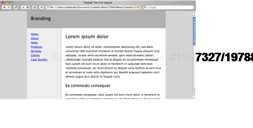
Because these elements are floated, they no longer take up any space in the flow of the document, causing the footer to rise up. In order to prevent this, you need to clear the floated items by applying the overflow method to their parent element, in this case the content div.
.content {
  overflow: hidden;
}
And there you have it: a simple two-column CSS layout (see Figure 8-7).
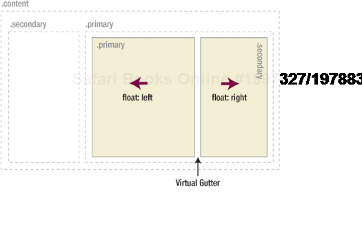
You'll notice that rather than creating two separate elements called primary-content and secondary-content, I've simply used the terms primary and secondary. I've then used the fact that these two elements are nested within the content element to create the association. This has a couple of benefits. First off, it means that you don't have to keep creating new class names for every element you want to style. Instead, you can use the cascade to help you out. Secondly, and arguably more importantly, you can use the same primary and secondary classes more than once, creating a very flexible naming system. For instance, say we wanted to create a three-column layout instead of just a two-column one.
The HTML needed to create a three-column layout is very similar to that used by the two-column layout, the only difference being the addition of two new divs inside the primary content div: one for the main content and one for the secondary content. Therefore, we can reuse our flexible primary and secondary class names again.
<div class="content">
<div class="primary">
<div class="primary">
<-- your primary primary content goes here -->
</div>
<div class="secondary">
<-- your secondary primary content goes here -->
</div>
</div>
<div class="secondary">
<!--navigation and secondary content goes here -->
</div>
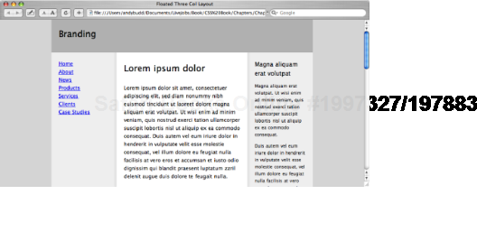
</div>Using the same CSS as the two-column technique, you can float the secondary content left and the primary content right. Then, inside the primary content div, you can float the primary div left and the secondary div right (see Figure 8-8). This essentially divides the primary content area in two, creating a three-column effect.
As before, the CSS for this is very simple. You just set your desired widths and then float the primary div left and the secondary div right, creating a 20-pixel gap in the middle:
.content .primary .primary {
width: 400px;
float: left;
display: inline;
}
.content .primary .secondary {
width: 230px;
float: right;
display: inline;
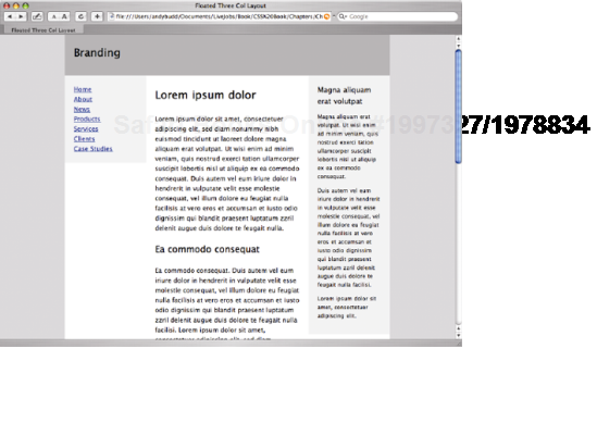
}One thing you'll notice is that the right-hand padding we gave to the primary div in the in the first example is now being applied to our new primary div in the second example. As such, we need to remove the pading from the more general style and apply it to the more specific style.
.content .primary {
  width: 670px; /* width increased and padding removed*/
  float: right;
  display: inline;
}

.content .secondary {
  width: 230px;
  float: left;
  display: inline;
}


.content .primary .primary {
  width: 400px;
  float: left;
  display: inline;
}


.content .primary .secondary {
  width: 230px;
  padding-right: 20px; /*  padding applied here instead*/
  float: right;
  display: inline;
}
This leaves you with a nice and solid three-column layout (see Figure 8-9).
So far, all the examples have used widths defined in pixels. This type of layout is known as fixed-width layout. Fixed-width layouts are very common, as they give the developer more control over layout and positioning. If you set the width of your design to be 960 pixels wide, it will always be 960 pixels. If you then want a branding image spanning the top of your design, you know it needs to be 960 pixels wide to fit. Knowing the exact width of each element allows you to lay them out precisely and know where everything will be. This makes fixed-width layout the easiest and therefore most common approach.
However, fixed-width designs have their downsides. First, because they are fixed, they are always the same size no matter what your window size. As such, they don't make good use of the available space. On large screen resolutions, designs created for 1024×760 can appear tiny and lost in the middle of the screen. Conversely, a design created for a 1024×760 screen will cause horizontal scrolling (or crawling) on smaller screen resolutions. With an increasingly diverse range of screen sizes to contend with, fixed-width designs don't adapt well to the flexible nature of the Web. As such, they often feel like a poor compromise.
Another issue with fixed-width design revolves around line lengths and text legibility. Fixed-width layouts usually work well with the browser default text size. However, you only have to increase the text size a couple of steps before sidebars start running out of space and the line lengths get too short to comfortably read.
To work around these issues, you could choose to use liquid or elastic layout instead of fixed-width layout.
With liquid layouts, dimensions are set using percentages instead of pixels. This allows liquid layouts to scale in relation to the browser window. As the browser window gets bigger, the columns get wider. Conversely, as the window gets smaller, the columns will reduce in width. Liquid layouts make for very efficient use of space, and the best liquid layouts aren't even noticeable.
However, liquid layouts are not without their own problems. At small window widths, line lengths can get incredibly narrow and difficult to read. This is especially true in multicolumn layouts. As such, it may be worth adding a min-width in pixels or ems to prevent the layout from becoming too narrow. However, set the min-width too large and your liquid designs inherit the same constraints as their fixed-width cousins.
Conversely, if the design spans the entire width of the browser window, line lengths can become long and difficult to read. You can do a couple of things to help avoid this problem. First, rather than spanning the whole width, you could make the wrapper span just a percentage—say, 85 percent. You could also consider setting the internal padding and margins as percentages as well. That way, the padding and margins will increase in width in relation to the window size, stopping the columns from getting too wide, too quickly. Last, you should add a maximum width on the wrapper to prevent the content from getting ridiculously wide on oversized monitors.
You can use these techniques to turn the previous fixed-width, three-column layout into a fluid, three-column layout. Start by setting the width of the wrapper as a percentage of the overall width of the window. Most people will pick an arbitrary size based on what looks good on their screens, and that's perfectly fine. However if you want to be more precise, take a look at your browser stats to calculate the most common window size and then pick a wrapper percentage that matches how the fixed width version would look at that size. A good tool for this is Liquid Fold (http://liquidfold.net/). For example, if your designer used a width of 960 pixels and the majority of your users have their browser windows set to 1250 pixels, the percentage to use would be (960 ÷ 1250) × 100 = 76.8 percent.
Next, set the width of the primary and secondary content areas as a percentage of the wrapper width. In the previous example, the width of our primary content div was 670 pixels. As the total width was 920 pixels, this works out as 72.82 percent. Similarly, the width of the secondary content div works out at exactly 25 percent. This leaves a 2.18 percent virtual gutter between the navigation and the wrapper to deal with any rounding errors and width irregularities that may occur:
.wrapper {
  width: 76.8%;
  margin: 0 auto;
  text-align: left;
}


.content .primary {
  width: 72.82%;
  float: right;
  display: inline;
}
.content .secondary {
  width: 25%;
  float: left;
  display: inline;
}
You then need to set the widths of the columns inside the primary content area. This gets a bit trickier, because the widths of the content divs are based on the width of the primary content element and not the overall wrapper. So this time, the width of the primary div is 400 pixels, which works out to be 59.7 percent of the parent element. Similarly, the width of the secondary div works out to be 34.33 percent. Finally, we still need a 20-pixel gutter, which works out at 2.63 percent of the parent element.
.content .primary .primary {
  width: 59.7%;
  float: left;
  display: inline;
}
.content .primary .secondary {
width: 34.33%;
padding-right: 2.63%;
float: right;
display: inline;
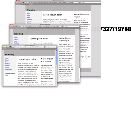
}This produces a liquid layout that is optimal at window size of 1250 pixels but is comfortable to read at both larger and smaller screen resolutions (see Figure 8-10).
Because this layout scales so nicely, there isn't any need to add a max-width property. However, to ensure the lines of text remain a readable length, it's always a good idea to add a max-width in ems. The layout does start to get a little cramped at smaller window sizes, so I'm going also to add a min-width in ems as well.
.wrapper {
  width: 76.8%;
  margin: 0 auto;
  text-align: left;
  max-width: 125em;
  min-width: 62em;
}
And there you have it, a nice, flexible, liquid layout.
While liquid layouts are useful for making the most of the available space, line lengths can still get uncomfortably long on high-resolution monitors. Conversely, lines can become very short and fragmented in narrow windows or when the text size is increased a couple of steps. If these limitations are of concern, elastic layouts may be your solution.
Elastic layouts work by setting the width of elements relative to the size of the font instead of the width of the browser. By setting widths in ems, you ensure that when the font size is increased the whole layout scales. This allows you to keep line lengths to a readable size and is particularly useful for people with reduced vision or cognitive disorders.
Like other layout techniques, elastic layouts are not without their issues. Elastic layouts share some of the problems with fixed-width layouts, such as not making the most use of the available space. Also, because the whole layout increases when the text size is increased, elastic layouts can become much wider than the browser window, forcing the appearance of horizontal scroll bars. To combat this, it may be worth adding a max-width of 100% to the wrapper div; max-width wasn't supported by IE6 and below, but it is supported by newer versions. If you need to support max-width in IE 6, you can use JavaScript as well.
Elastic layouts are much easier to create than liquid layouts as all of the HTML elements essentially stay in the same place relative to each other; they just all increase in size. Turning a fixed-width layout into an elastic layout is a relatively simple task. The trick is to set the base font size so that 1 em roughly equals 10 pixels.
The default font size on most browsers is 16 pixels. Ten pixels works out at 62.5 percent of 16 pixels, so setting the font size on the body to 62.5% does the trick:
body {
  font-size: 62.5%;
  text-align: center;
}
Because 1 em now equals 10 pixels at the default font size, we can convert our fixed-width layout into an elastic layout relatively easily. In previous editions of this book, I recommended setting all the widths in ems. However, my esteemed colleague and technical reviewer Natalie Downe suggested keeping the internal widths as percentages and only setting the wrapper width in ems. That way, the internal widths will still size themselves relative to the font size. This allows you to change the overall size of the layout without having to change the width on each individual element, making for a more flexible and maintainable solution.
.wrapper {
  width: 92em;
  max-width: 95%;
  margin: 0 auto;
  text-align: left;
}


.content .primary {
  width: 72.82%;
  float: right;
  display: inline;
}


.content .secondary {
  width: 25%;
  float: left;
  display: inline;
}
.content .primary .primary {
width: 59.7%;
float: left;
display: inline;
}
.content .primary .secondary {
width: 34.33%;
padding-right: 2em;
float: right;
display: inline;
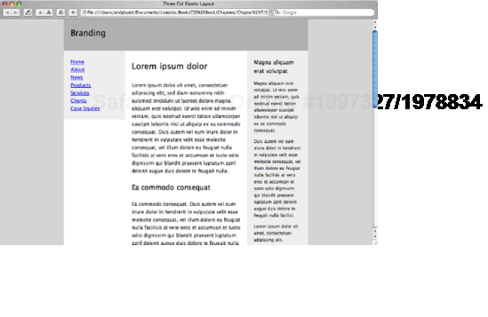
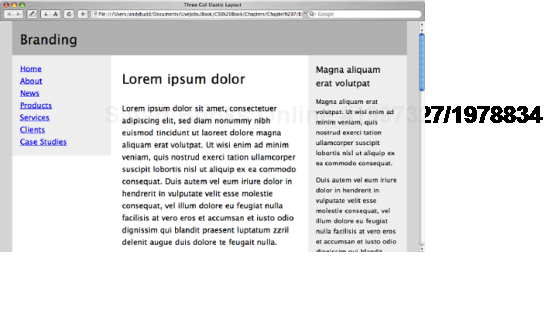
}This produces a layout that looks identical to the fixed-width layout at regular text sizes (see Figure 8-11), but scales beautifully as the text size is increased (see Figure 8-12).
With the increasing prevalence of page zooming in modern browsers, some people have begun to question the need for elastic layouts. However, until all browsers support page zooming by default, you may still want to consider elastic layouts for older browsers.
If you choose to use a liquid or an elastic layout, fixed-width images can have a drastic effect on your design. When the width of the layout is reduced, images will shift in relation to it and may interact negatively with each other. Images will create natural minimum widths, preventing some elements from reducing in size. Other images will break out of their containing elements, wreaking havoc on finely tuned designs. Increasing the width of the layout can also have dramatic consequences, creating unwanted gaps and unbalancing designs. But never fear—there are a few ways to avoid such problems.
For images that need to span a wide area, such as those found in the site header or branding areas, consider using a background image rather than an image element. As the branding element scales, more or less of the background image will be revealed:
#branding {
  height: 171px;
  background: url(/img/branding.png) no-repeat left top;
}


<div id="branding"></div>
If the image needs to be on the page as an image element, try setting the width of the container element to 100% and the overflow property to hidden. The image will be clipped on the right-hand side so that it fits inside the branding element but will scale as the layout scales:
#branding {
  width: 100%;
  overflow: hidden;
}


<div id="branding">
  <img src="/img/branding.png" width="1600" height="171" />
</div>
For regular content images, you will probably want them to scale vertically as well as horizontally to avoid clipping. You can do this by adding an image element to the page without any stated dimensions. You then set the percentage width of the image, and add a max-width the same size as the image to prevent pixelization.
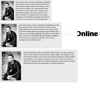
For example, say you wanted to create a news story style with a narrow image column on the left and a larger text column on the right. The image needs to be roughly a quarter of the width of the containing box, with the text taking up the rest of the space. You can do this by simply setting the width of the image to 25% and then setting the max-width to be the size of the image, in this case 200 pixels wide:
.news img {
  width: 25%;
  max-width: 200px;
  float: left;
  display: inline;
  padding: 2%;
}


  .news p {
  width: 68%;
  float: right;
  display: inline;
  padding: 2% 2% 2% 0;
}
As the news element expands or contracts, the image and paragraphs will also expand or contract, maintaining their visual balance (see Figure 8-13). However, on standards-compliant browsers, the image will never get larger than its actual size.
You may have noticed that the navigation and secondary content areas on all these layouts have been given a light gray background. Ideally, the background would stretch the full height of the layout, creating a column effect. However, because the navigation and secondary content areas don't span the full height, neither do their backgrounds.
To create the column effect, you can make fake columns by applying a repeating background image to an element that does span the full height of the layout, such as a wrapper div. Dan Cederholm coined the term "faux column" to describe this technique.
Starting with the fixed-width, two-column layout, you can simply apply a vertically repeating background image, the same width as the navigation area, to the wrapper element (see Figure 8-14):
#wrapper {
  background: #fff url(/img/nav-bg-fixed.gif) repeat-y left top;
}
For the three-column fixed width layout, you can use a similar approach. This time, however, your repeating background image needs to span the whole width of the wrapper and include both columns (see Figure 8-15). Applying this image in the same way as before creates a lovely faux two-column effect (see Figure 8-16).
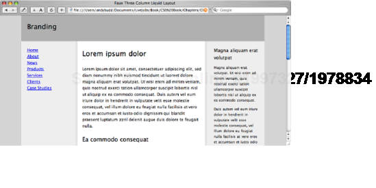
Creating faux columns for fixed-width designs is relatively easy, as you always know the sizes of the columns and their positions. Creating faux columns for fluid layouts is a little more complicated; the columns change shape and position as the browser window is scaled. The trick to fluid faux columns lies in the use of percentages to position the background image.
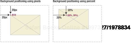
If you set a background position using pixels, the top-left corner of the image is positioned from the top-left corner of the element by the specified number of pixels. With percentage positioning, it is the corresponding point on the image that gets positioned. So if you set a vertical and horizontal position of 20 percent, you are actually positioning a point 20 percent from the top left of the image, 20 percent from the top left of the parent element (see Figure 8-17).
Positioning background images using percentages can be very useful, as it allows you to create background images with the same horizontal proportions as your layout and then position them where you want the columns to appear.
To create a faux column for the secondary content area, you start by creating a very wide background image. In this example, I have created an image that is 4000 pixels wide and 5 pixels high. Next, you need to create an area on the background image to act as the faux column. The secondary content area has been set to be 25 percent of the width of the wrapper, so you need to create a corresponding area on the background image that is 25 percent wide. For a background image that is 4000 pixels wide, the faux column part of the image needs to be 1000 pixels wide. Output this image as a GIF, making sure that the area not covered by the faux column is transparent.
The right edge of the faux column is now 25 percent from the left side of the image. The right edge of the secondary content area is 25 percent from the left edge of the wrapper element. That means if you apply the image as a background to the wrapper element, and set the horizontal position to be 25 percent, the right edge of the faux column will line up perfectly with the right edge of the navigation element.
.wrapper {
  background: #fff url(/img/secondary-faux-column.gif) repeat-y 25% 0;
}
You can create the background for the primary content area using a similar method. The left edge of this faux column should start 72.82 percent from the left edge of the image, matching the position of the primary content element relative to the wrapper. Because the wrapper element already has a background image applied to it, you will need to add a second wrapper element inside the first. You can then apply your second faux column background image to this new wrapper element.
.inner-wrapper {
  background: url(/img/primary-faux-column.gif) repeat-y 72.82% 0;
}
If you have worked out your proportions correctly, you should be left with a beautiful three-column liquid layout with columns that stretch the height of the wrapper (see Figure 8-18).
As well as creating columns as part of your main layout, you may want to create equal-height columns elsewhere in your design, like the ones in Figure 8-19. While this is easy to accomplish using tables, it's a little trickier in CSS.
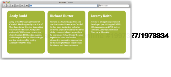
Let's start with the mark-up.
<div class="wrapper">
  <div class="box">
    <h1>Andy Budd</h1>
      <p>...</p>
  <div class="bottom"></div>
</div>


  <div class="box">
    <h1>Richard Rutter</h1>
      <p>...</p>
  <div class="bottom"></div>
</div>
<div class="box">
<h1>Jeremy Keith</h1>
<p>...</p>
<div class="bottom"></div>
</div>
</div>For this example, you are going to need three divs, one for each of the three columns. Inside each div, you'll need a heading, some copy, and an empty div to use as a hook for the bottom corners. All three divs are then enclosed in a wrapper div, which we will use to constrain the height. We can now start styling our boxes.
.wrapper {
  width: 100%;
}


.box {
  width: 250px;
  margin-left: 20px;
  float: left;
  display: inline;
  padding: 20px;
  background: #89ac10  url(/img/top.gif) no-repeat left top;
}
You will see from Figure 8-20 that this leaves us with three, uneven columns.
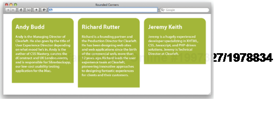
The trick to this technique is to give each box a large amount of bottom padding and then remove this height with a similar amount of negative margin. This causes each column to overflow the wrapper element (see Figure 8-21). If you then set the overflow property of the wrapper to hidden, the columns get clipped at their tallest point. In this example, I'm giving each element a bottom padding of 520 pixels and a bottom margin of 500 pixels. The 20 pixels difference forms the visible padding at the bottom of each box.
.wrapper {
  width: 100%;
  overflow: hidden;
}


.box {
  width: 250px;
  padding-left: 20px;
  padding-right: 20px;
  padding-top: 20px;
  padding-bottom: 520px;
  margin-bottom: 500px;
  margin-left: 20px;
  float: left;
  display: inline;
  background: url(/img/top.gif) #89ac10 top left no-repeat;
}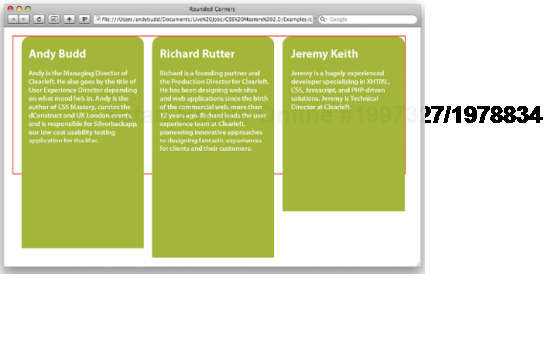
Figure 8.21. The red border shows the bounds of the wrapper div, so you can see how the three colums flow out of this element
To position the bottom of the columns in the right place, you need to align them with the bottom of the wrapper element. To do this, you first need to set the positioning context by giving the wrapper a position of relative. You can then set to position of the empty divs to be absolute and set their bottom properties to be zero. Now, all you need to do is give the elements the correct width and height and apply the bottom image as a background.
.wrapper {
  width: 100%;
  overflow: hidden;
  position: relative;
}


.box {
  width: 250px;
  padding-left: 20px;
  padding-right: 20px;
  padding-top: 20px;
padding-bottom: 520px;
margin-bottom: 500px;
margin-left: 20px;
float: left;
display: inline;
padding: 20px;
background: url(/img/top.gif) #89ac10 top left no-repeat;
}
.bottom {
position: absolute;
bottom: 0;
height: 20px;
width: 290px;
background: url(/img/bottom.gif) #89ac10 bottom left no-repeat;
margin-left: −20px;
}The result is a three-column layout that retains the height of the longest column, as shown in Figure 8-19. Neat, huh?
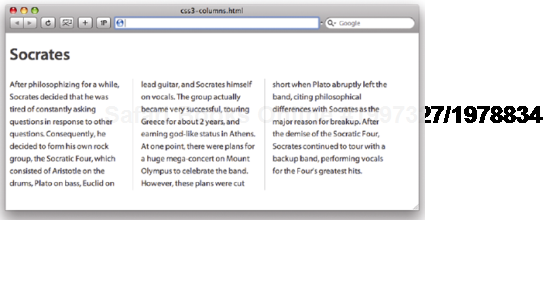
CSS 3 also gives us the ability to create equal-height text columns, as shown in Figure 8-22. This is achieved through the column-count ,column-width and column-gap properties.
Say you start with the following markup:
<h1>Socrates</h1>
<div class="col">
  <p>After philosophizing for a while...</p>
</div>
Applying these rules will create a three-column layout where each column is 14 ems wide and has a 2-em gap between it and the next columns. One of the nice features of CSS columns is what happens if the available space becomes smaller than the width of the defined columns. Rather than the columns wrapping, as you'd get if you were using floats, the column count simply reduces. So if there weren't enough space for three columns, you would reduce down to two.
.col {
  -moz-column-count: 3;
  -moz-column-width: 14em;
  -moz-column-gap: 2em;
  -moz-column-rule: 1px solid #ccc;
  -webkit-column-count: 3;
-webkit-column-width: 14em; -webkit-column-gap: 2em; -webkit-column-rule: 1px solid #ccc; column-count: 3; column-width: 14em; column-gap: 2em; column-rule: 1px solid #ccc; }
As you can probably see from the preceding code, CSS columns aren't widely supported yet. As such, you need to back up the regular code with the use of browser-specific extensions.
In the programming world, frameworks like Rails or Django take common patterns in web development, such as adding records to a database, and abstract them into a simple set of reusable components. This abstraction allows developers to build fairly sophisticated applications without needing to engineer these functions from scratch. Unlike a library of stand-alone functions, frameworks tend to be highly integrated. As such, frameworks are abstracted to such a degree that it's possible, although not desirable, to build entire applications without needing to understand the parent language.
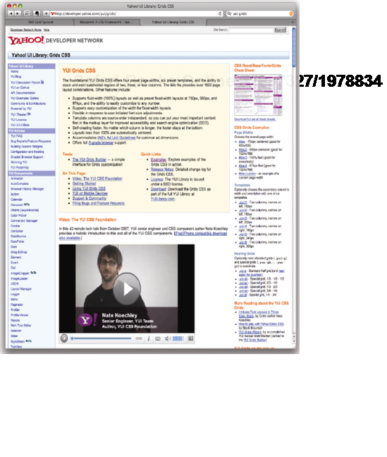
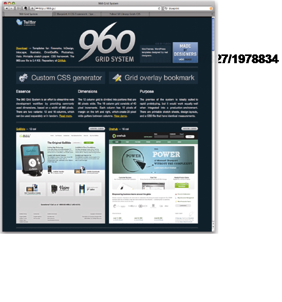
Over the last couple of years, we've slowly seen the rise of so-called CSS frameworks. These frameworks aim to take some of the drudgery out CSS and help users create a variety of common layouts without needing to edit the underlying CSS. Instead, these frameworks encourage developers to use a series of markup patterns and naming conventions and then manage the layout behind the scenes. The three most popular frameworks are YUI Grids, Blueprint, and 960 (see Figure 8-23), although there are several others to choose from.
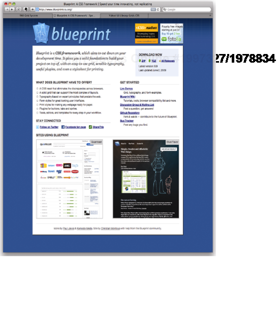
These frameworks offer a number of useful productivity benefits including global style resets, sitewide typographical handling, and consistent form treatment—things you will need on the majority of your projects. However, frameworks also change the way you write your markup, losing the important separation of presentation from meaning. For instance, the markup used in the Blueprint framework is clearly presentational in nature, talking, as it does, in terms of columns and column spans.
<div class="column span-24">
<!-- header -->
</div>
<div class="column span-4">
<!-- left sidebar -->
</div>
<div class="column span-16">
<!-- main content -->
</div>
<div class="column span-4 last">
<!-- right sidebar -->
</div>
By using frameworks to control layout, developers are forced to use a presentational style of markup that more closely resembles table-based design. In fact, you could argue that tables are better than CSS frameworks, because tables have the same ridged, presentational mark-up without the extra CSS to download. Frameworks also force the developer to learn not only the underlying language but the framework as well. Often this doesn't happen, and the developer is left with a partial understanding of both.
Frameworks have another disadvantaged in the fact that they enforce a specific grid structure on your designs. This is fine if your designs happen to fit the widths and margins defined by the framework. However, just as it's unacceptable for your programming framework to dictate the user experience of your website, it's unacceptable for your CSS framework to dictate the design of your site. By selecting a specific framework, the danger is that you'll end up using it for every project and thus painting yourself into a corner. Or, as the saying goes, if you only have a hammer, everything looks like a nail.
These problems become evident when you understand where frameworks came from. Rather than being designed from scratch as a flexible layout system for any possible design, most were created for the use on specific sites like Yahoo or the Laurence Kansas Journal. These sites already had well-defined grid structures and style guides, so the developers knew that every new page would follow the same pattern. Over time, the developers found other uses for these systems, so they abstracted them and released them to the general public. However, the focus of these frameworks on their original sites is still evident in their design.
So how do we get the productivity benefits from CSS frameworks without the obvious disadvantages? This is where the concept of CSS systems comes in. A CSS system is essentially a toolbox of reusable styles and markup patterns that can be used to develop site-specific frameworks. This toolbox could include your global resets, typographic styles, and form treatments, along with markup patterns for common HTML widgets such as sign-up forms, calendar tables, and navigation lists. You can then use the techniques you've learned in this book to develop a system for your clients that acts like a customized framework, complete with all the different layout options they will need. This process initially involves a little more work on the your part, but it provides all the benefits of a CSS framework without the pitfalls.
In this chapter, you learned how to create simple two- and three-column fixed-width layouts using floats. You then learned how these layouts could be converted into liquid and elastic layouts with relative ease, as well as exploring some of the problems associated with these layouts and how setting maximum widths in ems or pixels can offer solutions. You also saw how to create full height column effects on both fixed-width and flexible layouts, using vertically repeating background images. This chapter also touched on some of the techniques used to create CSS-based layouts. However, there are a lot of techniques out there, enough to fill a whole book of their own. Last, you learned some of the dangers inherent in CSS frameworks and the importance of developing your own CSS system instead.
One of the big problems developers face with CSS layouts is that of browser inconsistency. To get around browser-rendering issues, you need to have a good understanding of the various bugs and how to fix them. In the next chapter, you will learn about some of the better-known browser bugs along with the fundamentals of CSS debugging.