
By Simon Collison
In the previous edition of CSS Mastery, I introduced my More Than Doodles case study by talking about the "very rich palette" from which we designers can paint. At that time, we were reaching a period of critical mass, with web standards gaining ground across the industry. It was an exciting time, and we were having a ball with CSS 2.1, creating stunning layouts despite problems thrown at us by some of the older browsers.
More than three years on, we find ourselves increasingly comfortable with implementing techniques from the CSS 3 specification in our layouts. We can replace some decorative background images with combinations of CSS 3 rules such as border-radius and box-shadow, and we can achieve greater control of transparency layers without resorting to semi-transparent background images thanks to RGBa. Importantly, with progressive enhancement, we can still deliver a neatly constructed experience to those on browsers lacking support for CSS3 and its sweet little tools and techniques.
In this case study, you will learn about:
HTML and CSS organization and conventions
Grid flexibility
Highlighting the current page based on
bodyclassTargeting elements with pseudo classes and adjacent sibling selectors
Combining classes for extra power and flexibility
RGBa,border-radiusandbox-shadowpropertiesPositioning list items and revealing content
This case study is built on a rock-solid XHTML structure – as lean, organized, and powerful as possible. Specifically, the XHTML does not contain any extra markup added purely for the purpose of hooking CSS onto it. No, what we have in the markup is what we need in the markup – and nothing extraneous. So, the aim of this chapter is to take what we have and use really smart CSS selectors to target specific XHTML without the need for extra divs, clearing divs or anything else that could be deemed unnecessary.
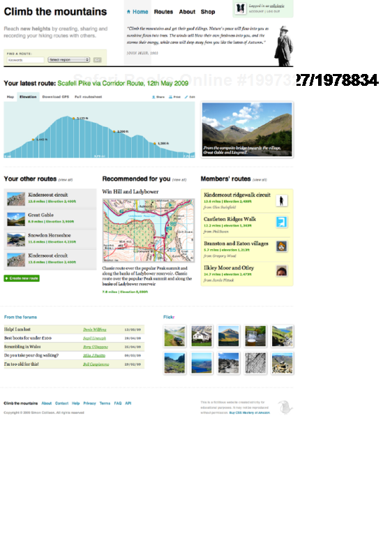
Climb the Mountains (herein referred to as CTM) is a fictitious web application dedicated to those hardy hill walkers, trekkers, and climbers out there who like nothing more than leaving the comfort of a warm home and spending hours, days, or weeks roaming the wildernesses in search of nature's pleasure. CTM is a social website with a strong community focus and networking opportunities between members (see Figure 11-1). A key feature is the upload and export of GPS routes to members' own GPS devices; this data adds detailed statistics to each archived route. Alongside this data, each route has accompanying photographs, maps, downloads, and associated information, and the information architecture (IA) is packed with data. This is where we can use some nifty CSS to bring things to life and ultimately ensure all copy and images are unsullied, and the whole layout can remain extremely flexible.
The design is broken up into numerous blocks of information, so that it is easier to focus on the area we're discussing, rather than mess around with layers of overly decorative styling. By analyzing a number of great techniques through this chapter, you'll hopefully see how these can be adapted and applied to your own designs, alongside others featured in this book.
Many thanks to my colleague Greg Wood for his considerable assistance with the Climb the Mountains concept. All of the photographs are from my own Flickr account, mostly taken in England's glorious Lake District earlier this year. The typefaces include various fonts from the Palatino family, plus more common flavors including Helvetica, Georgia, and good old Verdana, with defaults Arial or Times New Roman in the stacks.
The case study will remain online at http://www.climbthemountains.com/cssm/.
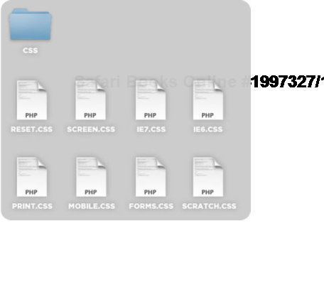
Without question or compromise, every single website I'm involved with needs to be built with a solid foundation layer. This is a conventions package. Over the last two years, I have worked with my colleagues to develop a base layer of rules and conventions that act as starting points for HTML, CSS, JavaScript, and ExpressionEngine. It's a bumper compendium of connected CSS files, naming conventions, modules, plug-ins, and library scripts that ensure any project led or worked on by any member(s) of the team will stay on convention and be simpler for anyone else to step into and work with at any time (see Figure 11-2). Constantly evolving, the package is one of the most essential tools in our box.
With specific regard for CSS, we have a set of cascading style sheets that work together to allow great flexibility and choice when it comes to browser irregularities, and enable the team to contribute via their own scratch files. With the latter, we use scratch files so that somebody can add their own CSS amendments or rules, and these will be rendered in the browser due to their place in the cascade. If the project director agrees to this CSS, it will then be taken from the scratch file and added to the relevant primary style sheet in place of any similar existing declarations. We also throw in very basic print and handheld style sheets, and a separate style sheet for any form styling. This is just our way.
The screen.css style sheet contains all declarations needed for the CTM case study if you're working in a Mac browser or in IE 8 or Firefox on a PC, alongside the reset.css style sheet. If you are working with IE 6 and/or IE 7, you'll also need the IE-specific style sheets described later in this section.
The screen.css file is linked as follows:
<link href="assets/css/screen.css" type="text/css" rel="stylesheet" media="screen" />
Many of the methods used in our screen.css style sheet will be familiar, but let's take a quick look at a couple of tools that I consider essential.
This tool is very easy to ignore or to dismiss as unnecessary. After all, your CSS will still work without such descriptive notes. Think again though. What if you are building a website as part of a larger team? What if your style sheets are often considerable in size? How do you ensure others can easily work with your designs, and also ensure that everything remains well organized?
This is where style sheet notes, and particularly a contents introduction can be immensely valuable. As a refresher, remember that any plain notes can be added anywhere in your style sheet by placing them within the following syntax:
/* I am a simple note */
So, we can use this approach to provide an up-to-date table of contents for the style sheet. This allows other designers and developers in the team to easily check that they are looking at the right sheet and to quickly check that the rules they want are there.
/*
CLIMB THE MOUNTAINS by SIMON COLLISON
VERSION 1.0


CONTENTS ----------


   1.BODY
   2.DEFAULT STYLING
   3.HEADINGS
   4.LINKS
5.IMAGES
   6.LAYOUT
   7.BRANDING/MASTHEAD
   8.NAVIGATION
   9.SITEINFO/FOOTER
   10.GLOBAL ELEMENTS
      10.1 CAPTIONED IMAGE
      10.2 ELEVATION
      10.3 DISTANCE/ELEVATION PARAGRAPH
   11.HOMEPAGE
      11.1 CONTENT PRIMARY
      11.2 CONTENT SECONDARY
      11.3 CONTENT TERTIARY
*/
The exact layout is up to the individual or team. In the preceding example, I've used a structure made of returns and tabbing to create a very legible table of contents. The important thing is that you maintain the contents and constantly iterate it as you add rules to the style sheet, move rules within it, or remove rules from it.
The aim of a specific reset.css sheet is to create a level playing field across all browsers and devices. For example, some browsers have a default style sheet that might set different margin values, padding, heading font sizes, line-height and so on from other browsers.
We bring the reset.css sheet into the cascade with the following line in screen.css:
@import url(reset.css); /* RESET CSS */
This then gives us the confidence to move forward knowing that (in most reset.css cases) we are dealing with XHTML elements that have no margin, no padding, no line-height, no set font-size, and so on. We can now confidently work through screen.css applying the values that we want and not have to worry about inheriting values from the browser style sheet.
CSS wizard Eric Meyer provides what he calls a "starting point, not a self-contained black box of no-touchiness" at http://meyerweb.com/eric/tools/css/reset/, and this was my initial starting point for the CTM site, with just a few of my own minor tweaks and additions.
This method of targeting specific Microsoft browser versions was introduced initially with Internet Explorer 5 and its point versions. Making use of XHTML markup wrapped in a conditional statement, inside of an XHTML comment, this special combination of syntax can be used anywhere in an XHTML document, giving us a brilliant opportunity to send certain information to certain browsers.
<!--[if IE 6]> Anything here is only seen by IE6 <![endif]-->
So, in the following example, we're using this combination of syntax to call three further style sheets should the user be viewing the site with any version of IE 6, IE 7, or IE 8.
<!--[if IE 6]><link href="assets/css/screen-ie6.css" type="text/css"rel="stylesheet" media="screen" /><![endif]--> <!--[if IE 7]><link href="assets/css/screen-ie7.css" type="text/css"rel="stylesheet" media="screen" /><![endif]--> <!--[if IE 8]><link href="assets/css/screen-ie8.css" type="text/css"rel="stylesheet" media="screen" /><![endif]-->
The beauty of this approach is that we can avoid adding IE-specific hacks to our existing CSS rules in screen.css (which will be implemented by all other browsers) and instead create browser-specific rules in the relevant IE style sheets. This is the case for the CTM design, as we are calling a number of IE-specific amendments to the CSS, which we'll discuss later in this case study.
A grid acts as a solid foundation for any page in any website. Using a grid should liberate you, not restrict you. Never be afraid to break free from the grid and experiment. The grid acts as a reminder, a guideline, and a sense of reassurance.
Typically of a predetermined width and with a designated number of columns and optional gutters, the grid is your best friend, walking you through danger and mild peril. It acts as middleman between Photoshop and CSS, informing your initial layout choices regarding floats, positioning, margins, padding, borders, and so on.
Like many other designers, I work with a grid layer that I can turn on and off at will, regardless of whether I'm prototyping in Photoshop, Fireworks or the browser itself (see Figure 11-3).
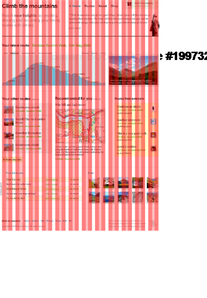
To bring all of this grid discussion to relevance, the Climb the Mountains case study layout is built on a robust yet flexible 1000-pixel wide grid. Within this 1000-pixel wide canvas, we have twelve columns, each separated by a clear gutter. Each column is 65 pixels wide, and each gutter is 25 pixels wide, as shown in Figure 11-4.
Each column has its own structure also. Within the 65-pixel wide column, we have three subcolumns or widths (from left to right) 25 pixels, 15 pixels, 25 pixels (see Figure 11-5).
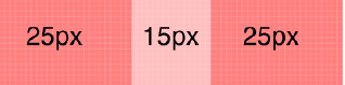
These subcolumns allow us to work with a grid within a grid in some ways. They provide additional points of reference, something else to measure to or against when twelve columns might not be tight enough for what we need. Trace down the full screen grab example and see how items are sometimes aligned with the main columns and sometimes with the subcolumns.
We can use the value assigned to the body element to change page layout, control behavior, and make other significant changes with CSS. In the first edition of this book, I used a unique ID for the body element of each page to control layout, combining this with a class for location, such as <body id="threeColLayout" class="home">. This time around, I'm using only the class.
<body class="home">
It doesn't matter whether you use an ID or a class for this purpose; the power we get from this super-parent element is the same regardless.
There are numerous ways of highlighting the page you are on, and many designers might use some clever PHP scripting to trigger the CSS, perhaps highlighting the Home link on the main navigation if on the homepage. That's cool, but it's just as easy with some smart CSS application reliant on pairing the body class with a navigation class. Let's take a look.
<body class="home">
The page is identified as the home page, and we'll now make sure each navigation item has a relevant class:
<ul id="navigation_pri">
   <li class="nav_home"><a href="#">Home</a></li>
   <li class="nav_routes"><a href="#">Routes</a></li>
   <li class="nav_about"><a href="#">About</a></li>
   <li class="nav_shop"><a href="#">Shop</a></li>
</ul>
In the preceding code snippet, you'll see that the Home link has a class nav_home. We'll also add a body class to the Routes page, so we can test the behavior later on:
<body class="routes">
Next, let's use CSS to apply the styling to the navigation list. Note that we'll position the element absolutely, at specific coordinates from the top and left of the main container.
ul#navigation_pri {
   list-style:none;
   margin:0;
   position:absolute;
   top:0;
   left:415px;
   font-size:19px;
   font-weight:bold;
   font-family:Helvetica,Arial,sans-serif;
}
ul#navigation_pri li {
   float:left;
   margin:0;
   padding:30px 10px 0 10px;
   height:3000px;
}
ul#navigation_pri li a {
color:#000;
}
ul#navigation_pri li a:hover,
ul#navigation_pri li a:focus {
color:#333;
text-decoration:underline;
}This will give us the basic styled navigation shown in Figure 11-6, but without any indication of the page we are currently viewing. (note that we'll examine the blockquote that sits on top of the navigation layer later in this section):
The next step is to use a selector to define a relationship between the body class and the navigation home class. Note that we have grouped two identical rules for the home page and the Routes page:
.home ul#navigation_pri li.nav_home,
.routes ul#navigation_pri li.nav_routes {
   background-color:#f5f5f5;
}
The first part of the selector .home or .routes sniffs to make sure we are viewing that page. The styling will only be applied if the ul#navigation_pri element is a child of .home or .routes. If a match is found, the action is performed. This will create the light gray background that fills the entire navigation tab area.
Next, we can define styles for the link behavior, again grouping the identical rules for .home and .routes:
.home ul#navigation_pri li.nav_home a,
.routes ul#navigation_pri li.nav_routes a {
   color:#278dab;
   background:#f5f5f5 0 center no-repeat;
   padding:0 0 0 20px;
}
.home ul#navigation_pri li.nav_home a:hover,
.home ul#navigation_pri li.nav_home a:focus,
.routes ul#navigation_pri li.nav_routes a:hover,
.routes ul#navigation_pri li.nav_routes a:focus {
   text-decoration:none;
   color:#000;
}
Thus, we get the blue text links we need. Finally, we can add some decoration only to the home page link. When the home page is in view, we'll display a small home icon to the left of the Home link:
.home ul#navigation_pri li.nav_home a {
background-image:url(../images/site/nav_back.gif);
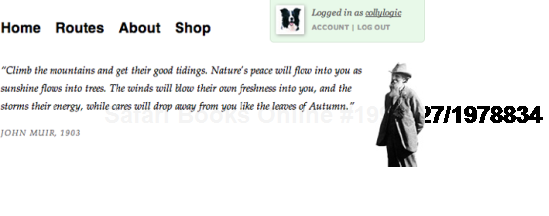
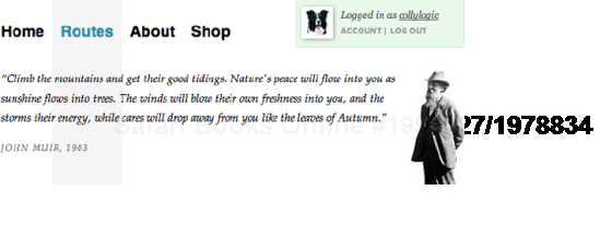
}This results in the home page display shown in Figure 11-7.

And Figure 11-8 shows our Routes page.
Now, back to that John Muir quote that sits on top of the main navigation. I truly love that quote – it inspires me to get outdoors regardless of the weather and blow off those web designer's cobwebs. Never forget to get out there, into the real world! On CTM, we could have rotating inspirational quotes in that part of the page to inspire the audience. Here's the markup:
<blockquote id="johnmuir"> <p>“Climb the mountains and get their good tidings. Nature's peacewill flow into you as sunshine flows into trees. The winds will blow theirown freshness into you, and the storms their energy, while cares will drop
away from you like the leaves of Autumn.”</p> <p><cite>John Muir, 1903</cite></p> </blockquote>
Aside from using specific character entities for the quotation marks, there's nothing especially unusual there, and we can move on to defining the styling. Earlier, we positioned the ul#navigation_pri element absolutely with position:absolute, 0px from the top and 415px from the left.
ul#navigation_pri {
   list-style:none;
   margin:0;
   position:absolute;
   top:0;
   left:415px;
   font-size:19px;
   font-weight:bold;
   font-family:Helvetica,Arial,sans-serif;
}
We can now define the styling for the blockquote:
div#branding blockquote {
   width:505px;
   float:right;
   padding:0 70px 20px 0;
   background:url(../images/site/branding_johnmuir.jpg) no-repeat right top;
}
But, it sits behind the blue navigation tab area, as shown in Figure 11-9.
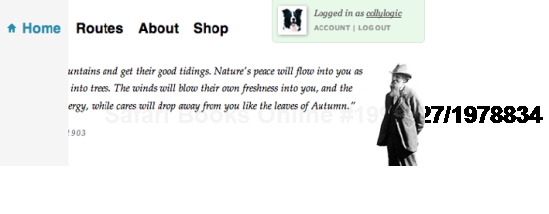
Figure 11.9. The blockquote is partly hidden behind the Home link.
However, considering that the navigation is positioned absolutely, if we add position:relative to the blockquote, we can make it appear above the blue tab area:
div#branding blockquote {
   position:relative;
   width:505px;
   float:right;
   padding:0 70px 20px 0;
   background:url(../images/site/branding_johnmuir.jpg) no-repeat right top;
}
And with that, the blockquote will sit nicely above the main navigation, as illustrated in the earlier navigation examples, such as Figure 11-7.
Earlier in the case study, we examined the power of using descendent selectors to control the main navigation styling based on the body class of each page. Here, we'll look again at how a thoughtful approach to markup can afford greater flexibility and control through deep descendent selectors and how this forms a basis for even greater control through advanced targeting of elements.
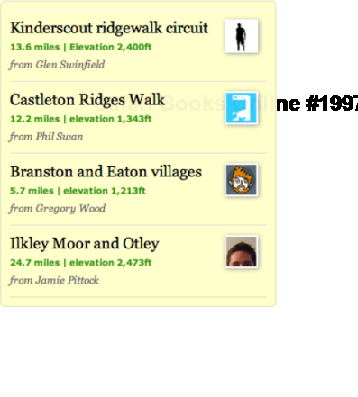
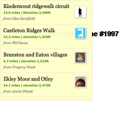
First, let's lay the foundations. On the right-hand side of the CTM case study, you'll see the light yellow Members' Routes panel, featuring walks contributed by other users of the site. There's nothing especially remarkable about the markup, but let's examine it ahead of doing some selectors magic later in the section.
Notice how we group several elements such as h3, p, and img inside each unordered list item. I've often been surprised how many designers don't realize that you can add all sorts of interesting elements inside the li element. Often, you might only see a and maybe img inside the li element, but you can do so much more.
<div id="others_routes">
  <h2>Members' routes <a href="#" class="more">(view all)</a></h2>
    <ul>
      <li>
        <h3><a href="#">Kinderscout circuit</a></h3>
          <p class="dist_elev">13.6 miles | Elevation 2,400ft</p>
          <p class="username"><a href="#">from Glen Swinfield <img
src="assets/images/content/avatar_swinfield.jpg" class="avatar"
alt="Glen Swinfield's avatar" /></a></p>
      </li>
      <li>
        <h3><a href="#">Castleton Ridge Walk</a></h3>
          <p class="dist_elev">12.2 miles | elevation 1,343ft</p>
          <p class="username"><a href="#">from Phil Swan <img
src="assets/images/content/avatar_swan.jpg" class="avatar"
alt="Phil Swan's avatar" /></a></p>
      </li>
      <li>
        <h3><a href="#">Branston Circular</a></h3>
          <p class="dist_elev">5.7 miles | elevation 1,213ft</p>
          <p class="username"><a href="#">from Gregory Wood <img
src="assets/images/content/avatar_wood.jpg" class="avatar"
alt="Gregory Wood's avatar" /></a></p>
      </li>
      <li>
        <h3><a href="#">Ilkley Moor and Otley</a></h3>
src="assets/images/content/avatar_swinfield.jpg" class="avatar"
alt="Glen Swinfield's avatar" /></a></p>
</li>
<li>
<h3><a href="#">Castleton Ridge Walk</a></h3>
<p class="dist_elev">12.2 miles | elevation 1,343ft</p>
<p class="username"><a href="#">from Phil Swan <img
src="assets/images/content/avatar_swan.jpg" class="avatar"
alt="Phil Swan's avatar" /></a></p>
</li>
<li>
<h3><a href="#">Branston Circular</a></h3>
<p class="dist_elev">5.7 miles | elevation 1,213ft</p>
<p class="username"><a href="#">from Gregory Wood <img
src="assets/images/content/avatar_wood.jpg" class="avatar"
alt="Gregory Wood's avatar" /></a></p>
</li>
<li>
<h3><a href="#">Ilkley Moor and Otley</a></h3><p class="dist_elev">24.7 miles | elevation 2,473ft</p>
<p class="username"><a href="#">from Jamie Pittock <img
src="assets/images/content/avatar_pittock.jpg" class="avatar"
alt="Jamie Pittock's avatar" /></a></p>
</li>
</ul>
</div>By building content in this way, we can collate blocks of information as lists, providing all the hierarchy and styling control that we know and love about lists.
It is then really easy to use basic selectors to target the unordered list within the others_routes containing div and the various elements within the li elements. Note that we're using border-radius, -webkit-border-radius, and –moz-border-radius rules to apply rounded corners to the ul element, and be reassured that we'll discuss these later in this case study.
div#others_routes ul {
   list-style:none;
   border:1px solid #dedeaf;
   background:#ffffcc;
   border-radius:5px;
   -webkit-border-radius:5px;
   -moz-border-radius:5px;
   margin:0;
   padding:10px;
}
div#others_routes ul li {
   margin:0;
   padding:10px 55px 10px 0;
   position:relative;
   border-bottom:1px solid #dedeaf;
   border-top:1px solid #fff;
}
div#others_routes ul li h3 {
margin-bottom:5px;
}
div#others_routes ul li img {
position:absolute;
top:10px;
right:10px;
}
div#others_routes ul li p.username {
margin:3px 0 0 0;
font-style:italic;
font-size:12px;
}
div#others_routes ul li p.username a {
color:#666;
}
div#others_routes ul li p.username a:hover,
div#others_routes ul li p.username a:focus {
text-decoration:underline;
}In the preceding markup, we're targeting deeper HTML elements with some straightforward descendent selectors. For example, we can strategically target the link hover styling of the username link with div#others_routes ul li p.username a:hover, descending deeper and deeper with the selector until we define our target element–an element owned by every preceding element in the selector, resulting in Figure 11-10.
Excellent. Our list of member-submitted walks and routes is shaping up nicely, and most might leave it as it is. It looks pretty neat and tidy. But wait! We are perfectionists, and we have powerful CSS at our disposal. Why settle for good when we could have great?
In the next two examples, we'll neaten up the top and bottom of the routes container using some nifty CSS tricks.
If you've ever wondered how a designer targets the first letter or line of a block of text, he or she is probably using a pseudo-class such as :first-letter or :first-line. These cool tricks enable us to style elements based on simple logic.
The :first-child pseudo-class targets only an element that is the first child of a containing element.
In this case study, I have my container of member's walks, with each item's detail added within an unordered list. Each li element has the same padding and thin border at the top and bottom.
div#others_routes ul li {
margin:0;
padding:10px 55px 10px 0;
position:relative;
border-bottom:1px solid #dedeaf;
border-top:1px solid #fff;
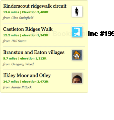
}This keeps the list content spaced evenly, but I'd like to reduce the amount of padding for only the top list item (in the example, this is the Kinderscout ridgewalk circuit walk). In fact, I don't want any padding at the top, and I don't want a border either.
So, bring on the pseudo-class. Here, we create a new rule, and we use the same selector to target the unordered list items inside the #others_routes containing div, but we add :first-child immediately after the li element, essentially saying "go in to the container, find the unordered list, and perform the following style override only on the very first li element you find."
div#others_routes ul li:first-child {
   padding-top:0;
   border-top:none;
}
As Figure 11-11 shows, the Kinderscout ridgewalk circuit item has no top border or top padding and nestles snugly under the roof of the parent container.
It's as simple as that, but it's a very powerful method of targeting a specific element, with a million and one uses. And now that we've dealt with the top of our contained list, let's see what we can do with the bottom of it.
Having just introduced you to :first-child, now would ideally be a fitting moment to introduce the usefulness of :last-child, a method of targeting the last instance of a child element within a specific parent container. The approach is much the same as with :first-child, so feel free to experiment with this. Unfortunately, only recent versions of browsers such as Safari, Firefox, Google Chrome, and Opera support this method, so we need to be mindful of IE 6, 7, and 8 and employ an alternative approach, thanks to adjacent sibling selectors.
In this example, we now need to do the reverse of what we just did with the :first-child pseudo-class. As we previously discussed, each unordered list item has top and bottom padding and a top and bottom border. We successfully turned off these styles for the first li element, now we need to turn them off for the last element.
But how do we do that? How does the style sheet know which is the very last element in a certain group, and how can we accurately target it. This requires some kind of dark arts, right? Well, sort of.
Adjacent sibling selectors consist of several selectors separated by the + combinator. This matches an element that is the next sibling to the first element. Note that elements must have the same parent, and the first must immediately precede the second.
So, as with our :first-child example, we again target the others_routes parent div, and we then methodically drill down through the selectors until we hit the element we wish to style. Our unordered list will always only have four li elements, and that is the key to making this work:
div#others_routes ul li + li + li + li {
   padding-bottom:0;
   border-bottom:none;
}
So here, we've created a selector that thinks "Ah, when in the others_routes div, find the unordered list, count along until we match the fourth li element, and apply styles to that only." Simple.
Thus, the result, shown in Figure 11-12, presents the fourth li element without bottom padding or a bottom border, adding further neatness and attention to detail, simply by making the most of the CSS selectors at our disposal.
In the first edition of this book, my case study relied heavily on boxes with rounded corners. Everybody wants rounded corners at some point for a little visual flair, and well, right angle corners are just so easy, boring maybe.
Of the seemingly endless possible methods of creating rounded corners, I settled on one that used a fair amount of JavaScript in combination with several background image sprites and a reasonable amount of extraneous markup. It was weighty, clumsy, awkward, and there wasn't really an alternative.
Fast-forward to me sitting here typing this chapter, and I'm basically just going blue, wanting to shout "CSS 3!" as loud as I can. Things have changed: expectations have grown, and the tools have evolved. Sure, the browsers haven't all caught up (what else do you expect?), but as an industry we are braver and more willing to work with new ideas and push things forward.
In this section, I'll take one humble image and caption from the CTM homepage and do all sorts of lovely CSS 3 things to it, without any use of JavaScript, further graphics, or extraneous markup. Viva La Revolution!
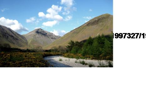
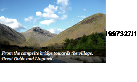
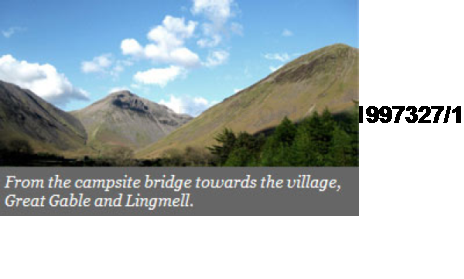
We'll being with one simple 310 × 185-pixel JPG named campsite.jpg (see Figure 11-13). Then, we'll apply a caption with white text onto a semitransparent grey overlay at the base of the image, and then apply a Polaroid-style photo border around the image, ensuring it has perfect rounded corners and a believable drop shadow. Thankfully, we can do all of that with CSS.
The markup is pretty simple. Our image and caption need to be contained within one div, named captioned_image for the purposes of this example. The paragraph is given class="caption", so we can target it directly, and for now, that is it.
<div class="captioned_image"> <img src="assets/images/content/campsite.jpg" alt="From the campsite" /> <p class="caption">From the campsite bridge towards the village, GreatGable and Lingmell.</p> </div>
With that markup in place, we can now experiment with three of the hottest CSS 3 techniques at our disposal.
Colors may be specified in a number of ways. Many specify color as an RGB triplet in hexadecimal format (a hex triplet). Others often use their common English names in some cases. It is also possible to use RGB percentages or decimals. The following examples are all valid for the color red:
color: #f00
color: #ff0000
color: red
color: rgb(255,0,0)
color: rgb(100%, 0%, 0%)
RGB stands for red, green, and blue and is a device familiar to most designers. RGBa introduces a fourth channel – an alpha channel that deals with transparency. The beauty of CSS 3 is that we can continue to specify color with RGB but also set the alpha transparency of that color with a fourth decimal value. We can use anything from 0.0 (totally transparent) through to 1.0 (totally solid).
In the following example, we again declare the color red with RGB, but also set a 50 percent transparency by declaring 0.5 as the alpha transparency.
color: rgb(255,0,0,0.5)
The RGBa value is assigned only to the element we declare, so any child elements will not inherit the transparency, which is a clear distinction from the opacity property, which will always be inherited.
So, for the CTM site, the following declarations will perform the first bit of magic for our photo and caption. We position the containing div relatively and then the caption absolutely, so that it can be positioned exactly where we wish above the image.
div.captioned_image {
   position:relative;
}
div.captioned_image p.caption {
   position:absolute;
   bottom:0;
   left:0;
   margin:0;
   color:#fff;
   font-size:13px;
   line-height:16px;
   font-style:italic;
   padding:5px;
}
We next declare the RGBa value as rgba(0,0,0,0.5) where the first three values combine to give us black and then the alpha transparency value of 0.5 sets a medium transparency, which can be tweaked until we're happy with the overall effect.
div.captioned_image p.caption {
position:absolute;
bottom:0;
left:0;
margin:0;
background:rgba(0,0,0,0.5);
color:#fff;
font-size:13px;
line-height:16px;
font-style:italic;
padding:5px;
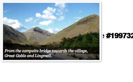
}This gives us the exact caption overlay we wanted, as shown in Figure 11-14.
As with many exciting new CSS 3 techniques, some browsers are playing catch-up, most notably Internet Explorer (including the current IE 8), which will not render the alpha-transparency. For example, IE 7 will instead default to a reasonably acceptable solid layer, much like we'd see if serving a transparent PNG graphic without forcing alpha transparency support (see Figure 11-15).
IE 8, which still does not support RGBa, will simply render the caption text on top of the image without any kind of background. To get around this problem, we can add a rule to the screeni-ie8.css style sheet to ensure a gray background is placed behind the text.
div.captioned_image p.caption { background:#666; }The important lesson is not to be put off by IE and its failings. I'd encourage all of you hexadecimal triplet lovers to start experimenting with the incredible flexibility of RGBa straight away, on a variety of elements within your layouts. You will never look back, and everything will be much clearer!
I'm still surprised when I speak to designers who aren't aware that classes can be combined to bring greater flexibility to elements.
For example, you might use class="profile" several times on any given page, assigning common color and layout information. However, let's say you wish to change only the background color based on a variable such as whether or not the user is a member or a guest. Instead of creating two profile styles just to supply different color references, you could simply keep colors as separate rules, and combine these with the profile class.
.profile {
width:300px;
margin:0 10px;
padding:10px;
font-size:11px;
}
.guest {
background-color:#ff9900;
}
.member {
background-color:#ff0000;
}
This style could then be applied using combined classes depending on user status. Any number of classes can be combined, simply by separating each with a space, as follows:
<div class="profile member">
<p>Member options...</p>
</div>
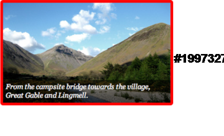
Bringing this to the CTM site, we can use combined classes to optionally add a frame around only certain captioned images. Notice that, alongside captioned_image, we have added the class polaroid:
<div class="captioned_image polaroid"> <img src="assets/images/content/campsite.jpg" alt="From the campsite" /> <p class="caption">From the campsite bridge towards the village, GreatGable and Lingmell.</p> </div>
We can now define the styling for this polaroid frame, and that calls for a few more tricks from the CSS 3 specification.
In the previous edition of CSS Mastery, both Andy and myself detailed a useful but somewhat laborious technique for adding frames and shadows to images. This involved a couple of divs and background images that needed to be very carefully styled and positioned. Yep, it was tough back in 2005.
This brings us to the border-radius property, which, essentially, brings rounded corners to elements using pure CSS declarations. Sadly, Internet Explorer (hello again) doesn't support this property at all, so IE corners will still be squared off, which seems acceptable to me. Currently, the same goes for the ever-evolving Opera browser.
At the time of this writing, no popular browsers are pledging support for the standard border-radius property, and so while it is important to include the declaration from a forward-thinking standpoint, we also need to add two further declarations in the short-term – one for Mozilla-based browsers such as cuddly Firefox and one for WebKit-based browser such as the ever-switched-on Safari (which also supports elliptical corners). For more information, examples and some cool tricks, view descriptions and examples over at http://www.the-art-of-web.com/css/border-radius/.
All three declarations are clearly defined here:
.polaroid {
   border:5px solid #f00;
   border-radius:5px;
   -webkit-border-radius:5px;
   -moz-border-radius:5px;
}
Seeing as white on white isn't exactly great for demonstrations, note that I have specified a temporary red border so that you can see what is happening in Figure 11-16. You'll see that each corner is rounded around a 5px radius. This is actually the radii of a quarter eclipse defining the exact corner. As with margin, padding, and border, there are four individual border-radius properties—one for each corner of an element—and one shorthand property.
Now, how much easier is that compared with the methods we were describing back in the first edition? With our corners rounded, we can now think about applying a simple drop shadow to give the image some sense of affordance.
CSS 3 brings us a significantly simpler method of creating neat drop shadows for the Safari 3 and above and Firefox 3.5 and above browsers. The property takes three lengths as its attributes—these being the horizontal offset, the vertical offset, and the blur radius—and finally a color.
If we apply a positive value to the horizontal offset of the shadow, the shadow will be on the right-hand side of the element. A negative offset will put the shadow on the left of the element.
If we apply a negative value to the vertical offset, the shadow will be appear on top of the element, whereas a positive value would place the shadow below the box.
The blur radius is really handy. If the value is set to 0 the shadow will be sharp, and the higher the number, the more blurred it will become.
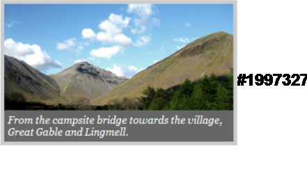
Adding this to our polaroid class, we can work with the four values to create a drop shadow that will be to the right and bottom of our captioned image, with a 5-pixel blur in a medium grey, as follows:
.polaroid {
   border:5px solid #fff;
   border-radius:5px;
   -webkit-border-radius:5px;
   -moz-border-radius:5px;
   -webkit-box-shadow:1px 1px 5px #999;
   -moz-box-shadow:1px 1px 5px #999;
}
Brilliantly, the box-shadow will respect the border-radius value we gave earlier, so that we have a rounded picture frame and complimentary shadow working in perfect harmony, as shown in Figure 11-17.
Alas, this isn't yet the case in Internet Explorer, as shown in Figure 11-18.
We noted the lack of RGBa transparency for the caption earlier, and you'll also see that our frame is rendered as a grey square frame. It has the same width (5px) but is not white and not rounded. Obviously, we're also bereft of that beautiful shadow. Remember, we have at least ensured the caption text sits on a gray background by adding a rule to our screen-i8.css style sheet. Oh well, maybe things will be fixed in IE by the time I have grandchildren.
For this chunk of the case study, we'll focus on the Your latest route area of the site, on the left of the layout. In a fully realized concept, this would be a selection of statistics, maps, and charts relating to a particular walk, each pane viewable via a different tab.
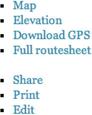
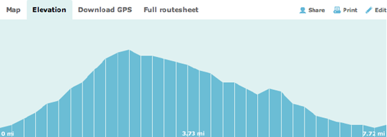
First, we'll begin by adding the navigation for the stats section of the CTM homepage. The markup requires two lists, one for the statistics tabs on the left, and one for the Share, Print, and Email options on the right:
<ul id="route_nav">
    <li><a href="#">Map</a></li>
    <li class="cur"><a href="#">Elevation</a></li>
    <li><a href="#">Download GPS</a></li>
    <li><a href="#">Full routesheet</a></li>
</ul>
<ul id="route_action">
<li class="share"><a href="#">Share</a></li>
<li class="print"><a href="#">Print</a></li>
<li class="edit"><a href="#">Edit</a></li>
</ul>Note that we've added class="cur" to the Elevation tab, as we'll want that to appear as selected throughout this exercise, and we can directly target that link with this additional class.
Due to our two unordered lists inheriting a few existing styles from elsewhere in the document, we have the basic blue link states and font-family and font-size rules shown in Figure 11-19.
Elsewhere, I've floated the Share, Print, and Email list to the right, with little extra of note. So, let's focus on the left-hand list from now on. We'll float that to the left and add a few basic styling declarations, including a bolder color for the selected tab:
ul#route_nav {
      list-style:none;
      font-family:Verdana,sans-serif;
      font-size:11px;
      font-weight:bold;
      float:left;
      margin:0;
}
ul#route_nav li {
      float:left;
margin:0;
padding:7px 10px;
}
ul#route_nav li a {
color:#666;
}
ul#route_nav li a:hover,
ul#route_nav li a:focus {
color:#333;
}
ul#route_nav li.cur a {
color:#000;
}This gives us our two lists as shown in Figure 11-20—one floated left and one floated right—with some initial styling.
We'll clear those floats by using clear:both on the statistics container that will follow this navigation. Next, we'll add a background color to the selected class:
ul#route_nav li.cur {
background:#dff1f1;
}
This defines the exact area of the selected tab, as shown in Figure 11-21.
That's our basic Your latest route navigation sorted, but there's another neat CSS 3 trick we can pull.
Earlier in this case study, we looked at the CSS 3 border-radius property, creating a simple rounded-corner frame for an image.
Here, we will use similar properties to add rounded corners to a basic shape, specifically the selected list item in our navigation.
We're using browser-relevant varieties of border-radius-top-left and border-radius-top-right to only apply the corners to the top of the shape:
ul#route_nav li.cur {
     background:#dff1f1;
     -moz-border-radius-topleft:3px;
     -webkit-border-top-left-radius:3px;
     -moz-border-radius-topright:3px;
     -webkit-border-top-right-radius:3px;
}
This simple adjustment to the CSS will give us the subtle but sexy tab shown in Figure 11-22 in Firefox and Safari.
With the navigation finally resolved, we can now move on to the altogether more juicy elevation data.
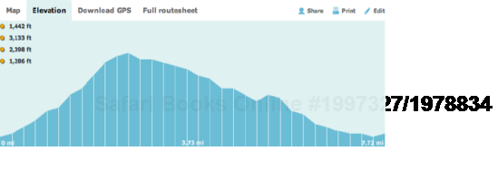
Below the Your latest route navigation bar, we'll now add the statistics pane that appears by default in the case study, the Elevation chart.
<div id="route_elevation">
</div>
The most important point to be aware of here is that (as mentioned earlier) we're using the route_elevation div to clear the floated navigation lists. So, you'll see clear:both defined for this div immediately.
.home div#route_elevation {
   clear:both;
   background:#dff1f1 url(../images/site/elevation_home.gif) 0 bottom no-repeat;
   position:relative;
   height:195px;
}
We also position the elevation div relatively, as this will assist us later when plotting li elements (we'll add these shortly) on the chart. We also apply the background image elevation_home.gif (see Figure 11-23) with one shorthand rule for color, image, position, and repeat properties.
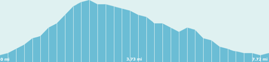
This gives us the image shown in Figure 11-24 with the navigation data and elevation chart combined.
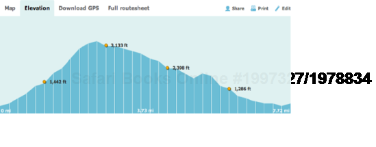
Next, we can create a new unordered list that will contain our elevation references. Each reference will feature a height and associated image from Flickr. Note that each list has a unique class, such as marker_01 and marker_02.
<div id="route_elevation">
  <ul>
    <li class="marker_01">
      <a href="#">
        <strong>1,442 ft</strong>
          <img src="assets/images/content/elevation_photo_1.jpg"
alt="At 1,442 ft: Photo of the village" />
      </a>
    </li>
    <li class="marker_02">
      <a href="#">
        <strong>3,133 ft</strong>
          <img src="assets/images/content/elevation_photo_2.jpg"
alt="At 3,133 ft: Pennine Way" />
      </a>
    </li>
    <li class="marker_03">
      <a href="#">
        <strong>2,398 ft</strong>
          <img src="assets/images/content/elevation_photo_3.jpg"
alt="At 2,398 ft: Cup of tea" />
      </a>
    </li>
    <li class="marker_04">
      <a href="#">
        <strong>1,286 ft</strong>
          <img src="assets/images/content/elevation_photo_4.jpg"
alt="At 1,286 ft: Wool packs" />
      </a>
    </li>
  </ul>
</div>
We'll use these unique classes to define the display position for each list item on the chart, basing the coordinates from the top and left of the elevation chart container.
.home div#route_elevation li.marker_01 {
   top:123px;
   left:97px;
}
.home div#route_elevation li.marker_02 {
   top:50px;
   left:237px;
}
.home div#route_elevation li.marker_03 {
   top:95px;
   left:377px;
}
.home div#route_elevation li.marker_04 {
   top:137px;
   left:517px;
}
It is still early in the process, so all we have so far are a bunch of list items each with height and image snuggling up to the left of the container (see Figure 11-25).
Before we force the list items to sit in their intended positions, let's first hide the images, and choose a more appropriate marker graphic. The graphic we'll use is the typical list bullet graphic shown in Figure 11-26 and named elevation_marker.png.
On to the list styling now, we'll set styles such as font-family, font-size, remove or define margin and padding, and so on. Importantly, we declare the elevation_marker.png background image for the div#route_elevation ul li element, applying a 15-pixel margin-left to create space between the bullet and the elevation height.
div#route_elevation ul {
   list-style:none;
   margin:0;
   font-family:Verdana,sans-serif;
   font-size:9px;
   font-weight:bold;
}
div#route_elevation ul li {
   margin:0;
}
div#route_elevation ul li a {
   color:#333;
   display:block;
   background:url(../images/site/elevation_marker.png) no-repeat 0 5px;
   padding:0 0 0 15px;
}
div#route_elevation ul li a:hover,
div#route_elevation ul li a:focus {
   color:#000;
}
div#route_elevation ul li a img {
   display:none;
}
Vitally, we have targeted the Flickr image thumbnails with div#route_elevation ul li a img, using display:none to prevent the images from being displayed.
The elevation chart now shows our list styled more suitably, but still snuggling up to the left of the container (see Figure 11-27).
To make sure the list elements display according to their positioned coordinates, all we need to do is position them absolutely using position:absolute as follows:
div#route_elevation ul li {
   margin:0;
   position:absolute;
}
This repositioning works because the parent container is positioned relative to its own parent. If it wasn't, our absolutely positioned list items would base their coordinates from the top and left of the browser window, which wouldn't do at all. As Figure 11-28 shows, the elevation points are now plotted accurately on the chart.
We now need to deal with the images we hid earlier and bring them into view when we roll over each elevation point.
Our targets are the :hover and :focus pseudo-link states, and with control of those, we can easily apply declarations that will bring the images into view on rollover.
Notice that after setting height and width, we again position the elements absolutely, and we use negative top and right values to position the images exactly where we want them in relation to the list marker.
div#route_elevation ul li a:hover img,
div#route_elevation ul li a:focus img {
   display:block;
   width:40px;
   height:40px;
   padding:4px 9px 10px 12px;
   position:absolute;
   top:-16px;
   right:-65px;
}
As a result, on rollover, we get the thumbnail pop-up as expected, sitting just to the right of the marker. We added some padding around the thumbnail too (see Figure 11-29).

It is now time to make use of that padding and fit a neat frame and arrow graphic behind the thumbnail images. I'm using elevation_marker_image_bg.png here, which is shown in Figure 11-30. Note that the shadow is added to the graphic at Photoshop stage and it's exported as a transparent PNG.

All that remains is to apply that background image to the CSS as follows:
div#route_elevation ul li a:hover img,
div#route_elevation ul li a:focus img {
   display:block;
   width:40px;
   height:40px;
   padding:4px 9px 10px 12px;
   position:absolute;
   top:-16px;
   right:-65px;
   background:url(../images/site/elevation_marker_image_bg.png) no-repeat 0 0;
}
If you're doing something similar, you may well need to fiddle with exact padding, positioning, and so forth, but the basic building blocks are all here. As a result of all the work we've done in this section, we now have a nicely executed Your latest route area of the page, with an interactive elevation chart plotting Flickr images, shown in Figure 11-31.

Of course, all of this would ultimately need to be hooked up to a powerful CMS to really be exceptional, but well, this is a CSS book.
There you have it. This has been more of a brief weekend city break than two weeks by the beach, but insightful nonetheless, I hope. I've really enjoyed pulling the Climb the Mountains concept together for this second edition of CSS Mastery, especially with the freedom to cut loose with some fresh CSS 3 ideas.
Naturally, there are oodles more bits and pieces in the Climb the Mountains site that I'd love to have been able to walk through with you. Sadly, there just isn't enough space in one book to go into that level of exploration. Still, if you like a behavior or treatment in the site, and it isn't covered in this chapter, I think it should be easy to jump in, examine the source, and figure out how things work. I've certainly done my best to structure the source code with clarity and sprinkle in a number of helpful notes and references where possible.
Remember, the site will remain online at http://www.climbthemountains.com/cssm, and the source code is available from www.friendsofed.com. Do feel free to take it, examine it, rip it apart, put it back together again, and use it as inspiration for your own ideas and stunning CSS-powered masterpieces.