
Compared to many programming languages, CSS is a relatively simple language to learn. The syntax is straightforward, and due to its presentational nature, there is no complicated logic to grapple with. The difficulties start when it comes time to test your code on different browsers. Browser bugs and inconsistent rendering are major stumbling blocks for most CSS developers. Your designs look fine on one browser, but your layout inexplicably breaks on another.
The misconception that CSS is difficult comes not from the language itself, but the hoops you need to jump through to get your sites working in older browsers. Bugs are difficult to find information on, poorly documented, and often misunderstood. Hacks are seen by many as magic bullets—arcane sigils with exotic names that, when applied to your code, will magically fix your broken layouts. Hacks are definitely potent tools in your armory, but they need to be applied with care and generally as a last resort. A much more important skill is the ability to track, isolate, and identify bugs. Only once you know what a bug is can you look for ways to squash it.
In this chapter, you will learn about
How to track down CSS bugs
The mysterious
hasLayoutpropertyHacks and filters
The most common browser bugs and their fixes
Graded browser support
We all know that browsers are buggy, some of them more than others. When a CSS developer comes across a problem with code, there is the immediate temptation to mark it as a browser bug and look for a hack or workaround. However, browser bugs aren't as common as everybody likes to think. The most common CSS problems arise not from the browser bugs but from an incomplete understanding of the CSS specification. To avoid these problems, it is always best to approach a CSS bug assuming that you have done something wrong. Only once you are sure that there are no errors on your part should you consider the problem to be the result of a browser bug.
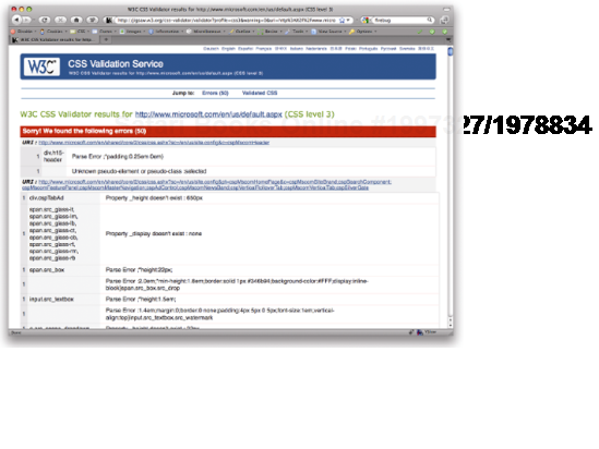
Some of the simplest CSS problems are caused by typographical and syntactical errors in your code. Things like forgetting to end your declarations with a semi-colon or typing font-face when you meant font-family. A simple way to get round this problem is to choose a CSS editor like SKEdit or CSS Edit that includes syntax highlighting and code completing. These features will help prevent basic errors but are no substitute for proper validation. Running your code through a service like the CSS Validator (http://jigsaw.w3.org/css-validator/) will highlight any grammatical errors, showing you the lines the issues are on and a brief description of each error (see Figure 9-1).
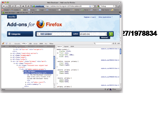
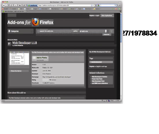
The Firefox Web Developer Toolbar extension (https://addons.mozilla.org/en-US/firefox/addon/60) includes shortcuts to the online versions of both the HTML and CSS validators. There is also the popular HTML Validator for Firefox (http://users.skynet.be/mgueury/mozilla/)
When validating your HTML and CSS, you may be greeted with a page full of errors. This can be quite intimidating at first, but don't worry. Most of these errors will be the result of one or two actual errors. If you fix the first error mentioned and revalidate, you will see many of the original errors disappear. Do this a couple of times, and your code should quickly become error free.
Remember that the validator is only an automated tool and is not infallible. There are a growing number of reported bugs with the validator, so if you think something is right but the validator is saying something different, always check against the latest CSS specification. For instance, at the time of this writing, the CSS validator was still throwing up errors for vendor-specific extensions like –moz-border-radius, even though these are allowed in the CSS specification. If in doubt, validate your code using the CSS 3 profile and then check the specification if you're unsure of anything.
As well as syntactic errors, one of the more common problems revolves around specificity and sort order. Specificity problems usually manifest themselves when you apply a rule to an element, only to find it not having any effect. You can apply other rules and they work fine, but certain rules just don't seem to work. In these situations, the problem is usually that you have already defined rules for this element elsewhere in your document using a more specific selector.
In the following example, CSS developers have set the background color of all the paragraphs in the content area to be white. However, they want the introductory paragraph to be orange and so have applied that rule directly to the paragraph:
.content p {
  background-color: white;
}


.intro {
 background-color: orange;
}
If you test this code in a browser, you will see that the introductory paragraph is still white. This is because the selector targeting all the paragraphs in the content area is more specific than the selector targeting the introductory paragraph. To achieve the desired result, you need to make the selector targeting the introductory paragraph more specific. In this case, the best way to achieve this is to add the class for the content element to the start of the intro paragraph selector:
.content p {
  background-color: white;
}


.content .intro {
 background-color: orange;
}
Try not to add more-specific selectors without thinking, as you may cause specificity issues is other parts of your code. Instead, it is often better to remove extraneous selectors, making them as generic as possible, and only add more specific selectors when you need fine-grain control.
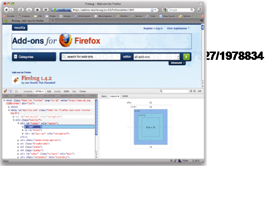
As mentioned in Chapter 1, the Firebug add-on for Firefox (https://addons.mozilla.org/en-US/firefox/addon/1843) is an invaluable tool for debugging your CSS. One of its many useful features is the ability to inspect an element to see which CSS styles are being overridden. It does this by crossing out any styles that are being overridden elsewhere in the style sheet, as shown in Figure 9-2.
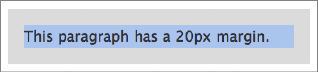
Margin collapsing (see Chapter 3) is another CSS feature that, if misunderstood, can cause a lot of gray hairs. Take the simple example of a paragraph nested inside a div element:
<div id="box">
  <p>This paragraph has a 20px margin.</p>
</div>
The box div is given a 10-pixel margin and the paragraph is given a 20-pixel margin:
#box {
  margin: 10px;
  background-color:#d5d5d5;
}


p {
  margin: 20px;
  background-color:#6699FF;
}
You would naturally expect the resulting style to look like Figure 9-3, with a 20-pixel margin between the paragraph and the div, and a 10-pixel margin around the outside of the div.
However, the resulting style actually looks like Figure 9-4.
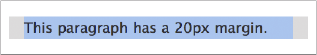
Two things are going on here. First, the paragraph's 20-pixel top and bottom margins collapse with the 10-pixel margin on the div, forming a single 20-pixel vertical margin. Second, rather than being enclosed by the div, the margins appear to protrude from the top and bottom of the div. This happens because of the way elements with block-level children have their height calculated.
If an element has no vertical border or padding, its height is calculated as the distance between the top and bottom border edges of its contained children. Because of this, the top and bottom margins of the contained children appear to protrude from the containing element. However, there is a simple fix. By adding a vertical border or padding, the margins no longer collapse and the height of the element is calculated as the distance between the top and bottom margin edges of its contained children instead.
To get the preceding example looking like Figure 9-3, you simply need to add padding or a border around the div:
#box {
  margin: 10px;
  padding: 1px;
  background-color:#d5d5d5;
}


p {
  margin: 20px;
  background-color:#6699FF;
}
Most problems with margin collapsing can be fixed by adding a small amount of padding or a thin border with the same color as the background of the element in question.
A great tool for visualizing how elements interact with each other is the topographic view in the Web Developer Toolbar. Enabling this option gives each element a colored background based on its position in the document. This makes it easy to see how elements are positioned relative to each other in the document (see Figure 9-5).
Another useful tool is the layout view in Firebug (see Figure 9-6), which shows you the various dimensions of the element being inspected.
The first step in tracking down a bug is to validate your HTML and CSS to check for typographical or syntactic errors. Some display errors are caused by browsers rendering pages in quirks mode. As such, it is a good idea to check that you are using the correct DOCTYPE for your markup language in order for your pages to render in standards mode (see Chapter 1). You can tell the mode your page is rendering in by checking it in the Firefox developer's toolbar. If your page is rendering in quirks mode, the checkmark at the top right of the toolbar will be gray. If your page is rendering in standards mode, the checkmark will turn green. Clicking this checkmark will provide more information about the page, as well as explicitly define the rendering mode (see Figure 9-7).
Figure 9.7. The Firefox web developer's toolbar shows if your page is displaying in standards or quirks mode
Many Windows developers used to develop their pages primarily using Internet Explorer, so each time they made a change, they previewed the page in IE to see if it was working correctly. Once the pages were almost ready, they would test in a variety of browsers and try to fix any inconsistencies that appeared. However, this is a very dangerous approach that can cause many long-term problems.
IE 6 is a notoriously buggy browser with several important CSS flaws. By using IE as their primary development browser, some developers mistakenly interpret IE's behavior as the correct behavior and wonder why more modern browsers "break" their carefully crafted CSS layouts. In reality, the pages are actually "broken" in IE and are displaying as written in the more standards-compliant browsers.
A much safer approach is to use a more standards-compliant browser, such as Firefox or Safari, as your primary development browser. If your layout works in one of these browsers, it will most likely work correctly in all standards-compliant browsers and is a sign that you're doing things correctly. You can then test your pages on less-capable browsers and devise workarounds for any display problems you find. Just remember not to leave browser testing until the end of the project. Instead, you should adopt a continual testing methodology, checking your pages in all the major browsers as you go along. That way, you won't get any nasty surprises at the end of the project when you thought you were almost finished.
This advice may sound obvious, but one of the best ways of becoming bug free is to actually avoid problems in the first place. A lot of rendering bugs are caused by overly complicated HTML or CSS. As such, it makes sense to use the simplest code possible to achieve the desired outcome. So avoid overly clever techniques in favor of tried and tested methods, and keep the number of hacks you use to an absolute minimum.
Because there are so many different ways of achieving the same effect, consider using a different method before spending hours debugging or hacking a particular technique. Only when you're sure there's not a simple way to route around the problem should you try tackling it head on.
Once you're sure you have a bug, you need to try to isolate the problem. By isolating the problem and identifying the symptoms, you can hopefully figure out what is causing the problem and fix it. One way to do this is by applying borders or outlines to the relevant elements to see how they interact:
.promo1 {
  float: left;
  margin-lrft: 5px;
  border: 1px solid red;
}


.promo2 {
  float: left;
  border: 1px solid green;
}
I tend to add borders directly to my code, although you could use the outline option in the web developer's toolbar, or one of many bookmarklets for outlining different elements. Sometimes just the act of adding borders will fix the problem, usually indicating a margin collapsing issue.
Try changing a few properties to see if they affect the bug, and if so, in what way. It may be useful to attempt to exaggerate a bug. For instance, if the gap between these two boxes is bigger than you expected in IE, try upping the margin to see what happens. If the space between the boxes in IE has doubled, you have probably fallen foul of IE's double-margin float bug.
.promo1 {
  float: left;
  margin-left: 40px;
  border: 1px solid red;
}


.promo2 {
float: left;
  border: 1px solid green;
}
Try some common fixes. For instance, many IE bugs are fixed by setting the position property to relative, by setting the display property to inline (on floated elements), or by setting a dimension such as width. You will learn more about these common fixes and why they work later in this chapter.
Many CSS problems can be found and fixed quickly, with a minimum of effort. If the problem starts to drag on, you should consider creating a minimal test case.
A minimal test case is simply the smallest amount of HTML and CSS required to replicate the bug. By creating a minimal test case, you help cut out some of the variables and make the problem as simple as possible.
To create a minimal test case, you should first duplicate the problem files. Start by removing extraneous HTML until you are left with just the basics. Then start commenting out style sheets to work out which style sheets are causing the problem. Go into those style sheets and start deleting or commenting out blocks of code. If the bug suddenly stops, you know that the last block of code you commented out is contributing to the problem. Keep going until you are left only with the code that is causing the problems.
From here, you can start investigating the bug in more detail. Delete or comment out declarations and see what happens. How does that change the bug? Change property values and see if the problem goes away. Add common fixes to see if they have any effect. Edit the HTML to see if that has any effect. Use different combinations of HTML elements. Some browsers have strange whitespace bugs, so try removing whitespace from your HTML. The list of potential areas for exploration are almost endless.
Once you know the root of the problem, you are in a much better position to implement the correct solution. Because there are many ways to skin a CSS site, the easiest solution is simply to avoid the problem in the first place. If margins are causing you problems, think about using padding instead. If one combination of HTML elements is causing problems, try changing the combination.
Many CSS bugs have very descriptive names. This makes searching for answers on the Web fairly easy. So if you have noticed that IE is doubling the margins on all floated elements, search for "Internet Explorer Double Margin Float Bug" and you are bound to find a solution.
If you find that you cannot avoid the bug, you may have to simply treat the symptoms. This usually involves filtering the rule off into a separate style sheet and applying a fix just for that browser.
If you have created a minimal test case, tried common solutions, searched for possible fixes, and still cannot find a solution, ask for help. You'll find lots of active CSS communities out there, such as CSS-Discuss (www.css-discuss.org/), the Web Standards Group (http://webstandardsgroup.org/), and Stackoverflow (http://stackoverflow.com). These communities are full of people who have been developing CSS sites for many years, so there is a good chance somebody will have experienced your bug before and know how to fix it. If you have a new or particularly intriguing bug, people may be willing to pitch in with suggestions and even help you work out a fix.
The thing to remember when asking for help is that most web developers are extremely busy people. If you haven't validated your code or have simply posted a link to your full site expecting them to trawl through hundreds of lines of HTML/CSS, don't expect a flood of help. The best way to ask for help on a mailing list or forum is to use a title that accurately describes the problem, write a succinct summary of the problem, and then either paste in your minimal test case or, if it is more than a few lines of code, link to the test case on your site. Annotated screenshots are also useful, as it's not always obvious from a written description what the problem is, especially if it only affects specific browser versions.
We all know that browsers can be buggy, and Internet Explorer 6 seems buggier than most. One of the reasons IE behaves differently from other browsers is because the rendering engine uses an internal concept called layout. Because layout is a concept particular to the internal working of the rendering engine, it is not something you would normally need to know about. However, layout problems are the root of many IE rendering bugs, so it is useful to understand the concept and how it affects your CSS.
Internet Explorer on Windows uses the layout concept to control the size and positioning of elements. Elements that are said to "have layout" are responsible for sizing and positioning themselves and their children. If an element "does not have layout," its size and position are controlled by the nearest ancestor with layout.
The layout concept is a hack used by Internet Explorer's rendering engine to reduce its processing overhead. Ideally, all elements would be in control of their own size and positioning. However, this causes huge performance problems in IE. As such, the Internet Explorer team decided that by applying layout only to those elements that actually needed it, they could reduce the performance overhead substantially.
Elements that have layout by default include
bodyhtml(in standards mode)tabletrandtdimghrinput,select,textarea, andbuttoniframe,embed,object, andappletmarquee
The concept of layout is specific to Internet Explorer on Windows, and is not a CSS property. Layout cannot be explicitly set in the CSS, although setting certain CSS properties will give an element layout. It is possible to see if an element has layout by using the JavaScript function, hasLayout. This will return true if the element has layout and false if it doesn't. hasLayout is a read-only property and so cannot be set using JavaScript.
Setting the following CSS properties will automatically give that element layout:
float: leftorrightdisplay: inline-blockwidth:any valueheight:any valuezoom:any value (Microsoft property—doesn't validate)writing-mode: tb-rl(Microsoft property—doesn't validate)
As of IE 7, the following properties also became layout triggers:
overflow: hidden, scroll, orautomin-width:any valuemax-width:any value exceptnone
Layout is the cause of many Internet Explorer rendering bugs. For instance, if you have a paragraph of text next to a floated element, the text is supposed to flow around the element. However, in IE 6 and below, if the paragraph has layout—because you've set the height, for example—it is constrained to a rectangular shape, stopping the text from flowing around the float (see Figure 9-8).
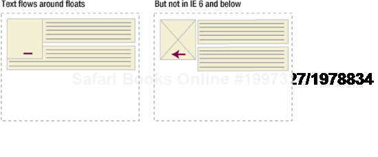
Figure 9.8. Text is supposed to flow around adjacent floated elements. However, in IE on Windows, if the text element has layout, this doesn't happen
The difference in rendering between browsers can cause all kinds of problems with floated layouts. Worse still, many people who use IE as their main browser mistakenly assume this is the correct behavior and get confused when other browsers treat floats differently. Furthermore, giving something layout appears to clear any floats contained therein, much like setting overflow:hidden.
Another problem revolves around how elements with layout size themselves. If the content of an element becomes larger than the element itself, the content is supposed to flow out of the element. However, in IE 6 and below, elements with layout incorrectly grow to fit the size of their contents (see Figure 9-9).
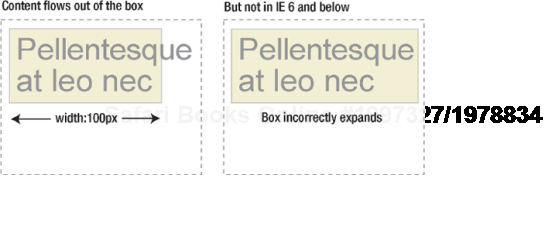
This rendering error means that width in IE on Windows actually acts more like min-width. This behavior is also the cause of many broken floated layouts in IE. When the content of a floated box incorrectly forces the width of the box to grow, the box becomes too big for the available space and drops below the other floated elements.
Other problems related to layout include
Elements with layout not shrinking to fit
Floats being auto-cleared by layout elements
Relatively positioned elements not gaining layout
Margins not collapsing between elements with layout
The hit area of block-level links without layout only covering the text
Background images on list items intermittently appearing and disappearing on scroll
You will notice that many of the IE fixes covered later in this chapter involve setting properties that force the element to have layout. In fact, if you come across an IE bug, one of the first things you can do is try applying rules that force layout to see if that fixes the problem.
If you would like to learn more about IE's internal hasLayout property, I recommend reading "On Having Layout" at http://www.satzansatz.de/cssd/onhavinglayout.html.
Thankfully, the IE team fixed most of the layout related problems in IE 7. However, the team did this by spotting common rendering bugs and creating exceptions in the code to handle them, rather than fixing the underlying causes. As such, there may still be a few obscure layout bugs kicking around that have not yet been discovered. IE 8 uses a completely new rendering engine that purportedly ditches the use of the hasLayout property and therefore fixes the cause of these problems.
In an ideal world, properly coded CSS would work in every browser with CSS support. Unfortunately, like all complicated pieces of software, browsers come with their own set of bugs and inconsistencies. In the early days, support for CSS was pretty poor, so developers had to get creative. By using parsing bugs and unimplemented CSS, developers were able to work their way around problems by selectively applying different rules to different browsers. As such, hacks and filters became a powerful weapon in a CSS developer's arsenal.
Thankfully, modern browsers have much better support than their predecessors, so we don't need to worry about hacks any more. However until older browsers disappear for good, you may find yourself maintaining legacy code. Therefore, it's a good idea to familiarize yourself with some of the more popular hacks and filters, if only so you can banish them from your code. Before we do this though, let's take a quick look at conditional comments.
Conditional comments are a proprietary, and thus nonstandard, Microsoft extension of regular HTML comments. As the name suggests, conditional comments allow you to show blocks of code depending on a condition, such as a browser version. Despite being nonstandard, conditional comments appear to all other browsers as regular comments, so they are essentially harmless. Because of this, conditional comments are generally regarded as the best way to deal with IE-specific bugs. Conditional comments first appeared in IE 5 on Windows and are supported by all subsequent versions of the Windows browser.
To deliver a specific style sheet to all versions of IE 5 and above, you could place the following code in the head of your HTML document:
<!-- [if IE]
    <link rel="stylesheet" type="text/css" href="/css/ie.css" />
-->
Versions of IE 5 and above on Windows would receive the stylesheet ie.css, while all other browsers would simply see some commented-out text. This is interesting but not particularly useful, as it's rare to find a bug that all versions of Internet Explorer exhibit. Instead, you will probably want to target a specific version or range of versions.
With conditional comments you could target a particular browser such as IE 6.0 using the following code:
<!-- [if IE 6]
    <link rel="stylesheet" type="text/css" href="/css/ie6.css" />
-->
You could also target sets of browsers such as IE 5 and IE 5.5:
<!-- [if lt IE 6]
    <link rel="stylesheet" type="text/css" href="/css/ie5x.css" />
-->
As well as using conditional comments to present style sheets to Internet Explorer, you can also use them to hide specific style sheets. Called downlevel-revealed conditional comments, the following syntax will hide more advanced styles from all versions of IE:
<!--[if !IE]>-->
    <link rel="stylesheet" type="text/css" href="/css/advanced.css" />
<!--<![endif]-->
And this code effectively hides your styles from Internet Explorer 5.x:
<!--[if gte IE 6]><!-->
    <link rel="stylesheet" type="text/css" href="/css/modern.css" />
<!--<![endif]-->
Conditional comments work extremely well and are relatively simple to remember. The main downside is that these comments need to live in your HTML, not your CSS. If a new version of Internet Explorer comes out you may be forced to update the conditional comments on each page of your site. However as long as you remember to do this, you should be fairly safe.
As a language, CSS was designed to be very forward compatible. If a browser doesn't understand a particular selector, it will ignore the whole rule. Likewise, if it doesn't understand a particular property or value, it will ignore the whole declaration. This feature means that the addition of new selectors, properties, and values should have no adverse effect on older browsers.
You can use this feature to supply rules and declarations to more advanced browsers, safe in the knowledge that older browsers will degrade gracefully. When a new version of the browser is launched, if it now supports the CSS you were using as a filter, it should work as expected. If you are using the more-advanced CSS to circumvent a problem in the older browsers, hopefully this problem will have been solved in the newer version. Because of this behavior, the use of unsupported CSS as a filtering mechanism is a relatively safe option. I say relatively because there is always a chance that the browser will support your new CSS but still exhibit the bug you were trying to fix.
Using filters that rely on parsing bugs is a slightly more dangerous route, because you are relying on a bug, not a feature. Similar to the previous method, if the parsing bug gets fixed but the bug you are trying to fix hasn't been addressed, you could end up with problems. However, more of a concern is that parsing bugs could find their way into newer versions of browsers. Say, for instance, a new version of Firefox has a particular parsing bug. If that bug is being used as a filter to supply IE with different width values to account for its proprietary box model, all of a sudden Firefox would inherit that width, potentially breaking a lot of sites. It is also worth bearing in mind that these kinds of hacks and filters will often invalidate your code. So as a general rule, it is probably safer to use filters that rely on unsupported CSS, rather than ones that use some kind of browser bug. Or better yet, avoid them all together.
There is a rather unfortunate overreliance on hacks and filters, especially among those new to CSS. When something does not work in a particular browser, some CSS developers will immediately employ a hack, seeing it as some kind of magic bullet. In fact, a few developers seem to measure their expertise by the number of obscure hacks and filters they know.
If you have done your homework and realize that the only option is to employ some form of hack or filter, you need to do so in a sensible and controlled manner. If your CSS files are small and simple, and you need to employ only a couple of hacks, it is probably safe to place these hacks in your main CSS files with comments indicating that is the case. However, hacks are usually fairly complicated and can make your code more difficult to read. If your CSS files are long and complicated, or you need to use more than a couple of hacks, you may be best separating them into their own style sheets. As well as making your code easier to read, separating out hacks means that if a hack starts causing problems in a future browser, you will know exactly where it is. Similarly, if you decide to drop support for a particular browser, removing the associated hacks is as simple as removing the CSS file.
Tantek Çelik created a series of filters (http://tantek.com/CSS/Examples/) based on browser parsing errors that allow you to supply stylesheets to selected browsers using the @import rule The filters used to be the recommended way of filtering out various versions of Internet Explorer until conditional comments became commonplace. However, you may still find these filters handy if, for instance, you need to explicitly target is IE 5.2 on the Mac. You can do this using Tantek's IE 5 for Mac band pass filter, which exploits an escaping bug within CSS comments:
/**//*/
    @import "ie5mac.css";
/**/
IE 5 for Mac incorrectly escapes the second asterisk, causing the @import rule to be applied. As such, IE 5 for Mac sees something like this:
/* blah */
    @import "ie5mac.css";
/**/
All other browsers correctly ignore the escaping element, as it is enclosed within a comment, and the @import rule is commented out. Essentially, all other browsers see a rule that looks like this:
/* blah *//*
   blah
*/
As with the other band pass filters, it is not necessary to understand how this filter works in order to use it. The beauty of these filters is they specifically target bugs in older, out-of-date browsers. Therefore, you should be able to use these filters safe in the knowledge that they shouldn't cause problems in newer browsers.
One of the best-known and possibly most useful inline CSS filters is known as the star HTML hack. This filter is incredibly easy to remember and targets IE 6 and below. As you are aware, the HTML element is supposed to be the first, or root, element on a web page. However older versions of IE have an anonymous root element wrapping around the HTML element. By using the universal selector, you can target an HTML element enclosed inside another element. Because this only happens in IE 6 and below, you can apply specific rules to these browsers:
* html {
  width: 1px;
}
As this bug was fixed in IE 7, it is a relatively safe way of targeting older versions of IE.
This hack forms part of the modified simplified box model hack (MSBMH), which used to be a popular way of managing Internet Explorer's propriety box model in older browsers.
#content {
  width: 80px;
  padding: 10px;
}


* html #content {
  width: 100px;
  width: 80px;
}
While I wouldn't recommend using this technique now, it is useful to know what it looks like as you may come across it in legacy code.
Instead of explicitly targeting older versions of Internet Explorer, say that you wanted to create a rule that these browsers will ignore. You can do this by using the child selector hack, though this technique isn't really a hack, as it simply uses a selector that older versions of IE don't understand but more modern browsers do.
In this example, the child selector hack is being used to hide a transparent background PNG image from IE 5-6 on Windows:
html>body {
  background-image: url(bg.png);
}
This rule will be hidden from older versions of Internet Explorer. However, IE 7 supports both the child selector and native PNG transparency, so it will interpret the code correctly.
One of the greatest skills any CSS developer can have is the ability to spot common browsers bugs. By knowing the various elements that conspire to cause these bugs, you can spot and fix them before they ever become a problem.
One of the most common and easy-to-spot bugs is the double-margin float bug in IE 6 and below. As the name suggests, this Windows bug doubles the margins on any floated elements (see Figure 9-10).
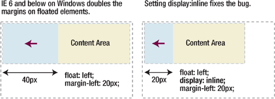
This bug is easily fixed by setting the display property of the element to inline. As the element is floated, setting the display property to inline won't actually affect the display characteristics. However, it does seem to stop IE 6 and below on Windows from doubling all of the margins. This is such a simple bug to spot and fix: every time you float an element with horizontal margins, you should automatically set the display property to inline, just in case margin gets added in the future.
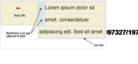
Another bug very common in IE 5 and 6 on Windows is the three-pixel text jog bug. This bug manifests itself when you have text adjacent to a floated element. For instance, say you had an element floated left, and you don't want the text in the adjacent paragraph to wrap around the float. You would do this by applying a left margin to the paragraph, the same width as the image:
.myFloat {
  float: left;
  width: 200px;
}


p {
  margin-left: 200px;
}
When you do this, a mysterious 3-pixel gap appears between the text and the floated element. As soon as the floated element stops, the 3-pixel gap disappears (see Figure 9-11).
Fixing this bug requires a two-pronged attack. First, the element containing the text is given an arbitrary height. This forces the element to have layout, which seemingly removes the text jog. Because IE 6 and below on Windows treat height like min-height, setting a tiny height has no effect on the actual dimensions of the element in that browser. However, it will affect other browsers, so you need to hide this rule from everything other than IE 6 and below on Windows. The best way to do this is to move these styles into a separate CSS file using conditional comments.
p {
  height: 1%;
}
Unfortunately, this technique causes another problem. As you learned earlier, elements with layout are constrained to a rectangular shape and appear next to floated elements rather than underneath them. The addition of 200 pixels of padding actually creates a 200-pixel gap between the floated element and the paragraph in IE 5 and 6 on Windows. To avoid this gap, you need to reset the margin on IE 5-6/Win back to zero:
p {
  height: 1%;
  margin-left: 0;
}
The text jog is fixed, but another 3-pixel gap has now appeared, this time on the floated image. To remove this gap, you need to set a negative 3-pixel right margin on the float:
p {
  height: 1%;
  margin-left: 0;
}


.myFloat {
  margin-right: −3px;
}
This will fix the problem if the floated element is anything other than an image. However, if the floated element is an image, there is one last problem to solve. IE 5.x on Windows adds a 3-pixel gap to both the left and the right of the image, whereas IE 6 leaves the image's margins untouched. As such, if you need to support IE 5.x, you will want to have one style sheet for those browsers:
p {
  height: 1%;
  margin-left: 0;
}


img.myFloat {
  margin: 0 −3px;
}
and another for IE 6:
p {
  height: 1%;
  margin-left: 0;
}


img.myFloat {
  margin: 0;
}Another curious bug involving floats is IE 6's duplicate character bug. Under certain conditions, the last few characters in the last of a series of floats will be duplicated beneath the float, as shown in Figure 9-12.
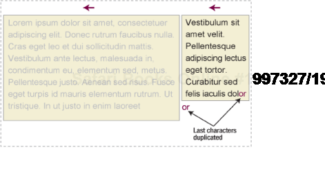
This bug manifests itself when you have multiple comments in between the first and last of a series of floated elements. The first two comments have no effect, but each subsequent comment causes two characters to be duplicated. So three comments would result in two duplicate characters; four comments would result in four duplicate characters; and five comments would result in six duplicate characters.
<div id="content">
 <!-- mainContent -->
<div id="mainContent">
...
</div><!-- end mainContent -->
  <!-- secondaryContent -->
<div id="secondaryContent">
...
</div>
Strangely, this bug seems related to the three-pixel text jog bug you saw previously. To fix the bug, you can remove 3 pixels from the final float by setting a negative right margin or make the container 3 pixels wider. However, both these methods are likely to cause problems in IE 7, which isn't expected to exhibit this bug. Because of this, the easiest and safest way to avoid this bug is to remove the comments from your HTML code.
Another strange and infuriating bug is IE 6's peek-a-boo bug, so called because under certain conditions text will seem to disappear, only to reappear when the page is reloaded. This happens when there is a floated element followed by some nonfloated elements and then a clearing element, all contained within a parent element that has a background color or image set. If the clearing element touches the floated element, the nonfloated elements in between seem to disappear behind the parent element's background color or image, only to reappear when the page is refreshed (see Figure 9-13).
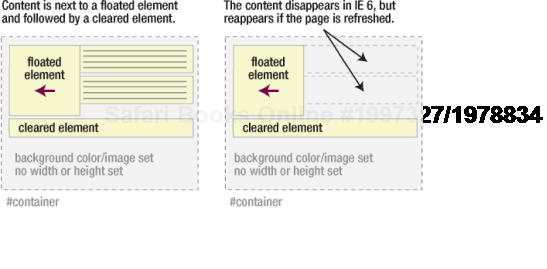
Luckily, there are a number of ways you can combat this bug. The easiest way is probably to remove the background color or image on the parent element. However, this is often not practical. Another way is to stop the clearing element from touching the floated element. The bug doesn't seem to manifest itself if the container element has specific dimensions applied. The bug also doesn't manifest itself if the container is given a line height. Last, setting the position property of the float and the container to relative also seems to alleviate the problem.
The last major browser bug I am going to cover involves absolutely positioned elements within a relatively positioned container. You learned in earlier chapters how useful nesting an absolutely positioned element in a relative container can be. However, IE 6 and below have a number of bugs when you use this technique.
These bugs arise from the fact that relatively positioned elements don't gain IE on Windows's internal hasLayout property. As such, they don't create a new positioning context, and all of the positioned elements get positioned relative to the viewport instead (see Figure 9-14).
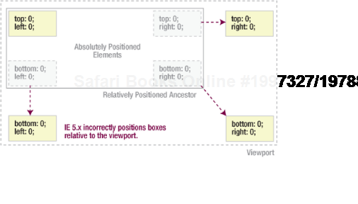
Figure 9.14. Demonstration showing how IE 5.x incorrectly positions absolutely positioned elements within a relative container
To get IE 6 and below on Windows to behave correctly, you need to force the relatively positioned container to have layout. One way to do this is to explicitly set a width and height on the container. However, you will often want to use this technique when you don't know the width and height of the container, or when you want one or both of these properties to be flexible.
Instead, you can use conditional comments to filter out IE 5 and 6 and then give the container layout by applying an arbitrary dimension. Because elements in IE 6 and below incorrectly expand to fit their contents, the actual height won't be affected.
.container {
  height: 1%;
}Internet Explorer isn't the only buggy browser around, so you may wonder why I have been focusing my attentions on IE bugs. Don't worry; it's not another case of Microsoft bashing; there are good reasons for this focus.
First, IE still has a significant market share so bugs tend to get found and documented pretty quickly. However, the pace of development is much slower in IE than other browsers. So, while Firefox and Safari are releasing new builds every few months, it can take years to see a new version of IE. As such, IE bugs tend to stick around longer.
The speed at which bugs are found and fixed in Firefox and Safari is excellent, but it does have its own problems. Rather than having two or three versions of a browser to deal with, you may have 10 or 20. You can never be sure if your users have the latest version, and this makes testing extremely difficult. IE, on the other hand, didn't see a major revision for about five years. As such, there has been much more time for bugs to surface and much more impetus to find a fix.
Luckily, IE 8 is a much more standards-compliant browser than previous versions. Many of the better-known IE bugs have been addressed, along with increased support for advanced CSS 2.1. As with all browsers, new bugs will surface, and IE 8 is far from perfect. However, the faster people can be convinced to upgrade to modern browsers such as IE 8 and Firefox, the quicker older browsers such as IE 6 can be retired.
No discussion about bugs would be complete without mentioning browser support. Each time a new version of Internet Explorer comes out, the release sparks a big discussion about when it is going to be safe to stop supporting the previous versions. After all, if Microsoft no longer officially supports IE6, why should we bother? Unfortunately, there is no clear solution to the problem of browser support, and the honest answer is that it depends on the individual site.
If you are hosting a site for web developers, you probably have a large Firefox and Mac user-base, in which case IE 6 usage may be so low as to deem it not worth worrying about. However, even a couple of percent on a site that receives a million visitors a month could equate to tens of thousands of unhappy customers. For business or consumer sites, the number of IE 6 users is likely to be much higher. You may even find that on specific sites IE 6 usage outstrips that of IE 7. This is because many corporate IT departments lock their users into specific browser versions, while many home users only update their browsers when they get a new machine. So instead of talking about dropping support for a certain browser, we need to grade on the curve and decide what support actually means on a site-by-site basis. This is where the idea of graded browser support comes in.
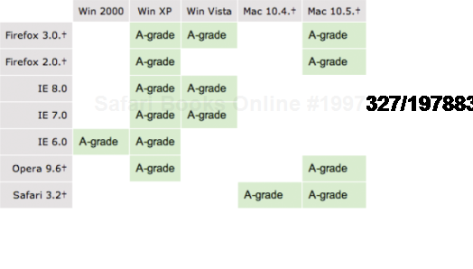
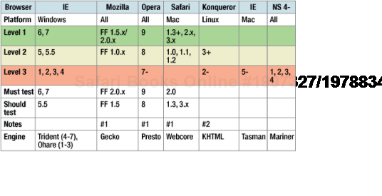
Large organizations like Yahoo and the BBC realize that not all browsers are created equal and that ensuring your site looks and behaves exactly the same in all browsers will increase maintenance costs while hampering innovation. In order to avoid having to design for the lowest common denominator in browser terms, these companies have started to adopt graded support charts (see Figures 9-15 and 9-16). Rather than seeing browser support as a binary supported/unsupported option, these charts offer a variety of different support levels, from rendering the full design for modern browsers, down to just the content for older versions. While each organization frames the problem differently, the steps are pretty much the same.
First, you need to identify the browsers for which you want to ensure render consistently across your site and then test on all of these browsers. This group will usually contain the latest and most popular browsers used by your audience. So the latest versions of Firefox, Safari, and Opera, as well as IE 7 and 8 will probably fall into this category. With these browsers, you want the sites to look largely the same, although for practical reasons a couple of pixels here or there won't make much difference.
Next, you identify a set of aging but still important browsers. This could include older versions of Firefox and Safari along with IE 6. You'll test on a random sampling of these browsers and attempt to fix any problems you find. However, you'll accept that rendering may not be perfect and may differ from browser to browser, just as long as the content is accessible.
Last, you'll identify a set of obscure or out-of-date browsers that you don't officially support. This would be browsers like IE 4, Netscape Navigator 4, or Opera 7. With these browsers, you still want to make the content and functionality available, but you're not worried about the presentation. As such, you are happy to accept fairly major design variations. Even better would be to remove the styling from these browsers altogether.
A graded support philosophy gives you a much more flexible way of dealing with the volume of browsers and other user agents out there. The charts from the BBC are a good starting point, but as every site is unique, I strongly recommend that you create your own on a project-by-project basis.
In this chapter, you have learned some important techniques for tracking down and squashing CSS bugs. You have learned about IE on Windows internal hasLayout property and how this is the root of many IE on Windows browser bugs. You also learned about some of the most common browser bugs and how to fix them. Finally, you've learnt how to deal with a plethora of different browsers through the use of graded support charts.
Next, you will see how all of this information can be put together, through two stunning case studies created by two of the best CSS designers and developers of our time.