
Three of the most important CSS concepts to grasp are floating, positioning, and the box model. These concepts control the way elements are arranged and displayed on a page, forming the basis of CSS layout. If you are used to controlling layout with tables, these concepts may seem strange at first. In fact, most people will have been developing sites using CSS for some time before they fully grasp the intricacies of the box model, the difference between absolute and relative positioning, and how floating and clearing actually work. Once you have a firm grasp of these concepts, developing sites using CSS becomes that much easier.
In this chapter you will learn about
The intricacies and peculiarities of the box model
How and why margins collapse
The difference between absolute and relative positioning
How floating and clearing work
The box model is one of the cornerstones of CSS and dictates how elements are displayed and, to a certain extent, how they interact with each other. Every element on the page is considered to be a rectangular box made up of the element's content, padding, border, and margin (see Figure 3-1).
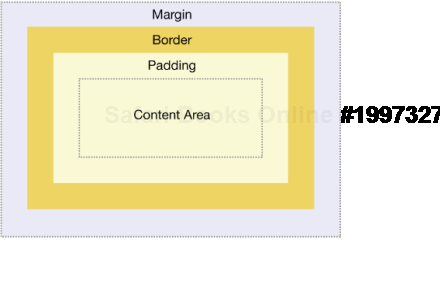
Padding is applied around the content area. If you add a background to an element, it will be applied to the area formed by the content and padding. As such, padding is often used to create a gutter around content so that it does not appear flush to the side of the background. Adding a border applies a line to the outside of the padded area. These lines come in various styles such as solid, dashed, or dotted. Outside the border is a margin. Margins are transparent and cannot be seen. They are generally used to control the spacing between elements.
Note
CSS 2.1 also contains the outline property. Unlike the border property, outlines are drawn over the top of an element's box, so they don't affect its size or positioning. Because of this, outlines can be useful when fixing bugs, because they won't alter the layout of your page. Outlines are supported by most modern browsers including IE 8 but are not supported in IE 7 and below.
Padding, borders, and margins are optional and default to zero. However, many elements will be given margins and padding by the user-agent style sheet. You can override these browser styles by setting the element's margin or padding back to zero. You can do this on a case-by-case basis or for every element by using the universal selector:
* {
  margin: 0;
  padding: 0;
}
Just remember that this technique is fairly indiscriminant, so it can have adverse effects on elements like the option element. As such it's probably safer to zero down the padding and margins explicitly using a global reset.
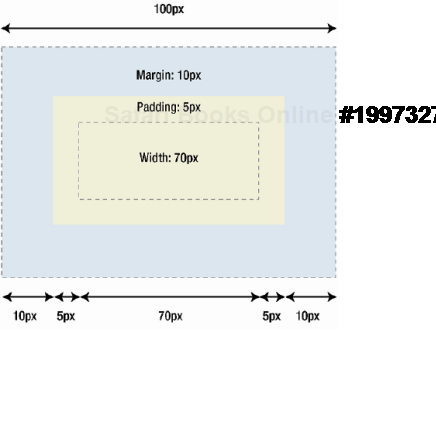
In CSS, width and height refer to the width and height of the content area. Adding padding, borders, and margins will not affect the size of the content area but will increase the overall size of an element's box. If you wanted a box with a 10-pixel margin and a 5-pixel padding on each side to be 100 pixels wide, you would need to set the width of the content to be 70 pixels (see Figure 3-2):
#myBox {
  margin: 10px;
  padding: 5px;
  width: 70px;
}
Padding, borders, and margins can be applied to all sides of an element or individual sides. Margins can also be given a negative value and can be used in a variety of techniques.
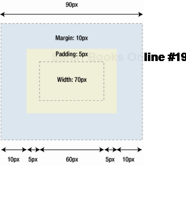
Unfortunately, older versions of Internet Explorer, along with IE 6 in quirks mode, use their own, nonstandard box model. Instead of measuring just the width of the content, these browsers take the width property as the sum of the width of the content, padding, and borders. This actually makes a lot of sense, because in the real-world boxes have a fixed size, and the padding goes on the inside. The more padding you add, the less room there will be for the content. However, despite the logic, the fact that these versions of IE disregard the specification can cause significant problems. For instance, in the previous example the total width of the box would only be 90 pixels in IE 5.x. This is because IE 5.x will consider the 5 pixels of padding on each side as part of the 70-pixel width, rather than in addition to it (see Figure 3-3).
Note
The CSS 3 box-sizing property allows you to define which box model to use, although this feature is unlikely to be widely used except in some very specific circumstances.
Luckily, there are several ways you can tackle this issue, the details of which can be found in Chapter 9. However, by far the best solution is to avoid the problem altogether. You can do this by never adding padding to an element with a defined width. Instead, try adding padding or margins to the element's parent or children.
Margin collapsing is a relatively simple concept. In practice, however, it can cause a lot of confusion when you're laying out a web page. Put simply, when two or more vertical margins meet, they will collapse to form a single margin. The height of this margin will equal the height of the larger of the two collapsed margins.
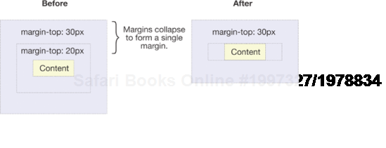
When two elements are above one another, the bottom margin of the first element will collapse with the top margin of the second element (see Figure 3-4).
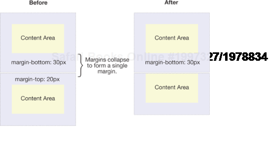
Figure 3.4. Example of an element's top margin collapsing with the bottom margin of the preceding element
When one element is contained within another element, assuming there is no padding or border separating margins, their top and/or bottom margins will also collapse together (see Figure 3-5).
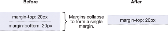
It may seem strange at first, but margins can even collapse on themselves. Say you have an empty element with a margin but no border or padding. In this situation, the top margin is touching the bottom margin, and they collapse together (see Figure 3-6).
If this margin is touching the margin of another element, it will itself collapse (see Figure 3-7).
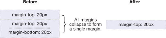
Figure 3.7. Example of an empty element's collapsed margin collapsing with another empty element's margins
This is why a series of empty paragraph elements take up very little space, as all their margins collapse together to form a single small margin.
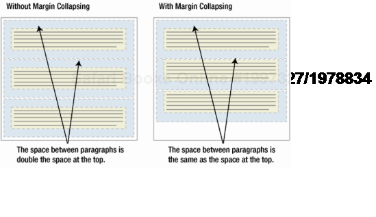
Margin collapsing may seem strange at first, but it actually makes a lot of sense. Take a typical page of text made up of several paragraphs (see Figure 3-8). The space above the first paragraph will equal the paragraph's top margin. Without margin collapsing, the space between all subsequent paragraphs will be the sum of their two adjoining top and bottom margins. This means that the space between paragraphs will be double the space at the top of the page. With margin collapsing, the top and bottom margins between each paragraph collapse, leaving the spacing the same everywhere.
Margin collapsing only happens with the vertical margins of block boxes in the normal flow of the document. Margins between inline boxes, floated, or absolutely positioned boxes never collapse.
Now that you are familiar with the box model, let's take a look at the visual formatting and positioning models. Understanding the nuances of both of these models is vitally important, as together they control how every element is arranged on a page.
People often refer to elements such as p, h1, or div as block-level elements. This means they are elements that are visually displayed as blocks of content, or block boxes. Conversely, elements such as strong and span are described as inline elements because their content is displayed within lines as inline boxes.
It is possible to change the type of box generated by using the display property. This means you can make an inline element such as an anchor behave like a block-level element by setting its display property to block. It is also possible to cause an element to generate no box at all by setting its display property to none. The box, and thus all of its content, is no longer displayed and takes up no space in the document.
There are three basic positioning schemes in CSS: normal flow, floats, and absolute positioning. Unless specified, all boxes start life being positioned in the normal flow. As the name suggests, the position of an element's box in the normal flow will be dictated by that element's position in the HTML.
Block-level boxes will appear vertically one after the other; the vertical distance between boxes is calculated by the boxes' vertical margins.
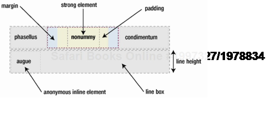
Inline boxes are laid out in a line horizontally. Their horizontal spacing can be adjusted using horizontal padding, borders, and margins (see Figure 3-9). However, vertical padding, borders, and margins will have no effect on the height of an inline box. Similarly, setting an explicit height or width on an inline box will have no effect either. The horizontal box formed by a line is called a line box, and a line box will always be tall enough for all the line boxes it contains. There is another caveat, though—setting the line height can increase the height of this box. Because of these reasons, the only way you can alter the dimensions of an inline box is by changing the line height or horizontal borders, padding, or margins.
Helpfully, CSS2.1 allows you to set the display property of an element to be inline-block. As the name suggests, this declaration makes the element line up horizontally as if it were an inline element. However, the contents of the box behave as though the box were a block-level, including being able to explicitly set widths, heights, vertical margins, and padding. Historically, this property has been poorly supported; hence, it's relative obscurity. Thankfully, inline-block is now supported by Firefox 3.0 and above, IE 8, and the latest versions of Safari and Opera, so I think we are going to see inline-block being used to create more interesting layouts over the next few years.
In the same way that HTML elements can be nested, boxes can contain other boxes. Most boxes are formed from explicitly defined elements. However, there is one situation where a block-level element is created even if it has not been explicitly defined—when you add some text at the start of a block-level element like a div. Even though you have not defined the text as a block-level element, it is treated as such:
<div>
    some text
    <p>Some more text</p>
</div>
In this situation, the box is described as an anonymous block box, since it is not associated with a specifically defined element.
A similar thing happens with the lines of text inside a block-level element. Say you have a paragraph that contains three lines of text. Each line of text forms an anonymous line box. You cannot style anonymous block or line boxes directly, except through the use of the :first-line pseudo element, which obviously has limited use. However, it is useful to understand that everything you see on your screen creates some form of box.
Relative positioning is a fairly easy concept to grasp. If you relatively position an element, it will stay exactly where it is. You can then shift the element relative to its starting point by setting a vertical or horizontal position. If you set the top position to be 20 pixels, the box will appear 20 pixels below the top of its original position. Setting the left position to 20 pixels will create a 20-pixel space on the left of the element, moving the element to the right (see Figure 3-10).
#myBox {
  position: relative;
  left: 20px;
  top: 20px;
}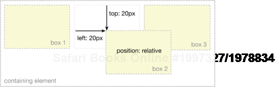
With relative positioning, the element continues to occupy the original space, whether or not it is offset. As such, offsetting the element can cause it to overlap other boxes.
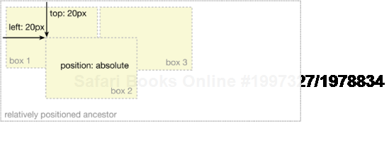
Relative positioning is actually considered part of the normal flow-positioning model, as the position of the element is relative to its position in the normal flow. By contrast, absolute positioning takes the element out of the flow of the document, thus taking up no space. Other elements in the normal flow of the document will act as though the absolutely positioned element was never there (see Figure 3-11).
An absolutely positioned element is positioned in relation to its nearest positioned ancestor. If the element has no positioned ancestors, it will be positioned in relation to the initial containing block. Depending on the user agent, this will either be the canvas or the HTML element.
As with relatively positioned boxes, an absolutely positioned box can be offset from the top, bottom, left, or right of its containing block. This gives you a great deal of flexibility. You can literally position an element anywhere on the page.
Note
The main problem people have with positioning is remembering which type of positioning is which. Relative positioning is "relative" to the element's initial position in the flow of the document, whereas absolute positioning is "relative" to nearest positioned ancestor or, if one doesn't exist, the initial container block.
Because absolutely positioned boxes are taken out of the flow of the document, they can overlap other elements on the page. You can control the stacking order of these boxes by setting a property called z-index. The higher the z-index, the higher up the box appears in the stack.
Positioning an absolutely positioned element in relation to its nearest positioned ancestor allows you to do some very interesting things. For instance, say you wanted to align a paragraph of text at the bottom right of a large box. You could simply give the container box a relative position and then absolutely position the paragraph in relation to this box:
#branding {
  width: 70em;
  height: 10em;
  position: relative;
}

#branding .tel {
  position: absolute;
  right: 1em;
  bottom: 1em;
  text-align: right;
}

<div id="branding">
    <p class="tel">Tel: 0845 838 6163</p>
</div>
Note
Absolutely positioning a box in relation to a relatively positioned ancestor works well in most modern browsers. However, there is a bug in IE 5.5 and IE 6 on Windows. If you try to set the position of the absolutely positioned box relative to the right or bottom of the relatively positioned box, you need to make sure the relatively positioned box has some dimensions set. If not, IE will incorrectly position the box in relation to the canvas instead. You can read more about this bug and possible fixes in Chapter 9. The simple solution is to set the width and height of your relative box to avoid this problem.
Absolute positioning can be a useful tool when laying out a page, especially if it is done using relatively positioned ancestors. It is entirely possible to create a design solely using absolute positioning. For this to work, these elements need to have fixed dimensions, so you can position them where you want without the risk of overlapping.
Because absolutely positioned elements are taken out of the flow of the document, they have no effect on boxes in the normal flow. If you were to enlarge an absolutely positioned box—by increasing the font size, for instance—the surrounding boxes wouldn't reflow. As such, any change in size can ruin your finely tuned layout by causing the absolutely positioned boxes to overlap.
Fixed positioning is a subcategory of absolute positioning. The difference is that a fixed element's containing block is the viewport. This allows you to create floating elements that always stay at the same position in the window. An example of this is shown at the old snook.ca website (see Figure 3-12). The weblog comment form has been given a fixed position to keep it anchored at the same place on screen when the page is scrolled. This really helps improve usability, and you don't have to scroll all the way to the bottom of the page to leave a comment.

Figure 3.12. At the old snook.ca website, the comment field on the right side of the screen used a fixed position to stay at the same position in the viewport.
Unfortunately, IE 6 and below do not support fixed positioning. IE 7 partially supports this property, but the implementation is fairly buggy. To get around these problems, Jonathan Snook used JavaScript to replicate the effect in IE.
The last visual formatting model is the float model. A floated box can either be shifted to the left or the right until its outer edge touches the edge of its containing box or another floated box. Because floated boxes aren't in the normal flow of the document, block boxes in the regular flow of the document behave as if the floated box wasn't there.
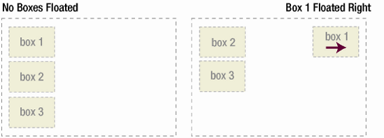
As shown in Figure 3-13, when you float Box 1 to the right, it's taken out of the flow of the document and moved to the right until its right edge touches the right edge of the containing block.
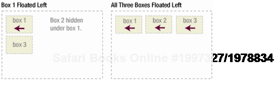
In Figure 3-14, when you float Box 1 to the left, it is taken out of the flow of the document and moved left until its left edge touches the left edge of the containing block. Because it is no longer in the flow, it takes up no space and actually sits on top of Box 2, obscuring it from view. If you float all three boxes to the left, Box 1 is shifted left until it touches its containing box, and the other two boxes are shifted left until they touch the preceding floated box.
If the containing block is too narrow for all of the floated elements to fit horizontally, the remaining floats will drop down until there is sufficient space (see Figure 3-15). If the floated elements have different heights, it is possible for floats to get "stuck" on other floats when they drop down.
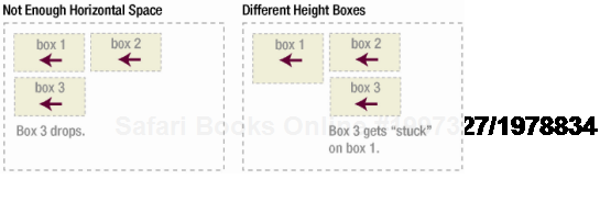
Figure 3.15. If there is not enough available horizontal space, floated elements will drop down until there is.
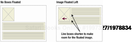
You learned in the previous section that floating an element takes it out of the flow of the document where it no longer exerts an effect on non-floated items. Actually, this isn't strictly true. If a floated element is followed by an element in the flow of the document, the element's box will behave as if the float didn't exist. However, the textural content of the box retains some memory of the floated element and moves out of the way to make room. In technical terms, a line box next to a floated element is shortened to make room for the floated element, thereby flowing around the floated box. In fact, floats were created to allow text to flow around images (see Figure 3-16).
To stop line boxes flowing around the outside of a floated box, you need to apply a clear property to the element that contains those line boxes. The clear property can be left, right, both, or none, and it indicates which side of the box should not be next to a floated box. I always used to think that the clear property was some magic flag that automatically negated the previous float. However, the reality is much more interesting. When you clear an element, the browser adds enough margin to the top of the element to push the element's top border edge vertically down, past the float (see Figure 3-17).
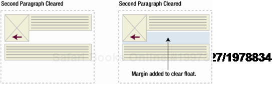
Figure 3.17. Clearing an element's top margin to create enough vertical space for the preceding float
As you've seen, floated elements are taken out of the flow of the document and have no effect on surrounding elements. However, clearing an element essentially clears a vertical space for all the preceding floated elements.
This can be a useful layout tool as it allows surrounding elements to make space for floated elements. This solves the problem you saw earlier with absolute positioning, where changes in vertical height do not affect surrounding elements and can break your design.
Let's have a look at floating and clearing in a little more detail. Say you have a picture that you want to float to the left of a block of text. You want this picture and text to be contained in another element with a background color and border. You would probably try something like this:
.news {
  background-color: gray;
  border: solid 1px black;
}

.news img {
  float: left;
}

.news p {
  float: right;
}

<div class="news">
    <img src="/img/news-pic.jpg" alt="my pic" />
    <p>Some text</p>
</div>
However, because the floated elements are taken out of the flow of the document, the wrapper div takes up no space. How do you visually get the wrapper to enclose the floated element? You need to apply a clear somewhere inside that element (see Figure 3-18). Unfortunately, as there are no existing elements in the example to clear, you could add an empty element under the last paragraph, and clear that.
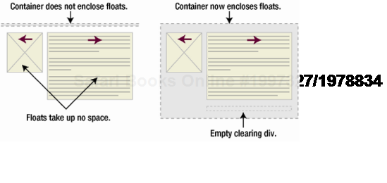
Figure 3.18. Because floats take up no space, they are not enclosed by container elements. The addition of an empty clearing element forces the container element to enclose the floats.
.news {
  background-color: gray;
  border: solid 1px black;
}


.news img {
  float: left;
}

.news p {
  float: right;
}

.clear {
  clear: both;
}
<div class="news">
<img src="/img/news-pic.jpg" alt="my pic" />
<p>Some text</p>
<br class="clear" />
</div>This gets the result we want, but at the expense of adding extraneous code to our markup. Often there will be an existing element you can apply the clear to, but sometimes you may have to bite the bullet and add meaningless markup for the purpose of layout.
Instead of clearing the floated text and image, you could choose to float the container div as well:
.news {
  background-color: gray;
  border: solid 1px black;
  float: left;
}


.news img {
  float: left;
}


.news p {
  float: right;
}


<div class="news">
    <img src="/img/news-pic.jpg" alt="my pic" />
    <p>Some text</p>
</div>
This creates the desired result. Unfortunately, the next element is now going to be affected by the float. To solve this problem, some people choose to float nearly everything in a layout and then clear those floats using an appropriate meaningful element, often the site footer. This helps reduce or eliminate the need for extraneous markup. However, floating can be complicated, and some older browsers may choke on heavily floated layouts. As such, many people prefer to add that extra bit of markup.
The overflow property defines how an element is supposed to behave if the enclosed content is too big for the stated dimensions. By default the content will spill out of the box, overflowing into the neighboring space. One useful side-effect of applying an overflow property of hidden or auto is that it will automatically clear any floats contained within. So this can be a useful way of clearing an element without adding any extra markup. This method is not appropriate in all situations, since setting the box's overflow property will affect how it behaves. More specifically, this method can force scroll bars or clip content under certain circumstances.
Then too, some people have taken to clearing floats using CSS-generated content or JavaScript. The basic concept for both methods is the same. Rather than add a clearing element directly to the markup, you add it to the page dynamically. For both methods, you need to indicate where the clearing element goes, and this is usually done with the addition of a class name:
<div class="news clear">
    <img src="/img/news-pic.jpg" alt="my pic" />
    <p Some text</p>
</div>
Using the CSS method, you use the :after pseudo-class in combination with the content declaration to add new content at the end of the specified existing content. In this case, I'm adding a period, as it is a fairly small and unobtrusive character. You don't want the new content to take up any vertical space or be displayed on the page, so you need to set height to 0 and visibility to hidden. Because cleared elements have space added to their top margin, the generated content needs to have its display property set to block. Once this is done, you can then clear your generated content:
.clear:after {
  content: ".";
  height: 0;
  visibility: hidden;
  display: block;
  clear: both;
}
This method works in most modern browsers but fails in Internet Explorer 6 and below. Various workarounds are available, many of which are documented at www.positioniseverything.net/easyclearing.html. The most common of these involves using the Holly Hack (see Chapter 8) to trick IE 5 and 6 into applying "Layout" (see Chapter 9) and incorrectly clearing the floats.
.clear {
display: inline-block;
}
/* Holly Hack Targets IE Win only */
* html .clear {height: 1%;}
.clear {display: block;}
/* End Holly Hack */
However, due to its complexity this method may not be suitable for everybody so has been included primarily for historical reasons.
An explanation of the JavaScript method is beyond the scope of this book but is worth a brief mention. Unlike the previous method, the JavaScript method works on all major browsers when scripting is turned on. However, if you use this method, you need to make sure that the content is still readable when scripting is turned off.
In this section, you learned about the box model and how padding, margin, width, and height affect the dimensions of a box. You also learned about the concept of margin collapsing and how this can affect your layouts. You were introduced to the three formatting models in CSS: normal flow, absolute positioning, and floating. You learned the difference between inline and block boxes, how to absolutely position an element within a relatively positioned ancestor, and how clearing really works.
Now that you are armed with this knowledge, let's start putting it to good use. In the following chapters of this book, you will be introduced to a number of core CSS concepts and you'll see how they can be used to create a variety of useful and practical techniques. So open your favorite text editor, and let's get coding.