
 Note CSS is no more than a collection of style rules, and each style rule is made up of a selector and a definition. Don’t let it get more complicated than that.
A style rule’s selector determines what it affects, and the definition determines how it is affected.
So, just as it is the entire job of HTML to define the document’s structure, it is the entire job of CSS to lay out and style that structure to appear as it should and where it should.
With the combination of the document object model (DOM) of HTML and the element selection capability of CSS, we have a very effective and relatively unique way of expressing a potentially complex structure and then separately styling unique sets of elements in that structure without being overly obscure or repetitious.
I call it relatively unique because the styling of many other UI languages tends to get mixed in with the document structure. With HTML and CSS, however, the two can remain separate. The advantage (beyond being clearer for the developer) is the ability to easily interchange style sheets and, in doing so, completely alter an app’s layout and style.
So the awesome power of CSS comes from its ability to define style rules and then determine to exactly which elements in the UI that rule should apply.
In Figure 3-1, you can find the app that precedes all others: the Windows Store app.
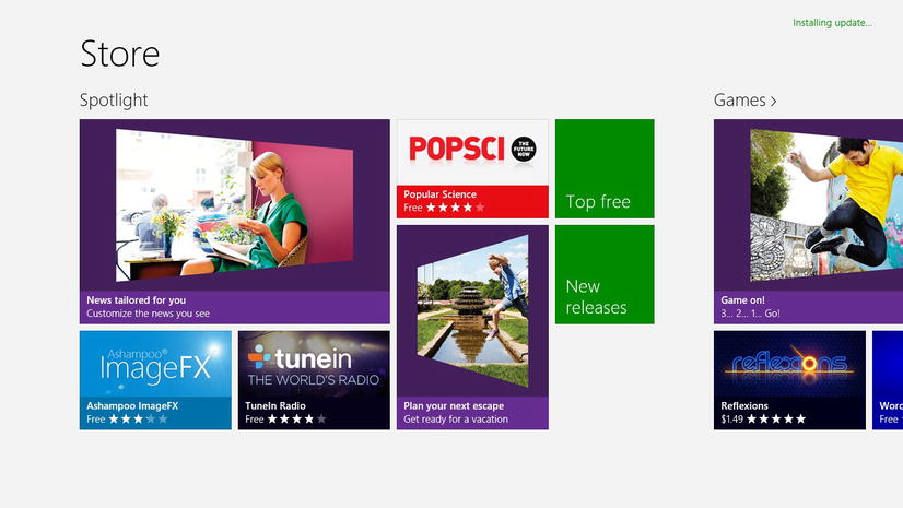
Figure 3-1. The Windows Store app
This app has content, but it has a lot of style as well. The app’s title is a larger font and positioned just so; the apps have images and captions and background colors, and everything on the page has a very intentional layout. Overall, the app has good content and good presentation of that content. That’s really what we’re shooting for.
CSS applies to or describes HTML. Actually it describes XML in general, but as far as we’re concerned in creating Windows 8 apps, HTML is our only consideration. That means that any time you create an HTML file and would like to affect the elements in that document with styles, you need to write and apply some CSS.
These styles can exist in three places:
- inline
- in an embedded style sheet
- in an external style sheet
Inline styles are defined in a style attribute added directly to the elements they should affect.
Inline styles are generally considered poor form since they mingle the structure and style in your project and can quickly become unwieldy. I generally never use inline styles, and I strongly feel that there are very few, if any, cases where they should be put into production. They may be helpful for some developers for things like rapid prototyping or troubleshooting design, but they should not be used in the final product. Listing 3-1 shows what inline styling looks like.
Listing 3-1. A simple HTML5 document with an inline style attribute on a div tag
<!-- default.html -->
<!DOCTYPE html>

<html lang="en" xmlns=" http://www.w3.org/1999/xhtml ">
<head>
    <meta charset="utf-8" />
    <title></title>
</head>
<body>
    <divstyle="font-weight: bold;" ></div>
</body>
</html>
Embedded style sheets are defined on the page they affect. A style element is added to the head element of the page and contains style rules to determine how style properties are applied to various elements. An embedded style sheet is generally less common than the third option and should likely be scarce in a Windows 8 app. Listing 3-2 is an example of an embedded CSS style sheet.
Listing 3-2. A simple HTML5 document with an embedded style tag
<!-- default.html -->
<!DOCTYPE html>

<html lang="en" xmlns=" http://www.w3.org/1999/xhtml ">
<head>
    <meta charset="utf-8" />
    <title></title>
    <style>
        #myDiv { font-weight: bold; }
    </style>
</head>
<body>
    <divid="myDiv" ></div>
</body>
</html>
Finally, external style sheets are the best method for defining and applying styles. With external style sheets, the affected HTML file is left untainted. The only trace, in fact, is the reference to the style sheet, which takes just a single line inside the head element, leaving the rest of the HTML to do its job, which is to provide the structure of the document. Another major advantage of using external style sheets is the ease of dynamically exchanging them for support of multiple themes, multiple languages, or even multiple platforms potentially.
Listing 3-3 shows a good example of an HTML file with a reference to an external style sheet.
Listing 3-3. A simple HTML5 document with a reference to an external CSS style sheet
<!-- default.html -->
<!DOCTYPE html>

<html lang="en" xmlns=" http://www.w3.org/1999/xhtml ">
<head>
    <meta charset="utf-8" />
    <title></title>
    <link href="default.css" rel="stylesheet" />
</head>
<body>
    <div id="myDiv"></div>
</body>
</html>

/* default.css */
#myDiv {
    font-weight: bold;
}
These style sheet files (.css) can be kept anywhere as long as they are accessible by way of an HTTP request from the HTML page. You could link to a style sheet that’s stored on an entirely different server on the internet, or it could be in a central folder in your web project (perhaps called css or styles), or it could be right next to your HTML file, and you can use either an absolute reference or a relative reference in the link’s href attribute.
It is a rather strong convention to put all style sheets in a central location in a web project, but it’s also quite common, especially when creating single page web applications, to create a style sheet for each and every HTML page in the project, and this is the convention in Windows 8 apps. When you’re architecting your Windows 8 app, you have the option of putting the CSS files anywhere you choose, but following the convention is a good practice. One of the built-in, Windows-8 project templates is the Navigation App template, and it follows this convention putting a CSS file, an HTML file, and a JavaScript file for each page in their own folder inside the pages folder.
The contents of the external style sheet (and the embedded style sheet too, for that matter) are simple—composed of nothing more than a large list of one style rule after another. Occasionally, style rules may be wrapped with a media query block, but we’ll save that subject for later.
Listing 3-4 shows how a style sheet (whether it’s an external style sheet or an embedded one) populated with some rules would look.
Listing 3-4. Typical format for style rules
selector {
    property: value;
    property: value;
    property: value;
}

selector {
    property: value;
    property: value;
    property: value;
}

selector {
    property: value;
    property: value;
    property: value;
}
For some of your shorter style rules, you might, like me, rather forego the line feeds between rules and format your rule on a single line, more like Listing 3-5.
Listing 3-5. A more compact format for saving vertical space when style rules are simple
selector { property: value; property: value; }
selector { property: value; property: value; }
selector { property: value; property: value; }
You’ll save some vertical space this way and perhaps extend the life of your mouse wheel, but like its sister technology HTML, CSS ignores extra whitespace, so you can feel free to format it however you like and know that it’s going to be interpreted the same.
Another typical and very helpful convention is the indentation of style rules that affect only elements that are below the preceding style rule. Indentation is used extensively in imperative coding languages to communicate the code structure to the developer and make it easier to read. In CSS, indented code indicates the hierarchical relationship between style rules. Remember that whitespace is ignored, so this indentation has no effect on the functionality. Notice in Listing 3-6 how the second style rule contains the same selector (“selectorA”) as the preceding rule, in addition to some more specifics. This means that it is in the context of its preceding rule, and this is what the indentation signifies. You’ll see this convention used in the sample code in this book.
Listing 3-6. Indentation strictly as a visual aide for indicating hierarchy
selectorA {
    property: value;
    property: value;
    property: value;
}

    selectorA selector1 {
        property: value;
        property: value;
        property: value;
    }

selectorB {
    property: value;
    property: value;
    property: value;
}
You know what style rules are now, so it’s time to learn how to compose them. We’ll begin with a discussion on selectors.
Imagine you are working with a typical word processor. When you are finished composing and perhaps editing your document, your job becomes one of formatting. To determine formatting for various parts of the document, you take two steps: you select the area you wish to format by dragging over it with the mouse, and then you apply various styling rules, usually by clicking command buttons or keyboard shortcuts. You might select the entire first paragraph, for example, and then determine that you want the font size to be increased to 16pt. Or you may choose only a single word and set it to be underlined.
These are exactly the steps you will take with CSS, only you select using a selector, and you apply styles using style properties. Your selector designates which HTML elements you want to select, and the associated style properties determine what should happen to that selection.
So writing selectors that select exactly what you intend is obviously a very important step, and I beg you not to skip over this section. I actually find far more developers that are weak and lacking in their CSS selection skills than I do those lacking in their formatting skills. What this amounts to is wasted time, space, and complexity, either over-defining their HTML with class and ID decorators that are not necessary or with redundant or wordy style rules in their CSS. Either misstep adds to the complexity of the project, which has obvious penalties even if the site or app works perfectly fine.
A selector is an expression that is evaluated and results in a list of zero to many DOM elements (or pseudo-elements, but we’ll get to that later).
The evaluation of a selector may, for instance, result in the selection of every div element on the page, the first p in the body, or the page footer element. Selectors can get quite specific, however, and result in things like every third list item (li) in the ordered list (ol) or the first letter of the third paragraph of the div called myDiv.
The goal in defining your selector is to select what you want, and that’s all. It is quite common to define a selector and style rule only to find that your rule is affecting more elements than you had intended.
There are a few different ways of referring to the same element. You can refer to it by its type (which is its tag name or element name, i.e., div, p, video, body, etc.). You can refer to it by its unique id attribute if it has one. You can refer to it by any of the values in its class attribute. Or, finally, you can refer to it using one of many other creative methods which we’ll get to in due time.
Before we dig into the different selection techniques, let’s define a few terms:
- style rule. A style rule is an entire statement that will determine which elements will be affected by a style and also define the style that will be applied. It consists of a selector and a declaration block.
- selector. A selector is a pattern for locating one or more elements in the DOM. A selector may be composed of multiple simple selectors combined with combinators.
- combinator. A combinator is a symbol that defines the contextual relationship between the element(s) targeted by the simple selector on its left and the element(s) targeted by the simple selector on its right.
- declaration block. A style rule’s declaration block defines the style properties and their values that will be applied to the results of the style rule’s selector.
Figure 3-2 illustrates these terms.
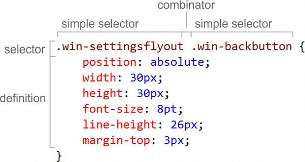
Figure 3-2. The anatomy of a CSS style rule
Now, let’s learn the various methods for selecting your elements.
The first selector that you should know is the type selector. A type selector is simply the name of an HTML element; using one results in the selection of every element of that type. The selector in Listing 3-7 will locate all div elements on the page and make the text bold.
Listing 3-7. A type selector targeting every div in the document
/* CSS snippet */
div {
    font-weight: bold;
}
Listing 3-8 will bold all of the text in the entire body. Technically, this will attempt to locate all of the body elements, but let’s hope you only have one!
Listing 3-8. A type selector targeting the document body
/* CSS snippet */
body {
    font-weight: bold;
}
If instead of specifying a type, you use an asterisk (*), you are using what’s called the universal type selector, which matches all types. The CSS in Listing 3-9 will match every element on the entire page and set its font to bold!
Listing 3-9. An explicit use of the universal type selector
/* CSS snippet */
* {
    font-weight: bold;
}
This universal selector is not used on its own too often, but it’s important to understand it for reasons that we’ll get to very soon.
Don’t forget that these type selectors, used on their own, will match any and all matching elements of the type. In order to select only one of your div elements, you’ll have to be more specific (and we’ll have more on that to come).
This is important. It is an absolute requirement that a type selector precede any other selectors in your expression. If you’ve done any CSS development already, that may come as a surprise. You may have used selectors such as the one in Listing 3-10.
Listing 3-10. Some selectors which include implicit use of the universal type selector
/* CSS snippet */
.first {
    font-size: 18pt;
}

#firstName {
    border: 1px solid black;
}

:hover {
    color: green;
}
Those examples don’t seem to have a type selector preceding, in this case, a class selector, an ID selector, and a pseudo-class selector respectively. Note, though, that if you don’t specify a type selector explicitly, then the universal type selector (*) is assigned for you implicitly. Therefore, the selectors in Listing 3-11 are identical to the preceding examples.
Listing 3-11. The same three rules with an exlicit universal type selector
/* CSS snippet */
*.first {
    font-size: 18pt;
}

*#firstName {
    border: 1px solid black;
}

*:hover {
    color: green;
}
And this makes sense, since what you mean to indicate with something like #firstName is any element with an id of firstName.
Unlike type selectors, class selectors are going to rely on your doing a little bit of work in your HTML file beyond simply declaring the element. Specifically, you’re going to need to decorate your element with a class. Listing 3-12 shows what it would look like to give a div element a class of important.
Listing 3-12. A div element with a class specified
<!-- HTML snippet -->
<div class="important"></div>
It’s important to understand what the intended use of class selectors are. Many developers use them where they should, instead, use ID selectors (coming up).
The class names that you add to your HTML elements should generally be adjectives of the element they’re associated with. Classes describe some permanent or transient characteristic of their element. A div may have a class of featured when it contains content that should be highlighted on the front page. A list item may have a class of selected when the user has chosen it. Or a video may have a class of hidden when it should wait for user action to show it.
Notice that I said that the classes may be a transient characteristic. In your HTML apps, you’ll likely use JavaScript to add or remove classes from certain elements according to the logic of the app. When a user selects an element, a JavaScript event may fire and add the selected class to that element. In doing so, the element would suddenly take on the style rules that apply to selected elements. In Listing 3-13, for example, the div with the id of mydiv does not have a class on it to start, but when the code in the JavaScript snippet fires (which may fire in reaction to something the user does), the bigAndBold class is added to the element, and all of the style properties that are defined by that style rule suddenly take effect.
Listing 3-13. Adding a class programmatically
<!-- HTML snippet -->
<div id="mydiv">Lorem ipsum</div>

/* CSS snippet */
.bigAndBold {
    font-size: large;
    font-weight: bold;
}

// JavaScript snippet
document.querySelector("mydiv").className = "bigAndBold";
Decorating your element with a class value does not alone do anything at all to your element unless that class has a style rule defined for it. Setting a video element’s class to hidden does not hide it unless you also write a style rule for the hidden class, something like display:none or visibility:hidden.
To target all of your elements with a certain class you simply prefix the class name with a period (.) in your selector, as in Listing 3-13.
Listing 3-13. A class selector referencing elements with a class of “important”
/* CSS snippet */
.important {
    color: red;
}
Elements are not limited to a single class. The HTML markup in Listing 3-14, for instance, is perfectly valid with three distinct classes defined.
Listing 3-14. An element with three defined classes
<!-- HTML snippet -->
<div class="important featured hidden"></div>
In this case, we are describing a div that is important, featured, and hidden. There’s nothing wrong with that.
Similarly and perhaps obviously, the same class name may decorate as many elements as necessary. The important thing is that you never use a class to uniquely identify an element. Uniquely identifying elements is the job of the id attribute and the ID selector and we’ll get to that very soon. Classes should be used when you are attempting to designate a set of entities that has something in common. Classes inherently relate to sets of elements.
Class selectors should be used in place of type selectors if the structure of your content may change. When you indicate a type in your selector, such as div, you make your style dependent on the document structure and make it more difficult to change that structure in the future. For instance, you may start with a list of div tags defining menu items, as in Listing 3-15.
Listing 3-15. A menu defined using a div
<!-- HTML snippet -->
<div class="menu">
    <div>Home</div>
    <div>About</div>
    <div>Products</div>
    <div>Services</div>
    <div>Contact</div>
</div>
You should be able to foresee, however, the possibility of this changing into something else like the unordered list in Listing 3-16.
Listing 3-16. The same menu now defined as an unordered list of list items
<!-- HTML snippet -->
<ul class="menu">
    <li>Home</li>
    <li>About</li>
    <li>Products</li>
    <li>Services</li>
    <li>Contact</li>
</ul>
In this case, you can keep your CSS styling abstract by referring to the menu by its class (menu) without indicating a type. Then the actual element type used can be changed without affecting the style.
So instead of the style rule in Listing 3-17, you should choose the one from Listing 3-18.
Listing 3-17. A type specific way of referring to the menu element
/* CSS snippet */
div.menu {
    /* menu styles */
}
Listing 3-18. A better, more abstract way of referring to the menu element
/* CSS snippet */
.menu {
    /* menu styles */
}
The first requires that you have a div of class menu. The second and preferred example simply requires that you have any element of class menu. The first would only work for the first example (the one using div elements), but the second would work for both.
Class selectors can also be chained on to one another to match only elements that have all of the specified classes.
I mentioned that elements’ class values should be thought of as adjectives of the element – things like hidden, bigger, emphasized, header. An element’s id value should be its name and it must be unique. An img tag may have the id of mainLogo, which gives us a solid definition of what it is for future reference, and there will be no other mainLogo on the entire page.
You must be sure of that, too, because some strange behavior can arise if you get multiple elements with the same id value.
When you refer to elements by their class, you can expect to find anywhere from zero to many, but when you refer to an element by its ID, you should expect only one, since as we’ve mentioned the ID should always be unique.
To select an element by its ID, you use the hash sign (#) before it. For example, Listing 3-19 shows a selector which will select the element with an id value of mainLogo and set its width to 80px.
Listing 3-19. An ID selector which should only match a single element
/* CSS snippet */
#mainLogo {
    width:80px;
}
It is not necessary to indicate a type explicitly because ID selectors are always referencing a single, specific element.
There’s really nothing more to ID selection than that. It’s very simple.
So far we’ve seen how to select an element by its type, by its class, and by its ID. Elements often have attributes, however, and it’s possible to select them based on the values of those properties.
As you can imagine, this opens up a lot of possibilities. There are a limited number of HTML elements, but there are a huge number of possible attributes and even more possible values for each of these attributes.
Look at the selector in Listing 3-20, which will set 120 pixels of left margin for all of the ListView controls on the page.
Listing 3-20. An attribute selector that matches ListView controls
/* CSS snippet */
 [data-win-control='WinJS.UI.ListView'] {
    margin-left: 120px;
}
The massive advantage here is that our HTML elements don’t have to get any more descriptive than they already are. The div is already announcing that it’s a ListView via an attribute, so we can use that instead of wasting bytes adding ID or class attributes.
That last example used the equality selector ([=]) to check that the value of the data-win-control attribute is WinJS.UI.ListView. There are other attribute selectors that can be used too, though.
If you specify a value in the square braces alone, it will check that that attribute exists regardless of what its value is (or even if it has a value at all!). Listing 3-21 will change the text to red for all input elements that have a required property.
Listing 3-21. An attribute selector that simply checks for the existence of a certain attribute
/* CSS snippet */
input[required] {
    color: red;
}
Remember that the required property in HTML5 does not require a value as it did in previous iterations of HTML. So, this existence comparison is helpful for these “valueless” attributes and likely for many other reasons as well.
Using the [|=] hyphen selector will match when the specified attribute’s value is exactly equal to the specified value, but it will also match if the attribute’s value has the specified value in it followed by a hyphen. So the attribute selector in Listing 3-22 will match paragraphs with a lang value of en, en-us, and en-au, but not es.
Listing 3-22. All lang attributes with a derivations of the English language
/* CSS snippet */
p[lang|='en'] {
    direction:ltr;
}
The [^=] selector is called the prefix selector, but I remember it as the “starts with”. Use this one to see if an attribute has a value that starts with some value. Listing 3-23 will add some left margin to all div elements whose ID starts with item.
Listing 3-23. The “starts with” selector
/* CSS snippet */
div[id^='item'] {
    margin-left:10px;
}
This would match item, item1, item02, item-3, and so on, but would not match selecteditem.
The [$=] selector is similar. It’s called the suffix selector (which I call “ends with”) and will match when the attribute ends with the value you specify. Listing 3-24 will match selecteditem, firstitem, and item, but not itemOne.
Listing 3-24. The “ends with” selector
/* CSS snippet */
div[id$='item'] {
    margin-left:10px;
}
The substring selector [*=] is easier to remember as “contains,” and it matches when any part of the attribute value matches. Listing 3-25 will match all div elements that have an ID containing the string ‘sidebar’.
Listing 3-25. The “contains” selector
/* CSS snippet */
div[id*='sidebar'] {
    margin-left:10px;
}
Finally, there is a whitespace selector [∼=] that will match your value in a space-delimited list of values. This one can come in very handy at times. Look at the span in Listing 3-26, which has a custom attribute called data-food-types, which will contains things like meat, vegetable, or dairy in a space-delimited attribute value. In that case, the whitespace selector would suit perfectly for determining whether meat was one of the values in the list. Values must match exactly; they cannot be partial matches.
Listing 3-26. One example use case for the whitespace selector
<!-- HTML snippet -->
<span data-food-types="dairy meat">meal</span>

/* CSS snippet */
span[data-food-type∼='meat'] {
    font-style:italic;
}
Like class and ID selectors, attribute selectors default to the universal type selector, so the following two lines are identical:
[data-win-control='WinJS.UI.ListView']
*[data-win-control='WinJS.UI.ListView']
By the way, leaving the explicit type selector (div) off in this case makes perfect sense since the data-win-control is only ever found on a div element anyway.
You can create an attribute selector for any attribute that can possibly describe an HTML element. For HTML, only recognized attributes are considered valid, but for HTML5, any recognized attribute or any attribute that begins with data- is considered valid, so developers are free to add custom attributes that begin with data-. The number of possible attribute selectors is unlimited.
Listing 3-27 shows some practical examples of where you might use attribute selectors in a Windows 8 app using HTML5.
Listing 3-27. Example attribute selectors in a Windows 8 app
/* CSS snippet */
section[role=main] {
    /* styles to affect the main section */
}

[data-win-control] {
    /* styles to affect all Windows 8 control in the document */
}

[data-win-control^='WinJS.UI'] {
    /* styles to affect just the UI controls */
}
| Attribute Selectors | ||
|---|---|---|
| Symbol | Name | Description |
| [=] | Equality | Matches elements with an attribute that has the specified name and value |
| [] | Existence | Matches elements with an attribute that has the specified name |
| |= | Hyphen | Matches elements with an attribute that has the specified value or that has the specified value followed by a hyphen |
| [^=] | Prefix | Matches elements with an attribute that begins with the specified value |
| [$=] | Suffix | Matches elements with an attribute that ends with the specified value |
| [*=] | Substring | Matches elements with an attribute that contains the specified value |
| [∼=] | Whitespace | Matches elements with an attribute that has the specified value or that has the specified value surrounded by whitespace |
It may interest you to note that you could actually select an element by its ID using an attribute selector, but that would be poor form, considering there’s an ID selector made just exactly for that.
Pseudo-class and Pseudo-element Selectors
I’m hoping you have the concept of a class by now. Remember, a class is an adjective. It describes the element that it decorates, and it is explicitly added by you – the developer. Pseudo-classes, on the other hand, are inherent. They are adjectives just like classes, but you don’t have to specify anything in the HTML.
When the user is hovering over a table row, for instance, the word hover could be used to describe that row, right? One of the pseudo-classes is :hover (as you can see, pseudo-classes are preceded by a colon), and it could be used to select that element as long as the user is hovering his mouse over it. It’s easier and cleaner to add a pseudo-class to your selector than it is to programmatically add classes to your elements.
Like the other selectors, it is possible to specify a pseudo-class on its own and invoke the default type selector. So :hover is the same as *:hover and will match any element at all that is hovered over.
The concept of a pseudo-element is very similar to that of a pseudo-class. Just like a pseudo-class acts like a class but is inherent and does not have to be designated by the developer, a pseudo-element acts like an element but is inherent and, again, does not have to be designated by the developer.
The first list item in a list is just that, whether you designate that explicitly or not, correct? One of the pseudo-classes is :first-child and it would select that first list item. Here again, we’re selecting elements without being forced to write extraneous markup.
You’ll likely run into some confusion over the difference between a pseudo-class and a pseudo-element, and that is because there was no difference in syntax in standards previous to CSS3. CSS3 introduced the double colon (::) syntax to refer to a pseudo-element and left the single colon (:) for the pseudo-class. The pseudo-elements that were formerly using a single colon remain in the spec for backwards compatibility, so you’ll see them twice in the following complete list of standard pseudo-classes and pseudo-elements: ::after, ::before, ::first-letter, ::first-line, ::selection, :active, :after, :before, :checked, :default, :disabled, :empty, :enabled, :first-child, :first-letter, :first-line, :first-of-type, :focus, :hover, :in-range, :indeterminate, :invalid, :lang(), :last-child, :last-of-type, :link, :not(), :nth-child(), :nth-last-child(), :nth-last-of-type(), :nth-of-type(), :only-child, :only-of-type, :optional, :out-of-range, :read-only, :read-write, :required, :root, :target, :valid, :visited.
In addition to the standard pseudo-classes and pseudo-elements, there are a few that are Microsoft vendor specific, and you should be familiar with them when working in a Windows 8 app. They are :-ms-input-placeholder, :-ms-keyboard-active, ::-ms-browse, ::-ms-check, ::-ms-clear, ::-ms-expand, ::-ms-fill, ::-ms-fill-lower, ::-ms-fill-upper, ::-ms-reveal, ::-ms-thumb, ::-ms-ticks-after, ::-ms-ticks-before, ::-ms-tooltip, ::-ms-track, and ::-ms-value. The vendor specific pseudo selectors are generally used to access the sub-elements of various controls.
I won’t take you through the entire list of pseudo selectors, but I want to highlight a few of the ones I find the most helpful.
The :root pseudo-class has one simple function, and that is to locate the root element of the document in context. For example, when CSS is describing an HTML document, the root is always the HTML element. You never know when this is going to come in handy, so keep it in your back pocket.
::first-letter is excellent for creating a drop cap in your paragraph. I can’t imagine what other use there might be for it, but as its name indicates, it represents the first letter in the text of the element it applies to. Remember that sometimes a pseudo-class or pseudo-element is explicitly attached to an element in the selector as in p::first-letter. Other times it’s implied as in div ::first-letter. Don’t miss the subtle difference there. The former means “the first letter of the paragraph tag. The latter has a space after the div and thus means “the first letter in every element that is a descendent of a div”.
Listing 3-28 defines what is likely the most popular use of the ::first-letter pseudo-element—for creating a drop cap. Figure 3-3 illustrates the resulting drop cap.

Figure 3-3. The style definition creates a drop cap effect
Listing 3-28. Using the ::first-letter pseudo-element to target the first letter in a paragraph
/* CSS snippet */
.dropCap::first-letter {
    font-size: 500%;
    float: left;
    line-height: 0.8em;
    padding: 0 4px 0 0;
    font-family: Serif;
    font-weight: bold;
    position: relative;
    left: -3px;
}
:checked is a pseudo-class (you can tell by the single, preceding colon) and will limit the checkboxes (or radio buttons) that are selected to only those which have been checked. Listing 3-29 and Figure 3-4 show the :checked pseudo-class in action.

Figure 3-4. Checkboxes that are marked as checked have received the border style
Listing 3-29. The :checked pseudo-class selector in action
<!-- HTML snippet -->
    <div id="checkboxes">
        <input type="checkbox" />
        <input type="checkbox" checked />
        <input type="checkbox" />
        <input type="checkbox" checked />
        <input type="checkbox" />
    </div>

/* CSS snippet */
#checkboxes :checked {
    border: 1px solid red;
}
::before, ::after, and content
The ::before and ::after pseudo-elements, used in conjunction with the content style property, are used to inject some content before or after the element targeted with your selector. At first, you may wonder what this functionality is even doing in CSS. It does, after all, seem like a content issue that should be handled by HTML and/or JavaScript.
There are cases, however, when the injection of content is really more of a styling concern. Imagine you want to render a small, complimentary glyph next to the hovered paragraph to indicate to the user which one is in focus. Or perhaps you want to show a check mark next to links that the user has already visited. Either of these would be impossible without the ::before and ::after pseudo-elements and the content property.
There’s at least one more thing that’s interesting about the content property. It allows for the use of an attr() function to refer to the value of one of the attributes of the element in context. For example, look at Listing 3-30, which will render a popup tooltip next to each link, when you hover over it, that includes the title of the link.
Listing 3-30. The ::after pseudo-element used to render a tooltip for hovered links
/* CSS snippet */
a:hover::after {
    content: attr(title);
    background-color: lightyellow;
    border: 1px solid black;
    color: black;
    position: relative;
    left: 10px;
    white-space: nowrap;
    padding: 5px;
}
This :required pseudo-class is used a whole lot to add a style to fields that are marked as required. Listing 3-31 shows an example. Typically, web developers will decorate required fields with a red border or an alternate background color or a complimentary symbol. A symbol could be added to required fields without any additional markup if used in combination with the ::before and ::after pseudo-elements and the content property we just learned.
Listing 3-31. An HTML element with a required attribute and a CSS rule to style it
<!-- HTML snippet -->
<input type="text" required />

/* CSS snippet */
input:required {
    border: 1px solid red;
    color: red;
}
The ::-ms-expand pseudo-element represents the tiny drop-down arrow that renders on select controls.
You can target the browse button that is rendered when you use a file input control by using the ::-ms-browse property. Being able to target sub-elements like this gives very granular control over the details of app design.
Many of the pseudo-classes relate to an element’s position in the DOM. They are :first-child, :first-of-type, :last-child, :last-of-type, :nth-child(), :nth-last-child(), :nth-last-of-type(), :nth-of-type(), :only-child, and :only-of-type.
These positional pseudo-classes are extremely useful in selecting just the right elements without being forced to decorate your HTML elements with an id or a class attribute. You can use them to refer to things like
- the first div on the page
- every other table row
- the last paragraph in a section
- the odd menu items
- every third list item
- and more
You’ll notice that about half of these pseudo-classes are suffixed with -child and half with -of-type. The -child do not restrict by element type, whereas the -of-type do. Consider the subtle difference between Listing 3-32 and Listing 3-33.
Listing 3-32. One of the positional pseudo-classes with the -child suffix
/* CSS snippet */
div p:first-child {
    font-weight: bold;
}
Listing 3-33. One of the positional pseudo-classes with the -of-type suffix
/* CSS snippet */
div p:first-of-type {
    font-weight: bold;
}
Listing 3-32 will select “every paragraph that is the first child among its siblings,” whereas Listing 3-33 will select “every paragraph that is the first paragraph among its siblings”. Of course, both of those matched paragraphs must also be a descendent of a div element, since the selector begins with div.
You’ve seen, then, what the first-child and first-of-type pseudo-classes do, and you can likely guess what last-child and last-of-type do. Look now at :nth-child(), :nth-of-type(), :nth-last-child(), and :nth-last-of-type(). These pseudo-classes are functional, and that’s why they have the parentheses.
To illustrate all of these positional pseudo-classes, consider the table in Listing 3-34.
Listing 3-34. A table with five rows
<!-- HTML snippet -->
<table id="myTable">
    <tr><td>Beans</td><td>2.7</td><td>67%</td></tr>
    <tr><td>Corn</td><td>1.7</td><td>40%</td></tr>
    <tr><td>Beets</td><td>2.9</td><td>77%</td></tr>
    <tr><td>Carrots</td><td>7.0</td><td>62%</td></tr>
    <tr><td>Celery</td><td>12.3</td><td>50%</td></tr>
</table>
If our goal was to select all of the table rows and color their background to gray, we could do so using . . .
/* CSS snippet */
#myTable tr {
    background-color: gray;
}
If, on the other hand, our goal was to select only certain rows, we would use one of either first-, last-, or nth-.
To select the first table row, we would use Listing 3-35.
Listing 3-35. The :first-child pseudo-class used to color the first row in a table
/* CSS snippet */
#myTable tr:first-child {
    background-color: gray;
}
To select the last table, row we would use Listing 3-36.
Listing 3-36. The :last-child pseudo-class used to color the last row in a table
/* CSS snippet */
#myTable tr:last-child {
    background-color: gray;
}
To select every other table row, we could use Listing 3-37.
Listing 3-37. The :nth-child pseudo-class used to color every other row in a table
/* CSS snippet */
#myTable tr:nth-child(2n) {
    background-color: gray;
}
Now, this one takes some explaining. The :nth-child pseudo-class acts like a function where you pass in a formula of the form an + b. The CSS engine will then plug a set of positive integers starting with 0 into the formula for n. The result will be a set of integers. CSS will omit the negative and zero values and use the resulting positive integers to determine which items should be matches.
In Listing 3-37, I just provided 2n, and that’s equivalent to 2n + 0 and evaluates to [0,2,4,6,8,...]. The 0 is omitted, and we are left with essentially highlighting every even row. This is a common scenario, so CSS also defines the even keyword and allows us to simply use #myTable tr:nth-child(even) to create the same effect.
Consider the formula 2n-1 then, which would evaluate to an integer set that looked like [−1,1,3,5,7,9,...]. CSS would then ignore the −1 (since it’s less than zero) and apply this style to elements 1, 3, and 5. Just like even, CSS defines the odd keyword to simplify matters.
The formula that you pass in to an nth- pseudo-class can get pretty fancy. Here are some examples . . .
Listing 3-38. Example formulas for the nth- pseudo-classes
2n /* every other (starting with the second) */
2n - 1 /* every other (starting with the first) */
3n /* every third */
3n + 3 /* every third starting with 3 */
-n + 3 /* only the first three */
n + 3 /* all, starting with the third */
Finally, let’s look at the :only-child and :only-of-type pseudo-classes. Listing 3-39 uses each of them.
Listing 3-39. Example use of :only-child and :only-of-type pseudo-classes
/* CSS snippet */
div p:only-child {
    font-size: larger;
}

div p:only-of-type {
    font-size: larger;
}
The first rule would select “the paragraph in a div as long as it’s the only element under that div”, and the second would select “the paragraph in a div as long as it’s the only paragraph element under that div”.
You can use the :target pseudo-class to add some fairly interesting interaction to your app without introducing any JavaScript.
Here’s how it works. If you have an element in your document with an id value that matches a fragment identifier in the current URL, then that element will match the :target pseudo-class.
If your URL, for instance, is http://www.mysite.com/#image01, then the element with an id of image01 will match the :target pseudo-class.
The fragment identifier is used to navigate a user around a single document, so by using this pseudo-class, you can add styling that gives the user a sense of where his focus is or what he’s doing.
The last one I want to show you is the :not pseudo-class. This one is helpful because it reverses whatever is inside the parenthesis. In an earlier example I showed you how to style all checked checkboxes using . . .
#checkboxes :checked {
    border: 1px solid red;
}
We can reverse that logic and select all unselected checkboxes using . . .
#checkboxes :not(:checked) {
    border: 1px solid red;
}
We know now how to select an element or set of elements using:
- the element’s type
- one or more of the element’s classes
- the element’s unique ID
- an expression to match the existence or value of an attribute of the element
- one or more pseudo-classes
- one or more pseudo-elements
That covers a lot of cases, but that’s not all we can do with selectors. Selectors can work in teams. They can be combined together using combinators to specify a hierarchical and possibly complex logical relationship between elements to get to the target element or elements.
We can easily select all of the div elements on the page and add some space above them by using:
div {
    margin-top: 6px;
}
If, however, we actually wanted to only add space before the div elements that are in a section, then we would have to use a combinator. We would have to use the descendent combinator actually, and it would look like Listing 3-40.
Listing 3-40. Two simple style selectors separated by a descendant combinator (a space)
/* CSS snippet */
section div {
    margin-top: 6px;
}
The selector in Listing 3-40 has a space in it. It separates section from div, and this sets up a hierarchical relationship between the two. It indicates that only a div that is a child of a section should match. This space is called the descendent combinator, and we’re going to look more extensively at it and three others.
Descendent
Use a space (˽) to indicate a descendent combinator.
Using this single space between two selectors means: “select all elements that match the second selector where that element is a descendent of an element that matches the first selector”. That sounds like a mouth full, but it’s not difficult when you look at it. An example will clear this one up.
div p {
    padding: 2px;
}
The preceding code will add some padding around all paragraph tags that are inside of a div. This means they can be nested any number of levels deep and they can be inside of any div whatsoever. This is a very liberal selector.
The child combinator is a greater-than sign (>).
The child combinator is similar to the descendent combinator except that it’s more specific. The child combinator only matches if the element matched by the selector on the right is a direct descendent of the element matched by the selector on the left.
You might run into trouble when you forget the child combinator and lazily leave a space between your selectors. A selector of div p, for instance, will match any paragraph that is a child of a div and when you only have one level of children under your div, that works just fine. It will also match p elements that are distant descendants of your div, however, and that may or may not be what you intended.
This is where the child combinator comes in. It requires that the element on the right be a direct child of the element on the left.
Descendent and child combinators indicate a vertical parent–child relationship between elements, but the sibling combinator (∼) indicates a horizontal relationship between children of the same parent.
The general sibling implies the order of the siblings but says nothing of how close or far apart the siblings are. Given A ∼ B, both A and B must have the same parent and B must come after A, but there may be many elements in between.
The adjacent sibling combinator (+) is like the general sibling combinator except more specific. The adjacent sibling indicates that the elements matching the selectors on either side are not only siblings but that they are immediately next to one another and in the indicated order.
You likely won’t use the adjacent sibling combinator as often as some of the others, but it’s one of those assets that’s great to have when you need it. Listing 3-41 shows one such case in which the intent is to remove the space above an H1 element if it comes immediately subsequent to another H1 element.
Listing 3-41. An excellent use for the adjacent sibling combinator
/* CSS snippet */
H1 + H1 {
    margin-top: -10px;
}
We’ve looked at simple selectors that match in type, class, ID, attribute, and more. We’ve looked at stringing simple selectors together using combinators to form hierarchies. There’s one more feature of selectors that’s quite important, and that is our ability to group them. It is quite common to wish for the same style properties to describe multiple target element sets. For instance, perhaps we want to be sure there are 10 pixels of space above each heading tag whether it’s an h1, an h2, or so on.
This could be described with individual style rules, but that would be quite redundant, so grouping syntax should be used. Grouping is doing by simply adding a comma between selectors. Listing 3-42 illustrates how we could add space to all of the heading tags.
Listing 3-42. A style rule that uses selector chaining to apply to five levels of header tags
/* CSS snippet */
h1, h2, h3, h4, h5 {
    margin-top: 10px;
}
It’s important to note, when using more complex selectors, that the comma signifies a complete reset of the selection chain. You may be tempted to try something like the code in Listing 3-43, for instance, to apply the same style to all of the heading tags under a certain div, but the results would not be what you intended. Because the comma breaks the selection chain, the h1 is going to work correctly, but the h2, h3, and h4 selectors are actually going to match every h2, h3, and h4 in the document.
Listing 3-43. An example of a selector chain that may not act as you expect
/* CSS snippet */
#topDiv #childDiv h1, h2, h3, h4 {
    margin-top: 10px;
}
The solution to the dilemma is to include the fully qualified style selector on each term in the chain. Listing 3-44 shows this rather lengthy but accurate solution.
Listing 3-44. The selector chain corrected to add the full hierarchy to each term
/* CSS snippet */
#topDiv #childDiv h1, #topDiv #childDiv h2, #topDiv #childDiv h3, #topDiv #childDiv h4 {
    Margin-top: 10px;
}
Remember that a style rule is made up of its selector and its definition (aka the declaration block). Remember also the simple concept that you have to select something before you can define what it is you want to modify about it. We have looked at length at how to select what you want, and now it is time to actually do something to it!
The definition of a style rule is very easy to understand because it is simply a collection of style properties in the form of a key value pair. The key and value are always delimited with a colon (:), and pairs are delimited from each other with a semi-colon (;).
The key is one of many CSS style properties that you will soon learn and the value is one of the valid values for that property.
For instance, color is a CSS style property, and red is one of its many valid values. Defining the text color of an element would involve targeting that element with a selector and then providing the color property key with a value of red.
The rule in Listing 3-45 will make all paragraph text red.
Listing 3-45. Set all paragraph text to red
/* CSS snippet */
p {
    color: red;
}
You should recognize the selector by now. The p is the selector. It is a type selector and it will match every paragraph tag in the document. The definition consists of a single key value pair. The key is color and the value is red.
That’s about as simple as a style rule gets, but they don’t get much more complicated either. The selector may be longer and more specific, and multiple style property pairs replace the single pair here.
Learning CSS mostly involves two things:
- learning how to use selectors and
- learning what all of the possible style properties there are for you to use
The easiest way to see what style properties are available is to just use IntelliSense in Visual Studio. When you invoke IntelliSense in the style definition, you’ll see a complete list of all style definitions possible (Figure 3-5). IntelliSense does not filter the list based on which properties apply to the element type you’ve selected.
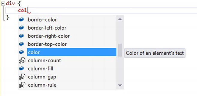
Figure 3-5. Visual Studio’s IntelliSense as it applies to CSS style properties
There are hundreds of properties, and I’ll introduce a good number of them in subsequent chapters. For now, I just want to make sure you understand a couple of fundamentals in their use.
As I said, defining a style property is pretty much as easy as typing it, typing a colon (:), typing the value, and then finishing it off with a semicolon (;).
Listing 3-46 shows a couple of style properties defined in a style rule that will apply to all p elements and will direct the text inside it to be blue and bold.
Listing 3-46. A style rule with two properties
/* CSS snippet */
p {
    color: blue;
    font-weight: bold;
}
Your style rule may be fairly short with only a handful of properties, or it may be very long with a whole lot of properties. It all depends on how much styling needs to be applied to the target element.
Now consider the following, sizeable style rule, which will apply to all div elements and will direct it to have a border that is 2px wide, dashed, and red all the way around.
div {
    color: blue;
    border-left-color: red;
    border-left-style: dashed;
    border-left-width: 2px;
    border-top-color: red;
    border-top-style: dashed;
    border-top-width: 2px;
    border-right-color: red;
    border-right-style: dashed;
    border-right-width: 2px;
    border-bottom-color: red;
    border-bottom-style: dashed;
    border-bottom-width: 2px;
}
Formidable, isn’t it? This is obviously not an elegant way to do something as simple as adding a red dashed border around an element, and that’s why shorthand properties exist. Shorthand properties allow you to define multiple style properties all at once. Let’s rewrite the last example taking advantage of the space and time that shorthand properties can save us.
div {
    color: blue;
    border: 2px dashed red;
}
That’s much better. A single property has replaced 12! The border property is a shorthand property. It takes a list of property values in a certain order delimited by spaces, and it applies them to the longer list of actual properties.
Here again, Visual Studio is your friend. When you enter a shorthand property, you get a tool tip that shows you the list of space-delimited properties that it’s expecting (Figure 3-6).
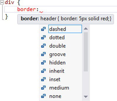
Figure 3-6. Visual Studio’s tool tip suggesting values for a shorthand property
Take a look at these common shorthand properties . . .
border:3px groove black;
font:bold 12px arial;
margin:4px 7px 2px 4px; /* sets the top, right, bottom, and left margins */
padding:10px 2px 7px 1px; /* sets the top, right, bottom, and left padding values */
background:url(image.png) no-repeat gray;
The margin and padding properties (which we’ll talk about in great length in chapter 3) have some alternate forms, even.
margin:4px 7px; /* sets the top/bottom margins to 4px, left/right margins to 7px */
padding:10px; /* sets padding to 10px on all sides */
Valid property values (the value after the colon and before the semi-colon) differ by style property, but they all follow some basic rules. All of the properties share one common, valid value – that is inherit. A value of inherit will indicate that the property should get its value from its parent element.
Length values are required to be a numeric followed immediately by one of the standard CSS units of measure from the table below.
| Unit | Description |
|---|---|
| em | the computed font size |
| Ex | the height of a lowercase ‘x’ |
| Px | pixels, relative to the viewing device |
| rem | the font size of the root element |
| vw | the viewport width |
| vh | the viewport height |
| vm | the smaller value of viewport width or height |
| ch | zero-width (width of the zero character in the rendered font) |
| in | inches |
| cm | centimeters |
| mm | millimeters |
| pt | points (1 point = 1/72 inches) |
| pc | picas (1 pica = 12 points) |
Besides these units of measure, you can specify a value followed by a percent sign (%) to calculate your length relative to its container. A table cell with a width of 50%, for instance, will (at least attempt to) take up half of the width of the table.
CSS3 introduced some functions that can be used to add some additional oomph to the units as well. The calc() function will do some math for you even if it involves disparate units. The following code set the width of a div to be 20 pixels less than the full width of its parent container and might be very helpful when placing an object on the page.
div {
    width:calc(100% - 20px);
}
And min() and max() will take an arbitrary number of parameters and return the smaller or largest respectively. To set the left padding to the smaller of 10% and 20 pixels, you could use the following:
div {
    padding-left:min(10%,20px);
}
Cascading Order, Specificity, and Scope
The end goal in working with CSS is to get properties to apply to document elements. It’s important, therefore, to consider some particulars that will affect what gets applied and what doesn’t.
The C in CSS stands for cascading, so you might surmise that it is one of the flagship features of this technology, and you would be right.
Cascading refers to the way style rules get applied to their target elements. One style rule may apply to an element only to be overridden by another style rule of greater importance.
The way that your browser (following the CSS standard) determines which of these rules is of greater importance is a rather complicated matter. I’m going to try to keep it simple, but you should understand what’s going on here so you don’t find yourself scratching your head and wondering why your text is green when you meant for it to be black.
Style rules do get applied in order. But what is that order? Remember the three ways to apply style properties to elements in your page? Inline styles, embedded style sheets, and external style sheet. The style rules in the embedded styles override those from the external style sheets, and the inline properties override them both.
Looking at the HTML page and external style sheet in Listing 3-47, can you determine whether the Hello, World! text in the div is going to be bold or not?
Listing 3-47. The cascading nature of CSS style rules
<!-- default.html -->
<!DOCTYPE html>
<html>
    <head>
        <title></title>
        <link href="default.css" rel="stylesheet" />
    </head>
    <body>
        <div id="myDiv"style="font-weight:normal;" >
            Hello, World!
        </div>
    </body>
</html>

/* default.css */
#myDiv {
    font-weight: bold;
}
The answer is that it will not be bold. The external style sheet indicated that it should be, but the inline style has overridden it with the font-weight: normal property.
If you’re not sure which of your rules are getting applied and which are getting overridden, use a style tracing tool. Most modern browsers contain such a feature in the developer tools, and the same thing is provided in Visual Studio when working with Windows 8 apps.
Specificity also plays a role in the matter. Specificity is a fancy word to describe the computer’s best guess at how specific your selector is and thus how much weight it should be given when competing with other rules. If two style rules end up targeting the same element, but one does so in a more specific way, then it is determined to have higher specificity, it wins, and that style rule’s properties are applied instead of the other.
ID selectors, for example, are very specific. If a certain div element is targeted by two style rules, each trying to give it a different color border, but one is referencing it by its id and the other by its type, then the former will win. The div in the following example, then, would have a red border even though we’ve given it a class of blue.
Listing 3-48. A div with an ID and a class and style rules targeting both
<!-- HTML snippet -->
        <divid="myDiv" class="blue" >
            Hello, World!
        </div>

/* CSS snippet */
#myDiv {
    border: 1px solid red;
}

.blue {
    border: 1px solid blue;
}
For a more in-depth look at CSS specificity, I recommend David Powers’ book Beginning CSS3.
When you study JavaScript, you’ll learn a pattern called the modular pattern, which is intended to give scope to certain blocks of JavaScript that are otherwise fully exposed to the global namespace and thus to all other code in the application.
CSS doesn’t have anything like this. CSS doesn’t have any scope! This means that if 100 style sheets were referenced on any given HTML page, then all of the CSS styles are available to all of the page.
Windows 8 apps, though, tend to follow a navigation pattern that keeps the user on a single page (default.html) and loads the HTML, CSS, and JavaScript of the page that the user navigates to instead of actually changing scope. This is a very good practice both for the developer and the user. It’s actually a very popular trend in modern website applications as well, but if you define a style rule in CSS on one page of a single page application, you can accidentally let that rule bleed over to other pages. For this reason, it’s recommended that you prefix your CSS style rule selectors with the class that Windows 8 gives to all page fragments, which is simply the name of the page.
If you create new item in a Windows 8 project in Visual studio called orders.html, then by default your page’s HTML will contain a div of class orders. If you precede all of your selectors with .orders and then a space (remember, that’s the descendant combinator), then your style rules will only match elements that exist inside your page. This is a very good practice to implement.
CSS2, the predecessor to CSS3, had media types. Media types allowed for the application of different style sheets, depending on the designated media value. Two common media values are screen or print. This meant that the developer could specify one style sheet that would be applied to the document when the user agent (the browser usually) was rendering it to the screen, and a different style sheet for rendering it to a printer.
CSS3 evolved nicely with the introduction of media queries, which greatly increase the functionality.
With media queries, instead of referencing an entirely different style sheet, we’re able to more granularly designate blocks of CSS style rules that apply to various media-related characteristics.
Instead of merely determining that a style sheet should apply in a given case (though this is still possible), a media query can determine that a single style rule (more granular than the whole sheet) should apply.
With media queries, it’s possible to distinguish not only between the various media types (things like screen and print and also handheld, projection, and tv), but also between orientations (portrait and landscape) and between various sizes, resolutions, and aspect ratios.
The ability to apply different styles to different media configurations is absolutely critical for Windows 8 development. Windows 8 can be installed on a huge number of systems; most of those systems have different size and resolution screens—some can be rotated—and to top it off, Windows 8 offers the ability to snap an app, setting it to just 320 pixels wide and placing it next to another app on the screen. This introduces even more possible rendering configurations.
Thankfully, media queries make our job as developers a lot easier.
Media queries start with the @media keyword, continue with a media type and some number of features, and end up resulting in a true or false value. A media query is true only if the type and all of the features match.
So valid media query syntax would look something like the following:
@media type and feature1 and feature2 and featureN {
    styleRule1;
    styleRule2;
    styleRuleN;
}
The valid values for the type are: screen, print, braille, handheld, print, projection, tty, tv, embossed, speech, and all, and the valid values for feature are width, height, device-width, device-height, orientation, aspect-ratio, device-aspect-ratio, color, color-index, monochrome, resolution, scan, grid, and Microsoft has extended this list with two additional, vendor-specific values: -ms-high-contrast and -ms-view-state. When working on a Windows 8 app, the -ms-view-state is going to be your best friend. This is how you determine which view state your app is in. It could be fullscreen landscape, fullscreen portrait, snapped, or filled (when an app is snapped next to yours).
A subset of the feature values enumerated above can be prefixed with min- and max-. A value of min-device-width: 800px, for instance, would be valid and helpful in specifying a media query that only matched if the device in use was at least 800 pixels wide. Additionally, a value of max-color-index: 256 would be valid and would match if the device supported 256 colors or less.
A media query list can be built up from multiple media queries by separating them with commas. All this does is apply the same set of style rules in multiple cases. In Listing 3-49, the color style property will apply to all paragraphs when the output medium is either on a screen or on a color printer.
Listing 3-49. A media query targeting the screen and color printers
/* CSS snippet */
@media screen, print and (color) {
    p {
        color: red;
    }
}
Besides specifying the media type that your media query should apply to, you can also specify the media type that your media query should exclude. You could make a media query that would apply to everything except for the printer by using . . .
@media not print {
    p {
        color: red;
    }
}
This would apply a color in every case except for print, where perhaps the desire is to save color ink.
If you’re creating a Windows 8 app, you’ll most certainly want to handle at least a couple of view states— full screen landscape and snapped view, if nothing else, and media queries are the way to go.
Summary
We’ve learned that the purpose of CSS is to affect your HTML with styles, and that affecting your HTML with styles is a two-fold process of, first, making a selection of one or more HTML elements and, second, defining the styles that should apply to that selection.
We looked in detail at the selection process—at the use of multiple selector types and the use of multiple combinator types for putting them together so our selections can be more specific.
We looked in detail at style definitions and how to define multiple properties in a style definition. We also saw shorthand properties in action, making our style properties easier to write.
We saw how style rules cascade, take effect, and possibly override each other, and we saw how we’re given the ability to use media queries to make our style rules take effect only in certain cases regarding the device, device size, and view state.
Next, we’ll look at real, live style properties, and we’ll start with properties that pertain to styling text.