
6
Aligning with Organizational Goals
While the focus on data literacy so far has been on understanding how to use data to find insights that lead to decisions and actions, this chapter takes a step back to highlight that it is important not only how you go about finding insights but also to ensure that those insights are actionable and provide value to the organization. For this reason, data literacy is closely connected with an organization’s strategy and goals.
Before starting any transformation, organizations need to first establish an overall strategy and vision for the organization. From there, they need to establish specific objectives that start at the top of an organization and cascade down. These objectives focus on employee activities to attain that vision. Then, organizations need to align their strategy and objectives with the employees’ culture. Organizational alignment only occurs when strategic business goals and cultural values and behaviors are mutually supportive. In this chapter, we’re going to cover the following main topics:
- Understanding the types of indicators
- Identifying key performance indicators
- Reviewing for unintended consequences
- Defining what to track
Understanding the types of indicators
In Chapter 1, The Beginning – The Flow of Data, we discussed the organizational data flow and how there is so much data available to organizations. What data should be used for understanding whether an organization is achieving its organizational goals? If the organization is not achieving its goals, what data should be used to understand why it is not?
Organizations should not wait till it is too late to understand whether they will achieve their goals. They should leverage an early warning system to help them drive toward those goals and understand when they are falling off track. In this sense, not all data is created equal. Some data is more important at the strategic level. Other data is relevant at the operational level to monitor the business that is driving toward the outcomes.
Before we get into a business example, let’s look at a personal example that we can all relate to: personal health. In this example, let’s assume someone’s strategic goal for their health is that they want to live long enough to see their great-grandkids. Everyone may have different strategic goals, and even each person may have different goals at different stages of their life. We need “indicators” that can help us quantify whether we are on track to achieve our goals. We can’t wait till we are older when our great-grandkids are born to see whether we achieved this. We need to understand what will help us achieve our goals and then drive and monitor those indicators.
We will discuss strategies for selecting the appropriate indicators for your organization or department later on in this chapter, but for this example, let’s assume one of the indicators chosen that we feel needs to be achieved in order for us to hit our strategic goal is heart disease risk. Let’s say there is a calculation that is used to calculate the risk of heart disease and that score ranges from 0 – 5. Based on external benchmarks from experts in the field, the target should be to have a score of 2 (or lower) and that becomes what is called a key performance indicator.
You may then start to track this indicator on a regular basis. This is great, but you don’t want to see one month that you are below target. You ideally want to know what will influence the indicator and proactively work on those. This will also help you identify the root cause of why you did not achieve the target. Based on advice from doctors, it is determined that blood pressure and cholesterol can impact the heart disease score. The doctor may set a target for both of these. This process continues iteratively to then determine and track what will influence blood pressure and cholesterol. The doctor may say that exercising for 150 minutes a week, keeping your weight below a certain level, and keeping calorie intake to certain levels will help reduce blood pressure and cholesterol. This process continues to iterate down till all the drivers have been documented and given a target. In addition, throughout this process, other data is stored and analyzed to help with the complete picture. For example, the doctor will store things such as the number of visits, whether or not the patient is a smoker, their age, and their height. This data does not have a target applied to them, just the data is stored for later use and analysis.
In this example, there are lots of different types of data. There are direct measures, such as weight and calorie intake. There are aggregations, such as average blood pressure, and there are ratios, such as the cholesterol ratio. Then, there are indicators, things that are not direct measures but are rather used to describe how something is performing, such as the heart disease risk score.
The indicators that are determined, via strategic planning, to be critical for driving toward a strategic objective are called key performance indicators (KPIs). Actions that are influencing and driving the heart disease risk score, such as the cholesterol level and average blood pressure, are called performance indicators. They are still required as a way to drive toward the goals and are important in helping diagnose why a KPI happens to be below target. For example, if someone’s heart disease risk score is above the target, the doctor will look at the performance indicators influencing it to help determine why it’s above target. It could be due to the fact the patient has a cholesterol ratio above target. Finally, the data that is stored and analyzed but does not have a target associated with it, such as weight and age, is commonly called a metric. Figure 6.1 depicts the metrics, performance indicators, and KPIs related to a personal strategic health goal.
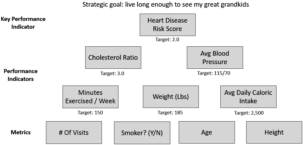
Figure 6.1 – Example performance indicators for personal health
Let’s now pivot and look at a business example.
Assume an organization defines a goal to increase its revenue this year by 25% compared to last year. Each department within the organization then strategizes on its goals to support the organizational goal. Once the goals are determined, each goal will be assigned performance indicators. For example, the sales department may have a goal to close 15 deals each month, and one of their performance indicators could be their conversion rate (how many opportunities end up in a sale). The marketing department may have a goal to bring in 25 new qualified opportunities each month, and one of their performance indicators could be the number of event attendees. The customer success department may have a goal to keep customer retention at 95% or higher each month, and one of their performance indicators could be the average customer health score (a score that takes into account many factors to determine how likely a customer is to leave). Each of these performance indicators is assigned a target.
Each department may have more than one goal and each goal may have more than one performance indicator. For example, for the sales goal, they may also have a performance indicator measuring the length of the sales cycle. The marketing goal may also have a performance indicator related to the number of unique visitors to the website each month. Figure 6.2 depicts the performance indicators for this business example.
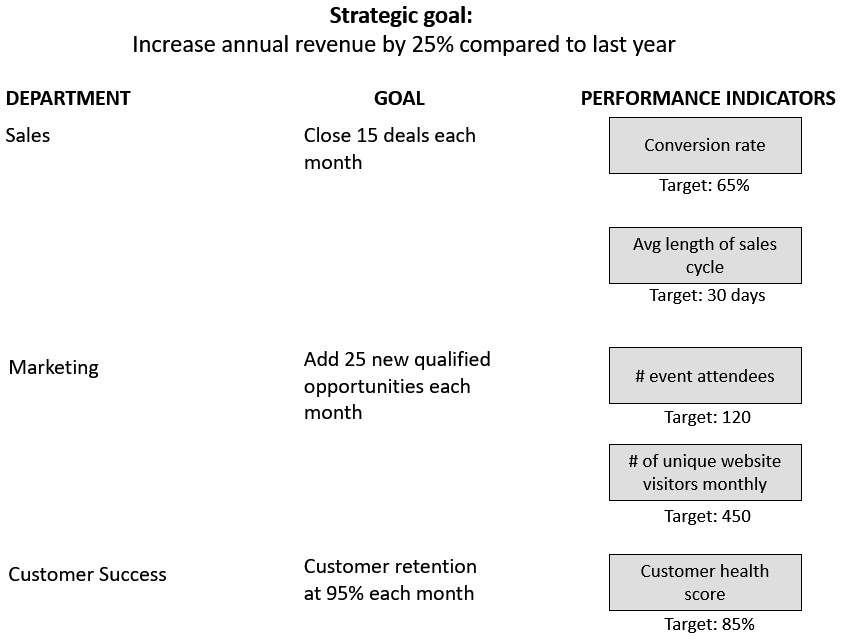
Figure 6.2 – Example performance indicators for an organization
The organization then reviews each performance indicator and determines which ones are the most critical to measure whether the organizational goal is achieved or not. The top level of an organization cannot have hundreds of KPIs. We will discuss this later on in this chapter, but a general rule of thumb is 5 KPIs at the organizational level. Those selected become the KPIs, and the other indicators that drive toward those outcomes become supporting performance indicators.
Let’s look at one more example. Earlier in the book, we introduced the story of a safety region in Holland that was trying to reduce the time it took for patients to get treatment in the hospital when they needed emergency cardiac care. They have a KPI called Call to Balloon, which tracks the time it takes from when the hospital ambulance is first dispatched to when they are treated. In addition, they have a series of supporting performance indicators, each with its own targets given as follows:
- Response time – The time after an ambulance is dispatched to when it arrives at the patient
- Call to Door – The time after an ambulance is dispatched to when the patient arrives at the emergency room
- ECG to Balloon – The time after the patient is first treated with an ECG in the ambulance to when they are treated in the emergency room
- Door to Balloon – The time between when the patient arrives in the emergency room to when they are treated
In addition, there is a series of metrics to support the various performance indicators. As these are metrics, they do not have targets assigned to them.
- Number of ambulance rides
- Number of interventions
- Time from a patient call to emergency services and the time the ambulance arrives
A visual representation of the performance indicators in this example is shown in Figure 6.3.
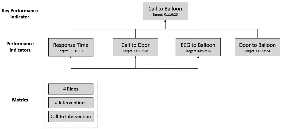
Figure 6.3 – Example performance indicators for a safety region
Now that we understand the various types of indicators, let’s move on to learn how we can identify which indicators should be KPIs.
Identifying KPIs
Identifying the right KPIs is critically important for data-informed organizations because they help keep objectives and organizational goals as key drivers of decision making. Having the wrong KPIs can waste a lot of time and effort working toward the wrong outcomes as well as have serious unintended consequences. Unintended consequences are discussed in more detail in the next section of this chapter. This section will help us first identify key characteristics of KPIs, and then how to identify the two types of KPIs: leading and lagging.
Characteristics of KPIs
Organizations always have some level of KPIs they are driving toward, but there are many times that those KPIs have a flaw in them. These flaws can lead to organizations that are striving to achieve their KPIs, but even if they do, they do not improve on the desired goals and outcomes. The following 10 characteristics will help you identify and define proper KPIs:
- Ties to strategic objectives: KPIs should be used to inform your organization’s strategic decision making. So, it is only natural that your KPIs need to tie to strategic objectives. Otherwise, you may be spending a lot of effort trying to hit a target on your KPI when it does not in fact align with the direction the organization is heading.
- Measured against targets: KPIs need to be measured against targets. There needs to be accountability; it could be something such as an achievement against the target. Sometimes, when you’re talking about eliminating expenses and costs in waste, it could be a reduction to meet the target. Sometimes, the target could be zero. For example, if you’re in manufacturing, you may be tracking the number of days since the last injury in the plant. In that example, the target is 0.
Sometimes organizations will leverage external benchmarks to set their targets. Benchmarks are reference points from other companies or from industry best practices. For example, a benchmark can be that the governing board on workplace safety says the best practice is to have one or fewer employee injuries every 6 months.
There are some situations when a company may not have a strategy defined yet. In those cases, it is hard to have a target for your KPI. In these situations, you should just capture the KPI, without a target, as a way to set the baseline. Then, after a month or two, have a discussion around where the target should be set and tie them to the organizational strategy.
- Ranges and levels: The KPIs are going to have ranges of performance, such as “above target,” “on target,” or “below target.” In some situations, those ranges can be expanded more, with the “below target” classification being split into “slightly below target” if you are within 10% of the target, and then “below target” if you are more than 10% below target.
- Encodings: Ranges can have different levels of encodings. Encodings are graphical cues to aid in the interpretation of the range. Maybe the most common example is a traffic light visualization. For example, if you are on target, it is green. If you are within 10% of the target, it is yellow. If you are more than 10% off of the target, it is red. Those would be the encodings. They may not be full visualizations, such as a traffic light visualization, but they may just be little icons within the visualization, such as a green arrow pointing up or a red arrow pointing down.
- Timeframes: Timeframes explain the unit of time relevant to the KPI. For example, if you are tracking your sales revenue, are you looking at it aggregated daily, weekly, or quarterly? Or, if your target is to have 0 accidents within your office for 90 days, then 90 days is the timeframe.
- Actionable: KPIs need to be actionable. As we have discussed earlier in this chapter, finding insights that are not actionable does not help the organization and just wastes time.
- Owned: All KPIs need to have a listed owner who is responsible for them. If there are KPIs that are shared across multiple teams and departments, it becomes really hard to drive accountability with them.
- Balanced: The aggregate of your KPIs needs to be balanced across the entire system. You should not only have lagging indicators, but for each lagging indicator, you should balance it with at least one or two leading indicators. Leading and lagging indicators are discussed in more detail later in this chapter.
- Aligned: All KPIs should be aligned. Alignment ensures that the KPIs are aligned at various levels. This means department-level KPIs should relate to the organizational-level KPIs. The process starts at the organizational level, and then is cascaded down and aligned. Department-level KPIs are created that relate and support the organizational-level ones.
- Sparse: In general, less is more when it comes to KPIs. Some people believe having more KPIs is ideal as it will give a better perspective into the state of the business. However, having too many KPIs will lead to overload. None of them will be prioritized over the others, and no one will have time to look at all of them. Many experts believe the right number of KPIs is around 5.
Now that we have identified the main characteristics of KPIs, let’s take a look at a couple of examples.
Figure 6.4 provides examples of different ways you can visualize your KPIs. The one on the left is a text visual that shows the % Orders In Stock KPI. The value is shown in the middle (40%), with a comparison to whether this is up or down from the previous week. The comparison is using color and arrows to visually show whether it is up or down. The bottom of the visual is showing Target (48%) as well as the timeframe (YTD – Year to Date).
The KPI on the right is the Avg % Discount on sales transactions in Q3. The value is shown in the gauge (7.1%), and using ranges and encodings, we can see this is below the target.
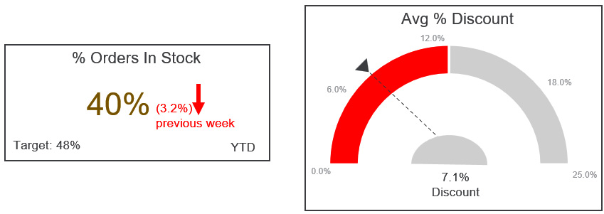
Figure 6.4 – Example 1 of KPI visualizations
The KPI shown in Figure 6.5 is utilizing a bullet chart to show two KPIs, Revenue and Staff occupation, as well as how they are doing against their respective targets.
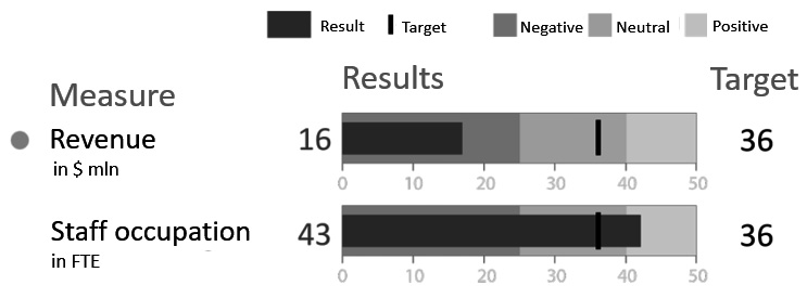
Figure 6.5 – Example 2 of KPI visualizations
You will learn more about choosing the right visualizations for KPIs, as well as for other analytics, in Chapter 8, Questioning the Data. Now that we have seen a few visual examples of KPIs, let’s move on to go a little bit deeper and understand the two types of KPIs: leading and lagging.
Leading and lagging indicators
Not all KPIs are designed to do the same thing. There are KPIs that are measuring the outcomes (lagging indicators) and there are KPIs that are measuring parts of the system that are supposed to be driving toward those outcomes (lagging indicators). Sometimes, they’re called drivers and outcomes.
Lagging indicators are outcome indicators. For each lagging indicator, organizations should define a few leading indicators, which help drive toward those outcomes.
The outcome is something that’s already happened. It’s almost too late at that point to change, for example, our quarterly sales revenue. If the revenue that came in that quarter was below the target, it is too late to do anything about it as the quarter is already over. What organizations really need is kind of like an early warning system, which allows them to spot not only that the outcome is in jeopardy, but also why it is in jeopardy. This can give them a chance to adjust during the quarter and work toward achieving the target.
Not only are we looking at those lagging outcomes, but we’re also holding people accountable and we’re measuring what are called leading indicators, which are drivers, that help those outcomes.
For example, if sales revenue is your outcome-based lagging indicator, you should brainstorm to think about what will help drive sales revenue. Two indicators could be the number of clients you have and the amount of revenue invoiced for each client. This process continues as you then brainstorm what will help drive both the number of clients and the amount of revenue invoiced for each client.
For example, the number of visits to your online store and the number of those visits that lead to a sale (conversion percentage) are both indicators to drive the number of clients. The number of products on each invoice and the average price of the products are both indicators to drive the amount of revenue invoiced for each client.
This process continues down till you have a list of indicators for all parts of the organization, as shown in Figure 6.6.
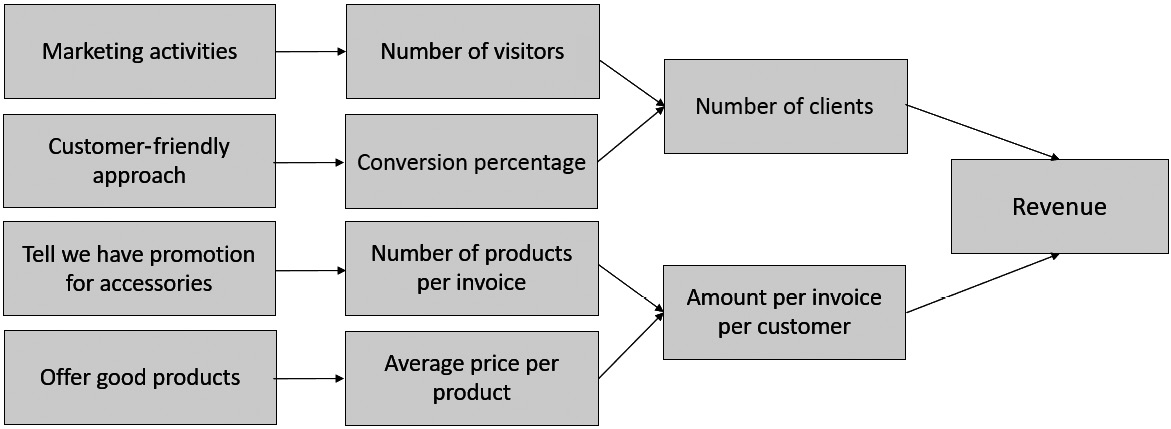
Figure 6.6 – Example leading and lagging indicators
In another example, think about an organization that provides an online video streaming subscription. One of their lagging indicators, which ties to their organizational strategy, is customer retention. Brainstorming on how to impact and drive customer retention, the organization believes that the customer’s engagement impacts their retention. A customer that is engaging more, potentially purchasing multiple add-on services, will be more likely to stay than leave. So, tracking customer engagement becomes a leading indicator. If the engagement scores go below target, it is an early warning that there is a good chance the outcome of achieving the sales revenue target will be missed as well.
The question you might be asking at this point is how do you determine the leading indicators? We will answer that later in this chapter. Before moving on to that, we will now learn how to review our planned KPIs for unintended consequences.
Reviewing for unintended consequences
While KPIs are hard to directly influence, they are easily susceptible to causing unintended consequences and driving the wrong behaviors. Revisiting the health example from earlier in the chapter, there are lots of diets out there that recommend some crazy things, such as never eating fat, or only eating fat, and everything in between. Maybe those diets will temporarily lower your weight on a short-term basis, but doing that also potentially has some unintended consequences on your body. Maybe you are vitamin or mineral deficient as a result. Someone that runs every day to stay in shape can potentially have the unintended consequence of directly causing damage to their knees or back.
The key to KPIs is balance and alignment. You don’t want to over-rotate one part of a system as you will then deplete another part of it. It is incredibly important to review your planned KPIs against those qualities. Failure to do so will end up in KPIs that may look like they are working and driving outcomes on the surface, but chances are they are negatively impacting another aspect of the business.
Applying Goodhart’s law to KPIs
British economist Charles Goodhart once said:
“When a measure becomes a target, it ceases to be a good measure.”
This has since become known as Goodhart’s law. One of the most famous examples of Goodhart’s law is related to a cobra bounty. A long time ago in India, there was an overpopulation of cobra snakes. To try to decrease the number of cobra snakes, the government decided to offer a snake bounty. Individuals received a monetary reward for each cobra snake turned in to government offices. Sounds logical and rational. If people turn in cobra snakes, then they are removing them from the city and decreasing the population. Initially, the bounty appeared successful with large amounts of cobra snakes being turned in. But after some time, individuals managed to manipulate the bounty. They started breeding cobras, and then when they got to a certain maturity, they would turn them over to the government to receive the bounties. This perfectly highlights what Goodhart was referring to in his famous quote.
Let’s look at another example, one that’s more business oriented. Many organizations will set sales targets to increase what they call the productivity of the salespeople. Assume you work for a car dealer. The car salesman might need to sell 20 cars per month to receive a bonus payment. At the end of the month, they’ll make a lot of phone calls, and what ends up happening is they could potentially create a lot of discounts just to get the cars off of their inventory and to sell them. Maybe it’s not a bad thing – maybe discounting is good – but let’s just assume that in this case, the discounting to reach the target is not a good thing for the business. It could in fact be detrimental to the business and it could reduce profit. Profit is one of their key strategic objectives, so they should consider changing the metric that they’re assigning for that, or potentially adding more rigor to the type of KPI. So, they should add some boundaries and some thresholds. Maybe it’s not just selling the number of cars, but it’s the number of cars with a certain amount of profit.
Let’s look at another example of a call center within an organization. Assume that this organization sets an average time per call in, for their employees, as a KPI to track. They could track and see which call center staff take longer for their calls to be completed. The unintended consequences could be that the call center staff may end up giving a customer a quick answer, or a very high-level reply that does not solve the problem, just to get them off the call to reduce the average time. If that organization’s strategy includes keeping customers happy and customer retention, then setting call targets without any quantifications on the quality to balance it would not be a good idea.
Now that you have gone through the process of creating lagging KPIs that are tied to your desired outcomes and then some leading KPIs that drive toward those outcomes, a review should be done to ensure there are no unintended consequences. Two common strategies to help review KPIs for unintended consequences are thinking systemically and applying human discretion.
Thinking systemically
Applying a system thinking perspective to how you look at your KPIs will help you look at what is really driving the outcomes. If you are selecting leading indicators that are not actually driving the outcomes, your system will not be balanced, and you will have unintended consequences. Revisiting the health example from earlier in the chapter, if you just focus on your weight but don’t focus on the correct diet, you could still eat foods that technically make you lose weight but may not be healthy for you. Over time, that will impact you and your system in a negative way. Think about everything you’re doing systemically and if you’re driving one behavior, is that going to have a negative impact on another behavior that you don’t want? Systems thinking is covered in greater detail in both Chapter 8, Questioning the Data and Chapter 11, Defining a Data Literacy Competency Framework.
Applying human discretion
One simple way to review KPIs for unintended consequences is simply to apply human discretion. Ask questions that ensure the indicators relate to the ultimate goal. Challenge your assumptions and apply cynicism to them. If it looks wrong, and it feels wrong, there’s a chance you should drill down and maybe there’s a reason you’re feeling that. Don’t just look at the potential solution and go with it. Use some human discretion to be critical and curious, and ask questions. This topic is the focus of the next chapter. Now that we have learned about unintended consequences, let’s see how we can apply this knowledge to some example KPIs.
Example #1
Assume an organization has a KPI to track the number of meetings each sales rep has with potential customers, the intention being that the more meetings you have, the more sales you will end up having. That could be true, but then you could have the alternative fact of scheduling meetings with people who are unlikely to become customers. They take meetings that are a waste of time, but they are hitting their target KPIs. Reflecting on what we learned in this chapter, if our overall objective is for more customers to buy our offerings, we will want to make sure that the meetings scheduled are with qualified potential customers. Qualified potential customers are prospects who have been evaluated to fit the profile of an ideal customer for the organization who have the intent to buy. Maybe the indicator becomes the number of meetings with qualified customers, and there is a very specific definition of what a qualified customer is.
Example #2
Assume an organization has a KPI to track employee retention, with a target of 95%.
To keep the organization, or a department within the organization, in line with this target, leaders may end up keeping bad employees, and not letting them go, just so they can hit their targets, especially if they have monetary incentives to hit these targets. Reflecting on what we learned in this chapter, a potential solution is to split up retention into voluntary and involuntary, and the targets are specific to voluntary attrition only. This would minimize leaders keeping employees who would have otherwise been exited.
Example #3
One of the most famous examples of an unbalanced KPI comes from a nail manufacturer. Assume the nail manufacturer has a KPI to track time to production. The time to production is the time from when a process for creating an item is started to when the process is completed and the item is ready to sell. If you measure people on that KPI, they could potentially be taking shortcuts just to hit the target. In this example, since the KPI is only focusing on the time to production, and there are no balancing KPIs to specify the quality or condition of the nail, resources ended up making a ton of very small nails.
Reflecting on what we learned in this chapter, we should add criteria and conditions to the target. For example, the height of the nail, the width of the nail, and the quality aspect of what is being produced should all be quantitatively measured and given targets within balanced KPIs.
Now that we understand the difference between measurements, metrics, and KPIs, we have an understanding that KPIs can be leading or lagging, and we also know how to balance KPIs to avoid unintended consequences, we are going to discuss how to determine what the right KPIs are.
Defining what to track
The process starts with determining the outcomes, using lagging KPIs, and then working backward to determine the leading KPIs that will drive toward those outcomes. Determining the right lagging indicators is somewhat straightforward, as they are directly tied to organizational goals. However, determining what indicators help drive those lagging indicators can take a lot of trial and error, and patience.
There are a variety of techniques to determine appropriate KPIs. The three that we want to introduce in this book are activity system maps, logic models, and balanced scorecards. Across all three of these techniques, the high-level process is the same:
- Start with the desired outcome and work backward.
- Throughout the process, we will be making assumptions. Challenge these assumptions.
- As you learn more, revisit the process and tweak the indicators. This is an ongoing process versus a one-time event.
These three techniques will be discussed in greater detail in the following sections.
Activity system maps
Activity system maps, introduced by corporate strategy guru Michael Porter, are a tool to help organizations visualize and plan their business goals. This process makes it easier to identify proper KPIs as well as they will be based on the activities on the map that drive the desired outcomes.
There are three high-level steps in the process of creating an activity system map:
- The process begins by identifying key elements of the value proposition of your strategy. A value proposition is an innovation, capability, or service that an organization believes will make it attractive to customers. Place these key elements on a whiteboard, a piece of paper, or a PowerPoint slide as colored circles.
- Identify a list of activities that help drive your value proposition. Add these activities to the visual started in step 1 as non-colored circles.
- For each activity, draw lines between it and another activity where the activities affect or depend on each other. Also, draw lines between it and any key element from step 1.
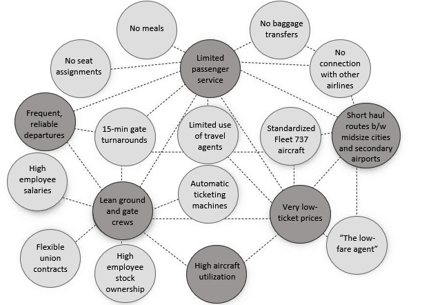
Figure 6.7 shows an example activity system map for Southwest Airlines, which Porter used in an article for the Harvard Business Review. Southwest Airlines is a discount airline in the United States and was one of the first discount airlines, and they came up with a different business model to support it.
Porter described Southwest’s goal as connecting “people to what’s important in their lives through friendly, reliable, and low-cost air travel.” He also highlighted Southwest’s key value propositions:
- Limited passenger services and amenities
- Short-haul, point-to-point routes between midsize cities and secondary airports
- Very low-ticket prices
- High aircraft utilization
- Lean, highly productive ground and gate crews
- Frequent, reliable departures
Southwest then strategized on activities that could drive those key components; please go through the references section to know more.
For example, for limited passenger services and amenities, they identified having no meals, no baggage transfers, no connections with other airlines, limited use of travel agents, 15-minute gate turnarounds, and no seat assignments. These activities all helped support and balance the system to allow them to have very low-ticket prices. To drive a lean, highly productive ground and gate crew, they offered a high level of employee stock ownership, flexible union contracts, and high compensation.
They came up with a strategy, aligned inputs and outputs, and reviewed everything to ensure it was balanced and one set of activities did not negatively impact another set.
Source: Michael E. Porter, "What is Strategy," Harvard Business Review, Nov— Dec, 1996, 61-78.
Figure 6.7 – Southwest Airlines activity systems map
While some of these activities do not lend themselves to metrics, many of them do. These then became the basis for the leading and lagging KPIs. For example, they would have to track aircraft utilization and on-time departures. Those could be seen as lagging indicators, and some of the activities driving those as leading indicators could be the quality and duration it takes to clean the planes in between routes or the number of services that required out-of-stock parts.
What was the end result? Southwest was able to create new opportunities that did not follow traditional rules. What were the results? By the 1990s, Southwest was consistently profitable when many other airlines were losing money and even filing for bankruptcy. By 2011, Southwest had flown the most passengers annually within the United States.
Southwest more recently showed how their ability to be agile and update their strategy using this same approach when COVID-19 hit. In early 2020, Southwest Airlines traffic had already dropped 97% from 2019 due to the pandemic. Showing that strategy needs to adjust at the right time, and agility is key, rather than cutting back on everything during the pandemic, Southwest reassessed their goals and used activity system maps to turn the pandemic into an opportunity. Realizing that most of the travel coming up was going to be vacation and adventure travel, not business travel, they adjusted their routes accordingly.
Logic models
One of the most popular tools for strategic planning is a logic model. It is really useful when trying to develop a new strategic initiative and understand what activities you should be working on. The W.K. Kellogg Foundation has driven the logic model into popular use. The foundation describes a logic model as:
“A picture of how your organization does its work – the theory and assumptions underlying the program. A program logic model links outcomes (both short- and long-term) with program activities/processes and the theoretical assumptions/principles of the program.” (p. III, 2004)
A logic model typically can be used in the beginning phase to design and plan for a new program or strategic initiative, and it can also be used to evaluate the quality and effectiveness of the program or initiative after it is launched. It can be very useful in determining good KPIs. A logic model typically defines six things: resources and inputs, activities and processes, outputs, short-term outcomes, intermediate outcomes, and long-term impact (see Figure 6.8).
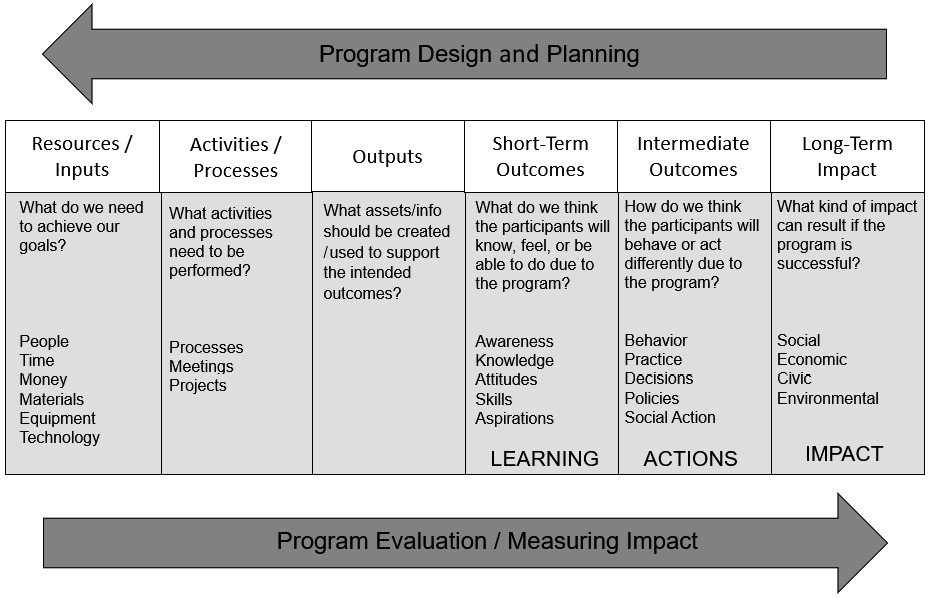
Figure 6.8 – Logic model template
Resources and inputs
Resources and inputs identify the resources available to the program. Resources include human resources, financial resources, technological resources, and any other inputs that are going to be used to support the program’s activities and processes.
Activities and processes
Activities and processes describe the actions that are needed to implement the program to reach the desired outcomes. These include designing processes, implementing projects, and developing and providing services.
Outputs
Outputs quantify the direct results from the activities and processes. If one of the activities is providing an educational course to your stakeholders, then the output is the number of classes delivered. If one of your activities is to develop and provide services to your stakeholders, then possible outputs are the number of customers served, or the number of hours of service provided. If your activity is around gathering feedback from stakeholders via focus groups, then a possible output is the number of focus groups held or the number of attendees of the focus groups.
One key point about outputs is they do not talk about the quality of the activities. It is just the quantities at this point. Quality is covered when the logic model is used as an evaluation tool.
Outcomes
Outcomes describe the results that are expected when the program is implemented as planned. They describe changes, not actions. Outputs are the actions, as they are the direct and quantifiable outputs from the program’s activities and processes. Outcomes are the results and the impact that the program’s activities and processes make on the stakeholders. Sounds very similar to lagging and leading indicators, right?
Logic models split outcomes into three stages, as changes do not happen at the same time. There is a causal chain of outcomes as some need to happen first to drive the longer-term outcomes. Short-term outcomes describe changes you expect immediately or in the near future, intermediate outcomes describe what changes you expect after that (say in 1-2 years), and long-term outcomes, also called impact, describe changes that will occur over time (beyond 2 years).
Rather than identifying outcomes in terms of duration, it may be easier to identify outcomes based on what is being changed as follows:
- Short-term outcomes focus on changes in awareness, opinions, knowledge and skills, and attitudes and mindsets.
- Intermediate outcomes focus on changes in behaviors or actions that result from the new awareness, opinions, and so on, from the short-term outcomes. These include not only changes in behaviors, but also various actions such as contributions, decision making, and policies.
- Finally, long-term outcomes focus on changes in condition or status that result from the intermediate outcomes. These include changes to social, environmental, civic, and economic conditions.
If you are building out a logic model upfront as part of the planning of a program, it is easier to start at the end and identify long-term outcomes and then work backward to identify intermediate outcomes needed to drive the long-term outcomes. The process continues backward when you finish by identifying inputs and resources.
Once completed, you have a robust and balanced list of leading and lagging indicators that can be used for your KPIs.
Now that we understand what a logic model is, let’s look at an example (see Figure 6.9). Let’s assume we are implementing a logic model to plan out our strategy as a new coffee retailer. Their strategy and goal are to make the most consistent and highest-quality coffee around. In the following table, we describe the various components specific to this example.
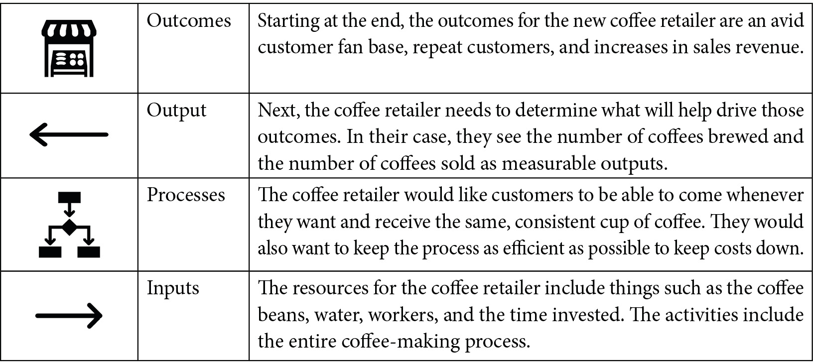
Figure 6.9 – Logic model for a coffee retailer
There are also a few additional components to a logic model that allow us to identify additional performance indicators. These indicators are not leading or lagging, but are rather tied to various business questions that may be asked:
- One is a project measure, which is a measure of projects that are implemented to support the overall program. Let’s say we do a branding campaign to sell our coffee. We could track the quality of that campaign.
- Another one is a performance measure. Let’s say each department wants to align with these organizational indicators and implement its department-level KPIs. Each location of the coffee retailer could have indicators for the performance objectives of the individual workers. For example, via assessment or inspection, they could measure how good each worker is at following the coffee brewing process that is outlined at the organizational level. In this case, each location could have an indicator for their average score for the efficiency and consistency of the brewing process. This also helps balance the indicators out, as you can have the best process in the world and the best ingredients, but if you do not have the right capacity or the workers are not properly trained or motivated, and they do not always follow the process, then it will negatively impact the organization’s desired outcomes.
- Finally, there are risk measures. Risk measures seek to identify potential sources of risk in the logic model activities. In this example, the retailer’s coffee beans are sourced from an outside vendor. What if something happens with that vendor, maybe the economy changes, and the prices drastically increase? Maybe the vendor gets the coffee beans from a country where there is a political or environmental disaster, which disrupts the ability of the retailer to receive the coffee beans. These external factors need to be considered and identified as risks in a logic model, and you can create indicators to ensure you are monitoring them. It may be hard to create leading indicators for all these risks, but you can create indicators that highlight what will change if any of these situations occur. In this example, if there is a natural disaster or so, the supply chain may be delayed, or the cost of our resources (the coffee beans) may go up. Having indicators to track the on-time delivery of the resources and the costs of those resources would be a good idea.
The entire end-to-end visual of the coffee retailer’s logic model is shown in Figure 6.10.
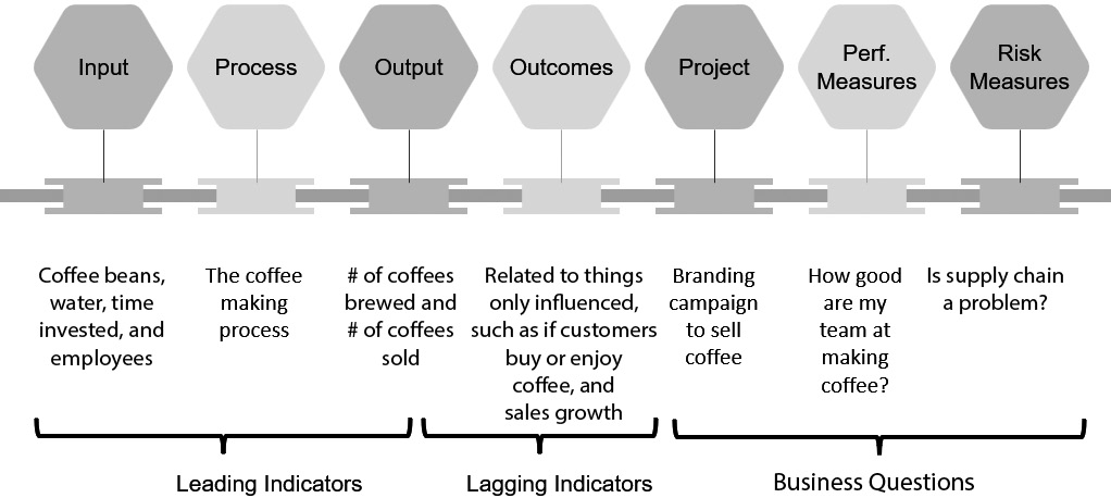
Figure 6.10 – Example logic model for a coffee retailer
Balanced scorecard
One other tool that is used frequently to determine and manage KPIs is a balanced scorecard. A balanced scorecard is an approach for looking at performance measures at different levels within a business. It aims to link an organization’s strategy to operational tactics. The scorecard looks at the business from four perspectives:
- The first is the financial perspective, which tracks financial performance. This is what the executives, shareholders, and board of directors would typically look at.
- Then, you have the customer perspective, which tracks things related to customers, such as what is the current market share, or what is the customer’s current satisfaction. This shows how customers perceive the business.
- Then, you have the internal process perspective, which tracks operational processes and goals needed to meet the customer objectives. This highlights what the business must do well internally to achieve its goals.
- Finally, you have the innovation perspective, which tracks things such as training, human capital, and systems. This looks at how the business can continue to evolve and improve.
Each perspective could have a few goals and metrics. Figure 6.11 displays an example balanced scorecard for a software company.
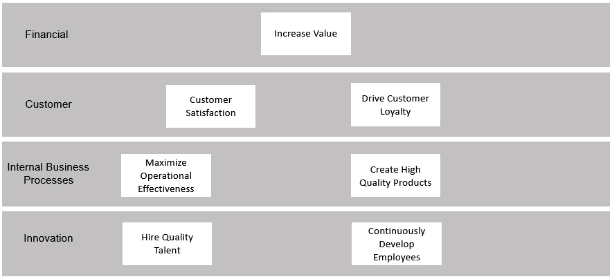
Figure 6.11 – Sample balanced scorecard
The goal of this company is to increase value to its shareholders. One measure for that is to track their sales revenue. The customer perspective includes driving customer satisfaction and loyalty. One measure for customer satisfaction is Net Promoter Scores (NPS) from a survey and loyalty can be measured by calculating net retention.
The internal business processes perspective includes maximizing operational effectiveness and creating high-quality products. These can be measured by things such as tracking cost savings on an annual basis and tracking net new purchases of products.
The innovation perspective includes hiring quality talent and continuously developing employees. These can be measured by looking at involuntary attrition numbers, and the number of training courses or hours provided to each employee, as an example. Remember, you still need to go through the process to balance everything and to avoid unintended consequences, so reviewing a metric such as the number of training courses provided would need to be balanced to ensure that courses are not just built without any value, just to achieve the target. Potentially, that metric would evolve to tracking something such as the number of internal promotions.
This is a very simplified balance scorecard; usually, they include many more goals and measures at each row. But this is sufficient to show you the approach and how you can use this to determine the right indicators to track. The financial metrics and customer satisfaction and loyalty could become the lagging indicators, and the others could be the leading indicators.
Once the goals and critical success factors are established, the organization needs to then assign performance indicators with targets for each one. For example, related to the customer loyalty goal, the goal could be to retain 95% of their current customers. One performance indicator related to that could be the results from customer satisfaction surveys. Based on historical data analysis, the organization recognizes that any score under 4 (on a 1-10 scale) has a high chance of a customer leaving, so they set the targets accordingly for that performance indicator. Keep in mind that we are sharing a few examples of how to align KPIs with strategic goals. If you are just starting out, do not bite off more than you can chew. No organization can do this all at once. Prioritize and discuss which elements are most important and start with measuring and assigning targets for those.
Summary
Individuals deal with information load every day. The amount of noise that exists within a business really hampers everyone’s ability to make data-informed decisions. In this chapter, you have learned how to focus on key performance indicators, or KPIs, that align with an organization’s goals. This is important so that you do not waste time measuring and analyzing elements that are not actionable to improve the business. You also learned how to balance and align these key performance indicators so that they work collectively together toward the same outcomes, as opposed to competing with one another.
Now that we have learned how important it is to align with organizational goals, we will focus in the next chapter on how we can critically review and inspect the data and insights coming from these indicators.
References
- “Overcoming the ‘Cobra Effect’ in Your Business,” Continuous Business Planning, accessed June 21, 2022:
- Porter, M. From Competitive Advantage to Corporate Strategy. Harvard Business Review. 1987.
- E. Mazareanu, “Enplaned Passengers on Domestic Flights – Airlines in U.S. 2011–2019,” Statista.com, April 1, 2020.
- W.K. Kellogg Foundation. W.K. Kellogg Foundation Logic Model Development Guide. Battle Creek: W.K. Kellogg Foundation. 1998.