8
Questioning the Data
There is an old saying: Curiosity killed the cat. This is often mentioned as a way to highlight to individuals who ask too many questions that they may not like the answers they get. People tend to hear this quote and think that curiosity is seen as a bad thing, because it may have unintended consequences. However, did you know this is not the full saying? The saying goes on: but satisfaction brought it back. This highlights that people should embrace curiosity, even if it does have some unintended consequences.
This saying highlights the critical data literacy skill of questioning. The most important part of the process of working with data is ensuring you understand what is being asked. There’s no such thing as asking too many questions when making decisions using data.
In this chapter, we’re going to cover the following main topics:
- Being curious and critical by asking questions
- Questioning based on the decision-making stage
Being curious and critical by asking questions
Data is not black and white; there is so much you can do with it. Accordingly, two people with the same data can come up with very different insights. This is because so much depends on the specific problem to be solved and the approach you take to solve it.
Perhaps, counter-intuitively, this process starts with questions, not answers. We don’t actually learn anything unless we truly question it. Most schools use a paradigm where they teach kids to answer questions asked by their teachers, but they don’t teach them how to question. The outcome of this is it forces kids to learn only facts.
Two things are wrong with that approach. First, we live in a world today where facts and other information are in abundance and are immediately accessible. We no longer have to find the nearest encyclopedia to look something up. We have this at our fingertips. In fact, we have much more information available at our fingertips, from many more sources, and some of those sources are either missing critical context or are not accurate. If we do not have the skills to question the information, we end up believing the information and insights are true when they are not.
When we take the COVID-19 pandemic as an example, most of us never anticipated that the pandemic would shine a spotlight on the need for data literacy. As stated earlier, we often start with questioning and seeking the answers that we need. During the pandemic it was no different—we all needed to make sense of it and what all the data meant. In this way, we were able to make better data-informed decisions from all kinds of levels. Let’s have a look at Figure 8.1, which shows types of questions from different perspectives through the COVID-19 pandemic:
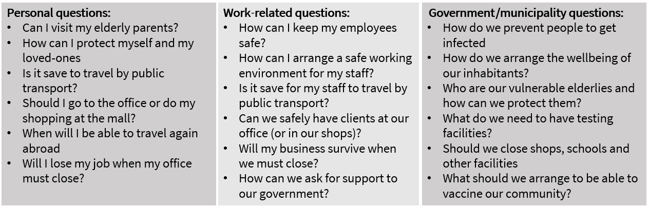
Figure 8.1 – COVID-19-related questions
Insights from data can be useful in making sense of the COVID-19 information and answers that we need when we take the time and read the questions, search for the right data, and try to make sense of it all. Likely, we are then able to make an informed decision instead deciding from our gut feel or impulsivity.
We have to start at the base of it all, so let’s go back to our personal questions listed in Figure 8.1. In order to answer any of these personal questions, we actually have to start with more questions specific to COVID-19:
- What is being positive, or what is a positive case?
- What is a PCR test or an antigen test?
- Where can I find information about the number of active cases in my region or town?
- I have read in the newspaper that elderly people need to be protected. Does this mean the older you are, you are most likely to get very sick with this virus, or worse?
When we look at the trends of confirmed (positive) cases, it gives us a good sense of what is happening in our neighborhood, region, town, or country. It gives us a good idea of where to go and where not to go. Finding that data should be found on the official channels.
From a business perspective, there are most likely some other questions besides the personal ones:
- What if my government or municipality gives the order to close our businesses? How will I get my income?
- If we remain open or open back up, which regulations do we need to take care of (disinfecting materials, coronavirus tests, contact tracing, fewer tables in our restaurant, and so on)?
- The news states that the number of positive cases is rising. What should we do, which advice should we follow, and what regulations will we face?
- What about my financial status—what is coming in and what is going out? Where can I get support for my financial matters?
For those questions, the owners of organizations might be interested in trends and hotspots for positive or confirmed cases. But then, organizations will need to know what to do when an outbreak occurs and what they can do to reopen or get the needed funding to survive. Having that information and those insights available will give them a broader understanding of what is happening with the COVID-19 pandemic in local areas or towns where those businesses are situated. It will help them to get a better sense of trends and effects from it and make better-informed decisions about what to do.
From a governmental, municipal, or safety region perspective, there are other kinds of questions that needs to be answered:
- What kind of measures do we have to take to protect our people?
- How many people can we test in our local test location?
- Do we have enough beds in our local hospital?
- Do we have enough ICU beds available, or are we able to transport people by air to other hospitals?
- How will we inform and convince the public to be vaccinated in order to protect themselves and others?
The people from those types of organizations should be watching the trends in their areas, the parts of towns where clusters of infections could occur, and so on. They should investigate the testing capacity and the development of the virus and see if there is enough capacity to administer people to hospital, have medication available, and so on.
When this information is available to them, people can make better data-informed decisions, but there is a danger of getting too much information from too many sources, which may show different answers. To avoid information overload and drawing incorrect conclusions, we need to question all the data and information we see. We need to question the source, the relevance, and the context, among other things, before we use it to make decisions.
And this is exactly what we are seeing out in the world today with massive amounts of misinformation being treated as truth. Many people are not questioning it. Second, the world is continuing to evolve and change at a rapid rate. The half-life of facts and information is shorter than it’s ever been. We don’t really know what information we need in the future. A better skill to teach kids is the ability to find their own insights when they need them, by asking the right questions. This is not just a problem related to teaching kids. As we grow up and join the workforce, it sometimes is even harder to teach and apply questioning as there are many cultural reasons why this is perceived as a negative.
What, then, are some key things we can do to help people ask the right questions when they are looking to gain insights from data?
Starting with the problem – not the data
Most people work backward when it comes to data. They begin with the data they have available, then leverage a set of tools and analytic techniques, and come out with some insights. The problem with this is they end up using very simple, closed, and leading questions, which then leads to uninteresting insights at best, and in the worst case what is called a type 3 error, where you are working on a solution to the wrong question. When you build a house, you don’t start building before you think about the requirements for the house, and then build a blueprint. Starting with the data, without doing much preliminary questioning and thinking, will give you the same results as building a house without any requirements. This is one reason why people who are good at questioning use systems thinking. The starting point has to be the full problem from a systems perspective—not the tools or which transformations to apply to the data.
It is not only critically important that you define the problem properly, but if you are a leader, it is also critically important you frame the problem appropriately as well. Thomas Wedell-Wedellsborg (a globally recognized innovation and problem-solving guru) gives an example of a problem where the organization needs to increase innovation. Wedell-Wedellsborg highlights that if the “problem is defined and communicated as a lack of motivation or an incomplete understanding of the company’s strategic imperatives, as examples, that can drastically change how the organization tries to find a solution.”
Intermezzo – systems thinking
Systems thinking within organizations helps to oversee and address the whole. The basis of systems thinking is that we consider an organization as a set of complex processes and opinions that adapt to each other, react to each other, and influence each other. The belief behind systems thinking is that the whole is greater than the sum of all of the parts. In the context of an organization, this means an organization is more than just all the various parts within it. It has to include the actions and relationships between the parts. To think systemically is to understand these actions and relationships and how decisions will impact all of them. The opposite of thinking systemically is to make a decision based on one part of the organization and not consider how that will impact other parts of the organization.
Identifying the right key performance indicators (KPIs) ahead of time
Ideally, organizations have already established a measurement framework with the proper objectives and KPIs before they even look at the data. If they haven’t, they won’t be able to ask the right questions, as they will be too focused on metrics, which may be irrelevant or not important to the situation or the organization.
Questioning not just the data, but also assumptions
Proper questioning to achieve the best insights requires the ability to not just question the data, but also assumptions and other information (that is, context) related to it. Data can provide us with different insights when we have different assumptions. Asking open-ended questions is a great way to make hidden assumptions visible. This is akin to how kids are asked to write out their work when solving math problems, as it provides an opportunity to understand the thought process and see where there may be assumptions that will impact the insights.
Using a questioning framework
There are multiple questioning frameworks available on the internet that help with asking the right questions. One, in particular, is introduced by Max Shron in his book Thinking with Data, and is outlined here:
- Context: Start by asking questions related to the context, such as: What is the problem or situation? Who are the stakeholders? Are there any related projects or dependencies?
- Need: Then, ask questions related to the need, such as: What will this give us that we did not have before, and why is this important to the organization?
- Vision: Then, ask questions related to the vision, such as: What will the results look like? How is the logic related to the insight?
- Outcome: Finally, ask questions related to the outcome, such as: What does success look like? Who will use these insights, and what will they do with them?
The diagram in Figure 8.2 helps us to see how we can address questions to a particular set of data. In this example, the data is around sales from a retail organization:
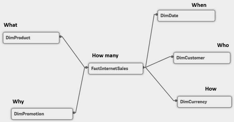
Figure 8.2 – Typical questions
Specific questions include the following:
- What kinds of products did we sell?
- When did we sell this particular product?
- How many products, or how many of those products did we sell?
- Who has bought our products and when did they buy them?
- Why did they buy this product? Did we have a promotion?
Although there are certainly plenty of wrong answers, there are not nearly as many wrong questions. Be inquisitive; approach problems with a 360-view in mind; continually ask why, what, who, and how—simply producing something by rote or a formulaic command won’t get you to the insight you need. Embrace the art of questioning.
Questioning based on the decision-making stage
Questioning is important throughout the entire journey from data to insights to decisions, no matter which role you play. If you are responsible for preparing data, you need to question things such as the validity and relevance of the data and aggregated information. If you are responsible for making decisions based on insights gleaned from the data and analytics, you need to question the insights provided to you and not just take them at face value. The questions are not meant to just help you understand when the insights may not be correct, but they will also help you identify why they may not be correct for the specific situation. For example, they were missing relevant data that would have materially changed the insight, or maybe the insight is accurate, but it answers a different question than what you need answering.
It is important to apply healthy skepticism and critical thinking here. What makes questioning even more important is the fact that everyone is susceptible to misinterpreting what data and insights really mean to your decision because we all are susceptible to cognitive bias. These biases make us think we have the right answer when, in fact, there are usually other data or insights that are more relevant or accurate to the situation. What we will cover through the remainder of this section are specific strategies and questions to help challenge the validity and relevance of data and insights.
Intermezzo – COVID-19 – removing emotions
In Chapter 1, The Beginning – the Flow of Data, we showed you a news article and discussed a small part of removing emotions. In this way, the picture becomes clearer, as shown in Figure 8.3:
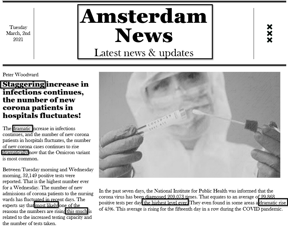
Figure 8.3 – News article and removing emotion
What is the news article trying to tell us? We truly have to dig deeper and try to answer some more questions. What does the rise of confirmed cases actually mean? If we look at 45%, where does it come from? What is the region where the increase was calculated? How was it calculated? How many positive cases were represented there? We need to question the things that we read, see, and consume a bit further than just reading the words in the article.
To understand the need to question things, let’s understand the process of questioning data and information.
Questioning data and information
When you are presented with data and information, before undertaking any analysis on it, you should follow a process to question it, to ensure it is OK in its current form to work with. This includes validating whether the data is trustworthy, orientating yourself to the data to understand it, identifying the lineage of the data and which transformations have been applied to it, and then validating the relevance of the data to the question or problem at hand.
Let’s understand all the aspects of data before diving deep into understanding and believing the data that is in front of us.
Data trustworthiness
When you are presented with data and information, you should assess whether you find the data to be credible and trustworthy. This means you should consider the source and examine the quality of the data, as follows:
- What is the source of the data?
- Is the data accurate? Can we trust it?
- Does the data or information align with facts from related sources?
- What is the quality of the data? Data quality can be measured in terms of accuracy, completeness, consistency, and whether it is up to date.
Related to the COVID article from Figure 8.3, can we trust the data? Is Amsterdam News a trustworthy news agency?
Data assimilation
After you have deemed the data trustworthy, you should orientate yourself to the data to ensure you fully understand it and consider the following:
- Do you and your colleagues have a collective agreement on what the definitions and words mean that are used?
- Do you understand the units of measurement being used?
- Do you understand the descriptive statistics for the data, including central tendency, measures of spread, and frequencies?
Related to the COVID article from Figure 8.3, many words were not given a definition, and many of them can be misleading. For example, even the word “case” as it relates to COVID-19 cases can be a bit misleading. How does someone become a positive case? Is it only when they test positive? Does it include patients who are assumed to be positive cases, but did not test? Are they only looking at current cases? Does it include people who had COVID-19 but have since recovered, or died?
It also includes emotional words such as: “staggering, dramatic, dramatically, most likely, this much, the highest level ever, dramatic rise”. Is that accurate? How do you quantify those?
Data lineage
The data provided to individuals to perform an analysis is commonly transformed and manipulated from its raw state to something else by the time it reaches the analyst. Data can be filtered out and excluded, whether it be specific points in time only or various categories being excluded, or maybe it’s a sampling from a larger dataset. Understanding data lineage, including which data was modified, how it was modified, who modified it, and why it was modified is critical. Consider the following points:
- Which transformations were applied to the data? If so, do you understand how the transformations were applied or calculated?
- Was any data filtered out (outliers, time-based, other selections)?
- How large is the data (sample size) compared to the population?
- If the data was collected via a survey, how was this data selected (random sampling, and so on)?
The COVID article from Figure 8.3 states that in some areas there was “a dramatic rise of 45%”. What were the sizes of the populations in those areas? If there were—say—50 people, then a rise of 45% means something different than a similar rise in a population of a couple of million citizens. The article also states the coronavirus has been diagnosed 209,073 times in the past 7 days. Does this include just positive test results, or also diagnoses from a doctor as presumed positive cases? If so, it is important to understand the lineage to ensure that the data is not double-counted for patients who have been diagnosed by a doctor without a test but then, later on, took a positive test as well.
Other examples related to COVID-19 deal with how some authorities handled data related to patients who died while they were infected with COVID-19. If a person died from a heart attack, it could have been a result of being infected with COVID-19, or it could have been completely unrelated. If an authority chooses to filter out all deaths that cannot be directly attributed to COVID-19 in their data, that context is extremely useful to share with the consumers reading this information.
You heard earlier in the book about a famous example of outliers with Dr. John Snow and the insights about a cholera outbreak in London back in the 19th century. Had Dr. Snow ignored the outlier, rather than using it as an opportunity to understand why it was an outlier, who knows how much longer the epidemic would have continued and how many more people would have died. While not every business decision is life or death like this one, this clearly highlights the importance of searching for outliers to learn more about why as opposed to just ignoring them or filtering them out of your dataset.
Outliers are individual values that differ greatly from most other values in a set. Identifying outliers is always one of the first things an individual should look for when trying to orientate themselves to the data. What defines an outlier is somewhat subjective. Many people treat an outlier as any data point that is three or more standard deviations away from the mean of the dataset.
Identifying outliers early on in the process allows you to understand what they are, investigate why they are outliers, and then decide whether to exclude them from the analysis or not.
Data relevance
Finally, the data may be trusted and understood clearly, but before you proceed, you should ensure the data is relevant to the question or problem at hand by addressing the following points:
- Is this data meaningful to help answer the problem/question?
- What other data and information is relevant that is missing (think systemically)?
The COVID article from Figure 8.3 states 32,149 positive tests were the highest number reported for a Wednesday. Is that relevant? It may be in some situations, but in general, COVID does not have favorite days of the week to infect patients.
Removing noise
When referring to analytics and statistics, noisy data is data that is meaningless to the problem or question at hand. It could be accurate data, but just irrelevant to the problem at hand, or it could be data that has quality issues. Noisy data complicates your ability to identify trends and patterns that will impact your question or problem. The goal is to pick the signal in the noise. The signal represents meaningful data. Whether it is at the raw data level or the insight level, it is important to remove any noise so that it does not distract you from interpreting the real insights.
Now that we have identified how to question the data and information, we will turn our focus to techniques to help us interpret results from any analysis or statistical experiments and the insights obtained from them.
Questioning analytic interpretations and insights
As a reminder, insights are derived from data and information, usually through analytics. Insights should consider the context of the problem/question at hand, and then draw conclusions that will lead to decisions and actions. Insights are typically shared just as words in written form, or along with data visualizations. This process is especially important to everyone working toward data-informed decisions. You may not be the person responsible for performing the analysis or coming up with the insight, but if you plan to use the insight and make a decision from it, you need to be sure you can critically review and evaluate it.
The process of questioning insights includes three steps:
- Questioning the relevance of the insight
- Questioning the words and visuals used in insights
- Applying healthy skepticism to insights and balancing with the human element
The next few sections will dive deeper into these three steps, starting with questioning the relevance of insights.
Questioning the relevance of insights
As with data relevance, you should review insights to ensure that they are relevant to the problem or question at hand. Even if you have already done this step when reviewing the data for relevance, it is important to also review insights for relevance. There are many situations where relevant data may be used, but insights that were obtained end up being irrelevant or not actionable. In other situations, the opposite is true, meaning there was other relevant data related to the situation that was not included in the analysis. Consider the following:
- Is this insight meaningful to help answer the problem/question?
- Does this insight align with your goals and objectives?
Questioning words and visuals
Once you question the analysis, you should then move on to questioning how insights are being shared and communicated. This includes checking the visual properties of any data visualizations and ensuring you understand the words used in insights.
Checking the visual properties (checking the time and scale)
Are the scales used in any of the visualizations confusing or misleading? Is the time frame specified long enough? Data visualizations are supposed to give us a clear and visual description to communicate insights. Visualizations are powerful in that they make insights more consumable than just via text, making it easier to see things such as patterns, trends, and outliers. This allows us to not only understand and interpret the information but also reflect and infer new information and insights to help us understand the situation and make a decision. However, all visualizations should be carefully reviewed to ensure they are not misrepresenting the situation. The last chapter focused on how people who create data visualizations should design them, and the scope of this section is for people who are trying to consume the visualization and draw conclusions from them.
Follow these three best practices for critically reviewing the configuration of data visualizations that have been shared with you:
- Identify the information contained on each axis: It is important to understand what data or information is used on each of the visualization’s axes. Pay special attention to any calculations used—for example, if a pie chart adds up to over 100%, or if a visualization is using a cumulative calculation.
- Identify the ranges and scales used (Is the time frame specific enough? Is the range altered?): Interpretations can be skewed simply by changing the ranges and scales used in visualizations. Suppose a visualization is set up to change the y axis to not show the entire range—for example, starting at the low end at some point in the middle of a range. This can be used to highlight differences but can make the differences seem bigger than they really are.
Potentially the visualization is trying to highlight a change, but the range shown in the visualization is for a condensed period of time. Is it possible to infer that our sales revenue has materially changed when we are only looking at 1 day’s or 1 week’s worth of data?
- Watch for misleading constructs (for example, does a pie chart add up to over 100%?); dates go from right to left: Visualizations are supposed to lower our cognitive load. Cognitive load is the amount of effort required by our brains when thinking, such as when trying to interpret a visualization. When the cognitive load is high, it can interfere and make us miss important information. The reason we want visualizations with low cognitive load is so that we can focus on only what is important and relevant in the visualization to be able to interpret it. In doing this, there are certain constructs that the human brain uses to subconsciously aid us in our interpretation. For example, a pie chart should add up to 100%. A line chart with time-series data should be read from left to right. A line chart should not be used with discrete data. We do not typically consciously think about these points, but when visualizations are set up that violate these constructs, they can be very misleading.
In the three visualizations shown in Figure 8.4, Figure 8.5, and Figure 8.6, we are all showing the same data insights. However, there are critical flaws in the first two that lead people consuming this visualization to draw incorrect conclusions. Figure 8.4 is not showing the y axis, so we cannot tell what it is showing or what the scale is that is used. We would draw a conclusion from this that the sales per year are rising, but how much and to what extent?
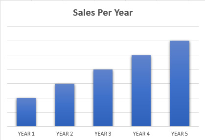
Figure 8.4 – Visualization without a y-axis scale
In Figure 8.5, we added y-axis labels and the range. However, we can see that the y axis here does not start at 0, so it artificially makes the increase bigger than it really is:
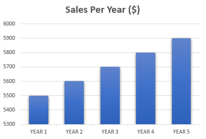
Figure 8.5 – Visualization with a scale not starting at 0
This is resolved in Figure 8.6, and you can see the true insights are less distorted than in the previous visualizations:
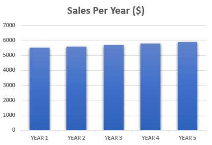
Figure 8.6 – Visualization with proper scaling
Now that we have discussed strategies for how to question visualizations to avoid misinterpreting them, let’s move on to the next step, which is to question the words that are used.
Words matter
There are two questions that we should be asking ourselves about the words that are used in insights:
- Do you understand the words that are used in insights?
- Are the words used leading you to a misleading conclusion?
As you continue to orientate yourself to insights, you should pay special attention to the words that are used in any of the verbal or visual descriptions. Interpretation of insights can be swayed easily based on the words that are used around them.
COVID-19 has given us tons of examples where this comes into play—for example, seeing visualizations and reports with the title The percentage of positive tests. What does this really tell us? Can we use this information to identify patterns or how prevalent the virus is? Not really, as it is not a random sample. In fact, most testing at the beginning of the pandemic was provided to those who had the worst symptoms or those who were at risk due to their job, medical conditions, or age.
In another example, a visualization shows “The total number of cases”, but that is not really accurate. It is the total number of confirmed cases, but there are many cases where people had COVID-19 but did not test for various reasons. If you’re using this visualization and insight to help make decisions on safety protocols to limit the spread of the disease, this can be misleading. Suppose there is a testing shortage, which was something that happened; then, the total number of cases will show a drop. However, it is not a real drop—it is an artificial drop since the reason for this was due to a shortage of tests. In both of these situations, the words used matter and can lead you to a less-than-ideal decision.
Being skeptical of insights
How many times have you made a decision and later realized that you either misunderstood the data or the insights or that you did not fully think through the impact of the decision? How many times did you realize after you made a decision that you were missing important context? In these situations, the data is not wrong. The data is correct, but it is your interpretation of the data and what it means related to the question at hand that leads to a less-than-ideal decision.
What is the solution? After you interpret the results of any analytics and statistics executed on the data, you will have an insight that you are ready to act on. But before you can act on it, you need to still be skeptical of the insight and apply the human element to it. It could very well be that the analysis performed is accurate but becomes skewed due to a bias, an incorrect assumption, or an outdated mental model. It could also very well be due to the fact the analysis did not include all the data that was truly relevant to the situation. This critical step is all about applying the human element to insights. Consider the following:
- Have you got multiple perspectives?
- Did you consider possible alternatives?
- Have you considered situations when the insight may not actually be true?
We make a lot of decisions and are bombarded with millions of pieces of information every day. Our brains are limited when processing information from the environment. We can hold only a small portion of those millions of pieces, and the information we manage to retain is done so on our own terms or based on our own subjective experiences and knowledge. The good news is that our brains are relatively efficient at making decisions due to heuristics. Heuristics are rules of thumb and mental shortcuts that the brain applies to guide decision-making based on a limited subset of the available information. These modes of thinking demonstrate how our brains classify objects, assess probabilities, and predict values based on automatic judgments that can be skewed. The bad news is that heuristics can lead to poor decisions.
While heuristics enable us to make snap decisions without constantly stopping to think about them, when it fails to produce a correct outcome, the result is known as a bias or, more specifically, an unconscious bias. An unconscious bias is a tendency to draw incorrect conclusions due to cognitive factors embedded in our brain and according to our culture, interests, knowledge, experiences, and even our feelings.
While there are hundreds of biases, we wanted to introduce three of the most common ones that impact decision-making: confirmation bias, survivor bias, and first-conclusion bias:
- Confirmation bias describes the tendency of the human brain to seek out data and information that validates our existing beliefs and hypotheses about a situation. At the same time, the human brain tends to ignore or skip over information that contradicts our beliefs. This is one reason why we say data literacy and data-informed decision-making is a team sport, as getting different perspectives from others who may not have the same initial belief or hypothesis as you can help challenge your thoughts.
- Survivor bias describes the tendency for the human brain to remember only part of the relevant data to make a decision. Those parts that are remembered tend to be ones that are still active—for example, using data from projects that succeeded as opposed to including those projects that failed too. A famous example of survivor bias is when a military in World War II wanted to minimize aircraft losses to enemy fire. The intent was to examine aircraft to see where they had the most damage and then fortify those areas. Survivor bias would cause the investigators to focus only on the planes that had not been shot down. However, looking at planes that were shot down would be the most useful data, as the planes that had damage but returned safely at least returned safely. Since the investigators did not have access to planes that had been shot down, they examined areas on returning planes where there was no damage, inferring that any plane that was hit in those areas resulted in a crash.
- First-conclusion bias describes the tendency of the human brain to give more emphasis to the first solution that comes to mind. Even if new data and information are presented later on that contradict the first decision, the brain will still be more inclined to go with the first solution. This is where the term “to a man with a hammer, everything looks like a nail” comes from, as carpenters’ first thoughts about problems tend to be within the lens of what they do, which is to use a hammer to hammer nails.
For more detailed information on these heuristics and biases, read Turning Data into Wisdom by Kevin Hanegan.
Tapping into our unconscious thoughts and improving our decision-making ability starts by recognizing that we are all biased. To ensure we are not making decisions based on bias, it is important to identify bias in our thinking and then work toward mitigating it as best as possible. Next are four strategies that can be applied to help mitigate bias.
PAUSE
A popular approach that can help us slow down our thinking is the PAUSE model, created by consulting firm Cook Ross. The PAUSE model is a five-step process, with each step named after one of the letters of the word PAUSE:
- “P” stands for pay attention. We must consider what’s happening beneath our judgments and assessments.
- “A” stands for acknowledge. Accept that our reactions and interpretations may not be proper.
- “U” stands for understand. We should try to learn more about alternative reactions, interpretations, and judgments that may be possible.
- “S” stands for search. Explore the most empowering, productive ways to deal with a situation.
- Finally, “E” stands for execute. We can now implement our action plan.
Let’s move on to the next strategy, the Ladder of Inference.
Ladder of Inference
One tool that can be used to try to identify and mitigate bias is the Ladder of Inference. The tool, created by organizational psychologist Chris Argyris, helps you avoid incorrect inferences in your decision-making process by using a step-by-step reasoning process.
The Ladder of Inference, as shown in Figure 8.7, describes the thinking process that we go through, typically without even realizing it, to go from data or information to a decision or an action:
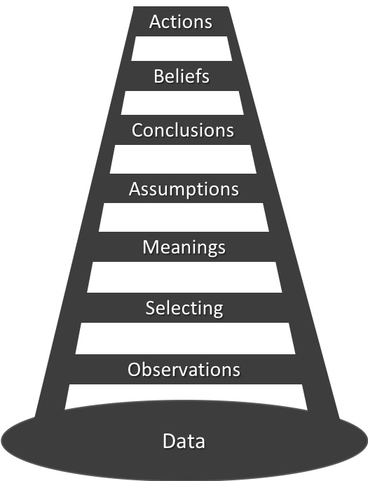
Figure 8.7 – Ladder of Inference
Let’s go through each step of the ladder from the previous diagram and identify what is included in each step:
- At the base of the ladder is all the possible data for a given situation.
- Individuals then see a subset of the data based on their observation of the situation.
- From there, individuals select a subset of the data that they feel is relevant, and they discard any data that they feel is irrelevant.
- Individuals then interpret the remaining data to add meaning to it.
- Individuals then make assumptions about the remaining data.
- Individuals then draw conclusions based on their assumptions and on what is good for them and their friends and family.
- Individuals then adopt beliefs based on their conclusions.
- Finally, individuals act on their beliefs as if they are proven facts.
The human brain typically takes less than a second to go through the steps just listed, and it often happens subconsciously for the individual. The actions from this process and the results are then all stored back in the brain’s long-term memory and will influence future situations when something similar arises. This can have a kind of tunnel-vision effect that leads us to ignore certain facts when we are presented with them and to potentially jump to conclusions. Using the Ladder of Inference as a tool can help us slow down this process and make ourselves aware we are going through each step. It also allows us to work backward down the ladder to see where we may have drawn a wrong conclusion.
This is tremendously helpful for decision-making processes as you can leverage it to help look at data without any preconceived thoughts or judgments. If you want to learn more about the Ladder of Inference and what questions to ask yourself as you go backward, you will find them in the book The Fifth Discipline Fieldbook: Strategies and Tools for Building a Learning Organization by Peter Senge.
You can also use this tool in the middle of a decision-making process before you draw a conclusion. It can be used to identify which level of the ladder you are currently on.
Getting diverse perspectives
Author Maya Angelou once said,
“You are the sum of everything you’ve ever seen, heard, eaten, smelled, been told, forgot — it’s all there. Everything influences each of us, and because of that, I try to make sure that my experiences are positive.”
This same concept relates to decision-making as well. If individuals are the sum of everything they have seen, heard, and so on, then getting input from other individuals who have seen and heard different things related to the decision at hand will help avoid blind spots, will give a clearer picture, and will ultimately allow you to make better-informed decisions.
However, it is not natural in the business world to reach out to others to get their perspectives. Sometimes, this is due to a hierarchical organizational culture that does not foster getting multiple perspectives. In other cases, individuals do not understand that other perspectives are relevant to their decision. When organizations support getting perspectives from others, and when individuals believe in the value of this, collective genius occurs, which results in a better decision.
Scott E. Page, the author of The Difference, highlights:
“When looking at diverse perspectives within decision-making, it is important to look at cognitive diversity.”
According to Page, cognitive diversity is as follows:
“the inclusion of people who have different styles of problem-solving and can offer unique perspectives because they think differently.”
Page goes on to identify four dimensions of cognitive diversity:
- Diverse perspectives: Individuals look at problems in different ways and have different perspectives. As a result, individuals also have different solutions to improve those situations or problems.
- Diverse interpretations: Individuals interpret the world differently by putting things into different classifications. For example, some people may think of me, the author of this book, as a teacher. Others may think of me as a parent, a coach, a data-literacy expert, or something else. They are all different interpretations of who I am.
- Diverse heuristics: Heuristics are rules of thumb or mental shortcuts that the brain uses to quickly assess a situation and make a decision. Individuals have their own heuristics unique to them, so that means that they also have unique and different ways to solve a problem.
- Diverse predictive models: Individuals have different ways of assessing a situation or problem. Some people may analyze the situation, while others may listen to a story to understand how to act.
Let’s move on to the next strategy.
Leveraging systems thinking and lateral thinking
We introduced the concept of systems thinking earlier in this chapter. This way of thinking can be incredibly useful with decision-making, as it helps you recognize unintended consequences. It does this by looking at the system as an entire component, rather than breaking it down into components to analyze separately.
In addition to systems thinking, individuals and organizations can also leverage lateral thinking to help question data and insights. Lateral thinking is the ability to think about solutions to problems in a new and indirect way. This is where the phrase “think outside of the box” comes from.
This approach is especially useful when trying to challenge an insight to see if there is any situation where the insight is not true. Next is a summary of an example from Paul Sloane’s book Lateral Thinking Puzzles of where lateral thinking can be useful.
In the example, when the military was analyzing data on head injuries during a war. The uniform at the time used a cloth helmet. In an attempt to minimize the number of head injuries, they decided to replace the cloth helmet with a metal helmet. To their surprise, the data showed that the number of head injuries increased after the change to metal helmets. The number of soldiers in battle and the intensity of the battle were the same as before.
It would be hard to challenge the insights that the metal helmets were not working. However, thinking laterally and thinking about situations in which the insight would not be true, the military’s reached another conclusion. In reality, the number of recorded head injuries increased, but there was another relevant data field that should have been included: the number of deaths. When looking at the data, we can see that the number of deaths decreased over that same time span. This is because if a soldier was hit on the head during battle, it would have most likely killed them. This was recorded by the military’s as a death, not a head injury. After helmets were updated to metal, fewer hits on the head would cause death. In those situations, they could very easily still create head injuries such as concussions or lacerations. When lateral thinkers ensure that the data for deaths is included in the analysis, the conclusion drawn is that metal helmets are working to minimize deaths.
Challenging your assumptions
It is not uncommon for an individual or an organization to follow a proper decision-making process, to use the right data, and yet still come up with a less-than-ideal decision. In those situations, usually what happens is the individual or the team making the decision makes an incorrect assumption about something related to the decision. It is critical that all aspects of a decision are questioned, including any assumptions. The following list of questions will help you challenge your assumptions:
- Have you written down all assumptions or things you think are true about your business and related to the question at hand, no matter how “obvious” you think they may be? And then, have you challenged the assumptions and asked when they could not be true?
- What would be required to happen for the insight to not be true?
- Has anything changed related to the environment or similar that could make your mental model not accurate?
As with our tendency to make biased decisions, we also easily make the wrong assumptions. Assumptions are inferences we assign to observed facts without proof. There are explicit assumptions, which are stated out loud, and implicit assumptions, which are hidden and not spoken about. We naturally make implicit assumptions as we reason about the world around us. Implicit assumptions include what we may infer about people’s motives and abilities. For example, a common assumption in business would be that people will pay for your new product. While that may be true, without any evidence to support that opinion, it can easily be overstated and become a false assumption.
Rather than overstating, some famous examples of incorrect assumptions understated the impacts of technological innovation. Back in the late 1800s, Western Union, the leader in telegraphs, declined an offer from Alexander Graham Bell for his patent for the telephone. Western Union leaders stated that the telephone would not be seriously considered as a means of communication and so the device was of no value to them. While this was incorrect, at least Western Union articulated its assumption so that people could potentially challenge it. Implicit assumptions are even harder to challenge as they are ones that are never stated out loud. This is why it is important to list out all assumptions that are made as part of the situation and problem at hand.
Summary
In this chapter, you have learned why it is important, as a data-literate individual, to critically evaluate everything, ranging from the data all the way to the insight and the decision. You can accomplish this by asking questions. Better questions will lead you to better insights and, ultimately, better decisions.
This process requires you to think critically and not accept any of the information at face value. This is important so that you can develop skills to properly examine and inspect data critically to benefit your organization. You learned how to question various components of the data, such as its trustworthiness, its lineage, and its relevance. You also learned how to question and critically evaluate both the words and visualizations shared with you.
Now that you have done this, you can now move on to the next step in the process, which is to choose the right visualizations for your data. This is discussed in the next chapter.
References
Please go through the following references for more information:
- Wahl, D. (2016). Designing Regenerative Cultures. Triarchy Press.
- What’s Your Problem?: To Solve Your Toughest Problems, Change the Problems You Solve. Thomas Wedell-Wedellsborg, Harvard Business Review Press, 2020.
- Shron, M. (2014). Thinking with Data. O’Reilly Media.
- Wald, Abraham (1943). A Method of Estimating Plane Vulnerability Based on Damage of Survivors. Statistical Research Group.
- Hanegan, K. (2020). Turning Data into Wisdom: How We Can Collaborate with Data to Change Ourselves, Our Organizations, and Even the World. Kevin Hanegan.
- Ross, Howard J. Everyday Bias: Identifying and Navigating Unconscious Judgments in Our Daily Lives. 2014.
- Senge, Peter M. The Fifth Discipline Fieldbook: Strategies and Tools for Building a Learning Organization. Crown Publishing, 1994.
- Maya Angelou interview. O, the Oprah Magazine. April 2011.
- Scott, E. P. The Difference: How the Power of Diversity Creates Better Groups, Firms, Schools, and Societies. Princeton, NJ: Princeton University Press, 2008.
- Sloane, Paul. Lateral Thinking Puzzles, 1991.