
7
Designing Dashboards and Reports
Everyone has probably heard the phrase a picture is worth a thousand words. But what if you can’t interpret that picture? What if you don’t know what you’re looking at? We were all exposed to charts, infographics, and other visual aids, particularly during the COVID-19 pandemic, and we’ve all seen how crucial data has become. We all witnessed visualizations that were made, some of which were even worse than before. Nobody benefits from poor visualizations or visuals that are difficult to interpret.
Charts can deceive us, and charts can lie in a variety of ways, such as giving us wrong or insufficient numbers, weird patterns, and so on. We recently witnessed a politician exhibit a single line graph on a piece of paper and remark, “Well, it goes up, so don’t bother; the line is moving up.” Without a single word of explanation, no specific facts to examine, it was simply stated, “The line is going up, so it’s good”.
We do not claim to be master data visualization gurus, but we have learned a lot in our time working in this field. In this chapter, we’ll go through the fundamentals of data visualization. In this chapter, we'll go through the fundamentals of data visualization. By the end, you'll have a better understanding of the importance of proper color usage in visualizations (because the color is important), how to design a dashboard using the Dashboard, Analysis, Reporting (DAR) approach, and when and why to use specific data visualizations. We will do so by using instances from the COVID-19 pandemic, as well as experiences from our own professional lives.
In this chapter, we will cover the following topics:
- The importance of visualizing data
- Deceiving with bad visualizations
- Using our eyes and the usage of colors
- Introducing the DAR(S) principle
- Choosing the right visualizations
- Understanding some basic visualizations
- Presenting some advanced visualizations
The importance of visualizing data
As one of our leading examples (thank you, Alberto Cairo) once stated, any chart, no matter how brilliantly made, will lead us astray if we don’t pay attention to it!
It has never been more vital than now to be able to interpret graphs, tables, and infographics as we have all learned how to deal with data and produce fascinating and wonderful representations for our viewers. However, if it is poorly built and we are unable to recognize defects in the graphs, we may make incorrect conclusions.
Going back in time, we began many years ago by making visualizations. Hundreds of drawings of our forefathers might be found in the Altamira caves in Spain. And it’s difficult to believe that these drawings are around 15,000 years old, making them the oldest in the world. Figure 7.1 depicts one of Altamira’s incredible cave artworks:

Figure 7.1 – A rock painting in Altamira, Spain
Note
The source of the image can be found at https://www.spain.info/en/places-of-interest/caves-altamira/.
These incredible rock paintings are about 15,000 years old! If we go back further in time, the Egyptians could also tell fantastic stories with their hieroglyphs. So, historically speaking, our forefathers first learned to understand and communicate through visuals, followed by scripts and writing. As a result, we are better equipped to comprehend images. We use these facts and discoveries to create understandable pictures through design and color usage.
William Playfair (1759 to 1823), one of the founding fathers of data visualization, developed some excellent visualizations back in the day. Figure 7.2 shows Playfair’s Atlas, which was created in 1786!
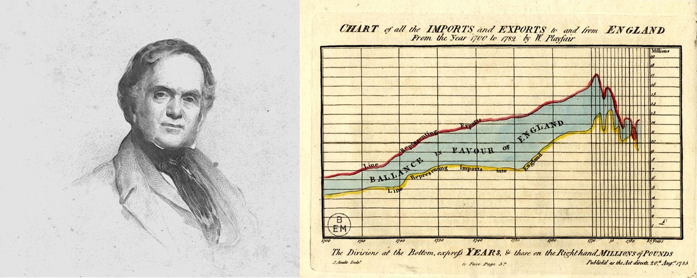
Figure 7.2 – Playfair’s Atlas
Note
The source of the image can be found at https://www.christies.com/en/lot/lot-5388575.
Playfair reasoned that if longitude and latitude are numbers, they may be replaced with any other quantity (year as the longitude and imported and exported data as the latitude). Using this logic, he was able to create the first amazing visualization.
Also known as The Lady With the Lamp, Florence Nightingale (1820 to 1910) was a British nurse, social reformer, and statistician. She created the incredible Diagram of the Causes of Mortality in the East Army. This diagram illustrated the epidemic sickness that claimed more British lives during the Crimean War than battlefield wounded men. Figure 7.3 illustrates the wonderful graphic created by the founder of nursing.
A Contribution to the Sanitary History of the British Army During the Late War with Russia was formally published by her. This book also included a beautiful and easy-to-read Rose diagram, as shown in Figure 7.3:
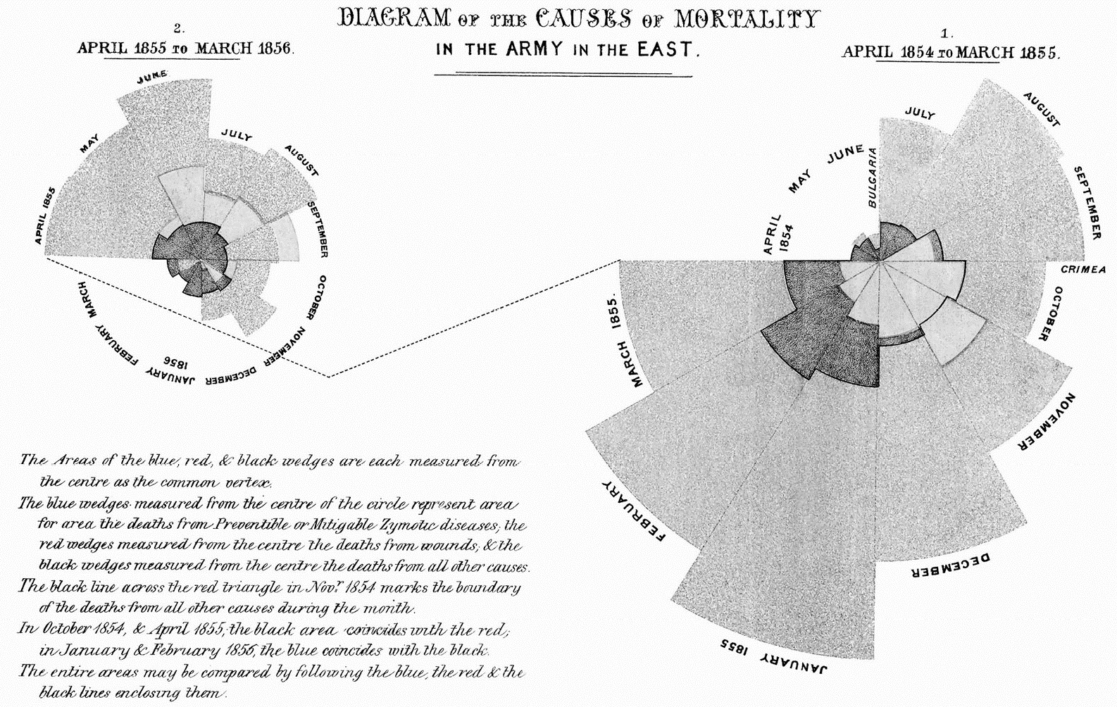
Figure 7.3 – Nightingale’s Rose Diagram
Note
The source of the image can be found at https://www.historyofinformation.com/image.php?id=851.
She honestly informed the leaders that the losses from epidemic diseases could be better controlled by a variety of factors, such as improved ventilation, housing, and nutrition.
Before we go more into detail on how to design the various charts that we can use, we do not claim to be visualization experts. We simply enjoy telling you tales on how to represent and read insights correctly. This allows you to learn how to create visuals that your viewers will comprehend and read. We wish to do so because we have been misled many times by various people. In the next section, we will discuss some examples that we’ve encountered in our daily work lives.
Deceiving with bad visualizations
Why is it important to know how to read a visualization? Why is it essential to create accurate graphs? The objective and primary goal of data visualization is to facilitate the recognition and identification of trends, outliers, and patterns in small and big datasets. In this situation, we use the term data visualization to refer to the process of converting collected data into a visual representation such as a graph, table, or even a map.
According to Alberto Cairo, the following frequent fallacies surround visualizations:
- A picture is worth a thousand words
- A visualization is intuitive
- The data should speak for itself
- Show don’t tell
And his statement is correct, if people don’t know how to read, understand and interpret visualizations.
Unfortunately, we get misled and misinformed in a variety of ways; we will look at several examples to learn how to identify misleading graphs.
Figure 7.4 shows two different data forms. The figure on the left is from FOX TV and is several years old. Can you see the flaw in this figure? If you look attentively, you will notice that the “axis” is not displayed correctly. On the right-hand side, we constructed a graph with the values from the first figure. This is a correct depiction of the values, and the difference is not that large! However, when you look at the graph what was shown on TV, you will notice a more dramatic change, which is not the case!
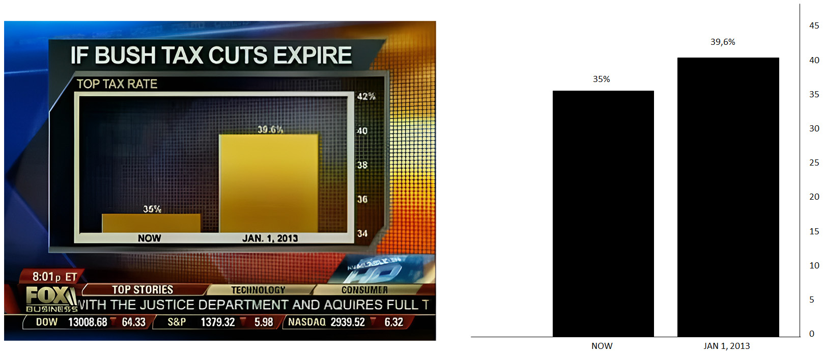
Figure 7.4 – A representation of a bad graph and the correct version
It is quite easy to be misled and misinformed by incorrect, badly constructed graphs. So, let us take a step back and demonstrate how to spot a badly drawn graph using some easy techniques. We will assist you with a simple basic rule for identifying charts that may mislead you. You will make a giant step forward in your data literacy learning journey when you understand the basic guidelines for recognizing difficulties with graphs.
Let us assume that a sales team meets to discuss the previous year’s sales. The entire team is pleased when a graph similar to the one shown in Figure 7.5 is displayed with the results of the previous year. We are all pleased with the upward trend of the growth curve. However, is this the case?
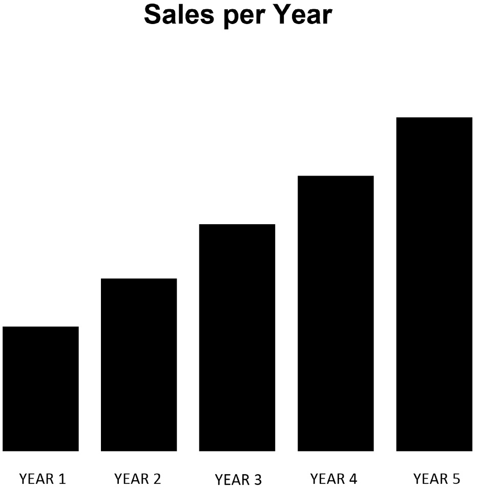
Figure 7.5 – Bad sales graph – 1
When we look at this graph more closely, we can see that some critical components are not designed or built correctly. To begin with, the Y-axis is completely absent!
In this instance, we should contact our graph developers and request that they add a Y-axis to the graph as shown in Figure 7.6.
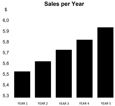
Figure 7.6 – Bad sales graph – 2
The Y-axis was added to the graph by our Data & Analytics team’s designer (or developer). Even if we carefully examine the graph in Figure 7.6, it is still somewhat incorrect! Our lesson in building a bar chart is that the Y-axis of a bar chart should always start at “0” to provide an accurate picture of our sales (or other) performance. In this instance, we should contact the graph designers again and request that the axis be set to 0.
When we set the Y-axis to 0, the picture completely changed; our sales rose slightly but there was no steep growth, as was shown in the first two figures. Figure 7.7, where we changed the Y-axis from 5,3 to 0 demonstrates this! The context for our graphs is critical; we want to leave as little opportunity for interpretation as possible:
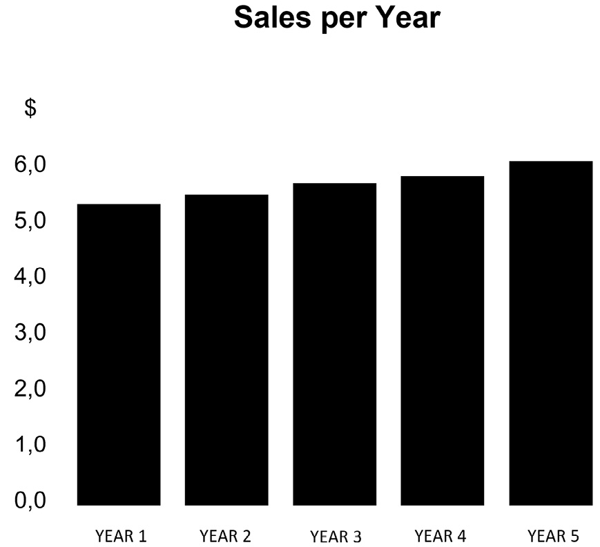
Figure 7.7 – Sales graph – final
To finish, there are certain basic guidelines to follow while visualizing data. We must always pay special attention to the graphs that we observe. The following are some common concerns that can arise (remember them):
- When a bar chart is used, the Y-axis needs to start at 0.
- When a pie chart is used, please do not use more than 4 to 5 slices (otherwise it won’t be readable anymore).
- Don’t turn your graphs upside down! Believe us when we say we’ve seen some during our work in the data and analytics world.
- Avoid using unusual items to look for correlations (pirates versus rock music, sold ice creams versus jellyfish stings, and so on).
- Poorly designed graphs can mislead you easily.
- Do not use dubious, incomplete, or insufficient data.
Many bad visualization examples can be found at https://viz.wtf/. We provide instances of strange and poor visualizations to our students and other trainees in our line of work, and to be honest, you will learn a lot from them! We must exercise caution and examine intently, ask questions, and be skeptical of what we see! The next section will go through how we look at graphs, how to interpret what we see, and how to utilize colors.
Using our eyes and the usage of colors
How do we pick a color for a data visualization? Color is used for more than merely enhancing an image or adding aesthetics to graphs. Color has emotional and cultural aspects that might enhance or hinder your visualization. Figure 7.8 depicts a couple of features that will help you choose colors for your visualizations:
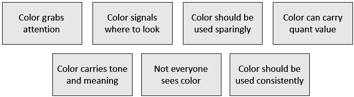
Figure 7.8 – Color does matter
Using the fundamental color guidelines presented in Figure 7.8 will allow you to create fantastic graphs that enable you to create impactful graphs utilizing colors correctly. However, there is still much to learn about reading visuals. Stephen Few (our second top example) wrote multiple books and papers on displaying data insights. His books and website (https://www.perceptualedge.com/) are a great place to learn about how our brains operate, how our minds work, and how easily our eyes can deceive us. Do you know that we don’t look with our eyes? We use our intellect to recognize patterns quickly. Figure 7.9 depicts our eye-brain connection:
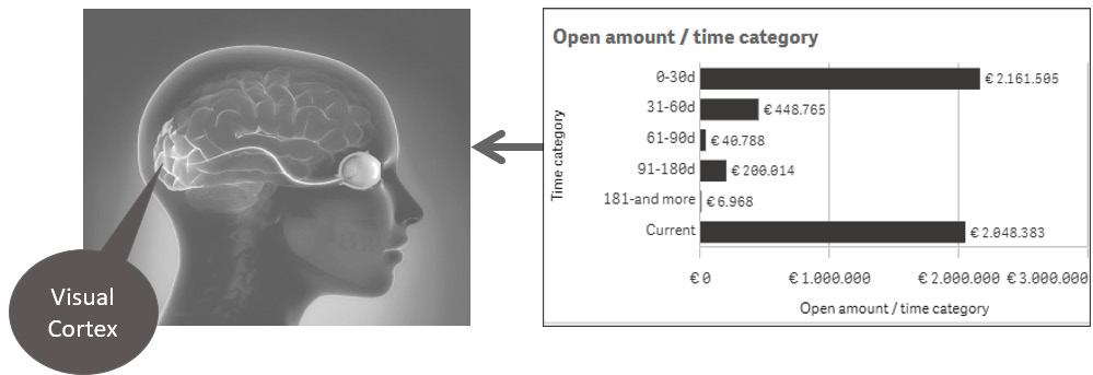
Figure 7.9 – Eye-brain connection
We accomplish this through the use of our iconic memory (our picture memory), which is very short-term memory. This explains why we recognize images so quickly. Figure 7.10 shows how our brain is dedicated to processing information that our eyes collect to take you through some easy principles.
Many aspects of visual perception are not intuitive. When we look at these two sets of objects, we can immediately see that those on the left are convex (which means outward) and that those on the right are concave (which means hollow):

Figure 7.10 – Convex versus concave
But what do you see in the representation displayed in Figure 7.11?

Figure 7.11 – Concave versus convex
The effect has now been reversed, with the things on the left appearing concave and the objects on the right appearing convex. However, all we did was flip each group of objects. We did not change them. Because our visual perception learned to presume that light was shining from above, we now regard those on the left as concave. Because the shadows are on the top, we see the items on the left as concave (hollow), and the ones on the right as convex (rounded outward), because the shadows are on the bottom.
Stephen Few inspired this visual perception example in one of his presentations on his website, Perceptual Edge: http://www.perceptualedge.com/files/VisualAnalysisCourse.pdf.
While reading this chapter, you’ve discovered that color does matter and that our brain helps us notice patterns faster. It is also critical that we understand what will work, what will not, and why.
Stephen Few also explores visual perception characteristics that are directly applicable to our world of data visualizations. These are known as the pre-attentive qualities of visual perception. Understanding those factors allows us to understand what will work, what will not, and why understanding the pre-attentive qualities is crucial.
Figure 7.12 depicts a small list of pre-attentive features in the areas of form, color, position, and motion. There are many more to discuss, but those are the fundamental factors that will assist you and be the most useful:
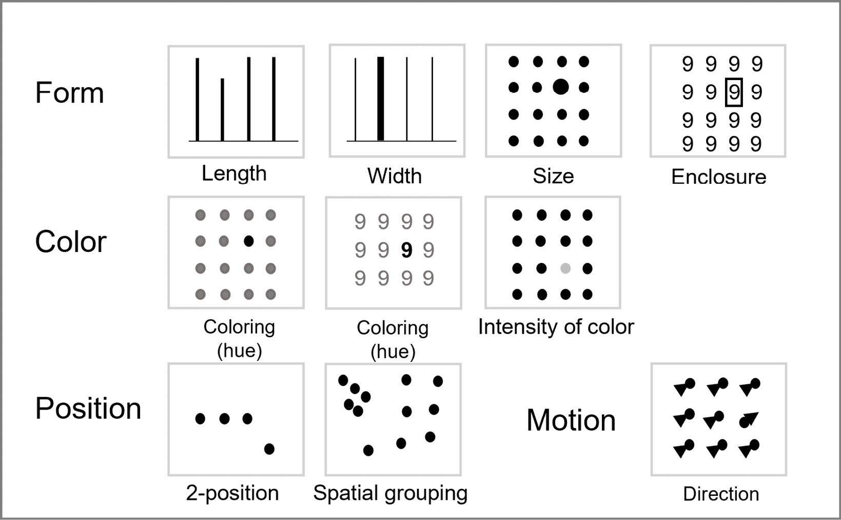
Figure 7.12 – Pre-attentive processing
When visualizing data, we must always keep colorblindness in mind. In reality, we must begin by asking several questions to our readers. If we understand our businesses and their aims better, we will be more equipped to picture what and how to visualize.
If you do not have a good eye for color, there are various tools available on the internet that we will introduce here to help you. If you go to the websites present after Figure 7.13, you may see all of the common color combinations, as well as take care of the corporate brand that you’ll need to maintain.
When developing a dashboard, contrast should be considered. Colors opposite of one another on a color wheel have high contrast. You can also generate contrast by darkening one color and lightening the other. Because different screens display colors differently, contrast is equally crucial when designing digitally on a screen. As a result, make sure you use adequate contrast where it matters. Figure 7.13 shows an example of a color wheel (in black and white) from one of the websites present after Figure 7.13. It will undoubtedly assist you in selecting the appropriate colors:
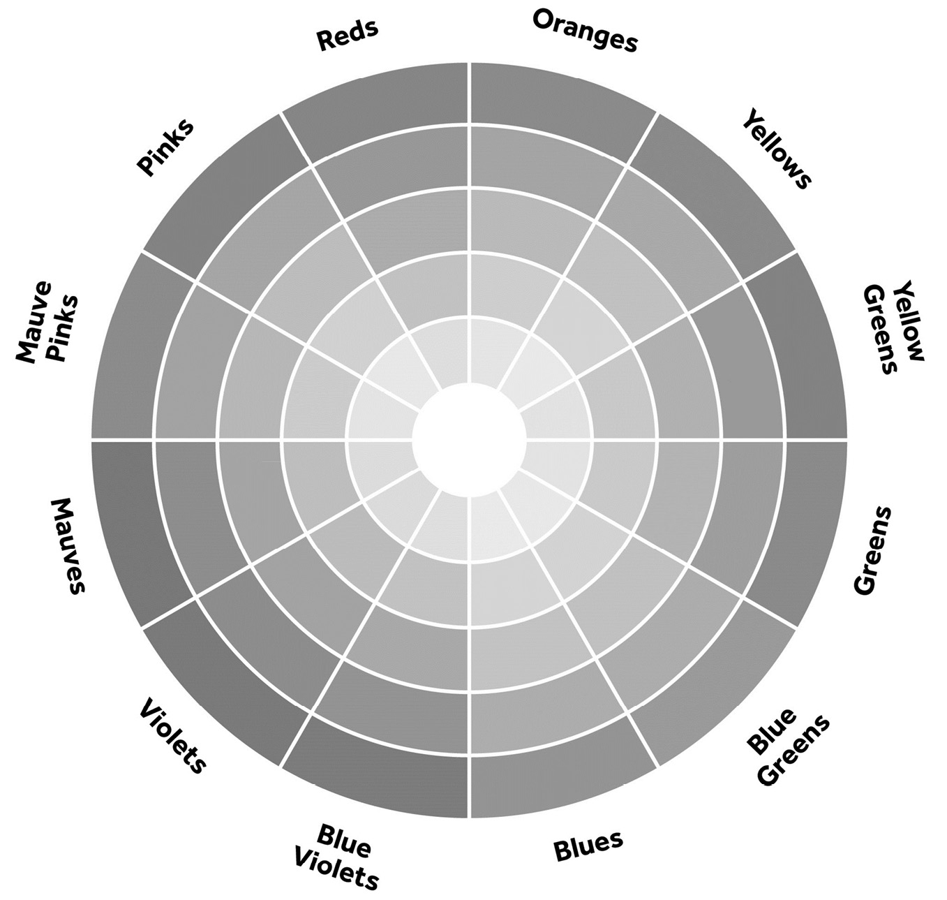
Figure 7.13 – Color wheel
You can find this color wheel at www.colormatters.com. The following are some other fantastic websites to visit:
You can utilize them to plan out the color schemes you want to use.
You’re probably wondering, “How do I choose the right color?” So, how do you pick a color for a data visualization? Color is about more than merely enhancing an image or aesthetic. Color has emotional and cultural aspects that might help or hinder your visualization. When it comes to color, there are a few factors to consider. Many of our associations are debatable, and people’s perspectives may differ. Symbolic meaning is frequently founded on cultural consensuses, such as connecting black with death. In Asia, red is associated with marriage and prosperity, but in the Ivory Coast, it is associated with death. Green is a wonderful color; we identify it with vegetation, mother nature, and money. On the other hand green in also associated in a negative sense with greed, envy, nausea, and poison. The color blue is commonly connected with the sea and the sky. From a cultural standpoint, it is associated with sadness in Iran. Did you know that blue is the most preferred corporate color worldwide?
So, using different colors in a presentation may have a huge impact on the appearance and feel of a visualization, and you should consider color associations when designing for a culturally varied audience.
Another fundamental idea is to understand how we read and which tools we use to view our dashboards and reports. When viewing a dashboard and its visualizations on a mobile device, keep in mind that all visualizations will be stacked on top of each other. When you look at a screen, you most likely (though not in every country) read from top left to bottom right. Figure 7.14 depicts how we read by using an image from a Google search with the keyword “dashboards:”
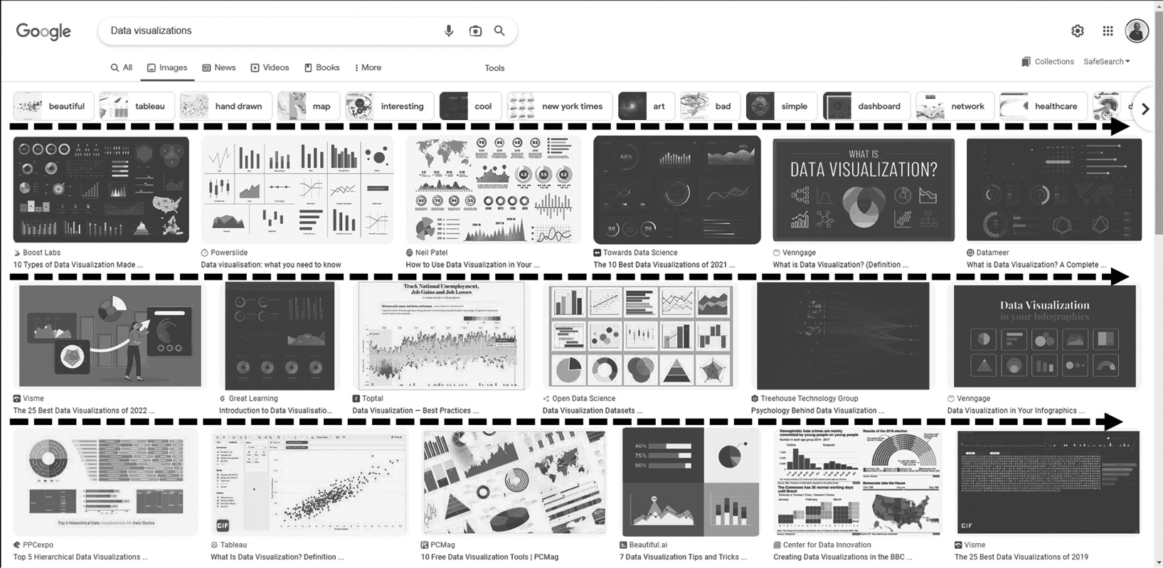
Figure 7.14 – When we read, we read from top left to right bottom
Of course, the existing data and analytics tools will allow you to adjust the reading methods for countries that do this differently. However, we utilize the reading view from the top left to bottom right in Europe and the United States.
This method of seeing information is something you’ll need to consider as you design your dashboards and reports. Because of the way we read, the most important visuals must be positioned at the top of the line that we consume. The major KPI elements should not be placed on the bottom right; instead, they should be placed on the top left-hand side!
In this section, we addressed how faulty visualizations can mislead you and provided you with the first basic tips for recognizing bad graphs. We talked about the importance of colors and how we gaze and read, and demonstrated some of the pre-attentive attributes. In the next section, we will introduce the DAR(s) principle, as well as provide definitions of dashboards and reports.
Introducing the DAR(S) principle
We have standard reports, such as those that meet periodic information needs; these are reports that do not change greatly over time. Examples include financial status, inventory, employee availability, the number of products sold, and so on. These reports frequently feature a fixed layout with the option of drilling (more comprehensive material), being more aggregated (drilling up), and even slicing and dicing (selecting a different angle)
Dashboards for management (score carding) are displayed differently. Dashboards or scorecards are often one-page documents that provide an overview of several graphs, meters, and tables. This overview provides a quick snapshot of the present state of things in a specific region of an organization. They also show how a company performs from a strategic standpoint, as shown in Chapter 6, Aligning with Organizational Goals.
The key takeaways are that there are three angles to display information, like dashboarding, analysis, and reporting. This is known as the DAR principle. We’ve even added an S to allow you to choose dimensions (angles) and facts (measurements) to generate tables or other visualizations on your own. This is known as the self-service area. We offer some example questions in Figure 7.14 to help you understand the DAR(S) principle:
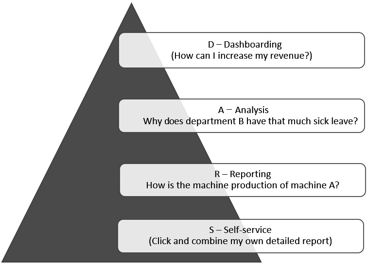
Figure 7.15 – DAR(S) principle
When we look at this informational pyramid, which we also addressed in Chapter 6, Aligning with Organizational Goals, we can see how it is related to the DAR(S) principle in a straightforward way.
From a strategic perspective, it is about assisting managers in making data-informed decisions by providing high-level knowledge about their specific firm. A dashboard’s data is largely limited to the past and the future.
We would like to study complicated data and its connections from an analytical perspective. We’d love to discover new angles (dimensions) and facts (measures). The analytical portion is primarily historical, with plenty of data interaction.
From an operational perspective, we require straightforward and accessible data analysis with a high degree of detail. The operational section is largely historical and contains a wealth of comprehensive information. Self-service analytics can also be made available in this part; analysts like to dig deeper into data with a high level of detail, but they also want to develop tables and visualizations.
We normally ask a lot of questions to be able to understand what our readers and business want, but we also try to explain to them what type of users they are. By identifying the users, we may also debate the depth of analysis and so on. We use the Bill Imnon user groups. Bill Imnon, considered the father of the data warehouse, identified four types of user groups: Farmers, Tourists, Explorers, and Miners. Using this method helps us investigate what type of granularity is needed and what type of interactivity is necessary for our viewers. Figure 7.16 depicts a table with many jobs that can exist in an organization; each function has its own set of requirements and preferences for how they want to use the insights for data-informed decision-making:
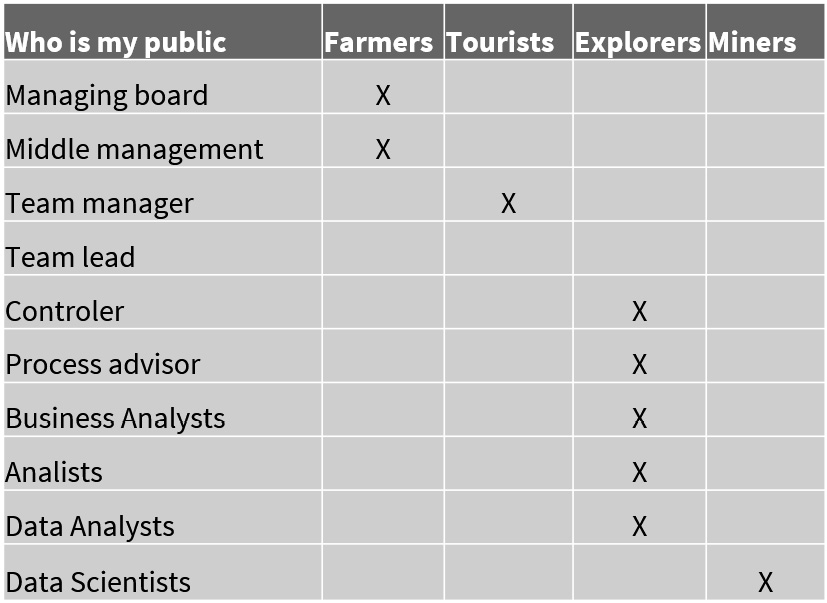
Figure 7.16 – Inmon groups to identify the level of interactivity and detail
Farmers have defined, predictable requirements. Tourists are practically equivalent to farmers, but they must utilize filters to look at the data differently and understand the findings. Explorers seek to examine existing indicators from several perspectives (dimensions) and interact thoroughly with dashboards and reports for data-informed decision-making. Miners are from more of a scientific field; they are our data scientists, and they want a lot of freedom to investigate anomalies in the data (looking for the golden egg).
Using this strategy not only helps us design and develop our frontend but also helps us establish what detailed level is required from a data warehouse standpoint.
Defining your dashboard
The following is Stephen Few’s definition of a dashboard (which we utilize in our daily lives):
When we divide the definition into numerous parts, we find the following elements:
- Presentation of visuals: How should the data be presented to the eye and brain? It must have a well-organized interface and must summarize divergent and attention-demanding material.
- Is it data used to achieve one or more goals: KPIs are typically used. It is tailored to a certain user group (or audience) and requires a certain level of detail; it is for a specific user group (or audience) and we must be clear about what should be displayed on the dashboard.
- It must fit on a single screen: There should be no scroll bars or toggling between screens; it should provide a clear overview.
- We need to see the results in the blink of an eye: This necessitates a high level of detail! The dashboard should do nothing more than what it is supposed to accomplish and should not raise any concerns. The message must be clear and concise.
- Putting all of those factors together, we can probably conclude that a dashboard is always custom-made: It is designed for a certain audience and requires a certain amount of information. By addressing all of these points, you’ll see that you’ll need to take specific actions to acquire the ideal results while creating or developing a wonderful, amazing, and clear dashboard. The crucial factors will be discussed in the next section.
Inquiring with your customers or the general public is a vital step. Involve your business users from the beginning; this will provide you with the best support and assistance. As a result, you will have a product that meets all of the standards. You must also immerse yourself in the business users. Ask your audience’s age, and remember, your audience may be from different age groups. Those from older generations may be less tech-savvy so it’s best to then keep the visualization as simple as possible as they consume information in a different manner. Find out if there are any colorblind people! When creating the initial drafts, consider numerous concepts, such as A/B testing, what appears better, and what the user can read and understand! All of the consequences of the requirements package must be evident to the client, as well as the level of detail. Agree (provisionally) on the drawing or proof of concepts with your client. We like to use sketches in our first designs to better understand our clients; we call this approach sketching and chatting or chatting and sketching.
Figure 7.17 illustrates a visualization or a requirements session to help illustrate the sketching and chatting process. This chat session was focused on Software Asset Management because it is critical to managing your assets as you can save a lot of money here (such as by simply removing the not used licenses, cloud subscriptions that are not used, and so on). The initial stage in this process was to gather suggestions for the requirements that needed to be displayed and the filters that were most likely to appear in our dashboard:
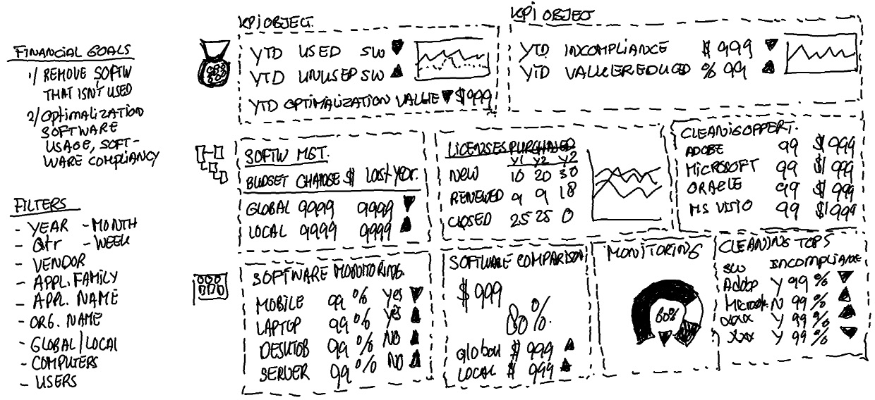
Figure 7.17 – Chatting and sketching
The next stage is to create a more detailed design for the new dashboard (while keeping the corporate identity colors and styling in mind). We like to do so in Photoshop or similar design software. Figure 7.18 illustrates the outcome of some chatting and sketching sessions:
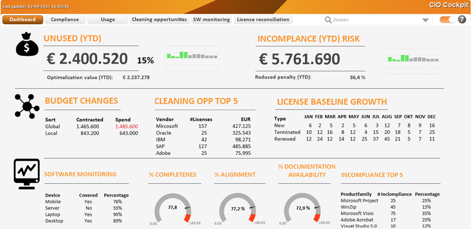
Figure 7.18 – Final result after a few chatting and sketching sessions
This is a true tale of how we devised this solution; however, we cannot show you the outcome because it is confidential. But what we’d like to state is that as soon as this image was presented in its original coloration, someone leaped up, got behind the laptop, and began clicking on it. Those are incredible moments that we will never forget because we knew we did the correct thing at the time!
We are frequently asked how we design a dashboard as per the DAR(S) principle. As one of our friends once stated (thank you Rob van Vliet), it is like eating an elephant piece by piece or chunk by chunk. When we look at those portions, we can discern some steps. We must identify the business questions, understand our target audience, locate the data, learn and define the measures, identify the analytical angles and filters, and then create the visualizations and necessary interaction.
Figure 7.19 shows the steps in the phases that we have discussed so far:
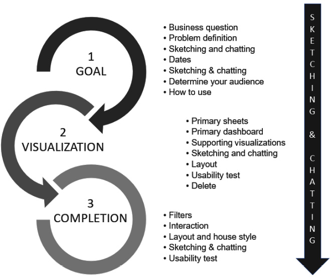
Figure 7.19 – The three phases of dashboard design
Figure 7.19 helps identify the steps of the sketching and chatting process. To conclude this section, here are some tips that we would like to share with you:
- Keep the screen quiet and readable.
- Preferably, the background should be off-white.
- No color gradients and no 3D effects.
- Use as few lines and borders as possible.
- No plot area background color.
- No frame around the object.
- No borders around the bars of a bar chart.
- Keep the lines on a line chart as thin as possible.
- Think of color blindness and how red and green are close to each other. For example, you could use a green up arrow instead of a green circle to indicate a positive metric (blue and green could also be an issue).
- Pay attention to signal colors: red is wrong, green is right, and yellow is in-between.
- Don’t use bright colors, but work with hues and saturation.
- The font should be readable (we know it’s a subjective thing, but don’t use a small size or unclear font).
- Consider your audience. What is their age?
As we mentioned regarding the common fundamental guidelines for building dashboards and reports, it should be evident that color matters and that design is governed by basic laws. However, we see the situation visualized in Figure 7.20 almost every day:
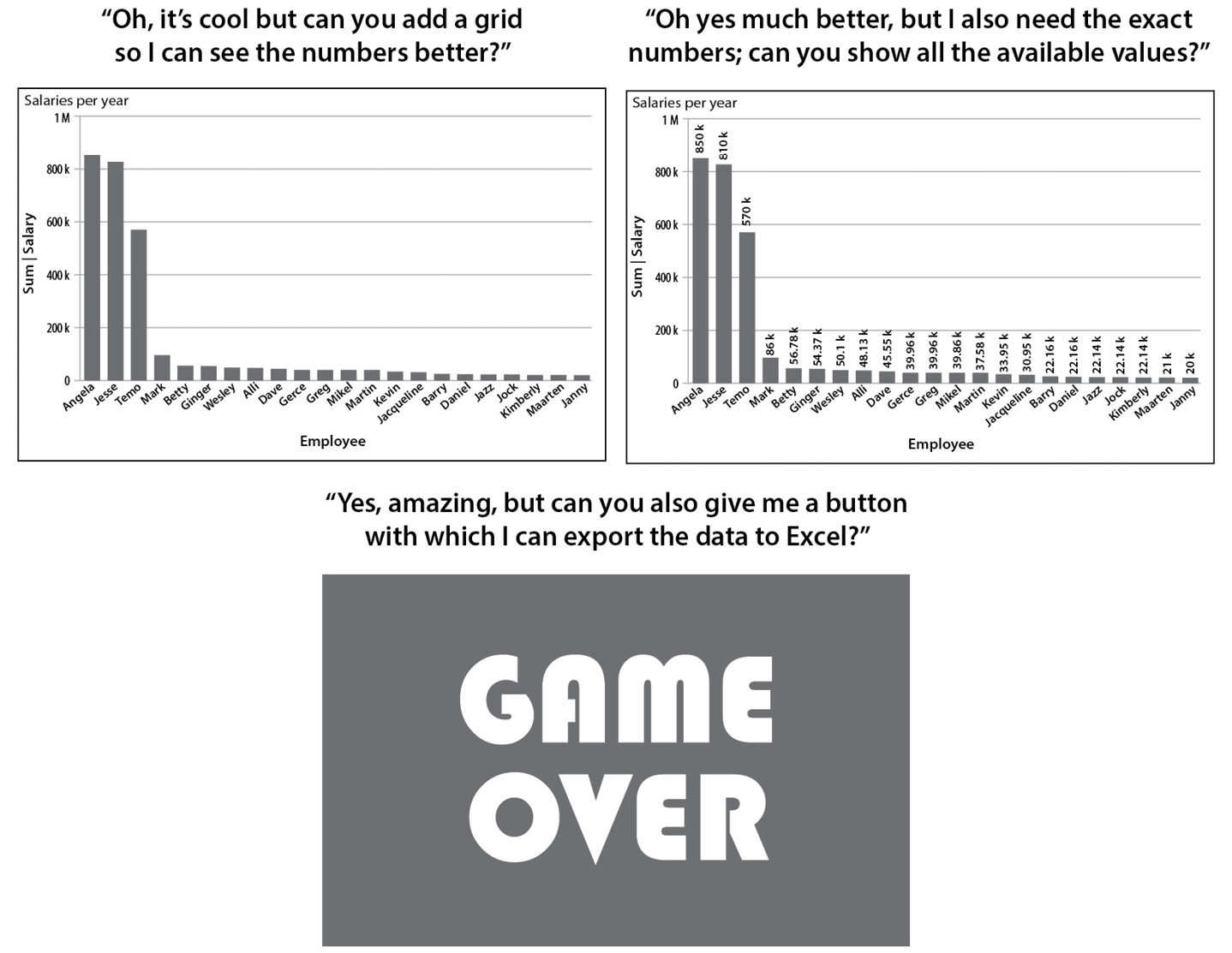
Figure 7.20 – This is how it usually goes
It is not strange to want to see the details. However, they should be displayed as a report (table or pivot table) or as a self-service component in your dashboard. In this manner, we protect and maintain the single point of truth. Exporting data from a dashboard to Excel does not work (several versions of detailed information, cleaned-up information, and so on) since it was saved in multiple spots by different people.
In this section, we spoke about the DAR(S) principle, the definition of a dashboard, and how to identify and find your dashboard readers. We also demonstrated the chatting and sketching technique.
In the next section, we will assist you with some of the most commonly used visualizations in our opinion (and the ones that we just love to use). We will go over the visualizations that you may use in your dashboard design as well as the underlying use cases in some detail. Of course, in between, we’ll tell you some incredible stories about data journeys we’ve worked on.
Choosing the right visualization
The incredible world of data visualizations is booming, and we’ve seen some great, amusing, and tough graphs in recent years. In addition, there are more types of visualizations than ever before; to be honest, we adore all of these visualizations, but you must be able to understand them. So, in our opinion, keep things simple! “Simplicity is the highest sophistication,” Leonardo da Vinci famously observed. This is extremely true; make things basic, comprehensible, and readable. When we do this, we can embark on our data journey, which we depicted in Figure 1.13 – The data-informed decision-making journey.
We should strive to keep things as basic as possible. Alternatively, we could apply artificial intelligence to see what we could learn from our dataset (which is mostly available in the tools nowadays). From there, we can create fantastic, legible dashboards that will result in wiser decisions and more value for our organization, owing to better outcomes.
Nine types of functions can be visualized, as shown in Figure 7.21:
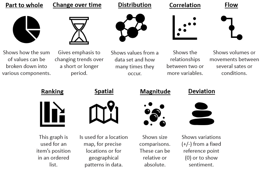
Figure 7.21 – The data visualization functional groups
The Financial Times has built an amazing visual vocabulary, which can be found at https://ft-interactive.github.io/visual-vocabulary/. Figure 7.21 is a reference to the great visual vocabulary. When designing a data story, consider one of these nine functional groupings and select a form of visualization that will properly accompany your data story. In the following section, we will look at some of the most commonly used visualizations when a person or organization is just getting started with data.
Understanding some basic visualizations
Visualizations help demonstrate and visualize the data for descriptive analytics. There are numerous graphs you may use. This book will walk you through some of the fundamental visualizations found in the majority (if not all) tools. We will begin by providing a graphical representation of the visualization and explain when and why you should utilize it.
Bar chart (or column chart or bar graph)
The bar chart belongs to the Ranking functional visualization group. Figure 7.22 shows two types of bar chart:
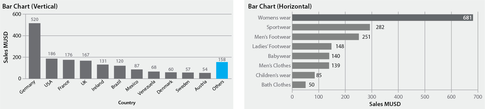
Figure 7.22 – Two types of bar chart
The most important aspect here is that the Y-axis of a bar chart should begin at 0 (if it does not, please contact the developers). A bar chart is used when an item in an ordered list can be positioned. It is utilized when the absolute or relative value is more essential. A helpful approach here is to emphasize the main topics of interest. When sorted into order, normal bar charts present the ranks of data considerably more readily.
When to apply
You should use this chart when specifying the number of incidents, items, and purchases made on a website by various sorts of users, wealth, deprivation, league tables, constituency election results, and so on.
https://infogram.com/examples/charts/bar-chart provides some fascinating examples of when to utilize a bar chart.
Line chart
The line chart is part of the Change over time functional visualization group. Figure 7.23 shows two different types of line charts that you can utilize:
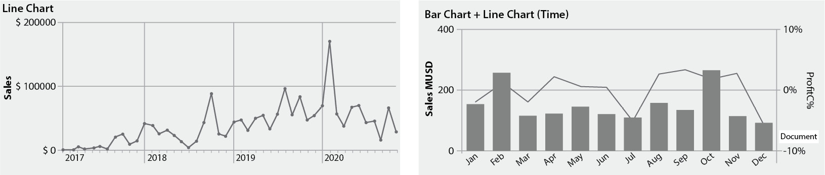
Figure 7.23 – Two types of line chart
A line chart allows you to display changing trends throughout time. This can be done on a daily, weekly, monthly, yearly, or other time scale. However, we’ve also seen some very complex time data displayed as a line chart. It is critical to select the appropriate period for your data story’s viewers. The most common approach is to display a moving time series, such as a 90-day moving average. Consider using markers to denote data points if the data is irregular. Figure 7.23 (the image on the right) depicts a useful method for displaying the relationship over time between an amount (columns) and a rate (line).
Look for trends in the dataset that have been displayed for you or by you. A trend is typically defined as an overall movement in one direction. It may rise or fall, but there is usually a consistent flow. Steps (rapid and sustained changes) or spikes (short-term changes) can occur as a result of a sales promotion or an enhancement (step) to a certain procedure.
Figure 7.24 shows a combination chart, where we can modify the colors for each expression (measure) to give the viewers of our chart additional analytical ability:
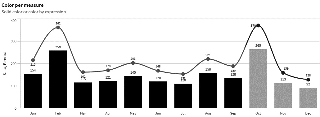
Figure 7.24 – Combination chart – colors per expression
Slope diagrams, area charts, fan charts with future projections, and connected scatterplots that show the movement of specific values are part of the other visualizations you may utilize in the Change over time group. An excellent illustration would be the numerous types of software vendor scores that are reviewed for the annual Gartner Magic Quadrant report. When you visualize multiple points across time, you can use a connected scatterplot. A great example can be found at https://qap.bitmetric.nl/extensions/magicquadrant/index.html.
When to apply
You should use a line chart to share information on price movements, economic time series, emerging market valuations, days on market averages by month, market sectoral changes, the average amount of payments over time, the number of sales categories (one line per category), and so on.
Pie chart
The pie/donut chart belongs to the Part to whole functional visualization group. In Figure 7.25, we have created two types of pie charts that you can use:
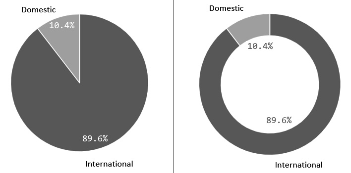
Figure 7.25 – Two examples of pie charts
William Playfair created one of the earliest documented pie charts in 1801. He authored a book called The Statistical Breviary, where he introduced both the pie chart and circle graph. His pie chart shows the proportions of the Turkish Empire located in Asia, Europe, and Africa before 1789. It is amazing to see how William Playfair used circle graphs to represent the data. You can find the complete story at https://infowetrust.com/project/breviary.
Let us discuss Figure 7.25, you can see that the total is 100% and that the slices are separated into values (the smaller slice is 10.4% and the larger slice is 89.6%). Pie charts function best with values of 25%, 50%, or 75%. In this approach, readers can more easily identify percentages in a pie chart than they would in other charts.
A pie chart is not a good choice when comparing slices or shares, or when there are many small slices. The general rule of thumb is 4 to 5 slices. Another rule of thumb is to avoid using distorted 3D visuals. Another typical error is that the data for a pie chart is not total, as it does not reflect 100%. The final issue is that pie charts are incorrectly used for groupings that are totaled up.
The second chart shown in Figure 7.25 is a donut chart, which is similar to a pie chart but has a blank middle where you can add additional (contextual) information. Tree maps, grid plots, and other charts can also be utilized within the Part to whole functional visualization group. Figure 7.26 depicts two examples – one of a grid plot (left) and one of a tree map (right):
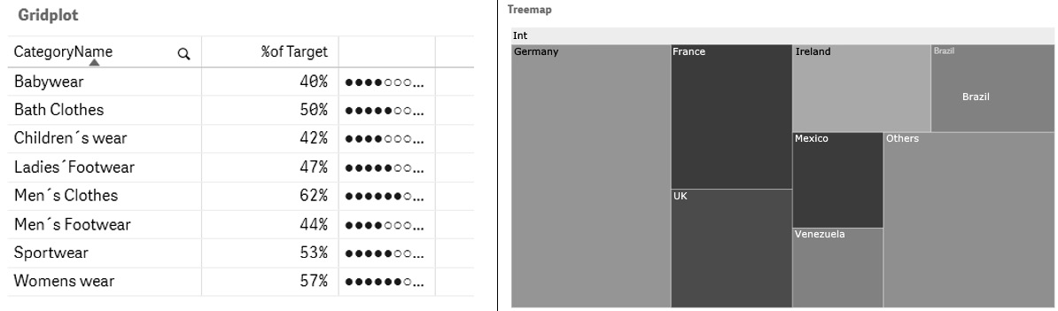
Figure 7.26 – An example of a grid plot and a tree map
Tree maps give a quick overview of the hierarchical structure. Tree maps are also good to compare the parts via their area size. These Part to whole diagrams are a great way for the viewers to make sense of a problem and see the relationship between the whole number and the components.
When to apply
To utilize a pie chart, you must have a complete quantity that is divided into numbers or discrete sections. When using a pie chart, your primary purpose should be to compare each slice’s contribution to the overall. When this is not achievable, a pie chart is not the best option. Some examples are the number of sales by user type, the number of different types of responses in a survey or questionnaire, and the number of votes cast in an election.
Heatmap
The heatmap is one of our favorite and most powerful graphs; it belongs to the Change over time functional visualization group:
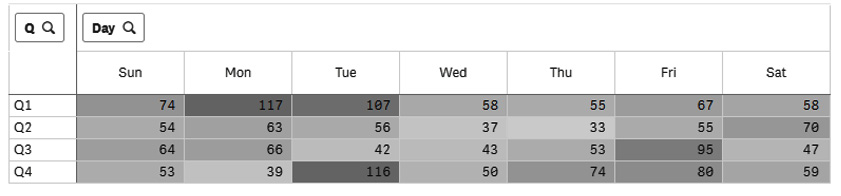
Figure 7.27 – A calendar heatmap
These types of graphs show the density of your data – for example, patterns per hour, per day, per week, and so on. When utilizing a calendar heatmap, you can detect flaws in planning versus requests or staffing versus requests, and even find the busiest times for a call center, and so on.
The bed cleaning story
Let us look at a real-life example of a hospital that was struggling with staffing, the number of requests, and delivering “clean beds” on time to demonstrate the effectiveness of a calendar heatmap. They agreed to provide clean bedding within 75 minutes. The cleaning department began by collecting Excel data, and we sought to discover a more convenient approach to do so. So, we began with some simple data to prepare (as we know it will be a journey) and a visualization solution. First, we provided some metrics to demonstrate the SLA data (did we meet the 75% mark?) and the number of requests, as well as a line chart displaying the number of requests over time. Figure 7.27 depicts the first visualizations that were developed:
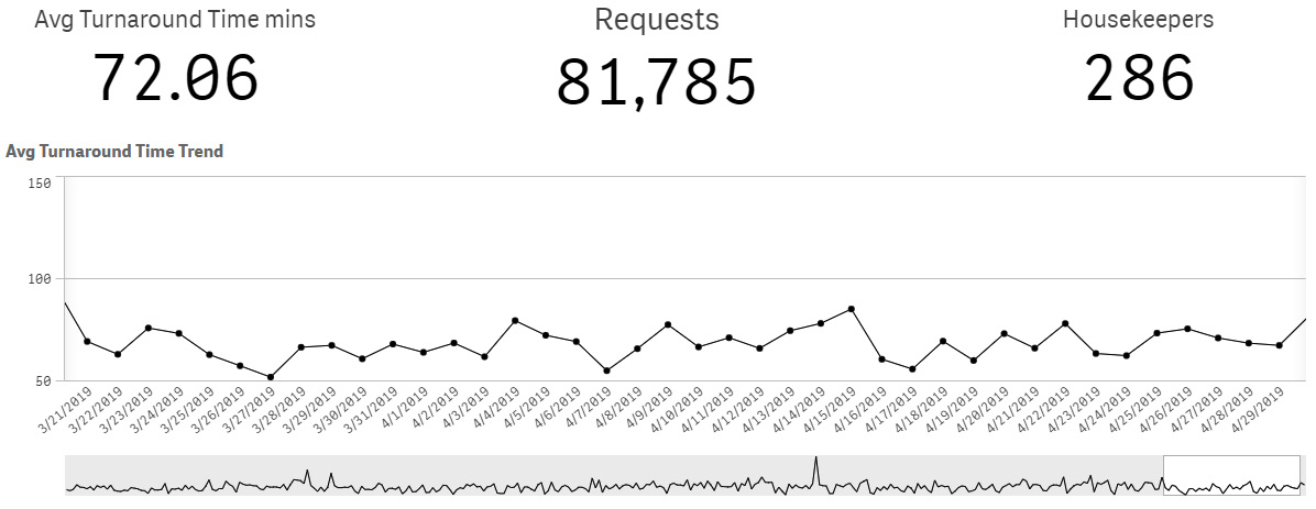
Figure 7.28 – The first bed cleaning visualization
This is interesting information, but it doesn’t reveal much while providing a decent summary. The customer required more precise details. We knew that the agreed-upon SLA time was 75 minutes (a target), so we could add a target line. Figure 7.29 shows the line chart with the newly added target line. Furthermore, we were able to detect requests that did not meet the SLA time frame. We did this by emphasizing the ones that did not reach the 75-minute mark but were above it. Being able to detect queries that took more than 75 minutes provided us with the opportunity to improve even more:
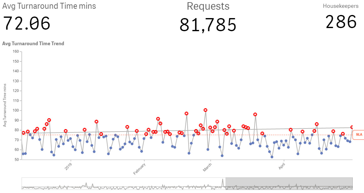
Figure 7.29 – Improving and adding a target line
From here, we identified more potential to expand the visualizations to a more detailed level and assisted the hospital’s management in identifying planning difficulties. We used these incredible heatmaps to visualize personnel, requests, and response time.
Figure 7.30 shows the wonderful calendar heatmaps that helped us understand the issues that happened during the day and prevented us from meeting the SLA time:
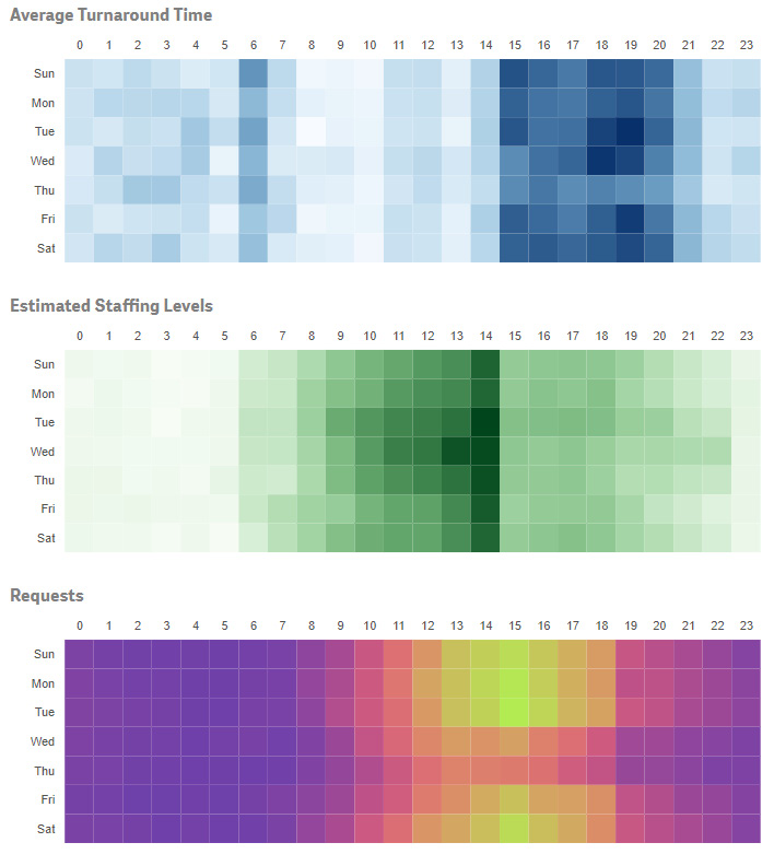
Figure 7.30 – The usage of powerful heatmaps
We discovered some significant findings when we utilized these calendar heatmaps to depict Average Turnaround Time and compared them to Estimated Staffing Levels and the number of Requests.
First and foremost, we can tell from the Average Turnaround Time chart that the time of delivery increases (the darker it is, the longer it takes) – that is, after 15:00 (3 P.M.). Second, from the Estimated Staffing Levels chart, we can observe that we have a high staffing level between 11:00 (11 A.M.) and 14:00 (2 P.M.).
After that, the number of employees drastically decreases.
However, the third visualization, Requests, also shows the total number of requests (the lighter the coloring becomes, the more requests are received). We witnessed the development of requests from 12:00 (noon) to 18:00 (6 P.M.) in this visualization.
We noted that the intended number of persons to be deployed did not correspond to the number of requests filed. We couldn’t see this in the first given visuals, but the heatmap clearly shows this pain spot. Therefore, it is natural to conclude that when staff planning and the number of requests received are out of sync, the average time for addressing those requests exceeds the SLA timings (which is shown in the Average Turnaround Time chart). Adding the values to this heatmap could be a recommendation for further improvement.
Using these visuals, they were able to better plan their personnel, as well as with the other visualizations we added to the dashboards and reports for this hospital, and improvements were made fast. Of course, there is more to this story, but we wanted to show you a real-world example of how calendar heatmaps may be used.
When to apply
Heatmaps can be used to visualize time series, as shown in our story. Engineers, academics, and marketers commonly use heatmaps for comparative data analysis and other purposes. It helps them identify trends and patterns, as explained in this section.
Radar chart
The radar chart is part of the Magnitude functional visualization group. Figure 7.31 shows two instances of a radar chart:
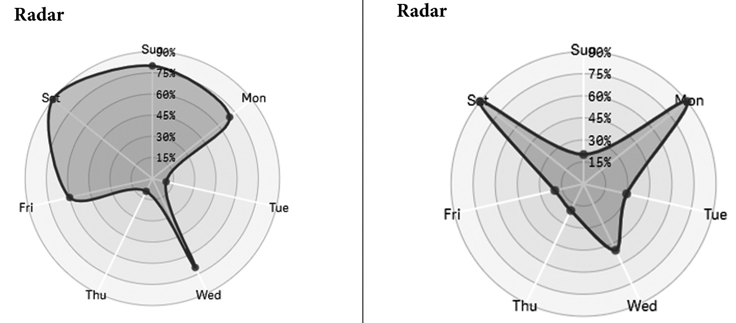
Figure 7.31 – Examples of radar charts
A radar chart is a chart that uses a small area to display several variables. When comparing two or more values, items, attributes, or features, you can utilize a radar chart. When using these types of charts, be sure you structure the chart in a way that makes sense to your readers. Radar charts are commonly used for illustrating commonality, exhibiting outliers, and ordinal data.
We once utilized a radar chart to depict differing responses from two different groups based on questionnaire responses. When we positioned the groups atop each other, it was amazing to see the distinctions between them.
To avoid a cluttered radar chart, plot no more than three sets of a group. When we employ too many, the chart becomes crowded and thus unreadable.
When to apply
You can use a radar chart to compare two types of pharmaceuticals from the same class along numerous dimensions, such as the most prevalent adverse effects, alcohol use, addiction, client expenses, and so on. You can also use this type of chart to show weekly sales figures/revenue by product category and the competitive analysis of your services in comparison to others. Last but not least, you might utilize a radar chart for human resources and to present, for example, the results of a soft or technical skill evaluation.
Geospatial charts
A geospatial or spatial chart is part of the Spatial functional visualization group. Some examples of geospatial charts are shown in Figure 7.32:
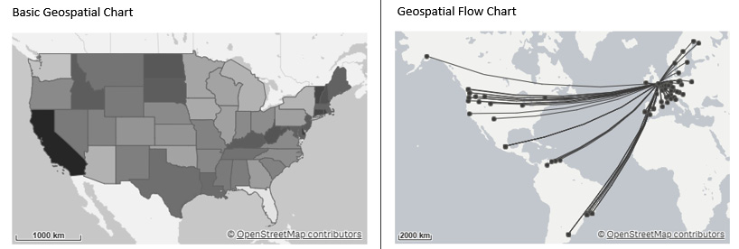
Figure 7.32 – Examples of geospatial charts
We’ve seen a lot of excellent geospatial charts over the years. We’ve seen plain basic charts, heatmaps on charts, flow charts, and contour charts (showing a city, a part of a city, and so on). The dots or bubbles of a chart depict the cities and their population, for example. When you use geographic data, it is commonly referred to as geospatial data, and it can contain various kinds of data. Geometric data and geographic data are two types of spatial data that are more widely employed.
Spatial data can help you understand a variety of topics, and there are numerous resources available on the internet. The main advantage of using spatial data is that the visualization may effectively illustrate the geographic distribution of key variables connected to location or region. The disadvantage here is that it can be tough to gain a decent overview when there are many values. By zooming in on specifics, the values can be visualized. Geospatial data can be presented in a variety of ways. As an example, imagine adding numerous layers to a geographical map and visualizing diverse types of information on the same map. Alternatively, you can establish a hierarchy of areas by using drill-down measurements to zoom in to a detailed level.
The story of Dr. Snow – death in the Pit
Outliers are individual values that differ significantly from the majority of other values in a set, and they can be identified using tools such as maps. Identifying outliers is always one of the first things you should look for when trying to get a sense of the data. The definition of an outlier is fairly subjective. Many people define an outlier as any data point that is three standard deviations or more out from the dataset’s mean. Early identification allows you to understand what they are, analyze why they are outliers, and then decide whether or not to eliminate them from the analysis.
Dr. John Snow is a well-known example of how an anomaly might help you identify practical ideas. Dr. Snow was researching a cholera outbreak in London in the nineteenth century. While the most widely held belief was that the cholera outbreak was caused by airborne bacteria, Dr. Snow hypothesized that it was spreading through the water supply via microscopic bacteria. On a map of London, he depicted the cholera deaths, as shown in the following figure:
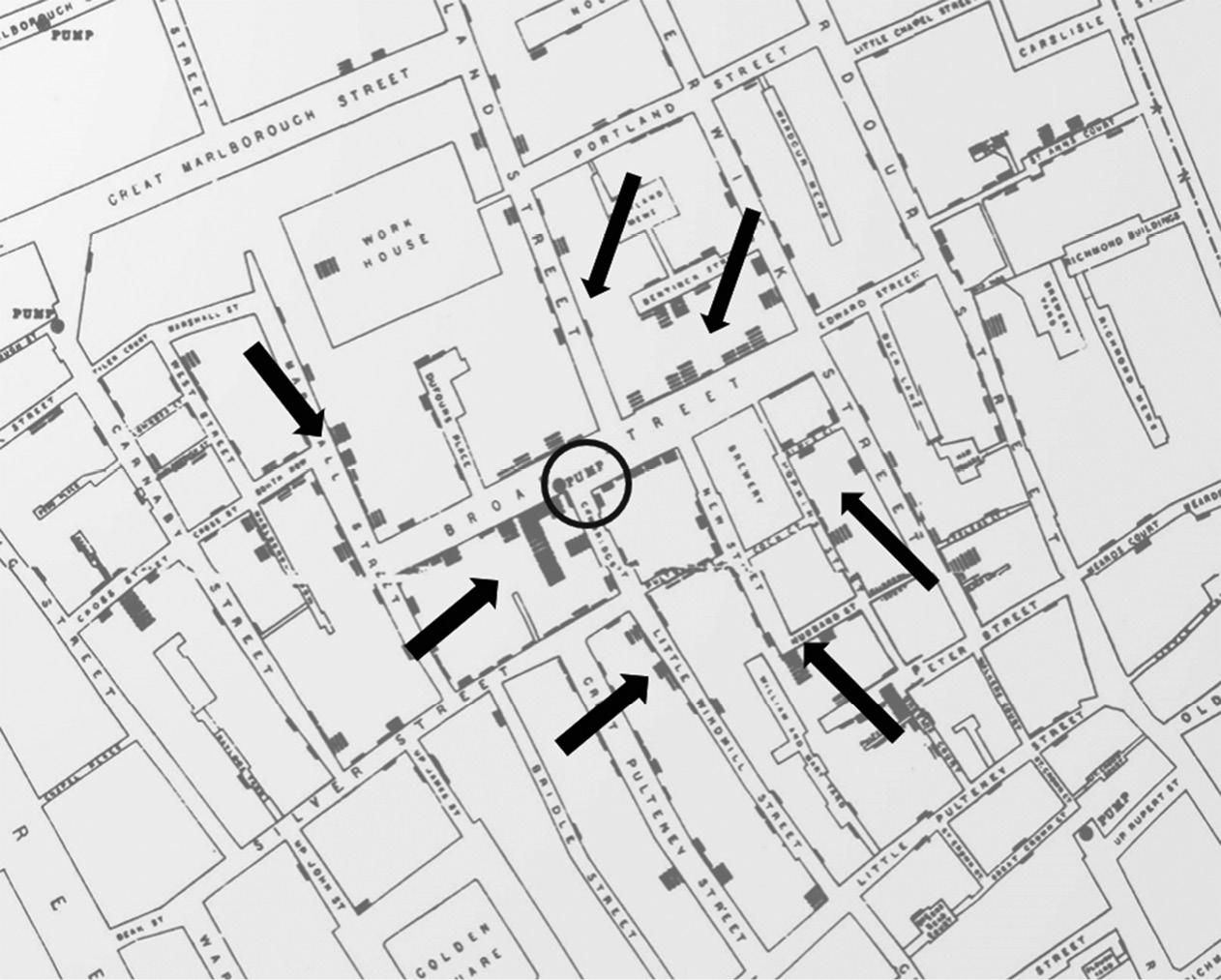
Figure 7.33 – The story of Dr. Snow
At first, no patterns surfaced and everything appeared to be random. What eventually contributed to the hypothesis’s validation? Only one outlier! The map indicated that someone had died who lived outside the city, far from the other deaths. He started to look into the anomaly and discovered that the individual used to live in the heart of the city, where there had been several deaths, and she used to enjoy the taste of the water there. She was so concerned that she would have the water transported to her new home. With this new information, there was enough proof to halt the water pumping from that water station, eventually putting an end to the epidemic.
Who knows how long the pandemic would have lasted and how many more people would have perished if Dr. Snow had dismissed the anomaly instead of using it as an opportunity to learn why it was an outlier? While not every business decision is as critical as this one, it emphasizes the significance of looking for outliers to understand more about why they exist rather than simply ignoring or filtering them out of your dataset.
When to apply
Some examples of when to use geospatial charts include visualizing population density in certain areas, localities, or countries, visualizing election results, identifying walking routes (on floor maps), detecting crime in cities (based on various criteria), and so on. It is also feasible to utilize a geospatial chart to indicate the distribution of offices, shops, and other important areas. They are not limited to places; sales values and other types of measures (bubbles and color) can also be added and shown.
KPIs in various ways
Key performance indicator (KPI) items are not mentioned in a single functional group but are usually closely linked to a company’s strategic objectives. Figure 7.24 depicts two forms of KPIs:
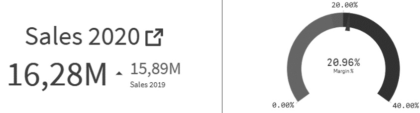
Figure 7.34 – Two types of KPIs
On the left-hand side, a KPI for summarized measures is displayed, while on the right-hand side, a more often-used KPI (gauge meter style) is displayed.
KPIs can be displayed in a variety of ways, with two of the most frequent types of visualizations shown in Figure 7.33. But there’s a catch! There are several methods for visualizing measures against a target. Summarized metrics are shown simply as a textual graph, as shown in Figure 7.33. In this example, we compared the sales amount of 2020 to the sales amount of 2019 at that time. This is known as “Year-to-Date.” In Figure 7.33, we even colored the amount of 16,28M slightly and added a small triangle pointing upwards in green, indicating that we had converted more sales than the previous year.
When displaying a KPI more traditionally, several KPI items can be used (a gauge, a horizontal gauge, and more). Typically, we do so by using the standard gauge chart, as shown on the right-hand side of Figure 7.33. In this example, we used three colors to show the good, neutral (you must act), and bad options (you have to take action as it’s wrong, bad, and so on).
Nowadays, we can configure triggers to send automated messages to our cell phones, send emails to get people’s responses, and so on. However, the human side must also lead to action; action to analyze, see what’s wrong, and enhance your operations (in the broadest way).
When to apply
You should apply KPIs to all metrics with a goal. We explored many types of examples in Chapter 6, Aligning with Organizational Goals.
Tables
Tables are not included in a single functional area, but they are commonly used to display detailed information, and mini-charts are occasionally added to such tables to indicate trends or patterns. We don’t think detailed tables belong in a dashboard, but when combined with mini-charts, we can present patterns and trends more simply, and they could end up in a dashboard as well.
Figure 7.34 depicts an example of a table that employs mini-charts:
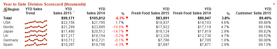
Figure 7.35 – Table with mini-charts
A dashboard can also benefit from highly aggregated data and the use of mini-charts. A table, on the other hand, is used to present more precise information. Tables are often used to lay out and organize detailed or complex data. However, by utilizing our DAR(S) defined format when generating dashboards and reports, we can provide our readers with a specific level of detail.
When you use tables, you should consider the following basic rules:
- Tables can show raw values or aggregated values (like in a pivot table).
- Use a table when you want to give your dashboard’s readers more detailed and specialized information.
- It is recommended to use a table when comparing data in many directions.
- Avoid using too many columns when building a table. This allows you to make the table more readable for your readers.
- Shorten the number format or round your figures (for example, 2.7M rather than 2,700,000).
- Even though we read from left to right, most individuals look at tables from top to bottom (vertically). This occurs more frequently when the data is ordered from A to Z or from 1 to 100.
- For slightly longer tables, please use a light gray color for every second row. This will help readers avoid jumping between rows while trying to read the values. Zebra shading is another name for this phenomenon.
- When designing a table, consider the height and width of the rows. When a table contains a lot of rows, a more compact layout may be preferable, while when it’s a smaller table, a wider layout may be preferable.
- Highlight important information by coloring the background or numerals. But don’t overdo it; it won’t help you make the message obvious. Coloring is typically used for parts that require more attention, such as a value that is almost on target or crossing a target. This is referred to as “management by exception.” Use subtle tones rather than bright hues.
- Nowadays, most tools will automatically sort your tables. It is a good idea to make your tables sortable and searchable so that your readers can discover the information they need more easily.
- We’ve already talked about heatmaps (Figure 7.27). Tables are a useful way to efficiently visualize your data. You could employ colors, as shown in our examples.
- The final piece of advice is to consider how you want to arrange your table. When you create a lengthier table, the vital values may get concealed and inaccessible to your readers. In this scenario, you may employ a form of custom sorting.
In this section, we discussed the most used types of visualizations and helped you understand when and how to utilize them. In the following section, we will go over some of the more sophisticated visualizations.
Presenting some advanced visualizations
As mentioned previously, when you learn to read visuals, your curiosity will grow and you’ll want to learn more about visualizations. From that curiosity, you can progress and learn to use more advanced visualizations. This section will cover some sophisticated types of visualizations that have been chosen from a huge list.
Bullet charts
Bullet charts are part of the Magnitude functional visualization group and represent progress toward a specific value (goal). One of the benefits of a bullet chart is that it displays the actual and desired values together. Another benefit is that if you align multiple bullet charts on top of each other, using the same range, you can also compare them (which you cannot do easily with multiple gauge charts). You can also add ranges for good, bad, and average values; these are represented by colored bands. Figure 7.36 depicts an example of a bullet chart:
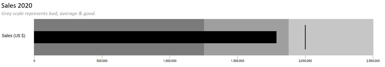
Figure 7.36 – An example of a bullet chart
The following are the benefits of using a bullet chart:
- Presenting the results in the shape of a bar makes it simpler to compare the different values with one another
- When comparing performance against an objective and a simple performance evaluation, you may provide the appropriate context (scaling and target)
- Using a bullet chart saves space on your dashboard
Scatter and bubble charts
Scatter and bubble charts are part of the Correlation functional visualization group. A scatter chart depicts the association of two or more “quantitative” values. We can size the bubbles with a third value when utilizing a bubble chart.
Figure 7.37 shows an example of a scatter chart (left) and a bubble chart (right):
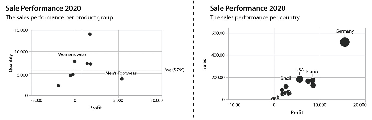
Figure 7.37 – Example of a scatter chart (left) and a bubble chart (right)
In the first example (Figure 7.37 – the left-hand side of the chart), we have visualized sales success by plotting quantity on the Y-axis and profit on the X-axis. The bubbles on the graph inform us that four of our articles had a negative profit, but that items in the Men’s Footwear category did not sell as well, even though we made a bigger profit. The remaining four goods, which are practically on the zero line, have a higher sold quantity but a smaller profit. In this scenario, we should delve further and examine what is going on with the negative profit cases.
The second example (Figure 7.37 – the right-hand side of the chart) shows our sales revenue on the Y-axis) and profit on the X-axis. But, in addition, when we look at the bubble sizes, we’ve included a measure in our bubble to see the total quantity sold. In the end, we can see a negative or poor profit and decreased sales quantities. It is also worthwhile to evaluate and go further into our dashboard charts to see how we can improve them.
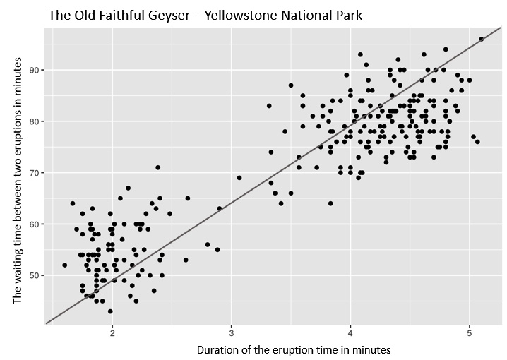
Figure 7.38 – A scatter plot of the Old Faithful geyser
The scatterplot of the American Geyser Old Faithful is another real-world example we can look at. The eruption of Old Faithful occurs every 50 to 80 minutes. When this occurs, the geyser emits hot water for several minutes:
- When we view all of the collected data points, we can see some intriguing things – for example, there is a link between the waiting period and the length of the eruption. The more you wait for an eruption, the longer the eruption lasts.
- Figure 7.38 depicts two distinct data point clouds, the first of which is a 2-minute eruption followed by a 50-minute pause. After an 80-minute wait, the second cloud erupts for 4.5 minutes.
- We find a correlation between the waiting duration and the eruption length in this situation since we’ve learned that the longer the waiting period, the longer the eruption.
Finally, please ensure that you are displaying the correct comparison or correlation. We’ve seen several awful graphics that relate rock music to eating ice cream or pie consumption to jellyfish stings.
Stacked bar charts
Stacked bar charts are part of the Part to whole functional visualization group. A stacked bar chart is a straightforward approach to depicting a part-to-whole relationship, but it can be difficult to understand when there are too many components (parts). Figure 7.39 depicts an example of a stacked bar chart:
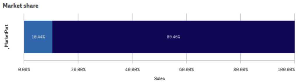
Figure 7.39 – An example of a stacked bar chart
A stacked bar chart can be used to display information such as market shares, fiscal budgets, organizational available funds, and process phases. We’ve visualized the steps of the “Call to Balloon” process in the following example, which is represented in Figure 7.40. We told this narrative in Chapter 2, Unfolding Your Data Journey. We were able to assess the process steps with the help of the developed visualizations, which included a stacked bar chart, so that we could improve our results. We refer to this technique as the flipping technique, as it’s good to show the top performing items but when we turn it around (flip it) we can draw attention to the items that need to improve! Figure 7.40 depicts an example of using a stacked bar chart to visualize the process steps:
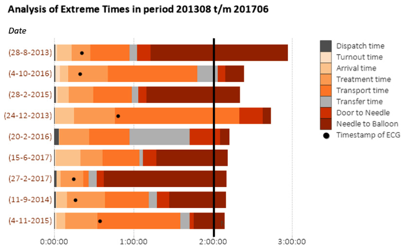
Figure 7.40 – Call to Balloon process breakdown with a stacked bar chart
We were able to discuss what happened and what caused the delay by simply looking at the different parts of the stacked bar chart and identifying the step that took too long. We were able to click on that specific bar so that a detailed report could unfold; by doing so, we could discuss what happened and what caused the delay. Following that, all the required steps can be made to improve the process. And, as shown in Chapter 2, Unfolding Your Data Journey, the Safety Region was able to improve our time by 20 minutes!
Sankey charts
The Sankey chart is a member of the Flow functional visualization group. A Sankey chart allows you to construct and display the flow and divides in your data. It also shows how changes progress from one to the next stage or category and so on. You can predict the possible outcomes of processes. Figure 7.41 depicts the flow of consumer products and market share (domestic versus international):
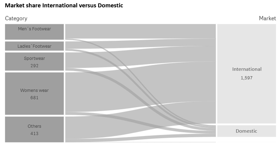
Figure 7.41 – The flow of consumer goods and the market share (domestic versus international)
Sankey charts can be applied to a variety of processes, including consumer goods, money flows, prescription flows, call center flows, and energy flows, among others. The width of the arrow, which represents the flow of energy or material, is proportionate to the magnitude of the flow in a Sankey chart. Common blunders to avoid include the position of the flows, which is critical, and aiming to reduce the number of crossings (which makes the chart very unclear).
When your visualization is cluttered and unreadable due to too many flows, attempt to avoid weak connections.
There are many process flow charts on the market, and we’ve seen some incredible ones. It is critical to consider what to envision and whether your readers will understand what you are attempting to demonstrate.
Waterfall charts
A waterfall chart is a financial tool that belongs to the Part to whole functional visualization group. For example, if you want to compare forecasts to actuals, a waterfall chart can display the running totals and allows you to subtract or add data. Figure 7.42 depicts an example of a waterfall chart:
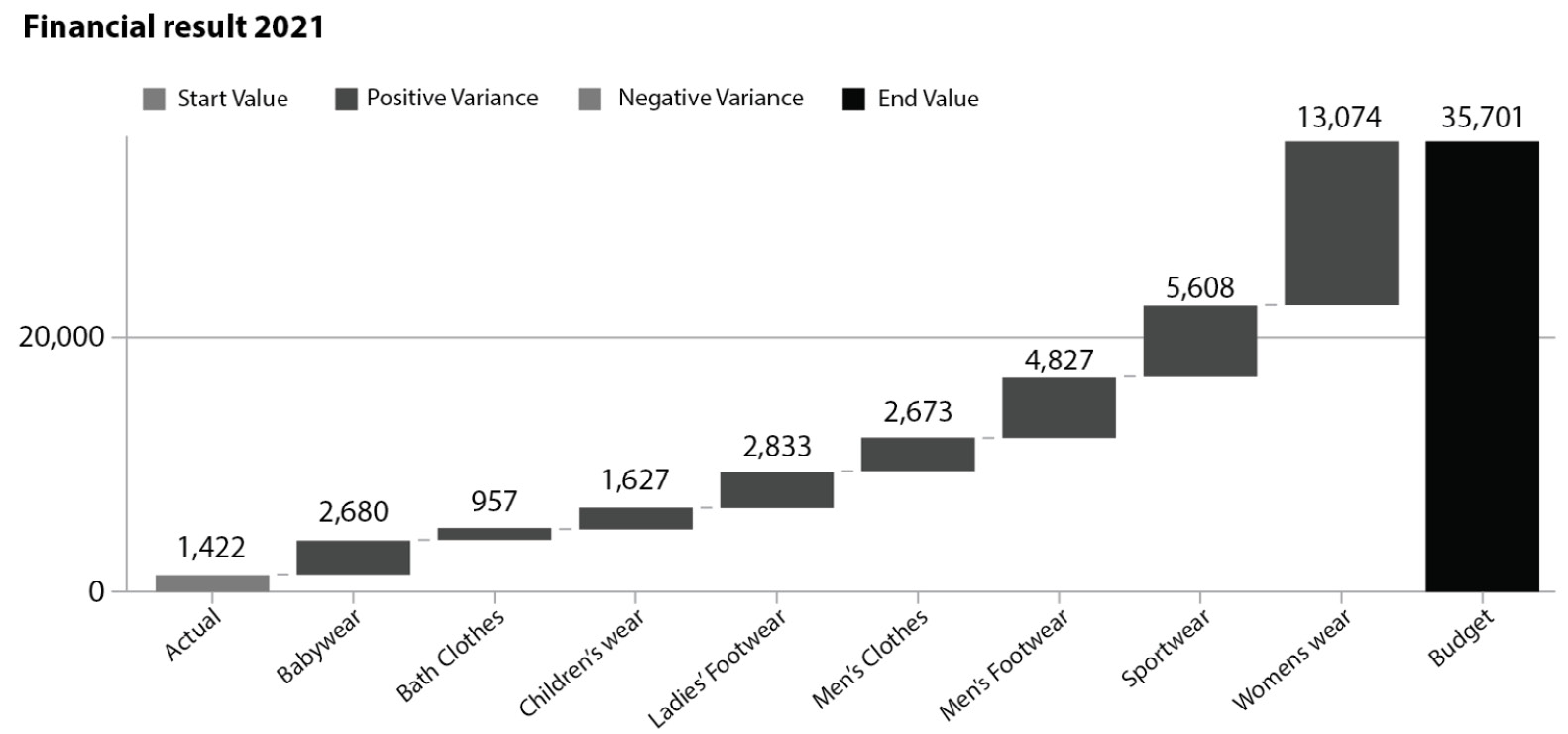
Figure 7.42 – An example of a waterfall chart
It is particularly important, for example, to see how a value at the beginning of the year is changed by monthly positive and negative values. You can display negative or positive values by coding the floating sections. When used correctly, waterfall charts are incredibly useful for displaying changes in financial or other data.
Here are some examples of when to use waterfall charts:
- A waterfall chart can be used to display an organization’s net income, as well as rises, declines, revenue, and expenses over a quarterly or yearly timeframe
- A waterfall chart can also be used to represent cumulative product sales over a year as well as an annual total
With this chart, we bring this section on more advanced sorts of visualizations to a close. We are certain that there are more visualizations than those discussed in this chapter. As previously said, there are numerous other sorts of charts that may be created using various methodologies or computer languages. From our perspective, the sorts of visualizations that we have shown you are the most commonly used in our professional lives.
In the final section, we have an intermezzo from a global corporation called AmbaFlex. AmbaFlex has created an incredible spiral conveying technique for material handling systems. These systems are utilized in logistics, packaging, bottling, and printing. This one-of-a-kind approach is employed in a variety of businesses and is particularly well known for the vertical transportation of goods and other packaged products.
Intermezzo – AmbaFlex and its data and analytics journey
We chatted with AmbaFlex’s Business Intelligence Solutions Manager, Bart Koning. We’ve talked about data before, including how to work with visualizations and data literacy. Bart was unambiguous when asked how he assisted his business users to grow and function using the dashboard that his team provided. It was critical to teach the staff how to deal with data and how to use the dashboards and reports that were developed. Simply throwing them over a wall and wishing them luck does not work! How do you ensure that the tool is set up so that people can work with it and find their way around it? It must be done in such a way that the user is proud of what they do, what they do with it, what they see, and how they form their activities. And now, the team is using this dashboard in talks and presentations, which is a fantastic advancement.
Data utilization has expanded, and insights must be available at all times and in all places. Some people may not use the insights daily, but they do use the environmental data weekly. Nonetheless, it has been a long path to this point, and it has not always been simple. Growth has arrived, and users have an increasing number of questions, and they truly expect this solution to address all of them. When the moment arrives and users understand how to find the information, we have the buzz. The “Aha, oh wow!” moments are similar to the opening of a flower. That is incredible and the time to excel in a professional manner of working!
Bart organized numerous training courses, such as a data visualization workshop for the entire data and analytics team, to teach them the fundamentals of data visualization. There is also an “AmbaAcademy,” where users can access online tutorials and physical workshops on how to use the dashboards and reports regularly. In addition, Bart organizes inspiration sessions to answer the topic of how you may use this instrument most effectively. The nice thing here is that dashboard viewers may also provide input on dashboards and reports. According to Bart, there is a significant difference in dealing with data and analytics between various professions (user groups) such as HRM, ERP, and CRM. Most supporting departments are increasingly process-focused, and data and analytics is the shell that holds everything together.
In response to this topic, what are your favorite kinds of visualizations?
Bart made it quite clear that he has a favorite: the bullet chart. A bullet chart provides a wealth of information about the current situation in comparison to the previous state. It also specifies the objective or bandwidth you wish to attain with your team or organization. A bullet chart can provide insights on the spot and takes up less space than a gauge meter. As Bart points out, while driving your car, you will have all of the relevant information in front of you. It’s not much, but it gets you from point A to point B. A bullet chart provides a lot of useful information in a single glance and saves space on your dashboards. Bart suggests altering the use of the bullet chart between current and expected situations, so long as it is extremely apparent to the user what they are looking for. As a result, the bullet chart is the most commonly used.
To conclude this section, we’ve discussed several types of visualizations and how to use them. A beautiful story has been told by AmbaFlex’s Business Intelligence Solutions Manager Bart Koning, and why he loves to use bullet charts. But when we want to fuel our visualizations even more, we can use a technique called contextual analytics. In the next section, we will look at this in a bit more detail.
Addressing contextual analysis
When it comes to data visualization, we’ve dealt with a lot of fundamentals. We’ve learned that context is essential for understanding what your image is about. Context is sometimes overlooked or not included in visualizations, leaving us to assume what the visualization is about. Context can take many forms, and this section will discuss how to provide context to your visualizations to help your readers grasp the information you want to convey for their data-informed decision-making.
There are various ways to provide context to your reports or dashboards, including employing text components (that is the simplest way). However, including more contextual information in your visualizations is also an option. Figure 7.43 shows an example of adding context to a graph so that elementary time intervals, or timestamps, contain contextual information. In this particular visualization, we have the clinical trials data that we collected from https://www.clinicaltrials.gov/ and we’ve added some interesting time stamps to give our readers more information:
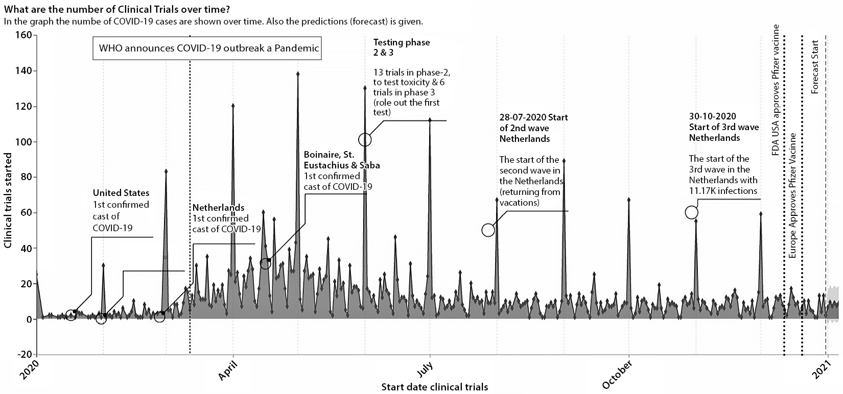
Figure 7.43 – Adding context to your charts
By using contextual elements, it helps our readers understand when peaks occur, or when important occurrences took place. We have added the important start of the COVID-19 pandemic and the moment the Food and Drug Administration (FDA) and European Medicines Agency (EMA) approved the various vaccines that were developed.
Another way to add extra contextual information is to use titles, subtitles, and footers. Figure 7.44 shows an example of this:
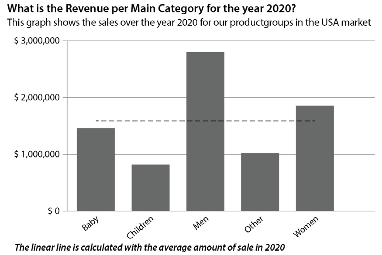
Figure 7.44 – An example of using a title, subtitle, and footer to give context
Here, we utilize the title for the business question we want to answer and then put that extra information in the subtitle. Alternatively, we can explain the goal colors, empty fields, and so on here. Then, by including extra information in the footer, the viewer of your visualization will have a better understanding of the visualization. And, with today’s tools, we can even add calculations as necessary.
To summarize this section, every reader must understand how to read a visualization and the message that we wish to convey for their data-informed decision-making. You can comprehend what they are looking at and how to interpret the dashboards and reports by including context. You can do so in a simple and meaningful way.
Summary
After reading this chapter, you should have a better grasp of data visualization and the basic rules to follow when developing dashboards and reports. This skill set allows you to develop better visualizations and read charts. We’ve learned that charts may readily be used to tell lies and that we should always consider the context of a representation. In this way, we can identify and question the good, terrible, and inaccurate visualizations.
Then, we discussed the most commonly used data visualizations and provided some examples of how to apply them. We’ve included some noteworthy success stories in this chapter and finished with some of our favorite advanced visualizations.
We concluded with a fantastic tale of one of our clients who went on that path a long time ago and learned to work with data insights. In addition, we discovered how they were able to be successful in their data and analytics journey.
In the next chapter, we’ll discuss questioning and its relationship to data literacy and data-informed decision-making. The next chapter will guide you through the many stages of questioning, as well as cover some best practices that you could use.