
2
Unfolding Your Data Journey
Data is everywhere, both within and outside of your organization, and as we discussed in Chapter 1, The Beginning – The Flow of Data, it is growing rapidly. Because of recent global crises, the worlds digital transformation has advanced several years in a short period of time.. From this vantage point, we can see that organizations are leveraging the value of data more than ever before to strengthen their market position, increase profitability, reduce costs, and so on.
The structure of your organization, as well as the processes and systems in place, determines how you can make the best use of data within it. We know from experience that data and the information generated from that data can help your organization be more effective and efficient. The road to a data and analytics transformation can be started by properly applying those insights. In this manner, you will be able to develop into a high-performing organization that makes use of data and analytics.
To be able to properly turn data into actionable insights, individuals need to be able to leverage multiple steps in analytics maturity: descriptive, diagnostic, predictive, prescriptive, and semantic. This chapter will introduce those steps with practical examples of what insights you can get from each step in the process.
In this chapter, we will discuss the following topics:
- Growing toward data and analytics maturity
- Descriptive analyses and the data path to maturity
- Understanding diagnostic analysis
- Understanding predictive analysis
- Understanding prescriptive analysis
- Can data save lives? A success story
Growing toward data and analytics maturity
When organizations can provide context and meaning to their internal and external data, they can put data in place for data-informed decision-making.
With 1.7 megabytes per second per person, our data mountain is growing (Chapter 1, The Beginning – The Flow of Data). According to research (statista.com), the world will generate more than 180 zettabytes of digital data by 2025. We have added a table so that you are able to understand the data growth from kilobyte to yottabyte:
|
Name |
Value in bytes |
|
Kilobyte (KB) |
1,000 |
|
Megabyte (MB) |
1,000,000 |
|
Gigabyte (GB) |
1,000,000,000 |
|
Terabyte (TB) |
1,000,000,000,000 |
|
Petabyte (PT) |
1,000,000,000,000,000 |
|
Exabyte (EB) |
1,000,000,000,000,000,000 |
|
Zettabyte (ZB) |
1,000,000,000,000,000,000,000 |
|
Yottabyte (YB) |
1,000,000,000,000,000,000,000,000 |
Figure 2.1 – Understanding data growth
The growth was higher than previously expected, caused by the increased demand due to the COVID-19 pandemic; more people worked and studied from home and used home entertainment options more often.
Having a large amount of data to use is not a goal in and of itself; the ultimate goal is to use that data and get that information from the data mountain to make data-informed decisions.
In reality, the journey is frequently different; we see companies begin with business intelligence (BI) without a plan and fail, or get stuck and remain at a basic level. Sometimes it’s even worse, and organizations begin with advanced analytics, or they fly in a team of data scientists, while others have no idea what is required, what it is, or whether the organizational objectives are measurable or defined.
To start with data and generate valuable insights is a difficult step; it all begins with some intriguing questions:
- What resources do we have?
- Should we use Excel or invest in tools?
- What data is available, and how can we use it?
- Where can I find the meaning of the data that will be used?
- What do I want to create or build?
Data projects (Chapter 13, Managing Data and Analytics Projects) include a strategic component as well as a technical component (Chapter 6, Aligning with Organizational Goals). Data and analytics projects, as with other maturity models, can be divided into several levels. There are numerous models, and we use a combination of them to highlight the differences in the following diagram to explain the path to analytical maturity:
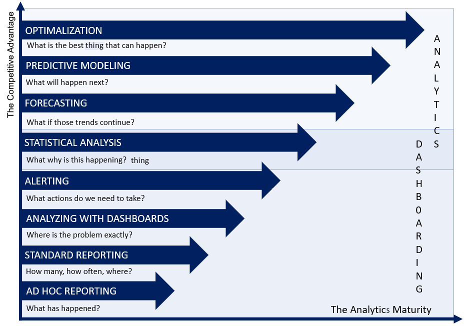
Figure 2.2 – Introducing analytical maturity
On the vertical axis, we note that working with various aspects of data and analytics can lead to a certain level of competitive advantage. However, all must grow, specifically in terms of analytics maturity as shown on the horizontal axis.
To begin, some level of BI maturity is required before investing in the use of advanced analytics or data science. It is necessary to investigate the commercial value of that journey toward artificial intelligence (AI). Do organizations do this solely because others do it? This last approach is just like children often trying to get into the same streams or fields/classes in their schools only because their friends have opted for that class without knowing or understanding their own choices, skills, and aptitudes.
Descriptive analyses and the data path to maturity
To be truly transformative and use data and analytics throughout your organization, you must prioritize the following factors:
- Your organization’s data and analytics ambitions, which will define your analytical maturity and allow you to be transformational
- Your organizational data and analytics goals must be aligned in order to progress from a transactional focus to adding business value to your organization
We will walk you through the maturity model’s various stages using Figure 2.3. Each step has its own power, explanation, but—most importantly—actions and peculiarities, and the diagram represents the steps that you should take as a person or as an organization to reach a higher level of maturity, advancing in data and analytics.
You’ll notice that we distinguish two areas, and we can define more as our field of work in data and analytics grows and changes on a daily basis. However, for the purposes of this book, we will limit ourselves to BI (looking backward with the help of your data) and the advanced things we can do with data and analytics, such as (advanced) analytics and data and science:
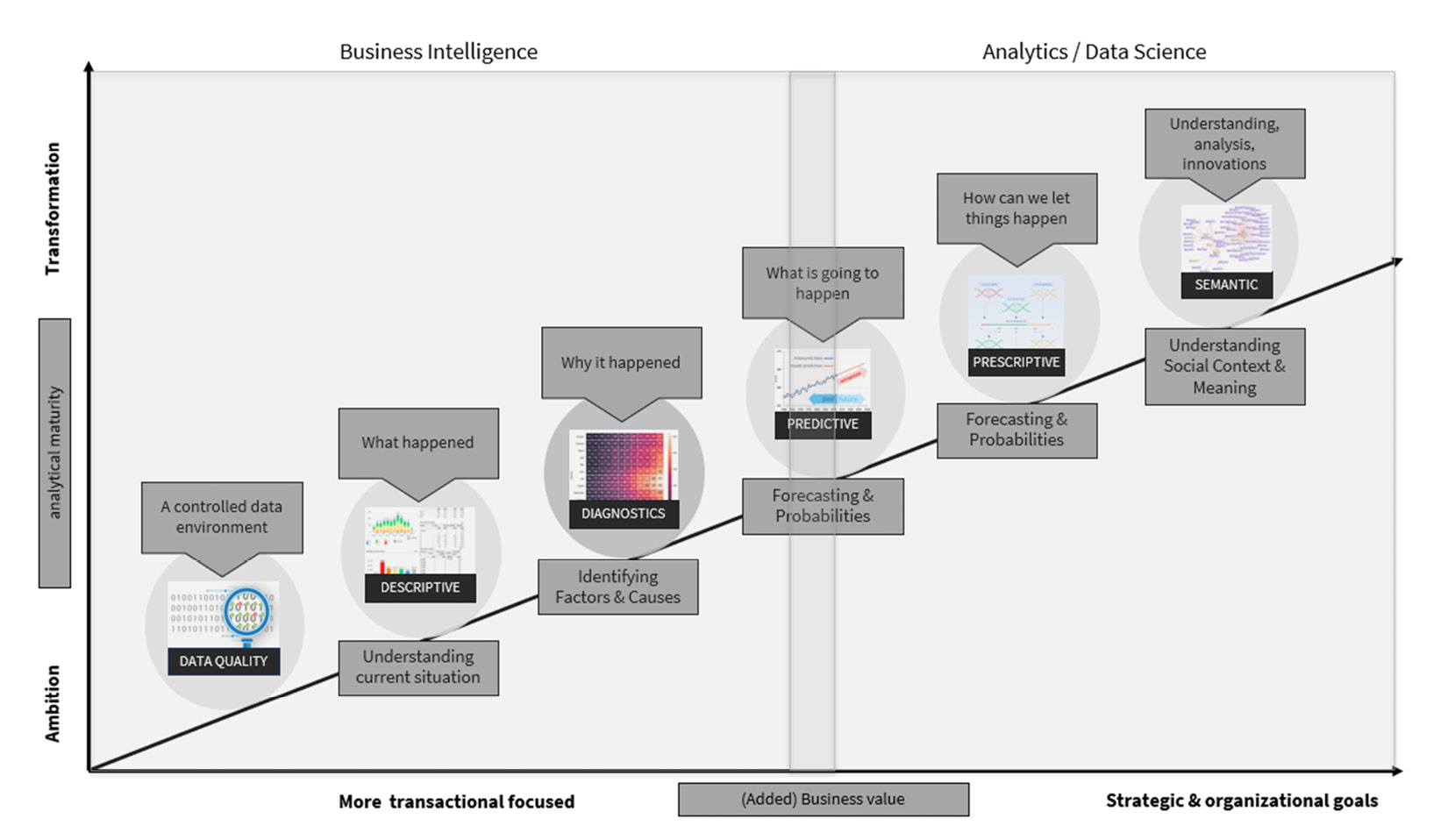
Figure 2.3 – The different phases in the world of data and analytics
In the following paragraphs, we will walk you through the various steps and describe the typical data analytics questions that arise during those phases. This way, you’ll be able to understand the various types of questions you’d like to answer for your data-driven decision-making processes.
Understanding descriptive analysis
Within organizations (and even within departments or teams), it usually begins with basic questions such as the following:
- What is our debtors’ payment behavior (how long is an invoice open)?
- When and how often are medicines registered (or dispensed)?
- How many people are admitted to the intensive care unit (ICU) and how many to the nursing wards?
- How much did I sell in the last month?
- What is the total number of incidents reported to our service desk?
- How many invoices have we sent in the last month, how much is still owed to our debtors, and what is the total amount owed?
These are simple but valid questions for any organization embarking on its journey into the wonderful world of BI. This step is also known as descriptive analytics or descriptive analyses, and the central questions are these: What happened? How did we do in the previous month? Have we sold enough items, or have we converted enough?
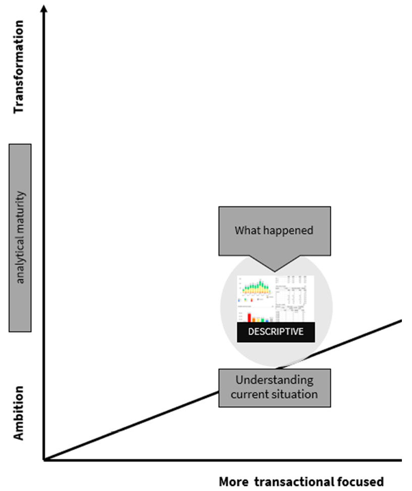
Figure 2.4 – The first step of the data journey: the phase of descriptive analytics
Most organizations begin with simple tools to visualize these fundamental questions, which is entirely legitimate. Although this is the most basic form of BI, now is the time to plan ahead of time, before a maze of reports supported by the most complex macros or coding emerges (and it is eventually no longer manageable).
During this phase, we must master the differences in terms that we will be able to use when analyzing or developing our first insights:
- Variable: This is a characteristic number or quantity that can be counted or measured. A characteristic or number is also known as a data item. Some examples are age, gender, business income, expenses, country of birth, class grades, eye color, and vehicle type.
- Mean: Also known as the average of all numbers in a given set of numbers.
- Median: The median is the midpoint of a sorted list of numbers in a set. If there are a lot of outliers, this median is a better description of the data.
- Mode: The mode is the most common number in a set of numbers.
- Outliers: An outlier is a number that lies outside of the majority of the other numbers in a set.
- Aggregations: Aggregated data is data that has been summarized using a method such as mean, median, mode, sum, and so on. It is the gathering of several things into a group.
When we look at the possible aggregations in a visualization, an important thing to remember here is that we must take care of the aggregations and thoroughly understand them. During the first step of the data journey, we will go over some examples to give you more insight into the most commonly used aggregations.
The first example is displayed in Figure 2.5, where we describe the aggregation average:
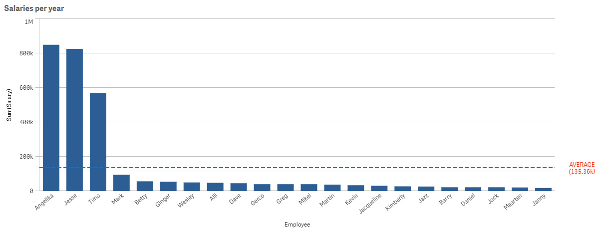
Figure 2.5 – Describing the aggregation: average
When we want to look into a company’s annual salaries to see what we could ask if we wanted to work for them, if we want to calculate the mean or average, we must be aware of the differences with the outliers. In our example, we calculated the average by adding all of the values in our list (including the higher salaries) and dividing it by the number of occurrences. In this case, we had a total of $2.975 million, which we divided by the number of occurrences, 22 in this case, to get an average salary of 135.36K.
That is an excellent salary; we can live with it. However, if we are not aware of the outliers in higher salaries, we may be easily duped. So, we’ll go a step further and use another aggregation, the median, which is the number in the middle of a sorted list of numbers. In Figure 2.6, we display the value of the aggregation median:
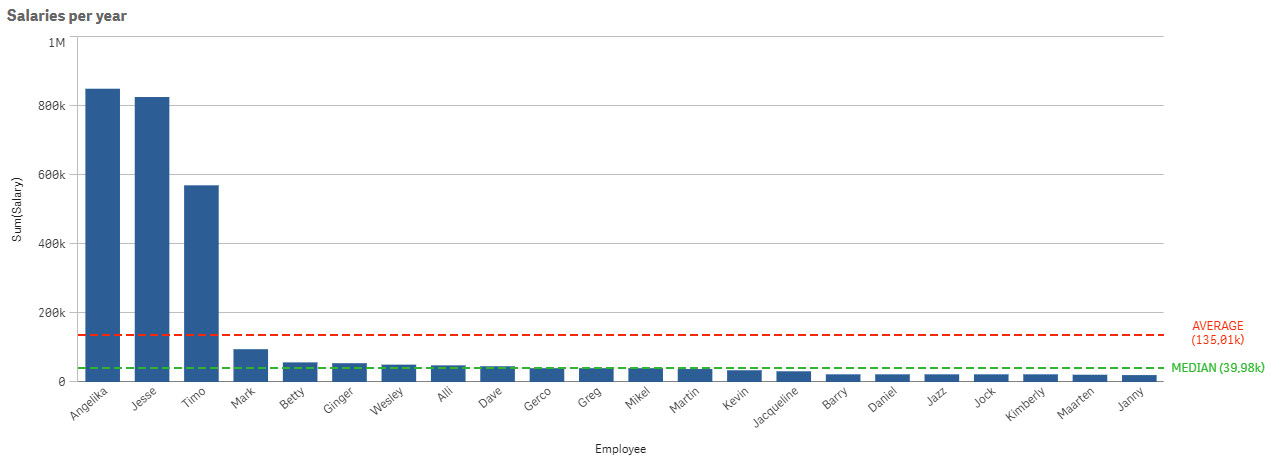
Figure 2.6 – Describing the aggregation: median
When we look at the median salary, we can see that it is set at 39.98K per year, which is way lower than the company’s average salary. This is shown in Figure 2.6.
The mode, or the most common number in a set of numbers, is the third aggregation. In Figure 2.7, the third aggregation, mode, is displayed, and in one blink of an eye, we can see the different outcomes of those three types of aggregations:

Figure 2.7 – Describing the aggregation: mode
Even the most common year salary is 22.14K, which is a completely different number than the median (the middle) or average (the total sum divided by the number of occurrences).
After showing you those three different aggregations, you will have noticed the variance in outcomes. This is an important lesson—you always have to take care of the type of aggregation that you want to use. The next important element is outliers, which we will discuss in the next section and explain with an example displayed in Figure 2.8.
Outliers are individual values that differ significantly from the majority of the other values in a set. Identifying outliers is always one of the first things a person should look for when trying to get a sense of the data. The definition of an outlier is somewhat subjective. Many people define an outlier as any data point that is three standard deviations or more away from the dataset’s mean. A standard deviation indicates the degree of dispersion in a certain dataset. It indicates how much the observed values deviate from the mean (or the average). As an example, suppose we have collected the ages of five students. The standard deviation then gives a picture of the age differences between these five students. A small standard deviation indicates that the students come from the same (age) group.
Early identification allows you to understand what they are, investigate why they are outliers, and then decide whether or not to exclude them from the analysis. However, it can also assist you in identifying elements that you can address to solve 80% of your problems (Pareto analysis).
Figure 2.8 depicts a debt collection dashboard, where we used a visualization known as a distribution plot. It’s simple to spot an outlier with this type of visualization. In our example, a customer has 44 outstanding invoices totaling €2,281,200.00. We can easily find and solve a problem with this debtor if we can find those types of outliers:
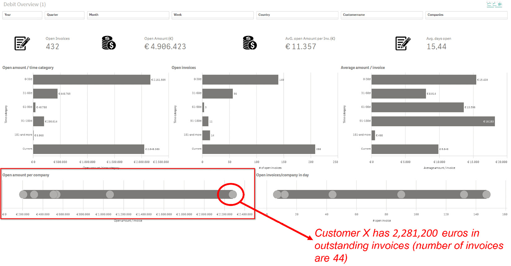
Figure 2.8 – The usage of a distribution plot to find outliers
In this section, we discussed aggregations such as mean, average, median, mode, and outliers. What we’ve learned from those examples is that we should be aware of the differences in how those values are calculated, as well as how we can easily spot outliers that we can focus on to solve problems or find the cause of those outliers.
Identifying qualitative or quantitative data
Quantitative implies something that is measurable and can be counted in numerical terms (quantity—something you can count or measure). Qualitative data cannot be counted or measured, and it is not numerical (quality—categorical data that cannot be counted or measured).
In fact, data (or variables) has different types that we must consider; when we begin analyzing, we must be aware of those different data types and how to use them.
Let’s have a visualization of how data can be branched into qualitative and quantitative categories and further categorized into nominal, ordinal, interval, and so on:
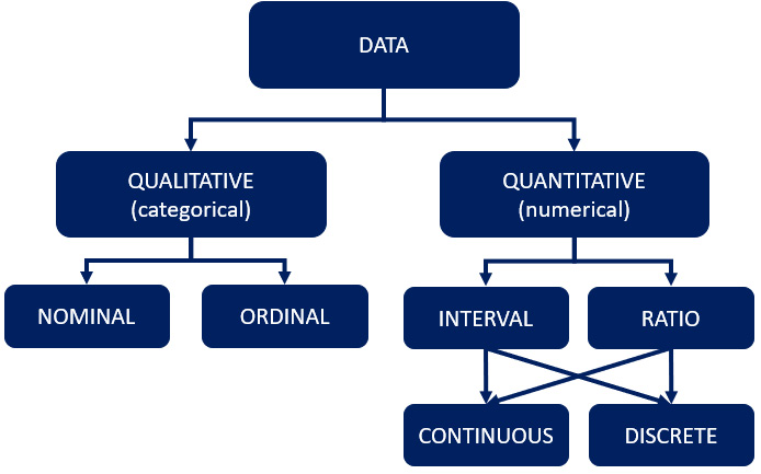
Figure 2.9 – The different forms of data types
Let’s go through each category present in the preceding diagram:
- Qualitative data: Examples of qualitative data include gender, sales region, marketing channel, and other things that can be classified or divided into groups or categories.
- Quantitative data: Examples of quantitative data include height, weight, age, and other numerically measurable items.
- Nominal data: This is qualitative data that does not have a sense of sequential order, such as gender, car brands, fruit types, people’s names, nationalities, and so on.
- Ordinal data: This is qualitative data with a sense of order. A good mnemonic for ordinal data is to remember that ordinal sounds like order, and the order of the variables (or data) is important. Consider the following examples: one to five, from good to best, or small, medium, to large.
- Interval data: Interval data is useful and enjoyable because it considers both the order and the difference between your variables. Interval data is quantitative data that has no absolute zero (the lack of absolute point zero makes comparisons of direct magnitudes impossible). You can add and subtract from interval data, but not multiply or divide it—temperatures in °C, for example. 20°C is warmer than 10°C, and the difference is 10 degrees. The angle between 10 and 0 is also 10 degrees.
To remember the difference between the meanings of interval, consider interval as the space between. So, you’re concerned not only with the order of variables but also with the values in between them.
- Ratio data: This is a type of quantitative data that has an absolute zero. You can multiply and divide ratio data, in addition to adding and subtracting. Height, for example, can be measured in centimeters, meters, or inches of feet. There is no such thing as a negative height.
- Continuous data: This is quantitative data that is not limited to a single value, as discrete data is. Continuous data can be divided and measured to as many decimal places as desired. A person’s height, for example, is classified as continuous data because a person can be 5 feet and 5 inches tall, as can the weight of a car, the temperature, or the speed of an airplane.
- Discrete data: Discrete data exists when values in a dataset are countable and can only take certain values—for instance, the number of students in a class, the number of fingers on your right hand, the number of players needed in a team, the number of children you have, and so on.
Along with understanding and using the right data terminology, here’s an example showing the importance of using the right data tools.
Intermezzo – Excel as a source can go wrong!
Within the various organizations that we worked for, we unfortunately had to conclude that Excel reports often hides the truth. We saw also that every version of an Excel spreadsheet had its own truth, and that different versions of that “so-called truth” were stored between several departments and teams in several folders. Another situation that we noticed is that organizations create sources (in Excel format) that are used as a foundation for dashboards and reports. It often does not hurt to use these in combination with the original sources, but if Excel is your only source and heavy macros and multiple versions are often used, this could be a huge problem.
For an organization where we were allowed to do a fantastic project to develop and further shape reports, fortunately, we were able to take care of this with a state-of-the-art BI solution. However, what outlined our surprise was that we were (unfortunately) not allowed to link to the original sources but had to link to their own developed (with complex macros) Excel files.
Understandably, the project ultimately went nowhere. If we reported an error, it took days before you could discover what was going on. After all, the error could come from anywhere. But experience also taught us that those types of reports should never contain Excel as a source. Ultimately, all errors reported were caused by the administrator of these Excel spreadsheets. We’d learned an expensive lesson, that’s for sure, and we finally threw the towel in the corner (saying no is also a lesson).
Understanding diagnostic analysis
The exciting part of going on that data journey is when your curiosity kicks in and you start asking questions such as why? This means you are already one step further along your journey. In his book Turning Data Into Wisdom, Kevin Hanegan (coauthor of this book) describes the step for this approach as exploratory analysis. All of this implies that you want to find out why things happened.
We can see that curiosity has arisen, and we are eager to learn what has caused the differences in figures and numbers. We begin by asking questions such as the following:
- Why are the numbers the way they are now? Why are sales this month lower (or higher) than last month?
- Why did department X convert the most while department Y lagged?
- Why did we sell fewer products C this month than last month?
- What are the causes of these statistics, and why is there more absenteeism due to illness?
- Why is department X’s absenteeism higher than department A’s?
- Why are these medications prescribed for these conditions?
- Why is there an increase in visits to the emergency room (or the doctor’s office), and what are the underlying causes?
- Why are the numbers of COVID-19 cases higher in certain areas when compared?
When you begin looking for causal factors and the consequences of those factors, your organization or you as an individual are already moving up the data and analytics ladder. This is referred to as diagnostic analytics or diagnostic analysis.
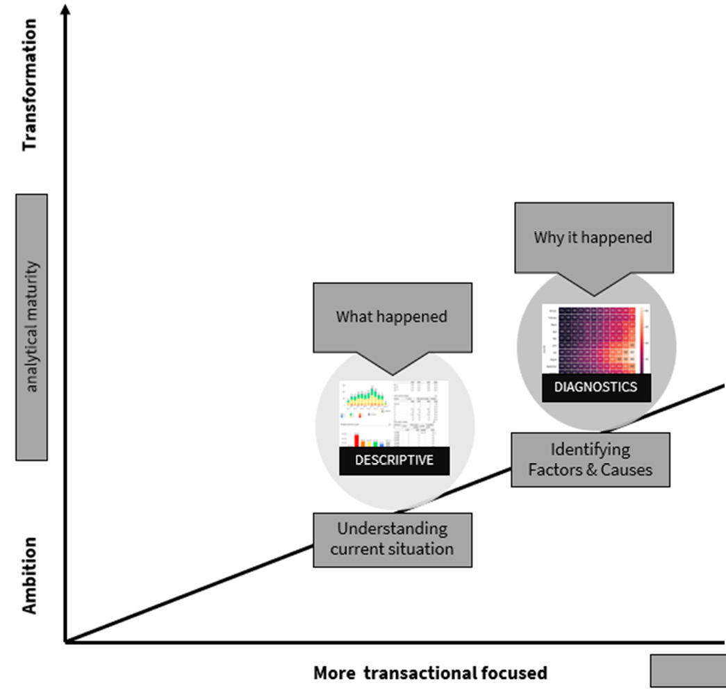
Figure 2.10 – Exploratory analysis: the second step of your data journey – the phase of diagnostic analysis
The first step of descriptive analytics focuses on measures of each variable (sum, count, average, and so on) of data that are independent of one another. Diagnostic analytics has developed the necessary curiosity to examine all of your data and create insights by utilizing your analytics skills to determine all aspects of data and how they relate to one another. While descriptive analysis helps to explain what happened, diagnostic analysis allows us to explain why it happened.
The presence of ambassadors with statistical and/or analytical skills within an organization drives this step. It is critical that people are guided by the hand during this phase and learn to analyze the results so that they can make better decisions supported by data—as we call it in this book, data-informed decision-making. This is a difficult task for many individuals and organizations.
The key components of the diagnostic phase are the ability to visualize your data using various types of visualizations so that you can investigate patterns, anomalies, and, of course, outliers, and determine whether there are any kind of relationships between the variables’ outcomes in the visualized data.
Intermezzo – proud!
In a somewhat larger organization, standard reports were initially made for HR, facility services, and the IT department. These three departments made their own reports and had one person per department who was working on those dashboards and reports. What struck us at that time was that the external information provision was actually state of the art, but that the internal (staff) information provision still left something to be desired.
The buzz started when we began with a small project to help the staff of several internal service desks find out which servers with all kinds of communicational connections between each other had problems and reported incidents (classified as Critical, High, Medium, or Low) and the service requests. Every incident or service request needed to be registered in the source system and needed to be handled within the agreed service-level agreement (SLA) lead time.
All desks needed to report on a monthly basis the number of incidents, the number of service requests, and the lead time to the management team. Every team lead was working as a siloed team, and every team was creating monthly reports on its own and ultimately delivering this report on the 5th day of the new month to the controller of the operations office. They would then combine all separate reports, perform their own analysis, and create a management report. This report was delivered on the 10th day of the new month.
When the manager of the team explained his strategic objectives and his bigger vision, to recognize an incident before it occurred, we started out with a measured plan and built the first interactive dashboard for the management team. From this point in time, we were able to have the complete report on the 1st of the new month. A buzz was created and more questions arose.
The next report was a report to manage third-line suppliers. The lead time for those types of dispatched incidents or requests was mostly too long and the department wasn’t able to discuss the open cases. With a newly created report, we were not only able to discuss the lead time of our third-line incidents or requests but we were also able to keep our suppliers to the agreed SLA handling times. Identifying “why” questions and being able to actually analyze and answer them, we were able to save more than €150K in only 1 year.
During the first two phases of descriptive and diagnostic analysis, we will discover that a data quality issue is present. Also, organizational definitions of certain calculations or field definitions are lacking.
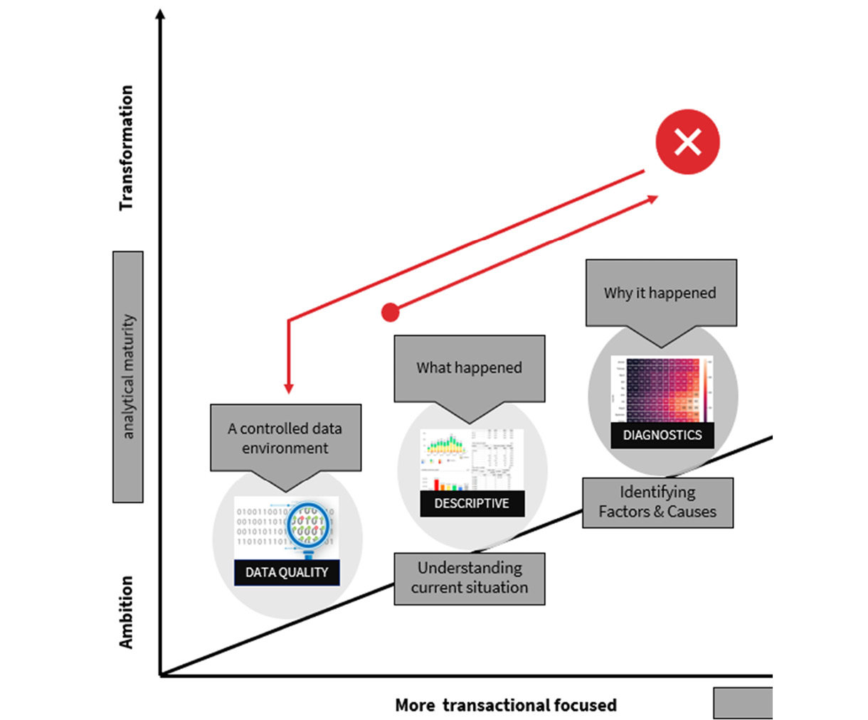
Figure 2.11 – The third step of your data journey: the discovery of data quality issues
Examples here can be how we define and calculate revenue or margins. Fortunately, data management or data governance is increasingly embraced by various types of organizations, just like the role of a chief data officer (CDO), which we discuss in Chapter 5, Managing Your Data Environment.
After all, if we go back to Chapter 1, The Beginning – The Flow of Data (Figure 1.12), we discussed the different disciplines that should have a place within an organization.
Incidentally, it is a separate field of work. In Chapter 5, Managing Your Data Environment, we will discuss the elements of data management and how to take care of data quality.
Nonetheless, it is prudent to consider and manage data management or data quality. From a fundamental standpoint, you can begin by addressing and displaying data quality issues in your initial dashboards and reports.
A good example is the story (intermezzo) of one of our projects, the Data Prewashing Program.
Intermezzo – the Data Prewashing Program
During various projects within different organizations, unfortunately, we had to conclude that data quality often leaves something to be desired. The frightening fact is that organizations often have not even discovered this themselves. An example is the story of an organization where we had to work on certain visualizations on top of their core business application. The project team set off energetically, and the first results were visible within a short amount of time.
Very quickly, it turned out that more than 75% of the dataset was not complete to enable us to measure the most important business objective (the number of requests compared to a certain target amount): the “reasons” for submitting the request was not filled in the source system. Well, how can you measure then, or how should we visualize this?
The first step was to go back to our customer and ask what they suggested we should do. We agreed to create a gap in time, measure from a certain point in time, and leave out the data before that point in time. Fortunately, that concept gave us better measures, but it turned out that just under 25% of the specific field was not filled.
As a sidestep, a list was made with the people who recorded this data and we also investigated whether this field was “mandatory” or a free field within the registration system. As a project team, we then entered into a discussion with the client and discussed the things we found out. The client’s phrase “Oh, it is often the same person who makes a mistake” was a good opening to discuss the first steps for increasing the data quality.
We then indicated that we wanted to use the so-called Data Prewashing Program so that the data entry and storage of elementary fields could be controlled on a daily basis, and in this way, the data quality could be improved.
The Data Prewashing Program is nothing more than a list that you provide daily with missing fields and with which you can control the data entry of certain fields. With current technologies, you are able to completely automate this, although personally managing the data entry and storage of data will always be part of it and is the task of the data owners, team leaders, or managers.
For example, we have already been able to help a number of customers with setting up the Data Prewashing Program, and messages are sent on a daily or hourly basis to people who make a mistake when data is entered in “mandatory fields” of a transactional system.
Data quality must be addressed and managed, but as previously stated, we are able to do so in simple steps. Here are the simplest ways to begin improving your data quality:
- Discuss the fundamental fields that require good data quality for measures/KPIs, and so on.
- Make a list (table) of those elementary fields and display the bad or empty data fields in this table. Include this list in your solution.
- Go over the list with your customer and set up a feedback loop through them.
- Provide a tip... make the field mandatory through their software supplier.
In Chapter 5, Managing Your Data Environment, we will go over the data management process in detail. After you have taken care of the fundamentals of data quality, your curiosity will grow exponentially, and the world of predictive measuring will be open to you, and your first questions—such as what is likely to happen—will arise.
Understanding predictive analytics
Predictive analytics or predictive analysis is the next stage of analytics. This is, in our opinion, one of the most enjoyable and amazing phases of any project on which we have worked.
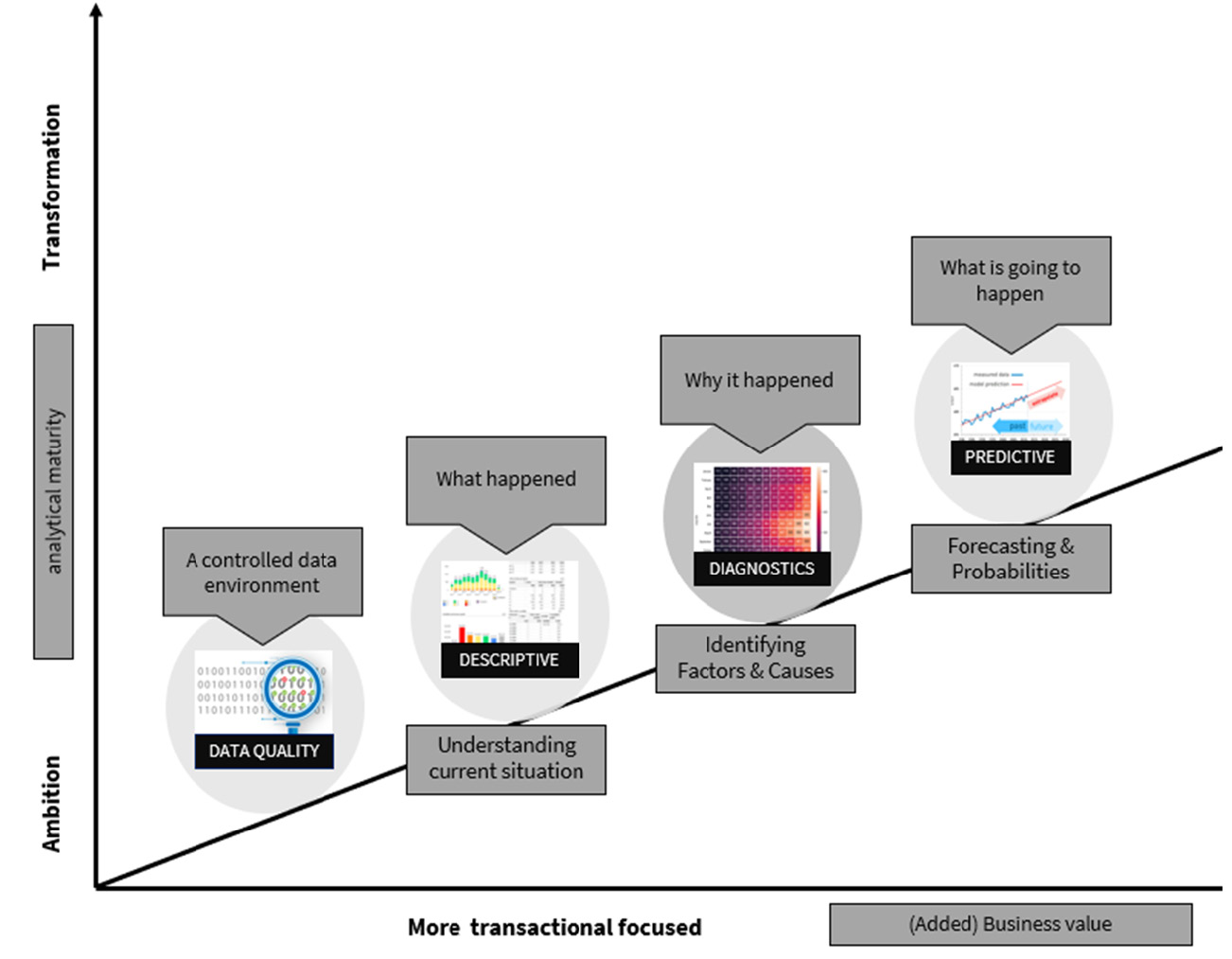
Figure 2.12 – The fourth step of your data journey: the phase of predictive analytics
When a solid foundation for data management has been established, achieving greater governance becomes possible. The next step is to arouse curiosity and cast a glimpse into the future. Predictive analysis is the study of historical data to forecast future behavior. Predictive analysis necessitates the use of various techniques, models, and even behavior. However, when done correctly, it can assist an organization in becoming more proactive. We know from experience that 80% of predictive questions are time-related when we look at predictive use cases (over time, next year, next month, and so on).
The following questions become current:
- What is the expected revenue next year (next quarter, next month)?
- What is the expectation of the number of customers?
- How many products will we sell if we grow by 10%?
- How many patients can we expect (taking into account the population growth or decrease) in the emergency room or GP’s surgery?
- What will be the increase in drug use, especially aimed at the modern addiction of opiate use, if we continue on this path?
- Can we stop fraud on the doorstep? In other words, can we identify which applications are a potential risk?
Figure 2.13 depicts an example of a forecast that includes the number of possible requests as well as the expected numbers (note: a prediction is always wrong, as we can’t predict with 100% assurance, as there are many factors that influence that number):
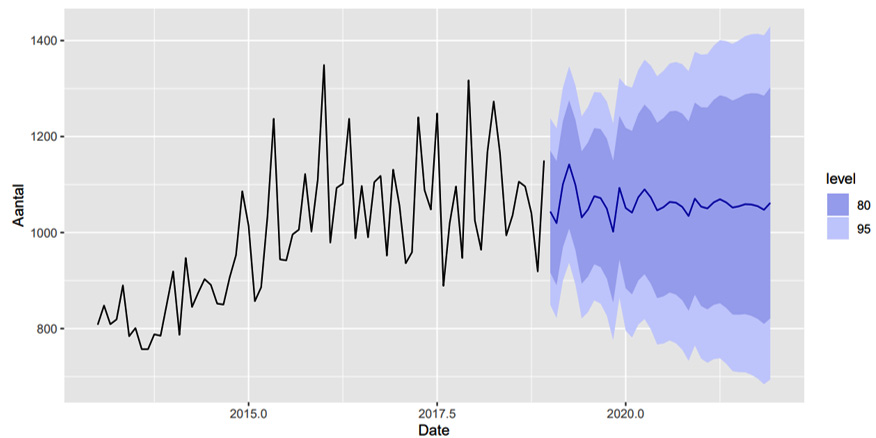
Figure 2.13 – An example of a forecast with the number of possible requests with the expected numbers (note: a prediction is always wrong)
Many inspiring examples of predictive analytics can be found on our path to wisdom and on the ever-expanding internet. We’ve selected two of them:
- Sometimes, we are able to find connections in data where you would not expect them. For example, the tax authorities discovered in the past that there was a greater chance that someone committed tax fraud within a certain series of numbers in their social security number. At first, this seemed to be based on nothing, but a thorough analysis revealed that this connection could be explained: the social security numbers were distributed in a specific district in 1975. It turned out that the social security numbers with an increased risk of tax fraud belonged to people who lived in a residential villa area in 1975. This article was found on https://biplatform.nl/517083/predictive-analytics-vijf-inspirerende-voorbeelden.html (please use Google translate to read in English).
- Police forces in the United States and the United Kingdom use predictive analytics to predict crimes or generate risk reports. In the United States, all types of sensors (such as cameras) are used, as well as reports of crimes and messages from people suspected of being criminals. All of this data is combined, and the control rooms indicate which risk areas exist in (near) real time. As a result, the police can try to predict where a crime will occur, allowing for more targeted efforts in high-risk neighborhoods.
Intermezzo – adding predictive value to data
Another inspiring example is predicting the number of visitors in emergency care. For a number of healthcare organizations, we did some amazing projects to give some predictive analysis outcomes. Of course, you have to learn from the past in order to predict the future (and again, predictions are always wrong). By combining open data such as data from the Central Bureau of Statistics, weather data, football team schedules data, and so on, it was easy to predict how many visitors would come to the emergency post (per coming year, quarterly, month, or week). This input was needed, among other things, for application to the various budgets required.
In addition, we were presented with a number of hypothetical questions, such as: does the number of visits to the emergency post increase when it snows? Or if temperatures are below 0, does the number of visits increase? Another hypothesis was: if football team AZ or AJAX is playing, there are fewer visits or calls to the emergency dispatch center of the GP post.
We first learned about the system based on past results (and luckily, we had enough data to use) and were able to predict 95% accurately what the expected growth or decrease in the number of visitors to the emergency post would be. We were even able to predict the growth or decline per age group. Finally, we were, of course, able to answer the hypothetical questions.
Fortunately, we can share one of the answers: the football matches of AZ or AJAX have absolutely no influence on the visits or calls to the emergency dispatch center of the GP post.
In the end, when you eventually get a call from the clients from those GP posts and you get the comment that the predictions were spot on and the client actually can do something with the insights, then that really is the best compliment you can get!
Understanding prescriptive analytics
Prescriptive analytics is a more advanced level of analytics. During this stage, you will not only predict what will happen in the near future but also what you will need to do to make that future as good as possible. During this phase, organizations attempt to answer the question, How can we ensure a particular outcome? This phase goes beyond the realization of predictions and can forecast a number of measures to capitalize on the previous phase’s results (forecasting).
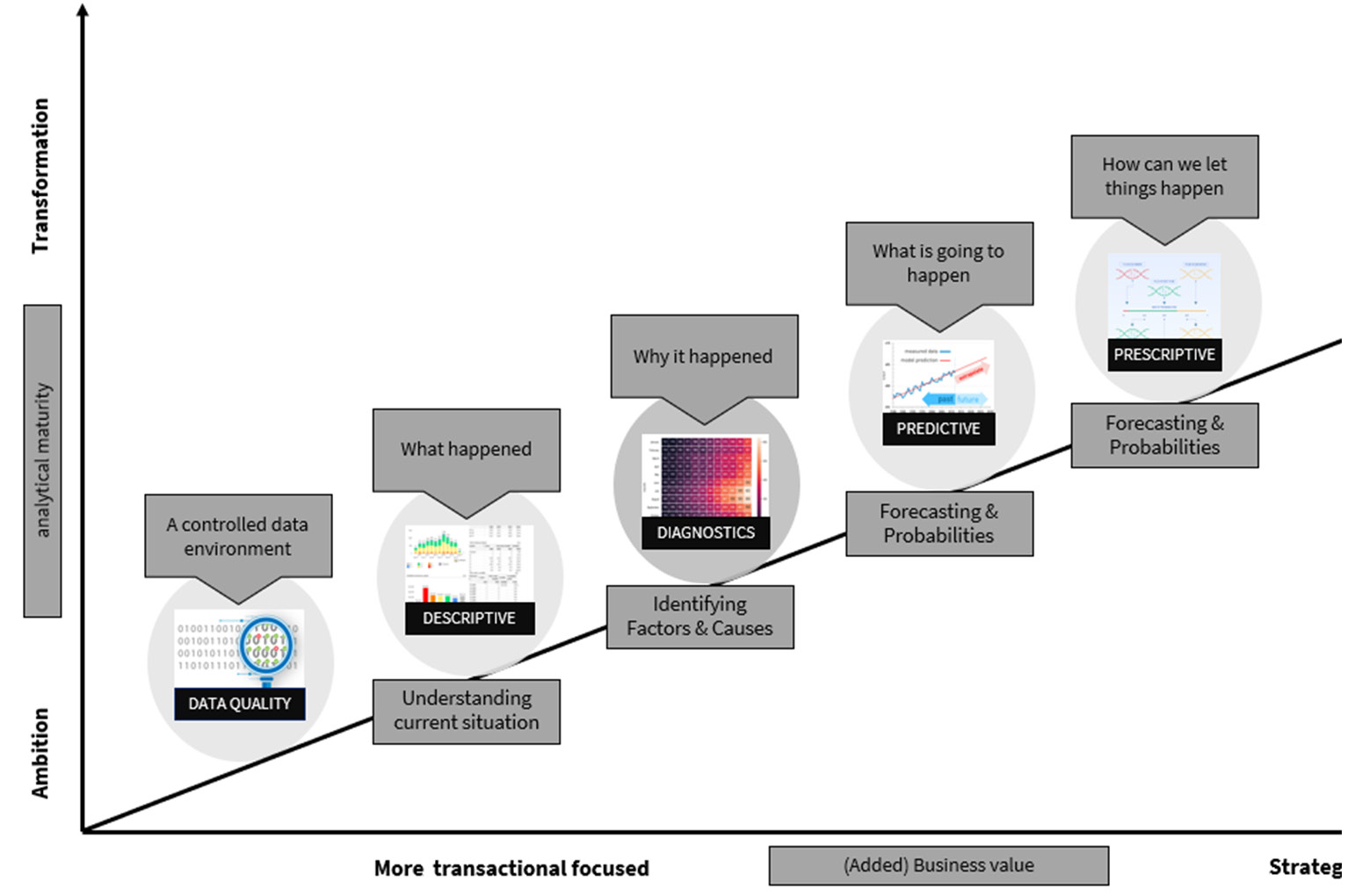
Figure 2.14 – The fifth step of your data journey: the phase of diagnostic analysis
Some nice examples are given here:
- Preventive checking of buildings with an increased risk of fires
- Proactively ordering parts that are likely to break on a machine soon
- The hiring of personnel who must first be trained for a longer period of time; strategic personnel planning
The concept of optimization is central to the phenomenon of “prescriptive analytics” or “prescribed analytics”. This simply means that when developing a prescriptive model, every minor detail must be considered. Supply chain, labor costs, employee scheduling, energy costs, potential machine failure—everything that could be a factor should be considered when developing a prescriptive model. Figure 2.15 shows a model where the decisions, predictions, and effects that should be considered are shown:
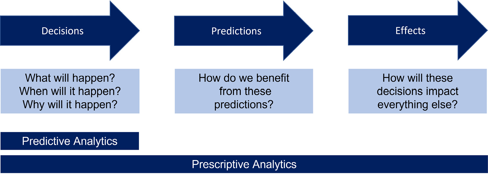
Figure 2.15 – Describing the prescriptive model and things to think of
As an example (from the book Turning Data into Wisdom), suppose a retail store uses descriptive (what happened) and diagnostic (why it happened) data to understand purchasing patterns and trends around their products. The store anticipates that sales of product A will increase during the holiday season. The company recognizes that it does not typically have a lot of extra product A inventory, but it anticipates that inventory will be higher during the holiday season. When inventory reaches a critical mass, prescriptive analytics will request a resupply.
Another example is a manufacturing plant that has a variety of machines in operation. Those machines are jam-packed with sensors. All of the data from those sensors is collected, and it must stay within a certain bandwidth. When the threshold is reached, the model can predict when a new part must be ordered, and when that order is placed, an appointment for repairs is automatically scheduled.
Because prescriptive analytics employs sophisticated tools and technologies, it is not suitable for everyone. To understand the necessary steps, models, and techniques to progress to a more complex analysis, it is necessary to have a basic understanding of all phases of the maturity model.
We described the descriptive, diagnostic, predictive, and prescriptive phases. Now, let’s have a look at the final phase of the model: AI.
AI
AI is revolutionizing the way we work and is being used in a variety of fields. AI is currently one of the fastest-growing technologies, and many businesses are expected to incorporate AI into their operations. However, AI has many facets and techniques that must be considered. After all, if you’re doing it because everyone else is, you’re wasting your time!
With Figure 2.16, we've come to the last step of the data journey: the phase of semantic or artificial intelligence.
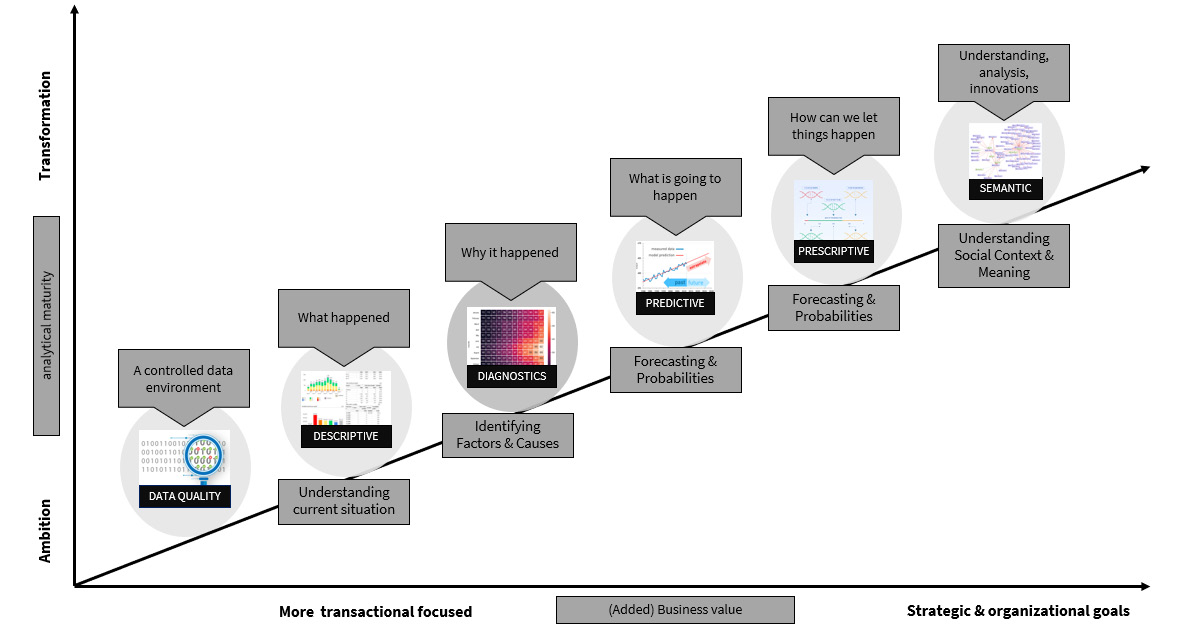
Figure 2.16 – The last step of your data journey: the phase of semantic or artificial intelligence
Otherwise, it will only cost money if the business value is not determined and presented. The techniques used vary and are diverse, and there are numerous examples where machine learning (ML), AutoML, or other forms of this amazing technique are used.
Some inspiring examples include the following:
- Using object recognition, automatically replenish shelves in a retail facility. AI can add significant value to retail. You can use object recognition to detect when a shelf is empty or about to run out. A signal can then be sent to the replenishment mechanism, ensuring that the compartment is always filled with articles and the retailer does not lose sales.
- Complying with construction safety regulations. Cameras with AI image recognition can be used to improve compliance with construction safety regulations. When the technology detects employees who are not wearing the prescribed protective equipment or who are in dangerous situations, management is notified and action can be taken quickly.
- Make packaging and labels interactive. Packaging can be made interactive to increase customer interaction and sales by using digital watermarks, QR codes, and ML. A consumer can scan a package offline or online to earn incentives or learn more about a product.
Consider the following:
- Request a demonstration
- Fill out a form for a chance to win a prize
- Play a video explaining the recipe by a chef
- Ask questions, fill out a questionnaire, and so on
From an e-commerce standpoint, you can collect and report data by scanning (via a mobile app) all events that occur on a phone, or even predict or add prescriptive elements if there is enough data. This frequently yields interesting insights that can be used to improve your customer/consumer relationship.
- Finally, an example from an Amsterdam University of Applied Sciences student group: they completed a minor project for the platform Kids in Data (www.kidsindata.com).
This platform aims to assist children all over the world in working with data and understanding what data literacy is, as well as what types of visualizations are available and when they should be used. They were given the task of developing a scan app, and by combining object recognition and ML, they were able to create a system that recognizes various types of visualizations and provides information to the students. Figure 2.17 shows a screenshot of this developed app.

Figure 2.17 – Scan app: Kids in Data
Intermezzo – early recognition of illnesses
A project was carried out to learn to recognize the eye disease macular degeneration with AI. For this, ML was used to learn to recognize eye diseases from medical images. You can also implement AI as a self-learning system and treat various diseases on the basis of learning models to detect visual material (send signals).
The technology behind this is that image recognition is getting smarter. When AI eventually misses a disease, this can be indicated by the doctor and the algorithms are adjusted again. The great thing about this project was that not only that macular degeneration could be recognized at an early stage, but also that eventually, more than 30 eye diseases could be recognized and the interface to the healthcare system was realized.
In addition, the AI results are stored in the file and immediately available to the doctor. However, the human aspect is important—the decision should always apply and you should not leave the decisions to the computer or computationally developed algorithms.
Can data save lives? A success story
Each minute counts in emergency healthcare, whether it is to save a life or to ensure the best possible quality of life after treatment. Optimizing the process from emergency calls to medical (angioplasty) procedures saves valuable minutes. Zone of Safety Holland, North accomplished this in collaboration with several hospitals in the area by utilizing the Call to Balloon dashboard.
Martin Smeekes, the director of the safety region, and his team of experts wanted to improve the critical process of Call to Balloon. Ambulance response times in this region of the Netherlands could not be improved further than the current 95% accuracy.
Martin wanted to improve the entire process, from the initial emergency call to the actual treatment (angioplasty). Everyone understood that by working together, they could achieve improvements in the time between the emergency call and the treatment.
This is how we began and worked on the Call to Balloon solution, which provides a general overview of realized times over a given time period. The smallest details of a single emergency call could be examined. The combination of data from various angles, as well as the ability to gain a better understanding on various levels, provides users with insights that would not otherwise be possible or visible.
Displaying the results in a dashboard is one thing, but being able to discuss them, suggest improvements, and have them implemented on all sides (dispatch, ambulance, hospital) is fantastic. This is where data-driven decision-making came into play, and teams from various organizations discussed the outcomes of cases that had passed the target lead time.
These developed dashboards include data from emergency calls and subsequent treatments in the region. This resulted in insights that would not have emerged without this information. These new insights led to improvements in the emergency care chain, saving vital minutes and thus improving patients’ quality of life.
The Call to Balloon dashboard displayed a process flow to illustrate the various steps in the process, as well as the average and median times. The process schema that is visualized shows the main Key Performance Indicator (KPI) “Call to Balloon” and the Performance Indicators (PI) that support the main KPI. In figure 2.18 the KPI and PI's are described. In Chapter 6, Aligning with Organizational Goals, we discuss the methodology of KPIs and have included this success story as well.
|
Call to Balloon |
The total time from the emergency call to the performed treatment, the angioplasty |
|
Response time |
The time from the emergency call to the arrival of the ambulance |
|
Call to Door |
The time from the emergency call to transfer the hospital personnel |
|
Door to Balloon |
The time from transfer by the hospital personnel to angioplasty |
|
ECG to Balloon |
The elapsed time between the ECG (by ambulance personnel) to angioplasty |
Figure 2.18 – The used definitions for the performance indicators that we used in this project
When we knew those steps, we were able to put them into our visualization solution and design it as a process. Figure 2.19 is the solution that we came up with:
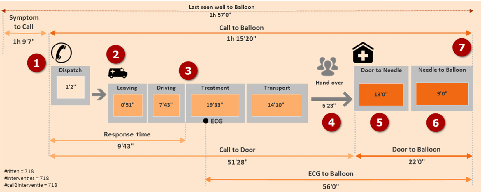
Figure 2.19 – The visualized process schema of Call to Balloon
Figure 2.19 displays all the sequential steps in this process and each has its own definition:
- The patient develops heart complaints.
- The patient calls are dispatched and the dispatch team registers the needed data in the source system.
- The staff of the ambulance is called in and they man the ambulance and leave the station.
- The ambulance drives off from the station and drives toward the patient.
- When ECG is performed and angioplasty is needed, the patient is transferred to the hospital.
- The patient is delivered to the CAD room where the treatment is performed.
- The vein has been punctured and the stent is placed.
With the dashboard, displayed in Figure 2.20 with the average times (and median times, if you prefer), the safety region was able to analyze the different steps by using all timestamps of those process steps. Data can be thoroughly examined. There are several options for obtaining information on achieved (standard) times:
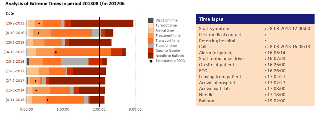
Figure 2.20 – The visualization that the safety region used to analyze the process steps
Figure 2.20 depicts a stacked bar chart that depicts each step of the process. The timer is set to 120 minutes. By visualizing it in this manner, the team was able to discuss and improve on all individual cases. When the specific extreme time chart was analyzed, the users could click on one of the bars, and the program that we built opened an overview automatically with all the detailed information about the specific patient and ride. We call this technique the Flipping Technique, which simply means; don't look only at the things that are doing well, flip it and look at the things that need attention.
With the gained knowledge, they were actually able to improve in various process steps, as detailed here:
- When the team began analyzing the data, they discovered that 95% of the dispatch calls were accurate when ambulances were dispatched to the patient. As a result, Martin and his team decided to change the protocol and send the ambulance straight to the patient’s address.
- While the ambulance was on its way, dispatch would ask the 911 call reporter additional questions, such as whether the patient required medication, when the first symptoms appeared, and so on. These responses were saved in the source systems.
- When the ECG was performed, the ambulance staff indicated whether angioplasty was required, and the team that was required to perform that treatment was called in directly (the patient was announced), so there was no wasted time. As Martin stated, we know that angioplasty is required, so why waste valuable time waiting for the specialists’ team to arrive?
- The process for delivering a patient to the first aid department has changed. Patients who previously had to wait in the first aid department are now taken directly to the CAD room. The reason for this is that angioplasty must be performed directly, and they already know from the ECG that this treatment is required. So, why waste those life-threatening minutes in the emergency room?
- Another significant finding was that the CAD room was not always ready for the next patient. As a result, the procedure was altered, and the CAD room is now always ready for the next patient.
As a result, no second is wasted, and the safety region was able to save 20 minutes of potentially life-saving time in the process lead time.
As a result of this remarkable success, Martin Smeekes and his team decided to test the Call to Needle (in the event of a stroke) process, as well as a Call to Knife trial (in case of emergency lifesaving surgeries).
One of the most difficult problems was keeping track of time in the hospital. Nowadays, a patient is given a wrist sensor, and the time is automatically recorded in the systems whenever a certain point is reached. This was a big wish at the start, and it was eventually implemented for patient care. As a result, the data became more precise, which is necessary for such processes.
Intermezzo – amazing moments!
During this project, there were two moments in time that will never be forgotten. The first moment was the first presentation of the solution to Martin Smeekes and his team. The chairman of the Dutch Society of Cardiologists, a professor, also joined the meeting. The moment he saw the first display of the dashboard and the analytical possibilities, he jumped out of his chair and walked toward the screen. The professor immediately pointed out some elements that could be improved. An amazing moment to feel that vibe that we had interpreted things well.
The second moment was in 2014 when Martin and I discussed the Call to Balloon case and I said that I would like the safety region to be the smartest organization in the Netherlands. He agreed to join the competition, and the safety region won the public award and the jury of the Smartest Organization in the Netherlands competition due to the following reasons:
They are 100% focused on continuous improvement based on data-informed decision-making.
They are willing to communicate with all parties and to actually go through the improvement steps with each other and actually implement them.
The data literacy skillset and organizational data literacy are high.
Therefore, they were able to improve the Call to Balloon process and the Call to Needle processes within 20 minutes.
Summary
Finally, data and analytics open up a world of possibilities. However, when it comes to the first questions, you should consider why you want to measure certain things, what your organization stands for, and where you want to go. You then move on to providing information about the mission, vision, and strategy that will be developed.
Everything is built on this foundation! This is required so that an organization can eventually develop into one that can make decisions based on data. The big pitfall is that we start doing things because others are doing them, that we measure everything because we can measure everything, and that we eventually lose sight of the forest for the trees and swerve completely out of control through a fog of data. That can’t, and shouldn’t, be the goal.
After reading this chapter, we should have a better understanding of the data journey, including which steps to take and how to apply them to our daily lives. We talked about descriptive analysis (what happened), diagnostic analysis (why did it happen), predictive analysis (what is likely to happen), and prescriptive analysis (how can we ensure things happen) in the wonderful world of AI and ML.
We came to a close with a story about the Netherlands’ safety region. You’ve discovered that they became a successful team by relying on data, allowing the insights to speak for themselves, and using the insights to make data-driven decisions.
In the next chapter, we’ll go over the four key pillars for establishing a data and analytics environment from an organizational standpoint.