
6
Looker Studio Built-In Charts
Data can be visualized using many different types of charts. Depending on the type of data to be represented and the insight to be gained, a specific chart type could be better suited than others. You looked at some common visualization types and their appropriate use in Chapter 3, Visualizing Data Effectively. Looker Studio offers a set of built-in chart types that you can use to create beautiful and meaningful dashboards. This chapter examines each of the built-in chart types using the call center dataset that we have worked with in the previous two chapters and explores how to configure them.
In this chapter, we are going to cover Looker Studio’s built-in chart types grouped under different sections. In the end, we will add some of the relevant charts to the report we have been building since Chapter 4, Google Looker Studio Overview, to create a coherent dashboard. The primary objective is to understand each built-in chart and its configuration, irrespective of whether the final dashboard requires it or not.
In this chapter, we will cover the following topics:
- Charts in Looker Studio – an overview
- Configuring tables and pivot tables
- Configuring bar charts
- Configuring time series, line, and area charts
- Configuring scatter charts
- Configuring pie and donut charts
- Configuring geographical charts
- Configuring scorecards
- Configuring other chart types
- Building your first Looker Studio report – adding charts
Technical requirements
To follow the example chart implementations in this chapter, you need to have a Google account so that you can create reports with Looker Studio. It is recommended that you use Chrome, Safari, or Firefox as your browser. Finally, make sure Looker Studio is supported in your country (https://support.google.com/looker-studio/answer/7657679?hl=en#zippy=%2Clist-of-unsupported-countries).
You can access the Looker Studio report that includes all the built-in charts that will be explored in this chapter at https://lookerstudio.google.com/reporting/6d1bddb7-9c1f-4869-bafe-499e4d05d411/preview, which you can copy and make your own. The completed “first Looker Studio report” that presents a simple dashboard depicting key call center metrics and patterns can be found at https://lookerstudio.google.com/reporting/b198dfb0-2b0b-43fc-9da4-19fc1e7362c5/preview.
Charts in Looker Studio – an overview
Looker Studio offers different chart types to visualize data. Built-in charts are components that Looker Studio provides as part of the tool, which you can configure to visualize data. At the time of writing, there are 36 built-in chart types and variations available in Looker Studio under the categories of Table, Scorecard, Time series, Bar, Pie, Google Maps, Geo chart, Line, Area, Scatter, Pivot table, Bullet, Treemap, and Gauge.
Collectively, these chart types address most data visualization needs. If your use case requires a chart type beyond these built-in types, Looker Studio allows you to create custom visualizations using JavaScript libraries. Such custom chart types are called community visualizations. You can also use custom visualizations created by others and made available to all through Looker Studio’s Report Gallery (https://lookerstudio.google.com/gallery?category=visualization). We will explore community visualizations in Chapter 7, Looker Studio Features, Beyond the Basics:
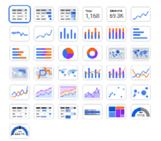
Figure 6.1 – The chart picker displays all the available built-in chart types
Report users may occasionally want to download data from an individual chart so that they can analyze this specific subset of data further on their own or create a snapshot of the chart data for future comparisons. From View mode, report users can export data from a chart to a CSV file or Google Sheets, so long as the report owner hasn’t restricted the operation in the report sharing settings. The Export option is available from the chart header and the right-click menu (only for the built-in chart types). The exported data reflects all the filters and date range selections that are currently applied to the chart and only includes the fields available in the chart.
The data source that we will use in this chapter to explore all the built-in charts is based on the call center dataset available at https://github.com/PacktPublishing/Data-Storytelling-with-Google-Data-Studio/blob/master/Call%20Center%20Data.csv. Refer to Chapter 4, Google Looker Studio Overview, for instructions for setting up the data source. Alternatively, you can use the enriched data source made available to you at https://lookerstudio.google.com/datasources/ebf4f00c-2cf3-41a4-95a4-97e698af9594. To follow along, create a new report from the data source by following these steps:
- Open the data source from the preceding link. If you are using your own data source, open it from the Data sources tab of the Looker Studio home page.
- Click the CREATE REPORT button at the top right to create a new report. Confirm this to add the data source to this report.
The defined data source includes some modifications that are useful for creating the example charts in this chapter. You may perform further modifications such as providing consistent and business-friendly naming conventions, adding additional calculated fields, and so on to configure the charts more easily and to help with further analysis of data.
In the following sections, we will delve into each chart category. For each chart type, we will cover the most relevant and important configurations using the Call Center data source. For complete and the most up-to-date chart references, please refer to the official Looker Studio support page at https://support.google.com/lookingstudio/topic/7059081?hl=en&ref_topic=9207420.
Configuring tables and pivot tables
Tables are the most basic form of representing data. They provide flexibility to display any number of data fields together. A table chart is best suited when you want to show the most granular data, a large number of fields, or multiple metrics with very different units and scales aggregated for one or more dimension fields. Table and pivot table charts in Looker Studio allow you to display metrics in three ways:
- Numbers
- Bars
- Heatmap
In this section, you will create a few tables and pivot tables using the Call Center data source and explore various configuration settings.
Table with numbers
The Call Center data source includes details of the calls made by customers from various states of the United States of America. Let’s add a table chart to the report to display multiple metrics for each state, as shown in the following screenshot:
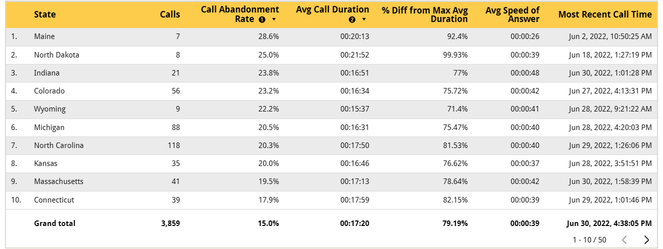
Figure 6.2 – Table chart to visualize detailed data or several metrics together
In the report designer, make sure the Call Center data source is selected from the Data panel. Click on Add a chart from the toolbar and select Table from the list. Configure the following properties in the SETUP tab for the chart:
- Dimensions and Metrics:
- Add State under Dimension. You can drag and drop the field from the Data panel into the SETUP pane or directly onto the table. Remove the dimension that is shown by default by clicking the X icon when you hover over the field in the SETUP pane. You can also select the data source field by clicking on the Add dimension pill under the Dimension section and choosing the data source from the drop-down that displays the available fields from the data source. These methods apply to adding chart metrics as well.
- Add the following as Metrics. The default method of aggregation that’s selected for each metric is based on the corresponding setting in the data source. Remove the metric that’s displayed by default in the table by clicking the X icon, if it’s not one of the following:
- Calls: This is the default Record Count metric renamed in the data source and represents the number of calls as each record in the dataset represents a unique call.
- Call Abandonment Rate: This is a calculated field defined in the data source that computes the percentage of abandoned calls.
- CallDurationSeconds: Click on the pencil icon for this field and set the display name to Avg Call Duration. From the same edit pane, change the Aggregation method to Average, if it’s not already selected:
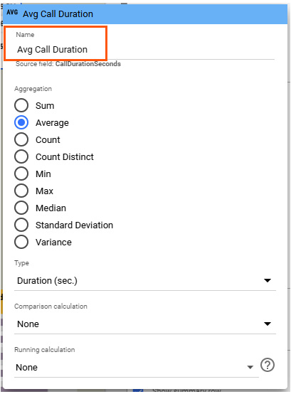
Figure 6.3 – Renaming a chart field from the edit pane. This can be accessed by clicking on the pencil icon on the left portion of the field in the SETUP tab
- Add CallDurationSeconds a second time by dragging and dropping the field from the Data panel or by selecting the field from the Add metric pill. Hover over the left of the added field and click the pencil icon that appears to open the edit pane. Then, set Comparison calculation to Percent difference from max. It doesn’t matter which of the two relative options – Relative to corresponding data or Relative to base data – you choose for this example as it only displays the data that applies to the comparison date range configured for the chart and we haven’t done so. You can find a detailed explanation of these options in Chapter 5, Looker Studio Report Designer. Set its name to % Diff from Max Avg Duration.
- AnsweredInSeconds: Click on the pencil icon for this field and set the display name to Avg Speed of Answer. From the same edit pane, change the Aggregation method to Average, if it’s not already selected.
- CallDateTime: This is the calculated field and can be derived from the original CallTime field of the dataset by parsing it to the Date & Time type. Click the pencil icon to open the edit pane, set the Aggregation method to Max, and rename the display name Most Recent Call Time.
Note
The most recent call time for each state may not be very useful information to see. It is included in the current example with the sole purpose of showing that a table chart allows you to display metrics of different data types and aggregations.
- Sorting:
Table charts allow you to sort the data by two fields. You can sort by Call Abandonment Rate in descending order to view the states with the highest proportion of calls where customers hang up before the customer service agents could resolve their issue at the top of the table. You can add a secondary sort field to break any ties in the primary sort field. For this example, choose Avg Call Duration as the secondary sort field. It is possible to sort the table by fields that are not displayed in the chart. This configuration defines the default sorting of data in the table. The report viewers can change the sort order by clicking on the column header. They can also sort the table on any column other than the configured primary and secondary sort columns. Resetting the report restores the default sorting configured by the report editor.
- Filtering:
You can restrict the data that gets displayed in a chart by adding a filter under the Filter section in the SETUP tab. For example, to look at only the call metrics from Platinum customers, you can add a filter, like so:
- In the Filter section, click Add a Filter.
- In the Filter pane, define an Include condition where CustomerTier is Platinum and name it Platinum customers, as shown in the following screenshot:
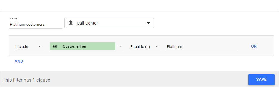
Figure 6.4 – Defining a filter to include only calls from Platinum customers
A summary row for the table will help us get a sense of the metrics for the overall data being visualized. Just check the box to show summary data. The summary value is computed using the method of aggregation chosen for the field in the chart.
Another key configuration that is important for table design is limiting the number of rows to display per page. By default, it is 100. A vertical scrollbar lets users read through all the rows on a single table page. The pagination controls at the bottom right allow users to browse through a large number of rows spanning multiple pages. For this example, set the row limit to 10.
Using the configurations from the STYLE tab, you can define the look and feel of the chart. The preceding table uses the following style configurations:
- Select the Wrap Text option under Table Header and Table Body.
- Update Table Colors as desired – for the header background (yellow) and odd row color (light gray). Displaying alternate rows with a different background color increases readability, especially when the table shows a lot of text.
- For each of the columns in the table, you can choose a proper alignment. In the case of metrics, you can set appropriate decimal precision and visual presentation – be it a number, a bar, or a heatmap. This example displays all the metrics as only numbers. For Column #2 and Column #4, which represent the Call Abandonment Rate and % Diff from Max Avg Duration metrics, respectively, set Decimal precision to 1.
Adjust the width of the table and columns appropriately by resizing the chart on the canvas. You can use the Resize columns option from the right-click (or ellipses) menu of the chart. It provides two options:
- Fit to data
- Distribute evenly
You can enable horizontal scrolling in the STYLE properties to scroll through a large number of columns. In this example, all the fields fit well within the table width, so we do not need any horizontal scrolling.
Table with bars
Table charts in Looker Studio are versatile. In addition to displaying metrics as numbers, you can also visualize them as data bars and heatmaps. The following table chart shows two metrics – Calls and Call Abandonment Rate – for the top 10 states by call volume as bars:
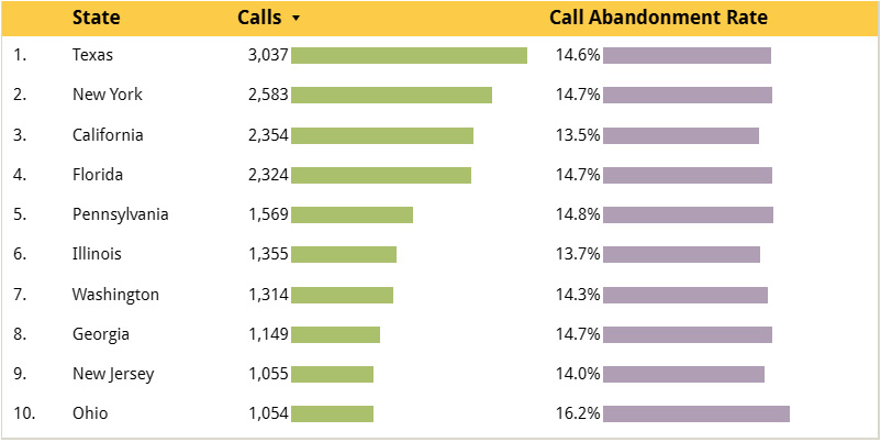
Figure 6.5 – Table with metrics shown as bars
The chart configurations for this chart are as follows:
- In the SETUP tab, do the following:
- Select Call Center as the data source.
- Choose State as the dimension field and Calls and Call Abandonment Rate as metrics.
- Limit Rows per Page to 10.
- Sort using the Calls field in Descending order.
- In the STYLE tab, configure the following:
- Unselect Show pagination under Table Footer properties
- For each metric column, select Show number to see the metric value beside the data bars
Out of these configurations, there are three options, when combined, that enable the table to display only the top 10 states by call volume. These are as follows:
- Sorting the table by the number of calls
- Limiting the number of rows per page to 10
- Disabling pagination
When you display the metrics as horizontal bars, you can also specify a target value to show a target line across the bars, as shown in the following screenshot:
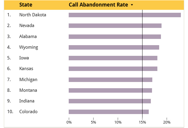
Figure 6.6 – Showing the target line for the data bars in a table
The preceding table also displays the axis to aid the interpretation of the metric values without explicitly showing each number beside the bar. You can find these configurations under the Metric settings in the STYLE tab.
Table with drill down
Drill down allows you to visualize different granularities of data in the same chart. It enables you to go from a more general view of data to a more specific view and vice versa with a single mouse-click. This provides an intuitive way to gain a more in-depth insight into data. By adding multiple dimensions to a table and enabling Drill down in the SETUP tab, you can look at data at different levels of detail – one level at a time. Figure 6.7 depicts the call abandonment rate by each state and county. The report viewer can use the up and down arrows in the chart header to drill down to County and drill up to State as needed.
The configurations for this table chart are as follows:
- From the SETUP tab, configure the following:
- Select Call Center as the data source.
- Add State and County Name as dimension fields. Set the display name for the latter as County from the edit pane by clicking the pencil icon for the field.
- Toggle the Drill down option.
- Add Call Abandonment Rate as the metric:
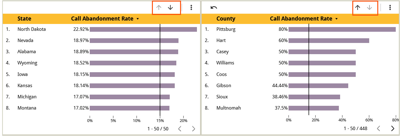
Figure 6.7 – Drill down and up dimensions
The STYLE configurations include the following:
- In the Metrics section, select Bar to display the metric as a bar.
- Select Show number and Show target. Set Target value to 0.15. This displays the target line at 15%.
- Check Show axis:
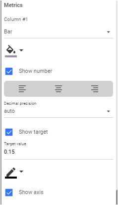
Figure 6.8 – Key STYLE settings for the metric of the table
It is also possible to drill down only for a selected dimension value. For example, if you want to only look at the counties of Alabama, select the row and choose Drill down from the right-click context menu:
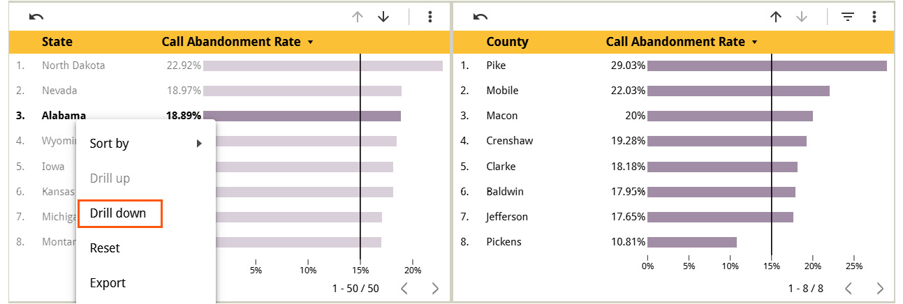
Figure 6.9 – Drill down dimension value
Drill down is a functionality that is available for several other chart types in addition to tables. Pivot tables have expand-collapse capability instead of drill-down, which we will cover in the next section.
Pivot tables
Pivot tables allow you to visualize data in a matrix or cross-tab form. You can summarize one or more metrics by dimension values along rows and columns. Just like regular tables, pivot tables allow you to present metrics as numbers, data bars, and heatmaps. Let’s say that you would like to understand how high or low the call abandonment rate is at different times of the day on each weekday. A pivot table with a heatmap provides an effective way to present this information, as shown here:
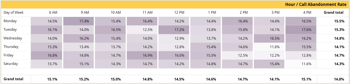
Figure 6.10 – Pivot table with a heatmap
While there is no significant pattern that emerges out of this data, we can see that the call abandonment rate is generally higher at the end of the day on most days of the week.
In addition to the breakdown of the metric for each hour and day of the week, you can also see the aggregated value for each hour and each weekday, respectively, by turning on the Show grand total option for both Rows and Columns.
Create the preceding pivot table chart as follows:
- Click on Add a chart and select Pivot table. You can either select the basic Pivot table chart type first and configure it to show a heatmap or directly choose Pivot table with heatmap from the menu.
- From the SETUP tab, configure the following:
- Make sure Call Center is selected as Data source.
- Add CallDateTime under Row dimension and change the data type to Date & Time | Day of Week. Set the display name to Day of Week in the edit pane by clicking the pencil icon for the field.
- Add CallDateTime as Column dimension and change the data type to Date & Time | Hour. Set the display name as Hour in the edit pane by clicking the pencil icon for the field.
- Choose Call Abandonment Rate as a Metric. Make sure the aggregation is AVG. If not, open the edit pane by clicking the pencil icon that appears when you hover over the left-hand side of the added field and select Average under Aggregation.
- Check Show grand total for both Rows and Columns.
- Sort Row #1 by Day of Week | Ascending and Column #1 by Hour | Ascending.
- From the STYLE tab, make the following changes:
- Select Heatmap for Metric #1 and change the color as needed
- Set Decimal precision to 1
Switching rows and columns
After adding dimensions as rows and columns, if you would like to switch rows and columns, you need to manually move these dimensions to columns and rows, respectively. Looker Studio does not offer a “switch rows and columns” option that can automatically do this for you.
You can depict multiple metrics in a pivot table. It is also possible to add multiple dimensions to rows and columns to break down metrics in a hierarchical manner. The following example shows two metrics – Call Abandonment Rate and Avg Speed of Answer. These metrics are broken by call topics on columns and states on rows. States are further broken down by county:
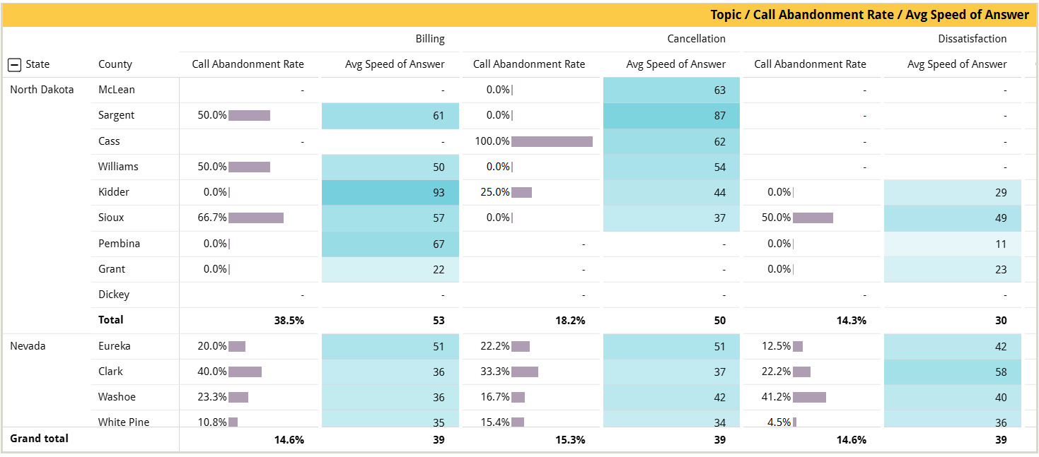
Figure 6.11 – Pivot table with multiple metrics and dimension hierarchies
You can expand and collapse dimensions on rows by enabling the respective option and choosing the default expand level in the SETUP tab. This provides users with the flexibility to look at aggregated metric values at the top level of the row dimension hierarchy and drill down as needed to lower-level details or vice versa. This behavior is different from the drill-down functionality available with other chart types. With Drill down, it is possible to drill into a single dimension value separately in addition to all the values of the top-level dimension. In the case of the pivot table’s expand-collapse capability, it is only possible to expand all the values of the higher-level dimension in the hierarchy and vice versa.
The chart configurations for the preceding pivot table chart are as follows:
- Click on Add a chart and select a Pivot table.
- From the SETUP tab, configure the following:
- Choose Call Center as the data source.
- Add State and County Name under the Row dimensions and update the display name for the latter as County by clicking the pencil icon on the corresponding field.
- Toggle the Expand-collapse button and set Default expand level to County.
- Add Topic as the Column dimension.
- Choose Call Abandonment Rate and AnsweredInSeconds as Metric types. Click the pencil icon for the latter and set Name to Avg Speed of Answer. Also, change Type to Numeric | Number to display just the number of seconds.
- Under Totals, select Show subtotals. This will show the row subtotals for State when expanded to the County dimension. Also, select Show grand total for Rows.
- Sort Row #1 by Call Abandonment Rate | Descending, Row #2 by Avg Speed of Answer | Descending, and Column #1 by Topic | Ascending.
- In the STYLE tab, do the following:
- Select Bar for Metric #1 and Heatmap for Metric #2. Set the colors as desired.
- Select the Show “-“ option for Missing Data.
Looker Studio provides a useful configuration for tables (as well as pivot tables, scorecards, and gauges) to display missing data in one of five different ways:
- 0
- -
- null
- (blank)
- No data
Make sure the chosen dimensions on the rows follow a hierarchy from the most general to the most specific. Otherwise, the metrics may show incorrect values in the cells when the hierarchy is expanded. There is no pagination in a pivot table chart. Horizontal and vertical scroll bars allow you to read through the entire table. A pivot table chart expects to have at least one Row dimension field since this is mandatory, while there can be no Column dimension fields at all.
In the next section, we will explore various forms of bar charts and their configurations.
Configuring bar charts
Bar charts are useful for representing one or a few metrics against one or two dimensions. Looker Studio offers different variations of bar charts, including horizontal bars, vertical bars, clustered bars, stacked bars, and 100% stacked bars. You can start with any specific variation and configure the chart appropriately to transform it into a different variation. In this section, you will learn how to configure various types of bar charts using the Call Center data source.
Columnar bar chart
In a columnar bar chart, the dimensional values are displayed along the X-axis and the metric values are displayed on the Y-axis. The following chart shows the call volume for different call topic categories. The topics are displayed in the decreasing order of corresponding call volumes:
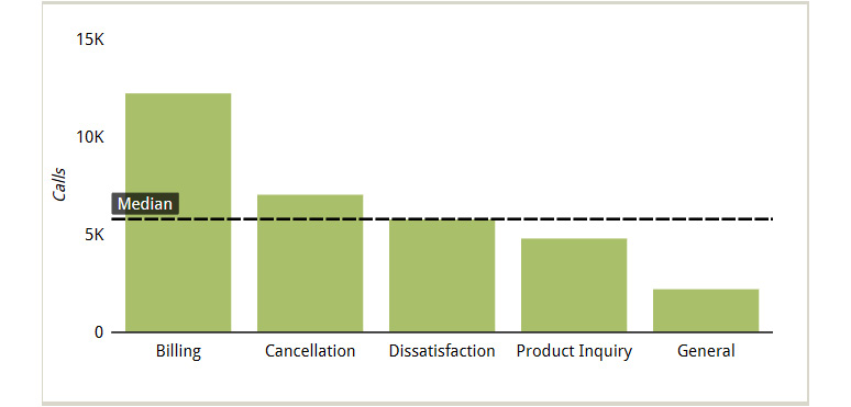
Figure 6.12 – Bar chart showing call topic categories in the decreasing order of call volumes
Showing the states as vertical bars is appropriate here because the topic names are short enough to be displayed clearly on the X-axis. By default, Looker Studio limits the number of bars to be displayed to 10. You can increase or decrease this number as per your needs from the STYLE tab. Here, there are only five call topic categories in the dataset and we want to display them all. So, we don’t need to adjust this limit.
A reference line is added to the chart to indicate the overall median call volume. A reference line can be added using a constant value, a metric, or a parameter. You can provide any constant value to compare the bars against the reference line. You can also base a reference line on any metric used in the chart. You can choose the appropriate aggregation type for the metric selected. The aggregation can be one of the following types:
- Average
- Median
- Percentile
- Min
- Max
- Total
We will discuss parameters in the next chapter. It is possible to add multiple reference lines to a chart.
The chart configurations for the preceding bar chart are as follows:
- Click on Add a chart and select the columnar bar chart type.
- From the SETUP tab, configure the following:
- Choose Call Center as the data source
- Add Topic as a Dimension.
- Toggle the Drill down option and make sure Default expand level is set to Topic.
- Add Subtopic as another Dimension.
- Add Calls as a Metric.
- Sort by Calls | Descending. This displays the bars in the decreasing order of their height, as represented by the metric.
- In the STYLE tab, configure the following:
- Choose an appropriate color for the bars.
- Click Add a reference line and choose Type as a Metric. Select Median for Calculation. You can also format the properties of the line, including its weight, type (solid, dotted, dashed, and so on), and color.
In this chart, I’ve chosen to show the Y-axis title, hide the legend, and make the gridlines transparent.
The preceding chart doesn't display any data labels. Here, showing data labels can be optional as the Y-axis scale helps you interpret the values. Users can always view metric values in the tooltip by hovering over the chart. That said, displaying data labels on the chart can be useful when understanding the exact values is necessary without requiring additional action from users . However, excessive use of data labels can make charts and, thereby, dashboard look cluttered. So, enable them sparingly and with deliberation:
Horizontal bar chart
When the dimension values are too long or there are too many, a horizontal bar chart might be a better fit. The following chart shows the top 10 call reasons based on the number of calls received by the call center:
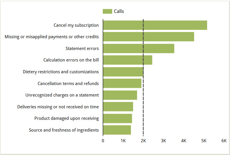
Figure 6.13 – Horizontal bar chart with long dimension values
You can adjust the width of the Y-axis to fit the labels. To do this, select the chart and hover over the Y-axis. The cursor will change to a slider, which you can move left or right as needed.
Tip
You can adjust any of the chart area boundaries – both axes and non-axes – on the canvas. Select the chart and align the cursor on the chart boundary to change the cursor to a slider. Then, move the slider up and down or left and right to get the desired fit and appearance. While the default positioning often works, this flexibility enables you to better fit longer axis labels and create additional space for legends, annotations, and more.
To build this chart, follow these steps:
- Click Add a chart from the toolbar and select either the horizontal bar chart type directly or can select the columnar chart type and change the orientation in the STYLE tab.
- Configure the following in the SETUP tab:
- Add Subtopic as a Dimension and Calls as a Metric.
- Make sure the sorting is by the added metric in descending order in the Sort section
- Configure the following properties from the STYLE tab:
- Choose an appropriate color under Color by.
- Add a reference line of the Constant value type and provide 2000 as Value. Uncheck Show label to hide the reference line label.
- Make the gridlines transparent.
By default, you can only show the bars in a single color, representing the metric being depicted. However, you can display individual bars in different colors based on a breakdown dimension. For example, the preceding bar chart can be modified to display the bars in different colors based on the higher-level topic that each subtopic falls under. Add the following configurations:
- The SETUP tab:
- Add Topic as a breakdown dimension
- The Style tab:
- Select Stacked Bars under Bar chart
- Select Dimension values under Color by
- Select Show axis title for Bottom X-Axis:
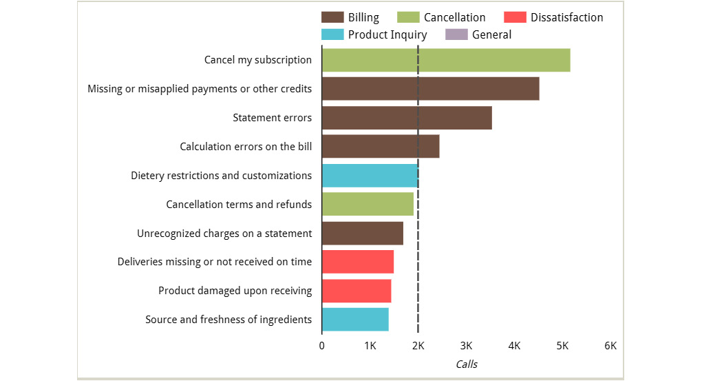
Figure 6.14 – Bar chart with multiple colors
When you use the primary dimension field as the breakdown dimension, then each bar will be colored based on the primary dimension, as shown in the following screenshot:
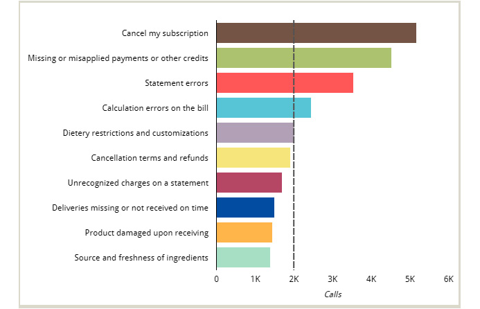
Figure 6.15 – Bar chart with the primary dimension values displayed in different colors
This is not that helpful because the call subtopics are already represented by the bars. Using different colors to represent the same will not provide any additional value. This manner of applying color to data adds noise to the chart and should be avoided.
Clustered bar chart
When a breakdown dimension is added to the chart’s SETUP tab, you can create a clustered bar chart or a stacked bar chart. For the clustered bar chart, make sure the Stacked bars option is unchecked in the STYLE tab. You can select the regular vertical or horizontal bar chart type from the chart picker or the Add a chart list and configure it appropriately or directly add the clustered bar variation. In the case of a clustered bar chart, the values of the secondary dimension are represented as individual bars clustered for each of the primary dimension values.
The following screenshot shows a clustered bar chart that shows the number of calls made by customers from different tiers under each topic category:
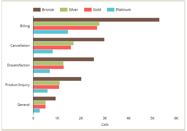
Figure 6.16 – Bar chart with the secondary dimension values clustered together
This chart displays the five topic categories as indicated by individual clusters. Customer tiers within each cluster represent different series. Similar to the number of bars, you can limit the number of series from the STYLE tab to show fewer bars within each cluster.
An important aspect of any chart is choosing the right colors. For any clustered or stacked bar chart, Looker Studio provides three ways to apply colors to the bars:
- Single color: Monochromatic shades of a single color.
- Bar order: Manually choose a color for each bar in the order they appear. If the bars are sorted differently, the chosen colors may represent different dimension values based on their position along the axis.
- Dimension values: Select colors for each dimension value. These colors apply to all charts using the same data source within a report and enable consistency.
In the preceding example, specific colors are assigned to different customer tiers, rather than the order in which they appear within the chart. This ensures that all charts where customer tiers are depicted use the same color for each tier.
The chart configurations for the preceding clustered bar chart are as follows:
- Click Add a chart and select the Horizontal bar chart type.
- From the SETUP tab, configure the following:
- Select Call Center as the data source.
- Add Topic as a Dimension and CustomerTier as a Breakdown dimension.
- Add Calls as a Metric.
- Sort by Calls | Descending. As a secondary sort, select CustomerTierNo in Ascending order.
- From the STYLE tab, do the following:
- Choose the Dimension values option under the Color by section. Click Manage dimension value colors to set the appropriate colors for each of the customer tier values – Bronze, Silver, Gold, and Platinum.
- Select Show axis title for Bottom X-axis and make the gridlines transparent.
The preceding chart includes all four customer tiers. To display only the call volumes for Gold and Platinum customers, use the following settings:
- In the SETUP tab, choose CustomerTierNo (numerical representation of customer tiers) as the Secondary sort field and select Descending. This will arrange the bars within each cluster from Platinum to Bronze.
- In the STYLE tab, set the Series option to 2.
The resulting chart is as follows:
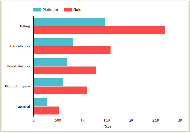
Figure 6.17 – Clustered bar chart with limited series in each cluster
Clustered bar charts provide an accurate representation of the metric value for each combination of the two dimensions – for example, the number of cancellation-related calls made by Platinum customers. However, they do not readily provide a sense of the total metric value for the dimension along the axis – for example, the total number of cancellation calls across all customer tiers.
Stacked bar chart
Instead of clusters of bars, you can display the breakdown dimension values as stacks. Stacked bar chart does not enable accurate comparison of stacks (different sections within the bar) across multiple bars as they have different starting points, all except the bottom-most one, in the case of column bar chart, and the left-most one, in the case of horizontal bar chart. However, they are helpful to understand general patterns and approximate values. The following chart presents the same data that’s shown in Figure 6.17, but with customer tiers as stacks:
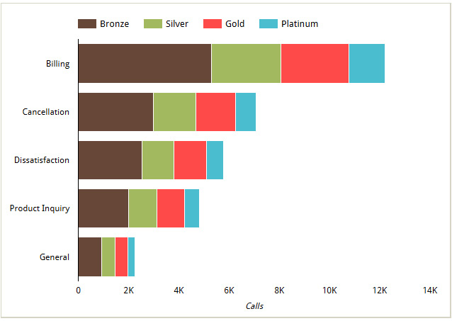
Figure 6.18 – Stacked bar chart showing the number of calls by different topic categories made by customers from different tiers
You can choose colors by a single color, bar order, or dimension values. Using dimension-specific colors provides consistent use of color in a report. However, when there are too many dimension values across many fields being depicted, managing colors for different dimension values might become cumbersome. Also, you may want to minimize the number of distinct colors used in a report for a cleaner look and to achieve design simplicity. For these reasons, the other options are useful.
Unlike clustered bar charts, stacked bar charts provide information on the total metric value for each dimension value along the axis. From the preceding stacked bar chart, you can easily tell how many calls were made under each topic category. However, they only provide an approximate sense of the metric value for the breakdown dimension values.
100% stacked bar charts depict the percentage distribution of the breakdown dimension values for each of the dimension values along the axis. This is useful when you are interested in the distribution rather than the absolute values:
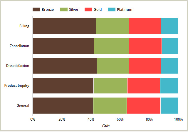
Figure 6.19 – 100% stacked bar chart depicting the distribution of calls made by customers of different tiers for various call topics
For both a stacked bar chart and a 100% stacked bar chart, you can display the total metric value for the primary dimension in the tooltip. For example, the total number of cancellation-related calls is shown as 7,084 when you hover over the corresponding bar in the preceding chart. Enable this by selecting the Show Total Card option under the Bar chart properties in the STYLE tab.
In this next section, you will learn how to configure, time series charts, line charts, and area charts.
Configuring time series, line, and area charts
When you have ordinal data with continuous scales and want to accentuate the relationship of one value to the next, you can use a line chart, a time series chart, or an area chart. However, these three chart types are not always interchangeable. Each chart type has its particular utility and advantages. While a line chart can represent any dimension on the X-axis, a time series chart can only show a date or date and time dimension on its axis. In general, area charts support any dimension on the X-axis. However, in Looker Studio, they can only be plotted with a time-based dimension. Area charts and stacked area charts are usually used with a Breakdown dimension to represent different areas, whereas line and time series charts are effective even with a single line. In this section, we will look into each of these chart types and configure them using the Call Center data source.
Line chart
A line chart plots a line for a variable represented on the Y-axis (usually a metric) for the continuous values of the variable depicted on the X-axis. Line charts emphasize the trend and comparison of metric values along the ordinal axis.
While line charts are used most commonly with time on the X-axis, any dimension with an ordinal scale can be plotted as well – for example, the number of days since first purchase, version numbers of a software product, and so on. The following line chart depicts the call volume by the speed of the answer in seconds:
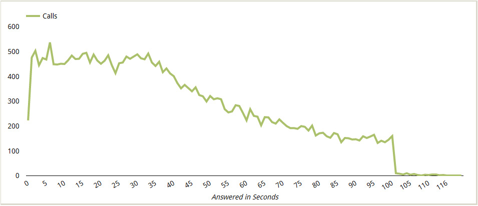
Figure 6.20 – Line chart with a numerical dimension on the X-axis
Note that the X-axis is just a number and not time. To achieve this representation, change the Type value of the AnsweredInSeconds dimension from Duration (sec) to Number in the SETUP tab, as shown in the following screenshot:
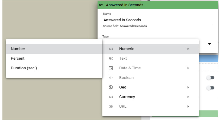
Figure 6.21 – Modifying the field type in the chart’s configuration
The following screenshot shows another line chart that depicts the week when the calls were made and the number of abandoned calls on the Y-axis. It shows the line with smooth curves, which can be configured from the STYLE tab by selecting the Smooth property under the General section. Also, the data plotted in the chart is restricted to only the first 12 weeks of the year, which was done by limiting the number of points to display. By default, a line chart represents 500 points. You can decrease or increase this number to show the desired data range. In this example, Number of Points is set to 12. This is similar to limiting the number of bars and series in the case bar charts. The resultant data that is displayed is primarily dependent on how the data is sorted within the chart. These configurations serve as an alternative to using chart filter conditions to restrict the data displayed in a chart:
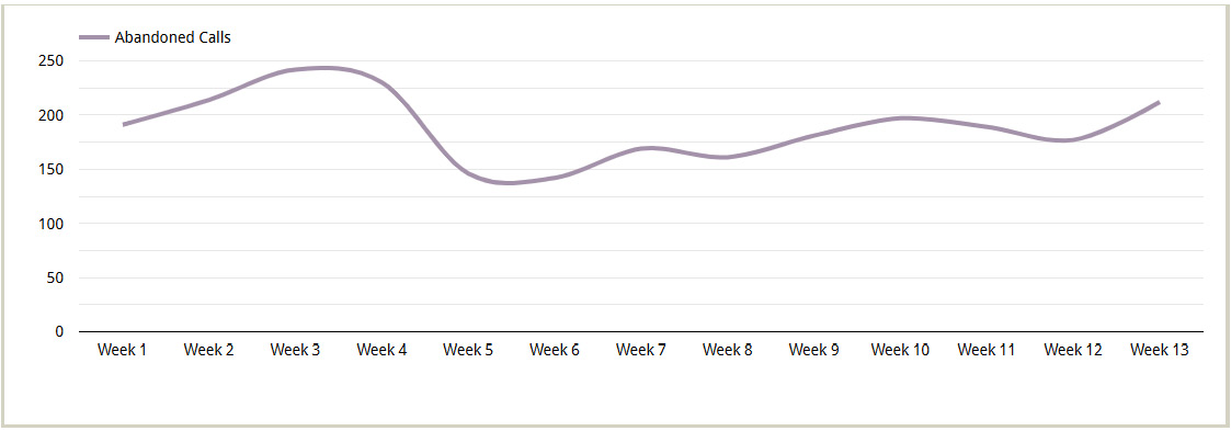
Figure 6.22 – Line chart with the date (ISO Week) on the X-axis
To build this chart, follow these steps:
- Click Add a chart and select the Line chart type.
- In the SETUP tab, configure the following:
- Add CallDateTime as a Dimension and change the format to Date & Time | ISO Week. This aggregates the data at the week level.
- Add IsCallAbandoned as a Metric.
- Sort by CallDateTime (ISO Week) in Ascending order.
- In the STYLE tab, configure the following:
- Under the Series #1 properties, choose an appropriate line color and weight. In this example, I’ve set the line weight to 4.
- Under the General properties, select Smooth. This makes the line smooth and curvy instead of straight-edged.
- Limit Number of points to 12. This causes the chart to show data only until Week 12 of the year. Note that the dataset contains 6 months of data from January 1 to June 30, 2022.
- Optionally, make the gridlines lighter by choosing a lighter shade of gray.
Tip
When using the Line chart type to visualize time series data, always configure the Sort property so that it uses the dimension on the X-axis in ascending order. The default sort order is usually by the metric used in the chart, which is not desirable while representing date/time or any other ordinal scale on the X-axis.
You can add multiple series (metrics) to a line chart and represent each series either as a line or bar. Let’s say that you have two series and that you have configured one of them to be displayed as bars. This will result in a combo chart. You can determine if you want to use a second axis (Right Y-axis) and define which series is represented on which axis. The following screenshot shows a combination chart created with two metrics – Calls and Call Abandonment Rate – depicted by bars and lines, respectively. We can see that the call abandonment rate stayed roughly the same, despite the variance in the overall of calls received by the call center:
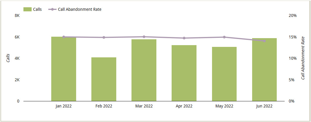
Figure 6.23 – Combination chart with lines and bars
The configurations for the preceding combination chart are as follows:
- Click Add a chart and select a regular line chart type. You can also choose the combination chart type directly from the list.
- In the SETUP tab, configure the following:
- Select Call Center as the data source.
- Add CallDateTime as a Dimension and change the format to Date & Time | Year Month. This aggregates the data at the month level.
- Add Calls as a Metric.
- Add Call Abandonment Rate as another Metric and make sure the aggregation is Average.
- Sort by Call Month (Year Month) in Ascending order.
- In the STYLE tab, configure the following:
- Under the Series #1 properties, select Bars and choose an appropriate line color and weight.
- Under the Series #2 properties, choose an appropriate line color and weight. Set Axis to Right to let the Call Abandonment Rate series use the right axis. Select Show Points.
- Show both the Left Y-axis and Right Y-axis titles.
- Make the gridlines transparent.
You can add additional metrics to the chart and choose to display each as either a line or bars. The following chart depicts three metrics, where two of them are presented as clustered bars:
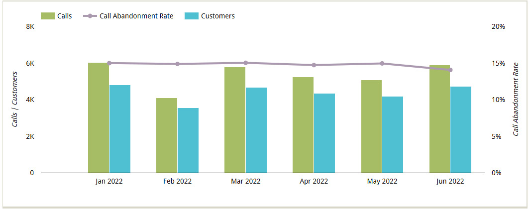
Figure 6.24 – Combination chart with a line and grouped bars
Add the CustomerNo field as an additional metric to the previous chart. Rename it Customers in the field’s edit pane, which you can access by clicking the pencil icon. Configure the new series to use bars and choose an appropriate color. You can stack the bars by selecting Stacked Bars in the General section when it makes sense for the metrics being displayed – that is, when the total value of the two metrics represents something meaningful. For instance, if we have the number of inbound calls and outbound calls as separate metrics, stacking these values will provide the total number of calls. For this example, stacking the number of calls and number of customers is not meaningful.
You can use a breakdown dimension with a line chart to visualize the metric as a separate line for each of the dimension values, as shown in the following screenshot. This chart shows the number of weekly calls made by customers of different tiers.
When a breakdown dimension is used, you can only visualize one metric in the line chart:
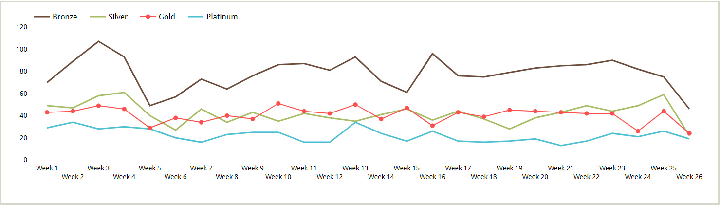
Figure 6.25 – Line chart using a breakdown dimension
If your breakdown dimension has a large number of values, you can limit the number of lines displayed by setting the Number of Series to the desired number. The default is 10. You can style each data series or line separately – choosing different colors and weights, enabling data labels and points, and so on. In this example, I’ve selected Show Points for Series #3, which represents the Gold customer tier. ISO Week starts on a Sunday, so add a chart filter to exclude January 1 as it represents partial Week 52 from the year before.
Time series chart
Looker Studio offers a specific chart type, called Timeseries, that you can use with time series data. This chart type only accepts a date or datetime dimension on the X-axis. Even if you can use a line chart type to visualize a time series, the Timeseries chart type offers certain advantages over the line chart, as follows:
- The Timeseries chart provides a continuous timeline on the X-axis, even if certain dates and times are missing from the data. The Line chart, on the other hand, only displays the dates and times that are present in the data and does not fill in any gaps.
- Timeseries charts allow you to display trendlines, while Line charts do not.
- A Timeseries chart shows all the data for the entire date range selected in the SETUP tab, whereas a Line chart allows you to limit the number of data points to plot.
All the configurations and options available for line charts are also available for time series charts, except for Number of Points. Similar to line charts, you can create combination charts with multiple metrics, use breakdown dimensions to show a time series for each dimension value, and so on with time series charts.
A trendline that you add to your time series chart can be one of three types:
- Linear: Best suited to describe data with a continuous increase or decrease over time in a steady manner
- Exponential: Best suited to describe data that rises or falls over time at an increasing rate
- Polynomial: Best suited to describe large volumes of data with oscillating values that have more than one rise and fall
Choose the one that best fits your data. The following time series chart displays a polynomial trendline for Call Abandonment Rate that more accurately represents the slight increase between the end of March and the beginning of April and a significant dip toward the end of June. In contrast, a linear trendline will just show a line with a negative slope to depict the overall decrease in the metric value for the date range and does not represent the increase of value in between.
An exponential trendline is not applicable for this data as the rate of change is minimal and steady rather than exponential:
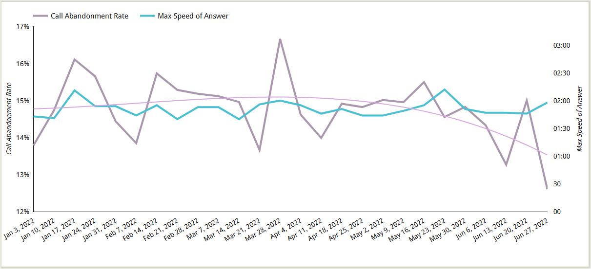
Figure 6.26 – A time series chart with a trendline and multiple series
The preceding chart depicts two series on dual axes with a trendline configured for one of the series. The configurations for this chart are as follows:
- Click Add a chart and select the Timeseries chart type.
- In the SETUP tab, configure the following:
- Select Call Center as the data source.
- Add CallDateTime as a Dimension and change the format to Date & Time | ISO Year Week. This aggregates the data at the week level.
- Add the Call Abandonment Rate and AnsweredInSeconds fields as Metric types. For the latter metric, open the edit pane by clicking the pencil icon and set Aggregation to Max to plot the maximum taken to answer a call for a given week. Provide a display name of Max Speed of Answer.
- Add a filter to exclude January 1 to remove the partial week.
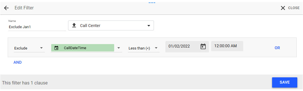
Figure 6.27 – Chart filter to exclude calls made before January 2nd
- In the STYLE tab, configure the following:
- Under the Series #1 properties, choose the appropriate line color and width for the Call Abandonment Rate metric.
- Set Polynomial to Trendline and adjust line color and width as desired. This example uses a line weight of 4 for the main series and 2 for the trendline.
- Under the Series #2 properties, choose the desired line color and weight. Set Axis to Right.
- Show the axis titles for both Y-axes.
- For the Right Y-axis option, set Axis Max value to 200. At the time of writing, leaving the axis limits to Auto for a metric of the Duration (sec) data type does not show any axis labels other than 0. As a workaround, setting the axis max value displayed, the axis ticks at 30-second intervals, which works for our data.
- Make the gridlines transparent. Displaying gridlines with dual axes may create a mishmash of lines and add clutter.
A useful and important configuration for a time series chart is how to represent missing data. The time series chart displays a continuous scale for the entire date range without any breaks, whether or not there is data for all the intermediate periods. You can choose to represent missing data in one of three ways from the General properties in the STYLE tab:
- Line to Zero
- Line Breaks
- Linear Interpolation
The following figure shows three charts – the leftmost is a line chart, while the other two are time series charts. All the charts are depicting the number of abandoned calls for each month. I’ve introduced missing data by adding a chart filter to exclude data between Mar 1, 2022, and Apr 30, 2022:
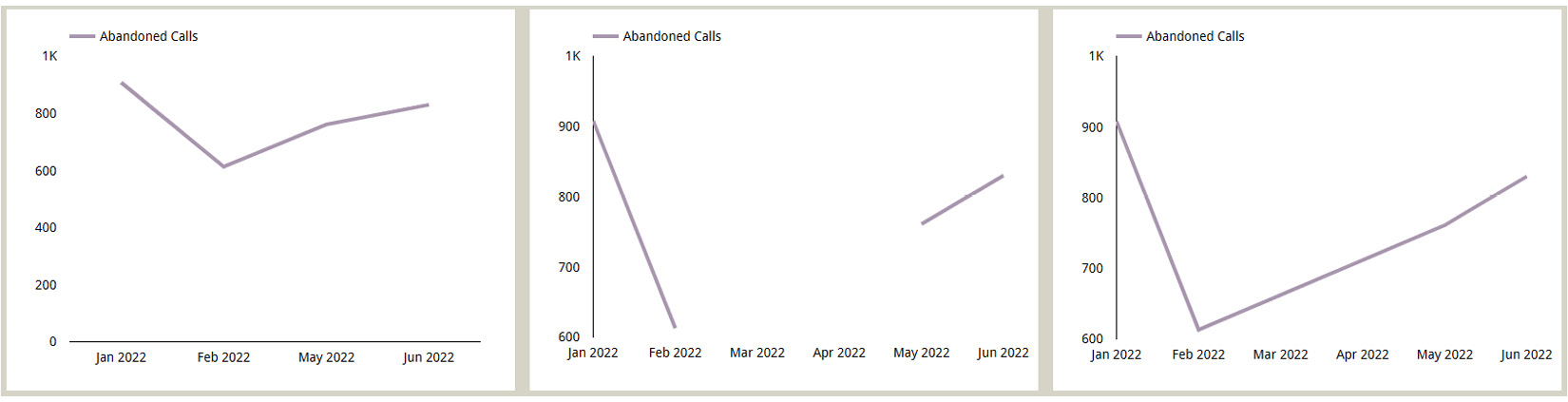
Figure 6.28 – Handling missing data for a time series
As you can see from the preceding charts, the axis on the line chart doesn’t display the missing months at all and shows a continuous line. The time series chart in the middle is configured to show line breaks for missing data, while the rightmost time series chart uses linear interpolation for the missing quarters.
For all the three chart types – Line, Timeseries, and Area – you can show cumulative sum values of the metric along the X-axis by selecting the Cumulative option for the series from the STYLE tab. The following time series chart shows the cumulative number of abandoned calls throughout June:
Note
The Cumulative option, when enabled, only computes the running sum of the metric values and does not provide an option to choose a different method of aggregation. This configuration only makes sense for additive metrics and using it for any non-additive metrics such as ratios, percentages, and so on will only result in meaningless data.
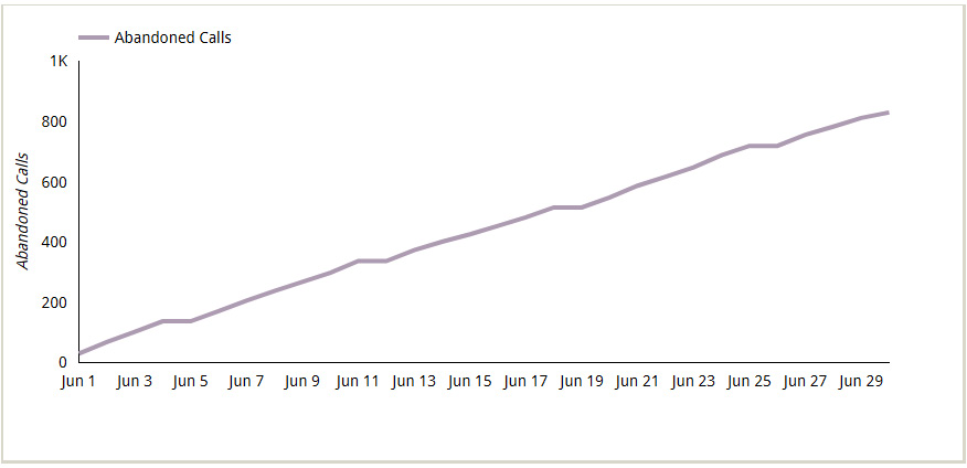
Figure 6.29 – Time series chart showing cumulative values
A time series chart without any axes displayed is called a sparkline chart. Typically, sparklines are tiny and compact. Their main purpose is to provide a general trend of the recent historical values for a metric and are almost always used along with other charts to provide historical context for a metric displayed on a scorecard, for example.
You can create a sparkline chart either by creating a regular time series chart and hiding the axes or by directly selecting the specific variation from the list:

Figure 6.30 – A sparkline chart with a scorecard
In the preceding screenshot, the sparkline chart, which displays the monthly trend of the Call Abandonment Rate metric, is placed on top of the scorecard depicting the year-to-date aggregation of the same metric. Use the Arrange menu or right-click context menu to order the components from front and back as needed.
You can choose to enable data labels on a sparkline, but this usually results in a very cluttered look due to the small size of the chart. At the time of writing, Looker Studio doesn’t provide the option to display only certain data labels such as min, max, starting value, ending value, and so on. Even though a sparkline doesn’t provide any contextual or value information at a glance, hovering over the data points will show the period and metric values in the tooltip.
Area chart
An area chart in Looker Studio is similar to a time series chart, but with a shaded area under the line. Similar to a time series chart, you can only use date or time on the X-axis. The following screenshot shows the number of weekly abandoned calls by customers in the Bronze, Silver, Gold, and Platinum tiers:
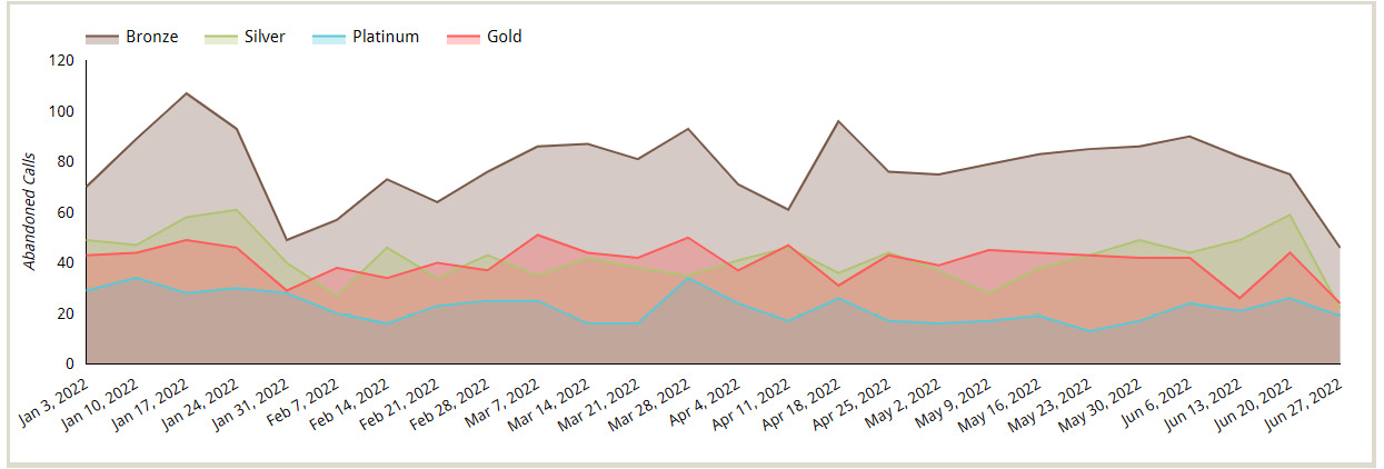
Figure 6.31 – Area chart depicting the number of abandoned calls over time for each of the customer tiers
In the case of multiple series, the entire area from the X-axis to each series line is shaded in different colors, resulting in overlapped colors. The shaded area in the area chart accentuates the difference in values between the series better than just lines. However, since different colors are overlaid on each other, it becomes difficult to interpret the chart correctly when there are more than a few series plotted.
The preceding area chart can be configured as follows:
- Click Add a chart and select the Area chart type.
- In the SETUP tab, configure the following:
- Select Call Center as the data source.
- Add CallDateTime as a Dimension and change the format to Date & Time | ISO Year Week. This aggregates the data at the month level.
- Add CustomerTier as a Breakdown dimension.
- Add IsAbandonedCalls as a Metric and rename it Abandoned Calls.
- Sort Breakdown dimension based on CustomerTierNo in ascending order. The X-axis is automatically sorted for the date range, just like in a time series chart.
- Add a filter to exclude January 1 (CallDateTime < 01/02/2022 12:00:00 AM).
- In the STYLE tab, configure the following:
- By default, 10 series can be displayed. Since we have only four customer tiers, we don’t need to adjust this number.
- You can color the series based on either series order or by setting specific colors for the dimension values (customer tiers, in this case).
- Set Show axis title to Left Y-Axis.
- Make the gridlines transparent.
Similar to a time series chart, you can choose to represent missing data in one of three ways: Line to Zero, Line Breaks, and Linear Interpolation. With Looker Studio’s area chart, you can only visualize one metric. You can add multiple metrics when the Optional metrics option is enabled. However, you can only choose one metric at a time.
Note
Area charts in general are based on line charts and can depict any dimension on the X-axis. In Looker Studio, the area chart is modeled like a time series chart, which means it has all the cool features of the time series chart when visualizing data over time. However, it lacks the flexibility that line charts provide for representing other forms of ordinal and continuous data. Area charts in Looker Studio also visualize only one metric at a time. Given the difficulty of interpreting area charts, these limitations can be perceived as good design choices by Google as Looker Studio doesn’t allow users to create overly complex and thereby ineffective and misleading area charts.
You can convert a simple area chart into a stacked area chart by enabling the Show stack option from the STYLE tab. In a stacked area chart, the series are stacked on top of each other and the shaded areas do not overlap, as shown in the following screenshot:
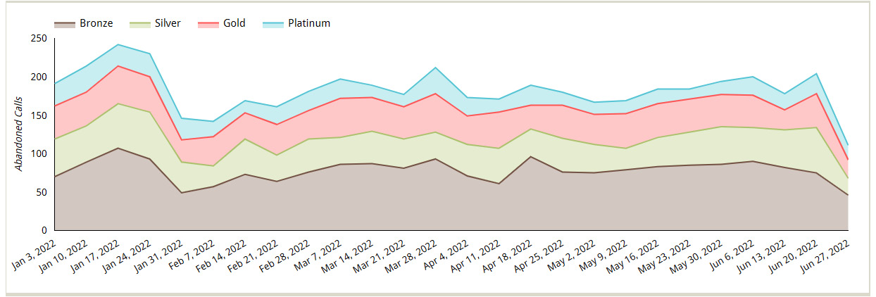
Figure 6.32 – Stacked area chart with absolute values of the metric
A 100% stacked area chart represents the percentage distribution of different series over time. Choose the 100% stacked area chart type directly from the list or modify a simple area chart by turning on the Show Stack and 100% Stacking options in the STYLE tab. As shown in the following screenshot, a 100% stacked area chart presents a different view from the preceding charts for the same data and tells you that the distribution of different customer tiers is pretty uniform across time:
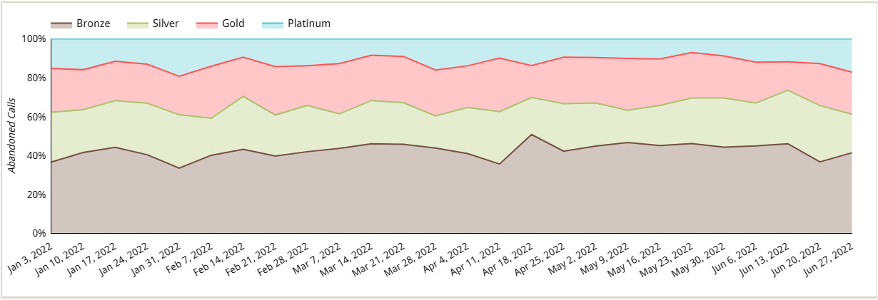
Figure 6.33 – 100% stacked area chart depicting the distribution of abandoned calls across different customer tiers
Use stacked area charts with caution as the actual difference between two series is not based on the height of the lines but rather on the area between the two lines. It is more difficult for the human eye to perceive areas accurately compared to the length of the lines.
In the next section, we will look at scatter charts and how to configure them.
Configuring scatter charts
A scatter chart enables you to visualize a large number of data points and understand the relationship between two metrics on the X and Y axes. The points in a scatter plot represent the dimension values chosen. The coordinates of each point in the chart indicate the values of the two metrics on the axes. In this section, we will explore the key configurations of the scatter chart type using the Call Center data source.
The following scatter chart plots customer zip codes against Avg Speed of Answer and Avg Call Duration:
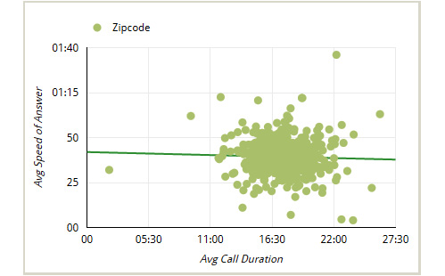
Figure 6.34 – Scatter chart with a trendline
You can add a trendline to the scatter chart to indicate the type and direction of the relationship between the two metrics on the axes. You can add a linear, exponential, or polynomial type of trendline based on your data.
By default, you can plot up to 1,000 points in a scatter chart. You can increase or decrease this number from the STYLE tab as per your needs. For example, you may want to decrease this number to only see the top N data points.
The preceding scatter chart can be configured as follows:
- Click Add a chart and select scatter chart type.
- Configure the following in the SETUP tab:
- Select Call Center as the data source.
- Add the Zipcode field as a Dimension.
- Add CallDurationSeconds as Metric X, make sure the method of aggregation is Average, and set the display name to Avg Call Duration.
- Add AnsweredInSeconds as Metric Y, make sure the method of aggregation is Average, and set the display name to Avg Speed of Answer.
- Configure the following in the STYLE tab:
- Select the desired color under Color by. Leave the Bubble Color setting to None. The Bubble Color setting allows you to color the bubble based on a dimension added to the chart.
- Choose the Linear type for Trendline and select the appropriate line color.
- Show the axis title for both the X and Y axes.
When an additional metric is depicted in a scatter chart by the size of the point, the chart is called a bubble chart. In the following screenshot, each point represents four dimensions – X and Y coordinates, the size of the bubble, and the color of the bubble. Looker Studio allows you to choose a dimension field to color the points or bubbles:
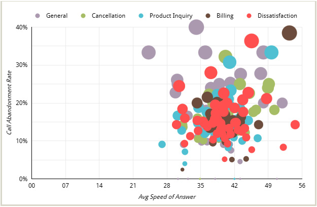
Figure 6.35 – Bubble chart colored by dimension values
Each bubble in the preceding chart represents a combination of the state that the calling customer belongs to and the call topic. The chart configurations are as follows:
- Configure the following in the SETUP tab:
- Select Call Center as the data source.
- Add State as the Dimension field. Also, add Topic as the second dimension. Like with other chart types, you can add multiple dimension fields to drill down and up from one level to another. In this example, we are not enabling the Drill down option. We are adding the second dimension to display the data at the granularity of State and Topic. We can use the Topic dimension to color the bubbles in the STYLE tab.
- Add AnsweredInSeconds as Metric X and rename it Avg Speed of Answer. Make sure Average is selected as the method of aggregation.
- Add Call Abandonment Rate as Metric Y.
- Add IsCallAbandoned as Bubble Size Metric to represent the number of abandoned calls for each customer state and call topic. Set the display name to Abandoned Calls. It will show up in the tooltip.
- Configure the following in the STYLE tab:
- Under the Scatter Chart properties, move the slider to adjust the scale of the bubble size and set the Topic dimension to Bubble Color.
- You can set the colors of the bubbles for each value of the chosen dimension either based on the bubble order or by defining colors for specific dimension values.
- Show the axis titles for both the X and Y axes and make the gridlines lighter.
Note
When a dimension is used to color the bubbles, Looker Studio does not provide the trendline option in the STYLE tab for the scatter chart.
In the next section, we will configure pie and donut charts.
Configuring pie and donut charts
Pie charts enable you to visualize data as parts of the whole. They are a good choice for depicting a few categories with largely varying proportions. In this section, we will learn how to configure pie charts and donut charts using the Call Center data source.
Looker Studio allows you to visualize up to 20 slices. However, depicting more than five slices usually wouldn’t be very useful or effective. Consider the pie chart on the left in the following figure. It represents the proportion of calls by the top 10 call reasons. The pie chart on the right provides a much better representation with fewer slices:
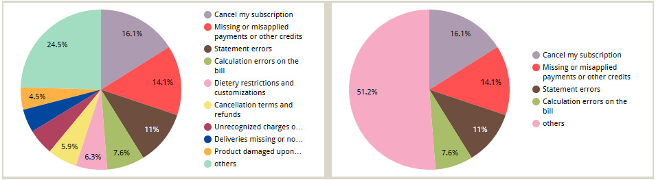
Figure 6.36 – A pie chart with too many slices (on the left) and a pie chart with an optimal number of slices (on the right)
The slices are automatically sorted by the decreasing order of the chart metric. If the number of dimension values is more than the number of slices configured, Looker Studio automatically groups the last values into the others category, as shown in the preceding figure. This chart can be configured as follows:
- Configure the following in the SETUP tab:
- Select Call Center as the data source
- Add Subtopic as a Dimension and Calls as a Metric
- Make sure the Sort field is set to Calls and that the order is Descending
- Configure the following from the STYLE tab:
- Under the Pie Chart properties, set the number of slices to 5.
- Color the slices based on a single color, slice order, or dimension value. In this example, I’ve used the Slice order option and selected the desired colors.
- Adjust the legend position, if needed.
For a pie chart, Percentage data labels are displayed by default. Under the Label properties in the STYLE tab, you can choose one of the following options:
- None
- Percentage
- Label (dimension)
- Value
It’s always advisable to display data labels, which are mostly percentage values on pie charts, since no scale can help us interpret the proportions. You can also format the font style for these labels as per your preference.
Text Contrast is a property that determines the color of the font for the labels based on the level of contrast required against the slice colors. In the preceding figure, you can see that the label is white for the brown-colored Statement errors slice, while the other labels are black.
Donut charts are just a variation of pie charts and have the same characteristics. Just move the donut slider from the STYLE tab to adjust the diameter of the donut hole. So, you can think of a donut chart as just a pie chart with a hole in its center:
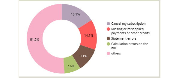
Figure 6.37 – A donut chart is a pie chart with a hole
Similar to other chart variations, you can create a donut chart directly by choosing the variation from the Add a chart list. You can also convert a pie chart into a donut chart and vice versa easily by selecting the appropriate chart type from the chart picker.
The next section delves into geographical charts and their configurations.
Configuring geographical charts
Geographical charts are used to visualize location data. In this section, we will learn how to use and configure the two types of charts that Looker Studio offers to represent geographical data – Geo and Google Maps.
The geographic dimensions allowed by Looker Studio include the following:
- Continent (for example, Europe).
- Subcontinent (for example, Eastern Europe).
- Country.
- Country subdivision (1st level): States, provinces, and so on. Available only for a small number of countries (for example, the US, Canada, France, Spain, and Japan).
- Country subdivision (2nd level): US counties, French departments, Italian provinces, and so on. Available only for some countries.
- Designated Market Area: Represents media markets. Only available for the United States (for example, Seattle-Tacoma).
- City.
- Postal Code.
- Address (need to be complete for accuracy).
- Latitude, Longitude.
Note
The Subcontinent and Designated Market Area geo dimensions are only available to Google Analytics data sources for geo charts. You cannot use this data type for other data sources when using the geo chart type.
Apart from these geo types, Looker Studio also accepts geospatial data types from data sources such as BigQuery, where the data is represented as polygons and points. Only Google Map charts support BigQuery’s GEOGRAPHY data type (it’s recognized as a geospatial data type in Looker Studio).
Note
Looker Studio offers only a handful of geo specific functions compared to BigQuery, mainly that return the name of the Geo based on its code. On the other hand, BigQuery provides many functions that allow you to transform your geospatial data in more useful ways.
Geo chart
The classic geo chart type allows you to depict a single metric for a geographical dimension. There is no option to specifically choose to use a filled color or bubbles to represent the metric in a geo chart. It is automatically set based on the geo dimension level used. The metric is represented with a filled color with higher levels such as continent, subcontinent, country, state/province (Country subdivision – 1st level), and designated market area. Such filled maps are also called choropleth maps. For County (Country subdivision – 2nd level), City, and Latitude, Longitude, the metric is represented by markers.
Note
The Country subdivision (2nd level), Postal Code, and Address geo dimensions can only be used with the Google Maps chart type. These cannot be used with a geo chart.
The following figure displays the number of calls made by customers from different states and counties in the United States as a geo chart:
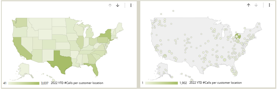
Figure 6.38 – Geo chart displaying the number of calls made by customer location, state-wide on the left and county-wide on the right
Geo charts allow you to drill down into lower levels of geo dimensions. In the chart depicted in the preceding figure, you can drill down from state level to county and vice versa.
An important property for a geo chart is Zoom area. You can have the map zoom into one of the following geo levels based on the geo dimension(s) you are depicting in the chart:
- World
- Continent
- Subcontinent
- Country
- Region (state, province, and so on within a country)
The configurations for the preceding chart are as follows:
- Click on Add a chart and select the Geo chart type.
- In the SETUP tab, configure the following:
- Select Call Center as Data source.
- Add State as a Dimension.
- Toggle the Drill down option and make sure Default expand level is set to State.
- Add County Name as another Dimension.
- Add Calls as a Metric.
- Set Zoom area to United States.
- In the STYLE tab, configure the following:
- Choose appropriate colors for the Max, Mid, and Min values. You can also determine which color to use for an area when no data is available for it.
- Select Show legend. This legend does not display any title, so add a custom text label with the metric name using the text control and place it over the chart.
A geo chart can only visualize up to 5,000 data points. Looker Studio chooses the top 5,000 data points by the decreasing order of the metric. This sorting is not configurable. Geo charts do not represent negative metric values well. Use a Google Maps chart type instead if you would like to depict negative values.
Google Maps chart
Looker Studio allows you to visualize and explore geographical data in a Google Maps environment using the Google Maps chart. You can interactively zoom in, zoom out, move the map around, and so on, just like in the Google Maps application. Any valid and supported geo dimensions can be used with this chart. Three variations of the Google Maps chart are available:
- Bubble maps
- Filled maps
- Heatmaps
Unlike in the case of a geo chart, with a Google Maps chart, you can choose whether to represent a metric of any geo dimension level as bubbles or map areas filled with a shaded color or as a heatmap with a color gradient. The only caveats are the Address and Latitude, Longitude geo dimensions, which can be represented only as bubbles. The following Google Maps chart shows the number of calls by the customer’s state using the filled map layer:
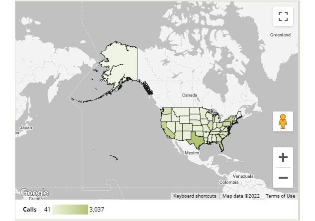
Figure 6.39 – Google Maps chart with a filled areas layer
Based on the geo dimension field used with the chart, the map zooms into the corresponding area by default. There is no specific Zoom area configuration for a Google Maps chart like there is in a Geo chart. The default view is often not user-friendly and requires the users to manually zoom into the desired area by using the map controls or just double-clicking on the map.
A useful setting for a Google Maps chart is the Tooltip dimension, which enables you to show the value of a dimension other than the default location field in the tooltip. You just have to make sure that this dimension has exactly one value for each location plotted. Otherwise, Looker Studio will return an error. This is helpful when the location field is a non-user-friendly code or ID and you want to show the location name to the user instead.
Google Map charts offer greater choice in terms of map styling options. You can choose either a Map (as shown in the preceding screenshot) or a Satellite view and select different background styles such as silver, standard, and dark. You can also set the map style to JSON and import your changes if you want something very fancy and custom.
You can even adjust the level of background details for roads, landmarks, and labels. By default, the most detailed maps are available to you, but you can set the right level of detail for your needs.
The preceding chart uses the default settings for most of the properties. You can build it as follows:
- Click on Add a chart and select the Google Maps – Filled Map chart type.
- In the SETUP tab, configure the following:
- Choose Call Center as the data source
- Add State as the Location field
- Add Calls as a Color metric
- In the STYLE tab, configure the following:
- Keep the Background Layer type set to Map and set Style to Silver.
- Make sure Layer Type is set to Filled areas (the other options are Bubbles and Heatmap). This determines how the metric is visualized.
- The Filled Area Layer property defines the opacity of the filled areas. You can adjust the border color and weight. Increase the opacity to 100% from the default value of 50%.
- Choose an appropriate color for the Max, Mid, and Min values of the metric. This example uses green for the Max value and leaves the rest as-is.
- Legend is displayed by default in the bottom position, along with the title. You can adjust the font and number format options as well.
The STYLE tab also allows you to enable or disable several map controls. By default, the following are enabled:
- Allow pan and zoom
- Show zoom control
- Show Street View control
- Show fullscreen control
The fullscreen control enables you to view the map enlarged to the entire screen. This provides a better experience for the users to explore. This also allows you to fit the chart in a small space on the dashboard, knowing that the users can expand it to full screen when needed. There are two more map controls that you can choose to show on the chart:
- Show map type control: This allows the user to switch between the map and satellite views
- Show scale control: This displays the map scale in miles or kilometers
The following Google Maps chart depicts the number of calls from the customers across different US counties. This chart is just a variation of the preceding chart, with the following configuration changes:
- Select the chart, and choose Bubble map from the chart picker on the top-right. Or from the STYLE tab, change the Layer Type from Filled areas to Bubbles
- In the SETUP tab, make the following changes:
- Choose County Code as the Location field
- Select County Name as the Tooltip field
- Make sure Calls is added under Size
- Add Call Abandonment Rate as a Color metric
- In the STYLE tab, make the following changes:
- Set the Background Layer map style to Standard.
- Reduce the level of detail for Roads and Landmarks.
- Under the Bubble Layer properties, adjust the size slider appropriately, and set the bubble’s opacity to 50%.
- Choose the appropriate colors for the Max and Min values.
- Unselect Show Street View control and select Show map type control options under Map Controls.
- There are separate styling options for the Size Legend and Color Legend. This example retains the default settings for these properties:
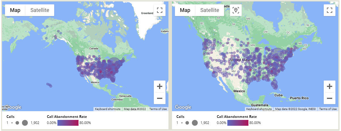
Figure 6.40 – Bubble map using a standard map layer. The default view is on the left. Manually zoom in to achieve the view of the right
Notice that the map does not zero in exactly on the specific region we filtered for. So, it becomes important to always allow the zoom and pan capabilities so that the user can explore the map as needed. There is a reset icon in the top-left corner, using which the user can reset the map to its original state after they’ve finished exploring.
The final variation of a Google Maps chart is a heatmap, as shown in the following figure. This displays the number of calls made by the customers from the state of California per zip code. Heatmaps plot each location as a point and draw circles around the points based on a radius property value. When these circles overlap, the values of the closest points are aggregated as either sum or weighted averages. You can provide a metric field to determine the corresponding weights of different locations:
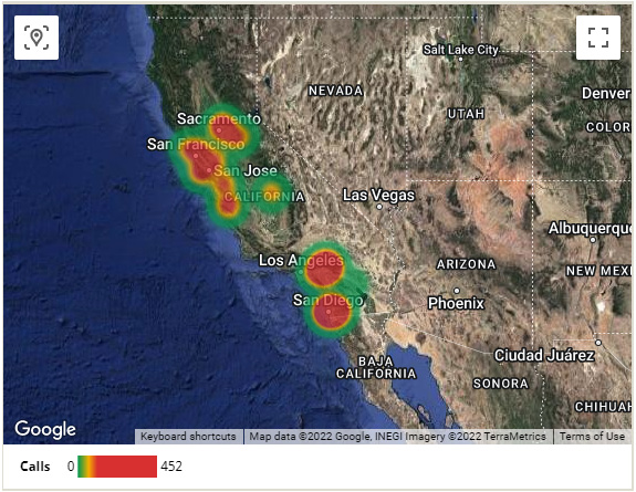
Figure 6.41 – A heatmap of the number of calls made by customers from the state of California
The configurations of this chart are as follows:
- Click on Add a chart and select the Google Maps – Heatmap chart type.
- In the SETUP tab, configure the following:
- Choose Call Center as the data source
- Add Zipcode as the Location field
- Add Calls as the Weight metric
- Under the Filters section, click on ADD A FILTER and create one with the Include condition set to State Equal to (=) California
- In the STYLE tab, configure the following:
- Select Satellite as Background Layer Type and choose Standard Style.
- Reduce the level of detail for Roads, Landmarks, and Labels.
- Under the Heatmap layer properties, set Heatmap aggregation to Sum (which computes the weighted average based on the metric chosen) and make sure the opacity is 70%. Increase the intensity a little bit to adjust the range of colors toward the high end.
- You can choose any colors you wish for the Max, Mid, and Min values. This example retains the default colors.
- Uncheck the Show zoom control and Show Street View control options.
- Double-click on the map and pan it to zoom in as needed.
Google Maps charts do not allow you to drill down into additional levels of geo dimensions. You can only visualize a single geographical dimension and in the cases of filled areas and heatmaps, only one metric. You can depict up to two metrics with a bubble map. Requiring the drill-down capability is one use case where a geo chart is a better fit.
At the time of writing, Google Maps charts don’t allow Optional Metrics. Geo charts, on the other hand, do support optional metrics. You can choose any one metric at a time to be visualized in the chart. In addition to the interactive map interface and allowing exploration, Google Map charts can plot a higher number of data points for the Latitude, Longitude field, the limit of which is up to 1 million bubbles. However, the limit for other geo dimensions is only 3,500, which is less than the 5,000-point limit for the geo chart. So, it’s a tradeoff that you need to make based on the volume of data to be displayed. More importantly, the greater the number of data points plotted, the longer it takes the Google Map chart to load. Consider both the advantages and disadvantages of the two categories of geographical charts while choosing between them.
In the next section, we will learn about configuring scorecard charts, which help present key performance metrics.
Configuring scorecards
With scorecard charts, you can show a single metric value as text. They are useful to display key performance metrics. In this section, we will configure a scorecard to display the Call Abandonment Rate metric. The following screenshot shows the metric value for the second quarter of 2022:

Figure 6.42 – Scorecard displaying the Call Abandonment Rate metric
You can build this scorecard as follows:
- Click on Add a chart and select the Scorecard chart type.
- In the SETUP tab, configure the following:
- Choose Call Center as the data source.
- Add Call Abandonment Rate as a Metric. Set the display name to Q2 Call Abandonment Rate.
- Set Default date range to a fixed duration of April 1, 2022, to June 30, 2022. Select the Fixed option from the top drop-down and select a Start Date and End Date. Our dataset only has the data for 6 months of 2022. For any up-to-date data source, you can choose other options such as This Quarter, This Month, and so on.
- In the STYLE tab, do the following:
- Add two conditional formatting rules to show the value text in green when the value is less than 0.1 and in red otherwise. You can choose to set the background color for the card based on this condition as well:
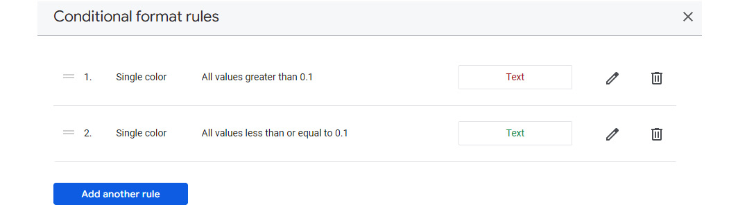
Figure 6.43 – Conditional formatting rules for the scorecard
- Set Decimal precision to 1 under Primary Metric.
From the STYLE tab, you can configure other properties such as the text style and alignment, card background and border, padding, and so on. I’ve updated the Line Height option under the Padding section to 48px.
Most metrics provide greater utility when compared against another timeframe. The following is an enhanced scorecard example that shows a comparison of the call abandonment rate for Q2 against the previous period value – that is, Q1, 2022 – below the primary metric number:

Figure 6.44 – Scorecard showing the comparison metric
You can modify the previous scorecard configurations to achieve the chart shown in the preceding screenshot using the following configurations. You can resize the chart on the canvas appropriately to fit the labels:
- In the SETUP tab, make the following changes:
Set Comparison date range to Previous period to provide the change in Call Abandonment Rate compared to the previous quarter. The period considered by the Previous period option is based on the period specified in the default date range. Since we have selected the default date range as a fixed date range of 91 days, Previous period is set to 91 days before that, which is Q1.
When you choose the default date range in terms of past quarters based on the current date, the previous period label is displayed as previous quarter. At the time of writing, I’ve set the default date range as follows to display the metric for Q2 (directly choosing Last quarter would have also worked):
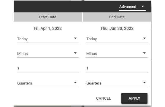
Figure 6.45 – Choosing a default date range relative to today
This changes the comparison label accordingly, as shown in the following screenshot:

Figure 6.46 – Scorecard using relative time as the default date range
- In the STYLE tab, do the following:
- Change the conditional formatting rules to set the background to red when the value is greater than 0.1 and green otherwise.
- Under the Comparison Metric options, select red for a positive change and green for a negative change.
- Check the Show Absolute Change option. We want to show the comparison metric as an absolute change instead of a percentage change.
- Uncheck Hide Comparison Label. This shows some text stating from previous quarter beside the comparison metric value.
- Under Labels, center-align Metric name, Metric value, and Comparison.
- Select a light gray for the border line and check Add Border Shadow under the Background and Border properties.
- Make sure the Line Height property is set to 48px under Padding. This property adjusts the space between the metric name, metric value, and comparison value.
Scorecards allow you to configure what to display when data is missing for the chosen date range. By default, No data is displayed. However, you can choose to show 0, a dash, blank, or “null” text.
In the next section, we will explore the remaining built-in chart types – the Treemap chart, Buller chart, and Gauge chart.
Configuring other chart types
In this section, we will look at the last three types of built-in charts that Looker Studio offers. These are the Treemap chart, Bullet chart, and Gauge chart. Both the bullet and gauge chart types represent a single metric against an optional target value. On the other hand, a treemap chart depicts hierarchical dimension data using nested rectangles.
Treemap
A treemap chart enables you to represent a single metric for one or more dimensions. It is especially useful for displaying hierarchical data. Each dimension value is a branch represented by a rectangle whose size or area is based on the metric chosen. This rectangle or branch is further divided into multiple rectangles representing the next level dimension values and so on. Only the name of the lowest level dimension is displayed as a label in each rectangle. You can display the name of the parent dimension as the branch header by enabling this option from the STYLE tab.
You can configure how many levels of data you want to see at a time. You can also use the Drill down function to add many levels of detail to the chart. Let’s say that you have four dimension fields that form a hierarchy, where you have added them to the chart and enabled the Drill down option. When you set the Levels to show property to 1, you can only see one dimension at a time as you drill up and down through the dimension hierarchy. Configuring the Levels to show property to 2 allows you to see Dimension 1 and Dimension 2 at the top of the drill hierarchy, Dimension 2 and Dimension 3 when you drill down once, Dimension 3 and Dimension 4 when you drill down once more, and finally only Dimension 4 when you reach the bottom of the hierarchy.
The following treemap shows the number of calls by topic and subtopic. It displays two levels of dimensions at a time and also enables you to drill down through the dimension hierarchy. In this example, when you drill down to Subtopic, you will see only one level of data even, though the Levels to show property is set to 2. This is because no child dimensions have been added after Subtopic in the SETUP tab:
Figure 6.47 – Treemap displaying the number of police incidents by category and subcategory
By default, a treemap in Looker Studio shows 500 rows of aggregated data for the chosen dimensions. You can adjust this number from 5 to 5,000. In this chart type, both the size and the color of the rectangle are based on a single metric.
Note
If the metric has negative values for any rows, those values are not represented in the treemap and are excluded.
The treemap chart is automatically sorted by the decreasing order of the metric value chosen and displays the corresponding branches from the top left to the bottom right. At the time of writing, there is no explicit sort option to change this default behavior.
The preceding treemap can be built as follows:
- Click on Add a chart and select Treemap from the list.
- In the SETUP tab, configure the following:
- Choose Call Center as the data source.
- Add Topic and Subtopic as dimensions. Enable Drill down.
- Keep Levels to show set to 2.
- Add Calls as a Metric.
- In the STYLE tab, configure the following:
- Choose the appropriate colors for the Max, Mid, and Min values of the metric
- Enable Show branch header and choose the desired background color for this header
Treemaps are good at showing the relative sizes of data categories at multiple levels, especially depicting the long-tailed distributions of data. They should not be used when the data is not hierarchical or when the metric values are close to each other for various dimensions.
Bullet chart
Bullet charts provide a simple way to display a single metric and benchmark it against target values. These charts are a popular choice to represent key performance indicators (KPIs). The following screenshot shows a bullet chart with a bar representing the overall Call Abandonment Rate of 14.8% for the first 6 months of the year 2022 against the target score of 10%. It also shows different thresholds to understand how good or bad the metric value is:
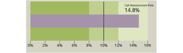
Figure 6.48 – Bullet chart depicting a metric value against the target benchmark
In this chart, three thresholds are defined at 8%, 12%, and 16%, respectively. Additionally, the target score is specified as 10%. A Call Abandonment Rate of 8% or less is considered very good. Anything between 8% and 12% is considered OK or average. A rate of more than 12% is considered poor.
You can only define up to three ranges – Range 1, Range 2, and Range 3 – for a bullet chart. You can set the value of a range to 0 to remove it. If you don’t want to use any ranges, set the same value that is large enough to display the metric for all range limits.
The preceding bullet chart can be built as follows:
- Click Add a chart and select the Bullet chart type.
- In the SETUP tab, configure the following:
- Choose Call Center as the data source
- Add Call Abandonment Rate as a Metric
- Add the following Range Limits:
- Range 1: 0.08
- Range 2: 0.12
- Range 3: 0.16
- Make sure Show Target is enabled and provide a value of 0.1
- Configure the following In the STYLE tab:
- Choose an appropriate color for the bar to represent the metric.
- Select the desired color to represent the threshold ranges. The ranges are displayed in varying shades of the single color selected.
- Make sure that you select Show Axis and adjust any font or number properties as desired. This example just uses the default values.
At the time of writing, Looker Studio’s bullet chart displays neither the data label for the metric nor the metric name on the chart. So, a separate scorecard chart is created and overlaid on the bullet chart to display them.
Gauge chart
Similar to a bullet chart, a gauge chart also displays a single metric against a target goal. Gauge charts provide a car dashboard-like look for monitoring performance metrics. These charts provide greater flexibility than bullet charts. The key differences between them are listed in the following table:
Table 6.1 – Key differences between a gauge chart and a bullet chart in Looker Studio
The following gauge chart displays the Call Abandonment Rate metric for Q2. The absolute change in the rate from the previous quarter is also shown. The black line displayed is the value of the metric for the comparison date range, which is Q1. This example doesn’t represent any target goal or range:
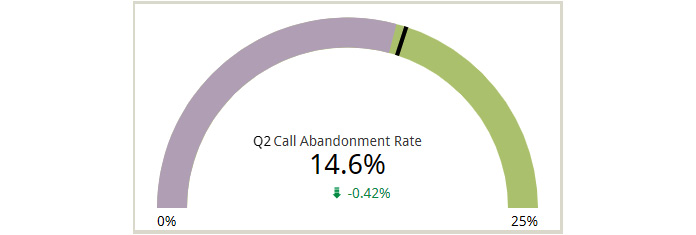
Figure 6.49 – Gauge chart with the comparison metric
This chart can be built as follows:
- Click Add a chart and select the Gauge chart type.
- In the SETUP tab, configure the following:
- Select Call Center as the data source
- Add Call Abandonment Rate as a Metric.
- Choose a Fixed range of April 1st, 2022, to June 30th, 2022, as Default date range.
- Set Comparison date range to Previous period to provide the change in the metric compared to the previous quarter.
- In the STYLE tab, configure the following:
- Choose the appropriate colors for the bar and the range
- Select Show Absolute Change to view the actual change in the metric value compared to the previous quarter rather than the default percentage change
- Under Comparison Metric, choose a red color for positive change and a green color for negative change
- Select Show Axis and set Axis Max to 0.25
- Add a text control to add a prefix of Q2 to the metric label. We do not want to change the display name of the field to reflect this as the same name is shown in the tooltip for the black line representing the previous period metric value.
When you add ranges and a target to the preceding chart, it looks as follows. The chart now displays two black lines – one for the target value and another for the metric value for the comparison date range. The two lines look alike and it is not possible to understand which is which without hovering over the lines to see the tooltips:
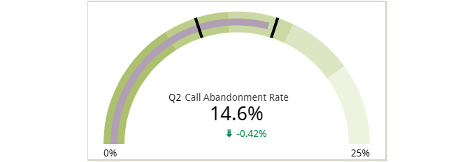
Figure 6.50 – Gauge chart with the target and ranges defined
Add the following configurations in the STYLE tab:
- Define four ranges as 0.08, 0.12, 0.16, and 0.2, respectively
- Select Show Target and set Target Value to 0.1
Gauge charts are often used in executive dashboards and reports for their appealing look. They are user-friendly and easily interpretable.
Building your first Looker Studio report – adding charts
You created the Call Center data source in Chapter 4, Google Looker Studio Overview, and set up a report with a title and a date range control in Chapter 5, Looker Studio Report Designer. Now, it’s time to add visualizations to the report. I’ve composed the dashboard as follows using some of the charts we configured in this chapter:
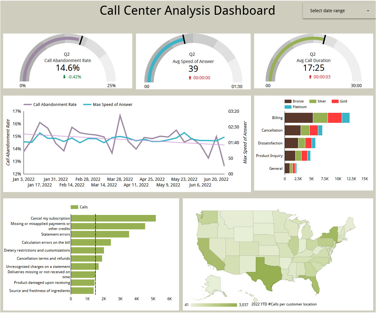
Figure 6.51–Dashboard using some of the charts we configured in this chapter
Build your report by adding a different set of charts or configurations, if you like, using what you’ve learned from this chapter.
Summary
Looker Studio offers several commonly needed visualization types as built-in charts. In this chapter, we examined each of the built-in charts available in Looker Studio at the time of writing and their key configurations. You understood the purpose and use of different data and style properties to build effective visualizations using a few public datasets.
In the next chapter, we will learn about some advanced features and concepts such as data blending, parameters, creating report templates, using calculated fields, and more.