
2
Principles of Data Visualization
Data storytelling is both an art and a science. The art part refers to the story structure and narrative elements that bind data and visual components together, whereas the science part of data storytelling pertains to the foundational principles of design and visual perception and their application. This book largely concerns itself with building data stories through dashboards and reports. It primarily deals with the science aspect of data storytelling. These forms of data presentation provide limited narrative flexibility owing to the dynamic nature of the data they represent. As the data changes over time, the insights it conveys and the story it tells will change accordingly. This makes it difficult to incorporate a rigid narrative. Hence, much of the emphasis is put on design elements such as the chart types, colors, and layout, that constitute the building blocks of storytelling through data, rather than on the narrative elements.
This chapter introduces several guiding principles and key design aspects to consider while building data visualizations. We will cover foundational concepts such as the simplicity of design, principles of visual perception, organization of content, and information accuracy. These principles form the bedrock of any decent visual design. Color plays a very important role in visual design and greatly affects how visual elements are perceived. We will delve into various aspects of choosing the right color schemes based on the specific use cases and audience needs.
For a deeper and more comprehensive study of these ideas, you can peruse other resources mentioned in the Further reading section at the end of the chapter. Additional data visualization concepts, primarily various chart types and gotchas, are discussed in the next chapter, Chapter 3, Visualizing Data Effectively.
In this chapter, we are going to cover the following main topics:
- Understanding foundational design principles
- Reviewing Gestalt principles of visual perception
- Using color wisely
Understanding foundational design principles
Well-crafted and effective dashboards are built on the foundations of design and visual perception that have been explored and studied for centuries. In contemporary times, Edward Tufte and Stephen Few are recognized as pioneers and the most notable leading experts of modern-day data visualization. Through their prolific work, they have elucidated the many intricacies of visualizing data and information effectively. In this section, we are going to review the following foundational principles and guidelines that form the basis of any good dashboard:
- Simplicity of design
- Organizing the layout
- Accuracy of information presented
Simplicity of design
The single most important guiding principle to building any visual representation of data is simplicity. Achieving simplicity mainly involves removing all distractions away from the data to be represented. In Edward Tufte’s words, it’s avoiding chart junk. Chart junk or non-data ink is anything that doesn’t represent data or information. It can take the form of redundant data, too many colors, three-dimensional (3-D) effects, dark gridlines, and much more. Chart junk interferes with the effective consumption of information. The rest of this section presents some common examples of chart junk and how they can be minimized effectively.
The following screenshot shows two variations of a bar chart depicting the average unit price for each product category. The gradient color and the textured color of the bars in the two charts respectively are distracting and do not add any information to the chart:
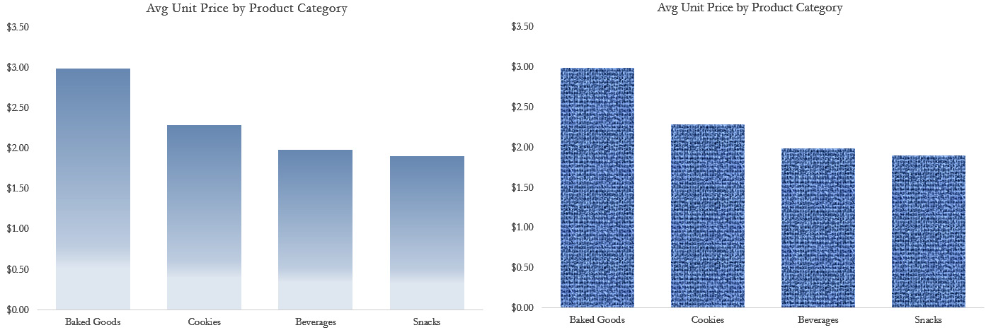
Figure 2.1 – Bar charts with distracting uses of color
Use solid colors to represent data and avoid using extraneous effects in an attempt to make a chart more visually appealing. The same applies to the background textures and patterns, as shown in the following screenshot:
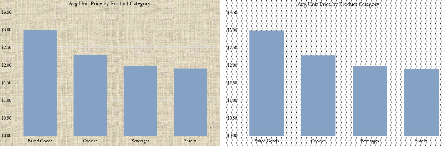
Figure 2.2 – Charts with distracting backgrounds
Background images for charts prove to be even more damaging to the eye, making it much more difficult to read and understand the data, as is the case here:
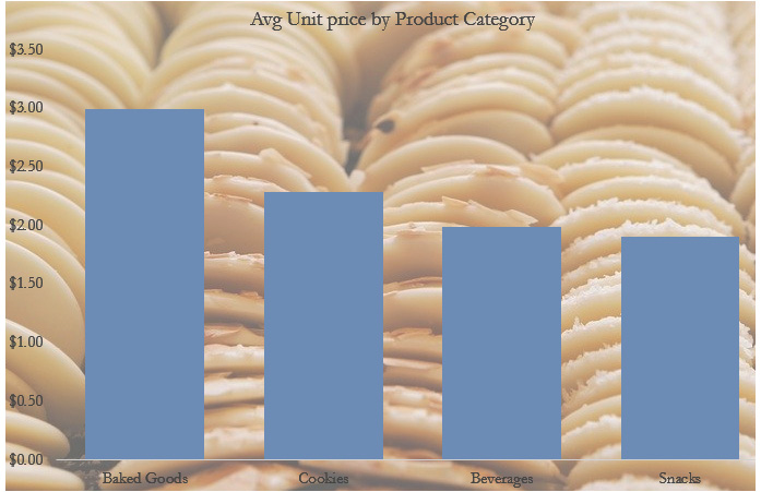
Figure 2.3 – Chart with ineffective use of images
While relevant and beautiful images usually grab the attention of users and it seems like a good idea to include them, a chart or a dashboard is not the right place for them. They distract users away from the objectives of the chart and jeopardize its utility. Use neutral solid colors as backgrounds, or none at all. This particular example showcases an especially bad case of using images, where the image doesn’t add any informational value. While the chart can perhaps be improved in other ways such as better color choice, labels, and so on, images as chart backgrounds seldom add value.
That said, images can aid data storytelling when justly used. Logos are often included in dashboards for branding purposes, while meaningful and relevant icons add value by enabling easier interpretation and increasing visual appeal. Pictographs are also a good example of displaying data as images. They are effective only for a small amount of data, though. The following screenshot shows male and female image icons (sourced from free-vectors.net under the Attribution 4.0 International (CC BY 4.0) license https://creativecommons.org/licenses/by/4.0/) that add context to the donut charts and a pictograph depicting the performance rating with star images (image by rawpixel.com):
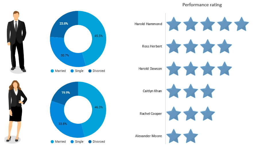
Figure 2.4 – Meaningful and appealing use of images
What about gridlines? Are they really chart junk? Judiciously placed gridlines help users to interpret charts easily. If there are too many lines or bars in a chart, adding gridlines may clutter the chart further. Dark-colored and thick gridlines are definitely noisy and considered non-data ink. Adding a large number of gridlines also contributes to chart junk. Use lighter and thin lines sparingly so as to enable the user to read the chart without difficulty while taking care not to clutter the chart. The following screenshot shows a line chart with distracting gridlines on the left and a chart with de-emphasized and useful gridlines on the right:
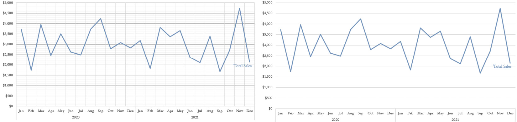
Figure 2.5 – Use gridlines in charts sparingly and in a non-interfering way
Simplicity also involves showing or encoding only enough information and nothing more. It is often tempting for a dashboard developer to incorporate all the different analyses and details that users can ever find useful into the dashboard and make it all-encompassing. Such a tendency leads to inefficiency and hinders users from achieving their objectives from the dashboard. If the users need to sift through the many visuals and details provided in the dashboard to get their basic questions answered, the dashboard is not simple enough. It is a case of Too Much Information (TMI). A visual—and thereby a dashboard—should contain the right amount of detail and precision to serve the objectives of the target users. The dashboard shown in the following screenshot attempts to provide information about a lot of aspects of Google Ads—campaigns, ad types, search keywords, devices, ad channels, asset types, and more. The level of detail varies, and it has a cluttered look:
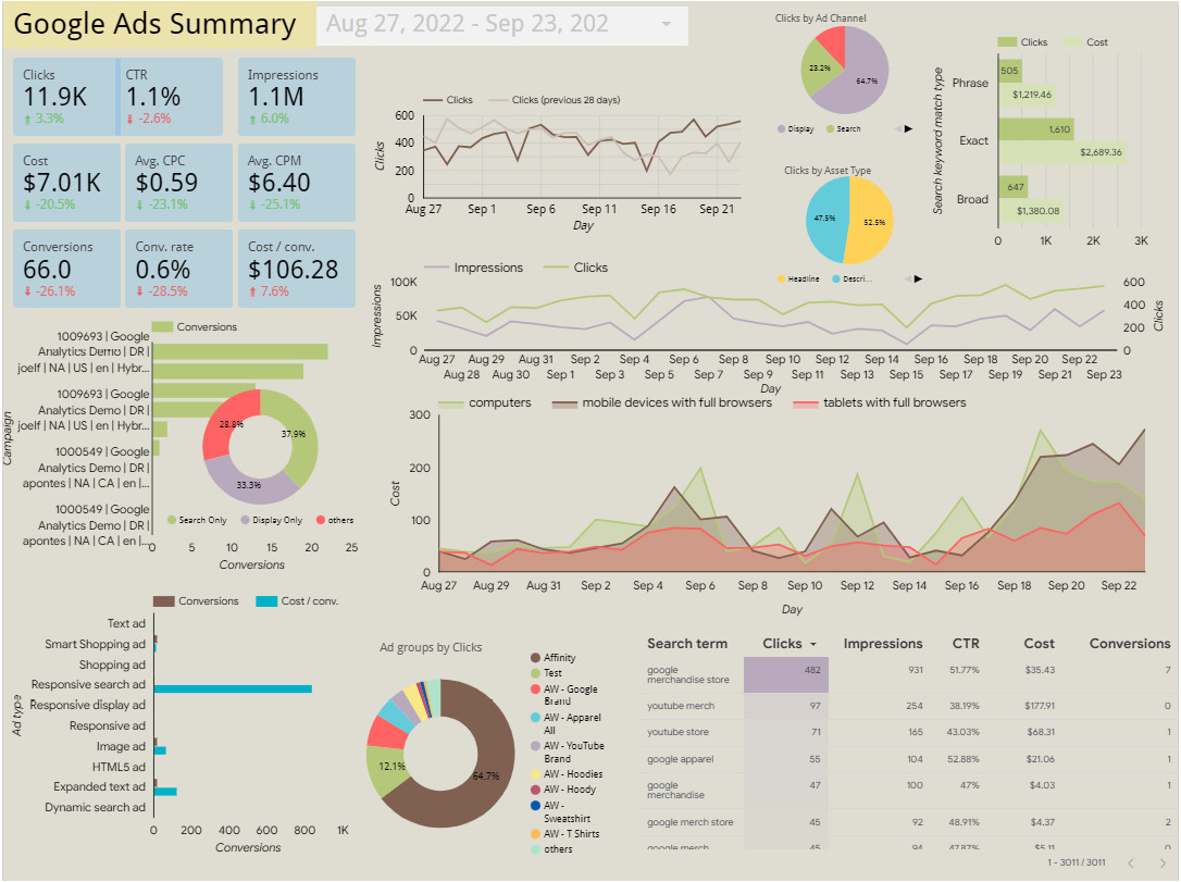
Figure 2.6 – Dashboard displaying too much information
Providing appropriate labels and context is key in making a dashboard easily readable. This includes elements such as titles, annotations, legends, units of measurement, and more. Consistency in the font style, font size, legend position, units of measurement, and numerical precision is a key enabler of simplicity in design. Having consistent elements across the dashboard puts a lower cognitive load on users as they do not have to process each element differently.
Removing, hiding, and de-emphasizing the details of less-important data is as essential as highlighting more important data elements. A dashboard where everything is highlighted is one in which nothing stands out. The way various elements in a chart or a dashboard are organized also affects how effective and meaningful the chart can be. The design should serve how we humans naturally perceive information visually.
Organizing the layout
The human eye typically follows the path of Z while consuming information visually. In this pattern, we scan content from the top left to the top right and then glance down through the content diagonally to the bottom left and continue to the bottom right. It is important to organize content in a way that supports the natural flow of eye movements. Keep this in mind while designing the layout of the dashboard so that it can meet its objectives more effectively. You should position the most important information in the top left and the least important information in the bottom right. It is more effective to place key performance indicators (KPIs) and other key metrics at the top of the dashboard, followed by relevant charts that explain these key metrics and provide the needed context to interpret the metrics appropriately.
Organizing filters in a dashboard or a report is an interesting challenge. In general, all the filter controls that apply to the entire report or page need to be displayed together in a single area. It can be toward the right of the page or on the top, but care should be taken not to obstruct users’ readability of the actual data, and also not to take up too much of the dashboard’s prominent real estate.
Occasionally, when a particular filter is applicable to only a specific chart or a group of charts, it can be placed near those charts and use enclosures such as borders or background shading to indicate that these filters and associated charts belong to a single group. This is one application of the Gestalt principle of enclosure. Figure 5.26 in Chapter 5, Looker Studio Report Designer, illustrates this idea.
Another important aspect of designing the layout of a dashboard or a report is to place relevant charts and elements together, not just filters and associated charts, but also different charts that depict the same metric or explain the same phenomenon. Also, if the same legend applies to multiple charts, you can display it just once and place it in such a way that it can be used to interpret those multiple charts easily without having to look back and forth. This is the Gestalt principle of proximity at play. The layout is also mainly influenced by the narrative and the story being told by the dashboard or the report.
When organizing charts horizontally or vertically, make sure to align the axes to provide a consistent and clean look. This makes a comparison of different charts easier. Unrelated to the layout, using the same scale for different charts depicting the same or a similar metric enables accurate and easier comparison. In some cases, however, it may be unreasonable to have all charts set to the same scale. For example, sales revenue in Canada might range from $500k-10m, while in Japan it could be $10k-50k. Say, you are visualizing these as separate charts on the same dashboard and you do not want users to make direct comparisons. In such situations, try not to place them on the canvas close to each other to discourage direct comparison. Also, clearly label the axes and make sure the information is getting across in a visually understandable way.
Accuracy of information presented
The primary objective of a data visualization or a dashboard is to show information accurately and meaningfully. It should not mislead users to perceive information incorrectly or make inaccurate conclusions. All the design principles we have discussed in this section so far should only be leveraged to serve this ultimate purpose—for example, simplifying the dashboard shouldn’t take it away from its intended meaning or clarity. Other forms of technically correct but undesirable ways of implementing these principles that impact the overall accuracy include but are not limited to the following:
- Emphasizing wrong elements, which may lead to incorrect interpretations
- Grouping inappropriate or incohesive elements, which may tell a totally different story than the one intended
- Not choosing the right type of chart, which causes users to interpret data incorrectly
The following section examines the classic principles of Gestalt theory and preattentive processing attributes that explain the various tendencies of human vision and how they relate to visualizing data.
Reviewing Gestalt principles of visual perception
Gestalt means an organized whole or form. This set of principles was developed by German psychologists in the 1920s to describe how humans perceive and interpret the world around them visually. These principles have since become the foundation for all design work—ranging from websites, logos, e-learning platforms, maps, advertisements, and more, to data visualizations. The following screenshot lists the key Gestalt principles that help design data visualizations that make the most intuitive sense:
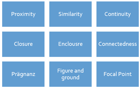
Figure 2.7 – Gestalt principles of visual perception
We will review each of these principles and how they can be applied to data visualizations, in the rest of this section.
Proximity
The principle of proximity posits that we tend to perceive elements that are placed close to each other as belonging to a single group. In the following screenshot, we can see three groups of circles based on the relative distance among the circles:

Figure 2.8 – Gestalt principle of proximity
In the case of a dashboard, the way white space is used to arrange various charts indicates which charts or elements are related. This enables users to read and interpret certain visuals together.
The proximity principle can also be used within a single visualization. We can observe three groups of data points in the scatterplot shown in the following screenshot based on their proximity or lack thereof:
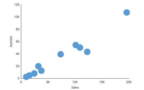
Figure 2.9 – Principle of proximity at play in a scatterplot
In the line chart shown in the following screenshot, the placement of labels close to the respective lines clearly indicates which line represents which country. This eliminates the need for a separate legend and helps reduce clutter:
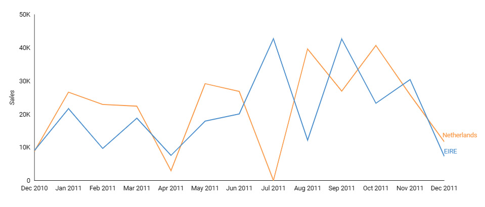
Figure 2.10 – Using the principle of proximity with labels
Another example that demonstrates the utility of the proximity principle is the clustered bar chart shown in the following screenshot. If the intention is to easily compare sales among different products for each country, clustering the countries together is not a suitable representation, as users are required to compare the bars that are spaced far from each other:
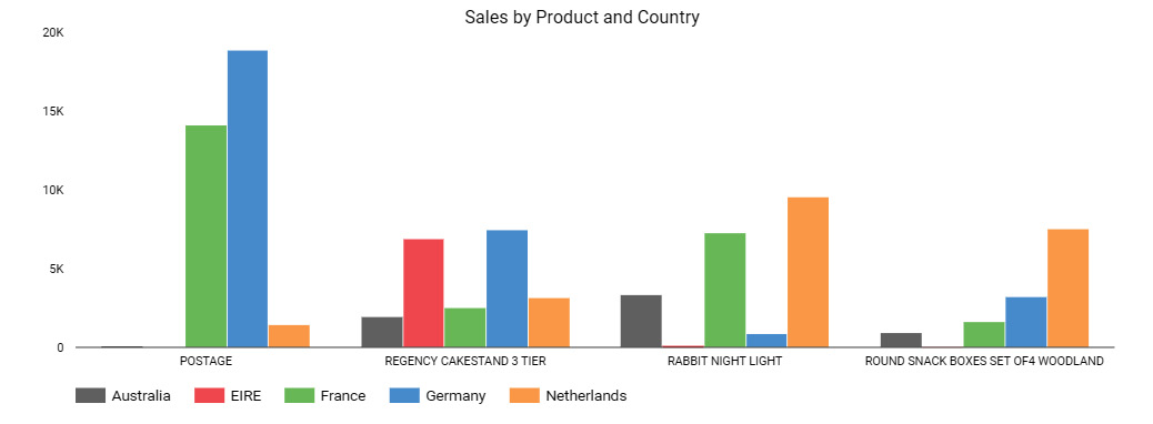
Figure 2.11 – Clustered bar chart that doesn’t facilitate easier comparison of sales among different products for each country
Instead, by clustering different quarters together as shown in the following screenshot, it becomes easier for the user to compare sales across quarters for each country. So, it’s important to understand how the data needs to be interpreted and design the visual accordingly:
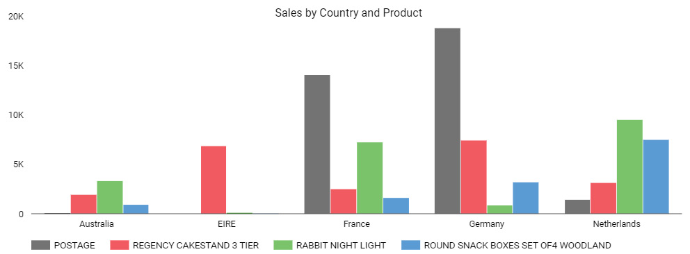
Figure 2.12 – Appropriate clustering to enable easier comparison of sales among different products for each country
The principle of proximity encourages you to place elements that are related to each other or those meant to be interpreted together close to each other.
Similarity
We perceive visual elements that are similar to each other as related. The principle of similarity says that elements that share attributes such as color, shape, size, and so on are seen as belonging to a group. In the following screenshot, we primarily identify two groups of circles based on their color:

Figure 2.13 – Gestalt principle of similarity by color
In the same way, the following items are recognized as two different groups—circles and triangles, based on the shared shape:

Figure 2.14 – Gestalt principle of similarity by shape
The principle of similarity is crucial for representing data visually, and we rely heavily on it. One common application is the use of legends. Based on the shared color, we interpret what the elements in a chart represent. You can see an example of this here:
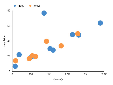
Figure 2.15 – Using color to identify related data in a scatterplot
In the preceding screenshot, the similarity principle is applied through the use of shared color in two ways: to perceive two groups of dots and to identify that the blue dots belong to the East region and the orange ones to the West region, with the help of the legend.
Continuity
The principle of continuity says that we follow continuous shapes, curves, and lines in order to make sense of the data. In the following screenshot, circles that are placed along the smooth curve are perceived as related compared to other random circles:

Figure 2.16 – Gestalt principle of continuity
In designing charts, the principle of continuity plays out in multiple ways. It enables us to view a continuous line even where there are gaps due to missing data instead of treating those two broken lines as separate. The following screenshot illustrates this phenomenon:
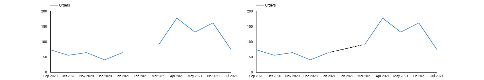
Figure 2.17 – Principle of continuity at play with missing data
Another place where we can use the principle of continuity is in bar charts. The chart on the left in the following screenshot isn’t easy to interpret because the products are sorted alphabetically and the bars do not follow a smooth path. On the other hand, the chart on the right is sorted by the length of the bars, resulting in a continuous pattern and making it much more readable:
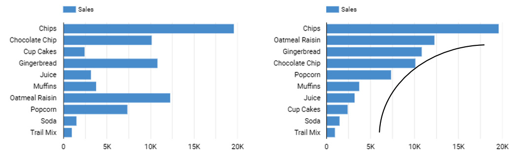
Figure 2.18 – Applying the principle of continuity to bar chart with sorting
The principle of continuity allows us to perceive elements that are arranged along a line or a curve as related to each other or part of the same group.
Closure
The principle of closure states that we tend to perceive familiar shapes and figures as a whole, even though they are broken and have gaps. In the following screenshot, we perceive the shapes as a star and a circle, even though they are not complete:

Figure 2.19 – Gestalt principle of closure
A common way we apply the principle of closure to designing graphs is by allowing users to see the two axes of the chart and perceive the complete boundary of the chart. This eliminates the need to use explicit borders and other aspects that result in a cluttered look. You can see an example of this here:
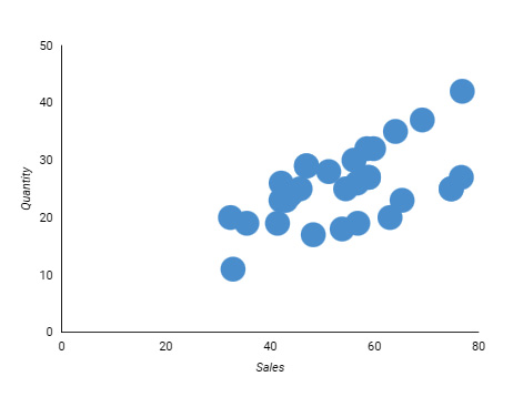
Figure 2.20 – Application of the principle of closure with open axes
The preceding screenshot shows a chart with two axes lines that allow us to discern the complete boundary of the chart, despite depicting only a partial boundary. Many visualization tools provide this behavior by default and do not enclose the chart on all sides. This helps in providing an uncluttered look.
Enclosure
The principle of enclosure says that we identify those elements enclosed by a boundary as belonging to a group. In the following screenshot, we consider the circles enclosed by the shape to be related:

Figure 2.21 – Gestalt principle of enclosure
In the following dashboard example, the set of KPI metrics are enclosed within a gray box and are meant to be perceived as related and represent a group:
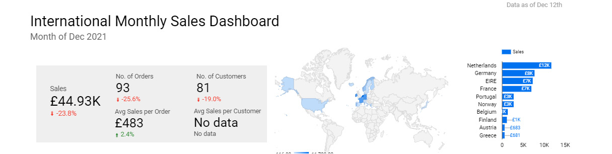
Figure 2.22 – Using the principle of enclosure in a dashboard to group related KPI metrics
Within a chart, we can enclose certain data points to have the user treat them as a group or even direct their attention to those elements, as illustrated here:
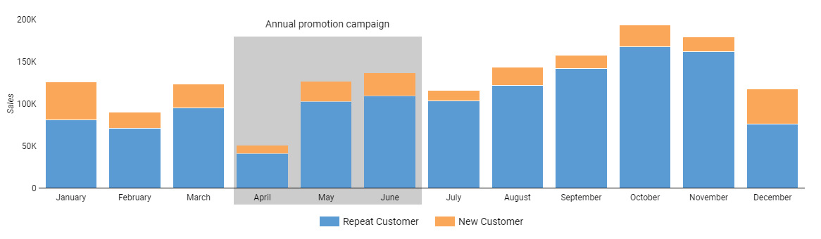
Figure 2.23 – Using the principle of enclosure within a chart
The preceding chart displays sales amount from repeat and new customers in different months of the year. A sales promotion campaign is run during the months of April through June, targeting new customers. Highlighting these months in the chart helps direct the user’s attention to understand the impact of the promotion.
Connectedness
We see elements that are connected as related as opposed to elements that are disconnected. This principle of connectedness can be illustrated in the simple screenshot that follows, which shows two instances of the collection of circles where they are connected in two different ways—vertically and horizontally:

Figure 2.24 – Gestalt principle of connectedness
We see three and two groups of circles respectively, based on how they are connected. In the following screenshot, the line chart on the left showcases the law of connectedness where by virtue of the connected line, the points are interpreted as related to each other. In contrast, the data points in the scatterplot on the right do not express any connectedness:
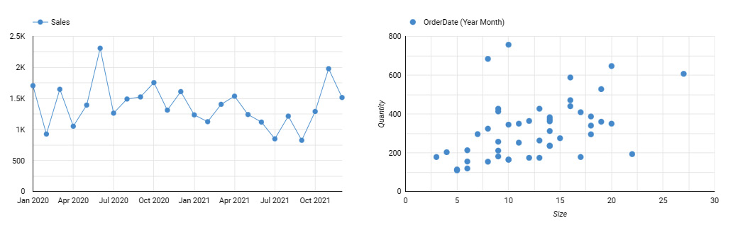
Figure 2.25 – Only the points that are connected to each other appear to be related
In the chart shown in the following screenshot, the text annotation is connected to the data point to indicate that the annotation applies to only this specific data point. This is another example of using the principle of connectedness in designing data visuals:
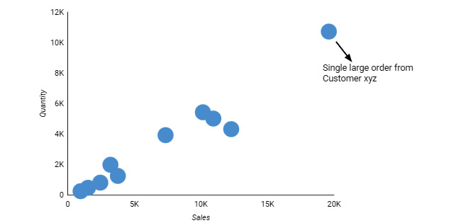
Figure 2.26 – Using the principle of connectedness with annotations
Connectedness generally exerts a greater influence on perception than proximity or similarity. It means that the elements that are connected to each other are perceived as a group, even if they are equally close to some other elements or similar in color or shape to others.
Prägnanz
We discussed the importance of simplicity while designing dashboards and visuals in the first section of the chapter. The Gestalt theory also emphasizes simplicity through the principle of prägnanz, which means pithiness or simplicity. It says that the human brain tends to see and interpret complex and ambiguous patterns and objects in the simplest form possible. We need to design things in the simplest form that can convey the information so as not to place an undue cognitive burden on the users.
In the following screenshot, we are likely to see two overlapping circles in each case, rather than a bunch of separate curves or shapes put together:

Figure 2.27 – Gestalt principle of prägnanz
In the case of data visualizations, the principle of prägnanz takes the form of sorting the bars and columns or representing timelines from left to right rather than in the reverse order, or even adding a trendline to a time-series chart to provide a simpler, intuitive, and more logical representation of information. Figure 2.18, under the principle of continuity, shows how an appropriately sorted bar graph is more easily readable than otherwise. In this example, both principles dictate the same representation:
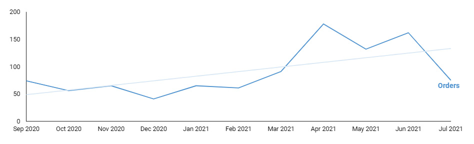
Figure 2.28 – Trend lines provide a simpler presentation of time-series data
The line chart shown in the preceding screenshot showcases the application of the principle of prägnanz through the use of trend lines and natural ordering of the time axis from left to right.
Figure and ground
The principle of figure and ground describes that we see things either as a figure in the foreground or in the background. We can use this tendency to place important and useful elements in the foreground and put less important or supporting elements in the background. This helps to guide users’ attention to the key information. It is essential to create a clear distinction between the figure and the ground through enough contrast and other aspects such as focus (make things in the background out of focus by blurring, fading, or tinting), size (make elements in the foreground larger in size compared to those in the background), and so on. The classic Rubin’s vase image shown in the following screenshot is an example of visual illusion that results when an element can either be a figure or a ground. While this destabilized relationship between figure and ground may have its application, forms of design where there is little distinction between the foreground and background should generally be avoided in data visualizations:

Figure 2.29 – Rubin’s vase with destabilized figure-ground relationship
A good example of this principle at play in charts is a geographical bubble map with the map forming the background and the bubbles forming the foreground, as illustrated here:
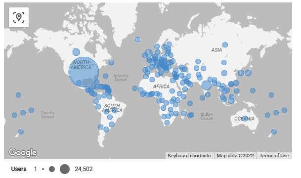
Figure 2.30 – Geographical bubble map provides an example of a stable figure-ground relationship
When using chart backgrounds or dashboard themes with non-clear backgrounds, choose colors carefully to achieve enough contrast so that foreground elements can be clearly and unambiguously identified. You can see an example of this here:
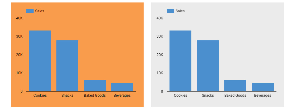
Figure 2.31 – Using the principle of figure-ground with contrast
In the preceding screenshot, the chart on the left makes a poor design choice as it results in greater eye fatigue and hence is harder to read.
Focal point
Finally, the principle of focal point states that elements that stand out from others are more noticeable than the rest. We can use distinctive properties such as color, shape, size, orientation, and so on to create focal points and capture the user’s attention. In the following screenshot, two properties—color and shape—are used to create a focal point:

Figure 2.32 – Gestalt principle of focal point
This principle relies on the preattentive processing phenomenon in human vision through which information is processed by humans subconsciously and automatically. Some of the attributes that help with preattentive processing, as identified by Colin Ware in his book Information Visualization: Perception for Design, include hue, intensity, length, width, curvature, orientation, shape, size, added marks, spatial grouping, two-dimensional (2D) positioning, blur, enclosure, and movement (flicker or motion). You can see an illustration of these attributes here:
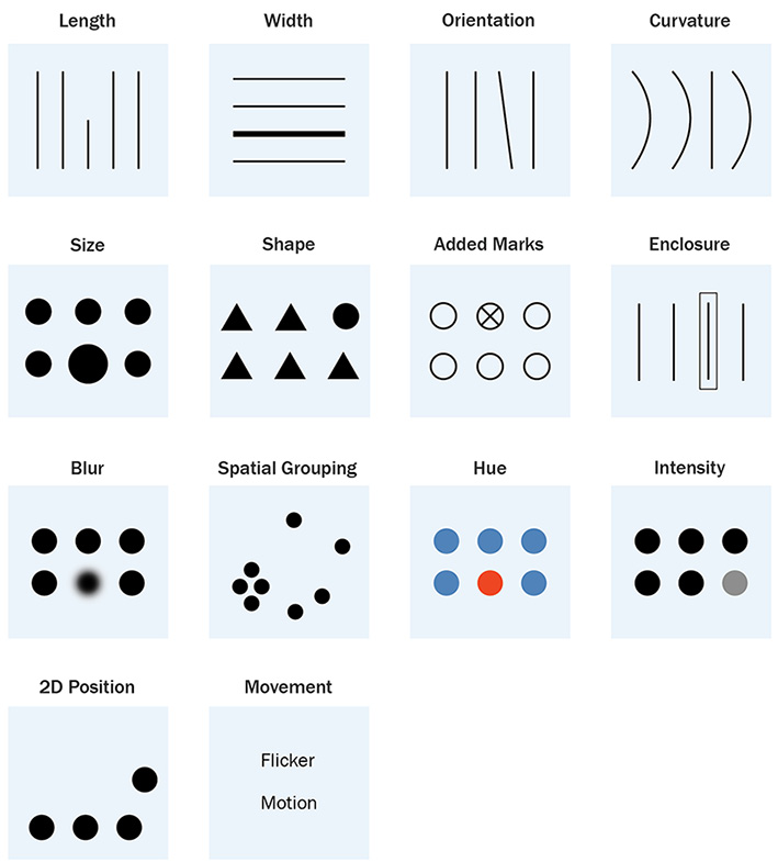
Figure 2.33 – Preattentive attributes
Of these attributes, only some—such as length and 2D position—can encode quantitative information well; some others—such as intensity, line width, size, blur, and flicker—can encode limited quantitative information, and others—such as shape, hue, and so on—do not encode any quantitative information.
Data visualization charts use various preattentive attributes to represent data. For example, a bar or column chart uses length to enable users to quickly identify the largest and smallest values. Judicial use of color helps highlight appropriate elements that users ought to pay attention to. Consider the following example where, as part of Cartier’s performance evaluation report, the column chart uses a distinctive color to highlight Cartier’s sales numbers. This directs users’ attention immediately to their sales performance in relation to their peers:
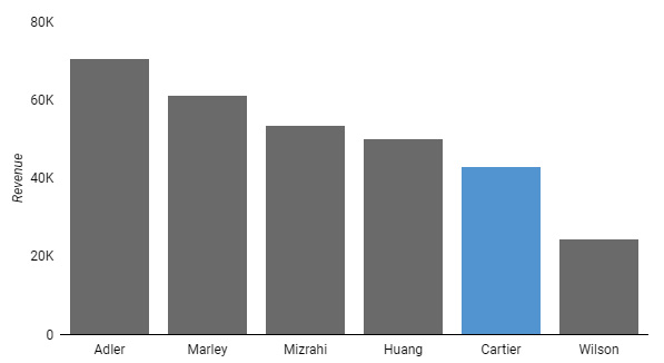
Figure 2.34 – Using hue as a preattentive processing attribute in a bar chart
In a dashboard or a chart, these preattentive attributes of color, size, position, and so on can also be used with textual elements such as annotations, KPI numbers, important updates, instructions, and more. For example, in a card visual, the current period value is shown in a bigger font size, and the comparative number against the previous period is shown in a smaller size, as follows:

Figure 2.35 – Example of using preattentive attributes of color, size, and position to direct users’ attention appropriately
Displaying occasional notes regarding data quality, data latency, or other pertinent information in the dashboard using a bright hue or an icon in a prominent position makes sure users do not miss this important information. You can see an example of this here:
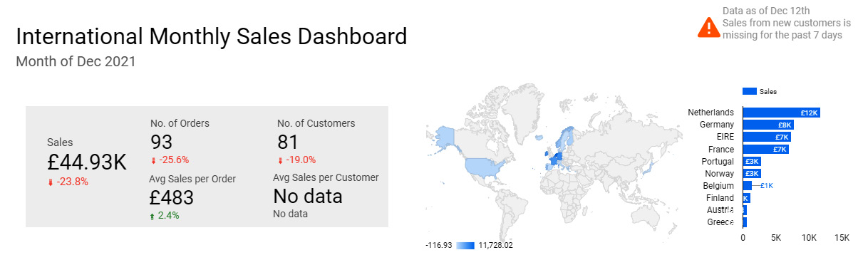
Figure 2.36 – Dashboard displaying an important note on the top along with an icon
The preceding screenshot depicts the top portion of a dashboard with an important note about missing or incomplete sales data. The note is accompanied by a relevant icon in a bright color to capture user attention.
Using color wisely
Color is perhaps the most important preattentive processing attribute that helps us to focus on and distinguish different elements easily. On the other hand, by choosing colors poorly, we hide or distract users from the purpose of the visual. In this section, we will go over some best practices in using color effectively.
Use fewer distinct colors
Having too many distinct colors in a visual or a dashboard can cause unnecessary strain on the eyes. Nothing really stands out in a jumble of disparate colors, and it becomes difficult to process the information. Three is a good number of colors to aim for using in a dashboard. You can include up to a couple of additional colors that are related to or in the same spectrum as the main colors. Figure 1.7 in Chapter 1, Introduction to Data Storytelling, is a good example of using fewer colors on a dashboard. The same dashboard using a number of different colors looks noisy, as shown in the following screenshot:
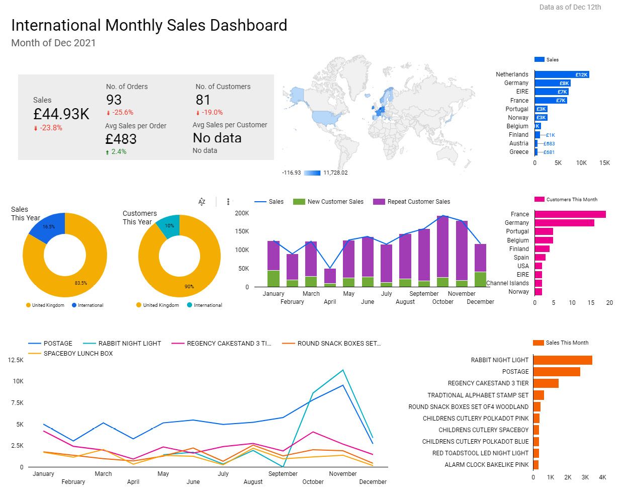
Figure 2.37 – Example dashboard using too many colors
Following the same idea, do not use color meaninglessly. In the bar chart shown in the following screenshot, different products are represented in different colors but the color doesn’t provide any additional information. In fact, it is highly distracting and makes it harder for users to read the chart:
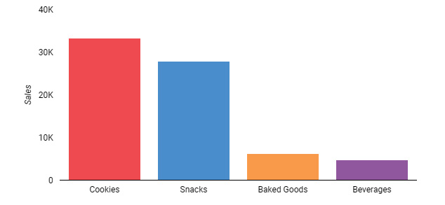
Figure 2.38 – Bar chart with a meaningless application of color
You need to be very deliberate in choosing colors for your visualizations to provide the best user experience (UX).
Choose an appropriate color palette and scheme
You can choose themes and a color palette that are readily available in many visual tools or build your own based on the company logo colors, website colors, or other specific needs. A light versus dark report theme is the first choice to make. Each has its own appeal and benefits. A light background works better when there is a lot of text to display as research states that we read dark text on a light background more efficiently than vice versa (Nielsen Norman Group: https://www.nngroup.com/articles/dark-mode/). A light theme also allows you to use a wider range of colors than a dark theme. On the other hand, dark themes look more stylish and elegant. Dark backgrounds work best when the design is minimalistic. You should also consider whether your report might be printed out - in this case a light theme will save on a lot of printer ink. Whether a light or dark background, pick colors that provide good contrast. With dark themes, choose lighter and unsaturated colors for better readability. The colors used for non-data graphical elements in the dashboard such as text, shapes, and lines should be minimal, non-intrusive (unless specifically intended to draw attention), and provide enough contrast. There are several color contrast checkers available on the web that help you test the contrast of background and foreground (Top seven free color contrast checkers and analyzers: https://axesslab.com/top-color-contrast-checkers/). The rest of the section discusses the colors to be used for data.
Using a monochromatic color scheme with a range of distinct shades and tones and extending it with a single contrast color is a common and effective strategy. This not only helps reduce cognitive overload by mostly sticking to variations of a single color but also enables emphasis and highlighting with the use of the contrast color. You can see an example of this here:

Figure 2.39 – Monochromatic color scheme with an optional single contrast color
Leveraging a single bright color sparingly to highlight and emphasize the needful is a very useful design strategy that results in a cleaner and more powerful dashboard that efficiently directs the users’ attention to the most prominent information.
In individual visualizations, depending on the type of data you are trying to represent, you can choose sequential, diverging, or qualitative color schemes. A sequential color scheme is usually monochromatic in nature—that is, based on a single color. It starts with the main color or origin hue and continues with decreasing intensity. You can see an example of this here:

Figure 2.40 – Sequential color to represent quantitative data
Conversely, a diverging color scheme is polychromatic. It uses two distinct colors on either end of the spectrum, transitioning from one hue to another in between at the lowest levels of intensity. An additional hue can be used in the middle of the divergent color scheme to represent three different ranges of values instead of just the two extremes, as depicted here:

Figure 2.41 – Diverging color scheme with two (on the left) and three (on the right) hues to emphasize extreme values at both ends of the continuum
Quantitative information, either discrete or continuous, is best represented by sequential or diverging schemes. A divergent palette helps emphasize extremes and should be used when there is a clear and meaningful pivot point in the metric value being represented. It can be zero for metrics such as profit (profit or loss) and rate of growth (positive growth or negative growth), or a reference point such as poverty level, target value, median, average, and so on. A divergent color scheme also allows users to see more differences in data.
A sequential palette is useful to show variation in a metric with no meaningful mid-point. Examples include metrics such as sales amount and number of users, which just range from the lowest to the highest values, and there is no well-defined central value where the change in hue is meaningful. Sequential palettes are more intuitive to read as the highest and lowest values can easily be discerned. Divergent palettes, on the other hand, often require a key for users to understand which colors represent more desirable versus less desirable values. A common application of using a divergent color scheme to represent data is a heatmap where two distinct hues are used to indicate hot and cold phenomena respectively.
To encode qualitative information such as products, categories, regions, and so on, you should use a categorical color scheme, which can span the entire spectrum of hues or just a subset of them. An example categorical palette is provided here:

Figure 2.42 – Categorical color scheme to represent unordered qualitative data
For ordinal qualitative data such as risk level (low, medium, high) or level of agreement in the Likert scale (strongly disagree to strongly agree), and so on, a monochromatic scheme such as the one shown next is a better fit. Similar to the continuous values, the lightness or darkness of the color can indicate the ordinal position of the qualitative value:
Figure 2.43 – Monochromatic color scheme to represent ordinal qualitative data
An interesting problem arises when you try to use color to represent a large number of categories. On one hand, it introduces a lot of noise to the chart. On the other hand, if the number of categories exceeds the number of distinct colors available in the palette, the colors are reused. This introduces conflict and confusion. Often, this problem can be addressed in the following different ways:
- Limit the number of categories to be depicted in the chart by filtering for only the key categories that users are interested in—for example, the top five.
- Identify three-five key dimension values and bundle all the remaining less important values into an Other bucket. You can apply a muted color to the Other bucket to de-emphasize it.
- Choose a different chart type so that the categories need not be represented by a color—for example, using a bar chart instead of a donut chart.
Use color consistently across the dashboard
Always use the same color for the same dimension or metric value throughout the dashboard. Not doing so results in a very poor UX. Using color in a consistent manner eases the burden on users and enables them to understand and interpret the charts faster. Using different colors for the same attribute in different charts requires users to decode the color encoding for each chart separately. Applying color in a conflicting way adds additional complexity and confuses the user. For example, in the chart shown in the following screenshot, the two colors blue and orange are used inconsistently for the countries Netherlands and EIRE. This is undesirable and hampers the effectiveness of the dashboard:
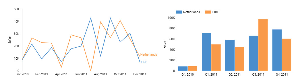
Figure 2.44 – Conflicting use of color across charts
Some colors have a natural meaning, and it bodes well for us to use them in a way that aligns with the associated meanings. Perhaps the most widely used encoding is the traffic-light colors for KPIs and other metrics: green to represent the good—a positive value or an increase, red to represent the bad—a negative value or a decrease, and— spacing optionally—yellow to represent caution for values that need to be watched out for. Using these colors in a way that defies this natural association results in a poor UX.
In the following screenshot, the card visual on the left displays the negative rate of change appropriately in red. However, the visual on the right depicts a negative rate of change in sales with a green color, which is counterintuitive:

Figure 2.45 – Using color counterintuitively
Similarly, while choosing a divergent color scheme, especially in heatmaps, choose warm and cold colors appropriately. Select warm colors such as red, orange, and yellow to represent hot phenomena such as higher user activity, higher sales, a higher number of issues, and so on, and cold colors such as blue, green, and purple to indicate cold phenomena such as lower activity, lower sales, and a lower number of issues respectively. You can see an example of this here:
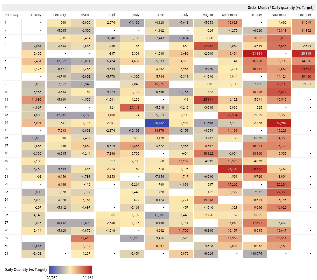
Figure 2.46 – Heatmap with warm and cold colors
The heatmap in the preceding screenshot represents hot and cold phenomena using an appropriate divergent color scheme.
A big caveat to using and relying on green versus red colors to show desirable and undesirable patterns is that not everyone can distinguish these colors from each other. This can be mitigated in one or more ways, as follows:
- Completely avoid using red and green together in visualizations. Using alternative colors will require a key or legend for users to understand what the colors mean.
- Use icons such as arrows and other visual cues in addition to or instead of color to indicate good versus bad.
- Use different intensities for red and green colors, when used together. This allows people with red-green blindness to differentiate them well, as color vision deficiency is mainly about not identifying certain hues, rather than their intensities.
Consider inclusive color schemes
Last but not least, choose color schemes that are colorblind-friendly so that they can be universally accessible. This is especially important for widely distributed content. Color blindness is much more prevalent than we think—it affects about 4.5% of the entire population. There are many different types of color blindness, the most common being red-green blindness, affecting almost 99% of the color-blind population. This type of color vision deficiency (CVD) takes several forms: those who cannot see the red color at all (protanopia), those who can identify only some shades of red (protanomaly), those who cannot see the green color at all (deuteranopia), and those who can identify only some shades of green (deuteranomaly). While we can still choose certain shades of red or green and have people with red-green CVD distinguish between the two, they don’t all see those colors as red and green. Blue is generally a safe color and is widely used in data visualizations. Choose and build colorblind-safe color palettes with care. All data visualization and reporting tools provide colorblind-friendly palettes for you to choose from. There are tools available, such as the one provided by David Nichols at https://davidmathlogic.com/colourblind/, that can help you understand how people with CVD actually see different colors and build your own colorblind-friendly palettes. Some color contrast checkers (Colour Contrast Analyser (CCA) https://www.tpgi.com/color-contrast-checker/) also determine how color contrast can affect people with CVD.
Summary
Data storytelling is a skillful amalgamation of narrative and visual representation. In this chapter, we learned about the design principles that form the foundation for building effective and compelling data visualizations. These principles are rooted in the nature of human vision and perception. We reviewed the centuries-old but still very much applicable Gestalt principles of visual perception and looked at three major guiding themes for data storytelling in this chapter.
We understood that simplicity is the hallmark of a great data story. Keeping things simple and to the point and removing all noise and distractions from the design are key to a great UX. Going further, we learned that organizing the layout of the dashboard to present a cohesive picture and fit the intended narrative is important.
Above all, representing the data accurately should be the main goal. A well-designed dashboard with incorrect information will not only be ineffective but also damaging by leading to incorrect insights and decisions.
Color is an important design element that needs careful application. We examined some guidelines on how to use it appropriately in data visuals as well as across the dashboard. We learned about various color schemes and their applications. The next chapter discusses how to choose the right visualization types and common pitfalls to avoid while designing visualizations.
Further reading
To learn more about the principles and foundations of data visualization, you can refer to the following resources:
- Tufte, Edward. The Visual Display of Quantitative Information. Graphics Press. Second Edition. 2001.
- Few, Stephen. Information Dashboard Design. Analytics Press. Second Edition. 2013.
- Knaflic, Cole Nussbaumer. Storytelling with Data. John Wiley & Sons. 2015.
- Wilke, Claus O. Fundamentals of Data Visualization: A Primer on Making Informative and Compelling Figures. O’Reilly Media. 2019.
- A detailed guide to colors in data vis style guides: https://blog.datawrapper.de/colors-for-data-vis-style-guides/