11 |
This chapter and the next four will help you sort out the settings you can make to customize how your camera uses its features, shoots photos, displays images, and processes the pictures after they’ve been taken. I’m not going to waste a lot of space on some of the more obvious menu choices. For example, you can probably figure out that the Touch Shutter option in the Shooting 7 menu deals with whether the Touch Shutter option is enabled or disabled. In this chapter, I’ll devote no more than a sentence or two to the blatantly obvious settings and concentrate on the more confusing aspects of setup, such as Automatic Exposure Bracketing.
This chapter discusses the Shooting menu pages common to both the R5 and R6 in Still photography mode. The entries on those pages are nearly identical. The R5 and R6 distribute their movie-shooting options differently. The descriptions of the Movie Shooting menus are located in Chapter 16, where I’ve collected all the basic video capture information and settings. For now, let’s start off with a general overview of the menus found on the EOS R5 and EOS R6.
Anatomy of the Menus
Your menus are divided into seven major tabs—Shooting, Autofocus, Playback, Network, Set-up, Custom Functions, and My Menu—each of which (except for the last) is further subdivided into three to nine separate pages. Each page’s listings are shown as a separate screen with no scrolling.
The tabs are color-coded: red for Shooting, magenta for Autofocus, blue for Playback, amber for Set-up, brown for Custom Functions, and Green for My Menu. The currently selected menu tab’s icon is white within a background corresponding to its color code. A lineup immediately underneath shows the page numbers available, and, at far right, the name of the page (for example, SHOOT1). The current screen’s number is highlighted. All the inactive menus are gray and dimmed.
The menus are easy to use, too. Just press the MENU button and use these controls:
- Jump between tabs. Rotate the QCD-2 to jump from one main tab to the next. Highlighting will always move from the current page on the current tab to the most recently accessed page and the most recently accessed entry of the next main tab. For example, if you’ve highlighted an entry on the Shooting 3 page and rotate the QCD-2 to the right, you’ll jump to whichever page you last used in the AF (autofocus) menu, with the particular entry you last used in that page highlighted. Rotate the QCD-2 to the left, and you’ll return to your previous location and entry in the Shooting 3 menu.
- Move from page to page. To move continuously from page to page, rotate the Main Dial or press the Multi-controller joystick left or right. If, for example, you were viewing the AF 3 menu, subsequent clicks to the right would take you to the AF 4, AF 5, and then onward to Playback 1, Playback 2, etc. Rotate to the left to reverse your movement. Forward and reverse movement wraps around, too; the Shooting 1 menu is located immediately after the last My Menu entry. As with whole-tab jumps, the most recently used entry on each page visited is highlighted. This is convenient if you use particular entries frequently.
- Scroll among page entries. When a given page is active, rotate the QCD-1 or press the Multi-controller joystick up or down to scroll among the entries on that page.
Tapping the MENU button brings up a typical menu like the one shown in Figure 11.1. (If the camera goes to “sleep” while you’re reviewing a menu, you may need to wake it up again by tapping the shutter release button.) Different menu tabs are provided, depending on the shooting mode, shown in Table 11.1.
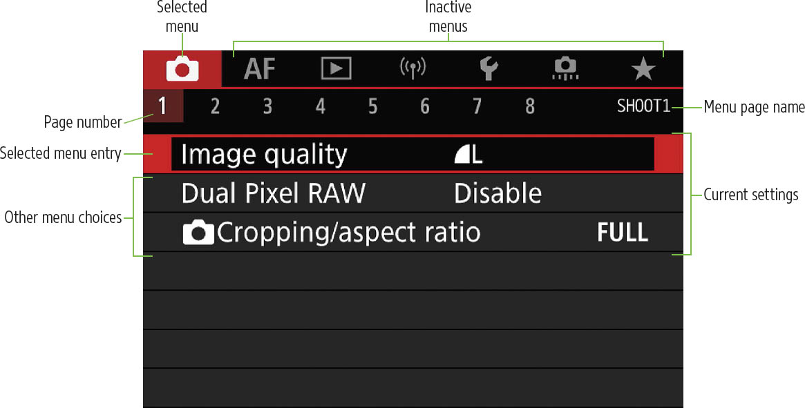
Figure 11.1 The menus are arranged in a series of tabs.

Here are the things to watch for as you navigate the menus:
- Menu tabs. In the top row of the menu screen, the menu that is currently active will be highlighted as described earlier. The numbers within the tab let you know if you are in, say, Set-up 1, Set-up 2, Set-up 3, or another tab. Just remember that the red camera icons stand for still and movie shooting options; the blue right-pointing triangles represent playback options; the yellow wrench icons stand for set-up options; the brown camera icons represent Custom Functions; and the green star stands for personalized menus defined for the star of the show—you.
- Selected menu item. The currently selected menu entry within a given tab will have a black background and will be surrounded by a box the same hue as its color code.
- Other menu choices. The other menu items visible on the screen will have a dark gray background.
- Current setting. The current settings for visible menu items are shown in the right-hand column, until one menu entry is selected (by pressing the SET key). Current settings aren’t appropriate for some menu entries (for example, the Protect Images or Print options in the Playback 1 and 2 screens), so the right column is left blank.
When you’ve moved the menu highlighting to the menu item you want to work with, press the SET button to select it. The current settings for the other menu items in the list will be hidden, and a list of options for the selected menu item (or a submenu screen) will appear. Or, you may be shown a separate settings screen for that entry. Within the menu choices, you can scroll up or down with the QCD-1. Press SET to select the choice you’ve made and press the MENU button again to exit.
Shooting Menu Options
You’ll find that the Shooting menu options are those that you access second-most frequently. You might make such adjustments as you begin a shooting session, or when you move from one type of subject to another. Canon makes accessing these changes very easy.
This section explains the options of the Shooting menus in still photography mode and how to use them. The options you’ll find in these red-coded menus include:
Shooting 1
- Image Quality
- Dual Pixel RAW (R5 only)
- Cropping/Aspect Ratio
Shooting 2
- Exposure Compensation/AEB (Automatic Exposure Bracketing)
- ISO Speed Settings
- HDR PQ Settings
- Auto Lighting Optimizer
- Highlight Tone Priority
- Anti-flicker Shooting
- External Speedlite Control
Shooting 3
- White Balance
- Custom White Balance
- WB Shift/Bkt
- Color Space
- Picture Style
- Clarity
- Lens Aberration Correction
Shooting 4
- Long Exposure Noise Reduction
- High ISO Speed Noise Reduction
- Dust Delete Data
Shooting 5
- Multiple Exposure
- HDR Mode
- Focus Bracketing
Shooting 6
- Interval Timer
- Bulb Timer
- Shutter Mode
- Release Shutter Without Card
Shooting 7
- IS (Image Stabilizer) Mode
- Touch Shutter
- Image Review
- High-Speed Display
- Metering timer
- Exposure Simulation
- Shooting Information Display
Shooting 8
- Viewfinder Display Format
- Display Performance
Shooting 9
- Movie Recording Quality (R6 Only)
- Sound Recording (R6 Only)
- Movie ISO Speed Settings (R6 Only)
- Movie Auto Slow Shutter (R6 Only)
- Shutter Button Function for Movies (R6 Only)
Image Quality
Options: Resolution: Large (default), Medium, Small 1, Small 2; JPEG Compression: Fine (default), Normal; JPEG (default), RAW, or RAW+JPEG
My preference: Resolution: Large; JPEG Compression: Fine; RAW+JPEG
This is the first option in the Shooting 1 menu (shown in Figure 11.1). You can choose the image quality settings used to store files. You have these choices to make when selecting a quality setting:
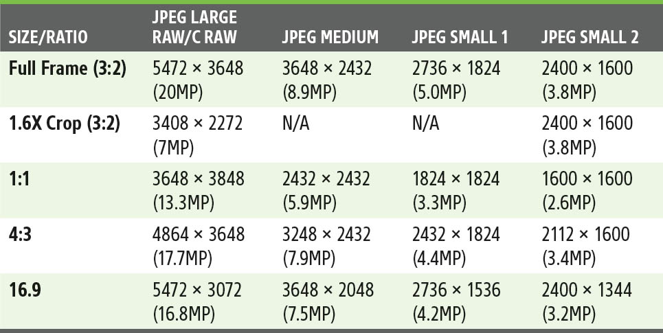
- Resolution. The number of pixels captured determines the absolute resolution of the photos you shoot. Your choices include:
- • R5: Large/RAW/C-RAW: 8192 × 5464 pixels (45MP); Medium: 5808 × 3872 pixels (22.5MP); Small 1: 4176 × 2784 pixels (11.6MP); Small 2: 2400 × 1600 pixels (3.8MP)
- • R6: Large/RAW/C-RAW: 5472 × 3648 pixels (20MP); Medium: 3648 × 2432 pixels (8.9MP); Small 1: 2738 × 1824 pixels (5MP); Small 2: 2400 × 1600 pixels (3.8MP)
- JPEG/HEIF compression. To reduce the size of your image files and allow more photos to be stored on a given memory card, the camera uses compression to squeeze the images down to a smaller size. This compacting reduces the image quality a little, so you’re offered your choice of Fine compression and Normal compression. The symbols help you remember that Fine compression (represented by a quarter-circle) provides the smoothest results, while Normal compression (signified by a stair-step icon) provides “jaggier” images. The Small 2 (S2) file option has no quality option icon, but it is Fine quality. I’ll explain the difference between JPEG and HEIF in the next section.
- JPEG/HEIF, RAW, or both. You can elect to store only JPEG/HEIF versions of the images you shoot or you can save your photos as uncompressed, loss-free RAW files, which consume about four times as much space on your memory card. Or, you can store both at once as you shoot. Many photographers elect to save both a JPEG and a RAW file, so they’ll have a JPEG or HEIF version that might be usable as-is, as well as the original “digital negative” RAW file in case they want to do some processing of the image later. You’ll end up with two different versions of the same file: one with a JPG extension and one with the CR3 extension that signifies a Canon RAW file.
To choose the combination you want, access the menus, scroll to Image Quality, and press the SET button. A screen similar to the one shown in Figure 11.2 will appear with two rows of choices. (If you’ve enabled HDR recording in the Shooting 2 menu, HEIF will appear instead of JPEG in the lower row.)
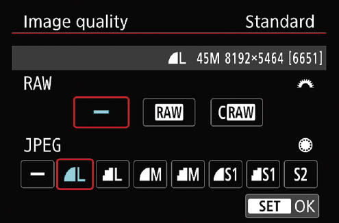
Figure 11.2 Choose your resolution, amount of compression, and file format from this screen.
Spin the Main Dial to choose from: — (no RAW), RAW, or C RAW. Rotate the QCD-1 to select one of the JPEG/HEIF choices: — (no JPEG/HEIF), Large, Medium, or Small in Fine or Normal compression (represented by smooth and stepped icons, respectively), plus Small 2 (with Fine compression), at the resolutions listed above. A red box appears around the currently selected choice. If you choose — for both RAW and JPEG/HEIF, then JPEG/HEIF Fine will be used. As always, when you’ve highlighted your selection, press SET to confirm.
DIFFERENT STROKES
Most of the time, the Image Quality settings you specify here for images will apply to all the images of that type—with one exception. If you’ve chosen Record Separately in the Record Functions + Card/Folder Selection entry of the Set-up 1 menu, you can store two versions of the same image, one in each card slot, using different Image Quality settings. I’ll explain how to do this, and why you might want this feature in Chapter 14.
Why so many choices? There are some limited advantages to using the Medium and Small resolution settings, Normal JPEG/HEIF compression setting, and the more compressed C-RAW format. They all allow stretching the capacity of your memory card so you can shoehorn quite a few more pictures onto a single memory card. That can come in useful when on vacation and you’re running out of storage, or when you’re shooting non-critical work that doesn’t require full resolution. The Small 2 setting can be useful for photos taken for real estate listings, web page display, photo ID cards, or similar non-critical applications.
For most work, using lower resolution and extra compression is often false economy. You never know when you might need that extra bit of picture detail. Your best bet is to have enough memory cards to handle all the shooting you want to do until you have the chance to transfer your photos to your computer or a personal storage device.
However, reduced image quality can sometimes be beneficial if you’re shooting sequences of photos rapidly, as the camera is able to hold more of them in its internal memory buffer before transferring to the memory card. Still, for most sports and other applications, you’d probably rather have better, sharper pictures than longer periods of continuous shooting.
HEIF vs. JPEG
Unless you’re using an iPhone and are deep into its features, you probably don’t know much about the relatively recent HEIF format. The Apple’s iOS 11 operating system for its smart devices was the first consumer product to use the HEIF format. The Canon EOS R5 and R6, along with the EOS 1-DX Mark III were the first digital cameras supporting it, with the Sony a1 following thereafter.
In a nutshell, HEIF images use an advanced compression scheme to produce files with higher image quality that may be only half the size of JPEGs, and have more features, including transparency and 16-bit color. The downside is that, as I write this, no browser supports it natively, and many software applications as well as operating systems like Windows 10 and Android need updates to accommodate HEIF. Macs need macOS High Sierra or later to interpret HEIF images. If you’re using a recent iPhone with HEIF, it can convert your images to JPEG automatically when you export them but will use the format to deploy special features internally (say, for Live images).
So, while HEIF will eventually replace JPEG (last updated in 1994) the transition will take many years. The good news is that you can create them now with your R5 or R6. When you enable HDR Shooting using the HDR PQ Settings entry of the Shooting 2 menu, the Image Quality menu will display HEIF at the bottom of the screen shown in Figure 11.2 instead of JPEG. In addition, the Playback 3 menu has an option for converting HEIF to JPEG so you can use your files with applications that can’t yet handle HEIF. I’ll explain the HDR PQ Settings entry later in this chapter, and cover HEIF to JPEG conversion in Chapter 13.
JPEG DEFAULT
Because HEIF is such a new format that has yet to build a solid following, I expect most of you will work with JPEGs for nearly all of your work when not using RAW. So, I will for the most part use JPEG as an example for many functions. You can assume that in nearly all cases HEIF can be substituted even if I don’t use “JPEG/HEIF” terminology every time. If JPEG or HEIF only apply, I will point that out.
JPEG/HEIF vs. RAW
You’ll sometimes be told that RAW files are the “unprocessed” image information your camera produces, before it’s been modified. That’s nonsense. RAW files are no more unprocessed than camera film is after it’s been through the chemicals to produce a negative or transparency. A lot can happen in the developer that can affect the quality of a film image—positively and negatively—and, similarly, your digital image undergoes a significant amount of processing before it is saved as a RAW file. Canon even applies a name (DIGIC X) to the digital image processing (DIP) chip used to perform this magic.
A RAW file is more like a film camera’s processed negative. It contains all the information, captured in 14-bit channels per color (and stored in a 16-bit space), with no compression, no sharpening, and no application of any special filters or other settings you might have specified when you took the picture. Those settings are stored with the RAW file so they can be applied when the image is converted to a form compatible with your favorite image editor. However, using RAW conversion software such as Adobe Camera Raw or Canon’s Digital Photo Professional, you can override those settings and apply settings of your own. You can select essentially the same changes there that you might have specified in your camera’s picture-taking options.
RAW exists because sometimes we want to have access to all the information captured by the camera, before the camera’s internal logic has processed it and converted the image to a standard file format. RAW doesn’t save as much space as JPEG. What it does do is preserve all the information captured by your camera after it’s been converted from analog to digital form. Of course, the RAW format preserves the settings information.
So, why don’t we always use RAW? Although some photographers do save only in RAW format, it’s more common to use either RAW plus one of the JPEG/HEIF options or just shoot JPEG/HEIF and avoid RAW altogether. That’s because having only RAW files to work with can significantly slow down your workflow. While RAW is overwhelmingly helpful when an image needs to be fine-tuned, in other situations working with a RAW file, when all you really need is a good-quality, untweaked image, consumes time that you may not want to waste. For example, RAW images take longer to store on the memory card, and require more post-processing effort, whether you elect to go with the default settings in force when the picture was taken, or just make minor adjustments.
Thus, those who depend on speedy access to images or who shoot large numbers of photos at once may prefer JPEG over RAW or HEIF. Wedding photographers, for example, might expose several thousand photos during a bridal affair and offer hundreds to clients as electronic proofs for possible inclusion in an album or transfer to a CD or DVD. These wedding shooters, who want JPEG images as their final product, take the time to make sure that their in-camera settings are correct, minimizing the need to post-process photos after the event. Given that their JPEGs are so good (in most cases thanks, in large part, to the pro photographer’s extensive experience), there is little need to get bogged down shooting RAW or the conversion headaches of HEIF this early in the game.
JPEG was invented as a more compact file format that can store most of the information in a digital image, but in a much smaller size. JPEG predates most digital SLRs and was initially used to squeeze down files for transmission over slow dialup connections. Even if you were using an early dSLR with 1.3-megapixel files for news photography, you didn’t want to send them back to the office over a modem (Google it) at 1,200 bps.
But, as I noted, JPEG (and now HEIF) provides smaller files by compressing the information in a way that loses some image data. Even though HEIF is gradually seeing more use, JPEG remains a viable alternative because it offers several different quality levels. At the highest-quality Fine level, you might not be able to tell the difference between the original RAW file or an HEIF image and the JPEG version. You’ve squeezed the image significantly without losing much visual information at all. (See Figure 11.3.)

Figure 11.3 Low compression yields the best image (left); at high compression, pixelation and artifacts rear their ugly heads.
In my case, I shoot virtually everything at RAW+JPEG Fine. I’m currently not bothering with HEIF much, at least until my software catches up with it. (Adobe didn’t add support for HEIC in Photo-shop for Windows until December 2020.) Most of the time, I’m not concerned about filling up my memory cards, as I usually have a minimum of five fast 64GB or 128GB memory cards with me. If I think I may fill up all those cards on a trip, I usually have a laptop with me and can transfer photos to that device. As I mentioned earlier, when shooting sports, I’ll shift to JPEG Fine (with no RAW file) to squeeze a little extra speed out of my continuous shooting mode, and to reduce the need to wade through eight-photo bursts taken in RAW format. On the other hand, on my last trip to Europe, I took only RAW (instead of my customary RAW+JPEG) photos to fit more images onto my laptop, as I planned on doing at least some post-processing on many of the images for a travel book I was working on.
Dual Pixel RAW (R5 Only)
Options: Enable, Disable (default)
My preference: Disable unless this special format is needed
Dual Pixel RAW is a special RAW format that can be manipulated in an image editor to make micro-adjustments to the focus plane, slightly improve bokeh effects (the smoothness of the out-of-focus areas of the image), and make corrections to ghosting and flare. Dual Pixel RAW files also offer the opportunity for advanced users to recover up to one additional stop in the highlights, and to adjust virtual lighting. In effect, the camera saves two different RAW files: one containing information from both sets of pixels (call them Sets A+B) while the other contains only the pixels in Set B. The software can then process each subset separately. I explained Dual Pixel Raw more completely in Chapter 5, which deals primarily with autofocus, but offers explanations of the other features of the format.
To use Dual Pixel RAW, you must select RAW, C RAW, or RAW+JPEG as your Image Quality, and then enable the Dual Pixel feature here. This feature is not available if you want to shoot multiple exposures, use automatic HDR, or One Touch image quality. Larger lens apertures increase the amount and effect of available corrections, and continuous shooting will be slower when using DPR. High-speed continuous shooting is not available at all.
I explain manipulating DPRAW files in Chapter 5 and show you how to work with them using the Playback menu’s processing features in Chapter 13. As I noted earlier, I don’t spend a lot of time explaining how to use software in this book, but you can learn more about processing these files in Canon’s Digital Photo Professional manual and other white papers available on their websites.
Cropping/Aspect Ratio
Options: FULL (default), 1.6X, 1:1, 4:3, 16:9; Shooting area display: Masked, Outlined
My preference: FULL
Your camera allows you to crop images in the camera. Instead of the full sensor frame of 36mm × 24mm, you can select a 1.6X APS-C crop (with a 3:2 crop ratio that’s the same as the FULL setting), or aspect ratios of 1:1 (square), 4:3, or 16:9 (which corresponds to high-definition/ultra-high-definition movie frames). You can also choose whether the shooting area is displayed within the frame—either outlined with blue lines or masked so that only the current crop or aspect ratio is displayed.
The 1.6X crop is significant, because it means that the R5 and R6, unlike other Canon full-frame cameras, can, when equipped with an EF/EF-S mount adapter, use APS-C-format EF-S lenses. You can use the 1.6X crop to increase the telephoto “reach” of RF and EF lenses (with adapter), giving you a 4176 × 2784–pixel, 11.6MP image. If you are using an EF-S lens, then the 1.6X crop is chosen automatically and the other aspect ratios are not available.
If you’ve selected the 1.6X crop or have mounted an EF-S lens, the image is magnified so the cropped portion fills the display, as the APS-C aspect ratio of 3:2 is identical to that of the full-frame image. A 1.6X indicator is displayed in the frame. For other aspect ratios, press the INFO button and choose either Masked or Outlined for the Shooting Area display. When masked, only the captured image area will be shown on the display; with Outlined, the full frame is shown, but the shooting area is marked with blue lines. Choose Outlined if you want to be able to see the parts of your subject outside the actual capture area. The crop/aspect ratio options are shown in Figure 11.4, and the relative resolutions are shown in Tables 11.2 and 11.3.
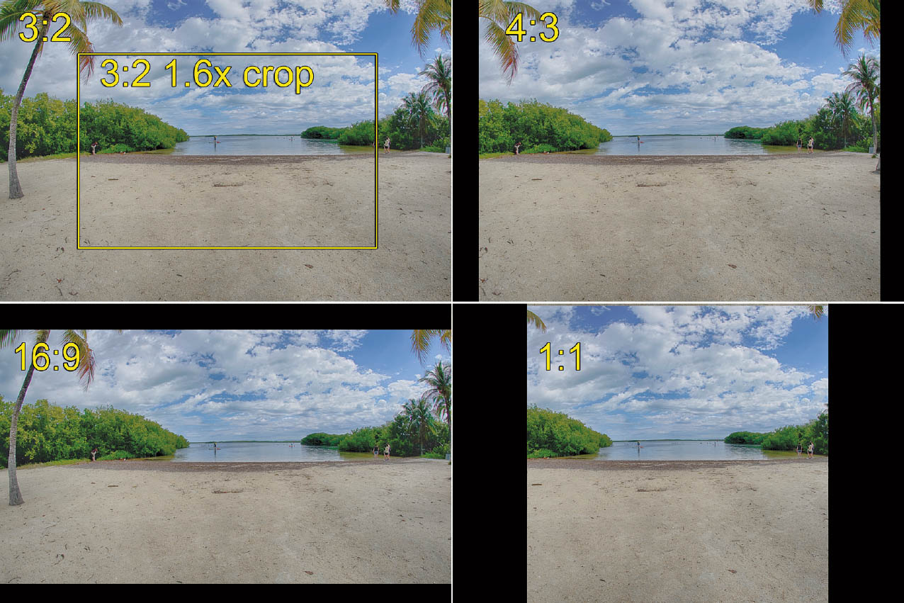
Figure 11.4 Crop/Aspect Ratio options.
TABLE 11.2 Crop/Aspect Ratio Image Sizes—R5

TABLE 11.3 Crop/Aspect Ratio Image Sizes—R6
Exposure Compensation/Automatic Exposure Bracketing
Options: Exposure comp/Auto exposure bracketing
My preference: N/A
The first entry on the Shooting 2 menu is Expo. Comp./AEB, or exposure compensation and automatic exposure bracketing. (See Figure 11.5.) As you learned in Chapter 4, exposure compensation increases or decreases exposure from the metered value. You can set it from this screen, or, in Fv, P, Tv, or AV modes by simply pressing the shutter release halfway and then rotating the QCD-1 to add or subtract exposure. A plus/minus exposure compensation indicator scale is displayed while compensation is in effect.
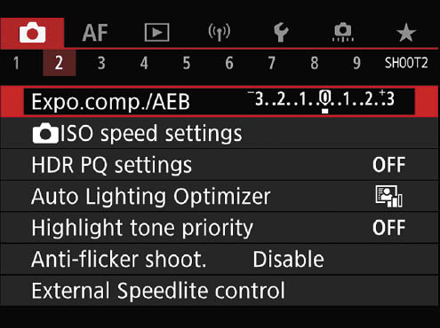
Figure 11.5 Exposure compensation/AEB is the first entry in the Shooting 2 menu.
Exposure bracketing using the AEB feature is a way to shoot several consecutive exposures using different settings, to improve the odds that one will be exactly right. Automatic exposure bracketing is also an excellent way of creating the base exposures you’ll need when you want to combine several shots to create a high dynamic range (HDR) image. (You’ll find a discussion of HDR photography in Chapter 4, too.)

Figure 11.6 Set the range of the bracketed exposures.
To activate automatic exposure bracketing, select this menu choice, then rotate the Main Dial to spread or contract the three lines beneath the scale until you’ve defined the range you want the bracket to cover, which can be up to plus/minus three stops from the base exposure, as shown in Figure 11.6. Then, use the QCD-1 (or Multi-controller joystick) to move the bracket set right or left, moving the base exposure point from the metered (0) value and biasing the bracketing toward underexposure (rotate left) or overexposure (rotate right).
When AEB is activated, the bracketed shots will be exposed in this sequence: metered exposure, decreased exposure, increased exposure. You’ll find more information about exposure bracketing in Chapter 4.
ISO Speed Settings
Options: ISO Speed, ISO Speed Range, Auto Range, Minimum Shutter Speed
My preference: N/A
Use this entry to select a specific ISO speed for still photography using a menu instead of the Quick Control menu, or to limit the range of ISO settings and shutter speeds that the camera selects automatically. In Scene Intelligent Auto mode, ISO is set automatically. The four subentries include:
- ISO Speed. This scale allows you to choose from the enabled ISO speeds, plus Auto, using a sliding scale that can be adjusted using the QCD-1, Multi-controller joystick, or the touch screen. Press INFO when the scale is visible to activate Auto.
- ISO Speed Range. You can specify the minimum and maximum ISO sensitivity available, including “expanded” settings you may have enabled such as Low (ISO 50 equivalent) and H (ISO 102,400 [R5] and 204,800 [R6] equivalents). I find myself using this feature frequently to keep me from accidentally switching to a setting I’d rather (or need to) avoid. For example, at concerts I may switch from ISO 1600 to 6400 as the lighting changes, and I set those two values as my minimum or maximum. Outdoors in daylight, I might prefer to lock out ISO values lower than ISO 100 or higher than ISO 800.
- Auto Range. This is the equivalent “safety net” for Auto ISO operation. You can set the minimum no lower than ISO 100 and the maximum to ISO 51,200 (R5) or ISO 102,400 (R6) in one-stop increments. Use this to apply your own “smarts” to Auto ISO setting. These settings will also act as the minimum and maximum speeds for ISO Safety Shift.
- Minimum Shutter Speed. You can choose whether to allow the camera to select the slowest shutter speed used before Auto ISO kicks in. The idea here is that you’ll probably want to boost ISO sooner if you’re using a long lens with P and Av modes (in which the camera selects the shutter speed). If you specify, for example, a minimum shutter speed of 1/250th second, if P or Av mode needs a slower shutter speed for the proper exposure, it will boost ISO instead, within the range you’ve specified with Auto Range. This setting has two modes: Auto (Standard) mode and Manual mode. In Auto mode, the camera decides when the shutter speed is too low. You can fine-tune this by choosing Slower or Faster on the scale (–3 to +3) that appears. In Manual mode, you manually select the “trigger” shutter speed, from 1 second to 1/8000th second. However, if you’ve handicapped the camera by selecting an Auto ISO range that doesn’t include a sensitivity high enough, the camera will override this setting and use a shutter speed lower than the minimum you specify anyway. The camera assumes (rightly or wrongly) that your upper ISO boundary is more important than your lower shutter speed limit. The lesson here is that if you really, really want to enforce a minimum shutter speed when using Auto ISO, make sure your upper limit is high enough. Note that the Minimum Shutter Speed setting is ignored when using flash.
HDR PQ Settings
Options: HDR Shooting, HDR Assist Display (Shooting), HDR Assist Display (Playback)
My preference: N/A
This entry enables capturing high dynamic range (HDR) images in HEIF and RAW formats conforming to the Perceptual Quantization (PQ) specification. (PQ a non-linear electro-optical transfer function that allows the display of HDR images using highly verbose scientific terminology.) It has three parameters:
- HDR Shooting. When enabled, HDR information is included in RAW files, and HEIF files are specified instead of JPEG in the Image Quality screen described earlier in this chapter. Canon recommends enabling Highlight Tone Priority (discussed shortly) at the same time.
- HDR Assist Display: Shooting. This setting adjusts the screen display so that HDR images as you shoot more closely resemble what you’d see if you were using an actual HDR-capable display device instead. Note that “resemble” is the operative word; the display will not be 100 percent accurate under most circumstances. You can fine-tune this option by choosing either Exposure Priority (Midtones) (for more accurate display of exposure values for subjects) or Tones Priority (Highlights) (for more accurate display of bright areas of the image, such as the sky).
- HDR Assist Display: Playback. This setting adjusts the screen display for images you’ve already captured during playback. It has the same Exposure and Tones Priority options.

TIP The HDR Assist Display settings here do not affect HDMI output. If HDR Shooting is enabled, you still must turn on HDMI HDR Output in the Playback menu (as described in Chapter 13) for accurate viewing on an external HDR device. In addition, when HDR Shooting is activated, the expanded L and H ISO settings are not available. Histograms may include areas not used in the image. They are shown in gray.
Auto Lighting Optimizer
Options: Disable, Low, Standard (default), High, Disabled in Manual or Bulb modes
My preference: Disable
The Auto Lighting Optimizer provides a partial fix for images that are too dark or flat. Such photos typically have low contrast, and the Auto Lighting Optimizer improves them—as you shoot—by increasing both the brightness and contrast as required. The feature can be activated in Program, Aperture-priority, Shutter-priority, and Flexible-priority modes. You can select from four settings: Standard (the default value, which is always selected when using Scene Intelligent Auto mode, and used for Figure 11.7), plus Low, High, and Disable. Press the INFO button to add/remove a check mark icon that indicates the Auto Lighting Optimizer is disabled during manual exposure. Since you’re likely to be specifying an exposure in Manual mode, you probably don’t want the optimizer to interfere with your settings, so disabling the feature is the default. Note: Auto Lighting Optimizer is not available when shooting HEIF images or using Highlight Tone Priority (discussed next).
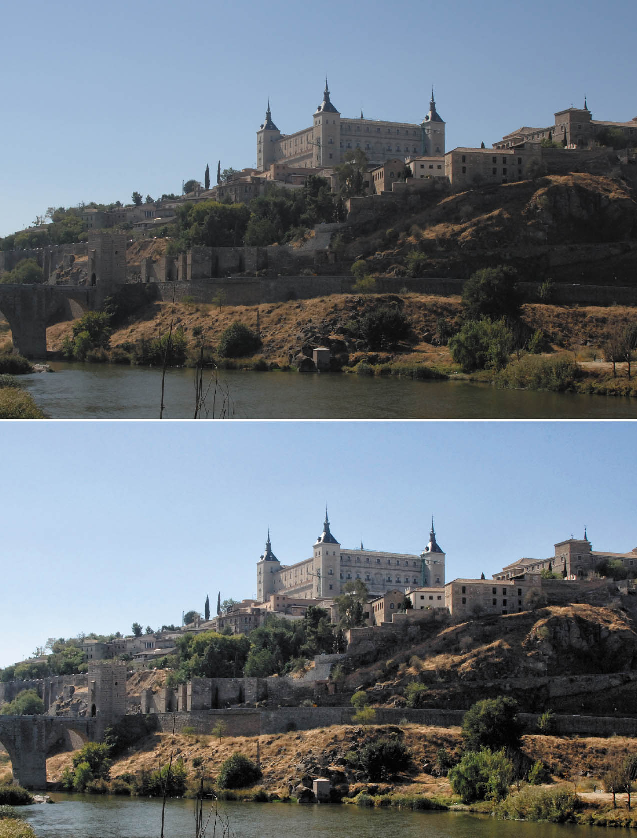
Figure 11.7 Auto Lighting Optimizer can brighten dark, low-contrast images (top), giving them a little extra snap and brightness (bottom).
Highlight Tone Priority
Options: Disable/OFF (default), Enable D+, Enhanced D+2
My preference: Disable
This setting concentrates the available tones in an image from the middle grays up to the brightest highlights, in effect expanding the dynamic range of the image at the expense of shadow detail. You’d want to activate this option when shooting subjects in which there is lots of important detail in the highlights, and less detail in shadow areas. Highlight tones will be preserved, while shadows will be allowed to go dark more readily (and may exhibit an increase in noise levels). Bright beach or snow scenes, especially those with few shadows (think high noon, when the shadows are smaller) can benefit from using Highlight Tone Priority. Your choices include:
- Disable/OFF. The normal dynamic range is applied. Note that when Highlight Tone Priority is switched off, the related Auto Lighting Optimizer setting (discussed above) functions normally.
- Enable D+. Highlight areas are given expanded tonal values, while the tones available for shadow areas are reduced. The ISO 100 sensitivity setting is disabled and only ISO 200 and above settings are possible. Expanded L and H ISO speeds are disabled. You can tell that this restriction is in effect by viewing the D+ icon shown in the viewfinder, on the ISO Selection screen, and in the shooting information display for a particular image. Image noise may slightly increase as the camera manipulates the image. Note that this setting disables the Auto Lighting Optimizer.
- Enhanced D+2. More aggressive preservation of overexposed highlights. Use this with caution, as your images can be changed rather drastically. This setting is not available when shooting movies.
Anti-Flicker Shooting
Options: Enable, Disable (default)
My preference: Disable, unless shooting under flickering light source
Novice sports photographers often ask me why shots they take in certain gymnasiums or arenas have inconsistent exposure, wildly varying color, or banding. The answer is that certain types of artificial lighting have a blinking cycle that is imperceptible to the eye, but which the camera can capture. This setting, when enabled, detects the frequency (it’s optimized for 100 Hz to 120 Hz illumination and may not detect other frequencies) of the light source that is blinking and takes the picture at the moment when the flicker has the least effect on the final image. It cannot be used in live view or movie shooting.
You may experience a slight shutter release time lag as the camera “waits” for the proper instant, and your continuous shooting speed may be reduced, which makes this setting a necessary evil for sports and other activities involving action. Your results may vary when using P or Av modes, because the shutter speed can change between shots as proper exposure requires. You’re better off using Tv or M mode, so the shutter speed remains constant.
If you want to detect flicker manually, once this feature is enabled, you can press the Q button, choose Anti-Flicker Shooting from the Quick Control menu, and press the INFO button. The camera will tell you whether or not flicker has been detected.
Anti-Flicker is disabled when using Scene Intelligent Auto, and may not work as well with dark backgrounds, a bright light within the image area, when using wireless flash, and under other shooting conditions. Canon recommends taking test shots to see how effective the feature is under the light source you are working with.
External Speedlite Control
Options: Flash Firing, E-TTL Balance, E-TTL II Metering, Continuous Flash Control, Slow Synchro, Flash Function Settings, Flash Custom Function Settings, Clear Settings
My preference: N/A
This multi-level menu entry includes settings for controlling the accessory EL/EX series Speedlites attached to the camera (see Figure 11.8). I’ll provide in-depth coverage of how you can use these options in Chapters 9 and 10 but will list the main options here for reference.
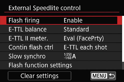
Figure 11.8 The External Speedlite Control menu entry.
Flash Firing
Use this option to enable or disable the attached electronic flash. Choose Enable, and the flash fires normally when it’s attached to the camera and powered up. Select Disable, and the flash itself will not fire, but the AF-assist beam emitted by the unit will function normally. You might want to use the latter option when you prefer to shoot under low levels of existing light, but still need the autofocusing boost the flash’s AF beam provides.
E-TTL Balance
This is an important feature that gives you extra control over how the illumination of the flash and ambient light are mixed to provide the overall exposure. Your choices include Standard (the default), which gives Speedlite and existing illumination equal weight. Specify Ambience-priority, and the existing light is dominant, with the flash being used as fill light to brighten the shadows. Choose Flash-priority instead, and the Speedlite becomes the main light source, illuminating both your subject and the background. This mode may work best under dim lighting conditions in which not much ambient illumination is available.
E-TTL II Metering
You can choose Evaluative (Matrix) or Average metering modes for the electronic flash exposure meter. Evaluative looks at selected areas in the scene to calculate exposure and is the best choice for most images because it attempts to interpret the type of scene being shot; Average calculates flash exposure by reading the entire scene, and it is possibly a good option if you want exposure to be calculated for the overall scene. If your scene includes faces, you can select a third option, Evaluative (Face-priority), which bases exposure on faces in the scene. This process takes a bit of extra time, so continuous shooting speeds may be slower in this mode. However, it’s more likely that your flash’s recycling time will be the dominant factor in selecting a continuous shooting speed.
Continuous Flash Control
This entry also has an effect on continuous shooting with a Speedlight. You can select E-TTL Each Shot, in which case, the camera will meter your scene before every exposure in a continuous sequence. Choose E-TTL 1st Shot instead and the exposure determined for the first shot will be used for subsequent shots. Use that option when you want the highest continuous shooting speed; it obviously works best when you are not recomposing between shots. Indeed, subject movement may result in a change in optimal exposure, so that first shot setting may turn out to be incorrect.
Slow Synchro
You can select the flash synchronization speed that will be used when working in Av (Aperture-priority) or P (Program) exposure modes. There are three choices:
- 1/250 (Electronic 1st-Curtain shutter) or 1/200 (Mechanical shutter) to 30 seconds Auto. The shutter speed is set automatically from 1/250th (or 1/200th) second to 30 seconds. High-speed sync can be used.
- 1/250 (Electronic 1st-Curtain shutter) or 1/200 (Mechanical shutter) to 1/60 second Auto. The shutter speed is set automatically from 1/250th (or 1/200th) second to 1/60th second. Slower shutter speeds are locked out. This setting reduces ghost images (as explained in Chapter 9) but backgrounds may be darker.
- 1/250 (Electronic 1st-Curtain shutter) or 1/200 (Mechanical shutter). Shutter speed is fixed at 1/250th or 1/200th second when using flash. High-speed sync is not available.
Normally, in Aperture-priority mode when using flash, you specify the f/stop to be locked in. The camera then adjusts exposure by varying the output of the electronic flash. In Program mode, the camera chooses the f/stop. Because the primary exposure comes from the flash, the main effect of the shutter speed selected is on the secondary exposure from the ambient light remaining on the scene.
Flash Function Settings
There is a total of six possible choices for this menu screen, plus Clear Settings. These additional options are grayed out unless you’re working in wireless flash mode. All these are explained in Chapters 9 and 10.
- ETTL Flash mode. This entry allows you to choose from automatic exposure calculation (E-TTL II), manual flash exposure, multi (repeating) flash, or Continuous Shooting Priority (CSP). The latter setting, which increases flash output and ISO speed each by one stop, uses less battery power and enables the camera to use flash when shooting continuously.
- Wireless functions/Firing Ratio Controls. These choices include Mode, Channel, Firing Group, and other options, such as Wireless Radio ID, used only when you’re working in wireless mode to control a wireless-capable external flash. If you’ve disabled wireless functions, the other options don’t appear on the menu. I covered these options in Chapter 10, which is an entire chapter dedicated to using the wireless shooting capabilities.
- Zoom. Use this to select a flash zoom head setting to adjust coverage area of compatible Speedlites.
- Shutter sync. You can choose first-curtain sync, which fires the pre-flash used to calculate the exposure before the shutter opens, followed by the main flash as soon as the shutter is completely open. This is the default mode, and you’ll generally perceive the pre-flash and main flash as a single burst. Alternatively, you can select second-curtain sync, which fires the pre-flash as soon as the shutter opens, and then triggers the main flash in a second burst at the end of the exposure, just before the shutter starts to close. (If the shutter speed is slow enough, you may clearly see both the pre-flash and main flash as separate bursts of light.) This action allows photographing a blurred trail of light of moving objects with sharp flash exposures at the beginning and the end of the exposure. This type of flash exposure is slightly different from what some other cameras produce using second-curtain sync. I explained how it works in Chapter 9.
If you have an external compatible Speedlite attached, you can also choose high-speed sync, which allows you to use shutter speeds faster than 1/250th/1/200th second, using the External Flash Function Setting menu.
- Flash exposure compensation. If you’d rather adjust flash exposure using a menu than with the ISO/Flash exposure compensation button, you can do that here. (If you happen to specify a value with both, this menu entry overrides the button-selected value.) Select this option with the SET button, then dial in the amount of flash EV compensation you want using the QCD-1. The EV that was in place before you started to make your adjustment is shown as a blue indicator, so you can return to that value quickly. Press SET again to confirm your change, then press the MENU button twice to exit.
- Flash exposure bracketing. Use these settings to specify options for adjusting the output of your unit when using bracketing with your compatible electronic flash.
Flash Custom Function Settings
Many external Speedlites from Canon include their own list of Custom Functions, which can be used to specify things like flash metering mode and flash bracketing sequences, as well as more sophisticated features, such as modeling light/flash (if available), use of external power sources (if attached), and functions of any slave unit attached to the external flash. This menu entry allows you to set an external flash unit’s Custom Functions from your camera’s menu. The exact functions available will vary by flash unit. For example, with the Speedlite 320EX, only Custom Functions 1 (Auto Power Off), 6 (Quick Flash with Continuous Shot), 10 (Slave Auto Power Off Timer), and 11 (Slave Auto Power Off Cancel) are available. With high-end units, like the Speedlite 600EX-RT, a broader range of choices (described in Chapter 9) are at your disposal.
Clear Settings
This entry allows you to zero-out any changes you’ve made to your external flash’s settings and Custom Functions settings and return them to their factory default settings. The exception is C.Fn-00 Distance Indicator Display (if available for your flash). That setting remains as adjusted until you change it yourself. Note that a flash’s Personal Functions (P.Fn) cannot be set or reset from the camera; you must use the Speedlite’s controls instead.
White Balance
Options: Auto (default), Daylight, Shade, Cloudy, Tungsten, White Fluorescent, Flash, Custom, Color Temperature
My preference: N/A
This is the first entry in the Shooting 3 menu. (See Figure 11.9.) If automatic white balance or one of the seven preset settings available (Auto, Daylight, Shade, Cloudy, Tungsten, White Fluorescent, or Flash) aren’t suitable, you can set a custom white balance using the Custom menu option or a specific color temperature value. The screen shown at left in Figure 11.10 is identical to the one that pops up when you select White Balance from the Quick Control screen. If you choose the “K” entry, you can select an exact color temperature from 2,500K to 10,000K using the Main Dial.
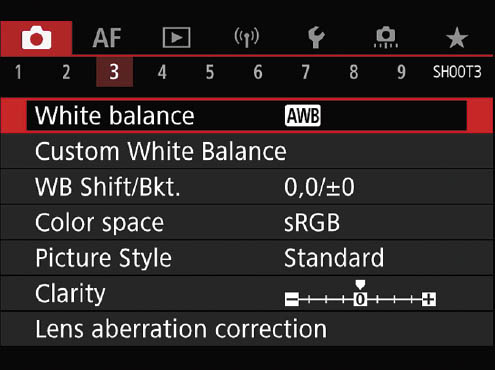
Figure 11.9 The Shooting 3 menu.
Of course, unless you own a specialized tool called a color temperature meter, you probably won’t know the exact color temperature of your scene. However, knowing the color temperatures of the preset options can help you if you decide to tweak them by choosing a different color temperature setting.
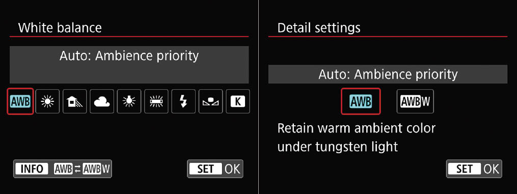
Figure 11.10 White balance presets can be chosen here (left). Ambience or White-priority can be set for Auto White Balance (right).
The values used are as follows, with two options available for Auto:
- Auto (AWB). 3,000K–7,000K. Press the INFO button when this is selected to toggle between Ambience-priority (to keep warm color under tungsten light) or White-priority (to produce neutral whites even under tungsten illumination). (See Figure 11.10, right.)
- Daylight. 5,200K
- Shade. 7,000K
- Cloudy. 6,000K
- Tungsten. 3,200K
- White Fluorescent. 4,000K
- Flash. 6,000K
- Custom. 2,000K–10,000K
- Color temperature. 2,500K–10,000K (Settable in 100K increments)
Choosing the right white balance can have a dramatic effect on the colors of your image, as you can see in Figure 11.11.
The problem with the available presets (Daylight, Shade, etc.) is that you have only seven of them, and in any given situation, all of them are likely to be wrong—strictly speaking. The good news is that they are likely to be only a little bit wrong. The human eye is very adaptable, so in most cases you’ll be perfectly happy with the results you get if you use Auto or choose a preset that’s in the white balance ballpark.
But if you absolutely must have the correct color balance or are frequently dissatisfied with the color balance when using Auto or one of the presets, you can always shoot RAW and adjust the final color balance in your image editor when converting the .cr3 file. Or, you can use a custom white balance procedure, described next.
If automatic white balance or one of the preset settings aren’t suitable, you can set a custom white balance using this menu option. The custom setting you establish will then be applied whenever you select Custom using the White Balance menu entry described earlier.
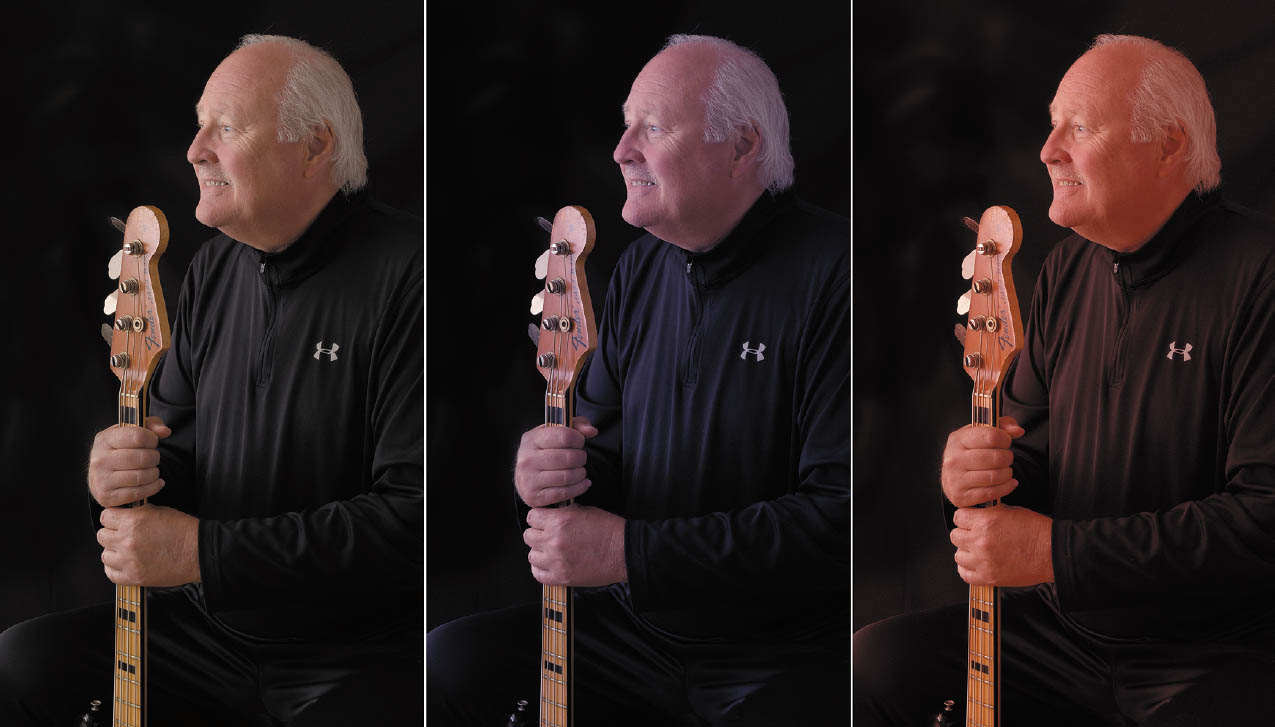
Figure 11.11 Adjusting color temperature can provide different results of the same subject at 3,400K (left), 5,000K (center), and 2,800K (right).
To set the white balance to an appropriate color temperature under the current ambient lighting conditions, focus manually (with the lens set on MF) on a plain white or gray object, such as a card or wall, making sure the object fills the spot metering circle in the center of the viewfinder. Then, take a photo. Next, press the MENU button and select Custom White Balance from the Shooting 3 menu. Use the QCD-1 until the reference image you just took appears and press the SET button to store the white balance of the image as your Custom setting.
Using an ExpoDisc
As I mentioned in Chapter 8, many photographers prefer to use a gadget called an ExpoDisc, from ExpoImaging, Inc. (www.expoimaging.com), which fits over (or attaches to) the front of your lens and provides a diffuse neutral (or semi-neutral) subject to measure with your camera’s custom white balance feature. ExpoDiscs cost $75 to $100 or so, depending on the filter size of your lens, but many just buy the 77mm version and hold it in front of their lens. (There’s a strap attached, so you won’t lose it.) Others have had mixed success using less-expensive alternatives (such as the lid of a Pringles can). ExpoImaging also makes ExpoCap lens caps with similar diffusing features, and you can leave one of them on your lens at all times (at least, when you’re not shooting).
There are two models, the standard ExpoDisc Neutral, and a Portrait model that produces a slightly warmer color balance suitable for portraits. The product produces the best results when you use it to measure the incident light; that is, the light falling onto your subject. In other words, instead of aiming your camera at your subject from the shooting position, take the time (if it’s possible) to position yourself at the subject position and point your ExpoDisc-equipped lens toward the light source that will illuminate the scene. (However, don’t point your camera directly at the sun! Aim at the sky instead.)
I like to use the ExpoDisc in two situations:
- Outdoors under mixed lighting. When you’re shooting outdoors, you’ll often find that your scene is illuminated by direct sunlight as well as by open shade, full shade, or a mixture of these. A custom white balance reading can help you zero in on the correct color balance in a situation that’s hard to judge visually.
- When using studio flash. It’s a nasty secret that many studio flash units change color temperature when you adjust the power slider to scale down the output. Perhaps your 1600ws (watt second) flash puts out too much light to allow you to use a larger f/stop for selective focus. So, you dial it down to 1/4 power. That will likely change the color temperature of the unit slightly, particularly when compared to your 800ws fill light, which you’ve reduced to half power. You can use the ExpoDisc to measure the color temperature of your main light at its new setting or aim it between two lights to obtain an average reading. The result will probably be close enough to the correct color temperature to satisfy most studio shooters.
Custom White Balance
Options: White balance setting
My preference: N/A
If automatic white balance or one of the preset settings (Daylight, Shade, Cloudy, Tungsten, White Fluorescent, or Flash) aren’t suitable, you can set a custom white balance using this menu option. The custom setting you establish will then be applied whenever you select Custom using the White Balance menu.
To set the white balance to an appropriate color temperature under the current ambient lighting conditions, focus manually (with the lens set on MF) on a plain white or gray object, such as a card or wall, making sure the object fills the spot metering circle in the center of the viewfinder. Then, take a photo. Next, press the MENU button and select Custom White Balance from the Shooting 3 menu. Rotate the QCD-1 until the reference image you just took appears and choose SET to store the white balance of the image as your Custom setting. Only compatible images that can be used to specify a custom white balance will be shown on the screen. Custom white balance images are marked with a custom icon and cannot be removed (although they can be replaced with a new custom white balance image).
A WHITE BALANCE LIBRARY
Shoot a selection of blank-card images under a variety of lighting conditions on a spare memory card. If you want to “recycle” one of the color temperatures you’ve stored, insert the card and set the Custom white balance to that of one of the images in your white balance library, as described above.
White Balance Shift/Bracketing
Options: WB bias and WB bracketing
My preference: N/A
White balance shift allows you to dial in a white balance color bias along the blue/amber dimensions, and/or magenta/green scale. In other words, you can set your color balance so that it is a little bluer or yellower (only), a little more magenta or green (only), or a combination of the two bias dimensions. You can also bracket exposures, taking several consecutive pictures each with a slightly different color balance biased in the directions you specify.
The process is a little easier to visualize if you look at Figure 11.12. The center intersection of lines BA and MG (remember high school geometry!) is the point of zero bias. Move the point at that intersection using the directional controls to locate it at any point on the graph using the blue/amber and magenta/green coordinates. The amount of shift will be displayed in the SHIFT box to the right of the graph.
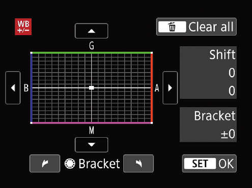
Figure 11.12 Use the Quick Control Dial 1 to specify color balance bracketing using magenta/green bias or to specify blue/amber bias.
White balance bracketing is like white balance shifting, only the bracketed changes occur along the bias axis you specify. This form of bracketing is like exposure bracketing, but with the added dimension of hue. Bias bracketing can be performed in any JPEG- (or HEIF-) only mode. You can’t use any RAW format or RAW+JPEG format because the RAW files already contain the information needed to fine-tune the white balance and white balance bias.
When you select WB SHIFT/BKT, the adjustment screen appears. First, you rotate the QCD-1 to set the range of the shift in either the magenta/green dimension (rotate to the left to change the vertical separation of the three dots representing the separate exposures) or in the blue/amber dimension by rotating to the right. Use the up/down/left/right buttons to move the bracket set around within the color space, and outside the MG or BA axes.
In most cases, it’s easy to determine if you want your image to be more green, more magenta, more blue, or more amber, although judging your current shots on the LCD screen can be tricky unless you view the screen in a darkened location so it will be bright and easy to see. Bracketing was covered in Chapter 4.
Color Space
Options: sRGB (default), Adobe RGB
My preference: I use the expanded Adobe RGB color space
When you are using one of the Creative Zone modes, you can select one of two different color spaces (also called color gamuts) using this menu entry. One color space is named Adobe RGB (because it was developed by Adobe Systems in 1998), while the other is called sRGB (supposedly because it is the standard RGB color space). These two color gamuts define a specific set of colors that can be applied to the images captured.
The Color Space menu choice applies directly to JPEG/HEIF images shot using P, Tv, Av, and M exposure modes. When you’re using Scene Intelligent Auto mode, the camera uses the sRGB color space for all the JPEG/HEIF images you take. RAW images are a special case. They have the information for both sRGB and Adobe RGB, but when you load such photos into your image editor, it will default to sRGB (with Scene Intelligent Auto or Creative Auto shots) or the color space specified here, unless you change that setting while importing the photos. (See the “Best of Both Worlds” sidebar that follows for more information.)
You may be surprised to learn that the camera doesn’t automatically capture all the colors we see. Unfortunately, that’s impossible because of the limitations of the sensor and the filters used to capture the fundamental red, green, and blue colors, as well as that of the elements used to display those colors on your camera and computer monitors. Nor is it possible to print every color our eyes detect, because the inks or pigments used don’t absorb and reflect colors perfectly. In short, your sensor doesn’t capture all the colors that we can see, your monitor can’t display all the colors that the sensor captures, and your printer outputs yet another version.
On the other hand, quite a few more colors are captured than we need. A 14-bit RAW image contains a possible 281 trillion different hues (16,384 colors per red, green, or blue channel), which are condensed down to a mere 16.8 million possible colors when converted to a 24-bit (eight bits per channel) image.
The set of colors, or gamut, that can be reproduced or captured by a given device (scanner, digital camera, monitor, printer, or some other piece of equipment) is represented as a color space that exists within the larger full range of colors. That full range is represented by the odd-shaped splotch of color shown in Figure 11.13, as defined by scientists at an international organization back in 1931. The colors possible with Adobe RGB are represented by the black triangle in the figure, while the sRGB gamut is represented by the smaller white triangle. The location of the corners of each triangle represents the position of the primary red, green, and blue colors in the gamut.
A third color space, ProPhoto RGB, represented by the yellow triangle in the figure, has become more popular among professional photographers as more and more color printing labs support it. While you cannot save images using the ProPhoto gamut, you can convert your photos to 16-bit ProPhoto format using Adobe Camera RAW when you import RAW photos into an image editor. ProPhoto encompasses virtually all the colors we can see (and some we can’t), giving advanced photographers better tools to work with in processing their photos. It has richer reds, greens, and blues, although, as you can see from the figure, its green and blue primaries are imaginary (they extend outside the visible color gamut). Those with exacting standards need not use a commercial printing service if they want to explore ProPhoto RGB: many inkjet printers can handle cyans, magentas, and yellows that extend outside the Adobe RGB gamut.

Figure 11.13 The outer curved figure shows all the colors we can see; the outlines show the boundaries of Adobe RGB (black triangle), sRGB (white triangle), and ProPhoto RGB (yellow triangle).
Regardless of which triangle—or color space—is used, you end up with some combination of 16.8 million different colors that can be used in your photograph. (No one image will contain all 16.8 million! Think about it: the only way an image could include that many colors would be if two-thirds of the pixels were each a unique hue!) But, as you can see from the figure, the colors available will be different.
Adobe RGB, like ProPhoto RGB, is an expanded color space useful for commercial and professional printing, and it can reproduce a wider range of colors. It can also come in useful if an image is going to be extensively retouched, especially within an advanced image editor, like Adobe Photoshop, which has sophisticated color management capabilities that can be tailored to specific color spaces. As an advanced user, you don’t need to automatically “upgrade” to Adobe RGB, because images tend to look less saturated on your monitor and, it is likely, significantly different from what you will get if you output the photo to your personal inkjet. (You can profile your monitor for the Adobe RGB color space to improve your on-screen rendition using widely available color-calibrating hardware and software.)
While both Adobe RGB and sRGB can reproduce the exact same 16.8 million absolute colors, Adobe RGB spreads those colors over a larger portion of the visible spectrum, as you can see in the figure. Think of a box of crayons (the jumbo 16.8 million crayon variety). Some of the basic crayons from the original sRGB set have been removed and replaced with new hues not contained in the original box. Your “new” box contains colors that can’t be reproduced by your computer monitor, but which work just fine with a commercial printing press. For example, Adobe RGB has more “crayons” available in the cyan-green portion of the box, compared to sRGB, which is unlikely to be an advantage unless your image’s final destination is the cyan, magenta, yellow, and black inks of a printing press.
The other color space, sRGB, is recommended for images that will be output locally on the user’s own printer, as this color space matches that of the typical inkjet printer fairly closely. You might prefer sRGB, which is the default for most cameras, as it is well suited for the range of colors that can be displayed on a computer screen and viewed over the Internet. If you plan to take your image file to a retailer’s kiosk for printing, sRGB is your best choice, because those automated output devices are calibrated for the sRGB color space that consumers use.
BEST OF BOTH WORLDS
If you plan to use RAW+JPEG for most of your photos, go ahead and set sRGB as your color space. You’ll end up with JPEGs suitable for output on your own printer, but you can still extract an Adobe RGB version from the RAW file at any time. It’s like shooting two different color spaces at once—sRGB and Adobe RGB—and getting the best of both worlds.
Of course, choosing the right color space doesn’t solve the problems that result from having each device in the image chain manipulating or producing a slightly different set of colors. To that end, you’ll need to investigate the wonderful world of color management, which uses hardware and software tools to match or calibrate all your devices, as closely as possible, so that what you see more closely resembles what you capture, what you see on your computer display, and what ends up on a printed hardcopy. Entire books have been devoted to color management, and most of what you need to know doesn’t directly involve your camera, so I won’t detail the nuts and bolts here.
To manage your color, you’ll need, at the bare minimum, some sort of calibration system for your computer display, so that your monitor can be adjusted to show a standardized set of colors that is repeatable over time. (What you see on the screen can vary as the monitor ages, or even when the room light changes.) I use the SpyderX Pro monitor color correction system from Datacolor (www.datacolor.com) for my computer’s 32-inch main screen and two 26-inch displays. The unit checks room light levels every five minutes and reminds me to recalibrate every week or two using a small sensor device, which attaches temporarily to the front of the screen and interprets test patches that the software displays during calibration. The rest of the time, the sensor sits in its stand, measuring the room illumination, and adjusting my monitors for higher or lower ambient light levels.
If you’re willing to make a serious investment in equipment to help you produce the most accurate color and make prints, you’ll want a more advanced system (up to $500) like the various Spyder products from Datacolor or Colormunki from X-Rite (www.colormunki.com).
Picture Style
Options: Auto (default), Standard, Portrait, Landscape, Fine Detail, Neutral, Faithful, Monochrome, three User Styles
My preference: Auto
This feature is one of the most important tools for customizing the way your photos are rendered. Picture Styles are a type of fine-tuning you can apply to your photos to change certain characteristics of each image taken using a particular Picture Style setting. The parameters you can specify for full-color images include the amount of sharpness, degree of contrast, the richness of the color, and the hue of skin tones. For black-and-white images, you can tweak the sharpness and contrast, but the two color adjustments (meaningless in a monochrome image) are replaced by controls for filter effects (which I’ll explain shortly), and sepia, blue, purple, or green tone overlays.
There are preset Picture Styles for Standard, Portrait, Landscape, Fine Detail, Neutral, and Faithful pictures, plus Auto, and three user-definable settings called User Def. 1, User Def. 2, and User Def. 3, which you can define to apply to any sort of shooting situation you want, such as sports, architecture, or baby pictures. There is also a seventh, Monochrome, Picture Style that allows you to adjust filter effects or add color toning to your black-and-white images. See Figure 11.14 for the main Picture Style menu.
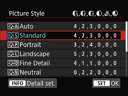
Figure 11.14 Picture Styles are available from this scrolling menu; these six, plus Faithful, Monochrome, and three User Def. styles that become visible when you scroll down the list.
Picture Styles are extremely flexible. Canon has set the parameters for Auto and the predefined color Picture Styles and the single monochrome Picture Style to suit the needs of most photographers. But you can adjust any of those “canned” Picture Styles to settings you prefer. Better yet, you can use those three User Definition files to create brand-new styles that are all your own. If you want rich, bright colors to emulate Velvia film or the work of legendary photographer Pete Turner, you can build your own color-soaked style. If you want soft, muted colors and less sharpness to create a romantic look, you can do that, too. Perhaps you’d like a setting with extra contrast for shooting outdoors on hazy or cloudy days.
The current settings for each are arrayed along the top in Figure 11.14 as icons, left to right: S (sharpness strength), F (sharpness fineness), T (sharpness threshold), Contrast (a half white/half black circle), Saturation (a triangle composed of three circles), and Color Tone (a circle divided into thirds). When you scroll down within the Monochrome Picture Style, Filter Effect (overlapping circles) and Toning Effect (paintbrush tip) appear. These parameters applied when using Picture Styles are described next.
Here are the Picture Style parameters:
- Sharpness. This parameter determines the apparent contrast between the outlines or edges in an image, which we perceive as image sharpness. When adjusting sharpness, remember that more is not always a good thing. A little softness is necessary (and is introduced by a blurring “anti-alias” filter in front of the sensor) to reduce or eliminate the moiré effects that can result when details in your image form a pattern that is too close to the pattern, or frequency, of the sensor itself. The default levels of sharpening were chosen by Canon to allow most moiré interference to be safely blurred to invisibility, at the cost of a little sharpness. As you boost sharpness (either using a Picture Style or in your image editor), moiré can become a problem, plus, you may end up with those noxious “halos” that appear around the edges of images that have been oversharpened. Use this adjustment with care. You have three individual parameters within this setting that you can adjust individually:
- • Strength. Set the intensity of the sharpening on an eight-step scale from 0 (weak outline emphasis) to 7 (strong outline emphasis). Adding too much strength can result in a halo and excess detail around the edges within your image.
- • Fineness. This determines which edges will be emphasized, on a scale of 1 (sharpens the finest lines in your image) to 5 (sharpens only larger, coarser lines). Use a lower number if you anticipate your image will have a wealth of fine detail that you want to emphasize, such as a heavily textured subject. A larger number might be better for portraits, so that eyes and hair might be sharpened, but not skin defects. Changes in Fineness and Threshold (which follows) do not apply when shooting movies.
- • Threshold. This setting uses contrast between the edges being sharpened and the surrounding areas, to determine the degree of sharpening applied to the outlines. It uses a scale from 1 to 5, with lower numbers allowing sharpening when there is less contrast between the edge and surroundings. There is an increase in noise when a low threshold is set. Higher numbers produce sharpening only when the contrast between edge and adjacent pixels is already high. The highest numbers can produce excessive contrast and a poster-like effect.
- Contrast. Use this control, with values from –4 (low contrast) to +4 (higher contrast), to change the number of middle tones between the deepest blacks and brightest whites. Low-contrast settings produce a flatter-looking photo, while high-contrast adjustments may improve the tonal rendition while possibly losing detail in the shadows or highlights.
- Saturation. This parameter, adjustable from –4 (low saturation) to +4 (high saturation) controls the richness of the color, making, say, a red tone appear to be deeper and fuller when you increase saturation, and tend more toward lighter, pinkish hues when you decrease saturation of the reds. Boosting the saturation too much can mean that detail may be lost in one or more of the color channels, producing what is called “clipping.” You can detect this phenomenon when using the RGB histograms, as described in Chapter 4.
- Color tone. This adjustment has the most effect on skin tones, making them either redder (0 to –4) or yellower (0 to +4).
- Filter effect (Monochrome only). Filter effects do not add any color to a black-and-white image. Instead, they change the rendition of gray tones as if the picture were taken through a color filter. I’ll explain this distinction more completely in the sidebar “Filters vs. Toning” later in this section.
- Toning effect (Monochrome only). Using toning effects preserves the monochrome tonal values in your image but adds a color overlay that gives the photo a sepia, blue, purple, or green cast.
The predefined Picture Styles are as follows:
- Auto. Adjusts the color to make outdoor scenes look more vivid, with richer colors.
- Standard. This Picture Style applies a set of parameters, including boosted sharpness, that are useful for most picture taking, and which are applied automatically when using Basic Zone modes other than Portrait or Landscape.
- Portrait. This style boosts saturation for richer colors when shooting portraits, which is particularly beneficial for women and children, while reducing sharpness slightly to provide more flattering skin texture. The Basic Mode Portrait setting uses this Picture Style. You might prefer the Faithful style for portraits of men when you want a more rugged or masculine look, or when you want to emphasize character lines in the faces of older subjects of either gender.
- Landscape. This style increases the saturation of blues and greens and increases both color saturation and sharpness for more vivid landscape images. The Basic Zone Landscape mode uses this setting.
- Fine detail. As you might expect, this setting uses sharpening and contrast to produce an image with optimum detail, at the expense of possibly adding some visual noise.
- Neutral. This Picture Style is a less-saturated and lower-contrast version of the Standard style. Use it when you want a more muted look to your images, or when the photos you are taking seem too bright and contrasty (say, at the beach on a sunny day).
- Faithful. The goal of this style is to render the colors of your image as accurately as possible, roughly in the same relationships as seen by the eye.
- Monochrome. Use this Picture Style to create black-and-white photos in the camera. If you’re shooting JPEG only, the colors are gone forever. But if you’re shooting JPEG+RAW you can convert the RAW files to color as you import them into your image editor, even if you’ve shot using the Monochrome Picture Style. Images are displayed in black-and-white on the screen during playback, but the colors are there in the RAW file for later retrieval.
TIP You can use the Monochrome Picture Style even if you are using one of the RAW formats alone, without a JPEG version. The camera displays your images on the screen in black and white and marks the RAW image as monochrome so it will default to that style when you import it into your image editor. However, the color information is still present in the RAW file and can be retrieved, at your option, when importing the image.
Selecting Picture Styles
Canon makes selecting a Picture Style for use very easy, and, to prevent you from accidentally changing an existing style when you don’t mean to, divides selection and modification functions into two separate tasks. There are different ways to choose from among your existing Picture Styles:
- Picture Styles menu. Use this menu entry and scroll down the list shown earlier in Figure 11.14 with the QCD-1 until the style you want to use is highlighted. Then press SET.
- Quick Control screen. Press the Q button and navigate to the Picture Styles icon in the right column. With the icon highlighted, you can rotate either dial or use the directional controls to choose the Style you want to use and press SET to confirm.
Defining Picture Styles
Canon makes interpreting current Picture Style settings and applying changes very easy. As you saw in Figure 11.14, the current settings of the visible Picture Style options are shown as numeric values on the menu screen. Some camera vendors use word descriptions, like Sharp, Extra Sharp, or Vivid, More Vivid that are difficult to relate to. You can change one of the existing Picture Styles or define your own whenever the Picture Styles menu is visible. Just follow these steps:
- 1. Choose a style to modify. Highlight the style you’d like to adjust.
- 2. Activate adjustment mode. Press the INFO button to choose Detail Set. The screen that appears next will be like the one shown in Figure 11.15 for the six color styles or three User Def. styles. In addition to the Sharpness and Contrast adjustments shown in the figure, you can scroll down to two more: Saturation and Color Tone. The Monochrome screen looks similar but substitutes Filter Effect and Toning Effect (discussed later) for Saturation and Color Tone.

Figure 11.15 Each parameter can be changed separately for color Picture Styles, such as the Standard style pictured.
- 3. Choose a parameter to change. Use the QCD-1 to scroll among the parameters, plus Default Set. at the bottom of the screen, which restores the values to the preset numbers.
- 4. Activate changes. Press SET to change the values of a highlighted parameter.
- 5. Adjust values. Use the QCD-1 to move the triangle to the value you want to use. Note that the previous value remains on the scale, represented by a gray triangle. This makes it easy to return to the original setting if you want.
- 6. Confirm changes. Press the SET button to lock in that value, then press the MENU button three times to back out of the menu system.
Any Picture Style that has been changed from its defaults will be shown in the Picture Style menu with blue highlighting the altered parameter. You don’t have to worry about changing a Picture Style and then forgetting that you’ve modified it. A quick glance at the Picture Style menu will show you which styles and parameters have been changed.
Making changes in the Monochrome Picture Style is slightly different. As I mentioned, the Saturation and Color Tone parameters are replaced with Filter Effect and Toning Effect options. (Keep in mind that once you’ve taken a JPEG photo using a Monochrome Picture Style, you can’t convert the image back to full color.) You can choose from Yellow, Orange, Red, or Green filters, or None, and specify Sepia, Blue, Purple, or Green toning, or None. You can still set the Sharpness and Contrast parameters that are available with the other Picture Styles.
FILTERS VS. TONING
Although some of the color choices overlap, you’ll get very different looks when choosing between Filter Effects and Toning Effects. Filter Effects add no color to the monochrome image. Instead, they reproduce the look of black-and-white film that has been shot through a color filter. That is, Yellow will make the sky darker and the clouds will stand out more, whereas Orange makes the sky even darker and sunsets more full of detail. The Red filter produces the darkest sky of all and darkens green objects, such as leaves. Human skin may appear lighter than normal. The Green filter has the opposite effect on leaves, making them appear lighter in tone. Figure 11.16, left, shows the same scene shot with no filter, then Yellow, Green, and Red filters.
The Sepia, Blue, Purple, and Green Toning Effects, on the other hand, all add a color cast to your monochrome image. Use these when you want an old-time look or a special effect, without bothering to recolor your shots in an image editor. Figure 11.16, right, shows the various Toning Effects available.

Figure 11.16 Left: Applying color filters: No filter (upper left); Yellow filter (upper right); Green filter (lower left); and Red filter (lower right). Right: Toning: Sepia (top left); Blue (top right); Purple (lower left); and Green (lower right).
Adjusting Styles with the Picture Style Editor
If you’d rather edit Picture Styles in your computer, the Picture Style Editor supplied for your camera in versions for both Windows and Macs allows you to create your own custom Picture Styles, or edit existing styles, including the Standard, Landscape, Faithful, and other predefined settings already present. You can change sharpness, contrast, color saturation, and color tone—and a lot more—and then save the modifications as a PF2 file that can be uploaded to the camera, or used by Digital Photo Professional to modify a RAW image as it is imported.
To create and load your own Picture Style, just follow these steps:
- 1. Load the editor. Launch the Picture Style Editor (PSE, not to be confused with the other PSE, Photoshop Elements).
- 2. Access a RAW file. Load a RAW CR3 image you’d like to use as a reference into the PSE. You can drag a file from a folder into the editor’s main window or use the Open command in the File menu.
- 3. Choose an existing style to base your new style on. Select any of the base styles except for Standard. Your new style will begin with all the attributes of the base style you choose, so start with one that already is close to the look you want to achieve (“tweaking” is easier than building a style from the ground up).
- 4. Split the screen. You can compare the appearance of your new style with the base style you are working from. Near the lower-left edge of the display pane are three buttons you can click to split the old/new styles vertically, horizontally, or return to a single image.
- 5. Dial in basic changes. Click the Advanced button in the Tool palette to pop up the Advanced Picture Style Settings dialog box that appears at left in the figure. These are the same parameters you can change in the camera. Click OK when you’re finished.
- 6. Make advanced changes. The Tool palette has additional functions for adjusting hue, tonal range, and curves. Use of these tools is beyond the scope of a single chapter, let alone a notation in a list, but if you’re familiar with the advanced tools in Photoshop, Photoshop Elements, Digital Photo Pro, or another image editor, you can experiment to your heart’s content. Note that these modifications go way beyond what you can do with Picture Styles in the camera itself, so learning how to work with them is worth the effort.
- 7. Save your Picture Style. When you’re finished, choose Save Picture Style File from the File menu to store your new style as a PF2 file on your hard disk. Add a caption and copyright information to your style in the boxes provided. If you click Disable Subsequent Editing, your style will be “locked” and protected from further changes, and the modifications you did make will be hidden from view (just in case you dream up your own personal, “secret” style). But you’ll be unable to edit that style later. If you think you might want to change your custom Picture Style, save a second copy without marking the Disable Subsequent Editing box.
Uploading a Picture Style to the Camera
Now it’s time to upload your new style to your camera into one of your three User Def. slots in the Picture Style array. Just follow these steps:
- 1. Link your camera for upload. Connect your camera to your computer using the USB cable, power up the camera, launch the EOS Utility, and click the Camera Settings/Remote Shooting choice in the splash screen.
- 2. Choose the Shooting menu. It’s marked with an icon of a white camera on a red background, from the menu bar located about midway in the control panel that appears on your computer display.
- 3. Select Register User Defined Style. Click on the box, outlined in red in the figure, to produce the Register Picture Style dialog box.
- 4. Choose a User Def. tab. Click on one of the three tabs, labeled User Def. 1, User Def. 2, or User Def. 3. Each tab will include the name of the current Picture Style active in that tab.
- 5. Click the Open File button and choose the Picture Style file to load. The Picture Styles you’ve saved (or downloaded from another source) will appear with a PF2 extension. Click on the one you want to use, and then click the Open button in the Open dialog box.
- 6. Upload Picture Style to the camera. The Register Picture Style File dialog box will return. Click OK and the Picture Style will be uploaded to the camera in the User Def. “slot” represented by the tab you’ve chosen. The name of the Picture Style will appear in the menu in place of User Def. 1 (or User Def. 2/User Def. 3).
Changing a Picture Style’s Settings from the EOS Utility
You can modify the settings of a Picture Style that’s already loaded into your camera from the EOS Utility when your camera is linked to your computer. Just follow these steps:
- 1. Link your camera to the computer. Connect your camera to your computer using the USB cable, turn the camera on, launch the EOS Utility, and click the Camera Settings/Remote Shooting choice in the splash screen.
- 2. Choose the Shooting menu. It’s marked with an icon of a white camera on a red background, from the menu bar located about midway in the control panel that appears on your computer display.
- 3. Access the Picture Style. Click on the Picture Style choice. The currently active Picture Style in the camera will be shown, along with its detail settings.
- 4. Choose a Picture Style to modify. Click the Picture Style box to produce a listing of all the available Picture Styles.
- 5. Click Detail Set. At lower left, Landscape is now highlighted. When you click on Detail Set., a dialog box appears. You can move the sliders to change the settings, as described earlier. You can also click the Default Set. button to return the settings to their original values.
- 6. Confirm choice. Click Return when you’ve finished making changes, and the Picture Style you’ve modified will be changed in the camera.
- 7. Exit EOS Utility. Disconnect your camera from your computer, and your modified style is ready to use.
Getting More Picture Styles
I’ve found that careful Googling can unearth other Picture Styles that helpful fellow EOS owners have made available, and even a few from the helpful Canon company itself. My own search turned up this link: https://global.canon/en/imaging/picturestyle/file/download.html, where Canon offers a half dozen or more useful PF2 files you can download and install on your own. Remember that Picture Style files are compatible between various Canon EOS models (that is, you can use a style created for the Canon 90D with your R5 or R6), but you should be working with the latest software versions to work with the latest cameras and Picture Styles. If you owned an earlier EOS and haven’t re-installed the software since your camera upgrade, you might need to re-install the software. It’s available for download from the Canon website.
Try the additional styles Canon offers. They include:
- Studio Portrait. Compared to the Portrait style built into the camera, this one, Canon says, expresses translucent skin in smooth tones, but with less contrast. (Like films in the pre-digital age that were intended for studio portraiture.)
- Snapshot Portrait. This is another “translucent skin” style, but with increased contrast with enhanced contrast indoors or out.
- Nostalgia. This style adds an amber tone to your images, while reducing the saturation of blue and green tones.
- Clear. This style adds contrast for what Canon says is additional “depth and clarity.”
- Twilight. Adds a purple tone to the sky just before and after sunset or sunrise.
- Emerald. Emphasizes blues and greens.
- Autumn Hues. Increases the richness of browns and red tones seen in fall colors.