"The perception of what a thing is and the perception of what it means are not separate, either."
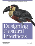
When Antenna Design set out to redesign New York City's Metropolitan Transit Authority's (MTA) ticket vending machines,[38] it initially assumed that everyone would realize the machines had touchscreens. After all, they figured, everyone had used ATMs and touchscreen kiosks at airports. But they found that, because the MTA serves literally tens of millions of people from all walks of life, a large percentage of its users had never done those things. They didn't know what it was like to use an ATM because they didn't even have a bank account.
Thus, when it came time to design the screen for the MetroCard Vending Machines, Antenna Design needed to provide an extremely obvious visual cue that the kiosk was a touchscreen.
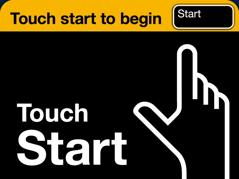
Figure 7-1. Even though you can touch anywhere on the screen to begin, Antenna Design wanted to make sure the instructions were dead simple, with two written cues and an animated hand to remove all ambiguity, even for tourists who do not read English. Courtesy Antenna Design.
Especially with free-form interactive gestures but also with touchscreens, it increasingly isn't enough to simply install a product and hope for the best. As noted in Chapter 1, the best gestural interfaces need to be discoverable. Users need to be made aware of their presence and, after that, their affordances. What can I do here? How can I activate and engage with this? What are the controls?
Designer Clive Grinyer relates a humorous anecdote[39] that brings the need for communication into stark relief:
"I work in Paris, in a large converted telephone exchange where we have recently installed new light switches that save energy by turning off when they don't detect movement. When you go to the loo, you don't move much, you might move bits of you, or you might grimace a bit, but it's not movement as such, certainly not detectable by the infrared monitor. So, after 20 seconds, the light goes off.
"Someone, somewhere, made the decision that after 20 seconds the light would go off. It might have been the facilities manager. It was more likely the person who set the default, probably the kind-hearted engineer who programmed these switches. He (and it was almost certainly a He) went home feeling good. He may have even told his kids that he had saved the world a few kilowatts, that he was doing his bit against George Bush (especially if he was French), and felt happy and satisfied when he went to sleep that night.
"But the experience I am having of his decision is that I am sitting on a loo in a foreign country waving my arms about because I think there is probably a sensor somewhere, if only I could see it, which will eventually see me and turn the light back on."
Although clearly this is an example of bad design (20 seconds is an awfully short period of time), this story amply indicates that communicating interactive gestures means communicating two pieces of information:
These two things can be delivered in a variety of ways over a variety of distances from the product.
Most gestural interfaces have three zones of engagement,[40] which happen in space relative to the size of the device:
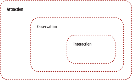
Figure 7-2. The three zones of engagement. The nearer to the product the user is, the more variety of communication methods can be employed to engage the user.
Figure 7-3. This touchscreen kiosk for HP's Photosmart Express is wrapped in signage to attract users in locations such as supermarkets and pharmacies. Note how the signs peek above the height of the shelves, and there is even a mat on the aisle floor. Courtesy Hewlett-Packard.
- Attraction
A person spots the product or output from the product, such as a sound, and is (hopefully) interested and intrigued by it. This typically happens from a distance—for large environmental displays, this could be from very far away. Often the attraction is triggered by environmental cues such as signage, sound, or the hardware of the product itself, or it could simply be that the person notices someone using the system. The gestures themselves, if broad enough, could also be enough to attract attention.
- Observation
From midrange, a person is able to see more detail about the product and the gestures involved in engaging with it. At this point, environmental cues such as signage are crucial. Signage can both instruct and engage at this distance. It's also from this distance that users can demonstrate to others how a product works. Observers learn the UI conventions of the product just by watching and asking questions.
- Interaction
From up close (within a meter/yard of most devices), the person can become a user, directly interacting with the product. The instructions and affordances here are likely on the product itself, meant to be seen and read from very nearby.
When designing a gestural system, it is good to keep these three zones in mind so that proper communication channels can be established and designed early, and the correct communication methods (discussed shortly) are used.
Adding to the complexity is that people simply aren't accustomed to using interactive gestures quite yet, and there can be some uncertainty and anxiety regarding using an unfamiliar system. Although interacting with gestural interfaces may be more natural than using a mouse and keyboard, it doesn't mean the interfaces are necessarily intuitive to use. Especially for public devices, people are initially wary about engaging with an unfamiliar gestural system for fear of breaking or damaging it, or simply looking foolish trying to use something new in a visible, public space. Add to this the fact that often the hardware looks expensive and that for years digital systems have been unreliable, and the result is a certain amount of ambient fear regarding gestural interfaces. Hubert Dreyfus argues that this fear comes from an innate awareness of the vulnerability of the body,[41] that we cannot undo an electrical shock, say.
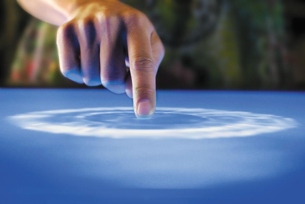
Figure 7-6. Microsoft's Surface has an excellent attraction affordance to lure users into touching its, well, surface: water. It looks as though you can touch the water, and so many people do, triggering the system to wake up from idle mode. Courtesy Microsoft.
The main way to overcome this fear in the observation and interaction zones is to create what I call an attraction affordance. An attraction affordance—usually on an idle screen (if there is a screen)—is one that is designed to be inviting and dead simple to interact with, but that doesn't necessarily relate to the important tasks of the system, only to initiate engagement with it. Attraction affordances have their roots in the video game arcades of the 1980s, when designers would agonize over the repeated demonstration of the game to entice players to put their money in. An attraction affordance goes one step further, providing some trigger to start engaging the system. Antenna Design's animated hand and "Touch start" message from the example that started this chapter is one case in point, as is Apple's "slide to unlock" latch on the front of the iPhone.
Another direction to explore is to not create a control, such as a button or slider, but instead to present content with which to interact. This content can relate to the device, or it can be simply something that begs engagement.
Of course, attraction affordances can be abused. Few people want to turn their location into something that looks like a video game arcade circa 1982! Sound and image have to be carefully managed for context.
You can communicate both the key presence and the instruction in several ways. As with most design decisions, the method of communication depends heavily on how it will be used and by whom. Detailed written instructions, for instance, will be useless for situations in which the users are illiterate or in locations such as a busy city street. Illustrations need to be of a certain size to be understood. Demonstrations need a means with which to view them.
Further complicating the methods of communication is the difficulty in communicating multiple gestures at once. You should avoid this if possible, but sometimes, as with trackpads and wall displays, you can't. With multiple gestures in a single space, the following methods may have to be layered on (as stickers or perhaps as a help mode that can be turned on).
Written instructions are a basic choice and make sense for simple actions—touch here to begin, slide to unlock, clap hands to turn on lights—that is, actions that are in common use and/or are unambiguous enough to be explained in text.
Note
Use written instructions for simple, unambiguous gestures.
Written instructions, because of their possible small size, can easily fit in places that other communication methods cannot, such as on small devices, and into different environments.
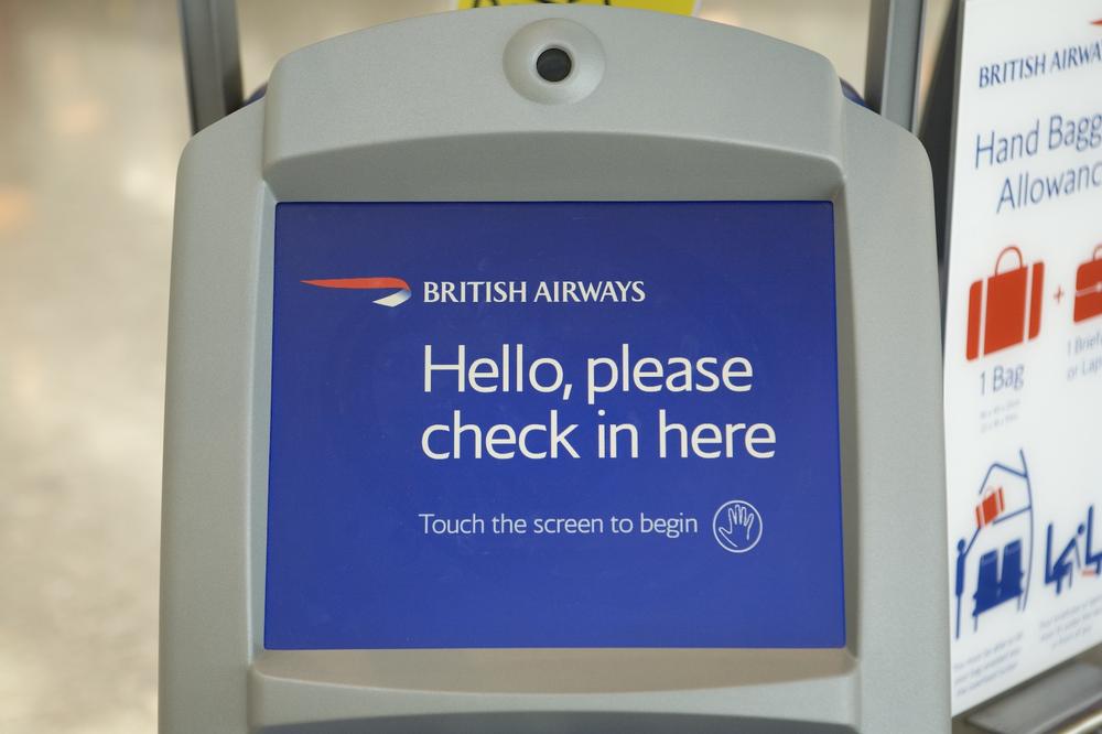
Figure 7-7. Politeness in the messaging, combined with a small hand icon on the British Airways kiosk at Heathrow Airport. Courtesy Terminal5Insider.
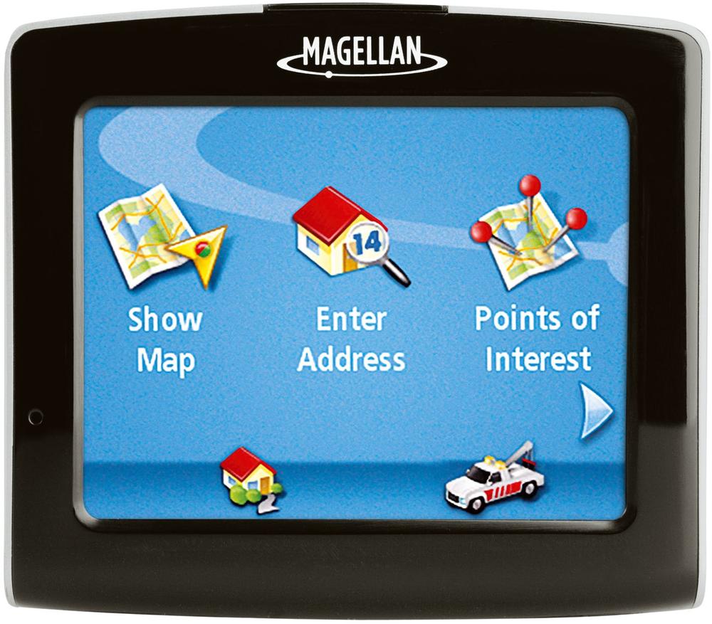
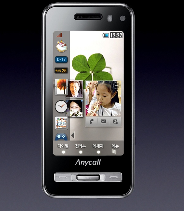
Figure 7-8. The Magellan Maestro 3210, since it is a more personal device than a kiosk, assumes that you know it is a touchscreen and simply provides major menu items with basic text instructions and icons. Courtesy Magellan.
As noted elsewhere, text is part of the interface and should be chosen as carefully as other controls and parts of the visual design. It is particularly tricky to read text and perform an instructed action at the same time! When it comes to instructional text, Winston Churchill's dictum that "Short words are best and the old words when short are best of all" should be taken to heart. Designer Erika Hall has outlined five guidelines for the best interface text:[42]
| Be authentic. |
| Be engaging. |
| Be specific. |
| Be appropriate. |
| Be polite. |
She has also noted the "Seven Kinds of Bad" when it comes to interface copy: vague, (too) clever, rude, oblivious, inconsistent, presumptuous, and unnatural. You should obviously avoid these at all costs.
When words are too cumbersome or could be misinterpreted, often a simple illustration will suffice to communicate how a system is used. Illustrations benefit from being more universal than written instructions in that the person doesn't have to read or speak the language to interpret the image (if the illustration is done well, of course).
Illustrations can be small as well, almost iconic, but not quite, as they often need to convey motion or detail.
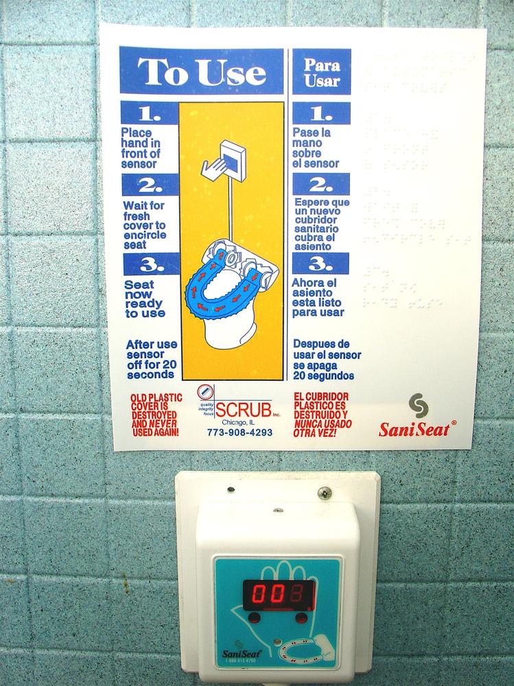
Figure 7-10. This SaniSeat shows where the hand is placed, but the rest of the system is so complicated (at least for a public toilet) that it requires a poster to explain.
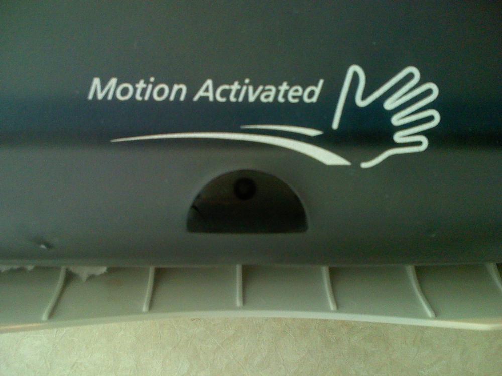
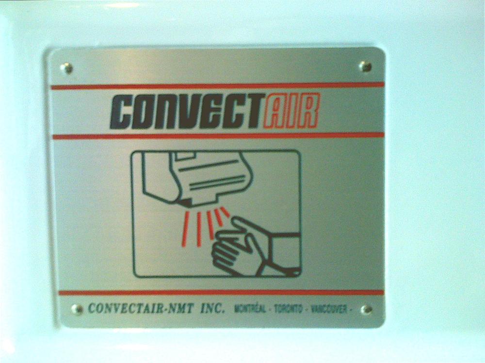
Figure 7-11. This paper towel dispenser combines a well-designed illustration showing the left-to-right movement required to trigger the device, with a small bit of text to show presence.
We've been discussing the communication of gestures, mostly in real time, in the context in which they are being performed. However, you can also apply all of these techniques in user manuals, help files, marketing brochures, and packaging—places where the communication doesn't always occur while the gesture is taking place, but rather before or after.
A demonstration is a moving image that shows the gesture that needs to be performed. This can be a simple, animated illustration or it can be a live-action movie with an actor performing the gesture. Of course, this necessitates some sort of display that can show motion: either a device monitor or TV screen, or a projector projecting the imagery onto a surface. (In theory, a 2D holograph could obviate the need for a monitor in certain situations where a screen would be impractical or impossible.)
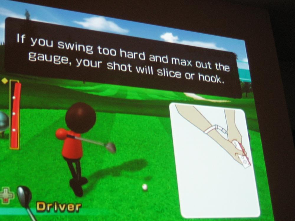
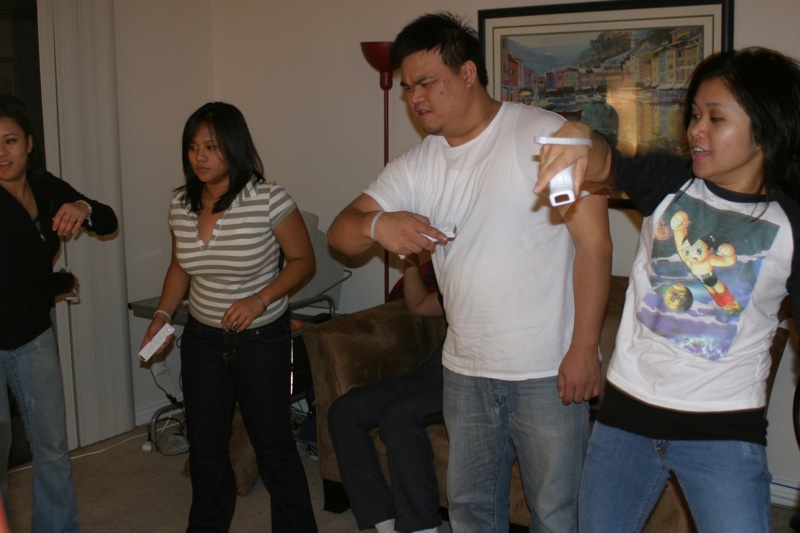
Figure 7-14. During game play, Wii games occasionally pop up demonstrations to help players learn or refine their gestures. Watching while doing is a powerful way to learn a gesture. Courtesy JasonJT.
Demonstrations typically show an animated movement in a loop so that it can be imitated to initiate an action. The animated hand touching the MTA vending machine discussed at the beginning of this chapter is an example of a simple demonstration.
There has been some activity, particularly in the ubiquitous computing community, to create symbols that indicate when an interactive system is present in a space when it would otherwise be invisible. Like other methods, these symbols can communicate presence and instruct users on how to use the system.
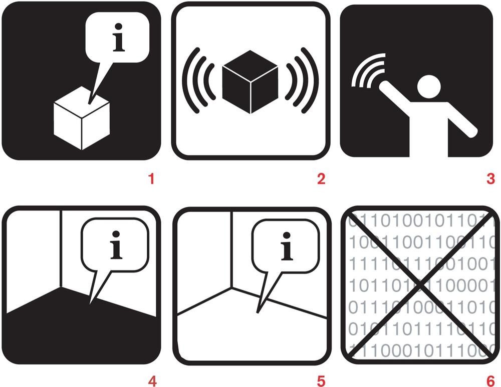
Figure 7-15. A sample from a set of ubiquitous computing icons from Adam Greenfield and Nurri Kim. 1: This object is self-describing. 2: This object has imperceptible qualities. 3: A gestural interface is available. 4: This location is self-describing. 5: A variation on #4. 6: Network dead zone; no information collected in this area.
Figure 7-16. Part of an icon set originally conceived for use with RFID technology and inspired by existing icons for push buttons, contact cards, and instructional diagrams. Courtesy Timo Arnall.
These symbols, however, are not in common use, and until they are, it is unwise to assume that simply putting one of these symbols on a sign will be enough to communicate to most users—at least in the short term. In the future, however, one can easily see that a universal set of symbols could be an extremely useful and powerful tool for designers.
It can be beneficial, both when designing and particularly when communicating designs, to think in terms of simile and metaphor. Metaphor for gestural interfaces makes perfect sense, as you are trying to turn something abstract (a digital system that is likely mostly invisible) into something concrete, controlled by the body. Metaphors, which turn abstract concepts into the concrete ("Time is money"), are the perfect tool for this.
You can say, "Make your hand flat and hold it up and move it back and forth, left and right," but it is much easier to say, "Wave." This is true not only for simple gestures but also for complex ones, perhaps even more so. "Move your hand like you are stirring a pot" is considerably easier to describe than it would be otherwise.
However, as noted in Chapter 1 and Chapter 2, gestures on their own do contain meaning, and that meaning can become mixed up with another metaphor that you try to lay on top of it. For instance, if your "stirring the pot" gesture has nothing to do with mixing something (e.g., images, sounds, etc.), users may be confused by it, and certainly might have difficulty remembering it.
Note
The best metaphors are those that match the understood meaning of the gesture with the action being performed.
We should never forget that the products we design do live in the world, often in specific contexts. How we create messages about a product in that context is essential to the life cycle of the product, but it also changes the environment, for good or ill. A beautiful gestural interface can quickly be ruined or tainted by the signage and hardware around it. The communication of a product's presence and use also communicates, directly or indirectly, its value and meaning.
Everyware: The Dawning Age of Ubiquitous Computing, Adam Greenfield (New Riders Publishing)
Universal Principles of Design, William Lidwell, Kritina Holden, and Jill Butler (Rockport Publishers)
The Elements of Style, William Strunk and E.B. White(Coyote Canyon Press)
Metaphors We Live By, George Lakoff and Mark Johnson (University of Chicago Press)
[38] As related by Antenna Design partner, Sigi Moeslinger, at Interaction08. Watch the video at http://interaction08.ixda.org/Sigi_Moeslinger.php.
[39] Read the whole post, "Technology doesn't work," at http://blog.clivegrinyer.com/blog/_archives/2007/2/13/2733052.html.
[40] This framework was suggested by Darren David and Nathan Moody of Stimulant.
[41] See Dreyfus's "Disembodied Telepresence and the Remoteness of the Real," in On the Internet (Routledge): 50–72, 2001.
[42] These appear in her presentation "Copy as Interface," at http://www.slideshare.net/mulegirl/copy-as-interface.