Chapter 8. Doing Things: Actions and Commands
This chapter is devoted to the “verbs” in the interface: how people can take an action or use a command. In other words, we’re going to look at the ways people get work done in software. This chapter explores the following:
-
Different methods for initiating action or activating commands
-
How to make it clear that an item can be acted on with affordances
-
Patterns and components that promote controlling and editing
This is in contrast to our discussions of “nouns” in interface design so far. First, we discussed structure and flow and visual layout. We reviewed interface objects such as windows, text, links, and static elements in pages. In subsequent chapters, we will look at complex components such as data visualizations and forms.
We think of the verbs—designing actions and commands—as the methods people can use to perform tasks in your application. Specifically, what we mean by that is how the person using your software can carry out these tasks:
-
Start, pause, cancel, or complete an action
-
Enter a setting, configuration, or value
-
Manipulate an object or component in the interface
-
Apply a change or transformation
-
Remove or delete something
-
Add or create something
Many of the patterns described in this chapter come from hardware interfaces that were developed and standardized long before software interfaces became ubiquitous. Other patterns mimic real-world behaviors and methods directly. It’s true that there is a lot of history here, and there are many best practices to follow. The standard platform style guides, such as those for Android and iOS, Windows and Macintosh, and JavaScript frameworks for responsive web and mobile user interfaces (UIs) will generally get you pretty close to a workable UI.
Most users now depend upon behaviors they have learned from other applications to negotiate menus and find buttons, so it benefits your users and you to follow those conventions, even if they seem to lack originality. Most of the time, people want to get work done using the interaction methods they already know.
A good UI strategy is to realize that the “lack of originality” in today’s software environments just means there are now near-universal UI standards for many common patterns and processes that your audience has already learned. They’re ready to use these skills immediately. So, a savvy UI designer, product manager, engineer, or product team will regard today’s established software standards, UI toolkits, component libraries, and off-the-shelf frameworks as a useful foundation. Many of the most common application features and functions no longer need to be coded from scratch. This frees up time and energy to design the unique features that truly excite your users and set your endeavor apart.
Examples of common functionality that we can now take for granted include such actions as cut, copy, and paste. Even though this is an abstract process, it is based on real-world actions. The “cut” or removed object or text is held temporarily in the “clipboard”–out of sight, not visible, temporarily in computer memory. Moderately experienced desktop computer users have learned how it’s “supposed to work.” The same is true for pop-up menus (context menus), which some users seem to look for everywhere, and other users never think to look for at all.
Another example is drag-and-drop. Drag-and-drop is more directly modeled on real-world behaviors: picking up objects and putting them down. But it absolutely has to work the way users intuitively expect it to—putting an object onto a “target drop zone” or onto a folder—or the illusion of direct manipulation is broken.
That being said, you can do many things to make your interface less dull and more usable. Your goals should be to make the appropriate actions available, label them well, make them easy to find, and support sequences of actions. There are a few creative ways to do it.
First, let’s list the common ways actions are available to the user:
Tap, Swipe, and Pinch
In mobile operating systems and applications, finger gestures are the primary method for performing actions. There is a wide variety of actions that we can perform in a touch screen operating system (OS). A deep dive into mobile interaction design is beyond the scope of this book. But the major actions to be aware of are tap, swipe, and pinch. Tap means to touch an icon, button, or object in the mobile OS. Doing this will either launch an application, click a button, select an object (like an image), or some other action. This is all determined by context.
Swiping is a common method for doing several other actions. Within an application, swiping on a screen is a way of navigating: scroll a page up or down, move to the next image in a series, move through a carousel or list of screens, or bring up another screen in the app, such as a settings screen or information panel. In a list UI, swiping on a line item is a way of revealing actions that can be applied to the item, such as archive or delete. Pinching usually controls the view or zoom. Pinching—sliding two fingertips inwards, toward each other on a touch screen—causes the view to zoom out on a photo or web page. Reverse pinching on an image or web page—sliding two fingertips apart—causes the view to zoom in, or magnify the page.
Rotate and Shake
Mobile devices are small enough that the entire device can be manipulated to perform commands—something that’s impossible with larger devices. The accelerometers and other sensors in the mobile device enable this. For example, it’s now almost universally understood that when viewing a video or image on a mobile device, rotating it ninety degrees from vertical to horizontal will change the viewport orientation from portrait to landscape. Most often this is done to maximize the video for better viewing. Shaking the device is also a common way to perform actions. Depending on the application, shaking can skip a song or undo an action.
Buttons
Buttons are placed directly onto the interface, without requiring the user to perform any action to see them, and are usually grouped semantically. (See the Button Groups pattern.) They’re big, readable, obvious, and extremely easy to use for even the most inexperienced computer users. But they take up a lot of space on the interface, unlike menu bars and pop-up menus. On landing pages, such as corporate home pages and product startup pages, calls to action are usually represented as single, large, eye-catching buttons—this is entirely appropriate for their purpose, which is to attract attention and say, “Click me!”
Toolbars
The canonical toolbar is a long, thin row of icon buttons. Often, they have other kinds of buttons or controls on them, too, such as text fields or Drop-down Choosers (Chapter 10). Iconic toolbars work best when the portrayed actions have obvious visual renderings; when the actions really need to be described with words, try other controls, such as combo boxes or buttons with text labels. Cryptic icons are a classic source of confusion and lack of usability.
Links
Buttons don’t need borders. Thanks to the web, everyone understands that colored text (especially blue text) usually indicates a clickable link. In a UI area where actions are expected but where you don’t need to draw attention or clutter the page, you can use simple clickable “link” text for actions instead of buttons. The link can be underlined by default, or you can have the underline appear only on hover. When the user rolls the mouse over the text, change the cursor and the link rendering (background color or border, for example) to reinforce the impression of clickability.
Hover Tools
If you want to show two or more actions for each item on an interface but you don’t want to clutter the page with lots of repeated buttons, you can make those buttons invisible until the mouse hovers over the item. (This is great for mouse-driven interface, but it doesn’t work well for touch screens.) See the Hover Tools pattern for more.
Then there are invisible action , which don’t have any labels at all to announce what they do. Users need to know (or guess) that they’re there, unless you put written instructions on the UI. Therefore, they don’t help with discovery at all, because users can’t read over them to find out what actions are possible. With buttons, links, and menus, the UI actions are available for inspection, so users learn from those. In usability tests, I’ve seen many users look at a new product and methodically walk down the menu bar, item by item, just to find out what it can do.
That being said, you almost always need to use one or more of the following invisible actions. People often expect to be able to double-click on items, for example. However, the keyboard (or the equivalent) is sometimes the only means of access for visually impaired users and people who can’t use a mouse. In addition, the expert users of some operating systems and applications prefer to work by typing commands into a shell and/or by using its keyboard actions.
Single-Clicking Versus Double-Clicking Items
Users in object-oriented operating systems—Windows and macOS—have learned that single-clicking an object such as an image or a document file means they are selecting it in order to perform an action on it. First, select the object. Then, apply an action or command, and it will be performed on the selected object. For example, selecting a file on your computer desktop allows you to perform an action on it, such as “move to trash.” Inside an application, single-clicking on an element will allow you to move it, scale it, or apply some action or command to it.
Users tend to view double-clicking as either “open this item,” “launch this application,” or “edit this item,” depending on context. Double-clicking on an image often means opening it in the creator or default application for viewing and editing it. Double-clicking an application’s icon directly in most operating systems launches that application. Double-clicking a piece of text might edit it in place.
Keyboard Actions
There are two types of keyboard actions to consider including in your UI designs. Both could be considered types of “accelerators.” That is, they are capabilities or features that seem more hidden or complicated, but actually enable more experienced users to complete tasks more quickly. Ideally, the goal for this group is less mouse and arm movement.
Keyboard commands are also critical to enabling access to the interface by people with different levels of physical ability and who might need assistive technology. The goal for this group is to not be required to use the mouse and graphical user interface (GUI) components to enter commands. That’s why both of these techniques help the user control the UI without their hands leaving the keyboard. The two types of keyboard actions are shortcuts and tab order.
Shortcuts
Keyboard shortcuts, such as the well-known Ctrl-S to save, should be designed into most desktop applications to support accessibility by differently abled persons, and efficient, rapid use by experienced users. The major UI platforms, including Windows, Mac, and some Linux environments, each have style guides that describe the standard shortcuts—and they’re all very similar. Additionally, menus and controls often have underlined access keys, which let users reach those controls without mouse-clicking or tabbing. (Press the Alt key, and then press the key corresponding to the underlined letter, to invoke these actions.)
Tab Order
In desktop applications, both native OS and web, we have the same accessibility and efficiency goals for tab ordering. Tab ordering means being able to use the tab (or other designated) key to move the keyboard “focus” or selection from one screen UI component to the next. The user can cycle continuously through all the selectable options on a screen. A selected UI component can receive keyboard commands, until the user moves the focus to the next screen component. When a form field or a submit button is selected this way, they can be modified or “clicked” without having to use the mouse. This is useful for people who need to use voice browsers or who find full keyboard and mouse controls beyond their physical capability.
Drag-and-Drop
Dragging and dropping items on an interface usually means either “move this here” or “do this to that.” In other words, someone might drag a file onto an application icon to say, “Open this file in that application.” Or they might drag that file from one place in a file finder to another place, thus moving or copying the item. Drag-and-drop is context-dependent, but it almost always results in one of these two actions.
Typed Commands
Command-line interfaces (CLIs) hark back to a much earlier computer era when the GUI had not yet been invented. Computer screens showed only text. Computer operating systems could be controlled by typing commands directly into a line or position on the screen for text input. CLIs generally allow free-form access to all the actions in the software system, whether it’s an operating system or an application. We consider these kinds of actions “invisible” because most CLIs don’t easily divulge the available commands. They’re not very discoverable, though they’re quite powerful once you learn what’s available—much can be done with a single well-constructed command. As such, CLIs are best for users committed to learning the software very well. Both macOS and Windows allow access to a Terminal mode for interacting with the computer in this way. Unix and DOS operating systems worked this way. Today, written SQL queries are a widely used form of typed commands.
Affordance
When a UI object looks like it might let you do something, such as tap it, click it, or drag it, we say it “affords” performing that action. It is, or has, an affordance. For example, traditional raised-edge buttons afford tapping or clicking; a scroll bar affords dragging; a date picker looks spinnable or rollable and so affords spinning; a text field affords typing; a blue underlined word affords clicking or tapping.
Contemporary mobile UIs and desktop GUIs offer functionality via exactly this type of direct perception, invitation to action, and manipulation. You have good grounds for designing your UI based on the rule of thumb that every interesting visual feature does something.
Building on this, affordances for actions could include the following:
-
Icons, objects, or shapes that are different from the rest of the interface
-
Text that is styled differently from regular reading copy
-
Something that reacts when the mouse pointer rolls over it
-
Something that reacts when tapped or swiped
-
A highlighted or high-contrast visual design treatment
-
Some object that looks manipulable: drop shadows, ridges or texture, highlights
-
An object or component that just looks different, or is separated with whitespace, from everything else on the screen
Direct Manipulation of Objects
Today, when the majority of interactions are on a mobile device, the design approach is to assume direct manipulation of the screen components. Tap a button to submit it, swipe a list item to delete it or open a contextual menu, drag an object to move it, pinch a map to zoom out, tap an image to access contextual image controls. This is in contrast to the older, desktop-menus approach in which the user must select an object and then go to another part of the interface to activate a command to apply to the selected object. The main point here is that mobile interfaces mostly go without complicated, indirect action menus and multiple selections. They favor acting on objects one by one, using a few simple gestures to act on the addressable object directly, or invoke contextual menus when needed.
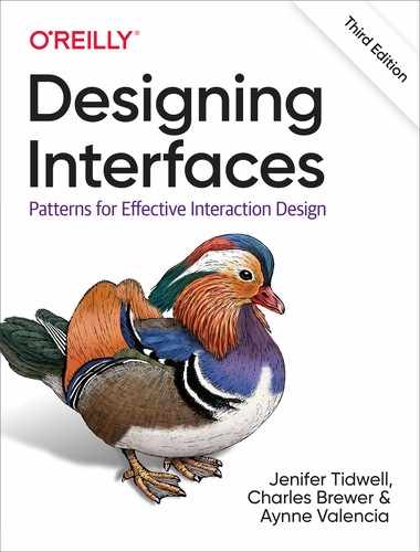
Figure 8-1 illustrates the affordances in the Adobe Premier Rush interface. It is a mobile-only video editing app for social media. It’s a good example of a UI challenge. In software interfaces, the user doesn’t get many sensory clues about what can be tweaked or handled: visuals give most of the clues, and affordances like highlighting or movement do the rest.
The video player controls at top are a near-universal control—certainly not an inscrutable UI. In the lower panel, things are more challenging. The bright blue vertical line overlies the tracks that hold the video and audio, so that indicates it’s a tool or reference point for the media. In fact, it’s the playhead, the video scrubber that marks the playback point for the media file above. The clips themselves are displayed as jumbo icons: squares or rectangles with an image from the underlying video. The assumption is that the creator remembers the original recorded events or at least recognizes that these are indeed the clips they want to work with. So the user knows what they represent. These clip objects automatically display a selected highlight outline (so you’ll know they’re selectable) when they touch the blue playback line or are tapped to select.
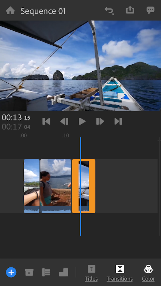
Figure 8-1. Adobe Premier Rush
The Patterns
The first patterns in this chapter talk about three of the many ways to present actions. When you find yourself reflexively putting actions on an application’s menu bar or pop-up menu, stop for a moment and consider using one of these instead:
-
Button Groups
-
Hover or Pop-Up Tools
-
Action Panel
Prominent “Done” Button or Assumed Next Step improves the single most important button on many web pages and dialog boxes. Smart Menu Items is a technique for improving some of the actions you put on menus; this is a very general pattern, useful for many kinds of menus (or buttons or links).
We’d like it if all the user-initiated actions in an application could be completed instantly, but that’s not reality. Preview shows the user what’s going to happen before a time-consuming action is committed. Spinners and Loading Indicators is a well-known technique for letting the user know where they are in a multi step process, whereas Cancelability refers to a UI’s ability to stop an operation when the user asks it to.
The last three patterns all deal with sequences of actions:
-
Multilevel Undo
-
Command History
-
Macros
These three interlocking patterns are most useful in complex applications, especially those whose users are committed to learning the software well and using it extensively. (That’s why the examples come from complex software such as Linux, Photoshop, and MS Word.) Be aware that these patterns are not easy to implement. They require the application to model a user’s actions as discrete, describable, and sometimes reversible operations, and such a model is very difficult to retrofit into an existing software architecture.
For further discussion of designing actions and commands, we recommend Design Patterns: Elements of Reusable Object-Oriented Software (Gamma, Erich, et al.; Addison-Wesley, 1998.)
Button Groups
Use when
There are many actions to show on the interface. You want to make sure they are all visible all the time, but you need to visually organize them so that they’re not chaotic or difficult to sort out. Some of these actions are similar to one another—they have similar or complementary effects, for instance, or they operate with similar semantics—and they can thus be assembled into groups of two to five.
You can use Button Groups for app-wide operations (such as Open or Preferences), item-specific actions (Save, Edit, Delete), or any other scope. Actions with different scope ought not to be grouped together, however.
Why
Grouping buttons helps make an interface self-describing. Well-defined clusters of buttons are easy to pick out of a complex layout, and because they’re so visible, they instantly communicate the availability of those actions. They announce, “These are the actions that are available to you in this context.”
Gestalt principles (Chapter 4) apply here. Proximity hints at relatedness; if the buttons are all together, they probably do related things. So does visual similarity; if you make all the buttons the same dimensions, for instance, they look like they belong together. Conversely, button groups that are separated in space—or that are different in shape—imply unrelated groups of actions.
Proper sizing and alignment help the Button Groups form a larger composite visual shape (this is the principle of closure).
How
Make a group out of related buttons so that they form a natural or logical set. An additional option is to label them with short but unambiguous verbs or verb phrases. Use vocabulary that makes sense to the users. Do not mix buttons that affect different things or have different scope; separate them into different groups.
All buttons in the group should have the same graphic treatment: borders, color, height and/or width, icon style, dynamic effects, and so on. You can line them up in a single column, or arrange them in a single row if they aren’t too wide.
(However, treat them differently if one action is a “primary” action, such as a Submit button on a web form. A primary action is an action that you want most users to take or that most users will expect to take. Give that button a stronger graphic treatment to make it stand out among the others.)
If all the buttons in a group act on the same object or objects, put the Button Groups to the left or right of those objects. You could put them below the objects instead, but users often have a “blind spot” at the bottom of complex UI elements such as multicolumn lists and trees—the user might not see the buttons at all. To make them more visible, keep the rest of the interface clean and uncluttered. If you have a specific design that works better with the buttons at the bottom, test its usability and find out. If there are enough buttons and if they have icons, you could also put them on a toolbar or ribbon-like strip at the top of the page.
By using Button Groups, you’re trying to avoid a crowded mess of buttons and links, or perhaps a long and plodding list of actions with no apparent differentiation at all. With this pattern, you create a visual hierarchy of actions: the user can see at a glance what’s related and what’s important.
Examples
Standard tools for graphic editors are often grouped by function. Figure 8-2 shows some common tools in groupings in Google Docs (separated by vertical lines, or “pipes”) that actually aid recognition. There are no fewer than 27 buttons on this interface. There’s a lot to understand and keep track of. But thanks to careful visual and semantic organization, the interface is never overwhelming.
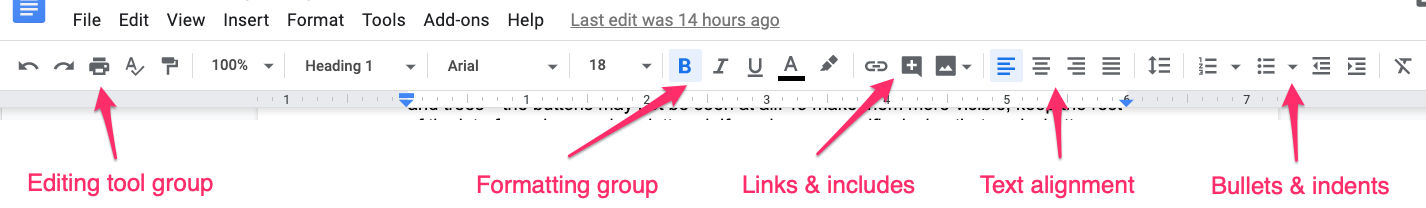
Figure 8-2. Button Groups in Google Docs
The second example (Figure 8-3) shows the header of a finder window from macOS. True to its design tradition, buttons are clearly more button-like. The Navigation group is two buttons placed together in a group. The View controls button group is a segmented button. The whole set has rounded edges only on the left and right, not for the contiguous buttons in the middle.
Figure 8-3. Apple macOS Finder
Hover or Pop-Up Tools
Use when
There are many actions to show on the interface. You want a clean, uncluttered look most of the time, but you need to put those actions somewhere, preferably on or next to the items they act upon. You’ve already allocated the space to show those actions, but they just make things too crowded and busy if they’re all visible all the time.
Hover Tools are commonly used in list interfaces, in which many small items—photos, messages, search results, and so on—are displayed in a column or list. The user can perform a number of actions on each one.
You don’t intend the interface to be used with fingertips, as with a touchpad device—you’re certain that almost all users will interact with your UI via a mouse.
Why
Hover Tools reveal themselves exactly when and where they’re needed. They stay out of sight otherwise, allowing the UI to remain clean and uncluttered. They appear when the user requests them, and by appearing in response to the user’s gesture, they draw attention to themselves.
Pop-up (right-click) menus, pull-down menus, and menu bars also meet these criteria, but they are not discoverable enough for some kinds of interfaces—they’re best used on traditional desktop applications, not web-based interfaces. (And sometimes they’re not the best choice on traditional applications, either.) Hover Tools are more easily discoverable because the gesture that produces them—a rollover—is so simple and natural.
Unfortunately, on touch screens, we have lost the ability to have a mouse and so there isn’t a hover state. On a touchpad, the only way a user can see the “Hover Tools” is if they actually touch the hover area. In these situations, if there are tools or actions that can apply to the object, display them in a pop-up panel or list that is grouped with the tapped object, or on top of it.
How
Design each item or hover area with enough space to show all the available actions. Hide the ones that clutter the interface too much, and show them only when the user hovers the mouse pointer over the area in question.
Respond quickly to the hover, and don’t use an Animated Transition—simply show the tools immediately, and hide them immediately when the user moves the pointer away. Likewise, never enlarge the hover area or otherwise rearrange the page when the user hovers the pointer over it. The idea is to make the hover action as lightweight and quick as possible so that the user can easily reach the necessary tools.
If the hover area is an item in a list, you might want to highlight the item by changing its background color or drawing a border around it. The act of showing tools will draw the user’s eyes to that area, but highlighting the item will do so even more.
Consider Hover Tools as an alternative to a drop-down menu, a pop-up menu, an Action Panel, a List Inlay with buttons in it, or a set of buttons repeated in each item.
Examples
Slack uses hover tools extensively (Figure 8-4). They appear for each posting in the main feed or in a thread. The alternatives would have been to show all the tools all the time—far too busy and crowded—or to move the tools to the top toolbar, where they would only operate on posts selected in the feed. That’s rather complicated. In contrast, the “Hover Tools” are right there and self-explanatory (or at least quickly learned).

Figure 8-4. Slack; examples of hover tools for posts and threads
Other implementations of Hover Tools use a show/hide overlay to display buttons or controls such as sliders. This is similar to the Drop-down Chooser pattern in Chapter 10, the only difference being your intent to use it for actions and not settings.
In YouTube (Figure 8-5), the YouTube player uses a hover to show the volume slider and other controls. The video player controls only display when the mouse scrolls over the player area itself. Otherwise, they are hidden so that there is less clutter to distract from the video itself.

Figure 8-5. YouTube web player
Action Panel
What
A panel or other grouping of commands that is more than just a static menu. The actions can promote the most common actions or the most relevant commands, depending on where the user is or what they are doing in the software. Action panels are a way to feature commands in a more eye-catching way.
Use when
You have a list of items, and a set of actions that can be performed on each one—too many to show all the actions for each item, and too many for Hover Tools. You could put them into a menu, but you might not have a menu bar at all, or you’d rather make the actions more discoverable than they would be on menu bars. Same for pop-up menus; they’re just not visible enough. Your users might not even realize the pop-up menus exist.
Or maybe your set of possible actions is too complex for a menu. Menus are best at showing a flat set of actions (because pull-right menus, or cascading menus, are difficult for some users to manipulate) in a very simple, linear, one-line-per-item presentation. If your actions need to be grouped, and especially if those groups don’t fit the standard top-level menu names—such as File, Edit, View, Tools, and so on—you might want a different presentation altogether.
This pattern can take up a lot of screen space, so it’s not usually a good choice for small devices.
Why
There are three main reasons to use Action Panel instead of menus or per-item buttons: visibility, available space, and freedom of presentation.
By placing the actions out on the main UI and not hiding them inside a traditional menu, you make those actions fully visible to the user. Really, Action Panel are menus in the generic sense; they just aren’t found in menu bars, drop downs, or pop ups. Users don’t need to do anything to see what’s on an Action Panel—it’s right there in front of them—so your interface is more discoverable. This is particularly nice for users who aren’t already familiar with the traditional document model and its menu bars.
There are many, many ways to structure objects on an interface: lists, grids or tables, hierarchies, and just about any custom structure you can devise. But Button Groups and traditional menus give you only a list (and not a very long one at that). An Action Panel is free-form—it gives you as much freedom to visually organize verbs as you have for nouns.
How
Putting the Action Panel on the UI
Set aside a block of space on the interface for the Action Panel. Place it below or to the side of the target of the action. The target is usually a list, table, or tree of selectable items, but it might also be a document in Center Stage (Chapter 4). Remember that proximity is important. If you place the Action Panel too far away from whatever it acts on, users might not grasp the relationship between them.
The panel could be a simple rectangle on the page. It could be one of several tiled panels on the page, perhaps a Movable Panels (see Chapter 4), a “drawer” in macOS, or even a separate window. If it’s closable, make it very easy to reopen, especially if those actions are present only on the Action Panel and aren’t duplicated on a menu!
The odds are good that you’ll need to show different actions at different times. So, the contents of the Action Panel might depend on the state of the application (e.g., are there any open documents yet?), on the items selected in some list somewhere, or other factors. Let the Action Panel be dynamic. The changes will attract the user’s attention, which is good.
Structuring the actions
Next, you need to decide how to structure the actions you need to present. Here are some ways you could do it:
-
Simple lists
-
Multicolumn lists
-
Categorized lists with headings and groupings
-
Tables or grids
-
Trees
-
Any combination of these in one panel
If you categorize the actions, consider using a task-centered approach. Group them according to what people intend to do. However, try to present them linearly. Imagine reading the actions aloud to someone who can’t see the screen—can you proceed through them in a logical fashion, with obvious start and end points? That, of course, is how a blind user would “hear” the interface.
Labeling the actions
For each action’s label, you could use text, icons, or both, depending on what conveys the nature of the actions best. In fact, if you use mostly icons, you end up with…a traditional toolbar! (Or a palette, if your UI is a visual builder-style application.)
Text labels on an Action Panel can be longer than those on a menu or a button. You can use multiline labels, for instance—better to explain fully. Just remember that longer, more descriptive labels are better for first-time or infrequent users who need to learn (or be reminded) what these actions do. The extra space spent on long labels might not be appreciated in high-performance interfaces used mostly by experienced users. If there are too many words, even first-time users’ eyes will glaze over.
Examples
The example in Figure 8-6 is from Dropbox. This is the desktop web UI for that service. on the right of the screen, there is an action panel. The purpose is to have always-visible, one-click access to the most common actions. The most likely or most frequently used command is given special treatment. Altogether, the grouping and separation of these commands show that this is an action panel.
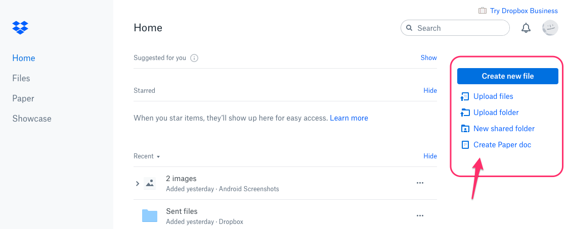
Figure 8-6. An Action Panel in Dropbox
The following screenshots from Windows 10 show two examples of a show/hide Action Panel. These are not always visible due to their screen-filling size. The user must click to open them. But after they’re open, they stay open and show a large number of options and actions the user could take.
Microsoft Windows 10 Start Menu (Figure 8-7)—the legendary pop-up menu—has been expanded beyond the classic list of app icons to launch. Now the panel is much larger in order to show groups of tiles (actually large, square buttons, some with dynamic status, such as the latest weather). The tiles are grouped according to the users’ anticipated most likely tasks. Selecting one will launch an application or open a directory.

Figure 8-7. Microsoft Windows 10 Start Menu
The Microsoft Windows 10Action Panel (Figure 8-8) is accessed via the “speech bubble” icon in the lower right. Most of this panel is a scrolling list of notifications. Many of these notifications are calls to action: the user needs to change a setting, activate a process or fix a problem. The notifications are clickable, so the user can take action directly from this list. At bottom is a set of buttons to access notification and system settings. Other design resources call this pattern a Task Pane.
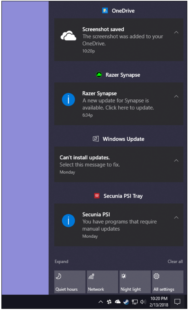
Figure 8-8. Microsoft Windows 10 Action Panel
Prominent “Done” Button or Assumed Next Step
Why
A well-understood, obvious last step gives your users a sense of closure. There’s no doubt that the transaction will be done when that button is clicked; don’t leave them hanging, wondering whether their work took effect.
Making that last step obvious is what this pattern is really about. Doing it well draws on the layout concepts in Chapter 4: visual hierarchy, visual flow, grouping, and alignment.
How
Create a button that actually looks like a button, not a link; either use platform standards for pushbuttons, or use a large or medium-sized button graphic with bold colors and well-defined borders. This will help the button stand out on the page and not be lost among other things.
Place the button that finishes a transaction at the end of the eye’s travel through the visual layout of the screen. Give it a label that is easy to understand. Make the whole button very obvious to see.
When labeling the button, prefer text labels to icons. They’re easier to understand for actions such as this, especially given that most users will look for a button labeled “Done” or “Submit.” The text in that label can be a verb or a short verb phrase that describes what will happen in the user’s terms—for example, “Send,” “Buy,” or “Change Record” are more specific than “Done” and can sometimes communicate more effectively.
Place the button where the user is most likely to find it. Trace the task flow down through the page or form or dialog box , and put the button just beyond the last step. Usually that will be on the bottom and/or right of the page. Your page layouts might have a standard place for them (see the Visual Framework pattern in Chapter 4), or the platform standard might prescribe it; if so, use the standard place.
In any case, make sure the button is near the last text field or control. If it’s too far away, the user might not find it immediately upon finishing their work, and they might go looking for other affordances trying to find out “what to do next.” On the web, users can end up abandoning the page (and possibly a purchase) without realizing it.
Examples
The Google Play store on an Android OS mobile device (Figure 8-9) displays information about a specific game. The preferred action, Install, is obvious from the size, color, position and white space around the Install button.
This is a good implementation in a mobile context. You can see the action button without even reading the labels, due to visual design alone:
-
The green color stands out. It’s a saturated color and it contrasts with the white background. (A white or light gray button with a black border would blend into the form.)
-
The graphic used for the button looks like a button. It’s a rectangle with subtle rounded corners. It is large, too.
-
The button is positioned under and to the right of the content, in this case, a mobile game. Both the task flow (the user scans from top to bottom) and the visual flow bring the user’s eye to rest at that button.
-
The button is set off by whitespace.
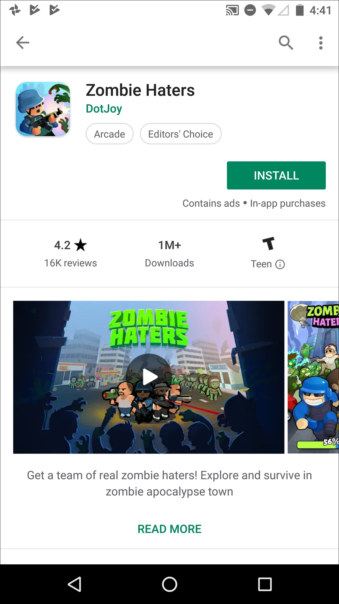
Figure 8-9. Google Play store, Android OS mobile device
JetBlue.com (Figure 8-10), Kayak.com (Figure 8-11), and Southwest.com (Figure 8-12) use strong buttons on their home page flight-search interfaces. These follow all the guidelines for Prominent “Done” Buttons, and again, you can see them immediately. In each, Search is the most prominent action step on the screen. It is called out as a button element and formatted with prominent size and contrasting color. (Southwest actually has two calls to action: Search and Book Now, for the current flight promotion).
Among these examples, JetBlue is using the most effective design. The button is easy to see due to color contrast, centered location, generous surrounding negative space, and its label.
Kayak uses a strong color pop for its search button, too, but it is less effective because its button uses an icon only and is on the far-right edge of the screen, where it is not immediately seen. The magnifying glass is a standard shorthand for search, but the user still must translate the shape into the word or concept.
Southwestuses the same button design for two buttons, so the user’s attention is split. It’s no longer a single call to action. In the lower Book panel, the button is effectively used: contrasting color to the white and blue, and a label and anchor location that message the next step for the job the panel has to do (help users find a flight). At the top, in the promotion area, the red and yellow are a lower-contrast combination, and the button seems a little lost. There are other, much larger components to this area of the screen that draw the eye, and the button is not so clearly aligned or placed so that the eye is driven to it.
Airbnb (Figure 8-13) offers a clear done/next step button on its home screen. The user fills out the booking search form. A single large Search button, designed to draw the eye, is the action that Airbnb wants to promote.

Figure 8-10. JetBlue.com

Figure 8-11. Kayak.com

Figure 8-12. Southwest.com

Figure 8-13. Airbnb.com
Smart Menu Items
Use when
Your UI has menu items that operate on specific documents or items, such as Close, or that behave slightly differently in different contexts, such as Undo.
Why
Menu items that say exactly what they’re going to do make the UI self-explanatory. The user doesn’t need to stop and figure out what object will be affected. They’re also less likely to accidentally do something that they didn’t intend to do, such as deleting “Chapter 8” instead of “Footnote 3.” It thus encourages safe exploration.
How
Every time the user changes the selected object (or current document, last undoable operation, etc.), change the menu items that operate on it to include the specifics of the action. Obviously, if there is no selected object at all, you should disable the menu item, thus reinforcing the connection between the item and its object.
Incidentally, this pattern could also work for button labels, or links, or anything else that is a “verb” in the context of the UI.
What if there are multiple selected objects? There’s not a whole lot of guidance out there—in existing software, this pattern mostly applies to documents and undo operations—but you could write in a plural, as in “Delete Selected Objects.”
Examples
Figure 8-14 shows a menu from the Adobe Lightroom menu bar. The first selection in the Edit drop-down menu is dynamic. The last filter the user applied in this case was the “Increase Clarity” filter. The menu remembers that, so it changes its first item to reflect that. The Undo action that it triggers is based on the immediately previous action performed by the user. The label changes depending on the actions the user takes.
The accelerator keystrokes are handy for repeated application of the same filter.
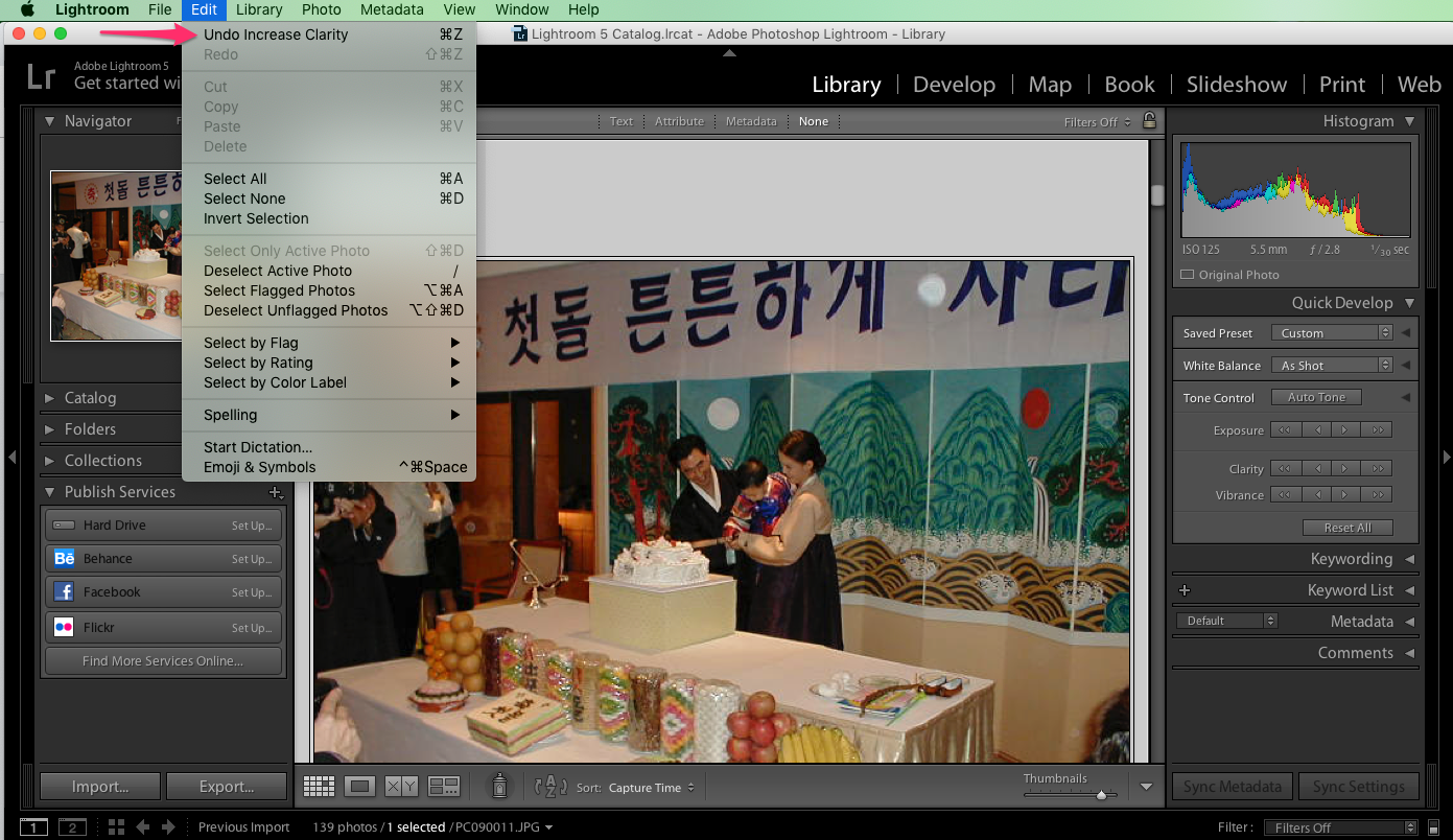
Figure 8-14. Adobe Lightroom
The previous example is from application menu bars , but you also can use this pattern effectively in contextual tools, such as the drop-down menu in Gmail (Figure 8-15). Several commands in the drop-down menu change depending on the currently selected email message. The menu item “Add [person from email] to Contacts list” is much clearer and more self-explanatory than a generic alternative, such as “Add sender to Contacts list.”
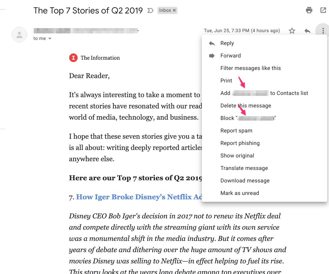
Figure 8-15. Gmail
Preview
What
Render a lightweight sample of the effects of a command, or the likely outcomes of an action. They are proactively rendered before the user has even submitted the action. This is a pattern in which the user is presented with realistic modeling of their possible action outcomes so that they can choose the one they like or want. This pattern is the opposite of the more simplistic and traditional interaction design method whereby the user must activate a command first and then wait to see what the results are.
Use when
The user is just about to perform a “heavyweight” action such as opening a large file, printing a 10-page document, submitting a form that took time to fill out, or committing a purchase over the web. Users want some assurance that they’re doing it correctly. Doing it incorrectly would be time-consuming, difficult to reverse, or otherwise costly.
Alternatively, the user might be about to perform some visual change with a difficult-to-predict result, such as applying a filter to a photo. It’s better to know in advance whether the effect will be desirable.
Why
Previews help prevent errors. A user might have made a typo or misunderstood something that led to the action in question (such as purchasing the wrong item online). By showing the user a summary or visual description of what’s about to happen, you give them a chance to back out or correct any mistakes.
Previews can also help an application become more self-describing. If someone’s never used a certain action before, or doesn’t know what it will do under certain circumstances, a preview explains it better than documentation—the user learns about the action exactly when and where they need to.
How
Just before the user commits an action, display whatever information gives them the clearest picture of what’s about to happen. If it’s a print preview, show what the page will look like on the chosen paper size; if it’s an image operation, show a close-up of what the image will look like; if it’s a transaction, show a summary of everything the system knows about that transaction. Show what’s important—no more, no less.
Give the user a way to commit the action straight from the preview page. There’s no need to make the user close the preview or navigate elsewhere.
Likewise, give the user a way to back out. If they can salvage the transaction by correcting information previously entered, provide a chance to do that too, with “Change” buttons next to changeable information. In some wizards and other linear processes, this might just be a matter of navigating a few steps backward.
Examples
Apple Photos (Figure 8-16, left) gives users a wide variety of photo filters. Each filter offers a “what you see is what you get” prospective render. When editing a selected photo, each filter choice at the bottom of the screen displays what that image would look like, using that filter. Users do not need to guess what a filter might do, or make a filter selection first in order to see what it does. They can simply review the rendered thumbnails and select the one they like, based on the realistic preview of the image. From a usability perspective, it is much easier and quicker for people to recognize the choice they like and select it, as opposed to having to remember what the command is and guessing at the outcome. (Photoshop and other image-processing applications use similar previews.)
The Bitmoji app example (Figure 8-16, right) shows a closely related use case. Bitmoji creates customized illustration-style avatars and amusing cartoons that users can share via messaging and social media. The first step in using Bitmoji is for the user to build their own cartoon likeness by adding their choices for hair, eyes, expression lines, skin tone, and other features. Here, the user is trying to find the closest match to their real-world appearance from a limited set of pre rendered options. For skin tone, Bitmoji renders faces based on the user’s selections, and then offers a different preview for each of the available skin tones. Creating a more realistic, personalized avatar is easier and faster when the user can scroll through a large selection of skin tone previews.
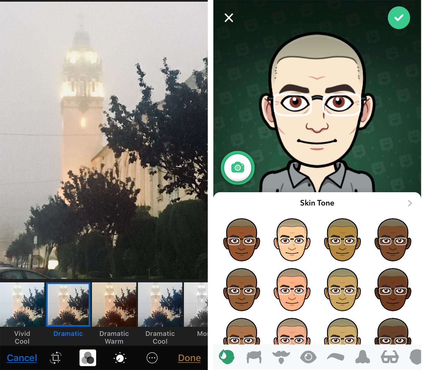
Figure 8-16. Apple Photos app and Bitmoji app
Online product builders and customizers often use Previews to show what the user has created so far as part of the sales process. The customizable Prius car in Figure 8-17 is a good example. As the user specifies the exact features they would like for their Prius, the preview of the vehicle updates to show the user’s selections. Multiple previews for exterior and interior help potential buyers get a better idea of what their choices might look like. The user is able to move back and forth between the major steps in the process, and also to experiment with variations at each step to see what it would actually look like. The goal is to get a quote for a car that’s based on what the customer exactly wants. Preview tools like this are highly engaging.
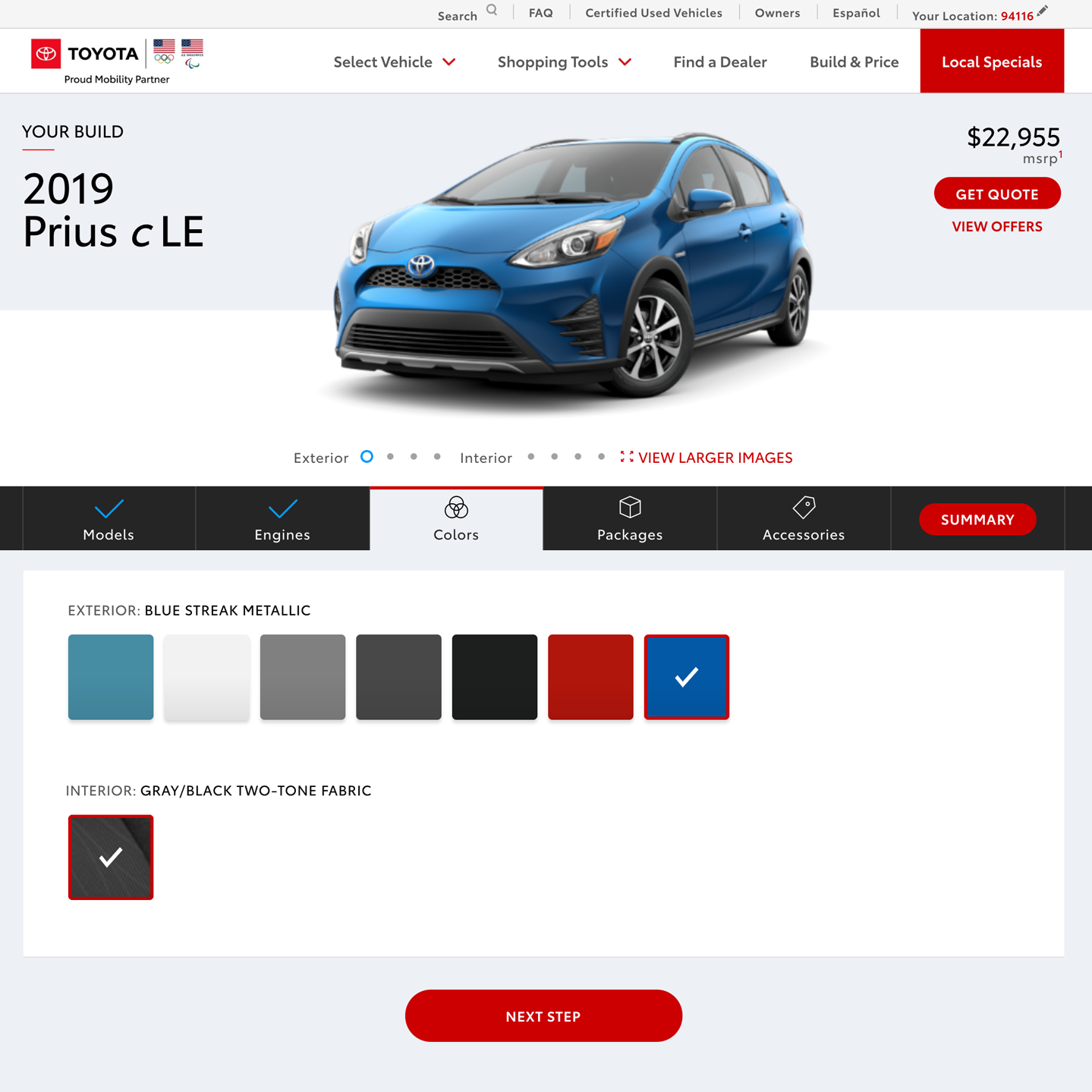
Figure 8-17. Toyota.com
The customizable makeup regimen from Sephora.com (Figure 8-18) is a more personal example. Here, the customer is trying to find the right beauty products out of a huge number of possible brands and selections. They can experiment with how things would look. This makeup preview app lets the shopper add an image of their own face and then virtually try out a huge range of cosmetics and techniques. They can preview what different products and colors would do for skin, eyes, lashes, eyebrows, and lips. The outcome of experimenting and previewing is a list of the products that will give them the look she wants. The products that are applied to the face preview automatically appear in the “What You’re Wearing” purchase list.
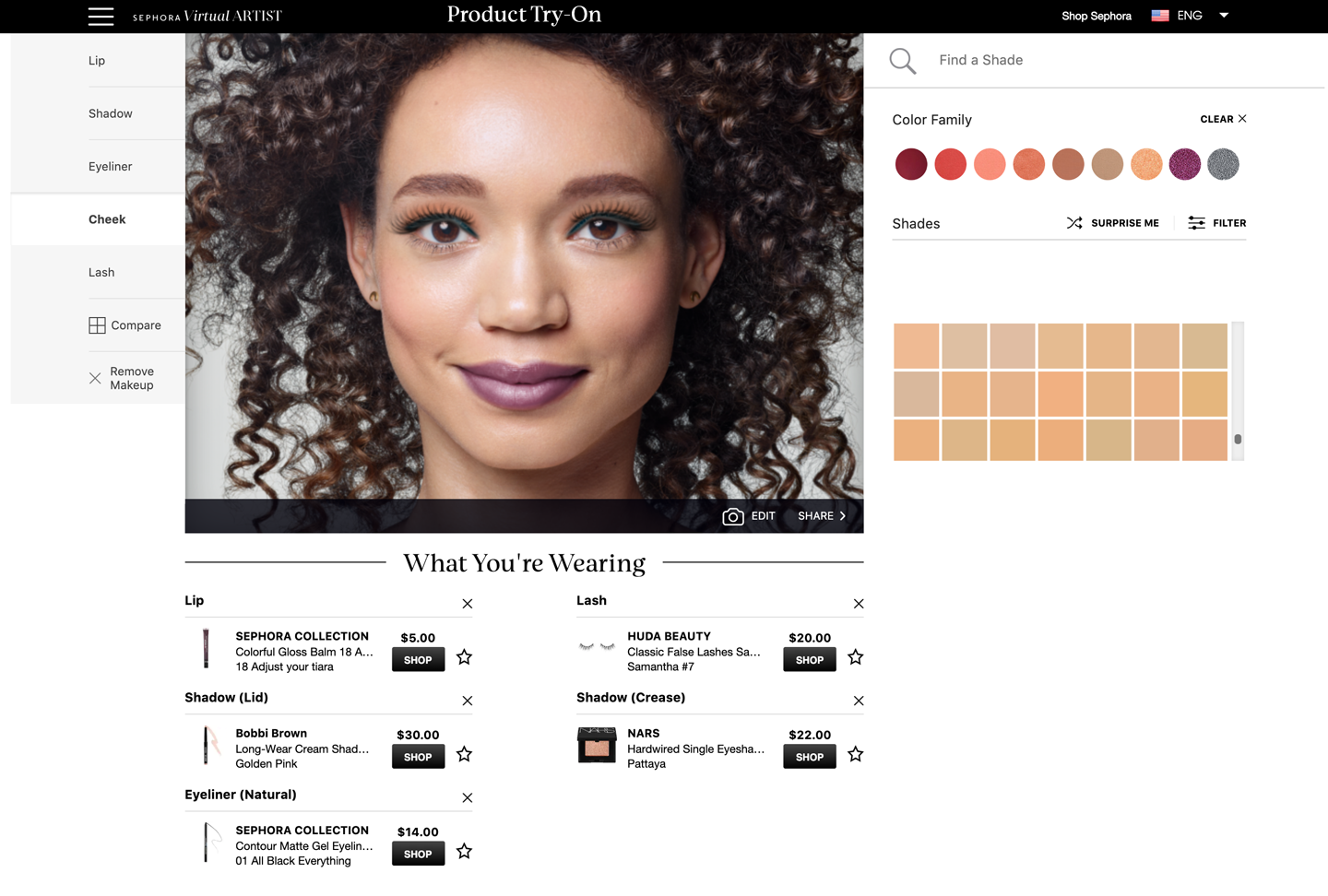
Figure 8-18. Sephora.com
Spinners and Loading Indicators
What
An animation or other indicator that displays after a user submits an action and before there is a response. If there is a delay in this response, Spinners and Loading Indicators let a waiting user know that their interaction session is “live” and that a response from the system is in progress. This prevents users from breaking their task focus.
Spinners
A spinner is an animation that shows the system is processing something. It is normally stateless; that is, it does not communicate a changing state such as percentage complete (although this is not a rule).
Loading indicators
A loading indicator is usually a meter or thermometer-style animation that shows key data about a task that takes a long time, for example, uploading large files or images, or loading a mobile app on the consumer’s mobile device. Loading indicators show a constantly updating “empty/full” meter plus helpful data such as percent complete, bytes of data processed versus unprocessed, and how much time remains to completion.
Use when
A time-consuming operation interrupts the UI, or runs in the background, for longer than two seconds or so.
A summary of advice from prominent usability and digital design experts Don Norman and Jakob Nielsen, reviewing research on this topic, can offer a good set of guidelines:1
-
Less than one-tenth of a second, users feel they are interacting with a “live” UI because the response from the software feels instantaneous. There is no delay in going from one UI action to the next. This is the expected response time for usable software.
-
Between one-tenth of a second and one second, the user is aware of the delay but they will wait, staying on task, with the expectation of continuing immediately.
-
Longer than a one-second delay in response, the user is likely to think the UI is not working, that something might be wrong, or they might abandon the task. In this situation, spinners or loading indicators are mandatory if you want users to know that your software is indeed working. Alternately, you might want to let them know that they have time to move on to another activity while the process completes.
Why
Users become impatient when the UI just sits there. Even if you change the mouse pointer to a clock or hourglass (which you should in any case, if the rest of the UI is locked out), you don’t want to make a user wait for an unspecified length of time.
Experiments show that if users see an indication that something is going on, they’re much more patient, even if they must wait longer than they would without a Loading Indicator. Maybe it’s because they know that “the system is thinking,” and it isn’t just hung or waiting for them to do something.
How
Show an animated indicator of how much progress has been made. Either verbally or graphically (or both), tell the user:
-
What’s currently going on
-
What proportion of the operation is complete
-
How much time remains
-
How to stop it
As far as time estimates are concerned, it’s OK to be wrong sometimes, as long as your estimates converge on something accurate quickly. But sometimes the UI can’t determine how far along it is. In that case, show a stateless spinner.
Most GUI toolboxes provide a widget or dialog box that implements this pattern. Beware of potentially tricky threading issues, however—the Loading Indicator must be updated consistently while the operation itself proceeds uninhibited. If you can, keep the rest of the UI alive, too. Don’t lock up the UI while the Loading Indicator is visible.
If it’s possible to cancel the operation whose progress is being monitored, offer a cancel button or similar affordance on or near the Loading Indicator; that’s where a user is likely to look for it. See the Cancelability pattern (next) for more information.
Examples
Spinners are usually used when there is a very slight wait. Their function is to let the user know “we’re working on it, hang on a second.”
Apple’s Touch ID service on its iPhones (Figure 8-19) allows app developers (in this case, CVS) to securely log in their customers without typing usernames and passwords. We see the iOS spinner momentarily while the iPhone/iOSand CVS are processing the log in.
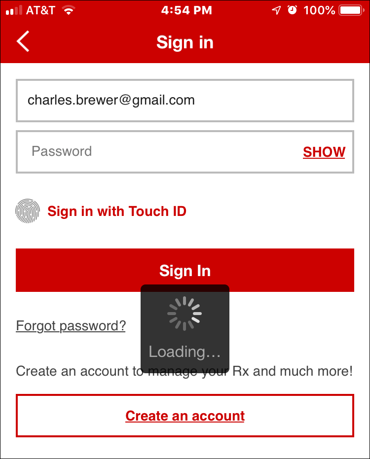
Figure 8-19. Apple iOS, CVS mobile app; An iOS spinner example
Spinners are also a standard part of most UI toolkits and frameworks. Figure 8-20 shows the specification and example in the Twitter Bootstrap UI framework. One of the standard components in the Bootstrap library is a customizable spinner, which is ready to be used anywhere in a Bootstrap web application.

Figure 8-20. Twitter Bootstrap component library (getbootstrap.com) border spinner
The Blueprint UI toolkit (Figure 8-21) offers a button component that supports the inline display of a spinner as part of the button. When the user clicks one of these buttons, they would see the label or icon on the button change to the spinner momentarily.

Figure 8-21. Blueprint UI toolkit (blueprintjs.com), button loading state
Loading indicators offer more robust status and information for processes that take a longer time. They are for situations in which there is enough time to generate and display this information. The user will then know how long it’s going to take and can wait, cancel, or do something else and come back later.
Figure 8-22 shows the Google Play store again, this time with a game download in progress to a user’s Android device. The “Install” button has disappeared. It was replaced with the loading indicator. This is an informative loading indicator. The loading indicator is the green and gray horizontal line. The animated green bar represents how much of the game has been downloaded compared to the total file size, represented by the gray bar. The same information is given as updating numerical totals. There is also a percentage complete figure.

Figure 8-22. Google Play store, Android OS
Adobe uses loading indicators in its Creative Cloud application for macOS desktop. This is a small and compact version that is still usable. Figure 8-23 shows an update to Photoshop CC in progress. There is a small thermometer-style loading indicator, which here is 3% complete.

Figure 8-23. Adobe Creative Cloud desktop manager, macOS
Cancelability
Use when
A time-consuming operation interrupts the UI or runs in the background for longer than two seconds or so—such as when you print a file, query a database, or load a large file. Alternatively, the user is engaged in an activity that literally or apparently shuts out most other interactions with the system, such as when working with a modal dialog box.
Why
The ability for software users to cancel a task or process in the UI at any time is an important usability standard. It relates to “user control and freedom,” one of the top 10 usability heuristics, or guidelines, that software expert Jakob Nielsen of Nielsen Norman Group found from a review of industry research and findings.2
Users change their minds. After a time-consuming operation starts, a user might want to stop it, especially if a Loading Indicator informs the user that it will take a while. Or the user might have started it by accident in the first place. Cancelability certainly helps with error prevention and recovery—a user can cancel out of something they know will fail, such as loading a page from an unreachable website.
In any case, a user will feel better about exploring the interface and trying things out if they know that anything is cancelable. It encourages Safe Exploration (Chapter 1), which in turn makes the interface easier and more fun to learn.
How
First, find out if there’s a way to speed up the time-consuming operation so that it appears to be instantaneous. It doesn’t even need to be genuinely fast; if a user perceives it as immediate, that’s good enough. On the web or a networked application, this can mean preloading data or code—sending it to the client before it’s asked for—or sending data in increments, showing it to the user as it comes in. Remember, people can read only so fast. You might as well use the loading time to let the user read the first page of data, then another page, and so on.
But if you really do need Cancelability, here’s how to do it. Put a Cancel button directly on the interface, next to the Loading Indicator (which you are using, right?) or wherever the results of the operation will appear. Label it with the word Stop or Cancel, and/or put an internationally recognizable stop icon on it: a red octagon, or a red circle with a horizontal bar, or an “X.”
When the user clicks or presses the Cancel button, cancel the operation immediately. If you wait too long—for more than a second or two—the user might doubt whether the cancel actually worked (or you might just dissuade them from using it because they might as well wait for the operation to finish). Inform the user that the cancel worked—halt the Loading Indicator, and show a status message on the interface, for instance.
Multiple parallel operations present a challenge. How does the user cancel a particular one and not others? The Cancel button’s label or tool tip can state exactly what is being canceled when it’s clicked (see the Smart Menu Items pattern for a similar concept). If the actions are presented as a list or a set of panels, you might consider providing a separate Cancel button for each action to avoid ambiguity.
Examples
The game install screen in the Google Play store (Figure 8-24) shows a minimalist cancel icon. The green and gray bar here is actually a spinner. The green bar animates left-right for a few seconds while the download connection is established. Note the large “X” cancel icon to the right of this. The consumer can cancel the download and install process at any time.

Figure 8-24. Google Play store, Android OS
Adobe displays a different style of cancel “X” button in its Creative Cloud desktop app for macOS (Figure 8-25). In this desktop drop-down panel, in the Photoshop CC line item, next to the loading indicator, there is an “X” icon. The customer can select this to cancel the update/install process anytime.

Figure 8-25. Adobe Creative Cloud desktop manager, macOS
Multilevel Undo
What
The ability to reverse a series of actions performed by the user. Multilevel Undo is a combination of simple undo combined with a history of user actions, with their sequence captured as well as the actions. Multilevel Undo is a way of reversing any recent history of commands or actions step by step, in the opposite order in which they were performed. That is, the first undo is for the most recently completed action. The second undo reverses the second most-recent action, and so on. There are usually limits to the length of the history file to support Multilevel Undo.
Use when
You’re building a highly interactive UI that is more complex than simple navigation or form fill-in. This includes mail readers, database software, authoring tools, graphics software, and programming environments. Design this function when you want to give your users the ability to back out of or recover from a series of actions, not just a single action.
Why
The ability to reverse a long sequence of operations step by step lets users feel that the interface is safe to explore. While they learn the interface, they can experiment with it, confident that they aren’t making irrevocable changes—even if they accidentally do something “bad.” This is true for users of all levels of skill, not just beginners.3
After the user knows the interface well, they can move through it with the confidence that mistakes aren’t permanent. If the user’s finger slips and they hit the wrong menu item, no complicated and stressful recovery is necessary; they don’t need to revert to saved files, shut down and start afresh, or go ask a system administrator to restore a backup file. This spares users wasted time and occasional mental anguish.
Multilevel Undo also lets expert users explore work paths quickly and easily. For instance, a Photoshop user might perform a series of filtering operations on an image, study the result to see whether they like it, and then undo back to the starting point. Then they might try out another series of filters, maybe save it, and undo again. The user could do this without Multilevel Undo, but it would take a lot more time (for closing and reloading the image). When a user works creatively, speed and ease of use are important for maintaining the experience of flow. See Chapter 1 for more information, especially the Safe Exploration and Incremental Construction patterns.
How
Reversible operations. The software your UI is built on first needs a strong model of what an action is—what it’s called, what object it was associated with, how to record it, and how to reverse it. Then, you can build an interface on it.
Decide which operations need to be reversible. Any action that might change a file or database—anything that could be permanent—should be reversible, whereas transient or view-related states, such as selecting between tabs, often are not. Specifically, these kinds of changes are expected to be reversible in most applications:
-
Text entry for documents or spreadsheets
-
Database transactions
-
Modifications to images or painting canvases
-
Layout changes—position, size, stacking order, or grouping—in graphics applications
-
File operations, such as deleting or renaming files
-
Creation, deletion, or rearrangement of objects such as email messages or spreadsheet columns
-
Any cut, copy, or paste operation
The following kinds of changes are generally untracked in the action history and are not reversible. Navigation actions are a good example of this kind of ribbon-like, nonreversible action.
-
Text or object selection
-
Navigation between windows or pages
-
Mouse cursor and text cursor locations
-
Scroll bar position
-
Window or panel positions and sizes
-
Changes made in an uncommitted or modal dialog box
Some operations are on the borderline. Form fill-in, for instance, is sometimes reversible and sometimes not. However, if tabbing out of a changed field automatically commits that change, it’s probably a good idea to explore making it reversible.
Note
Certain kinds of operations are impossible to undo, but usually the nature of the application makes that obvious to users with any experience at all. Impossible undos include the purchase step of an ecommerce transaction, posting a message to a forum or chat room, or sending an email—as much as we’d sometimes like that to be undoable!
In any case, make sure the reversible operations make sense to the user. Be sure to define and name them in terms of how the user thinks about the operations, not how the computer thinks about them. You should be able to undo a block of typed text, for instance, in chunks of words, not letter by letter.
Design an undo or action history stack
Each operation goes on the top of the action history stack as it is performed. Each undo reverses the operation at the top (the most recent action) first, then the next one below it (the next most recent), then the next, and so on. Redo works its way back up the stack step by step.
The stack should be at least 10 to 12 items long to be the most useful, and longer if you can manage it. Long-term observation or usability testing can tell you what your usable limit is. (Constantine and Lockwood assert that having more than a dozen items is usually unnecessary because “users are seldom able to make effective use of more levels.”4 Expert users of high-powered software might tell you differently.)
Presentation
Finally, decide how to present the undo stack to the user. Most desktop applications put Undo/Redo items on the Edit menu. Also, Undo is usually hooked up to Ctrl-Z or its equivalent. The best-behaved applications use Smart Menu Items to let the user know exactly which operation is next up on the undo stack.
Examples
Microsoft Word (Figure 8-26) shows a more typical presentation of Multilevel Undo. In this case, the user typed some text and then inserted a table. The first undo removes the table. When that’s done, the following undo—the next action in the undo stack—represents the typed text, and invoking Undo again will remove that text. Meanwhile, the user has the opportunity to “undo the undo” by using the Redo menu item. If we’re at the top of the stack (as in the first screenshot), there is no Redo, and that menu item is overloaded with a Repeat action. This is a complicated abstract concept to try to bring to life in an interface. If you attempt something this, add a scenario or two in your help system to explain more fully how it works.

Figure 8-26. Microsoft Word History of Actions
Although it is not visible, Word keeps an undo stack in memory. This allows the user to select Undo multiple times to return to a previous state of the file. When the user reverses their most recent action with the Undo command, the first item in the Edit smart menu changes to the next action in the undo stack.
Most users will never develop a clear mental picture of the algorithms being used here; most people don’t know what a “stack” is, let alone how it is used in conjunction with Repeat and Redo. That’s why the Smart Menu Items are absolutely critical to usability here. They explain exactly what’s going to happen, which reduces the cognitive burden on the user. What is important is that they see that they can back up and move forward again through the sequence of their recent actions.
Command History
What
Undoable actions
As the user performs actions, keep a visible record of those actions—what was done to what, and when. This is a list or record of the steps that the user took. This list is visible, and can be manipulated by the user, applying or removing or changing the sequence of these actions. Usually this is in conjunction with a file, photo, or other digital object that is being changed by these commands.
Browser history
As the user browses the internet browsers keep a visible record of the sites, apps and URLs they visit. This is more like a log file. This data can be searched for keywords in the URL string, or browsed by date. This is useful for finding a site that the user visited before, but can’t remember the exact URL.
Use when
Users perform long and complex sequences of actions, either with a GUI or a command line. Most users are fairly experienced, or if not, they at least want an efficient interface that’s supportive of long-term and recurring work. Graphical editors and programming environments are usually good candidates.
Why
Sometimes, a user needs to remember or review what they did in the course of working with the software. For instance, they might want to do any of these things:
-
Repeat an action or command done earlier, which they don’t remember well
-
Recall the order in which some actions were done
-
Repeat a sequence of operations, originally done to one object, on a different object
-
Keep a log of their actions, for legal or security reasons
-
Convert an interactive series of commands into a script or macro (see the Macros pattern in this chapter)
How
Keep a running list of the actions taken by the user. If the interface is driven from a command line, you have it easy—just record everything typed there. If you can, keep track of the history across sessions so that the user can see what was done even a week ago or longer.
If it’s a GUI, or a combination of graphic and command-line interfaces, things become a little more complicated. Find a way to express each action in one consistent, concise way, usually with words (though there’s no reason why it can’t be done visually). Make sure you define these with the right granularity—if one action is done en masse to 17 objects, record it as one action, not 17.
What commands should be recorded, and what shouldn’t? See the Multilevel Undo pattern for a thorough discussion of what commands should “count.” If a command is undoable, it should be recorded in the history, too.
Finally, display the history to the user. That display should be optional in most software, because it will almost certainly play a supporting role in the user’s work, not a starring role. Lists of commands—oldest to newest—tend to work well. If you’d like, you could timestamp the history display somehow.
Examples
Google’s Chrome browser (Figure 8-27), like all browsers, keeps a history of the websites and web applications that the user visits. The user can view, search, and browse it, which allows the user to go back to a URL they went to before, or share an item from the list. Google Chrome History screen, although not strictly a history of actions, is a history file from the user’s browsing history. This allows for predictive text options when typing in a URL if the URL or file is already in the history. The user can also search the history file or manually select a URL to go back to a previously visited URL.
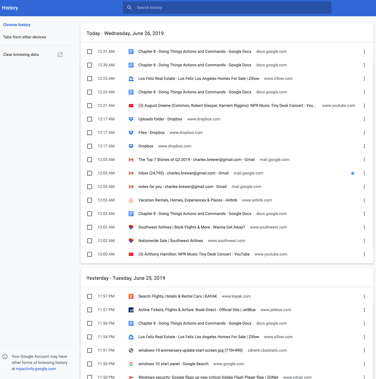
Figure 8-27. Google Chrome History screen
Adobe Photoshop CC’s undo stack (Figure 8-28) is effectively a command history. You can use it to undo the actions you performed, but you don’t have to; you can also just look at it and scroll through it, reviewing what you did. It uses icons to identify different classes of actions, which is unusual, but nice to use. This bona fide history of actions is a long-established feature of Photoshop. Each tool, action, filter, or other command is recorded in a chronological list. This is visible in the History palette (in the lower left of the figure). More than a simple history for undo, the History feature allows the user to selectively turn actions on or off or rearrange their sequence, which affects the current image.
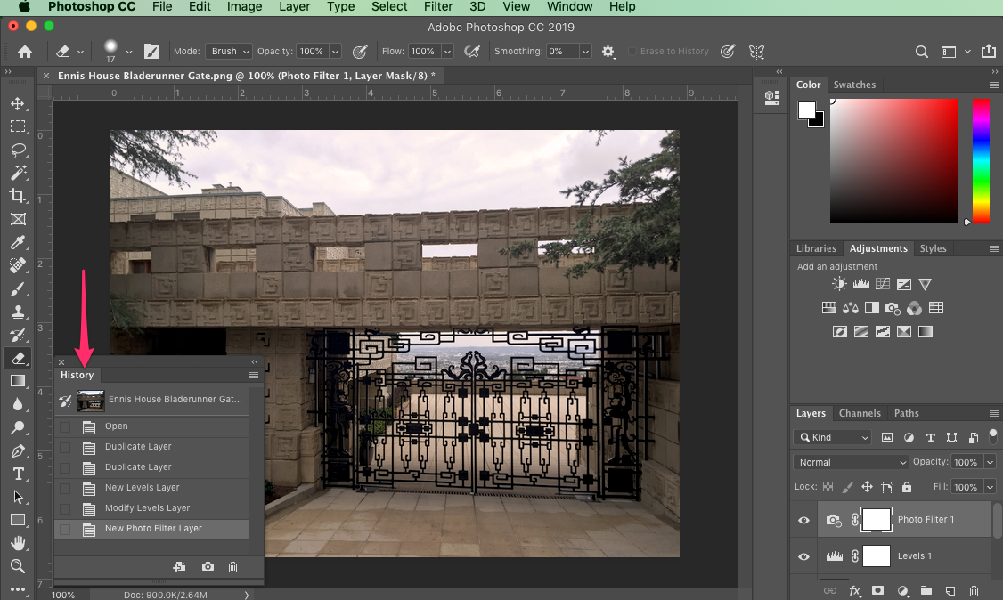
Figure 8-28. Adobe Photoshop CC
Macros
Why
No one wants to perform the same set of repetitive interactive tasks over, and over, and over again! This is exactly what computers are supposed to be good at. Chapter 1 described a user-behavior pattern called Streamlined Repetition; macros are precisely the kind of mechanism that can support that well.
Macros obviously help users work faster. But by reducing the number of commands or gestures needed to get something done, they also reduce the possibility of finger slips, oversights, and similar mistakes.
You might also recall the concept of “flow,” also discussed in Chapter 1. When a long sequence of actions can be compressed down into a single command or keyboard shortcut, the experience of flow is enhanced—the user can accomplish more with less effort and time, and they can keep their larger goals in sight without becoming bogged down in the details.
How
Provide a way for the user to “record” a sequence of actions and easily “play them back” at any time. The playback should be as easy as giving a single command, pressing a single button, or dragging and dropping an object.
Defining the macro
The user should be able to give the macro a name of their choice. Let them review the action sequence somehow so that they can check their work or revisit a forgotten sequence to see what it did (as in the Command History pattern). Make it possible for one macro to refer to another so that the user can build on each other.
Users will certainly want to save macros from one day to the next, so make sure that those macros can be saved to files or a database. Present them in a searchable, sortable, and even categorizable list, depending on the needs of your users.
Running the macro
The macro itself could be played back literally, to keep things simple; or, if it acts upon an object that can change from one invocation to another, you could allow the sequence to be parameterized (e.g., use a placeholder or variable instead of a literal object). Macros should also be able to act on many things at once.
How the names of the macros (or the controls that launch them) are presented depends heavily upon the nature of the application, but consider putting them with built-in actions rather than making them second-class citizens.
The ability to record these sequences—plus the facility for macros to build on one other—create the potential for the user to invent an entirely new linguistic or visual grammar, a grammar that is finely tuned to their own environment and work habits. This is a very powerful capability. In reality, it’s programming; but if your users don’t think of themselves as programmers, don’t call it that or you’ll scare them off. (“I don’t know how to program anything; I must not be able to do this.”)
Examples
Adobe Photoshop CC (Figure 8-29) has extensive macro capabilities. The primary one is the ability to create or record complex, multi step image edit and transformation commands. These are called Actions in Photoshop. Actions greatly speed up image workflows through automation and reuse. In this example, on the left, an existing action called Sepia Toning is selected to show the multiple, nested steps that all happen in sequence within this action. On the right, the Actions menu shows the options for recording, editing, and fine-tuning complicated, multi step actions.
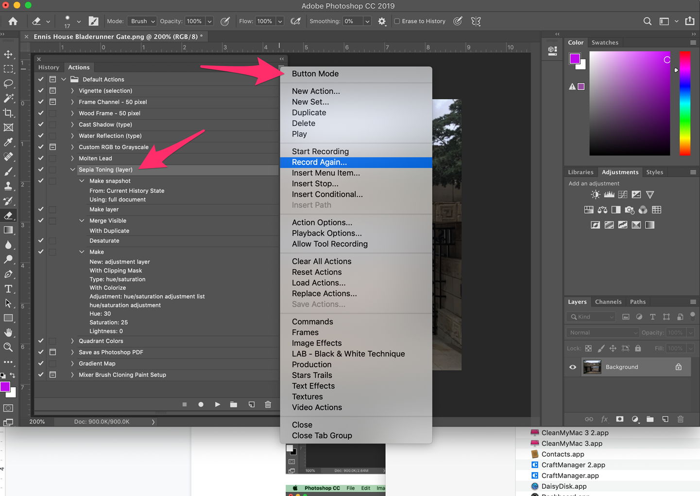
Figure 8-29. Recording a macro in Adobe Photoshop CC
Adobe Photoshop CC (Figure 8-30) shows the Batch automation menu and dialog box in Photoshop. This is another macro builder. These are user-created workflow scripts that direct Photoshop to open images from one location, apply saved actions, and save the images with specified naming in a different location. This creates even more time savings because the user does not need to open each image by hand to apply the action macro. In this way the user can quickly and automatically process very large numbers of files, saving huge amounts of manual effort.
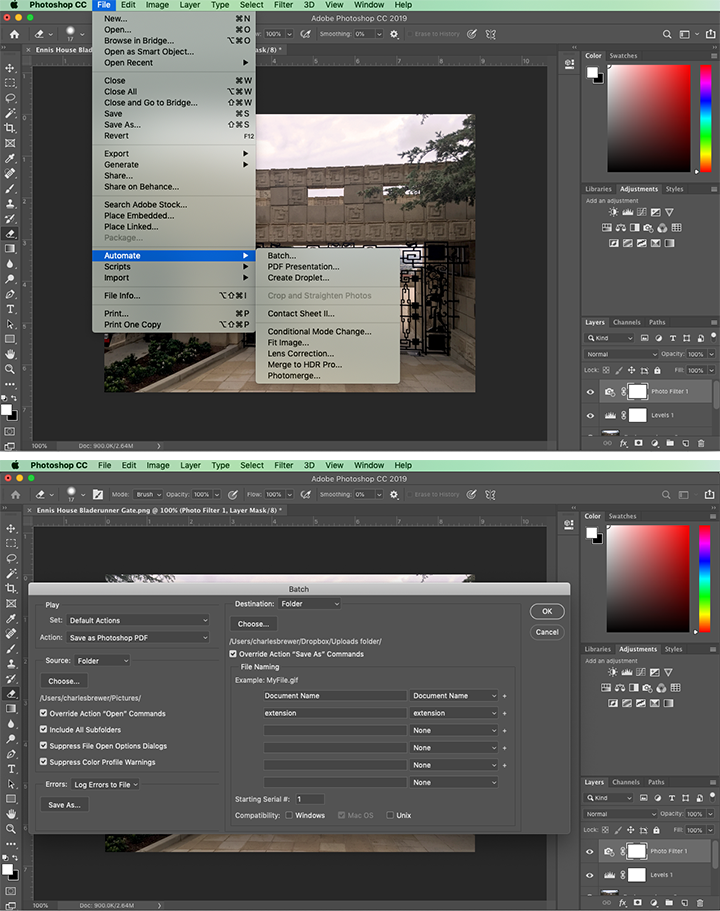
Figure 8-30. Batch automation: configuring a series of actions to perform on multiple files automatically
It is now possible to integrate and script different web apps, services, and platforms as if they were one application. IFTTT (If This, Then That) (Figure 8-31) is a web application for doing this. Third-party software companies that have API access and have integrated with the IFTTT platform become available for use. A given customer can provide their third-party logins to IFTTT and begin connecting their disparate web apps with macros, called “recipes” in IFTTT, to do work.
Here are some examples of what IFTTT recipes can do:
-
Synchronize the profile photo across all your social media accounts
-
Automatically back up image files from social media to a cloud storage account
-
Turn home automation devices on/off based on your mobile
-
Save social media posts to a cloud spreadsheet
-
Save fitness data from devices to a cloud spreadsheet
IFTTT recipes are built by providing your login credentials to your online accounts and then building simple macros using the IFTTT web app (Figure 8-31). The large phrase in the screen “if [Twitter] then [+] that” is a macro in the process of being created. The first part is ready. This account has integrated with their Twitter account(s). Selecting the Twitter icon opens a different screen for configuring the Twitter-driven trigger for the macro. The next step is to configure the “that” step. For example, log each tweet to a Google spreadsheet. These are the actions IFTTT or other integrated internet service should execute. These macros allow for custom automated business processes that integrate unconnected web apps and services.
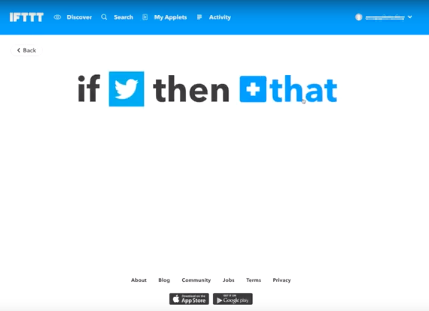
Figure 8-31. IFTTT (If This, Then That) applet creator
Microsoft Excel (Figure 8-32) allows macros to be recorded, named, stored along with the document, and even assigned to a keyboard shortcut. In this example, the user can record a macro and later edit it in a programming environment (a lightweight Visual Basic editor included in Excel). The user records macros to process data and manipulate spreadsheets within Excel. These can be edited and saved for reuse.
If you are developing a truly scriptable application, the lesson from Excel is to think about how such macros could be abused. You might want to put constraints around what can be done via macros.

Figure 8-32. Microsoft Excel
Conclusion
In this chapter, we examined the different modes and means of taking action or initiating commands in software. As an interaction designer, you have a number of patterns and best practices to help users see and understand what they can do and what’s going on. The important point is that you want to make the most important actions visible. To accomplish this, you can use the graphic design methods discussed in this chapter. The benefits of making actions clear is that you can guide new and existing users to the preferred next step. Patterns like Preview and Multilevel Undo help users to avoid error. They will learn the software more quickly, too.
Don’t underestimate the positive feelings that come from giving people the ability to play around safely with your interface (that is, they stay in control of what they’re doing because the understand how to preview, initiate, cancel and reverse actions.) For more advanced users or in complicated interactions, designing the ability to record actions as if on a timeline, with the ability to go forward and back in time, is a powerful level of control over actions. Finally, you might want to consider designing macro-like abilities into your software for users who need the speed and efficiency of executing multiple actions automatically and programmatically.
1 Nielsen, Jakob. “Response Times: The 3 Important Limits.” Nielsen Norman Group, Nielsen Norman Group, 1 Jan. 1993, https://oreil.ly/6IunB. This article, updated in 2014, cites additional sources of research into software response time and its effect on users.
2 Nielsen, Jakob. “10 Usability Heuristics for User Interface Design: Article by Jakob Nielsen.” Nielsen Norman Group, 24 Apr. 1994, https://oreil.ly/Sdw4P.
3 Alan Cooper and Robert Reimann devote an entire chapter to the undo concept in their book About Face 2.0: The Essentials of Interaction Design (Wiley, 2003).
4 Constantine, Larry L., and Lucy A.D. Lockwood. “Instructive Interaction: Making Innovative Interfaces Self-Teaching.” User Experience, vol. 1, no. 3, 2002. Winter, https://oreil.ly/QMNpz.