
Chapter 9. Showing Complex Data
Done well, information graphics—including maps, tables, and graphs—communicate knowledge visually rather than verbally in an elegant and magical way. They let people use their eyes and minds to draw their own conclusions; they show, rather than tell. Visualizing data is an art and a science. Data visualization is a specialization within the discipline of design and requires subject matter expertise in addition to a strong visual design sensibility.
Creating artful visualizations is a discipline unto itself. This chapter discusses the basics of information graphics and shows some of the most common ways to display data in a mobile application or website.
The Basics of Information Graphics
Information graphics simply means data presented visually, with the goal of imparting knowledge to the user. We include tables and tree views in that description because they are inherently visual, even though they’re constructed primarily from text instead of lines and polygons. Other familiar static information graphics include maps, flowcharts, bar plots, and diagrams of real-world objects.
But we’re dealing with computers, not paper. You can make almost any good static design better with interactivity. Interactive tools let the user hide and show information as they need it, and they put the user in control, allowing them to choose how to view and explore that information.
Even the mere act of manipulating and rearranging the data in an interactive graphic has value—the user becomes a participant in the discovery process, not just a passive observer. This can be invaluable. The user might not end up producing the world’s best-designed plot or table, but the process of manipulating that plot or table puts the user face to face with aspects of the data that they might never have noticed on paper.
Ultimately, the user’s goal in using information graphics is to learn something. But the designer needs to understand what the user needs to learn. The user might be looking for something very specific, such as a particular street on a map, in which case they need to be able to find it—for instance, by directly searching or by filtering out extraneous information. The user needs to get a “big picture” only to the extent necessary to reach that specific data point. The ability to search, filter, and zero in on details is critical.
On the other hand, the user might be trying to learn something less concrete. They might look at a map to grasp the layout of a city rather than to find a specific address. Or, they might be a scientist visualizing a biochemical process, trying to understand how it works. Now, overviews are important; users need to see how the parts interconnect with the whole. They might want to zoom in, zoom back out again, look at the details occasionally, and compare one view of the data to another.
Good interactive information graphics offer users answers to these questions:
-
How is this data organized?
-
What’s related to what?
-
How can I explore this data?
-
Can I rearrange this data to see it differently?
-
How can I see only the data that I need?
-
What are the specific data values?
In these sections, keep in mind that the term information graphics is a very big umbrella. It covers plots, graphs, maps, tables, trees, timelines, and diagrams of all sort; the data can be huge and multilayered, or small and focused. Many of these techniques apply surprisingly well to graphic types that you wouldn’t expect.
Before describing the patterns themselves, let’s set the stage by talking about some of the questions posed in the previous list.
Organizational Models: How Is This Data Organized?
The first thing a user sees in any information visualization is the shape you’ve chosen for the data. Ideally, the data itself has an inherent structure that suggests this shape to you. Table 9-1 shows a variety of organizational models. Which of these best fits your data?
| Model | Diagram | Common graphics |
| Linear | List, single-variable plot | |
| Tabular |  |
Spreadsheet, multicolumn list, sortable table, Multi-Y Graph, other multivariable plots |
| Hierarchical |  |
Tree, list, tree table |
| Network of interconnections | 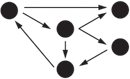 |
Directed graph, flowchart |
| Geographic (or spatial) | Map, schematic, scatter plot | |
| Textual | Word cloud, directed graph | |
| Other | Plots of various sorts, such as parallel coordinate plots, treemap, etc. |
Try these out against the data you’re trying to show. If two or more might fit, consider which ones play up which aspects of your data. If your data could be both geographic and tabular, for instance, showing it as only a table might obscure its geographic nature—a viewer might miss interesting features or relationships in the data if it’s not shown as a map, too.
Preattentive Variables: What’s Related to What?
The organizational model you choose tells the user about the shape of the data. Part of this message operates at a subconscious level; people recognize trees, tables, and maps, and they immediately make some assumptions about the underlying data before they even begin to think consciously about it. But it’s not just the shape that does this. The look of the individual data elements also works at a subconscious level in the user’s mind: things that look alike must be associated with one another.
If you’ve read Chapter 4, that should sound familiar—you already know about the Gestalt principles. (If you jumped ahead in the book, this might be a good time to go back and read the introduction to Chapter 4.) Most of those principles, especially similarity and continuity, will come into play here, too. Let’s look a little more at how they work.
Certain visual features operate preattentively: they convey information before the viewer pays conscious attention. Take a look at Figure 9-1 and find the blue objects.

Figure 9-1. Find the blue objects
I’m guessing that you can do that pretty quickly. Now look at Figure 9-2 and do the same.

Figure 9-2. Find the blue objects again
You did that pretty quickly too, right? In fact, it doesn’t matter how many red objects there are; the amount of time it takes you to find the blue ones is constant! You might think it should be linear with the total number of objects—order-N time, in algorithmic terms—but it’s not. Color operates at a primitive cognitive level. Your visual system does the difficult work for you, and it seems to work in a “massively parallel” fashion.
On the other hand, visually monotonous text forces you to read the values and think about them. Figure 9-3 shows exactly the same problem with numbers instead of colors. How fast can you find the numbers that are greater than one?
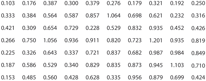
Figure 9-3. Find the values greater than one
When dealing with text such as this, your “search time” really is linear with the number of items. But what if we still use text, but make the target numbers physically larger than the others, as in Figure 9-4?
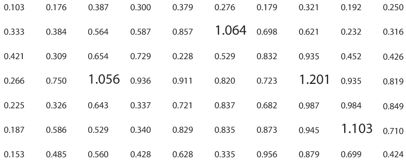
Figure 9-4. Find the values greater than one again
Now we’re back to constant time again. Size is, in fact, another preattentive variable. The fact that the larger numbers protrude into their right margins of their respective columns also helps you find them—alignment is yet another preattentive variable.
Figure 9-5 shows many known preattentive variables.
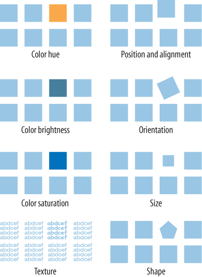
Figure 9-5. Eight preattentive variables
This concept has profound implications for text-based information graphics, like the table of numbers shown earlier in Figure 9-3. If you want some data points to stand out from the others, you need to make them look different by varying their color, size, or some other preattentive variable. More generally, you can use these variables to differentiate classes or dimensions of data on any kind of information graphics. This is sometimes called encoding.
When you need to plot a multidimensional data set, you can use several different visual variables to encode all those dimensions in a single static display. Consider the scatter plot shown in Figure 9-6. Position is used along the x- and y-axes; color hue encodes a third variable. The shape of the scatter markers could encode yet a fourth variable, but in this case, shape is redundant with color hue. The redundant encoding helps a user visually separate the three data groups.
All of this is related to a general graphic design concept called layering. When you look at well-designed graphics of any sort, you perceive different classes of information on the screen. Preattentive factors such as color cause some of them to “pop” out of the screen, and similarity causes you to see those as connected to each other, as though each were on a transparent layer over the base graphics. It’s an extremely effective way of segmenting data—each layer is simpler than the whole graphic, and the viewer can study each in turn, but the relationships among the whole are preserved and emphasized.

Figure 9-6. Encoding three variables in a scatter plot
Sorting and Rearranging: Can I Rearrange This Data to See It Differently?
Sometimes, just rearranging an information graphic can reveal unexpected relationships. Look at Figure 9-7, taken from the National Cancer Institute’s online mortality charts. It shows the number of deaths from lung cancer in the state of Texas. The major metropolitan regions in Texas are arranged alphabetically—not an unreasonable default order if you’re going to look up specific cities, but as presented, the data doesn’t lead you to ask interesting questions. It’s not clear why Abilene, Alice, Amarillo, and Austin all seem to have similar numbers, for instance; it might just be chance.

Figure 9-7. Cancer data by city, sorted alphabetically
But this chart lets you reorder the data into numerically descending order, as in Figure 9-8. Suddenly the graph becomes much more interesting. Galveston is ranked first—why is that, when its neighbor, Houston, is further down the scale? What’s special about Galveston? (OK, you need to know something about Texas geography to ask these questions, but you get my point.) Likewise, why the difference between neighbors Dallas and Fort Worth? And apparently the Mexico-bordering southern cities of El Paso, Brownsville, and Laredo have less lung cancer than the rest of Texas; why might that be? You can’t answer these questions with this data set, but at least you can ask them.
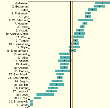
Figure 9-8. The same Cancer data chart, sorted numerically
People who can interact with data graphics this way have more opportunities to learn from the graphic. Sorting and rearranging puts different data points next to each other, thus letting users make different kinds of comparisons—it’s far easier to compare neighbors than widely scattered points. And users tend to zero in on the extreme ends of scales, as I did in the preceding example.
How else can you apply this concept? A sortable table offers one obvious way: when you have a many-columned table, users might want to sort the rows according to their choice of column. This is pretty common. (Many table implementations also permit rearrangement of the columns themselves, by dragging.) Trees might allow reordering of their child nodes. Diagrams and connected graphs might allow spatial repositioning of their elements while retaining their connectivity.
Drawing on the information architecture approaches discussed in Chapter 2, consider these methods of sorting and rearranging:
-
Alphabetically
-
Numerically
-
By date or time
-
By physical location
-
By category or tag
-
By popularity—heavily used versus lightly used
-
User-designed arrangement
-
Completely random (you never know what you might see)
For a subtle example, take a look at Figure 9-9. Bar charts that show multiple data values on each bar (known as stacked bar charts) might also be amenable to rearranging—the bar segments nearest the baseline are the easiest to evaluate and compare, so you might want to let users determine which variable is next to the baseline.

Figure 9-9. Rearrangement of a stacked bar chart
The light blue variable in this example might be the same height from bar to bar. Does it vary, and how? Which light blue bars are the tallest? You really can’t tell until you move that data series to the baseline—that transformation lines up the bases of all those blue rectangles. Now a visual comparison is easy: light blue bars 6 and 12 are the tallest, and the variation seems loosely correlated to the overall bar heights.
Searching and Filtering: How Can I See Only the Data That I Need?
Sometimes you don’t want to see an entire data set at once. You might start with the whole thing and narrow it down to what you need—filtering—or you might build up a subset of the data via searching or querying. Most users won’t even distinguish between filtering and querying (though there’s a big difference from, say, a database’s point of view). The user’s intent is the same: to zero in on whatever part of the data is of interest, and get rid of the rest.
The simplest filtering and querying techniques offer users a choice of which aspects of the data to view. Checkboxes and other one-click controls turn parts of the interactive graphic on and off. A table might show some columns and not others, per the user’s choice; a map might show only the points of interest (e.g., restaurants) selected by the user. The Dynamic Queries pattern, which can offer very rich interaction, is a logical extension of simple filter controls such as these.
Sometimes, simply highlighting a subset of the data, rather than hiding or removing the rest, is sufficient. That way a user can see that subset in context with the rest of the data. Interactively, you can do this with simple controls, as described earlier. The Data Brushing pattern describes a variation of data highlighting; it highlights the same data in several data graphics at once.
Look at Figure 9-10. This interactive ski trail map can show four categories of trails, coded by symbol, plus other features such as ski lifts and base lodges. When everything is “turned on” at once, it’s so crowded that it’s difficult to read anything. But users can click the trail symbols, as shown, to turn the data “layers” on and off. The screenshot on the left shows no highlighted trails; the one on the right switches on the trails rated black diamond with a single click.
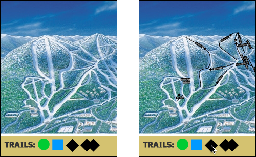
Figure 9-10. Interactive ski trail map
Searching mechanisms vary heavily from one type of graphic to another. A table or tree should permit textual searches, of course; a map should offer searches on addresses and other physical locations; numeric charts and plots might let users search for specific data values or ranges of values. What are your users interested in searching on?
When the search is done and the results obtained, you might set up the interface to show the results in context, on the graphic—you could scroll the table or map so that the searched-for item is in the middle of the viewport, for instance. Seeing the results in context with the rest of the data helps the user understand the results better.
Here are the characteristics of the best filtering and querying interfaces:
- Highly interactive
-
They respond as quickly as possible to the user’s searching and filtering. (Don’t react to individual keystrokes if it significantly slows down the user’s typing, however.)
- Iterative
-
They let a user refine the search, query, or filter until they get the desired results. They might also combine these operations: a user might do a search, get a screenful of results, and then filter those results down to what they want.
- Contextual
-
They show results in context with surrounding data, to make it easier for a user to understand where they are in a data space. This is also true for other kinds of searches, as it happens; the best text search facilities show the search terms embedded in sentences, for instance.
- Complex
-
They go beyond simply switching entire data sets on and off, and allow the user to specify nuanced combinations of conditions for showing data. For instance, can this information graphic show me all the items for which conditions X, Y, and Z are true, but A and B are false, within the time range M–N? Such complexity lets users test hypotheses about the data and explore the data set in creative ways.
The Actual Data: What Are the Specific Data Values?
Several common techniques help a viewer get specific values out of an information graphic. Know your audience—if they’re interested in getting only a qualitative sense of the data, there’s no need for you to spend large amounts of time or pixels labeling every little thing. But some actual numbers or text is usually necessary.
Because these techniques all involve text, don’t forget the graphic design principles that will make the text look good: readable fonts, appropriate font size (not too big, not too small), proper visual separation between unrelated text items, alignment of related items, no heavy-bordered boxes, and no unnecessary obscuring of data. Here are some other aspects for you to consider:
- Labels
-
Many information graphics put labels directly on the graphic, such as town names on a map. Labels can also identify the values of symbols on a scatter plot, bars on a bar graph, and other things that might normally force the user to depend on axes or legends. Labels are easier to use. They communicate data values precisely and unambiguously (when placed correctly), and they’re located in or beside the data point of interest—no going back and forth between the data point and a legend. The downside is that they clutter up a graphic when overused, so be careful.
- Legends
-
When you use color, texture, line style, symbols, or size on an information graphic to represent values (or categories or value ranges), the legend shows the user what represents what. You should place the legend on the same screen as the graphic itself so the user’s eyes don’t need to travel far between the data and the legend.
- Axes, rulers, scales, and timelines
-
Whenever position represents data, as it does on plots and maps (but not on most diagrams), these tell the user what values those positions represent. They are reference lines or curves on which reference values are marked. The user has to draw an imaginary line from the point of interest to the axis, and maybe interpolate to find the right number. This is more of a burden on the user than direct labeling. But labeling clutters things when the data is dense, and many users don’t need to derive precise values from graphics; they just want a more general sense of the values involved. For those situations, axes are appropriate.
- Datatips
-
The Datatips pattern (described in this chapter) are tool tips that show data values when the user hovers over a point of interest. They offer the physical proximity advantages of labels without the clutter. They work only in interactive graphics, though.
- Data spotlight
-
Like Datatips, a data spotlight highlights data when the user hovers over a point of interest. But instead of showing the specific point’s value, it displays a “slice” of the data in context with the rest of the information graphic, often by dimming the rest of the data. See the Data Spotlight pattern.
- Data brushing
-
A technique called data brushing lets users select a subset of the data in the information graphic and see how that data fits into other contexts. You use this with two or more information graphics; for instance, selecting some outliers in a scatter plot causes those same data points to be highlighted in a table showing the same data. For more information, see the Data Brushing pattern in this chapter.
The Patterns
Because this book is about interactive interfaces, most of these patterns describe ways to interact with the data: moving through it; sorting, selecting, inserting, or changing items; and probing for specific values or sets of values. A few of them deal only with static graphics: information designers have known about Multi-Y Graph and Small Multiples for a while now, but they translate well to the world of digital interfaces.
You can apply the following patterns to most varieties of interactive graphic, regardless of the data’s underlying structure (some are more difficult to learn and use than others, so don’t throw them at every data graphic you create):
-
Datatips
-
Data Spotlight
-
Dynamic Queries
-
Data Brushing
The remaining patterns are ways to construct complex data graphics for multidimensional data—data that has many attributes or variables. They encourage users to ask different kinds of questions about the data, and to make different types of comparisons among data elements.
-
Multi-Y Graph
-
Small Multiples
Datatips
What
Data values appear when your finger or mouse rolls over a point of interest on an interactive data table or when you tap or click the icon.
The Pew Research chart (Figure 9-11) example shows Datatips in action.

Figure 9-11. Pew Research, Changing Face of America
Use when
You’re showing an overview of a data set, in almost any form. More data is “hidden behind” specific points on that graphic, such as the names of streets on a map or the values of bars in a bar chart. The user is able to “point at” places of interest with a mouse cursor or a touch screen.
Why
Looking at specific data values is a common task in data-rich graphics. Users will want the overview, but they might also look for particular facts that aren’t present in the overview. Datatips let you present small, targeted chunks of context-dependent data, and they put that data directly where the user’s attention is focused: the mouse pointer or fingertip. If the overview is reasonably well organized, users will find it easy to look up what they want, and you won’t need to put it all on the graphic. Datatips can substitute for labels.
Also, some people might just be curious. What else is here? What can I find out? Datatips offer an easy, rewarding form of interactivity. They’re quick (no screen loading), they’re lightweight, and they offer intriguing little glimpses into an otherwise invisible data set.
How
Use a tool tip–like window to show the data associated with that point. It doesn’t need to be technically a “tool tip”—all that matters is that it appears where the pointer is, it’s layered atop the graphic, and it’s temporary. Users will get the idea pretty quickly.
Inside that window, format the data appropriately. Denser is usually better, because a tool-tip window is expected to be small; don’t let the window get so large that it obscures too much of the graphic while it’s visible. And place it well. If there’s a way to programmatically position it so that it covers as little content as possible, try that.
You might even want to format the Datatips differently depending on the situation. An interactive map might let the user toggle between seeing place names and seeing latitude/longitude coordinates, for example. If you have a few data sets plotted as separate lines on one graph, the Datatips might be labeled differently for each line, or have different kinds of data in them.
Many Datatips offer links that the user can click. This lets the user “drill down” into parts of the data that might not be visible at all on the main information graphic. The Datatips is beautifully self-describing—it offers not only information, but also a link and instructions for drilling down.
An alternative way of dynamically showing hidden data is to reserve some panel on or next to the graphic as a static data window. As the user rolls over various points on the graphic, data associated with those points appears in the data window. It’s the same idea, but using a reserved space rather than temporary Datatips. The user must shift their attention from the pointer to that panel, but you never have a problem with the rest of the graphic being hidden. Furthermore, if that data window can retain its data, the user can view it while interacting with something else.
In contemporary interactive infographics, Datatips often work in conjunction with a Data Spotlight mechanism . The spotlight shows a slice through the data—for example, a line or set of scattered points— whereas the Datatips shows the specific data point that’s under the mouse pointer.
Examples
The CrimeMapping example (Figure 9-12) shows an icon to indicate what kind of crime has occurred and plots this point on a map. A user can zoom in and out of the map and filter the nature of the crime by selecting “What” from the panel on the left.

Figure 9-12. CrimeMapping
CrimeMapping uses both Datatips and a Data Spotlight. All incidents of theft are highlighted on the map (via the spotlight), but the Datatips pattern describes the particular incident at which the user is pointing. Note also the link to the raw data about this crime.
So many geographic information graphics are built upon Google Maps that it deserves a particular mention. The map can toggle between a simplified map or satellite view, and can have information like traffic, routes, and place markers overlaid on the map (Figure 9-13).

Figure 9-13. Google Maps
The Transit Mobile App (Figure 9-14) shows a route overlaid on a map with simplified route icons and Datatips. The colors, symbols and data change depending on what mode of transport is selected.
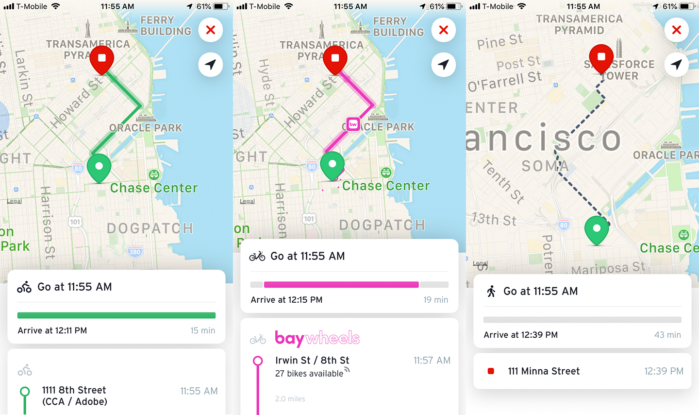
Figure 9-14. Transit Mobile App
Data Spotlight
What
As the user hovers over an area of interest, highlight that slice of data (graph line, map layer, etc.) and dim the rest.
The very beautiful Atlas of Emotions (Figure 9-15) shows a range of emotions and their intensity. When the user cursors over the data, it reveals associated emotions in that family.

Figure 9-15. Atlas of Emotions
Use when
The graphic contains so much information that it tends to obscure its own structure. It might be difficult for a viewer to pick out relationships and trace connections among the data because of its sheer richness.
The data itself is structurally complex—it might have several independent variables and complicated “slices” of dependent data such as lines, areas, scattered sets of points, or systems of connections. (If the rolled-over data is merely a point or a simple shape, Datatips is a better solution than Data Spotlight. They’re often used in conjunction with each other, though.)
Why
A Data Spotlight untangles the threads of data from one another. It’s one way that you can offer “focus plus context” on a complex infographic: a user eliminates some of the visual clutter on the graphic by quieting most of it, focusing only on the data slice of interest. However, the rest of the data is still there to provide context.
It also permits dynamic exploration by letting a user flick quickly from one data slice to another. The user can see both large differences and very small differences that way—as long as the Data Spotlight transitions quickly and smoothly (without flicker) from one data slice to another as the mouse moves, even very tiny differences will be visible.
Finally, Data Spotlight can be fun and engaging to use.
How
First, design the information graphic so that it doesn’t initially depend on a Data Spotlight. Try to keep the data slices visible and coherent so that a user can follow what’s going on without interacting with the graphic (someone might print it, after all).
To create a spotlight effect, make the spotlighted data either a light color or a saturated color while the other data fades to a darker or grayer color. Make the reaction very quick on rollover to give the user a sense of immediacy and smoothness.
Besides triggering a spotlight when the mouse rolls over data elements, you might also put “hot spots” onto legends and other references to the data.
Consider a “spotlight mode.” In this, the Data Spotlight waits for a longer initial mouse hover before turning itself on. After it’s in that mode, the user’s mouse motions cause immediate changes to the spotlight. This means the spotlight effect won’t be triggered accidentally, when a user just happens to roll the mouse over the graphic.
An alternative to the mouse rollover gesture is a simple mouse click or finger tap. This lacks the immediacy of rollovers, but it works on touch screens and it isn’t as subject to accidental triggering. However, you might want to reserve the mouse click for a different action, such as drilling down into the data.
Use Datatips to describe specific data points, describe the data slice being highlighted, and offer instructions where necessary.
Examples
Here is an example of the data spotlight in action.
Winds and Words (Figure 9-16) is an interactive Game of Thrones data visualization. When a user clicks on a character, the other characters recede into the background and the selected character is shown along with their relationship to other characters.

Figure 9-16. Winds and Words
Dynamic Queries
What
Employ easy-to-use standard controls such as sliders and checkboxes to define which slices or layers of the data set are shown, and immediately and interactively filter the data set. As the user adjusts those controls, show the results immediately on the data display.
The Google Public DataExplorer (Figure 9-17) allows the user to select a variety of variables and see the results immediately, the user can also move the slider on a timeline to see the results of the data over time.
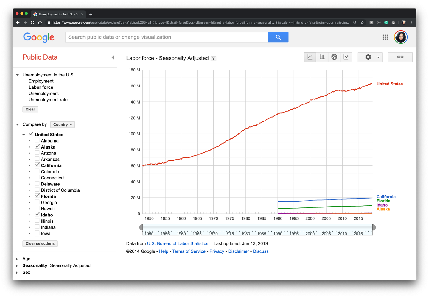
Figure 9-17. Google Public Data Explorer
Use when
You’re showing the user a large, multivariate data set, of any shape, with any presentation. Users need to filter out some of the data in order to accomplish any of several objectives—to eliminate irrelevant parts of the data set, to see which data points meet certain criteria, to understand the relationships among the various data attributes, or simply to explore the data set and see what’s there.
The data set itself has a fixed and predictable set of attributes (or parameters, variables, dimensions, whatever term you prefer) that are of interest to users. They are usually numeric and range bounded; they might also be sortable strings, dates, categories, or enumerations (sets of numbers representing non-numeric values). Or they might be visible areas of data on the information display itself that can be interactively selected.
Dynamic Queries can also apply to search results. Faceted searches might use a dynamic query interface to let users explore a rich database of items, such as products, images, or text.
Why
First, Dynamic Queries are easy to learn. No complicated query language is necessary at the user’s end; well-understood controls are used to express common-sense Boolean expressions such as “price > $70 AND price < $100.” They lack the full expressive power of a query language—only simple queries are possible without making the user interface too complicated—but in most cases, that’s enough. It’s a judgment call that you need to make.
Second, the immediate feedback encourages open-ended exploration of the data set. As the user moves a slider thumb, for instance, they see the visible data contract or expand. As the user adds or removes different subsets of the data, they see where the subsets go and how they change the display. The user can concoct long and complex query expressions incrementally, by tweaking this control, then that, then another. Thus, a continuous and interactive “question and answer session” is carried on between the user and the data. The immediate feedback shortens the iteration loop so that exploration is fun and a state of flow is possible.
Third—and this is a little subtler—the presence of labeled dynamic-query controls clarifies what the queryable attributes are in the first place. If one of the data attributes is a number that ranges from 0 to 100, for instance, the user can learn that just by seeing a slider that has 0 at one end and 100 at the other end.
How
The best way to design a dynamic query depends on your data display, the kinds of queries you think should be made, and your toolkit’s capabilities. As mentioned, most programs map data attributes to ordinary controls that live next to the data display. This allows querying on many variables at once, not just those encoded by spatial features on the display. Plus, most people know how to use sliders and buttons.
Other programs afford interactive selection directly on the information display. Usually the user draws a box around a region of interest and the data in that region is removed (or retained while the rest of the data is removed). This is manipulation at its most direct, but it has the disadvantage of being tied to the spatial rendering of the data. If you can’t draw a box around it—or otherwise select points of interest—you can’t query on it! See the Data Brushing pattern for the pros and cons of a very similar technique.
Back to controls, then: picking controls for dynamic queries is similar to the act of picking controls for any kind of form—the choices arise from the data type, the kind of query to be made, and the available controls. Here are some common choices:
-
Sliders to specify a single number within a range.
-
Double sliders or slider pairs to specify a subset of a range: “Show data points that are greater than this number, but less than this other number.”
-
Radio buttons or drop-down (combo) boxes to pick one value out of several possible values. You might also use these to pick entire variables or data sets. In either case, “All” is frequently used as an additional metavalue.
-
Checkboxes or toggles to pick an arbitrary subset of values, variables, or data layers.
-
Text fields to type in single values. Remember that text fields leave more room for errors and typos than do sliders and buttons, but are better for precise values.
Example
The Apple Health interface (see Figure 9-18) allows the user to tap on days and view the individual day’s activity.

Figure 9-18. Apple Health
Data Brushing
What
Allow the user to select data items in one view and show the same data selected simultaneously in another view. The example in Figure 9-19 shows a timeline that allows the user to easily shift the view over time and changes the data points on the map as well as the data on the side panel on the right.

Figure 9-19. American Panorama, Foreign-Born Population
Use when
You can show two or more information graphicsat a time. You might have two line plots and a scatter plot, or a scatter plot and a table, or a diagram and a tree, or a map and a timeline, whatever—as long as each graphic is showing the same data set.
Why
Data Brushing offers a very rich form of interactive data exploration. First, the user can select data points using an information graphic itself as a “selector.” Sometimes, it’s easier to find points of interest visually than by less-direct means, such as Dynamic Queries—outliers on a plot can be seen and manipulated immediately, for instance, whereas figuring out how to define them numerically might take a few seconds (or longer). “Do I want all points where X > 200 and Y > 5.6? I can’t tell; just let me draw a box around that group of points.”
Second, by seeing the selected or “brushed” data points simultaneously in the other graphic(s), the user can observe those points in at least one other graphical context. That can be invaluable. To use the outlier example again, the user might want to know where those outliers are in a different data space, indexed by different variables—and by learning that, the user might gain immediate insight into the phenomenon that produced the data.
A larger principle here is coordinated or linked views. Multiple views on the same data can be linked or synchronized so that certain manipulations—zooming, panning, selection, and so forth—done to one view are simultaneously shown in the others. Coordination reinforces the idea that the views are simply different perspectives on the same data. Again, the user focuses on the same data in different contexts, which can lead to insight.
How
First, how will users select or “brush” the data? It’s the same problem you’d have with any selectable collection of objects: users might want one object or several, contiguous or separate, selected all at once or incrementally. Consider these ideas:
-
Tapping keywords
-
Single selection by clicking with the mouse
-
Selecting a range by turning them on and off
As you can see, it’s important that the other views react immediately to Data Brushing. Make sure the system can handle a fast turnaround.
If the brushed data points appear with the same visual characteristics in all the data views, including the graphic in which the brushing occurs, the user can more easily find them and recognize them as being brushed. They also form a single perceptual layer (see the “Preattentive Variables: What’s Related to What?”). Color hue is the preattentive variable most frequently used for brushing, probably because you can see a bright color so easily even when your attention is focused elsewhere.
Examples
Maps lend themselves well to Data Brushing, because data shown in a geographic context can often be organized and rendered in other ways, as well. A super delightful variation of the data brushing is in the AllTrails app (Figure 9-20, left). When the user moves their finger over the trail map on the bottom of the screen, the trail map pointer (the blue dot) moves along the trail to indicate the elevation and grade at that point in the trail.
Trulia’s Search map view (Figure 9-20, right) shows available listings that fit within the search parameters by plotting them on a map. Users can filter the results of the specific boundaries outlined on the map by tapping or clicking Local Info and seeing data specific to the area within the boundaries.

Figure 9-20. AllTrails app and Trulia Search results
Multi-Y Graph
What
Stack multiple graph lines in one panel to share the same x-axis (Figure 9-21).
Figure 9-21. New York Times graphic
Use when
You present two or more graphs, usually simple line plots, bar charts, or area charts (or any combination thereof). The data in those graphs all share the same x-axis—often a timeline, but otherwise they describe different things, perhaps with different units or scale on the y-axis. You want to encourage the viewer to find “vertical” relationships among the data sets being shown—correlations, similarities, unexpected differences, and so on.
Why
Aligning the graphs along the x-axis first informs the viewer that these data sets are related, and then it lets them make side-by-side comparisons of the data.
How
Stack one graph on top of the other. Use one x-axis for both, but separate the y-axes into different vertical spaces. If the y-axes need to overlap somewhat, they can, but try to keep the graphs from visually interfering with each other.
Sometimes, you don’t need y-axes at all; maybe it’s not important to let the user find exact values (or maybe the graph itself contains exact values, such as labeled bar charts). In that case, simply move the graph curves up and down until they don’t interfere with each other.
Label each graph so that its identity is unambiguous. Use vertical grid lines if possible; they let viewers follow an X value from one data set to another, for easier comparison. They also make it possible to discover an exact value for a data point of interest (or one close to it) without making the user take out a straightedge and pencil.
Examples
Google Trends allows a user to compare the use frequency of different search terms. The example in Figure 9-22 shows two sports-related terms that are comparable in volume, so they’re easy to compare in one simple chart. But Google Trends goes beyond that. Relative search volume is illustrated on the top chart, whereas the bottom chart shows news reference volume. The metrics and their scales are different, so Trends uses two separate y-axes.

Figure 9-22. Google Trends
The example in Figure 9-23 shows an interactive Multi-Y Graph constructed in MATLAB. You can manipulate the three data traces’ y-axes, color-coded on the left, with the mouse—you can drag the traces up and down the graph, “stretch” them vertically by sliding the colored axis end caps, and even change the displayed axis range by editing the y-axis limits in place. Here’s why that’s interesting: you might notice that the traces look similar, as though they were correlated somehow—all three drop in value just after the vertical line labeled 1180, for instance. But just how similar are they? Move them and see.
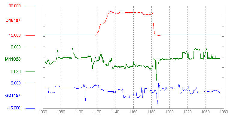
Figure 9-23. MATLAB plot
Your eyes are very, very good at discerning relationships among data graphics. By stacking and superimposing the differently scaled plot traces shown in Figure 9-24, a user might gain valuable insight into whatever phenomenon produced this data.

Figure 9-24. MATLAB plot, again
The information graphics in a multi-Y display don’t need to be traditional graphs. The weather chart shown in Figure 9-25 uses a series of pictograms to illustrate expected weather conditions; these are aligned with the same time-based x-axis that the graph uses. (This chart hints at the next pattern, Small Multiples.)

Figure 9-25. Weather chart from The Weather Channel
Small Multiples
What
Small multiples display small pictures of the data using two or three data dimensions. The images are tiled on the screen according to one or two additional data dimensions, either in a single comic-strip sequence or in a 2D matrix.
The climate heat map (Figure 9-26) shows data over time in small thumbnails to show dense information in a manner that is easy to understand.
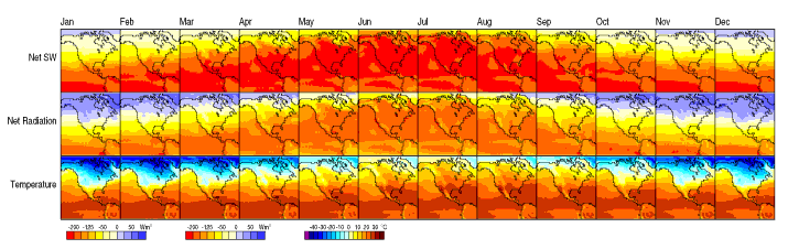
Figure 9-26. Climate heat map, from a University of Oregon publication
Use when
You need to display a large data set with more than two dimensions or independent variables. It’s easy to show a single “slice” of the data as a picture—as a plot, table, map, or image, for instance—but you find it difficult to show more dimensions than that. Users might be forced to look at one plot at a time, flipping back and forth among them to see differences.
When using Small Multiples, you need to have a fairly large display area available. Mobile devices rarely do this well, unless each individual picture is very tiny. Use this pattern when most users will be seeing these on a large screen or on printed paper.
That being said, sparklines are a particular type of Small Multiples that can be very effective at tiny scales, such as in running text or in a column of table cells. They are essentially miniature graphs, stripped of all labels and axes, created to show the shape or envelope of a simple data set.
Why
Small Multiples are data-rich—they show a lot of information at one time, but in a comprehensible way. Every individual picture tells a story. But when you put them all together and demonstrate how each picture varies from one to the next, an even bigger story is told.
As Edward Tufte put it in his classic book, Envisioning Information (Graphics Press), “Small multiple designs, multivariate and data bountiful, answer directly by visually enforcing comparisons of changes, of the differences among objects, of the scope of alternatives.” (Tufte named and popularized Small Multiples in his famous books about visualization.)
Think about it this way. If you can encode some dimensions in each individual picture, but you need to encode an extra dimension that just won’t fit in the pictures, how could you do it?
- Sequential presentation
-
Express that dimension varying across time. You can play them like a movie, use Back/Next buttons to screen one at a time, and so on.
- 3D presentation
-
Place the pictures along a third spatial axis, the z-axis.
- Small multiples
-
Reuse the x- and y-axes at a larger scale.
Side-by-side placement of pictures lets a user glance from one to the other freely and rapidly. The user doesn’t need to remember what was shown in a previous screen, as would be required by a sequential presentation (although a movie can be very effective at showing tiny differences between frames). The user also doesn’t need to decode or rotate a complicated 3D plot, as would be required if you place 2D pictures along a third axis. Sequential and 3D presentations sometimes work very well, but not always, and they often don’t work in a noninteractive setting at all.
How
Choose whether to represent one extra data dimension or two. With only one, you can lay out the images vertically, horizontally, or even line-wrapped, like a comic strip—from the starting point, the user can read through to the end. With two data dimensions, you should use a 2D table or matrix—express one data dimension as columns, and the other as rows.
Whether you use one dimension or two, label the Small Multiples with clear captions—individually if necessary, or otherwise along the sides of the display. Make sure the users understand which data dimension is varying across the multiples, and whether you’re encoding one or two data dimensions.
Each image should be similar to the others: the same size and/or shape, the same axis scaling (if you’re using plots), and the same kind of content. When you use Small Multiples, you’re trying to bring out the meaningful differences between the things being shown. Try to eliminate the visual differences that don’t mean anything.
Of course, you shouldn’t use too many Small Multiples on one screen. If one of the data dimensions has a range of 1 to 100, you probably don’t want 100 rows or columns of small multiples, so what do you do? You could bin those 100 values into, say, five bins containing 20 values each. Or you could use a technique called shingling, which is similar to binning but allows substantial overlap between the bins. (That means some data points will appear more than once, but that can be a good thing for users trying to discern patterns in the data; just make sure it’s labeled well so that they know what’s going on.)
Some small-multiple plots with two extra encoded dimensions are called trellis plots or trellis graphs. William Cleveland, a noted authority on statistical graphing, uses this term, and so do the software packages S-PLUS and R.
Examples
The North American climate graph, at the top of the pattern in Figure 9-26, shows many encoded variables. Underlying each small-multiple picture is a 2D geographic map, of course, and overlaid on that is a color-coded “graph” of some climate metric, such as temperature. With any one picture, you can see interesting shapes in the color data; they might prompt a viewer to ask questions about why blobs of color appear over certain parts of the continent.
The Small Multiples display as a whole encodes two additional variable : each column is a month of the year, and each row represents a climate metric. Your eyes have probably followed the changes across the rows, noting changes through the year, and comparisons up and down the columns are easy, too.
The example shown in Figure 9-27 uses the grid to encode two independent variables—ethnicity/religion and income—into the state-by-state geographic data. The dependent variable, encoded by color, is the estimated level of public support for school vouchers (orange representing support, green opposition). The resultant graphic is very rich and nuanced, telling countless stories about Americans’ attitudes toward the topic.

Figure 9-27. Geographic and demographic Small Multiples chart
The Power of Data Visualization
The example in Figure 9-28 is an excellent demonstration of how using data visualization done well can be aesthetically pleasing but informative. The Show Your Stripes information graphics shows temperature change data from 1850 to 2019 using only simple bars and color. Its designer compiled dense information and simplified it to inform the viewer. One visual image is doing the work of several charts and graphs in this compelling image.
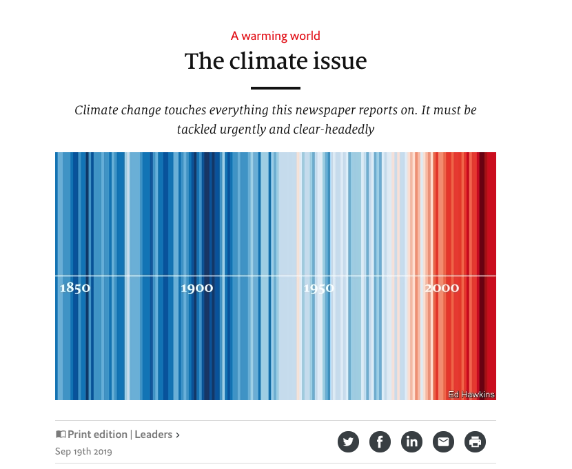
Figure 9-28. Show Your Stripes via The Economist, Sept 2019
Yes, a picture can tell a thousand words, but when you add interactivity to these pictures you increase understanding. The examples in this chapter show that graphical methods such as maps and diagrams can communicate dense amounts of information in graceful, delightful, and beautiful ways.