
Chapter 3. Getting Around: Navigation, Signposts, and Wayfinding
The patterns in this chapter deal with the challenges of navigation: How do users know where they are now? Where can they or should they go next? How can they get there from here?
To answer these questions, we look at these important aspects of navigation:
-
The purpose of navigation in user experience (UX)
-
Methods to promote wayfinding in your software
-
Different types of navigation
-
How to design navigation
-
Patterns of navigation that can be useful
Navigation can be challenging because moving around in a website or application is like commuting: you need to do it to get where you want to go, but it’s dull, it’s sometimes infuriating, and the time and energy you spend on it just seems wasted. Couldn’t you be doing something better with your time, such as playing a game or getting some actual work done?
The best kind of commuting is none at all. Having everything you need right at your fingertips without having to travel somewhere is pretty convenient. Likewise, keeping most tools “within reach” on an interface is handy, especially for intermediate-to-expert users (i.e., people who have already learned where everything is). Sometimes, you do need to put lesser-used tools on separate screens where they don’t clutter things up; sometimes, you need to group content onto different pages so that the interface makes sense. All of this is fine as long as the “distances” that a user must travel remain short. So, less is better.
Understanding the Information and Task Space
The purpose of navigation is to help the user know and understand the information space they are in. This includes understanding what tasks they can do, as well. Finally, they need to know how to get around. Navigation helps users know the following:
-
The information and tools that are available in terms of subject and scope
-
How the content and functionality are structured
-
Where I am now
-
Where I can go
-
Where I came from and how to go back or how to back up
Suppose that you’ve built a large website or application that you’ve had to break up into sections, subsections, specialized tools, pages, windows, wizards, and so forth. How do you help users navigate?
Signposts
Signposts are features that help users figure out their immediate surroundings. Common signposts include page and window titles, web-page logos and other branding devices, tabs, and selection indicators. Patterns and techniques such as good global and local navigation links, Progress Indicator, Breadcrumbs, and Annotated Scroll Bar —all described in this chapter—inform users as to where they currently are and, often, where they can go with only one more jump. They help a user to stay “found” and to plan their next steps.
Wayfinding
Wayfinding is what people do as they find their way toward their goal. The term is pretty self-explanatory. But how people actually do it is quite a research subject—specialists from cognitive science, environmental design, and website design have studied it. These common-sense features help users with wayfinding:
- Good signage
- Clear, unambiguous labels anticipate what you’re looking for and instruct you where to go; signs are where you expect them to be, and you’re never left standing at a decision point without guidance. You can check this by walking through the artifact you’re designing and following the paths of all the major use cases. Make sure that each point where a user must decide where to go next is signed or labeled appropriately. Use strong “calls to action” on the first pages that a user sees.
- Environmental clues
- You’d look for restrooms in the back of a restaurant, for instance, or a gate where a walkway intersects a fence. Likewise, you would look for an “X” close button in the upper right of a modal dialog box and logos in the upper-left corner of a web page. Keep in mind that these clues are often culturally determined, and someone new to the culture (e.g., someone who’s never used a given operating system before) might not be aware of them.
- Maps
- Sometimes, people go from sign to sign or link to link without ever really knowing where they’re going in a larger frame of reference. (If you’ve ever found your way through an unfamiliar airport, that’s probably what you did.) But some people might prefer to have a mental picture of the whole space, especially if they’re there often. Also, in badly signed or densely built spaces, such as urban neighborhoods, maps might be the only navigational aids people have.
In this chapter, the Clear Entry Points pattern is an example of careful signage combined with environmental clues–the links should be designed to stand out on the page. A Progress Indicator, obviously, is a map. Modal Panel sort of qualifies as an environmental clue because the ways out of a modal panel take you directly back to where you just were.
I’ve compared virtual spaces to physical spaces here. But virtual spaces have the unique ability to provide a navigational trump card, one that physical spaces can’t (yet) provide: the Escape Hatch. Wherever you are, click that link, and you’re back to a familiar page. It’s like carrying a wormhole with you. Or a pair of ruby slippers.
Design Considerations
Navigation must be designed. What navigation options are displayed, how they are labeled, and where and when the navigation displays in the UI are all considerations for design. This section briefly discusses design considerations for effective navigation.
Cognitive Load
When you walk into an unfamiliar room, you look around. In a fraction of a second, you take in the shape of the room, the furnishings, the light, the ways out, and other clues; very quickly you make some assumptions about what this room is and how it relates to why you walked in. Then, you need to do what you came in to do. Where? How? You might be able to answer immediately—or not. Or maybe you’re just distracted by other interesting things in the room.
Similarly, bringing up a web page or opening a window incurs a cognitive cost. Again, you need to figure out this new space: you take in its shape, its layout, its contents, its exits, and how to do what you came to do. All of this takes energy and time. The “context switch” forces you to refocus your attention and adjust to your new surroundings.
Even if you’re already familiar with the web page (or room) you just went into, it still incurs a cost in terms of time for perceiving, thinking, and reorienting yourself to the information space. Not a large cost, but it adds up—especially when you figure in the actual time it takes to display a window or load a page.
This is true whether you’re dealing with web pages, application windows, dialog boxes, or device screens. The decisions that users make about where to go are similar—they still need to read labels or decode icons, and the users will still make leaps of faith by clicking links or buttons they’re not sure about.
Furthermore, loading time affects people’s decisions. If a user clicks through to a page that takes too long to load—or fails to load altogether—they might be discouraged and just close the page before they find what they came for. (So, how many viewers is that sidebar video player costing you?) Also, if a site’s pages take a chronically long time to load, users will be less likely to explore that site.
There’s a reason why companies like Google work very hard to keep page loads as fast as possible: latency costs viewers.
Keep Distances Short
Knowing that there’s a cost associated with jumping from page to page, you can understand now why it’s important to keep the number of those jumps down. A great rule of thumb is to think about how to keep the number of taps or clicks to get from point A to point B as small as possible. There are several ways you can optimize for this in your navigation design.
Put frequently accessed items directly in the global navigation
Frequency of use influences the design of your navigation, too. Elevate or raise frequent actions so that they are at the top level of your navigation structure and thus there is direct access. This is independent of where they are in the structure of your site or app.
You can bury infrequently-used tools or content in the site structure. They will require a drilldown in the appropriate submenu. This is true within a single tool or screen, as well. You can hide seldom-used settings or optional steps behind an extra “door : a closed accordion panel or a tabbed panel. As always, experiment with different designs, and usability-test them if you have any doubts.
Bring steps together
Real efficiency gains can come from structuring the application so that common tasks can be accomplished in a single screen. One of the most annoying situations for users is to have a simple or frequent task, but be forced to go into multiple levels of subpages, dialogs, and so forth to perform one step in each place. It’s even worse if there is a dependency among the steps. Having to back up because of a missing precondition is wasted time and energy.
Can you design your workflows so that the most common 80% of use cases can be done in one page, without any context switches?
This is difficult to do with some kinds of applications. A certain tool or form can simply be very complicated. First try simplifying and minimizing. Group and segment the screen, but then shorten labels, turn words into pictures, use different form controls that save space, and move instructional copy to tool tips and pop-up panels. Then, look at using progressive disclosure so that only the first step or most-used controls display. Consider Module Tabs or an Accordion to hide other steps or content by default. This can be revealed automatically as the user works their way through the tool, or it can be optional information that the user must click or tap to view.
A second method is to bring multiple steps, tools, or screens together into a single Wizard with multiple steps (we examine this shortly).
Navigational Models
What is the navigational model for your site or app? In other words, how do the different screens (or pages, or spaces) link to one another and how do users move between them?
Now let’s look at a few models found in typical sites and apps.
Hub and Spoke
Most often found on mobile devices, this architecture (Figure 3-1) lists all of the major parts of the site or app on the home screen, or “hub.” The user clicks or taps through to them, does what they need to do, and comes back to the hub to go somewhere else. The “spoke” screens focus tightly on their jobs, making careful use of space—they might not have room to list all of the other major screens. The iPhone home screen is a good example; the Menu Page pattern found on some websites is another.
Figure 3-1. Hub and spoke architecture
Fully Connected
Many websites and mobile applications follow this model. There’s a home page or screen, but it and every other page link to all the others—they each have a global navigation feature, such as a top menu. The global navigation might be a single level (as shown in Figure 3-2, with only five pages), or it might be deep and complex, with multiple levels and deeply buried content but with complete navigation on every screen. As long as the user can reach any page from any other with a single jump, it’s fully connected.

Figure 3-2. The fully connected model
Multilevel or Tree
This is also common among websites (see Figure 3-3). The main pages are fully connected with one another, but the subpages are connected only among themselves (and usually to the other main pages, via global navigation). You’ve seen this on sites that have subpages listed only in sidebars or subtabs—users see these on menus that only show up after they’ve clicked the link for the main page or category. It takes two or more jumps to get from one arbitrary subpage to another. Using drop-down menus, the Fat Menus pattern, or the Sitemap Footer pattern with a multilevel site converts it to a fully connected one, which is preferable.
Figure 3-3. Multilevel navigation
This pattern is also found in enterprise web software. Companies that offer a suite of web applications often keep these apps separate. This can be because full integration into a unitary platform is not desired, or simply hasn’t happened yet, or because the apps are a result of recent or ongoing acquisitions. Another reason is that the components of the suite might be sold separately. The end result is a product set in which each application is an experience on its own, separate from the others. However, the software provider and the customer usually want a single sign on and a single point of access to everything. So, they are tied together at the top, behind a login. There, the user can access each of the applications and manage their account settings.
Step by Step
Slideshows, process flows, and Wizard (Chapter 2) lead the user step by step through the screens in a prescribed sequence (Figure 3-4). Back/Next links are prominent on the page. Stepwise navigation can be as simple as designing a search interface that then presents a search engine results page. Ecommerce purchase flows are also a common example. Here, there is a designed path from product page, to shopping cart, to the checkout process (can be multiple screens), and finally the completed transaction confirmation. As a third example, many subscription retail companies (especially clothing, cosmetics, and other personal goods) have a questionnaire or online survey as the first step in the customer onboarding process. The customer steps through a series of questions that establish their preferences for style, budget, sizes, brands, frequency of delivery, and so on.

Figure 3-4. Step-by-step flows
Pyramid
A variant on the stepwise model, a pyramid uses a hub page or menu page to list an entire sequence of items or subpages in one place (see Figure 3-5). The user picks out any item, jumps to it, and then has the option to use Back/Next links to step through other items in order. They can go back to the hub page anytime. See the Pyramid pattern in this chapter for more. This is very common for content sites that publish stories as a gallery of pictures.

Figure 3-5. Pyramid
Some artifacts are best represented as single large spaces, not many small ones. Maps, large images, large text documents, information graphics, and representations of time-based media (such as sound and video) fall into this category. Panning and zooming are still navigation–so offer controls for panning (moving horizontally or vertically), zooming in and out, and resetting to a known position and state.
Figure 3-6 shows an example of pan-and-zoom. Map interfaces are the most common example of this type of navigation.

Figure 3-6. Pan and Zoom
The Patterns
This chapter talks about several aspects of navigation: overall structure or model, knowing where you are, determining where you’re going, and getting there efficiently.
The first set of patterns address the navigational model and are more or less independent of screen layout:
-
Clear Entry Points
-
Menu Page
-
Pyramid
-
Modal Panel
-
Deep Links
-
Escape Hatch
-
Fat Menus
-
Sitemap Footer
-
Sign-In Tools
The next few patterns work well as “You are here” signposts (as can a well-designed global navigation):
-
Progress Indicator
-
Breadcrumbs
-
Annotated Scroll Bar
Progress Indicator, Breadcrumbs, and Annotated Scroll Bar also serve as interactive maps of the content. Annotated Scroll Bar is intended more for pan-and-zoom models than for multiple interconnected pages. Finally, Animated Transition helps users stay oriented as they move from one place to another. It’s a visual trick, nothing more, but it’s very effective at preserving a user’s sense of where they are and what’s happening. Now, let’s begin exploring these patterns.
Clear Entry Points
What
Present only a few main entry points into the interface so that the user knows where to start. For first-time and infrequent users, it removes some of the burden of learning the site. Make them task-oriented or directed at a specific audience type. Use clear calls to action. The Clear Entry Points schematic in Figure 3-7 represents this concept.
Figure 3-7. Clear Entry Points schematic
Use when
You’re designing a site or application that has a lot of first-time or infrequent users. Most of these users would be best served by reading a certain piece of introductory text, doing an initial task, or choosing from a very small number of frequently used options.
However, if the purpose is clear to basically everyone who starts it, and if most users might be irritated by one more navigation step than is necessary (like applications designed for intermediate-to-expert users), this might not be the best design choice.
Why
Some applications and websites, when opened, present the user with what looks like a morass of information and structure: lots of tiled panels, unfamiliar terms and phrases, irrelevant ads, or toolbars that just sit there disabled. They don’t give the hesitant user any clear guidance on what to do first. “OK, here I am. Now what?”
For the sake of these users, list a few options for getting started. If those options match a user’s expectations, they can confidently choose one and begin working-this contributes to immediate gratification. If not, at least they know now what the site or app actually does, because you’ve defined the important tasks or categories at the outset. You’ve made the application more self-explanatory.
How
When the site is visited or the application started, present these entry points as “doors” into the main content. From these starting points, guide the user gently and unambiguously into the application until they have enough of a context to continue by themselves.
Collectively, these entry points should cover most of the reasons most users would be there. There might be only one or two entry points, or several; it depends on what fits your design. But you should phrase them with language that first-time users can understand—this is not the place for application-specific tool names.
Visually, you should show these entry points with emphasis proportional to their importance.
On the home page or starting page, most sites will additionally list other navigation links—global navigation, utility navigation, and so on—and these should be smaller and less prominent than the Clear Entry Points . They’re more specialized, and don’t necessarily lead you directly into the heart of the site any more than a garage door leads you directly into the living room. The Clear Entry Points should serve as the “front doors.”
Examples
Apple’s main iPad page (Figure 3-8) needs to do only a few things: identify itself, make the iPad look inviting, and direct the user toward resources for buying one or learning more. The global navigation recedes visually, compared to the strong, well-defined entry point. There is a secondary focus on the row of small schematic diagrams. These are links to the iPad models, too, plus accessories. But above the fold, the users is clearly directed to the iPad Pro. On the rest of the page, there are additional front doors—large promotional images for other iPad models.

Figure 3-8. iPad page on Apple’s site
Spotify (Figure 3-9) focuses exclusively on the new customer with its website’s landing page. There is a simple and clear call to action in the center of the screen.
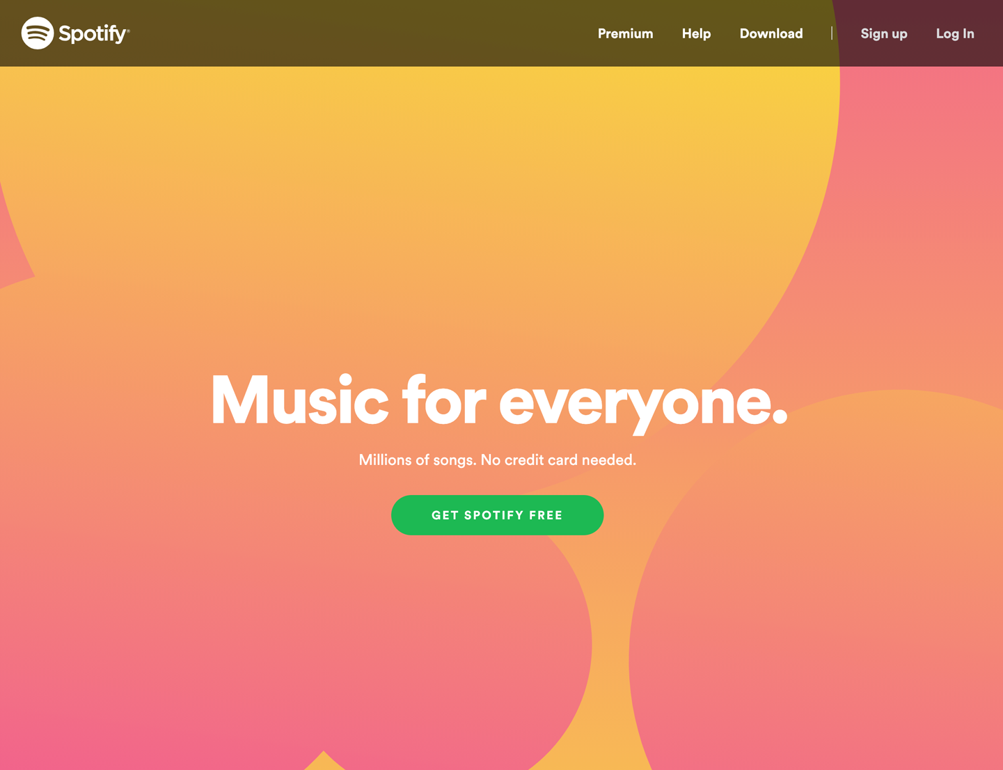
Figure 3-9. The Spotify landing page—a very clear single door
Adobe Illustrator and other applications show a startup dialog when the application is started (see Figure 3-10). This orients a new or infrequent user to the possibilities for action. The major actions are creating something new or opening an existing document. Each one is treated twice. On the left, for more experienced or confident users who are ready to get down to business, there are two boldly marked buttons: Create New and Open. Despite being small, their visual treatment makes them pop as entry points into getting started. On the right, there are the same two options, but given a much bigger, more visual and more explanatory approach. “Start a New File Fast” has several choices that represent most likely device and screen sizes. The schematic diagrams for each make them even easier to understand. Below this, in Recent, is a grid of recently opened files, each with a thumbnail image to assist in recognition and recall. This is a good example of designing different entry points to appeal to different users.
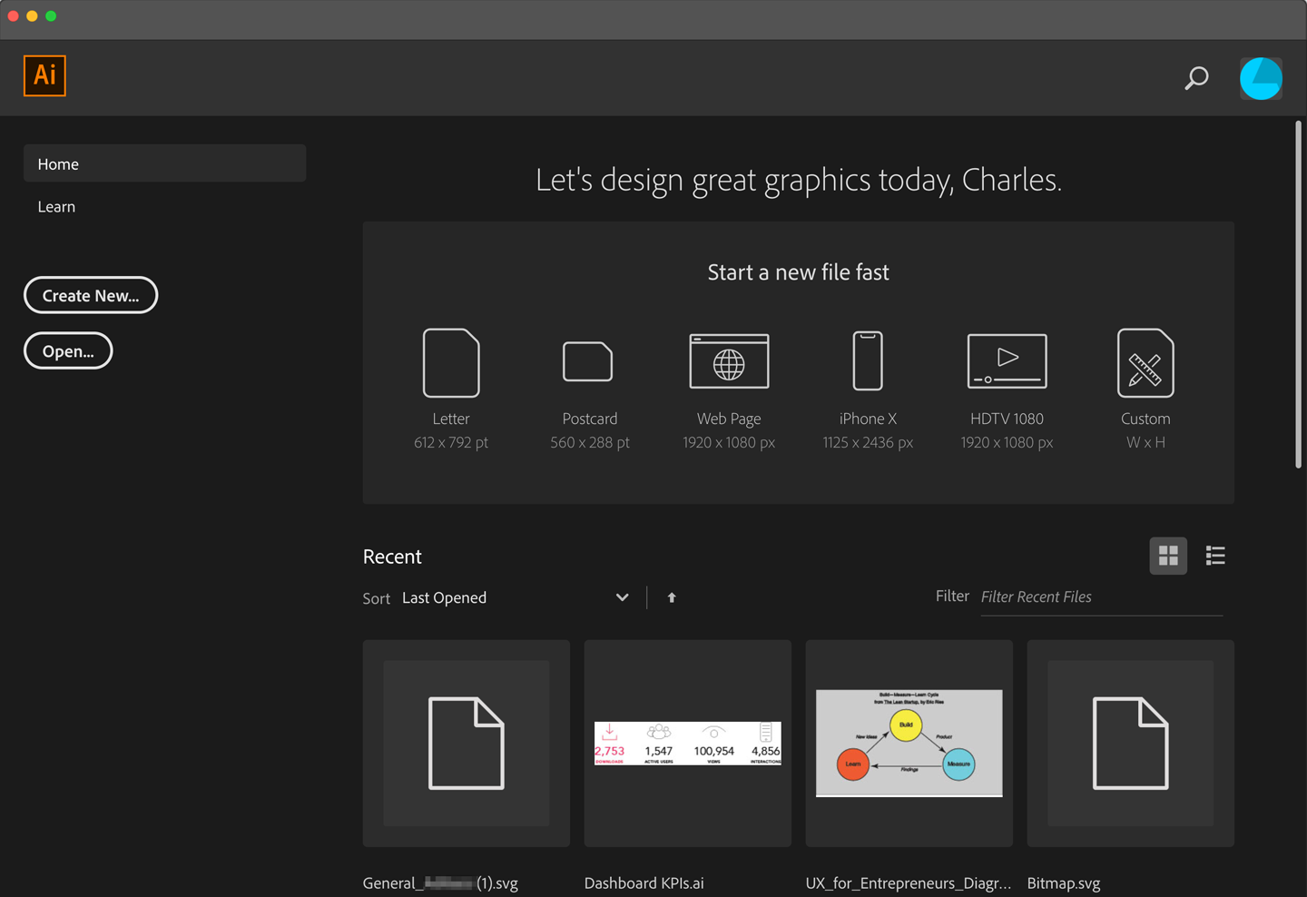
Figure 3-10. The Adobe Illustrator CC startup dialog
Prezi (Figure 3-11), like Spotify, is using its entry point on the website to make it easy for potential customers to move toward purchase. In Prezi’s case, it realized its innovative presentation software needs demonstration. Differentiating its product is the biggest need, and probably the biggest question in the minds of Prezi’s potential buyers. The front door sends the message, “Come in and check it out.”

Figure 3-11. Prezi’s landing page
Tesla (Figure 3-12) offers three entry points as represented by the three Tesla models in the photograph. The primary focus is on the Model 3 (the user interface zooms in on it, a clever move). With the focus on the Model 3, there are two entry points: Customize your own Tesla or browse the cars that are available now.

Figure 3-12. Tesla’s landing page
Menu Page
What
Fill the page with a list of links to content-rich pages in your site or app. Show enough information about each link to enable the user to choose well. Show no other significant content on the page. The venerable Craigslist home page (Figure 3-13) is an example of a highly successful menu page.
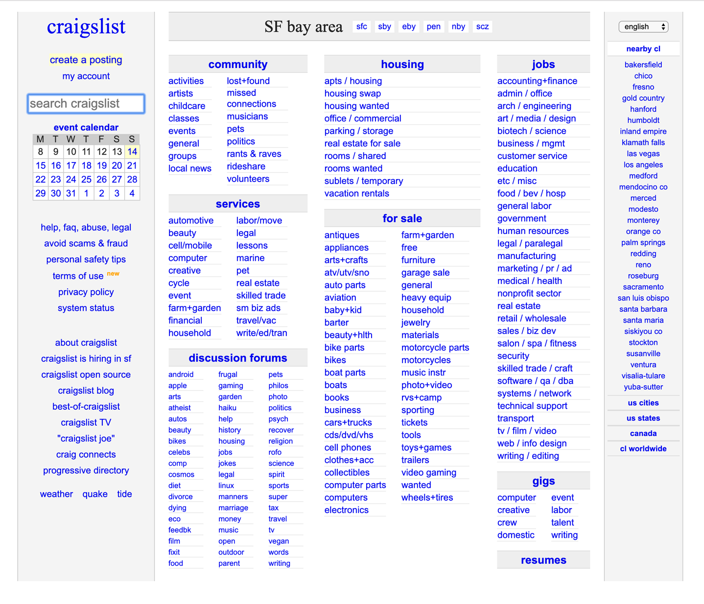
Figure 3-13. Craigslist
Use when
You’re designing a home page, starting screen, or any other screen whose purpose is to be just a “table of contents”–to show where users can go from here. You might not have room for featured content (such as an article, video, or promotion), or you might simply want to let the user pick a link with no distractions.
Mobile apps and sites often use compact, one-column Menu Pages to make the best use of their small screens when they need to display many navigation options.
If your (full-size) site needs to “hook” visitors into staying on the page, it might be better to use some of the page space for promotional items or other interesting content, and a Menu Page wouldn’t be the best design choice. Likewise, a site that needs to explain its value and purpose should use the space to do that, instead.
It takes some courage to design a Menu Page because you must be very confident of the following:
-
Visitors know what the site or app is about
-
They know what they came for and how to find it
-
They are searching for a particular topic or destination and want to locate it as quickly as possible
-
They wouldn’t be interested in news, updates, or features
-
They won’t be confused or repelled by the density of your menu page design
Why
With no distractions, users can focus all of their attention on the available navigation options. You get the entire screen (or most of it, anyway) to organize, explain, and illustrate those links, and can thus direct users to the most appropriate destination page for their needs (Figure 3-13).
How
If you’re creating a mobile design, Menu Page is one of your principal tools for designing sites or apps with many levels of functionality. Keep list labels short, make targets large enough to tap easily (for touch screens), and try not to make hierarchies too deep.
A word of caution regarding menu pages: It is very easy for these to become overwhelming. Consider using them for seldom-used screens such as reference or index pages. In all cases, look for ways to align, group, and label content for easier comprehension.
The remainder of the discussion here applies to full-sized sites and apps.
First, label the links well and provide just enough contextual information for users to decide where to go. This isn’t necessarily easy. Visitors might find it very helpful to have a description or teaser with each link, but that could take up a lot of space on the page. Likewise for thumbnail images—they can look great, but how much value do they add?
Look at the San Francisco city government directory screen in Figure 3-14 and the University of California, Berkeley directory screen in Figure 3-15. Visitors to the SF.gov Departments page are given just that: an alphabetical list. Visitors to the UC, Berkeley site already know the meanings of these links—they’re the names of academic programs—so the extra information is about the degree offerings, not the definition of the school. The designer is thus able to pack in more links toward the top of the screen. The result is an information-dense, useful page.
On the other hand, the articles in the AIGA resources page (Figure 3-16) do benefit from descriptive text and images. The titles alone aren’t necessarily enough to persuade a visitor to click through. (Keep in mind, too, that a user who clicks through and finds that the destination page isn’t what they wanted will become frustrated quickly. Make sure your descriptions are accurate and fair!)
Second, consider the visual organization of the list of links. Do they come in categories, or perhaps a two- or three-level hierarchy? Is it ordered by date? Express that organizational scheme in the list.
Third, don’t forget a search box.
Finally, reconsider whether you have anything else to say on this page. Home page space, in particular, is quite valuable for drawing in users. Is there an interesting article teaser you can put there? A work of visual art? If such things would annoy more than intrigue, continue designing a pure Menu Page.
Examples
The website for the City and County of San Francisco, SF.gov (still being developed as of this writing), takes a portal approach (Figure 3-14). It brings together links to all of the services and departments. The implied majority use case here is that people are searching for a particular department or service within this large governmental organization.
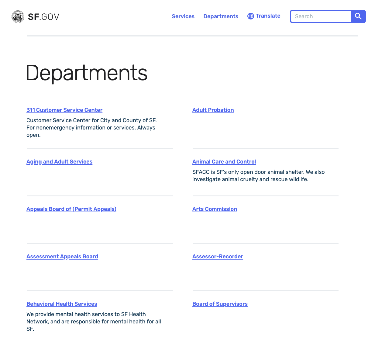
Figure 3-14. SF.gov
In the website for the University of California, Berkeley (Figure 3-15), the “Academics” page shows a list of links. When a user reaches this point in the website, they’re probably looking for a specific department or resource, not for, say, an explanation of what Berkeley is about. The whole point of this page is to move the visitor along to a page that answers a well-defined need.

Figure 3-15. The University of California, Berkeley schools and colleges menu page
The AIGA website contains many resources for design professionals. The site presents several top-level categories for those resources, as shown in the global navigation, but the landing page for each of those categories is a Menu Page (Figure 3-16). The articles are shown with thumbnail images and summary text; the rich format gives the viewer enough of a context to decide whether to invest time in clicking through to the article.
This page is intriguing enough to hook a user on its own, without featuring any particular content at all.

Figure 3-16. A Menu Page from AIGA’s website
Last, the Museum of Modern Art uses large images and small text on this version of Menu Page (Figure 3-17).
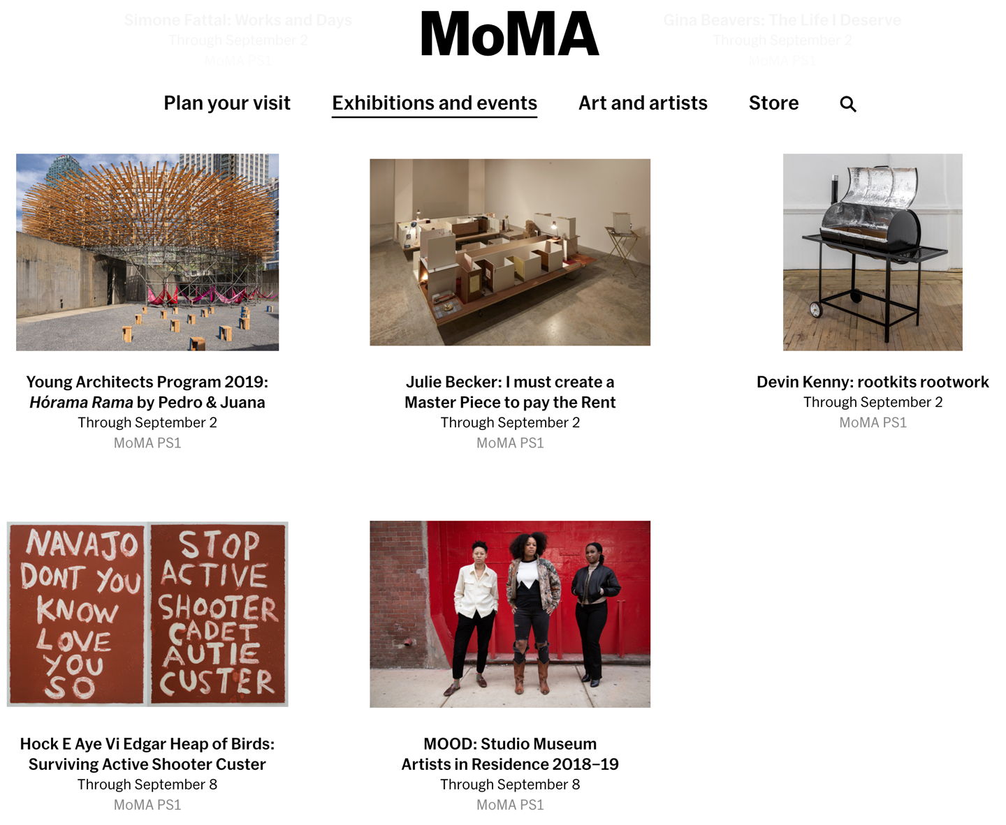
Figure 3-17. The Museum of Modern Art, New York PS1 exhibit menu page
Pyramid
What
Link together a sequence of pages with Back/Next links. Create a parent page that links to all of the pages in this sequence, and let the user view them either in sequence or out of order. Figure 3-18 presents this pattern schematically.

Figure 3-18. Pyramid schematic
Use when
The site or application contains a sequence of items that a user would normally view one after another, such as a slideshow, a wizard, chapters in a book, or a set of products. Some users would rather view them one at a time and out of order, however, and they need to be able to pick from a full list of the items.
Why
This pattern reduces the number of clicks it takes to get around. It improves navigation efficiency, and it expresses a sequential relationship among the pages.
Back/Next (or Previous/Next) links or buttons are all well and good. People know what to do with them. But a user doesn’t necessarily want to be locked into a page sequence that they can’t easily get out of: having gone seven pages in, will they need to click the Back button seven times to get back where they started? That is a recipe for frustration and low usability (lack of user control).
By putting a link back to the parent page on each sequence page, you increase the user’s options. You’ve now have three main navigation options instead of two—Back, Next, and Up. You haven’t made it much more complex, but a user who is casually browsing (or one who’s changed his mind in midstream) will need far fewer clicks to go where they want to go. It’s more convenient for users.
Likewise, chaining together a set of unconnected pages is kind to users who actually want to see all the pages. Without the Back/Next links, they would be “pogo sticking” to the parent page all the time; they might just give up and leave.
How
List all of the items or pages, in order, on the parent page. Render the list in a way that suits the types of items you’re dealing with (Chapter 7), such as a Thumbnail Grid for photos or a rich text list for articles. A click on an item or link brings the user to that item’s page.
On each item page, put Back/Next links. Many sites show a small preview of the next item, such as its title or a thumbnail. In addition, put in an Up or Cancel link to bring the user back to the parent page.
One Pyramid variation turns a static linear sequence into a loop by linking the last page back to the first without going back to the parent. This can work, but does the user know that they’ve looped all the way back around? Do they recognize the first page in the sequence? Not necessarily. If the order of a sequence is important, you should link the last page to the parent page; this signals the user that they’ve seen all there is to see.
Examples
Facebook’s photo album page is a classic Pyramid example.The album can be seen in its entirety by scrolling the page (see Figure 3-19). The images are thumbnails. Selecting a photo opens the slideshow, which is organized via the Pyramid pattern (Figure 3-20). Scroll right, scroll left, or exit to the grid again are the navigation options.

Figure 3-19. A Facebook photo album
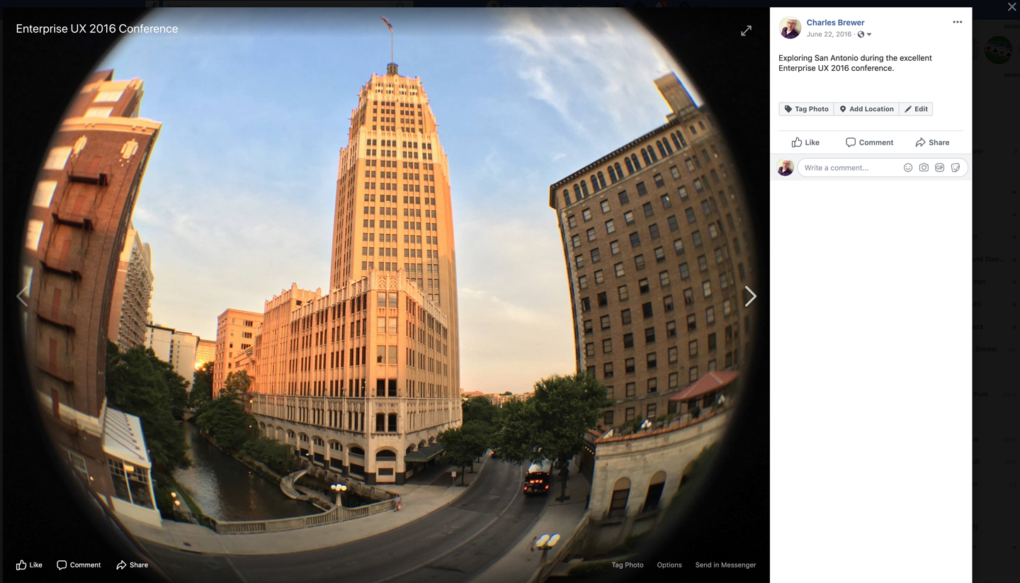
Figure 3-20. A child page from the same Facebook feature, showing Back, Next, and Close buttons near the photo
Modal Panel
What
A screen with no navigation options other than acknowledging its message, completing its form, or clicking the panel away. Modals appear on top of the current screen. Modals are usually invoked by a user action. This can be selecting something or performing some triggering action. Modal panels often show up in a “lightbox” on top of a full screen or page: The screen underneath is visible but everything except the modal is behind a gray layer and is not accessible. This is used for small, focused tasks that require the user’s full attention. Modals usually consist of one page, with no other navigation options, until the user finishes the immediate task. Figure 3-21 illustrates the schematic for the Modal Panel pattern.
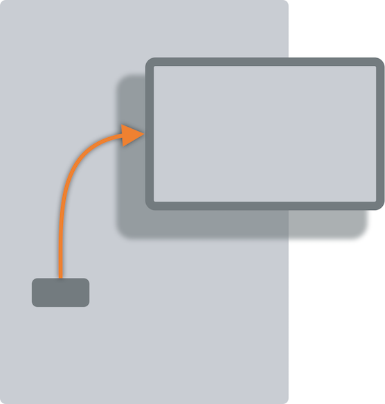
Figure 3-21. The Modal Panel schematic
Use when
Modals are great for focusing on a single action or process. They are also great for not losing context while carrying out a quick subtask or detour from a main screen or action, where you want the user to take care of a small task and then get back to the bigger task. They can also work well when the app or site has gotten into a state from which it shouldn’t or can’t proceed without input from the user. In a document-centric application, for instance, a “save” action might need the user to supply a filename if one wasn’t already given. In other contexts, the user might need to sign in before proceeding, or acknowledge an important message.
If the user simply initiates a minor action that might need further input, try to find a way to ask for that input without a modal panel. You could show a text field right below the button that the user clicked, for example, and leave it “hanging” there until the user comes back to it—there’s no need to hold up the entire site or app until that input is given. Let the user do something else and then return to the question at a later time.
Why
A modal panel cuts off all other navigation options from the user. They can’t ignore it and go somewhere else in the app or site: they must deal with it here and now. When that’s done, the user is sent back to where they were before.
It’s an easy model to understand—and to program—though it was overused in applications of past years. A modal panel is disruptive. If the user isn’t prepared to answer whatever the modal panel asks, it interrupts their workflow, possibly forcing them to make a decision about something they just don’t care about. But when used appropriately, a modal panel channels the user’s attention into the next decision that they need to make. There are no other navigation possibilities to distract the user.
How
In the same space on the screen where the user’s attention lies, place a panel, dialog box, or page that requests the needed information. It should prevent the user from bringing up other pages in that application. This panel ought to be relatively uncluttered, in keeping with the need to focus the user’s attention onto this new task with minimal distractions.
Remember that this is a navigation-related pattern. You should carefully mark and label the ways out, and there shouldn’t be many of them; one, two, or maybe three. In most cases, they are buttons with short, verbish labels, such as “Save” or “Don’t save.” There is usually a “Close” or “X” button in the upper right. Upon clicking a button, the user should be taken back to the page they came from.
The lightbox effect is a very effective visual presentation of a modal panel. By dimming most of the screen, the designer highlights the bright modal panel and focuses attention on it. (For this to work, the modal panel needs to be large enough for the user to find it effortlessly.)
Some websites use modals for sign-in and registration screens. Retail and other sites that want to prompt sign in/registration only when truly needed (to avoid interrupting the user) are commonly done this way: global and local navigation are stripped out, and all that’s left are to perform the sign-in task or exit.
Operating systems and graphical user interface (GUI) platforms usually offer OS-level modal dialog boxes. These are best used in traditional desktop applications—websites should avoid them in favor of lighter-weight overlay techniques, which are easier for the designer to control and less disruptive to the user. OS-level modals usually freeze the UI except for the modal window.
Examples
Airbnb uses a lightbox to draw attention to its login (Figure 3-22). This appears directly over the public website landing page. There are only three ways to deal with it: sign in, register, or click the familiar “X” button in the upper-left corner. This is typical of many lightbox-highlighted modal panels on the web. If Airbnb does not recognize the user’s computer (usually because they cleared cookies), the modal panel changes in place to display the two-factor authentication screen.
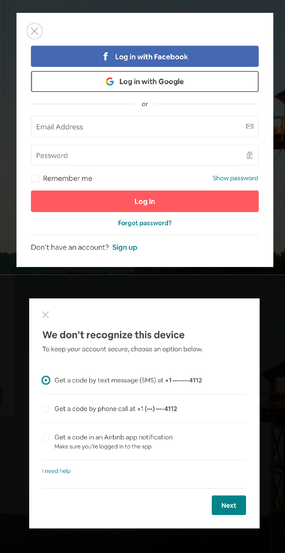
Figure 3-22. Airbnb login modal panel and security check modal panel
As mentioned earlier, retailers often delay any sign-in or register step until the last possible moment in the shopping process in order to make the purchase process as uninterrupted as possible. After the user is in the shopping cart, however, it makes sense to require them to sign in. Registered shoppers need to activate their shipping and payment details, and the retailer would like to invite new customers to become registered. B&H Photo is a good example of this pattern (Figure 3-23).

Figure 3-23. B&H checkout log in modal
Macy’s uses a modal window earlier in the shopping process (Figure 3-24). In its case, it confirms for the shopper that their selected item has been added to their shopping bag for purchase. Macy’s takes advantage of this moment to offer additional items that the shopper might be interested in.
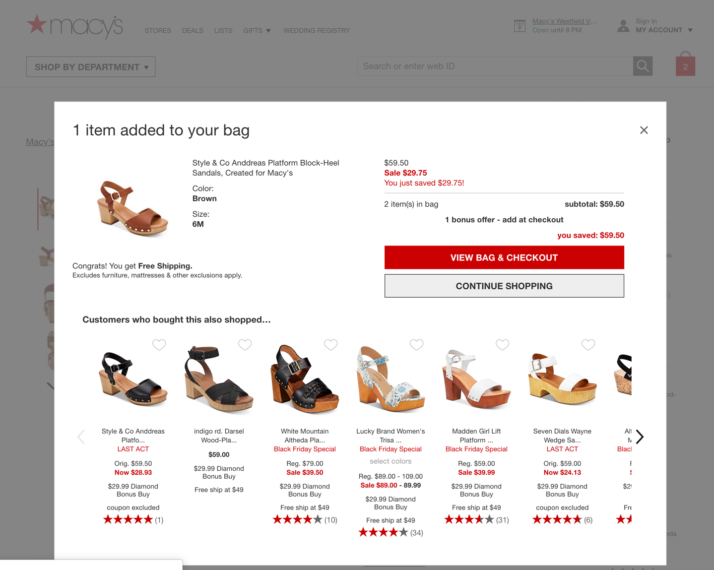
Figure 3-24. Macy’s “Put in Bag” confirmation modal
Priceline uses a modal to respond to a traveler’s lack of activity in a clever way (Figure 3-25). If the customer has searched for a flight or hotel, but doesn’t take any further action from the search results page, it’s possible they’ve switched to another task or website or have stepped away. Priceline seeks to reengage with the customer, so after a short time, this modal appears, offering to show even more recent, up-to-date results.
Figure 3-25. Priceline timeout and reengagement modal
The “shade” form of a MacOS modal dialog box draws attention to itself as it drops down from the window title bar (animated, of course). These and other application-level modal dialog boxes actually prevent the user from interacting with the rest of the application; thus, the user is forced to finish or dismiss this thread of work before doing anything else (Figure 3-26).
Figure 3-26. A modal panel in a Mac application
Deep Links
What
Capture the state of a site or app in a URL or other link that can be saved or sent to other people. When loaded, it restores the state of the app to what the user was seeing. In other words, a deep link should be a method for linking to both a location in your software and also a state, such as being signed in or resuming an incomplete process at the point where the user left off, or retaining information so that the user doesn’t need to reenter it. Such bookmarks, permalinks, and deep links are all ways for a user to conveniently navigate to a selected point or state, even if it’s deep within a navigational structure. This avoids traversing many links to get to a desired page or state. Mobile OS deep links are a particular method for allowing users to go from app to app on their mobile device without losing information or task context. Figure 3-27 shows how this works schematically.
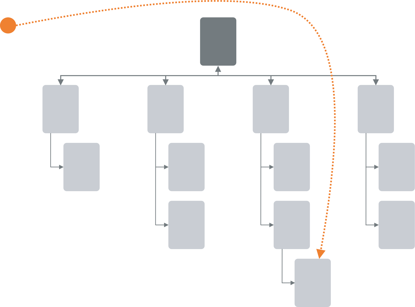
Figure 3-27. Deep Links state schematic
Use when
The site or app’s content is something specific and interactive, such as a map location and zoom level, book page, video clip, or information graphic. The deep-link sender wants to include a specific desired point or state that might be difficult to find otherwise, or it might take many steps to get there from a typical starting point. The app might have many user-settable parameters or states, such as viewing modes, scales, data layers, and so on—these can add to the complexity of finding a particular point and seeing it in the “right” way.
Why
Deep Links gives the user a way to jump directly to a desired point and application state, thus saving time and work. It behaves like a “deep link” directly into a piece of content on a conventional site—or a permalink to a blog entry—in the sense that you end up with a URL pointing directly to the desired content. But it can be more complex than a permalink, because it can capture both application state and content position.
This pattern is useful for saving a state that the user might want to recreate later, especially if they can “bookmark” it using well-known mechanisms (like browser bookmarks). It’s also handy for sharing with other people, and that’s where it really shines. A URL representing a deep-linked state can be emailed, tweeted, posted to a social network, discussed in a forum, published in a blog entry, and talked about in any number of ways. It might make a statement, or go viral, or become a “socially mediated object.”
How
Track the user’s position in the content, and put that into a URL. Track supporting data there as well—comments, data layers, markers, highlighting, and so on—so that reloading the URL will bring it all back.
Consider what other parameters or interface states you might want users to save: zoom levels, magnification, viewing modes, search results, and so on. Not all of these should necessarily be captured, because loading the deep-linked state shouldn’t trample on settings that a user doesn’t want changed. Work carefully through some usage scenarios to figure this out.
URLs are the best format for saving Deep Links: they are universally understood, portable, short, and supported by a vast variety of tools, such as bookmarking services.
As a user moves through the content and changes various parameters, immediately put the updated URL in the browser’s URL field so that it can be easily seen and ultimately copied and shared. Not everyone will think to find it there, so you might also design a “Link” feature whose existence informs the user, “Here’s how you create a link to this screen.” Some sites offer to generate a JavaScript “Embed” fragment that not only captures position and state, but also lets users embed the entire thing into another website.
Deep links in the mobile world have a specific meaning. Both iOS and Android applications can be configured so that public URLs map to corresponding “locations” in the native OS mobile application (rather than the public URL in the mobile browser). This allows any shared links to launch their associated mobile app, with its (usually) more robust controls and performance. Mobile-native applications can also pass deep links from one application to another. For example, the IMDB app might host a link to a movie trailer on a website. Instead of opening the mobile web browser, the link is passed to, say, the YouTube native app on the user’s device, which offers more control over playback and interaction.
Examples
One of the nicest features of sharing videos from YouTube is the ability to embed a starting point for the clip directly in the share link (Figure 3-28). YouTube sharing includes the ability to specify starting point in a video. Recipient’s video playback will begin here, not at the beginning of the shared video.

Figure 3-28. Sharing a YouTube video
Google Books captures a large amount of state in its URLs (Figure 3-29): the position in the book, the viewing mode (single page, two-up, thumbnails), the presence of toolbars, and even search results. It does not capture magnification level, which makes sense, because that’s a very individual setting. The URL as seen in the “Link” tool is actually redundant—the URL shown by the browser itself is exactly the same.
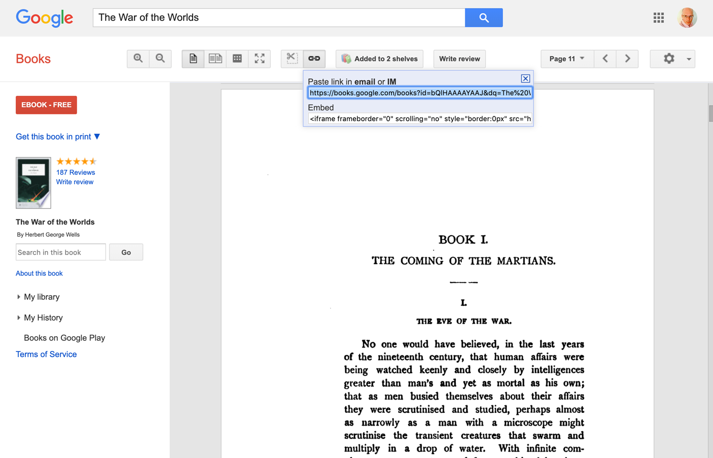
Figure 3-29. Deep-linked state in Google Books, found in two places: the browser’s URL field, and the “Link” feature
In Apple iOS, the operating system itself checks public URLs against the deep link configuration of all installed native applications. This allows a pass-off from the mobile browser so that the user can view the selected page, song, stream, or video in an installed app (Figure 3-30), and not through the mobile browser, which might offer limited functionality for the destination link. Rerouting to the device-resident app lets the user enjoy more functionality and a more robust viewing experience.
Figure 3-30. iOS; Deep linking from mobile web to mobile app
Job listings site Indeed.com has robust searching and filtering tools for job searchers. These parameters are written to the URL, allowing the search to be shared or saved for later, to trigger a refreshed search (Figure 3-31).
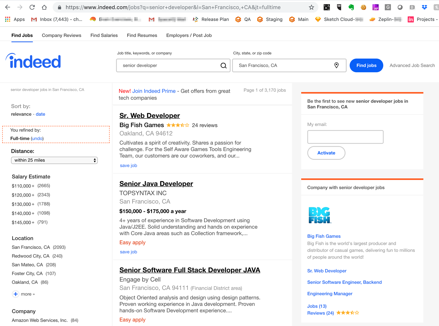
Figure 3-31. Indeed job search; parameters are written in the URL so that this search can be shared or saved
Escape Hatch
What
A well-labeled button or link that clearly gets the user out of their current screen and back to a known place. Use these on screens that have limited navigation options. Also use escape hatches for when a user is hopelessly entangled in an app, reaches an error state, or becomes deep-linked into a page that they have no context for understanding. The schematic in Figure 3-32 illustrates this concept.
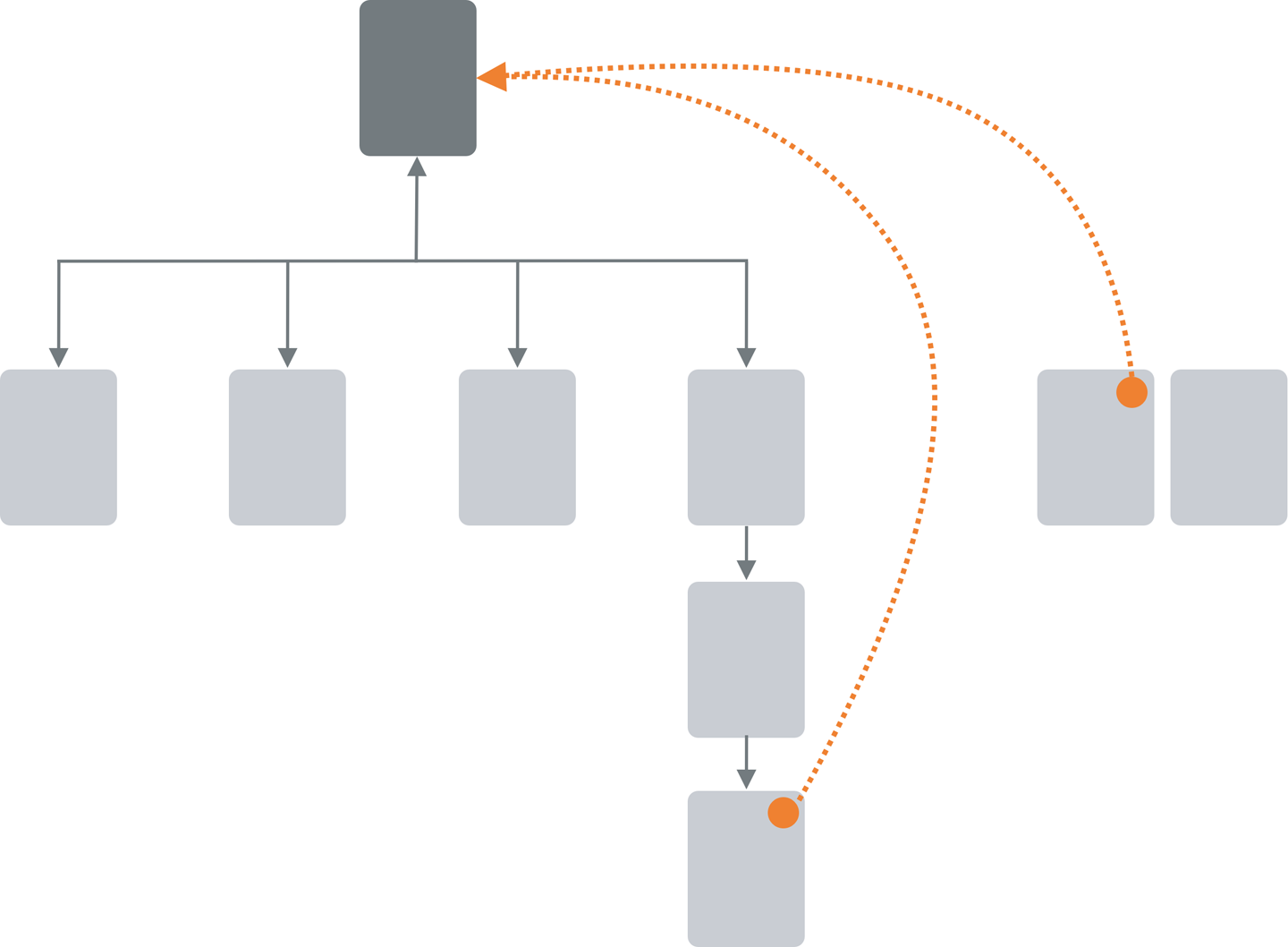
Figure 3-32. Escape Hatch schematic
Use when
You have pages that constitute some sort of serial process, such as a wizard, or any pages that lock the user into a limited navigation situation, such as a Modal Panel. These might also be pages that users can reach out of context, as they could do via search results.
There are also dead-end screens. For example, HTTP server error screens, such as for Error 404 Page Not Found (there are many of this type of error screens), are a great place to put an escape hatch.
Why
Limited navigation is one thing, but having no way out is quite another! If you give the user a simple, obvious way to escape from a page, no strings attached, they’re less likely to feel trapped there. It also prevents people from bailing out completely by closing the application completely.
This is the kind of feature that helps people feel like they can safely explore an app or site. It’s sort of like an undo feature—it encourages people to go down paths without feeling like they’re committing to them. (See the Safe Exploration pattern in Chapter 1.)
Now, if these are pages that users can reach via search results, it’s doubly important that escape hatches be put on each page. Visitors can click these to get to a “normal” page that tells them more about where they actually are.
How
Put a button or link on the page that brings the user back to a “safe place.” This might be a home page, a hub page in a hub-and-spoke design, or any page with full navigation and something self-explanatory on it. Exactly what it links to will depend upon the application’s design.
Examples
Websites often use clickable site logos as home-page links, usually in the upper left of a page. These provide an Escape Hatch in a familiar place while helping with branding.
In some dialogs, a Cancel button or the equivalent can serve this purpose. These also let the user say, “I’m done with this; forget I ever started it.”
Have you ever called a company—for instance, your bank—and had to work your way through a set of phone menus? They can be long, confusing, and time-consuming. If you find yourself in the wrong menu, you might just hang up and try again from the top. But many phone menu systems have a hidden Escape Hatch that they don’t tell you about: if you dial “0” at any point, you might be connected to a human operator. Many customers go directly to this hidden shortcut.
Many websites have certain pages that limit navigation options, such as Modal Panel and pages without global navigation. The LinkedIn Settings screen is one example. This section of LinkedIn is separate from the main web application. The global navigation is not present. If a user finds themselves here, there are two ways to get back, through two escape hatches. The first is the LinkedIn logo to go back to the home page. The second is a “Go Back to LinkedIn.com” link with the member’s own profile picture (see Figure 3-33).

Figure 3-33. The LinkedIn Settings page, with link and avatar in the upper right as an escape hatch back to LinkedIn
Helping browsers recover from dead ends is a good use of escape hatches, too. Curbed.com’s website offers an escape hatch on its 404 Not found error screens. In the copy is a link to jump to the home page (Figure 3-34). Curbed also offers system status messaging, so if the Curbed website is actually not active, the user would know that.

Figure 3-34. Curbed.com 404 error page with an escape hatch to the home page
Fat Menus
What
Display a long list of navigation options in drop-down or fly-out menus. Also called “mega-menus.” Use these to show all of the subpages in site sections. Organize them with care, using well-chosen categories or a natural sorting order, and spread them out horizontally. You can find an example of this pattern in the “All Microsoft” fat menu on Microsoft.com (Figure 3-35).
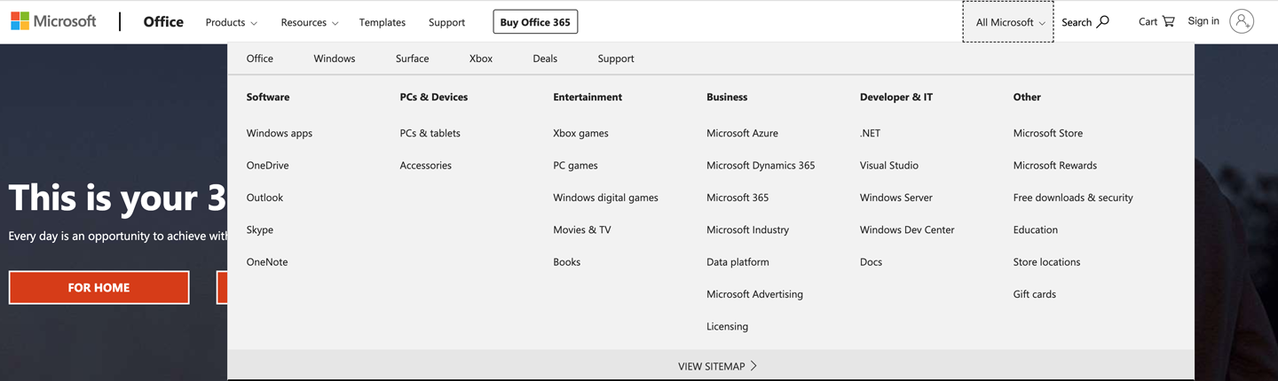
Figure 3-35. Microsoft’s All Microsoft menu
Use when
The site or app has many pages in many categories, possibly in a hierarchy with three or more levels. You want to expose most of these pages to people casually exploring the site, so they can see what’s available. Your users are comfortable with drop-down menus (click to see them) or fly-outs (hover over them with the pointer).
Why
Fat Menus makes a complex site more discoverable. They expose many more navigation options to visitors than they might otherwise find.
By showing so many links on every page, you make it possible for a user to jump directly from any subpage to any other subpage (for most subpages, anyhow). You thus turn a multilevel site—where subpages aren’t linked to the subpages in other site sections—into a fully connected site (Figure 3-35).
Fat Menus are a form of progressive disclosure, an important concept in UI design. Complexity is hidden until the user asks to see it. A visitor to a site that uses these can look over the menu headings to get a high-level idea of what’s there, and when that user is ready to dive in, they can open up a Fat Menu with a gesture. The user isn’t shown millions of subpages before they’re ready to deal with them.
If you’re already using menus in your global navigation, you might consider expanding them to Fat Menus if showing more links makes the content more attractive to casual browsers. People won’t need to drill down into categories and subcategories of your site hierarchy in order to discover interesting pages—they’ll see them there, right up front.
How
On each menu, present a well-organized list of links. Arrange them into Titled Sections (Chapter 4) if they fit into subcategories; if not, use a sorting order that suits the nature of the content, such as an alphabetical or time-based list.
Use headers, dividers, generous whitespace, modest graphic elements, and whatever else you need to visually organize those links. And take advantage of horizontal space—you can spread the menu across the entire page if you want. Many sites make excellent use of multiple columns to present categories. If you make the menu too tall, it might go right off the end of the browser page.
The best sites have Fat Menus that work stylistically with the rest of the site. Design them to fit well into the color scheme, grid, and so on of the page.
Some menu implementations don’t work well with accessibility technology such as screen readers. Ensure that your Fat Menus can work with these. If they can’t, consider switching to a more static strategy, such as a Sitemap Footer.
You can adapt Fat Menus for mobile screens if necessary. In that case, you should linearize the columnar layout left to right. That is, the menu is reordered into a single column, with the sections stacked vertically. It’s best not to insert this much navigation content into every mobile screen. Instead, consider making this a reference navigation screen that is accessed through a separate mobile navigation scheme.
Examples
Macy’s, like most big retailers, has a vast inventory with many categories of items for sale. Browsing and finding a specific category or item of interest can be challenging in these cases. Well-designed fat menus can be a useful solution. Macy’s uses a two-part fat menu (Figure 3-36). The shopper first opens the top-level fat menu with the level-one major categories. When they select one of these, a second panel opens that covers the page. A huge amount of level-2 categories are displayed in this second panel.
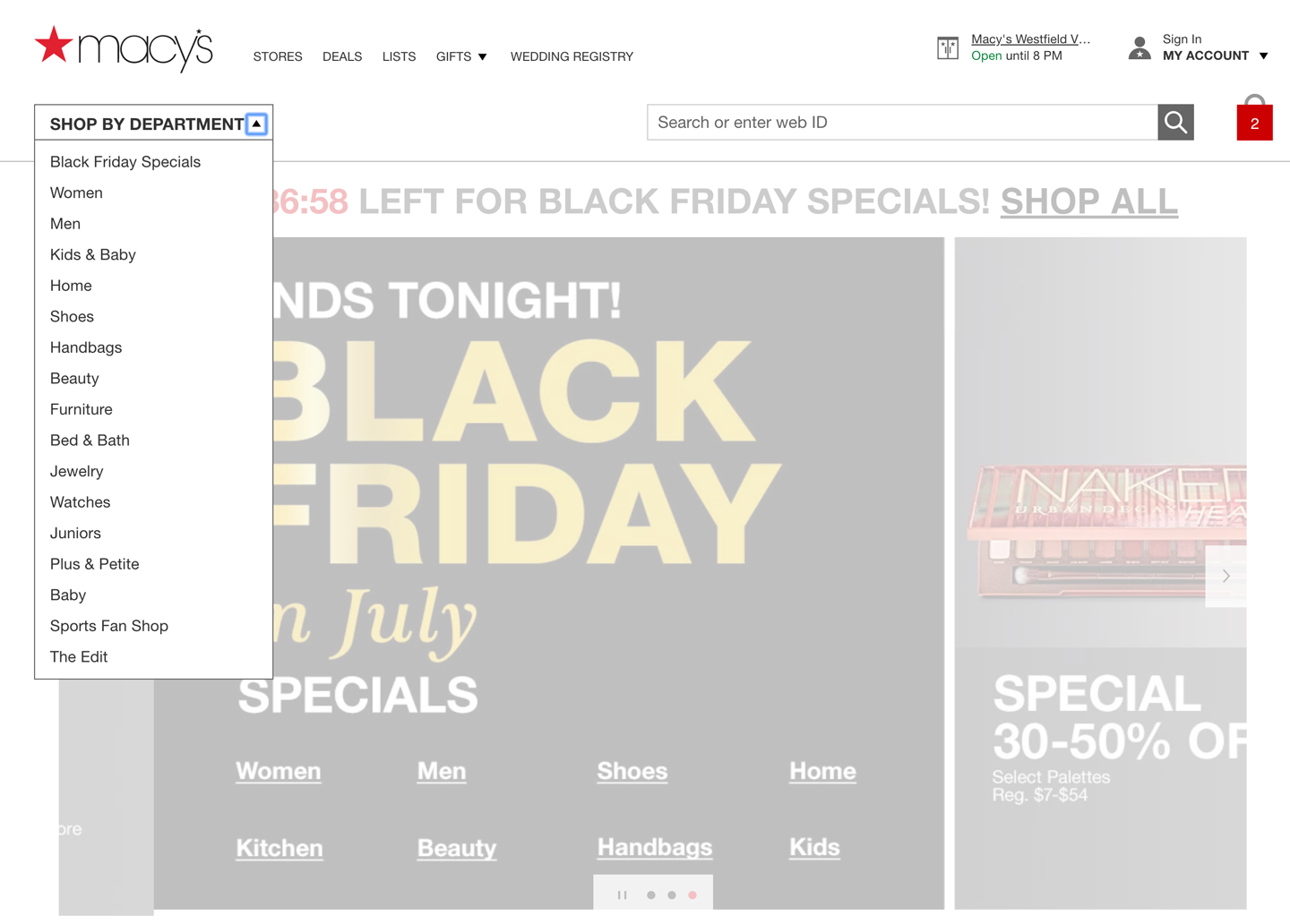

Figure 3-36. The Macy’s two-level fat menu with progressive disclosure
The Fat Menus on the Starbucks website are very well designed (Figure 3-37). Each menu is a different height but the same width and follows a strict common page grid (they’re all laid out the same way). The style blends in with the site, and the generous negative space makes it easy to read. Product promotions are worked into the design, but not obnoxiously.


Figure 3-37. Starbucks coffee menu
As shown in Figure 3-38, Mashable’s fat menus use a hybrid approach. The text menus are off to the left and deemphasized. It takes full advantage of the horizontal space to show featured articles. This is clever—the knowledgeable user can skim a large number of headlines by rolling over the menus.

Figure 3-38. Mashable’s Science menu
The American Red Cross uses Fat Menus liberally (Figure 3-39). When the user rolls over any top-level menu item, the resultant Fat Menus cover up the top portion of the screen. There is good organization and presentation of topics and links, making this large website structure easily comprehensible. The sections in each Fat Menu are organized by most likely questions or use cases.

Figure 3-39. The American Red Cross menu
WebMD uses an alphabetical sorting order for its list of health topics (Figure 3-40). There is direct access to information on most common conditions, a long list of additional resources, and room for two promoted stories with graphics. The likelihood that the site visitor can find the link they’re looking for—and continue to engage—is high.
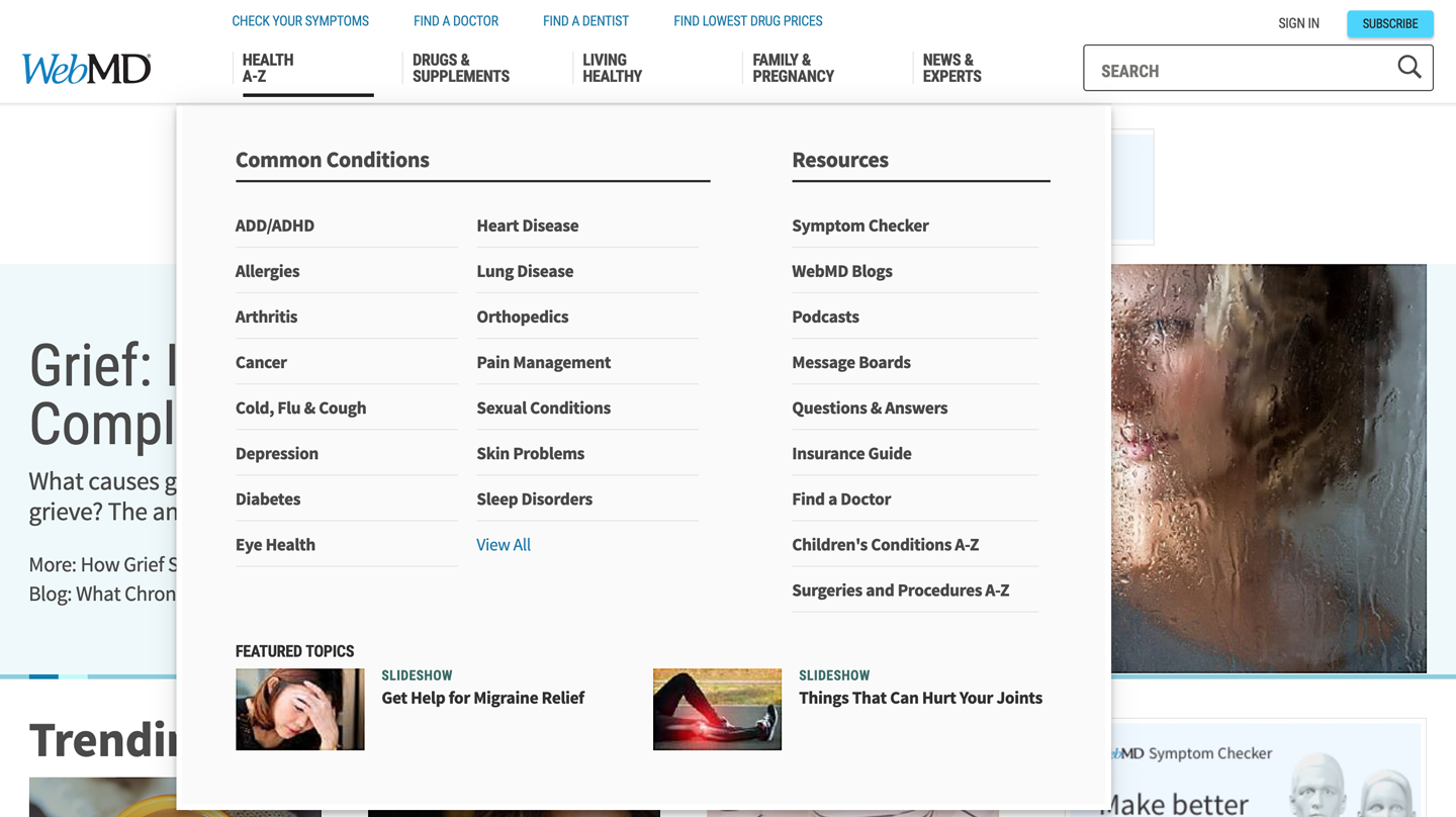
Figure 3-40. WebMD’s Health A–Z menu
Sitemap Footer
What
A comprehensive directory of links, organized into categories, that provides an at-a-glance review of the full scope of the website, and links to all major sections and pages (Figure 3-41). In other words, the sitemap footer is an index to the website, and could also be a directory to other sites and resources. What is unique about the footer location is that there are no vertical space restrictions, unlike Fat Menus at the top of the screen.
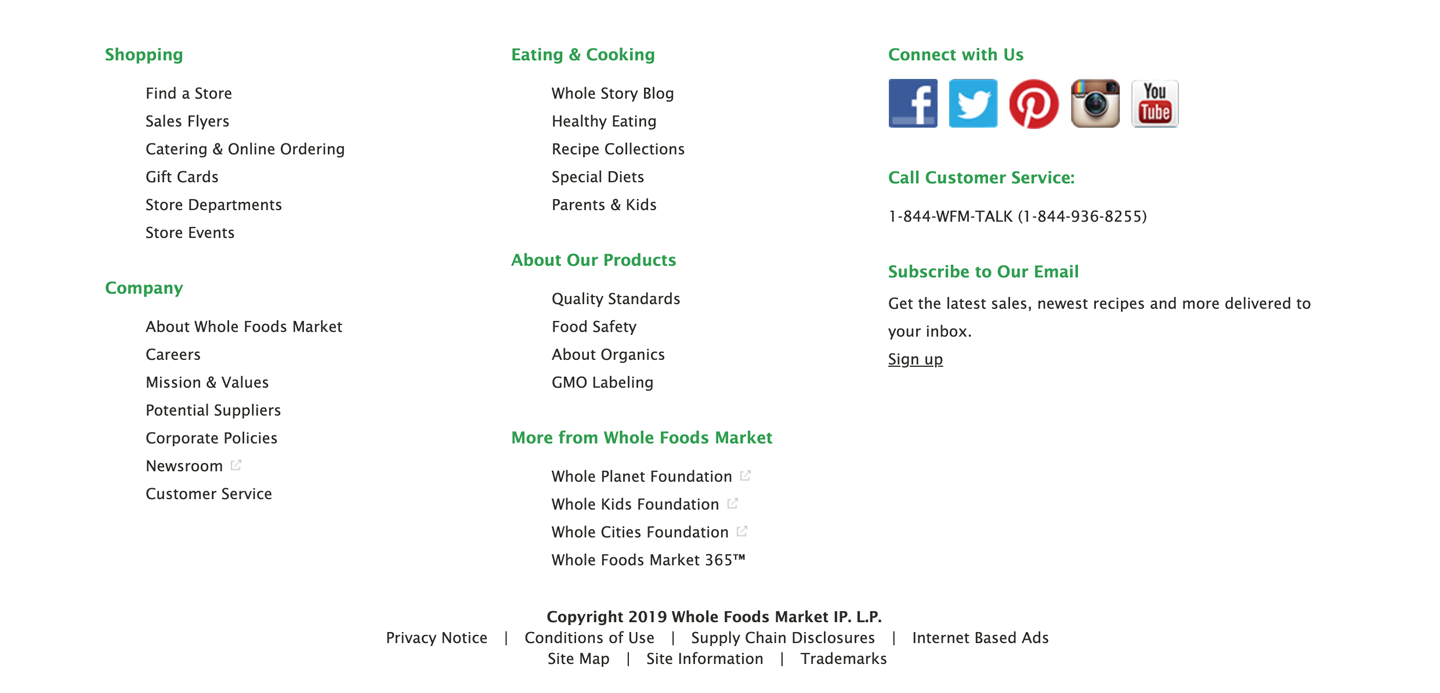
Figure 3-41. Whole Foods footer
Use when
The site you’re designing uses a generous amount of space on each page and you don’t have severe constraints on page size or download time. You don’t want to take up too much header or sidebar space with navigation.
The site has more than a handful of pages, but not an outrageously large number of categories and “important” pages (things that users will look for). You can fit a reasonably complete site map—at least for pages that aren’t in the header—into a strip no taller than about half of a browser window.
There might be a global navigation menu in the page header, but it doesn’t show all levels in the site hierarchy—maybe it shows only the top-level categories. You prefer a simple, well-laid-out footer instead of Fat Menus, perhaps because of implementation ease or accessibility issues.
Why
Sitemap Footer make a complex site more discoverable. The pattern exposes many more navigation options to visitors than they might otherwise have.
By showing so many links on every page, you make it possible for a user to jump directly from any subpage to any other subpage (or major page, anyhow). You thus turn a multilevel site—where subpages aren’t linked to the subpages in other site sections—into a fully connected site. The footer is where the user’s attention lands when they read to the end of a page. By placing interesting links there, you entice the user to stay on the site and read more.
Finally, showing users the entire site map gives them a strong sense of how the site is constructed and where they might find relevant features. In complex sites, that could be valuable.
You might find yourself trying to choose between a Sitemap Footer design and a Fat Menus design. In conventional websites, a Sitemap Footer would be easier to implement and debug because it doesn’t depend on anything dynamic: instead of showing fly-out menus when the user rolls over items or clicks them, a Sitemap Footer is just a set of static links. It’s also easier to use with screen readers and it doesn’t require fine pointer control, so it wins on accessibility, as well.
On the other hand, the footer might be ignored by busy or casual users who focus only on the page content and the headers. Usability-test if you have any doubts, and watch the click metrics to see if anyone even uses the Sitemap Footer.
How
Design a page-wide footer that contains the site’s major sections (categories) and their most important subpages. Include utility navigation and tools such as language choice, along with other typical footer information such as copyright and privacy statements.
This might constitute a complete site map for your site, or it might not. The idea is to cover most of what visitors need to find without overloading the header or sidebar navigation. Place a site map into the footer of every page on a site. Treat it as part of the global navigation, complementary to the header.
In practice, what often happens is that the global navigation options at the top of the page reflect a more task-oriented design—it tries to answer visitors’ immediate questions regarding “What is this about?” and “Where do I find X right this second?” Meanwhile, the Sitemap Footer shows the complete, permanent information architecture of the site itself. This two-part arrangement appears to work well.
If your site deals with content that itself requires complex navigation—such as a large set of products, news articles, music, videos, books, and so on—you could use the top of the page for content navigation and the Sitemap Footer for almost everything else.
Here are some features that you can find found in Sitemap Footer:
-
Major content categories
-
Information about the site or organization
-
Corporate information, Contact Us, and Careers links
-
Partner or sister sites; for example, sites or brands owned by the same company
-
Community links such as forums
-
Help and support
-
Contact information
-
Current promotions
-
Donation or volunteer information, for nonprofits
Examples
REI’s website demonstrates the difference between task-oriented top-of-page global navigation and an effective Sitemap Footer (Figure 3-42). Shopping, learning, and travel dominate the header, as they should—these are what most site visitors come for. The footer handles secondary tasks that are nevertheless important: Corporate “about” information, customer support, membership, and so on.
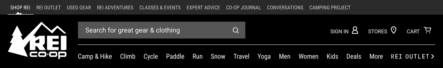
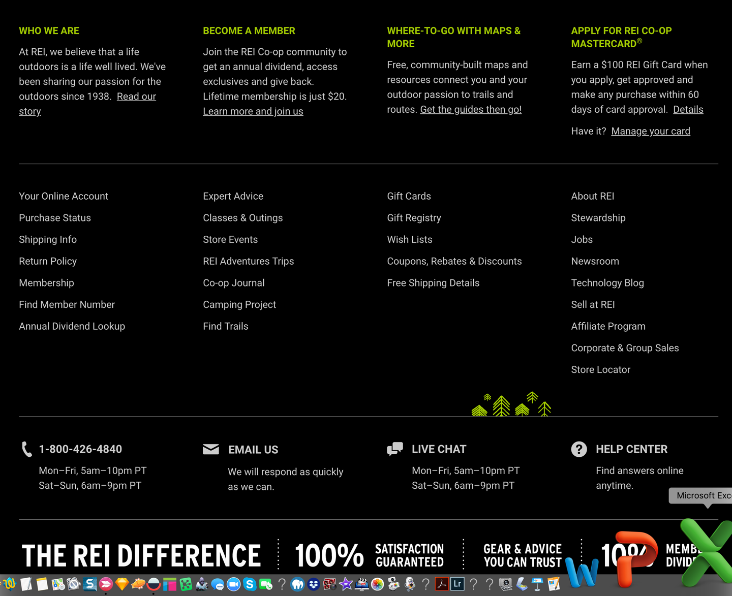
Figure 3-42. REI header and footer
The Los Angeles Times header and footer shows a similar approach, but for a big publisher. The header menu is organized by the major topics of interest to the news consumer. It maps closely to a traditional newspaper section structure. The footer is different: it’s organized around corporate information and links, and secondary audiences such as advertisers and job seekers (Figure 3-43).


Figure 3-43. Los Angeles Times header and footer
The Wall Street Journal takes a similar approach in its header and footer (Figure 3-44). There is a robust news topics structure in the header. The footer is dedicated mostly to the business: membership, customer service, and other businesses in the Dow Jones & Company organization. There is additional consumer content featured in the Tools section.
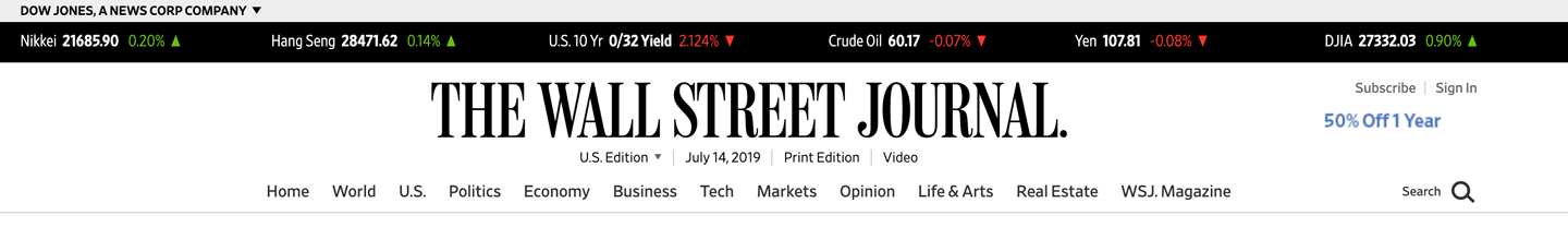

Figure 3-44. Wall Street Journal footer
The New York Times does not follow this pattern in its footer. It uses this space to offer an expanded view into the information hierarchy of the new content. It’s a bigger index that backs up the header navigation (Figure 3-45). There are links to the corporate organization, but they are strongly deemphasized at the very bottom.

Figure 3-45. New York Times footer
Salesforce uses its sitemap footer to recap the three main areas that it expects visitors and customers to be interested in (Figure 3-46). There is a set of links that showcases the company’s products, and why customers should care. A second set offers links to the usual corporate information, careers, and investors information. The third is to important related content, such as the company’s third-party application marketplace and its annual conference.
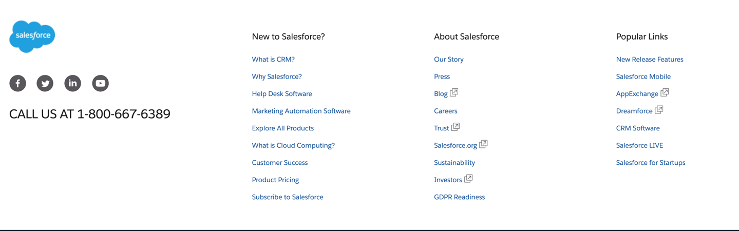
Figure 3-46. Salesforce footer
Sign-In Tools
Use when
Sign-In Tools are useful for any site or service for which users often sign in.
Why
This pattern is purely convention; the upper-right corner is where many people expect such tools to be, so they will often look there. Give users a successful experience by putting these tools where they expect them to be.
How
Reserve space near the upper-right corner of each page for Sign-In Tools. Place the user’s sign-in name there first (and possibly a small version of their avatar, if it exists), unless the name and avatar are already present elsewhere on the page. Make sure each tool works exactly the same on every page in the site or app.
Cluster together tools such as the following:
-
Sign-out button or link (this is important, so make sure it’s here)
-
Account settings
-
Profile settings
-
Site help
-
Customer service
-
Shopping cart
-
Personal messages or other notifications
-
A link to personal collections of items (e.g., image sets, favorites, or wish lists)
-
Home
Don’t make this space too large or loud, lest it dominate the page—it shouldn’t. This is utility navigation; it’s there when a user needs it, but is otherwise “invisible” (well, not literally). For some items, you can use small icons instead of text—shopping carts, messages, and help all have standard visuals you can use, for instance. See the examples in this pattern for some of them.
The site Search box is often placed near the Sign-In Tools, although it needs to be in a consistent spot regardless of whether anyone is signed in.
When no user is signed in, this area of the page can be used for a sign-in box—name, password, call to action, and possibly tools for retrieval of forgotten passwords.
Examples
Following are some examples of Sign-In Tools from Airbnb (Figure 3-47), Google (Figure 3-48), and Twitter (Figure 3-49). These are visually unobtrusive but findable simply because they’re in the correct corner of the page or window. Airbnb surfaces a set of links that relate to membership and signing in: becoming a host, upcoming trips, saved searches in addition to the member sign-in tools drop-down menu. Google and Twitter hide the sign-in tools completely in a drop-down menu. Only the user’s profile picture displays as the access by default.

Figure 3-47. Airbnb sign-in tools
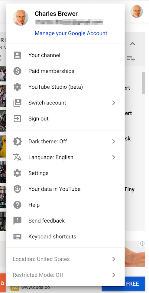
Figure 3-48. Google sign-in tools

Figure 3-49. Twitter sign-in tools
Progress Indicator
What
On each page in a sequence, show a map of all the pages in order to show steps in a process, including a “You are here” indicator. Retailer Menlo Club (Figure 3-50) uses a progress indicator in its check-out process.

Figure 3-50. Menlo Club checkout progress indicator.
Use when
You design a written narrative, a process flow, a Wizard, or anything else through which a user progresses page by page. The user’s path is mainly linear.
If the navigation topology is large and hierarchical (as opposed to linear) you might want to consider using Breadcrumbs instead. If you have a large number of steps or items and their order doesn’t matter much, this morphs into a Two-Panel Selector (Chapter 7).
Why
Progress Indicators indicate to a user how far they’ve come through a series of steps—and, more important, how far they have yet to go before the process is finished. Knowing this helps them decide whether to continue, estimate how long it will take, and stay oriented.
Progress Indicators also serve as navigational devices. If someone wants to go back to a previously completed step, they can do so by clicking that step in the map of steps.
How
Near an edge of the page, place a small map of the pages in the sequence. Make it one line or column if you can, to keep it from competing visually with the actual page content. Give the current page’s indicator some special treatment such as making it lighter or darker than the others; do something similar with the already-visited pages.
For the user’s convenience, you might want to put the map near or next to the main navigation controls, usually Back and Next buttons.
How should you label each page’s indicator on the map? If the pages or steps are numbered, use the numbers—they’re short and easy to understand. But you should also put the page titles in the map. (Keep the titles short, so the map can accommodate them.) This gives the user enough information to know which pages to go back to and anticipate what information they’ll need in upcoming pages.
Examples
The slideshow shown in Figure 3-51 has a simple Progress Indicator at the bottom. It’s a simple page count, with the current page indicated. The user cannot use it to actually move through the sequence. Users would need to use the Previous and Next arrow buttons on the sides.

Figure 3-51. National Geographic Kids slideshow with page number progress indicator (center bottom)
The Vanity Fair slideshow also uses a static page numbering progress indicator (Figure 3-52). The indicator itself does not trigger navigation.
Figure 3-52. Vanity Fair’s slide show with page number progress indicator
The Mini Cooper product configurator (Figure 3-53) shows a full-featured progress indicator that lets the user move back and forth at will, but organizes the pages in a sequence. The Progress Indicator at the top is a critical control for “playing” with the app, for moving among the various pages, and exploring different options.
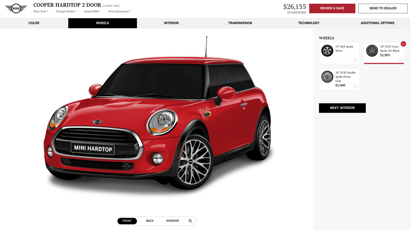
Figure 3-53. Mini Cooper product configurator, with sequence map across the top
Ecommerce check-out processes usually have a few, defined steps. The one for B&H Photo (Figure 3-54) has a typical Progress Indicator at the top. Its steps are disabled when the user hasn’t completed the required earlier step.

Figure 3-54. B&H checkout with progress indicator
Breadcrumbs
What
Breadcrumbs refers to a specific type of navigation that shows the path from the starting screen down through the navigational hierarchy, the content architecture of the site, to the selected screen. The Breadcrumbs navigation pattern can be thought of as a series of parent—child links that show the drilldown into the information architecture of the site. The breadcrumbs show where in the content hierarchy the current screen is. Target (Figure 3-55) shows a common use of breadcrumbs on sites with large product directories.
Figure 3-55. Target breadcrumbs
Use when
Your application or site has a hierarchical structure with two or more levels. Users move around via direct navigation, browsing, filtering, searching within the site, or deep-linking into it from elsewhere. Global navigation alone isn’t sufficient to show a “You are here” signpost, because the hierarchy is too deep or large.
Alternatively, your site or app might have a set of browsing and filtering tools for a large dataset, such as products being sold online. The products are categorized in a hierarchy, but that categorization doesn’t necessarily match the way people will look for those products.
Why
Breadcrumbs show each level of hierarchy leading to the current page, from the top of the application all the way down. In a sense, they show a single linear “slice” of the overall map of the site or app.
So, like a Progress Indicator, Breadcrumbs help a user to pinpoint where they are. This is especially handy if they’ve jumped abruptly to somewhere deep in the tree, as they would by following search results or a faceted browsing tool. Unlike a Progress Indicator, though, Breadcrumbs don’t indicate to the user where they’re headed next. They deal only with the present.
Some texts tell you that Breadcrumbs—so named for the Hansel and Gretel story, in which Hansel drops breadcrumbs on a forest trail to mark their way home—are most useful for telling the user how they got to where he is from the top of the site or app. But that’s only true if the user has drilled straight down from the top, with no sidetracking, or following other branches, or dead-ends, or searching, or linking directly from other pages…not likely.
Instead, Breadcrumbs are best for telling you where you are relative to the rest of the app or site—it’s about context, not just history. Look at the Target example in Figure 3-55. Faceted browsing—searching for items with certain characteristics—brought me to this page deep in the Target website. (A keyword search could have done the same.) But now that I’m here, I can see where I am in the product hierarchy and I know what else I can look at. I can use the Breadcrumbs to look at all of Target’s stand mixers and do some comparison shopping.
Finally, Breadcrumbs are usually clickable links or buttons. This turns them into a navigational device in their own right.
How
On each page that is below a certain level in the navigational hierarchy—that is, it is deep in the content or screen or page architecture—show a list of all the parent pages, up to the main or home page. The goal is to see the parent-child relationships or what the “drill down” path is to get to the currently selected screen. Near the top of the page, put a line of text or icons indicating the current level of hierarchy. Start with the top level; to its right, put the next level and so on down to the current page. Between the levels, put a graphic or text character to indicate the parent—child relationship between them. This is usually a right-pointing arrow, triangle, greater-than sign (>), slash (/), or right angle quotes (»).
The labels for each page should be the page titles. Users should recognize them if they’ve been to those pages already; if not, the titles should at least be self-explanatory enough to tell the user what those pages are about. The labels should be links to those pages.
Some Breadcrumbs show the current page as the last item in the chain; some don’t. If yours do, make them visually different from the rest of the items because they’re not links.
Examples
Samsung makes extensive use of Breadcrumbs, especially in its content-dense customer support area of the website. Figure 3-56 shows two uses of breadcrumbs. One is in the expected position in the upper left, just above the central image. It shows where we are in the product support hierarchy. Down below in the main content area, there is a step-by-step “Find your TV” widget that helps the customer narrow in on their specific television. On the left we can see a smaller breadcrumb that plays back where the user is in the product hierarchy.

Figure 3-56. Samsung TV support; showing breadcrumbs twice
B&H Photo uses a large, prominent breadcrumb component to help the customer see where they are and where they have navigated to in this huge online catalog of products (Figure 3-57).

Figure 3-57. Breadcrumbs on the B&H site
Figure 3-58 shows an example of Breadcrumbs used outside a “page” context. The Chrome developer tools, among many other such tools for software developers, provide a way for users to manage very deep hierarchical structures (in this case, the Document Object Model and nested structural tags in an HTML page). Breadcrumbs are invaluable here for letting the you keep track of where you are in that code structure.
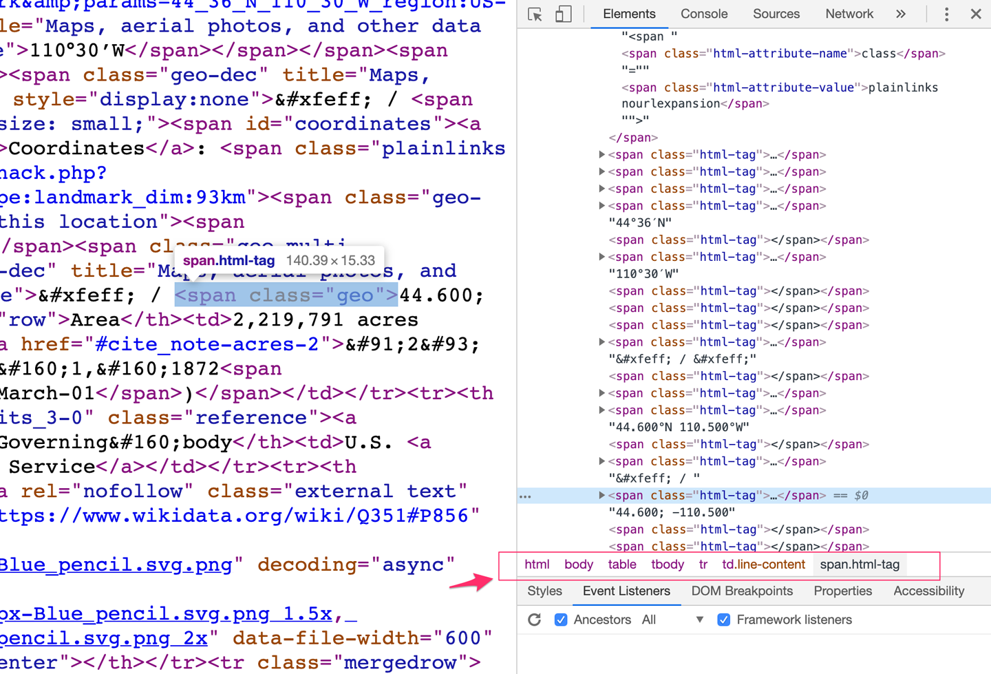
Figure 3-58. Chrome developer tools
Annotated Scroll Bar
What
An addition to ordinary scroll bar functionality so that it serves as a notification or as a map of the content in the current document or screen, or as a “You are here” indicator. In the example from Google Docs (Figure 3-59), the pop-up panel attached to the scroll grab bar lets the user see where they are in a multipage document.
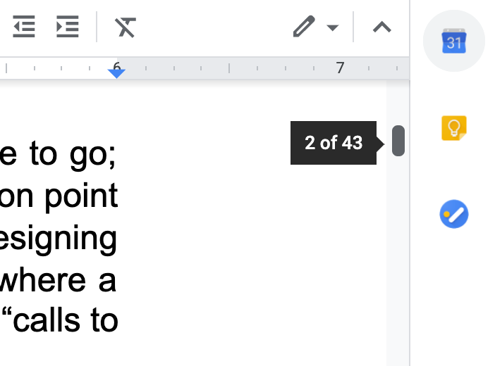
Figure 3-59. Google Docs scroll bar showing page numbers
Use when
You’re designing a document- or data-centric application. Users will scan this document or graphic for items of note such as specific page numbers or section or chapter titles, or alerts. This can be helpful if your users have trouble keeping track of where they are and where to go next as they scroll.
Why
Even though the user remains within one navigational space as they scroll through the content, signposts are still useful. When scrolling quickly, it’s really difficult to read the text flying by (or impossible, if the screen can’t refresh quickly enough), so some other indicator of position is necessary. Even if they stop briefly, the part of the document that they can see might not contain anything by which they can orient themselves, like headers.
Why a scroll bar? Because that’s where the user’s attention is focused. If you put signposts there, the user will see them and use them as they scroll, rather than trying to look at two different screen areas at once. You can put signposts close to the scroll bar and still get the same effect; the closer, the better.
When the scroll bar shows indicators in the scroll bar track itself, you get something that behaves just like a one-dimensional Overview Plus Detail (Chapter 9). The track is the overview; the scrolled window is the detail.
How
Put a position indicator on or near the scroll bar. Either static or dynamic indicators might work—dynamic indicators change as the user scrolls (Figure 3-59). Static indicators are those that don’t change from second to second, such as blocks of color in the scroll bar track (see the DiffMerge screenshot in Figure 3-60). Make sure their purpose is clear, though; such things can baffle users who aren’t used to seeing graphics in the scroll bar track.
Dynamic indicators change as the user scrolls, and they are often implemented as tool tips. As the scroll position changes, the tool tip shown next to the scroll thumb changes to show information about the content there. This will vary with the nature of the application. Microsoft Word, for instance, puts page numbers and headers in these tool tips.
In either case, you’ll need to learn what a user will most likely be looking for and thus what you need to put into the annotations. The content structure is a good starting point. If the content is code, you might show the name of the current function or method; if it’s a spreadsheet, show the row number, and so on. Also consider whether the user is currently performing a search—the scroll bar annotation should show where the search results are in the document.
Examples
The DiffMerge application shown in Figure 3-60 visually highlights the differences between two versions of a text file: differing sections are marked in red, and the corresponding section of the scroll bar is highlighted in blue. The scroll bar serves as an overall map, thus making large numbers of file “diffs” easier to comprehend.

Figure 3-60. DiffMerge
Chrome annotates its scroll bar with search results (Figure 3-61). When you search for a word on a web page, Chrome highlights the found words on the page with yellow, and places a yellow indicator in the scroll bar wherever they are found. This way, the user can scroll directly to those points in the document.
In this example, the two instances of the “Find” search word are highighted in the text. In the scroll bar on the right, notice the small hash marks running top to bottom. The search matches are indicated as the first two yellow bars in this list. We can see that there are many more “Find” matches down in the rest of the article because we see many more yellow hash mark displayed down the scroll bar.
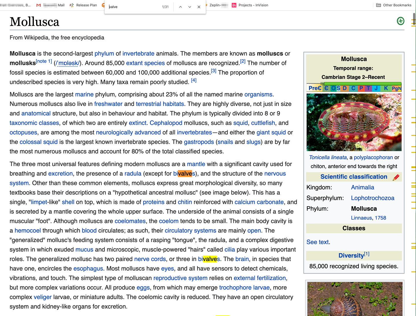
Figure 3-61. Chrome “Find” results
Animated Transition
Use when
Interface animations are very popular and common in mobile applications. They are almost a standard for quality interactions on mobile. Some folder, window, and scrolling animations are part of the mobile OS itself. Above and beyond this, when you want to add a clear visual confirmation that a user’s input was received, such as a tap on a button or that an action is in progress (such as “screen loading”), or when you simply want to brand your application experience, consider using animations.
Users might need to move through a large virtual space, such as an image or map. They might be able to zoom in to varying degrees, pan or scroll, or rotate the entire thing. This is especially useful for information graphics, such as maps and plots.
Alternatively, the interface might have sections that can be closed and opened again, either by the system or by the user—such as trees with closable parent nodes, standalone windows that open and close, or an interface built with open/close panels. You also might use Animated Transition when users jump from one separate page to another.
Animated transitions can also give the user a sense for where the file or object is located in the interface itself—for example, where a launcher icon might be in the macOS launch bar.
Why
All of these transformations can disrupt a user’s sense of where they are in the virtual space. Zooming in and out, for instance, can throw off a user’s spatial sense when it’s done instantaneously, as can rotation and the closing of entire sections that prompts a relayout of the screen. Even scrolling down a long page of text, when it’s jumpy, can slow down the reader.
But when the shift from one state to another is visually continuous, it’s not so bad. In other words, you can animate the transition between states so that it looks smooth, not discontinuous. This helps keep the user oriented. We can guess that it works because it more closely resembles physical reality—when was the last time you instantly jumped from the ground to 20 feet in the air? Less fancifully, an animated transition gives the user’s eyes a chance to track a location while the view changes rather than trying to find the location again after an abrupt change.
It can also give useful UI control and navigation feedback. In Figure 3-62, we see two animations that Apple’s macOS uses extensively. The first is rollover magnification of icons in the “dock.” This actually helps users understand which icon their mouse is above as they swipe back and forth. The second is the page open/close zoom effect. The document window animates to its parent app icon in the dock, helping the user remember where they have put it away.

Figure 3-62. macOS dock magnification and app window transition
When done well, Animated Transition bolsters your application’s perception of quality, speed, and liveliness.
How
For each type of transformation that you use in your interface, design a short animation that “connects” the first state with the second state. For zoom and rotate, you might show the in-between zoom or rotate levels; for a closing panel, you might show it shrinking while the other panels expand to take up the space it leaves behind. To whatever extent possible, make it look like something physical is happening.
But this pattern is a double-edged sword. Beware of making the user motion sick! The animations should be quick and precise, with little or no lag time between the user’s initiating gesture and the beginning of the animation. Limit it to the affected part of the screen; don’t animate the entire window. And keep it short. Research shows that 300 milliseconds might be ideal for smooth scrolling. Test it with your users to see what’s tolerable.
If the user issues multiple actions in quick succession, such as pressing the down arrow key many times to scroll, combine them into one animated action. Otherwise, the user might sit there through several seconds’ worth of animation as the punishment for pressing the down arrow key 10 times. Again: keep it quick and responsive.
Some of the types of transitions to consider include the following:
-
Brighten and dim
-
Expand and collapse
-
Fade in, fade out, and cross-fade
-
Slide
-
Spotlight
Examples
Tesla (Figure 3-63) uses a simple zoom in the initial load of its website. The user can see the three Tesla models in overview, and then the image zooms in on the Model 3. In this case, the zoom in is purely an attention-focusing flourish. The user can’t actually control the zoom in. However, the user can pan left and right to select the other Tesla models. This panning action is smoothly animated.


Prezi presentation software makes extensive use of zooming and panning views to create unique and flowing presentations. Figure 3-64 shows a selection of screens from a demonstration. As the user steps through the screens, the presentation zooms in, displays text, pans to the right, and then zooms out again when exiting the section. It makes for an interesting sense of flying through the information space.
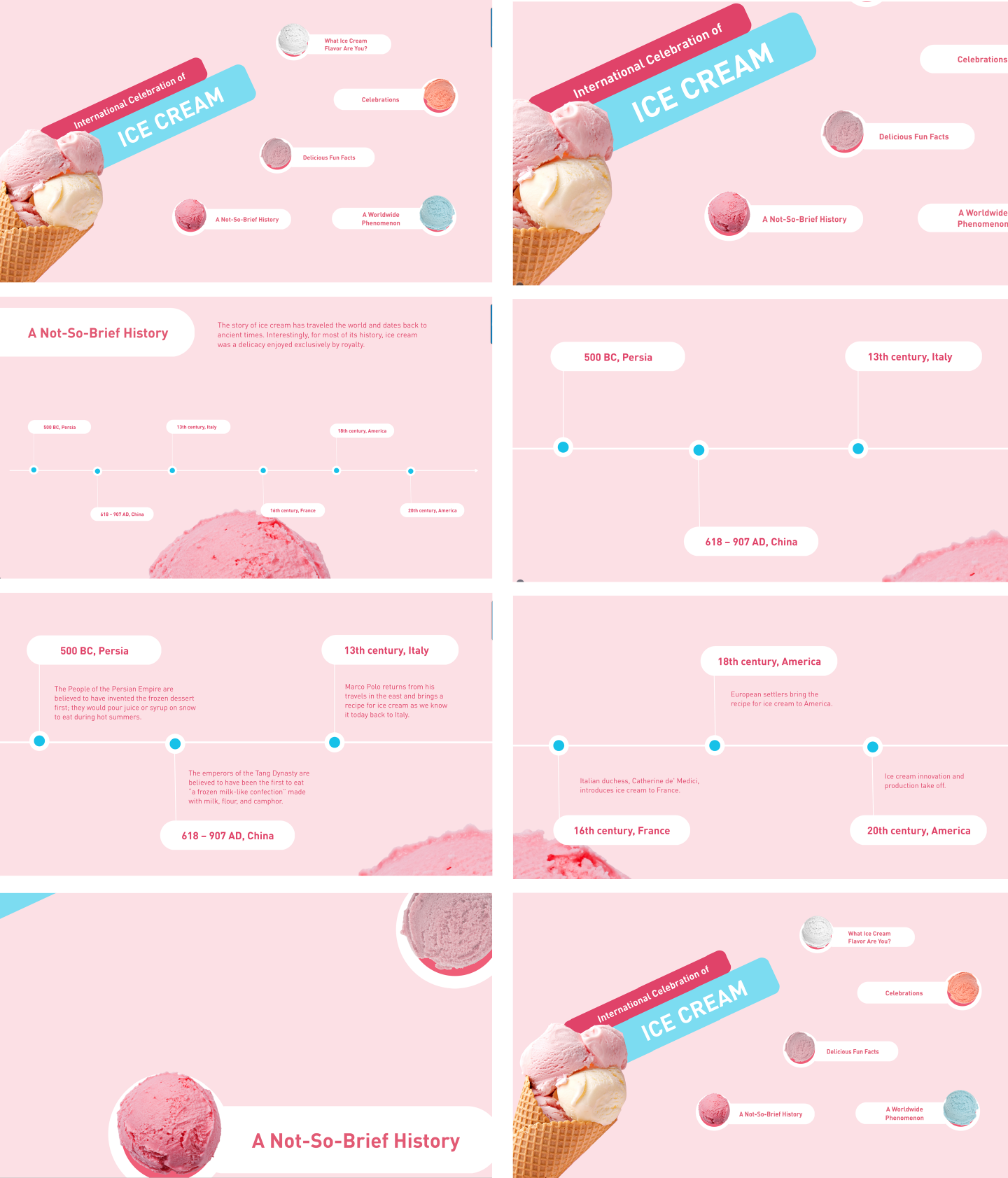
Figure 3-64. Prezi’s unique presentation software features animated “zoom reveals,” slides, and zoom-out animations.
Further Reading
For a much deeper exploration of the value of animation and how to bring it into your interface design, check out the following:
-
Creating Web Animations: Bringing Your UIs to Life by Kirupa Chinnathambi (O’Reilly, 2017).
-
Transitions and Animations in CSS: Adding Motion with CSS by Estelle Weyl (O’Reilly, 2016)
-
“SVG Animations” in From Common UX Implementations to Complex Responsive Animation by Sarah, Drasner (O’Reilly, 2017)
Conclusion
Well-designed navigation and wayfinding in your app or platform can help your users learn your app more quickly, maintain a sense of orientation and context, be confident in using your content and tools, know what to do and where to go, and generally not spend excess time being flustered, confused, or lost. Navigation is a feature of your designs that has a long life cycle —maybe the longest of any feature. If designed well (that is, it makes sense from your user’s point of view and fit for purpose, based on the information and tasks they are working with), it will have “evergreen” value. Good navigation and wayfinding help tremendously with new user onboarding, recovering from error states and confusion, getting work done, and generally feeling not blocked but capable. The design approach and the navigation patterns outlined in this chapter will help you to create a UX in your application where getting around takes on a flowing, magic quality of almost vanishing from the user’s awareness.
Social
When a site takes advantage of social media integration, even more navigation options come into play. This often takes a number of forms. There might be a news or postings module that displays activity and content shared by your friends. There might be a type of leaderboard or “trending now” component. This provides links to stories and posts that are being shared the most among all users on the social media network. For a closer look at how to use the social graph in your designs, see Designing Social Interfaces: Principles, Patterns, and Practices for Improving the User Experience by Christian Crumlish and Erin Malone (O’Reilly, 2015).