Chapter 5. Visual Style and Aesthetics
“Never underestimate the power of beauty.”
Visual design is more than just “skinning a user interface”; visual design and look-and-feel, done well, can make a digital product stand out. The visual language used in any given interface conveys the attitude and spirit of your brand, and stands as an avatar of it across various touchpoints. Visual design can make or break the usability of a product and trust in your brand.
In 2002, a research group discovered something interesting. The Stanford Web Credibility Project set out to learn what causes people to trust or distrust websites. Much of what they found made intuitive sense: company reputation, customer service, sponsorships, and ads all helped users decide whether a website is credible.
But the most important factor—number one on their list—was the appearance of the website. Users did not trust sites that looked amateurish. Sites that made the effort to craft a nice, professionally designed look made a lot more headway with users, even if those users had few other reasons to trust the site.
What was true then is true now; looking good matters.
True beauty is the combination of the physical form and desired function operating together in harmony. In digital design, it is not enough that each pixel is perfect but it also must add usefulness, understanding, or delight and often a combination of all three.
In this chapter, we go over the core elements of visual design and discuss what makes a visual design aesthetically pleasing.
The Basics of Visual Design
In this chapter, we talk about some of the principles of good visual design:
-
Visual hierarchy
-
Composition
-
Color
-
Typography
-
Readability
-
Evoking a feeling
-
Images
Take a look at the four examples in Figure 5-1. They might look like different designs but they all contain mostly the same visual elements. Using only color and changes to the text, they achieve such different impressions—a screen’s color scheme can cause you to either smile or cringe, for example. The impression they give are vastly different, although they contain the same content.
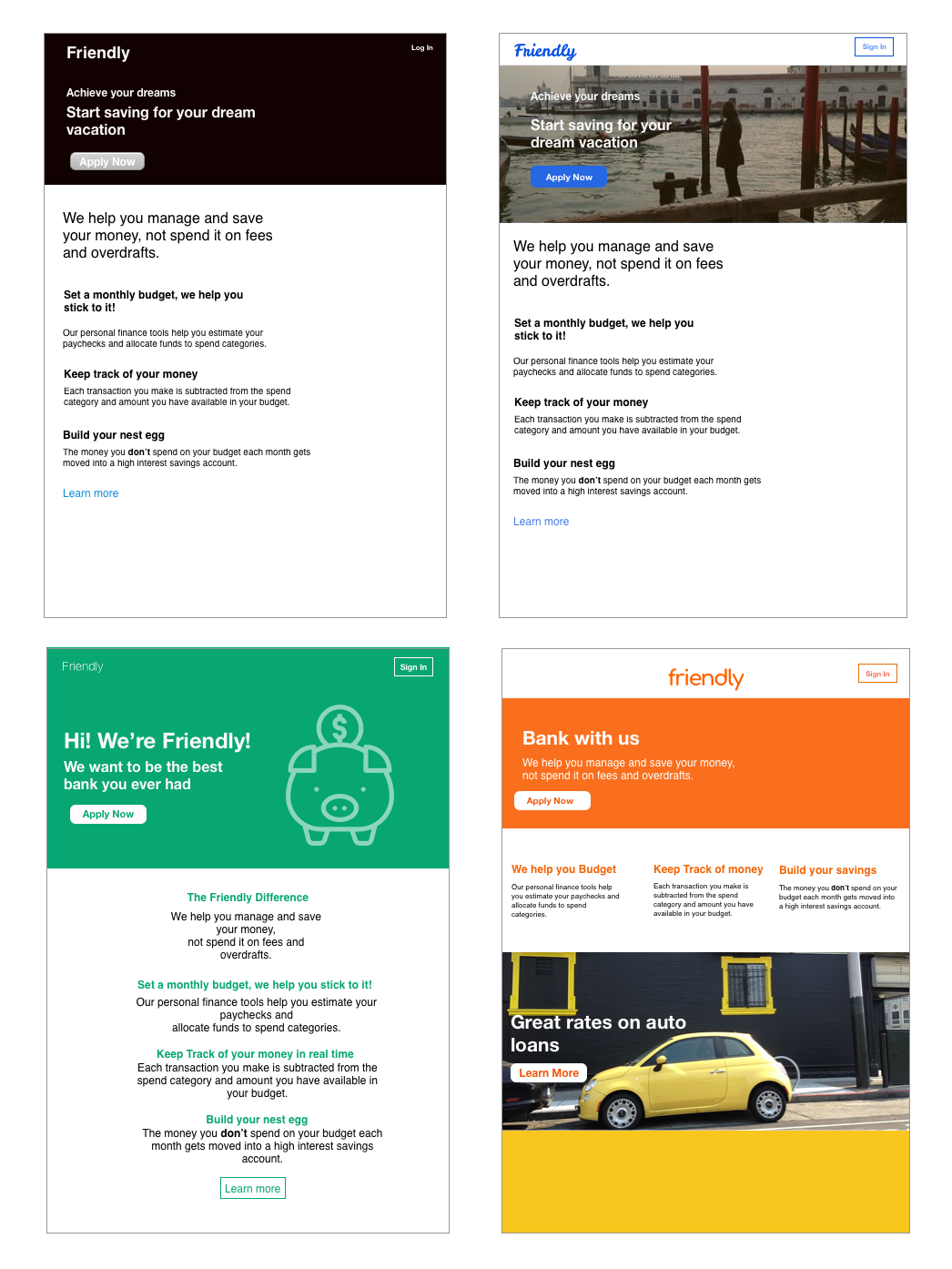
Figure 5-1. Visual design examples
Visual Hierarchy
Visual hierarchy refers to presentation of visual elements on any given layout. Let’s explore the characteristics of visual hierarchy.
Clarity
How well the design communicates the information the designer is trying to convey.
Actionability
How the user knows what they are supposed to do on any given screen.
Affordance
Affordance means that it looks or behaves like what it does. For example, a button that looks slightly three-dimensional gives a visual cue that it is clickable.
Composition
Composition refers to the arrangement and proportion of a visual design.
Consistency
Visual elements appear in a predictable and uniform visual language. If you employ icons in your interface design that they are always used within your experience to convey the same functionality. The same goes for the use of language in your interface.
Alignment
Nothing is more jarring to a user than moving from screen to screen and having the elements of the screen change for no apparent reason. Make sure the screen elements do not move their place from screen to screen. Text that changes from left, right, or center aligned randomly is also disharmonious to the understandability and legibility of digital product design.
Color
Color is immediate. It’s one of the first things you perceive about a design, along with basic forms and shapes. Yet the application of color to art and design is infinitely subtle—master painters have studied it for centuries. We can only scratch the surface here.
When devising a color scheme for an interface, first rule out anything that makes the text difficult to read:
-
Always put dark foregrounds against light backgrounds, and vice versa—to test, pull the design into an image tool such as Photoshop and desaturate it (make it grayscale).
-
When red or green indicate a critical distinction, make sure to also reinforce the color with a different shape or with text. This is because many color blind people won’t be able to see the difference. Statistically, 10% of men have some form of colorblindness, as do about 1% of women.
-
Avoid certain color combinations. As an example, bright blue text on a bright red background will fatique the eye. This is because blue and red are complimentary colors, which means they are on opposite sides of the color wheel (Figure 5-2).

Figure 5-2. A color wheel
-
It is less straining on the eyes to read black text on a white background, however, white backgrounds tend to glow light through them, which can be fatiguing to the eye. So, if you are designing something that will be used on a tablet and you will have lots of blank space around your content or UI elements, try a dark colored background to reduce the backlight glow.
With that out of the way, here are some very approximate rules for color usage.
Warm versus cool
Red, orange, yellow, brown, and beige are considered “warm” colors. Blue, green, purple, gray (in large quantities), and white are considered “cool.” See Figure 5-3.
Figure 5-3. Warm colors versus cool colors
Dark versus light background
The screens with light backgrounds—white, beige, and light gray—feel very different from those with very dark backgrounds. Light is more typical of computer interfaces (and printed screens); dark screens can feel edgier, more somber, or more energetic, depending on other design aspects. See Figure 5-4.
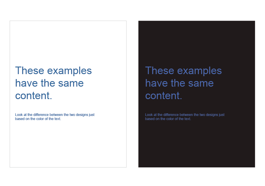
Figure 5-4. Dark versus light backgrounds
High versus low contrast
Whether the background is dark or light, the elements on that background might have either high or low contrast against it. Strong contrast evokes tension, strength, and boldness; low contrast is more soothing and relaxing. See Figure 5-5.

Figure 5-5. Contrast
Saturated versus unsaturated
Highly saturated, or pure, colors—brilliant yellows, reds, and greens, for example—evoke energy, vividness, brightness, and warmth. They are daring; they have character. But when overused, they can tire the eyes, so most UI designs use them sparingly; they often choose only one or two. Muted colors, either dark or light (tones or tints, respectively), make up the bulk of most color palettes. You probably wouldn’t want to stare at that pink all day long in a desktop application. See Figure 5-6.

Figure 5-6. Saturated versus desaturated
Combinations of hues
When you begin combining colors, interesting effects happen. Two saturated colors can evoke far more energy, motion, or richness than one alone. A screen that combines one saturated color with a set of muted colors directs attention to the saturated color and sets up “layers” of color—the brighter and stronger ones appear closer to the viewer, whereas the grayer and paler colors recede. Strong dimensionality can make a design dramatic. Flatter designs, with more muted or lighter colors, are calmer.
Don’t rely on color alone
Color is awesome, but don’t rely on color alone to indicate important information. A good example from the real world is a stop sign in the United States (see Figure 5-7). Anywhere you go, the stops signs will always look the same. They are red, they say “STOP” and they are a distinct octagon shape. These create three cognitive cues to indicate what is being asked of the viewer.
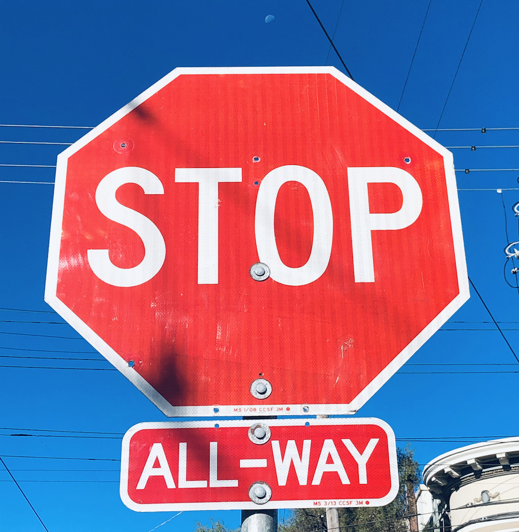
Figure 5-7. Example of a stop sign in the United States
The same is true in using visual elements in the digital world. Help your users to understand the information you are trying to convey by doubling up with color and shape.
Color references and resources
Typography
The majority of content on the web, other than cat videos and movies, is textual. Designing for a legible, non–eye straining experience on the digital medium is an art all to itself. Typography is a topic deserving of its own book, and in fact, there are entire categories of books devoted to this topic alone. You can certainly nerd out on typography, as is demonstrated in Figure 5-8. In this section, we introduce some of the most important points to understand typography for digital design.

Figure 5-8. The anatomy of type for digital design
Types of typefaces
There are a couple of terms that will help in understanding some of the finer points around using type. A typeface refers to the name of the particular design of type. For example, Helvetica or Arial or Times New Roman are typefaces. A font is a particular size, weight, and style of a typeface; for example, Helvetica Bold 12 pt, or Arial Italic 8pt, or Times New Roman 18 pt. You will often see the word “font” incorrectly used to describe a typeface in digital design. There is no origin story that we have found to explain why that is, but it is helpful to know the difference.
There are several layers of classifications for typefaces, but here are the ones most relevant to digital design.
Serif
Serif typefaces have small lines and curves at the end of the letters (Figure 5-9). They tend to be the most common typefaces for reading dense amounts of text. The serif tends to subtly guide the reader from letter to letter, thereby making the reading experience less taxing on the eye.

Figure 5-9. Examples of serif typefaces
Sans serif
San serif fonts (Figure 5-10) do not have lines at the end of the letters. They tend to have a more contemporary look and the letters tend to hold their legibility at smaller sizes, which is one of the main reasons you will see sans serif typefaces used frequently in user interfaces.

Figure 5-10. Examples of sans serif typefaces
Display
Display typefaces (Figure 5-11) are typefaces that work well at a very large size; they can be serif or sans serif. Display typefaces are good for establishing a look and feel of a brand, in a headline or for a logo, but they are not appropriate for user interfaces, UI controls, forms, or body copy. Never use a display typeface for large amounts of text as display typefaces can be overwhelming when overused and lose legibility in smaller sizes.
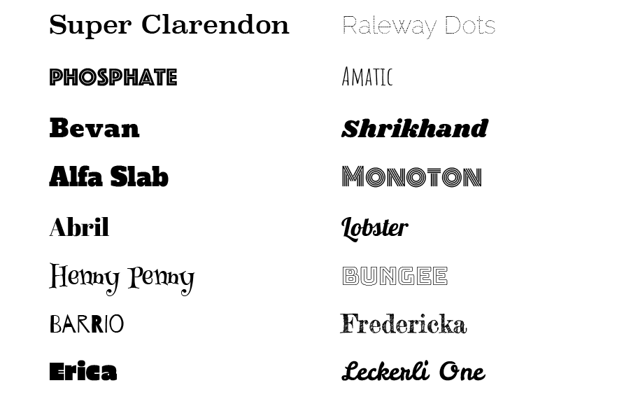
Figure 5-11. Examples of display typefaces
Monospace
Monospace fonts (Figure 5-12) have letters that occupy the same space horizontally regardless of the actual width of the character. These typefaces were used in the early days of computers and you will see them also used in the interfaces of LED screens, interfaces where numbers are the primary content and screens that do not have more sophisticated ways of rendering text. Examples where you might see monospaced fonts are interfaces of noncomputer electronic devices, in-dash car displays, and appliance interfaces.
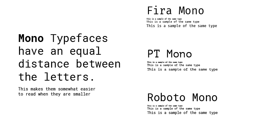
Figure 5-12. Examples of monospaced typefaces
Size
Type size is measured by “points,” commonly abbreviated as “pt.” The smaller the point size, the smaller the type. Generally, you do not want to go below 10 pts for the best on-screen legibility; 12 pts seems to be the most used standard body-text size (see Figure 5-13). For small print items such as copyright information you might have in the footer of a website, 9 pts works well. For experiences that are primarily for reading (such as a news site, or a digital reader), it’s best to default to a comfortable point size like 12 pts and allow the user to increase the size as they prefer.
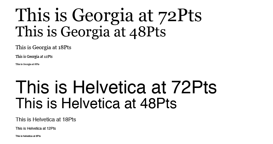
Figure 5-13. Examples of font sizes
Leading
Leading (pronounced like the metal) refers to the vertical separation between lines of text, specifically the distance between the baseline (refer back to Figure 5-8) of one line of text and the baseline of the next line. Leading should provide enough space between the lines so the eye flows from line to line and to prevent ascenders and descenders from overlapping, but not so much that the each line feels distant and separated.
Tracking and kerning
Related to leading is tracking. Tracking is the horizontal spacing between all letters. Improper tracking can affect readability, particularly when set too tight or too wide (Figure 5-14). But even when set properly, there can still be problems with certain characters. This is when kerning comes in handy. Kerning is when a designer manipulates and adjusts the space (tracking) between specific pairs of characters (usually reducing the space). This is needed, for instance, when a letter that takes up a lot of space, such as a capital “D,” and one that takes up much less space, like an “I,” are side by side and have an awkward distance between them. Kerning helps make the letter pairs look more balanced and legible. Most typefaces that are optimized for digital design, such as the fonts in Google Fonts or Apple or Microsoft UI typefaces, have already been kerned to look proportional on the screen.
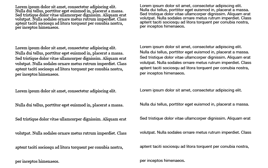
Figure 5-14. Tracking that is tight, proportional and wide
Font pairing
Font pairing is combining two typefaces in a design. Combining fonts is an art unto itself, but there are now some sites that help in aiding selection of fonts that look good together. There are numerous subtleties to finding combinations that work well, but there are a couple of quick rules:
-
When combining fonts that are in the same typeface family, use a different weight or style (bold, italic) to differentiate the text.
-
Never combine two typefaces that are similar. A way to avoid this is to pair a serif with a sans serif type (Figure 5-15).
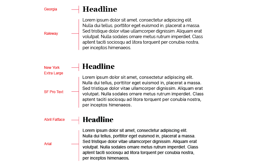
Figure 5-15. Examples of type pairs
Paragraph alignment
Paragraph alignment refers to the imaginary vertical line to which the text of a paragraph aligns. In digital design, there are four options to choose from: left align, center align, right align, or justified. Justified text adjusts the spacing between words so that lines are both left- and right-aligned.
Generally speaking, you cannot go wrong left-aligning the text. As you can see in Figure 5-16, this is a highly readable way to align large amounts of text.
-
The center-aligned text will draw the eye because of the whitespace around it, but use it sparingly because it is also more difficult to read.
-
Right-aligned text and justified text are not usually used in UI design.
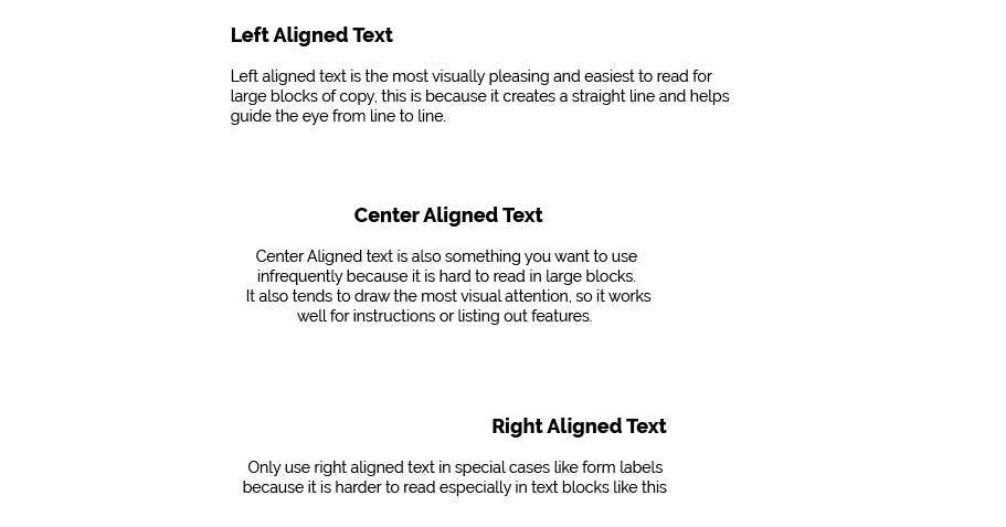
Figure 5-16. Paragraph alignment
Readability
By choosing a typeface for a piece of text, you decide what kind of voice that text is “spoken” in. The voice might be loud or soft, friendly or formal, colloquial or authoritative, hip or old-fashioned.
As with color, readability—the cognitive part—comes first when choosing type. Small text—or what’s called “body text” in print and on websites—demands careful consideration. The following characteristics for body text also apply to “label fonts” in graphical user interfaces (GUIs), used to caption text fields and other controls:
-
On computer displays, sans serif fonts often work better at very small point sizes, unlike print, for which the serif fonts tend to be more readable as body text. Pixels aren’t big enough to render tiny serifs well. (Some serif fonts, such as Georgia, do look passable, though.)
-
Avoid italicized, cursive, or otherwise ornamental fonts; they are unreadable at small sizes.
-
Highly geometric fonts tend to be difficult to read at small point sizes, as the circular letters (e, c, d, o, etc.) are difficult to differentiate. Futura, Universal, and some other mid-twentieth-century fonts are like this.
-
All-capital letters is too difficult to read for body text, though it works fine for headlines and short texts. Capital letters tend to look similar and are not as easy for a reader to differentiate.
-
Set large amounts of text in a medium-width column when possible—say, around 10—12 English words on average. Don’t right justify narrower columns of text; let it be “ragged right.”
Evoking a Feeling
Now for the visceral and emotional aspects. Typefaces have distinctive voices—they have different characteristics, textures, and colors on the screen. For instance, some fonts are dense and dark, whereas others are more open (Figure 5-17)—look at the thickness of strokes and the relative sizes of letter openings for clues, and use the “squint test” if you need a fresh and objective look at the font. Some fonts have narrower letters than others, and some font families have “condensed” versions to make them even narrower. The tracking might be distant or close, making the block of text look either more open or more solid.

Figure 5-17. Examples of typefaces
Serifs and curves add another dimension to font color and texture. Serifs add a level of scale that’s much smaller than the letterform itself, and that adds refinement to the font’s texture—the thick sans serif fonts look blunt and strong in comparison. The curves and angles used in each letterform, including those that form the serif, combine to form an overall texture. Though it’s not always easy to explain why some fonts speak with a formal voice, whereas others speak with an informal voice. Comic Sans and other playful fonts are certainly informal, but so is Georgia, when compared to Didot or Baskerville. All-caps and capitalized words speak more formally than lowercase; italics speak informally.
Cultural aspects come into play here, too. Old-fashioned fonts, usually with serifs, tend to look—wait for it—old-fashioned, although anything set in Futura (a sans serif font) still looks like it came from a 1963 science textbook. Verdana has been used so much on the web that it’s now standard for that medium. And Chicago will always be the original Mac font, no matter what context it’s used in.
Spaciousness and crowding
Some designs use plenty of whitespace; others crowd the screen elements together. Spaciousness on the screen gives an impression of airiness, openness, quiet, calmness, freedom, or stateliness and dignity, depending on other design factors.
Crowded designs can evoke urgency or tension under some circumstances. Why? Because text and other graphic elements need to “breathe”—when they’re colliding against one another or against the edges or borders of the screen, they cause visual tension, as demonstrated in Figure 5-18. Our eyes want to see margins around things. We become slightly disturbed by designs that shove the headlines directly against the text. Likewise, the compact layout somehow contributes to the busy, industrial feel of the screen, though it doesn’t have collisions.
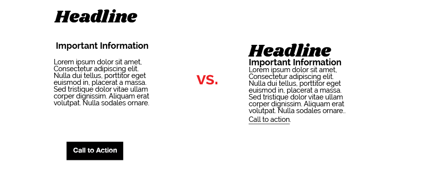
Figure 5-18. A spacious and crowded visual design
However, not all crowded designs evoke that kind of tension. Some connote friendliness and comfort. If you give the text and other elements just enough space and reduce the interline spacing (leading) to the smallest amount that is comfortably readable, you might achieve a friendlier and less rarified look.
Angles and curves
A screen composed of straight up-and-down lines and right angles generally looks calmer and more still than a screen containing diagonal lines and nonrectangular shapes. Likewise, a screen with many different angles has more apparent motion than a screen with a single repeated angle on it.
Curves can also add motion and liveliness, but not always. A design made with a lot of circles and circular arcs can be calming and restful. But a curve swooping through a screen sets the whole design in motion, and a few carefully chosen curves in an otherwise rectangular design add sophistication and interest.
In the example in Figure 5-19, Stripe uses angles to create a dynamic and legible design to guide the eye around the design and thus to the important information the designer wants visitors to read.

Figure 5-19. Stripe online payments website
Wherever two curves intersect, notice what the geometrical tangents to those curves are doing. Are the tangents at right angles? That results in a calmer, more still composition; if they cross at a more acute angle, the design has more tension and apparent motion. (Again, these aren’t hard-and-fast rules, but they’re generally true.)
When using angles, curves, and nonrectangular shapes, think about where the focal points are: at sharp angles, where lines cross, and where multiple lines converge, for instance. Use these focal points to draw the viewer’s eye where you want it to go.
Texture and rhythm
Texture can add richness to visual design. Text forms its own texture, and you can control the look of that texture by choosing good typefaces. For many screens and interfaces, fonts are the most important texture element.
You also can use texture to surround strong visual elements and set them off. Textures add visual interest and depending on what they look like, they can add warmth, richness, excitement, or tension.
The most effective textures in the interface design are subtle, not vivid checkerboards of eye-hurting colors. They use gentle color gradations and very tiny details. When spread over large areas, their impact is greater than you might think. An exception might be in the example in Figure 5-20. Szimpla Kert is a store and cafe in Budapest and the website uses bright colors and visual texture to evoke a celebratory, dynamic look and feel.

Figure 5-20. Szimpla Kert website
Be careful when using textures behind words on a computer screen—it rarely works. All but the subtlest textures interfere with the readability of small text. You can put them behind large text, but watch the way the edges of the letterforms interact with the different colors in the texture; this can visually distort the letters.
Images
Photography
Photography can set the mood of a design. On the web and mobile digital products, photography is one of the most powerful tools to establish how a brand is expressed. A well-placed photo can tell a story in a single glance much more efficiently than words could. Photographs are extraordinary tools for evoking emotional responses.
In most desktop applications and mobile applications, content and ease of use are more important than style. You should use purely decorative images sparingly and with great care on functional GUIs because they tend to be distracting.
Here are a few tips to keep in mind:
-
If you use a person’s face, be sure to pay attention to where the gaze of the person’s eye is directed. Humans tend to look where other humans look. Even when those humans are images on a screen.
-
Try to avoid clichés when you can. How many web screens have you seen showing the same happy, smiling faces? Kids flying kites? Competent-looking business people in crisp suits? How about roads winding through beautiful mountain scenery? Sunsets or beaches? Rolling grassy hills under sunny blue skies? Try not to rely on these visual conventions alone to set the tone for your brand.
-
Stock art (photographs that you can purchase, sometimes royalty-free) are okay, but for the biggest impact, nothing beats custom photography or designs that have been created by trained art directors and visual designers.
Icons
Icons (Figure 5-21) are graphical representations that serve in place of text to express an idea or denote functionality.

Figure 5-21. Icons
Creating icons, like typography, photography, or illustration, is a skill on its own. Icons express complex ideas at a glance and give the user an idea of what actions to expect when they click or tap an item.
-
Look for UI conventions you see on the web or from other icons. Applying common conventions found in other designs make it less likely your user will need to relearn what the icon means.
-
Make sure your icons all share the same visual style: the same weight, and either filled in or outlined, for example.
-
Don’t rely on icons alone. Use them sparingly and when you can, use text labels as well for maximum user comprehension.
Cultural references
A design might remind you of something cultural—a brand, movies, art style, historical era, a literary genre, or inside joke. A familiar reference can evoke memories or emotions strong enough to trump all these other design factors, though the best designs make cultural references work in concert with everything else.
Obviously, if you make overt cultural references, consider your audience. A 10-year-old will not get a 1970s pop art reference. Chances are good that a young adult in India won’t either. But if your audience is sufficiently well defined for you to know that a cultural reference will be familiar to them, it can be a good “hook” to engage a viewer emotionally with your design.
Cultural references are rarely used in functional application designs, but you can see them in applications like QuickBooks, in which some screens are designed to look like checks and bills. They actually move beyond a stylistic treatment and become an interaction metaphor, but the metaphor still is entirely cultural—someone who has never seen a checkbook wouldn’t respond in the same way as someone who has.
Repeated visual motifs
Good design has unity: it hangs together as one entity, with each element supporting the others structurally and viscerally. That’s a challenging goal to achieve. I can’t give you hard-and-fast rules on how to do it; it takes skill and practice.
But one thing that contributes greatly toward visual unity is the repetition of visual elements or motifs. We’ve already talked about angles and curves; you can use diagonal lines of the same angle, or lines with similar curvature, as repeated elements in a design.
Also, consider typography. Use only one main body text font, though other fonts can work very effectively in small areas such as sidebars or navigation links. (Their contrast to the main font makes them stand out.) If you have several headlines or titled sections, use the same headline font for them. You also can pull smaller graphic elements—line width and color, for instance—out of your fonts into the rest of the design.
Rhythms like these can be powerful design tools. Use them with care, and apply them to groups of comparable things—users will assume that similarity in form means similarity in function.
Visual Design for Enterprise Applications
Those of you who work on consumer-facing digital products might already be familiar with everything discussed so far. People expect websites and mobile applications to have strong graphic styling, and you rarely will find them looking completely plain and neutral.
But what if you work on desktop or enterprise applications? If you try to apply these principles to the controls’ look-and-feel—how the controls are drawn—you might not have many choices. Native Windows or Mac applications generally use the standard platform look-and-feel, unless you’re willing to work hard to develop a custom one. Enterprise applications should be optimized for workflow and be easy to look at for large stretches of the workday.
Given the situation, you can be forgiven for just using the platform look-and-feel standards and concentrating your graphic design attentions elsewhere.
Even if you do use a neutral look-and-feel for your actual widgets, there still are ways to be creative:
- Backgrounds
-
Unobtrusive images, gradient fills, and subtle textures or repeated patterns in large background areas can brighten up an interface to an amazing extent. Use them in dialog or screen backgrounds; tree, table, or list backgrounds; or box backgrounds (in conjunction with a box border).
- Colors and fonts
-
You often can control overall color schemes and fonts in a native-looking UI, too. For instance, you might draw headlines in an unusual font at several point sizes larger than standard dialog text, and maybe even on a strip of contrasting background color. Consider using these if you design a screen layout using the Titled Sections pattern (Chapter 7).
- Borders
-
Borders offer another possibility for creative styling. Again, if you use Titled Sections or any other kind of physical grouping, you might be able to change how box borders are drawn.
- Images
-
In some UI toolkits, certain controls let you replace their standard look-and-feel with custom images on a per-item basis. Buttons often allow this, for instance, so your buttons, including their borders, can look like anything you want. Tables, trees, and lists sometimes permit you to define how their items are drawn You also can place static images on UI layouts, giving you the ability to put images of any dimension just about anywhere.
Accessibility
The biggest concern is accessibility. Operating systems such as Windows let users change desktop color/font themes, and that’s not just for fun—visually impaired users use desktop themes with high-contrast color schemes and giant fonts just so they can see what they’re doing. Make sure your design works with those high-contrast themes. It’s the right thing to do.1
Another danger is fatiguing your users. If you design an application meant to be used at full size or for a long time, tone down the saturated colors, huge text, high contrast, and eye-catching textures—make the design quiet, not loud. More important, if your application is meant to be used in high-stress situations, such as a control panel for heavy machinery, strip out anything superfluous that might distract users from the task. Here, cognitive concerns are far more important than aesthetic .
Ranges of Visual Styles
Visual design styles change fairly quickly. Most often, new releases of operating systems drive a change in the visual UI styles that are adopted after their release. In this way, Apple, Microsoft, and now Google are setting the trends for the visual styles in the applications that will be used on their platforms. We take a deep-dive into a few of the more widely used styles across these platforms and across their touchpoints: web, desktop software, and mobile applications.
Skeuomorphic
A skeuomorphic design refers to a style of UI that mimics the characteristics of objects found in real life. Skeuomorphism is often used during a period of transition when a new type of interaction is used and you want the user to understand how something works by using an idea or concept with which they are already familiar.
When the iPad was first released, skeuomorphic visual designs were on almost every application. This was used as a visual affordance to inform the user how to interact with a touch interface.
In the Apple Wallet example shown in Figure 5-22 (left), the list of items stored in the list of data has been given a visual design that mimics the look of cards or tickets. This translation of real-life objects to the digital help the user to find what they are looking for and also helps them manage and arrange the content.
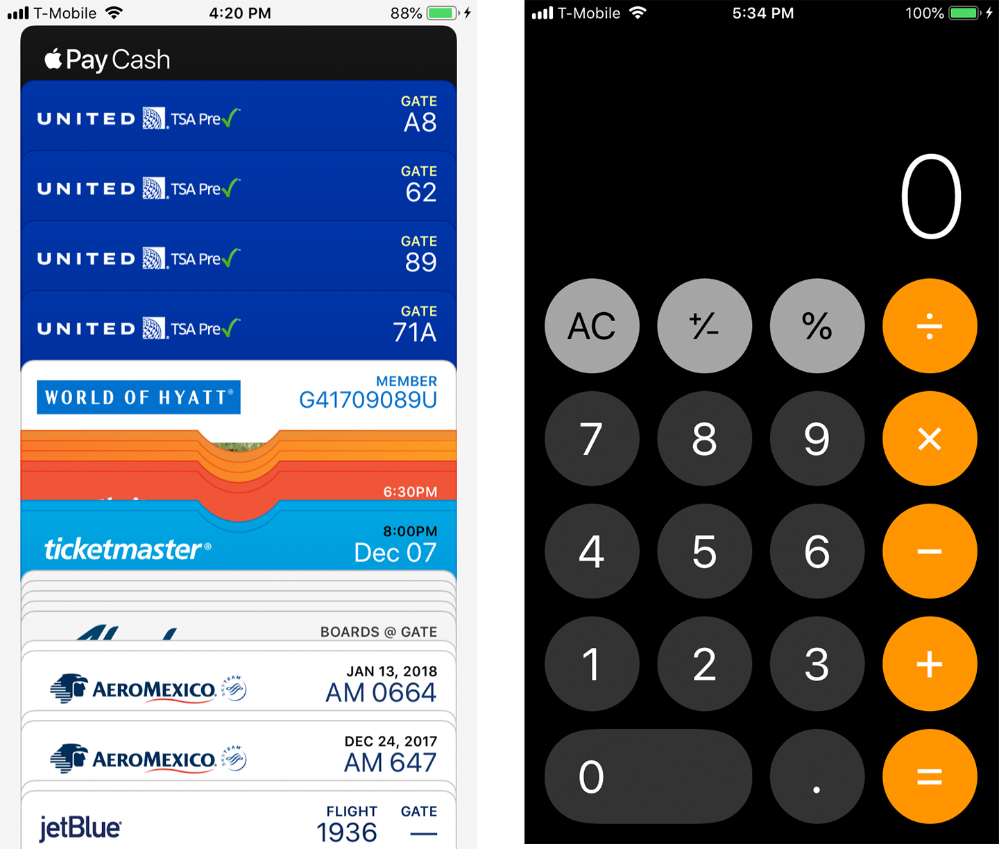
Figure 5-22. Apple iOS Wallet and Apple iOS calculator
Apple uses the skeuomorph successfully again in its calculator app Figure 5-22 (right). The rounded numbers are an optimal “touch target” size (we will discuss this more in the context of mobile design in Chapter 6) and the functionality mirrors what you would expect from a physical calculator. In this way, the designers of iOS have transcended the iPhone into a device that morphs and changes to the intended functionality of the application.
You can also use a skeuomorph within another design style to increase usability. In the Square Invoice set-up process (Figure 5-23), the designer chose to use the visual language of the real-life physical check so that a user would know where to locate the routing and checking account numbers needed to set up their account.

Figure 5-23. Square Invoice bank account entry and Eventbrite interface
Illustrated
Interface design doesn’t need to be cold and sterile. If it makes sense for the brand, using illustration is a good way to set a fun and approachable tone to an application or website. Using an illustrated style also sets you free from what is possible in the real world and allows the designer to express complex concepts limited to only what’s possible in the imagination.
Eventbrite (Figure 5-24) is an event-listing and ticket-purchase service that uses an illustrated style all around its mobile application interface providing a warm and inviting visual look and feel.
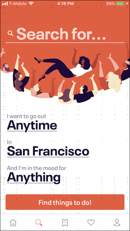
Figure 5-24. Eventbrite interface
Florence (Figure 5-25) is a site for self-employed nurses to find shifts. This could have been a boring, staid site but the illustrations and visual design set the tone for a fun and friendly brand.

Figure 5-25. Florence.co.uk
Happy Cow (Figure 5-26) is a mobile application that helps vegetarians and vegans find restaurants and food anywhere in the world. The site uses the Happy Cow mascot and a lighthearted icon language throughout its UI.

Figure 5-26. Happy Cow
When your product is your application or website, which is the case with the examples shown in this section, using custom illustrations is an effective way to establish a memorable brand.
Flat Design
Characterized by solid background colors, simple understandable icons and sans serif typography, flat design is one of the most widely used visual design styles you will see on the web and in mobile apps. Think of the style of signage used in airports and in transportation and you can see why this flat and minimal style has such universal appeal. It is culturally agnostic, easy to localize, and can scale to different viewports (screen sizes) easily.
Flat design is considered a truly digital style because the visual language of the UI (with the exception of the icons) is no longer pretending to be analogous to something in real life. Instead, the UI is meant to blend into the background and allow the user to focus on the content.
The examples shown in Figure 5-27 demonstrate flat design in a mobile application. What are the commonalities you see? Do you see solid colors, a single typeface used at different sizes, use of two-dimensional icons? When you pay attention to this visual style you will notice that it is used everywhere.

Figure 5-27. Cash and Booking.com apps
AirVisual (Figure 5-28) is a mobile application that shows the air quality in cities throughout the world. It employs a combination of flat design and custom illustrations for a clear and usable visual presentation.
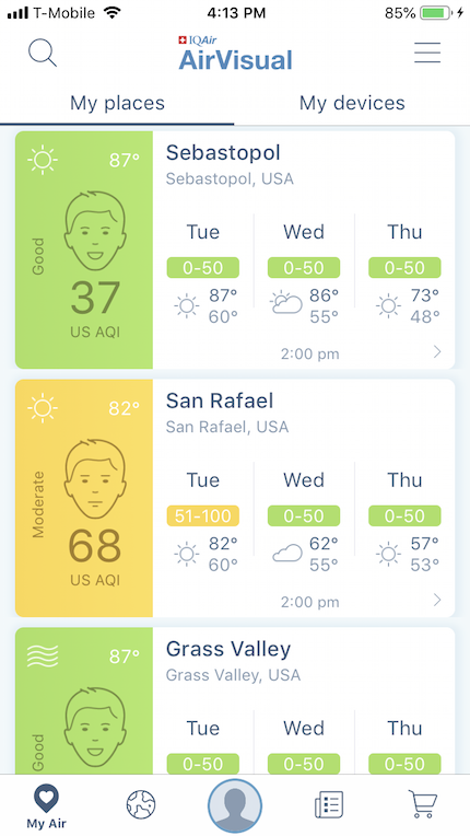
Figure 5-28. AirVisual app
For more details on flat design
Minimalistic
Minimal designs reduce the screen elements to the barest minimum. You will often see minimal designs used in task-based apps when the things that a user can do are straightforward or the interface is primarily used for viewing data rather than inputting or manipulating data.
Clear Todos (Figure 5-29) is an extreme example of showing only shades of color and text and very limited Visual UI cues as to how the interface works.

Figure 5-29. Clear Todos app
The Calm app (Figure 5-30, left) shows only what is absolutely necessary for the user to see on any given screen. In the example here, one button is used to control the functionality and a subtle but helpful animation instructs the user what to do.
Apple Health (Figure 5-30, right) uses bold colorful information graphics as the core of its visual UI.
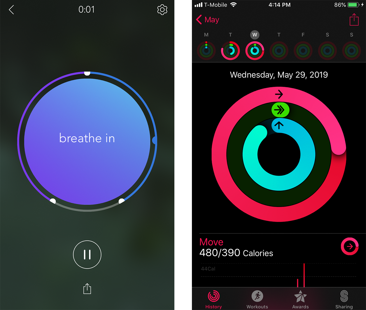
Figure 5-30. Calm and Apple Health apps
Glitché (Figure 5-31) is an application to create “glitch” style photos and videos. Its minimal UI allows the user to focus on the task and doesn’t take valuable screen estate away from the primary task of photo and video editing.
Brian Eno’s Bloom music application (Figure 5-31) uses only audio cues to inform the user how to interact with it. The experience relies on subtle, muted color changes and ambient sound that encourages exploration and creation.

Figure 5-31. Glitché and Bloom
Adaptive/Parametric
On the extreme end of minimalism, adaptive or parametric refers to designs where the form is not static or defined but rather generated algorithmically, in relationship to the objects (static or dynamic) that come in proximity. You will see this type of interface paradigm often used in video or photo applications, and more and more you will see it in other types of interfaces. A written definition does not do this type of design justice. Imagine an interface that is mostly invisible until it comes into contact with something that enables an interaction to happen—then the UI reveals itself and wraps around the object with which a user can interact. When creating visual designs for this kind of interface, creating a high-contrast and fluid UI visual style is key.
Apple Measure (Figure 5-32) is a measuring tool that comes with iOS. To measure something, the user points their phone or tablet at the object and then the measuring tools and functions assemble themselves onto the interface.

Figure 5-32. Apple iOS Measure
Simple (Figure 5-33) is a mobile banking application. To deposit a check, a user is prompted to take a photo of the check, and the UI will emerge to indicate when the photo is in the correct place and when a photo can be captured.

Figure 5-33. Simple check capture
Conclusion
Great visual design is a skill that takes time to perfect. Graphic design is a discipline all to itself, and it would take far more than a chapter to get into the nuances of the grid, color theory, typography, and gestalt to truly understand how to create a pixel-perfect visual design. Fortunately, with new website creation and editing tools, much of the finesse that it takes to get a perfectly kerned and detailed designed look are available to everyone with a credit card and content to share.
Web creation platforms like Squarespace, Wix, and WordPress have premade templates that have been created by visual designers. These tools take the guesswork out of designing layouts and worrying over spacing and margins and legibility.
We have just scratched the surface of what there is to know about visual design in the context of the UI. The big takeaways are that aesthetics matter, and getting those details right makes a huge difference in how your product or service will be perceived by your audience.
1 And, depending on who buys your software, it might also be the legal thing to do. The US government, for example, requires that all software used by federal agents be accessible to people with disabilities. For more information, see http://www.section508.gov. The Americans with Disabilities Act also has design standards.