Chapter 11. User Interface Systems and Atomic Design
The previous chapter gives many examples that point to a strong pattern in interface design: screen interfaces often are made up of a system of commonly used components. Recent developments in how designers and developers approach interface design build on this trend of design as a system. In this chapter, we’ll look at component-based front end UI frameworks. Understanding and using this approach will help you deliver consistency, scalability, and better usability to your software. Thus, this chapter covers the following:
-
An overview of component-based user interface (UI) systems
-
A summary of the Atomic Design philosophy that takes a components-based approach
-
A look at selected UI frameworks (component libraries) specifically for web and mobile web that you will likely be working with
Designing software applications today means creating a rich interactive experience for consumers and business customers, no matter what device they are using or where they are. The expectation is that the experience is always on, always communicating with the world around it, communicating with other people, and dynamically responding to its user from second to second.
Today, software is created from the ground up to connect to the internet in order to take advantage of powerful cloud-based information processing, storage, and communication. Mobile devices are the dominant consumer computing platform. Customers expect a given application to take full advantage of the capabilities of the local device, such as cameras, voice input, live location data, their own prior activities and preferences, and more. They also want to access the same software from multiple devices—mobile, tablet, desktop, watch, TV, and more—with a seamless transition and an experience that stays recognizably the same. They also do not expect to compromise functionality and capability with smaller devices. Designers create UI systems to set UI standards in this environment.
The design and development approach that makes this possible is centered around components and widgets as well as connection to other systems in real time for communication, transaction, live data, and storage. The idea is to design and build a system of components that lets users accomplish their tasks without regard to the many different devices, screen sizes, operating systems, or web browsers.
UI Systems
UI systems, or UI design systems, are UI styles and standards systems that help a company’s designers, developers, and partners maintain quality and consistency in the look and feel of their software products. They use a components-based approach. They focus on standardizing the functionality and look and feel as much as possible while still staying in line with different operating system (OS) standards. They do not specify implementation technologies, such as what programming language to use.
The main point for you as an interaction designer is that a components-based approach to interfaces and design is the standard approach now (at least for the nuts-and-bolts functionality like filling out forms, picking dates and times, and so on.) Let’s look at this briefly.
Technology companies such as Microsoft, Apple, Google, and many others have UI systems that cover multiple operating systems and multiple devices and screens:
-
Microsoft’s Fluent Design System offers a standardized library of styles and code modules for Windows OS, web, iOS, and Android.
-
Apple’s User Interface Guidelines cover macOS and iOS apps, watchOS (for Apple Watch) and tvOS (for Apple TV).
-
Google’s Material Design System covers web, Android, iOS, and now native desktop OS applications through its Flutter UI framework.
An Example Component-Based UI System: Microsoft’s Fluent
Let’s look at one UI system and one component in it as an example. In 2017, Microsoft released Fluent, its UI system. Its goal is to help any product in Microsoft’s software ecosystem look and feel like Microsoft, whether it is on the Windows desktop, on Android, on iOS or on the web.
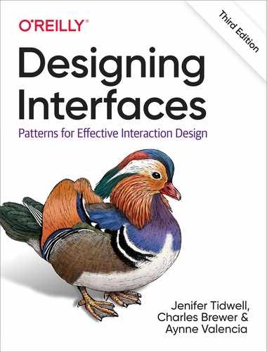
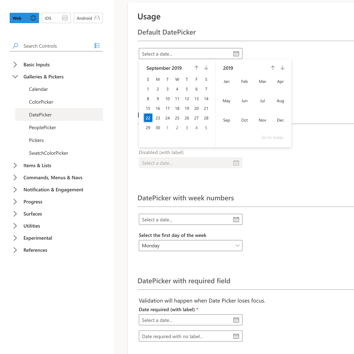
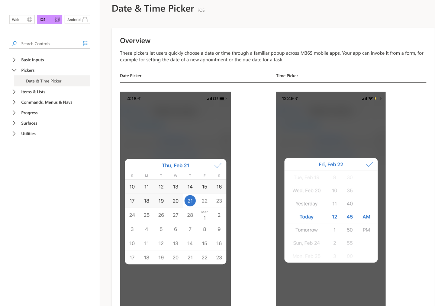
A quick look at the website for the Fluent UI system shows its scope (Figure 11-1). Let’s imagine that you are an interaction designer at Microsoft, and you are designing an app that needs a date and time picker. If you’re designing for the web, you’ll want to look at the Fluent web date picker (Figure 11-2). If you are a mobile designer, you will want to look at either the Fluent iOS date picker (Figure 11-3) or the Fluent Android date picker (Figure 11-4). Finally, if you are a Windows desktop designer, you’ll want the Fluent Windows date picker (Figure 11-5).

Figure 11-1. The Microsoft Fluent Design System home page

That is a quick look at a components-based UI design system. How can interaction designers develop design systems that give them the same advantages of consistency, scalability, and reusability in their own work? One method has become popular: Atomic Design. We review this approach to design in the next section.
Atomic Design: A Way of Designing Systems
Design and design methodologies have been evolving directly alongside UI design systems, as described previously. UI design now includes the idea that we are designing a system of flexible, reusable components for assembling interfaces for almost any screen or device.
Many designers have begun thinking this way. Atomic design is an example of probably the most widely known name for this approach. It was originally developed by designer Brad Frost on his blog and now also his book, Atomic Design (Brad Frost, 2017). It is now widely adopted and adapted by design teams in solving design problems and creating their UI design systems. We present a brief summary of this approach here.
Overview
Atomic design consists of selected principles and a structure for categorizing UI components. We summarize them broadly in the following subsections.
Break it down
Atomic design is basically a bottom-up approach to building interfaces. A starting point is analyzing the software you are designing at the moment. Then, break down the pages and screens into their smallest pieces that still remain usable and functional on their own. Many of the aforementioned UI frameworks can also be a starting point because they are already broken down into components.
Style guide
The basic and universal guidelines for design are set up: color, typography, a layout grid (or a plan for contemporary, grid-less, resizing containers), icons, and more. See Chapter 4 for a discussion of layout grids, and Chapter 5 for color and typography. It’s important to remember that this is still in service of delivering a unique and pleasing look and feel in the end. Following brand guidelines, or creating a branded look and feel, drives the choices here. Everything in your atomic design system will build from this and inherit these styles through CSS. Begin with styling the most basic, atomic units of your software. As you combine these elements, you’ll need to add more style standards to control appearance, behavior, and layout, up to templates for entire screens of components.
Consistency
Avoiding “UX debt,” the slow accumulation of diverging design styles and a different look and feel, is a major goal. The same component is reused everywhere, retaining its specified design. It’s reused as an entire component. There’s no need to create it from scratch, with the associated chance of changing how it looks. In this way, the software can grow and expand while maintaining consistency in its UI.
Modularity
The main idea is that you want a system of software building blocks that can be assembled into tools and screens to meet a specific need. Little pieces join together to make bigger pieces. The metaphor here is creating a LEGO toy set, except for user interfaces. You can use small pieces on their own, or you can put them together in combination to create much bigger, more robust components and tools.
Nesting
As mentioned a moment ago, the strategy is to start with the smallest possible functional elements and the most universal style standards, such as typography and color palettes. You can use the smaller pieces to create larger ones. For example, a simple text input field can be combined with a label, an Input Hint or Input Prompt (see Chapter 10), and a drop-down selector within the input field to make a more usable, dynamic form component. There is also the idea of inheritance of styles. The styling of the smaller components is carried with them into the larger aggregation. Changing the style declaration at the base level will then change it everywhere in the system. For example, a color from the color palette could be adjusted for better contrast and accessibility, and this propagates everywhere that this color is used. You could adjust the corner radius for buttons, and anything using the button element picks up this shape change right away. For the design team, this can be accomplished by using a common library file or shared file that all the designers reference. When linked properly, design files can automatically update when the source file updates. In live products, the engineering team must integrate any design updates into the source code that renders the associated component. Once this is done, the product will reflect the changes.
Build it up
It almost goes without saying that the point of creating a set of LEGO-like building blocks is so that we can build entire screens, workflows, and applications. Designers can style existing web app components such as buttons and input fields and then build up from there. They can also start with the modules and components already available in UI frameworks, like those we discussed earlier. There are many to choose from, with different levels of customizability. Some require more component building; others already have a big library of UI components. Pick the one that best suits your needs and works with the JavaScript framework that your developers are using.
Not tied to any technology
Despite the tech-centric discussion in this chapter, Frost and many other designers take pains to say that designers should stay focused on design and not on the limits of any particular technology or framework. The goal is the same as it always was: understanding users; finding opportunities to make their lives easier; and designing delightful, usable software experiences for them. Atomic design, UI frameworks, and UI patterns are merely tools to achieve this, not any kind of restraint or blocker.
The Atomic Design Hierarchy
A UI design system that is built up with atomic design has a structure based on going from small and simple to large and complex.
Molecules
Molecules are groupings of two or more atomic components to make a more complete functional element. Examples of molecule elements might be an image with title and caption to form a news or promotional molecule within a Grid of Equals (Chapter 4), or a form input with a label, Input Hint, Input Prompt, and a submit button.
Organisms
Organisms represent collections of molecules into fairly complex objects that handle multiple functions or a major function of your software. A good example of this would be a header module in your app or website. It might consist of a company logo, the entire global navigation component (such as Fat Menus, in Chapter 3), a search module, utility navigation or Sign-In Tools, user avatar, and a notifications counter.
Templates
Templates are the scaffolding for putting molecules and organisms together for specific purposes. They are the layout recipes for creating the types of screens that you will need based on the content you have. Often these templates represent a screen type that occurs over and over. Examples of this would include a form, a home page, a report with a chart, or a screen for tabular data.
Pages
Pages represent the end product: templates now filled out with real content. The underlying template and module system can be standardized, but each page is different based on the unique content it serves up. And you now have a consistent Visual Framework (Chapter 4) enforced throughout the site.
How can an interaction designer bring an atomic design–inspired system to life? Fortunately, there are many libraries of interface components that are ready to be styled, modified and put to use quickly. These are called UI frameworks. It’s likely your development team has selected one already. In the next section, we take a look at some selected UI frameworks.
UI Frameworks
The UI frameworks we discuss in this section are tied to web and mobile web technologies: HTML, CS , and JavaScript (or similar programming language, such as CoffeeScript or TypeScript). That is because this third edition of Designing Interfaces focuses specifically on screen-based interfaces for web and mobile.
UI frameworks have a number of different names: frontend frameworks, CSS frameworks, UI kits, UI toolkits. But they all consist of the same thing: A system of software components for building a screen-based UI. It’s worth looking at these more closely for two reasons:
-
UI frameworks are great examples of component systems in action
-
It’s likely you will be designing software that uses one of these frameworks
Overview
Software developers today for web and mobile have developed JavaScript (or other similar language) frameworks for rendering their frontend code. These frameworks are simply libraries of prepared, configurable code modules which can be customized more easily than writing code from scratch. They are used to generate the appropriate HTML, CSS, and JavaScript for web and mobile web applications. This makes for rapid software development and more consistent code and UI. Some examples of the most popular JavaScript frameworks are Angular, React, Vue, Ember, and Node.js, and there are many others. These code frameworks handle user inputs, make API calls, and process data returned by these APIs.
Benefits
Code frameworks are the middleware engine that is churning away to make a lot of underlying complexity go away. This offers a number of benefits:
- Speed
- Prepared code to handle the majority of expected use cases means that you can generate working software faster.
- Consistency
- Code modules and common CSS render UI components the same way.
- Masking different browser capabilities
- In the not so distant past, browsers had varying levels of support for HTML, CSS, and JavaScript standards. They also implemented browser-specific quirks. This was an attempt to differentiate and “win the browser wars.” This created a huge problem getting early web and mobile software to operate and look the same on different browsers. Modern JavaScript frameworks now automatically take care of browser and OS differences.
- Responsive design automatically included
- There’s no doubting that we have seen an explosion of different device types and screen sizes. Responsive design is an answer to this challenge. Liquid layouts that automatically change based on the user’s screen size helped designers create designs that worked across devices. Modern code frameworks include this important capability.
The Rise of UI Frameworks
These code frameworks also provide the component libraries for the front end or presentation layer of your application. This is why they are called UI frameworks, UI kits, UI toolkits, CSS frameworks, or frontend frameworks. They contain modules and components with which interaction designers are familiar: headings, buttons, form inputs, images, and so on.
Designers can customize the appearance of these UI frameworks in many ways. Indeed, the main point of this chapter is that this is often the bulk of the design job on a software project today. This is the context for UI design today:
-
Component-based UI frameworks are part of a systems approach to UI design.
-
Design the system, not one-off screens.
-
UI frameworks are a starting point, and can be adapted and styled.
-
UI frameworks are a floor, not a ceiling. They save time and energy that you can use to solve other, more complex problems.
In the following sections, we look at some common UI toolkits and compare and contrast them by looking at just a few examples of components from each.
A Look at Selected UI Frameworks
In this section, we take a quick tour of a selection of the UI frameworks that are out there today. There are dozens, with more appearing every day. An exhaustive comparison and contrast is beyond our scope here. One key point is that they all use CSS so that color, typography, and other design styles are open to customization. Another key point is that these toolkits consist of modules and component . The goal is to show that UI frameworks will often be your starting point for your atomic design–inspired design process. Here are the selected UI frameworks that we look at:
-
Bootstrap
-
Foundation
-
Semantic UI
-
Materialize
-
Blueprint
-
UIkit
Bootstrap
Bootstrap is one of the most popular UI frameworks today. Originally developed by Twitter, it’s available for anyone to use. Figure 11-6 shows the list of components that are included by default. Figure 11-7 shows examples of common button components.
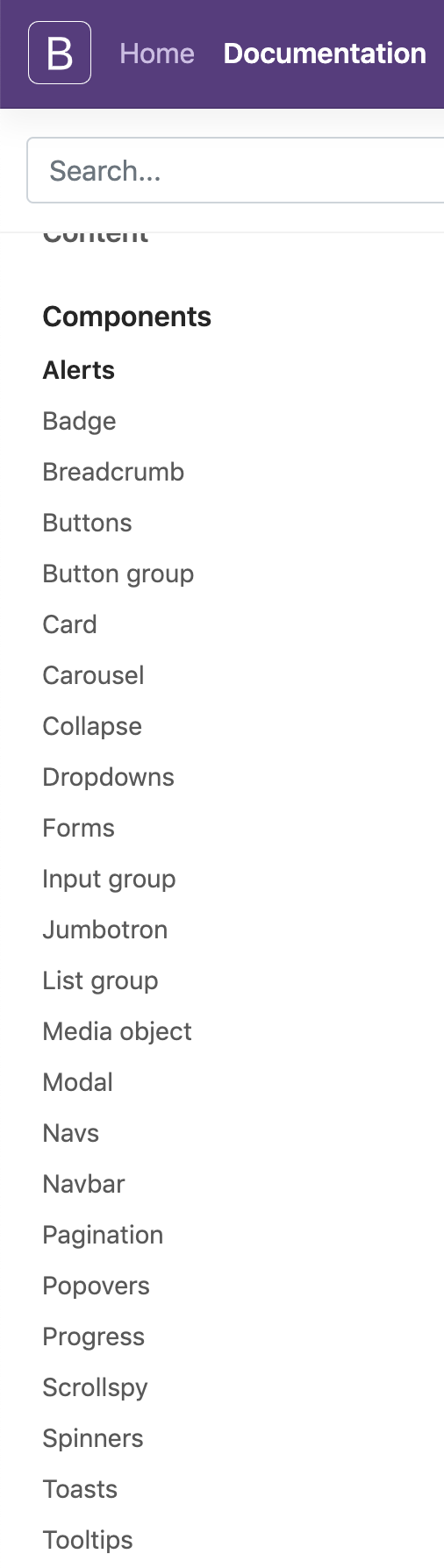
Figure 11-6. Bootstrap components
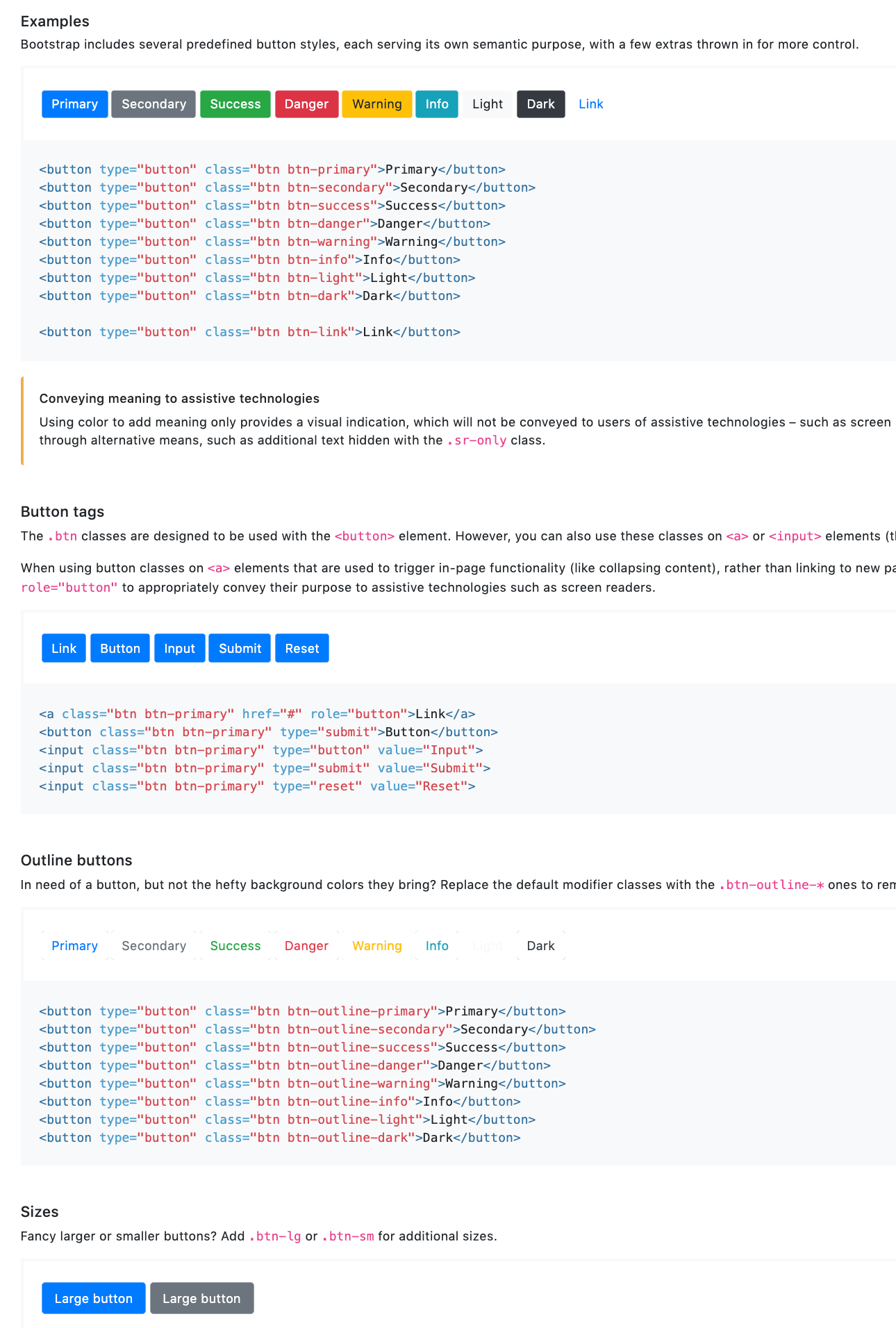
Figure 11-7. Bootstrap button components
Foundation
Foundation is another popular UI framework today. Originally developed by a company called Zurb, it is robust and has a large contributor community. Many large enterprises use Foundation. Figure 11-8 shows the list of components that are included by default. Figure 11-9 shows examples of button components.

Figure 11-8. Foundation components

Figure 11-9. Foundation button components
Semantic UI
Semantic is a UI framework that aims to be friendly to the ordinary person. Its organization and naming use natural language and real-world concepts. Figure 11-10 shows the list of components that are included by default, and Figure 11-11 shows its button components.

Figure 11-10. Semantic UI components
Figure 11-11. Semantic UI button components
Materialize
Materialize is one of many UI frameworks that is based on Material, the design system for Android. Originally developed by Google, Material is widely used for Android-native apps but also for web and mobile apps by third parties. Materialize helps them do this and stay in line with Material style. Figure 11-12 shows the list of components that are included by default. Figure 11-13 shows button component examples.

Figure 11-12. Materialize components

Figure 11-13. Materialize button components
Blueprint
Blueprint is a UI framework that is optimized for data-intensive web applications. Developed by Palantir Technologies, it’s available to any software project. Figure 11-14 shows the list of components that are included by default; Figure 11-15 presents examples of buttons.
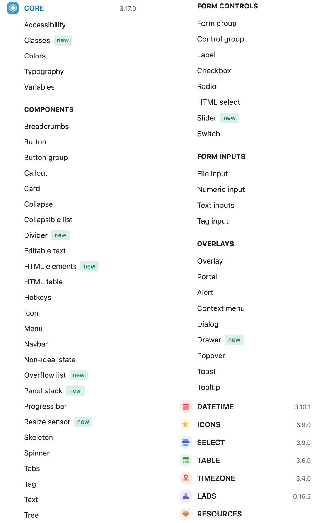
Figure 11-14. Blueprint components

Figure 11-15. Blueprint buttons component
UIkit
UIkit is a minimalist UI framework intended for a quick start with a frontend component design. Figure 11-16 shows UIkit’s list of components that are included by default, and Figure 11-17 shows button component examples.
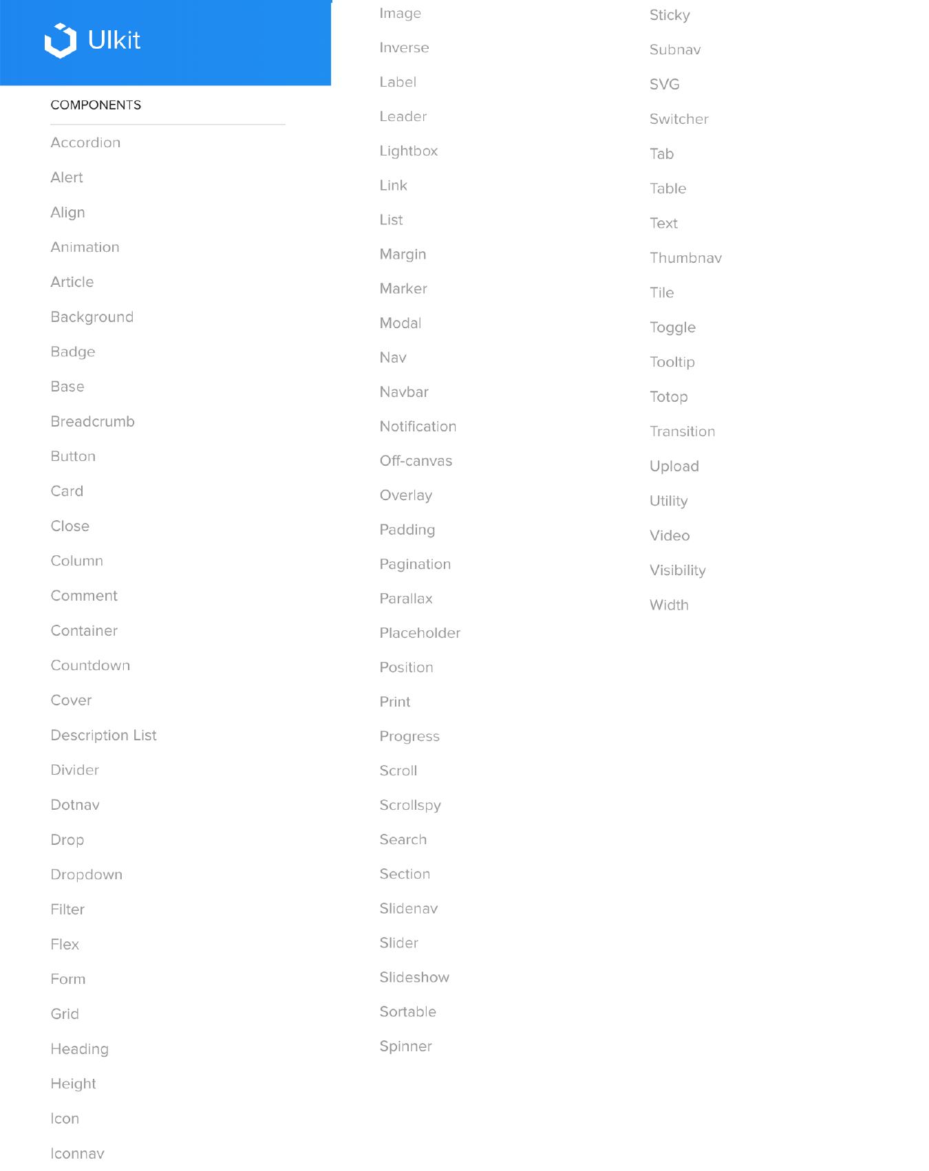
Figure 11-16. UIKit components
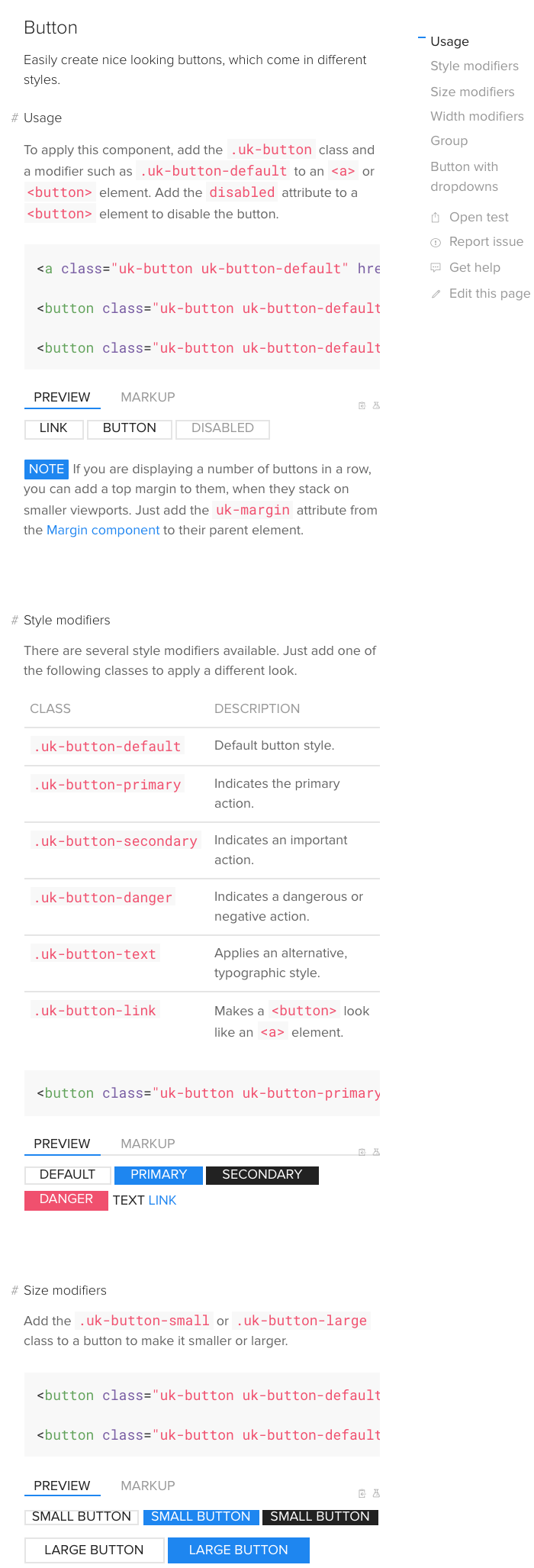
Figure 11-17. UIkit buttons component
Conclusion
A strong basis for designing scalable, consistent interfaces today is using a design systems approach, such as atomic design, paired with a modern UI framework like the those previewed in this chapter. UI frameworks are a standard part of the engineering foundation for software projects, so you can expect your engineering team to select one. These frameworks use a patterns-based approach to the UI. The benefits are quicker and easier design and deployment of the standardized, repeated parts of your interaction design. For your customers, there is the benefit of an easier learning curve and more confidence in using your designs. There are also the benefits of scaling the design team and your software without introducing random variations or different ways of doing the same thing. This allows you to free up time to solve the really difficult interaction design challenges.