
Chapter 10. Getting Input from Users: Forms and Controls
Sooner or later, the software you design will probably need to collect information from people. It might even happen in the first few minutes of interaction. What’s your login name? What words do you want to search for? Where should we ship your order?
In this chapter, we look at a number of topics related to getting input from users:
-
Guidelines for designing useful, usable forms
-
Different forms for different purposes
-
Developing effective autocompletion
-
Designing complicated controls
Form interactions seem to be easy to design at first. This is for several reasons. Everyone is familiar with the standard form elements such as text fields, checkboxes, and combo boxes. We have more than two decades of interactive form design examples to choose from. These input controls are also a big part of the user interface (UI) frameworks we will review in Chapter 11. All of these interface toolkits have form elements and controls ready to go, out of the box.
However, you might stuggle with a design that is awkward, difficult for users to understand, or difficult to complete. Here’s another sample question that can shed light on the kinds of problems designers need to think about in designing forms and controls: for what location do you want a weather report? The user might wonder, do I specify a location by neighborhood, city, region, state, country, postal code, or what? Are abbreviations OK? What if I misspell it? What if I ask for a city it doesn’t know about? Isn’t there a map to choose from? And why can’t it remember the location I gave it yesterday, anyhow?
This chapter discusses ways to smooth out these problems. The patterns, techniques, and controls described here apply mostly to form design—a form being simply a series of question/answer pairs. However, they will also be useful in other contexts, such as for single controls on web pages or on application toolbars. Input design and form design are core skills for interaction designers, as you can use them in every genre and on every platform.
First, let’s review some design guidelines for creating effective, usable forms and controls.
The Basics of Form Design
Here are a few principles to remember when doing input and form design:
- Respect the user’s time and attention
-
Approach form design with an awareness of how much time and effort it will cost a person to fill out a form. This cost in their eyes can be higher than the designer thinks. Make the form as short and simple as possible using the techniques that we describe in this chapter.
- Make sure the user understands the purpose of the form
-
A form asks the user to do work in exchange for something. The form’s headlines, context, and wording should confirm why it’s asking for this information, how the information will be used, and what the user will get out of it.
- Minimize the number of form inputs
-
Consider each question or element carefully. It’s unkind to ask the user to do unnecessary work. If you ask for a US Zip Code, for instance, can you deduce the city and state? For credit cards, it’s not necessary to ask for the card type (Visa, Mastercard, etc.) because the first two integers will identity the type of credit card. Consider not asking for first and last name if an email address can function as the username.
- Minimize visual clutter
-
Generally, a form is not the place to distract the user with other material. Keep it simple, clean, and focused.
- Group and title the form elements into sections where possible
-
If you design a long or complicated form, break it up into descriptive Titled Sections (see “Titled Sections”). Group and label the form elements. Use titles and subtitles to further organize and explain the form.
- Consider dynamic, show/hide sections for long, complicated forms
-
A long or complicated form can be intimidating if everything is displayed all at once. There is also the increased chance that the user will skip a step among all the fields. Instead, consider breaking up the form into sections with only the first section displayed by default. The other sections can be displayed one by one, in sequence. Optional parts of a form can be always hidden by default.
- Use alignment for clear vertical flow
-
Use layout and alignment so there is a strong vertical flow to the form whether in one column or more. Align the left edges of the inputs, and use the same vertical separation as much as possible. The eye should be able to move from label to input with minimum travel.
- Indicate what are required and what are optional fields
-
Indicating what fields must be filled out in a form is both a courtesy and also a usability and error-prevention strategy. Should you mark the required fields, or the optional ones? You will need to decide on a standard approach for all your forms in your app or website.
- Labels, instructions, examples, and help
-
Use descriptive form labels, input examples, and help text with individual form fields. Labels are still a best practice for ensuring accessibility by differently abled people. Avoid lots of placeholder text in fields because it can confuse users into thinking they filled them out already. Use vocabulary that is appropriate for the audience and task domain. Don’t be afraid to put instructions into your form if necessary (and you always have the option of putting instructions in a user-triggered pop-up or modal window).
- Use the width of the input fields to preview the length of the input
-
Your choice of controls will affect the user’s expectation of what is asked for. A radio button suggests a one-out-of-many choice, whereas a one-line text field suggests a single word or phrase. A large, multiline text entry field implies a longer answer, such as a paragraph.
- Accept variations in input formatting
-
Accept multiple formats for dates, addresses, phone numbers, credit card numbers, and so on, per the Forgiving Format pattern. If you ask for input that needs to be formatted in a specific way, offer the user examples about how to format it.
- Error prevention and validation as quickly as possible
-
The goal here is to help the user get it right the first time. Give instructions and examples to make it clear what information is needed. Deploy contextual help in the form. Show an error message as soon as it becomes clear that the user made a mistake. Consider giving feedback on a field-by-field basis. Help the person catch any individual validation errors before submitting the form as a whole. On the form, give actionable validation messaging: Indicate which input field is problematic, why, and how the user might fix it. See the patterns Password Strength Meter and Error Messages.
Autocompletion goes a step further by telling the user what input is valid, or by reminding the user what they entered some previous time, or saving time by offering the most common entries.
- Consider top-aligned labels for mobile and web-responsive designs
-
Top-aligned labels are those that appear above the user input fields, instead of to the left. Using this alignment works best for responsive-design screens because the components can stack vertically without a change to layout. There is less chance the label and input will become misaligned.
- Consider internationalization
-
Account for the need to offer the form to users in countries and cultures outside your own. There are the immediate concerns that it be possible for the language of the form to be changed without breaking the layout (consider different lengths of translated text strings and different writing directions). There is also the need to switch to different units, styles, and formatting of numbers, measurements, dates, times, currencies, and other standards. Beyond that, different data securityand privacy legislation might affect what information you can legally gather, transmit, and store.
- Message success
-
When a user has successfully submitted a form, make sure to let them know this and specify to them what is going to happen next.
- Usability test it
-
For some reason, when input forms are involved, it’s particularly easy for designers and users to make radically different assumptions about terminology, possible answers, intrusiveness, and other context-of-use issues. Do some usability testing, even if you’re reasonably sure your design is good.
Form Design Continues to Evolve
One major caveat to form design is that it continues to change and evolve. As interaction designers, we need to consider the pros and cons of new form capabilities.
Required versus optional
The practice of marking required fields with an asterisk (*) is still common. It’s a good idea in this case to explain in the form what the asterisk means, although many sites are now omitting the legend. Because this places a slight burden on the user to figure out, other approaches are now used. Usability experts Nielsen/Norman Group says marking all required fields is still the most usable approach.1
One option is to count how many required fields versus optional fields there are and then label only the smaller number—the exceptions to the majority. A second option is to display only required fields, omitting all optional fields. Explaining that all fields are required helps remove confusion, but many forms do without this notice, as well.
A third way is to not mark required fields, and mark optional fields with the word “optional” next to the label or input field. This is the standard approach as used in the United States Web Design System and the UK Government web design standards.
Floating labels
It’s now possible to display labels for input fields inside the form elements themselves. The labels display at full size by default, similar to placeholder text in an input field. However, if a user selects the input field, the floating label becomes small-sized text and moves up to be aligned close to the inside top of the input field. It gets out of the way but remains visible as the user enters text. Although it gives a snappy animation to your forms, consider whether this will be usable for your audience.
Further Reading
There are a number of design books focused specifically on form design. Here are three to consider if you want a more extensive analysis:
-
Enders, Jessica. Designing UX: Forms: Create Forms That Don’t Drive Your Users Crazy. SitePoint, 2016.
-
Jarrett, Caroline, and Gerry Gaffney. Forms That Work: Designing Web Forms for Usability. Elsevier/Morgan Kaufmann, 2010.
-
Wroblewski, Luke. Web Form Design: Filling in the Blanks. Rosenfeld Media, 2008.
The Patterns
Most of these patterns describe controls—specifically, how you can combine input controls with other controls and text in ways that make them easier to use. Some patterns define structural relationships between elements, such as Drop-down Chooser and Fill-in-the-Blanks.Others, such as Good Defaults and Smart Prefills and Autocompletion, discuss the values of controls and how those values change.
The patterns in the list that follows deal primarily with text fields. That shouldn’t be surprising. Text fields are as common as dirt, but they don’t make it easy for users to figure out what should go in them. They’re easiest to use when presented in a context that makes their usage clear. The patterns give you many ways to create that context.
-
Forgiving Format
-
Structured Format
-
Fill-in-the-Blanks
-
Input Hints
-
Input Prompt
-
Password Strength Meter
-
Autocompletion
The next two patterns deal with controls other than text fields. Drop-down Chooser describes a way to create a custom control, and List Builder, referenced in the control table shown earlier, describes a commonly reinvented combination of controls that lets users construct a list of items.
You should design the remaining patterns into the whole form. They apply equally well to text fields, drop- down menus, radio buttons, lists, and other stateful controls, but you should use them consistently within a form (or within a dialog box, or even an entire application).
-
Good Defaults and Smart Prefills
-
Error Messages
Patterns from other chapters apply to form design, as well. You can place labels above the form fields (at the cost of vertical space, but with plenty of horizontal room for long labels), or left-aligned along the left edge of the form. The choice can affect the speed of form completion.
Chapters 3 and 4 also give you some larger-scale design possibilities. A gatekeeper form—any form that stands between the user and their immediate goal, such as sign-up or purchase forms—should be in Center Stage, with very few distractions on the page. Alternatively, you might make it a Modal Panel, layered over the page.
If you have a long form that covers different topics, you might consider breaking it up into Titled Sections or even separate pages. (Tabs tend to work poorly as grouping mechanisms for forms.) If you break up a form into a sequence of pages, use the Wizard and Progress Indicator patterns to show users where they are and where they’re going.
Finally, forms should use a Prominent “Done” Button (Chapter 8) for the completion or submission action. If you have secondary actions, such as a form reset or a help link, make those less prominent.
Forgiving Format
What
Permit users to enter inputs in a variety of choices, formats, and syntax, and make the application interpret it intelligently. Weather.com (Figure 10-1) shows an example of this.

Figure 10-1. Weather.com
Use when
Your UI asks for data that users might type with an unpredictable mix of vocabulary or styling (whitespace, hyphens, abbreviations, or capitalizations). More generally, the UI can accept input of various kinds from the user—different meanings, formats, or syntax. But you want to keep the interface visually simple.
Why
The user just wants to get something done, not think about “correct” formats and complex UI . Computers are good at figuring out how to handle input of different types (up to a point, anyway). It’s a perfect match: let the user type whatever they need, and if it’s reasonable, make the software do the appropriate thing with it.
This can help simplify the UI tremendously, making it much easier to figure out. It can even remove the requirement for an Input Hints or Input Prompt, though they’re often seen together, as in the example in Figure 10-1.
You might consider Structured Format as an alternative, but that pattern works best when the input format is entirely predictable (and usually numeric, like telephone numbers).
How
The catch: it turns a UI design problem into a programming problem. You need to think about what kinds of text a user is likely to type in. Maybe you ask for a date or time, and only the format varies—that’s an easy case. Or maybe you ask for search terms, and the variation is what the software does with the data. That’s more difficult. Can the software disambiguate one case from another? How?
Each application uses this pattern differently. Just make sure the software’s response to various input formats matches what users expect it to do. Test, test, and test again with real users.
Examples
The New York Times uses Forgiving Format in several features that need information from users. Figure 10-2 shows examples from its real estate search and from its financial quotes feature.
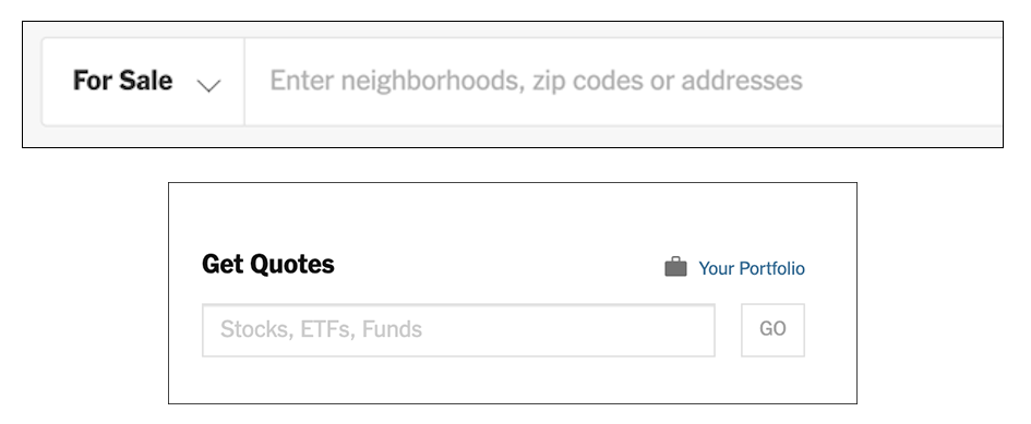
Figure 10-2. Two search fields in the New York Times website hint at the variety of possible formats they will accept
Google Finance (Figure 10-3) helps users find the correct stock symbol by mapping what they type to the most likely matching stock symbols. It’s not necessary to know or enter the exact stock symbol.
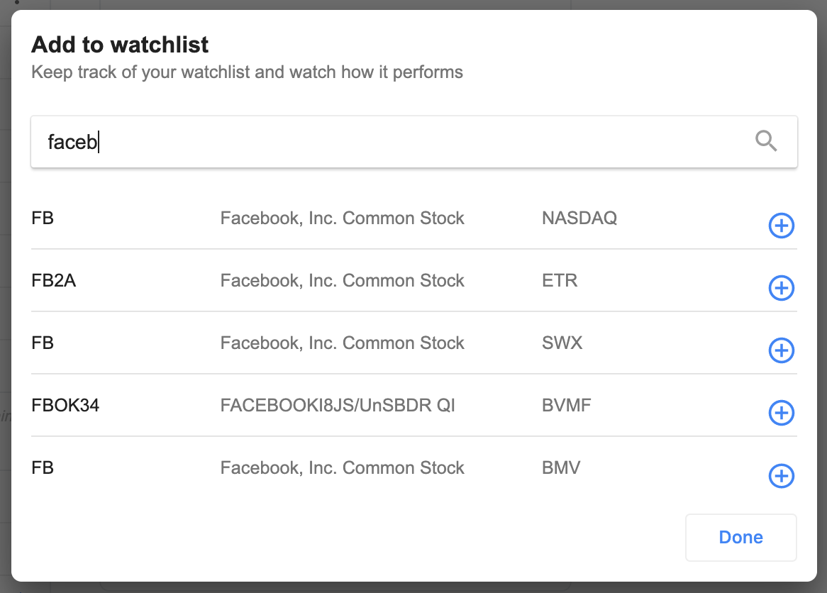
Figure 10-3. Adding a stock to a personal watchlist in Google Finance
Consider forms that request credit card numbers from the user. As long as 16 digits are typed, why should the form care whether the user separates them by spaces, or by hyphens, or by nothing at all? PayPal, for example, allows customers to enter their credit card number however they want. The credit card number field accepts spaces as separators, hyphens, or no spaces. Paypal standardizes the format immediately afterward. (Figure 10-4).

Figure 10-4. PayPal
Figure 10-5 comes from Google Calendar’s tool for setting up a meeting. Look at the “from” and “to” fields in the screenshot—you don’t need to give it a fully defined date, like what’s in the text fields now. If today is July 13 and you want to set up a meeting for July 20, you can type any of the following terms:
-
Saturday 7/20
-
Saturday 20/7
-
20/7/2019
-
7/20/2019
-
20/7
-
7/20
The specified date then is “echoed back” to the user in the appropriate format for the user’s language and location.
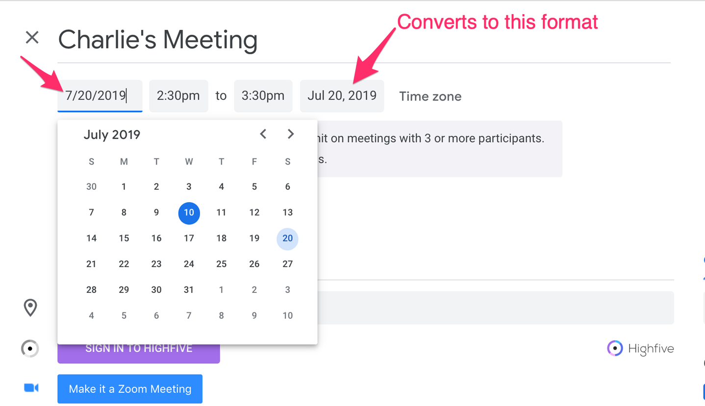
Figure 10-5. Google Calendar
Structured Format
Use when
Your interface requests a specific kind of text input from the user, formatted in a certain way. That format is familiar and well defined, and you don’t expect any users to need to deviate from the format you expect. Examples include credit card information, local telephone numbers, and license strings or numbers.
It’s generally a bad idea to use this pattern for any data in which the preferred format might vary from user to user. Consider especially what might happen if your interface is used in other countries. Names, addresses, postal codes, and telephone numbers all have different standard formats in different places. Consider using Forgiving Formatin those cases.
Why
The structure of the text fields gives the user a clue about what kind of input is being requested. Expectations are clear. The user is spared from wondering whether they need to type in any spaces, slashes, or hyphens. The structure already takes care of that.
This pattern usually is implemented as a set of small text fields instead of one big one. That alone can reduce data entry errors. It’s easier for someone to double-check several short strings (two to five characters or so) than one long one, especially when numbers are involved. Likewise, it’s easier to transcribe or memorize a long number when it’s broken up into chunk . That’s how the human brain works.
Contrast this pattern to Forgiving Format, which takes the opposite tack: it allows you to type in data in any format, without providing structural evidence of what’s being asked for. (You can use other clues, instead, like Input Hints.) Structured Format is better for very predictable formats, Forgiving Format for open-ended input.
How
Design a set of text fields that reflect the format being asked for. Keep the text fields short, as clues to the length of the input.
After the user has typed all the digits or characters in the first text field, confirm it by automatically moving the input focus to the next field. The user can still go back and re-edit the first one, of course, but now they know how many digits are required there.
You can also use Input Prompt to give the user yet more clues about what’s expected. In fact, structured format fields for dates often do use Input Prompt, such as “dd/mm/yyyy”.
Examples
Airbnb uses structured format in the form for the customer to enter their security code to verify their identity (Figure 10-6). There are four placeholder dashes of one digit each. This corresponds to the code they are sent. This is structured format for the four-digit code, with the insertion point jumping automatically to the next integer field when the user types in a digit.

Figure 10-6. Airbnb security code entry form
At Official Payments, a service provider to the State of California, the online forms for making tax payments include structured data (Figure 10-7). The taxpayer’s telephone number fields and the tax date range fields are separate and have added symbols to reinforce the proper data format. Telephone number and date fields are structured to promote successful data entry and avoid errors.

Figure 10-7. Officialpayments.com
Similarly, in Outlook for Microsoft Office 360, scheduling a meeting brings up a dialog window with date and time selectors (Figure 10-8). These are broken up into individual input fields so that the user must step through each one in sequence. It’s not possible to select the entire date string or time string and type in new values, or try alternates such as DD/MM/YYYY. Each month, day, year, hour, minute and am/pm string must be entered separately, in the prescribed place and format (unless using the date picker drop-down list).

Figure 10-8. Microsoft Outlook/Office 360
Fill-in-the-Blanks
What
Arrange one or more fields in the form of a prose sentence or phrase, with the fields as “blanks” to be filled in by the user. San Francisco Public Library (Figure 10-9) uses this approach for its search.

Figure 10-9. San Francisco Public Library
Use when
You need to ask the user for input, usually one-line text, a number, or a choice from a drop-down list. You tried to write it out as a set of label/control pairs, but the labels’ typical declarative style (such as “Name:” and “Address:”) isn’t clear enough for users to understand what’s going on. You can, however, verbally describe the action to be taken once everything’s filled out, in an active-voice sentence or phrase.
Why
Fill-in-the-Blanks helps to make the interface self-explanatory. It makes it easier to construct rules or conditions. After all, we all know how to finish a sentence. (A verb phrase or noun phrase will do the trick, too.) Seeing the input, or “blanks,” in the context of a verbal description helps the user understand what’s going on and what’s required.
How
Write the sentence or phrase using all your word-crafting skills. Use controls in place of words.
If you’re going to embed the controls in the middle of the phrase instead of at the end, this pattern works best with text fields, drop-down list , and combo boxes—in other words, controls with the same form factor (width and height) as words in the sentence. Also, make sure the baseline of the sentence text lines up with the text baselines in the controls, or it will look sloppy. Size the controls so that they are just long enough to contain the user’s choices, and maintain proper word spacing between them and the surrounding words.
This is particularly useful for defining conditions, as one might do when searching for items or filtering them out of a display. The Excel and eBay examples in Figures 10-10, 10-11, and 10-12 illustrate the point. Robert Reimann and Alan Cooper describe this pattern as an ideal way to handle queries; their term for it is natural language output.2
There’s a big “gotcha” in this pattern, however: it becomes very difficult to properly localize the interface (convert it to a different language) because comprehension now depends upon word order in a natural language. For some international products or websites, that’s a nonstarter. You might need to rearrange the UI to make it work in a different language; at the very least, work with a competent translator to make sure the UI can be localized.
Examples
Microsoft Excel makes extensive use of Fill-in-the-Blanks for its conditional formatting rules. These allow users to set up automatic cell highlighting based on logical rules so that it’s easy to see important status or results. Using the sentence-style format of Fill-in-the-Blanks makes it easy to specify the desired logic.
In Figures 10-10 and 10-11, we see two different ways Excel enables this. In the “Classic” example, a sequence of drop-down menus with phrases allows the user to set up a fairly complicated If-then instruction. The user selects a series of statements and conditions in a sentence-like sequence to specify the desired logic. In Figure 10-10, reading the fill-in-the-blank structure sounds very close to natural language instructions: “Format only cells that contain a cell value between 33 and 66. Format them with a yellow fill and bold yellow text.”
In Figure 10-11, we’re creating instructions for when to display green, yellow, and red icons. There’s more to configure here, but Excel lays out a stack of three fill-in-the-blank statement builders. These are more compact, using logical symbols like “>=” instead of writing out “greater than or equal to.” Still, it’s easy to construct the display logic by stepping through the fill-in-the-blanks structure. It’s a little more work, but for the green icon, reading left to right, we can get “Display the green icon when the value is greater than or equal to 67 percent.” Excel takes the numerical value that the user enters here and automatically prefills the fill-in-the-blank logic for the second, yellow icon so that it doesn’t conflict with the first.

Figure 10-10. Classic conditional fomatting in Microsoft Excel
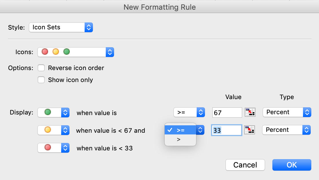
Figure 10-11. Icon Set conditional formatting in Microsoft Excel
When users search for items on eBay, they can use the Advanced Search form to specify various criteria. The form shown in Figure 10-12 has several examples of Fill-in-the-Blanks.
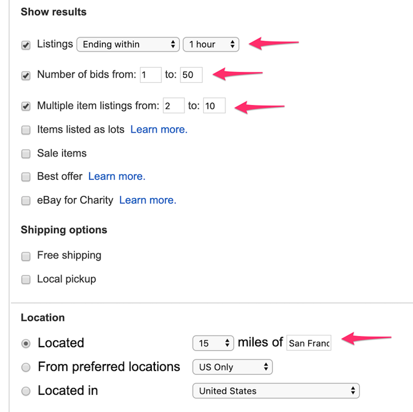
Figure 10-12. eBay search filter form
Input Hints
Use when
The interface presents a text field, but the kind of input it requires isn’t obvious to all users. You don’t want to put more than a few words into the text field’s label.
Why
A text field that explains what goes into it frees users from having to guess. The hint provides context that the label itself may not provide. If you visually separate the hint from the main label, users who know what to do can more or less ignore the hint, and stay focused on the label and contro .
How
Write a short example or explanatory sentence, and put it below or beside the text field. The hint can be visible all the time, or it can appear when the text field receives input focus.
Keep the text in the hint small and inconspicuous, though readable; consider using a font two points smaller than the label font. (A one-point difference will look more like a mistake than an intended font-size change.) Also, keep the hint short. Beyond a sentence or two, many users’ eyes will glaze over, and they’ll ignore the text altogether.
Examples
Figure 10-13 shows two short input hints in the 1-800-Flowers registration page. The advantage of Input Hints is that it leaves the control blank—the user is forced to consider the question and give an answer, and there is no chance the input field will be skipped over because it looks already filled in.

Figure 10-13. The 1-800-Flowers registration screen
The printing dialog boxes used by several Microsoft Office applications supply an Input Hints below a Forgiving Format text field—it takes page numbers, page ranges, or both (Figure 10-14). The hint explains how to use the Page Range print feature. The hint is very useful to anyone who’s never had to use the Page Range option, but users who already understand it don’t need to focus on the written text; they can just go straight for the input field.

Figure 10-14. Microsoft Word print dialog box
Longer descriptions can be used in Input Hints when necessary. The examples from Gmail’s registration page (Figure 10-15), are about as long as you’d want to put next to a text field. Indeed, Google offers additional information, but the user must select the link “Why we ask for this information”—which loads a web page in a new browser window. It’s good customer service to explain what the company policy is, but most users will never follow a link when they’re filling out a form, especially if they’re trying to get through it quickly and don’t have major privacy concerns. So, don’t depend on linked pages to convey critical information.

Figure 10-15. Gmail registration page
Apple places Input Hints on the right of the form, aligning the controls with their hints (Figure 10-16). This is a graceful way to structure a page full of Input Hints.
Figure 10-16. Apple checkout screen
Some forms show Input Hints only when the focus is on the text field itself, or only when a condition is met, as Yelp does (see Figure 10-17). This hint appears only after the user starts composing their password but has not included a required character. Otherwise, the hints are hidden. This is nice because the hidden hints don’t clutter the interface or add visual noise; however, the user doesn’t see them at all until they click (or tab into) the text field. If you use these, note that you must leave space for them in the interface, or have it expand.

Figure 10-17. Yelp password input hint
Trunk Club (Figure 10-18) offers a fairly compact, vertical registration form. When the user selects the Password field, the form opens up to display the password hints. That is, the password hints appear only when the user tabs into the password field.

Figure 10-18. Trunk Club
Input Prompt
Use when
The UI presents a text field, drop-down list, or combo box for input. Normally you would use a good default value, but you can’t in this case—perhaps there is no reasonable default. The examples from the Blueprintjs UI Toolkit (Figure 10-19) show how prompts can help explain the function of the input field.

Figure 10-19. Blueprintjs UI Toolkit; four example inputs with prompts
Why
It helps make the UI self-explanatory. Like Input Hints, an Input Prompt is a handy way of supplying help information for controls whose purpose or format might not be immediately clear.
With Input Hints, someone quickly scanning the UI can easily ignore the hint (or miss it entirely). Sometimes this is your desired outcome. But an Input Prompt sits right where the user will type, so it can’t be ignored. The advantage here is that the user doesn’t have to guess whether they have to deal with this control or not—the control itself tells them to. (Remember that users don’t fill out forms for fun—they’ll do as little as needed to finish up and get out of there.) A question or an imperative “Fill me in!” is likely to be noticed.
Not the same as floating labels
Contemporary form design frequently uses “float labels” (see Brad Frost’s article on Float Labels). This uses HTML label elements inside the form fields, very similar to input prompts, for the sake of elegance and simplicity. However, an input prompt disappears when the focus is on a form input that has prompt text. Floating labels move and change size but do not disappear on focus. Look again at Figure 10-15 (the Gmail registration screen); there are no labels outside the form inputs. The label “Phone number (optional)” and the next form input label “Recovery email address (optional)” are actually floating labels inside the input fields. In this case, input prompts are redundant. The phone number field has been selected, and instead of the text vanishing completely (formerly a huge drawback of input prompts), the label has moved up to the top edge of the input field. The user can still refer to it, and not need to remember it. On the other hand, only using floating labels can be problematic when you need to have both label text and input prompt text to explain different information.
How
Choose an appropriate prompt string:
-
For a drop-down list, use Select, Choose, or Pick
-
For a text field, use Type or Enter
-
A short verb phrase
End it with a noun describing what the input is, such as “Choose a state,” “Type your message here,” or “Enter the patient’s name.” Put this phrase into the control where the value would normally be. (The prompt itself shouldn’t be a selectable value in a drop down; if the user selects it, it’s not clear what the software should do with it.)
Because the point of the exercise was to tell the users what they were required to do before proceeding, don’t let the operation proceed until they’ve done it! As long as the prompt is still sitting untouched in the control, disable the button (or other device) that lets the user finish this part of the operation. That way, you won’t need to throw an error message at the user.
For text fields, put the prompt back into the field as soon as the user erases the typed response.
Use Good Defaults and Smart Prefills instead of an Input Prompt when you can make a very accurate guess about what value the user will put in. The user’s email address might already have been typed somewhere else, for instance, and the originating country can often be detected by websites.
Examples
Lyft (Figure 10-20) deploys a form with an Input Prompt. The Input Prompt displays by default, and disappears when the user begins typing. If the user deletes their entry, the input prompt text returns.
Figure 10-20. Lyft mobile app input prompt
Password Strength Meter
Use when
The UI asks the user to choose a new password. This is quite common for site registrations. Your site or system cares about having strong passwords, and you want to actively help users choose good ones.
Why
Strong passwords protect both the individual user and the entire site, especially when the site handles sensitive information and/or social interactions. Weak passwords ought to be disallowed because they permit break-ins.
A Password Strength Meter gives immediate feedback to the user about their new password—is it strong enough or not? Do they need to make up a new one, and if so, with what characteristics (numbers, capital letters, etc.)? If your system is going to reject weak passwords, it’s usually best to do it instantly, not after the user has submitted the registration form.
How
While the user types their new password or after keyboard focus leaves the text field, show an estimate of the password strength beside the text field. At minimum, display a text and/or graphic label indicating a weak, medium, or strong password, and special wording to describe a too-short or invalid password. Colors help: red for unacceptable, green or blue for good, and some other color (often yellow) in between. Yelp’s password strength meter is a good example of this (Figure 10-21).
If you can, show additional text with specific advice on how to make a weak password better—a minimum length of eight characters (for instance), or the inclusion of numbers or capital letters. A user might get frustrated if they repeatedly fail to produce a valid password, so help them be successful.
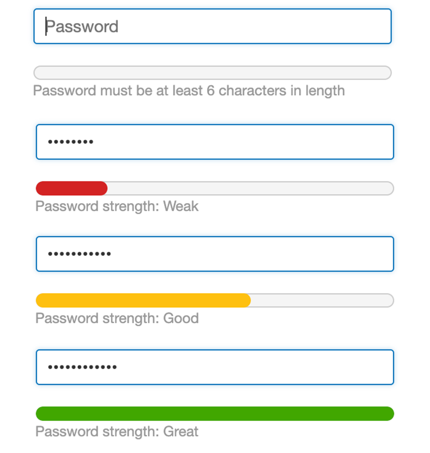
Figure 10-21. Yelp password strength meter
Also, the form containing the password field should use Input Hints or other text to explain this beforehand. A short reminder of good password heuristics can be useful to users who need reminders, and if your system will actually reject weak passwords, you should warn the user about it before they finish the form. Many systems require a minimum number of characters for a valid password, such as six or eight.
By default, don’t show the password, but you might consider offering a toggle with which the user can view their password. Don’t make suggestions of alternative passwords. General hints are all you can really give.
An explanation of password security is beyond the scope of a UI pattern. There are excellent online and print references for this topic, however, should you need to understand it more deeply.
Examples
GitHub’s password strength meter (Figure 10-22) takes a contemporary approach that converts the password requirements or conditions (displayed as input hints) into a kind of meter. This could also be considered a kind of checkmark process. The user can read the requirements and follow them directly, of course. As they type, certain key words and phrases in the hint change from red (password requirement not met) to green (requirement is met). In this way, the user can adjust their password as they type to create a good one.

Figure 10-22. GitHub password strength meter states
Airbnb does a very similar thing, except that it makes the password meter into an explict checklist that updates as the user types (Figure 10-23)

Figure 10-23. Airbnb password strength meter states
H&M uses a highly compact checklist style password strength meter (Figure 10-24). Again, it is presented as an input hint that is just a brief set of phrases. As the user enters a strong password, the requirements become checked.

Figure 10-24. H&M password strength meter states
Retailer Menlo Club uses a minimalist approach, as well (Figure 10-25). It chose a classic thermometer-style password strength meter that uses just color and length. There is no input hint or instructions. As the user enters a password, the color bar “fills in” the meter, changing from red to yellow and finally to green.

Figure 10-25. Menlo Club password strength meter
Glassdoor offers another minimalist approach (Figure 10-26). There is an input hint for the password, but the requirements are light. The password strength indicator has just two states: Red with warning icon, meaning not a compliant password, and a green checkmark, meaning the password is acceptable.
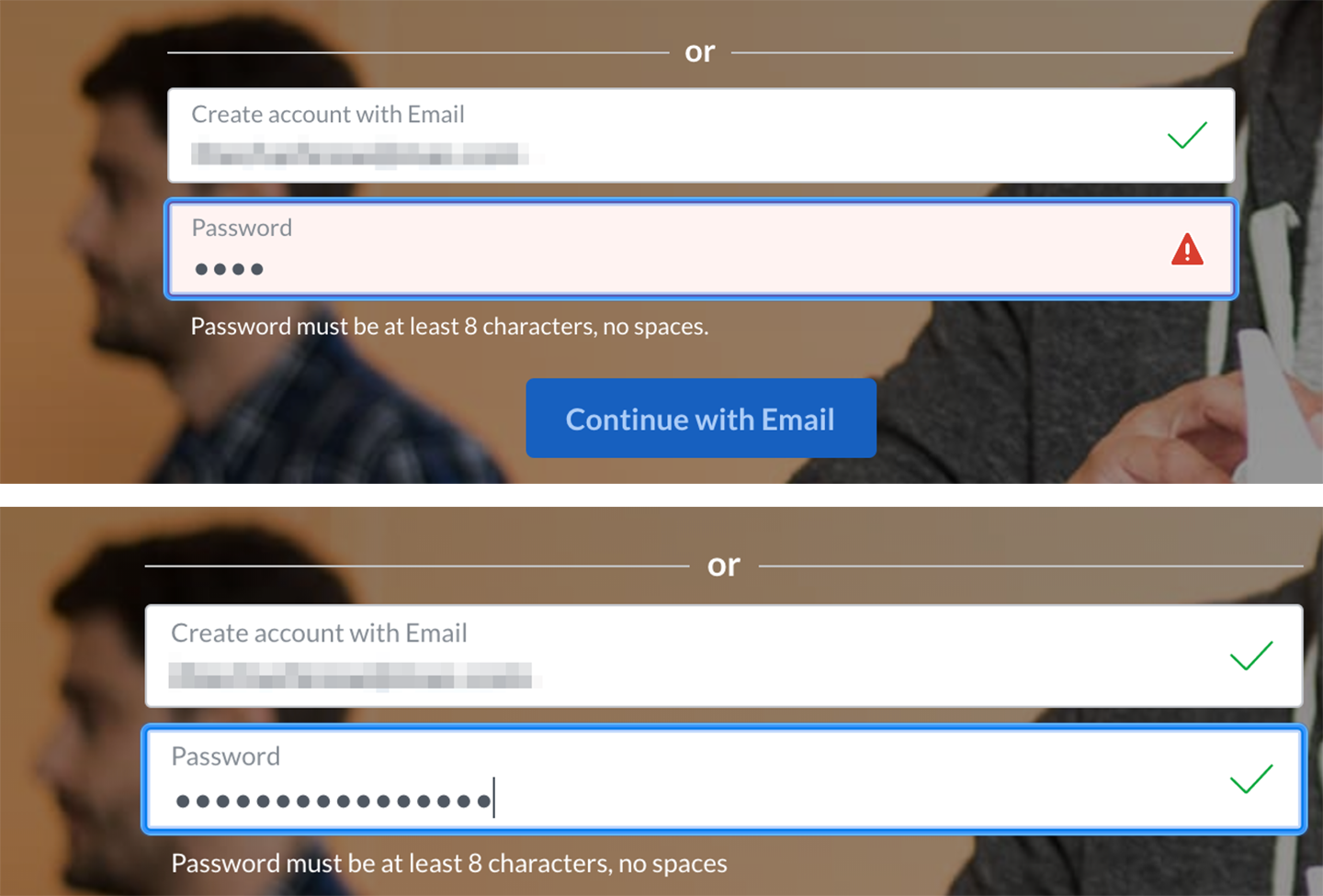
Figure 10-26. Glassdoor password strength meter. This is reduced to just two password strength states: The rating is either “warning/error” or “OK.”
Autocompletion
Search becomes much more efficient and powerful if you add autocompletion. In real time, as the searcher enters their term(s) into the search input field, offer the most likely match based on the available string of characters. Offering up the most popular or most frequently searched terms is often part of making smart suggestions here. The benefit is that searchers save time because a match for their intent appears for selection without having to enter their entire search string. Amazon (Figure 10-27) offers an example of this capability in action.

Figure 10-27. Amazon autocomplete
What
As the user types into a text field, anticipate the possible answers, show a selectable list of them, and automatically complete the entry when appropriate.
Use when
The user types something predictable, such as a URL, the user’s own name or address, today’s date, or a filename. You can make a reasonable guess as to what the user is attempting to type—perhaps there’s a saved history of things this user has previously typed, for instance, or perhaps they are picking from a set of preexisting values, such as a list of filenames in a directory.
Search boxes, browser URL fields, email fields, common web forms (such as site registration or purchase), text editors, and command lines all seem to be much easier to use when supported by Autocompletion.
Predictive and social algorithms now drive autocomplete, as well. Popular, trending or most commonly entered search terms populate search engine autocompletes.
Why
Autocompletion saves time, energy, cognitive burden, and wrist strain for the user. It turns a laborious typing effort into a simple pick list (or less, if a single completion can be reliably supplied). You can thus save your users countless seconds of work, and contribute to the good health of thousands of wrists.
When the typed entries are long and difficult to type (or remember), like URLs or email addresses, Autocompletion is quite valuable. It reduces a user’s memory burden by supplying “knowledge in the world” in the form of a drop-down list. An additional benefit can be error prevention: the longer or stranger the string that must be typed, the greater the odds of the user making a typographical error. Autocompleted entries have no such problems.
For mobile devices, it’s even more valuable. Typing text on a tiny device is no fun; if a user needs to enter a long string of letters, appropriate Autocompletion can save them a great deal of time and frustration. Again, email addresses and URLs are excellent candidates to support mobile email and web usage.
Autocompletion is also common in text editors and command-line UI . As users type commands or phrases, the application or shell might offer suggestions for completion. Code editors and operating system shells are well suited for this, because the language used is limited and predictable (as opposed to a human language, such as English); it’s therefore easier to guess what the user tries to type.
Finally, lists of possible autocompletions can serve as a map or guide to a large world of content. Search engines and site-wide search boxes do this well—when the user types the beginning of a phrase, an Autocompletion drop-down list shows likely completions that other people have typed (or that refer to available content). Thus, a searcher can get a view into the public mental landscape, the trends among the vast numbers of people online. Very often they are seeking the same things. This offers a curious or uncertain user a way to navigate based on the wisdom (or curiosity) of crowds.
How
With each additional character that the user types, the software quietly forms a list of the possible completions to that partially entered string. If the user enters one of a limited number of possible valid values, use that set of valid values. If the possible values are wide open, one of these might supply completions:
-
Previous entries typed by this user, stored in a preferences or history mechanism
-
Common phrases that many users have used in the past, supplied as a built-in “dictionary” for the application
-
Possible matches drawn from the content being searched or perused, as for a site-wide search box
-
Other artifacts appropriate to the context, such as company-wide contact lists for internal email
-
Most popular or frequently submitted request strings
From here, you can approach the interaction design of Autocompletion in two ways. One is to show the user a list of possible completions on demand—for example, by pressing the Tab key—and let the user choose one explicitly by picking from that list. Many code editors do this. It’s probably better used when the user would recognize what they want when they see it but might not remember how to type it without help. “Knowledge in the world is better than knowledge in the head.”
The other way is to wait until there’s only one reasonable completion and then put it in front of the user, unprompted. Word does this with a tool tip; many forms do it by filling in the remainder of the entry but with selection turned on, so another keystroke would wipe out the autocompleted part. Either way, the user gets a choice about whether to retain the Autocompletion or not—and the default is to not keep it.
Make sure that Autocompletion doesn’t irritate users. If you guess wrong, the user won’t like it—they then must erase the Autocompletion and retype what they meant in the first place, avoiding having Autocompletion pick the wrong completion yet again. These interaction details can help prevent irritation:
-
Always give the user a choice to take the completion or not take it; default to “no.”
-
Don’t interfere with ordinary typing. If the user intends to type a certain string and just keeps typing in spite of the attempts at autocompletion, make sure the result is what the user intended to type.
-
If the user keeps rejecting a certain autocompletion in one place, don’t keep offering it. Let it go at some point.
-
Guess correctly.
Examples
Many email clients, of course, use Autocompletion to help users fill in To: and CC: fields. They generally draw on an address book, contacts list, or list of addresses with which you’ve exchanged email. The example from Apple Mail (Figure 10-28) shows a single completion suggested upon typing the letters f i d; the completed text is automatically highlighted, so a single keystroke can get rid of it. You can thus type straight “through” the completion if it’s wrong.

Figure 10-28. Apple Mail autocomplete
Google’s Gmail offers autocomplete for email composition (Figure 10-29). Pressing the right arrow key completes the sentence with the suggestion.
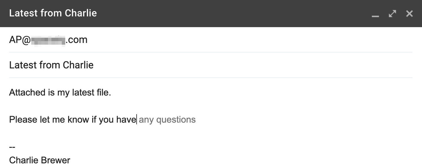
Figure 10-29. Gmail autocompletion in the body of the email
Drop-down lists of Autocompletion possibilities can take many forms. Figures 10-30 through 10-36 show examples of drop-down list formatting. Strategies for autocompletion can focus on specific data types and information only, or they can be more expansive, including searching varied data sources. Autocompletion can also be an opportunity for promotions and paid placement.

Figure 10-30. Apple Safari browser autocomplete
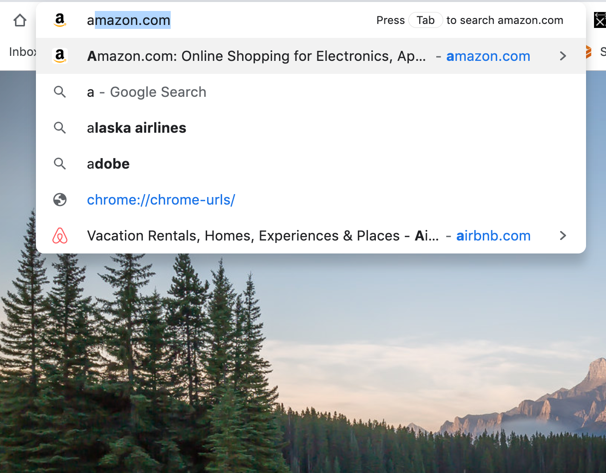

Figure 10-32. Google.com Search autocomplete

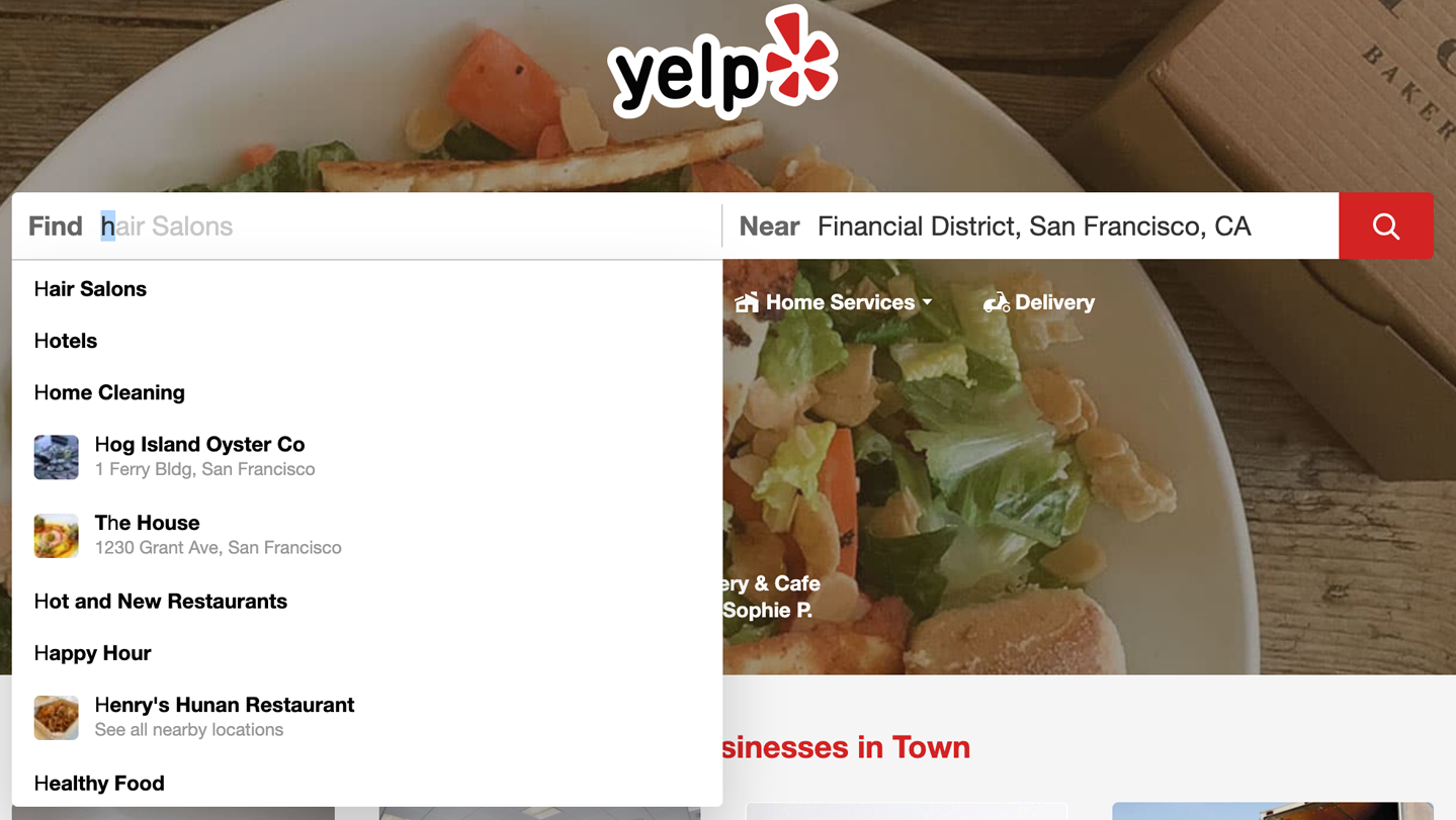
Figure 10-34. Yelp.com Search autocomplete

Figure 10-35. Expedia.com “Things to Do” Search autocomplete

Figure 10-36. Kayak.com Search autocomplete
Drop-down Chooser
Use when
The user needs to supply input that is a choice from a set (such as in the color example in Figure 10-37), a date or time, a number, or anything other than free text typed at a keyboard. You want to provide a UI that supports that choice—a nice visual rendering of the choices, for instance, or interactive tools—but you don’t want to use space on the main page for that; a tiny space showing the current value is all you want.
Why
Most users are very familiar with the drop-down list control (called a combo box when used with a free-typing text field). Many applications successfully extend this concept to drop-down lists that aren’t simple lists, such as trees, 2D grids, and arbitrary layouts. Users seem to understand them with no problem, as long as the controls have down-arrow buttons to indicate that they open when clicked.
Drop-down Choosers encapsulate complex UIs in a small space, so they are a fine solution for many situations. Toolbars, forms, dialog boxes, and web pages of all sorts use them now. The page the user sees remains simple and elegant, and the chooser UI shows itself only when the user requests it—an appropriate way to hide complexity until it is needed.
How
For the Drop-down Chooser control’s “closed” state, show the current value of the control in either a button or a text field. To its right, put a down arrow. This can be in its own button or not, as you see fit; experiment and see what looks good and makes sense to your users. A click on the arrow (or the whole control) brings up the chooser panel, and a second click closes it again.
Design a chooser panel for the choice the user needs to make. Make it relatively small and compact; its visual organization should be a familiar format, such as a list, a table, an outline-type tree, or a specialized format like a calendar or calculator (see the examples in the next section). See Chapter 7 for a discussion of list presentation.
Scrolling the panel is fine if the user understands that it’s a choice from a large set, such as a file from a filesystem, but keep in mind that scrolling one of these pop-up panels is not easy for people without perfect dexterity!
Links or buttons on the panel can in turn bring up secondary UIs—for example, color-chooser dialog boxes, file-finder dialog boxes, or help pages—that help the user choose a value. These devices usually are modal dialog boxes. In fact, if you intend to use one of these modal dialog boxes as the primary way the user picks a value (say, by launching it from a button), you could use a Drop-down Chooser instead of going straight to the modal dialog box. The pop-up panel could contain the most common or recently chosen items. By making frequently chosen items so easy to pick, you reduce the total time (or number of clicks) it takes for an average user to pick values.
Examples
This first example shows several drop-down selectors in Microsoft Word (Figure 10-37).

Figure 10-37. Microsoft Word drop-down choosers
Photoshop’s compact, interaction-rich toolbars use Drop-down Chooser heavily. Figure 10-38 shows three examples: Brush, Marquee Tool, and Opacity. The Brush chooser is a selectable list with a twist—it has extra controls such as a sliders, brush direction dial, icons of presets, and an expandable folder directory of brushes for yet more choices. Selecting the lower-right corner of the Marquee Tool opens the options menu, showing the special versions of that, too. The Opacity chooser is a simple slider, and the text field above it echoes its value.

Figure 10-38. Photoshop drop-down choosers
Design tool Sketch offers a multifunction drop-down chooser for its color picker (Figure 10-39). It offers robust color space configuration with hue and shade controls, numerical color values, and a grid of saved colors. Several menus offer access to even more functionality.

Figure 10-39. Sketch drop-down chooser
The Thumbnail Grid pattern (Chapter 7) is often used in Drop-down Chooser in place of a text-based menu. The examples fromPowerPoint (Figure 10-40) and Keynote (Figure 10-41) demonstrate several styles of Thumbnail Grid.


List Builder
What
A pattern for creating a complicated selection set from a larger source set of objects. A list builder has the “source” and the “destination” lists visible in the same widget. This lets the user move items between them, via buttons or drag-and-drop. This pattern is also called a two column multiselector.
Why
The key to this pattern is to show both lists on the same page. The user can see what’s what—they don’t need to jump to and from a modal chooser dialog box, for instance.
A simpler alternative to List Builder might be a single list of checkbox items. Both solve the “select a subset” problem. But if you have a very large source list (such as an entire filesystem), a list of checkboxes doesn’t scale—the user can’t easily see what’s been checked off, and thus might not get a clear picture of what they selected. The user must continually scroll up and down to see it all.
How
Put the source list and the destination list next to each other, either left to right or top to bottom. Between the two lists, put Add and Remove buttons (unless your users find drag-and-drop to be obvious, not requiring explanation). You could label the buttons with words, arrows, or both. Clicking list elements can also cause them to jump to the opposite list.
This pattern provides room for additional functionality, too. Both the source list and the destination list may be searchable. The source list could be a multilevel directory with an open/close file folder structure. The destination list could be ordered, with tools to move or drag and drop the items into the desired order from top to bottom.
Depending on what kind of items you deal with, you could either move the items literally from the source to the destination—so the source list “loses” the item—or maintain a source list that doesn’t change. A listing of files in a filesystem shouldn’t change; users would find it bizarre if it did because they see such a list as a model of the underlying filesystem, and the files aren’t actually deleted. That’s a judgment call.
Give the lists multiple-selection semantics instead of single-selection, so users can move large numbers of items from list to list.
Examples
Most modern implementations of this pattern depend upon drag-and-drop or simple clicking to move items between areas; it’s important that the user receive visual confirmation that selected items are moved to the destination list. The web application multiselector, multiselect.js, shows a fast and simple UI for creating lists (Figure 10-42). This open source developer project has developed a typical two-column multiselect widget for use in web applications.
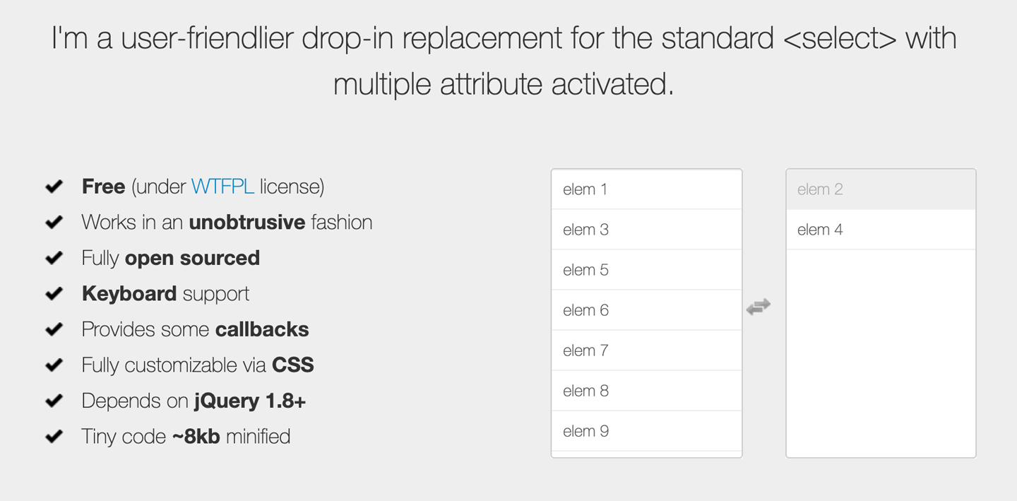
Figure 10-42. Loudev.com multiselect.js
Drupal offers a similar component, a multiselect list builder widget, as part of its enterprise content management system (Figure 10-43).
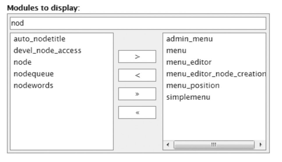
Figure 10-43. Drupal content management system
Graphical list building works, too. Lightroom (Figure 10-44) demonstrates a more contemporary approach to a List Builder: you can drag items from a potentially long list of source images into a “batch” group in order to perform operations on all batched images at once. Large text informs the user what to do at critical moments in the interaction, such as starting a new batch or removing an image from the batch.
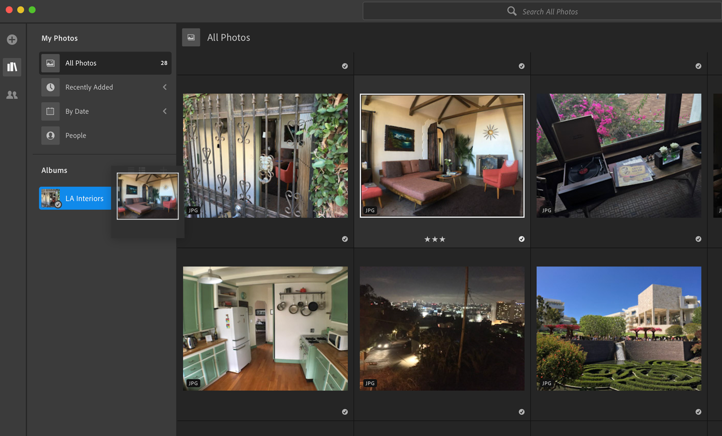
Figure 10-44. Adobe Lightroom
Good Defaults and Smart Prefills
What
Use default values for form elements that are intended to save the user time and effort in completing the form. Good defaults draw from a number of sources of data for prefills: previously entered data from the session, information from the user’s account, current location, current data and time, and other values that the designer can identify as having a high probability of making it easier and quicker for the user to complete a form.
Use when
Your UI asks the user any questions requiring form-like input (such as text fields or radio buttons), and you want to reduce the amount of work that users need to do. Perhaps most users will answer in a certain way, or the user has already provided enough contextual information for the UI to make an accurate guess. For technical or semirelevant questions, maybe the user can’t be expected to know or care about the answer, and “whatever the system decides” is OK.
But supplying defaults is not always wise when answers might be sensitive or politically charged, such as passwords, gender. or citizenship. Making assumptions like that, or prefilling fields with data you should be careful with can make users uncomfortable or angry. (And for the love of all that is good in the world, don’t leave “Please send me advertising email” checkboxes selected by default!)
Why
By providing reasonable default answers to questions, you save the users work. It’s really that simple. You spare the user the effort of thinking about, or typing, the answer. Filling in forms is never fun, but if having default answers provided halves the time it takes the user to work through the form, they’ll be grateful.
Even if the default isn’t what the user wants, at least you offered an example of what kind of answer is asked for. That alone can save the user a few seconds of thought—or, worse, an error message.
Sometimes, you might run into an unintended consequence of Good Defaults. If a user can skip over a field, that question might not “register” mentally with the user. They might forget that it was asked; they might not understand the implications of the question, or of the default value. The act of typing an answer, selecting a value, or clicking a button forces the user to address the issue consciously, and that can be important if you want the user to learn the application effectively.
How
Prefill the text fields, combo boxes, and other controls with a reasonable default value. You could do this when you show the page to the user for the first time, or you could use the information the user supplies early in the application to dynamically set later default values. (For instance, if someone supplies a US Zip Code, you can infer the state, country, and municipality from just that number.)
Don’t choose a default value just because you think you shouldn’t leave any blank controls. Do so only when you’re reasonably sure that most users, most of the time, won’t change it—otherwise, you will create extra work for everybody. Know your users!
Occasional-use interfaces such as software installers deserve a special note. You should ask users for some technical information, such as the location of the install, in case they want to customize it. But 90% of users probably won’t. And they won’t care where you install it, either—it’s just not important to them. So, it’s perfectly reasonable to supply a default location.
Examples
Kayak (Figure 10-45) supplies default values when a user begins a search for flights. Kayak kindly suggests a week-long vacation: it prefills the flight search with duration of one week, starting a month from now. The other defaults are quite reasonable: a round-trip economy flight with one traveler is common, and the “From” city can be derived from either the user’s geographic location or the user’s previous searches. Kayak goes one step further by prefilling the departure date (a month in the future) and the return (one week later). The effect of having all these defaults is that the user spends less time thinking about those parts of the form, and they get a quicker path to their immediate goal—the search results.
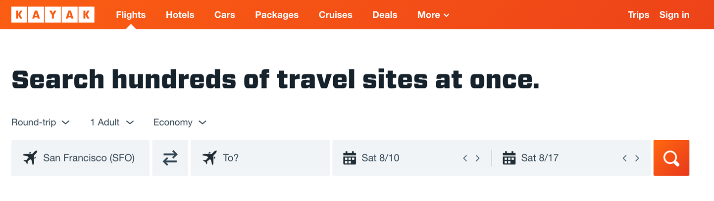
Figure 10-45. Kayak
The Fandango mobile app (Figure 10-46) uses the current location and date as its default movie search parameters. When the person opens this app, it uses the current date and location to generate a list of movies for today near where you are. It goes one step further: the default for this screen has a small “toast” or pop-up banner at the bottom (on top of the search results), offering a look at what’s playing today at the very nearest movie theater.

Figure 10-46. Fandango (iOS)
When creating a new image file in Photoshop, it starts by default with the OS clipboard (Figure 10-47). The assumption here is that the user has just created a screenshot and is in the process of editing that image. So Photoshop takes the width and height of the image in the clipboard and uses that to prefill the dimensions of the Create New file, a smart way to save time. No worry that the image and the canvas will have a size mismatch.
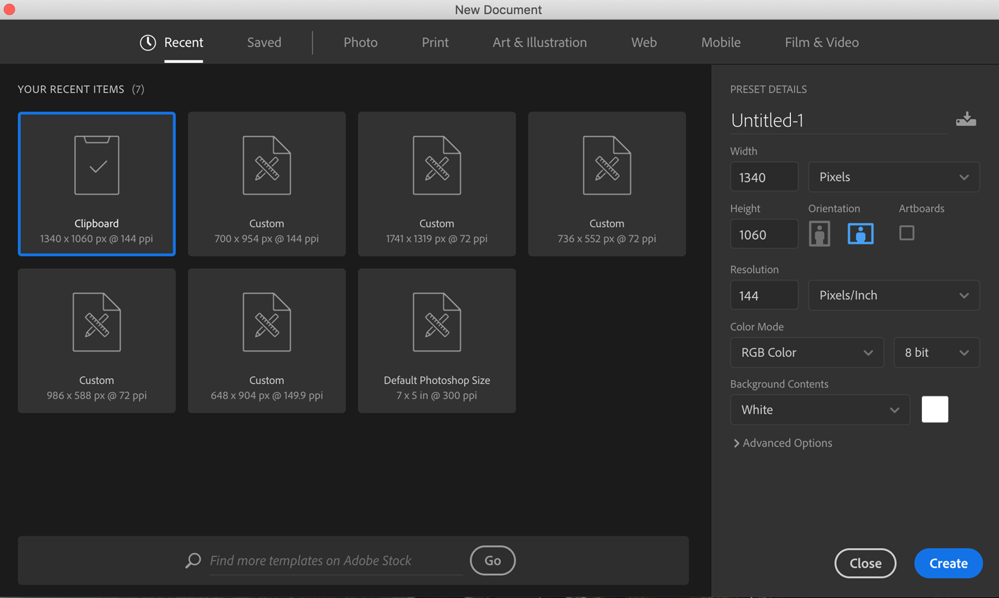
Figure 10-47. A Create New dialog in Photoshop CC
When an image canvas is resized in Photoshop, the dialog box shown in Figure 10-48 appears. The original image was 1340 × 1060, as shown. These dimensions become the default Width and Height, which is very convenient for several use cases. The application prefills the width and height of the current image as the starting point for a different canvas size. If the user wants to put a thin frame around the image, they can start with the existing dimensions and increase them by just two pixels each; if they want to make the image canvas wider but not taller, they need only change the Width field; or just click OK now and nothing changes.

Figure 10-48. Canvas Size dialog box in Photoshop CC
Error Messages
Use when
Users might enter form information that somehow isn’t acceptable. They might skip required fields, enter numbers that cannot be parsed, or type invalid email addresses, for instance. You want to encourage them to try again. You want to point out typos before they become a problem, and help puzzled users understand what is asked for.
Why
The goal of displaying error messages is to help the user fix their issues and complete their task as quickly and painlessly as possible.
Two very traditional methods are seldom encountered and not recommended. One is to report error messages to users via modal dialog boxes. Those messages could be very helpful, pointing out what the problem was and how you could fix it. The problem is that you had to click away the modal dialog box to fix the error. And with the dialog box gone, you couldn’t read the error message anymore. A second traditional approach is to show the form error messages on an error screen after you clicked the Submit button. Again, you can read the message, but you must click the Back button to fix the problem; after you do that, the error messages are gone. Then you need to remember what the error said and then scan the form to find the field with the error, and then fix the error. This is so much effort that it is not likely to be completed successfully or requires a great deal of back and forth.
Most web forms now place the error message on the form itself. By keeping both messages and controls together on the same page, you allow the user to read the message and make the form corrections easily, with no jumping around or error-prone memorization. Also, web forms put error messages physically next to the controls where the errors were made. Now the user can see at a glance where the problems were—no need to hunt down the offending field based just on its name—and the instructions for fixing it are right there, easily visible.
How
First, design the form to prevent certain kinds of errors. Use drop-down lists instead of open text fields if the choices are limited and not easy to type. For text fields, offer Input Hints, Input Prompt, Forgiving Format, Autocompletion, and Good Defaults and Smart Prefills to support text entry. Limit the total number of form fields as much as possible. Have a clear system for marking what fields are optional and what are required.
When errors do happen, and your form is long or complicated, you should show some kind of error message on top of the form. The top is the first thing people see. (It’s also good for visually impaired users—the top of the form is read to them first, so they know immediately that the form has an error.) Put an attention-getting graphic there, and use text that’s stronger than the body text: make it red and bold, for instance. In contemporary short forms, this step is often omitted.
The universal standard is to mark the form fields that caused the errors. You should display element-specific messages next to each affected control. This will require extra space beside, above, or below the fields—but at the least, use color and/or a small graphic to mark the field. Users commonly associate red with errors in this context. Use it freely, but since so many people are colorblind with respect to red, use other cues, too: language, bold text (not huge), and graphics.
If you’re designing for the web or some other client/server system, try to do as much validation as you can on the client side. This means checking for and displaying validation feedback to the user as they fill out the form, not after they have submitted it. The contemporary standard is to validate an input as soon as the focus moves to the next input field. Some forms have validation code that begins checking input as soon as the user selects the input field. Errors and feedback can appear once a user triggers it with their data entry. Either way is much quicker: The user has a chance to fix everything before submitting the form. (In some clumsy designs, an error message appears as soon as the user begins to type a valid entry, and it doesn’t disappear until the user finishes a valid string or entry. This is inappropriate and annoying, so don’t do this.)
A tutorial on error-message writing is beyond the scope of this pattern, but here are some quick guidelines:
-
Make them short, but detailed enough to explain both which field it is and what went wrong: “You haven’t given us your address” versus “Not enough information.”
-
Use ordinary language, not computerese: “Is that a letter in your zip code?” versus “Numeric validation error.”
-
Be polite: “Sorry, but something went wrong! Please click ‘Go’ again” versus “JavaScript Error 693” or “This form contains no data.”
Examples
The registration forms for Mailchimp (Figure 10-49), Mint (Intuit) (Figure 10-50) and H&M (Figure 10-51) show a traditional approach. The user fills out the form and then selects submit. The Get Started! button for Mailchimp becomes active after successfully entering an email address and password, but omits checking for the required Username field. To discover this, the user has to submit and then try again. The specific problem inputs are highlighted for correction, with error messages. Mailchimp displays a generic error alert at the top of the form in addition to marking the error inputs. However, the error messaging is clear.
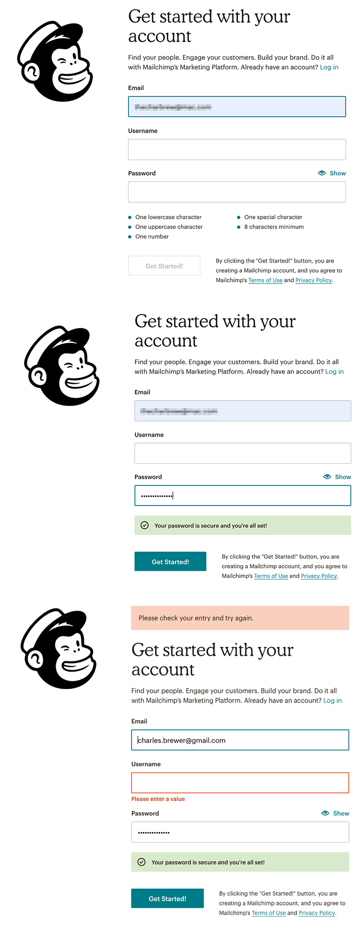
Figure 10-49. Mailchimp registration page
In the Mint example (Figure 10-50), the error message explains that the second password string does not match the first, and needs to be re-entered so it does match.
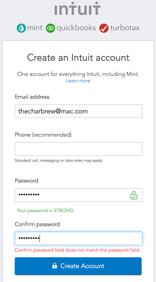
Figure 10-50. Mint (Intuit) registration screen
At H&M (Figure 10-51) the Become a Member button is always active. If the customer forgets a required field, they get an error message only after selecting Become a Member. The error message itself is good: It says exactly what needs to be done to fix the problem.
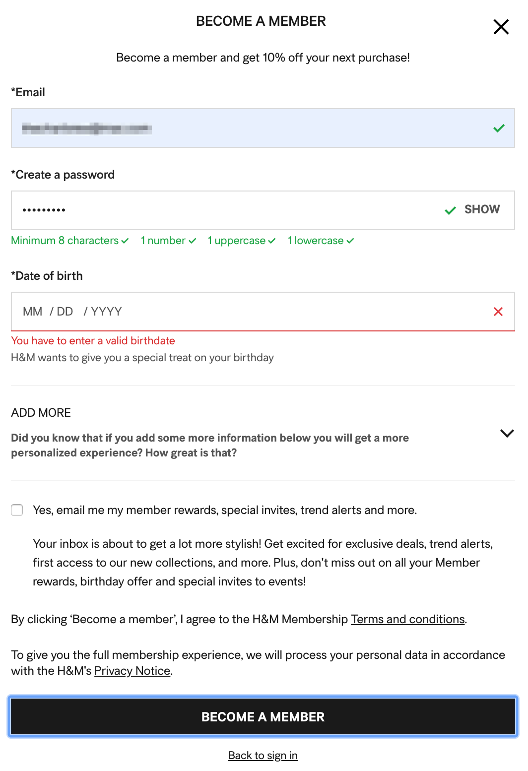
Figure 10-51. H&M
The standard solution today is to avoid creating a situation where the user skips a required step or has an invalid entry in the first place. The submit option simply doesn’t become active until the required steps are filled in successfully.
Twitter breaks their sign-up process into multiple steps (Figure 10-52). In Step 1, the option to continue is not active by default. There is no option to go to Step 2 until this screen is successfully filled out. This drives the outcome of completing the form successfully with properly formatted data in order to get to the goal of the next step in registration. Bonus: The form is in a modal dialog box. There is no other navigation to distract, except to quit the whole process. Validation happens in real time, before the user selects the Next button. After the user fixes the required fields, the next step selector becomes active. Email address validation happens in real time. Actionable feedback appears without having to submit the form, saving the user a wasted action.

Figure 10-52. Twitter registration
When you add a not fully specified item to your cart at the Jos. A. Bank site, it uses a gentle message to remind you to fill in missing information, as shown in Figure 10-53. In this case, the Add to Bag button is always active. The shopper must select it to generate the validation error message.

Figure 10-53. Jos. A. Bank
Conclusion
Form and control design is one area of interaction design in which the designer really can analyze all the possible use cases and think through exactly how they would like to handle the various interactions—standard, error, and edge cases. Form design can start out fairly simple but can become an exacting and challenging task. However, the design principles in this chapter give you a solid grounding in how to approach this activity and create useful, usable designs. The examples we reviewed can also be models for how you can manage important processes such as registration and passwords, validation and error messages, data formatting, and creating controls to handle complicated tools and settings.
1 Budiu, Raluca. “Marking Required Fields in Forms.” Nielsen Norman Group, 16 Jun. 2019, https://oreil.ly/vPQSQ.
2 See their book About Face 2.0: The Essentials of Interaction Design (Wiley), page 205.