
Chapter 2. Organizing the Content: Information Architecture and Application Structure
Picking up on the concept of building a foundation from Chapter 1, let’s now take a look at what an information foundation for your software or app might look like. What this means is designing the information architecture—how the data, content, and functionality are organized in a way that makes sense for the people you’re designing for. Specifically, in this chapter we cover the following:
-
A definition of information architecture
-
How to design the information and task space for comprehension and navigation
-
Different methods of organizing content and data for use
-
How to organize tools and features for efficient work
-
Developing a system of repeatable frameworks or screen types
-
Patterns for displaying, accessing, and navigating content and functionality
At this point, you might feel confident that you understand what your users want out of your application or site. You might have written down some typical scenarios that describe how people might use high-level elements of the application to accomplish their goals. You have a clear idea of what value this application adds to people’s lives.
It’s tempting at this stage to want to go directly to designing the screens and components of your interface, working with colors, typography, language, and layouts. If you’re the kind of person who likes to think visually and needs to play with sketches while working out the broad strokes of the design, go for it.
However, to take full advantage of your customer insights and give your design the best chance for success, the next step is to use your understandings to develop your information architecture. Don’t become locked in to specific interface design decisions just yet. Instead, take a step back and think about designing the overall structure and framework of your software so that it makes sense from your user’s point of view. Think through the information, the workflows, the language of the site or application, and then organize them so they are easy to learn and easy to use.
This is information architecture. Let’s break this down by looking at the benefits and scope of information architecture design.
Purpose
The purpose of information architecture is to create the framework for your digital product, service, site, or application to be successful. In particular, we mean successfully understood, learned, and used with a minimum of mental strain or confusion. A critical part of these interactive experiences is that the interface shouldn’t get in the way.
The irony of information architecture is that customers only notice it when it’s bad. For instance: the organization of the experience makes no sense. The interface is confusing and the screens are frustrating. Customers don’t understand the terminology they see on screen. They can’t find what they need when they need it. Basically, it gets in the way.
On the other hand, if we’ve done our jobs properly, our design is invisible. Users don’t really notice great information architecture. All users know is that they have a natural, efficient, and pleasant digital experience.
What does that mean in practice?
Stepping back, we can say that the context is people who are trying to do something: find information, watch a video, buy something, sign up for something. In short, they have a task to do. But the people who make the digital product—that’s you—can’t be there in person. You need to design your app to mimic what a good customer service representative would do:
-
Anticipate what they need
-
Organize and talk about the information from the customer’s point of view
-
Offer information in a clear, simple way
-
Use words that the customer understands
-
Offer clear next steps
-
Make it really obvious where you are and what’s happening
Definition
Information architecture (IA) is the art of organizing and labeling an information space for optimal understanding and use. Specifically, IA is using your understanding of your users to design the following:
-
Structures or categories for organizing your content and functionality
-
Different ways that people can navigate through the experience
-
Intuitive workflows or multistep processes for getting tasks done
-
Labels and language for communicating about this content
-
Searching, browsing, and filtering tools to help them find what they’re looking for
-
A standardized system of screen types, templates, or layouts so that information is presented consistently and for maximum usability
IA encompasses many things: presenting, searching, browsing, labeling, categorizing, sorting, manipulating, and strategically hiding information. Especially if you’re working with a new product, this is where you should begin. The goal is for all of this to make sense from the user’s point of view so that they can use your site or app successfully.
Designing an Information Space for People
In the same way that construction architects draw up blueprints before a house is actually built, designers—information architects—create a plan for how their information space will be laid out in a usable manner and how people will move around in it and get work done there. In both cases, there is efficiency and value in thinking through how people will use what you are going to build, before you build it.
Approach
It can be helpful to think about an application in terms of its underlying data and tasks. Do this without thinking about the look and feel that they will ultimately take on. Think more abstractly:
-
What information and tools do you need to show to the users?
-
Based on their expectations and immediate situation, when do you show them?
-
How are the information and the tools categorized and ordered?
-
What do users need to do with them?
-
How many ways can you present those things and tasks? You might need more than one.
-
How can you make it usable from their point of view?
These lines of inquiry can help you think more creatively about the IA you’re designing.
Separate Information from Presentation
Thinking about IA separately from the visual design is so important that it’s worth looking at in more detail. The design challenge becomes more manageable when you tackle it in phases. In fact, it’s useful to think of designing as a process of building up layers of design, one on top of the other.
In the same way that software engineers think of applications in three layers—databases; tools and queries; and reports, results, and responses—designers can think of their design has having three layers.
Figure 2-1 gives a schematic representation of this approach. IA is the lowest layer, the foundation. Much like with a physical building, the structure of this foundation will ultimately be invisible, but will shape everything that is built on top of it. In the digital world, we are concerned with creating an IA foundation that has appropriate concepts, labels, relationships, and categories. It lays out the permanent information structure that users can navigate, search through, and manipulate on the upper layers of the experience.
The middle layer is the functionality and information delivery layer of your site or app. It is the screens, pages, stories, lists, and cards your users browse, search, and read. It contains the tools they use to search, filter, monitor, analyze, communicate, and create.
The topmost layer is the presentation layer: the visual design and editorial system for presenting and rendering. It consists of colors, typography, layouts, graphics, and more. When done well, the presentation layer design creates focus, flow, and clarity.
![Layered Design: Designing up from the content/data layer to the presentation layer (based on ideas by: Garrett, Jesse James. The Elements of User Experience: User-Centered Design for the Web and Beyond. [New Riders, 2011])](http://images-20200215.ebookreading.net/7/4/4/9781492051954/9781492051954__designing-interfaces-3rd__9781492051954__assets__dein_0201.png)
Figure 2-1. Layered Design: Designing up from the content/data layer to the presentation layer (based on ideas by Jesse James Garrett, The Elements of User Experience: User-Centered Design for the Web and Beyond [New Riders, 2011])
Mutually Exclusive, Collectively Exhaustive
Your content and tools need to be organized in a way that makes sense to your audience. As you go through the process of organizing the data and content into major categories or sections, consider this useful rule of thumb: MECE.
MECE stands for “Mutually Exclusive, Collectively Exhaustive.” First, your information architecture should have categories of content that are clearly distinct from one another, with no confusing overlap. Second, “collectively exhaustive” means that taken all together, your organization schema is complete. It accounts for all the information your site or application is supposed to handle, and all of the situations and use cases you are designing for. There’s a place to find everything or put anything. Later in the process, your information structure should be able to expand to accommodate new data without things becoming confusing.
These categories will form the foundation of your navigation system, which is discussed in more detail in Chapter 3.
To document and communicate this organization scheme, information architects develop such tools as site maps and content outlines.
Ways to Organize and Categorize Content
You have probably already used some common organizational methods to organize and categorize the information in your site or app. These are especially useful when planning how to display large amounts of structured data in tables. They also are important for planning for how users will search and browse, filter information, and sort and refine their results. We describe six of these methods in a moment. This list is based on the work of Richard Saul Wurman in his book on information architecture, Information Anxiety 2 (Que, 2001), and Abbey Covert and Nicole Fenton’s book How to Make Sense of Any Mess (Covert, 2014). Both make excellent further reading.
Wurman offers a handy way to remember the main methods of organization in the acronym “LATCH.” This stands for “Location, Alphabet, Time, Category, Hierarchy.” Let’s look at these and others in more detail.
Alphabetical
This means organizing lists, names, and any labeled items according to the sequence of the alphabet. You can do this in descending order, from A to Z, or in ascending or reverse order, from Z to A. This can also include numbers if they are part of the name or label, with the numbers “0” and up preceding the alphabetical letters. This is a great default for any list or menu of items.
Number
Organizing by number can include a number of variations. First is according to integer, in which items or the numbers themselves are sorted in ascending or descending order based on the sequence of the number system. The second is by ordinal position: first, second, third, and so on. A third way is by value or total. Things such as financial amounts, discounts, size, rank, priority, and rates of change can be arranged from largest value to smallest, and vice versa. Tabular data uses this pattern heavily.
Time
Chronological order is another useful way to organize content. This is very common in social media feeds, where reverse chronological order is common—the most recent item is first in the list, with older items lower in the list. Information can be organized by date, time, or duration in ascending or descending order. They can also be arranged by frequency—low to high, and the reverse. They can also be arranged by sequence in time: which happened first, or should happen first, as in steps in a process. Tasks are also often split into a sequence of steps (can also be thought of as the aforementioned number).
Location
Location can mean organizing by a geographic or spatial location. There are many systems for specifying geographic location, such as latitude and longitude. Geographic categories are often nested or hierarchical, such as countries containing states, which contain cities (see Hierarchy, next). Location can also be distance from or to some reference point, and ordering based on that. In digital systems, it’s critical for users to learn their location in the information space, both overall and on an individual screen.
Category or Facet
In IA, content can be labeled and then grouped into categories or topics. A category can be thought of as a feature or quality that a set of items has in common. This is a very useful method of organizing because it is so flexible. Often, there is a spectrum or degree implied in the category that can be used to order the items in the set. A simple example is organizing by color.
Advanced organizing schemes use facets. A facet system assigns multiple qualities or categories, with a range of values in each, to each item. A good example of faceted classification in action is Amazon, where customers can use multiple values to narrow down their product search, such as price, availability, and customer rating.
Designing for Task and Workflow-Dominant Apps
IA also includes designing workflows and tasks. Documentation related to this often includes such things as user stories and flow diagrams.
Make Frequently Used Items Visible
The first rule of thumb in designing for tasks or workflow is frequency of use. Tasks, controls, commands, or topics that are repeated often or used frequently should be immediately available to the user, without having to search or browse. On the other hand, controls or information that are not needed very often can be hidden away or accessed only by navigating to it. User settings and help systems are good examples of features that are hidden in standard use but accessible when needed.
“Chunk Up” Jobs into a Sequence of Steps
Sequencing is the second organizing principle for IA for tasks and workflows. This means breaking up a big task or process into a series of steps, to make each individual step less demanding on the user. This is often the structure for a wizard or multistep process that leads the user through a complex task. Plan for communicating to the user where they are in the process.
Design for both novice and experienced users
When chunking a task, consider the level of learning, skill, or mastery that different users may have. Like in computer games, it’s useful to consider how first-time users might need a simplified interface or special additional help to assist them. This can take the form of additional instructions, screen overlays, or wizards for complex processes. Many applications and websites devote resources to designing a new user experience or onboarding, to improve learning and customer retention. People who are unfamiliar with your app or site will particularly appreciate this approach.
On the other end of the skill spectrum, advanced or experienced users can be fast and efficient with complicated interfaces that are densely packed with information and selectors. Offering them “accelerators” such as shortcuts and the ability to customize their interface help them to be efficient. Designing for keyboard-only navigation and input is also valuable here.
Multiple Channels and Screen Sizes Are Today’s Reality
It goes without saying that consumers and business users alike now expect to access information, sites, and applications via multiple channels such as desktop, mobile and messaging, and across a multitude of screen sizes and devices. Voice-activated services interfaces don’t have screens at all. In designing your IA, consider what channels, modes, and devices your site or application will need to function across. This will drive how your information is organized, segmented, and sequenced.
Display Your Information as Cards
A common pattern in several of the examples that follow is a reliance on a Cards pattern. With the majority of all digital interactive experiences being via mobile devices, it makes sense to make the building block of your experience a card that fits on a smaller screen. This small container of information, photos, and other data can work individually or it can be displayed in a list or grid on larger screens. The key is to plan for how to scale down and scale up the experience while still delivering access and control to your information and features.
Designing a System of Screen Types
As mentioned earlier, IA also includes designing a system of screen types. Each screen type has a differentiated function. In this way, the user can learn how to use each screen reliably, even when the content in it changes based on topic, filters, and other selections.
A useful framework for approaching screen types is from Theresa Neil. She developed ideas for application structures in the context of Rich Internet Applications (RIAs). Neil defines three types of structures based on the user’s primary goal: information, process, and creation.1
This list gives us a framework within which to fit the idioms and patterns that we talk about in this and other chapters.
Now, let’s look at pages that serve single important functions. In an application, this might be a main screen or a major interactive tool; in a richly interactive website, it might be a single page, such as Gmail’s main screen; in a more static website, it might be a group of pages devoted to one process or function.
Any such page will primarily do one of these things:
- Overview
- Show a list or set of things
- Focus
- Show one single thing, such as map, book, video, or game
- Make
- Provide tools to create a thing
- Do
- Facilitate a single task
Most apps and sites do some combination of these things, of course. But consider developing a screen system in which each has a particular organizing principle.
Overview: Show a List or Grid of Things or Options
This is what most of the world’s home pages, start screens, and content sites seem to do. The digital world has converged on many common idioms for showing lists, most of which are familiar to you:
-
Simple text lists
-
Menus
-
Grids of cards or images
-
Search results in list or grid form
-
Lists of email messages or other communications
-
Tables of data
-
Trees, panels, and accordions
These overview screens present information organization challenges. Here are some questions to consider in designing your overview screens:
-
How big is the dataset or how long is the list?
-
How much space is available to display it?
-
Is it flat or hierarchical, and if it is a hierarchy, what kind?
-
How is it ordered, and can the user change that ordering dynamically?
-
How can the user search, filter, and sort?
-
What information or operations are associated with each list item, and when and how should they be shown?
Because lists and grids are so common, a solid grasp of the different ways to present them can benefit any designer. A few patterns for designing an interface around a list are described in this chapter (others are in Chapter 7).
You can build either an entire app or site or a small piece of a larger artifact around one of these patterns. They set up a structure into which other display techniques—text lists, thumbnail lists, and so on—can fit. Other top-level organizations not listed here might include calendars, full-page menus, and search results:
-
Feature, Search, and Browse. Countless websites that show products and written content follow this pattern. Searching and browsing provide two ways for users to find items of interest, whereas the front page features one item to attract interest.
-
Streams and Feeds. Blogs, news sites, email readers, and social sites such as Twitter all use a news stream or social stream pattern to list their content, with the most recent updates first in the scrollable list.
-
Grids. A well-defined interface type for presenting stories, actions, cards, and selectors. It is also used for handling photos and other pictorial documents. It can accommodate hierarchies and flat lists, tools to arrange and reorder documents, tools to operate directly on pictures, launch apps, drill down to details, and so on.
After you’ve chosen an overall design for the interface, you might look at other patterns and techniques for displaying lists. See Chapter 7 for a thorough discussion.
Focus: Show One Single Thing
The entire point of this screen type is to show or play a single piece of content or functionality, such as an article, map, or video. There might be small-scale tools clustered around the content—scrollers and sliders, sign-in box, global navigation, headers and footers, and so forth—but they are minor. Your design might take one of these shapes:
-
A long, vertically scrolled page of flowed text (articles, books, and similar long-form content).
-
A zoomable interface for very large, fine-grained artifacts such as maps, images, or information graphics. Map sites such as Google Maps provide some well-known examples.
-
The “media player” idiom, including video and audio players.
As you design this interface, consider the following patterns and techniques to support the design:
-
Mobile Direct Access, to take the user directly into the main function of your app, often using location and time data to generate valuable information without the user providing any input.
-
Alternative Views, to show the content in more than one way.
-
Many Workspaces, in case people want to see more than one place, state, or document at one time.
-
Deep-Linked State, in Chapter 3. With this, a user can save a certain place or state within the content so that they can come back to it later or send someone else a URL.
-
Some of the mobile patterns described in Chapter 6, if one of your design goals is to deliver the content on mobile devices.
Make: Provide Tools to Create a Thing
This screen type is for creating or updating digital objects. Most people are familiar with the idioms used by these tools: text editors, code editors, image editors, editors that create vector graphics, and spreadsheets.
At the level of application structure or IA, we can often find the following patterns:
-
Canvas Plus Palette describes most of these applications. This highly recognizable, well-established pattern for visual editors sets user expectations very strongly.
-
Almost all applications of this type provide Many Workspaces—usually windows containing different documents, which enable users to work on them in parallel.
Do: Facilitate a Single Task
Maybe your interface’s job isn’t to show a list of anything or create anything, but simply to get a job done. Signing in, registering, posting, printing, uploading, purchasing, changing a setting—all such tasks fall into this category.
Forms do a lot of work here. Chapter 10 talks about forms at length and lists many controls and patterns to support effective forms. Chapter 8 defines another useful set of patterns that concentrate more on “verbs” than “nouns.”
Not much IA needs to be done if the user can do the necessary work in a small, contained area, such as a sign-in box. But when the task gets more complicated than that—if it’s long, or branched, or has too many possibilities—part of your job is to work out how the task is structured.
-
Much of the time, you’ll want to break the task down into smaller steps or groups of steps. For these, a Wizard might work well for users who need to be walked through the task.
-
A Settings Editor is a very common type of interface that gives users a way to change the settings or preferences of something—an application, a document, a product, and so on. This isn’t a step-by-step task at all. Here, your job is to give users open access to a wide variety of choices and switches and let them change only what they need, when they need it, knowing that they will skip around.
These four screen types—overview, focus, make, and do—will likely show up in some form in your own system of screen types for your software.
The Patterns
The previous section reviewed information architecture in general terms. Now let’s examine specific design patterns related to expressing information architecture in the experience of your software.
-
Feature, Search, and Browse
-
Mobile Direct Access
-
Streams and Feeds
-
Thumbnail Grid
-
Dashboard
-
Canvas Plus Palette
-
Wizard
-
Settings Editor
-
Alternative Views
-
Many Workspaces
-
Help Systems
-
Tags
Feature, Search, and Browse
Use when
Your site offers users long lists of items—articles, products, videos, and so on—that can be browsed and searched. You want to engage incoming users immediately by giving them something interesting to read or watch.
Alternately, your site focuses on enabling searching or transacting. In this case, search is the dominant element on the screen. Featured content and browsing have secondary importance.
Why
These three elements are found together on many sites. Searching and browsing go hand in hand to find desired items. Some people will know what they’re looking for and use the search box, whereas others will do more open-ended browsing through the lists and categories you show them.
Featured items are how you engage the user. They’re far more interesting than just category lists and search boxes, especially when you use appealing images and headlines. A user who lands on your page now has something to read or experiment with, without doing any additional work at all—and they may find it more interesting than whatever they originally came for.
How
Place a Search box in a prominent location, such as an upper corner, or in a banner across the middle top of the site. Demarcate it well from the rest of the site—use whitespace to set it off, and use a different surrounding background color if necessary.
Alternatively, display Search in a collapsed or compacted state. It still needs to be easy to see and access, but it can be an icon or the label “Search.” Selecting this opens the full search field. This pattern saves space on smaller screens.
Set aside Center Stage (Chapter 4) for the featured article, product, or video. Very near it, and still at the top of the page, place an area for browsing the rest of the site’s content. Most sites show a list of stories, cards, topics, or product categories. These might be links to pages devoted to those categories.
If the category labels open in place to show subcategories, the list behaves like a tree. Some sites, such as Amazon, turn the category labels into menus: when the pointer rolls over the label, a menu of subcategories appears.
Choose the features well. Features are a good way to sell items, advertise specials, and call attention to breaking news. However, they are the front door and also define what your site is about. What will they want to know about? What will capture their attention and hold them at your site?
As the user browses through categories and subcategories, help them “stay found” with the Breadcrumbs pattern (Chapter 3).
Examples
Content-centric websites
The following three examples demonstrate the classic pattern of Feature, Search, Browse. WebMD (Figure 2-2), Yahoo! (Figure 2-3), and Sheknows (Figure 2-4) are news- and content-centric digital publishers. WebMD and Yahoo! have Search at the top as a single large feature. Sheknows offers a variation: two features above a prominent search input.

Figure 2-2. WebMD
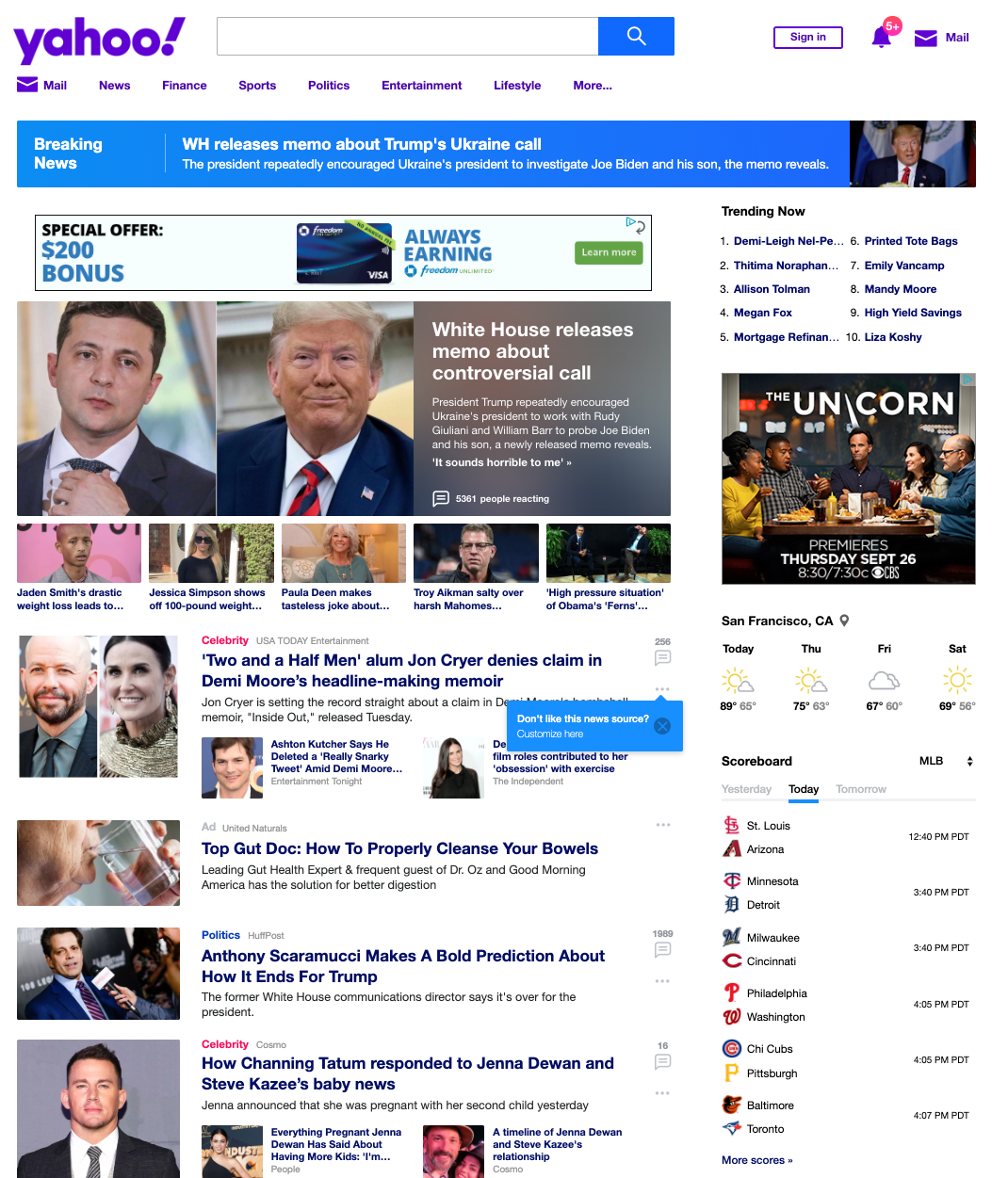
Figure 2-3. Yahoo!
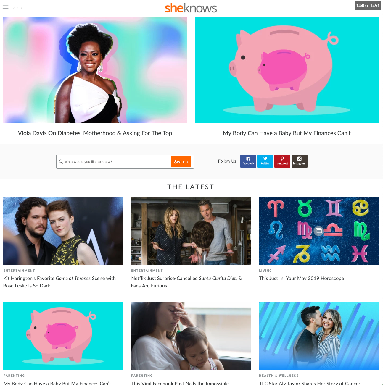
Figure 2-4. Sheknows
Commerce- centric websites
Major retailers like Target (Figure 2-5) and Ace Hardware (Figure 2-6) follow the same pattern. Search is at the top, with large features (sales promotions) below. Both sites support browse with grids of cards.
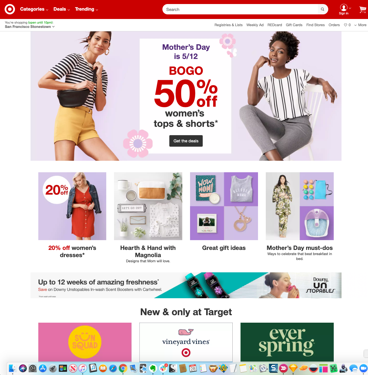
Figure 2-5. Target
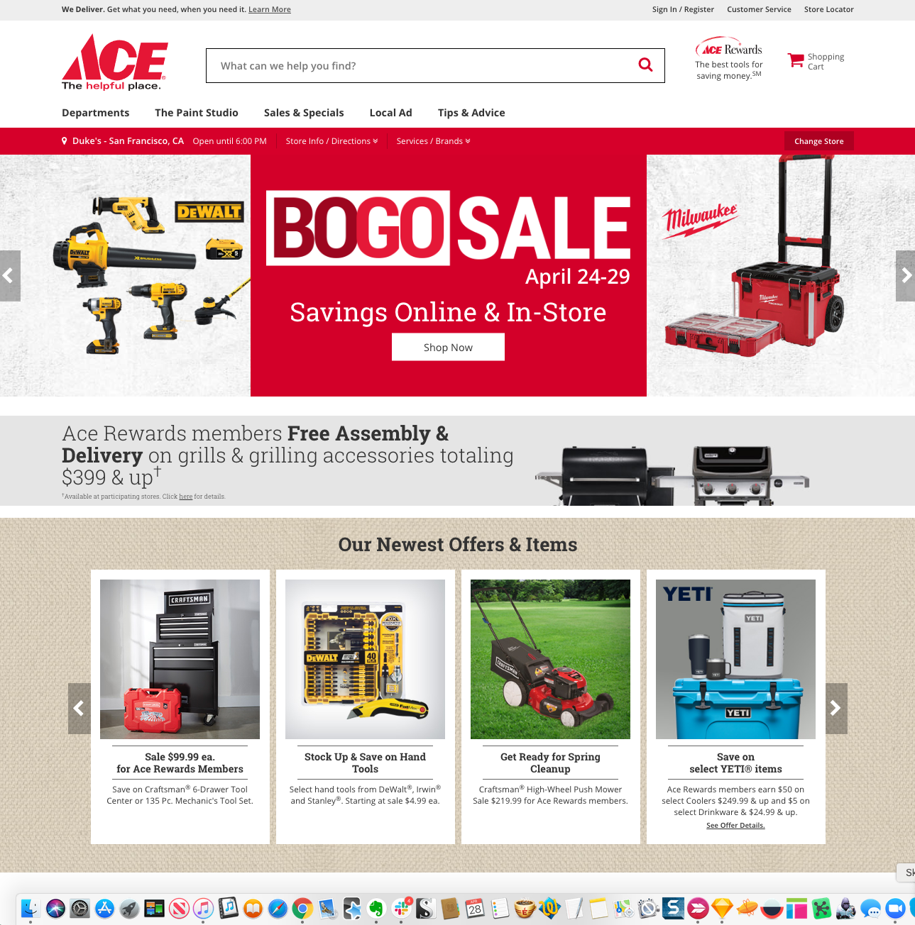
Figure 2-6. Ace Hardware
Task-centric websites
These two examples show how Feature, Search, and Browse changes when deployed in a context for which getting the user to carry out a task (search) is the priority. For British Airways (Figure 2-7), a large travel search module dominates the entire screen at the top of the page. Below the fold, there is minimal content: A featured article and only three cards for browsing.
Epicurious (Figure 2-8) gives primacy to search, as well. It occupies a screen-width panel at the top of the page. However, the content features and browse cards begin immediately below. Their large size and appetizing photos and titles give them almost equal weight to search. Based on your needs, you can decide which prioritized or balanced approach is best suited for your situation and design your interface accordingly.
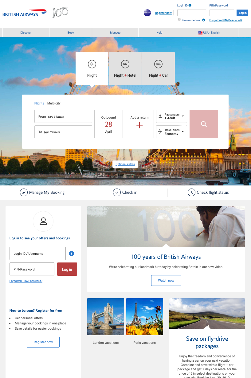
Figure 2-7. British Airways
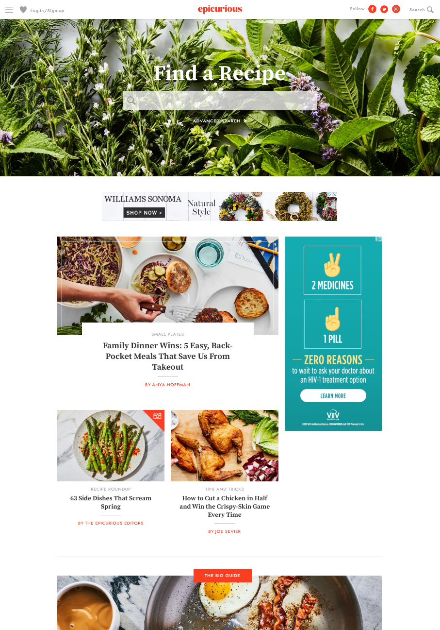
Figure 2-8. Epicurious
Search with facets and filters
These examples show how two different websites use multiple categories, or facets, to help the user create a targeted search for large datasets. Each facet can have a range of values. Combinations of facets for search or filtering allows for sophisticated searching of large datasets.
Crunchbase (Figure 2-9) is unusual in that it promotes faceted filters as part of its search submittal, implying that the searcher can achieve better, more appropriate search results by using the facets. Featured content is below.
Epicurious (Figure 2-10) and Airbnb (Figure 2-11) both use a more traditional deployment of faceted filters on their search results screens (note the mobile-friendly grid of cards format for search results in both cases). The facets are most relevant for narrowing the search results based on their domain.

Figure 2-9. Crunchbase
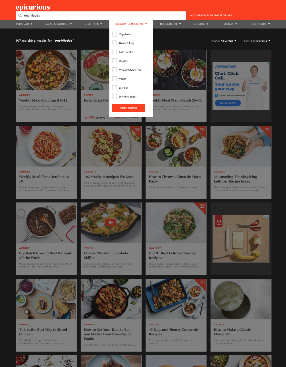
Figure 2-10. Epicurious search results with faceted filters
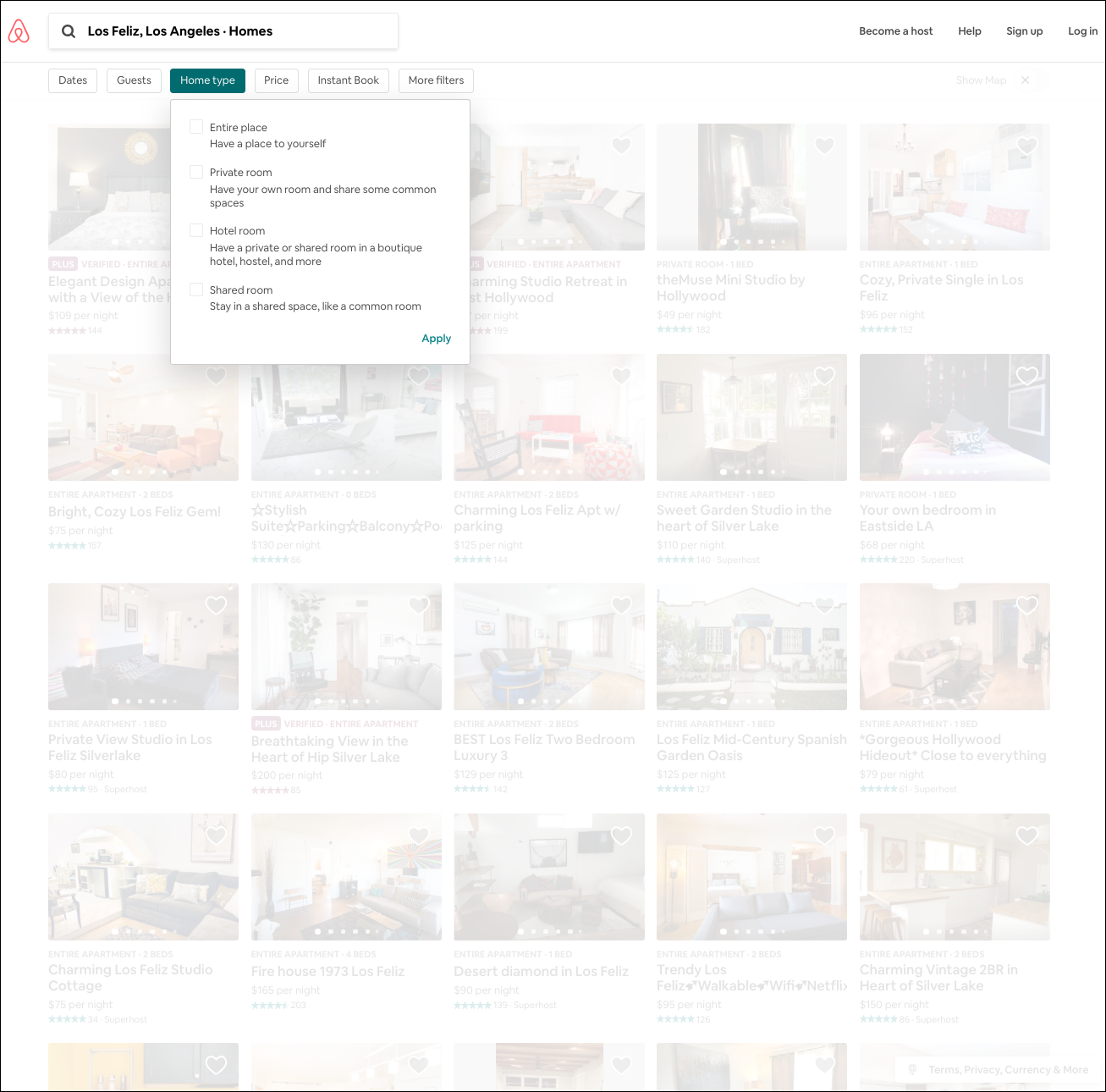
Figure 2-11. Airbnb search results with faceted filters
Mobile Direct Access
What
The first screen presents actionable information without requiring any input or action from the user. The app makes assumptions about any settings or queries (such as location or time) related to its primary function, and presents the output for immediate response. Making assumptions about what the user is most likely to do also drives what appears on launch.
Use when
Your mobile app generates value by doing one thing really well, or is used or known for one primary thing.
Why
Starting the user with an immediately actionable mode, choice, or screen provides instant value to the user, and gets them engaged instantly. There is limited ability to enter search or any kind of choice or configuration, but there is useful information available from the device and the primary use cases to make this assumption highly likely to be valuable, even expected.
How
Use live data from the user’s mobile device (assuming the user has given permission in the settings). Primarily, look at location and time to generate a meaningful landing screen for the user. Make assumptions about what the user is most likely to be doing with your app, and get them as close to completing the action as possible, with a minimum of input.
Examples
All of these examples are mobile but could be valuable in desktop settings. In the first example, Snap (Figure 2-12, left) lives up to its brand as a photo-centric social media and camera company. When the app is launched, the user-facing camera is automatically turned on, ready to take a selfie. The next three examples all show how the apps use location and time data to return meaningful results with no input from the customer. INRIX ParkMe (Figure 2-12, right), Eventbrite and Weatherbug (Figure 2-13) give useful results this way. ParkMe makes some smart prefill assumptions (park for one hour) to gather price results by default.
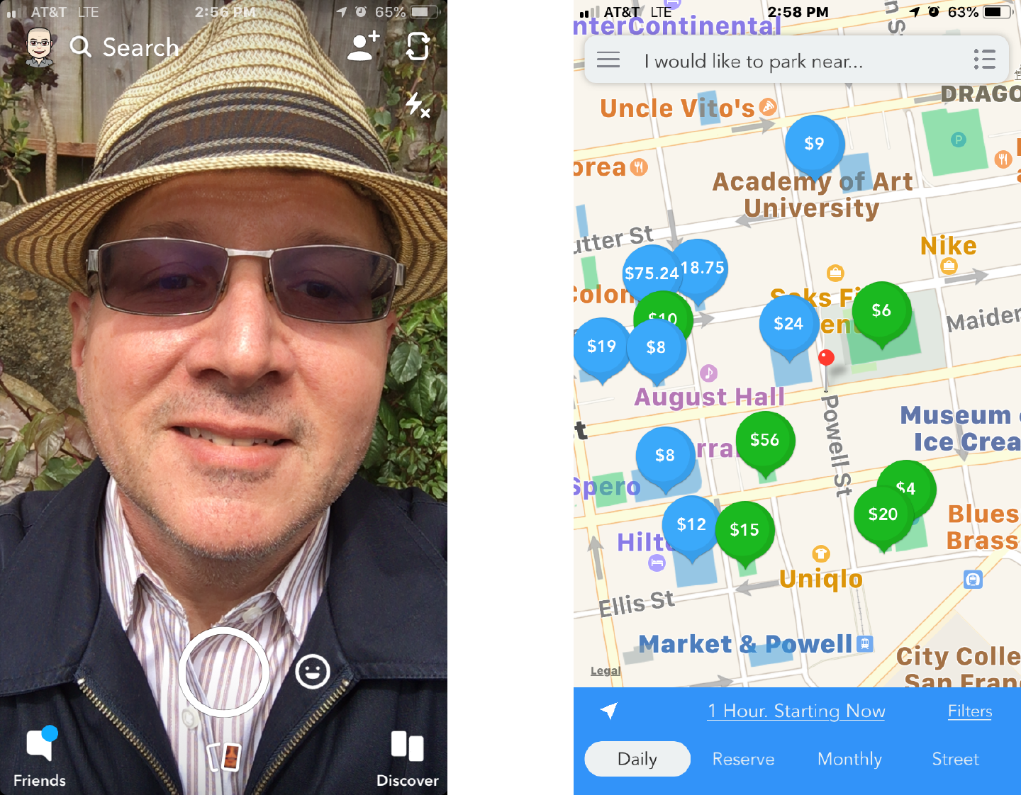
Figure 2-12. Snap and INRIX ParkMe start screens
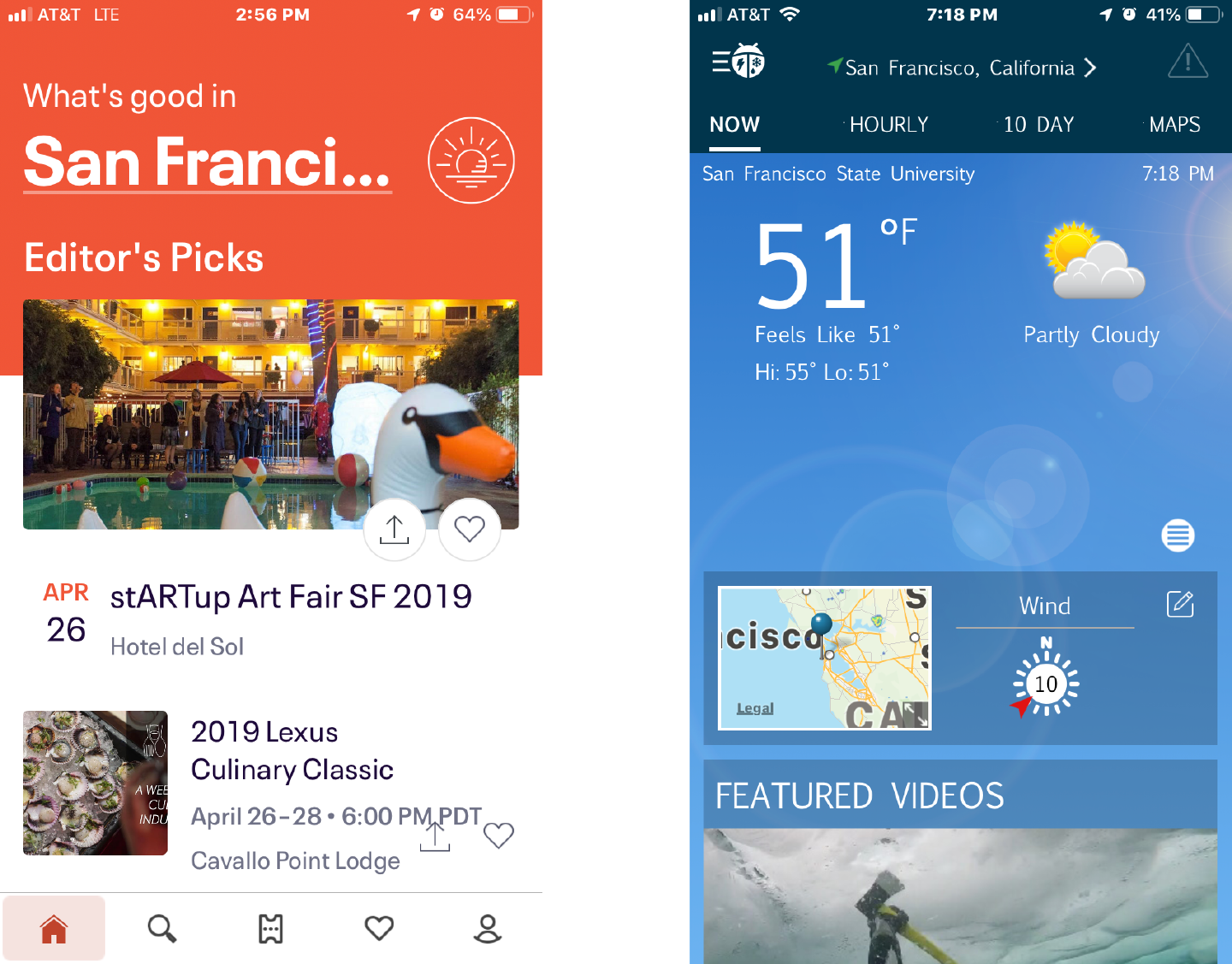
Figure 2-13. Eventbrite and Weatherbug start screens
Streams and Feeds
What
A continuously updated series of images, news stories, web articles, comments, or other content presented in a scrollable, vertical (sometimes horizontal) strip or ribbon. The items in the feed are usually presented as “cards,” with an image from the article, a headline, introductory copy, and the name of the source with a link.
News/content streams
Content can be first party (publish your own content) or aggregated from third parties. This news stream approach, inspired by social media, is an established, mobile-friendly pattern for publishers. This usually consists of time-stamped items in a reverse chronological list that updates dynamically.
Business collaboration
Social media technology has now integrated into the way we work online. It is common for companies of all types to use online tools to collaborate. This allows employees and teams from any location to still come together online for discussion and feedback. Social media–style comment feeds are one of the most common patterns. There is often an important difference in how it is displayed: it is the standard in “collaboration-ware” and messaging-based apps for the most recent entry or posting to be at the bottom of the activity feed. Older comments move up as newer comments post at the bottom, where the newest post appears. Discussion channels in Slack are great examples of this model.
Use when
Your site or app has frequently updated content and the user checks it often, often dozens of times a day. Also, use this pattern when you have multiple collaborators on a project, and you need to stay on top of comments and feedback from multiple people. This feedback often comes asynchronously, meaning different people give feedback at different times. This is especially common in distributed or remote teams. For news publishers and aggregators, use one or more source channels, such as own original content, blogs, major news sites, other social site updates, and content partners to deliver timely content to users.
The pure social version can be personal—a user “owns” it, as for social media sites like Twitter or Facebook friends list.
For business collaboration software, use this pattern to allow people to view, comment, and edit a document. The document and the discussion are presented together. Employees can scroll through the comment feed to see the history of the discussion.
Why
Ensures that new content is always appearing first in the list of items in the user’s feed. This makes each visit a reward, with something new to see and to scroll through. People can keep up with a news stream easily because the latest items reliably appear first in the list with no effort on the part of the user. This promotes the habit of checking back frequently and spending lots of time reading, following, and interacting with their stream.
People go to many sites or apps each day to keep up with their friends’ activities, engage in conversations, or follow topics or blogs of interest. When multiple “news” sources can be blended in one place, it’s easier to keep track of it all.
From the perspective of a publisher, such as a news website, publishing your own content in the feed or stream format promotes engagement, return visits, and interaction.
From the perspective of a business, social collaboration software allows employees to be more efficient and to save time. Remote workers and employees in different locations and time zones can still come together asynchronously to get work done.
This pattern supports the Microbreaks behavior pattern that we introduced in Chapter 1. A glance at a Streams and Feeds application can give a user lots of useful information (or entertainment) with very little time or effort.
How
From its origins as a social media innovation, this pattern has become a common one for any company, app, or site that publishes or aggregates large amounts of content continuously, for social media, and for business collaboration software. The following discussion assumes a chronological ordering for the streams and feeds, but this is only one way. Indeed, nowadays the stream sequence is determined by algorithms, which might be optimizing for engagement, clicks, customer interest, or other parameters. So, consider that more personalized, context-responsive experiences are possible.
List incoming items in reverse chronological order. Display newest items at the beginning of the list without waiting for the user to request an update. Older items are pushed further away by the newer comments or entries. Offer a way for the user to get an immediate update or refresh. Also, they need to be able to scroll or review through the list to get to the older, unreviewed items.
Offer publisher-curated streams that the user can view in addition to their own social stream. Offer advanced users the ability to create custom streams based on topics or curated lists of other members. Others, such as TweetDeck, use Many Workspaces to show multiple parallel panels of incoming content.
Information shown with each item might include the following:
- What
-
For short micro-updates, show the entire thing. Otherwise, show a title, a teaser that’s a few words or sentences long, and a thumbnail picture if one is available.
- Who
-
This might be the person who wrote an update, the blog where an article was posted, the author of said article, or the sender of an email. It could be the coworker who posted a comment or document. Actual names of the people humanizes the interface, but balance this against recognition and authoritativeness—the names of news outlets, blogs, companies, and so forth are important, too. Use both if that makes sense.
- When
-
Give a date or timestamp; consider using relative times, such as “Yesterday” and “Eleven minutes ago.” As the post ages, switch to the traditional date-and-time stamp.
- Where
-
If an item’s source is a website, link to that website. If it comes from one of your organization’s blogs, link to that.
When there’s more to an item than can be shown easily in the list display, show a “More” link or button. This is a good pattern for long comments. For news or story cards, allow the reader to click on the card to load the full story as a new screen. You might design a way to show the entire contents of an item within the news stream window. The News Stream is a list, so you can choose among Two-Panel Selector, One-Window Drilldown, and List Inlay. Examples abound of each model.
Give the user ways to respond immediately to incoming items. Stars, thumbs-up, liking, and favoriting are available in some systems—these all provide low-effort feedback and “handshaking” among people who don’t have time to write out long replies. But allow those long replies to be written, too! By placing controls and text fields immediately next to an item, you encourage responsiveness and interaction. This is usually a good thing in social systems.
As of this writing, Streams and Feeds designs for mobile devices are fairly straightforward. Almost all of them devote the full screen to a single list—often an Infinite List (Chapter 6) with richly formatted text—and users can drill down to an item by simply tapping or clicking it in the list.
Many Streams and Feeds services, including Twitter and Facebook, use the Infinite List pattern for both their mobile and full-screen designs. This pattern lets users load a page or two of the most recent updates, and it gives the option of loading more to go “backward in time.”
- Activity history
-
Some resources use the term activity stream for a very closely related concept: the time-ordered stream of actions (usually social actions) performed by a single entity such as an individual, system, or organization. It is a history of their actions. This is a useful concept, and it doesn’t really conflict with a Streams and Feeds pattern, which talks about the stream of activities that are of interest to an individual or group of users, not generated by them. A news stream will usually have multiple diverse sources.
Examples
News/content streams
Techcrunch (Figures 2-14 and 2-15) is a great example of a Streams and Feeds publisher. The main mobile app and website is a scrollable stream of stories, with the most recent stories first in the list of content. At this level, the reader is provided with just enough information to get the main idea: a photo, a headline, and some introductory copy. If the reader selects the story, they go to the full version, with larger images and full text. This detail page is where the social sharing feature is available, promoting distribution to the reader’s own social networks.
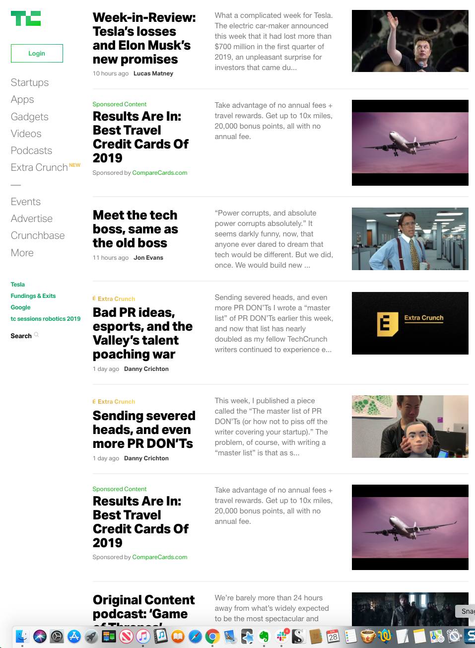
Figure 2-14. Techcrunch
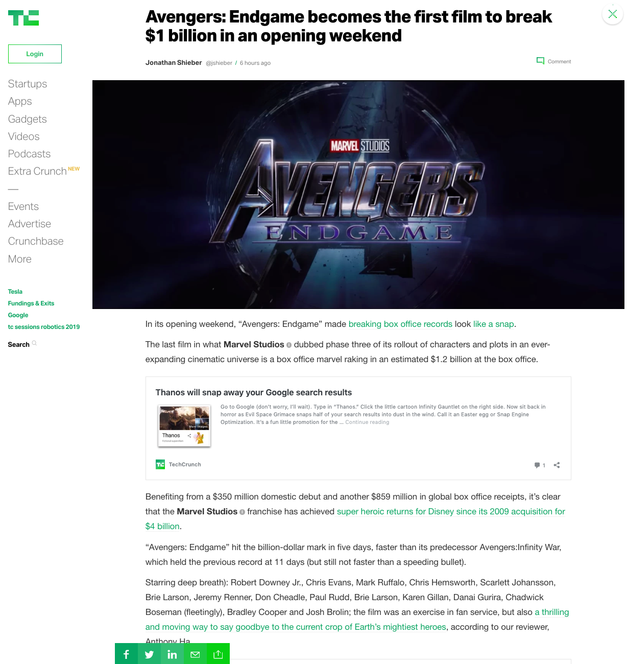
Figure 2-15. Techcrunch Detail/Individual Article screen
BuzzFeed News (Figures 2-16 and 2-17) follows exactly the same pattern. Note that this company uses the word “feed” in its name. This shows how important this pattern is to the company’s identity and purpose. Again, we see a scrollable stream of stories, with the most recent stories first in the list of stories. BuzzFeed’s strong editorial voice is clear in the enticing headlines and reader-challenging questions. Selecting a story loads the detail screen, with the full story, quiz, or gallery of images. The social sharing widget is even more prominent.

Figure 2-16. BuzzFeed News
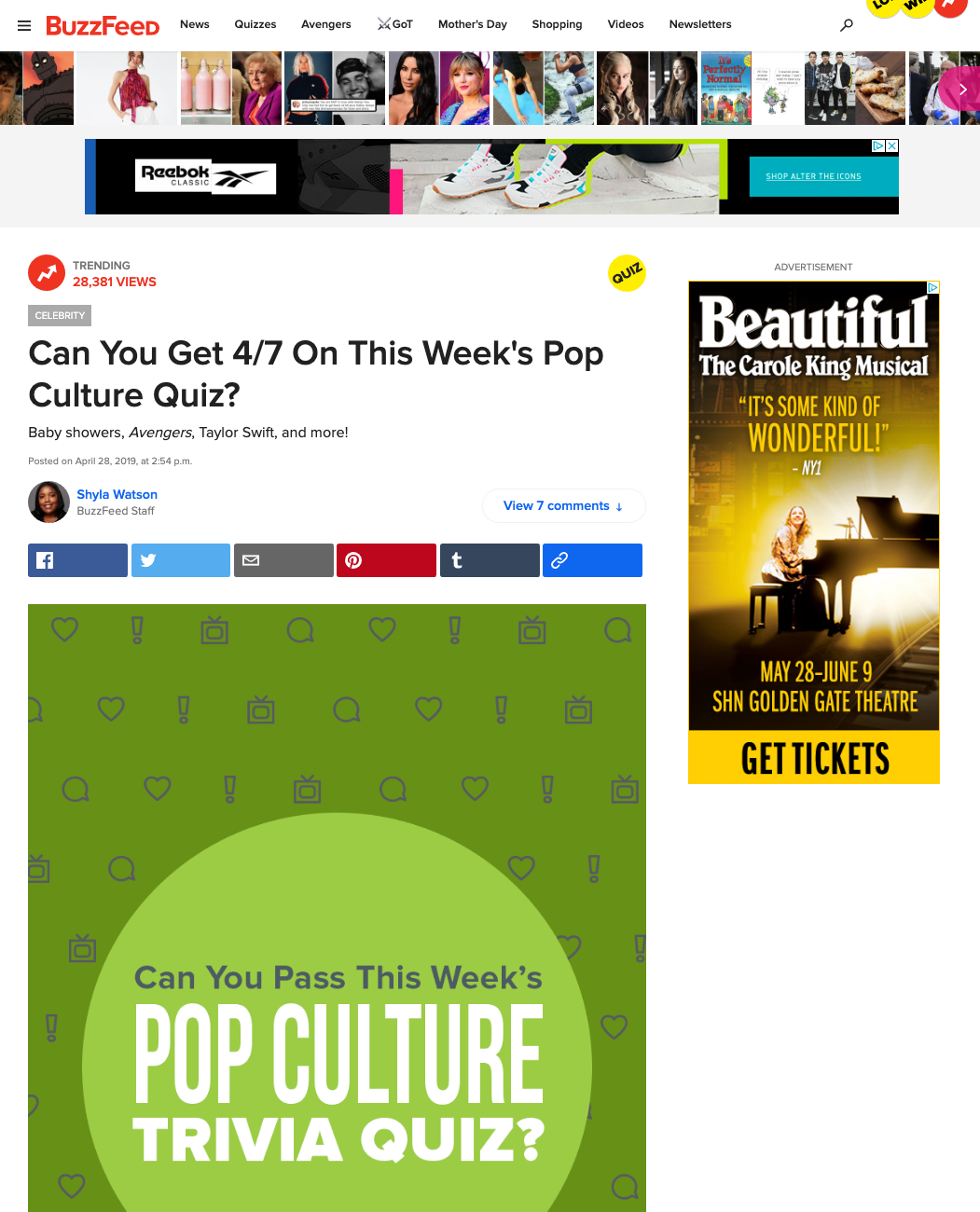
Figure 2-17. BuzzFeed News Detail/Individual Article screen
The RealClear family of sites is based around aggregating links to stories published elsewhere on the web. The most active is RealClearPolitics (Figure 2-18). Although this looks like a simple, flat list that you might find in a wiki or encyclopedia, it is a feed. The links are published multiple times each day. These updates, taking a cue from the history of print newspapers, have the labels “Morning Edition” and “Afternoon Edition.” Note how RealClearPolitics mimics the newspapers of the past, with a “morning edition” of curated links, followed by an “evening edition” of new links. The reader can scroll or use a menu selector to review previous days’ links. It’s an endless feed of a curated, time-based list of stories.

Figure 2-18. RealClearPolitics
Flipboard (Figure 2-19) looks like a magazine or picture viewer but is actually a feed reader. It can link to and aggregate from your social media accounts or from popular publishers with feeds. You can also use hashtag keywords to create feeds of matching articles from across all feeds.

Figure 2-19. Flipboard start screen
Flipboard, again, is actually a feed that has rendered the content cards in a variety of sizes, organized into pages like a book (Figure 2-20). The user swipes left to right just like browsing a magazine.

Figure 2-20. Flipboard news stream
Social streams
Social streams dominate the consumer internet experience. This doesn’t show any signs of ending anytime soon. This is because streams drive engagement. As shown with Twitter (Figure 2-21) and Instagram (Figure 2-22), the social stream is alive and well. The feed can be a mix of content or posts or cards from business and personal networks, as with Twitter. Or it can be (almost) purely a personal social feed, as with Instagram. The feed is the consumption format here: view the image, the comment, and then use the social feedback features to like, share, or comment in turn.
Social networking services, news aggregators, and private communications (such as email) provide plenty of examples of personal Streams and Feeds.
Facebook automatically (and unpredictably) switches between a filtered Top Stories view, and a Most Recent view that shows everything. However, Facebook excels at the immediate response. Posting a short comment to a Facebook entry is almost as easy as thinking about it.

Figure 2-21. Twitter

Figure 2-22. Instagram
Business collaboration
Social feeds and streams have made the jump from consumer experiences to business. They are the key component for enabling online, distributed and remote work collaboration. They allow employees to work together in a number of ways. They can start or add to threaded discussions organized by topic. Or they can congregate around a digital document that is generated collaboratively. This work can happen in real time or asynchronously. Employees can be in the same geographic location, or distributed across time zones. In Slack (Figure 2-23), the whole platform is built around discussion topics. Within the company “space,” employees can start or contribute to group discussions, or start private chat sessions with one or more coworkers. Files can be shared directly in the feed. In Quip (Figure 2-24), a digital document is the anchor. Multiple collaborators work on this document. The social and comment feed next to the document gives a history of the discussion around the document. Both of these approaches are now a standard part of many business applications.

Figure 2-23. Slack
Figure 2-24. Quip
Media Browser
What
A “grid of objects” structure is for browsing and selecting from a group of objects. The objects are presented in rows and columns. It uses thumbnails, item views, and a browsing interface, such as a scrolling list. For content-centric sites and applications, it allows an overview of the files, stories, or documents available to read. Media browsers are also common for managing media and editing photos, videos, and other pictorial items.
Why
This is a distinct style of application that is commonly used for mobile and desktop. As soon as someone sees the grid of image and video objects in the media browser, they know what to expect: browse, click to view, set up slideshows or playlists, and so on.
Patterns and other components described elsewhere in this book that often use media browser structures include the following:
-
Grid of Equals
-
One-Window Drilldown
-
Two-Panel Selector
-
Pyramid
-
Module Tabs and Collapsible Panels
-
Button Groups
-
Trees or outlines
-
Keyboard Only
-
Search box
-
Social comments and discussion
How
Set up two principal views: a matrix or grid layout of the items in the list, and a large view of a single item. Users will go back and forth between these. Design a browsing interface and associate it with the Media Browser to let users explore a large collection easily.
The media browser
Use this pattern to show a sequence of items. Many apps show a small amount of metadata with each item, such as title or author; but do this with care because it clutters the interface. You might offer a control to adjust the size of the thumbnails. There might also be a way to sort the items by different criteria, such as date, label, or rating, or to filter it and show only the starred items (for instance).
When a user clicks an item, show it immediately in the single-item view. Applications often let the user traverse the grid with the keyboard; for example, with the arrow keys and space bar. (See the Keyboard Only pattern in Chapter 1.)
If the user owns the items, offer ways to move, reorder, and delete items at this level in the interface. This implies having a multiple-selection interface, such as Shift-select, checkboxes, or lassoing a group of items with the pointer. Cut, copy, and paste should also work in applications.
You can offer slideshow or playlist functionality to all users at the Media Browser level.
The browsing interface
The contents of the Media Browser should be driven by a browsing interface that might be complex, simple, or nearly nonexistent, depending on the nature of the application. If needed, interfaces should offer a Search box, either to search an individual user’s items or to search all public items (or both). Alternatively, just present a scrollable grid.
Websites that host public collections, such as YouTube and Vimeo, use the entire home page as a browsing interface. Sites such as these often present a balanced view with user-owned content and also public or promoted content.
Private photo and video management interfaces—especially desktop apps such as Apple Photos or iMovie—should let the user browse the filesystem for images stored in different directories. If users can group items into albums, sets, projects, or other types of collections, these should be available in a browsing interface, too. Most also permit favoriting or starring of items.
Adobe Bridge puts filters into its browsing interface; more than 10 properties can be used to slice through a large collection of items, including keywords, modification date, camera type, and ISO.
The single-item view
This displays a full story or document or image using the entire screen so that the user can read it, edit it, or comment/share. This is the detail or full-view screen as a screen on its own. Alternatively, show a large view of the selected image (or a player, for a video). This view can be next to the media browser grid if the window is large, or it might replace the area used by the grid. Display metadata—information about the item—next to it. In practice, this means choosing between a Two-Panel Selector and a One-Window Drilldown. See Chapter 7 for these list-related patterns.
If the interface is a website or is otherwise web-connected, you might choose to offer social features at this level. Comments, liking or thumbs-up, and sharing might be here. Likewise, users also can tag or label here, either privately or publicly. An “other items you may like” feature is sometimes found in web-based public collections.
Editing features for individual items will reside here, as well. For instance, a photo manager might offer simple functionality such as cropping, color and brightness adjustment, and red-eye reduction. Metadata properties could be edited here, too. If a full editor is too complex to present here, give the user a way to launch a “real” editor. (Adobe Bridge, for example, lets the user launch Photoshop on a photo.) Use Button Groups to maintain a simple, comprehensible visual grouping of all these features.
Link the item to the previous and next items in the list by providing “previous” and “next” buttons, especially if you use One-Window Drilldown to display the single-item view (which also requires a Back button). See the Pyramid navigational pattern in Chapter 3.
Examples
Browse a collection of objects
The power of images is that they can carry a huge amount of information and can be recognized quickly. This is why they are so frequently used to represent a collection of objects for browsing and selecting. A grid of images presented with or without written descriptions is a compact, useful pattern for selecting a single item from a large collection. This pattern is universal across mobile, desktop, and large screen user interfaces like Apple TV. Selecting a single item or card from the media browser grid will load the object for direct consumption or it will load a detail screen with a description. In the Kindle reading app for iOS (Figure 2-25), the browser is nothing more than images of the book covers. In Instagram (Figure 2-26), one’s profile has very little metadata in favor of a scrolling grid of previously posted images. The layout of images is your Instagram identity and personality. In YouTube (Figure 2-27), Apple TV (Figure 2-28) and LinkedIn Learning (Figure 2-29), full-screen browsers allow users to browse a large number of video assets quickly. Seen here also is a common variation on the square grid layout: a scrolling ribbon—a single height row that scrolls. Because of the huge number of items to browse, all of them group the images into categories for easier comprehension and review. Apple TV takes a minimalist approach. YouTube provides the most information, with each item becoming a “card” with image, title, author, and popularity metrics (not surprising since YouTube is built on social media dynamics).
When you view someone’s YouTube channel, you can choose to see either a media browser or, in the single video view, a list beside a video player (the default). Clicking a thumbnail brings you to the page for that video, where detailed information and a discussion are shown. Visitors can browse by looking at playlists, the latest videos added, the most-viewed videos, and the top-rated videos; a Search box is also provided, as it is everywhere.

Figure 2-25. iOS Kindle app

Figure 2-26. Instagram profile screen

Figure 2-27. YouTube
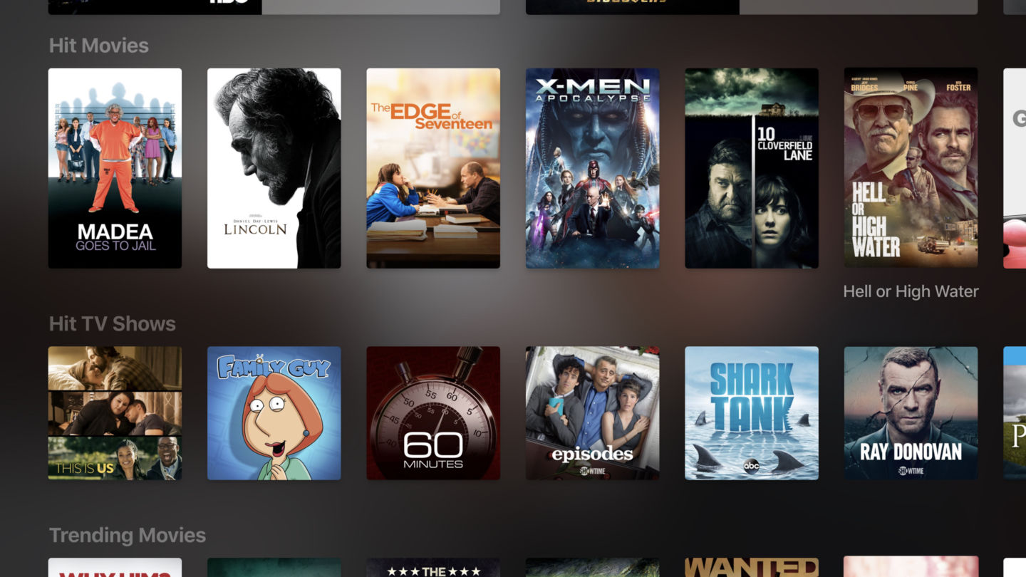
Figure 2-28. Apple TV

Figure 2-29. LinkedIn Learning
Manage and edit media assets
Media and document creators also use this media browser layout to manage assets that are being assembled or processed. Apple Photos (shown in Figure 2-30), Adobe Bridge (Figure 2-31), and Apple iMovie (Figure 2-32) are mobile desktop applications for managing personal collections of images. Their browsing interfaces—all Two-Panel Selector—vary in complexity from Apple Photos’ very simple design to Adobe Bridge’s numerous panels and filters. Apple Photos uses One-Window Drilldown to reach the single-item view, whereas Adobe Bridge and Apple iMovie put all three views together on one page. A common variation on the square grid layout is a single-height row that scrolls: a ribbon. In the case of iMovie, it is a timeline. It is the central working palette for creating time-based media such as videos.

Figure 2-30. Apple Photos

Figure 2-31. Adobe Bridge

Figure 2-32. Apple iMovie
Adobe Acrobat (Figure 2-33), the reader/editor for the popular PDF document format, offers a grid view of document pages. This is used in the edit mode. It allows for rapid reorganization of pages, or selecting pages for deletion, or selecting an insertion point for adding screens.

Figure 2-33. Adobe Acrobat
Dashboard
What
A dashboard is often the first screen a customer will see when logging in to a consumer or business platform. They are a very common pattern for business information software. Dashboards display key data points in a single information-dense page, updated regularly. They show users relevant, actionable information, charts and graphs, and important messages and links or buttons, often related to key metrics or workflows that are important to the business.
Dashboards are very popular because they solve the need to get a quick update on status, on key information, and on tasks to be done. Your site or application deals with an incoming flow of information from something—web server data, social chatter, news, airline flights, business intelligence information, or financials, for example. Your users would benefit from continuous monitoring of that information.
Why
This is a familiar and recognizable page style. Dashboards have a long history, both online and in the physical world, and people have well-established expectations about how they work: they show useful information, they update themselves, they usually use graphics to display data, and so on.
A dashboard uses many interlocking patterns and components. Many online dashboards use a collection of these patterns found elsewhere in this book:
How
Determine what information users need or want to see, or what tasks they need to stay on top of. This isn’t as simple as it sounds, because you need a researcher’s or editor’s eye—eliminate confusing or unimportant data, or people won’t be able to pick out the parts that matter. Remove, or at least deemphasize, information that doesn’t help the user. Feature the most important information or next steps.
Use a good visual hierarchy (Chapter 4) to arrange lists, tables, and information graphics on the page. Try to keep the main information on one page, with little or no scrolling, so people can keep the window on-screen and see everything at a glance. Group related data into Titled Sections, and use tabs only when you’re confident that users won’t need to see the tab contents side by side.
Use One-Window Drilldown to let users see additional details about the data—they should be able to click links or graphics to find out more. Datatips work well to show individual data points when the pointer rolls over an information graphic.
Choose appropriate and well-designed information graphics for the data you need to show. Gauges, dials, pie charts, and 3D bar charts look nice, but they are rarely the best way to show comparative information at a glance—simple line and bar charts express data better, especially time-based data. When numbers and text are more relevant than graphics, use lists and tables. Row Striping is a common style for multicolumn data tables.
People will try to get actionable information from the dashboard at a glance, without looking closely at every element on the page. So, when you show text, consider highlighting keywords and numbers so that they stand out from surrounding text.
Should your users be able to customize their dashboard displays? Many dashboards do offer customization, and your users might expect it. One way to customize a dashboard page is to rearrange the sections—Salesforce offers Movable Panels to users, in addition to choosing which gadgets are shown.
Examples
Salesforce (Figure 2-34) has built a huge software business around answering the need for enterprises large and small to monitor and manage all forms of business processes. Custom-built and customizable dashboards are a central part of this strategy. Some examples of purpose-built dashboards are shown here. Users can build or configure modules according to their needs, and then arrange the standard-sized modules into a grid that suits them best. These can be saved and shared.


Figure 2-34. Salesforce Dashboards
SpaceIQ (Figure 2-35) offers a dashboard on login. This startup follows a classic design pattern of offering key performance indicators, an overview of what is happening now or needs attention, and quick navigation to other key parts of the platform.
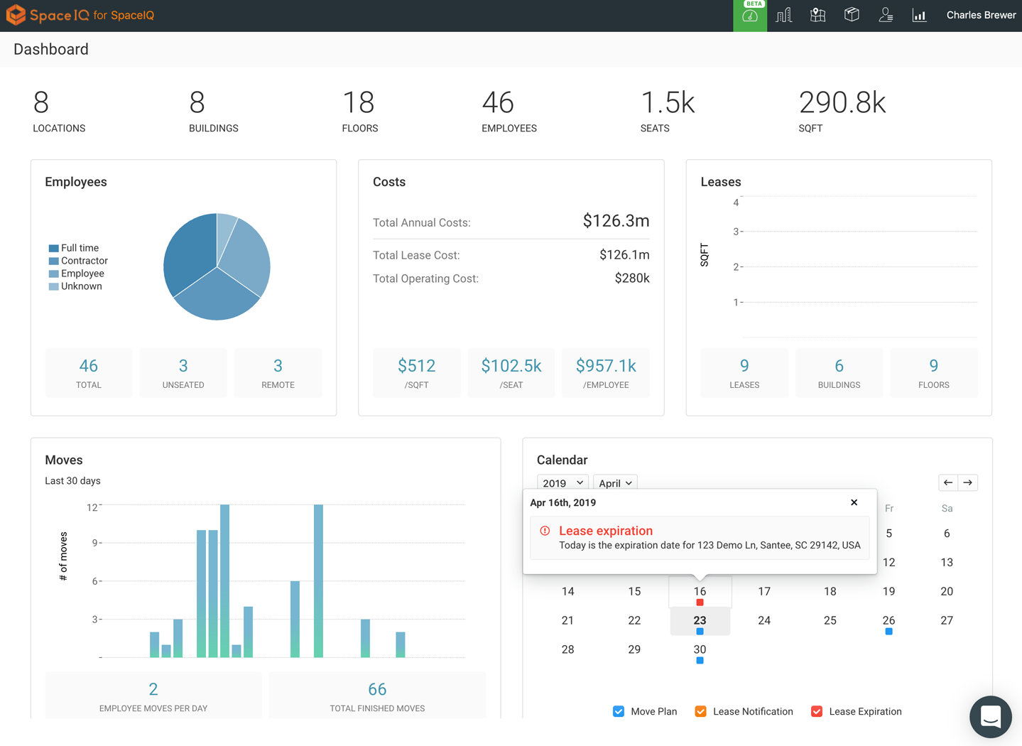
Figure 2-35. SpaceIQ
Finally, you might be interested in Stephen Few’s book on information dashboards, Information Dashboard Design: Displaying Data for At-a-Glance Monitoring (Analytics Press, 2013).
Canvas Plus Palette
What
An application structure defined by a central workspace with containers of tools around it. It consists of a large blank area, or canvas, where a user creates or edits a digital object. Arranged around this open area, at the sides or top or bottom, are grids of tools, called palettes. The tools are represented as icons. The user clicks the palette buttons to create objects on the canvas, or to select a tool to modify objects. The overall effect is a digital workbench or virtual artist’s easel. The user selects one tool after another to use on the main object.
Use when
You’re designing any kind of graphical editor. A typical use case involves creating new objects and arranging them on some virtual space.
Why
This pair of panels—a palette with which to create things, and a canvas on which to put them—is so common that almost every user of desktop software has seen it. It’s a natural mapping from familiar physical objects to the virtual on-screen world. And the palette takes advantage of visual recognition: the most common icons (paintbrush, hand, magnifying glass, etc.) are reused over and over again in different applications, with the same meaning each time.
How
Present a large empty area to the user as a canvas. It might be in its own window, as in Photoshop (Figure 2-18), or embedded in a single page with other tools. The user just needs to see the canvas side by side with the palette. Place additional tools—property panels, color swatches, and so on—to the right or bottom of the canvas, in small palette-like windows or panels.
The palette itself should be a grid of iconic buttons. They can have text in them if the icons are too cryptic; some GUI-builder palettes list the names of GUI components alongside their icons, for instance.
Place the palette to the left or top of the canvas. It can be divided into subgroups, and you might want to use Module Tabs or Collapsible Panels to present those subgroups.
Most palette buttons should create the pictured object on the canvas. But many builders have successfully integrated other things such as zoom mode and lassoing into the palette.
The gestures used to create items on a palette vary from one application to another. Some use drag-and-drop only; some use a single click on the palette and a single click on the canvas; and some use pressure-sensitive tools, such as a digital pen or simply varying your finger pressure on a touch-sensitive screen and other carefully designed gestures. Usability testing in this area is particularly important because the behaviors of the tools might not be obvious or might be difficult to learn.
Examples
The examples that follow show a variety of canvas and palette patterns. Adobe Photoshop (Figure 2-36) is a classic. All four edges of the app feature palettes, panels and commands that the author uses when working on an image. In Axure RP Pro (Figure 2-37), there are palettes to the left and right of the central drawing pane, where the user creates interactive wireframes for software prototypes. Next is OmniGraffle (Figure 2-38), a vector drawing application for MacOS, which has its tools palette on the left. Even mobile apps have need of this pattern when dealing with large numbers of tools or choices. In iOS Photos (Figure 2-39), the image that the user is editing appears in the central canvas. Below this are three tools palettes that are open-close panels, with multiple editing tools inside each.
Figure 2-36. Adobe Photoshop

Figure 2-37. Axure RP Pro

Figure 2-38. OmniGraffle

Figure 2-39. iOS Photos
Wizard
Use when
You are designing a UI for a task that is long or complicated, and that will usually be novel for users—not something that they do often or want much fine-grained control over (such as the installation of a software package). You’re reasonably certain that the designer of the UI will know more than the user does about how best to get the task done.
Tasks that seem well suited for this approach tend to be either branched or very long and tedious—they consist of a series of user-made decisions that affect downstream choices.
The catch is that the user must be willing to surrender control over what happens and when. In many contexts, that works out fine, because making decisions is an unwelcome burden for people doing certain things: “Don’t make me think, just tell me what to do next.” Think about moving through an unfamiliar airport—it’s often easier to follow a series of signs than it is to figure out the airport’s overall structure. You don’t get to learn much about how the airport is designed, but you don’t care about that.
But in other contexts, it backfires. Expert users often find a Wizard frustratingly rigid and limiting. This is particularly true for software that supports creative processes such as writing, art, or coding. It’s also true for users who actually do want to learn the software; Wizard doesn’t show users what their actions really do or what application state gets changed as choices are made. That can be infuriating to some people.
Why
Divide and conquer. By splitting up the task into a sequence of chunks, each of which can be dealt with in a discrete “mental space” by the user, you effectively simplify the task. You have put together a preplanned road map through the task, thus sparing the user the effort of figuring out the task’s structure—all they need to do is address each step in turn, trusting that if they follow the instructions, things will turn out OK.
But the very need for a Wizard indicates that a task might be too complicated. If you can simplify a task to the point where a short form or a few button clicks can do the trick instead, that’s a better solution. (Keep in mind, too, that a Wizard approach is considered a bit patronizing.)
How
“Chunking” the task
Break up the operations constituting the task into a series of chunks, or groups of operations. You might need to present these groups in a strict sequence, or not; sometimes there is value in breaking up a task into steps 1, 2, 3, and 4 just for convenience.
A thematic breakdown for an online purchase can include screens for product selection, payment information, a billing address, and a shipping address. The presentation order doesn’t much matter because later choices don’t depend on earlier choices. Putting related choices together just simplifies things for people filling out those forms.
You might decide to split up the task at decision points so that choices made by the user can change the downstream steps dynamically. In a software installation Wizard, for example, the user might choose to install optional packages that require yet more choices; if they choose not to do a custom installation, those steps are skipped. Dynamic UIs are good at presenting branched tasks such as this because the user never needs to see anything that’s irrelevant to the choices they made.
In either case, the difficult part of designing this kind of UI is striking a balance between the sizes of the chunks and the number of them. It’s silly to have a two-step Wizard, whereas one comprising 15 steps is tedious. On the other hand, each chunk shouldn’t be overwhelmingly large, or you’ve lost some benefits of this pattern.
Physical structure
Wizards that present each step in a separate page, usually navigated with Back and Next buttons, are the most obvious and well-known implementation of this pattern. They’re not always the right choice, though, because now each step is an isolated UI space that shows no context—the user can’t see what went before or what comes next. But an advantage of such a Wizard is that they can devote each page to that step completely, including illustrations and explanations.
If you do this, allow the user to move back and forth at will through the task sequence. Offer a way for the user to step backward or to otherwise change their mind about an earlier choice. Additionally, many UIs show a selectable map or overview of all the steps, getting some of the benefits of a Two-Panel Selector. (In contrast to that pattern, a Wizard implies a prescribed order—even if it’s merely suggested—as opposed to completely random access.)
If you instead choose to keep all the steps on one page, you could use one of several patterns from Chapter 4:
-
Titled Sections, with prominent numbers in the titles. This is most useful for tasks that aren’t heavily branched because all steps can be visible at once.
-
Responsive Enabling, in which all the steps are present on the page, but each one remains disabled until the user has finished the previous step.
-
Progressive Disclosure, in which you wait to show a step on the UI until the user finishes the previous one. This might be the most elegant way to implement a short Wizard. It’s dynamic, compact, and easy to use.
Good Defaults and Smart Prefills (from Chapter 10) are useful no matter how you arrange the steps. If the user is willing to turn over control of the process to you, the odds are good they’re also willing to let you pick reasonable defaults for choices they might not care much about, such as the location of a software installation.
Examples
The Microsoft Office designers have done away with many of its Wizards, but a few remain—and for good reason. Importing data into Excel is a potentially bewildering task. The Import Wizard (Figure 2-40) is an old-school, traditional application Wizard that guides the user step by step through the import process. It uses Back/Next buttons, branching, and no sequence map, but it works. Each screen lets you focus on the step at hand, without worrying about what comes next.
Figure 2-40. The Microsoft Excel import wizard
Settings Editor
Use when
You are designing any of the following applications or tools, or something similar:
-
An application that has app-wide preferences.
-
An operating system (OS), mobile device, or platform that has system-wide preferences.
-
A site or app for which a user must sign in—users will need to edit their accounts and profiles.
-
An open-ended tool to create documents or other complex work products. Users might need to change a document’s properties, an object within a document, or another item.
-
A product configurator, which allows people to customize a product online.
Why
Though both use forms, a Settings Editor is distinct from a Wizard, and it has very particular requirements. A user must be able to find and edit a desired property without being forced to walk through a prescribed sequence of steps—random access is important.
To aid findability, the properties should be grouped into categories that are well labeled and make immediate sense.
Another important aspect of Settings Editor design is that people will use it for viewing existing settings, not just changing them. The design needs to communicate the values of those settings at a glance.
Experienced users have strong expectations for preference editors, account settings, and user profiles being in familiar places and behaving in familiar ways. Break these expectations at your own peril!
How
First, make it findable. Most platforms, both mobile and desktop, have a standard place to find application-wide preferences—follow the conventions, and don’t try to be overly clever. Likewise, websites where people sign in usually put links to account settings and profiles where the username is shown, often in the upper-right or upper-left corner.
Second, group the properties into pages, and give those pages names that make it easy to guess what’s on them. (Sometimes all the properties or settings fit on one page, but not often.) Card-sorting exercises with representative users can help you figure out the categories and their names. An outrageously large number of properties might require a three- or four-level hierarchy of groups, but be careful that users don’t get frustrated at having to click 53 times to reach commonly needed properties.
Third, decide how to present these pages. Tabs, Two-Panel Selector, and One-Window Drilldown (Chapter 7) with an extensive page “menu” on the top page seem to be the most common layouts for Settings Editor.
The design of the forms themselves deserves an entire chapter. See Chapter 10 for patterns and techniques used in forms.
Finally, should you immediately apply changes that the user makes or offer Save and Cancel buttons? That can depend on the type of settings you’re working with. Platform-wide settings seem to be applied immediately when changed; settings on websites mostly use Save buttons; and application settings and preferences can go either way. It might not be a huge usability issue in any case. Follow an established convention if there is one, or see what the underlying technology requires; test it with users if you still have open questions.
Examples
Google (Figure 2-41) and Facebook (Figure 2-42) both use tabs to present the pages of their profile editors. Amazon has one single link for all account-related information: Your Account (see Figure 2-43). This Menu Page (Chapter 3) lists account settings alongside order information, credit card management, digital content, and even community and wish-list activity. The clean, tight page organization is terrific—if I have any questions about what’s going on with my relationship to Amazon, I know I can find it somewhere on this page.
Google, Facebook, and Amazon have huge settings, preferences, and configuration management issues related to their services. Customers must access these settings from time to time in order to review or change them. All have opted for a strong organization system to categorize their settings and preferences. Google and Facebook use tabs to organize the settings into major categories, with screens in each that are in turn sectioned out with titles and groups of controls to allow for comprehension and relatively easy access. Amazon places its most frequently used settings and configurations at the top of the settings screen, with special formatting as giant buttons. Selecting one allows the user to drill down into the appropriate category of settings. Below this is a grid of cards, each labeled with its settings category name, and displaying a list of links to each subcategory within. All three use strong information architecture and navigation to bring some understandable structure to a complicated part of their platform. Although it’s not painless, the user has a good chance of eventually finding and changing the setting they seek.
Amazon (Figure 2-43) offers an outrageously large number of properties that require a deep hierarchy of pages. The designers mitigated some of the problems, however. For instance, they put a list of shortcuts on the top-level page; these are probably the items users look for most often. They put a search box on the top. And by using lists of items, they show users which items fall into which categories.
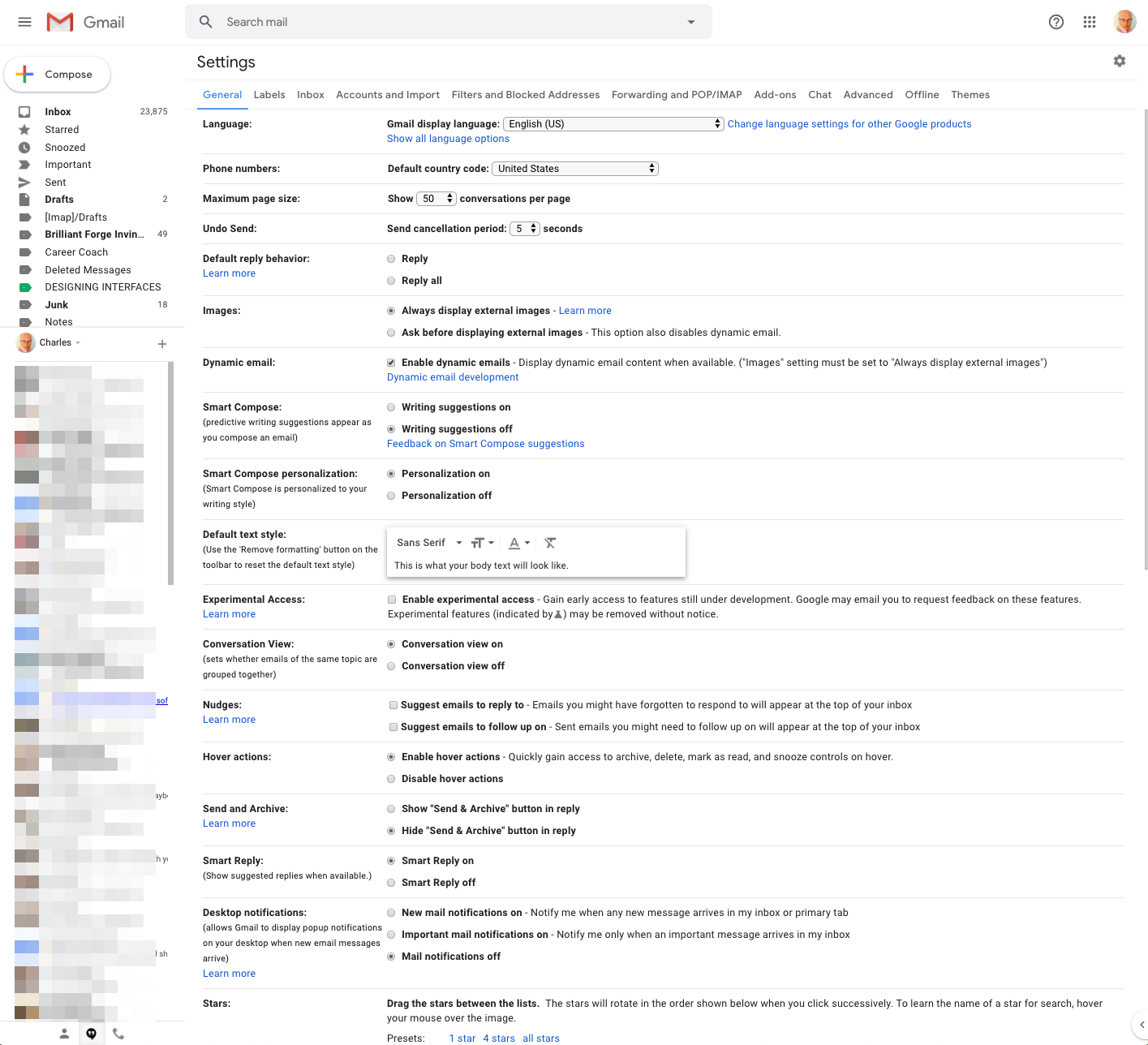
Figure 2-41. Google

Figure 2-42. Facebook
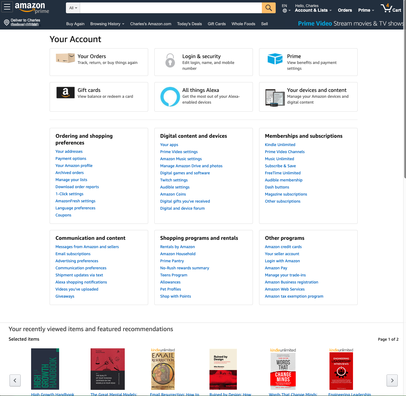
Figure 2-43. Amazon
In Apple’s mobile OS, iOS, there are many settings (Figure 2-44). Some are for the entire device, and some are for individual apps on the iPhone. Apple has opted for a single scrolling list. Some order is provided by putting the most critical and frequently used settings at the top. The items in the long list are also grouped to help with navigation and selection.
For its desktop OS, macOS, Apple has opted for a panel of categories for its system settings (Figure 2-45). These are marked by sections, icons, and labels to help with understanding the categories and selecting the right one.
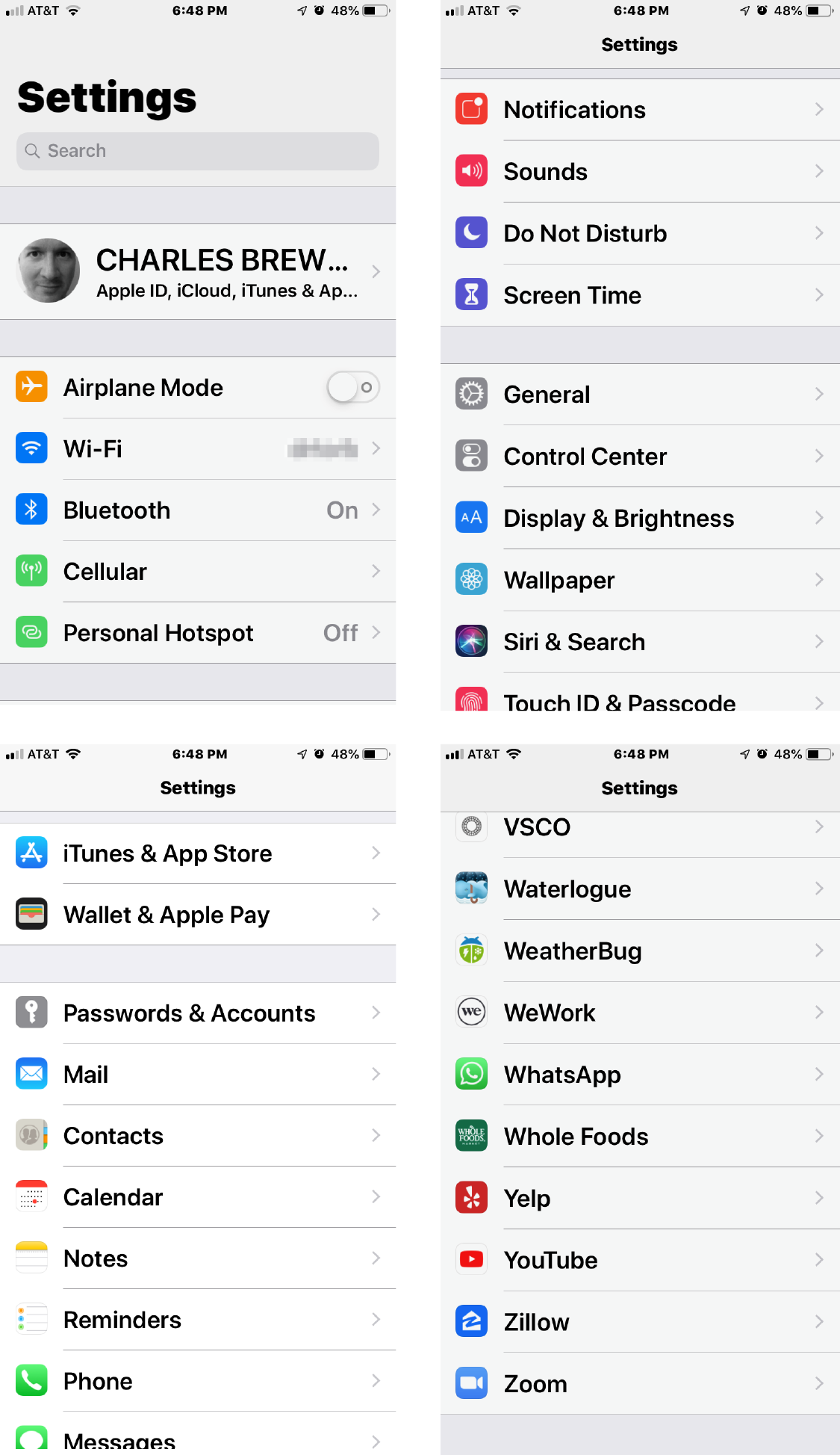
Figure 2-44. iOS settings
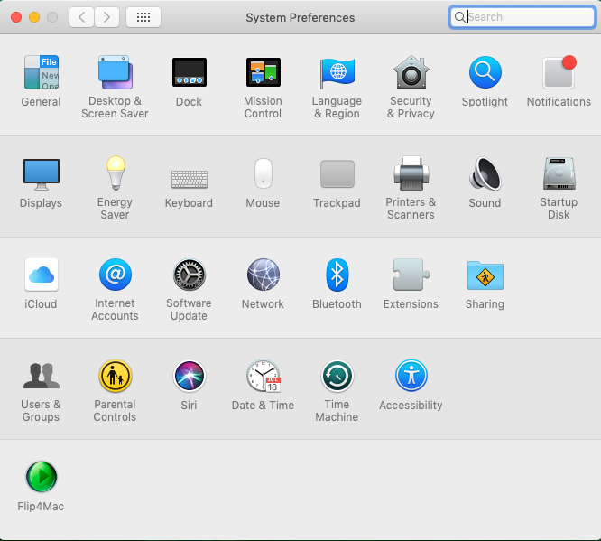
Figure 2-45. macOS system preferences
Alternative Views
Use when
You’re building something that views or edits a complex document, list, website, map, or other content. You might face design requirements that directly conflict with one another. You can’t find a way to show both feature set A and feature set B at the same time, so you need to design both separately and let the user choose between them.
Why
Try as you might, you can’t always accommodate all possible usage scenarios in a single design. For instance, printing is typically problematic for websites because the information display requirements differ—navigation and interactive gizmos should be removed, for instance, and the remaining content reformatted to fit the printer paper.
There are several other reasons for Alternative Views:
-
Users have preferences with regard to speed, visual style, and other factors.
-
A user might need to temporarily view data through a different “lens” or perspective in order to gain insight into a problem. Consider a map user switching between views of street information and topographic information (see Figure 2-31 at the top of the pattern).
-
If a user is editing a slideshow or website, for instance, they might do most of their editing while using a “structural” view of the document, containing editing handles, markers for invisible content, layout guides, private notes, and so on. But sometimes they will want to see the work as an end user would see it.
How
Choose a few usage scenarios that cannot easily be served by the application’s or site’s normal mode of operation. Design specialized views for those scenarios, and present them as alternatives within the same window or screen.
In these alternative views, some information might be added and some might be taken away, but the core content should remain more or less the same. A common way to switch views is to change the rendering of a list; file finders in both Windows and macOS let users switch from lists to Thumbnail Grid to Tree Table to Carousel, for instance.
If you need to strip down the interface—for use by a printer or screen reader, for instance—consider removing secondary content, shrinking or eliminating images, and cutting out all navigation but the most basic.
Put a “switch” for the mode somewhere on the main interface. It doesn’t need to be prominent; PowerPoint and Word used to put their mode buttons in the lower-left corner, which is an easily overlooked spot on any interface. Most applications represent the alternative views with icons. Make sure it’s easy to switch back to the default view, too. As the user switches back and forth, preserve all of the application’s current state—selections, the user’s location in the document, uncommitted changes, undo/redo operations, and so on because losing them will surprise the user.
Applications that “remember” their users often retain the user’s alternative-view choice from one use to the next. In other words, if a user decides to switch to an alternative view, the application will just use that view by default next time. Websites can do this by using cookies; desktop applications can keep track of preferences per user; an app on a mobile device can simply remember what view it used the last time it was invoked. Web pages can have the option of implementing Alternative Views as alternative CSS pages. This is how some sites switch between ordinary pages and print-only pages, for example.
Examples
Let’s look at an effective use of different “modes” or alternative views of data in two different applications. The pattern is to offer search results on a map, giving a spatial or geographic representation, and then to show the same results as a scrollable list, which can be sorted and filtered more easily. One mode is for an overview, and geographic context (closer to or further from me). The other is for reading detailed information about each item.
Yelp, the local business directory platform, is the first example. On iOS, the Yelp mobile app (Figure 2-46) offers the two aforementioned views. The searcher must toggle between the views on the small screen format. The Yelp desktop app (Figure 2-47) has the room to offer the map and list views side by side. This offers more robust exploration and learning interactions, such as highlighting the same venue in the list and on the map.
Zillow, the real estate platform, follows a similar design. On iOS, Zillow offers a map view and a list view of your query results (Figure 2-48). The user must toggle between the views. On the Zillow desktop app (Figure 2-49), the home or rental searcher can view these modes side by side. Note the choice to use photographs of the properties in the list view. This supports rapid scanning of the huge numbers of choices so that the searcher can zero in on properties they consider most attractive.

Figure 2-46. Yelp iOS map and list screens

Figure 2-47. Yelp desktop map and list combination screen

Figure 2-48. Zillow iOS map and list screens

Figure 2-49. Zillow desktop map and list combination screen
Two graphic editors, Apple Keynote (Figure 2-50) and Adobe Illustrator (Figure 2-51), show different views of a work product. In the slideshow, the user normally edits one slide at a time, along with its notes, but sometimes the user needs to see all the slides laid out on a virtual table. (Not shown is a third view, in which Keynote takes over the screen and actually plays the slideshow.)
Adobe Illustrator shows an “outline” view of the graphic objects in the document—most useful if you have a lot of complex and layered objects—and the normal, fully rendered view of the artwork. This mode is explicitly for performance reasons. The outline view puts much less demand on the computer processor and so speeds up work considerably.
Figure 2-50. Apple Keynote

Figure 2-51. Adobe Illustrator
Many Workspaces
Use when
You’re building an application that views or edits any type of content—websites, documents, images, or entire projects that include many files. A major aspect of choosing this pattern is the need to have different views or task “modes” available at the same time. For example, people often keep many browser tabs open at the same time so that they can switch between various websites, or compare them. Application developers and media creators often need to see and adjust code or controls in an editor window, and at the same time see the output of their work to see whether they are getting the desired outcomes—either as compiled and executed code, or as a rendered media object.
Designers of conventional websites don’t generally need to think about this. All of the major browsers supply perfectly good implementations of this pattern, using tabs and browser windows. Spreadsheet applications such as from Microsoft or Google offer tabbed workspaces to separate a complicated workbook into individual calculation sheets.
Applications whose central organizing structure is a personal news stream might not need Many Workspaces, either. Email clients, personal Facebook pages, and so forth show only the one news stream that matters to the user; multiple windows don’t add much value. That being said, email clients often let a user launch multiple email messages in different windows. Some Twitter applications can show several filtered streams side by side; for instance, they might show a search-based feed, then a feed from a custom list, and then a feed of popular retweets. (See the TweetDeck example in Figure 2-52.)
Why
People sometimes need to switch rapidly between different tasks in the same project or file, or monitor activity across a large number of real-time feeds.
People multitask. They go off on tangents, abandon trains of thought, stop working on task A to switch to task B, and eventually come back to something they left hanging. You might as well support it directly with a well-designed interface for multitasking.
Side-by-side comparisons between two or more items can help people learn and gain insight. Let users pull up pages or documents side-by-side without having to laboriously switch context from one to another.
This pattern directly supports some Chapter 1 patterns, such as Prospective Memory (a user might leave a window open as a self-reminder to finish something) and Safe Exploration (because there’s no cost in opening up an additional workspace while leaving the original one where it is).
How
Choose one or more ways to show multiple workspaces. Many well-known applications use the following:
-
Tabs
-
Separate OS windows
-
Columns or panels within a window
-
Split windows, with the ability to adjust the splitters interactively
If you deal with fairly simple content in each workspace—such as text files, lists, or Streams and Feeds—split windows or panels work fine. More complex content might warrant entire tab pages or windows of their own so that a user can see a larger area at once.
The most complicated cases involve development environments for entire coding projects. When a project is open, a user might be looking at several code files, stylesheets, command windows (where compilers and other tools are run), output or logfiles, or visual editors. This means that many, many windows or panels can be open at once.
When users close some web browsers, such as Chrome, the set of workspaces (all open web pages, in tabs and windows) are automatically saved for later use. Then, when the user restarts the browser, their entire set of previously opened web pages is restored, almost as they left it. This is especially nice when the browser or machine has crashed. Consider designing in this feature; it would be a kindness to your users.
Examples
Both TweetDeck (Figure 2-52) and Hootsuite (Figure 2-53) take a multipanel or multistream approach to managing social media feeds.
TweetDeck is a Streams and Feeds–type application that can show many streams at once: filtered Twitter feeds, non-Twitter sources, and so on. The example in Figure 2-52 shows several typical TweetDeck columns. This maintains the spirit of a news stream by keeping all the updates visible at once; had these columns been in different tabs or windows, a user wouldn’t be able to see all the updates as they happen.
TweetDeck by default allows the user to see multiple streams side by side from within their own account. In the example in Figure 2-52, the user can see their main feed, notifications, and their messages at the same time. Normally, these are hidden behind various navigation tabs and can be viewed only one at a time. Note also that the fourth panel displays a Twitter-curated list of trending hashtags. TweetDeck supports many feed panels open at the same time, which is useful for monitoring other Twitter accounts at the same time.
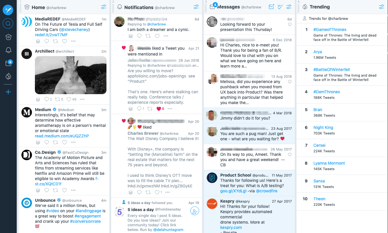
Figure 2-52. Twitter TweetDeck
Hootsuite is a social media postings management platform. It’s valuable for individuals, businesses, and publishers who want to manage and coordinate their social media accounts in one place. This is useful for pushing out new content or increasing follower and reader interaction across their entire social media ecosystem. In this example (Figure 2-53), the Hootsuite user has set up their Twitter and LinkedIn accounts. With this side-by-side feed view, the user can keep track of activity in both accounts (and many more). Posting and responding to each separate account can be carried out from one multipanel Hootsuite view.

Figure 2-53. Hootsuite
Cinema 4D (Figure 2-54) is a tool for creating, rendering, and animating three-dimensional objects. This desktop application uses a multipanel approach to give the user simultaneous views of multiple information and tool spaces. There are panels that show source files and versions of the current work file; a central panel that shows the current 3D object, palettes, toolbars, and panels that have all the controls for working on the 3D object; and a timeline tool that controls the animation of the 3D object.

Figure 2-54. Cinema 4D
Help Systems
What
Providing labels, explanations, and descriptions of how to use the interface are a fundamental part of making usable software. The goal is to provide assistance, answers, or training to users when they need it—in multiple forms so the it can be accessed in different situations.
Inline/display
Helping your users in an immediate way starts with the copy that displays on the screen by default. The purpose of inline copy is to communicate what the user is looking at and what the purpose of a given section or component is. Additionally, examples of the inputs you might be soliciting from users also helps prevent misformatting. Consider a mix of the following:
-
Meaningful headlines and subheaders
-
Instructions: a phrase or sentence directly on the screen to help with a particularly tricky interface.
-
Labels for form elements
-
Prompts or example inputs either in or next to form elements
Tool tips
Tool tips are brief descriptions or explanations of each component on the screen. On desktop web apps, these display when the user hovers over the interface component. Another method is to display a question mark or other icon (or a link) next to a specific component. Tapping or clicking the icon displays a short explanation.
Full help system
This is a fully written out user guide that covers all the major features and functions of your app. This is most common for desktop applications. The help system can include descriptions, glossaries, FAQs, how-to’s, videos, and other information. Help systems often reinforce or replicate user training materials, especially for complicated apps. Help systems can be embedded in the app itself, or can be hosted on a separate website.
Guided tours
It is now common to deploy step-by-step guided tours or walkthroughs within your application. Many companies now offer this capability. It usually takes the form of a lightbox or other layer on top of the application itself. These display as a series of pop ups or pointers that take the user through a tour or help them complete a process in a stepwise fashion. These guided tours can be triggered by a variety of events: first time in the app, from the user selecting a “show me how” help option, or by more advanced user behavior analytics and behaviors.
Knowledge base
Many contemporary customer success software platforms include a Quora-style knowledge base. This consists of a database of questions and answers that are built up over time by the users of the system. This can be created or used just by a customer support team. However, it is now common to open up the knowledge base to customers, as well. Often this knowledge base offers the ability to submit a question or topic and see a list of most related questions and answers created by previous users. Knowledge bases are often the core of modern app help systems, and are the first form of customer support–self-support.
Online community
Software that is popular enough or specialized enough to have a significant user base can also be supported by an online community of users. This is an advanced technique where the goal is to build a long-term community of users who will help one another, spread usage, and create a culture that fosters platform growth. Sometimes, these communities form on their own, as groups on social media platforms or forums like LinkedIn, Facebook, or Reddit. Many companies create, host, and moderate their own online user communities to ensure quality discussions. They also create and moderate official groups and communities on social media sites.
Use a mixture of lightweight and heavyweight help techniques to support users with varying needs.
Use when
Every well-designed website or application should have some form of help. Copy on the screen, prompts in form elements, and tool tips are a must. How will you help beginners become experts? Some users might need a full-fledged help system, but you know most users won’t take the time to use it. For complicated applications, full training and help documentation is a must.
Why
Users of almost any software artifact need varying levels of support for the tasks they’re trying to accomplish. Someone approaching it for the first time ever (or the first time in a while) needs different support than someone who uses it frequently. Even among first-time users, enormous differences exist in commitment level and learning styles. Some people want to watch a tutorial video, some won’t; most find tool tips helpful, but a few find them irritating.
Help texts that are provided on many levels at once—even when they don’t look like traditional “help systems”—reach everyone who needs them. Many good help techniques put the help texts within easy reach, but not directly in the user’s face all the time, so users don’t become irritated. However, the techniques need to be familiar to your users. If they don’t notice or open a Collapsible Panels, for instance, they’ll never see what’s inside it.
How
A lightweight or simple help approach can include displaying meaningful on-screen copy, such as descriptive headers and on-screen instructions. Rollover tool tips for all controls is another lightweight approach. However, rollovers work only on desktop apps in which the browser can track where the user’s mouse pointer is, thus triggering tool tips based on location. Mobile can offer tool tips, as well, but these must be tapped on to access them (there is no hover concept in the mobile interaction design world). This also means any hover tools that you have implemented in a web app must be accessed via a tap action, icon, or menu on mobile.
When the user wants to learn in more detail or as a task in itself, a user guide or online manual is the way to go. Sometimes, this is in your application itself. Other times, it is a separate website or system. This is a more heavyweight technique because it involves creating more content. The benefit is that this help system information has a long life cycle–it provides value for a long time and doesn’t need continuous updating. Users can refer to it again and again, and updates need happen only periodically.
You can think of help systems as existing on multiple levels of detail. Some are very close to the user and their task and are meant to maintain focus on completing it. Others are separate experiences in and of themselves and create a separate learning environment, for times when the user wants to focus on learning.
Create help on several levels, including some (but not necessarily all) of the help types in the following list. Think of it as a continuum: each requires more effort from the user than the previous one but can supply more detailed and nuanced information:
-
Meaningful headings, instructions, examples, and help text directly on the page, including patterns such as Input Hints and Input Prompt (both found in Chapter 10). At the same time, try to keep the total amount of text on the page low.
-
Prompt text in form fields.
-
Tool tips. Use them to show very brief, one- or two-line descriptions of interface features that aren’t self-evident. For icon-only features, tool tips are critical; users can take even nonsensical icons in stride if a rollover says what the icon does! (Not that I’d recommend poor icon design, of course.) The disadvantages of tool tips are that they hide whatever’s under them and that some users don’t like them popping up all the time. A short time delay for the mouse hover—for example, one or two seconds—removes the irritation factor for most people.
-
Hover Tools (Chapter 8). These can display slightly longer descriptions, shown dynamically as the user selects or rolls over certain interface elements. Set aside areas on the page itself for this rather than using a tiny tool tip.
-
Longer help texts contained inside Collapsible Panels (see Chapter 4).
-
Introductory material, such as static introductory screens, guided tours, and videos. When a new user starts the application or service for the first time, these materials can immediately orient them toward their first steps (see the Instant Gratification pattern in Chapter 1). Users might also be interested in links to Help resources. Offer a toggle switch to turn off the introduction—users will eventually stop finding it useful—and offer a way back to it elsewhere in the interface in case a user wants to go back and read it later.
-
Help shown in a separate window, often in HTML via browsers, but sometimes in WinHelp or Mac Help (a desktop app for help). The help resource is often an online manual—an entire book—reached via menu items on a Help menu, or from Help buttons on dialog boxes and HTML pages.
-
Live technical support, usually via chat email, the web, Twitter, or telephone.
-
Online community support. This applies only to the most heavily used and invested software—the likes of Photoshop, Linux, Mac OS X, or MATLAB—but users might consider it a highly valuable resource. Host your own community or use social networking resources for these or more traditional online forums.
Examples
In-screen help: labels and tool tips
The first layer of help that can be designed into your software is the help that appears right in the context of usage: labels, rollover highlights, and tool tips. In Adobe Photoshop’s desktop application (Figure 2-55), hovering the mouse over a tool icon (which lacks a label) causes it to change background color and then display a tool tip that explains what the highlighted tool does. Learning through exploration is enabled this way.
Figure 2-55. Adobe Photoshop: animated titles as hover tools and tool tips
Microsoft Excel (Figure 2-56) view controls have permanent labels. The selected tool has a selected appearance and a corresponding label. But if the user hovers over an unselected view button, the label will change to show temporarily what the name of the highlighted (not selected) tool is. Excel also makes extensive use of regular rollover tool tips, as shown in Figure 2-57, especially for icons that don’t have default labels.

Figure 2-56. Microsoft Excel: animated titles as hover tools

Figure 2-57. Microsoft Excel: tool tips
Help systems
Publishing instructional and reference content in the software platform or application itself is a longstanding best practice in usability and customer success. Essentially it means providing a digital version of the user manual for the software that the customer can access as needed. This provides incredible value to users because they have a place to turn to answer their questions that they can access on their own, without having to initiate a customer service request. They also don’t need to break from their task at hand to come back later. Also, new users self-train with such materials. From a customer confidence and satisfaction point of view, and considering the savings in reduced customer service requests, deploying a help system in your application (or in a separate website that your software can link to) is a significant benefit.
Adobe Photoshop (Figure 2-58) shows how a designer can access help and tutorials directly in the application. From Photoshop, the user has links to the Adoble Photoshop Help website (Figure 2-59). Microsoft Excel (Figure 2-60) offers the full help system in a separate application window that can be opened while using the app.
Figure 2-58. Adobe Photoshop Search and Help
Figure 2-59. Adobe Photoshop Help (website)
Figure 2-60. Microsoft Excel Help (in the application itself)
New user experiences: guided instruction
What is the most natural way in the world for a visitor, a new resident, or a new employee to learn where things are, how the space or campus is laid out, or how to do things? Or, what’s the best way for an existing user to get some help in the form of a reminder, a repeat training, or a “refresher”? It’s to ask a more experienced person to give a tour, to be a guide. Many software platforms have taken this approach to onboarding new users. It’s possible to create and deploy step-by-step guides for software that gives a new customer or employee a tour of the software or a guide for how to do specific tasks. These often take the form of an overlay on top of the standard interface, or a series of pop ups that point to key screen components. In this way, a new UX can be scripted and developed once and then used by many people after that.
Userlane (Figure 2-61) is a company that provides a user-guide authoring platform that other companies can deploy in their own software. In the example here, using Wikipedia as a demonstration, an instructional panel displays in lightbox mode on top of the regular Wikipedia interface. In this way, the learner is prompted to focus on one step or interface component at a time, which promotes better learning. They can also go at their own pace while still getting a tour of all the most important parts of the software by the end.
Similarly, Pendo (Figure 2-62) offers pop-up user guides as part of its customer engagement platform. The Pendo customer, usually a software company, creates user guides for how to do things in the app. In this example, the learner is in the middle of some task walk-through. The immediate next step, which is to go to Settings, is highlighted at top in an overlay.
Figure 2-61. Lightbox mode: instructional panel with highlighted step (Userlane)
Figure 2-62. Overlay mode: step-by-step pop ups pointing to UI elements (Pendo)
Online community
Finally. if all other sources of help are exhausted, a user can turn to the wider user community for advice. We’ve now moved beyond the realm of software design, per se, but this is still product design—the UX extends beyond the bits installed on users’ computers. It includes the interactions they have with the organization, its employees or other representatives, and its website.
The UI design app Sketch is widely used, and it’s no surprise that the company wants to bring this community together around this popular tool. The Sketch User community (Figure 2-63) shows how this community is a source of news and learning.
Similarly, Adobe User Forums (Figure 2-64) offer a way for designers and others to discuss issues. Adobe creates the forum. Their customers create the content in the form of discussions, questions and answers, and advice. In this way, knowledge can be spread more easily among members of the community.
Community building like this happens only for products in which users become deeply invested, perhaps because they use the product every day at work or at home. But having an online community of users of some sort is common. It is also a huge advantage for the product. So, it is worth considering how to foster such a community.

Figure 2-63. User community as a learning resource; hosted by third party (Sketch community hosted by Spectrum)

Figure 2-64. Adobe User Forums
Tags
What
Tags are a method of classifying and categorizing information by adding labels to it. To put it another way, it is a method of creating or attaching descriptive metadata to an article, a social media post, or any other piece of information. They form an additional kind of faceted classification and navigation system for your app or website: a topic-based one. If you provide or attach these tags, the customer can use them to search and browse content by these facets, or category descriptors.
Another aspect of tags is that they can be provided by the reader or consumer, too. They can be a form of user-generated content. Tags can be a way for users to manage their own data: grouping of content, searching, browsing, sharing, or recall. Multiple tags can be added to the same post or article. With enough tagged content, online consumers can view or browse the content or online activity using tags created by co-users. This is a common feature of discussion boards, blogs and social-enabled apps and sites of all kinds.
Social media has created and spread the near-universal standard of adding the hash or pound symbol “#” to the beginning of a word to mark it specifically as a tag, or “hashtag. ” Hashtags create a way for users to link from a single social post or article to a search results feed that contains posts from other people also marked with the same hashtag. This is a powerful way for information to spread rapidly.
Use when
Enable tagging when you want to take advantage of your users’ desire to classify, browse, share, and promote content associated with topics of interest to them. Tags are a user-generated classification system. When this is generated by your readers or customers and is accessible to others, it becomes a way for them to discover and navigate to content that’s of interest. Apps or platforms that have a large amount of information, such as news publishers or social media sites, will add tags to their content, or allow users to tag their posts. In this way, a homegrown topic navigation and discovery system grows along with the content, a complement to whatever formal navigation and IA scheme you have designed into your product.
Why
The purpose of tagging from a design perspective is twofold. First, it promotes increased usage of your app or website because your users are able to find content, media, and other information that is highly relevant to the tag or keyword of interest at the moment. Even more, if you have users who actively tag content, they are becoming more invested in your product or platform because they are creating their own content (usually for social media sharing) using your content. Both of these can help to increase usage and retention.
The second reason to tag your content or enable your users to tag is to crowdsource an organic organization scheme for your app or community that would otherwise be too expensive and time consuming to do on your own. These can form quickly around topics of the moment, and they can also be long-lived topics. Over time, a naturally user-centered structure and order can emerge. This can be especially useful if you want to activate or amplify your customers’ own interest in finding, reading, sharing, commenting on, and more related to topics that are naturally interesting to them.
How
Create or incorporate software that allows words to be added to content or posts as tags. Furthermore, your search function must be able to search the tagged content and create index or results screens that show all content that is tagged with a particular keyword. Tags or hashtags also should be formatted as links automatically. Selecting the tag generates a search based on that tag, and creates a search results page with most relevant or most recent content also tagged with that term.
Examples
Stack Overflow (Figures 2-65 and 2-66) is a hugely popular question-and-answer discussion board and online community that serves the software developer community. This website consists almost totally of user-generated content in the form of threaded, tagged discussions. In other words, it offers a deep and robust crowd-sourced tag/topic system for finding information. Readers can browse lists of most recent and most popular questions. They also use the tags attached to each post. Participants tag their posts liberally. This allows readers to find discussion threads tagged with the same topic, and closely related topics. Tracking and displaying related tags creates a rich information and navigation browsing ecosystem with high likelihood of readers finding relevant content related to their topic of interest.

Figure 2-65. Stack Overflow, showing relevant tags (each highlighted within in a round-cornered rectangle below the subject) for each question

Figure 2-66. Stack Overflow filtered by tag
Texas Monthly (Figure 2-67) uses the massively popular Wordpress content management system and web publishing platform to create their online magazines. A prominent feature of Wordpress is the ability to add tags to articles and posts at the time of publication. These tags are displayed along with the main article, and link to other posts within the Wordpress system, which generates additional pages for the reader based on the tag they clicked. In the Texas Monthly example, several tags display at the bottom of an article. The authors have chosen a number of keywords to describe this and other articles. In this example, when the user clicks the tag “Travel,” for example, they can see a list of other travel articles that Texas Monthly has published. This promotes increased time on the site, site circulation, and reader engagement.

Figure 2-67. Texas Monthly article tags (powered by Wordpress)
Evernote is a personal note-taking and web archiving application for mobile, web, and desktop. Its users save articles, files, presentations and web pages into a central location: the Evernote platform. It allows users to add their own tags when “clipping” a web page to Evernote (Figure 2-68). This helps with categorizing and finding similar saved articles later. There is also a tag index screen where the user can see what tags exist, and how many articles or clippings are tagged with each term (Figure 2-69). Selecting a given tag creates a search results list of clippings with that tag. In addition to free-text searching, Evernote’s user-generated tag system creates a powerful method for categorizing and managing large amounts of disparate media and information. Inside the Evernote app itself, the user can search by tag (Figure 2-70).

Figure 2-68. Evernote Screen Clipper offers the ability to add tags
Figure 2-69. Evernote app with tags browser
Figure 2-70. Evernote app with ability to search by tags
Conclusion
Information architecture, or IA, is a challenging aspect of designing software because it is simultaneously abstract (organization and labeling schemes) and also concrete (navigation and tags, for example). It’s important to remember that the IA should be based on the users’ vocabulary and mental model of the business or task domain. The IA should be designed to accept new content and data over time, and still serve to organize and hold everything without confusion. So, design for an “evergreen” information architecture. The processes outlined in this chapter will help you do just that: mutually exclusive, collectively exhaustive categorization; using commonly understood organization methods, chunking up content, developing a system of screen types based on usage, and then the patterns in this chapter. It’s useful to think of the IA of your software as being the invisible organization scheme, and the various interaction design patterns and widgets as ways of exploring this information space. Search, browse, navigation systems, tags, cross-links, multiple media types, and more might all be necessary to learn and navigate the information architecture fully.
In Chapter 11, we look at how modern UI frameworks and atomic design principles help us to quickly build out these IA widgets at scale.
1 “Rich Internet Screen Design” in UX Magazine.
Social streams
Content comes from other members that the user follows (plus options to have editors highlight certain posts, or insert sponsored content). Again, this is usually a list of items in reverse chronological order, updated dynamically.