Chapter 4. Layout of Screen Elements
Layout is defined as the particular way elements are arranged. In the case of interface design, these elements are the informational, functional, framing, and decorative parts of the screen. Thoughtful placement of these elements helps to guide and inform your users about the relative importance of the information and functions.
No matter what size screen you are designing for—web, kiosks, or mobile—careful consideration of the placement of content is key to helping the user understand what they need to know and what to do about it.
Often you will hear the term “clean” to describe a screen-based design. A clean layout follows the principles of visual information hierarchy, visual flow, alignment through a grid, and adheres to Gestalt principles.
In this chapter, we define these principles that inform your users what you want them to know and what you want them to do about it.
The Basics of Layout
This section discusses several elements of layout: visual hierarchy, visual flow, and dynamic displays.
Visual Hierarchy
Visual hierarchy plays a part in all forms of design. The most important content should stand out the most, and the least important should stand out the least. A viewer should be able to deduce the informational structure from its layout.
A good visual hierarchy gives instant clues about the following:
-
The relative importance of screen elements
-
The relationships among them
-
What to do next
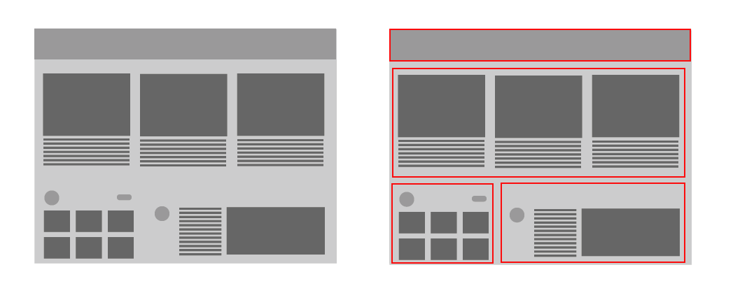
Visual hierarchy in action
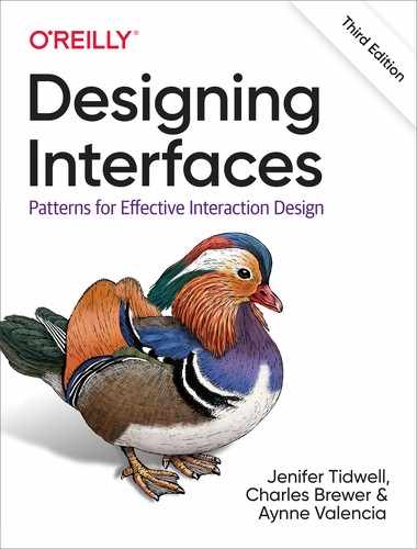
Take a look at the example in Figure 4-1. Can you tell at a glance what is the most important information in Example A? Can you tell what is the most important information in example B? Most people will find Example B the easier layout to understand, even with only rectangles and squares. This is because the arrangement of the screen elements, the relative size, and proportion of the elements imply their importance and guide the viewer on what to pay the most attention to.

Figure 4-1. A) Example of no visual hierarchy, and B) example of a visual hierarchy
What Makes Things Look Important?
Size
The size of the headlines and subheads give the viewer a clue about order and importance. Headlines will tend to be bigger and more dramatic because of contrasting size, visual weight, or color. In contrast, a small strip of text at the bottom of the page says quietly, “I’m just a footer,” and less important (Figure 4-2).
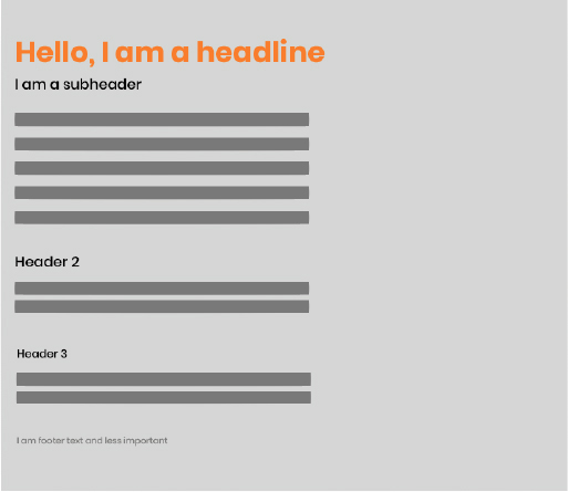
Figure 4-2. Example of size
Position
Simply by glancing at the size, position, and colors of the layout in Figure 4-3, you can guess the most important elements of each of the four examples.
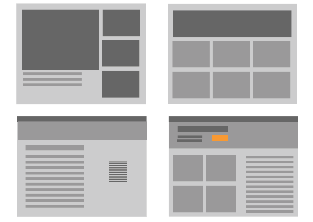
Figure 4-3. Ways to distinguish importance by position, size, or color
Density
Density refers to the amount of space between elements of the screen. Take a look at the example in Figure 4-4. The left shows a denser layout where content is tightly gathered together. The example on the right has a more open look with content spread evenly apart. The less-dense example will also be slightly more difficult to read and for the viewer to distinguish which elements are related to one another.

Figure 4-4. Example of more density and less density
Background color
Adding shade or a background color will draw attention to a block of text and distinguish it from other text. The example on the left in Figure 4-5 has a consistent background for all elements. This implies no distinction and a continuity of the importance of the elements. In comparison, in the example on the right side of the figure, the background and contrast elements in the middle draw the eye immediately to it, implying more importance. Contrast draws attention.
Figure 4-5. Example of no background color and background color
Rhythm
Lists, grids, whitespace, and alternating elements such as headlines and summaries can create a strong visual rhythm that irresistibly draws the eye, as shown in Figure 4-6.
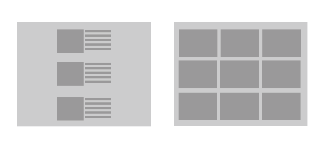
Figure 4-6. Lists and grids to create a visual rhythm
Emphasizing small items
To make small items stand out, put them at the top, along the left side, or in the upper-right corner. Give them high contrast and visual weight, and set them off with whitespace. But note that in a text-heavy screen, like most websites, certain controls—especially search fields, sign-in fields, and large buttons—tend to stand out anyway. This is less about raw visual characteristics than meaning: if someone is looking for a Search box, for instance, their eyes will go straight to the text fields on the page. (They might not even read the labels for those text fields.)
Another way to emphasize small items is to use spacing and contrast to distinguish them, as shown in Figure 4-7.

Figure 4-7. Techniques to bring attention to small items
Alignment and grid
In digital design, legibility is critical. Helping guide the viewer to information and action is key. Creating a design that is based on a grid (Figure 4-8) allows the designer to focus on the content, assured that the layout will have visual consistency and balance (Figure 4-9). Grids also help multiple designers work on separate but related layouts.
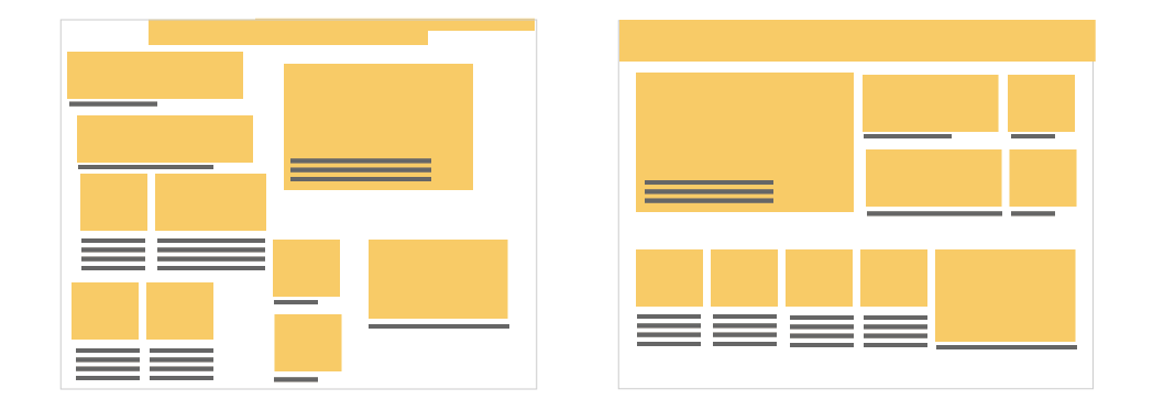
Figure 4-8. Gridless layout (left), and a layout designed on a grid (right)
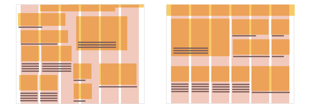
Figure 4-9. Grid overlaid on the examples in Figure 4-8
Grids are found in all digital design, and they are fundamental in creating designs that will be responsive and can accommodate dynamic content, which we discuss later.
Grids are composed of margins and gutters (Figure 4-10 and Figure 4-11). Margins are the space around the content and gutters are the spaces between.
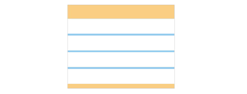
Figure 4-10. Vertical grid with margins (yellow) and gutters (blue)

Figure 4-11. Horizontal grid with margins (yellow) and gutters (blue)
Using a grid is a good way to ensure that the content will create a visually harmonious composition, and will aid in reducing the cognitive load of your viewer.
Four Important Gestalt Principles
“Gestalt” is a term that comes from a psychological theory that took hold in the 1920s. Gestalt is a German word that means “form” or “shape.” In design, we often refer to Gestalt Principles which refers to a set of rules describing the way humans perceive visual objects. The theory behind grouping and alignment was developed early in the twentieth century by the Gestalt psychologists. They described several layout properties that seem to be hardwired into our visual systems. We look at each one in the following subsections.
Similarity
Items that are similar in shape, size, or color are perceived as related to one another. If you have a few things “of a type” and you want viewers to see them as equally interesting alternatives, give them an identical (and distinctive) graphic treatment.
A list of many similar items, arranged in a strong line or column, becomes a set of peer items to be viewed in a certain order. Align these items very precisely with one another to create a visual line. Examples include bulleted lists, navigation menus, text fields in a form, row-striped tables, and lists of headline and summary pairs.
Are one or more items more “special” than the others like it? Give it a slightly different treatment, such as a contrasting background color, but otherwise, keep it consistent with its peers (see the example on the right in Figure 4-13). Or use a graphic element to disrupt the line along which the items are aligned, such as a bump-out, overlap, or something at an angle.

Figure 4-13. Grouping related peer items (left) and distinguishing two items among peers (right)
Continuity
Our eyes will naturally follow the perceived lines and curves formed by the alignment of other elements, as demonstrated in Figure 4-14.
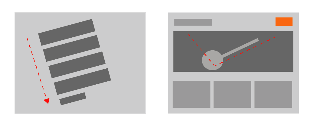
Figure 4-14. Two examples of visual continuity.
Closure
The brain will naturally “close” lines to create simple closed shapes such as rectangles and blobs of whitespace, even if they aren’t explicitly drawn for us. In the examples in Figure 4-15, you will likely see (clockwise, from upper left) a rectangle, a circle, and two triangles. None of these shapes are actually represented in the image but the eye completes the line in your brain.

Figure 4-15. Example of closure
These principles are best used in combination with one another. Continuity and closure explain alignment. When you align things, you form a continuous line with their edges, and the users will follow that line and assume a relationship. If the aligned items are coherent enough to form a shape—or to form one out of the whitespace or “negative space” around it—closure is also at work, adding to the effect.
Visual Flow
Visual flow deals with the tracks that readers’ eyes tend to follow as they scan the page.
It’s intimately related to visual hierarchy, of course—a well-designed visual hierarchy sets up focal points on the page wherever you need to draw attention to the most important elements, and visual flow leads the eyes from those into the less important information.
As a designer, you want to be able to control visual flow on a page so that people follow it in approximately the correct sequence. Several forces can work against one another when you try to set up a visual flow. For those raised in Western culture, one is our tendency to read top to bottom and left to right. When faced with a monotonous page of text, that’s what you’ll do naturally; but if there are strong focal points on the page, they can distract you from the usual progression, for better or for worse.
Focal points are the spots your eyes can’t resist going to. You tend to follow them from strongest to weakest, and skillfully designed pages have only a few—too many focal points dilute the importance of each one. A good visual hierarchy uses focal points to pull eyes to the appropriate places in the correct order. The next time you pick up a magazine, look at some well-designed ads and notice what your eyes gravitate toward. The best commercial graphic artists are masters at setting up focal points to manipulate what you see first.
So, how do you create a good visual flow? One simple way is to use implied lines, either curved or straight, to connect elements on the page. This creates a visual narrative for the viewer to follow. In the example in Figure 4-16, the designer who created this older Uber home page used several techniques to guide the eye around the screen; from the use of the blue call to action buttons, to the use of a grid to bring harmony to the composition, to the size of the headline in comparison to the subhead. Pay particular attention to the gaze of the young woman in the photo. Her gaze is pointed to the headline, which uses implied lines to subconsciously guide the viewer’s eye around the layout to hit all the of the most important elements of the page.

Figure 4-16. Visual hierarchy in an older Uber home page
In the examples in Figure 4-17, your eyes will naturally follow the lines. It’s not difficult to set up a layout that flows well, but be on your guard against layout choices that work counter to flow. If you want viewers to read a site’s story and value proposition, arrange the critical pieces of that narrative along a continuous line, and don’t interrupt it with eye-catching extras.

Figure 4-17. Implied lines for visual flow
If you’re designing a form or set of interactive tools, don’t scatter controls all over the page—that just forces the user to work harder to find them. In the example in Figure 4-18, look for where the call to action button is; it should be easy to find because the designer placed it after the text that a user will read first. If you don’t care whether they read that text, you can isolate the calls to action with whitespace.

Figure 4-18. Calls to action
Figure 4-19 shows a poor example of visual flow and visual hierarchy. How many focal points are there, and how do they compete with one another? Where do your eyes want to go first, and why? What does this page say is important?
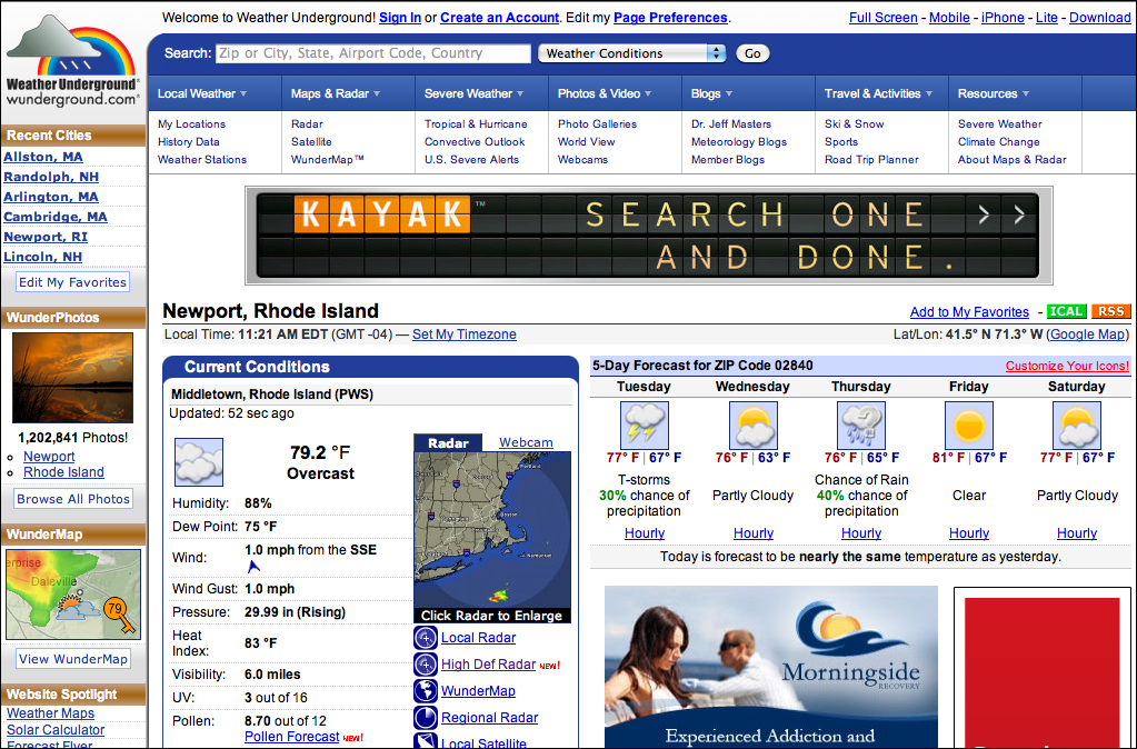
Figure 4-19. Weather Underground’s jumbled visual hierarchy
Using Dynamic Displays
Everything we’ve discussed so far applies equally to UIs, websites, posters, billboards, and magazine pages. They deal with static aspects of the layout. Ah, but you have a dynamic computer to work with—and suddenly time becomes another dimension of design.
Just as important, computers permit user interaction with the layout to an extent that most printed matter can’t. There are ways in which you can take advantage of the dynamic nature of computer or mobile displays. Consider space usage, for example—even the biggest consumer-grade computer screens have less usable space than, say, a poster or a newspaper page. There are many techniques for using that space to present more content than you can show at one time.
Scroll Bars
Scroll bars let the user move around at will, in one or two dimensions (but refrain from using horizontal scrolling with text, please!). Scroll bars are one very common way of presenting a small “viewport” onto a large thing, such as text, an image, or a table. Or, if you can carve up the content into coherent sections, you have several options—Module Tabs, Accordions, Collapsible Panels, and Movable Panels are patterns that put some layout control into the user’s hands, unlike the more static Titled Sections.
The following techniques invoke time by letting the user see different content at different times.
Responsive Enabling
To guide a user successfully through a form or process, or to prevent confusion about the user’s mental model, a UI might only enable certain functionality when the user completes a specific action. In the example in Figure 4-20, the Mac OS System Preferences provide a typical example of disabling based on a binary choice.
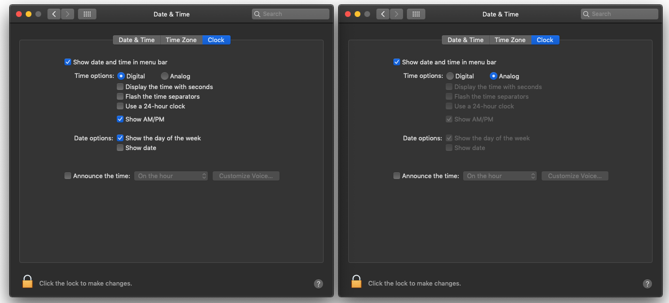
Figure 4-20. Mac OS System Preferences
Progressive Disclosure
In some contexts, information is shown only after the user takes a specific action. Moo.com, an online custom business card and print shop (Figure 4-21), uses this technique in its “create a custom product” flow. In the figure, a customer doesn’t see the customization options until they click into the editable parts of the card.

Figure 4-21. Progressive Disclosure example in Moo.com
UI Regions
Whether you are designing for web, software, or mobile layouts, you can typically count on having one or more of the following UI regions to work with (see also Figure 4-22):
- Header/window title
-
This is the topmost region in any given layout, it is used for global branding and global navigation elements in mobile and web design, and you will often see this region used for toolbars and navigation in software. Headers are typically a constant element in the layout of a template, so it’s important to carefully choose what you put on this valuable screen space.
- Menu or navigation
-
This is usually near the top or to the left-hand side of the screen. Note these can also be panels (see below).
- Main content area
-
This should be where the majority of screen real estate is dedicated. This is where the information content, forms, task areas, and branding for landing experiences is located.
- Footers
-
This is where secondary and global or redundant navigation resides; it can also contain helpful information like business contact information.
- Panels
-
Panels can be on the top, on the side or the bottom. They can be persistent or dismissible depending on what functionality you are using on that panel.
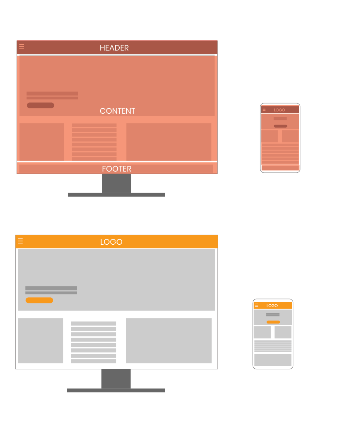
Figure 4-22. UI regions, web and desktop application
The Patterns
This chapter’s patterns give you specific ways to put all these layout concepts into play. The first three address the visual hierarchy of the entire page, screen, or window, regardless of the type of content you put into that page. You should consider Visual Framework fairly early in a project because it affects all of the major pages and windows in an interface.
Layout
The following patterns are most commonly used for desktop and web applications. If you are primarily showing search results, a Grid of Equals is a good choice. However, if your application is task or productivity or a creation tool, Center Stage might make the most sense. Whatever you choose, make sure that choice is driven by the content you need to show for the user to achieve the desired objective.
-
Visual Framework
-
Center Stage
-
Grid of Equals

Figure 4-23. Visual Framework (upper left), Center Stage with a panel (upper right), Grid of Equals (lower left)
Chunking Information
The next group of patterns represents alternative ways of “chunking” content on a page or window. This is useful when you have more content than you can comfortably put on the screen at one time. These patterns deal with visual hierarchy, too, but they also involve interactivity, and they can help you choose among the specific mechanisms available in UI toolkits. Here are the patterns we look at in this section:
-
Titled Sections
-
Module Tabs
-
Accordion
-
Collapsible Panels
-
Movable Panels
Visual Framework
What
Across an entire app or site, all screen templates share common characteristics to maintain a consistent layout and style. Each page might use the same basic layout, margin, header and gutter size, colors, and stylistic elements, but the design gives enough flexibility to handle varying page content.
Use when
You’re building a website with multiple pages or a UI with multiple windows—in other words, almost any complex software. You want it to “hang together” and look like one thing, deliberately designed; you want it to be easy to use and navigate.
Why
When a UI uses consistent color, font, layout, and when titles and navigational aids—signposts—are in the same place every time, users know where they are and where to find things. They don’t need to figure out a new layout each time they switch context from one page or window to another.
A strong visual framework, repeated on each page, helps the page content stand out more. That which is constant fades into the background of the user’s awareness; that which changes is noticed. Furthermore, adding enough character to the design of the visual framework helps with the branding of your website or product—the pages become recognizable as yours.
How
Draw up an overall look-and-feel that will be shared among all pages or windows. Home pages and main windows are “special” and are usually laid out differently from inner pages, but they should still share certain characteristics with the rest of the site, such as:
- Color
- Backgrounds, text colors, accent colors, and other colors
- Fonts
- For titles, subtitles, ordinary text, callout text, and minor text
- Writing style and grammar
- Titles, names, content, short descriptions, any long blocks of text, and anything else that uses language.
In a Visual Framework design like that of JetBlue, shown in Figure 4-24, all pages or windows share the following, as appropriate:
-
“You are here” signposts, such as titles, logos, Breadcrumbs trails, global navigation with indicators of the current page, and Module Tabs
-
Navigational devices, including global and utility navigation, OK/Cancel buttons, Back buttons, Quit or Exit buttons, and navigational patterns such as Progress Indicator and Breadcrumbs (Chapter 3)
-
Spacing and alignment, including page margins, line spacing, the gaps between labels and their associated controls, and text and label justification
-
The overall layout, or the placement of things on the page, in columns and/or rows, taking into account the margins and spacing issues listed previously

Figure 4-24. Example of a Visual Framework in JetBlue’s mobile website
Implementation of a Visual Framework should force you to separate stylistic aspects of the UI from the content. This isn’t a bad thing. If you define the framework in only one place—such as a CSS stylesheet, a Java class, or a visual system library—it lets you change the framework independently from the content, which means that you can more easily tweak and adjust it to get it as you want it. (It’s also good software engineering practice.)
Examples
JetBlue’s site (Figure 4-25) employs a restricted color palette, a strong header, and consistent use of fonts and curved rectangles in its Visual Framework. Even the login page and modal dialogs use these elements; they don’t look out of place. Notice the stylistic similarities to the mobile site.

Figure 4-25. The JetBlue home page
In the same way, TED’s site (Figure 4-26) uses limited color and a layout grid to maintain consistency.

Figure 4-26. The TED home page
Center Stage
Use when
The screen’s primary job is to show a single unit of coherent information to the user, let them edit a document, or enable them to perform a certain task. Other content and functions are secondary to this one. Many types of interfaces can use a Center Stage—tables and spreadsheets, forms, and graphical editors all qualify. So do web pages that show single articles, images, or features.
Why
The design should guide the user’s eyes immediately to the beginning of the most important information (or task) rather than have them wandering over the page in confusion. An unambiguous central entity anchors the user’s attention. Just as the lead sentence in a news article establishes the subject matter and purpose of the article, so the entity in Center Stage establishes the purpose of the UI.
After that’s done, the user will assess the items in the periphery in terms of how they relate to what’s in the center. This is easier for the user than repeatedly scanning the page, trying to figure it out. What comes first? What’s the second? How does this relate to that? And so on.
How
Establish a visual hierarchy with the primary content or document dominating everything else. (See the chapter introduction for a discussion of visual hierarchy.) When designing a Center Stage, consider these particular factors, though none of them are absolutely required:
- Size
- The Center Stage content should be at least twice as wide as whatever’s in its side margins, and twice as tall as its top and bottom margins. (The user can change its size in some UIs, but this is how it should be when the user first sees it.) Keep “the fold” in mind—when a small screen is used, where does the content cut off at the bottom? Make sure the Center Stage still takes up more of the “above-the-fold” space than anything else.
- Headlines
- Big headlines are focal points and can draw the user’s eye to the top of the Center Stage. That happens in print media, too, of course. See the chapter introduction and Titled Sections for more.
- Context
- What is the primary task of the product? This will inform what the user will expect to see when they open the screen. Is it a graphic editor? A long text article? A map? A filesystem tree?
Notice that I didn’t mention one traditional layout variable: position. It doesn’t much matter where you put the Center Stage—top, left, right, bottom, center; it can be made to work. If it’s big enough, it ends up more or less in the center anyway. Note that well-established genres have conventions about what goes into which margins, such as toolbars on top of graphic editors, or navigation bars on the left side of web or mobile screens.
Examples
The Google Docs text editor (Figure 4-27) devotes almost all of its horizontal space to the document being edited; so does Google’s spreadsheet editor. Even the tools at the top of the page don’t take up a huge amount of space. The result is a clean and balanced look.
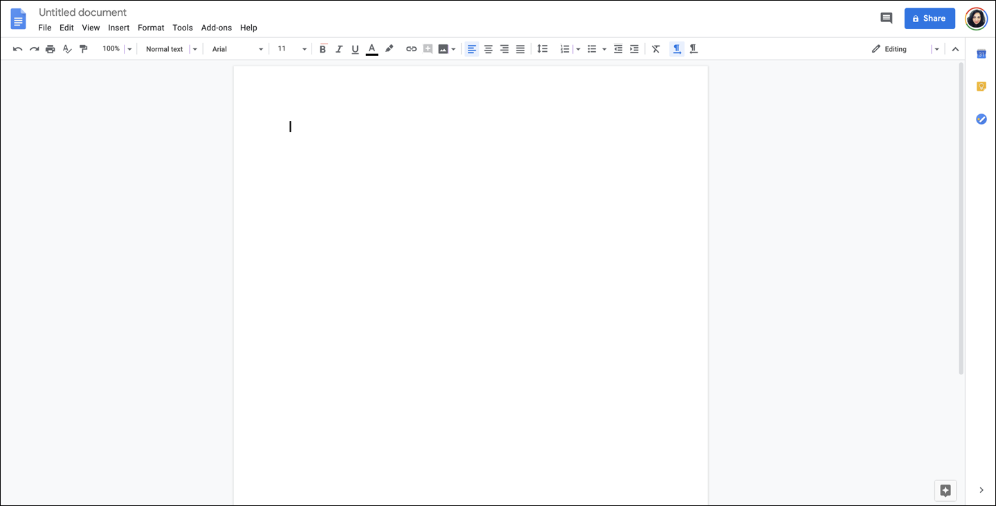
Figure 4-27. Google Docs
The Sketch desktop application (Figure 4-28) features a Center Stage layout. Upon launching a new blank document or template, the user sees a canvas where they are able to have the visual focus on creating content unencumbered by unneeded content or features.
Because most of the products in the Google Suite are task-based, Center Stage is a common framework found in most of those products (Figure 4-29), such as Google Earth, Google Slides, Google Hangout, and Google Sheets.
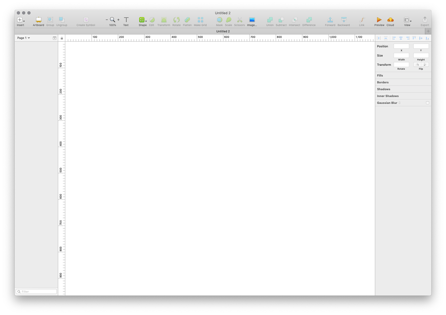
Figure 4-28. Bohemian Sketch
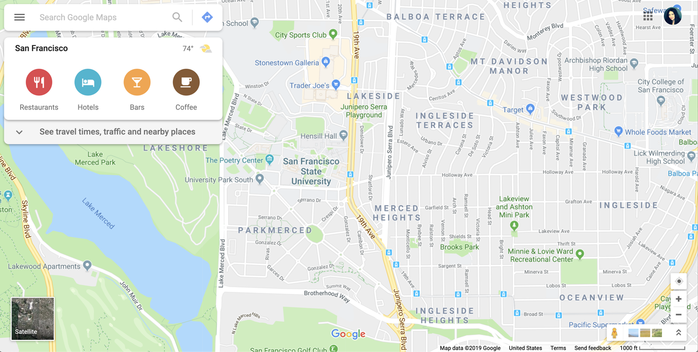
Figure 4-29. Google Maps
For more information on Google’s design language, go to https://material.io/design.
Grid of Equals
Use when
The page contains many content items that have similar style and importance, such as news articles, blog posts, products, or subject areas. You want to present the viewer with rich opportunities to preview and select these items.
Why
A grid that gives each item equal space announces that they have equal importance. The common template for items within the grid informs the user that the items are similar to one another. Together, these techniques establish a powerful visual hierarchy that should match the semantics of your content.
How
Figure out how to lay out each item in the grid. Do they have thumbnail images or graphics? Headlines, subheads, summary text? Experiment with ways to fit all the right information into a relatively small space—tall, wide, or square—and apply that template to the items you need to display. Arrange content items in a grid or matrix. Each item should follow a common template, and each item’s visual weight should be similar.
Now arrange the items in a grid. You could use a single row or a matrix that’s two, three, or more items wide. Consider page width as you do this design work—what will your design look like in a narrow window? Will most of your users have large browser windows or use mobile or other devices (Figure 4-30)?

Figure 4-30. Responsive design example: desktop version (left), mobile version (center), tablet version (right)
You might choose to highlight grid items statically (to emphasize one item over others) or dynamically, as a user hovers over those grid items. Use color and other stylistic changes, but don’t change the positions, sizes, or other structural elements of the grid items.
Examples
In the Hulu example (Figure 4-31), the size and relative importance of each item in the grid is the same and has a consistent interaction behavior.

Figure 4-31. Hulu grid
In CNN’s layout (Figure 4-32) and Apple TV’s layout (Figure 4-33), the consistent visual treatment marks these items as peers of one another. An advantage of using grids to display lists of items is that a user of this interface will need to interact with only one grid item to understand how all of the grid items behave.
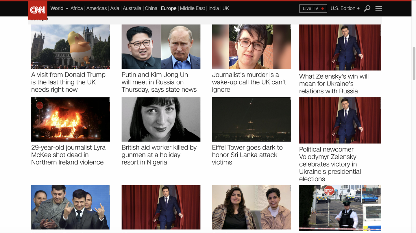
Figure 4-32. CNN’s grid
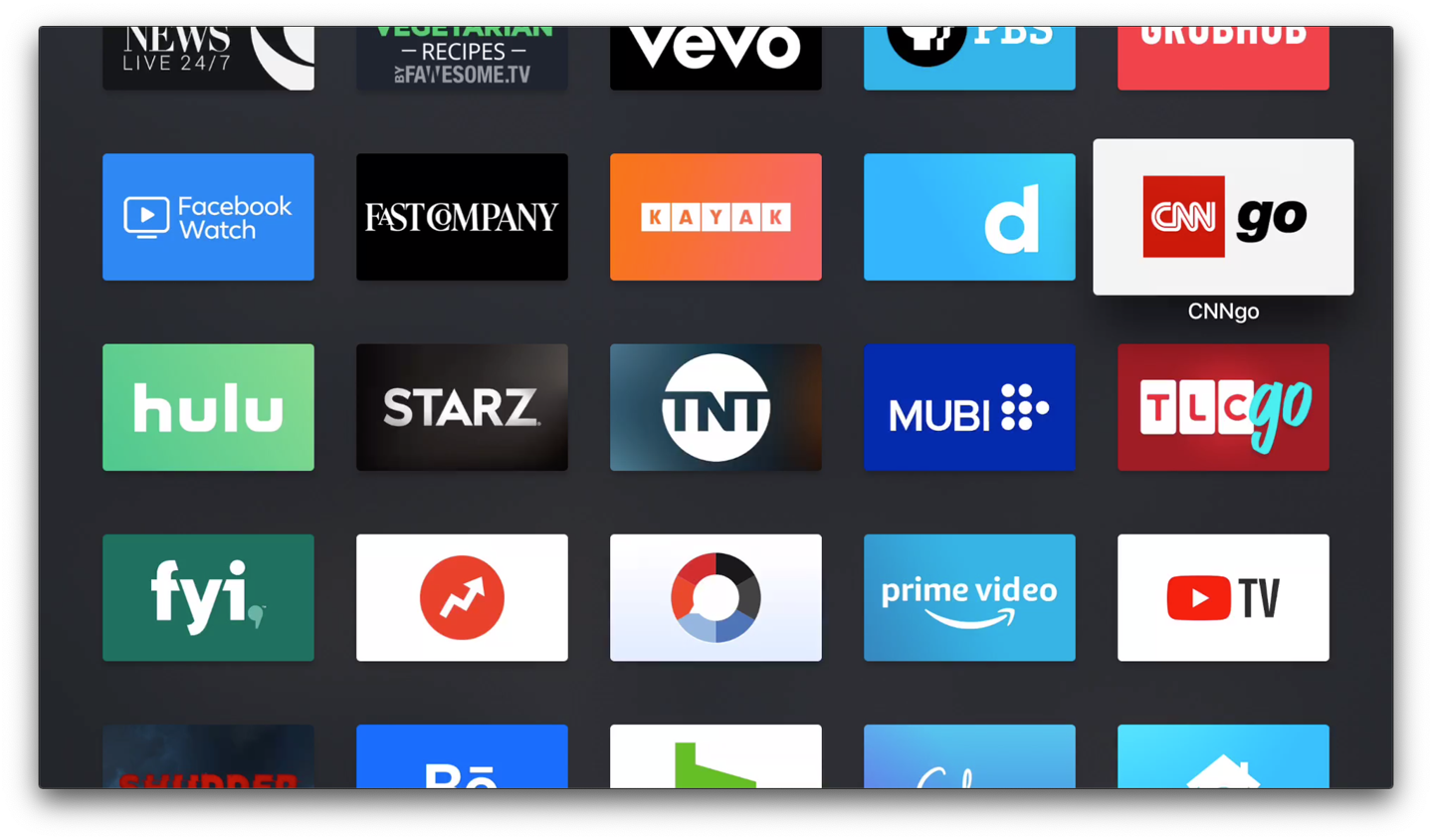
Figure 4-33. Apple TV’s grid
Titled Sections
Use when
You have a lot of content to show, but you want to make the page easy to scan and understand, with everything visible. You can group the content into thematic or task-based sections that make sense to the user.
Why
Well-defined and well-named sections structure the content into easily digestible “chunks,” each of which is now understandable at a glance. This makes the information architecture obvious. When the user sees a page sectioned neatly into chunks like this, their eye is guided through the page more comfortably.
How
First, get the information architecture right—split up the content into coherent chunks (if it hasn’t already been done for you) and give them short, memorable names (see Figure 4-34):
-
For titles, use typography that stands out from the rest of the content—bolder, wider, larger point size, stronger color, different font family, outdented text, and so on. See the chapter introduction for more on visual hierarchy.
-
Try reversing the title against a strip of contrasting color.
-
Use blocks of contrasting background color behind the entire section.
-
Boxes made from etched, beveled or raised lines are familiar with desktop UIs. But they can get lost (and just become visual noise) if they’re too big, too close to one another, or deeply nested.

Figure 4-34. Examples of titled sections
If the page is still too overwhelming, try using Module Tabs, an Accordion, or Collapsible Panels to hide some of the content.
If you’re having trouble giving reasonable titles to these chunks of content, that might be a sign that the grouping isn’t a natural fit for the content. Consider reorganizing it into different chunks that are easier to name and remember. “Miscellaneous” categories may also be a sign of not-quite-right organization, though sometimes they’re genuinely necessary.
Examples
In its account settings page, Amazon (Figure 4-35) shows titles corresponding to levels of the visual hierarchy: the page title, section titles, and subtitles atop lists of links. Note the use of whitespace, boxes, and alignment to structure the page.

Figure 4-35. Amazon account settings
Google’s settings also feature Titled Sections (Figure 4-36). Some contain functionality; others deep-link to other settings pages.
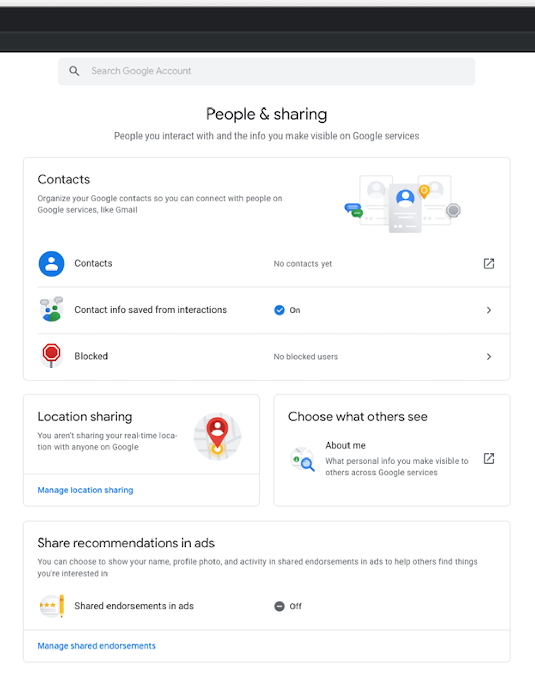
Figure 4-36. Google account settings
Module Tabs
Use when
You have a lot of heterogeneous content to show on the page, possibly including text blocks, lists, buttons, form controls, or images, and you don’t have room for everything. Some of the page content comes in groups or modules (or can be sorted into coherent groups). Those modules have the following characteristics:
-
Users need to see only one module at a time.
-
They are of similar length and height.
-
There aren’t many modules—fewer than 10; preferably a small handful.
-
The set of modules is fairly static; new pages won’t be added frequently nor will existing pages change or be removed frequently.
-
The modules’ contents can be related to or similar to one another.
Why
Grouping and hiding chunks of content can be a very effective technique for decluttering an interface. Tabs work well; so do Accordions, Movable Panels, Collapsible Panels, and simply arranging things into a clean grid of Titled Sections.
How
First, get the information architecture right. Split up the content into coherent chunks, if it hasn’t already been done for you, and give them short, memorable titles (one or two words, if possible). Remember that if you split up the content incorrectly, users will be forced to switch back and forth between tabs as they compare them or look for information they can’t find. Be kind to your users and test the way you’ve organized it.
Indicate the selected tab unambiguously, such as by making it contiguous with the panel itself. (Color alone isn’t usually enough. If you have only two tabs, make sure it’s abundantly clear which one is selected and which one isn’t.)
The tabs don’t need to be literal tabs, and they don’t have to be at the top of the stack of modules. You can put them in a left-hand column, or underneath, or even turned 90 degrees with the text read sideways.
When deployed on web pages, Module Tabs tend to be distinct from navigational tabs (those used for global navigation, or separate documents, or for loading new pages). Tabs are useful there, too, of course, but this pattern is more about giving the user a lightweight way to see alternative modules of content within a page.
If there are too many tabs to fit in a narrow space, you could do one of several things: shorten the labels by using an ellipsis (and thus make each tab narrower), or use carousel-like arrow buttons to scroll the tabs. You could also put the tab labels in a left-hand column, instead of putting them on top. Never double-row the tabs.
Examples
Expedia’s flight search module (Figure 4-38) breaks up the different types of searches available into tabs. This allows Expedia to feature the options available to the potential customer in a highly discoverable way without sacrificing valuable screen real estate.

Figure 4-38. Expedia Search
MacOS system preferences (Figure 4-39) also use Module Tabs to highlight functionality in the most logical place a user might look for it. The tabs are across the top, labeled Battery and Power Adapter.
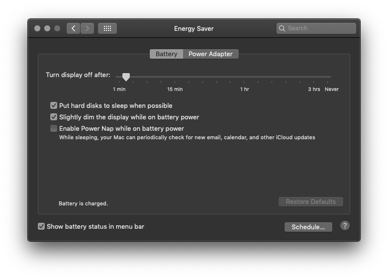
Figure 4-39. macOS system preferences
Accordion
What
Put modules of content into a collinear stack of panels that the user can close and open independently of one another (Figure 4-40).

Figure 4-40. Examples of accordions
Use when
You have a lot of heterogeneous content to show on the page, possibly including text blocks, lists, buttons, form controls, or images, and you don’t have room for everything. Some of the page content comes in groups or modules (or can be sorted into coherent groups).
Those modules have the following characteristics:
-
Users might want to see more than one module at a time.
-
Some modules are much taller or shorter than others, but they’re all of a similar width.
-
The modules are part of a tool palette, a two-level menu, or some other coherent system of interactive elements.
-
The modules’ contents might be otherwise related or similar.
-
You might want to preserve the linear order of the modules.
Also note that when large modules are open or many modules are open, the labels on the bottom of the Accordion can scroll off the screen or window. If that’s a problem for your users, consider using a different solution.
Why
Accordions have become a familiar interactive element on web pages, almost as familiar as tabs and drop-down menus. (They aren’t quite as straightforward to use, however.) Many websites use accordions in their menu systems to manage very long lists of pages and categories.
In general, grouping and hiding chunks of content can be a very effective technique for decluttering an interface. The Accordion pattern is part of a toolkit that includes Module Tabs, Movable Panels, Collapsible Panels, and Titled Sections to do so.
Accordions can be useful in web-page navigation systems, but they really shine in desktop applications. Tool palettes in particular work well with Accordions (and Movable Panels, as well, for similar reasons). Because users can open any set of modules and leave them open, Accordions help users modify their “living space” in a way that suits them. Yet it’s easy to reopen a rarely used module when it becomes needed.
How
Establish the title that you want to name each section. It should be concise but enough information to know what the information under it will be.
Create a visual affordance (an indication that represents how something is meant to be used) such as an arrow or triangle icon to indicate that there is information that can be revealed by clicking or tapping on it.
Allow more than one module to be open at a time. There are differing opinions on this—some designers prefer only one module to be open at a time, and some implementations allow only one (or have a switch that developers can set, at least). But in my experience, especially in applications, it’s better to let users open multiple modules at a time. It avoids the abrupt and unexpected disappearance of a previously open module, and allows users to compare content in multiple modules without repeatedly opening and closing modules.
When used in an application or when the user is signed in to a website, an Accordion ought to preserve its state of opened and closed modules between sessions. This isn’t as important for navigation menus as it is for tool palettes.
Examples
Samsung’s FAQs in its Help pages use accordions to display the question and reveal the answer upon clicking on the expand arrow (Figure 4-41). This allows the user to quickly scan the page for the information they are seeking and quickly navigate to another topic if they need to.

Figure 4-41. Samsung Help
Google Chrome’s settings page uses expanding accordions to reveal the detailed setting options (Figure 4-42). This enables the user to see all the options “above the fold” and get a better idea of where to click.
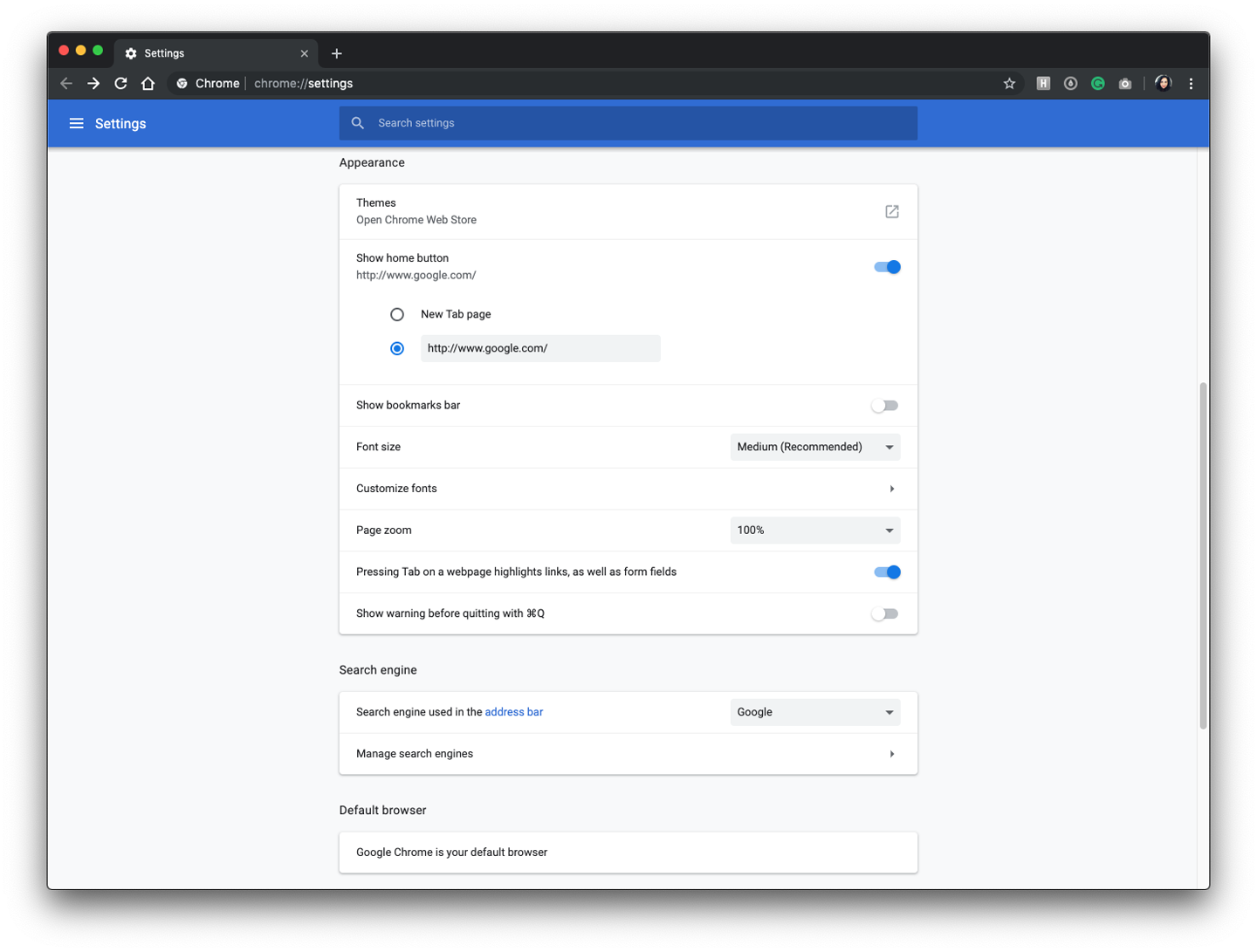
Figure 4-42. Google Chrome Settings
Collapsible Panels
Use when
You have a lot of heterogeneous content to show on the page, possibly including text blocks, lists, buttons, form controls, or images or when you have Center Stage content that needs to take visual priority.
These modules have the following characteristics:
-
Their content annotates, modifies, explains, or otherwise supports the content in the main part of the page.
-
The modules might not be important enough for any of them to be open by default.
-
Their value can vary a lot from user to user. Some will really want to see a particular module; others won’t care about it at all.
-
Even for one user, a module might be useful sometimes, but not other times. When it’s not open, its space is better used by the page’s main content.
-
Users might want to open more than one module at the same time.
-
The modules have very little to do with one another. When Module Tabs or Accordions are used, they group modules together, implying that they are somehow related; Collapsible Panels do not group them.
Why
Hiding noncritical pieces of functionality or content helps to simplify the interface. When a user hides a module that supports the main content, it simply collapses, giving its space back over to the main content (or to whitespace). This is an example of the principle of Progressive Disclosure (showing hidden content when and where the user needs it). In general, grouping and hiding chunks of content can be a very effective technique for decluttering an interface.
How
Put each supporting module into a panel that the user can open and close via a single click. Label the button or link with the module’s name or simply “More,” and consider using a chevron, menu icon, or rotating triangle to indicate that more content is hidden there. When the user closes the panel, collapse the space used by that panel and devote it to other content (such as by moving up the content below it on the page).
Animating the panels as they open and close helps the user create a visual and spatial understanding of how this functions and where to find it in the future.
If you find that most users are opening up a Collapsible Panel that’s closed by default, switch to open by default.
Examples
The Apple news application (Figure 4-43) uses a left-hand panel as an extensible way for the user to add or remove news and topic channels and a way to navigate through those channels. When the user wants to focus on the content alone, they can tap the panel icon (to the left of “Today,” on the center header) to slide the panel away to the left.

Figure 4-43. Apple News, iPad version, with navigation panel expanded
Google Maps (Figure 4-44) allows for the user to continue to see the map while finding directions, once the destination directions are selected, the panel collapses to allow for viewing the directions unobstructed. If the user needs to edit or change or add a stop, they can easily expand the side panel.
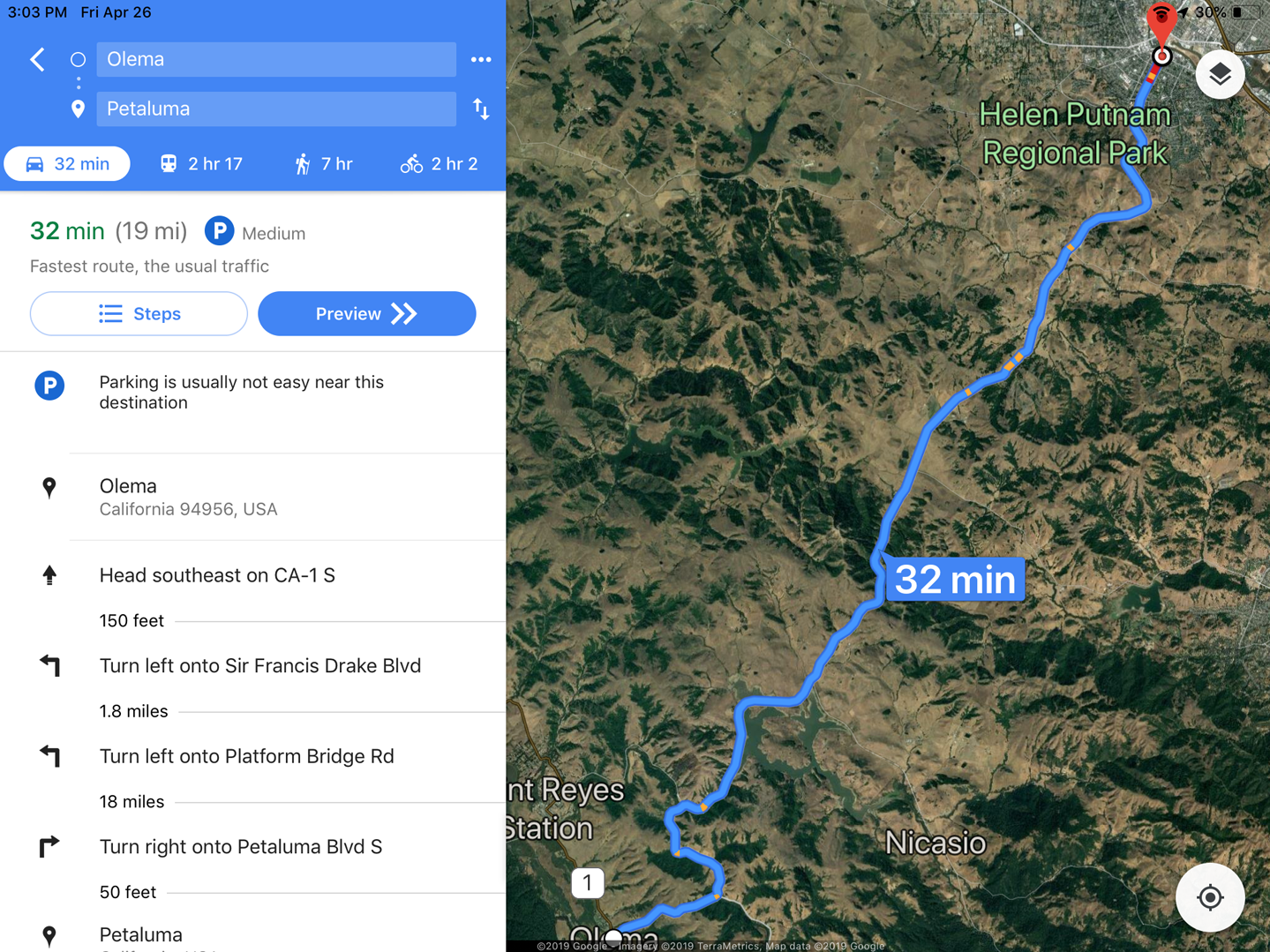
Figure 4-44. Google Maps, iPad version, showing left-hand panel with direction functionality
Movable Panels
What
Put modules of content in boxes that can be opened and closed independently of one another. Allow the user to arrange the boxes freely on the page into a custom configuration. You will often see movable panels in the Center Stage layout in creator tools like the Adobe Suite (Figure 4-45), and productivity and communication applications like Microsoft Excel and Skype.
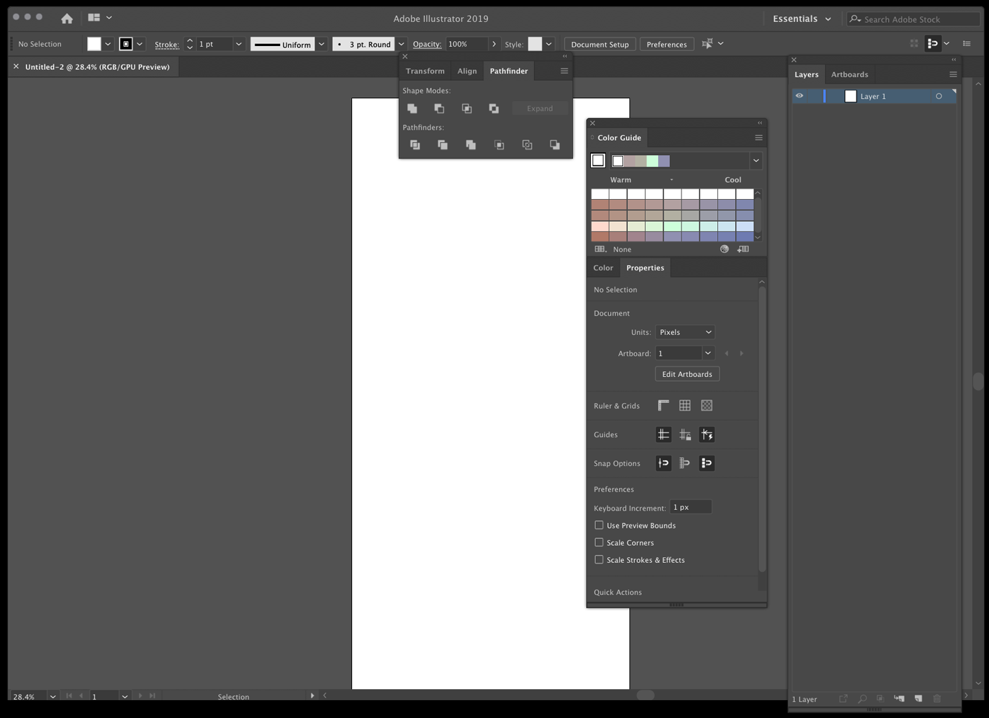
Figure 4-45. Movable Panels in Adobe Illustrator
Use when
You’re designing either a desktop application or a website that most users sign in to. News portals, dashboards, and canvas-plus-palette apps often use Movable Panels. The screen you are designing is a major part of the app or site—something that users see often or for long periods of time. You have a lot of heterogeneous content to show on the page, possibly including text blocks, lists, buttons, form controls, or images.
Modules have some of the following characteristics:
-
Users will almost certainly want to see more than one module at a time.
-
Their value can vary a lot from user to user. Some people want modules A, B, and C, whereas others don’t need those at all and want to see only D, E, and F.
-
The modules vary a lot in size.
-
Their position on the page isn’t terribly important to you, but it might be to users. (By contrast, a page of static Titled Sections ought to be arranged with thought given to the importance of page position; important things go to the top, for instance.)
-
There are many modules—possibly so many that if all were shown at once, a viewer would be overwhelmed. Either you or the user should pick and choose among them.
-
You’re willing to let users hide some modules from view altogether (and offer a mechanism to bring them back).
-
The modules can be part of the tool palette or some other coherent system of interactive elements.
Why
Different users have different interests. Websites such as dashboards and portals are most useful to people when they can choose the content they see. When they’ll be working on something for a while in a desktop application, people like to rearrange their environment to suit their working style. They can place needed tools close to where they work; they can hide things they don’t need; they can use Spatial Memory to remember where they put things.
Rationally speaking, Movable Panels help users get things done more efficiently and comfortably (in the long run—after they’ve spent time rearranging their environment the way they like it.). But this kind of personalization seems to appeal to people on some other level, too. They might do this on infrequently visited websites that provide some kind of entertainment, for instance. Personalization can increase engagement and buy-in.
Finally, a Movable Panels design easily accommodates new modules introduced over time, such as those contributed by third parties.
How
Give each module a name, a title bar, and a default size, and arrange them on the screen in a reasonable default configuration. Let the user move modules around the page at will, via drag-and-drop if possible. Permit each module to be opened and closed with a simple gesture, such as a mouse click on a title bar button.
Depending upon the design you’ve chosen, you might want to give the user freedom to place these pieces anywhere at all, even if they overlap. Or you might want a predefined layout grid with “slots” where pieces can be dragged and dropped—this lets the screen maintain alignment (and some sense of dignity) without making the user spend too much time fiddling with windows. Some designs use ghosting—big drop targets that appear dynamically; for example, dotted rectangles—to show where a dragged module would go when dropped.
Consider letting users remove modules altogether. An “X” button in the title bar is the familiar way to remove one. After a module is gone, how does a user bring it back? Let users add modules—including brand-new ones, perhaps—from a list of available modules that can be browsed and searched.