
Creating page layouts with CSS
Using Firefox to turn styles on and off
Styling unordered lists for links
Understanding the box model
Comparing browser differences
Using Dreamweaver's CSS layouts
Creating custom CSS layouts
Using Dreamweaver's AP Divs
Working with conflicting styles
Using the design time style sheet
Whether you're new to CSS or you've been struggling (I mean designing) with styles for years, Dreamweaver's many CSS features offer welcome assistance to even the most experienced designers.
One of the challenges with CSS is still a relatively new addition to the world of Web design, and browser support — which can make the difference between a beautiful Web page and a jumbled design that's unreadable — continues to change and evolve.
So Adobe dedicated the equivalent of decades of time (at least in Internet years) to designing a collection of CSS layouts that you can use to get a head start on many common page designs. Whether you're creating static HMTL pages or dynamic, database-driven sites with PHP, you can customize Dreamweaver's pre-styled layouts to create a broad range of Web site designs that are designed to display well in a wide-range of Web browsers. The first part of this chapter shows you how to work with these layouts and how to edit them to create your own designs.
If you prefer, you can create your own custom CSS layouts, and you find a few tips for doing so in the second part of this chapter. You also find instructions for creating a collection, or list, of links for a navigation bar using the <ul> tag, an increasingly recommended way to develop accessible navigation features.
Before you start this chapter, I recommend you at least skim through Chapter 5, where you find an introduction to CSS, a review of the many panels, dialog boxes, and inspectors you can use to create, apply, and edit styles in Dreamweaver, as well as instructions for creating CSS styles with class and tag selectors.
In this chapter, you move on to more advanced uses of CSS with instructions for creating styles with ID and compound selectors to position and align images, text, and other elements on a Web page.
Brace yourself. You're getting into some of the most complex Web design features that Dreamweaver has to offer, but I think you'll find the power and precision of these options well worth the effort. If you want to create Web designs that display well in a variety of browsers, screen sizes, and devices, and you want to ensure that your pages meet the latest Web standards, and are accessible to special Web browsers used by the disabled, CSS is clearly your best option. You start with customizing one of the predesigned layouts in Dreamweaver and then move on to creating custom CSS features from scratch.
Before you rush off to check out all the CSS layouts included in Dreamweaver, let me warn you: They're not much to look at when you first open them. They're intentionally designed with the most basic of formatting options and a dull gray color scheme — but fortunately color styles are some of the easiest to alter in CSS.
If you know the basics of editing styles, covered in the Chapter 5, you can adjust the width of columns, the formatting styles for text, and the alignment of any element on the page relatively easily. If you're new to CSS, altering one of these layouts may seem confusing at first, but trust me, it's certainly easier than creating a design from scratch.
No matter what you're experience level, the following tutorials are designed to help you appreciate how Dreamweaver's CSS layouts work, and to help you customize the layouts step-by-step to create your own page designs.
Figure 6-1 shows what a Dreamweaver CSS layout looks like when it's first created. Figure 6-2 shows the same layout after it's been customized. In the steps that follow, you find detailed instructions for editing this CSS layout. Although you find many different layout designs to choose from in Dreamweaver, the basic process for editing the CSS rules to customize one of these layouts is the same for them all.


Figure 6-2. You can customize Dreamweaver's CSS layouts a little, or a lot, to create your own Web site designs.
To create a new page using one of Dreamweaver's CSS layouts, follow these instructions:
Choose File
New.
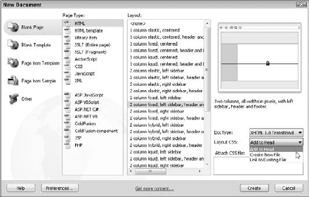
The New Document dialog box appears (see Figure 6-3).
Choose Blank Page from the left column and HTML from the Page Type column in the middle.
If you're working on a dynamic site, you can choose any of the options in the bottom part of the Page Type section, including ASP.NET, PHP, or ColdFusion and still use a CSS layout.
Select any of the CSS layouts listed in the Layout section.
For this example, I chose 2 Column Fixed, Left Sidebar, Header and Footer.
Notice in Figure 6-3, that when you select a CSS layout, a preview of the layout is displayed in the top right of the dialog box.
From the Layout CSS drop-down list, choose the type of style sheet you want to create as you create the page.
Choose Add to Head to create an internal style sheet and include all the styles for the layout in the Head area of the new document.
Choose Create New File to create a new external style sheet with all the page styles as you create the new document with the design.
Choose Link to Existing File to add the style sheet information for the new document to an existing style sheet.
Click Create.
Note
It's important to save all the pages of a Web site in the root folder. You find more about defining a Web site and specifying a root folder in Dreamweaver in Chapter 2.
Choose File
If you saved the styles in an external style sheet, you're prompted by a second dialog box to save the style sheet separately. If the styles are contained in an internal style sheet, they're saved automatically when you save the page.
Removing class styles from CSS layouts
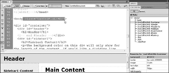
All the CSS layouts in Dreamweaver are identified by a class style, such as .twoColFixLtHdr used in the layout shown in the style used in these two exercises. These class names are made up of abbreviations for the layout. In this case, .twoColFixLtHdr describes this layout as a two-column design with a fixed size, a left sidebar, and a header.
These class names are included at the beginning of each of the ID styles in this CSS layout, making all the ID styles compound styles, which can make identifying the IDs a bit more confusing. These styles work with this class style at the beginning because the class is attached to the <body> tag of the code in the page. Even though .twoColFixLtHdr isn't defined by any rules, its presence in the <body> tag and at the beginning of the name of each of the ID styles enables the styles in this layout to work properly.
To remove a class style, follow these instructions:
Click the Split view button at the top of the workspace to view the code in split view, as shown in this figure.
Find the
<body>tag in the code (it appears just after any CSS styles and just before the content of the page begins).Delete everything but the
<body>tag and brackets.This class style can be handy for identifying the selected layout, but it also complicates the style names in a way that isn't necessary. If you want to simplify the style names in a design like this, you can remove the class style— just make sure you remove it from both the
<body>tag and the style names of each ID style in the CSS Styles panel.In this example, you'd delete
class="twoColFixLtHdr"(including the space) and leave<body>. When you do this, all the links to the ID styles break, and the page layout loses all the corresponding formatting, which changes the appearance dramatically. Don't worry. You can get it all back by following the next steps.Select just the class name at the beginning of an ID style in the CSS Styles panel and press the Delete or Backspace key.
For example, for
.twoColFixLtHdr #container, select only.twoColFixLtHdr(including the space) and delete the entire class name and space, leaving only#container.Repeat Step 4 for each ID style that includes the class name.
When you delete the class name from the beginning of each of ID style in the CSS Styles panel, the page layout is restored in the workspace.
After you create a new page with a CSS layout, you have a seemingly infinite number of options for editing it, but first you have to determine which styles in the style sheet correspond to the elements you want to edit.
In this example, because I've chosen a fixed width layout, I know a style can be used to change the width of the layout area. Following a common practice of using <div> tags to contain elements on a page and using ID styles to describe how they should be displayed, Dreamweaver includes a <div> tag with an ID style named #container in every layout. To change the width of any of these designs, change the corresponding #container style, as shown in the following exercise.
The steps in the following sections explain how to edit the overall design of a page created with a Dreamweaver CSS layout. I've broken the process into several step lists to help you following along more easily. Note: The steps assume you're proceeding through the sections in order.
As you can probably imagine, there are many ways you can edit the styles in a CSS layout to create your own designs, and the process I explain in the following sections is just one them. I help you understand what you need to do to get started. After you set your basic page design, you can create as many additional styles as you desire. In the section "Styling an Unordered List for Links," for example, you find instructions for creating a series of styles to format a list of links with the <ul> and <li> tags to create a horizontal navigation bar with a simple rollover effect.
To begin editing styles in a CSS layout, follow these steps:
With the file open, choose Window
The CSS Styles panel opens or expands.
Click the plus (+) sign (or a triangle on a Mac) next to the style sheet name to open the list of styles.
All the styles associated with the new page are listed.
Note
To change any element in the design of this page, edit the corresponding style.
Select the name of any style listed in the CSS Styles panel.
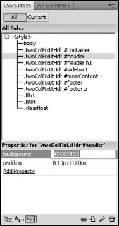
The corresponding CSS rules defined for the style are displayed in the Properties pane at the bottom of the CSS Styles panel, as shown in Figure 6-4. Clicking through the list of styles and reviewing their corresponding rules is a good way to get a quick overview of the design and to see where the various page formatting options are stored.
Note
All the styles that include a # sign are ID styles, which correspond to
<div>tags in the page code. These styles control the size and positioning of the main areas of the page and are named to correspond. For example,.twoColFixLtHdr #headercontrols the area at the top of the page design where you see the word Header. Similarly,#sidebar1controls the area with the headline Sidebar1 Content.
To edit page-wide settings, such as the font face, size, and color of the text used throughout the page, follow these steps:
Double-click the
bodystyle in the CSS Styles panel.The CSS Rule Definition dialog box opens.
Select the Type category and specify your desired Font settings.
Select the Background category and use the color well in the Background-Color field to specify a color for the entire background of the page.
Alternatively, you can enter any hexadecimal color code manually in the Background-Color field.
Click the Apply button to preview your changes and then click OK to save the changes and close the dialog box.
To edit the Header area at the top of the page, follow these steps:
Select the
.twoColFixLtHdr #headerstyle in the CSS Styles panel, as shown in Figure 6-4.In the Properties pane, you can see that the
#headerstyle includes a definition for a background color, which is set to#DDDDDD(the hexadecimal code for the gray color displayed in the top of the page design where the word Header appears).Note
All the CSS layouts in Dreamweaver are identified by a class style, such as
.twoColFixLtHdrused in the layout shown in this example. Dreamweaver uses these class names to distinguish between the layouts, but they aren't necessary. If you prefer to simplify the ID styles names in your layout, you can remove the class name by following the instructions in the sidebar, "Removing class styles from CSS layouts."Click and drag to select the background color code and press the Delete key.
Removing the color code from the Background-Color field in the
.twoColFixLtHdr #headerstyle removes the background color from the Header area completely and returns that part of the page to the default color, which is white (unless it's been set to another color in another style).To change the background color, double-click the
.twoColFixLtHdr #headerstyle to open the CSS Rule Definition dialog box, select the Background category, and then use the color well in the Background-Color field to select another color.Click and drag to select the word Header in the top part of the page in the workspace and press the Delete key.
The word Header disappears.
To add your own text to the Header area, type the text as you would anywhere else on a Web page.
To add a graphic to the Header area, make sure your cursor is in the Header area, choose Insert
The image appears in the Header area.
Remove any unwanted spacing.
The Header area of this (and nearly all the) CSS layouts in Dreamweaver includes extra space created by an
<h1>tag and padding in the#headerstyle. If you replace Header with text, you may want to maintain these spacing features, but if you add an image, as I have in this example, you probably want to get rid of this extra space. Here's how:Click to select the
.twoColFixLtHdr #headerstyle in the CSS Styles panel.Click and drag to select the contents of the Padding field. In this example, select "0 10px 0 20px" in the Padding field in the Properties pane at the bottom of the CSS Styles panel and then press the Delete or Backspace key.
This completely removes all the padding from the Header area.
Select the text or image you inserted into the Header area and then right-click the
<h1>tag in the tag selector at the bottom of the workspace and choose Remove Tag from the pop-up menu, as shown in Figure 6-5.

You may also want to adjust the width and padding of the content areas in your preset layout. When you're done, you're ready to add your own text to these areas. The following steps explain how:
To change the width of the entire content area, select the
.twoColFixLtHdr #containerstyle in the CSS Styles panel.The style definition appears in the Properties pane (refer to Figure 6-5).
Select the size in the width field and type a new number with your desired page width.
In this example, I selected the width, which is set to 780, as shown in Figure 6-5, and I changed it to 760. When you alter the width of the
#contentstyle, as I did here, you change the width of the entire design because all the other<div>tags are contained within the<div>that's formatted with the#contentstyle and they're all set to expand to fill the#content <div>.Replace the text in the sidebar and main content areas.
You can replace the text in any page created from a CSS layout just as you would in any other Web page. If you delete content, such as the headline in the sidebar, make sure you also delete any corresponding code, such as the
<h3>tag, which formats the sidebar heading. You can most easily delete this code by using the tag selector, as shown in Figure 6-5.To change the width and background color of the sidebar, double-click the
.twoColFixLtHdr #sidebar1style in the CSS Styles panel.The CSS Rule Definition dialog box opens.
Select the Background category and use the color well in the Background-Color field to specify a color.
Alternatively, you can enter any hexadecimal color code manually.
Select the Box category and change the width, padding, and margin settings.
You can alter the width of the sidebar, the padding (the space inside the border of the sidebar), or the margins (the space outside the border of the sidebar).
Click the Apply button to preview the changes and then click OK to save the changes and close the dialog box.
The changes are applied automatically to the design in the open page.
Warning
When you change the width of a sidebar in a Dreamweaver CSS layout, you must also change the corresponding margin setting in the
mainContentstyle (as you see in the next step). The width in the sidebar style and the margin in themainContentstyle are used in combination to control the positioning of the sidebar andmainContent <div>s in relation to each other.Double-click the
.twoColFixLtHdr #mainContentstyle in the CSS Styles panel.The CSS Rule Definition dialog box opens.
Select the Box category and change the margin settings to correspond to the new width of the sidebar.
In this example, I changed the width of the sidebar from 200 to 300, so I need to change the corresponding margin setting in the
mainContentstyle. You may not want to change the margin setting by the same amount as you changed the width of the sidebar because this can lead to a margin that may not look right in your page design. Instead, I recommend you experiment by changing the margin setting and then clicking the Apply button to see how the page looks.Choose File
If you saved the styles in an external style sheet, you're prompted by a second dialog box to save the style sheet separately. If the styles are contained in an internal style sheet, they're saved automatically when you save the page.
Tip
After you edit a CSS layout to create the page design you want to use in your site, it's good practice to save the page as a template so that you can create additional pages with the same layout, without repeating all these steps to customize the styles. As you discover in Chapter 9, there are many advantages to using Dreamweaver's template features when you're designing a site with more than a few pages.
Here's a related tip: If you'll use the design as a template, make sure you save your styles in an external style sheet so that the style rules can be edited outside the template. Find instructions for creating external style sheets and for moving internal styles into an external style sheet in Chapter 5.
Even if you prefer another Web browser, I strongly encourage you to download and install the Firefox browser for testing your Web pages. Firefox is made for both Mac and PC computers and you can download it for free from www.mozilla.com/firefox.
Not only is it good practice to test your pages in more than one browser (at the very least, Internet Explorer and Firefox), the Firefox browser offers several special features and extensions that can help you better view your CSS and the CSS on other people's Web sites.
As shown in Figures 6-6 and 6-7, you can turn the styles that format a Web page on and off in Firefox. To turn off styles, choose View
Note
The Web Developer Add On for Firefox adds many great features to the browser, including the ability to view an external style sheet on any Web site (that's right, you can look under the hood of other people's Web sites with this add-on). You can even view CSS style sheets by Media type so that you can see how a site, such as Disney.com, develops different style sheets for print, screen, and handheld devices. To find this valuable addition to Firefox, click the Add-Ons link at the top of the Firefox Web page and then search for Web Developer. The Add-Ons link, which is consistently rated with five out of five stars, is free, and takes only a few seconds to download and install.
Here's a great CSS trick for turning a bulleted list into a navigation bar with a simple rollover effect. Using a bulleted list for navigation bars is a well-accepted convention for Web sites that meet current accessibility standards. A bulleted list is a logical choice for navigation elements because even if the style rules are removed, the links still stand out from the rest of the elements on the page and are clearly grouped together.
In Figure 6-6 and 6-7, you see the same Web page displayed in Firefox with the styles turned on and off. Notice that the navigation links are formatted in a simple, bulleted list when the styles are turned off but are displayed in a horizontal row with no bullets when styles are turned on.
Thanks to CSS, you can gain the benefits of styling a list of links with the unordered list tag and still format your links with any style you choose so that you don't have to keep those boring bullets and can align your links horizontally or vertically. Using CSS instead of images to create a rollover effect like the one featured in the following exercise not only makes your page more accessible, but it helps your page load faster, too.

Figure 6-6. You can view the same Web page with styles turned on or off in the Firefox browser. In this image, the styles are turned on.

Note
This exercise builds on the page design created in the earlier sections in this chapter, except that I've removed the class styles that were included at the beginning of each of the ID styles. This makes it simpler to create new styles within the <div> tags that are formatted by the ID styles. You find instructions for altering the styles in a CSS layout like this in the sidebar, "Removing class styles from CSS layouts" earlier in this chapter.
To create a navigation bar using CSS to redefine the unordered list and link tags, follow these steps:
Place your cursor in the HTML page where you want your navigation bar to appear and then click the Div button in the Common Insert panel to insert a
<div>tag.The Insert Div Tag dialog box opens, as shown in Figure 6-8.
Tip
When you're creating a list of links to serve as your navigation bar, it's best to store those links in a
<div>tag at the top or side of the page where visitors to your site can easily find them.Specify an Insert option.
You can choose from a variety of options in the Insert drop-down list to more precisely control where the new
<div>tag is added. If you're not sure, you can leave the Wrap around Selection option selected, even if you haven't selected anything.Enter a name in the Class field or the ID field.
You can name the
<div>tag anything you like as long as you don't use spaces or special characters (underscores and hyphens are okay). In this example, I chose to create an ID style, so I entered navbar in the ID field. (Remember: ID styles are generally recommended for positioning<div>tags that make up part of the layout of a Web page.)Click the New CSS Rule button to create a new style for your Div ID as you insert the
<div>tag.The New CSS Rule dialog box opens.
Select the Box category and specify the desired settings for the size, margins, and padding.
For the
navbarshown in this example, I set the margins to 0, set the padding to 2 pixels, checked the All box to apply the same padding to all sides, and left the Height and Width fields blank, which means the<div>tag will expand to fit its contents and its container.Select the Background category and choose a background color or image.
If you don't specify a color or insert a background image, the color of the
navbar <div>tag will be determined by the color of any<div>tag that contains it or by the specified page color. In this example, I've selected a lavender color to set thenavbarapart from the rest of the design.Select the Type category and specify the font options.
If you don't specify any font settings, the text will be displayed in the font set for the page or the surrounding container.
Note
In this example, I've set the font to Verdana in the
<body>tag, and because I don't want to change it, I left the Font-Family field blank. I do, however, want the text to display a little smaller in thenavbarthan it does in the rest of the page, so I've set the Font-Size to 90 percent, which will display the text in this<div>tag at 90 percent of the default text size for the page.Click OK to close the New CSS Rule dialog box and then click OK to close the Insert Div Tag dialog box.
The new
<div>tag is added to the page and the#navbarID style is created and listed in the CSS Styles panel.Content for id "navbar" goes hereis inserted between the open<div>tag and the close</div>tag to make it easy to identify where you should add your own content within the<div>tag. Make sure to delete this text when you add your own content.Insert the text for each link into the navbar
<div>area.Make sure to separate each line of text with a Return (so that the text is formatted with a
<p>tag in the code). If the lines aren't separated by paragraph tags, the unordered list won't be applied properly in the next step.To format the text as an unordered list, click and drag to select all the text in the
navbar <div>and then click the Unordered List icon in the Property inspector.If you haven't redefined the unordered list tag already, the text changes to the default settings of an unordered list, removing the space between each line and adding bullets.
Set links from each text section just as you would link any other text block or image.

Warning
If you haven't yet created the pages you'll link to, you can set a temporary link by entering a pound (#) sign in the Link field. This is important because in order for the styles that you create in the rest of this exercise to work, the text must be linked to something so that the link styles will apply.
Create a new style to redefine the unordered list tag when it's displayed in the
<div>tag with the#navbarID by following these steps to create styles with the compound selector:Choose Format
Under Selector Type, choose Compound.
In the Selector Name field, enter
#navbar ul, as shown in Figure 6-9, and then click OK.In the CSS Rule Definition dialog box, choose the Box category and set margins and padding to
0.Select the Same for All check box for both margins and padding to remove the margins and padding included in the
<ul>HTML tag.Click OK to save the style and close the dialog box.
The spacing around the list of links formatted as an Unordered List disappears.
Create a new compound style to redefine the list item tag by following these steps:
Choose Format
Under Selector Type, choose Compound.
In the Selector Name field, enter #navbar ul li (make sure to include spaces between each name) and then click OK.
In the CSS Rule Definition dialog box, select the Block category and set Display to Inline.
This changes the style of the
<li>tag from vertical to horizontal.Select the List category and set Type to None to remove the bullet.
Select the Box category and set margins left and right to 40 pixels.
This separates the list items from one another in the horizontal list. You can change the setting to any measurement to create the amount of space between links that best fits your design.
Click OK to save these settings and close the dialog box.
Create a new style to redefine the link tag by following these steps:
Choose Format
Under Selector Type, choose Compound.
In the Tag field, enter #navbar a:link and then click OK.
In the CSS Rule Definition dialog box, select the Type category and set Decoration to None by clicking the check box.
This removes the underline from linked text.
Still in the Type category, change the text color to the color you want your links to appear when they're first loaded on a page.
I set the text color to a dark blue.
Click OK to save these settings and close the dialog box.
Create a new style to redefine the hover link tag so that the link color will change when a user rolls a cursor over the link:
Choose Format
Under Selector Type, choose Compound.
In the Tag field, enter #navbar a:hover and then click OK.
In the CSS Rule Definition dialog box, select the Type category and set Decoration to None by clicking the check box.
This removes the underline from linked text. If you prefer to have the underline appear when a user rolls a cursor over a link, check Underline.
Still in the Type category, change the text color to the color you want your links to appear when users roll their cursors over the link.
I set the text color to a bright red color. The more dramatic the color difference between the
a:linkanda:hovercolors, the more dramatic the rollover effect.Click OK to save these settings and close the dialog box.
Create a new style to redefine the visited link tag so that the link color will change after a user clicks a link:
Choose Format
Under Selector Type, choose Compound.
In the Tag field, enter #navbar a:visited and then click OK.
In the CSS Rule Definition dialog box, choose the Type category and set Decoration to None by clicking the check box.
Still in the Type category, change the text color to the color you want your links to appear after the link has been visited.
I set the text color to a light gray color. If you want the color to remain the same, set the
a:visitedlink to the same color as thea:link.Click OK to save these settings and close the dialog box.
Click the Live View button at the top of the workspace or click the Preview button to view the page in a browser to see the effect of the link styles.


This section is designed to help you better understand how Dreamweaver creates CSS layouts and introduces you to how to create your own custom CSS layouts. For starters, you explore the box model workflow, which forms the foundation of any CSS layout. You also discover some basics about margins versus padding and how CSS displays in different browsers.
The key to understanding the way CSS works when it comes to page layout is to think in terms of designing with a series of infinitely adjustable containers, or boxes. The entire process is often referred to as the box model. Think of the box model this way:
Create
<div>tags that span the full width of the page and stack one on top of another.Although you can use any HTML element for page layout, the
<div>tag is used most often to create page layouts with CSS.<div>stands for division. Think of the<div>tag as simply a container to hold other content or to make a division on the page, separating one section of content from another. Unlike other HTML tags, the<div>tag has no inherent formatting features except to add a line break. Unless CSS is applied to a<div>tag, it can seem invisible on a page. And yet it has a powerful purpose because any content surrounded by an opening<div>tag and closing<div>tag becomes an object (or a box) that can be formatted with CSS.Add content, such as text and images, into each box.
Alternatively, you can create the CSS styles to position the boxes and then add content, but I find it easier to decide how to define the styles after I see at least some of the content in place.
Tag content as needed, with the
<ul>tag or<p>(paragraph) tag to contain your content.With the content and boxes in place, create the styles that position each box to create the design you want for the page.
Most often, you assign each
<div>tag an ID and then create an ID style to control how each container appears on the page. You give each ID style attributes to control the position, alignment, and other formatting options of each box and its contents. You can also specify such settings as margins, padding, and borders to add space and outlines around these containers.
Note
ID style names always begin with a # sign and must match the corresponding ID assigned to the block element, in this case <div> tags in the HTML code. For a quick reference to style selectors and their corresponding HTML code, see the sidebar, "CSS options at a glance." For a more detailed explanation of CSS selectors, see Chapter 5.
When it comes to design, one of the more confusing aspects of the box model is the way margins and padding work:
Padding adds space inside an element. Think of padding as a way to add a cushion around the inside of a box so that your content doesn't bump into the sides of your box.
Margins add space outside an element. Think of margins as a way to add space between boxes and other elements on a page, such as text and images, so that they don't bump into each other.
In Figure 6-10, you see a <div> tag with a corresponding ID style that creates the thin, black, border around the <div> tag, which defines it as follows:
500 pixels wide
25 pixels of padding inside the
<div>tag border50 pixels of margin spacing outside the
<div>tag border

Here's the confusing part:
Padding adds to the specified width. If you specify a width for a
<div>tag (or any other box element), as I have in Figure 6-10, the total width is increased by the padding. In my example, the<div>tag will fill 550 pixels of space on the page: 500 pixels for the width plus 25 pixels on each side of padding.Margins add to the total space taken up by an element in a page. The margins of the
<div>tag style are set to 50 pixels, so the<div>tag is positioned 50 pixels from the top and left of the page and no other element will display closer than 50 pixels on the right or bottom. This prevents the display of any other element in that space and it means that the<div>tag effectively takes up all of that space on the page.Borders add to the specified width, too. The ID style for the
<div>tag also includes border settings, which cause the dark border to surround the<div>tag. The thin border adds another 2 pixels to each side of the<div>tag (4 pixels total).
Thus, the total space on the page that will be filled by the <div> tag is 654 pixels:
500 pixel width
50 pixels total of padding
4 pixels of border
100 pixels for the 50 pixel margin on each side
Note
As you see in the exercise that follows, understanding how styles affect the width of elements is especially important when you want to place two or more containers side by side, such as the three photos contained within <div> tags in the page design shown in Figure 6-11.

Note
Note that in the example shown in Figure 6-11, I've set the margins for the entire page to 0. This is an easy setting to make in the Page Properties dialog box, available by clicking the Page Properties button in the Property inspector or by choosing Modify
When you alter the margin settings in the Page Properties dialog box, Dreamweaver automatically creates a new tag style by redefining the <body> tag. Setting page margins to 0 means that any content on the page will be aligned from the very top and left edges of the browser window when the page is displayed in a Web browser. If you don't change the page margins, most Web browsers will display the contents of a Web page 10 pixels from the top and left edges of the browser window.
Neither Dreamweaver nor I can show you exactly how your Web pages will look to everyone who may ever view them on the Web because different browsers display Web pages differently, especially older browser versions that don't include standards-compliant support for CSS (and many other advanced Web design features, for that matter).
If you want your Web pages to look exactly the same in every browser that might ever visit your pages, you have to create very simple designs that don't use any of the latest Web design features. If you want to create more advanced page designs and want your pages to look exactly the same in all the most recent browser versions (including Internet Explorer versions 5 and up), you'll have to move on to more advanced CSS training when you're finished with this book and explore the "hacks" that have been developed to get around browser differences. You'll find many books, Web sites, and training videos dedicated to advanced CSS training.
Note
For a list of more advanced CSS training resources online and off, visit www.DigitalFamily.com/dreamweaver and look for the article on "Where to learn advanced CSS tips and tricks."
For the purposes of this book, I've designed pages that are consistent in their display on IE 6 and later, Firefox 1.5 and later, and Safari and Firefox on the Mac. I can't cover all the CSS hacks needed to design CSS layouts for every browser in use on the Web today, but the browsers that I targeted with these designs represent the majority of Web browsers your visitors are likely to use.
Tip
One of the advantages of using the predesigned CSS layouts in Dreamweaver is that they're designed with browser differences in mind and, unless you edit them heavily, should display well in the vast majority of Web browsers. When you create custom CSS designs, like the one covered in the next section, "Creating a Custom CSS Layout," keep in mind that you run the risk of creating designs that can look quite different from one browser to another.
Splitting the view
If you're creating a series of <div> tags to position content on a Web page, you may find it easier to keep track of the <div> tags if you use Dreamweaver's split view, which enables you to see the code view and design view simultaneously. To split the workspace area, choose View
If you select an image, text, or another element on a page in design view, it's automatically highlighted in code view, a great feature that makes it easier to find your place in the code when you're trying to troubleshoot what's happening behind the scenes.
I like to use split view to keep an eye on the code as I create page designs, especially when I'm inserting <div> tags, because it can be hard to keep track of how <div> tags are arranged and nested when you're using only design view.
I leave it to you to decide whether to worry about visitors with older browsers and whether to explore more advanced CSS training when you're finished here. At the very least, this is why I always recommend that you test your page designs in a variety of Web browsers, and on both Macs and PCs, whenever possible. With a little trial and error, you can often find ways to create even complex designs that look good across many different systems.
There are many approaches to creating layouts with CSS. You can create fluid layouts that expand and contract to fill the browser window no matter how wide or narrow, and you can create fixed layouts that remain a specified width no matter how wide the browser window. When you create fixed-width designs, such as the example in this section, it's good practice to center the design on the Web page so that it appears to float in the middle of the page no matter what the size of the browser window.
Tip
The following exercise walks you through the creation of the design shown in Figure 6-11 using a series of <div> tags created within a <div> tag with an ID named #container. The corresponding container style defines the container with a fixed width of 760 pixels. As you see in Step 4 in the later section "Styling the container <div> tag," the trick to centering a <div> tag with a style is to set the left and right margins to Auto. This makes the browser display an equal amount of margin space on each side of the container and effectively centers the <div> tag and all its content in the page. This is an important trick because <div> tags and other block-level elements have no center option.
Work through the following sections in order to create a fixed-width, three-column layout with a header and footer area using CSS and <div> tags. I've broken the key tasks into individual sections.
Choose File
Alternatively, you can use one of the predesigned CSS layouts listed under the Layout section covered in "Using CSS Layouts in Dreamweaver" earlier in this chapter.
Save the page in the root folder of the Web site.
It's important to save all the pages of a Web site in the root folder. You find more about defining a Web site and specifying a root folder in Dreamweaver in Chapter 2.
Choose Modify
The Page Properties dialog opens.
For this example, I set the page margins to 0 and the Background color to a dark blue color.
Note that when you use the Page Properties dialog box, Dreamweaver creates the corresponding CSS styles for the
<body>tag, saves them in an internal style sheet at the top of the HTML document, and displays the new styles in the CSS Styles panel. (You find instructions for moving internal styles into an external style sheet in Chapter 5.)Click the Insert Div Tag button in the Common Insert panel, as shown in Figure 6-12.
The Insert Div Tag dialog box opens.
This is the first of a series of
<div>tags you'll add to the page, and these steps can get a bit tricky, but the goal is simple — to insert a<div>tag for each section of content that you want to appear on the page. For this design (shown completed in Figure 6-11) I need five<div>tags; one to serve as the container for the entire design, which can also contain the banner image at the top; one for each of the three photos I want to line up in the three columns; and one for the footer, where I'll add my copyright information at the bottom of the page.In the Insert Div Tag dialog box, enter the container name in the ID field and then click OK.
A
<div>tag is inserted into the page with the words:Content for id "container" Goes Here.Tip
Although you can create styles for your
<div>tags as you create them by clicking the New CSS Rule button, I often find it simpler to first create the<div>tags and name then, add the content to the<div>tags, and then go back and create the styles after the content's in place.Make sure your cursor is inside the
<div>tag you just created, press Enter (Return) to add a paragraph break, and then click the Insert Div Tag button in the Common Insert panel to add another<div>tag inside the first one.The Insert Div Tag dialog box opens.
In the Insert Div Tag dialog box, enter photo1 in the ID field and then click OK.
A
<div>tag is inserted into the page with the words:Content for id "photo1" Goes Here.Make sure your cursor is inside the first
<div>tag namedcontainer, and just below the second<div>tag namedphoto1, and click the Insert Div Tag button in the Common Insert panel to add another<div>tag.In the Insert Div Tag dialog box, enter photo2 in the ID field and then click OK.
A
<div>tag is inserted into the page with the words:Content for id "photo2" Goes Here.Make sure your cursor is inside the first
<div>tag namedcontainer, and just below the third<div>tag namedphoto2, and click the Insert Div Tag button in the Common Insert panel to add another<div>tag.In the Insert Div Tag dialog box, enter the name photo3 in the ID field and then click OK.
A
<div>tag is inserted into the page with the words:Content for id "photo3" Goes Here.Make sure your cursor is inside the first
<div>tag namedcontainer, and just below the fourth<div>tag namedphoto3, and click the Insert Div Tag button in the Common Insert panel to add another<div>tag.In the Insert Div Tag dialog box, enter the name of the footer in the ID field and then click OK.
A
<div>tag is inserted into the page with the words:Content for id "footer" Goes Here.Tip
If you've entered all the
<div>tags correctly, your page should look like Figure 6-12. If you have accidentally created one<div>tag inside another when you don't mean to, choose EditAdd content to each
<div>tag.You can add content to each of your
<div>tags as you would add content anywhere else on a page. For this example, I used the Insert Image icon in the Common Insert panel to add the images and then I typed in the text for the captions and copyright information.
Figure 6-12. You can create a CSS layout like the one shown in Figure 6-11 by first creating a series of <div> tags like you see here.
Think of the container <div> tag as the <div> tag that contains all the others. The styles you set for it create the overall width of the design you create with all the other <div> tags and other elements you insert inside the container <div> tag. To set the styles for the example in this section, follow these steps:
Place your cursor at the beginning of
Content the id "container" Goes Here.Click the New CSS Rule icon (hint: it looks like a small piece of paper with a plus sign (+) over it) at the bottom of the CSS Styles panel.
The New CSS Rules dialog box opens. Because your cursor was inside the container
<div>,#containershould already be entered into the Selector Name field. If it's not, type it in exactly as you entered the name when you created the container<div>. If anything else is included in the Selector Name field, such as the<p>tag, delete it so that only#containerremains.Leave the Rule Definition drop-down list set to This Document Only and click OK.
The CSS Rule definition for
#containeropens.In the CSS Rule Definition dialog box, specify the formatting settings.
As shown in Figure 6-13, for the container
<div>tag in this example, I set the width to 780 pixels. Here's the trick to centering a<div>tag like this: Set the left and right margins to Auto. That way a browser automatically adds an equal amount of margin space to each side of the<div>tag, effectively centering it on the page.Click the Apply button to preview the style and then click OK to close the CSS Rule Definition dialog box and save the style.
When you create an ID style that matches the name of an ID assigned to a
<div>tag, the style is applied immediately when you click the Apply button. (Make sure the ID and the style name are an exact match. If you add an extra space or mistype a character, this won't work.)

To ensure that your layout will work with three columns (at least that's the number of columns in the example for this section), calculate how wide to define the styles for each of your photo <div>s. Yes, that means you have to do a little math, and yes, you're certainly welcome to get out a calculator or make a sketch on scrap paper (or, as I prefer, do both). With this prep work out of the way, you're ready to create styles for the columns. The following steps walk you through the process:
Calculate the width and positioning of the <div> tags that create the three columns in the design.
Let me walk you through the way I'd calculate this design. First, I know I set the width for the
#containerto 780 pixels so I know that's all the space I have to work with. Next, I know that each of the photos is 175 pixels wide, so I know that I have to subtract 175 times 3 (which is 525 pixels) from 780. That leaves me with 235 pixels to create margins between my three photos and the left and right side of my container. If I want to space them evenly, I'd then need to divide 235 by 3, but I've decided that I'd rather group the three photos in the middle of the design and leave more space on the right and left.So, I decide arbitrarily that I want 20 pixels of margin space between each of the images in the center area of the page and then I split up the remaining space on each side of the group of three photos. That means I need to subtract 40 pixels from 235, which leaves me with 195 pixels to split between the two sides. Because you can't use fractions of pixels, I put 98 pixels on the left and leave 97 pixels on the right.
With the calculations complete, you're ready to define the styles for the three columns by creating ID styles for each of the photo
<div>s. In addition to setting the width, padding, and margins for each style, I also used the Float option to align the<div>s to the left so that they align next to each other.Place your cursor inside the
<div>you namedphoto1and then click the New CSS Rule icon (the one with the plus sign [+] over it) at the bottom of the CSS Styles panel.The New CSS Rules dialog box opens. Because your cursor was inside the
photo1<div>tag,#photo1should already be entered into the Selector Name field. If it's not, type it exactly as you entered the name when you created the<div>tag.Tip
If one
<div>tag is contained within another, as you see in this case where the#photo1 <div>tag is inside the#container <div>tag, then both names appear automatically in the Selector Name field. In this case, you have the option of deleting the name of the first div to create a simple ID style, or keeping both names to create a compound style which will only work if the styles are used together.Leave the Rule Definition drop-down list set to This Document Only and click OK
The CSS Rule definition for
#photo1opens.Click to select the Box category and specify Width, Float, and Margin settings, as shown in Figure 6-14.
For the
photo1 <div>tag in this example, I set the width to 175 pixels, exactly the size of the photo. Next, choose Left from the Float drop-down list to align the<div>tag to the left side of the page. Now here's the tricky part, I want this<div>tag to be 98 pixels from the left side of my container, so I want to set the Left margin to 98 pixels. Finally, I set the Top, Right, and Bottom margins to 10. (I'll set the inside margins of the other two photos to 10 pixels to achieve a 20-pixel wide margin between them.)Click the Apply button to preview the style click OK to close the CSS Rule Definition dialog box and save the style.
The style is applied automatically, and the first photo aligns to the left, 98 pixels from the left side of the page.
Place your cursor inside the
<div>tag you namedphoto2and then click the New CSS Rule icon (the one with the plus sign [+] over it) at the bottom of the CSS Styles panel.The New CSS Rules dialog box opens. Because your cursor was inside the
photo2 <div>tag,#photo2should already be entered into the Selector Name field. If it's not, type it exactly as you entered the name when you created the<div>tag.Leave the Rule Definition drop-down list set to This Document Only and click OK
The CSS Rule definition for
#photo2opens.Click to select the Box category and specify Width, Float, and Margin settings.
For the
photo2 <div>tag in this example, I set the width to 175 pixels, exactly the size of the photo. Next, choose Left from the Float drop-down list to align the<div>tag to the left side of the page so it will float up next to the first photo. And finally, select the Same for All box under Margin and enter 10 in the Top field. A 10 automatically appears in all four margin fields because Same for All is selected.Click the Apply button to preview the style and then click OK to close the CSS Rule Definition dialog box and save the style.
The style is applied automatically, and the second photo aligns to the left, 20 pixels from the first photo.
Place your cursor inside the
<div>tag you namedphoto3and then click the New CSS Rule icon (the one with the plus sign [+] over it) at the bottom of the CSS Styles panel.The New CSS Rules dialog box opens. Because your cursor was inside the
photo3 <div>tag,#photo3should already be entered into the Selector Name field. If it's not, type it exactly as you entered the name when you created the<div>tag.Leave the Rule Definition drop-down list set to This Document Only and click OK
The CSS Rule definition for
#photo3opens.Click to select the Box category and specify Width, Float, and Margin settings.
For the
photo3 <div>tag in this example, I set the width to 175 pixels, exactly the size of the photo. Next, choose Left from the Float drop-down list to align the<div>tag to the left side of the page so it will float up next to the second photo. And finally, enter 10 pixels in the Top, Bottom, and Left Margin fields.Tip
Leave the Right Margin field blank for
photo3. Because it's aligned to the left, you don't need to specify the margin space on the right, and leaving this blank allows for greater flexibility if the page is viewed in an older browser version (some older browsers display margins differently; leaving this blank can prevent the third photo from wrapping down below the first two in older browsers).Click the Apply button to preview the style and then click OK to close the CSS Rule Definition dialog box and save the style.
The style is applied automatically, and the third photo aligns to the left, floating up to position 20 pixels from the second photo.

The last phase in creating the custom CSS layout example in this section is to style the footer and then make any additional changes you want to the design.
To create a style for the footer, in this example, use the Clear option to keep the footer positioned at the bottom of the page layout. If you're creating a multi-column design like the one in this example, and you use the Float option to align the columns to the left or right, you run the risk that the footer <div> tag at the bottom of the design will be displayed on top of or beside the columns instead of below them.
The reasons for this get complicated, but it has to do with how box elements change when you use the Float setting and take them out of the flow of the page. Because column heights can vary due to text size, differences in different browsers, and computer platforms, it's almost impossible to create columns of text on a Web page that will always be displayed with the same height. As a result, it's good practice to use the Clear option to ensure that the footer remains at the bottom of the design no matter what. Using the Clear option also ensures that the container will surround all the content on the page when it's displayed in a browser.
Follow these steps to create a style for the footer <div> tag:
Place your cursor inside the footer
<div>tag and then click the New CSS Rule icon (the one with the plus sign [+] over it) at the bottom of the CSS Styles panel.The New CSS Rules dialog box opens. Because your cursor was inside the footer
<div>,#footershould already be entered into the Selector Name field. If it's not, type it exactly as you entered the name when you created the<div>tag.Leave the Rule Definition drop-down list set to This Document Only. and click OK.
The CSS Rule definition for
#footeropens.Click to select the Box category and specify the Padding and Clear settings.
First, set the Padding to 10 with the Same for All button selected to add a little space around the copyright text in the footer.
Next, choose Both from the Clear drop-down list. This forces the footer to clear all the columns above it and ensures that the footer appears at the very bottom below all the content of the page.
After you style the footer, you can still add any other styles you want to format the text, images, and other elements in the design. To achieve the final design you see in Figure 6-11, I created styles to alter the text formatting of the captions as well as the copyright text in the footer. Using styles created with a class selector works well for this kind of formatting, which you can find more about in Chapter 5.
AP Divs, or layers in Dreamweaver 8, permit precise positioning of elements on an HTML page. Think of an AP Div as a container for other elements, such as images, text, tables, and even other layers. You can put this container anywhere on an HTML page and even stack these containers on top of each other.
With AP Divs, you can position text blocks and images exactly where you want them on a page by specifying the distance of the AP Div from the top and left sides of a page or from any other container, such as another <div> tag. With AP Divs, you can also layer, or stack, elements on top of each other by changing the Z Index setting.
Because an AP Div is a container, you can manipulate everything in it as a unit. For example, you can move one AP Div so that it overlaps another. You can even make AP Divs invisible and use JavaScript or another scripting language to change visibility dynamically.
To create an AP Div, follow these steps:
Choose Insert

To reposition an AP Div on the page, click anywhere along the outline of the AP Div to select it and then drag it to the desired location.
When you hold the mouse over the outline of the AP Div, the cursor turns to a four-pointed arrow (or a hand on the Macintosh). You also see eight tiny, square handles around the perimeter of the box.
Click and drag any handle to resize the AP Div.
To add content to an AP Div, insert your cursor inside the AP Div.
A blinking cursor appears inside the AP Div box.
Choose Insert
Image.The Select Image Source dialog box appears.
Click the filename of the image you want to insert and then click OK.
Fill in the Alternate Text and Long description fields and then click OK.
The image is inserted into the AP Div.
Enter any text you want in the AP Div by typing or using copy and paste as you would to add text anywhere else on a Web page.
Warning
AP Divs can be problematic when you're working with text because text size can change in Web pages when displayed on different computer platforms, and users can change the text size in their browsers. If you've created AP Divs that are sized to fit tightly around the text in the size it appears on your computer, the layout can change dramatically when the page is displayed on another computer. For example, if the text size is larger, the text can get cut off or overlap other elements on the page. The best way to avoid this problem is to leave the height unspecified. This enables the AP Div to adjust to fit the content so that nothing is positioned under the AP Div in the layout and thus nothing is likely to get hidden if the text overlaps the AP Div.
To change AP Div settings in the Property inspector, click the little tab (which appears in the upper-left area of the AP Div when it's selected).
The Property inspector displays the AP Div settings, including its coordinates in relation to the left and top of a browser window when the AP Div is selected: L (for left), T (for top).
As shown in Figure 6-15, the AP Div in this example is exactly 300 pixels from the left side of the browser window and 175 pixels from the top. In addition to using the click-and-drag method to move a layer, you can change a layer's position by entering numbers in the position boxes: L (number of pixels from the left edge of the page) and T (number of pixels from the top of the page). You can also change the height and width of an AP Div by entering a size in the width (W) and in the height (H) fields in the Property inspector.
Name your AP Div by typing a name in the AP Div ID text box in the upper-left corner of the Property inspector.
When you create a new AP Div, Dreamweaver automatically names your AP Div for you, starting with
apDiv1,apDiv2, and so on. I find it easier to keep track of AP Divs when I change the name to something more descriptive, especially if I'm working with lots of AP Divs on a page.

Note
You must select the AP Div in the main work area first for its properties to appear in the Property inspector, where you can rename the AP Div and change the height, width, left, top, and other settings.
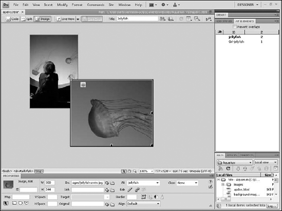
A powerful feature of AP Divs is their maneuverability: You can stack them on top of each other and make them visible or invisible. To stack AP Divs, simply drag one AP Div on top of another. Unlike other elements in a Web page, AP Divs give you complete layout control by including the capability to overlap one another. You can use AP Divs to position and layer any element on a page. For example, to overlap images, simply place each image in a separate AP Div and then move one AP Div so that it overlaps the other. To let you control which AP Div is on top, Dreamweaver provides two ways to change the stacking order with the Z Index. You can change the Z Index from the Property inspector or the AP Elements panel (see Figure 6-16). To open the AP Elements panel shown in Figure 6-16, choose Window
To change the stacking order and visibility of AP Divs, follow these steps:
Open a page that has two or more layers on it, such as the page with the jellyfish photos, as shown in Figure 6-17.
Select an AP Div by clicking anywhere on the border outline of the AP Div.
Choose Window
The AP Elements panel lists any AP Divs that have been inserted into a Web page.
Tip
If you're familiar with layers in Adobe Photoshop or Macromedia Fireworks, you may find some similarities here, such as the eye icon to control visibility and the capability to drag AP Divs around in the panel to change their order.
Reorder the stacking of the AP Divs by changing their corresponding Z Index numbers in the Property inspector or in the AP Elements panel.
The lowest number is the bottommost layer. The highest number is the topmost layer. To change the stacking order, simply select the number under the Z Index field and enter a higher or lower number.
Click the eye icon to the left of any AP Div in the AP Elements panel to turn the layer visibility on or off.
If no eye appears, the visibility is set to the default, which usually means on, except in the case of nested AP Divs. (You find out about nested AP Divs in the next section.) If the eye is open, the AP Div is visible on the screen and in the browser. If the eye is closed, the layer is invisible.
Tip
If you want to prevent any of your AP Divs from overlapping, select the Prevent Overlaps check box in the AP Elements panel.

Be careful when you apply more than one style to the same element (something that's easier to do than you may realize). The styles may conflict, and because browsers aren't always consistent in how they display styles, the results can be inconsistent and undesirable.
For the most part, the latest versions of Firefox and Internet Explorer display all attributes applied to any element, even if they're from different style rules, as long as the styles don't conflict. If they do conflict, browsers prioritize styles depending on how the styles have been defined and the order in which they appear. The method for determining this priority is what cascading is all about.
Cascading refers to the way in which multiple styles can apply to — or cascade over — the same element on a page. Because multiple styles can affect the same element, CSS has many rules to help prevent conflicts. These rules determine the priority each style should receive as a browser interprets styles. Style priorities are organized in a hierarchical order and work in a kind of a top-down fashion, similar to the way water cascades over rocks as it flows down a stream.
To help you better understand how styles cascade, consider this example. You can create a style for an entire page by redefining the <body> tag, the HTML tag that surrounds all the content displayed in the main window of a browser. So, for example, you could redefine the <body> tag with a rule that makes the default font for all text on your page Arial. Then you could redefine the <h1> tag with a rule that makes your headlines Garamond. And then the browser would have to determine how to display your headline based on this conflicting information. Should the headline be Arial because the page font is set to Arial in the <body> tag or should it be Garamond because that's the font in the <h1> tag?
To resolve this kind of conflict, CSS follows a hierarchy that can get rather complicated, but one of the simplest things to remember is that the closer a style is to an element (more specifically, a style defines an element), the higher that style's priority. So, as you might imagine, the headline style overrides the page style because it more specifically defines the style of the headline than the body style, which applies to the entire page.
CSS selectors also follow a hierarchy. Styles created with ID selectors are given priority over styles created with class, and both are given higher priority than styles that use the tag selector to redefine existing HTML tags. When styles have the same priority, deciding which is highest comes down to which style most specifically applies to an element.
Another basic guideline is that CSS rules get the highest priority, followed by HTML presentation attributes (for example, align, color, face, and bgcolor), followed by the browser default settings (font type and font size, for example). CSS rules always get the highest priority in any scenario. But within CSS, internal style sheets have priority over external style sheets, and inline styles, which are styles defined within the line of HTML code where the tag appears, get the highest priority.
Note
After you become savvy about using style sheets, you'll find that working with external style sheets affords the most power because you can link to them from multiple pages in your site rather than having to create a new internal style sheet for each page in your site. You have the added advantage in that you can easily alter your styles in just one place if you need to make changes after styles are applied. Even better, you can create multiple external style sheets as part of the design process and use a Dreamweaver feature — design time style sheets — to switch between them as you work on your document.
One benefit of the design time style sheets feature is that you can view how different external style sheets affect your page without linking to them. This feature is a great way to quickly switch between style sheets in a document and explore various what-if scenarios with the style sheets you create before you apply them. You may begin to like this feature because you can play around with and explore the full power of CSS. After you decide that you like a particular style sheet, you can apply it to your page as you do any other style sheet.
Note
Design time style sheets affect only the appearance of styles in Dreamweaver. Because they're not real links, they show up only at runtime when a Dreamweaver document is open. Design time style sheet info is also stored in a design note file. If you want to preserve your design time style sheet info, be sure that you don't delete the corresponding design note file.
To set up design time style sheets, follow these steps:
Choose Format
The Design Time Style Sheets dialog box appears.
To work with a specific style sheet, click the Add Item button (+) above the Show Only at Design Time field.
The Select File dialog box appears, and you can select a CSS file. Remember that CSS files usually end with a
.cssextension. You can also add multiple CSS files by clicking the Add button again.To hide a specific style sheet, click the Add Item button (+) above the Hide at Design Time field and select from the Select File dialog box the style you want to hide.
To delete a listed style sheet from either category, select the style sheet and click the Remove Item button (–) to delete it.