
Most Access applications are centered on forms. Forms are used to collect and display information, navigate about the application, and more. This chapter covers all the basics of creating and working with forms. We’ll begin by looking at the various uses of forms. Then we’ll delve into the wealth of form and control properties. You’ll learn the differences between bound, unbound, and calculated controls, and when it is appropriate to use each. You’ll also learn important form techniques, such as how to create forms based on data from more than one table, and when forms should be populated with a query result rather than a table or embedded SQL statement.
Developers often think that forms exist solely for the purpose of data entry. To the contrary, forms serve many different purposes in Access 2002:
Data entry—Displaying and editing data
Application flow—Navigating through your application
Custom dialog boxes—Providing messages to your user
Printing information—Providing hard copies of data-entry information
Probably the most common use of an Access form is as a vehicle for displaying and editing existing data or for adding new data. Fortunately, Access offers many features that allow you to build forms that ease data entry for your users. Access also makes it easy for you to design forms that let your users view and modify data, view data but not modify it, or add new records only.
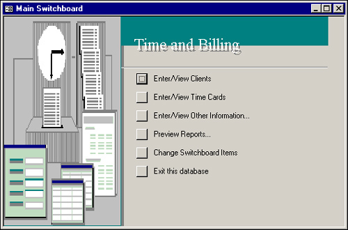
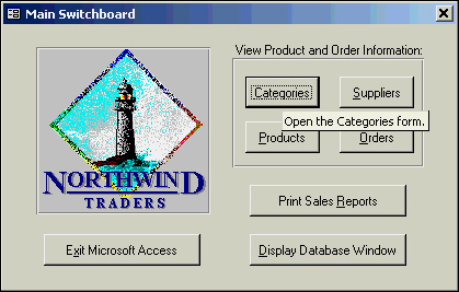
Although not everyone immediately thinks of an Access form as a means of navigating through an application, forms are quite strong in this area. Figure 5.1 shows a form created with the Switchboard Manager in Access 2002; Figure 5.2 shows a “home-grown” switchboard form. Although the Switchboard Manager makes designing a switchboard form very simple, you will find any type of switchboard easy to develop. You can be creative with switchboard forms by designing forms that are both utilitarian and exciting. Switchboard forms are covered in detail in Chapter 9, “Advanced Form Techniques.”
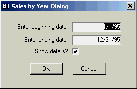
You can also use Access to create custom dialog boxes used to display information or retrieve information from your users. The custom dialog box shown in Figure 5.3 gets the information needed to run a report. The user must fill in the required information before he can proceed.
Another strength of Access is its capability to produce professional-looking printed forms. With many other products, it’s difficult to print a data-entry form; sometimes the entire form needs to be re-created as a report. In Access, printing a form is simply a matter of clicking a button that has a little code written behind it. You have the option of creating a report that displays the information your user is entering or of printing the form itself.
Access offers many styles of forms. The data in a form can be displayed one record at a time, or you can let the user view several records at once. Forms can be displayed modally, meaning that the user must respond and close the form before continuing, or displayed so that the user can move through the open forms at will. The important thing to remember is that there are many uses and styles of forms. You will learn about them throughout this chapter, in Chapter 9, and throughout the book. As you read this chapter, remember that your forms are limited only by your imagination.
Access forms are comprised of a few different sections; each one has its own function and behavior. These are the three main sections of an Access form:
Header
Detail
Footer
The Detail section of a form is the main section; it’s the one used to display the data of the table or query underlying the form. As you will see, the Detail section can take on many different looks. It’s quite flexible and robust.
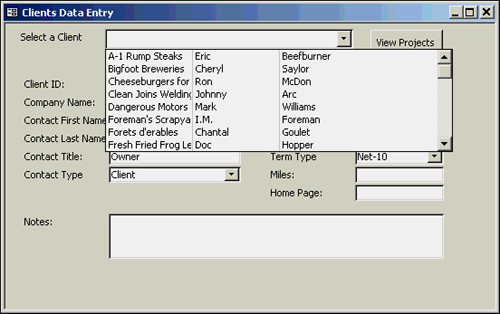
The Header and Footer sections of the form are used to display information that doesn’t change from record to record. Command buttons that control the form—such as one used to let users view all the projects associated with a particular client—are often placed in a form’s header or footer. Controls can also be used to help the user navigate around the records associated with the form. In the example shown in Figure 5.4, the user can select from a valid list of clients. After a client has been selected from the combo box, the user is moved to the appropriate record.
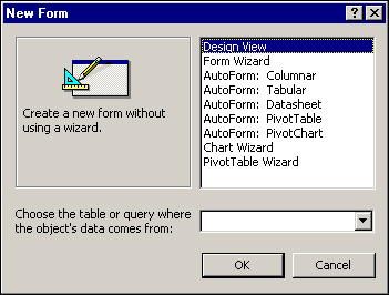
You can create a new form in several ways. The most common way is to select the Forms icon from the Objects list in the Database window. You can then select the Create Form in Design View icon or the Create Form by Using Wizard icon. Another way to create a form is to click Forms in the Objects list and then click the New button on the Database window toolbar. The New Form dialog box will appear, allowing you to select from a multitude of creation options. (See Figure 5.5.) Forms can be created from scratch by using Design view, or they can be created with the help of any one of eight wizards. The wizards will be covered briefly before you move on to the process of creating a form from scratch. Even the most experienced developers use the Form Wizard to perform certain tasks.
To create a form with the Form Wizard, select the Create Form By Using the Wizard icon with the Forms icon selected in the Objects list. You can also select Form Wizard from the New Form dialog and click OK. First, the Form Wizard prompts you for the name of the table or query you want to use as the form’s foundation. Whether you’re creating a form with Form Wizard or from Design view, it’s generally better to base a form on a query or on an embedded SQL statement (a query stored as part of a form). Doing so offers better performance (unless your form requires all fields and all records), allows for more flexibility, and lets you create a form based on data from several tables.
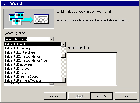
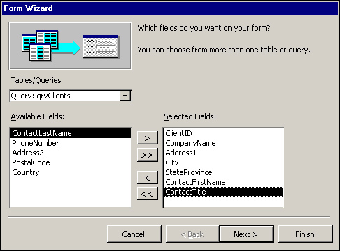
Figure 5.6 shows the Tables/Queries drop-down list. You can see that all the tables are listed, followed by all the queries. After you select a particular table or query, its fields are displayed in the list box on the left. (See Figure 5.7.) To select the fields you want to include on the form, double-click the name of the field or click on the field; then click the > button. In the example shown in Figure 5.7, several fields have been selected from the qryClients query.
After you’ve selected the fields you want, click Next. The second step of the Form Wizard allows you to specify the layout for the form you’re designing. You can select from Columnar, Tabular, Datasheet, Justified, PivotTable, or PivotChart; the most common choice is Columnar. Click Next after selecting a form layout.
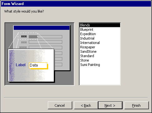
In the third step of the Form Wizard, you can select a style for your form from several predefined styles. (See Figure 5.8.) Although all the properties set by the wizard can be modified in Design view after the form has been created, to save time, it’s best to select the appropriate style now. Click Next after selecting a style.
In the final step of the Form Wizard, supply a title for your form. (If you just accept the default, the form will have the same name as the underlying table or query, which could be confusing.) Unfortunately, the form’s title becomes the name of the form as well. For this reason, type the text you want to use as the name of the form. If you want to follow standard naming conventions, you should begin the name of the form with the tag frm. You can worry about changing the title in Design view of the form. This last step of the Form Wizard also lets you specify whether you want to view the results of your work or open the form in Design view. It’s usually best to view the results and then modify the form’s design after you have taken a peek at what the Form Wizard has done.
Tip
Another way to start the Form Wizard is to click the Tables or Queries icon in the Objects list, and then click the table or query you want the form to be based on. Use the New Object drop-down list on the toolbar to select Form; this opens the New Form dialog box. Select Form Wizard. You won’t have to use the Tables/Queries drop-down list to select a table or query. The table or query you selected before invoking the wizard is automatically selected for you.
Although the Form Wizards are both powerful and useful, in many cases you’ll prefer building a form from scratch, especially if you’re building a form that’s not bound to data. To create a form without using a wizard, click Forms in the Objects list. Double-click the Create Form in Design View icon or click New on the Database window toolbar to open the New Form dialog box and select Design View (the default choice). If you clicked New to open the New Form dialog, and your form will be bound to data, use the drop-down list in the New Form dialog box to select the table or query that will serve as the form’s foundation. Click OK, and the Form Design window appears. (See Figure 5.9.)
The Form Design window is used to build and customize a form. Using this window, you can add objects to a form and customize them by using the Properties window. Microsoft has supplied many form and control properties. After gaining a command of these properties, you can customize the look and feel of your forms.
Even the best developer needs the right tools for the job. Fortunately, Microsoft has given you tools to help you build exciting and utilitarian forms. The Form Design window includes a toolbar, a toolbox, and the actual form you’re designing. Other tools are available to help you with the design process, including the Field List and Properties window.
By default, two toolbars appear when you’re in a form’s Design view: the Form Design toolbar and the Formatting toolbar. The Form Design toolbar has buttons you use to save, print, copy, cut, paste, and perform other standard Windows tasks within the form. It also includes buttons that allow you to toggle the different design windows (such as the toolbox). The Format Painter tool allows you to easily apply all formatting from one control to one or more additional controls. The Build tool invokes the Choose Builder dialog box, from which you can invoke the Expression, Macro, or Code builder. The Formatting toolbar contains tools for graphically modifying the form’s properties and objects. You can modify the font, font size, and color of selected objects on the form. With the Formatting toolbar, you can also add bold, underline, and italic or change the alignment; you can also add special effects to the selected objects.
Many windows are available to help you with the design process when you’re in a form’s Design view. If you don’t have a high-resolution monitor, you’ll probably find it annoying to have all the windows open at once. In fact, with all the windows open at once on a low-resolution monitor, the form is likely to get buried underneath all the windows. This is why Microsoft has made each window open and close in a toggle-switch–like fashion. The Form Design toolbar has tools for the Field List, Toolbox, and Properties windows, and each of these toolbar buttons is a toggle. Clicking once on the button opens the appropriate window; clicking a second time closes it.
Figure 5.10 shows a form with the Field List, Toolbox, and Properties windows open. Although each of these windows can be sized however you like (and the toolbox can be docked to a window edge), the design environment in this low-resolution display is rather cluttered with all these windows open. One of the tricks in working with Access is knowing when it’s appropriate to have each set of tools available. The goal is to have the right windows open at the right time as often as possible.
Note
The Field List, Toolbox, and Properties windows can be closed by using the toolbar buttons. In addition, they can be closed by using the Close button on each window, or they can be toggled with the View menu.
Tip
Access 2002 offers some handy new shortcut keystrokes for working with forms and form properties. In Design view, the F4 key displays the property sheet. When working with a property sheet in Design view, pressing Shift+F7 will shift the focus to the Form Design window while maintaining the focus on the selected control. You can toggle among all available views for a form (Design, Datasheet, Form, PivotTable, PivotChart) by pressing CTRL+> or CTRL+. (period). You can toggle among the different views in the reverse order using CTRL+< or CTRL+, (comma). These shortcut keys are also supported for changing between available views of tables, queries, reports, pages, views, and stored procedures.
Fields can be easily added to a form by using the Field List window, which contains all the fields that are part of the form’s record source. The record source for the form is the table, query, or embedded SQL statement that underlies the form. For example, in Figure 5.10, the form’s record source is qryClients. The fields listed in the Field List window are the fields that are part of the query. To add fields to a form, use these two steps:
Make sure the Field List window is visible. If it isn’t, click the Field List button on the toolbar.
Locate the field you want to add to the form; then click and drag the field from the field list to the place on the form where you want it to appear. The location you select becomes the upper-left corner of the text box, and the attached label appears to the left of where you dropped the control.
Note
A control is an object that you add to a form or report. Types of controls include text boxes, combo boxes, list boxes, and check boxes.
Note
To add multiple fields to a form at the same time, select several qryClients fields from the field list. Use the Ctrl key to select noncontiguous fields or the Shift key to select contiguous fields. For example, hold down your Ctrl key and click on three noncontiguous fields. Each field will be selected. Next, click a field, hold down your Shift key, and click another field. All fields between the two fields will be selected. If you want to select all fields, double-click the field list title bar. Click and drag any one of the selected fields to the form, and all of them will be added to the form at once.
You must know several important tricks of the trade when selecting, moving, aligning, and sizing form objects. These tips will save you hours of frustration and wasted time.
The easiest way to select a single object on a form is to click it. After the object is selected, you can move it, size it, or change any of its properties. Selecting multiple objects is a bit trickier, but can be done in several ways. Different methods are more efficient in different situations. To select multiple objects, you can hold down the Shift key and click each object you want to select. Each selected object is surrounded by selection handles, indicating that it has been selected.
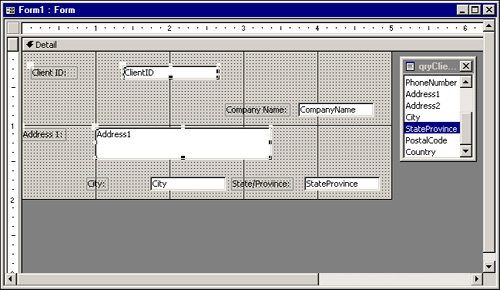
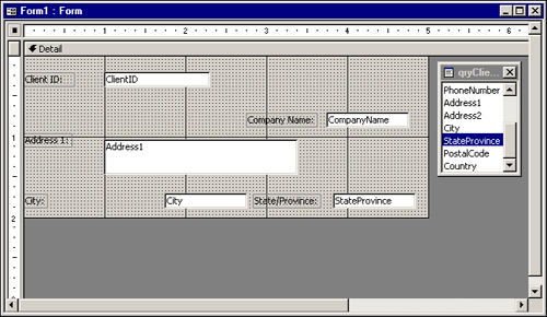
Figure 5.11 shows a form with four selected objects; it’s important to understand which objects are actually selected. The ClientID text box, the Address label and text box, and the Company Name label are all selected; however, the Client ID label and CompanyName text box aren’t selected. If you look closely at the figure, you can see that the selected objects are completely surrounded by selection handles. The Client ID label and CompanyName text box each has just a single selection handle because they’re attached to objects that are selected. If you change any properties of the selected objects, the Client ID label and CompanyName text box will be unaffected.

You can also select objects by lassoing them. Objects to be lassoed must be located adjacent to one another on the form. Place your mouse pointer on a blank area of the form (not over any objects)and then click and drag your mouse pointer. You can see a thin line around the objects your mouse pointer is encircling. When you let go, any objects that were within the lasso, including those only partially surrounded, are selected. If you want to deselect any of these objects to exclude them, hold down your Shift key and click the object(s) you want to deselect.
One of my favorite ways to select multiple objects is to use the horizontal and vertical rulers that appear at the edges of the Form Design window. Click and drag within the ruler. Notice that as you click and drag on the vertical ruler, two horizontal lines appear, indicating which objects are selected. As you click and drag across the horizontal ruler, two vertical lines appear, indicating the selection area. When you let go of your mouse, any objects within the lines are selected. As with the process of lassoing, to remove any objects from the selection, hold down your Shift key and click on the object(s) you want to deselect.
To move a single control with its attached label, you don’t need to select it first. Place your mouse over the object and click and drag. An outline appears, indicating the object’s new location. When the object reaches the position you want, release the mouse. The attached label automatically moves with its corresponding control.
To move more than one object at a time, you must first select the objects you want to move. Select the objects using one of the methods outlined in the previous section. Place your mouse over any of the selected objects and click and drag. An outline appears, indicating the proposed new position for the objects. Release the mouse when you have reached the position you want for the objects.
Sometimes you want to move a control independent of its attached label, which requires a special technique. If you click a control, such as a text box, as you move your mouse over the border of the control, a hand icon with five fingers pointing upward appears. If you click and drag, both the control and the attached label move as a unit, and the relationship between them is maintained. If you place your mouse pointer over the larger handle in the upper-left corner of the object, the mouse pointer appears as a hand with only the index finger pointing upward. If you click and drag here, the control moves independently of its attached label, and the relationship between the objects changes.
Access makes it easy to align objects. Figure 5.12 shows several objects that aren’t aligned. Notice that the attached labels of three of the objects are selected. If you align the attached labels, the controls (in this case, text boxes) remain in their original positions. If you select the text boxes as well, they will try to align with the attached labels. Because Access doesn’t allow the objects to overlap, the text boxes end up immediately next to their attached labels. To left-align any objects (even objects of different types), select the objects you want to align and then choose Format, Align, Left or right-click one of the objects and select Align, Left. The selected objects are then aligned. (See Figure 5.13.) You can align the left, right, top, or bottom edges of any objects on a form.

Note
Don’t confuse the Format, Align feature with the Align tools (Align Left, Center, Align Right) on the Formatting toolbar. The Format, Align feature aligns objects one to the other, but the Align tools on the Formatting toolbar provide justification for the text inside of an object.
Tip
It is helpful to add to the toolbar the design tools that you commonly use. For example, you can easily add the Format|Align options to the toolbar. To modify the toolbar, select Tools|Customize. Click to display the appropriate toolbar on the Toolbars tab. You will find the align tools in the Form/Report Design category. Drag and drop the desired tools from the Commands list onto the appropriate toolbar.
The Snap to Grid feature determines whether objects snap to the gridlines on the form as you move and size them. This feature is found under the Format menu. If you turn off this feature (it’s a toggle), objects can be moved and sized without regard for the gridlines.
Just as there are several ways to move objects, you have several options for sizing objects. When an object is selected, each handle, except for the handle in the upper-left corner of the object, can be used to size the object. The handles at the top and bottom of the object allow you to change the object’s height, and the handles at the left and right of the object let you change the object’s width. You can use the handles in the upper-right, lower-right, and lower-left corners of the object to change the width and height of the object simultaneously. To size an object, place your mouse pointer over a sizing handle, click, and drag. You can select several objects and size them all at once. Each of the selected objects increases or decreases in size by the same amount; their relative sizes stay intact.
Access offers several powerful methods of sizing multiple objects, found under the Format, Size menu:
To Fit: Sizes the selected objects to fit the text within them
To Grid: Sizes the selected objects to the nearest gridlines
To Tallest: Sizes the selected objects to the height of the tallest object in the selection
To Shortest: Sizes the selected objects to the height of the shortest object in the selection
To Widest: Sizes the selected objects to the width of the widest object in the selection
To Narrowest: Sizes the selected objects to the width of the narrowest object in the selection
Probably the most confusing of the options is Format, Size, To Fit. This option is somewhat deceiving because it doesn’t perfectly size text boxes to the text within them. In today’s world of proportional fonts, it isn’t possible to perfectly size a text box to the largest possible entry it contains. Generally, however, you can visually size text boxes to a sensible height and width. Use the field’s Size property to limit what’s typed in the text box. If the entry is too large to fit in the allocated space, the user can scroll to view the additional text. As the following Tip indicates, the Format, Size, To Fit option is much more appropriate for labels than it is for text boxes.
Access gives you excellent tools for spacing the objects on your form an equal distance from one another. Notice in Figure 5.14 that the ClientID, Address, and City text boxes aren’t equally spaced vertically from one another. To make the vertical distance between selected objects equal, choose Format, Vertical Spacing, Make Equal. In Figure 5.15, you can see the result of using this command on the selected objects in Figure 5.14.
The horizontal distance between objects can be made equal by choosing Format, Horizontal Spacing, Make Equal. Other related commands that are useful are Format, Vertical Spacing, Increase (or Decrease) and Format, Horizontal Spacing, Increase (or Decrease). These commands maintain the relationship between objects while proportionally increasing or decreasing the distance between them.
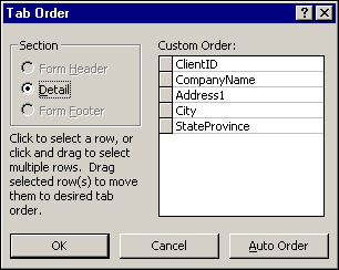
The tab order for the objects on a form is determined by the order in which you add the objects to the form. However, this order isn’t necessarily appropriate for the user. You might need to modify the tab order of the objects on the form. To do so, select View, Tab Order to open the Tab Order dialog box, shown in Figure 5.16. This dialog box offers two options. Use the Auto Order button to tell Access to set the tab order based on each object’s location in a section on the form. However, if you want to customize the order of the objects, click and drag the gray buttons to the left of the object names listed under the Custom Order heading to specify the objects’ tab order.
Note
You must set the tab order for the objects in each section of the form (that is, header, detail, or footer) separately. To do this, select the appropriate section from the Tab Order dialog box, and then set the order of the objects in the section. If your selected form doesn’t have a header or footer, the Form Header and Form Footer sections are unavailable.
Windows programming in general, and Access programming in particular, isn’t limited to just writing code. Your ability to design a user-friendly interface can make or break the success of your application. Access and the Windows programming environment offer a variety of controls, and each one is appropriate in different situations. The following sections discuss each type of control, outlining when and how it should be used.
Labels are used to display information to your users. Attached labels are automatically added to your form when you add other controls, such as text boxes, combo boxes, and so on, and they can be deleted or modified as necessary. Their default captions are based on the Caption property of the field that underlies the control they’re attached to. If nothing has been entered into a field’s Caption property, the field name is used for the label’s caption.
The Label tool, found in the toolbox, can be used to add any text to the form. Click the Label tool; then click and drag the label to place it on the form. Labels are often used to provide a description of the form or to supply instructions to users. Labels can be customized by modifying their font, size, color, and so on. Although developers can use VBA code to modify label properties at runtime, users don’t have this Ability.
Tip
Sometimes attached labels get detached from their associated text boxes. This means that the label will no longer move, size, and become selected with the text box that it applies to. To reassociate the label with the text box, cut the label (Ctrl+X), click to select the text box, and then press Ctrl+V to paste.
If you purposely want to disassociate a label from its attached control, simply cut the label and then paste it back on the form without selecting the control that it was attached to. This allows you to perform tasks such as hiding the control without hiding the label.
Text boxes are used to get information from the user. Bound text boxes display and retrieve field information stored in a table; unbound text boxes gather information from the user that’s not related to a specific field in a specific record. For example, a text box can be used to gather information about report criteria from a user.
Text boxes are automatically added to a form when you click and drag a field from the field list to the form. The Display control for the field must be set to Text Box. (The Display control is the default control type for an object; this default is set in the design of the underlying table.). Another way to add a text box is to select the Text Box tool from the toolbox, and then click and drag to place the text box on the form. This process adds an unbound text box to the form. If you want to bind the text box to data, you must set its Control Source property.
Combo boxes allow a user to select from a list of appropriate choices. Access offers several easy ways to add a combo box to a form. If a field’s Display Control property has been set to Combo Box, a combo box is automatically added to a form when the field is added. The combo box automatically knows the source of its data as well as all its other important properties.
If a field’s Display Control property hasn’t been set to Combo Box, the easiest way to add a combo box to a form is to use the Control Wizard. When selected, the Control Wizards tool helps you add combo boxes, list boxes, option groups, and subforms to your forms. Although all the properties set by the Combo Box Wizard can be set manually, using the wizard saves both time and energy. If you want the Combo Box Wizard to be launched when you add a combo box to the form, make sure the Control Wizards tool in the toolbox has been clicked (switched on) before you add the combo box.
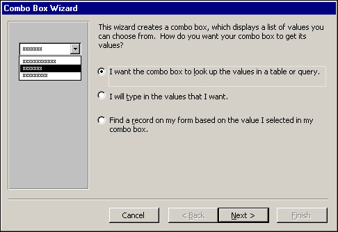
Then, select the Combo Box tool in the toolbox, and then click and drag to place the combo box on the form. This launches the Combo Box Wizard; its first step is shown in Figure 5.17. You’re offered three sources for the combo box’s data. Use the first option if your combo box will select the data that’s stored in a field, such as the state associated with a particular client. I rarely, if ever, use the second option, which requires that you type the values for the combo box. Populating a combo box this way makes it difficult to maintain. Every time you want to add an entry to the combo box, your application must be modified. The third and final option is appropriate when you want the combo box to be used as a tool to search for a specific record. For example, a combo box can be placed in the form’s header to display a list of valid customers. After selecting a customer, the user is then moved to the appropriate record. This option is available only when the form is bound to a record source.
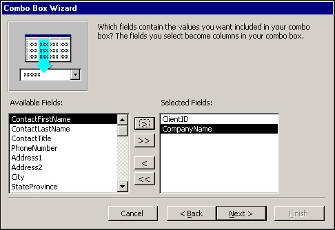
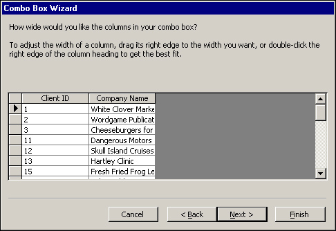
In the second step of the Combo Box Wizard, you select a table or query to populate the combo box. For optimal performance, you should select a query. In the third step, you select the fields that appear in your combo box. (See Figure 5.18.) The combo box being built in the example will be used to select the client associated with a particular project. Although the CompanyName field will be the only field visible in the combo box, ClientID and CompanyName have both been selected because ClientID is a necessary element of the combo box. After a company name has been selected from the combo box, the client ID associated with the company name will be stored in the ClientID field of the tblProjects table.
The fourth step lets you specify the width of each field in the combo box. Notice in Figure 5.19 that Access recommends that the key column, ClientID, be hidden. The idea is that the user will see the meaningful English description while Access worries about storing the appropriate key value in the record.
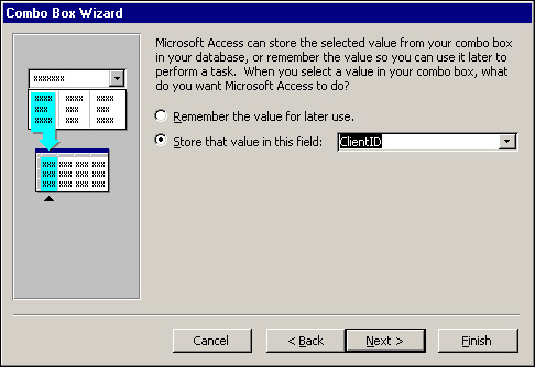
In the wizard’s fifth step, you specify whether you want Access to simply remember the selected value or store it in a particular field in a table. In the example shown in Figure 5.20, the selected combo box value will be stored in the ClientID field of the tblProjects table.
The sixth and final step of the Combo Box Wizard prompts for the text that will become the attached label for the combo box. Pressing the Finish button completes the process, building the combo box and filling in all its properties with the appropriate values.
Although the Combo Box Wizard is a helpful tool, it’s important to understand the properties it sets. Figure 5.21 shows the Properties window for a combo box. Many of the Combo Box properties are covered in other chapters, but take a moment to go over the properties set by the Combo Box Wizard in this example.
The Control Source property indicates the field in which the selected entry is stored. In Figure 5.21, the selected entry will be stored in the ClientID field of the tblProjects table. The Row Source Type property specifies whether the source used to populate the combo box is a table/query, value list, or field list. In the example, the Row Source Type is Table/Query. The Row Source is the name of the actual table or query used to populate the combo box. In the example, the Row Source is tblClients. The Column Count property designates how many columns are in the combo box, and the Column Widths property indicates the width of each column. In the example, the width of the first column is zero, which renders the column invisible. Finally, Bound Column is used to specify which column in the combo box is being used to store data into the Control Source. In the example, this is column 1.
Combo boxes are very powerful controls, but you need to know many other things about them to leverage their power. The advanced aspects of combo boxes are covered in Chapter 9.
List boxes are similar to combo boxes, but differ from them in three major ways:
They consume more screen space.
They allow you to select only from the list that’s displayed. This means you can’t type new values into a list box (as you can with a combo box).
They can be configured to let you select multiple items.
As with a combo box, the Display Control of a field can be set to List Box, and a list box will be added to the form when the field is clicked and dragged from the field list to the form.
The List Box Wizard is almost identical to the Combo Box Wizard. After running the List Box Wizard, the List Box properties affected by the wizard are the same as the Combo Box properties. Advanced list box techniques are covered in Chapter 9.
Check boxes are used when you want to limit your user to entering one of two values, such as Yes/No, True/False, or On/Off. You can add a check box to a form in several ways:
Set the Display Control of the underlying field to Check Box; then click and drag the field from the field list to the form.
Click the Check Box tool in the toolbox; then click and drag a field from the field list to the form. This method adds a check box to the form even if the Display Control of the underlying field isn’t a check box.
Click the Check Box tool in the toolbox; then click and drag to add a check box to the form. The check box you have added will be unbound. To bind the check box to data, you must set the control’s Control Source property.
Option buttons and toggle buttons can be used alone or as part of an option group. An option button or toggle button alone can be used to display a True/False value, but this isn’t a standard use of an option or toggle button. (Check boxes are standard for this purpose.) As part of an option group, option buttons and toggle buttons force the user to select from a mutually exclusive set of options, such as choosing from American Express, MasterCard, Visa, or Discover for a payment type. This use of option buttons and toggle buttons is covered in the section, “Option Groups.”
The difference between option buttons and toggle buttons is in their appearance. Personally, I find toggle buttons confusing to users. I find that option buttons provide a much more intuitive interface.
Option groups allow the user to select from a mutually exclusive set of options. They can include check boxes, toggle buttons, or option buttons, but the most common implementation of an option group is option buttons.
The easiest way to add an option group to a form is to use the Option Group Wizard. Make sure the Control Wizards button in the toolbox is selected, click Option Group in the toolbox, and then click and drag to add the option group to the form. This launches the Option Group Wizard.
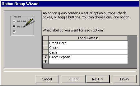
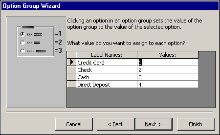
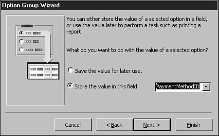
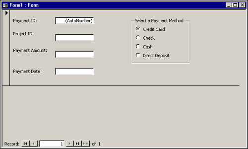
The first step of the Option Group Wizard, shown in Figure 5.22, allows you to type the text associated with each item in the option group. The second step gives you the option of selecting a default choice for the option group. This choice comes into effect when a new record is added to the table underlying the form. The third step of the wizard lets you select values associated with each option button. (See Figure 5.23.) The text displayed with the option button isn’t stored in the record; instead, the underlying numeric value is stored in the record. In Figure 5.23, the number 2 is stored in the field if Check is selected. The fourth step of the Option Group Wizard asks whether you want to remember the option group value for later use or store the value in a field. In Figure 5.24, the option group value is stored in the PaymentMethodID field. In the fifth step, you can select from a variety of styles for the option group buttons, including option buttons, check boxes, and toggle buttons. You can also select from etched, flat, raised, shadowed, or sunken effects for your buttons. The wizard lets you preview each option. The sixth and final step of the wizard allows you to add an appropriate caption to the option group. The completed group of option buttons is shown in Figure 5.25.
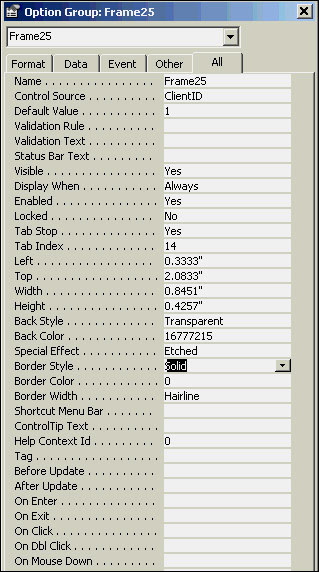
It’s important to understand that the Option Group Wizard sets properties of the frame, the option buttons within the frame, and the labels attached to the option buttons. The properties of the frame are shown in Figure 5.26. The control source of the frame and the default value of the option group are set by the Option Group Wizard. Each individual option button is assigned a value, and the caption of the attached labels associated with each button is set.
When you first build a form, you might not always choose the best type of control to display each field on the form, or you might make what you think is the best choice for the control, only to find out later that it wasn’t exactly what your user had in mind. In Access, it’s easy to morph, or convert, the type of control into another type. For example, you can morph a list box into a combo box.
One of the most common types of conversions is from a text box to a combo box. To morph a text box to a combo box, right-click on the text box. Choose Change To, and then select Combo Box. The types of controls available depend on the type of control you’re morphing. For example, a text box can be converted to a label, list box, or combo box. (See Figure 5.27.)
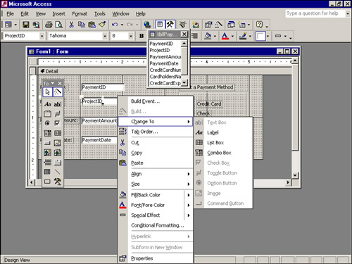
After morphing a text box to a combo box, you modify the appropriate Control properties. The Row Source, Bound Column, Column Count, and Column Widths properties need to be filled in. For the row source, you must select the appropriate table or query. If you select a table and then click the ellipsis, you are prompted to create a query based on the table. After selecting Yes, you can build a query containing only the fields you want to include in the combo box. You’re then ready to select the bound column, which is used to store data in the underlying table. For example, the user might select the name of a project that a payment is being applied to, but the ProjectID will be stored in the Payments table. Set the column count to the number of columns selected in the underlying query; the column widths can be set so that the key column is hidden.
Access 2000 introduced conditional formatting, which displays data meeting specified criteria differently than it displays data meeting other criteria. For example, you can display sales higher than a certain amount in one color and sales less than that amount in another color. To conditionally format data displayed within a control, follow these steps:
Select the control you want to conditionally format.
Select Format|Conditional Formatting. The Conditional Formatting dialog appears.
Select Field Value Is, Expression Is, or Field Has Focus from the first combo box.
Select the appropriate operator from the second combo box.
Enter the values you are testing for in the text boxes that appear on the right.
Select the special formatting (bold, italic, background color, and so on) that you want to apply when the conditional criteria are met.
Click Add to add additional formats.
Click OK to apply the conditional formatting.
Forms have many properties that can be used to affect their look and behavior. The properties are broken down into categories: Format, Data, Event, and Other.
To view a form’s properties, you must select the form in one of two ways:
Click the Form Selector (the small gray button at the intersection of the horizontal and vertical rulers)
Choose Edit|Select Form
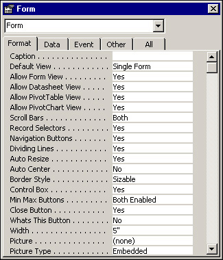
After a form has been selected, click the Properties button on the toolbar to view its properties. The Properties window, shown in Figure 5.28, consists of five tabs: Format, Data, Event, Other, and All. Many developers prefer to view all properties at once on the All tab, but a form can have a total of 107 properties! Rather than viewing all 107 properties at once, try viewing the properties by category. The Format category includes all the physical attributes of the form, the ones that affect the form’s appearance (such as background color, for example). The Data category includes all the properties of the data that the form is bound to, such as the form’s underlying record source. The Event category contains all the Windows events to which a form can respond. For example, you can write code that executes in response to the form being loaded, becoming active, displaying a different record, and so on. The Other category holds a few properties that don’t fit into the other three categories.
As mentioned, forms have 107 properties, and, of those, 52 are Event properties, covered in Chapter 9. This section covers the Format, Data, and Other properties of forms.
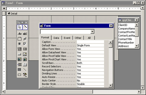
The Format properties of a form affect its physical appearance. Forms have 31 Format properties, described here.
Caption: The Caption property sets the text that appears on the form’s title bar. This property can be customized at runtime. For example, you could include the name of the current user or specify the name of the client for whom an invoice is being generated.
Default View: The Default View property allows you to select from five available options:
SINGLE FORM—Only one record can be viewed at a time.CONTINUOUS FORMS—As many records as will fit within the form window are displayed at one time, each presented as the detail section of a single form.DATASHEET—Displays the records in a spreadsheet-like format, with the rows representing records and the columns representing fields.PIVOTTABLE—Displays the records in a Microsoft Excel–type PivotTable format.PIVOTCHART—Displays the records in a Microsoft Excel–type PivotChart format
The selected option becomes the default view for the form.
Allow Form View: Prior to Access 2002, Access forms had a property called Views Allowed. The This Views Allowed property determined whether the user was allowed to switch from Form view to Datasheet view, or vice versa. The Default View property determined the initial default display mode for the form, but Views Allowed determined whether the user was permitted to switch out of the default view.
In Access 2002, Microsoft has separated out each type of view as an additional property for the form. Allow Form View specifies whether the user is permitted to switch to the Form view of a form.
Allow Datasheet View: Allow Datasheet View determines whether the user is permitted to switch to the Datasheet view of a form.
Allow PivotTable View: Allow PivotTable View determines whether the user is allowed to switch to the PivotTable view of a form.
Allow PivotChart View: Allow PivotChart View determines whether the user is allowed to switch to the PivotChart view of a form.
Scroll Bars: The Scroll Bars property determines whether scrollbars appear if the controls on the form don’t fit within the form’s display area. You can select from vertical and horizontal scrollbars, neither vertical nor horizontal, just vertical, or just horizontal.
Record Selectors: A record selector is the gray bar to the left of a record in Form view, or the gray box to the left of each record in Datasheet view. It’s used to select a record to be copied or deleted. The Record Selectors property determines whether the record selectors appear. If you give the user a custom menu, you can opt to remove the record selector to make sure the user copies or deletes records using only the features specifically built in to your application.
Navigation Buttons: Navigation buttons are the controls that appear at the bottom of a form; they allow the user to move from record to record within the form. The Navigation Buttons property determines whether the navigation buttons are visible. You should set it to No for any dialog forms, and you might want to set it to No for data-entry forms, too, and add your own toolbar or command buttons that enhance or limit the standard buttons’ functionality. For example, in a client/server environment, you might not want to give users the ability to move to the first or last record because that type of record movement can be inefficient in a client/server architecture.
Dividing Lines: The Dividing Lines property indicates whether you want a line to appear between records when the default view of the form is set to Continuous Forms. It also determines whether dividing lines are placed between the form’s sections (header, detail, and footer).
Auto Resize: The Auto Resize property determines whether the form is automatically sized to display a complete record.
Auto Center: The Auto Center property specifies whether you want the form to automatically be centered within the Application window whenever it’s opened.
Border Style: The Border Style property is far more powerful than its name implies. The options for the Border Style property are None, Thin, Sizable, and Dialog. The border style is often set to None for splash screens, which means the form has no border. A Thin border is not resizable; the Size command isn’t available in the Control menu. This setting is a good choice for pop-up forms, which remain on top even when other forms are given the focus. A Sizable border is standard for most forms. It includes all the standard options in the Control menu. A Dialog border looks like a Thin border. A form with a border style of Dialog can’t be maximized, minimized, or resized. Once the border style of a form is set to Dialog, the Maximize, Minimize, and Resize options aren’t available in the form’s Control menu. The Dialog border is often used along with the Pop Up and Modal properties to create custom dialog boxes.
Control Box: The Control Box property determines whether a form has a Control menu. You should use this option sparingly. One of your responsibilities as an Access programmer is to make your applications comply with Windows standards. If you look at the Windows programs you use, you’ll find very few forms without Control menu boxes. This should tell you something about how to design your own applications.
Min Max Buttons: The Min Max Buttons property indicates whether the form has minimize and maximize buttons. The available options are None, Min Enabled, Max Enabled, and Both Enabled. If you remove one or both buttons, the appropriate options also become unavailable in the Control menu. The Min Max property is ignored for forms with a border style of None or Dialog. As with the Control Box property, I rarely use this property. To make my applications comply with Windows standards, I set the Border Style property, and then inherit the standard attributes for each border style.
Close Button: The Close Button property determines whether the user can close the form by using the Control menu or double-clicking the Control icon. If you set the value of this property to No, you must give your user another way to close the form; otherwise, the user might have to reboot his or her computer to close your application.
Whats This Button: The Whats This Button property specifies whether you want the Whats This button added to the form’s title bar. This feature works only when the form’s Min Max Buttons property is set to No. When the Whats This Button property is set to Yes, the user can click on the Whats This button and then click on an object on the form to display Help for that object. If the selected object has no Help associated with it, Help for the form is displayed, and if the form has no Help associated with it, Microsoft Access Help is displayed.
Width: The Width property is used to specify the form’s width. This option is most often set graphically by clicking and dragging to select an appropriate size for the form. You might want to set this property manually when you want more than one form to be the exact same size.
Picture, Picture Type, Picture Size Mode, Picture Alignment, and Picture Tiling: The Picture properties let you select and customize the attributes of a bitmap used as the background for a form.
Grid X, Grid Y: The Grid X and Grid Y properties can be used to modify the spacing of the horizontal and vertical lines that appear in the form when in Design view. By setting these properties, you can affect how precisely you place objects on the form when the Snap to Grid option is active.
Layout for Print: The Layout for Print property specifies whether screen or printer fonts are used on the form. If you want to optimize the form for printing rather than display, set this property to Yes.
SubdatasheetHeight: The SubdatasheetHeight property is used to designate the maximum height for a subdatasheet.
SubdatasheetExpanded: The SubdatasheetExpanded property allows you to designate whether a subdatasheet is initially displayed in an expanded format. When set to False, the subdatasheet appears collapsed. When set to True, the subdatasheet appears in an expanded format.
Palette Source: The Palette Source property determines the source for selecting colors for a form.
Orientation: The Orientation property allows you to take advantage of language-specific versions of Microsoft Access, such as Arabic. This property can be set to support right-to-left display features for language-specific editions of Access, provided that the underlying operating system supports that language and is 32-bit (for example, Windows 2000).
Moveable: The Moveable property determines whether the user can move the form window around the screen by clicking and dragging the form by its title bar.
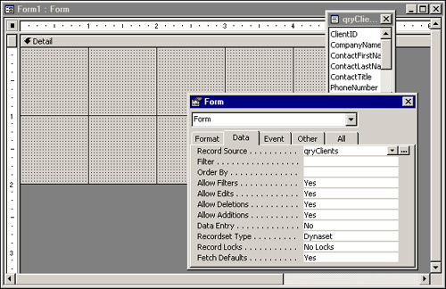
The Data properties of a form are used to control the source for the form’s data, what sort of actions the user can take on the data in the form, and how the data in the form is locked in a multiuser environment. There are 11 Data properties of a form.
Record Source: The Record Source property indicates the Table, Stored Query, or SQL statement on which the form’s records are based. After you have selected a record source for a form, the controls on the form can be bound to the fields in the record source.
Tip
The record source of a form can be changed at runtime. Because of this aspect of the Record Source property, you can create generic, reusable forms for many situations.
Filter: The Filter property is used to automatically load a stored filter along with the form. I prefer to base a form on a query that limits the data displayed on the form. The query can be passed parameters at runtime to customize exactly what data is displayed.
Order By: The Order By property specifies in what order the records on a form appear. This property can be modified at runtime.
Allow Filters: The Allow Filters property controls whether records can be filtered at runtime. When this option is set to No, all filtering options become disabled to the user.
Allow Edits, Allow Deletions, Allow Additions: These properties let you specify whether the user can edit data, delete records, or add records from within the form. These options can’t override any permissions that have been set for the form’s underlying table or queries. Security is covered in Chapters 27, “Database Security Made Easy,” and 28, “Advanced Security Techniques.”
Data Entry: The Data Entry property determines whether your users can only add records within a form. Set this property to Yes if you don’t want your users to view or modify existing records but want them to be able to add new records.
Recordset Type: The Recordset Type property gives you three options: Dynaset, Dynaset (Inconsistent Updates), and Snapshot. Each offers different performance and updating capability. The Dynaset option creates a fully updateable recordset. The only exceptions to this rule involve records or fields that can’t be updated for some other reason. An example is a form based on a query involving a one-to-many relationship. The join field on the one side of the relationship can be updated only if the Cascade Update Related Records feature has been enabled. The Dynaset (Inconsistent Updates) option allows all tables and bound data to be edited. This might result in inconsistent updating of data in the tables involved in the query. The Snapshot option doesn’t allow any updating.
Record Locks: The Record Locks property specifies the locking mechanism to be used for the data underlying the form’s recordset. Three options are available. The No Locks option—the least restrictive locking mechanism—provides optimistic locking; that is, Access doesn’t try to lock the record until the user moves off it. This option can lead to potential conflicts when two users simultaneously make changes to the same record. The All Records option locks all records underlying the form the entire time the form is open. This is the most restrictive option and should be used only when it’s necessary for the form’s user to make sure other users can view, but not modify, the form’s underlying recordset. The Edited Record option locks a 4KB page of records as soon as a user starts editing the data in the form. This option provides pessimistic locking. Although it averts conflicts by prohibiting two users from modifying a record at the same time, it can lead to potential locking conflicts. These three locking options are covered in detail in Alison Balter’s Mastering Access 2002 Enterprise Development.
Fetch Defaults: The Fetch Defaults property is new in Access 2002. It allows you to specify whether defaults for bound fields underlying the form are retrieved when new records are added. When this property is set to No, default values are not retrieved. When set to Yes, default values are retrieved.
Pop Up: The Pop Up property indicates whether the form always remains on top of other windows. This property is often set to Yes, along with the Modal property, for custom dialog boxes.
Modal: The Modal property indicates whether focus can be removed from a form while it’s open. When the Modal property is set to Yes, the form must be closed before the user can continue working with the application. As mentioned, this property is used with the Pop Up property to create custom dialog boxes.
Cycle: The Cycle property controls the behavior of the Tab key in the form. The options are All Records, Current Record, and Current Page. When the Cycle property is set to All Records, the user moves to the next record on a form when he presses Tab from the last control on the previous record. With Current Record, the user is moved from the last control on a form to the first control on the same record. The Current Page option refers only to multipage forms; when the Cycle property is set to Current Page, the user tabs from the last control on the page to the first control on the same page. All three options are affected by the tab order of the objects on the form.
Menu Bar: The Menu Bar property specifies a menu bar associated with the form. The menu bar, sometimes referred to as a command bar in Access 2002, is created by using the Customize dialog box. Reach this dialog box by choosing Toolbars from the View menu and then selecting Customize. Menus are covered in Chapter 9, “Advanced Form Techniques.”
Toolbar: The Toolbar property designates a toolbar associated with the form. The toolbar, sometimes referred to as a command bar in Access 2002, is created by using the Customize dialog box. The toolbar you select is displayed whenever the form has the focus. Toolbars are covered in Chapter 9.
Shortcut Menu, Shortcut Menu Bar: The Shortcut Menu property indicates whether a shortcut menu is displayed when the user clicks with the right mouse button over an object on the form. The Shortcut Menu Bar property lets you associate a custom menu with a control on the form or with the form itself. As with a standard menu bar, a shortcut menu bar is created by choosing Toolbars from the View menu and then selecting Customize. Shortcut menus are covered in Chapter 9.
Fast Laser Printing: The Fast Laser Printing property determines whether lines and rectangles print along with the form. When this property is set to Yes, you’ll notice a definite improvement when printing the form to a laser printer.
Help File, Help Context ID: The Help File and Help Context ID properties are used to associate a specific Help file and topic with a form.
Tag: The Tag property is an extra property used to store miscellaneous information about the form. This property is often set and monitored at runtime to store necessary information about the form. You could use the Tag property to add a tag to each of several forms that should be unloaded as a group.
Has Module: The Has Module property determines whether the form has a class module. If no code is associated with your form, setting this property to No can noticeably decrease load time and improve your form’s performance while decreasing the database’s size.
Allow Design Changes: The Allow Design Changes property determines whether changes can be made to the design of the form while viewing form data. If this property is set to All Views, the Properties window is available in Form view, and changes made to form properties while in Form view are permanent if the form is saved.
Available Control properties vary quite a bit, depending on the type of control that’s been selected. The more common properties are covered in this section; individual properties are covered throughout the book as they apply to a specific topic.
Format: The Format property of a control determines how the data in the control is displayed. A control’s format is automatically inherited from its underlying data source. This property is used in three situations:
When the Format property is not set for the underlying field
When you want to override the existing Format setting for the field
When you want to apply a format to an unbound control
You can select from a multitude of predefined values for a control’s format, or you can create a custom format. I often modify this property at runtime to vary the format of a control depending on a certain condition. For example, the format for a Visa card number is different from the format for an ATM card number.
Decimal Places: The Decimal Places property specifies how many decimal places you want to appear in the control. This property is used with the Format property to determine the control’s appearance.
Caption: The Caption property is used to specify information helpful to the user. It’s available for labels, command buttons, and toggle buttons.
Hyperlink Address: The Hyperlink Address property is available only for command buttons, images, and unattached labels. It contains a string used to specify the a UNC (path to a file) or a URL (Web page address) associated with the control. When the form is active and the cursor is placed over the control, clicking the control displays the specified object or Web page.
Hyperlink SubAddress: Like the Hyperlink Address property, the Hyperlink SubAddress property is available only for command buttons, images, and unattached labels. The Hyperlink SubAddress property is a string representing a location in the document specified in the Hyperlink Address property.
Visible: The Visible property indicates whether a control is visible. This property can be toggled at runtime, depending on specific circumstances. For example, a question on the form might apply only to records in which the gender is set to Female; if the gender is set to Male, the question shouldn’t be visible.
Display When: The Display When property is used when you want certain controls on the form to be sent only to the screen or only to the printer. The three options are Always, Print Only, or Screen Only. An example of the use of the Display When property is a label containing instructions. You might want the instructions to appear on the screen but not on the printout.
Scroll Bars: The Scroll Bars property determines whether scrollbars appear when the data in the control doesn’t fit within the control’s size. The options are None and Vertical. I often set the Scroll Bars property to Vertical when the control is used to display data from a Memo field. The scrollbar makes it easier for the user to work with a potentially large volume of data in the Memo field.
Can Grow, Can Shrink: The Can Grow and Can Shrink properties apply only to the form’s printed version. The Can Grow property, when set to Yes, expands the control when printing so that all the data in the control fits on the printout. When the Can Shrink property is set to Yes and no data has been entered, the control shrinks so that blank lines won’t be printed.
Left, Top, Width, Height: These properties are used to set the control’s position and size.
Back Style, Back Color: The Back Style property can be set to Normal or Transparent. When set to Transparent, the form’s background color shows through the control. This is often the preferred setting for an option group. The control’s Back Color property specifies the background color (as opposed to text color) for the control.
Special Effect: The Special Effect property adds 3D effects to a control. The options for this property are Flat, Raised, Sunken, Etched, Shadowed, and Chiseled. Each of these effects gives the control a different look.
Border Style, Border Color, Border Width: These properties affect the look, color, and thickness of a control’s border. The border style options are Transparent, Solid, Dashes, Short Dashes, Dots, Sparse Dots, Dash Dot, and Dash Dot Dot. The Border Color property specifies the color of the border; you can select from a variety of colors. The Border Width property can be set to one of several point sizes.
Caution
If the Border Style of a control is set to Transparent, the control’s Border Color and Border Width are ignored.
Fore Color, Font Name, Font Size, Font Weight, Font Italic, Font Underline: These properties control the appearance of the text in a control. As their names imply, they let you select a color, font, size, and thickness of the text and determine whether the text is italicized or underlined. These properties can be modified in response to a runtime event, such as modifying a control’s text color if the value in that control exceeds a certain amount. The Font Weight selections generally exceed what is actually available for a particular font and printer—normally, you have a choice of only Regular and Bold, in whatever value you select for this property.
Text Align: The Text Align property is often confused with the ability to align controls. The Text Align property affects how the data is aligned within a control.
Reading Order: The Reading Order property is new in Access 2002. As its name implies, it allows you to specify the reading order for text in a control. This feature is only available if you are using a version of Microsoft Office that supports right-to-left features.
Keyboard Language: The Keyboard Language property is new to Access 2002. It allows you to override the keyboard language currently in use. This means that when a specific control receives the focus, the language specified in this property becomes the keyboard language in affect while typing data into the control.
Scroll Bar Align: The Scroll Bar Align property is another language-related property new in Access 2002. You use this property to place the vertical scrollbars in the appropriate left-to-right or right-to-left position. If the System option is selected, the position of the scrollbar is based on the selected user interface language. The scrollbar is placed on the right for left-to-right languages and on the left for right-to-left languages. If Left or Right is selected, the scrollbar is placed on the left or right side of the control, respectively.
Numerical Shape: The Numerical Shape property is new to Access 2002. It allows you to designate whether numeric shapes are displayed in the Arabic or Hindi style. The available choices for this property are System, Arabic, National, and Context. System bases the Numerical Shape on the operating system. Arabic and National use the Arabic and Hindi styles, respectively. Context bases the numerical style on the text adjacent to the control.
Left Margin, Top Margin, Right Margin, Bottom Margin: These properties determine how far the text appears from the left, top, right, and bottom of the control. They are particularly useful with controls such as text boxes based on memo fields, which are generally large controls.
Line Spacing: The Line Spacing property is used to determine the spacing between lines of text in a multiline control. This property is most commonly used with a text box based on a memo field.
Is Hyperlink: This property, when set to Yes, formats the data in the control as a hyperlink. If the data in the control is a relevant link (that is, http:\microsoft.com), the data will function as a hyperlink.
Control Source: The Control Source property specifies the field from the record source that’s associated with a particular control. A control source can also be any valid Access expression.
Input Mask: The Format and Decimal Places properties affect the appearance of a control, but the Input Mask property affects what data can be entered into the control. The input mask of the field underlying the control is automatically inherited into the control. If no input mask is entered as a field property, the input mask can be entered directly in the form. If the input mask of the field is entered, the input mask of the associated control on a form can be used to further restrict what is entered into that field via the form.
Note
If a control’s Format property and Input Mask property are different, the Format property affects the display of the data in the control until the control gets focus. Once the control gets focus, the Input Mask property prevails.
Default Value: The Default Value property of a control determines the value assigned to new records entered in the form. This property can be set within the field properties. A default value set at the field level is automatically inherited into the form. The default value set for the control overrides the default value set at the field level.
Validation Rule, Validation Text: The validation rule and validation text of a control perform the same functions as they do for a field.
Caution
Because the validation rule is enforced at the database engine level, the validation rule set for a control can’t be in conflict with the validation rule set for the field to which the control is bound. If the two rules conflict, the user can’t enter data into the control.
Enabled: The Enabled property determines whether you allow a control to get focus. If set to No, the control appears dimmed.
Locked: The Locked property determines whether the data in the control can be modified. When the Locked property is set to Yes, the control can get focus but can’t be edited. The Enabled and Locked properties of a control interact with one another. Table 5.1 summarizes their interactions.
Filter Lookup: The Filter Lookup property indicates whether you want the values associated with a bound text box to appear in the Filter By Form window.
Name: The Name property allows you to name the control. This name is used when you refer to the control in code and is also displayed in various drop-down lists that show all the controls on a form. It’s important to name your controls because named controls improve your code’s readability and make working with Access forms and other objects easier. The naming conventions for controls are in Appendix B, “Naming Conventions.”
IME Hold, IME Mode, IME Sentence Mode: The IME (Input Method Editor) properties are new in Access 2002. IME is a program that converts keystrokes into East Asian character sets. The IME properties are used to designate the settings in effect when an Input Method Editor is used.
Status Bar Text: The Status Bar Text property specifies the text that appears in the status bar when the control gets focus. This property setting overrides the Description property that can be set in a table’s design.
Enter Key Behavior: The Enter Key Behavior property determines whether the Enter key causes the cursor to move to the next control or to add a new line in the current control. This setting is often changed for text boxes used to display the contents of Memo fields.
Allow AutoCorrect: The Allow AutoCorrect property specifies whether the AutoCorrect feature is available in the control. The AutoCorrect feature automatically corrects common spelling errors and typos.
Vertical: The Vertical property is used to control whether the text in the control is displayed horizontally or vertically. The default is No, or horizontal. When Yes (vertical display) is selected, the text within the control is rotated 90 degrees.
Auto Tab: The Auto Tab property, when set to Yes, automatically advances the cursor to the next control when the last character of an input mask has been entered. Some users like this option, and others find it annoying, especially if they must tab out of some fields but not others.
Default: The Default property applies to a command button or ActiveX control and specifies whether the control is the default button on a form.
Cancel: The Cancel property applies to a command button or ActiveX control. It indicates that you want the control’s code to execute when the Esc key is pressed while the form is active.
Auto Repeat: The Auto Repeat property specifies whether you want an event procedure or macro to execute repeatedly while its command button is being pressed.
Status Bar Text: The Status Bar Text property specifies the message that appears in the status bar when the control has the focus.
Tab Stop: The Tab Stop property determines whether the Tab key can be used to enter a control. It’s appropriate to set this property to No for controls whose values rarely get modified. The user can always opt to click in the control when necessary.
Tab Index: The Tab Index property sets the tab order for the control. I generally set the Tab Index property by using View, Tab Order, rather than by setting the value directly in the control’s Tab Index property.
Shortcut Menu Bar: The Shortcut Menu Bar attaches a specific menu to a control. The menu bar appears when the user right-clicks the control.
ControlTip Text: The ControlTip Text property specifies the ToolTip associated with a control. The ToolTip automatically appears when the user places the mouse pointer over the control and leaves it there for a moment.
Help Context ID: The Help Context ID property designates the Help topic associated with a particular control.
Tag: The Tag property is an extra property you can use to store information about a control. Your imagination determines how you use this property. The Tag property can be read and modified at runtime.
There are important differences between bound and unbound controls. Unbound controls display information to the user or gather information from the user that’s not going to be stored in your database. Here are some examples of unbound controls:
A label providing instructions to the user
A logo placed on a form
A combo or text box placed on a form so that the user can enter report criteria
A rectangle placed on the form to logically group several controls
Bound controls are used to display and modify information stored in a database table. A bound control automatically appears in the form specified in its Display Control property; the control automatically inherits many of the attributes assigned to the field that the control is bound to.
Note
The Display Control property is set in the design of the underlying table. Located on the Lookup tab of the Table Design window, it determines the default control type that is used when a control is added to a form or report.
A calculated control is a special type of control that displays the results of an expression. The data in a calculated control can’t be modified by the user. The control’s value automatically changes as the values in its expression are changed. For example, the Sales Total changes as the Price or Quantity is changed.
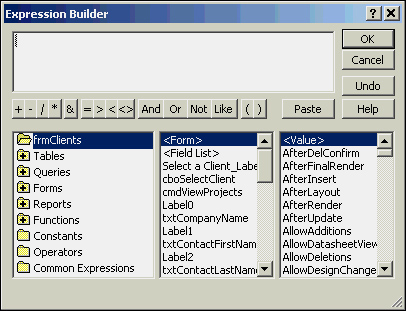
As mentioned in the previous section, a control can contain any valid expression as its control source. When entering an expression as a control source, the expression must be preceded by an equal sign. The control source can be manually typed, or you can use the Expression Builder to make the process easier.
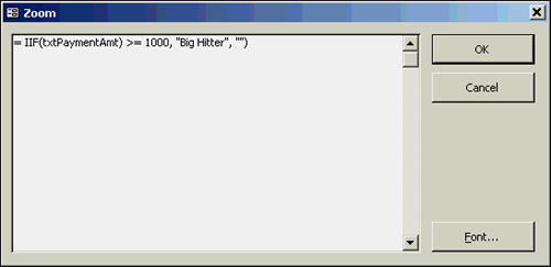
To add an expression to a control source, start by adding an unbound control to the form. To use the Expression Builder, click the control’s Control Source property, and then click the ellipsis. The Expression Builder appears. (See Figure 5.29.) In the list box on the left, select the type of object you want to include in the expression. The middle and right list boxes let you select the specific element you want to paste into your expression. The Expression Builder is useful when you’re not familiar with the specific syntax required for the expression. An expression can also be entered directly into the text box for the Control Source property. To view the expression more easily, you can use the Zoom feature (Shift+F2). The Zoom dialog box for the control source is pictured in Figure 5.30; the expression shown in the figure evaluates the PaymentAmount. If the PaymentAmount is greater than or equal to 1,000, the message “Big Hitter” is displayed; otherwise, nothing is displayed.
With the Command Button Wizard, you can quickly and easily add functionality to your forms. It writes the code to perform more than 30 commonly required tasks. The tasks are separated into record navigation, record operations, form operations, report operations, application operations, and other miscellaneous tasks. The Command Button Wizard is automatically invoked when a command button is added with the Control Wizards tool selected. The first step of the Command Button Wizard is shown in Figure 5.31; here, you specify the category of activity and specific action you want the command button to perform. The subsequent wizard steps vary, depending on the category and action you select.
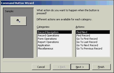
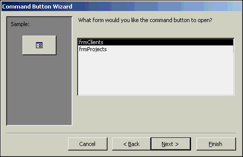
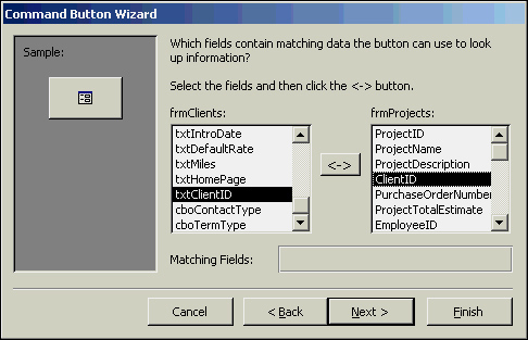
Figure 5.32 shows the second step of the Command Button Wizard when the Form Operations category and Open Form action are selected in the first step. This step asks which form you want to open. After selecting a form and clicking Next, you’re asked whether you want Access to open the form and find specific data to display, or whether you want the form to be opened and all records displayed. If you indicate that you want only specific records displayed, the dialog box shown in Figure 5.33 appears. This dialog box asks you to select fields relating the two forms. In the next step of the wizard, select text or a picture for the button. The final step of the wizard asks you to name the button.
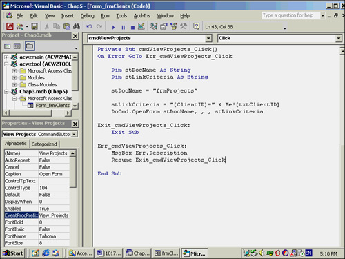
What’s surprising about the Command Button Wizard is how much it varies depending on the features you select. It allows you to add somewhat sophisticated functionality to your application without writing a single line of code. The code generated by the example just outlined is shown in Figure 5.34; it will make a lot more sense after you read the next couple chapters. The advantage to the code generated by the Command Button Wizard is that it can be fully modified after it’s written; this means that you can have Access do some of the dirty work for you, and then customize the work to your liking.
Many forms are based on more than one table. A form, for example, that shows a customer at the top and the orders associated with that customer at the bottom is considered a one-to-many form. Forms can also be based on a query that joins more than one table. Rather than seeing a one-to-many relationship in such a form, you see the two tables displayed as one, with each record on the many side of the relationship appearing with its parent’s data.
There are several ways to create one-to-many forms. As with many other types of forms, you can use a wizard to help you or build the form from scratch. Because all the methods for creating a form are helpful to users and developers alike, the available options are covered in this section.
Building a one-to-many form by using the Form Wizard is a simple, 10-step process:
Click Forms in the Objects list and double-click the Create Form by Using Wizard icon.
Use the Tables/Queries drop-down list to select the table or query that will appear on the one side of the relationship.
Select the fields you want to include from the one side of the relationship.
Use the Tables/Queries drop-down list to select the table or query that will appear on the many side of the relationship.
Select the fields you want to include from the many side of the relationship.
Click Next.
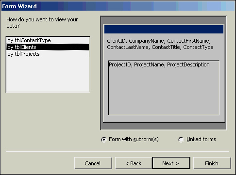
Select whether you want the parent form to appear with subforms or the child forms to appear as linked forms. (See Figure 5.35.) Click Next.
If you select the Subform option, indicate whether you want the subform to appear in a tabular format, as a datasheet, as a PivotTable, or as a PivotChart. (This option is not available if Linked forms was selected in step 7,) Click Next.
Select a style for the form; then click Next.
Name both the form and the subform and click Finish.
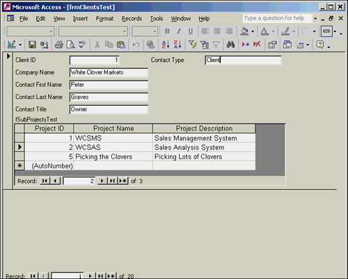
The result is a main form that contains a subform. An example is shown in Figure 5.36.
A one-to-many form can also be created by building the parent form; then adding a Subform/Subreport control, which is found in the toolbox. If you want to use the Subform/Subreport Wizard, make sure that the Control Wizards tool is selected before you add the Subform/Subreport control to the main form. Then follow these steps:
Click and drag to place the Subform/Subreport control on the main form; this invokes the Subform/Subreport Wizard.
Indicate whether you want to use an existing form as the subform or build a new subform from an existing table or query.
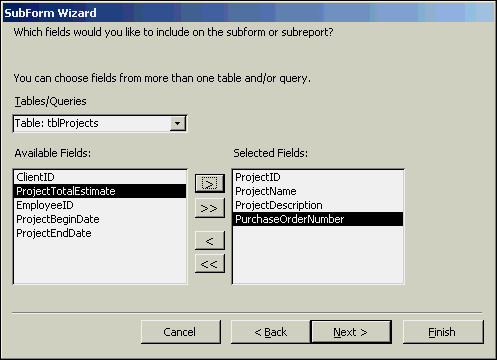
If you select Use existing Tables and Queries, the next step of the Subform/Subreport Wizard prompts you to select a table or query and which fields you want to include from it. (See Figure 5.37.) Select the fields; then click Next.
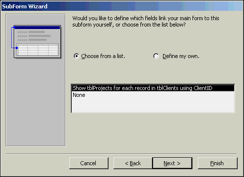
The next step of the Subform/Subreport Wizard allows you to define which fields in the main form link to which fields in the subform. You can select from the suggested relationships or define your own. (See Figure 5.38.) Select the appropriate relationship and click Next.
Name the subform and click Finish.
The resulting form should look similar to the form created with the Form Wizard. Creating a one-to-many form this way is simply an alternative to the Form Wizard.
Once a subform has been added, you need to understand how to work with it. To begin, familiarize yourself with a few properties of a Subform control:
Source Object: The name of the form that’s being displayed in the control.
Link Child Fields: The fields from the child form that link the child form to the master form.
Link Master Fields: The fields from the master form that link the child form to the master form.
You should also understand how to make changes to the subform. One option is to open the subform in a separate window (as you would open any other form). After closing and saving the form, all the changes automatically appear in the parent form. The other choice is to modify the subform from within the main form. With the main form open, the subform is visible. Any changes made to the design of the subform from within the main form are permanent.
The default view of the subform is Datasheet or Continuous Forms, depending on how you added the subform and what options you selected. If you want to modify the default view, simply change the subform’s Default View property.
Note
When the subform is displayed in Datasheet view, the order of the fields in the subform has no bearing on the datasheet that appears in the main form. The order of the columns in the datasheet depends on the tab order of the fields in the subform. You must therefore modify the tab order of the fields in the subform to change the order of the fields in the resulting datasheet.
Tip
Access 2002 now makes it easier to work with subforms and subreports in Design view. Scrolling has been improved so that it’s easier to design subforms and subreports. In addition, you can now open subforms in their own separate Design view window by right-clicking the subform and selecting Subform in New Window. Alternatively, instead of right-clicking the subform, you can select the subform and then click View|Subform in New Window from the menu bar.
One strategy when building forms is to base them on queries; by doing this, you generally get optimal performance and flexibility. Rather than bringing all fields and all records over the network, you bring only the fields and records you need. The benefits are even more pronounced in a client/server environment where the query is run on the server. Even in an environment where data is stored in the proprietary Access file format (.mdb) on a file server, a form based on a stored query can take better advantage of Access’s indexing and paging features. By basing a form on a query, you also have more control over which records are included in the form and in what order they appear. Finally, you can base a form on a query containing a one-to-many join, viewing parent and child information as if it were one record. Notice in Figure 5.39 that the client and project information appear on one form as if they were one record.
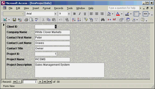
In earlier versions of Access, stored queries offered better performance than embedded SQL statements. This is because when a query is saved, Access compiles the query and creates a query plan, which has information on the best way to execute the query based on available indexes and the volume of data. In earlier versions of Access, if a form was based on an embedded SQL statement, the SQL statement was compiled and optimized each time the form was opened. With Access 2002 (as with Access 2000), embedded SQL statements are compiled just like stored queries. You might ask whether, with Access 2002, it is better to base a query on a stored query or on a SQL statement. My personal preference is as follows: If I plan to use the same or a similar query with multiple forms and reports, I build a query and base multiple forms and reports on that query. This keeps me from having to duplicate my efforts in building the query. If I have a query that is unique to the form, I build it as an embedded SQL statement. This eliminates the extra “clutter” of the query in the database container.
Note
A query plan can sometimes be inaccurate because the query plan optimizes the query based on the amount of data in the underlying tables. If the amount of data in the tables underlying a form changes significantly, it is necessary to rebuild the query plan. This can be accomplished by opening, running, and saving the query, or by compacting the database.
Microsoft has made it easier to develop Internet-aware applications by adding hyperlinks to forms and allowing you to save an Access form as HTML, XML, or a Microsoft Active Server Page (.asp), or in the Microsoft IIS 1-2 format. These features are covered in the following sections.
Hyperlinks can be added to unattached labels (labels not attached to a text box or other object), command buttons, and image controls. Once added, they let the user jump to a document (UNC) or Web page (URL) simply by clicking the control containing the hyperlink. To add a hyperlink to a label, command button, or image control, follow these steps:
Click to select the control.
View the control’s properties.
Select the Format tab of the Properties window.
Click in the Hyperlink Address property.
Click the build button (the ellipsis) to open the Insert Hyperlink dialog box. (See Figure 5.40.)
With Existing File or Web Page selected as the Link To option, you can enter a file path or URL in the text box or click Current Folder to locate a file or Web Page in the current folder. You can also click to insert hyperlinks to Browsed Pages or Recent Files. With Object in This Database selected as the Link To option, you can link to an object in the current database (see Figure 5.41). Select Create New Page to create a new data access page, and select Email Address to link to an email address.
Click OK to finish the process. The contents of the Link to File or URL combo box become the Hyperlink Address, and the object name becomes the Hyperlink SubAddress. (See Figure 5.42.)
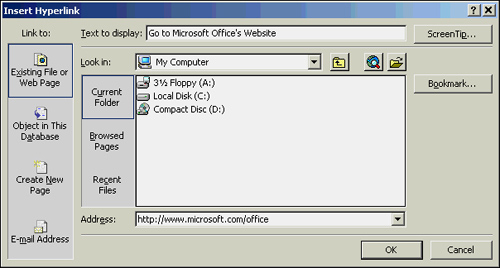
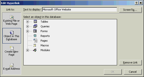
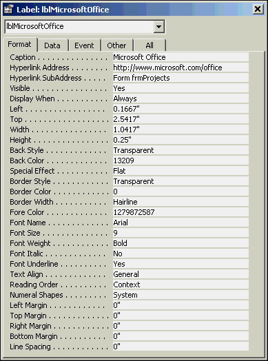
Tip
Using a hyperlink address to open an object in an Access database, rather than using the Click event of the command button and VBA code, allows you to remove the class module associated with the form (if that is the only procedure you need for the form), thereby optimizing the form’s performance.
Forms can be saved as HTML documents in one of two ways. The first method is to save a form as HTML by choosing File, Export (you can also right-click the form in the database container [Database window] and select Export). The Export Form dialog appears. Select HTML Documents (*.html*.htm) from the Save as Type drop-down. Enter a filename for the HTML document. If you want the system’s default browser to load after the HTML document is saved, click Autostart. Click Export. The HTML Output Options dialog box appears. If desired, click Browse to locate an HTML template file. Click OK to close the dialog box. Only the datasheet associated with the form is saved as HTML; the format of the form itself isn’t saved.
The other method is to choose File, Save As. Select Data Access Page from the As drop-down. Additional information about saving forms as HTML is included in Chapter 26, “An Introduction to Access and the Internet/Intranet,” and in Alison Balter’s Mastering Access 2002 Enterprise Development.
Forms can also be saved as XML by selecting the form within the database window (or by having the form open and in focus) and clicking File, Export from the menu bar. Choose XML Documents (*.xml) from the Save As type drop-down. Accept the default filename or specify a different filename and click Export All. Access generates three files: filename.htm, filename.xsl, and filename.xml. The .xsl file is the stylesheet for displaying the XML data. When you open the .htm file within a browser, the form is displayed with the data. If you open the .xml file within a browser, you are viewing the actual XML code.
Note
These topics, and others on creating Access applications for the Internet, are covered in more detail in Chapter 26 and in Alison Balter’s Mastering Access 2002 Enterprise Development.
Forms can also be saved as Active Server Pages or in the Microsoft IIS 1-2 format. Both of these options create dynamic forms. With Microsoft IIS 1-2, Microsoft Information Server uses the .HTX and .IDC files to build an .HTM file with the current data. The .IDC file contains data source information, including the data source name, username, password, and the query that returns the record source of the form being created. The .HTX file is an HTML file that includes merge codes indicating where the data being returned should be inserted. With Active Server Pages, Microsoft Internet Information Server also builds an .HTM file with the current data.
Here are the steps involved in creating the form:
Double-click Create form in Design view.
Activate the Data tab of the Properties window. Select the Record Source property and select tblClients as the Record Source. Although we will modify this form later in the book to be based on a query, for now it is based directly on the tblClients table.
Select the CompanyName, ContactFirstName, ContactLastName, ContactTitle, ReferredBy, AssociatedWith, IntroDate, DefaultRate, Miles, HomePage, and Notes fields from the field list. Drag and drop them to the form so they appear as shown in Figure 5.43.
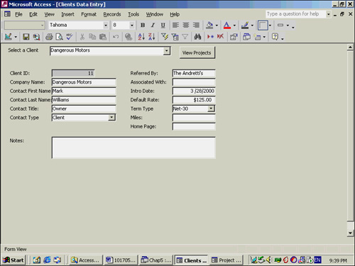
The next step is to add a combo box that allows the user to select the appropriate contact type for the client. The easiest way to accomplish the task is using the control wizards.
Make sure that the Control Wizards tool is selected.
Click to select a combo box from the toolbox. Then click and drag to add the combo box to the appropriate location in the detail section of the form. The Combo Box wizard launches.
Select I Want the Combo Box to Look Up the Values in a Table or Query. Click Next.
Select the tblContactType table from the list of available tables and click Next.
Select both the ContactTypeID and the ContactType fields and click Next.
Leave the Key column hidden, and size the ContactType column, if desired. Click Next.
Select Store that value in this field. Select ContactTypeID from the combo box and click Next.
Enter Contact Type as the text to appear within the label and click Finish.
Click the Data tab of the Properties window. Click the Row Source property and click the ellipsis to invoke the Query Builder.
Designate that you want the Contact Type field to appear in ascending order.
Close the Query Builder window and designate
Yes, you want to save changes made to the SQL statement and update the property.
You can add another combo box to the form, allowing the user to designate the terms for the client, with the following steps:
Make sure that the Control Wizards tool is selected.
Click to select a combo box from the toolbox, and click and drag to add it to the appropriate location in the detail section of the form. The Combo Box wizard launches.
Select I Want the Combo Box to Look Up the Values in a Table or Query. Click Next.
Select the tblTerms table from the list of available tables and click Next.
Select both the TermTypeID and the TermType fields and click Next.
Leave the Key column hidden, and size the TermType column, if desired. Click Next.
Select Store that value in this field. Select TermTypeID from the combo box and click Next.
Enter Term Type as the text to appear within the label and click Finish.
Click the Data tab of the Properties window. Click the Row Source property and click the ellipsis to invoke the Query Builder.
Designate that you want the Term Type field to appear in ascending order.
Close the Query Builder window and designate Yes, you want to save changes made to the SQL statement and update the property.
Take the following steps to refine the look and feel of the form:
Use the appropriate tools to size and align the objects to appear as in Figure 5.43.
Rename the objects per the naming conventions found in Appendix B (“txt” for text boxes, “cbo” for combo boxes, and so on).
Set the Dividing Line, Navigation Buttons, and Record Selector properties of the form to No. Set the Auto Center property to Yes.
Select View|Tab Order and set the tab order of the controls as appropriate.
Set the Caption property of the form to Client Data Entry.
Because the txtClientID is bound to an AutoNumber field, it is best to set its Locked property to Yes, its Tab Stop property to No, and its Back Color property to the same color as the background of the form.
The next step is to add a combo box to the form that allows the user to select the client whose data they want to view.
Select Form Header/Footer from the View menu.
Expand the header to make it large enough to hold the combo box and a command button that navigates to the frmProjects form.
Make sure that the Control Wizards tool is selected.
Click to select a combo box from the toolbox, and click and drag to add it to the header section of the form. The Combo Box wizard launches.
Select Find a record on my form based on a value I selected in my combo box. Click Next.
Select the ClientID, CompanyName, ContactFirstName, and ContactLastName fields as the Selected fields and click Next.
Size the columns as appropriate (keeping the Key column hidden) and click Next.
Type Select a Company as the text for the label, and click Finish.
Click the Data tab of the Properties window. Select the Record Source property and click the ellipsis to launch the Query Builder.
Change the Sort Order to sort the combo box entries by CompanyName, ContactFirstName, and ContactLastName.
Close the Query Builder window and designate Yes, you want to save changes made to the SQL statement and update the property.
Run the form and make sure that the combo box functions properly.
The next step is to design the Projects form. The projects form is pictured in Figure 5.44. The form is easily created with the form wizard and then customized. Here are the steps involved:
Select Forms from the list of objects in the Database window.
Double-click Create Form by Using a Wizard.
Select tblProjects from the Tables/Queries drop-down. This record source is modified in Chapter 9.
Click to select all fields and click Next.
Select Columnar from the list of layouts, and click Next.
Select a style of your choice, and click Next.
Title the form frmProjects and click Finish.
Switch to the form Design view. Delete the ProjectID and EmployeeID text boxes, and the ClientID combo box. Move and size the form objects so that the form appears as in Figure 5.44.
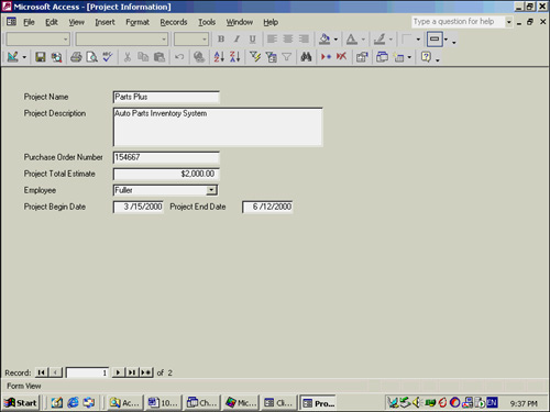
A combo box must be added for the EmployeeID.
Make sure that the Control Wizards tool is selected.
Click to select a combo box from the toolbox, and click and drag to add it to the appropriate location in the detail section of the form. The Combo Box wizard launches.
Select I Want the Combo Box to Look Up the Values in a Table or Query. Click Next.
Select the tblEmployees table from the list of available tables and click Next.
Select the EmployeeID, LastName, and FirstName fields and click Next.
Leave the Key column hidden, and size the LastName and FirstName columns, if desired. Click Next.
Select Store that value in this field. Select EmployeeID from the combo box and click Next.
Enter Employee as the text to appear within the label and click Finish.
Click the Data tab of the Properties window. Click the Row Source property and click the ellipsis to invoke the Query Builder.
Designate that you want the LastName and FirstName fields to appear in ascending order.
Close the Query Builder window and designate Yes, you want to save changes made to the SQL statement and update the property.
Take the following steps to refine the look and feel of the form:
Rename the objects per the naming conventions found in Appendix B (“txt” for text boxes, “cbo” for combo boxes, and so on).
Set the Dividing Line and Record Selector properties of the form to
No.Select View|Tab Order and set the tab order of the controls as appropriate.
Set the Caption property of the form to Project Information.
The final step is to tie the Clients form to the Projects form. The command wizard will help to accomplish the task.
Return to the frmClients form in Design view.
Make sure the Control Wizards toolbar button is active.
Click to select a command button and then click and drag to place it within the Header section of the frmClients form. The Command Button wizard launches.
Click Form Operations within the list of categories.
Click Open Form within the list of Actions and click Next.
Select frmProjects as the name of the form you would like the command button to open. Click Next.
Click Open Form and Find Specific Data to Display. Click Next.
Click to select the ClientID field from the frmClients form and the ClientID field from the frmProjects form. Click the <-> button to designate the fields are joined. Click Next to continue.
Select a picture or enter text for the caption of the command button.
Enter the name for the command button. Don’t forget to use proper naming conventions (for example, cmdShowProjects). Click Finish.
Switch from Design view to Form view and test the command button. The frmProjects form should load, displaying projects for the currently selected client.
Microsoft Access gives you rich, powerful tools you can use to build even the most sophisticated form. This chapter gives you an overview of what Access forms are capable of and shows you the many options you have for creating a new form.
Regardless of how a form has been created, you need to know how to modify all the attributes of a form and its controls. This chapter showed you how to work with form objects, modifying both their appearance and how they’re tied to data. Each control type and its properties were discussed in detail, and all the properties of the form itself were covered. Using the techniques in this chapter, you can control both the appearance and functionality of a form and its objects.