One of my favorite investment books is The Single Best Investment, by Lowell Miller.1 In it, he uses the term bouncing principal to describe the notion that a steady yield makes it acceptable for your principal to rise and fall (aka bounce) within a reasonable limit. He argues that being a successful investor isn’t about playing the market; it’s about being a partner in the enterprise and beyond.
In fact, says Lowell, it’s really about a “compounding machine that sits quietly off in the corner working for you while you go about your business. It’s about harnessing the true power of time and growth, the incredible accumulation of modest gains into enormous ones which is the essence of compounding.”
Compounding, Lowell aptly points out, “is the money that money makes, added to the money that money has already made. And each time money makes money, it becomes capable of making even more money than it could before!”
I couldn’t agree more. In this chapter, I’ll use this kind of mindset to show you how risky you should or shouldn’t be in the quest to have your money make money, so it can be added to the money that your money has already made. Let’s get to work finding the right mix of stocks, bonds, real estate, and cash so you can retire early and happy.
The Evolution of “Own Your Age in Bonds”
John Bogle is one of my favorite investors of all time. Born in 1929, Bogle is founder of The Vanguard Group, Inc. and president of Vanguard’s Bogle Financial Markets Research Center.
For years, Bogle had a rule of thumb to own your age in bonds. People tend to love it. It’s very simple, easy to remember, and it worked, so it has been ingrained in the minds of Americans for the last 20 years.
You’re 40 years old? Own 40 percent in bonds. Fifty? You know what to do.
It worked by slowly migrating you away from the riskiest part of your portfolio: stocks (i.e., the growth bucket). Thus, as you got closer to needing to use your money, you had less exposure to a big stock market crash or bear market stock correction.
The fact that bonds have provided a very respectable rate of return for the last three decades has made the “own your age in bonds” methodology a very smooth ride. Very simply, bonds have functioned as lower-risk, moderate return investments.
So, for much of this time, Bogle’s theory has been a memorable and useful way to think about your portfolio.
Take a look at the interest rate on the 10-year Treasury bond over the last 53 years (Illustration 9.1).
Illustration 9.1 10-Year Treasury Yield Chart 1960–2013
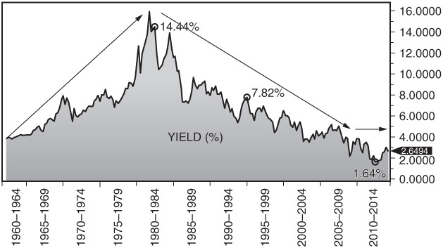
This graph charts the 10-year Treasury rate from 1960 to 2013. Rates rose from the 1960s to 1980 (14 percent) and fell from 1980 to the present. Now interest rates are moving sideways to higher.
As you can see in this chart, interest rates tend to move in long cycles. At this point in time, we’ve been in a three-decade cycle of steadily descending rates. In general (for the last 30-plus years), they’ve moved down, then sideways, then down, then sideways. It seems likely that in the next decade we’re in for the opposite kind of movement—interest rates moving sideways and up.
So the gusty tailwind that made “own your age in bonds” work for so many different reasons now feels more like a slight breeze at best, and maybe even a slight breeze in your face rather than at your back.
Let’s say you buy a 10-year Treasury bond today at 2.5 percent. In two years, the U.S. government might have to pay up to 4 percent to borrow money for 10 years. But it doesn’t matter: you’re still stuck with that meager 2.5 percent bond for the next eight years. The price of your bond will fall on paper to reflect that today’s new higher rates (4 percent) make its 2.5 percent rate from 2 years ago look less attractive to investors. That’s true for most bonds in a rising interest rate environment.
If a rising rate environment does happen, and you still want to own your age in bonds, you’ll be left with two options:
1. Sell your bonds at a lower price than you paid for them (mentioned earlier).
2. Hold onto your bonds and watch your price fluctuate before you finally get your full amount returned to you at maturity (provided the bond issuer doesn’t default).
Do either of those sound like good options? If not, it’s time to adjust your thinking. I’ve come to the conclusion that it’s no longer optimal to focus on owning your age in bonds. I hope John Bogle can forgive me!
Adjusting the Bogle: Own Your Age in Income
We all know there are many different ways to invest money. So what is the main reason we choose to hold bonds? For consistent income, right? It’s called interest—that’s what comes from bonds. It’s a simple, predictable piece of your portfolio that doesn’t have a lot of downside or risk.
If interest rates rise for the next 30 years and you still want to generate some sort of steady income while trying to maintain your principal, you’ll have to do something differently. You know that income comes from a lot of different places, not just bonds. So let’s have your new rule of thumb for the next couple of decades be “own your age in income.”
The 10-Year Treasury Rate
The 10-year Treasury rate is an important benchmark because nearly all of the nation’s borrowing rates are derived from this interest rate. In other words, wherever the 10-year Treasury rate lands, so goes the average mortgage rate, and so on.
The 10-year Treasury rate is also important because of people’s penchant for the safety of buying Treasury bonds.
What’s important here is finding the best rate to watch so that you can plan accordingly. This doesn’t always prove easy. Legendary economist John Kenneth Galbraith once stated: “The only function of economic forecasting is to make astrology look respectable.”
It’s a funny line because it contains a kernel of truth. Yet, some economic indicators are actually so reliable, and some patterns so established, that they can predict exactly what’s going to happen. Not convinced? Let’s look at some examples.
If oil prices rise from $80 to $90 a barrel, then gas prices are nearly certain to go up within a week or two. Most people only pay attention to the price of a tank of gas—not to its precursor. But West Texas Intermediate, a grade of crude oil used as a benchmark in oil pricing, is a reliable indicator of what you’ll pay at the pump.
The same goes for the mortgage market and the interest rate on the 10-year Treasury bonds. As oil is to gas, 10-year Treasury rates are to mortgage rates.
I’ve been studying the 10-year Treasury bond and its effect on markets since I started in the investment business. In early May 2013, the yield was 1.6 percent. So, if you were to buy a new bond at that level you would be paid 1.6 percent on your money each year for 10 years. At the end of 10 years, the government would pay you back your full principal.
By the end of May 2013, that rate had risen to more than 2.1 percent. That’s a full half percent. That may not seem like a lot, but it’s a 32 percent rise in interest rates in just a couple of weeks.
The reason? The Federal Reserve (the central bank for the entire U.S. banking system and economy) had begun to hint at slowing the monthly rate of their Treasury bond purchases (known as quantitative easing), including the 10-year Treasury bond.
Since the financial crisis, the Fed has done everything in its power to keep interest rates as low as possible. That has allowed rates on government bonds like the 10-year Treasury to drop well under 2 percent. (A rate of 4 percent is probably closer to normal at this point in time.) The Fed’s action has dropped mortgage rates to historic lows.
When the Fed lowers short-term rates, it ultimately leads the yield on the 10-year Treasury bond to drop. That causes mortgage rates to drop. You don’t have to be Alexander Hamilton to figure that out—it’s Economics 101. In April of 2012, the average 30-year mortgage was about 4 percent. Because rates (in 2013) stayed persistently low, the average 30-year mortgage a year later was under 3.5 percent!
Now, because the economy and the job and housing markets have recovered to some extent, the Fed may begin to slow down all the measures it has taken to keep rates low.
In May of 2013, rates on the 10-year Treasury shot up. Predictably, mortgage rates have already started following suit. As of March 31, 2014, the average 30-year mortgage stood at nearly 4.4 percent. That upward trend will likely continue.
Because mortgage rates have bounced back up to the 4 (plus) percent level, applications to refinance mortgages have already begun to drop. So, this may prove the end of the lowest mortgage rates in history. If you haven’t already refinanced an existing mortgage, the window may be closing on the balcony of the house you won’t get to own.
If you haven’t already bought a house, there may still be time to get a mortgage rate in the low 4 percent range—but don’t expect that opportunity to last forever.
Thinking of doing a refi? Don’t delay. Thinking of buying a home? Start shopping soon. All good things come to an end, and the incredibly low mortgage rates of 2013 and 2014 may soon be nothing but a distant memory.
The Legacy of Inflation: What It Means for You
Look again at Illustration 9.1. The chart shows us that from 1960 to the present, the 10-year Treasury rate started around 4 percent, and then it rose to 5, and then it was at 6, and it slowly continued up, then sideways, then up, then sideways, until at one point in 1981, the 10-year Treasury yield was 14 percent! This meant that if you bought a bond from the U.S. government, that bond paid you 14 percent a year. Cha-ching!
Why was it so high?
The reason was because we also had inflation at double-digit rates. Even though you might’ve been making 14 percent, if inflation was 10 percent during that short period of time, your real rate of return was only 4 percent. Less enthusiastic cha-ching . . .
You always have to factor in inflation when considering anything you do, but it’s even more critical with bonds because inflation is typically 1 to 3 percent and bonds usually pay 3 to 5 percent. Therefore, bonds—particularly government ones—typically only have a small amount of return in excess of inflation, while stocks have historically exceeded inflation fairly significantly.
In general, inflation’s a killer of everything. It just takes away your return no matter how you try to make money.
For the most part, from 1960 to 1981, interest rates rose and rose and rose and rose. If you were in the bond market during that time, you could buy bonds each year that paid more in interest than the bond you bought the year before.
Because of the inverse relationship between interest rates and bond price, this made for a tough environment (Illustration 9.2). If you bought a bond that yielded you 6 percent over 5 years and the following year that interest rate went up to 7 percent, buyers would be reluctant to pay you face value for your bond. If you did want to sell your 6 percent bond, most likely you’d have to sell it at a discount. We’ll talk more about this later.
Illustration 9.2 Bond Seesaw: The Inverse Relationship of Bonds and Interest Rates

You could make out really well or be ruined financially—it all depends on which side of the seesaw you’re sitting on.
Bond investors saw a lot of the same seesaw movement during this era. Interest rates kept going up and up and up, peaking at more than 15 percent in September of 1981. Since then, they’ve fallen fairly consistently over the last 30 plus years.
So the 10-year Treasury rate went from Mt. Everest in 1981 all the way down to the bottom of the ocean—1.6 percent—as of May 2013.2 Because of the inverse relationship bond prices have with interest rates, the last three decades have been good for the bond market. Primarily, they’ve done two things:
1. Paid you a nice interest rate
2. Maintained a price bias to the upside
In other words, bonds have had a tailwind for approximately 32 years because of the bond price to interest rate seesaw relationship. If you’ve been participating, not only have you gotten a coupon of 3, 4, or 5 percent on the bonds you hold, but if you held individual bonds, bonds ETFs, or bond mutual funds, you very likely saw some price appreciation as well.
Bonds have been an easy and wonderful place to invest (particularly from 1980 until early 2013) with relatively high, steady overall returns (from both income and appreciation) with much less volatility than the stock market.
The 50-50 Rule: Keep Half Your Portfolio in Growth and Half in Income
I like to think of Benjamin Graham’s 50-50 Rule as a starting point toward the balance of “buckets” in your portfolio.
Now, let’s take this 50-50 approach one step further. As your risk tolerance becomes more conservative over time (as you near retirement and have less stomach for large portfolio swings), it may make sense for you to systematically adjust the balance of your buckets—i.e., increase the percentage you have in the “lower volatility” income bucket and reduce the percentage you maintain in the alternative income and growth buckets. In fact, there’s an entire category of investment vehicles that attempt to do that for you.
Target date retirement funds do just that. For example, the Vanguard Target Retirement 2030 Fund adjusts its underlying asset mix between stocks and bonds over time.4 The closer you get to your target retirement date—the year 2030 in this case—the more conservative the mix of investments will become.
Over time, the percentage of stocks will go down and the percentage of bonds will go up. Today, a fund targeting your retirement in the year 2030 may have approximately 20 to 25 percent in bonds and the other 75 percent in stocks, both U.S. and international.
Let’s compare that to a 2015 fund. The Vanguard Target Retirement 2015 Fund does the exact same thing as the 2030, except that this one will have approximately 45 to 48 percent in bonds.
If this approach doesn’t appeal to you, you can always stick to the basics of Benjamin Graham’s philosophy. This means you essentially always keep a balance of half and half—approximately half invested in the growth bucket and half in the income bucket—keeping your life extra simple. If you have half of your portfolio invested in the stock side of the market when the economy’s doing well and the stock market’s on a tear, at least half of your assets will participate. Not bad.
Conversely, when the world looks scary, the economy is lagging, and the stock market is going down, half of your portfolio might feel the brunt of a stock market correction. The other half, however, the bond (income bucket) side of the equation, might very well be moving sideways, or possibly going up, thus reducing the overall volatility, bite, and downside pressure of your portfolio. In a manner of speaking, half of your portfolio is exposed to risk while the other half is safe in the storm cellar.
If you look at any U.S. stock market history chart, you will see tremendous growth—especially if the chart goes back to the 1920s. In fact, nearly any chart you look at that goes back nine or more decades will show growth in nearly every possible asset class you can think of. Large stocks, small stocks, international stocks, bonds, gold, housing prices—you name it—all have grown in price over time. And the further you look back in time, the greater the rise will seem when looking at where prices stand today.
To give you an idea of what $1 would have turned into had you invested it in 1926 (until the end of 2012), here’s how several different investment categories ended up (percentages below are in terms of average annual returns):
• U.S. small stock total return index—$1 turned into $18,365 (11.9 percent)
• U.S. large stock total return index—$1 turned into $3,533 (9.8 percent)
• U.S. long-term government bonds—$1 turned into $123 (5.7 percent)
• U.S. five-year fixed-term investment—$1 turned into $57 (4.8 percent)
• U.S. 30-day Treasury bills—$1 turned into $21 (3.5 percent)
• Inflation—$1 turned into $13 (3 percent)
So let’s say an alien from a faraway planet crash-landed on the corner of Broad Street and Wall Street on a Monday morning a few minutes before the NYSE’s opening bell. If he looked at these results and was asked what category he wanted to invest in, he would clearly say, “I want the first one on the list—U.S. small stocks. I want the one that makes the most.”
It’s very simple, right? Even this alien would understand it. And then if that option were not available to him, he’d choose the next best one. U.S. large stocks, right? From the list above, the U.S. large stock index has returned almost 10 percent per year.
Why should this be any different for you? (See Illustration 9.3.) Alien or not, the math is the same.
Illustration 9.3 Best and Worst Possible Investor Returns
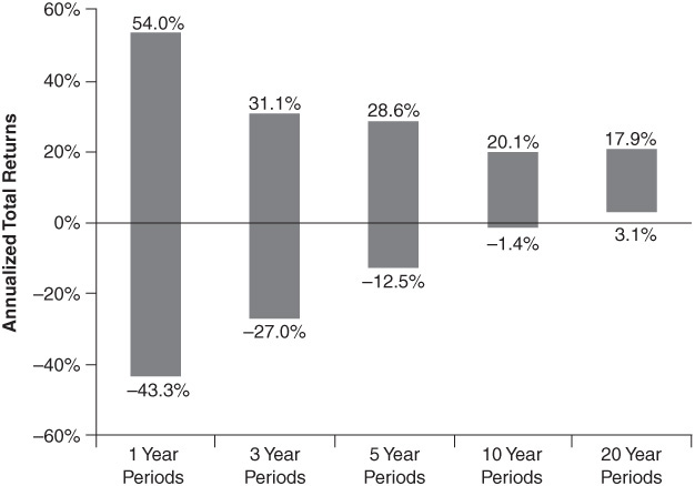
This chart shows the range of S&P returns over 1-, 3-, 5-, 10-, and 20-year holding periods.
Chart created by Strategas Research Partners. Used with permission.
Worst Five-Year Period
If you look at the absolute worst five-year period, from 1926 until 2011, your stock holdings in the S&P 500 could have dropped as much as 12.5 percent annually—provided that you purchased the S&P 500 at the beginning of its worst-ever five-year run. So, even over the course of roughly 85 years, a short five-year period of your money going in the wrong direction can take an extraordinarily difficult emotional and financial toll. This is especially true if you’re close to or in retirement.
The very thought of this makes investing your money purely in stocks seem very risky. The road to financial gain is fraught with dips, speed bumps, and land mines. During that terrible five-year period when numbers are down more than 12 percent per annum (or over 30 percent in aggregate), it’s very difficult to convince yourself to keep your investments all in the growth bucket (stocks, small stocks, etc.).
If you do, you’re going to have periods of time that feel like an eternity. Watching your investments fall 30-plus percent in five years—that’s pretty tough to stomach. You start to wonder if the days ahead are going to be just as gloomy. “Maybe this time,” you think, “America might not get out of its rut. Maybe this time the wars in the Middle East won’t end. Maybe we’re going to spiral into another dust bowl Great Depression.”
There’s always the worry of the unknown, and just because America has been a resilient nation in the past doesn’t mean the grim reaper won’t find us the next time. So it’s only natural for most investors to get nervous and anxious when the line dips south, and that’s why they don’t always have the stomach, fortitude, patience, foresight, and conviction to stay fully invested in stocks.
This is why it’s so important to keep in mind Illustration 9.4.
Illustration 9.4 The Behavioral Effect on Investor Returns
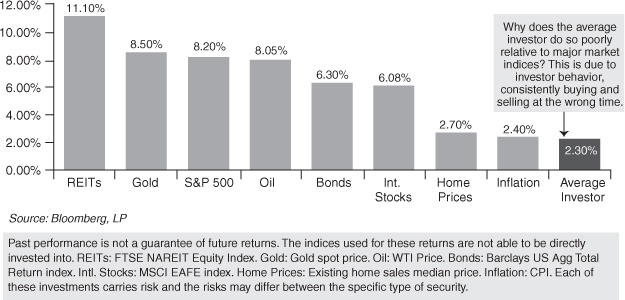
This chart, published by Capital Investment Advisors (using market data and research from DALBAR), depicts 20-year annualized returns between 1993 and 2012.
This chart is one of the most interesting pieces of research in the investment industry. Researched by Capital Investment Advisors (and the DALBAR research company), it shows that REITs (real estate investment trusts) were at 11.1 percent, the S&P 500 at 8.2 percent, oil at 8.05 percent, international stocks (EAFE) at 6.08 percent, bonds at 6.3 percent, and housing at 2.7 percent over the 20-year period from 1993 to 2012.
But here’s the kicker: the chart shows that, at 2.3 percent a year, the lowest returns belong to the Average Asset Allocation investor (shown to the far right).5 Even inflation, at 2.5 percent, was higher than the Average Asset Allocation fund investor return. Think that’s a bad sign? (Hint: the answer is yes.)
That 2.3 percent is a shockingly low number, considering nearly every major investable asset class is shown in this chart—all of which have done significantly better by themselves. (Actual investor returns were determined by analyzing mutual fund data.) One predominant theory as to why there is such a vast disparity between what “most investments” earn and what individuals earn has to do with individual investors buying, selling, and chasing the wrong asset class, consistently at the wrong time. These practices relate to emotionally “timing the market,” leading to the poor overall returns most individual investors are infamous for.
So what’s the answer? How do you as an investor not end up on the right-hand side of this infamous DALBAR chart? Keep the following three tips in mind:
• You need to have a careful combination of safety and risk.
• Have some of the steady asset classes mixed in with those terrifyingly volatile ones so that your overall financial trajectory is smoothed out.
• While one area of your investment portfolio does poorly in a given year, one or more of your areas should be increasing in value. As the value of one bucket begins to wane, the value of another bucket turns upward.
Counterbalance is what you’re looking for as an investor. You want to smooth out your ride as much as possible and balance those buckets.
The Wes Moss Risk Line Continuum
The easiest way to think of where you stand relative to the rest of the world, from an investment perspective, is to very simply look at the Wes Moss Risk Continuum in Illustration 9.5. You’ll see that CDs are on the far left side, at a risk level of 1. On the other end, the far right side, with a risk level of 10, sit the most aggressive and riskiest investments you can find.
Illustration 9.5 Wes Moss Risk Continuum
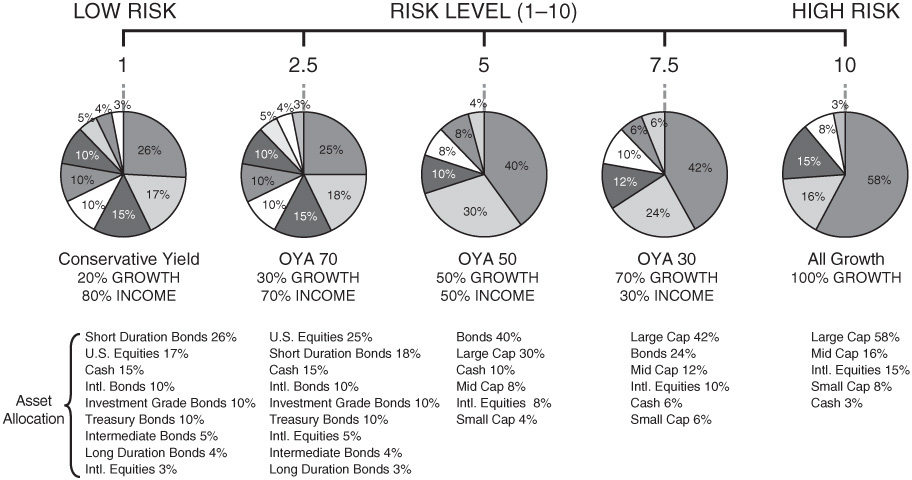
These pie charts show you five examples of different percentage amounts, on a range of preferred risk from 1 (very conservative) to 10 (very aggressive). Pie #1 is a very conservative example (1), Pie #2 is moderately conservative (2.5), Pie #3 is moderate (5), Pie #4 is moderately aggressive (7.5), and Pie #5 is fully aggressive (10).
If you are an investor occupying the area on the left, you are mostly invested in CDs and money market accounts. If you are an investor fully off to the right side of the continuum, you’ve invested 100 percent in stocks—particularly small stocks, emerging market stocks, and the most volatile areas of the entire global stock market.
Neither end of the spectrum is a good place to be in its own right. Just like everything else in the world, moderation and balance are king. You want to be somewhere along the continuum.
Here’s some information to help you decide where you fit on the continuum:
• I find that the happiest investors (particularly investors age 55 and up) are somewhere very close to the middle.
• More conservative investors who find themselves in the “don’t want to lose” camp rather than the “I want big gains” camp find themselves closer to the left side.
• Younger investors, ages 30 to 55, are typically happier closer to the right side.
The key here is that happy investors have an appropriate balance between all of the buckets I laid out in Chapter 8: cash, income, growth, and alternative income. They own various bonds in the income bucket, various stocks in the growth bucket, and various alternative investments in the alternative income bucket.
Find where you are comfortable now (knowing that can change or migrate over time), and try sticking to your personal balance as long as possible. Remember, balance is key, and time-in as an investor is your friend. If you find and implement the right balance for you, you are more likely to experience years and years of overall growth without getting thrown off the horse—and you might be able to retire sooner than you thought you could.
What About the Balance of My 401(k) Plan?
Accumulators—people in their thirties, forties, and fifties (who have decades for their money to last)—are well served by finding a pie-chart approach to the right of the center in Illustration 9.5, or between the 6 and 9 risk range.
If your main investment assets are in your 401(k) and you have 25 mutual funds to choose from, and every single one of them is set to reinvest dividends—as nearly all 401(k) plans are—then you’re adding to this portfolio every time one of your funds pays a dividend or income, in addition to the amount you save each month from your paycheck.
Again, I’m a believer in mastering the middle. So even for those of you in the younger “accumulator” stage, unless you possess great fortitude and are okay with markets going up and down significantly, 10 to 30 percent in any given year, then you don’t necessarily want to be at 10 on the risk continuum.
What if you’re not an accumulator, and you need to live off of your money now? Then you are officially in the “distribution stage,” otherwise known as a distributor. Distributors are primarily in or near retirement—ages 60 and up—and are typically happier between a 2.5 and 7.5 on the risk scale. They tend to put a huge focus on the amount of predictable income that is generated each year from their portfolio. Remember: it’s your portfolio’s cash flow that is the predictable part, not the direction of the stock or bond market.
Calculating Your Overall Investment Return: Yield + Gain/Loss
By now, you’re probably sick of the $10 example, but let’s do a super speedy review. You can invest your $10 in two different ways: either it can grow a dollar a year for 10 years, leaving you with $20, or it can pay you a dividend of a dollar a year, also leaving you with $20. Either way you end up in the same place, but you arrive there through very different vehicles of investment.
The all-growth example is a 10 on the risk line continuum. This method works well if you have a perfect and steady return. But in the real world, the waters aren’t usually so calm. You may have a plus 10 percent year, then a minus 15 percent year, then a plus 5 percent year, followed by a minus 3 percent year. So there’s little steadiness to an all-growth approach and no reliability in the short term. That makes this method easy to abandon on an emotional level. It’s hard to see your hard-earned money fluctuate so much.
On the other hand, if you target a certain yield or income through the DID (dividends, interest, distribution) approach we discussed in Chapter 7, you will know your cash flow or percentage yield at the beginning of every year. In this case, you can target your overall income-only yield (3, 4, or 5 percent), adjust your bucket balance accordingly, and make sure the components inside of each bucket are doing their job of generating steady cash flow.
Remember, on average your income bucket should yield in the 3 to 5 percent range, growth bucket in the 2 to 4 percent range, and the alternative income bucket in the 6 percent range.
Here’s an example of targeting on overall portfolio yield:
Balance of the buckets:
• 55% income
• 30% growth
• 15% alternative income
Yield (only) per bucket:
• Income bucket: 4%
• Growth bucket: 3%
• Alternative income bucket: 6%
Here’s what the math looks like:
Income 55% × 4% yield
Growth 30% × 3% yield
Alternative income 15% × 6% yield
= 4.00% yield
Next Example. Now, shift your bucket percentages a bit to the following, assuming the same level of yield for each bucket, and your yield changes.
Balance of the buckets:
• Income bucket: 50%
• Growth bucket: 40%
• Alternative income bucket: 10%
And here’s the overall yield:
Income 50% × 4% yield
Growth 40% × 3% yield
Alternative income 10% × 6% yield
= 3.8% overall yield
Again, what we are solving for here is only the yield part of the equation. One common misconception is that the yield part of the bucket equation is your only return. That’s not the case. The yield (cash flow) is the predictable part of the equation. Whether you also will get appreciation out of each bucket (namely the alternative income and growth buckets) largely depends on the economy and stock market in general.
Your overall investment return should be a combination of your yield (the predictable part) plus the appreciation (or depreciation, aka gain/loss) in the value of the securities that reside in each bucket. So let’s take the overall portfolio yield of 3.8 percent from the preceding example and subject it to an additional equation:
The gain/loss of the underlying investments in each bucket:
• Income bucket: 1%
• Growth bucket: 8%
• Alternative income bucket: 3%
(50% × 1% gain) + (40% × 8% gain) + (10% × 3 % gain) = 4% overall gain
Now, to calculate the overall investment return, here’s what the math looks like:
overall investment return = yield + gain/loss
So in this case:
3.8% + 4% = an overall investment return of 7.8%
Now 7.8 percent is a number I can stand behind!
Finding Yourself on the Risk Continuum
Let’s say you buy into the bucket approach to income investing. Clearly, you must be a smart and happy person! So, what’s next? Consider these three questions:
1. How much time do you have until you need to live off of the money (distribution phase)?
2. What percentage do you allocate to each bucket?
3. What’s the risk associated with the balance that you choose?
This goes back to my continuum. It’s a great starting point for understanding your personal balance.
If you are 40, how much time do you have as an investor? Well, unless you’ve been a power-saver since the age of 20, you have roughly 20 to 25 years before you’ll likely be in a position of complete financial freedom, having the ability to retire. Then you’ll have another 20 to 25 years in retirement. This means you will effectively have a half-century of investing in front of you.
A half-century is a long time horizon. Just remember this before you decide on the balance of your buckets. More years as investor means you will have more time to participate when our economy and stock market has good years. So unless you are completely afraid of taking any risk whatsoever, make sure you don’t ignore the growth bucket, even if it’s the most volatile bucket of the four.
“Anything less than a 10-year horizon is just speculation.”
—John Bogle
The quote above is one my favorite investment quotes of all time. I realize that the quote might sound a little idealistic, but not when taken within the context of the turbulent stock market and the economy we experienced (aka: suffered) from 2000 to 2010.
Yet, it is difficult for us as humans to think ahead 50 years. Like all animals, we have that day-to-day survival instinct deep inside of us. That instinct was crucial when we were still running from lions. Unfortunately, it doesn’t serve us quite as well amongst the wolves of Wall Street.
Investing is truly something that should be done over your entire lifetime. Ten years can admittedly sound like a heck of a long time today, but not once you take a step back and think about the fact that you’re 30, 40, or 50, and might live until you’re 90 or 100!
Age-Old Advice: A By-the-Decade How To
If you want some age-old advice on how to balance your buckets, follow my by-the-decade suggestions below:
At Age 40
Put 30 percent in your income bucket, 60 percent in the growth bucket, and 10 percent in the alternative income bucket.
How much of this pays “income”? Great question. One hundred percent of the income bucket pays income—that means 30 percent of your portfolio. One hundred percent of the alternative income bucket pays some sort of income, so that’s another 10 percent. That puts us at 40 percent, which means you own your age in income. Mission accomplished!
From there, 50 percent of the growth bucket should be dividend-paying stocks that pay income. That 50 percent in “dividend income” that comes from the growth bucket equals another 30 percent of your total portfolio paying you an income stream, which means another full 30 percent of your overall portfolio is paying you some level of income. All of a sudden, despite only being 40 years old, 70 percent of your assets are giving you income to some degree. While you’ll actually be reinvesting, and reinvesting, and reinvesting that income for many years to come, it’s still very exciting to see that you’ll be able to get used to a consistency of cash flow.
At Age 50
Put 40 percent in the income bucket, 50 percent in the growth bucket, and 10 percent in the alternative income bucket.
Again, which parts are paying you income? One hundred percent of the income bucket, 100 percent of the alternative income bucket, and two-thirds of the growth bucket. Added all up, that means 83 percent of your portfolio is paying you an income.
At Age 60
Put 45 percent in the income bucket, 45 percent in the growth bucket, and 10 percent in the alternative income bucket.
At this point, we don’t even have to do any math because I want 100 percent of your portfolio to be paying dividend-paying income.
For the rest of your life, age 60 and above, you should be a 100 percent income investor. I love that rule! Everything should pay you an income. Let’s make that your mantra here. Everything should be paying you an income from age 60 on. Obviously, there are no absolutes, but if you stick to this mindset, you’ll be glad you did.
If You Don’t Like Your Risk, Modify It
Many of the examples listed above fall into the “moderate risk” category, anywhere from a 4 to a 7.5 on the risk continuum. How do you change that? Well, there are two ways to increase or modify the risk and expected return of your portfolio.
1. Shift a higher percentage from the income bucket over to the riskier buckets. The growth bucket or alternative income bucket. The less you put in the income bucket, the less predictable, steady, and contained your overall returns will be. The upside goes up, but so does the downside.
2. Change the risk/reward scenario. The risk and volatility perspective of your overall portfolio also adjusts due to the components you use inside your buckets.
If you decide on a percentage to put in a bucket—for example, 50 percent into the growth bucket—what does that composition look like? Should you own stocks like Apple, or is it better to own utility stocks like Southern Company? Looks like we’d better explore. Down into the bucket we go!
Into the Bucket: Taking a Look at Stock Categories
Inside the growth bucket, you have all kinds of different stock categories to choose from. The main categories are U.S., international, and emerging markets stocks. Within the U.S. category, you can use large stocks, small stocks, and midsize stocks. On the more conservative side of the ledger, you would gravitate toward larger companies that are less cyclical (referred to as noncyclicals).
I mentioned these previously when speaking about industries in the SHUT index—staples (consumer staple type companies like Procter & Gamble, Colgate, Clorox, Coca-Cola), healthcare companies (Eli Lilly and Bristol-Myers Squibb), utility companies (Consolidated Edison and Southern Company), and telecommunications (AT&T and Verizon).
These companies are within sectors that are not as highly impacted when the economy fluctuates when compared to more cycle sectors (I’ll explain these in a minute). For instance, in a bad economy you still run your heater when it’s cold, drink Diet Coke, and use Clorox bleach with your laundry.
These areas of the economy just don’t fluctuate much—they aren’t very cyclical. Hence, these are industries we consider to be noncyclicals. Sounds amazing, right? Why don’t we all just buy those? Well, they often don’t have as much growth potential.
I like to use Southern Company as an example. It’s a conglomerate of power companies in multiple states: Georgia, Mississippi, Alabama, and Florida. For our purposes, let’s use Georgia.
Southern Company already supplies the power for most customers in the entire state of Georgia. Are they able to double their sales in the way a company like Apple could by coming out with a new product? The answer is no. They are reliant upon people moving to Georgia to use the service they are already providing. Quite frankly, it’s very difficult for them to increase or decrease their revenue significantly in any given period. They are a staple in your budget, and their investment value reflects that fact.
To compensate for slower rates of growth, noncyclical companies tend to pay out more of the profits they generate in the form of stock dividends. Hence, you see that one of the highest-paying sectors in stock market is utility companies. They pay anywhere from 3.5 to 5 percent in dividend yield. Not too shabby.
Conversely, think of the more cyclical areas of the economy and stock market. Again, remember my acronym—MEDFIT (materials, energy, discretionary, financials, industrials, and technology).
As an example, I like to look at home builders, who are part of a highly cyclical industry. In 2005 or 2006, did you know any contractors who were out of work? Probably not. New housing starts were running at a pace of over 2 million new homes built annually in America (by 2006). During the Great Recession and housing collapse, that number went down to about 400,000 homes. So we had a 75 to 80 percent drop. Think all those contractors were still working? Nope.
Now imagine the impact that had on housing stocks! Yikes. Like home building, pure growth companies like Google, Amazon, and Facebook can have delicious upsides, but if they go out of favor, imagine what can happen to their stock.
For some context: in 2007 when nearly everyone’s smart-phone was a BlackBerry, BlackBerry stock soared above $200 a share (from about $20 a share in 2003). As I write this book, BlackBerry trades around $6 a share. So $20 to $200, then down to $6. That’s cyclical. (Not to mention bad news for BlackBerry.)
Bonds in the Bucket
In the income bucket, what kind of bonds should you own? There are many kinds of bonds, and not all are created equal. Let’s differentiate between some of the types so you can decide which ones make sense for you.
Some bonds available yield less than 1 percent (short-term Treasuries) and others yield nearly 20 percent (bonds issued by some car and insurance companies, for example). So which do you select? The answer is somewhere in between. Here are some bond-oriented income strategies you can combine to find a happy medium.
Investment-Grade Corporate Bonds
Investment-grade corporate bonds are debt instruments issued by corporations to raise money for various reasons. They are IOUs to you as an investor from the company issuing them, with a promise of a coupon payment each month, quarter, or year, and a promise to pay the original issue amount back at maturity. Investment-grade means that the rating agencies have given that bond a minimum rating of BBB or above (ratings from agency to agency may vary).
Over the past 10 years or so, these bonds have yielded (on average) about 1.5 percent more than government-issued debt (Treasuries), but at times can have significantly higher yield than Treasuries, sometimes 2 to 4 percent above. This will depend heavily on the interest rate and economic environment. You can hold these bonds directly as individual bonds, through bond ETFs or index funds, or use an actively managed bond mutual fund.
High-Yield Corporate Bonds
High-yield corporate bonds (familiarly called junk bonds) are corporate-issued debt with a credit rating below BBB. Although the phrase “junk bond” doesn’t leave most investors feeling cozy at night, strategic use of high-yield bonds can enhance your income—and if owned in a diversified manner—through the use of an ETF (exchange-traded fund) or mutual fund—the risk can be greatly mitigated.
Due to their lower credit rating, high-yield bond issuers pay a premium yield compared to government and investment grade debt. High-yield bonds may pay you a great deal of interest but carry heavy default risk, and even though you may receive a very high level of interest (5 percent to 8 percent and even higher), the price of your bond may drop or even go to zero if the issuer/company goes belly up. Consider hedging your default risk by owning an ETF or mutual fund with hundreds of underlying positions rather than just owning a handful of individual high-yield bonds.
Municipal Bonds
Municipal bonds are debt instruments issued by local governments to fund the cost and operation of basic public services and projects such as water/sewer projects, toll facilities, roads, bridges, hospitals, and other municipally funded operations. Typically, the interest payments you get from these bonds are funded by the people who use the services: drivers paying tolls, families paying their water/sewer bill, and various state and local taxes.
Municipal bonds are unique because they typically offer yields exempt from federal and state taxes (provided you live in the state of issuance). Given the tax-free interest on these bonds, investors in high tax brackets (the 33 or 39.6 percent brackets) are often able to “keep” more of their income when compared to similar corporate bonds whose interest is whittled down due to taxes.
Municipals are rated by agencies just like corporate bonds and carry varying default risks depending on the issuer. However, think about what it would take for people to stop paying their taxes, tolls, or their utility bills. As my grandmother always said, “People always pay the sewer bill when the toilet bowl starts backing up!”
TIPS
You might also consider Treasury inflation-protected securities (TIPS). We talked briefly about these in the last chapter: they are issued by the U.S. government and attempt to provide three things: safety, yield, and protection against rising future costs (inflation). TIPS are auctioned by the government several times a year, depending on maturities, and are kept at fixed interest rates.
Your TIPS will pay you a consistent yield over time (depending on the maturity) and adjust for inflation. If CPI (the consumer price index) starts going through the roof, never fear: your TIPS will adjust upward. In the event of deflation (where CPI actually goes down), your TIPS will have a negative adjustment. They are traded in the open market, which leaves their price subject to fluctuation. Without having to go directly to the Treasury to purchase TIPS, look at the Barclay’s index ETF (TIP) or Vanguard’s TIP mutual fund (VIPSX).
I Bonds
I Bonds work similarly to TIPS and are issued directly by the Treasury, but as an individual you can only buy $10,000 worth of I Bonds in a given year. Instead of a specific maturity, they work on an accrual basis, accumulating interest until you choose to cash them in.
Yields now on I Bonds can be pretty low, sometimes lower than 1 percent, but there will be more to the story as I Bonds adjust for inflation, moving up in line with the consumer price index (CPI). So if CPI was at 4 percent, an I Bond owner with a 1 percent interest rate would receive 1 percent plus the 4 percent adjustment for a grand total of 5 percent. Not bad for a government bond.
Floating Rate Bonds
These are a form of corporate or high-yield bonds that have flexible interest rates. This makes them very different from most of the other bond categories. Because the interest paid to you can “float,” it means that as interest rates migrate up over the next five years (or more)—as I expect them to do—you are not locked into an exceedingly low interest rate. If interest rates in general migrate higher over the next several years, floating rate bonds have a good chance of avoiding the negative impact of the bond-price to interest-rate seesaw effect.
My Advice on How Best to Diversify
You should own a diverse basket of “bonds” depending on your needs and risk tolerance. Conservative investors who place safety over yield should put their emphasis on corporate bonds, high-quality municipal bonds, and government-issued TIPS, while more aggressive income investors could choose to focus on corporate, high-yield, and floating rate bonds as they seek higher yields.
It’s important to note that diversification is key with all types of bonds. That’s why I recommend broadly diversified exchange-traded funds (ETFs) and actively managed corporate and municipal funds with ultra-low internal fees.
Whether you prefer stocks or bonds, cyclicals or noncyclicals, TIPS or high-yield bonds, MLPs stocks or floating rate bonds, REITs or Energy Royalty Trusts, or any of the other countless investment vehicles, always keep in mind the balance between risk, safety, and reward.
Some risks are worth it, but only be as risky as you have to be. Investing is simple, not easy. Success in any field, including investing, takes time—you can’t sprint a marathon. Find the pace that’s right for you, and let it carry you toward an early retirement.