
Chapter 16
Rigorous Empirical Evaluation
Analysis
If it ain’t broke, it probably doesn’t have enough features.
– Anonymous
Objectives
After reading this chapter, you will:
1. Be able to analyze informal summative (quantitative) usability data, compare results with usability targets, and decide whether you can stop iterating
2. Have the working knowledge to analyze formative (qualitative) critical incident and UX problem data
3. Know how to perform cost-importance analysis to prioritize UX problems to fix
16.1 Introduction
16.1.1 You Are Here
We begin each process chapter with a “you are here” picture of the chapter topic in the context of the overall Wheel lifecycle template; see Figure 16-1. This chapter is about analyzing data collected during evaluation.
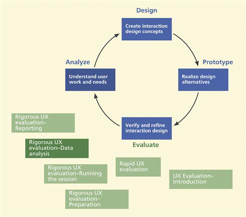
Figure 16-1 You are here; at data analysis, within the evaluation activity in the context of the overall Wheel lifecycle template.
The focus of research and practice has slowly been shifting away from methods for usability data collection and comparisons of those data collection methods to issues about how best to use data generated or collected by these methods (Howarth, Andre, & Hartson, 2007). So, now that we have data, what’s next?
16.2 Informal summative (quantitative) data analysis
As we have said, the quantitative data analysis for informal summative evaluation associated with formative evaluation does not include inferential statistical analyses, such as analyses of variance (ANOVAs), t tests, or F tests. Rather, they use simple “descriptive” statistics (such as mean and standard deviation) to make an engineering determination as to whether the interaction design has met the UX target levels. If the design has not yet met those targets, qualitative analysis will indicate how to modify the design to improve the UX ratings and help converge toward those goals in subsequent cycles of formative evaluation.
Iteration can seem to some like a process going around in circles, which can be scary to managers. As we will see later, your informal summative analysis, coupled with your UX targets and metrics, is a control mechanism to help managers and other project roles know whether the iterative process is converging toward a usable interaction design and when to stop iterating.
16.2.1 Lining up Your Quantitative Ducks
The first step in analyzing quantitative data is to compute simple descriptive statistics (e.g., averages) for timing, error counts, questionnaire ratings, and so on, as stated in the UX targets. Be careful about computing only mean values, though, because the mean is not resistant to outliers and, therefore, can be a misleading indicator. Because we are not doing formal quantitative analysis, the small number of participants typical in formative evaluation can lead to a mean value that meets a reasonable UX target and you can still have serious UX problems.
It may help to include standard deviation values, for example, to indicate something about the rough level of confidence you should have in data. For example, if three participants are all very close in performance times for a particular task, the numbers should give you pretty good confidence, and the average is more meaningful. If there is a big spread, the average is not very meaningful and you should find out why there is such a variance (e.g., one user spent a huge amount of time in an error situation). Sometimes it can mean that you should try to run a few more participants.
After you compute summary statistics of quantitative data, you add them to the “Observed Results” column at the end of the UX target table. As an example, partial results from a hypothetical evaluation of the Ticket Kiosk System are shown in Table 16-1 using some of the UX targets established in Table 10-10.
Table 16-1 Example of partial informal quantitative testing results for the Ticket Kiosk System
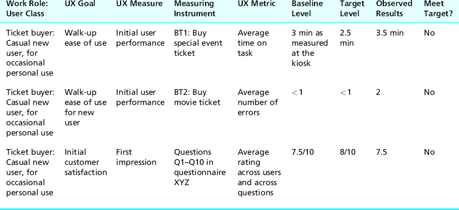
Next, by directly comparing the observed results with the specified UX goals, you can tell immediately which UX targets have been met, and which have not, during this cycle of formative evaluation. It is useful to add, as we have done in Table 16-1, yet one more column to the right-hand end of the UX target table, for “Did you meet UX target?” Entries can be Yes, No, or Almost.
In looking at the example observed results in Table 16-1, you can see that our example users did not meet any of the UX target levels. This is not unusual for an early evaluation of a still-evolving design. Again, we stress that this was only informal summative analysis—it cannot be used anywhere for claims and cannot be used for any kind of reporting outside the UX group or, at most, the project team. It is only for managing the iterative UX engineering process internally. If you want results from which you can make claims or that you can make public, you need to do (and pay for) a formal summative evaluation.
Not All Errors Are Created Equal
Andrew Sears, Professor and Dean, B. Thomas Golisano College of Computing and Information Sciences, Rochester Institute of Technology
As we design and evaluate user interfaces, we must decide what metrics will be used to assess the efficacy of our design. Perhaps the most common choices are the speed–error–satisfaction triad that we see used not only in usability studies but also in more formal evaluations such as those that appear in scholarly journals and conference proceedings. After all, a fast system that leads to many errors is not particularly useful, and even a fast and error-free system is not useful if nobody will use it (unless you are dealing with one of those less common situations where users do not have a choice).
If we accept that each of these aspects of usability should be considered in some form and define how each will be assessed, we can begin to evaluate how well a system performs along each dimension, we can introduce changes and evaluate the impact of these changes, and we can fine-tune our designs. There are many techniques that help usability engineers identify problems, including approaches that result in problems being classified in one way or another in an effort to help prioritize the process of addressing the resulting collection of problems. Prioritization is important because there may not be time to fix every problem given the time pressures often experienced as new products are developed. Prioritization is even more important when one considers the variable nature of the “problems” that can be identified when using different evaluation techniques.
While the severity of a problem may be considered when deciding which problems to fix, the focus is typically on eliminating errors. However, through our research with several error-prone technologies, it has become clear that focusing exclusively on eliminating errors may lead to less than optimal outcomes. These technologies, including speech and gesture recognition, can produce unpredictable errors that can result in dramatically different consequences for the user of the system. It was in this context that we began to rethink the need to eliminate errors. This shift in focus was motivated, in part, by the fact that we could not necessarily eliminate all errors but we noticed that there were opportunities to change what happened when errors did occur. It was also motivated by the observation that people are really quite good at processing input where some details are missing or inaccurate. Perhaps the simplest example would be when you are participating in a conversation, but the person you are talking to mumbles or background noise masks a few words. Often, it is possible to fill in the gaps and reconstruct what was missed originally.
Two specific examples may be useful in seeing how these ideas can be applied when designing or redesigning information technologies. The first example considers what happens when an individual is interacting with a speech-based system. At times, the speech recognition engine will misinterpret what was said. When using speech to navigate within a text document, such errors can result in a variety of consequences, including ignoring what was said, moving the cursor to the wrong location, or even inserting extra text. Recovering from each of these consequences involves a different set of actions, which require different amounts of work. By recognizing that an error has occurred, and using this information to change the consequences that an individual must overcome, we can improve the usability of a system even without eliminating the error. At times, a slightly higher error rate may be desirable if this allows the severity of the consequences to be reduced sufficiently. This example is explored in more depth by Feng and Sears (2009). This article discusses the issue of designing for error-prone technologies and the importance of considering not only the number of errors users encounter but the severity of the consequences associated with those errors.
A second example looks at the issue of taking notes using mobile technologies. The process of entering text on mobile devices is notorious for being slow and error prone. If someone tries to record a brief note while correcting all errors, the process tends to be sufficiently slow to discourage many individuals. At the same time, people tend to be quite good at dealing with many different types of errors. Because these brief notes tend to be used to remind the user of important details, having an error-free note may not be that important as long as the erroneous note is sufficient to remind the user of the information, event, or activity that inspired them originally to record the note. Our studies found that a note-taking mechanism that did not allow users to review and correct their notes could allow users to recall important details just as effectively as error-free notes while significantly reducing the time they spent recording the note. Dai et al. (2009) explore this example in more detail, showing how users can overcome errors.
Errors are inevitable, but not all errors result in the same consequences for the user. Some errors introduce significant burdens, creating problems that the user must then fix before they can continue with their original task. Other errors may be irritating, requiring users to repeat their actions, but do not introduce new problems. Still other errors may be annoying but may not prevent the user from accomplishing his or her task. Understanding how an error affects the user and when there are opportunities to reduce the consequences of errors (sometimes this can involve increasing the number of errors but still results in an overall improvement in the usability of the system) can allow for more effective systems to be designed even when errors cannot be prevented.
References
1. Dai L, Sears A, Goldman R. Shifting the focus from accuracy to recallability: A study of informal note-taking on mobile information technologies. ACM Transactions on Computer-Human Interaction. 2009;16(1), 46 Pages.
2. Feng J, Sears A. Beyond errors: Measuring reliability for error-prone interaction devices. Behaviour and Information Technology. 2009;29(2):149–163.
16.2.2 The Big Decision: Can We Stop Iterating?
Now it is time for a major project management decision: Should you continue to iterate? This decision should be a team affair and made at a global level, not just considering quantitative data. Here are some questions to consider:
![]() Did you simultaneously meet all your target-level goals?
Did you simultaneously meet all your target-level goals?
![]() What is your general team feeling about the conceptual design, the overall interaction design, the metaphor, and the user experiences they have observed?
What is your general team feeling about the conceptual design, the overall interaction design, the metaphor, and the user experiences they have observed?
If you can answer these questions positively, you can accept the design as is and stop iterating. Resource limitations also can force you to stop iterating and get on with pushing this version out in the hope of fixing known flaws in the next version. If and when you do decide to stop iterating, do not throw your qualitative data away, though; you paid to get it, so keep this round of problem data for next time.
If your UX targets were not met—the most likely situation after the first cycle(s) of testing—and resources permit (e.g., you are not out of time or money), you need to iterate. This means analyzing the UX problems and finding a way to solve them in order of their cost and effect on the user experience.
Convergence toward a quality user experience
Following our recurring theme of using your own thinking and experience in addition to following a process, we point out that this is a good place to use your intuition. As you iterate, you should keep an eye on the quantitative results over multiple iterations: Is your design at least moving in the right direction?
It is always possible for UX levels to get worse with any round of design changes. If you are not converging toward improvement, why not? Are UX problem fixes uncovering problems that existed but could not be seen before or are UX problem fixes causing new problems?
16.3 Analysis of subjective questionnaire data
Depending on which questionnaire you used, apply the appropriate calculations for the final scores (Chapter 12).
16.4 Formative (qualitative) data analysis
Our friend Whitney Quesenbery gave us this nutshell digest of her approach to usability problem analysis, which she in turn adapted from someone else:
The team usually includes all the stakeholders, not just UX folks, and we rarely have much time. First, we agree on what we saw. No interpretation, just observation. This gets us all on the same page. Then we brainstorm until we agree on “what it means.” Then we brainstorm design solutions.
16.4.1 Introduction
Formative analysis of qualitative data is the bread and butter of UX evaluation. The goal of formative data analysis is to identify UX problems and causes (design flaws) so that they can be fixed, thereby improving product user experience. The process of determining how to convert collected data into scheduled design and implementation solutions is essentially one of negotiation in which, at various times, all members of the project team are involved. In the first part of qualitative analysis you should have all your qualitative data represented as a set of UX problem instances so that you can proceed with diagnosis and problem solutions.
Problem Instance (UX)
A UX problem instance is a single occurrence of an encounter with a given problem by a given user, inspector, or participant. When more than one participant experiences what is essentially the same problem, the encounters are counted as different instances so they are not reported as different problems.
Critical Incident
A critical incident is a UX evaluation event that occurs during user task performance or other user interaction, observed by the facilitator or other observers or sometimes expressed by the user participant, that indicates a possible UX problem. Critical incident identification is arguably the single most important source of qualitative data.
Did not find many UX problems? Better look again at your data collection process. We seldom, if ever, see an interaction design for which UX testing does not reveal lots of UX problems. Absence of evidence is not evidence of absence.
Figure 16-2 illustrates the steps of qualitative data analysis: consolidating large sets of raw critical incident comments into UX problem instances, merging UX problem instances into UX problem records, and grouping of UX problem records so that we can fix related problems together.
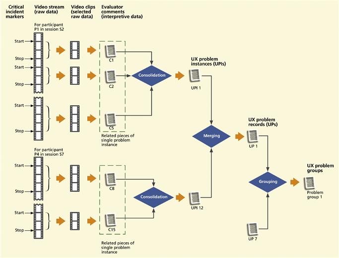
Figure 16-2 Consolidating, merging, and grouping of UX problem data.
For practical purposes we have to separate our material into chapters. In practice, early analysis—especially for qualitative data—overlaps with the data collection process. Because evaluator comments are interpretive, we have already begun to overlap analysis of qualitative data with their capture. The earlier you think about UX problems and their causes, the better chance you have at getting all the information you will need for problem diagnosis. In this chapter, we move from this overlap with data collection into the whole story of qualitative data analysis.
16.4.2 Get an Early Jump on Problem Analysis
Keep a participant around to help with early analysis
In a typical way of doing things, data collection is “completed,” the participant is dismissed, and the team does high fives and cracks open the bubbly before turning its attention to data analysis. But this Dilbertian HFTAWR (high-frivolity-to-actual-work ratio) approach puts the problem analyst at a disadvantage when the need inevitably arises to ask the participant questions and resolve ambiguities. The analyst can sometimes ask the facilitator or others who collected data, but often at significant communication effort.
Neither the facilitator nor the analyst now has access to the participant. Too often the problem analyst can only try to interpret and reconstruct missing UX data. The resulting completeness and accuracy become highly dependent on the knowledge and experience of the problem analyst.
We suggest bringing in the problem analyst as early as possible, especially if the analyst is not on the data collection team. And, to the extent it is practical, start analyzing qualitative data while a participant is still present to fill in missing data, clarify ambiguous issues, and answer questions.
Early UX problem data records
If data collectors used software support tools, the critical incident notes may already be in rudimentary problem records, possibly with links to tagged video sequences. With even minimal support from some kind of database tool, evaluators can get a leg up on the process yet to come by entering their critical incident descriptions directly into data records rather than, say, just a word processor or spreadsheet. The earlier you can get your raw critical incident notes packaged as data records, the more expedient the transition to subsequent data analysis.
Clean up your raw data before your memory fades
However you get data, you still have mostly raw qualitative data at this point. Many of the critical incident notes are likely to be terse observational comments that will be difficult to integrate in subsequent analysis, particularly if the person performing UX problem analysis is not the same person who observed the incidents and recorded the comments.
Therefore, it is essential for data collectors to clean up the raw data as soon after data collection as time and evaluator skills permit to capture as complete a record of each critical incident as possible while perishable detailed data are still fresh. In this transition from data collection to data analysis, experienced data collectors will anticipate the need for certain kinds of content later in problem analysis.
Clarify and amplify your emotional impact data
UX problems involving emotional impact are, by nature, usually broader in scope and less about details than usability problems. Therefore, for UX problems about emotional impact, it is important to get at the underlying essence of the observations while the explanatory context is still fresh. Otherwise, in our experience, you may end up with a vague problem description of some symptoms too nebulous to use.
16.4.3 Sources of Raw Qualitative Data
We are talking primarily about data from lab-based UX testing here, but critical incident data can come from other sources such as expert UX inspections. It is our job to sort through these, often unstructured, data and extract the essential critical incident and UX problem information. Regardless of the source of the raw data, much of the data analysis we do in this chapter is essentially the same.
Some sources are less detailed and some are more synoptic, for example, evaluator problem notes from a session without video recording tend to be more summarized, or summary problem descriptions can come from a UX inspection, in which there are no real critical incidents as there are no real users.
For these less detailed data, inputs to data analysis are often in the form of narratives about perceived UX-related situations and you might have to work a bit harder to extract the essence. These reports often roll up more than one problem in one description and you need to unpack individual UX issues into UX problem instances, as discussed next.
16.4.4 Isolate Individual Critical Incident Descriptions
On occasion, participants can experience more than one distinct UX problem at the same time and a single critical incident comment can refer to all of these problems. The first step in the sequence for refining raw data into UX problem reports is to scan the raw critical incident notes, looking for such notes about more than one UX problem, and separate them into multiple critical incident notes, each about a single UX problem.
Here is an example from one of our UX evaluation sessions for a companion Website for the Ticket Kiosk. The participant was in the middle of a benchmark task that required her to order three tickets to a Three Tenors concert. As she proceeded through the task, at one point she could not locate the button (which was below the “fold”) to complete the transaction.
When she finally scrolled down and saw the button, the button label said “Submit.” At this point she remarked “I am not sure if clicking on this button will let me review my order or just send it in immediately.” This is an example of a critical incident that indicates more than one UX problem: the button is located where it is not immediately visible and the label is not clear enough to help the user make a confident decision.
16.4.5 Consolidating Raw Critical Incident Notes into UX Problem Instances
The UX problem instance concept
Howarth et al. (Howarth, Andre, & Hartson, 2007; Howarth, Smith-Jackson, & Hartson, 2009) introduced the concept of UX problem instances to serve as a bridge between raw critical incident descriptions and UX problem records. A UX problem instance is a single occurrence of a particular problem experienced by a single participant.
The same UX problem may be encountered and recorded in multiple instances—occurring in the same or different sessions, observed by the same or different evaluators, experienced by the same or different participants, within the context of the same or of a different task. These are not each separate problems, but several instances of the same problem.
Critical incidents vs. UX problem instances
We have been using the term “critical incident” for some time and now we are introducing the idea of a UX problem instance. These two concepts are very similar and, if used loosely, can be thought of as referring to more or less the same thing. The difference rests on a bit of a nuance: A critical incident is an observable event (that happens over time) made up of user actions and system reactions, possibly accompanied by evaluator notes or comments, that indicates a UX problem instance.
Critical incident data are raw data and just a record of what happened and are not yet interpreted in terms of a problem or cause and, therefore, not in a form used easily in the analysis that follows. The UX problem instance is a more “processed” or more abstract (in the sense of capturing the essence) notion that we do use in the analysis.
Gathering up parts of data for a critical incident
Raw data for a single critical incident can appear in parts in the video/data stream interspersed with unrelated material. These data representing parts of a critical incident may not necessarily be contiguous in a real-time stream because the participant, for example, may be multitasking or interrupting the train of thought.
To build a corresponding UX problem instance, we need to consolidate all data (e.g., raw notes, video and audio sequences) about each critical incident. The second column from the left in Figure 16-2 shows sets of clips related to the same critical incident being extracted from the video stream. This step pulls out all the pieces of one single critical incident that then indicates (makes up) the UX problem instance.
This extraction of related parts of a single critical incident description will be fairly straightforward. Raw data related to a given critical incident instance, if not contiguous in the stream of events, will usually be in close proximity.
Example: Consolidating Critical Incident Parts of a Single UX Problem Instance
These abstract ideas are best conveyed by a simple example, one we borrow from Howarth, Andre, and Hartson (2007), based on real raw data taken from a UX evaluation of a photo management application. Using this application, users can manage photographs, already on a PC or received via email, into albums contained on their computers.
For this example, our user is trying to upload a picture to put in an album. The transcript of raw data (video stream plus evaluator comments) goes something like what you see in Figure 16-3.
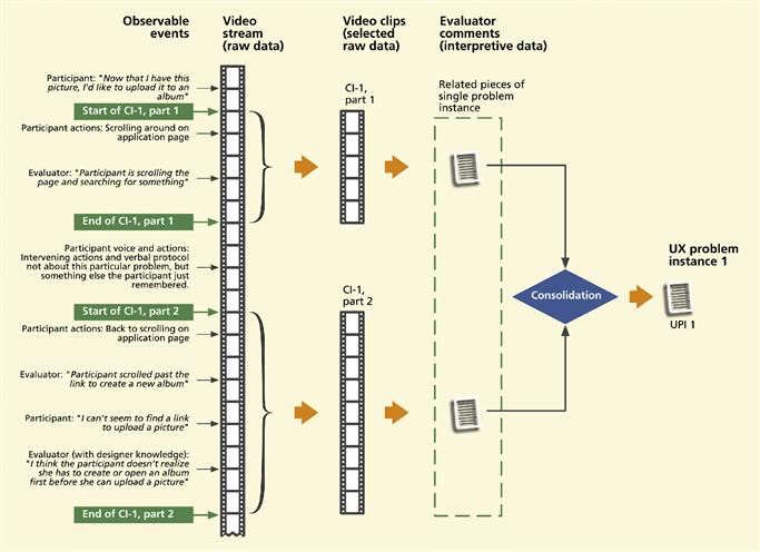
Figure 16-3 Example “transcript” of raw data stream showing multiple critical incident notes pertaining to a single UX problem instance.
In consolidating the raw critical incident notes (and associated video and audio clips) relating to this one UX problem instance, the practitioner would include both parts of the transcript (the two parts next to the curly braces, for CI-1, part 1 and CI-1, part 2) but would not include the intervening words and actions of the participant not related to this UX problem instance.
Putting it into a UX problem instance
This is a good time for a reality check on the real value of this critical incident to your iterative process. Using good UX engineering judgment, the practitioner keeps only ones that represent “real” UX instances.
As you put the critical incident pieces into one UX problem instance, you abstract out details of the data (the he-said/she-said details) and convert the wording of observed interaction event(s) and think-aloud comments into the wording of an interpretation as a problem/cause.
16.4.6 A Photo Album Example
Using the Howarth et al. (2007) example of a photo album management application, consider the task of uploading a photo from email and importing it into the album application.
16.4.7 UX Problem Instances
UX problem instance content
To begin with, in whatever scheme you use for maintaining UX data, each UX problem instance should be linked back to its constituent critical incident data parts, including evaluator comments and video clips, in order to retain full details of the UX problem instance origins, if needed for future reference.
The next thing to do is to give the problem a name so people can refer to this problem in discussions. Next we want to include enough information to make the UX problem instance as useful as possible for data analysis. Much has been said in the literature about what information to include in a UX problem record, but common sense can guide you. You need enough information to accomplish the main goals:
You will support these goals by problem records fields containing the following kinds of information.
Problem statement: A summary statement of the problem as an effect or outcome experienced by the user, but not as a suggested solution. You want to keep your options flexible when you do get to considering solutions.
User goals and task information: This information provides problem context to know what the user was trying to do when the problem was encountered. In the photo album example, the user has photos on a computer and had the goal of uploading another picture from email to put in an album contained in the photo management application.
Immediate intention: One of the most important pieces of information to include is the user’s immediate intention (at a very detailed level) exactly when the problem was encountered, for example, the user was trying to see a button label in a small font or the user was trying to understand the wording of a label.
More detailed problem description: Here is where you record details that can harbor clues about the nature of the problem, including a description of user actions and system reactions, the interaction events that occurred.
Designer knowledge (interpretation and explanation of events): Another very important piece of information is an “outside the user” explanation of what might have happened in this problem encounter. This is usually based on what we call “designer knowledge.” If the participant was proceeding on an incorrect assumption about the design or a misunderstanding of how the design works, the correct interpretation (the designer knowledge) can shed a lot of light on what the participant should have done and maybe how the design could be changed to lead to that outcome.
Designer knowledge is a kind of meta comment because it is not based on observed actions. It is based on knowledge about the design possessed by the evaluator, but not the participant, of why the system did not work the way the user expected and how it does work in this situation. We set up the evaluator team to ensure that someone with the requisite designer knowledge will be present during the evaluation session to include that information in the UX problem instance content that we now need in this transition to data analysis. Here is an example of designer knowledge, in this case about a critical incident that occurred in evaluation of the photo album application, as shown near the bottom left-hand side of Figure 16-3: “I think the participant doesn’t realize she has to create or open an album first before she can upload a picture.”
Causes and potential solutions: Although you may not know the problem causes or potential solutions at first, there should be a place in the problem record to record this diagnostic information eventually.
UX problem instance project context
In addition to the problem parameters and interaction event context, it can be useful to maintain links from a problem instance to its project context. Project context is a rather voluminous and largely uninteresting (at least during the session) body of data that gives a setting for UX data within administrative and project-oriented parameters.
While completely out of the way during data collection and not used for most of the usual analysis process, these project context data can be important for keeping track of when and by whom problem data were generated and collected and to which version or iteration of the design data apply. This information is linked and cross-linked so that, if you need to, you can find out which evaluators were conducting the session in which a given critical incident occurred and on what date, and using which participant (participant id, if not the name). Project context data can include (Howarth, Andre, & Hartson, 2007):
16.4.8 Merge Congruent UX Problem Instances into UX Problem Records
We use the term congruent to refer to multiple UX problem instances that represent the same underlying UX problem (not just similar problems or problems in the same category).
Find and merge multiple UX problem instances representing the same problem
In general, the evaluator or analyst cannot be expected to know about or remember previous instances of the same problem, so new critical incident descriptions (and new UX problem instances accordingly) are created each time an instance is encountered. Now you should look through your problem instances and find sets that are congruent.
How do you know if two problem descriptions are about the same underlying problem? Capra (2006, p. 41) suggests one way using a practical solution-based criterion: “Two problems, A and B, were considered the same [congruent] if fixing problem A also fixes problem B and fixing problem B also fixes problem A.” Capra’s approach is based on criteria used in the analysis of UX reports collected in CUE-4 (Molich & Dumas, 2008). The symmetric aspect of this criterion rules out a case where one problem is a subset of the other.
As an example from our Ticket Kiosk System evaluation, one UX problem instance states that the participant was confused about the button labeled “Submit” and did not know that this button should be clicked to move on in the transaction to pay for the tickets. Another (congruent) UX problem instance account of the same problem (encountered by a different participant) said that the participant complained about the wording of the button label “Submit,” saying it did not help understand where one would go if one clicked on that button.
Create UX problem records
In the merging of congruent UX problem instances, the analyst creates one single UX problem record for that problem. This merging combines the descriptions of multiple instances to produce a single complete and representative UX problem description.
The resulting problem description will usually be slightly more general by virtue of filtering out irrelevant differences among instances while embracing their common defining problem characteristics. In practice, merging is done by taking the best words and ideas of each instance description to synthesize an amalgam of the essential characteristics.
As an example of merging UX problem instances in the photo album application example, we see UX problem instances UPI-1 and UPI-12 in the middle of Figure 16-2, both about trying to find the upload link to upload pictures before having created an album into which to upload. The problem in UPI-1 is stated as: “The participant does not seem to understand that she must first create an album.”
The problem in UPI-12 says “User can’t find link to upload pictures because the target album has not yet been created.” Two users in different UX evaluation sessions encountered the same problem, reported in slightly different ways. When you merge the two descriptions, factoring out the differences, you get a slightly more general statement of the problem, seasoned with a pinch of designer knowledge, in the resulting UX problem record, UP-1: “Participants don’t understand that the system model requires them to create an album before pictures can be uploaded and stored in it.”
In your system for maintaining UX data (e.g., problem database), each UX problem record should be linked back to its constituent instances in order to retain full details of where merged data came from. The number of UX problem instances merged to form a given UX problem is useful information about the frequency of occurrence of that problem, which could contribute to the weight of importance to fix in the cost-importance ratings (coming up soon later).
If an instance has a particularly valuable associated video clip (linked to the instance via the video stream tag), the UX problem record should also contain a link to that video clip, as the visual documentation of an example occurrence of the problem. Some UX problems will be represented by just one UX problem instance, in which case it will just be “promoted” into a UX problem record.
Thence, UX problem instances will be used only for occasional reference and the UX problem records will be the basis for all further analysis.
16.4.9 Group Records of Related UX Problems for Fixing Together
UX problems can be related in many different ways that call for you to consider fixing them at the same time.
![]() Problems may be in physical or logical proximity (e.g., may involve objects or actions within the same dialogue box).
Problems may be in physical or logical proximity (e.g., may involve objects or actions within the same dialogue box).
![]() Problems may involve objects or actions used in the same task.
Problems may involve objects or actions used in the same task.
![]() Problems may be in the same category of issues or design features but scattered throughout the user interaction design.
Problems may be in the same category of issues or design features but scattered throughout the user interaction design.
![]() Problems may have consistency issues that require similar treatments.
Problems may have consistency issues that require similar treatments.
![]() Observed problem instances are indirect symptoms of common, more deeply rooted, UX problems. A telling indicator of such a deeply rooted problem is complexity and difficulty in its analysis.
Observed problem instances are indirect symptoms of common, more deeply rooted, UX problems. A telling indicator of such a deeply rooted problem is complexity and difficulty in its analysis.
By some means of association, for example, using an affinity diagram, group together the related records for problems that should be fixed together, as done with UP-1 and UP- 7 at the right-hand side of Figure 16-2. The idea is to create a common solution that might be more general than required for a single problem, but which will be the most efficient and consistent for the whole group.
Example: Grouping Related Problems for the Ticket Kiosk System
Consider the following UX problems, adapted with permission, from a student team in one of our classes from an evaluation of the Ticket Kiosk System:
Problem 9: The participant expected a graphic of seat layout and missed seeing the button for that at first; kept missing “View Seats” button.
Problem 13: For “Selected Seats,” there is no way to distinguish balcony from floor seats because they both use the same numbering scheme and the shape/layout used was not clear enough to help users disambiguate.
Problem 20: In “View Seats” view, the participant was not able to figure out which of the individual seats were already sold because the color choices were confusing.
Problem 25: The participant did not understand that blue seat sections are clickable to get detailed view of available seats. She commented that there was not enough information about which seats are available.
Problem 26: Color-coding scheme used to distinguish availability of seats was problematic. On detailed seat view, purple was not noticeable as a color due to bad contrast. Also, the text labels were not readable because of contrast.
Suggested individual solutions were:
Problem 9 Solution: Create an icon or graphic to supplement “View Seats” option. Also show this in the previous screen where the user selects the number of seats.
Problem 13 Solution: Distinguish balcony seats and floor seats with a different numbering scheme and use better visual treatment to show these two as different.
Problem 20 Solution: Use different icons and colors to make the distinction between sold and available seats clearer. Also add a legend to indicate what those icons/colors mean.
Problem 25 Solution: Make the blue seat clickable with enhanced physical affordances, and when one is clicked, display detailed seat information, such as location, price, and so on.
Problem 26 Solution: Change the colors; find a better combination that can distinguish the availability clearly. Consider using different fills instead of just colors. Probably should have thicker font for labels (maybe bold would do it).
These problems may be indicative of a much broader design problem: a lack of effective visual design elements in seat selection part of the workflow. We can group and label all these problems into the problem group:
With a group solution of:
Higher level common issues within groups
When UX problem data include a number of critical incidents or problems that are quite similar, you will group these instances together because they are closely related. Then you usually look for common issues among the problems in the group.
But sometimes the real problem is not explicit in the commonality within the group, but the problems only represent symptoms of a higher level problem. You might have to deduce that this higher level problem is the real underlying cause of these common critical incidents.
For example, in one application we evaluated, users were having trouble understanding several different quirky and application-specific labels. We first tried changing the label wordings, but eventually we realized that the reason they did not “get” these labels was that they did not understand an important aspect of the conceptual design. Changing the labels without improving their understanding of the model did not solve the problem.
16.4.10 Analyze Each Problem
Terminology
To begin with, there is some simple terminology that we should use consistently. Technically, UX problems are not in the interaction design per se, but are usage difficulties faced by users. That is, users experience UX problems such as the inability to complete a task. Further, UX problems are caused by flaws in the interaction design. Symptoms are observable manifestations of problems (e.g., user agitation, expressed frustration, or anger).
Thus, the things we actually seek to fix are design flaws, the causes of UX problems. Some (but not all) problems can be observed; but causes have to be deduced with diagnosis. Solutions are the treatments (redesign changes) to fix the flaws. Further downstream evaluation is needed to confirm a “cure.”
Sometimes we say “the poor design of this dialogue box is a UX problem” but, of course, that is a short-hand way of saying that the poor design can cause users to experience problems. It is okay to have this kind of informal difference in terminology, we do resort to it ourselves, as long as we all understand the real meaning behind the words.
Table 16-2 lists the terminology we use and its analog in the medical domain.
Table 16-2 Analogous UX and medical terminology
| General Concept | Medical | Usability/User Experience |
| Problems | Illness or physical problems experienced by patient | UX problems experienced by user (e.g., inability to complete task) |
| Symptoms | Symptoms (e.g., difficulty in walking, shortness of breath) | Symptoms (e.g., frustration, anger) |
| Diagnosis (causes of symptoms) | Identify the disease that cause the symptoms (e.g., obesity) | Identify interaction design flaws that cause the UX problems |
| Causes of causes | Identify the cause(s) of the disease (e.g., poor lifestyle choices) | Determine causes of interaction design flaws (e.g., poor UX process choices) |
| Treatment | Medicine, dietary counseling, surgery to cure disease | Redesign fixes/changes to interaction design |
| Cure confirmation | Later observation and testing | Later evaluation |
16.4.11 UX Problem Data Management
As time goes by and you proceed further into the UX process lifecycle, the full life story of each UX problem grows, entailing slow expansion of data in the UX problem record. Each UX problem record will eventually contain information about the problem: diagnosis by problem type and subtype, interaction design flaws as problem causes, cost/importance data estimating severity, management decisions to fix (or not) the problem, costs, implementation efforts, and downstream effectiveness.
Most authors mention UX problems or problem reports but do not hint at the fact that a complete problem record can be a large and complex information object. Maintaining a complete record of this unit of UX data is surely one place where some kind of tool support, such as a database management system, is warranted. As an example of how your UX problem record structure and content can grow, here are some of the kinds of information that can eventually be attached to it. These are possibilities we have encountered; pick the ones that suit you:
Problem diagnosis (problem type and subtype and causes within the design)
Links to constituent UX problem instances
Links for relationships to other UX problems (e.g., in groups to be fixed together)
Evaluation session date, location, etc.
Session type (e.g., lab-based testing, UX inspection, remote evaluation)
Cost-importance attributes for this iteration (next section)
For more about representation schemes for UX problem data, see Lavery and Cockton (1997).
16.4.12 Abridged Qualitative Data Analysis
As an abridged approach formative (qualitative) data analysis:
![]() Just take notes about UX problems in real time during the session.
Just take notes about UX problems in real time during the session.
![]() Immediately after session, make UX problem records from the notes.
Immediately after session, make UX problem records from the notes.
As an alternative, if you have the necessary simple tools for creating UX problem records:
16.5 Cost-importance analysis: prioritizing problems to fix
It would be great to fix all UX problems known after each iteration of evaluation. However, because we are taking an engineering approach, we have to temper our enthusiasm for perfection with an eye toward cost-effectiveness.
So, now that we are done, at least for the moment, with individual problem analysis, we look at some aggregate problem analysis to assess priorities about what problems to fix and in what order. We call this cost-importance analysis because it is based on calculating trade-offs between the cost to fix a problem and the importance of getting it fixed. Cost-importance analysis applies to any UX problem list regardless of what evaluation method or data collection technique was used.
Although these simple calculations can be done manually, this analysis lends itself nicely to the use of spreadsheets. The basic form we will use is the cost-importance table shown in Table 16-3.
Table 16-3 Basic form of the cost-importance table
16.5.1 Problem
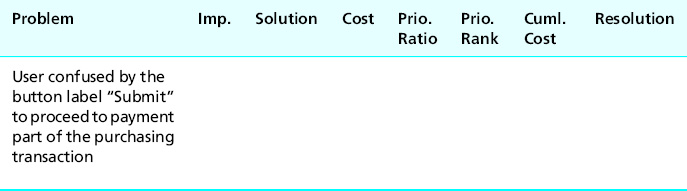
Starting with the left-most column in Table 16-3, we enter a concise description of the problem. Analysts needing to review further details can consult the problem data record and even the associated video clip. We will use some sample UX problems for the Ticket Kiosk System in a running example to illustrate how we fill out the entries in the cost-importance table.
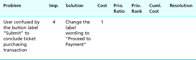
In our first example problem the user had decided on an event to buy tickets for and had established the parameters (date, venue, seats, price, etc.) but did not realize that it was then necessary to click on the “Submit” button to finish up the event-related choices and move to the screen for making payment. So we enter a brief description of this problem in the first column of Table 16-4.
Table 16-4 Problem description entered into cost-importance table
16.5.2 Importance to Fix
The next column, labeled “Imp” in the table, is for an estimate of the importance to fix the problem, independent of cost. While importance includes severity or criticality of the problem, most commonly used by other authors, this parameter can also include other considerations. The idea is to capture the effect of a problem on user performance, user experience, and overall system integrity and consistency. Importance can also include intangibles such as management and marketing “feelings” and consideration of the cost of not fixing the problem (e.g., in terms of lower user satisfaction), as well as “impact analysis” (next section).
Because an importance rating is just an estimate, we use a simple scale for the values:
![]() Importance = M: Must fix, regardless
Importance = M: Must fix, regardless
![]() Importance = 5: The most important problems to fix after the “Must fix” category
Importance = 5: The most important problems to fix after the “Must fix” category
![]() If the interaction feature involved is mission critical
If the interaction feature involved is mission critical
![]() If the UX problem has a major impact on task performance or user satisfaction (e.g., user cannot complete key task or can do so only with great difficulty)
If the UX problem has a major impact on task performance or user satisfaction (e.g., user cannot complete key task or can do so only with great difficulty)
![]() If the UX problem is expected to occur frequently or could cause costly errors
If the UX problem is expected to occur frequently or could cause costly errors
![]() Importance = 3: Moderate impact problems
Importance = 3: Moderate impact problems
![]() If the user can complete the task, but with difficulty (e.g., it caused confusion and required extra effort)
If the user can complete the task, but with difficulty (e.g., it caused confusion and required extra effort)
![]() If the problem was a source of moderate dissatisfaction
If the problem was a source of moderate dissatisfaction
![]() Importance = 1: Low impact problems
Importance = 1: Low impact problems
![]() If problem did not impact task performance or dissatisfaction much (e.g., mild user confusion or irritation or a cosmetic problem), but is still worth listing
If problem did not impact task performance or dissatisfaction much (e.g., mild user confusion or irritation or a cosmetic problem), but is still worth listing
This fairly coarse gradation of values has proven to work for us; you can customize it to suit your project needs. We also need some flexibility to assign intermediate values, so we allow for importance rating adjustment factors, the primary one of which is estimated frequency of occurrence. If this problem is expected to occur very often, you might adjust your importance rating upward by one value.
Conversely, if it is not expected to occur very often, you could downgrade your rating by one or more values. As Karat, Campbell, and Fiegel (1992) relate frequency of occurrence to problem severity classification, they ask: Over all the affected user classes, how often will the user encounter this problem?
Applying this to our importance rating, we might start with a problem preventing a task from being completed, to which we would initially assign Importance = 5. But because we expect this UX problem to arise only rarely and it does not affect critical tasks, we might downgrade its importance to 4 or even 3. However, a problem with moderately significant impact might start out rated as a 3 but, because it occurs frequently, we might upgrade it to a 4.
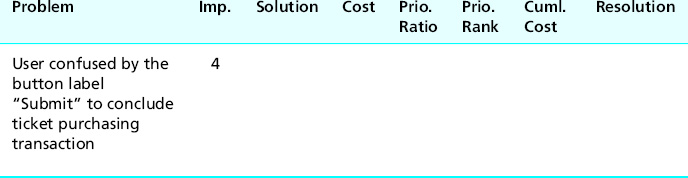
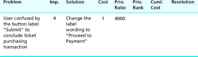
For example, consider the Ticket Kiosk System problem about users being confused by the button label “Submit” to proceed to payment in the ticket-purchasing transaction. We rate this fairly high in importance because it is part of the basic workflow of ticket buying; users will perform this step often, and most participants were puzzled or misled by this button label.
However, it was not shown to be a show-stopper, so we initially assign it an importance of 3. But because it will be encountered by almost every user in almost every transaction, we “promoted” it to a 4, as shown in Table 16-5.
Table 16-5 Estimate of importance to fix entered into cost-importance table
Learnability can also be an importance adjustment factor. Some problems have most of their impact on the first encounter. After that, users learn quickly to overcome (work around) the problem so it does not have much effect in subsequent usage. That could call for an importance rating reduction.
16.5.3 Solutions
The next column in the cost-importance table is for one or more candidate solutions to the problems. Solving a UX problem is redesign, a kind of design, so you should use the same approach and resources as we did for the original design, including consulting your contextual data. Other resources and activities that might help include design principles and guidelines, brainstorming, study of other similar designs, and solutions suggested by users and experts. It is almost never a good idea to think of more training or better documentation as a UX problem solution.
Solutions for the photo album problem example
Let us look at some solutions for a problem in the example concerning the photo album application introduced earlier in this chapter. Users experienced a problem when trying to upload photos into an album. They did not understand that they had to create an album first. This misunderstanding about the workflow model built into the application now requires us to design an alternative.
It appears that the original designer was thinking in terms of a planning model by which the user anticipates the need for an album in advance of putting pictures into it. But our users were apparently thinking of the task in linear time, assuming (probably without thinking about it) that the application would either provide an album when it was needed or let them create one. A usage-centered design to match the user’s cognitive flow could start by offering an active upload link.
If the user clicks on it when there is no open album, the interaction could present an opportunity for just-in-time creation of the necessary album as part of the task flow of uploading of a picture. This can be accomplished by either asking if the user wants to open an existing album or creating a new one.
Taking a different design direction, the interaction can allow users to upload pictures onto a “work table” without the need for pictures to necessarily be in an album. This design provides more interaction flexibility and potential for better user experience. This design also allows users to place single photos in multiple albums, something that users cannot do easily in their current work domain (without making multiple copies of a photo).
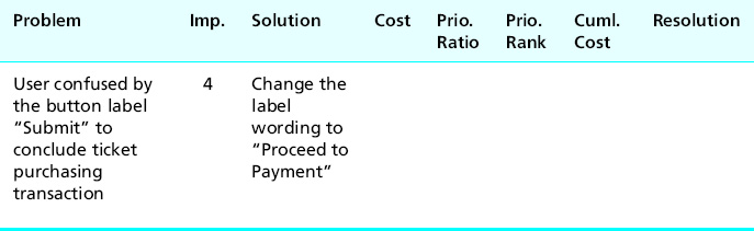
Ticket Kiosk System example
Coming back to the confusing button label in the Ticket Kiosk System, one obvious and inexpensive solution is to change the label wording to better represent where the interaction will go if the user clicks on that button. Maybe “Proceed to payment” would make more sense to most users.
We wrote a concise description of our proposed fix in the Solution column in Table 16-6.
Table 16-6 Potential problem solution entered into cost-importance table
16.5.4 Cost to Fix
Making accurate estimates of the cost to fix a given UX problem takes practice; it is an acquired engineering skill. But it is nothing new; it is part of our job to make cost estimates in all kinds of engineering and budget situations. Costs for our analysis are stated in terms of resources (e.g., time, money) needed, which almost always translates to person-hours required.
Because this is an inexact process, we usually round up fractional values just to keep it simple. When you make your cost estimates, do not make the mistake of including only the cost to implement the change; you must include the cost of redesign, including design thinking and discussion and, sometimes, even some experimentation. You might need help from your software developers to estimate implementation costs.
Because it is very easy to change label wordings in our Ticket Kiosk System, we have entered a value of just one person-hour into the Cost column in Table 16-7.
Table 16-7 Estimate of cost to fix entered into cost-importance table
Cost values for problem groups
Table 16-8 shows an example of including a problem group in the cost-importance table.
Table 16-8 Cost entries for problem groups entered into cost-importance table
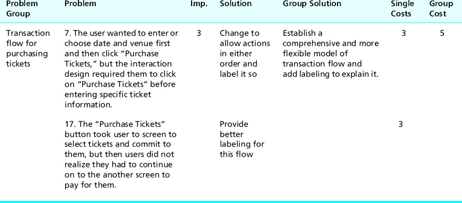
Note that the cost for the group is higher than that of either individual problem but lower than their sum.
Calibration feedback from down the road: Comparing actual with predicted costs
To learn more about making cost estimates and to calibrate your engineering ability to estimate costs to fix problems, we recommend that you add a column to your cost-importance table for actual cost. After you have done the redesign and implementation for your solutions, you should record the actual cost of each and compare with your predicted estimates. It can tell you how you are doing and how you can improve your estimates.
16.5.5 Priority Ratio
The next column in the cost-importance table, the priority ratio, is a metric we use to establish priorities for fixing problems. We want a metric that will reward high importance but penalize high costs. A simple ratio of importance to cost fits this bill. Intuitively, a high importance will boost up the priority but a high cost will bring it down. Because the units of cost and importance will usually yield a fractional value for the priority ratio, we scale it up to the integer range by multiplying it by an arbitrary factor, say, 1000.
If the importance rating is “M” (for “must fix regardless”), the priority ratio is also “M.” For all numerical values of importance, the priority ratio becomes:
![]()
Example: Priority Ratios for Ticket Kiosk System Problems
For our first Ticket Kiosk System problem, the priority ratio is (4/1) × 1000 = 4000, which we have entered into the cost-importance table in Table 16-9.
Table 16-9 Priority ratio calculation entered into cost-importance table
In the next part of this example, shown in Table 16-10, we have added several more Ticket Kiosk System UX problems to fill out the table a bit more realistically.
Table 16-10 Priority ratios for more Ticket Kiosk System problems
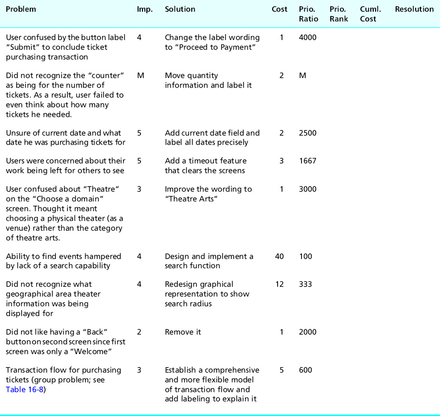
Note that although fixing the lack of a search function (the sixth row in Table 16-10) has a high importance, its high cost is keeping the priority ratio low. This is one problem to consider for an Importance = M rating in the future. At the other end of things, the last problem (about the Back button to the Welcome screen) is only Importance = 2, but the low cost boosts the priority ratio quite high. Fixing this will not cost much and will get it out of the way.
16.5.6 Priority Rankings
So far, the whole cost-importance analysis process has involved only some engineering estimates and some simple calculations, probably in a spreadsheet. Now it gets even easier. You have only to sort the cost-importance table by priority ratios to get the final priority rankings.
First, move all problems with a priority ratio value of “M” to the top of the table. These are the problems you must fix, regardless of cost. Then sort the rest of the table in descending order by priority ratio. This puts high importance, low cost problems at the top of the priority list, as shown at A in the upper left-hand quadrant of Figure 16-4. These are the problems to fix first, the fixes that will give the biggest bang for the buck.
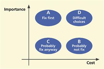
Figure 16-4 The relationship of importance and cost in prioritizing which problems to fix first.
Being the realist (our nice word for cynic) that you are, you are quick to point out that, in the real world, things do not line up with high importance and low cost together in the same sentence. You pay for what you get. But, in fact, we do find a lot of problems of this kind in early iterations.
A good example is a badly worded button label. It can completely confuse users but usually costs almost nothing to fix. Sometimes low-importance, low-cost problems float up near the top of the priority list. You will eventually want to deal with these. Because they do not cost much, it is usually a good idea to just fix them and get them out of the way.
The UX problems that sort to the bottom of the priority list are costly to fix with little gain in doing so. You will probably not bother to fix these problems, as shown at B in the lower right-hand quadrant of Figure 16-4.
Quadrants A and B sort out nicely in the priority rankings. Quadrants C and D, however, may require more thought. Quadrant C represents problems for which fixes are low in cost and low in importance. You will usually just go ahead and fix them to get them off your plate. The most difficult choices appear in quadrant D because, although they are of high importance to fix, they are also the most expensive to fix.
No formula will help; you need good engineering judgment. Maybe it is time to request more resources so these important problems can be fixed. That is usually worth it in the long run.
The cost-importance table for the Ticket Kiosk System, sorted by priority ratio, is shown in Table 16-11.
Table 16-11 The Ticket Kiosk System cost-importance table, sorted by priority ratio, with cumulative cost values entered, and the “line of affordability” showing the cutoff for this round of problem fixing
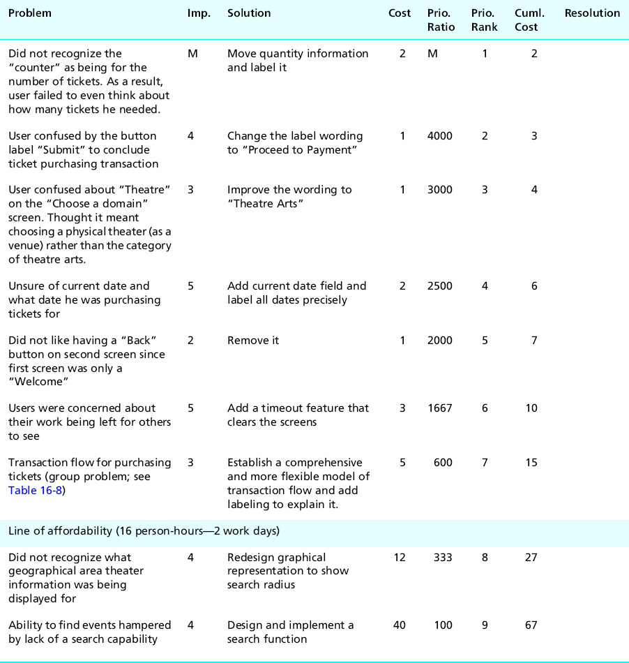
16.5.7 Cumulative Cost
The next step is simple. In the column labeled “Cuml. Cost” of the cost-importance table sorted by priority ratio, for each problem enter an amount that is the cost of fixing that problem plus the cost of fixing all the problems above it in the table. See how we have done this for our example Ticket Kiosk System cost-importance table in Table 16-11.
16.5.8 The Line of Affordability
Using your budget, your team leader or project manager should determine your “resource limit,” in person-hours, that you can allocate to making design changes for the current cycle of iteration. For example, suppose that for the Ticket Kiosk System we have only a fairly small amount of time available in the schedule, about 16 person hours.
Draw the “line of affordability,” a horizontal line in the cost-importance table just above the line in the table where the cumulative cost value first exceeds your resource limit. For the Ticket Kiosk System, the line of affordability appears just above the row in Table 16-11 where the cumulative cost hits 27.
Just for giggles, it might be fun to graph all your problems (no, not all your problems; we mean all your cost-importance table entries) in a cost-importance space like that of Figure 16-4. Sometimes this kind of graphical representation can give insight into your process, especially if your problems tend to appear in clusters. Your line of affordability will be a vertical line that cuts the cost axis at the amount you can afford to spend on fixing all problems this iteration.
16.5.9 Drawing Conclusions: A Resolution for Each Problem
It’s time for the payoff of your cost-importance analysis. It’s time for a resolution—a decision—about how each problem will be addressed.
First, you have to deal with your “Must fix” problems, the show-stoppers. If you have enough resources, that is if all the “Must fix” problems are above the line of affordability, fix them all. If not, you already have a headache. Someone, such as the project manager, has to earn his or her pay today by making a difficult decision.
The extreme cost of a “Must fix” problem could make it infeasible to fix in the current version. Exceptions will surely result in cost overruns, but might have to be dictated by corporate policy, management, marketing, etc. It is an important time to be true to your principles and to everything you have done in the process so far. Do not throw it away now because of some perceived limit on how much you are willing to put into fixing problems that you have just spent good money to find.
Sometimes you have resources to fix the “Must fix” problems, but no resources left for dealing with the other problems. Fortunately, in our example we have enough resources to fix a few more problems. Depending on their relative proximity to the line of affordability, you have to decide among these choices as a resolution for all the other problems:
In the final column of the cost-importance table, write in your resolution for each problem, as we have done for the Ticket Kiosk System in Table 16-12.
Table 16-12 Problem resolutions for Ticket Kiosk System
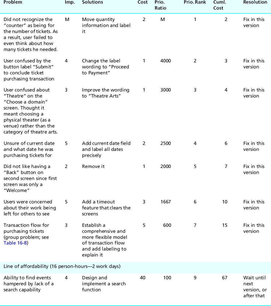
Finally, look at your table; see what is left below the line of affordability. Is it what you would expect? Can you live with not making fixes below that line? Again, this is a crossroads moment. You will find that in reality that low-importance/high-cost problems are rarely addressed; there simply will not be time or other resources. That is okay, as our engineering approach is aiming for cost-effectiveness, not perfection. You might even have to face the fact that some important problems cannot be fixed because they are simply too costly.
However, in the end, do not just let numbers dictate your actions; think about it. Do not let a tight production schedule or budget force release of something that could embarrass your organization. Quality is remembered long after schedules are forgotten.
16.5.10 Special Cases
Tie-breakers
Sometimes you will get ties for priority rankings, entries for problems with equal priority for fixing. If they do not occur near the line of affordability, it is not necessary to do anything about them. In the rare case that they straddle the line of affordability, you can break the tie by almost any practical means, for example, your team members may have a personal preference.
In cases of more demanding target systems (e.g., an air traffic control system), where the importance of avoiding problems, especially dangerous user errors, is a bigger concern than cost, you might break priority ties by adjusting the priorities via weighting importance higher than cost in the priority ratio formula.
Cost-importance analysis involving multiple problem solutions
Sometimes you can think of more than one solution for a problem. It is possible that, after a bit more thought, one solution will emerge as best. If, however, after careful consideration you still have multiple possibilities for a problem solution, you can keep all solutions in the running and in the analysis until you see something that helps you decide.
If all solutions have the same cost to fix, then you and your team will just have to make an engineering decision. This might be the time to implement all of them and retest, using local prototyping (Chapter 11) to evaluate alternative design solutions for just this one feature.
Usually, though, solutions are distinguished by cost and/or effectiveness. Maybe one is less expensive but some other one is more desirable or more effective; in other words, you have a cost–benefit trade-off. You will need to resolve such cost–benefit problems separately before entering the chosen solution and its cost into the cost-importance table.
Problem groups straddling the line of affordability
If you have a group of related problems right at the line of affordability, the engineering answer is to do the best you can before you run out of resources. Break the group back apart and do as many pieces as possible. Give the rest of the group a higher importance in the next iteration.
Priorities for emotional impact problems
Priorities for fixing emotional impact problems can be difficult to assess. They are often very important because they can represent problems with product or system image and reputation in the market. They can also represent high costs to fix because they often require a broader view of redesign, not just focusing on one detail of the design as you might for a usability problem.
Also, emotional impact problems are often not just redesign problems but might require more understanding of the users and work or play context, which means going all the way back in the process to contextual inquiry and contextual analysis and a new approach to the conceptual design. Because of business and marketing imperatives, you may have to move some emotional impact problems into the “Must fix” category and do what is necessary to produce an awesome user experience.
16.5.11 Abridged Cost-Importance Analysis
As an abridged version of the cost-importance analysis process:
![]() Put the problem list in a spreadsheet or similar document.
Put the problem list in a spreadsheet or similar document.
![]() Project it onto a screen in a room with pertinent team members to decide priorities for fixing the problems.
Project it onto a screen in a room with pertinent team members to decide priorities for fixing the problems.
![]() Have a discussion about which problems to fix first based on a group feeling about the relative importance and cost to fix each problem, without assigning numeric values.
Have a discussion about which problems to fix first based on a group feeling about the relative importance and cost to fix each problem, without assigning numeric values.
![]() Do a kind of group-driven “bubble sort” of problems in which problems to fix first will float toward the top of the list and problems you probably cannot fix, at least in this iteration, will sink toward the bottom of the list.
Do a kind of group-driven “bubble sort” of problems in which problems to fix first will float toward the top of the list and problems you probably cannot fix, at least in this iteration, will sink toward the bottom of the list.
![]() When you are satisfied with the relative ordering of problem priorities, start fixing problems from the top of the list downward and stop when you run out of time or money.
When you are satisfied with the relative ordering of problem priorities, start fixing problems from the top of the list downward and stop when you run out of time or money.
16.6 Feedback to process
Now that you have been through an iteration of the UX process lifecycle, it is time to reflect not just on the design itself, but also on how well your process worked. If you have any suspicions after doing the testing that the quantitative criteria were not quite right, you might ask if your UX targets worked well.
For example, if all target levels were met or exceeded on the very first round of evaluation, it will almost certainly be the case that your UX targets were too lenient. Even in later iterations, if all UX targets are met but observations during evaluation sessions indicate that participants were frustrated and performed tasks poorly, your intuition will probably tell you that the design is nevertheless not acceptable in terms of its quality of user experience. Then, obviously, the UX team should revisit and adjust the UX targets or add more considerations to your criteria for evaluation success.
Next, ask yourself whether the benchmark tasks supported the evaluation process in the most effective way. Should they have been simpler or more complex, narrower or broader? Should any benchmark task description be reworded for clarification or to give less information about how to do a task?
Finally, assess how well the overall process worked for the team. You will never be in a better position to sit down, discuss it, and document possible improvements for the next time.
16.7 Lessons from the field
16.7.1 Onion-Layers Effect
There are many reasons to make more than one iteration of the design–test–redesign part of the UX lifecycle. The main reason, of course, is to continue to uncover and fix UX problems until you meet your UX target values. Another reason is to be sure that your “fixes” have not caused new problems. The fixes are, after all, new and untested designs.
Also, in fixing a problem, you can uncover other UX problems lurking in the dark and inky shadows of the first problem. One problem can be obscured by another, preventing participants and evaluators from seeing the second problem, until the top layer of the onion1 is peeled off by solving that “outer” problem.
16.7.2 UX Problem Data as Feedback to Process Improvement
In our analysis we are also always on the lookout for causes of causes. It sometimes pays off to look at your UX process to find causes of the design flaws that cause UX problems, places in your process where, if you could have done something differently, you might have avoided a particular kind of design flaw. If you suffer from an overabundance of a particular kind of UX problem and can determine how your process is letting them into the designs, maybe you can head off that kind of problem in future designs by fixing that part of the process.
For example, if you are finding a large number of UX problems involving confusing button or icon labels or menu choices, maybe you can address these in advance by providing a place in your design process where you look extra carefully at the precise use of words, semantics, and meanings of words. You might even consider hiring a professional writer to join the UX team. We ran into a case like this once.
For expediency, one project team had been letting their software programmers write error messages as they encountered the need for them in the code. This situation was a legacy from the days when programmers routinely did most of the user interface. As you can imagine, these error messages were not the most effective. We helped them incorporate a more structured approach to error message composition, involving UX practitioners, without unduly disrupting the rest of their process.
Similarly, large numbers of problems involving physical user actions are indicators of design problems that could be addressed by hiring an expert in ergonomics, human factors engineering, and physical device design. Finally, large numbers of problems involving visual aspects of design, such as color, shape, positioning, or gray shading, might indicate the need for hiring a graphic designer or layout artist.
Exercise
See Exercise 16-1, UX Data Analysis for Your System
1 Thanks to Wolmet Barendregt for the onion-layer analogy.