
Chapter 20
Affordances Demystified
Objectives
After reading this chapter, you will:
1. Have acquired a clear understanding of the concept of affordances
2. Know and understand differences among the types of affordances in UX design
3. Know how to apply the different types of affordances together in UX design
4. Be able to identify false affordances and know how to avoid them in UX design
5. Recognize user-created affordances and their implications to design
To begin with, we gratefully acknowledge the kind permission of Taylor & Francis, Ltd. to use a paper published in Behaviour & Information Technology (Hartson, 2003) as the primary source of material for this chapter. This chapter is a prerequisite for the next two chapters, on the User Action Framework and design guidelines, but we hope that you find it an interesting topic on its own.
20.1 What are affordances?
Although a crucially important and powerful concept, the notion of “affordance,” as pointed out by Norman (1999), has suffered misunderstanding and misuse (or perhaps uninformed use) by researchers and practitioners alike and in our literature. In this section we define the general concept of affordances as used in human–computer interaction (HCI) design and give more specific definitions for each of four kinds of affordance.
20.1.1 The Concept of Affordance
The relevant part of what the dictionary says about “to afford” is that it means to offer, yield, provide, give, or furnish. For example, a study window in a house may afford a fine view of the outdoors; the window helps one see that nice view. In HCI design, where we focus on helping the user, an affordance is something that helps a user do something. In interaction design, affordances are characteristics of user interface objects and interaction design features that help users perform tasks.
20.1.2 Definitions of the Different Kinds of Affordance
In an effort to clarify the concept of affordance and how it is used in interaction design, we have defined (Hartson, 2003) four types of affordances, each of which plays a different role in supporting users during interaction, each reflecting user processes and the kinds of actions users make in task performance. Those kinds of affordances are as follows:
![]() Cognitive affordances help users with their cognitive actions: thinking, deciding, learning, remembering, and knowing about things.
Cognitive affordances help users with their cognitive actions: thinking, deciding, learning, remembering, and knowing about things.
![]() Physical affordances help users with their physical actions: clicking, touching, pointing, gesturing, and moving things.
Physical affordances help users with their physical actions: clicking, touching, pointing, gesturing, and moving things.
![]() Sensory affordances help users with their sensory actions: seeing, hearing, and feeling (and tasting and smelling) things.
Sensory affordances help users with their sensory actions: seeing, hearing, and feeling (and tasting and smelling) things.
![]() Functional affordances help users do real work (and play) and get things done, to use the system to do work.
Functional affordances help users do real work (and play) and get things done, to use the system to do work.
In analysis and design, each type of affordance must be identified for what it is and considered on its own terms. Each type of affordance uses different mechanisms, corresponds to different kinds of user actions, and has different requirements for design and different implications in evaluation and problem diagnosis.
As an example to get you started, consider a button available for clicking somewhere on a user interface. Sensory affordance helps you sense (in this case, see) it. Sensory affordance can be supported in design by, for example, the color or location of the button. Cognitive affordance helps you understand the button by comprehending what the button is used for, via the meaning of its label. Physical affordance helps you click on this button, so its design support could include the size of the button or its distance from other buttons.
20.2 A little background
Who “invented” the concept of affordances? Of course we all know it was Donald Norman. Well, not quite. While Norman did introduce the concept to HCI, the concept itself goes back at least as far as James J. Gibson (1977, 1979), and probably further.
Gibson is a perceptual psychologist who took an “ecological” approach to perception, meaning he studied the relationship between a living being and its environment, in particular what the environment offers or affords the animal. Gibson’s affordances are the properties and objects of the environment as reckoned relative to the animal, and “the ‘values’ and ‘meanings’ of things in the environment [that] can be directly perceived” (Gibson, 1977) by the animal. In this book, human users of computer systems are the animals (are not they, though?).
Norman (1999) begins his interactions article by referring to Gibson’s definitions of “afford” and “affordance,” as well as to discussions he and Gibson have had about these concepts. Paraphrasing Gibson (1979, p. 127) within an HCI design context, affordance (as an attribute of an interaction design feature) is what that feature offers the user, what it provides or furnishes.
Here Gibson is talking about physical properties. Gibson gives an example of how a horizontal, flat, and rigid surface affords support for an animal for standing or walking. In his ecological view, affordance is reckoned with respect to the animal/user, which is part of the affordance relationship.
Thus, as Norman (1999) points out, Gibson sees an affordance as a physical relationship between an actor (e.g., user) and physical artifacts in the world reflecting possible actions on those artifacts. Such an affordance does not have to be visible, known, or even desirable.
Since Norman brought the term affordance into common usage in the HCI domain with his book The Design of Everyday Things (Norman, 1990), the term has appeared many times in the literature. However, terminology surrounding the concept of affordance in the literature has been used with more enthusiasm than knowledge, and we are left with some confusion.
Beyond Gibson and Norman, Gaver (1991) and McGrenere and Ho (2000) have influenced our thinking about affordances. Gaver (1991) sees affordances in design as a way of focusing on strengths and weaknesses of technologies with respect to the possibilities they offer to people who use them.
He extends the concepts by showing how complex actions can be described in terms of groups of affordances, sequential in time and/or nested in space, showing how affordances can be revealed over time, with successive user actions, for example, in the multiple actions of a hierarchical drop-down menu. Gaver (1991) defined his own terms somewhat differently from those of Norman or Gibson. That McGrenere and Ho (2000) also needed to calibrate their terminology against Gaver’s further demonstrates the difficulty of discussing these concepts without access to a richer, more consistent vocabulary.
In most of the related literature, design of cognitive affordances (whatever they are called in a given paper) is acknowledged to be about design for the cognitive part of usability, ease of use in the form of learnability for new and intermittent users (who need the most help in knowing how to do something). All authors who write about affordances give their own definitions of the concept, but there is scant mention of physical affordance design.
Sensory affordance is neglected even more in the literature. Most other authors include sensory affordance only implicitly and/or lumped in with cognitive affordance rather than featuring it as a separate explicit concept. Thus, when these authors talk about perceiving affordances, including Gaver’s (1991) and McGrenere and Ho’s (2000) phrase “perceptibility of an affordance,” they are referring (in our terms) to a combination of sensing (e.g., seeing) and understanding physical affordances through sensory affordances and cognitive affordances.
Gaver refers to this same mix of affordances when he says “People perceive the environment directly in terms of its potential for action.” As we explain in the next section, our use of the term “sense” has a markedly narrower orientation toward discerning via sensory inputs such as seeing and hearing.
20.3 Four kinds of affordances in UX design
20.3.1 Cognitive Affordance
Cognitive affordance is a design feature that helps, aids, supports, facilitates, or enables thinking, learning, understanding, and knowing about something. Cognitive affordances play starring roles in interaction design, especially for less experienced users who need help with understanding and learning.
Because of this role, cognitive affordances are among the most significant usage-centered design features in present-day interactive systems, screen based or otherwise. They are the key to answering Norman’s question (1999, p. 39) on behalf of the user: “How do you know what to do?”
As a simple example, the symbol of an icon that clearly conveys its meaning could be a cognitive affordance enabling users to understand the icon in terms of the functionality behind it and the consequences of clicking on it. Another cognitive affordance might be in the form of a clear and concise button label.
Cognitive affordance is usually associated with the semantics or meaning of user interface artifacts. In this regard, cognitive affordance is used as feed forward. It is help with a priori knowledge, that is, knowledge about the associated functionality before selecting an object such as a button, icon, or menu choice. In short, a button label helps you in knowing about what functionality will be invoked if you click on that button.
Communication of meaning via cognitive affordance often depends on shared conventions. The symbols themselves may have no inherent meaning, but a shared convention about the meaning allows the symbol to convey that meaning.
Another use of cognitive affordance is in feedback—helping a user know what happened after a button click, for example, and execution of the corresponding system functionality. Feedback helps users in knowing whether the course of interaction has been successful so far.
20.3.2 Physical Affordance
Physical affordance is a design feature that helps, aids, supports, facilitates, or enables doing something physically. Adequate size and easy-to-access location could be physical affordance features of an interface button design enabling users to click easily on the button.
Because physical affordance has to do with physical objects, we treat active interface objects on the screen, for example, as real physical objects, as they can be on the receiving end of real physical actions (such as clicking or dragging) by users. Physical affordance is associated with the “operability” characteristics of such user interface artifacts. As many in the literature have pointed out, it is clear that a button on a screen cannot really be pressed, which is why we try to use the terminology “clicking on buttons.”
Physical affordances play a starring role in interaction design for experienced or power users who have less need for elaborate cognitive affordances but whose task performance depends largely on the speed of physical actions. Design issues for physical affordances are about physical characteristics of a device or interface that afford physical manipulation. Such design issues include Fitts’ law (Fitts, 1954; MacKenzie, 1992), physical disabilities and limitations, and physical characteristics of interaction devices and interaction techniques.
20.3.3 Sensory Affordance
Sensory affordance is a design feature that helps, aids, supports, facilitates, or enables user in sensing (e.g., seeing, hearing, feeling) something. Sensory affordance is associated with the “sense-ability” characteristics of user interface artifacts, especially when it is used to help the user sense (e.g., see) cognitive affordances and physical affordances. Design issues for sensory affordances include noticeability, discernability, legibility (in the case of text), and audibility (in the case of sound) of features or devices associated with visual, auditory, haptic/tactile, or other sensations.
While cognitive affordance and physical affordance are stars of interaction design, sensory affordance plays a critical supporting role. As an example, the legibility of button label text is supported by an adequate size font and appropriate color contrast between text and background. In short, sensory affordance can be thought of as an attribute that affords cognitive affordance and physical affordance; users must be able to sense cognitive affordances and physical affordances in order for them to aid the user’s cognitive and physical actions.
Why do we call it “sensory affordance” and not “perceptual affordance?” In the general context of psychology, the concepts of sensing and perception are intertwined. To avoid this association, we use the term “sensing” instead of “perception” because it excludes the component of cognition usually associated with perception (Hochberg, 1964). This allows us to separate the concepts of sensory and cognitive affordance into mostly non-overlapping meanings.
While overlapping and borderline cases are interesting to psychologists, HCI designers need to separate the concepts because design issues for user sensory actions are almost entirely orthogonal to design issues for cognitive actions. As an illustration, consider text legibility, which at a low level is about identifying shapes in displayed text as letters in the alphabet, but not about the meanings of these letters as grouped into words and sentences.
But text legibility can be an area where user perception, sensing, and cognition overlap. To make out text that is just barely or almost barely discernable, users can augment or mediate sensing with cognition, using inference and the context of words in a message to identify parts of the text that cannot be recognized by pure sensing alone. Context can make some candidate letters more likely than others. Users can recognize words in their own language more easily than words in another language or as groups of nonsense letter combinations.
In HCI, however, we seek to avoid marginal design and ensure that designs work for wide-ranging user characteristics. Therefore, we require effective design solutions for both kinds (sensory and cognitive) of affordances, each considered separately, in terms of its own characteristics. Simply put, a label in a user interface that cannot be fully discerned by the relevant user population, without reliance on cognitive augmentation, is a failed HCI design.
Thus, we wish to define sensing at a level of abstraction that eliminates these cases of borderline user performance so that HCI designers can achieve legibility, for example, beyond question for the target user community. In other words, we desire an understanding of affordance that will guide the HCI designer to attack a text legibility problem by adjusting the font size, for example, not by adjusting the wording to make it easier to deduce text displayed in a tiny font.
In our broadest view, a user’s sensory experience can include gestalt, even aesthetic, aspects of object appearance and perceptual organization (Arnheim, 1954; Koffka, 1935), such as figure–ground relationships, and might sometimes include some judgment and lexical and syntactic interpretation in the broadest spatial or auditory sense (e.g., what is this thing I am seeing?), but does not get into semantic interpretation (e.g., what does it mean?). In the context of signal processing and communications theory, this kind of sensing would be about whether messages are received correctly, but not about whether they are understood.
20.3.4 Functional Affordance
Functional affordances connect physical user actions to invoke system, or back end, functionality. Functional affordances link usability or UX to usefulness and add purpose for physical affordance. They are about higher level user enablement in the work domain and add meaning and goal orientation to design discussions.
We bring Gibson’s ecological view into contextualized HCI design by including a purpose in the definition of each physical affordance, namely associated functional affordance. Putting the user and purpose of the affordance into the picture harmonizes nicely with our interaction- and user-oriented view in which an affordance helps or aids the user in doing something.
Yes, a user can click on an empty or inactive part of the screen, but that kind of clicking is without reference to a purpose and without the requirement or expectation that any useful reaction by the system will come of it. In the context of HCI design, a user clicks to accomplish a goal, to achieve a purpose (e.g., clicking on a user interface object, or artifact, to select it for manipulation or clicking on a button labeled “Sort” to invoke a sorting operation).
McGrenere and Ho (2000) also refer to the concept of application usefulness, something they call “affordances in software,” which are at the root of supporting a connection between the dual concepts of usability and usefulness (Landauer, 1995). In an external view it is easy to see a system function as an affordance because it helps the user do something in the work domain.
This again demonstrates the need for a richer vocabulary, and conceptual framework, to take the discussion of affordances beyond user interfaces to the larger context of overall system design. We use the term functional affordance to denote this kind of higher level user enablement in the work domain.
20.3.5 Summary of Affordance Types
Table 20-1 contains a summary of these affordance types and their roles in interaction design.
Table 20-1 Summary of affordance types
| Affordance Type | Description | Example |
| Cognitive affordance | Design feature that helps users in knowing something | A button label that helps users know what will happen if they click on it |
| Physical affordance | Design feature that helps users in doing a physical action in the interface | A button that is large enough so that users can click on it accurately |
| Sensory affordance | Design feature that helps users sense something (especially cognitive affordances and physical affordances) | A label font size large enough to be discerned |
| Functional affordance | Design feature that helps users accomplish work (i.e., usefulness of a system function) | The internal system ability to sort a series of numbers (invoked by users clicking on the Sort button) |
20.4 Affordances in interaction design
20.4.1 Communication and Cultural Conventions
An important function of cognitive affordance is communication, agreement about meaning via words or symbols. Communication is exactly what makes precise wording effective as a cognitive affordance: something to help the user in knowing, for example, what to click on. We see symbols, constraints, and shared conventions as essential underlying mechanisms that make cognitive affordances work, as Norman (1999) says, as “powerful tools for the designer.”
In the tradition of The Design of Everyday Things (Norman, 1990), we illustrate with a simple and ubiquitous non-computer device, a device for opening doors. The hardware store carries both round doorknobs and lever-type door handles. The visual design of both kinds conveys a cognitive affordance, helping users think or know about usage through the implied message their appearance gives to users: “This is what you use to open the door.” The doorknob and lever handle each suggests, in its own way, the grasping and rotating required for operation.
But that message is understood only because of shared cultural conventions. There is nothing intrinsic in the appearance of a doorknob that necessarily conveys this information. On another planet, it could seem mysterious and confusing, but for us a doorknob is an excellent cognitive affordance because almost all users do share the same easily recognized cultural convention.
This “on another planet” idea led to an interesting exercise in a class of graduate students on how cultural conventions influence our perception of affordances. We handed out identical empty Coke bottles to several groups and asked them to look at the bottles, to hold and handle them, and to think about what kinds of uses the inherent affordances evoke. We wanted them to get down to Gibson’s ecological level.
Students responded with the usual answers about affordances evinced by sight and touch. Visually, a Coke bottle has obvious affordances as a vessel to hold water, it can hold flowers, or it can serve as a rough volume measuring device. The heft and sturdiness sensed when held in one’s hand indicate affordances to serve as a paperweight, a plumb bob on a string, or even an oddly shaped rolling pin.
Then we asked them if they had seen the movie called The Gods Must Be Crazy. Although this cool movie was apparently before the time of most of them, some eyebrows were raised in an “ah ha” moment. In this movie, an empty coke bottle falls out of the sky from a passing airplane and is found by a family of Bushmen in the deep Kalahari. The Kalahari Bushmen, who have never seen a bottle before, can rely on only its inherent characteristics as clues to physical affordances leading to possible uses. The perceived affordances were not influenced by cultural conventions or practice.
The Bushmen used it for a variety of tasks—to transport water, to pound soft roots and other vegetation, as an entertainment device when they figured out how to use it as a whistle, and eventually as a weapon to attack one another.
That these affordances became so apparent to the Bushmen, but might not be obvious to most people from an industrialized part of the world, indicates the impact of social experience and cultural conventions to influence, and even prejudice, one’s perception of an object’s affordances.
20.4.2 Cognitive Affordance as “Information in the World”
Norman characterizes a view of cognitive affordance that we share (Norman, 1999, p. 39): “When you first see something you have never seen before, how do you know what to do? The answer, I decided, was that the required information was in the world: the appearance of the device could provide the critical clues required for its proper operation.” This view of cognitive affordance as information in the world to aid understanding is fundamental and resonates with the ecological view of Gibson. The attribute that communicates the use of an object is an integral part of the object. This definitely works for, say, a label on a user interface button.
20.4.3 Affordance Roles—An Alliance in Design
In most interaction designs, the four types of affordance work together, connected in the design context of a user’s work environment. To accomplish work goals, the user must sense, understand, and use affordances within an interaction design.
Each kind of affordance plays a different role in the design of different attributes of the same artifact, including design of appearance, content, and manipulation characteristics to match users’ needs, respectively, in the sensory, cognitive, and physical actions they make as they progress through the cycle of actions during task performance.
As Gaver (1991, p. 81) says, thinking of affordances in terms of design roles “allows us to consider affordances as properties that can be designed and analysed in their own terms.” Additionally, even though the four affordance roles must be considered together in an integrated view of artifact design, these words from Gaver speak to the need to distinguish individually identifiable affordance roles.
Coming back to the example about devices for opening doors, the simplest is a round doorknob. Its brass color might be a factor in noticing or finding it as you approach the door. The familiar location and shape of a doorknob convey cognitive affordance via the implied message that it is what you use to open the door. A doorknob also affords physical grasping and rotating for door operation. Some designs, such as a lever, are considered to give better physical affordance than that of a round knob because the lever is easier to use with slippery hands or by an elbow when the hands are full. The push bar on double doors is another example of a physical affordance helpful to door users with full hands.
Sometimes the physical affordance to help a user open a door is provided by the door itself; people can open some swinging doors by just pushing on the door. In such cases, designers often help users by installing, for example, a brass plate to show that one should push and where to push. Even though this plate might help avoid handprints on the door, it is a cognitive affordance and not a real physical affordance because it adds nothing to the door itself to help the user in the physical part of the pushing action. Sometimes the word “push” is engraved in the plate to augment the clarity of meaning as a cognitive affordance.
Similarly, sometimes the user of a swinging door must open it by pulling. The door itself does not usually offer sufficient physical affordance for the pulling action so a pull handle is added. A pull handle offers both cognitive and physical affordance, providing a physical means for pulling as well as a visual indication that pulling is required.
As an example of how the concepts might guide HCI designers, suppose the need arises in an interaction design for a button to give the user access to a certain application feature or functionality. The designer would do well to begin by asking if the intended functionality, the functional affordance, is appropriate and useful to the user. Further interaction design questions are moot until this is resolved positively.
The designer is then guided to support cognitive affordance in the button design, to advertise the purpose of the button by ensuring, for example, that its meaning (in terms of a task-oriented view of its underlying functionality) is clearly, unambiguously, and completely expressed in the label wording, to help the user know when it is appropriate to click on the button while performing a task. Then, the designer is asked to consider sensory affordance in support of cognitive affordance in the button design, requiring an appropriate label font size and color contrast, for example, to help the user discern the label text to read it.
The designer is next led to consider how physical affordance is to be supported in the button design. For example, the designer should ensure that the button is large enough to click on it easily to accomplish a step in a task. Designers should try to locate the button near other artifacts used in the same and related tasks to minimize mouse movement between task actions. But also designers should locate each button far enough away from other, non-related, user interface objects to avoid clicking on them erroneously.
Finally, the designer is guided to consider sensory affordance in support of physical affordance in the button design by ensuring that the user notices the button so that it can be clicked. For example, the button must be a color, size, and shape that make it noticeable and must be located in the screen layout so that it is near enough to the user’s focus of attention. If the artifact is a feedback message, it also requires attention to sensory affordance (e.g., to notice the feedback), cognitive affordance (e.g., to understand what the message says about a system outcome), and physical affordance (e.g., to click on a button to dismiss the message box).
In sum, the concept of affordance does not offer a complete prescriptive approach to interaction design but does suggest the value of considering all four affordance roles together in the design of an interaction artifact by asking (not necessarily always in this order):
![]() Is the functionality to which this interaction or artifact gives access useful in achieving user goals through task performance (functional affordance, or purpose of physical affordance)?
Is the functionality to which this interaction or artifact gives access useful in achieving user goals through task performance (functional affordance, or purpose of physical affordance)?
![]() Does the design include clear, understandable cues about how to use the artifact (cognitive affordance) or about system outcomes if the artifact is a feedback message?
Does the design include clear, understandable cues about how to use the artifact (cognitive affordance) or about system outcomes if the artifact is a feedback message?
![]() Can users easily sense visual (or other) cues about artifact operation (sensory affordance in support of cognitive affordance)?
Can users easily sense visual (or other) cues about artifact operation (sensory affordance in support of cognitive affordance)?
![]() Is the artifact easy to manipulate by all users in the target user classes (physical affordance)?
Is the artifact easy to manipulate by all users in the target user classes (physical affordance)?
![]() Can users easily sense the artifact for manipulation (sensory affordance in support of physical affordance)?
Can users easily sense the artifact for manipulation (sensory affordance in support of physical affordance)?
Considering one affordance role but ignoring another is likely to result in a flawed design. For example, if the wording for a feedback message is carefully crafted to be clear, complete, and helpful (good cognitive affordance), but users do not notice the message because it is displayed out of the users’ focus of attention (poor sensory affordance) or users cannot read it because the font is too small, the net design is ineffective. A powerful drag-and-drop mechanism may offer good physical and functional affordance for opening files, but lack of a sufficient cognitive affordance to show how it works could mean that most users will not use it.
Another example of a way that cognitive affordance and physical affordance work together in interaction design can also be seen in the context of designing constraints for error avoidance. “Graying out” menu items or button labels to show that inappropriate choices are unavailable at a given point within a task is a simple, but effective, error avoidance design technique.
This kind of cognitive affordance presents a logical constraint to the user, showing visually that this choice can be eliminated from possibilities being considered at this point. In that sense, the grayed-out label is a cognitive affordance on its own, quite different from the cognitive affordance offered by the label when it is not grayed out.
If cognitive and physical affordances are connected in the design, a grayed-out button or menu choice also indicates a physical constraint in that the physical and functional affordance usually offered by the menu item or button to access corresponding functionality is disabled so that a persistent user who clicks on the grayed-out choice anyway cannot cause harm. Because these two aspects of graying-out work together so well, many people think of them as a single concept, but the connection of these dual aspects is important.
20.5 False cognitive affordances misinform and mislead
Because of the power of cognitive affordances to influence users, misuse of cognitive affordances in design can be a force against usability and user experience. When cognitive affordances do not telegraph physical affordances, it is not helpful.
Worse yet, when cognitive affordances falsely telegraph physical affordances, it is worse than not helping; it leads users directly to errors. Gibson calls this “misinformation in affordances”; for example, as conveyed by a glass door that appears to be an opening but does not afford passage. Draper and Barton (1993) call these “affordance bugs.”
Sometimes a door has both a push plate and a pull handle as cognitive affordances in its design. The user sees this combination of cognitive affordances as an indication that either pushing or pulling can operate this as a swinging door. When the door is installed or constrained so that it can swing in only one direction, however, the push plate and pull handle introduce conflicting information or misinformation in the cognitive affordances that interfere with the design as a connection to physical affordances.
We know of a door with a push plate and a pull handle that was installed or latched so that it could only be pushed. A “push” sign had been added, perhaps to counter the false cognitive affordance of the pull handle. The label, however, was not always enough to overcome the power of the pull handle as a cognitive affordance; we observed some people still grab the handle and attempt to pull the door open.
Figure 20-1 contains a photograph of a door sign in a local store that is confusing because of the conflicts among its cognitive affordances.
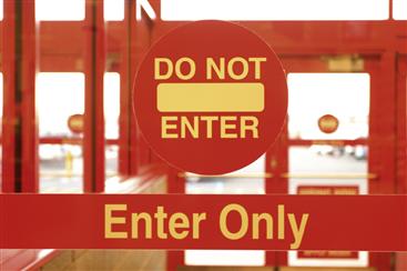
Figure 20-1 A door with a confusing sign containing conflicting cognitive affordances.
This sign is on the inside of the door. The explanation from a clerk in the store was that it really means to enter only from the outside and not to go through the door from the inside. One can only nod and sigh. They were probably reusing an available design object, the “Do Not Enter” sign, instead of tailoring a sign more specific to the usage situation. The resulting mashup was nonsense.
Another example of a false cognitive affordance showed up in a letter received recently from an insurance company. There was a form at the bottom to fill out and return, with this line appearing just above the form, as seen in Figure 20-2.
![]()
Figure 20-2 False cognitive affordances in a form letter that looks like an affordance to cut.
Because that dashed line looked so much like the usual “Cut on this line to detach” cognitive affordance, one might easily detach the form before realizing that the customer information above would be lost. A better design might simply omit this warning because, without it, the typical user would not even think of ripping the paper.
Examples of false cognitive affordances in user interfaces abound. A common example is seen in Web page links that look like buttons, but do not behave like buttons. The gray background of the links in the top menu bar of a digital library Website, Figure 20-3, makes them seem like buttons. A user might click on the background, assuming it is part of a button, and not get any result. Because the “button” is actually just a hyperlink, it requires clicking exactly on the text.
![]()
Figure 20-3 False cognitive affordances in a menu bar with links that look like buttons.
Below-the-fold issues on Web pages can be compounded by having a horizontal line on a page that happens to fall at the bottom of a screen. Users see the line, a false affordance, and assume falsely that it is the bottom of the page and so do not scroll, missing possibly vital information below.
Sometimes a false cognitive affordance arises from deliberate abuse of a shared convention to deceive the user. Some designers of pop-up advertisements “booby trap” the “X” box in the upper right-hand corner of the pop-up window, making it a link to launch one or more new pop-ups when users click on the “X”, trapping users into seeing more pop-up ads when their intention clearly was to close the window.
As another example, consider a radio with the slider switch, sketched in Figure 20-4a, for selecting between stereo and monaural FM reception. The names for the switch positions (Stereo, Mono) are a good match to the user’s model, but the arrows showing which way to slide the switch are unnecessary and introduce confusion when combined with the labels.
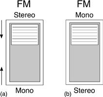
Figure 20-4 Radio switch with mixed affordances.
The design has mixed cognitive affordances: the names of the modes at the top and bottom of the switch are such a strong cognitive affordance for the user that they conflict with the arrows. The arrows in Figure 20-4a call for moving the switch up to get monaural reception and down to get stereo. At first glance, however, it looks as though the up position is for stereo (toward the “stereo” label) and down is for monaural, but the arrows make the meaning exactly the opposite. The names alone, as shown in Figure 20-4b, are the more normal and natural way to label the switch.
As another example, Figure 20-5 is a photo of part of the front of an old microwave. The dial marks between the settings for “Defrost” and “Cook” seem to indicate a range of possible settings but, in fact, it is a binary choice: either “Defrost” or “Cook” but nothing in between. The designer could not resist the temptation to fill in the space between these choices with misleading “design details” that are false affordances.
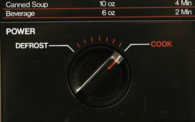
Figure 20-5 Useless dial marks between power settings on a microwave.
As a further example, in Figure 20-6, we see a sign that has made the rounds on the Internet, mainly because it is so funny. It is an example of a cognitive affordance that is misleading.

Figure 20-6 Misdirection in a cognitive affordance.
20.6 User-created affordances as a wake-up call to designers
If a device in the everyday world does not suit the user, we will frequently see the user modify the apparatus, briefly and unknowingly switching to the role of designer. We have all seen the little cognitive or physical affordances added to devices by users—Post-it™ notes added to a computer monitor or keyboard or a better grip taped to the handle of something. These trails of user-created artifacts blazed in the wake of spontaneous formative evaluation in the process of day-to-day usage are like wake-up messages, telling designers what the users think they missed in the design.
A most common example of trails (literally) of user-made artifacts is seen in the paths worn by people as they walk. Sidewalk designers usually like to make the sidewalk patterns regular, symmetric, and rectilinear. However, the most efficient paths for people getting from one place to the other are often less tidy but more direct. Wear patterns in the grass show where people need or want to walk and, thus, where the sidewalks should have been located. The rare and creative sidewalk designer will wait until seeing the worn paths, employing the user-made artifacts as clues to drive the design.
Sometimes the affordances are already there but they are not effective. As Gaver says, when affordances suggest actions different from the way something is designed, errors are common and signs are necessary. The signs are artifacts, added because the designs themselves did not carry sufficient cognitive affordance.
We have all seen the cobbled design modifications to everyday things, such as an explanation written on, an important feature highlighted with a circle or a bright color, a feature (e.g., instructions) moved to a location where it is more likely to be seen. Users add words or pictures to mechanisms to explain how to operate them, enhancing cognitive affordance.
Neither do physical affordances escape these design lessons from users. You see added padding to prevent bruised knuckles. A farmer has a larger handle welded onto a tractor implement, enhancing physical affordance of the factory-made handle and its inadequate leverage. User-created artifacts also extend to sensory affordances.
For example, a homeowner replaces the street number sign on her house with a larger one, making it easier to see. Such user-made artifacts are a variation on the “user-derived interfaces” theme of Good et al. (1984), through which designers, after observing users perform tasks in their own way, modified interaction designs so that the design would have worked for those users.
Example:
In Figure 20-7, a photo of a glass door in a convenience store, we show an example of a user-added cognitive affordance. The glass and stainless steel design is elegant: the perfectly symmetric layout and virtually unnoticeable hinges contribute to the uncluttered aesthetic appearance, but these same attributes work against cognitive affordance for its operation.
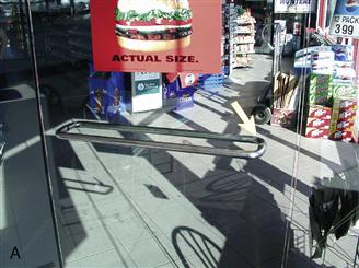
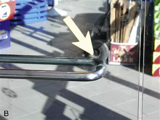
Figure 20-7 Glass door with a user-added cognitive affordance (arrow) indicating proper operation.
The storeowner noticed many people unsure about which side of the stainless steel bar to push or pull to open the door, often trying the wrong side first. To help his customers with what should have been an easy task in the first place, he glued a bright yellow cardboard arrow to the glass, pointing out the correct place to operate the door.
Example:
The icons shown in Figure 20-8 are for lightness and darkness settings on a home office copier/printer, icons with ambiguous meanings. The icon for lighter copies showed more white but the white can be interpreted as part of the copy and it seems more dense than the icon for darker copies so the user had to add his own label, as you can see in the figure.
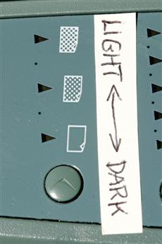
Figure 20-8 A user-created cognitive affordance explaining copier darkness settings.
These trails of often inelegant but usually effective artifacts added by frustrated users leave a record of affordance improvements that designers should consider for all their users. Perhaps if designers of the everyday things that Norman (1990) discusses had included usability testing in the field, they would have found these problems before the products went to market.
In the software world, most applications have only very limited capabilities for users to set their preferences. Would not it be much nicer for software users if they could modify interaction designs as easily as applying a little duct tape, a Post-it, or extra paint here and there?
In Figure 20-9 we show how a car owner created an artifact to replace an inadequate physical affordance—a built-in drink holder that was too small and too flimsy for today’s super-sized drinks. During one trip, the user improvised with a shoe, resulting in this interesting example of a user-installed artifact.
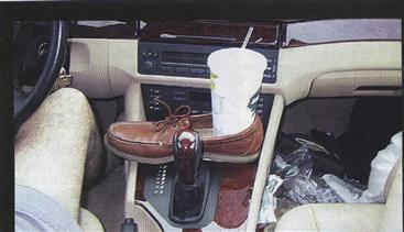
Figure 20-9 A user-made automobile cup-holder artifact,
used with permission from Roundel magazine, BMW Car Club of America, Inc. (Howarth, 2002).
As an example, consider a desktop printer used occasionally to print a letter on a single sheet of letterhead stationery. Inserting the stationery on top of the existing plain paper supply in the printer does this rather easily. The only problem is that it is not easy to determine the correct orientation of the sheet to be inserted because:
![]() there is no clear mental model of how the sheet travels through in the interior mechanism of the printer
there is no clear mental model of how the sheet travels through in the interior mechanism of the printer
![]() printers can vary in this configuration
printers can vary in this configuration
![]() the design of the printer itself gives no cognitive affordance for loading a single sheet of letterhead
the design of the printer itself gives no cognitive affordance for loading a single sheet of letterhead
Thus, the user attached his own white adhesive label, shown in Figure 20-10, that says “Stationery: upside down, face up,” adding yet another user-created artifact attesting to inadequate design. As Norman (1990, p. 9) says, “When simple things need pictures, labels, or instructions, the design has failed.”
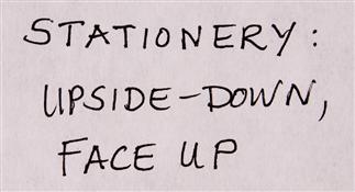
Figure 20-10 A user-created cognitive affordance to help users know how to insert blank letterhead stationery.
As you know, the world is full of examples of user-created cognitive affordances, attesting to the need for better design for everyone. As another example here, in Figure 20-11 we show a road sign at a country road corner in Maine.


Figure 20-11 A user-created cognitive affordance added to a roadside sign; see arrow on post to left of the sign.
We were looking for the campground and the sign confirmed that we were close, but we were not sure which way to turn to get there. Then we saw the arrow that someone else had added on the post to the left of the sign, which helped us complete our task. It was also an indication that we were not the first to encounter this UX problem.
20.7 Emotional affordances
Because of the importance of emotional impact as part of the user experience, we see the possibility of a new type of affordance—an emotional affordance. We suggest the value of considering emotional affordances in interaction design, affordances that help lead users to a positive emotional response. This means features or design elements that make an emotional connection with the user. These will include design features that connect to our subconscious and intuitive appreciation of fun, aesthetics, and challenges to growth.
Emotional Impact
Emotional impact is the affective component of user experience that influences user feelings. Emotional impact includes such effects as pleasure, fun, joy of use, aesthetics, desirability, pleasure, novelty, originality, sensations, coolness, engagement, novelty, and appeal and can involve deeper emotional factors such as self-expression, self-identity, a feeling of contribution to the world, and pride of ownership.
This new kind of affordance plays well into the original Gibson ecological view of affordances that are about the relationship between a living being and its environment. This is just what we are talking about with respect to emotional impact, especially phenomenological aspects. Gibson’s affordances are about values and meanings that can be perceived directly in the environment.
Apple products are bristling with emotional affordances, and it is an operational concept in the automobile design world. The mobile world is trying to leverage emotional affordances to attract customers. Let us work together to make this a new kind of affordance in full standing with the others.