13. Working with Color, Transparency, and Effects
In this chapter, you learn how to use InDesign’s enhanced color management tools, the Ink Manager, and Swatches panel options.
When you’re designing a layout, color truly is the great communicator. Good use of color is an excellent way to incite a reaction from your audience. Colors can inspire, stimulate, and influence all of us, which is why we rely on their effectiveness.
Before you begin working with color and transparency in InDesign, it’s a good idea to choose your color management settings. Doing so lets you “soft proof” your work and ensure color accuracy on all your devices.
Understanding Color Management Principles
Colors can appear one way on your monitor but appear drastically different when you print them. Thankfully, InDesign includes enhanced color management features that can make screen colors come as close as possible to what you’ll see in the final printed piece. These color settings can also be synchronized with the other applications in the Creative Suite (such as Photoshop and Illustrator) using Adobe Bridge. This synchronization ensures that the colors appear the same in all the Adobe Creative Suite applications.
Color management is intended to ensure that the colors you are viewing on your screen are displaying a true representation of what your layout will look like upon final output. The idea is to maintain color consistency on every device (print and display) through the use of embedded color profiles.
Choosing Color Settings
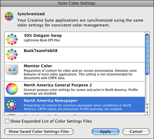
You choose InDesign color management settings from the Color Settings dialog box. To display the dialog box, choose Edit, Color Settings. At the top of the dialog box, InDesign displays whether the current color settings are synchronized with the other applications in the Creative Suite (see Figure 13.1).
Figure 13.1. Bridge displays a brief description of each color setting in the Suite Color Settings dialog box.
To synchronize color management settings with the other applications in the Creative Suite, launch Adobe Bridge and choose Edit, Creative Suite Color Settings. Choose the setting you want to use and click Apply.
You can choose a different color management setting from what is currently being used in the other suite applications. To turn off synchronization of color management settings in InDesign, choose Edit, Color Settings. In the Color Settings dialog box that appears, choose a different setting from the Settings drop-down list.
To resynchronize color management settings with the other suite applications, choose the same color management setting that is currently chosen in the Suite Color Settings dialog box in Bridge.
Whether synchronized or not, the color management setting you choose in InDesign applies specific working space profiles and color management policies for both RGB and CMYK color spaces. It also applies specific conversion options, which you can view in the dialog box by clicking the Advanced Mode check box. For more on a working space profile, color management policy, or conversion option (color engine and rendering intent), hover the cursor over the respective menu and refer to the bottom of the dialog box for a brief description.
You can also save your own custom working space profiles, color management policies, and conversion options as a custom setting. To do so, choose the preferred options and click the Save button. In the Save Color Settings dialog box that appears, enter a name for the setting. Click the Save button to add the custom setting to the Settings drop-down list.
To prevent the profile mismatch or missing profile warning dialog boxes from appearing when you open a document, disable both Ask When Opening options in the Profile Mismatches portion of the dialog box. To disable color management policies altogether, choose Off from the RGB and CMYK drop-down lists located in the Color Management Policies portion of the dialog box.
Color Managing Placed Graphics
If your workflow does not require you to color manage entire documents, you might still be concerned about outputting the colors of imported graphics properly. In this scenario, you can color manage individual graphics as you import them or after you’ve already placed them in a document.
![]() LET ME TRY IT
LET ME TRY IT
Color Manage Imported Graphics
You have the capability to color manage a graphic as you place it in your document; however, you can also change the settings to an image already placed in the document. To do so, apply the following steps:
- Choose File, Place and browse to the file’s location on your disk using the Place dialog box. Before you click Open, enable the Show Import Options check box.
- In the Color panel of the Image Import Options dialog box, you can specify how you would like to color manage the graphic. To apply the current document color settings to the graphic, choose Use Document Default and Use Document Image Intent from the lists (see Figure 13.2).
Figure 13.2. Choose the preferred color management settings from the Color panel of the Image Import Options dialog box.
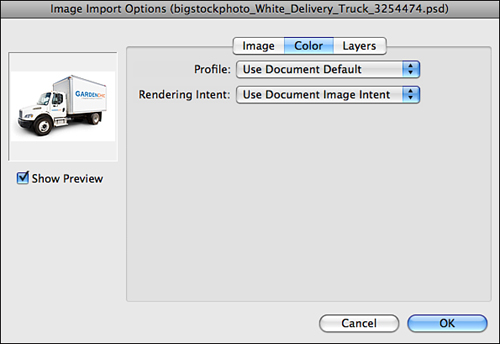
- To apply a different color setting to the graphic, select the desired color profile and rendering intent from the respective drop-down lists.
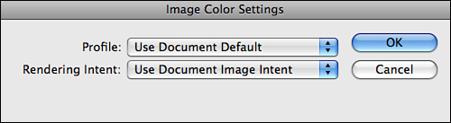
To color manage a graphic that has already been placed in a layout, select it with either selection tool and choose Object, Image Color Settings. In the Image Color Settings dialog box that appears, choose the preferred settings from the Profile list and Rendering Intent list, and then click OK (see Figure 13.3).
Figure 13.3. Choose the preferred color management settings from the drop-down lists available in the Image Color Settings dialog box.
Using Proof Setup for Soft Proofing
Normally, you print a proof of your document to see how its colors will look. On a color-managed system, you can display an onscreen preview of how your document’s colors will look when reproduced.
InDesign’s Proof Setup feature enables you to preview onscreen how a document will appear when it is printed. This process is called soft proofing.
To use this feature, choose one of three options from the View, Proof Setup submenu:
• Custom: When you choose this option, InDesign displays the Customize Proof Condition dialog box. In the dialog box, select a device profile to proof with from the Device to Simulate drop-down list (see Figure 13.4). It’s important to understand that InDesign simulates onscreen how the document’s color settings should appear based on the chosen profile.
Figure 13.4. In the Customize Proof Condition dialog box, select a device profile from the Device to Simulate drop-down list.
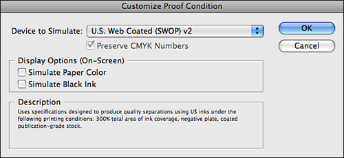
Under Display Options (On-Screen), enable the Simulate Paper Color and Simulate Black Ink options to preview a profile’s dynamic range. If Simulate Paper Color is selected, InDesign automatically enables and grays out the Simulate Black Ink option.
• Document CMYK: Creates a soft proof using the document’s CMYK profile.
• Working CMYK: Creates a soft proof of CMYK ink colors using the CMYK working space.
After you’ve chosen the preferred proof setup option, you can toggle the soft proof feature on and off by choosing View, Proof Colors.
Creating, Saving, Editing, and Deleting Color Swatches
The Swatches panel acts as the central hub for applying and editing color in InDesign. You can store your favorite colors and gradients as swatches in the panel, load colors from other InDesign documents, and add colors from various libraries.
The easiest way to save a swatch is to drag and drop it into the Swatches panel for future use. You can drag and drop swatches from the Tools panel, Color panel, Gradient panel, or from the top of the Swatches panel.
You can also create a new color swatch. To display the New Color Swatch dialog box, choose New Color Swatch from the Swatches panel menu (see Figure 13.5). Choose a color type (Spot or Process) from the Type drop-down list. You can also choose a mode (RGB, CMYK, or Lab) from the Color Mode list. You can enter a custom name in the Swatch Name field or enable the Name with Color Value option.
Figure 13.5. You can create a new color swatch using the controls available in the New Color Swatch dialog box.

Process color uses a combination of four inks: cyan, magenta, yellow, and black (CMYK). You use process colors when creating a layout intended for printing on a printing press.
Use RGB color builds (a combination of red, green, and blue) when creating layouts for onscreen display over the Web or any device.
![]() LET ME TRY IT
LET ME TRY IT
Creating CMYK Color Swatches
To create a CMYK color swatch for use in a print layout, follow these steps:
- Choose New Color Swatch in the Swatches panel menu.
- For Color Type, choose Process.
- For Color Mode, choose CMYK.
- Enter in values in the Cyan, Magenta, Yellow, and Black areas below the Color Mode area.
- To save the color in the Swatches panel and close the New Color Swatch dialog box, click OK. To save the color in the Swatches panel without closing the dialog box, click the Add button. You can then continue creating color swatches and adding them to the Swatches panel.
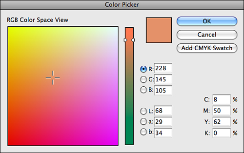
You can also create a color swatch using the Color Picker. To access the Color Picker, double-click the fill or stroke icon located at the bottom of the Tools panel, or in the Control or Color panels. Choose a color by clicking in the color ramp or by entering values in the RGB, Lab, or CMYK fields (see Figure 13.6). To save the color in the Swatches panel without closing the dialog box, click the Add button.
Figure 13.6. You can also create a color swatch using the Color Picker.
Tell Me More: Media 13.1—Adding Unnamed Colors to the Swatches Panel
![]()
Access this video file through your registered Web edition at my.safaribooksonline.com/9780132174541/media.
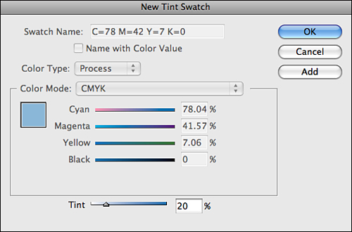
InDesign also enables you to create a new swatch based on a tint of a selected color. To create a tint swatch, select a color from the Swatches panel and choose New Tint Swatch from the panel menu. When the New Tint Swatch dialog box appears, enter a value in the Tint field or drag the tint slider (see Figure 13.7). Click OK to add the tint swatch to the Swatches panel and close the dialog box.
Figure 13.7. In the New Tint Swatch dialog box, enter a value in the Tint field or drag the tint slider.
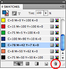
To delete a swatch, click the Delete Swatch button at the bottom of the panel (the trash can icon), or drag it over the button and release the mouse button (see Figure 13.8).
Figure 13.8. Click the Delete Swatch button to remove the selected swatches from the panel list.
Creating and Editing Gradients
The Gradient panel allows you to apply gradients to selected items within your layout. This panel works closely with the Gradient tool and Swatches panel, allowing you to apply gradients to both fills and strokes for selected frames, shapes, paths, and even editable text. There are two types of gradients: Radial and Linear.
A Linear gradient causes the gradient to go from left to right or up or down. Radial causes the gradient to move outward in a circle.
![]() LET ME TRY IT
LET ME TRY IT
Create or Edit a Gradient
To create or edit a gradient, apply the following steps:
- Click one of the color stop sliders at the bottom of the Gradient panel. Then drag a color directly on top of it from one of these areas: the Swatches panel list, the fill or stroke icon located at the bottom of the Tools panel, or the fill or stroke icon located at the top of the Swatches panel.
- Drag the color stop sliders left or right to alter the gradient blend (see Figure 13.9). You can delete a color from the gradient by dragging its slider off the panel; however, you must always have at least two colors present.
Figure 13.9. Drag the color stop sliders in the Gradient panel left or right to alter the gradient blend.

You can save any gradients you create by dragging the gradient panel swatch directly into the Swatches panel list.
Accessing Colors Stored in Libraries
You can access colors stored in swatch libraries (such as Pantone colors: www.pantone.com) through the Color Mode list of the New Color Swatch dialog box. To access the dialog box, choose New Color Swatch from the Swatches panel menu. From the Color Mode drop-down list, choose a swatch library to display (see Figure 13.10).
Figure 13.10. Choose a swatch library from the Color Mode drop-down list.
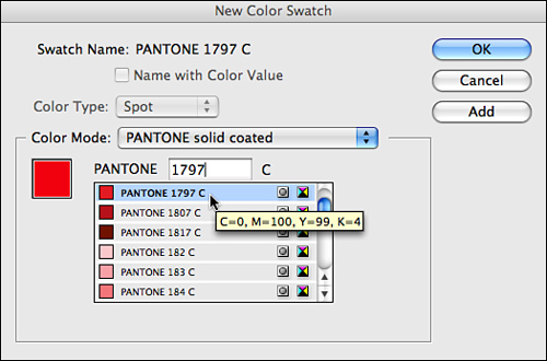
To save the color in the Swatches panel, click the Add button. You can then continue selecting library swatches and adding them to the Swatches panel.
If you know the number of a specific library swatch that you’d like to locate and use, enter it in the search field and let InDesign select it for you.
Converting Spot Colors to Process
Process color uses a combination of four inks: cyan, magenta, yellow, and black (CMYK). You use process colors when creating a layout intended for printing on a 4-color printing press.
Spot colors are premixed inks that you can use instead of or in conjunction with process inks. Use spot colors when your print budget requires you to work with only one or two colors, or if you’d like to add a fifth color to a four-color process print job.
If you are creating a four-color layout, any additional spot colors that are being used in the document must be converted to process. You can convert spot colors to process using the Ink Manager or by changing Color Mode and Type settings for a selected swatch in the Swatch Options dialog box.
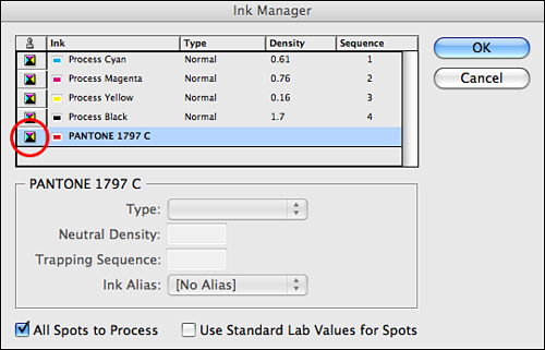
Converting Spot Colors with the Ink Manager
The Ink Manager converts spot colors to process during output without changing the color swatch definitions in the document. To convert spot colors to process using the Ink Manager, choose Ink Manager from the Swatches panel menu.
In the Ink Manager dialog box that appears, select a spot color from the list and click its color mode icon in the far-left column (see Figure 13.11). Doing so toggles the swatch from spot to process. To convert all spot colors in the document to process, check the All Spots to Process option in the bottom left of the dialog box.
Figure 13.11. To toggle the swatch from spot to process, locate a spot color from the Ink Manager list and click its color mode icon in the far-left column.
Converting Spot Colors with Swatch Options
Unlike with the Ink Manager, converting a spot color to process using the Swatch Options dialog box actually alters the swatch definition in the document. If you intend to always use these colors as process, it is okay to convert them in the document; however, doing so can mute certain colors that fall out of the much wider RGB color gamut.
![]() LET ME TRY IT
LET ME TRY IT
Converting Spot Colors to Process Using the Swatch Options Dialog Box
To convert a spot color to process, follow these steps:
- Select a spot color from the Swatches panel list and choose Swatch Options from the panel menu.
- In the Swatch Options dialog box that appears, choose CMYK from the Color Mode list and Process from the Color Type list (see Figure 13.12).
Figure 13.12. In the Swatch Options dialog box, choose CMYK from the Color Mode list and Process from the Color Type list.
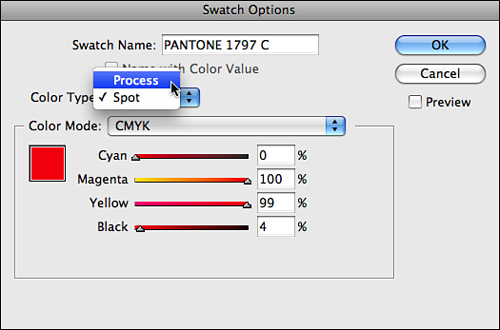
- Click OK to convert the color and close the dialog box.
Importing Colors from Other InDesign Documents
You can import colors from other InDesign documents in three ways:
• Choose Load Swatches from the Swatches panel menu. In the Open a File dialog box that appears, browse to an InDesign file on your disk and click Open. When you do, InDesign closes the dialog box and adds all the stored swatches to the Swatches panel.
• Choose New Color Swatch from the Swatches panel menu and select Other Library from the Color Mode drop-down list. When you do, InDesign launches the Open a File dialog box, where you can browse to an InDesign file on your disk. Click Open to add all the stored swatches to the New Color Swatch dialog box. You can then select the swatches you’d like to use and add them to the Swatches panel by clicking the Add button.
• Select colors from the Swatches panel and drag them from one InDesign document to another.
Working with Kuler
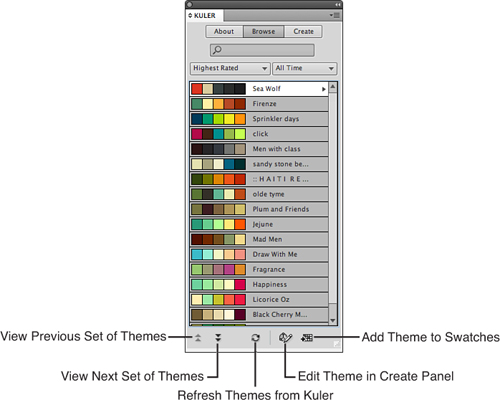
Kuler is an online community of designers that create and share color themes. The Kuler panel enables you to access groups of colors (called themes), from kuler.adobe.com. As long as you have a working Internet connection, you can use the Kuler panel to browse through thousands of themes from within InDesign. You can also download, edit, and incorporate these color themes into your own design projects and even upload themes of your own.
To display the Kuler panel, choose Window, Extensions, Kuler. To access Kuler themes, click the Browse button at the top of the panel. You can control which themes are displayed in the Browse panel by choosing different options from the search and limit drop-down lists provided (see Figure 13.13). You can also search for a specific theme by entering its name, tag, or creator in the Search field. To add a theme to the Swatches panel, select it from the list, then click the triangle to the right and choose Add to Swatches from the pop-up list, or click the Add Theme to Swatches button.
Figure 13.13. You can use the Kuler Browse panel to browse for online color themes from within InDesign.
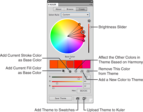
To edit a selected theme, double-click it in the search list, click the Edit theme button at the bottom of the Browse panel, or choose Edit This Theme from the pop-up menu. When you do, InDesign displays the theme in the Kuler Create panel, where you can edit the colors using the RGB sliders, the Brightness slider, or by choosing different colors from the color wheel (see Figure 13.14). To save a theme, click Save Theme and enter a name for it in the pop-up window that appears; then click Save. You can then choose to upload the new theme to the Kuler site by clicking the Upload button, or save it to the Swatches panel by clicking the Add button.
Figure 13.14. You can edit themes using the controls available in the Kuler Create panel.
Creating and Assigning a Trap Preset
Trapping is the process of creating a slight overlap between abutting colors on a commercial printing press. This is done to compensate for common registration errors. The default trap settings in InDesign work great for most print jobs; however, certain print jobs may require that you assign a custom trap preset to a specific page range or to the entire document.
![]() LET ME TRY IT
LET ME TRY IT
Create and Assign a Trap Preset
You can create and assign a trapping preset using the Trap Presets panel.
- Open the Trap Presets panel by choosing Window, Output, Trap Presets.
- To access the New Trap Preset dialog box, choose New Preset from the panel menu (see Figure 13.15).
Figure 13.15. Enter the preferred settings in the New Trap Preset dialog box.
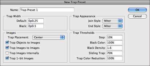
- Enter a name for the trap preset in the Name field.
- The value you enter in the Trap Width section’s Default field sets the trap width for all inks (except solid black). Enter a value in the Black field to set the trap width for solid black.
- To define how corner points in trap segments appear, select Miter, Round, or Bevel from the Join Style drop-down list. Select Miter or Overlap from the End Style menu to define how trap line endpoints appear.
- Choose a trap placement option from the drop-down list provided.
• Center: Applies a trap that expands uniformly on either side of the image boundary.
• Choke: Applies a trap that extends into the image area.
• Neutral Density: Applies a trap based on the ink neutral density of the neighboring colors.
• Spread: Bleeds the colors from the image into the adjacent InDesign object.
- Choose Trap Objects to Images to automatically apply the chosen Trap Placement option to InDesign objects that are adjacent to imported images.
- Choose Trap Images to Images to automatically apply trapping to imported images that are adjacent to each other.
- Choose Trap Images Internally to automatically apply in-RIP trapping (applied with the RIP software used by your print service provider) to color areas inside imported bitmap images (such as screen shots).
- Choose Trap 1-bit Images to automatically apply trapping to black-and-white images that are adjacent to InDesign objects.
- Enter a value in the Step field to determine the percentage of difference required between each color element to activate automatic trapping.
- Enter a value in the Black Color field to determine the percentage of black that must be present in a color before applying Black Trap Width.
- Enter a value in the Black Density field to determine the level of black ink neutral density required to activate automatic trapping.
- Enter a value in the Sliding Trap field to determine at what percentage a trap changes from a spread to a centerline trap, or from a centerline trap to a choke.
- Enter a value in the Trap Color Reduction field to determine the percentage of colors InDesign creates as it builds traps.
- Click OK to add the new preset to the Trap Preset panel list.
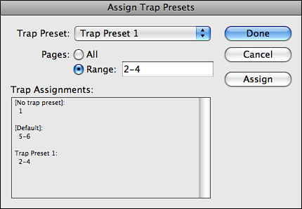
To assign the trap preset to a document, choose Assign Trap Preset from the panel menu. In the Assign Trap Presets dialog box that appears, choose the preset from the Trap Preset drop-down list. You can then indicate whether you would like to assign the preset to all pages or over a specific range of pages in the document (see Figure 13.16). Click Done to assign the trap preset.
Figure 13.16. You can assign trap presets to specific pages via the Assign Trap Presets dialog box.
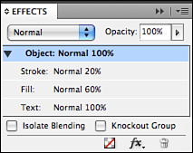
Changing an Object’s Opacity Level
Lowering a selected object’s opacity level lets you see through it. You can do this in InDesign using the controls located in the Effects panel. InDesign enables you to adjust an object’s fill, stroke, and text opacity level separately or all at once. You can also control the opacity level of frame contents (placed graphic or text); however, InDesign does not allow you to apply different opacity values or transparency effects to individual text characters within a single frame.
In the Opacity area of the Effects panel, click and drag the drop-down Opacity slider to change a selected object’s opacity level (see Figure 13.17). The lower the opacity level, the more transparent the selected object becomes.
Figure 13.17. Enter a value in the Opacity field of the Effects panel to change a selected object’s overall opacity level.
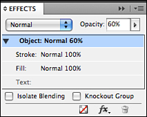
To apply separate opacity levels to the stroke, fill, or text of a selected object, select Stroke, Fill, or Text in the Effects panel and then enter a value in the Opacity field (see Figure 13.18).
Figure 13.18. The Effects panel enables you to adjust an object’s stroke, fill, and text opacity level separately.
Applying Blend Modes
InDesign allows you to apply transparent blend modes to selected objects. By applying these blend modes, you can control how a transparent object’s colors blend with the colors of the objects behind it.
To apply a blend mode to a selected object, select one from the Blend Mode drop-down list located at the top of the Effects panel. To apply separate blend modes to the fill and stroke of a selected object, select either Stroke or Fill in the Effects panel and then choose a blend mode from the list (see Figure 13.19).
Figure 13.19. Choose a blend mode from the drop-down list located at the top of the Effects panel.
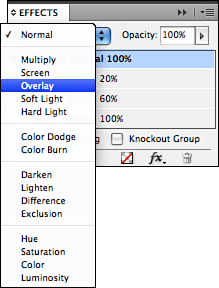
Here’s an explanation of what each blend mode does:
• Normal: At 100% opacity, a selected object’s color does not blend with the colors of the objects underneath.
• Multiply: Darkens a selected object’s color by multiplying its values with the values of the colors underneath. White colors are not affected.
• Screen: Lightens a selected object’s color by multiplying the inverse of the base and blend colors. Screening lighter colors produces greater changes; black is not affected.
• Overlay: Darkens (multiplies) or lightens (screens) a selected object’s color while preserving luminosity. Contrasting colors produce greater changes; black, white, and 50% gray are not affected.
• Soft Light: Darkens (multiplies) or lightens (screens) a selected object’s color without preserving highlight and shadow values. Blend colors above 50% darken the base color; blend colors below 50% lighten the base color. Black, white, and 50% gray are not affected.
• Hard Light: Produces the same effect as Soft Light but with more contrast.
• Color Dodge: A selected object’s pixels are colorized using the hue of the pixels underneath. Color Dodge has a greater effect on lighter colors.
• Color Burn: A selected object’s pixels are colorized using the hue of the pixels underneath. Color Burn has a greater effect on darker colors.
• Darken: When a selected object’s color is lighter than the colors underneath, the darker color is applied.
• Lighten: When a selected object’s color is darker than the colors underneath, the lighter color is applied.
• Difference: Applies the color that results when blend and base colors are subtracted from each other. White inverts the base color; black has no effect.
• Exclusion: Produces the same effect as Difference but with less contrast.
• Hue: Applies the hue of the blend color to the luminance and saturation of the base color.
• Saturation: Applies the saturation of the blend color to the luminance and hue of the base color.
• Color: Applies the hue and saturation of the blend color to the luminance of the base color.
• Luminosity: Applies the luminance of the blend color to the hue and saturation of the base color.
Show Me: Media 13.2—Applying Blend Modes
![]()
Access this video file through your registered Web edition at my.safaribooksonline.com/9780132174541/media.
Applying Effects
Let’s face it—effects are cool. What’s not cool is interrupting your design process to create them in other applications such as Adobe Photoshop. Adobe understands this, and that’s why they’ve made it possible to create effects, such as shadows, glows, bevels, and feathering directly in InDesign.
You can apply effects to imported graphics, shapes, lines, tables, text frames, and editable text characters. One of the great things about InDesign effects is that they are not permanent. You can edit their settings or turn them on or off at any time.
To apply an effect to a selected object in InDesign, choose one from the Effects submenu, located under the Object menu or the Effects panel menu. Doing so launches the Effects dialog box.
On the left side of the Effects dialog box, check the effect(s) you would like to apply to the selected object. Each effect has its own set of unique controls. To display the controls for a specific effect on the right side of the panel, select the effect name from the menu list on the left (see Figure 13.20).
Figure 13.20. Choose the preferred effect settings using the controls available in the Effects dialog box.

Proceed to choose the preferred settings for each effect. To see the settings applied to the object as you enter them in the dialog box, enable the Preview option.
Show Me: Media 13.3—Applying Effects
![]()
Access this video file through your registered Web edition at my.safaribooksonline.com/9780132174541/media.
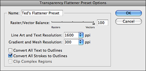
Creating a Transparency Flattener Preset
Anytime you adjust an object’s opacity level, apply a blend mode, import a transparent graphic, or apply a drop shadow or a feathering effect, you are applying transparency. InDesign lets you know which pages in the document contain transparency by displaying a checkerboard pattern over the respective page icons in the Pages panel.
To print transparent objects, they must be flattened so that PostScript printing language can understand them. At output time, InDesign applies the transparency flattener presets that you choose. You can print using one of the noneditable default settings (Low, Medium, or High Resolution), or create and apply a custom preset using settings recommended by your print service provider.
To create a custom Flattener preset, choose Edit, Transparency Flattener Presets. In the Transparency Flattener Presets dialog box that appears, click New. InDesign opens the Transparency Flattener Preset Options dialog box (see Figure 13.21).
Figure 13.21. Choose the preferred transparency flattener settings using the controls available in the Transparency Flattener Preset Options dialog box.
![]() LET ME TRY IT
LET ME TRY IT
Create Transparency Flattener Preset
You can create a transparency flattener preset by applying the following steps:
- Enter a name for the flattener preset in the Name field.
- Drag the Raster/Vector Balance slider to adjust the amount of nonpixel-based information (called vector) that will be kept in your document. Higher settings keep more vector objects (such as Adobe Illustrator graphics); lower settings convert more vector objects to pixels (called rasterizing). Select the lowest setting to rasterize all the artwork.
- Enter a ppi (pixels per inch) resolution value in the Line Art and Text Resolution field for rasterizing vector objects.
- Enter a ppi value in the Gradient and Mesh Resolution field for rasterizing transparent objects such as drop shadows, feathers, and gradients. Gradient and mesh resolution should be set around 150 to 300 ppi.
- For some output devices (but generally not high-resolution printers) transparent text appears bolder than the rest of the text in the document when printed. When this happens, enable the Convert All Text to Outlines option to make all text items (transparent and opaque) output the same. By doing so, the flattener converts all text to outlines when printing.
- Thin lines can also print bolder than the rest of the lines in the document when transparency is applied. Enable the Convert All Strokes to Outlines option to make all lines (transparent and opaque) output the same. By doing so, the flattener converts all strokes to outlines at print time.
- Enable the Clip Complex Regions option to prevent any unwanted lines from printing when rasterizing vectors. Doing so produces a higher-quality print but increases the amount of time it takes to output.
Show Me: Media 13.4—Using the Flattener Preview Panel
![]()
Access this video file through your registered Web edition at my.safaribooksonline.com/9780132174541/media.
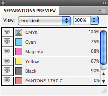
Using the Separations Preview Panel
The Separations Preview panel allows you to preview CMYK process plates individually onscreen, before outputting. You can use the separations preview to check total ink coverage (to make sure it does not exceed press limitations) and overprinting (including transparency and blends).
Click one of the process plates in the panel (Cyan, Magenta, Yellow, or Black) to preview that separation. By default, the individual separations appear onscreen as black. However, you can change the preview setting to show actual plate colors by disabling the Show Single Plates in Black option in the panel menu.
From the View drop-down list at the top of the panel, choose Separations or Ink Limit. Choose Separations to preview CMYK process plates individually. Choose Ink Limit to enter an ink limit percentage (you should get this number from your print service provider) and highlight any excessive ink coverage in the document in red. Hover the cursor over any area in the document to view the CMYK numerical build for a specific color (see Figure 13.22).
Figure 13.22. InDesign displays the percentage numbers next to each plate color in the panel and updates them as you move the cursor around the document.