1. Understanding Your Workspace
This chapter gets you up to speed with InDesign’s interface and helps you get the hang of where everything is and how it all works.
If you’re totally new to Adobe InDesign, the first thing you should do is become familiar with the application’s user interface. The first time you launch InDesign, you might not know where to start or what to click first. The controls, menus, panels, and general look of the interface are indeed all very different from other software applications that you may have used, such as QuarkXPress or Microsoft Word. However, after you become familiar with this new environment, you’ll feel right at home with InDesign CS5.
Exploring the Interface
It doesn’t really matter whether you’re a “Mac person” or a “PC person” when you’re working in InDesign CS5. For the most part, the interface controls look and behave the same way on either Windows XP/Vista/7 or Mac OSX. The exceptions are the usual shortcut key differences, a few menu commands, and some system-specific buttons and controls (mostly in regard to printing and exporting documents).
Let’s take a look at the main interface controls in InDesign CS5.
The InDesign CS5 Interface
The InDesign interface is very intuitive and easy to navigate. Everything you need to work with and create layout documents is right at your fingertips. The first interface item you should familiarize yourself with is the Welcome Screen.
Shown in Figure 1.1 is the default, Essentials Workspace for InDesign CS5. These are the main elements you will be working with:
• Menu Bar: You can access any of the menu list options by clicking any of the word headings in the menu bar.
• InDesign Application Menu: This “Mac only” menu provides access to InDesign’s application-specific options, such as Preferences, as well as some other Mac OS X system features such as Hiding and Showing.
• Application Bar: View options, zoom percentage, screen mode, and arrange options are all available from the Application Bar drop-down lists.
• Control Panel: Options for the tool you currently have selected in the Tools panel always appear here.
• Tools Panel: You can access any of the InDesign tools by clicking one of the icons shown in the Tools panel.
• Panels: All the panels can be accessed under the Window menu in the menu bar. They are listed alphabetically in the main pull-down, but note that some are grouped into submenus within the list. After they are accessed, all panels (other than the Tools panel or the Control panel) appear docked on the right side of your screen, but can also be relocated within the dock, grouped with other panels, or released from the dock and left free-floating.
• Welcome Screen: This dialog box appears only when you first launch InDesign. It contains links for opening recent documents, creating new documents (including books and libraries), and accessing the InDesign community via the Internet. If you’d prefer not to see the Welcome Screen every time you launch InDesign, enable the Don’t Show Again option located in the lower-left corner of the dialog box.
Figure 1.1. This is the startup Welcome Screen that you see the first time you launch InDesign CS5.
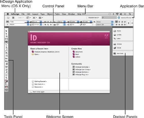
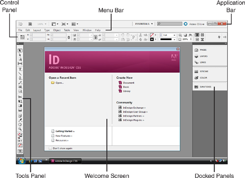
Figure 1.2. This is the screen you see the first time you launch InDesign CS5 in Windows.
The Document Window
Anytime you open or start a new document InDesign places it in its own document window. You can view all the pages in your document within this window (see Figure 1.3).
Figure 1.3. Every document window contains its own set of rulers, as well as controls for accessing specific pages of a document.
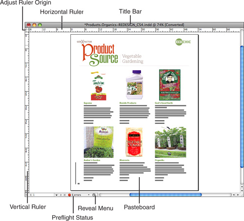
The document window includes the following items;
• Title Bar: The filename and view magnification percentage are always displayed at the top of the document window in the title bar.
• Pasteboard: The work area for creating page layouts and designs is always surrounded by a thin rule and a hard drop shadow. The white area outside the pasteboard is not printable. If you Control-click (Mac) or right-click (Win) in the Pasteboard area, you can access various commands, depending on which tool you currently have selected.
• Adjust Ruler Origin: Click and drag to change the zero point in your document (the point of origin for your rulers). Double-clicking this area resets the zero point to the top-left corner.
• Page Access: In the bottom-left corner of the document window are controls for accessing specific pages in the document. The number that is displayed indicates which page you are currently viewing in the document window. Click the arrow to the right of it to select a different page from the footer menu, or double-click in the text field to type in the number of the page you’d like to view. A group of arrow buttons enables you to access the next spread, previous spread, and first or last page of the document.
• Preflight Status: By default, InDesign’s Preflight option is always on, which allows InDesign to automatically check for document errors in the background while you work. InDesign displays any Preflight prepress check errors that it finds in the document at the bottom of the window. Click the arrow to the right of the status display to select different Preflight options from the footer menu.
• Reveal Menu: Click the Reveal Menu button at the bottom of the document window to choose a display option from the footer menu. You can choose to reveal the document in the Finder (Mac), Explorer (Win), Bridge, or Mini Bridge.
• Rulers: When visible, the rulers always surround the top and left sides of a layout in the document window.
 LET ME TRY IT
Hiding/Showing Rulers
To display the document rulers, follow these steps:
- To show or hide the rulers in a document window, choose View, Show/Hide Rulers or press Cmd-R (Mac) or Ctrl+R (Win).
- To choose the unit of measurement that you’d like to display in each ruler, choose InDesign, Preferences, Units and Increments (Mac) or Edit, Preferences, Units and Increments (Win) to access the Units and Increments panel of the Preferences dialog box.
- Select an option from the Ruler Units area of the panel. Note that each ruler (Horizontal and Vertical) has a separate drop-down list, which enables you to select a different measurement unit for each ruler.
The ruler area also enables you to click and drag guidelines (referred to as ruler guides) onto the pasteboard. Hold down Shift as you click and drag to snap the guide to the nearest ruler increment. Double-click in the ruler area to add a guide at that exact measurement point on the page.
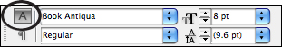
Label Icons and Data Fields
For many of the interface controls, an identifying label icon appears next to a related data field. The icon gives you a visual representation of what the control’s function is. You can click this icon to select the current value that is displayed in the accompanying data field (see Figure 1.4).
Figure 1.4. Descriptive icons accompany each data field in the interface.
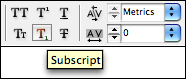
ToolTips
These little guys can be really helpful if you’re new to InDesign. Some of the label icons may be hard to decipher if you’re new to the interface, in which case it’s ToolTips to the rescue! Just hover your cursor over any tool, control, or panel name, and in a few seconds, a little yellow box appears with a description (see Figure 1.5).
Figure 1.5. You can refer to the ToolTip for a brief description of any interface control.
Show Me: Media 1.1—Working with ToolTips
Access this video file through your registered Web edition at my.safaribooksonline.com/9780132174541/media.
Interface Menus
In addition to the menu lists that are accessible from the menu bar, you can access a series of menus at various other places within the InDesign interface. The menus are broken down into four categories: Panel Menus, Footer Menus, Contextual Menus, and Drop-downs.
Panel Menus
Most of the panels contain additional options that you can access via the panel’s flyout menu. To display the flyout menu, click the panel menu icon located in the upper-right corner of the panel, where you can choose from several panel-specific commands (see Figure 1.6).
Figure 1.6. The menu options for the Swatches panel offer quite a bit to choose from.
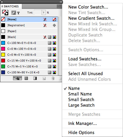
If you can’t find the command you’re looking for from the menu bar lists, it’s always a good idea to check a related panel menu. You might be surprised at what you’ll find!
Tell Me More: Media 1.2—Accessing Panel Menu Options
Access this video file through your registered Web edition at my.safaribooksonline.com/9780132174541/media.
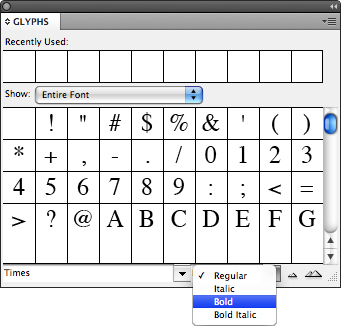
Footer Menus
Footer menus behave exactly like panel menus; the only exception is that you must access them from the bottom of a window (such as the Glyphs panel or the document window) rather than from the top of a panel (see Figure 1.7).
Figure 1.7. The Glyphs panel footer menu shown here provides a great, quick and easy way to access different fonts and font styles.
Contextual Menus
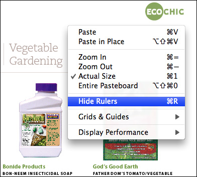
Control-clicking (Mac) or right-clicking (Win) in the document window, as well as in certain panels and dialog boxes, gives you quick access to certain item-specific options (see Figure 1.8). These options are determined by which tool you have selected and where you click in the interface.
Figure 1.8. The contextual menu for the Pasteboard, which you can access by Control+clicking (Mac) or right-clicking (Win) with the Selection tool.
Show Me: Media 1.3—Accessing Contextual Menus
Access this video file through your registered Web edition at my.safaribooksonline.com/9780132174541/media.
Drop-down Lists
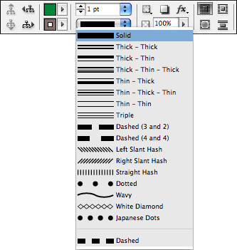
Many of the panels and dialog boxes contain drop-down lists that provide additional options and settings, as shown in Figure 1.9. Click the blue arrows to access these drop-down lists.
Figure 1.9. The Control panel contains several drop-down lists that provide additional options for specific tools. Shown here are the stroke options available for the Line tool.
On/Off Controls
Some controls in InDesign simply need to be turned on or off. There are three simple ways to “hit the switch” for these controls: by clicking check boxes, option buttons, and toggle buttons.
Check Boxes
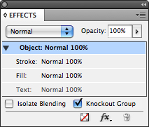
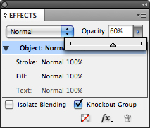
Certain controls in InDesign are turned on and off by checking boxes. A checked box indicates that the control is on, and an unchecked box indicates that it is off. To place a check in an empty box, click in it with your mouse or click once on its accompanying text-field description (see Figure 1.10).
Figure 1.10. The Knockout Group option enabled in the Effects panel.
Option Buttons
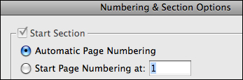
Various other controls in InDesign are activated by clicking an option button. You encounter these only when there are two or more choices for a control, in which case you can choose one, but never more than one at the same time. Clicking either the empty circle or its accompanying text-field description activates your selection (see Figure 1.11).
Figure 1.11. The Automatic Page Numbering option enabled in the New Section dialog box.
Toggle Buttons
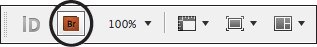
Clicking a toggle button performs a simple, specific task. For example, clicking the Bridge icon shown here in the Application bar launches the Adobe Bridge application (see Figure 1.12). After Bridge is launched, clicking the toggle button brings Bridge to the front of your open applications.
Figure 1.12. The Go to Bridge toggle button gives you quick and easy access to the Bridge application.
Action Buttons
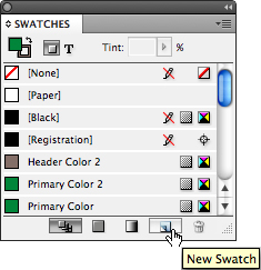
These buttons appear at the bottom of certain panels. Clicking one of them performs an action that is specific to the panel you are currently working with (see Figure 1.13). Although they are not labeled, hovering over them with your mouse launches a ToolTip description explaining what the button’s function is. To repeat the action, click again.
Figure 1.13. The New Swatch button for the Swatches panel.
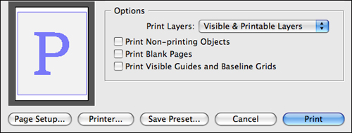
Text Buttons
You can find text buttons in certain dialog boxes, such as Print, Package, Save, and Export. The button’s function is labeled with text rather than an icon (see Figure 1.14). Click the button to perform its specific action. The blue button (Mac) or the blue-outlined button (Win) is InDesign’s default choice, which you can also select by pressing Return (Mac) or Enter (Win).
Figure 1.14. The text buttons for the Print dialog box in Mac OS X.
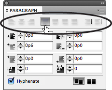
Select Buttons
Select buttons are always arranged in related groups. Much like the option buttons described earlier, you can select only one button at a time from the group. Each button’s function is labeled with a descriptive icon, but if you’re still not sure what it does, you can always refer to the ToolTip by hovering over it with your cursor (see Figure 1.15).
Figure 1.15. The text justification buttons located in the Paragraph panel.
Toggles
Much like Photoshop and Illustrator, InDesign features toggle controls in its Layers panel. As shown in Figure 1.16, the two columns to the left of each layer are used for “toggling” options on or off. The left column toggles the layer’s visibility. The right column toggles the layer’s lock function.
Figure 1.16. The toggle controls for the Layers panel.
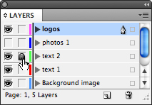
An icon appears in the column whenever a toggle control is activated; an empty box appears when it is not. Click in either column to toggle the layer’s visibility and/or lock function on or off.
Data Fields
Data fields enable you to enter specific numerical values. Click the label icon or control name to the left of the data field to highlight the current value and type (see Figure 1.17). You can also double-click directly in the data field and enter the preferred value.
Figure 1.17. Certain data fields enable you to adjust values in increments by clicking the up arrow and down arrow to the left of the number.
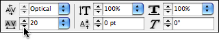
Some data fields are accompanied by a flyout list, which contains preset values to choose from (see Figure 1.18).
Figure 1.18. You can access the flyout list by clicking the arrow to the right of the data field.
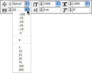
Drop-down Sliders
Some data fields allow you to adjust a value by using a drop-down slider. To make the drop-down slider visible, click the arrow to the right of the number. You can then click and drag the slider arrow to the left or right to adjust the value (see Figure 1.19). Watch the current value that is displayed in the data field change as you click and drag: lower values are to the left and higher values to the right. You can also click anywhere on the slider line to place the arrow at that exact value.
Figure 1.19. Some data fields contain drop-down sliders. Shown here is the drop-down slider for the Effects panel Opacity field.
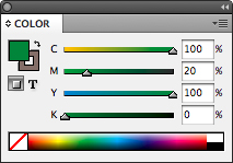
Visible Sliders
Other data fields have a slider control displayed right next to them rather than hidden in a drop-down (see Figure 1.20). These sliders are always visible within the panel. You can use these sliders to adjust values in the same way as the drop-down sliders.
Figure 1.20. The visible sliders for the Color panel.