
8. Formatting Text
In this chapter, you learn how to format characters and paragraphs and how to insert footnotes, drop caps, tab stops, and special characters.
What exactly is formatting? Is it the same as applying character and paragraph styles? The answer is yes and no. Formatting is the process used to alter the look of type on the page—something that in the old days, before desktop publishing, we called typesetting. Styles, although related, are something very different.
Character and paragraph styles enable you to apply different kinds of formatting to your text. You’ll learn how to use styles in Chapter 9, “Working with Styles.” However, to fully understand the power of styles and how best to use them, you must first learn how to format text.
Formatting Characters
The controls in the Character panel (or Control panel) enable you to apply formatting attributes to selected text. With these settings you can specify font and type style, letter spacing, character scaling, and several other character attributes.
Kerning and Tracking
To maintain the “clean look” of the page and improve legibility, it helps to adjust the amount of space between characters. You can control character spacing in your layouts by adjusting kerning and tracking values.
What exactly is the difference between kerning and tracking? Good question. The kerning value reflects the amount of space placed between two characters, whereas tracking lets you control the spacing over a range of characters.
Kerning
InDesign offers two types of auto kerning: Metrics and Optical. You can choose either method from the Character panel menu or the Control panel drop-down list.
Metrics kerning relies on how the character values were built into the font by the font’s designer. Depending on how the characters were designed, Metrics may or may not be the most effective method of auto kerning.
Optical kerning applies spacing amounts based on character outlines. In general, this results in much more even character spacing than Metrics kerning.
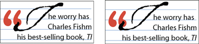
To apply either auto-kerning method, select the text frame with the Selection tool, and then switch to the Type tool. You can then choose Metrics or Optical from the Kerning menu in the Character panel or Control panel and auto kern all the characters in the story. Figure 8.1 shows an example of Metrics auto kerning (top) and an example of Optical auto kerning (bottom).
Figure 8.1. Optical auto kerning (bottom) results in better character spacing than Metric auto kerning (top) in this sample text.

After you apply an auto-kerning method that works best with your font choice, you can also manually adjust any character spaces that appear incorrectly spaced. To increase/decrease kerning values, place the Type tool cursor in between characters and enter a positive or negative value in the Character panel or Control panel Kerning field. You can also use the manual kerning keyboard shortcuts: Opt-Left/Right arrow keys (Mac); Alt+Left/Right arrow keys (Win).
Tracking
Tracking is the process of adding or subtracting spacing over a range of selected characters (see Figure 8.2). The same tracking value is placed between each set of characters. To adjust the tracking, select two or more characters with the Type tool and enter a positive or negative value in the Tracking field located in the Character panel or Control panel, or select a default tracking value from the drop-down list.
Figure 8.2. Shown here is text with a Tracking amount of zero (top) and a tracking amount of 100 applied (bottom).

Word Spacing
To add word spacing for a selected range of text without affecting letter spacing, press Option-Cmd- (Mac), or Alt+Ctrl+ (Win). This command adds the default keyboard increment (set in Preferences) to the word spacing only (not character spacing). The default increment is set in the Units & Increments panel of the Preferences dialog box (see Appendix A, “Settings and Preferences”). To decrease word spacing, press Option-Cmd-Delete (Mac) or Alt+Ctrl+Backspace/Delete (Win). To increase/decrease by five times the default amount, add the Shift key to either shortcut.
Scaling and Skewing Type
Scaling or skewing is considered creating “fake italics” or “fake condensed/expanded type.” It is considered fake because it distorts the characters from their original font design.
Although it is possible to scale or skew type as contents when resizing or shearing a frame (see Chapter 6, “Working with Objects”), it is also possible to scale and skew type selected within a frame using character formatting. Scaling and skewing type in this fashion enables you to apply various scaling percentages and skewing angles to different characters within the same frame, the same paragraph, and even the same line.
To scale text, select an area of text with the Type tool and change the Vertical or Horizontal Scale values in the Character panel or Control panel. Note that doing so does not affect the point size of the text (see Figure 8.3).
Figure 8.3. Shown here is some text with no scaling applied (top); with 150% horizontal scaling applied (middle); and with 150% vertical scaling applied (bottom).

To skew text, select an area of text with the Type tool and change the Skew value in the Character panel or Control panel (see Figure 8.4). Positive values skew the selected character(s) to the right and negative values to the left.
Figure 8.4. Shown here is a “fake italic” version of Myriad Bold with a 12° skew applied (top) and the “real” Myriad Italic (bottom). Note the much smoother curves in the real Myriad Bold italic.

Adjusting Leading and Baseline Shift
Leading reflects the vertical space between baselines of a paragraph (the imaginary lines that each row of characters sits on top of). Increasing the leading pushes baselines farther away from each other, and decreasing it brings them closer together.
The default auto-leading option sets the leading at 120% of the type size (for example, 12-point leading for 10-point type). When auto leading is in use, InDesign displays the leading value in parentheses in the Leading menu of the Character panel (see Figure 8.5). Just as kerning and tracking values control the horizontal space between characters, leading and baseline shift values control the vertical space between baselines.
Figure 8.5. Shown here is 8.5 pt text with Auto leading applied (top) and 12 pt. leading applied (bottom).
To set the leading for a story, select all the text with the Type tool and enter a value in the Leading field of the Character panel or Control panel.
When you choose Auto from the Leading drop-down list, InDesign applies a leading value based on a percentage of the largest character on a line. This can often result in uneven leading amounts that appear awkward in your layout. Therefore, it is best to avoid using the Auto Leading feature. You can tell when auto leading is being used, because the leading value appears in parentheses in the Leading field.
Tell Me More: Media 8.1—Applying Leading to an Entire Paragraph
![]()
Access this video file through your registered Web edition at my.safaribooksonline.com/9780132174541/media.
At times, you might need to select and move individual characters above or below the baseline. Examples include centering a large lead-in character or repositioning a drop cap that uses a script font.
To shift the baseline of an individual character, select it with the Type tool and enter a value in the Baseline Shift field in the Character panel or the Control panel. Entering a positive value positions the selected character further above the baseline, and entering a negative value positions it further below.
Figure 8.6. Shown here is a script drop cap that extends below the baseline (left) and the same script drop cap with a 2-point baseline shift applied (right).
Underline and Strikethrough
Rather than drawing an underline or strikethrough with the Line or Pen tools, its much easier to apply them (and edit them later) using character formatting.
To apply an underline, select an area of text with the Type tool and choose Underline from the Character panel fly-out menu, or click the Underline toggle button in the Control panel.
![]() LET ME TRY IT
LET ME TRY IT
Customizing an Underline
You can customize an underline’s appearance by entering settings in the Underline Options dialog box. To do so, follow these steps:
- To access the dialog box, choose Underline Options from the Character panel or Control panel menu.
- When the dialog box appears, click the Underline On option to access the settings (see Figure 8.7).
Figure 8.7. The Underline Options dialog box enables you to customize an underline’s appearance.
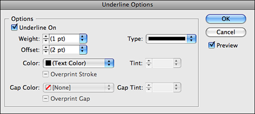
- The rest of the dialog box is set up like the Stroke panel, allowing you to choose an underline weight, offset, type, color, tint, and when applying an open stroke type—gap color, and gap tint (see “Applying Strokes” in Chapter 5, “Working with Frames and Shapes”).
- You can also choose to overprint any applied underline or gap colors.
- Click OK, and the underline options are automatically applied to your selection.
To apply a strikethrough, select an area of text with the Type tool and choose Strikethrough from the Character panel fly-out menu, or click the Strikethrough toggle button in the Control panel.
![]() LET ME TRY IT
LET ME TRY IT
Customizing Strikethrough
You can customize a strikethrough’s appearance by entering settings in the Strikethrough Options dialog box. To do so, follow these steps:
- To access the dialog box, choose the Strikethrough Options from the Character panel or Control panel menu.
- When the dialog box appears, click the Strikethrough On option to access the settings (see Figure 8.8). The rest of the dialog box is set up exactly like the Underline Options dialog box discussed in the previous set of steps.
Figure 8.8. The Strikethrough Options dialog box enables you to customize a strikethrough’s appearance.
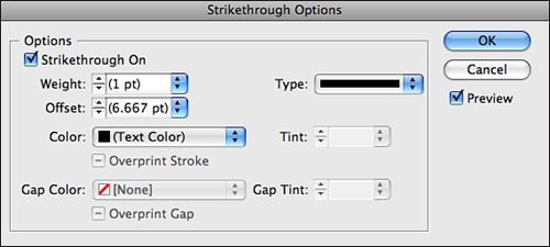
To avoid difficult registration on press, you should enable the overprint option in this dialog box when applying strikethrough or gap colors. Doing so ensures that the colors align properly when printed.
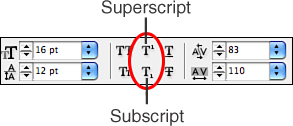
Superscript and Subscript
Subscripts appear at or below the baseline, whereas Superscripts appear above the baseline.
Although it is possible to insert a glyph character such as a copyright or registered trademark symbol by decreasing its point size and shifting its baseline, it is quicker to apply InDesign’s built-in Superscript and Subscript features. Select the character(s) with the Type tool and choose Superscript or Subscript from the Character panel menu, or click the appropriate button in the Control panel. InDesign scales and shifts the baseline of the character(s) using the percentages entered in the Advanced Type panel of the Preferences dialog box (see Figure 8.9).
Figure 8.9. To apply the superscript or subscript formatting to a selected character, click the Superscript or Subscript buttons in the Control panel.
Formatting Paragraphs
InDesign considers a “paragraph” as any sequence of characters that ends in a carriage return (also referred to as a paragraph return). Many other attributes make up paragraph formatting in InDesign, but the basics include horizontal alignment, left/right indents, first/last-line indents, and space before/space after. These attributes determine the “shape” of a paragraph.
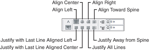
Setting Paragraph Horizontal Alignment
You can choose to align selected paragraphs to the left, center, right, or justify them. Justified options enable you to align the last line of the paragraph left, center, right, or justified.
• Align Left: When Align Left is used, the selected paragraph aligns to the left of the page.
• Align Center: When Align Center is used, the selected paragraph aligns to the center of the page.
• Align Right: When Align Right is used, the selected paragraph aligns to the right of the page.
• Align Towards Spine: If a paragraph is formatted with Align Towards Spine on a left-hand page, the paragraph will be right-aligned on that page.
• Justify with Last Line Aligned Left: You can choose to justify all text in a paragraph, excluding the last line. It will be aligned left
• Justify with Last Line Aligned Center: You can choose to justify all text in a paragraph, excluding the last line. It will be aligned center
• Justify All Lines: You can choose to justify all text in a paragraph, including the last line.
• Justify Away from Spine: This is similar to Align Toward Spine except the alignment is reversed.
To apply one of the horizontal alignment options, insert the Type tool anywhere in the paragraph and click one of the horizontal alignment buttons in the Paragraph panel or the Control panel.
Figure 8.10. Click one of the horizontal alignment buttons to apply an alignment option to the selected paragraph.
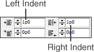
Setting Left and Right Paragraph Indents
You can set left and right paragraph indents using the controls located in the Paragraph panel, Control panel, or the Tabs panel. To set a left or right paragraph indent using the Paragraph panel or Control panel, place the Type tool cursor anywhere in the paragraph and enter a value in the Left Indent or Right Indent fields (see Figure 8.11).
Figure 8.11. To apply a left or right indent to a selected paragraph, enter a value in the Left Indent or Right Indent fields.
![]() LET ME TRY IT
LET ME TRY IT
Using the Tabs Panel to Set Left/Right Indents
To set left/right indents using the Tabs panel, do the following:
- Insert the Type tool anywhere in a paragraph and choose Type, Tabs. (You can also press Shift-Cmd]-T (Mac) or Shift+Ctrl+T (Windows) to open the Tabs panel).
- When the Tabs panel appears (see Figure 8.12), set a left indent by clicking the bottom-left arrow (the Left Indent icon) and dragging it to the right, or enter a value in the X field. A vertical guide appears in the text frame as you drag.
Figure 8.12. You can also set a left or right paragraph indent using the controls in the Tabs panel.
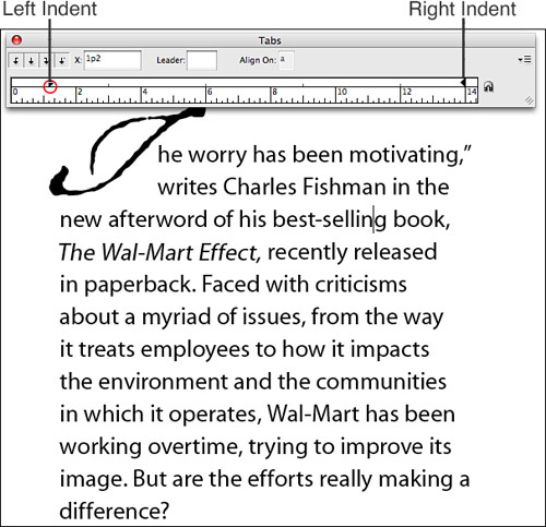
- To set a right indent, click and drag the right arrow (the Right Indent icon) to the left, or enter a value in the X field. A vertical guide appears in the text frame as you drag.
Setting First and Last Line Indents
InDesign also allows you to set first and last line indents using the controls located in the Paragraph panel and Control panel. In addition, you can set first line (but not last line) indents using the Tabs panel.
To set a first or last line indent using the controls in the Paragraph panel or Control panel, place the Type tool cursor anywhere in the paragraph and enter a value in the First Line Left Indent or Last Line Right Indent fields (see Figure 8.13).
Figure 8.13. To set a first or last line indent to a selected paragraph, enter a value in the First Line Left Indent or Last Line Right Indent fields.
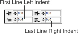
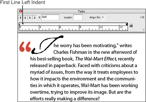
To set a first line left indent using the Tabs panel, insert the Type tool cursor anywhere in the paragraph and choose Type, Tabs. When the Tabs panel appears above the paragraph, drag the top-left arrow (the First Line Indent icon) to the right, or enter an indent value in the X field (see Figure 8.14).
Figure 8.14. You can also set a first line left indent using the controls in the Tabs panel.
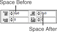
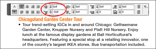
Putting Space Before and After Paragraphs
You can avoid adding unnecessary paragraph returns in your layouts by utilizing the Space Before and Space After feature. Space Before adds spacing before the selected paragraph. Space After adds spacing after the selected paragraph.
To add space before or after a paragraph using the controls in the Paragraph panel or Control panel, place the Type tool cursor anywhere in the paragraph and enter a value in the Space Before or Space After fields (see Figure 8.15).
Figure 8.15. To apply space before or after a selected paragraph, enter a value in the Space Before or Space After fields.
Show Me: Media 8.2—Putting Space Before and After Paragraphs
![]()
Access this video file through your registered Web edition at my.safaribooksonline.com/9780132174541/media.
Creating Drop Caps
To apply a drop cap, insert the Type tool cursor anywhere in the paragraph, and enter a value in the Drop Cap Number of Lines field located in the Paragraph panel or Control panel (see Figure 8.16). This number determines the size and baseline shift for the drop cap character. You can apply this effect to additional characters by entering a larger value in the neighboring Drop Cap One or More Characters field.
Figure 8.16. To apply a basic drop cap, enter a value in the Drop Cap Number of Lines field.
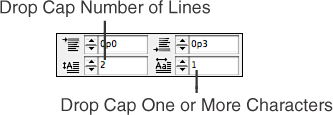
You can select and format drop cap characters just like any other character. To enhance a drop cap’s appearance, select it with the Type tool and change the applied font, type size, kerning, and baseline shift. You can also save formatted drop caps as part of a paragraph style.
Applying Keep Options
By applying InDesign’s Keep Options feature, you can prevent widows and orphans from appearing throughout the text in a layout. A widow is the last line of a paragraph that ends up by itself at the top of a column, separated from the rest of the paragraph. An orphan is the first line of a paragraph that ends up on its own line at the end of a column. A very short line that ends up on its own line is also considered an orphan. Additionally, a word that gets separated from the rest of a paragraph and ends up on its own line is considered a widow.
Not only do these little annoyances affect readability, but they are also a terrible eyesore! To ward off these typographical gremlins, insert the Type tool cursor anywhere in the paragraph and choose Keep Options from the Paragraph panel or Control panel menu, (or press Option-Cmd-K [Mac] or Alt+Ctrl+K [Win]) to open the Keep Options dialog box (see Figure 8.17).
Figure 8.17. Using the Keep Options dialog box to determine how InDesign handles orphans and widows in your text.
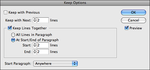
The Keep Options dialog box is divided into four sections:
• Keep with Previous: This option forces a line of text to always appear below the last line of the previous paragraph.
• Keep with Next: By entering a value of 1 in the Keep with Next fields, you can ensure that text always remains with the paragraph that follows it. For example, if applied to header text, the header always remains directly above the paragraph that follows it. Should any text or frame edits push the paragraph into a new column, new page, or a text wrap, the header will move with it.
• Keep Lines Together: You can safeguard your text from any sneaky widows and orphans appearing by enabling the Keep Lines Together option and choosing At Start/End of Paragraph. To keep paragraphs together during editing, enter a value in the Start and End fields. These values tell InDesign the minimum number of lines allowed to separate at the start or end of a paragraph should it be pushed into a new column or page; therefore, entering a value of 2 ensures that a widow or orphan will never appear.
• Selecting All Lines In Paragraph from the Keep Lines Together: This option does not allow for any lines to be separated from a paragraph. Instead, the whole paragraph moves.
• Start Paragraph: The Start Paragraph menu contains options for forcing a column or page break before the selected paragraph. Choose one of these options to ensure the paragraph’s position in the layout. Options include Anywhere (the default), In Next Column, In Next Frame, On Next Page, On Next Odd Page, and On Next Even Page.
Creating Hanging Indents and Punctuation
Hanging indents are great for creating custom bulleted or numbered lists. By placing a hanging indent after a lead-in character (a bullet point, a number, and so on), you can force the subsequent lines of the paragraph to line up evenly with the indent.
You can also clean up the overall look of your text by allowing punctuation marks—such as periods, commas, and quotation marks—to hang outside the column. You can do this by applying the Optical Margin Alignment option located in the Story panel. When you enable this feature, InDesign not only adjusts the punctuation, but also makes a slight adjustment to the edges of any characters that extend outside the column edge.
Creating Hanging Indents with the Paragraph Panel/Control Panel
To create a hanging indent using the Paragraph panel/Control panel indent fields, perform the following steps:
- In the first line of each paragraph, insert a tab after the lead-in character.
- Enter a positive value in the Left Indent field of the Paragraph panel or Control panel (see Figure 8.18).
Figure 8.18. You can create a hanging indent using the controls in the Paragraph panel or Control panel.
- Enter the negative opposite of the Left Indent value in the First Line Indent field of the Paragraph panel or Control panel.
![]() LET ME TRY IT
LET ME TRY IT
Creating Hanging Indents with the Indent to Here Character
To create a hanging indent using the special Insert to Here character, perform the following steps:
- In the first line of each paragraph, insert a tab after the lead-in character.
- Place the Type tool cursor just after the tab in each paragraph and choose Type, Insert Special Character, Other, Indent to Here (see Figure 18.19).
Figure 8.19. Another way to create a hanging indent is to insert the Indent to Here character after the tab.
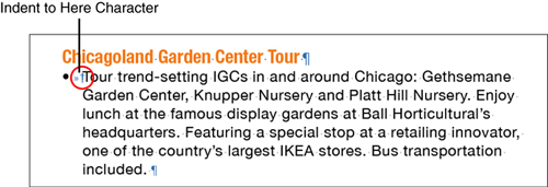
- If necessary, adjust the tab indents using the controls in the Tabs panel.
Creating Hanging Indents with the Tabs Panel
To create a hanging indent using the controls in the Tabs panel, insert a tab after the first character in the first line of each paragraph. Press Cmd-Shift-T (Mac) or Ctrl+Shift+T (Win) to open the Tabs panel (see Figure 8.20). Hold down the Shift key and drag the bottom-left arrow (the Left Indent icon) to the right.
Figure 8.20. You can also create a hanging indent using the controls in the Tabs panel.
Hanging Punctuation
You can greatly improve the “look” of your text by hanging punctuation marks outside the column edge. To apply hanging punctuation to a story, perform the following steps.
- Select a text frame with either selection tool.
- Open the Story panel by choosing Window, Type & Tables, Story.
- Click the Optical Margin Alignment check box to allow InDesign to instantly adjust the punctuation and extended character alignment (see Figure 8.21). Optical Margin Alignment carries through to all threaded frames in a story, and is also applied to any overset text.
Figure 8.21. Adding hanging punctuation can give a cleaner look to your layout.
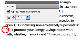
- If necessary, adjust the applied “hang” amount by increasing or decreasing the value entered in the Align Based on Size field.
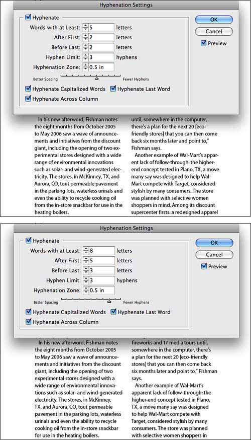
Choosing Hyphenation Settings
InDesign allows you to apply specific hyphenation settings to a document or selected paragraph. The Hyphenation Settings are found by choosing Hyphenation from the Paragraph panel or Control panel menu.
To set document-wide hyphenation settings, choose Edit, Deselect All. The settings you specify in the Hyphenation Settings dialog box that appears are applied to all added and imported text (untagged and unformatted), while preexisting paragraphs retain their applied hyphenation settings.
To adjust hyphenation settings for a specific paragraph, insert the Type tool anywhere in the paragraph and access the Hyphenation Settings dialog box (see Figure 8.22). You can apply the settings to multiple paragraphs by selecting them before opening the Hyphenation Settings dialog.
Figure 8.22. The Hyphenation Settings dialog box enables you to customize the auto hyphenation settings applied to the document.
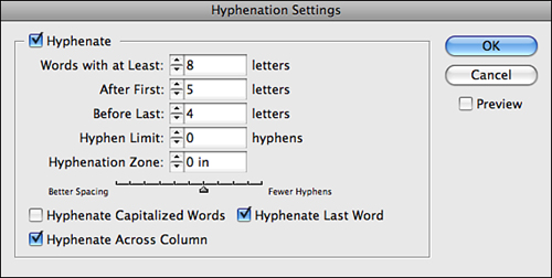
The Hyphenation Settings dialog box includes the following options:
• Hyphenate: Click to access and apply hyphenation settings.
• Words with at Least: Enter a value indicating how many letters a word must contain before hyphenation can occur. Higher values result in fewer hyphenations.
• After First: Enter a value indicating how many letters a word fragment must contain preceding a hyphen. To avoid two-letter fragments, enter a value of 3 or higher.
• Before Last: Enter a value indicating how many letters a word fragment must contain following a hyphen. To avoid two-letter fragments, enter a value of 3 or higher.
• Hyphen Limit: Enter a value to limit the number of consecutive hyphens allowed at the left edge of the column.
• Hyphenation Zone: Enter a value indicating the inset of the imaginary “hyphenation zone” along the right column edge. Higher values result in fewer hyphenations but more ragged lines. This option does not apply to justified text.
• Hyphenation Slider: Drag the slider to the left for Better Spacing; drag to the right for Fewer Hyphens. Click the Preview button to see the effect as it is being applied.
• Hyphenate Capitalized Words: Uncheck this option to prevent hyphenation of proper names and other capitalized words.
• Hyphenate Last Word: Check this option to allow hyphenation of the last word of a paragraph.
• Hyphenate Across Column: Check this option to allow words to be hyphenated across a column, frame, or page.
Figure 8.23. A paragraph that uses InDesign’s default hyphenation settings: more hyphens and ragged lines (top); and a paragraph that uses custom hyphenation settings: fewer hyphens and more ragged lines (bottom).
Choosing Justification Settings
The Justification dialog box, which you can access by choosing Justification from the Paragraph panel or Control panel menu, enables you to control how InDesign handles word and letter spacing. The values entered in the Minimum, Desired, and Maximum fields of this dialog box are percentages of the standard word and letter spaces embedded in the font by its designer.
The Justification dialog box also lets you adjust the default Auto Leading percentage, specify a Single-Line or Paragraph Composer, and choose from Single Word Justification options (see Figure 8.24).
Figure 8.24. The Justification dialog box settings determine how InDesign handles word and letter spacing.
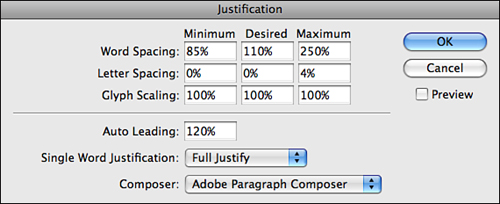
The list that follows explains each of the options found in the Justification dialog box and how they affect your text:
• Word Spacing: Enter a value to apply Minimum, Desired, and Maximum percentages of word spacing. Nonjustified text only responds to the Desired value.
• Letter Spacing: Enter a value to apply the Minimum, Desired, and Maximum amount of character spacing. As with Word Spacing, nonjustified text only responds to the Desired value.
• Glyph Scaling: Enter a value to apply the Minimum, Desired, and Maximum amount of horizontal glyph scaling allowed. This option is genuinely weird. Glyph scaling fits characters into a line by stretching them, except it uses different scaling percentages, resulting in all different character shapes from line to line. Unless you’re purposely trying to make your type look bad, you should keep these values set at 100%.
• Auto Leading: Enter a value for InDesign to apply to paragraphs set to Auto Leading. Auto Leading is the amount of space between lines in a paragraph and is calculated using a percentage (entered here) of the largest character on a line.
• Single Word Justification: Choose a justification method for InDesign to use when faced with a single-word line in a paragraph (usually the result of a really long word, such as a website address, or a really narrow column). Options include Full Justify, Align Left, Align Center, and Align Right.
• Composer: Choose a paragraph composition method from this drop-down list. Adobe Single Line Composer calculates word and letter spacing on a per-line basis. This adds greater space variation to the text and can make it harder to read. Adobe Paragraph Composer considers all lines in a paragraph when calculating word and letter spacing. Paragraph (or multiline) composition generally results in better-looking text that is much easier to read.
Spanning Columns
InDesign lets you create a headline or a subhead that you can place across multiple columns in a multicolumn text frame. This means that you no longer need to cut headline text from the main text flow and place it in a separate text frame to place it across multiple columns.
![]() LET ME TRY IT
LET ME TRY IT
Spanning Multiple Columns
To place a headline or a subhead across multiple columns, follow these steps:
- Insert the Type tool cursor anywhere in the paragraph and choose Span Columns from the Paragraph panel or Control panel menu.
- In the Span Columns dialog box that appears, choose Span Columns from the Paragraph Layout drop-down list (see Figure 8.25).
Figure 8.25. The Span Columns dialog box enables you to insert space before and after the spanning paragraph.
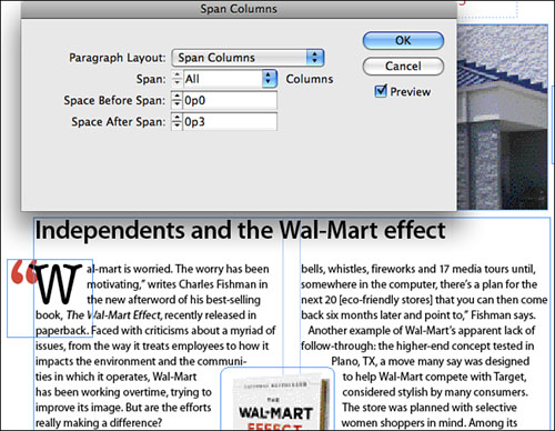
- Specify the number of columns to span across by choosing an option from the Span drop-down list.
- To insert space before or after headline or subhead, enter a value in the Space Before/Space After Span fields.
- Click OK to apply the settings.
If it is not necessary to insert space before or after the span, you can bypass the Span Columns dialog box and choose the number of columns to span across from the Span Columns drop-down list in the Control panel (see Figure 8.26).
Figure 8.26. You can choose the number of columns to span across from the Span Columns drop-down list in the Control panel.
![]()
Splitting Paragraphs into Columns
InDesign also lets you split selected paragraphs across multiple columns. This feature is useful for converting a single list of bulleted items into a multicolumn list. It is especially useful for layouts where a header is present above the column and you want it to span the new columns.
![]() LET ME TRY IT
LET ME TRY IT
Creating Columns from Existing Text
To split paragraphs across multiple columns, follow these steps:
- Highlight the paragraphs with the Type tool.
- Choose Span Columns from the Paragraph panel or Control panel menu.
- In the Span Columns dialog box that appears, choose Split Column from the Paragraph Layout drop-down list (see Figure 8.27).
Figure 8.27. The Span Columns dialog box also enables you to adjust the inside and outside gutter spacing.
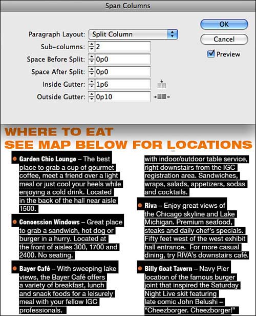
- Specify the number of subcolumns to create by entering a value in the Subcolumns field.
- To insert space before or after the split, enter a value in the Space Before/Space After Split fields.
- To adjust the size of the inside or outside gutter, enter a value in the Inside/Outside Gutter field.
- Click OK to apply the settings.
If it is not necessary to insert space before or after the split or adjust the gutter spacing, you can bypass the Span Columns dialog box and choose the number of columns to split across from the Span Columns drop-down list in the Control panel (see Figure 8.28).
Figure 8.28. You can choose the number of columns to split across from the Span Columns drop-down list in the Control panel.
![]()
Show Me: Media 8.3—Spanning and Splitting Columns
![]()
Access this video file through your registered Web edition at my.safaribooksonline.com/9780132174541/media.
Creating Bulleted and Numbered Lists
InDesign lets you place a bullet or number before each paragraph in a list format. You can also save bulleted and numbered list attributes as part of a paragraph style.
To set and apply bullet and numbering attributes, highlight the list with the Type tool and choose Bullets and Numbering from the Paragraph panel or Control panel menu. In the Bullets and Numbering dialog box that appears, choose Bullets or Numbers from the List Type drop-down list.
When you select the Bullets option, the Bullets and Numbering dialog box displays a set of characters you can choose from to place before each paragraph in a selected list. The dialog box also includes options that enable you to choose a font family and style, point size, and color to apply to the selected bullet character (see Figure 8.29).
Figure 8.29. The Bullets and Numbering dialog box enables you to set and apply bullet attributes and positioning.
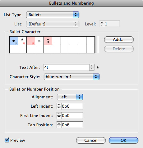
At the bottom of the dialog box, you can define the bullet position by choosing Hanging or Flush Left from the Position drop-down list, or by entering values in the Left Indent, First Line Indent, and Tab Position fields. Check the Preview option to see the settings applied to the selected list as you enter them.
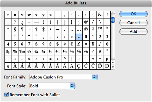
You can add to the set of characters by clicking the Add button in the Bullets and Numbering dialog box. When you do, InDesign launches the Add Bullets dialog box, which enables you to select characters from a chosen font and add them to the set (see Figure 8.30). To ensure that an added bullet character is applied using the selected font, enable the Remember Font with Bullet option. Click OK to add the selected character to the set and close the Add Bullets dialog box. Click the Add button to add the selected character to the set and keep the Add Bullets dialog box open.
Figure 8.30. The Add Bullets dialog box enables you to select characters from a chosen font and add them to the set.
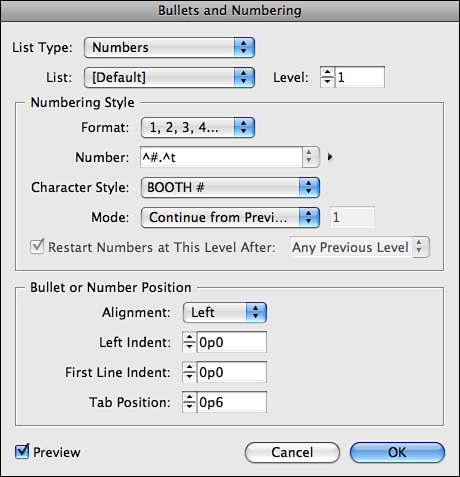
When you select the Numbers option from the List Type drop-down list, you must choose a style and separator character from the respective lists (see Figure 8.31). (Separators include periods or parentheses). You can also enter a separator character in the field provided. In the Start At field, enter a number to start the list with, and then choose a font family and style, point size, and color to apply. At the bottom of the Bullets and Numbering dialog box, you can define the bullet position by selecting an option from the Position drop-down list or by entering values in the Indent/Position fields. Check the Preview option to see the settings applied to the selected list as you enter them.
Figure 8.31. The Bullets and Numbering dialog box enables you to set and apply numbering attributes and positioning.
Setting Tabs
You can adjust tab stops for selected tab characters using the controls in the Tabs panel. Insert the Type tool in any paragraph line that contains a tab character (or multiple tab characters), and open the Tabs panel by choosing Type, Tabs (or by pressing Cmd-Shift-T [Mac] or Ctrl+Shift+T [Win]).
Click the Magnet button located in the bottom right of the Tabs panel to position it (when possible) directly above the selected text frame. Click above the tab ruler to place a tab stop, or enter a specific measurement value in the X field (see Figure 8.32). With the tab stop icon selected, click one of five alignment option buttons (also shown in Figure 8.32).
Figure 8.32. Click above the tab ruler to place a tab stop; then click one of the tab alignment option buttons.
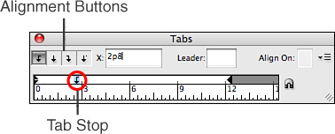
By clicking one of the alignment option buttons in the Tabs panel, you can align the text (left, centered, or right) to a specific tab stop position. By clicking the Decimal Tab Stop button, you can align decimal points and other non-numeric characters to the tab stop position. You can also enter a custom character to use for the decimal tab stop in the Align On field.
You can move a tab stop by dragging it to the left or right above the tab ruler in the Tabs panel. As you do, a vertical guide follows your movements in the text frame and a grayed-out tab stop icon appears in its previous position above the tab ruler. You can also move a tab stop by selecting it in the Tabs panel and entering a new measurement value in the X field.
To position a series of tab stops that are spaced an equal distance apart from each other, select a tab stop icon in the Tabs panel and choose Repeat Tab from the panel menu. The tab stop is repeated and applied to all tab characters across the length of the column, replacing any preexisting tab stops.
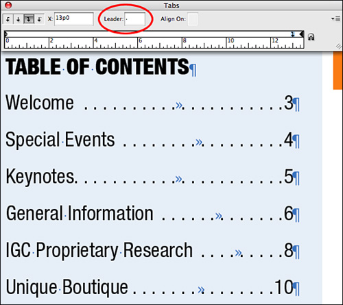
To fill a tab space with series of characters (called leaders), select the tab stop icon and enter a leader character (period, dash, bullet point, and so on) into the Leader field of the Tabs panel (see Figure 8.33).
Figure 8.33. To insert a tab leader, select the tab stop icon in the Tabs panel and enter the leader character into the Leader field.
Copying and Pasting Text Formatting
The Eyedropper tool enables you to sample type attributes and apply them to other types in your document. Although it is a good idea to save it as part of a style, you might want to preview it first in several places in your layout. You might also be on such a tight deadline that you simply don’t have time to stop and create a style. If you like what you see, you can always use it to create a character or paragraph style later and reapply as needed.
You can sample formatted text by hovering over it with the Eyedropper tool and clicking. You’ll know the formatting has been sampled when the Eyedropper icon appears full. You can then proceed to highlight any text you’d like to apply the sampled formatting to. Continue applying without having to resample all over again.
Show Me: Media 8.4—Copying and Pasting Text Formatting
![]()
Access this video file through your registered Web edition at my.safaribooksonline.com/9780132174541/media.
Inserting Special Characters
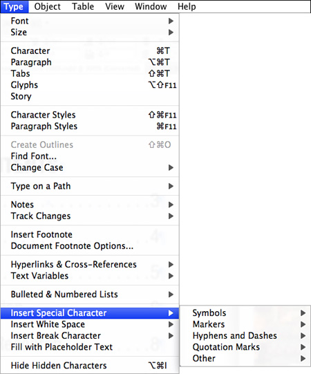
InDesign allows you to insert special characters into the text, such as an em dash, hair space, copyright symbol, or forced line break. The Type, Insert Special Character submenu includes commands for inserting symbols, markers, hyphens and dashes, quotation marks, and other special characters. To apply one of these commands, position the Type tool cursor anywhere you’d like to insert a special character and select the command from the submenu (see Figure 8.34).
Figure 8.34. The Insert Special Character submenu contains several commands for inserting symbols, markers, hyphens and dashes, quotation marks, and other special characters.
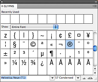
Another way to access and insert special characters is through the Glyphs panel. These characters (called glyphs) are built in to the font. You can preview and apply glyphs using the Glyphs panel. To open the Glyphs panel, choose Type, Glyphs or Window, Type & Tables, Glyphs.
From the Show drop-down list in the Glyphs panel, you can choose to display available glyph characters for an entire font or alternates for a type selection. You can also choose to display additional glyph subsets such as Small Capitals, Discretionary Ligatures, or Slashed Zeros. To insert a glyph, position the Type tool cursor anywhere you’d like the glyph to appear and double-click the character in the Glyphs panel (see Figure 8.35).
Figure 8.35. Double-click the character in the Glyphs panel to insert it into the text.
The Glyphs panel also allows you to create and save all your favorite glyph characters in a custom glyph set.
![]() LET ME TRY IT
LET ME TRY IT
Creating and Editing a Glyph Character Set
To create a set of glyph characters, follow these steps:
- Choose New Glyph Set from the panel menu.
- In the New Glyph Set dialog box that appears, enter a name for the set, and click OK.
- Choose a font from the list at the bottom of the Glyphs panel and then select a glyph to add to the set.
- Choose Add to Glyph Set from the panel menu and select your set’s name from the submenu list. You can continue to select and add as many glyphs to the set as you like.
- To edit a glyph set, choose Edit Glyph Set from the panel menu and select a set from the submenu.
- To remove a glyph from the set, select it from the Edit Glyph Set dialog box display and click the Delete from Set button. You can also apply a different font and style to a selected glyph character in this dialog box.
Certain OpenType fonts also contain special characters (such as fractions and discretionary ligatures) that you can apply automatically. You can turn these special character options on and off by selecting them from the Character panel’s or Control panel’s OpenType submenu (see Figure 8.36).
Figure 8.36. Choose which OpenType special character options to enable.
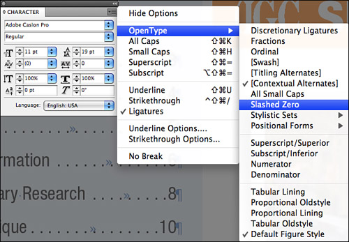
An option that appears in brackets, such as [Contextual Alternates], indicates that it is not available for the currently selected font. When available, you can also apply a Stylistic Set from the OpenType submenu. When you do, InDesign applies set glyphs over the font’s default glyphs.
Inserting Footnotes
InDesign allows you to create footnote references that automatically number themselves.
To insert a footnote, position the Type tool cursor at the end of a word and choose Type, Insert Footnote. When you do, InDesign creates a superscript number and places the corresponding reference at the bottom of the column for you to enter footnote text (see Figure 8.37).
Figure 8.37. Enter footnote text at the bottom of the column.

As you type, the footnote text area automatically expands the column as needed, but not past the footnote reference number. If you allow it to split, the overset footnote text carries over to the next text frame column or threaded frame. If not, InDesign either moves the footnote reference to the next column or displays an overset icon. When this happens you can either resize the frame or change the text formatting to make the text fit.
Footnote numbering restarts with each story. You can change footnote numbering, formatting, and layout in the Footnote Options dialog box. To access the dialog box, choose Type, Document Footnote Options.
To access the footnote numbering and formatting options, click the Numbering and Formatting button at the top of the Footnote Options dialog box (see Figure 8.38).
Figure 8.38. The options you choose in the Numbering and Formatting panel enable you to customize the appearance of the footnote text.
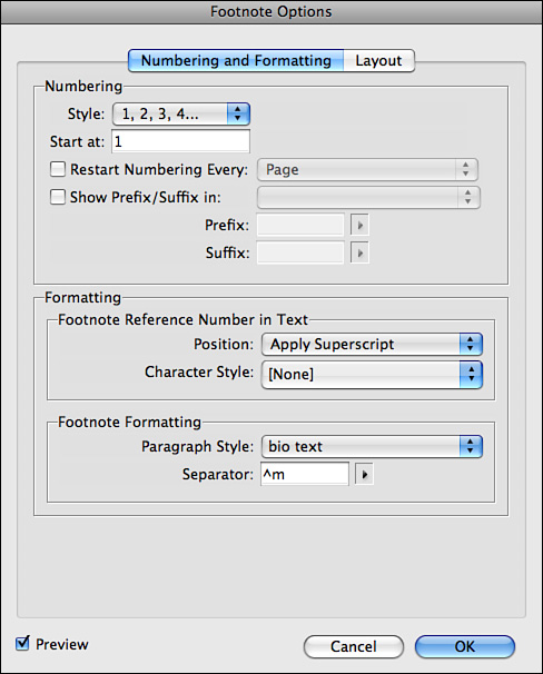
The options in the Numbering and Formatting panel of the Footnote Options dialog include the following:
• Numbering Style: Choose a footnote numbering style from the drop-down list.
• Start at Specify: The start number for the first footnote of the story.
• Restart Numbering Every: Allows renumbering to start within the document. Choose Page, Spread, or Section from the drop-down list to indicate when renumbering should begin.
• Show Prefix/Suffix In: Displays prefixes or suffixes in the footnote reference. This option is useful for displaying footnote text or references in parentheses or brackets, such as (1) or [1].
• Position Choose: A footnote reference number display method. Options include Apply Superscript, Apply Subscript, and Apply Normal.
• Character Style: Choose a character style to apply to the footnote reference number. To apply no style, choose None from the drop-down list.
• Paragraph Style: Choose a paragraph style to apply to the footnote reference text. To apply no style, choose None from the drop-down list.
• Separator: Choose a whitespace character (a whitespace character is a blank space that appears between characters) to place between the footnote number and the start of the footnote text. To change the existing separator, delete it first, and then select a new one from the drop-down list. You can also use multiple characters as separators.
To access the footnote layout options, click the Layout button at the top of the Footnote Options dialog box (see Figure 8.39).
Figure 8.39. The options you choose in the Layout panel enable you to customize the positioning of the footnote text.
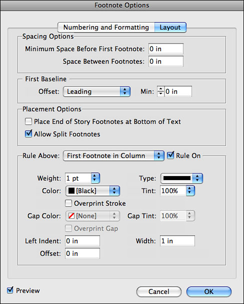
The options in the Layout panel of the Footnote Options dialog include the following:
• Minimum Space Before First Footnote: Enter a value to specify the amount of space between the bottom of the column and the first line of the footnote.
• Space Between Footnotes: Enter a value to specify the amount of space between paragraphs of footnote text.
• First Baseline Offset: Specifies the amount of space between the footnote divider and the first line of footnote text. Choose to apply Ascent, Cap Height, Leading, X Height, or Fixed first baseline offset to the footnote.
• Place End of Story Footnotes at Bottom of Text: Allows footnotes placed in the last column to appear directly below the last frame of the story rather than at the bottom of the column.
• Allow Split Footnotes: Enable this option to allow overset footnotes to carry over to the next text frame column or threaded frame.
• Ruler Above: Specifies appearance and location options for the footnote divider line. These options are similar to those available for creating paragraph rules. For no rule to appear, uncheck the Rule On option.