
Chapter 4. Images
Compared to printed images, Web images are easy to prepare and can be used without cost. However, there are drawbacks to using images on the Web. Image files are often larger than text files and take more time to download. Images command attention and can be distracting. When images are used to convey important information, people who cannot see them miss the message.
Images are not bad per se. Some concepts are easier to grasp when images are used to reinforce the text. For example, when assembly instructions include graphic depictions of each step, we have a way to visually confirm that we are on the right track. When product information includes a photograph, we know far more about the product than we would by simply reading a text description (Figure 4.1).
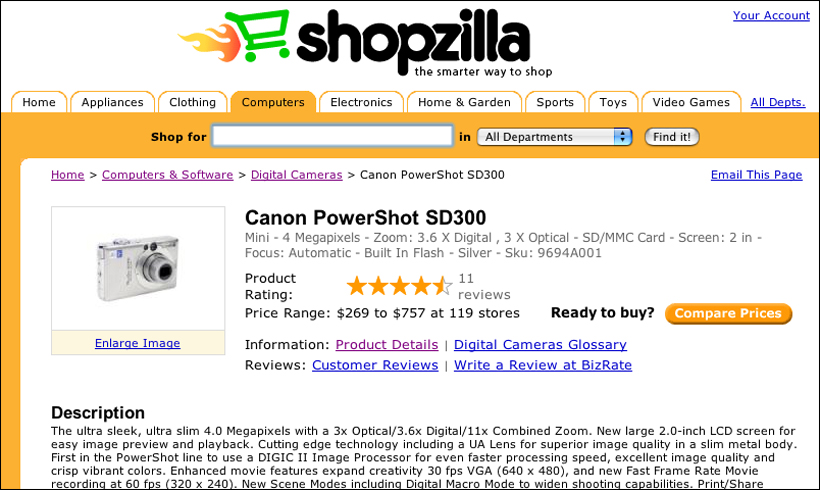
FIGURE 4.1 The Shopzilla site provides shoppers with a product image along with a text description. The image communicates information about the visual attributes of the product.
However, images affect accessibility when they are used as the sole means of conveying information. When content is presented as an image, people who cannot see images cannot access the content. People who have viewing requirements may not be able to modify images sufficiently to meet their needs. People with technical limitations—such as low bandwidth or older browser software—may not have access to images.
In some circumstances, images can be used without concern for those who cannot access them. Images are effective for establishing a visual site identity. Images and icons that reinforce text are not always essential to nonvisual users. To achieve universal usability, we do not have to abandon images—indeed, doing so would make the Web difficult for people who are helped by images. We simply need to use images appropriately, and in a way that does not result in the exclusion of some users.
4.1. Basic Principles
4.1.1. Use images purposefully
Some concepts require graphic representation: a chart depicting population growth on a census site, perhaps, or a photograph of a seascape on a travel site. A table of figures or a description of the scene can summarize, but cannot replace, the images. Other images are used to convey a sense of place or purpose, such as a photograph of a doctor with a patient on a hospital site. We sometimes use images as part of the user interface, such as arrows, icons, and buttons. We also use images to establish a visual identity for a site, so people know where they are. Though some of these examples are more compelling than others, in each of them the images have a purpose: providing information, establishing context, providing direction, or establishing a brand or identity.
In other cases, even though our content does not lend itself to visual representation, we feel compelled to include images because we know that “the Web is a visual medium,” and we need to add images in order to “spice up our pages” (Figure 4.2).
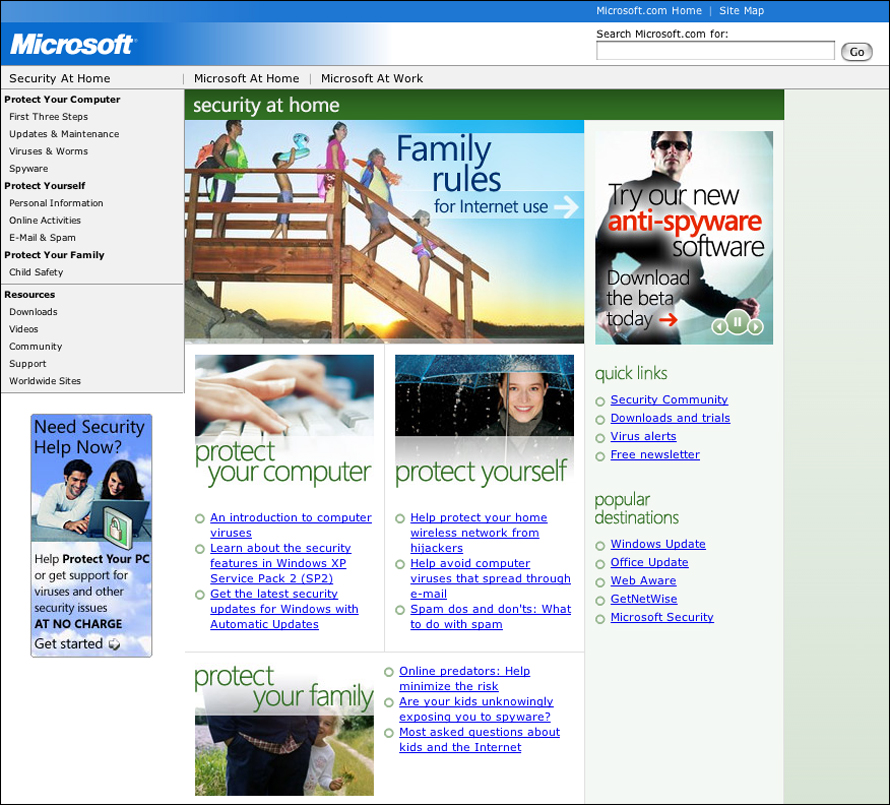
FIGURE 4.2 When images are used for visual impact, as on the Microsoft page shown here, their meaning can be unclear, as can their relationship to the content of the site.
This is a misuse of a powerful communication device. Images first draw the eye, then they invite interpretation. When presented with a page containing an image and text, our eye is drawn to the image. We then try to interpret why it’s there and what it means. On a day-care center home page, we know that the photo of Susie and Sam on a swing is there to give us a sense of the spirit of the place, not to show us how to swing or to help us recognize Susie and Sam. When the meaning and purpose of an image is clear, images communicate extremely well. When images are unrelated, they foil all attempts at interpretation, which can lead to frustration. If the day-care center home page contained a photo of a duck, unless the center’s name was something like Ducky Day Care, users might be baffled by the image.
Images are effective when they are used purposefully. If images are not part of the message, then don’t use them. When using images, make sure they are appropriate to the context. A Web page that provides computer setup information should not be peppered with photos of happy people using computers. Instead, include useful images, such as photos or diagrams that demonstrate what is described in the setup instructions (Figure 4.3).
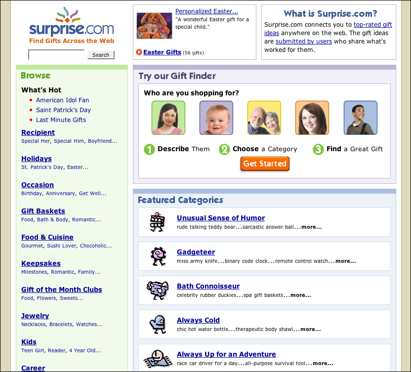
FIGURE 4.3 Surprise.com includes images as an essential part of the user interface. The meaning of the images is unambiguous. The images may make features of the site more comprehensible to users who are helped by images.
In a nutshell. Images come at a cost to usability—they take time to download and are inaccessible to users who cannot see them. Use images with a purpose, such as providing information or enhancing the user interface.
4.1.2. Do not use graphic text
When it comes to advancing universal access on the Web, text is the best tool we have. Text is machine-friendly and can be read and modified by software. Text can go through many permutations and still convey its message.
Images, on the other hand, are not readable by machines and therefore are not amenable to change. From the browser’s perspective, an image is a collection of colored pixels. Browser software cannot look at an image of a navigation link and recognize that the colored pixels are, in fact, text characters that make up the word home or help. As a result, software cannot make intelligent use of graphic text the way it can with plain text.
For example, the browser cannot enlarge an image gracefully; to do so intelligently, the browser would have to be able to make sense of the image. In order to make an image larger, all the browser can do is more of the same—add to the existing colored pixels—which is not an elegant solution. When a user enlarges graphic text, the result is pixilated text that is difficult to read (Figure 4.4).
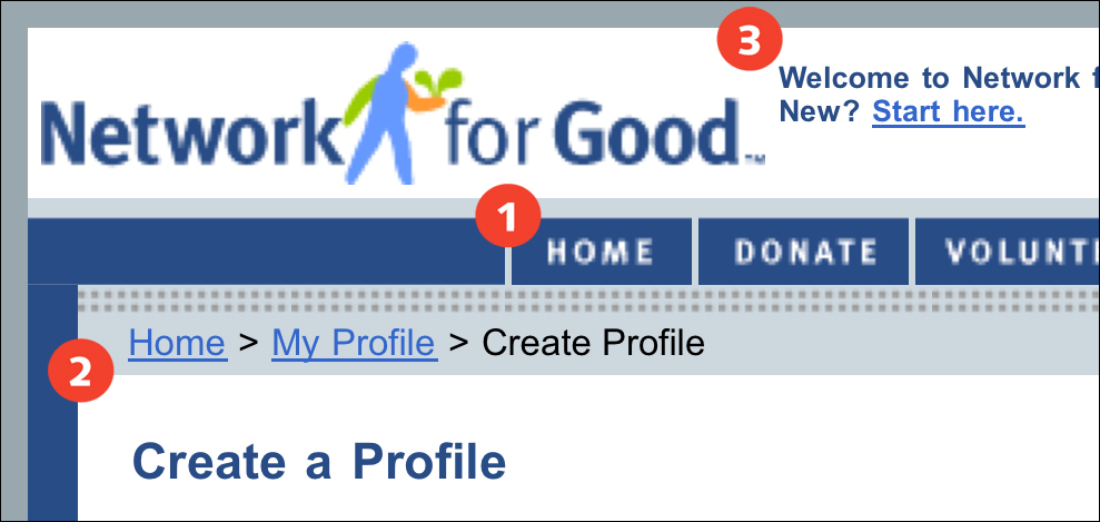
FIGURE 4.4 Some browsers, such as Opera, allow users to enlarge graphics as well as text. However, graphic text, such as the site links and logo (1) on the Network for Good site, becomes pixilated when enlarged and may be difficult to read, whereas regular text (2, 3) remains clear and legible.
Graphic text cannot accommodate other modifications that can be made to plain text. Users cannot change the color or style of graphic text. Applying a custom style sheet will have no effect. Moreover, people who cannot see will not have access to graphic text.
Ultimately, graphic text can be an insurmountable barrier to people who are attempting to use the Web. If images are used for navigation, people may not be able to access the information that is contained in the images. If people cannot use a site’s navigation, they cannot use the site. Plain text is always better, particularly for something as essential as navigation.
Of course, sometimes graphic text is acceptable—when its purpose is visual, as in a banner graphic and logo. Here the primary function of the text is branding, not information. In these cases, the page structure (title tag, page heading) must describe the content and origins of the page, so the information conveyed in the graphic text is available to people who cannot see the image.
In a nutshell. Graphic text is not machine-readable, flexible, or customizable, and therefore is inaccessible to some users. Avoid using graphic text; use plain text instead.
4.1.3. Avoid animated images
If images are a powerful force in commanding the attention of the user, moving images are many times more commanding. It is nearly impossible to ignore a page element that is moving, particularly one that is blinking rapidly on and off.
Animations are generally seen as an annoyance on Web sites. They make it difficult to focus on the primary content of a page. For some people, animations are more than an annoyance. They cause discomfort or even medical consequences, such as migraines or seizures. Even static images that only appear to be animated can be a trigger—for example, images with closely spaced stripes that seem to vibrate (Figure 4.5).
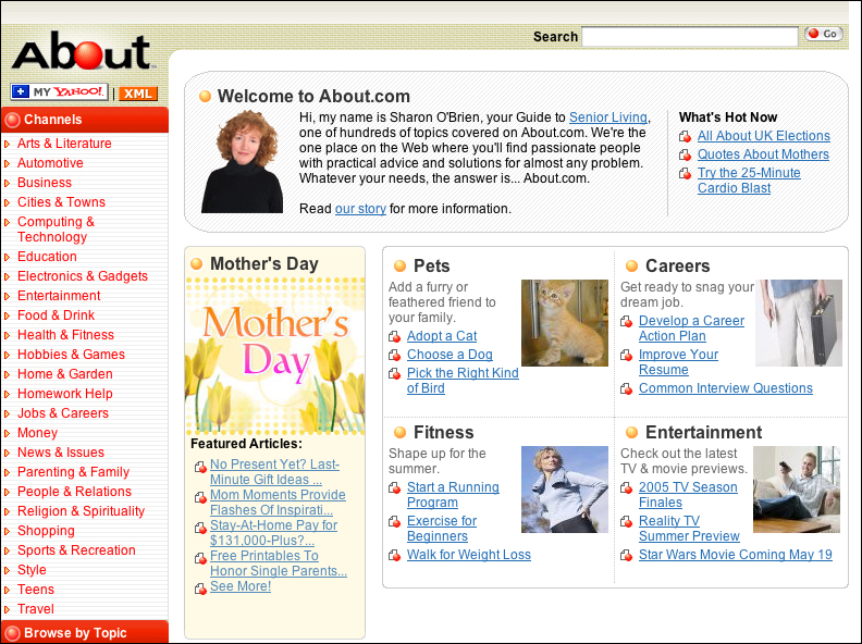
FIGURE 4.5 About.com uses a patterned background that appears to vibrate, which can cause discomfort and impair readability.
Do not place an animation alongside primary content. An animation should appear on a page of its own so the decision to view it is an explicit user choice. Do not begin playing the animation right when the page loads. Instead, provide controls for starting and stopping the animation. Avoid images that include patterns that seem to animate, such as striped or patterned backgrounds.
In a nutshell. Animations are distracting and can even be debilitating. Avoid using animations. When using animations, allow users to control playback: play, pause, and stop.
4.2. Text Alternates
4.2.1. Provide alt-text for all relevant images
Many HTML structures allow designers to provide information in more than one format so users can access it using different methods. Link underlines are an alternate method for identifying links for people who cannot see color. Alternate text is an alternate method for supplying information to people who cannot see images.
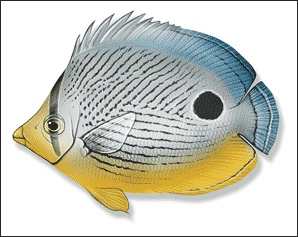
When an image is essential to the content and functioning of the page, nonvisual users can read the text description provided in the ALT attribute of the IMG tag. Take a text graphic with alt-text that is the same as the text that is displayed in the graphic: The visual user reads the text in the text graphic (as long as it is readable); the nonvisual user has software that reads the text in the ALT attribute (Figure 4.6).
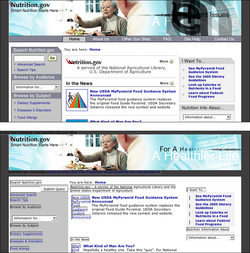
FIGURE 4.6 Nonvisual users can use sites with images as long as equivalent alternate text is provided. Nutrition.gov provides descriptive alt-text for its image links so users who do not have access to images can still use the site.
When images do not contain alt-text, users who cannot access images are stuck. People who do not load images are unable to navigate a Web site that uses images for navigation if alt-text is not provided. Since screen reader software cannot interpret images, it relies on alt-text to communicate image information to the user. When an image is provided without alt-text—for example, <img src="photo.jpg">—the only information the screen reader can relay is that there is an image on the page and that its file name is “photo.jpg” (Figure 4.7).
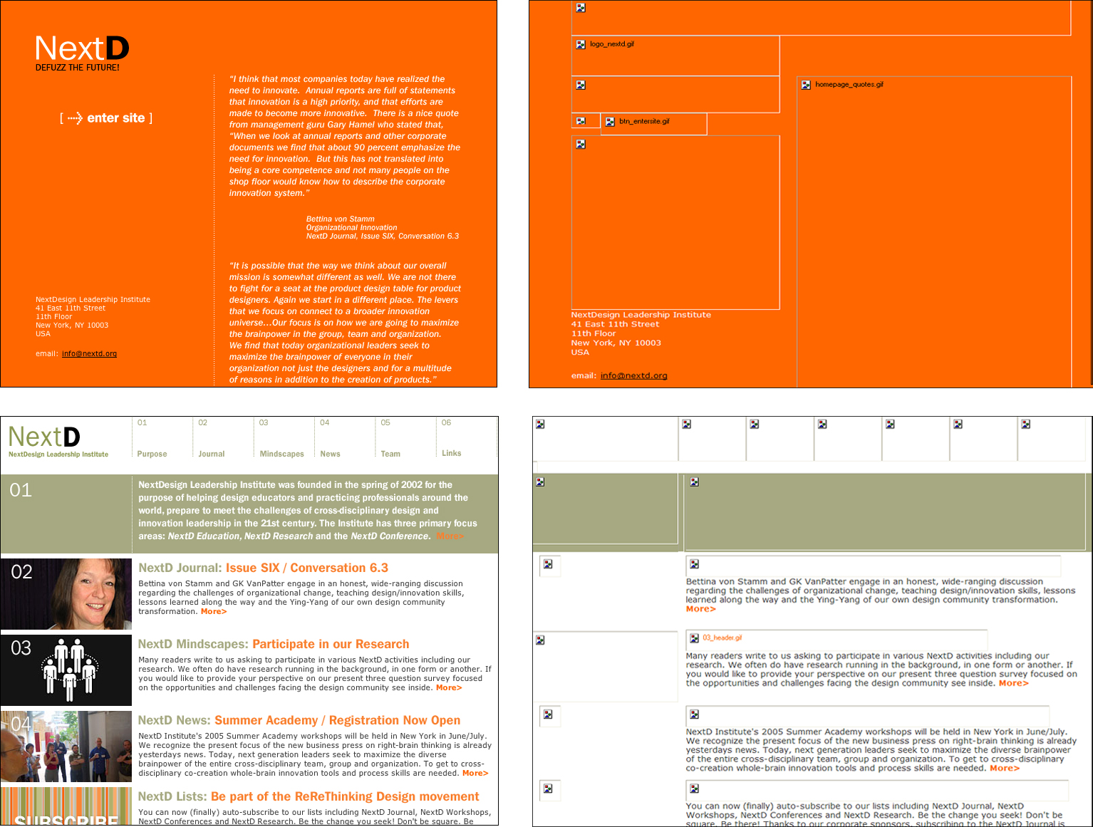
FIGURE 4.7 The NextD site uses images for essential elements but, in some instances, provides unhelpful alt-text and, in others, provides no alt-text. Users who do not access images will have trouble using the site.
If a picture is worth a thousand words, then a short description in the ALT attribute is a poor substitute. In many cases, however, such a description can provide enough information to assure Web access to nonvisual users. For images that are part of the user interface, provide alternate text that provides the equivalent function. In other words, the alt-text for the New York Times masthead should be “The New York Times masthead”; the alt-text for a print icon should be “Print this page.” When an image is part of the content of the page, the alt-text should describe the image: “Photograph of sunset,” “Graph of net gains,” “Painting of Venus by Botticelli.”
Other types of image elements should have alt-text as well. For example, image maps should have alt-text for all the active areas. Form buttons should also have alt-text. Background images cannot contain alt-text, so make sure background images are not required content.
In a nutshell. Users who cannot access images can get the equivalent information via alt-text. For images that are part of the user interface, use alt-text to provide the functional equivalent, such as “Go to next page” or “Print this page.” For content images, use alt-text to provide a brief image description.
4.2.2. Provide a full text description for content images
Generally, the best that alt-text can do for content images is provide a brief description of the format and subject of an image. To fully describe the information contained in an image to a nonvisual user, we need to use other methods.
HTML allows for a full description of image content by providing the LONGDESC attribute of the IMG tag. The content of LONGDESC is a file address pointing to a file that contains a text description of the image. When a nonvisual user encounters an image with a linked text description, he or she loads the linked file, reads the description, and then returns to the originating page.
Another way to provide a full image description is to provide image captions. This approach benefits both visual and non-visual users because text may prove helpful in comprehending the image. For example, an image caption explaining the contents of a graph or chart allows nonvisual users to access the information via the caption, and helps visual users to better their understanding (Figure 4.8).
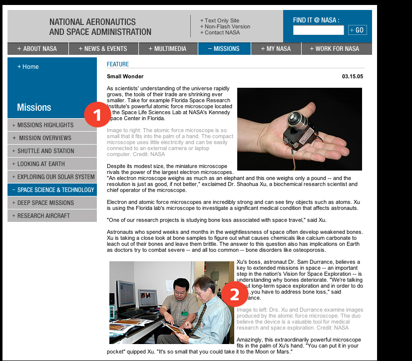
FIGURE 4.8 NASA includes captions (1, 2) for the images on its site. The captions provide information about images for both visual and nonvisual users.
In a nutshell. Content images may require more description than can be provided via alt-text. Provide a text description of the image information using a linked page or image caption.
4.2.3. Provide blank alt-text for irrelevant or redundant images
Alt-text is a way of communicating relevant information contained in images to people who cannot access images. However, not all images are relevant to nonvisual users. When images are relevant only in a visual context, provide blank alt-text (alt="") so nonvisual users do not have to bother with irrelevant content. Software that reads Web pages understands that empty alt-text identifies an image that is irrelevant, and so it does not communicate any information about the image to the user.
For example, elements such as spacers, bullets, and arrows do not add anything beyond visual emphasis and do not need to be described. People using screen reader software do not need to know that red bullets mark list items. When blank alt-text is used for such images, the software will skip over the image.
Also, images that appear alongside text to provide visual emphasis or clarification need not be communicated to nonvisual users. For example, text links are often paired with icons to help people quickly identify the link purpose, such as an arrow next to a “next page” link, or an email icon next to an “email this article” link. In these cases, the text link does a sufficient job of conveying the link function to nonvisual users. Generally, when images are used to reinforce text links, providing the functional equivalent via alt-text only results in redundancy (Figure 4.9).
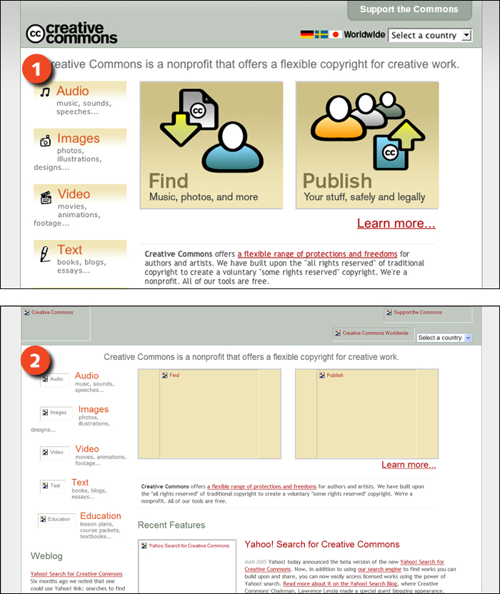
FIGURE 4.9 When images are used to reinforce text links, such as the icons on the Creative Commons site (1), alt-text is redundant since its function is handled by the link text (2). In these cases, the best approach is to provide blank alt-text (alt="").
In a nutshell. Not all images are relevant to nonvisual users. When images are not relevant outside of a visual context—such as spacer images or custom bullets—provide blank alt-text (alt="").
4.2.4. Maintain a catalog of image content
Web designers have a lot to keep track of with respect to images. Publishing Web images involves both the visible properties of an image and its nonvisible properties—such as alt-text and long descriptions. In order to ensure quality and consistency, keep some sort of catalog of image content. When image cataloging is part of the Web design process, the task of composing alternate text becomes a deliberate part of providing image content. When an image is used in multiple locations, the catalog can be the source for the alternate text.
In a nutshell. Alt-text and text descriptions are integral to providing image-based content. Maintain an image inventory that includes alt-text and text descriptions, particularly for large-scale or collaborative projects.
4.3. Size
4.3.1. Keep image dimensions as small as possible
From a data perspective, images are much less efficient than text. A photograph of a toaster requires more disk space to store and more bandwidth to deliver than a paragraph of text describing the toaster. However, for the visual user, an image can be far more efficient at conveying what that toaster looks like. We use images because they are a powerful and effective way to communicate. For Web designers, the goal must be to capitalize on the advantages of images without overburdening the user.
Web images are demanding because they require more data than text. The commonly used Web image formats are bitmap images, which, unlike text and vector graphics, are not stored intelligently and therefore require more data. To make up for this, Web bitmap images, including GIF, JPEG, and PNG, use different compression schemes to reduce file size, so the images can traverse the network more quickly.
Images are also less flexible than text. While text can reflow to fit different display devices, images cannot. This means that a user viewing a 500-pixel-wide image on a 320-pixel-wide display device will be unable to see the entire image at once.
To make the best use of images, keep the image dimensions as small as possible. When it comes to file size and display speed, small images fare better than large ones (Figure 4.10). Also, smaller images work better on small display devices.

400 × 500 high-quality JPEG = 28KB

400 × 500 low-quality JPEG = 12KB

300 × 375 high-quality JPEG = 20KB

200 × 250 high-quality JPEG = 12KB
FIGURE 4.10 Compression reduces file size, but also reduces image quality. An alternate method for producing small image files is to reduce image dimensions. Smaller images make smaller files and adapt better to different displays.
When saving images, use the image format that best suits the image. GIF and PNG work well for graphics and illustrations; JPEG works well for photographs. Use as much compression as possible to reduce the file size without overly degrading image quality. For GIF images, one of the best ways to reduce file size is by reducing the number of colors in the image (Figure 4.11 previous page).
256 color GIF = 36 KB

64 color GIF = 24 KB
32 color GIF = 20 KB
FIGURE 4.11 One way to reduce file size when working with GIF images is to reduce the number of colors used to represent an image. Often, reducing the number of colors has little noticeable effect on image quality.
In a nutshell. Large images take longer to download and limit page flexibility. Keep image dimensions as small as possible, and save images using as much compression as possible without significantly degrading image quality.
4.3.2. Use thumbnails for large images
Sometimes images need to be big. Product images must be large enough to display the details that are important to shoppers. Images for printing must be large enough to use in printed publications. Content images, such as those on museum or teaching sites, must be large enough to represent the content.
However, given the demands that images place on the user, large images should not appear on the main pages of a site. Most users will not want to wait to load a large image in order to move around a site. Instead, provide access to large images via a thumbnail or text link on a main page that invites the user to load the full-size image (Figure 4.12).
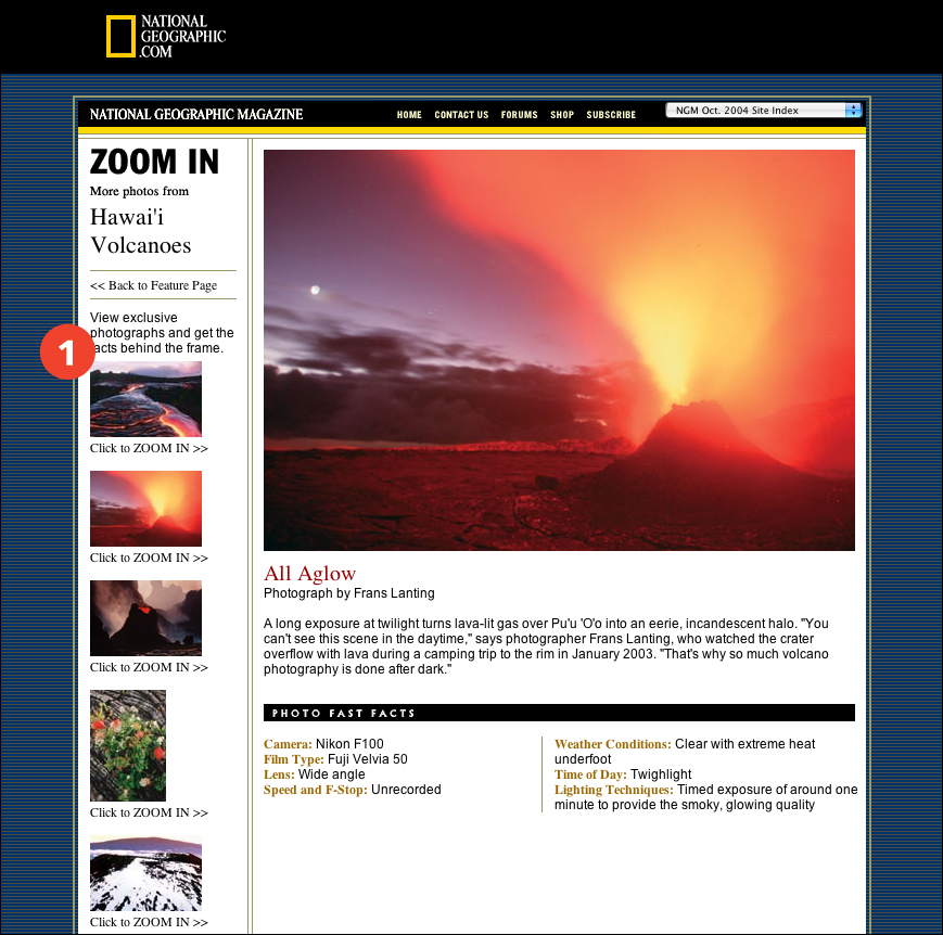
FIGURE 4.12 National Geographic provides thumbnail versions of its photographs (1), allowing users to choose which of the larger images they wish to view.
In a nutshell. Large images are sometimes integral to the purpose of a site. Provide access to large images using thumbnails or text links so users can choose whether to load the image.